Finally the compositions have come together! So for this project I finally veered away from traditional (okay maybe not, a little towards the end) and went full on illustration style. Since it was a project to introduce our future jobs through 4 different typographic compositions, I figured taking a personal approach would be nice; sharing my story.
CONCEPT & MESSAGE
Concept of my project: Growing up, the different job aspirations I had.
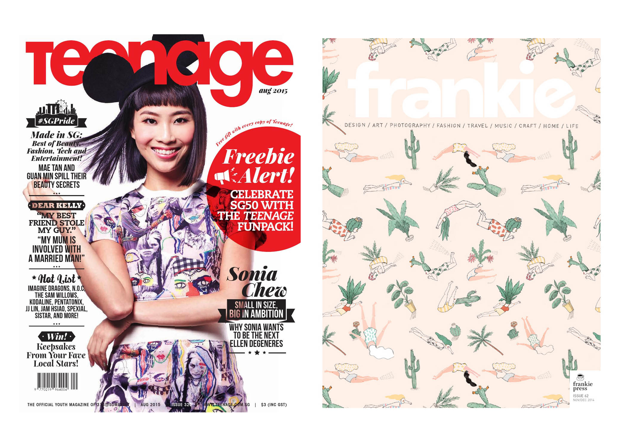
The main subject matter for inspiration and spur of the job aspirations for this project was magazines. Magazines I grew up reading.
Teenage when I was much younger. Actually I still do now only because I really love their editorial style and I’ve always dreamed of joining their publication if I were to ever go into an editorial job in the future. The first publication I’d want to work for. Also, more recently frankie, because of its content (art, design, photography, craft..) Both are lifestyle magazines.
Message of my project: Growing up, my perceptions and sensitivity towards things change. I paid attention to specific parts of a magazine which led me to the different job aspirations as shown in the four different compositions.
EXECUTION
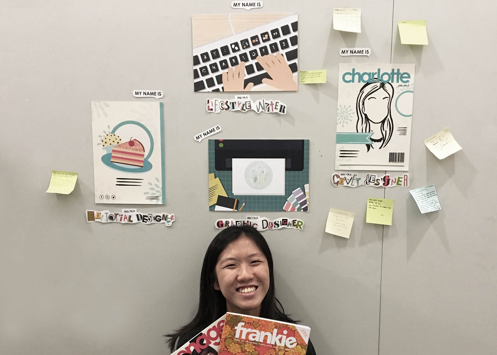
#1 My name is Charlotte and I’m a Cover Designer.

For the first composition, it’s inspired by that one time as I read my very first magazine, Teenage. I was immediately drawn to the magazine cover. You know how sometimes when browsing books in the library and deciding which ones to borrow? The factors for consideration were usually the synopsis, and book cover (though yes, never judge a book by it’s cover but you can’t lie. appearance matters yeah) So I thought to myself, one day I want to design the covers of magazines and this publication’s in particular.
Through feedback and suggestions received during past consultations, here’s what I ended up with. The final improved version. Used the simple vector shapes, a silhouette of myself that I came up with for the final 2D I project last sem (Ego In Different Settings) to depict/mimic the cover of a magazine. Teenage in particular.
#2 My name is Charlotte and I’m a Lifestyle Writer
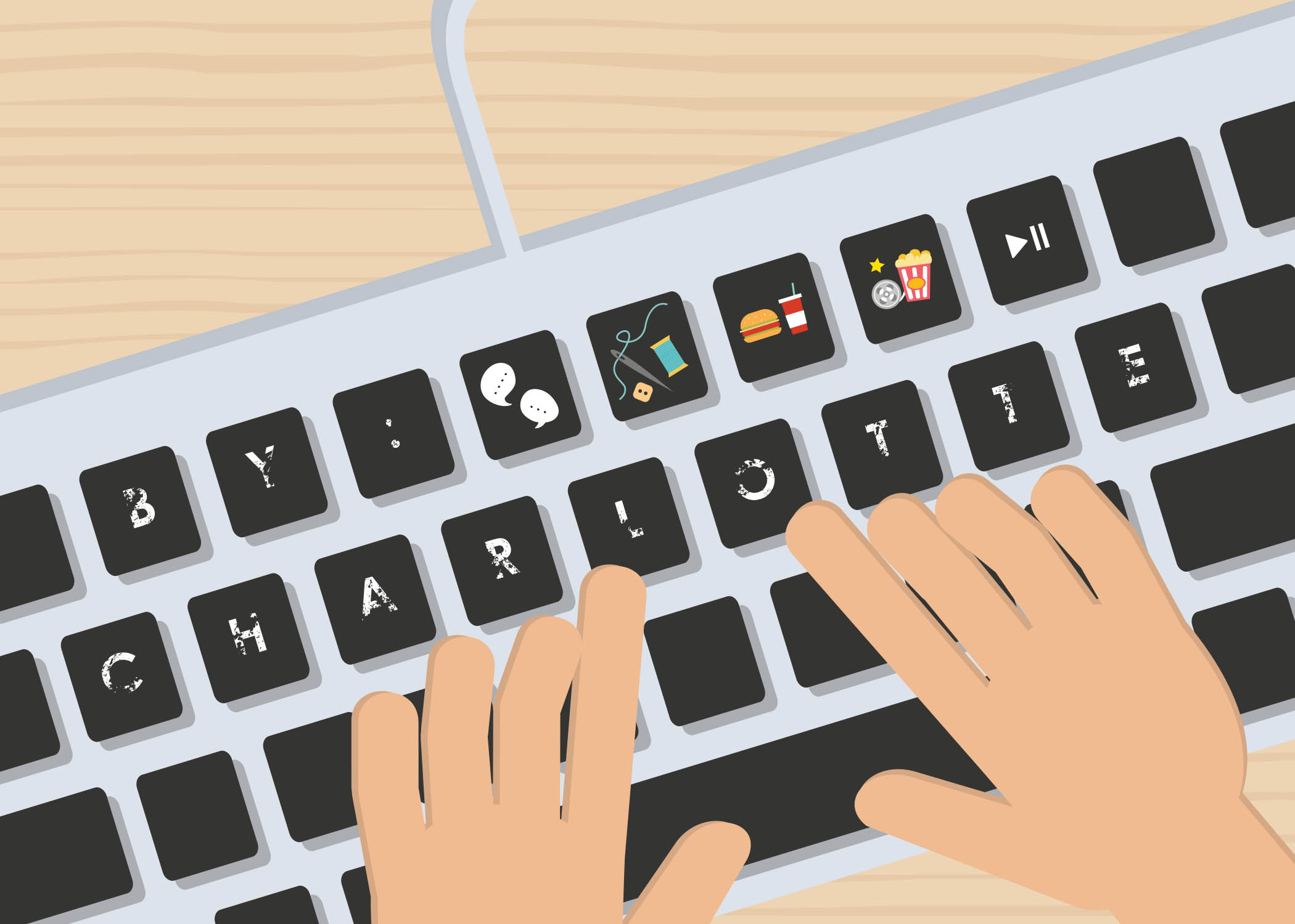
The story behind this composition: Back in poly days for final year we had to take this online journalism whereby we wrote for a school publication, e-magazine (online). So we wrote lifestyle articles. I enjoyed the various categories a lifestyle magazine was made up of – film, reviews, music, entertainment, DIY & craft even. At this point, I felt like I paid more attention to the content in magazines, which what led on to this particular job aspiration I had.
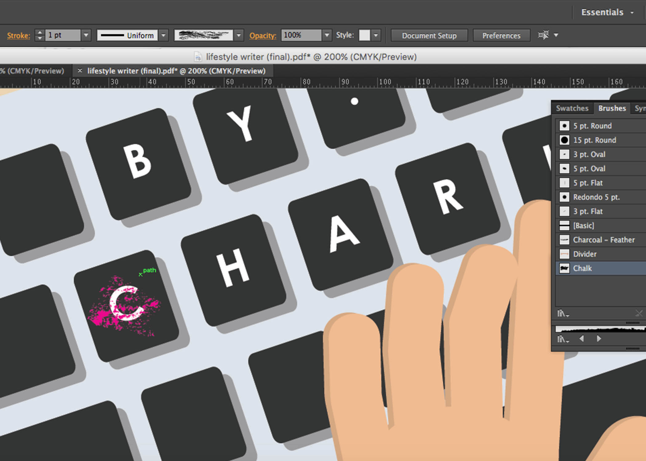
So based on the conventional look of a keyboard; the characters on each key, I replaced them with the characters of my name taking the form of a byline with illustration of the various categories in a lifestyle magazine at the top row.
Following Joy’s suggestion on creating several stains on the keyboard or making the characters on the keys look faded so that the composition doesn’t look so flat, has more added meaning like I’ve been hard at work with this dream job of mine… I went with the latter suggestion. Chanced upon the technique online to create a ‘distressed’ look to objects on photoshop. It gave the effect of fading I guess which eventually worked well! (see below)

Step 1
Step 2
That’s how I achieved the faded look on the keys and the site where I learnt how to: https://gomedia.com/zine/tutorials/distressing-techniques-in-adobe-illustrator/
#3 My name is Charlotte and I’m a Graphic Designer.
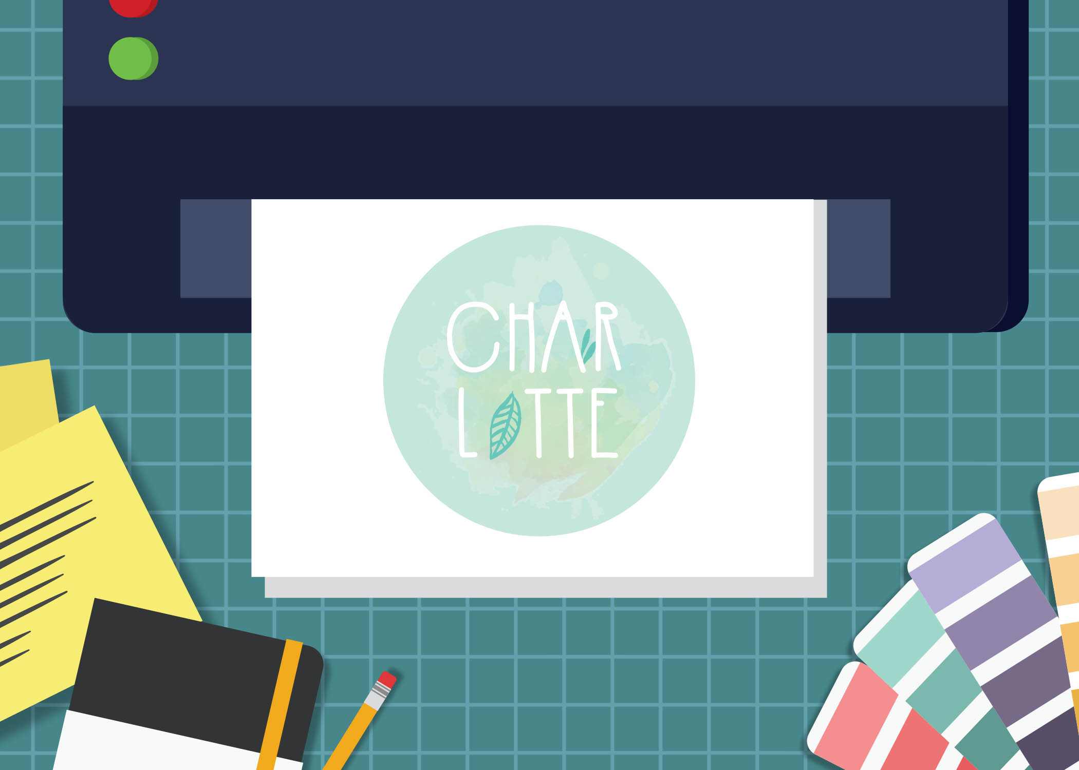
So after Teenage underwent a revamp in terms of the layout of their spreads, type of paper used for printing, style of publication a few years back I realised they started to have illustrations in their spreads which caught my eye. And ah, I also chanced upon frankie magazine where they had a lot of illustration based layout aesthetics and I started noticing those which led me to this job aspiration I had.
Following the suggested idea of having my name incorporated into a logo design, that’s (above) the final outcome of this composition! The idea behind my logo design is a combination of the things I love and see myself as – A nature loving artsy wallflower. Which explains the little nature looking illustrations, leafs replacing parts of my name, splashes in as the background.
Felt that I could’ve done better with the logo design especially with the colours. It looked alright on screen but when printed it came off way too light. Sizing was a bit funny too. During critique Joy suggested that the composition might have worked better if the logo came off as a half-done/unfinished one giving of a work-in-progress feel and I thought that was a really nice suggestion!
#4 My name is Charlotte and I’m an Editorial Designer

Final composition! I still feel amused at myself for coming up with the composition idea. This was the hardest to do too for me in terms of coming up with a design for it and how I could incorporate my name within.
As mentioned in the process post, I wanted the composition to resemble a back cover of the magazine, tying back to my whole concept and my realisation that cover design is covered under the job scope of an Editorial Designer too. I guess looking back now, present day I still really would love to explore the editorial side of a magazine publication one day. Especially working for the publication I grew up reading – Teenage.
So for a back cover, looking at past magazines I own I realised they are all if not mostly ads. Advertorials mostly of various sorts – food, products, lifestyle related basically. I had no idea. What kind of ad should I come up with? Joy suggested I could promote my “future publication/design company” hahaha. It was a really good suggestion but I thought it’d be nice to have something lifestyle. Name… name.. name. Not sure how or where to begin with this composition, I then searched the meaning of my name, the first meaning to pop-up was that my name’s some sort of a dessert that can be in cake form?! Okay so a food ad it is!!
The meaning I saw:
charlotte
ˈʃɑːlət
noun1. a pudding made of stewed fruit with a casing or covering of bread, sponge cake, biscuits, or breadcrumbs.
Embedded my name within a cake slice using the warp/clipping function (http://www.vectordiary.com/illustrator/warp-text-inside-a-heart-shape-tutorial/), felt it kind resembled the glaze/marbling of a cake? Similarly, I used lines to mimic the text of the ad so as to avoid the problem of typefaces and too many fonts used.
Feedback gotten on this during critique was that since the characters of my name were mostly longish, I could’ve used it to create the shape/outline of the cake or have it incorporated into the layers of the cake rather than having it warped into the top layer of the cake as it didn’t came off clear that it was made up of my name until I mentioned it.
Oh right, I also had the compositions printed on different paper types.
The “front” and “back cover” on thicker gsm paper – 230/gsm art paper partially glossy whereas the lifestyle writer and graphic designer compositions were printed on 160/gsm matte paper.
Not sure if they were obvious during presentation and yikes I forgot to mention this then.
CURATION
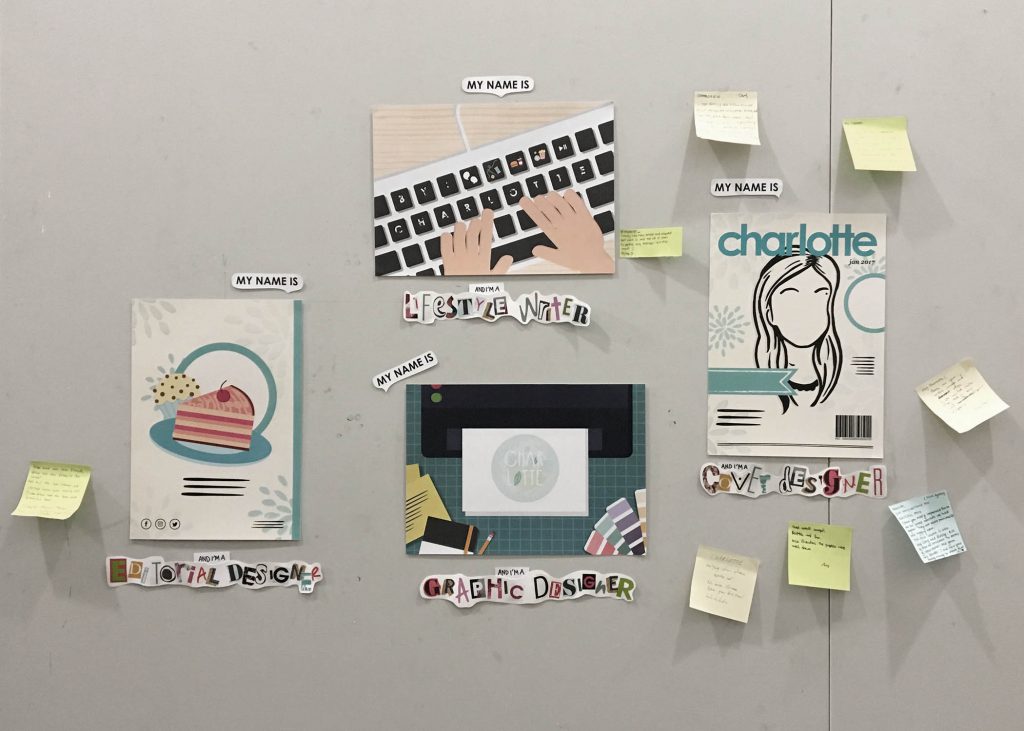
For curation, I wanted to place my compositions as such that it looked like a magazine and I went in that order for presenting my compositions as well.
- Front Cover
- Spreads
- Back Cover
And as mentioned from the start, I still couldn’t veer away from traditional. Couldn’t stop my itchy hands from doing a little bit of tactility haha. So since there wasn’t any restrictions on how we should do up the labels so long we had them for each composition, I purposely cut out characters from past magazines I owned, pasting together in collage style to spell out each of my future jobs to link back my whole theme/concept of magazines.
CHALLENGES & OVERALL THOUGHTS
All in all, this project wasn’t as easy as I imagined it to be at the start. The possibilities were endless and I struggled most at the start when conceptualising but slowly, the compositions came together so all’s good! First time going full illustration for 2D too! Something I’ve always wanted to try since I’ve worked mostly on traditional for the 2D projects last semester, especially the last one.
Can’t wait to get started on the next project since it explores the areas which I’m really intrigued in and wanna go into – Editorial and Publishing 😉 Plus exploring and working on a neighbourhood to put together a zine sounds like a really cool idea, hopefully everything goes well!!