Hannah Höch

hh

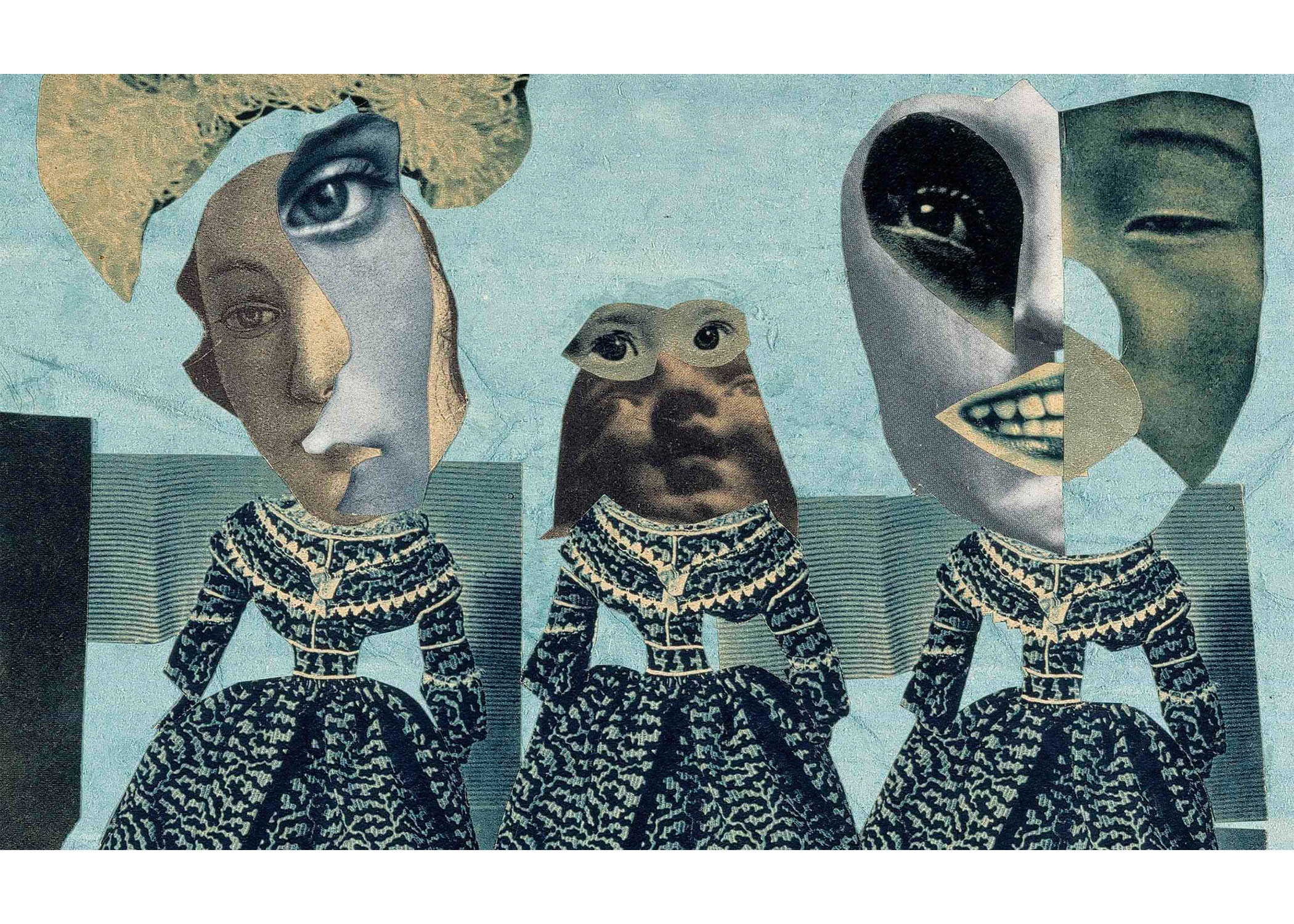
Still one of my favourite artists I’ve come across last semester for 2D while researching for technique inspirations for our final project (Ego In Different Settings). I love how Höch uses the photomontage and collage technique to create those abstract yet quirky looking artworks of hers.

The overlapping of images, and different compositions/angles of the different pieces of the photomontage helps to create some dimension and a dynamic feel to her works which is definitely something I can explore once again in this project since I really enjoy working with textures & tactility.
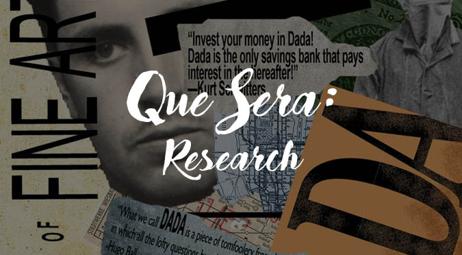
hh1


DADA

To sum up, an art movement that was meant to go against the values of culture of what was believed to have caused the First World War. DADA eventually became recognised an a type of avant-garde art which included works in mediums of visual, literary, music, collage, cut-up writings and more.

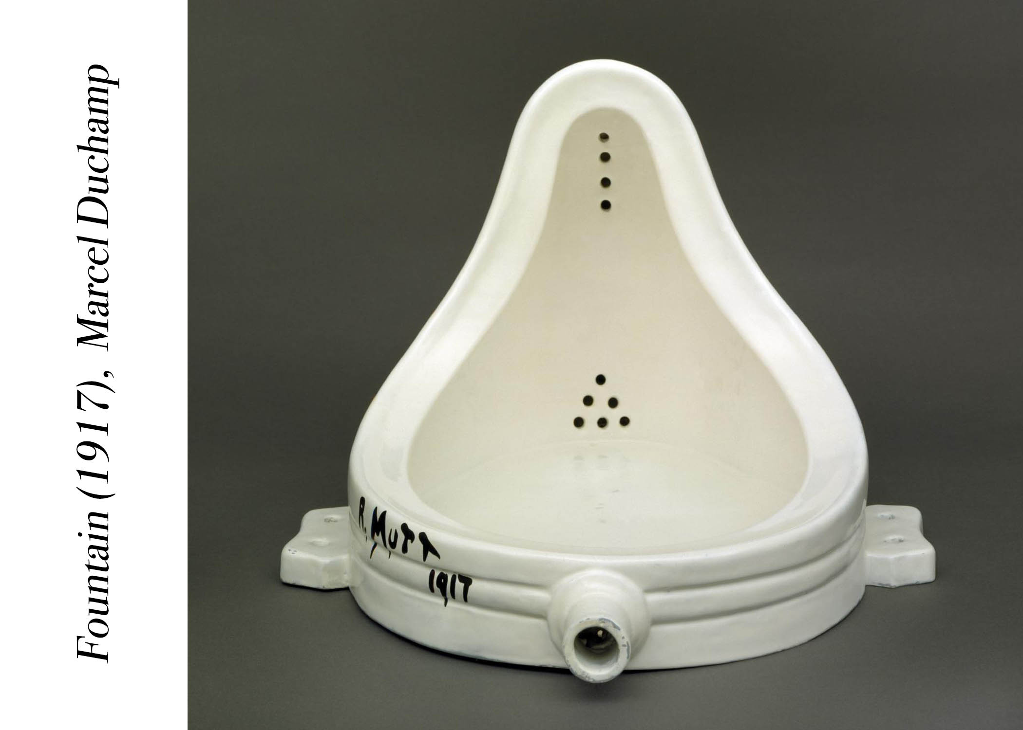
One famous DADA art would be the Fountain (1917) by Marcel Duchamp

dada

But in this case for our project, I think the more relevant forms of DADAism that we’ll be able to adapt would be the collage and cut-up writings technique of creating art. Back to artist Höch, she too had works that likened to the DADA art movement. Below are more examples during DADA:
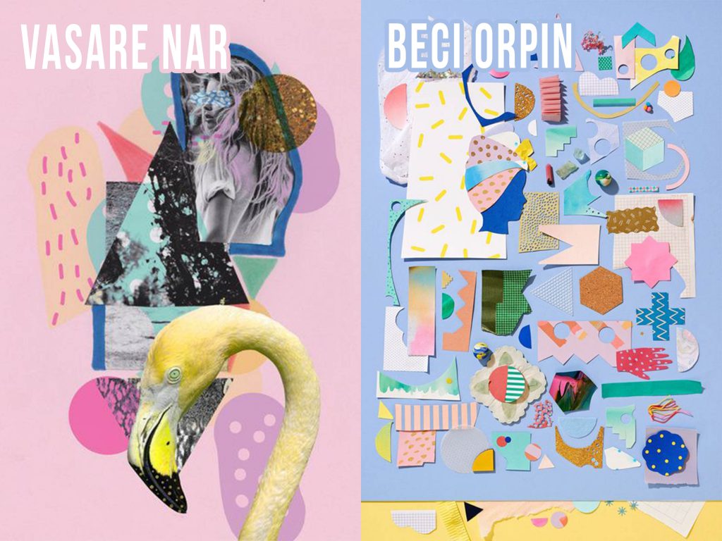
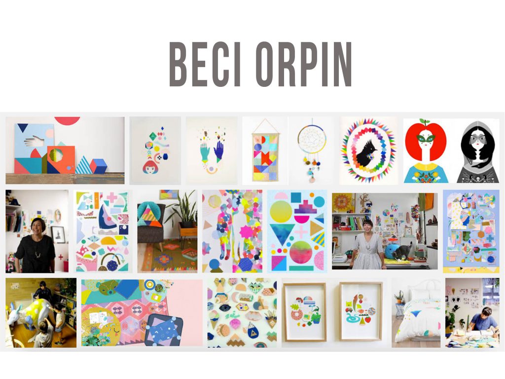
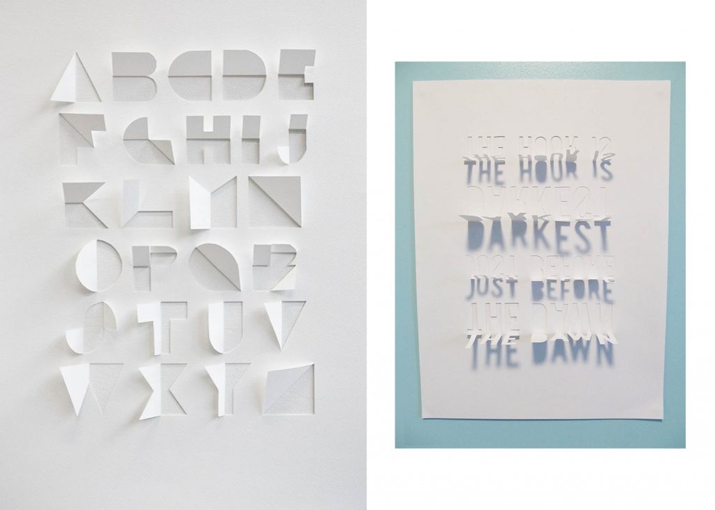
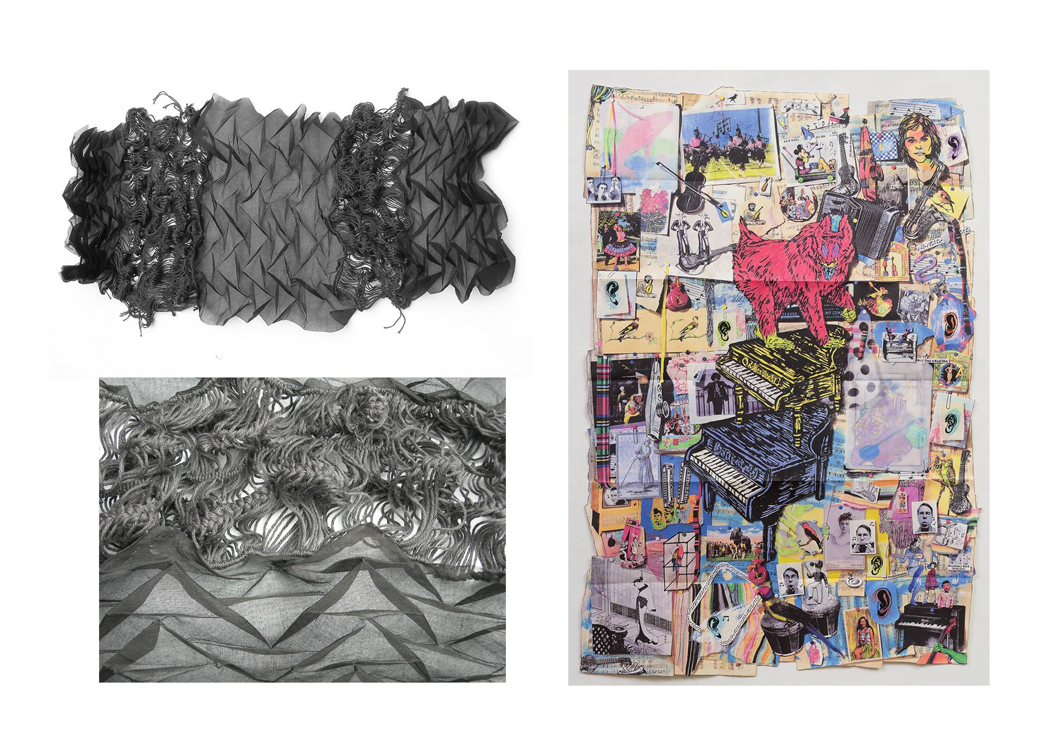
dada2 dada1


Paper Cut-Outs

papercut
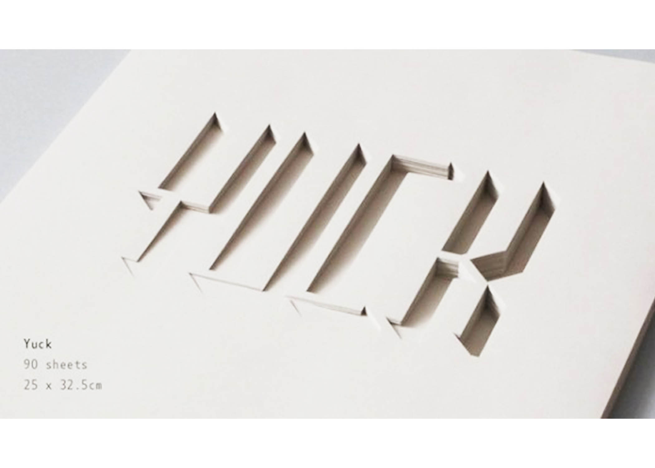
Another technique I found interesting and a possible exploration for this project, paper cut-outs! They can help create some sort of spatial depth and achieve a really cool effect. Not sure if this would work for the concept I’m going for but definitely keeping this in mind 🙂 I particularly like how it creates texture and at the same time a minimalistic feel (for the designs below)
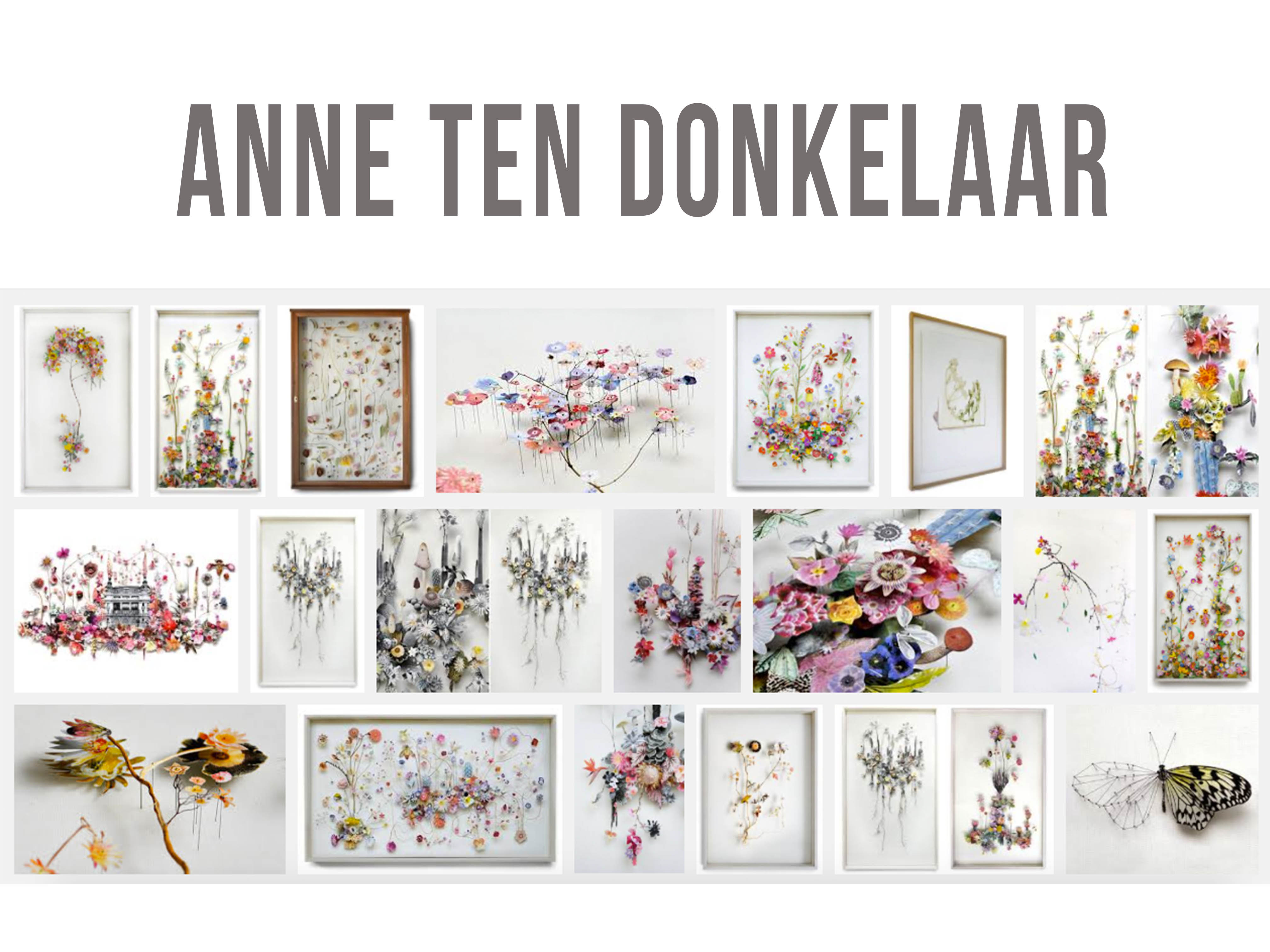
papercut1


Layering

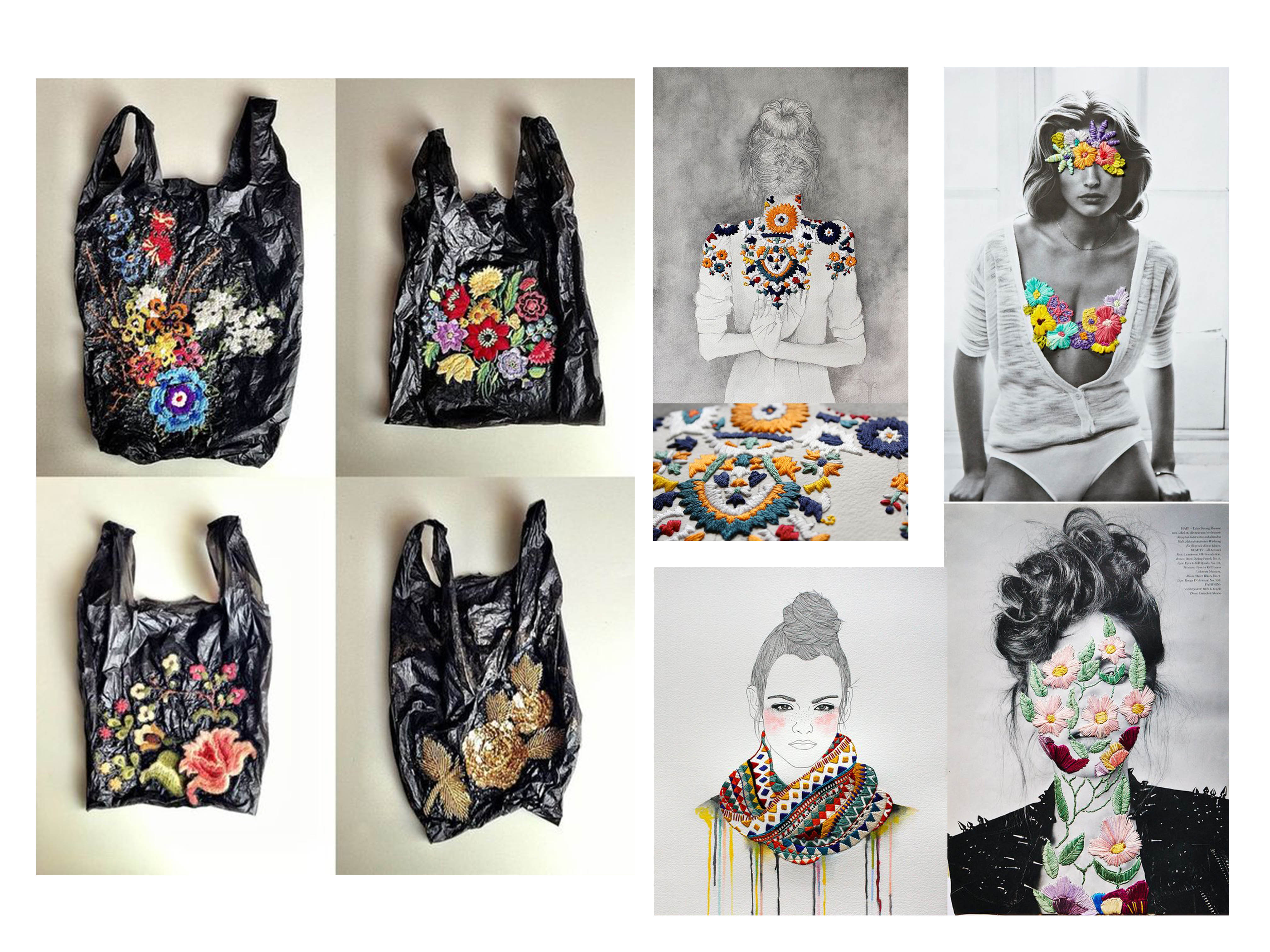
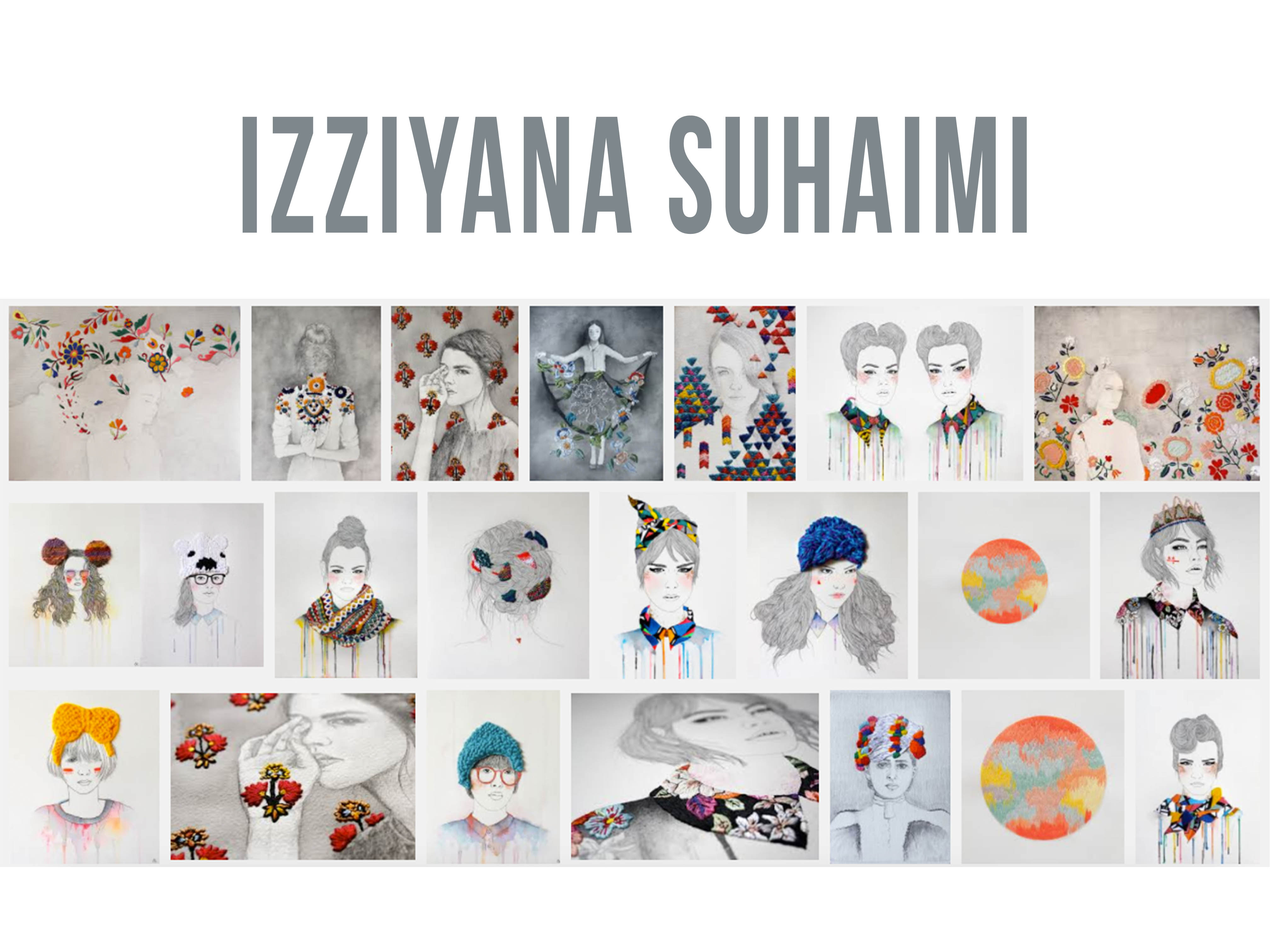
The last technique I found interesting, pretty much the same idea of treating surfaces but in this case it’s layering – Done through various mixed mediums. For example, it can be all embroidery based (layering threads over one another layer after layer to achieve more dimensionality) or doing it through painting.

Basically it’s just going over layer after a layer (if that makes sense…)
This technique just screams tactility and textures 😀

layering1 layering


So after much researching, what you see above are the artists, art movements and techniques I found interesting for this project. As I enjoy exploring the idea of tactility in my works, guess the research below would be helpful!

Seems like I can’t escape the idea… but treating the surfaces to achieve tactility in my compositions would probably only be for one or two as I intend to somehow create a link between the technique used with the job I’ve selected – Saving the further explanation for the process post later on!

Prior to the execution of the project, Pinterest was my go to site for inspirations. You can pretty much call it a heaven/library for art inspirations. I’ve never used it so Pinterest intensely before and every time I end up browsing off topic because one pin leads to another interesting one. ?

It helped me identified the medium and feel I was going for as this round’s project allowed us to explore any medium we wanted to. Here comes the problem. Whenever there’s more freedom in a project given, there’s so many possibilities and there comes the headache of narrowing down the ideas. It’s hard but it eventually worked out. 🙂 Right off the bat, I had mediums in mind that I wanted to try out on the compositions.

Below are some I was intrigued by and those I already had in mind as mentioned.

EMBROIDERY/PATCHWORK

embroidery

I love how embroidery is so versatile. It can even be done on plastic bags!!

Izziyana Suhaimi: http://www.izziyanasuhaimi.com/ 

An artist who does fashion illustrations with embroidered accents and accessories.izziyana-suhaimi

COLLAGE

Linking back to the Dadaism art movement, this medium was pretty relevant to the tactility I has in mind for the project as well. Here are some artist references I chanced upon while browsing through Pinterest.

research

beciorpinworks

More of her works: http://beciorpin.com/ 

CRAFTWORK

craftwork

More of her works: http://anneten.nl/

TYPOGRAPHY (EXTRA)

typography1

Example

Another idea I had was to try using word typography and translate it into a literal image from the words. Example would be like the image above. Using the word Cat to form an image of an cat from it. I thought I could apply idea/technique this to this project to form each equation and composition which I thought could’ve been rather interesting.

So in this case, something that represents ME, e.g. A flower. So using the word flower form an image of a flower. But I figured that it’d take a super long time to get the image-typography thing going as it would’ve been a challenge visualising.


 COLOUR THEORY RESEARCH & COLOUR INSPIRATIONS ? 

For this project a huge component of it was for use to apply colour theories. So before starting on the compositions our homework was to research on what they were. This was a table that I found to be a really helpful summary of the various kinds of colour theories around.

colourtheory

Another interesting aspect of colours was that it could represent one’s emotions and feelings. It could also symbolise something. Some examples of emotions as seen below in the chart. I later on applied this to my compositions as well.

colourmeanings

For colours, I really wanted to go for pastel hues or pop hues as they were colours that I recently took a liking to after follower a local embroidery artist and a local designer on Instagram. I particularly enjoy the range of colours they worked with and was inspired to take on a similar colour schemes for my compositions.

@teeteeheehee: https://www.instagram.com/teeteeheehee/

teeteeheehee

@ultraaviolets: https://www.instagram.com/ultraaviolets/

ultraaviolets

Besides the above inspirations, I got ideas from design seeds too. It’s this account on Pinterest that provides a wide range of ready mixed colour palettes. Based on these, I generated a colour scheme for each row of compositions using Adobe Kuler since we had to make apply colours in accordance to the colour harmonies we learnt and also taking in account my theme for each equation.

Bright Hues

brighthues

kateshaw

Another artist that used vibrant colours in her works, Kate Shaw

More of her works: http://www.kateshaw.org/?doing_wp_cron=1478882812.2931230068206787109375

Pastel/Muted Hues

pastelnmuted

Eventually I think I was leaning more towards the pastel and muted range of colours as my eventual rows of compositions weren’t highly saturated and hard on the eyes. You can see the end-product in my final post so keep reading 🙂

Through all these research, I’ve decided to go with the basic idea of having every composition start off with a digital “base” first and I will treat the surface thereafter with a traditional medium since during consultation Joy mention that the composition shouldn’t be fully 3D, ideally it should still have some 2D flat elements to it.