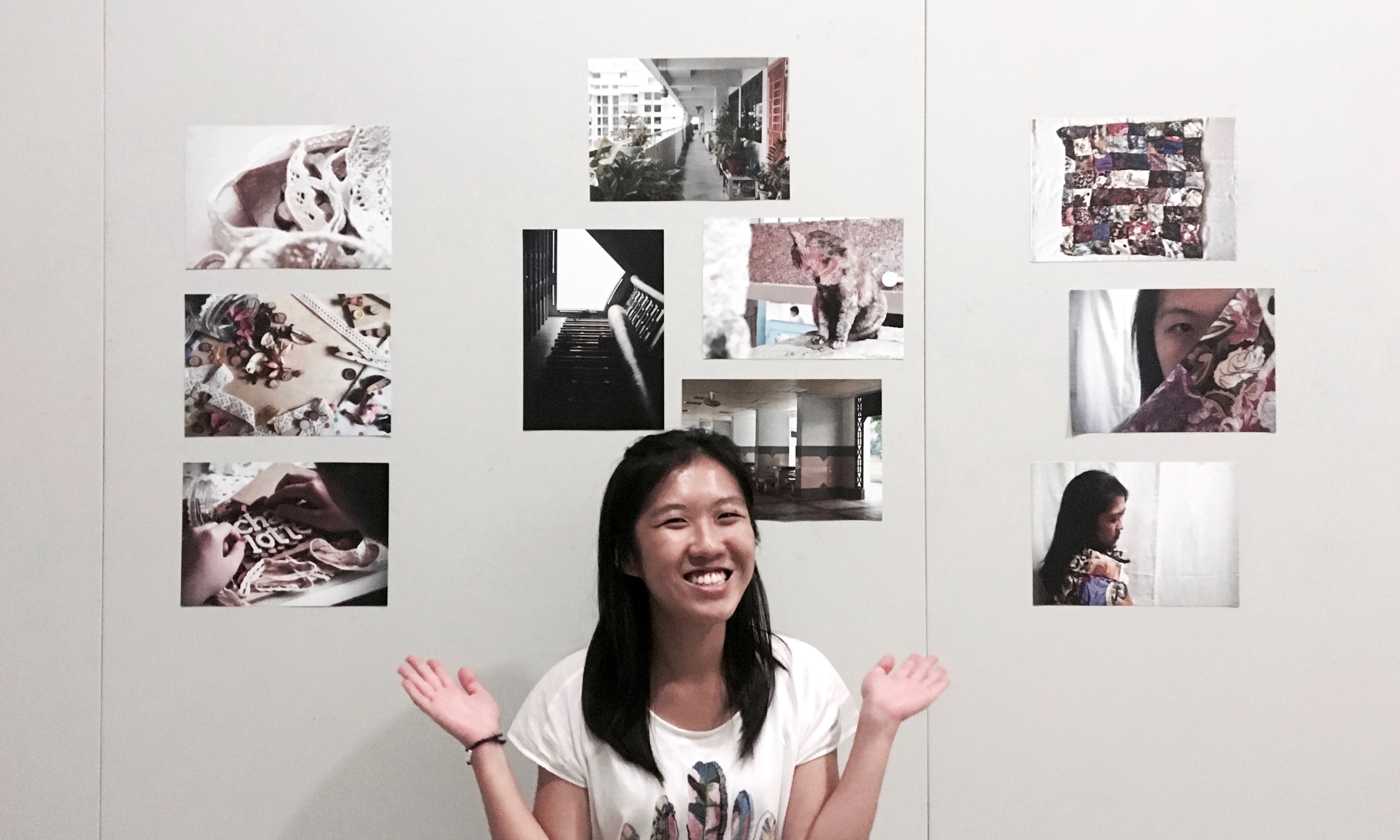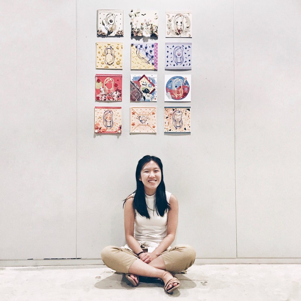
Oh no, I realised I missed out quite a bit on what I wanted to share during the presentation on Thursday… The one project where I’m supposed to be the most calm since it’s something really personal. Guess my nervousness got the better of me, especially since I was the second last to present (for the first time)… Thankfully there’s still this OSS post. Hopefully it makes up a little for the lost content. I felt that the presentation could have been so much better if I did not momentarily blank out! ???
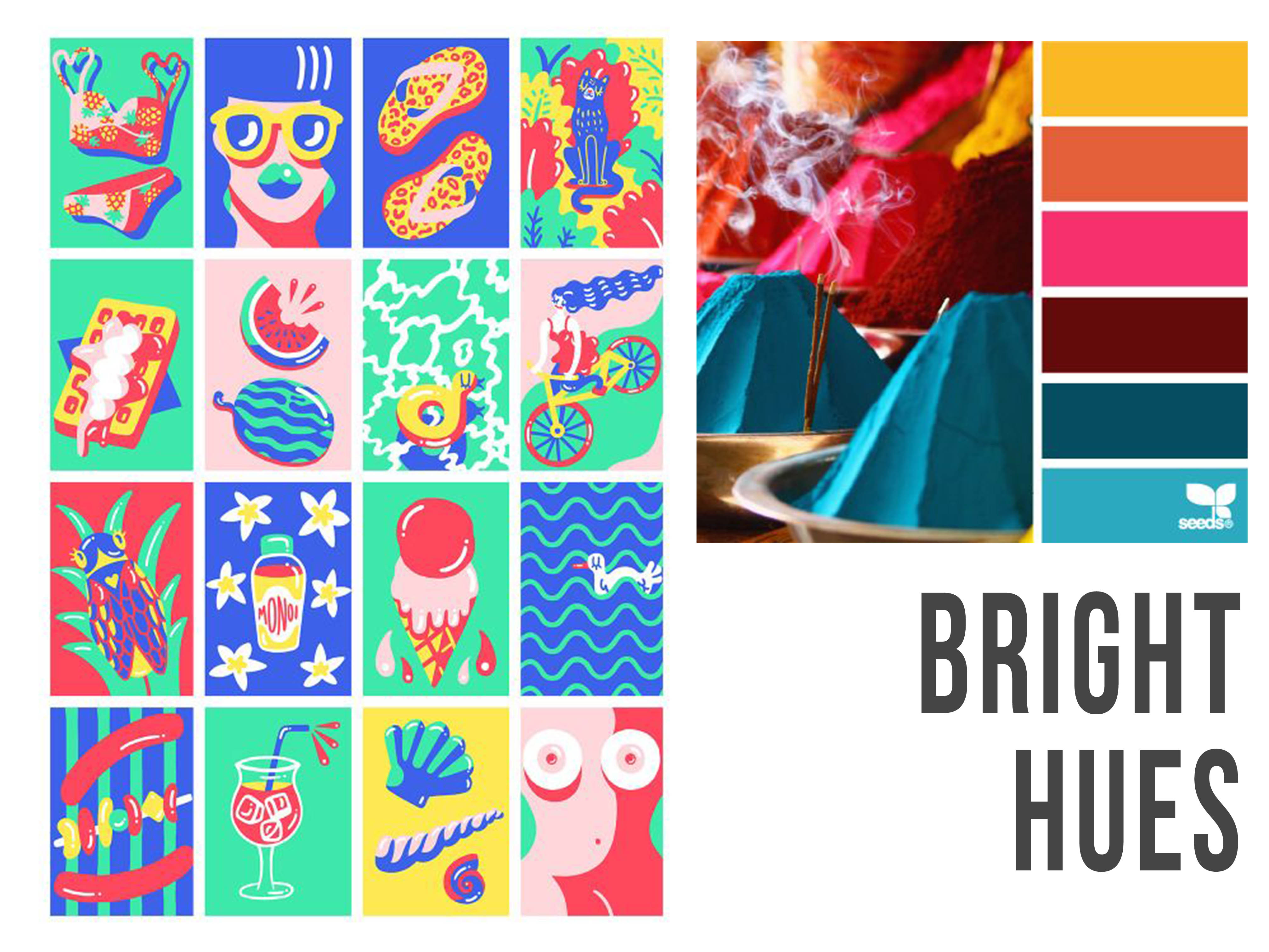
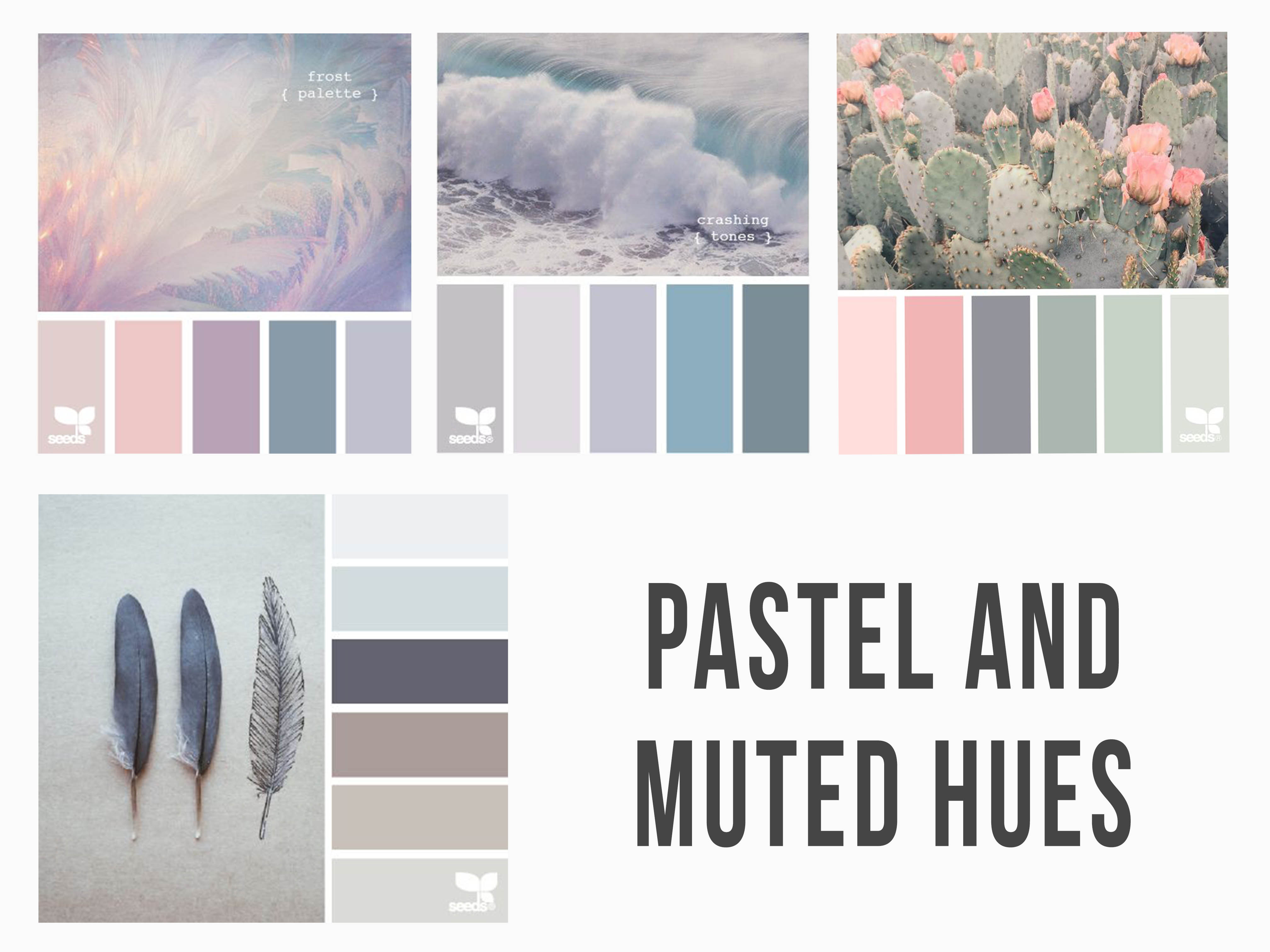
CONCEPT
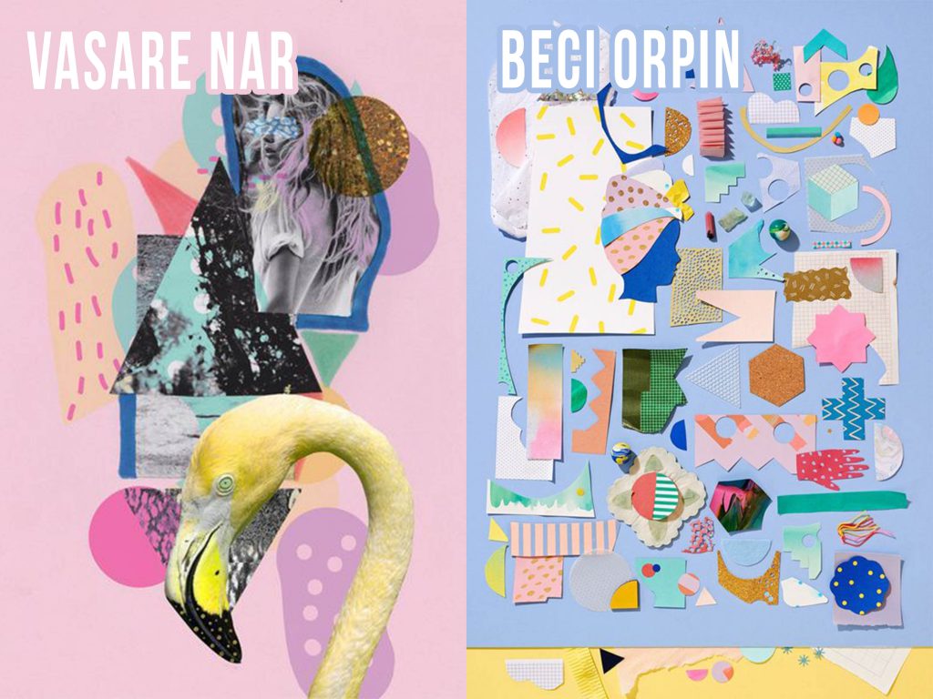
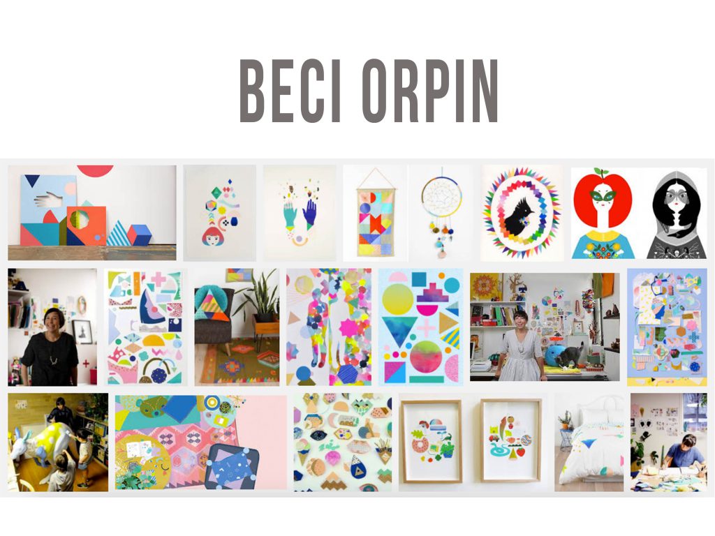
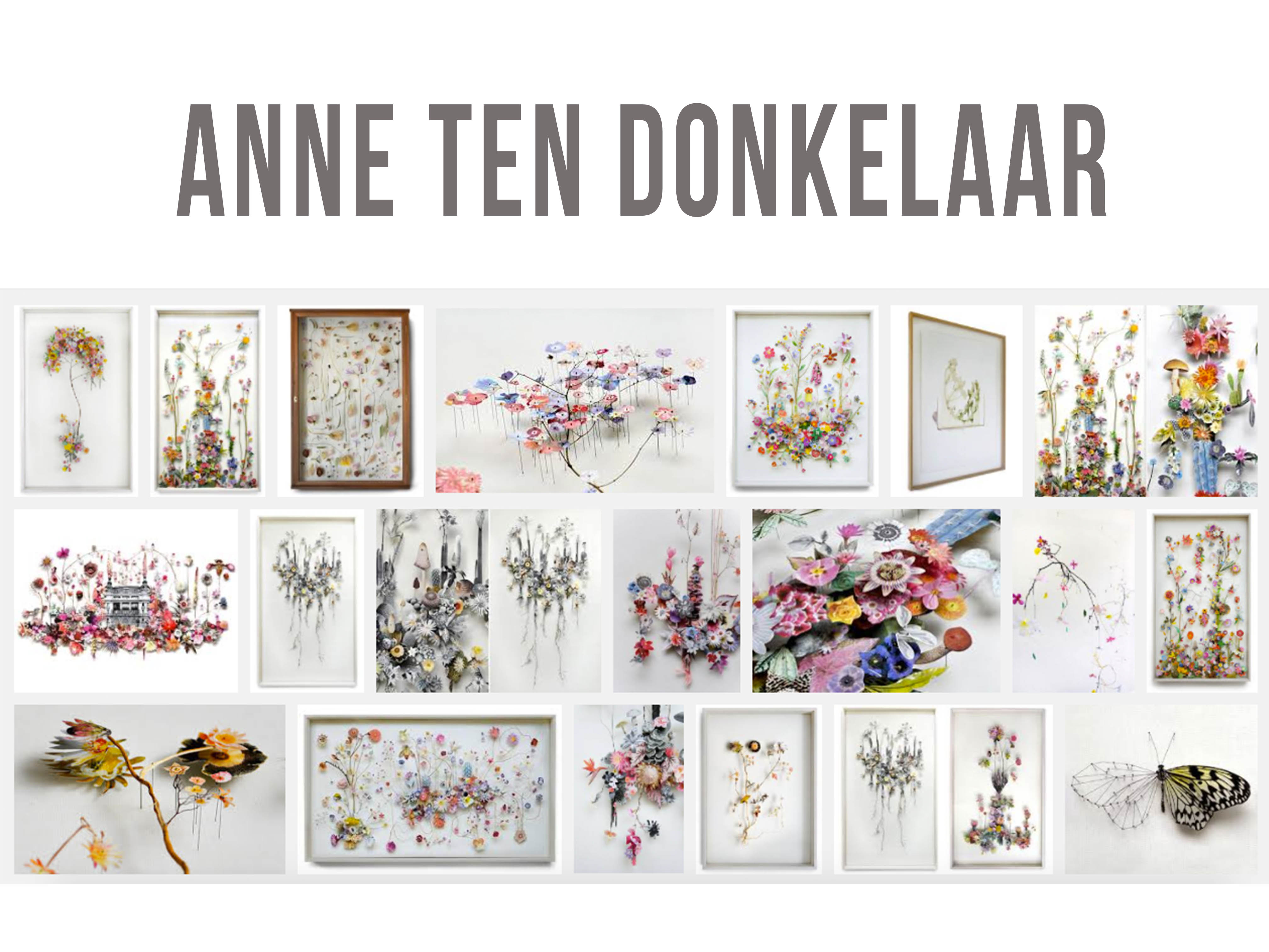
For this project I knew I wanted to focus on tactility and textures. Thus my initial idea was to do different interpretations based on one same equation using the mediums and colour theories as the varying factors which Joy said was possible. But after going into the brainstorming process, I realised that it wouldn’t be exactly feasible. It’ll probably turn out too monotonous by just having repeating motifs throughout with the change of colours and mediums used.
Scratch that idea, I came up with another based off the project brief that is You + A Setting = You and The Setting Interacting. I decided to make the 12 compositions very me and personal by sharing 4 THINGS ABOUT ME with the application of the colour theories learnt and exploration of mixed medium/techniques that I personally enjoy.
EXECUTION
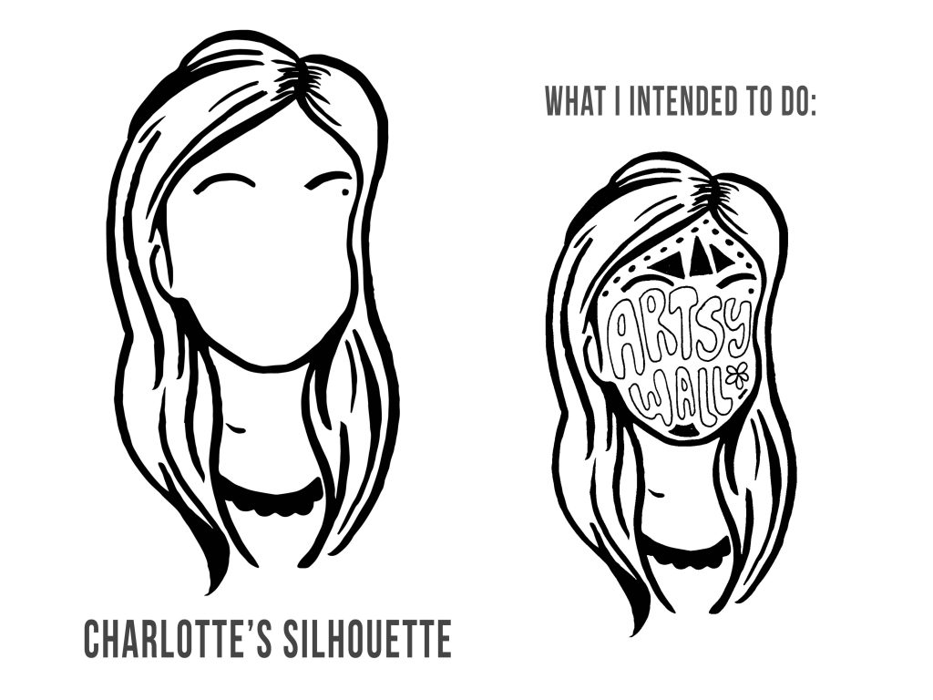
The basic approach for each of the 12 compositions was to do up a digital “base”/surface first and then treat the surface using various traditional mediums/hands-on art techniques. I vectorised a drawn silhouette of myself to establish a recurring motif of sorts throughout the 12 compositions as well as to use it as a representative motif of “ME” in the equation.
There was also the use of geometric shapes in the background for the compositions for consistency as I didn’t want the background of the compositions to be too plain. On the other hand, colour theories used were mainly analogous, complementary, triadic and monochrome harmonies with some colours used intentionally because of it’s colour symbolism which would be subsequently explained in the respective equations created.
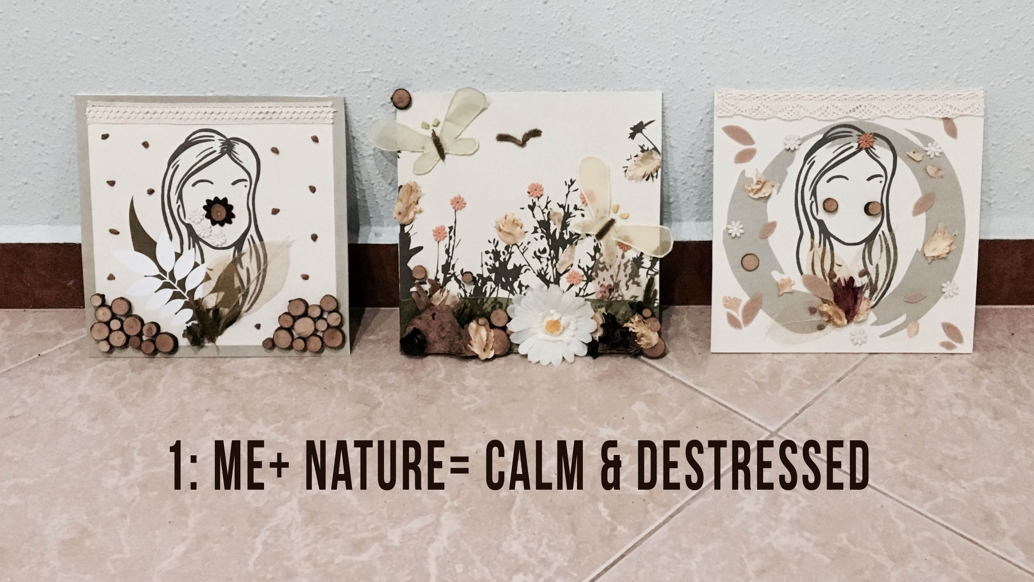
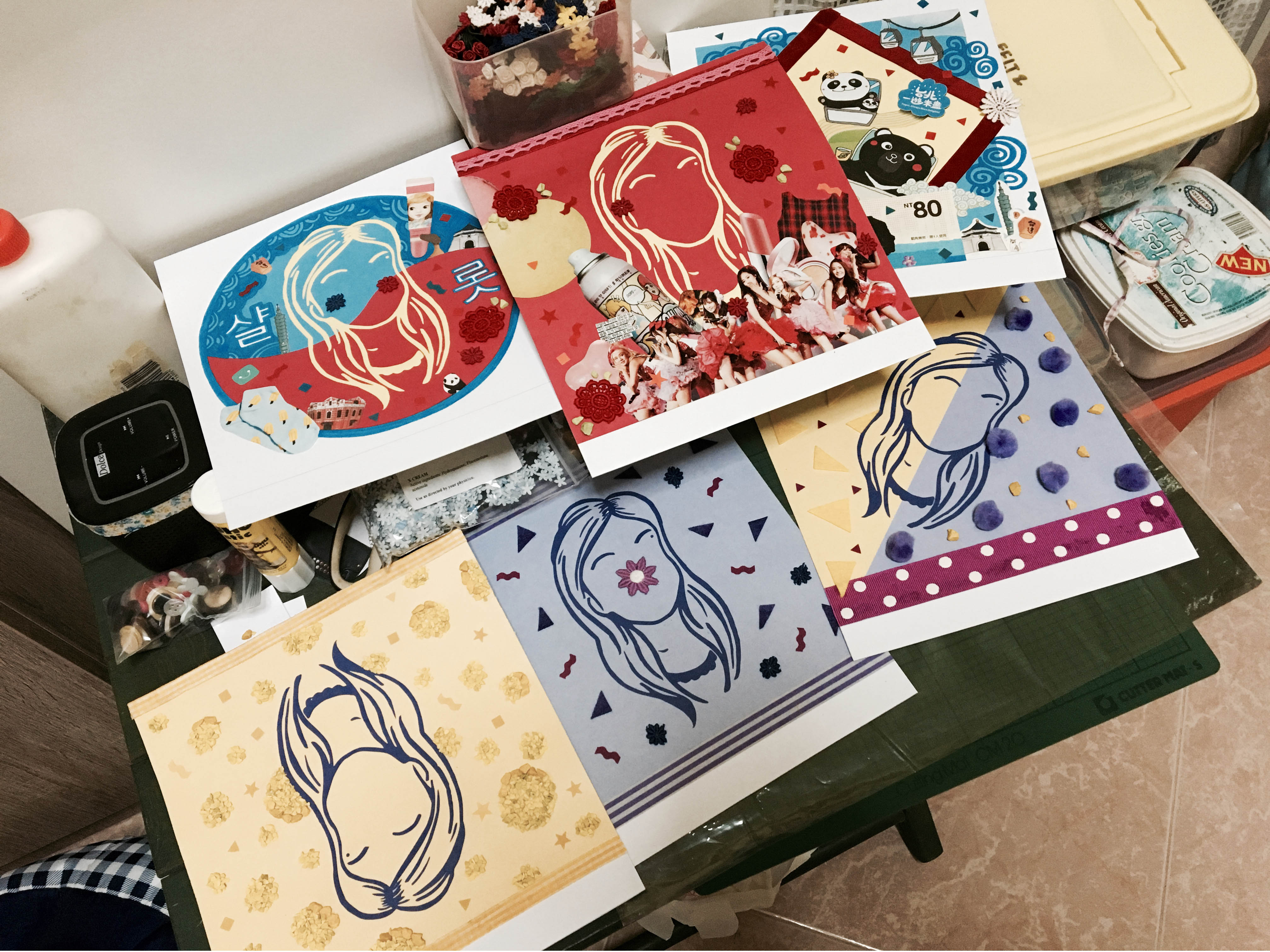
EQUATION 1 – Me + nature/floral = A Calm State Of Mind

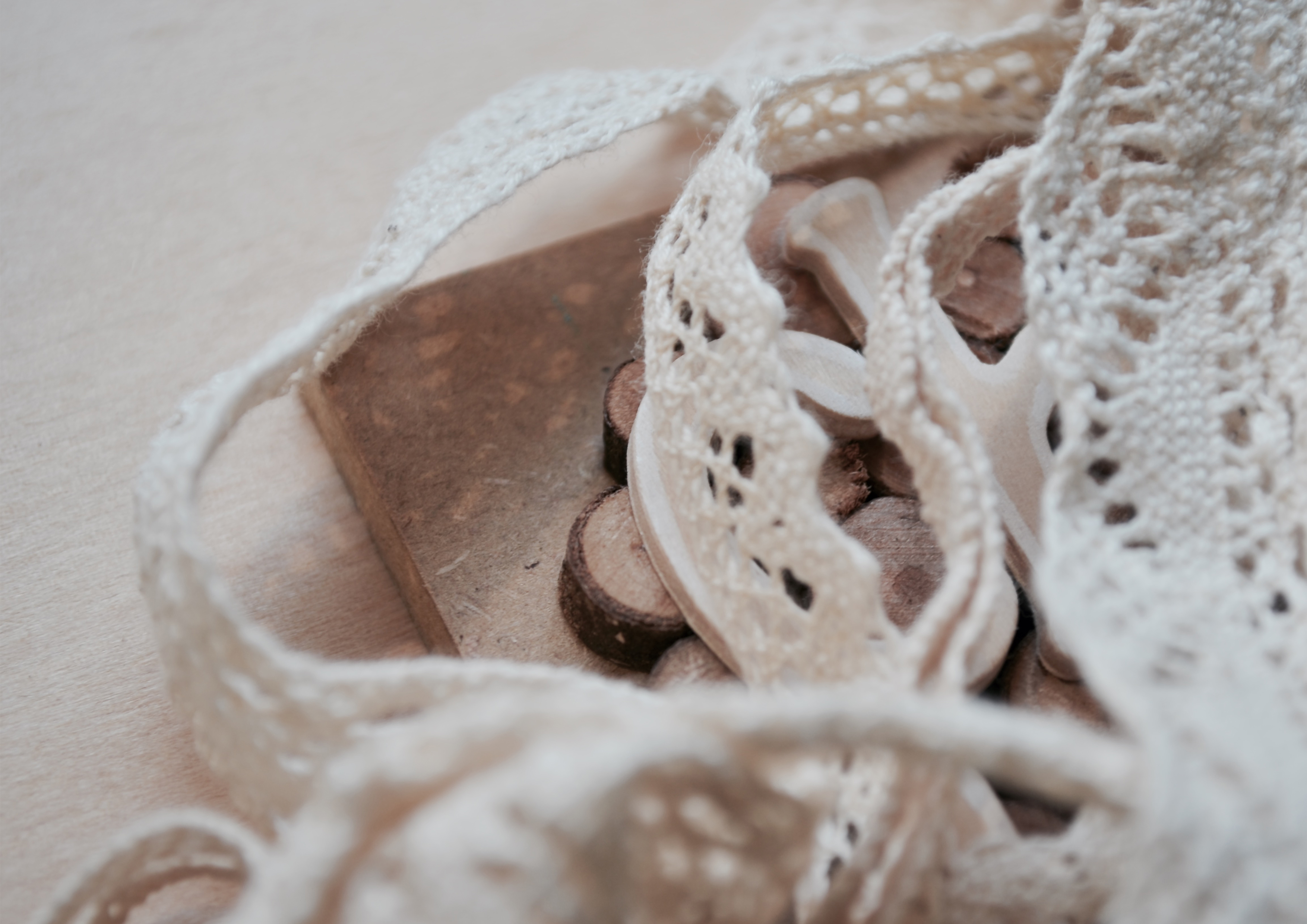
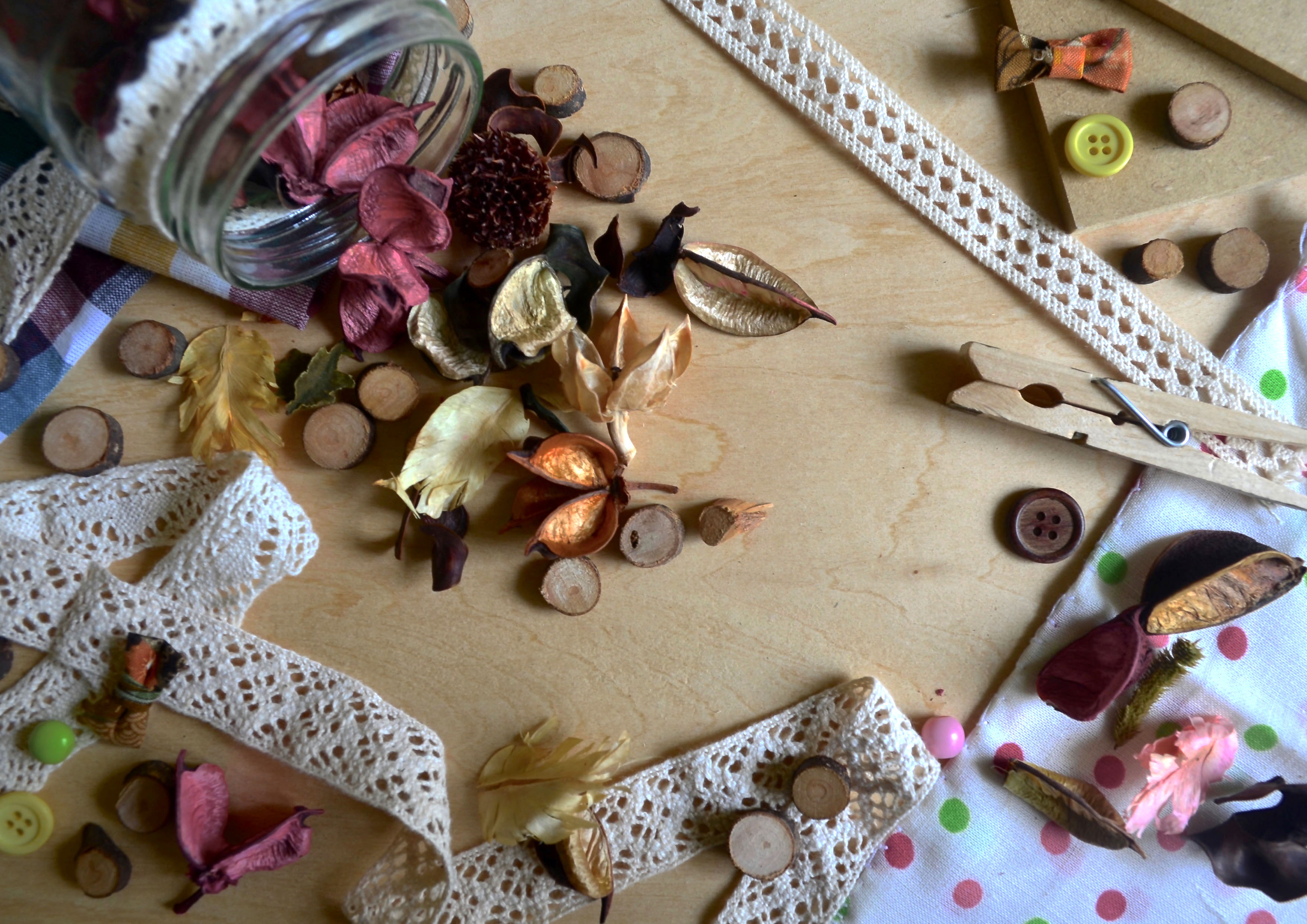
I had in mind colours of nature while working on this first equation. I felt that muted light “woody”-brownish colours would best for this as I intended to treat the surface using nature related materials such as dried flowers, leaves, potpourri and wooden chips.
For the first composition I slowly established the theme of the equation by surrounding my silhouette with some of the nature related materials and the second is pretty much establishing the nature setting. In the final composition, a zen and calm state with the leaf patterns being spatially spaced away from one another and a zen symbol surrounding the silhouette is used.
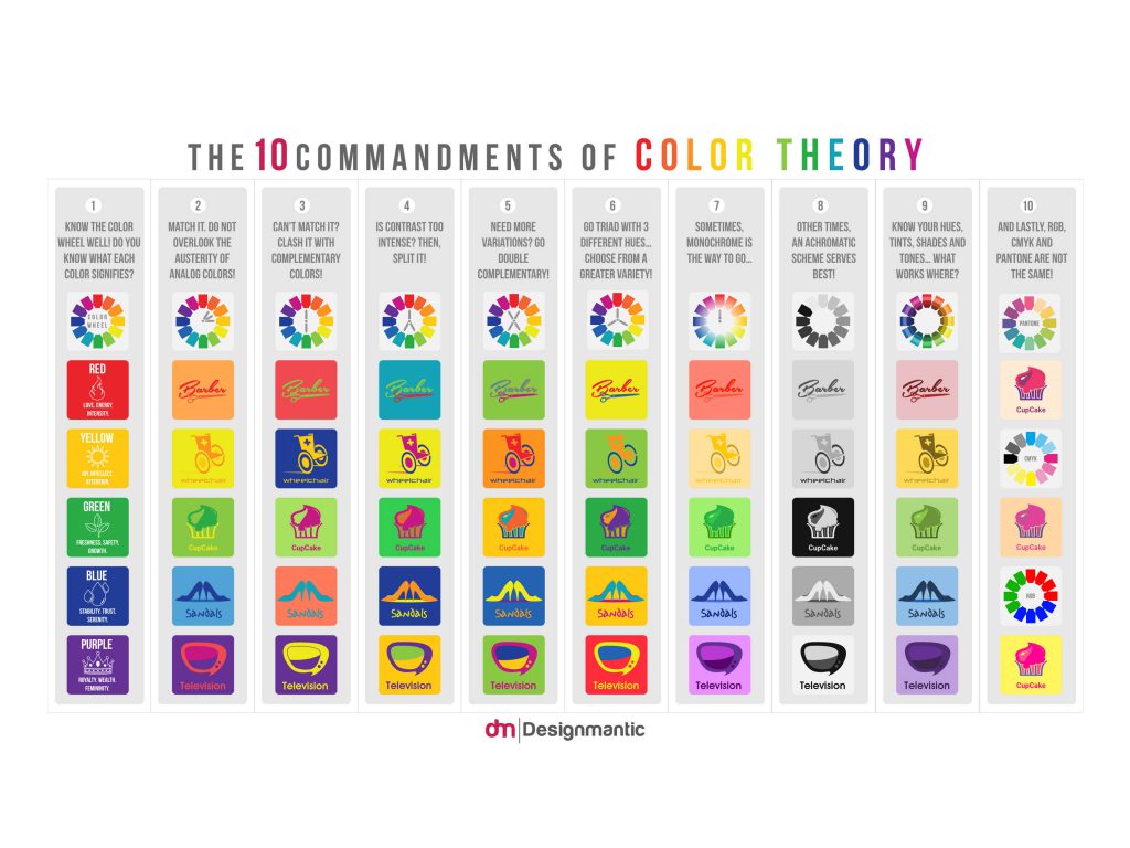
Colour theories used:
Monochrome: Different shades of Brown
Analogous & Triadic: Yellow, Orange, Green , Brown
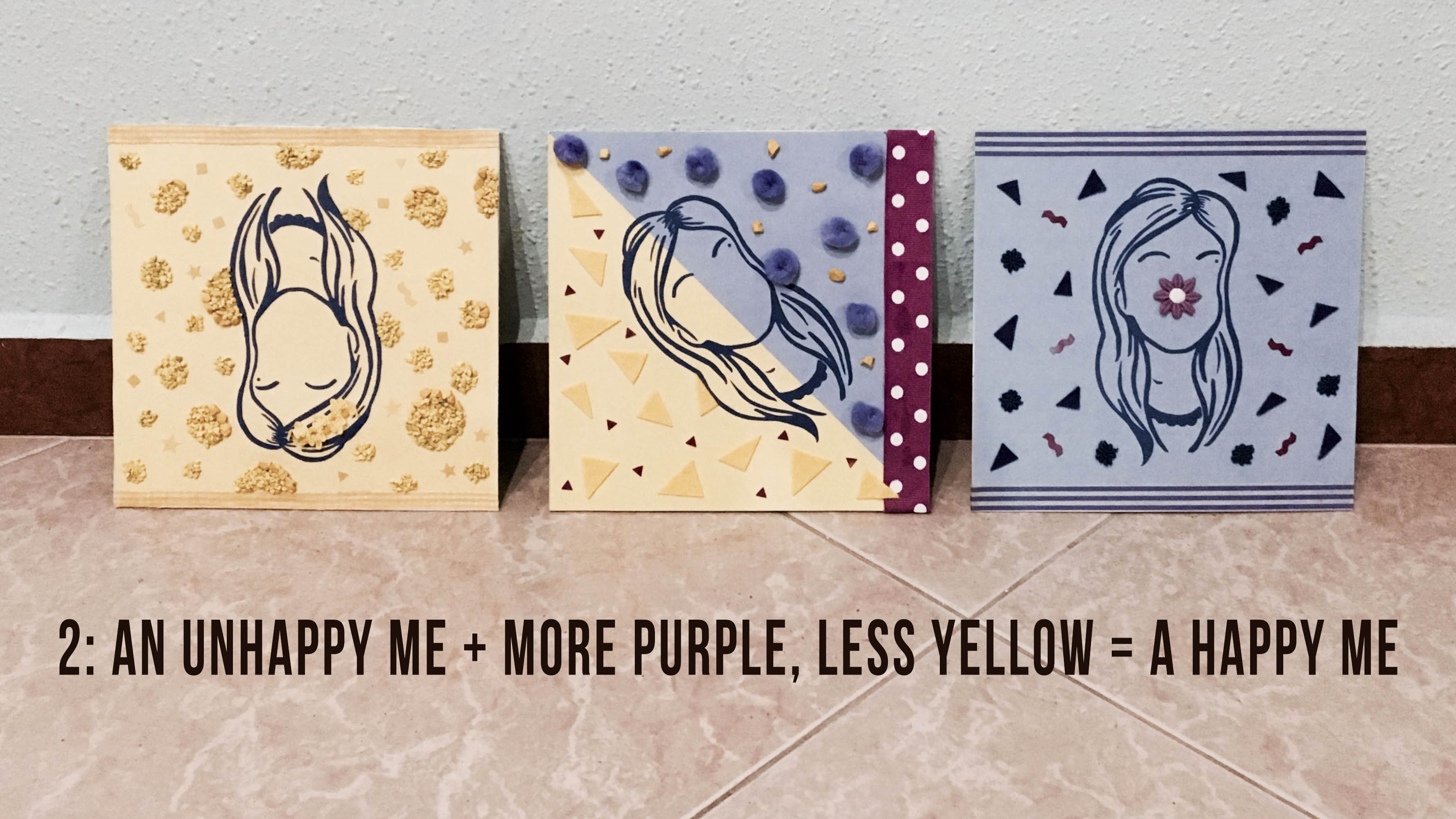
EQUATION 2: An Uncomfortable Me + More Purple, Less Yellow = A Happier Me

The idea for this second equation came by surprise. I was trying to think of one while exploring the complementary colour theory on Adobe Kuler and these two colours came out which led to my idea!
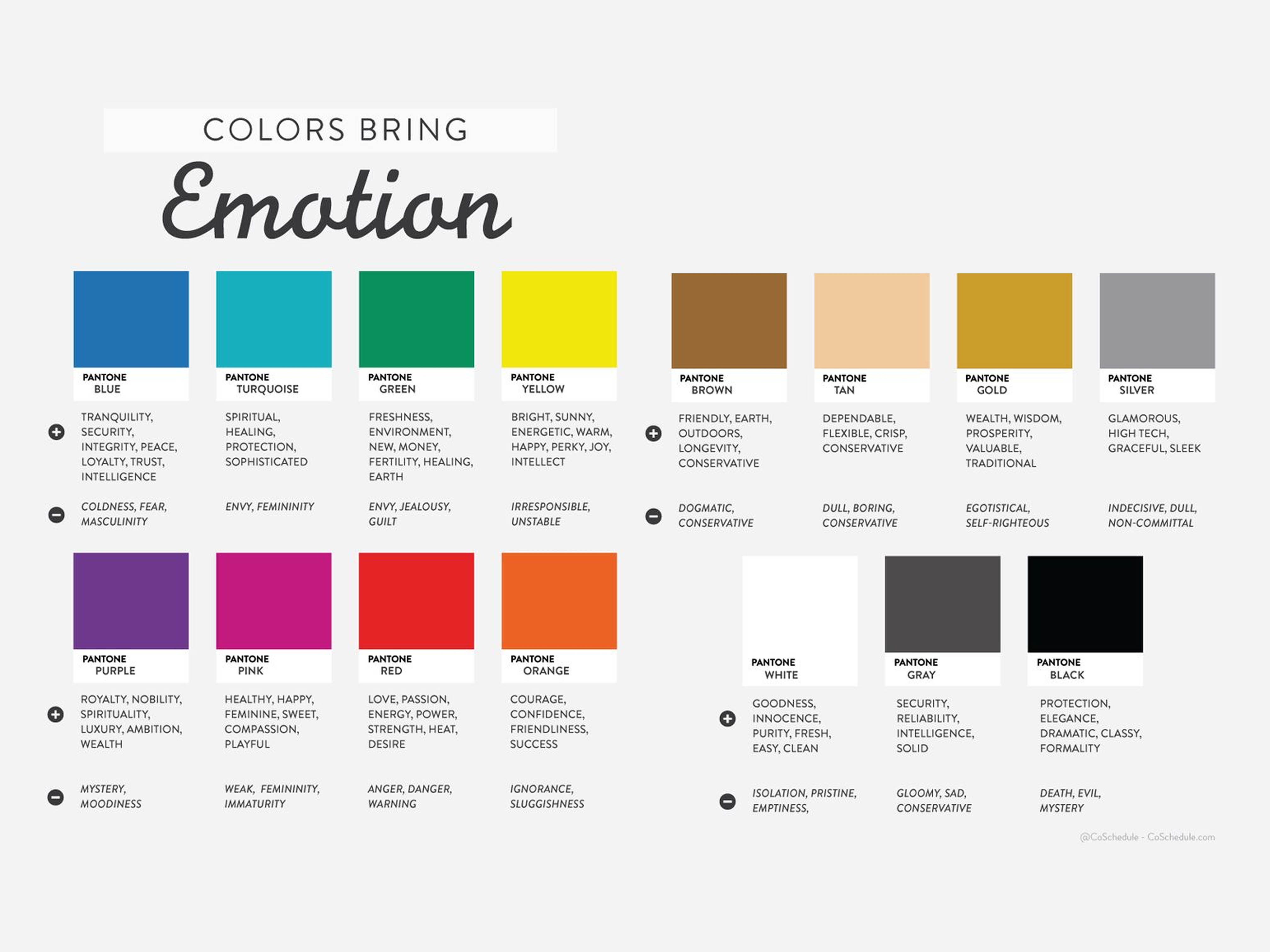
My favourite and hated colours by coincidence haha. Yellow’s a colour that I dislike because of how in Primary and Secondary School I was placed in the yellow house. Yes, that’s 10 years of being in the same house… ? and not forgetting my hate for anything cheese (cheese is yellow too) which often turns out to be an irony since I still take some cheese foods like pizza… So yes, this was a super appropriate colour. And purple for no particular reason is my favourite colour, 80% of my items owned used to be in this colour.
For the first composition, I flipped my silhouette upside down so as to show discomfort with my disliked colour and by creating a various sized textured circles in the background, I wanted to bring across the idea of a cheese patten. In the second composition I start to balance out the colours on both sides, introducing my favourite colour and my silhouette orientation slowly going back to a normal orientation. Then the last composition, the silhouette’s finally in a normal orientation (a happy me) since it’s totally now in my favourite colour 🙂
Colour theories used:
Complementary: Purple and Yellow
Monochrome: Different shades of Purple and Yellow in the geometrical background
EQUATION 3: Me in Korea + Taiwan = My favourite countries (fusion)
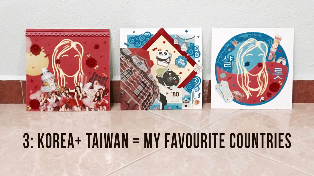
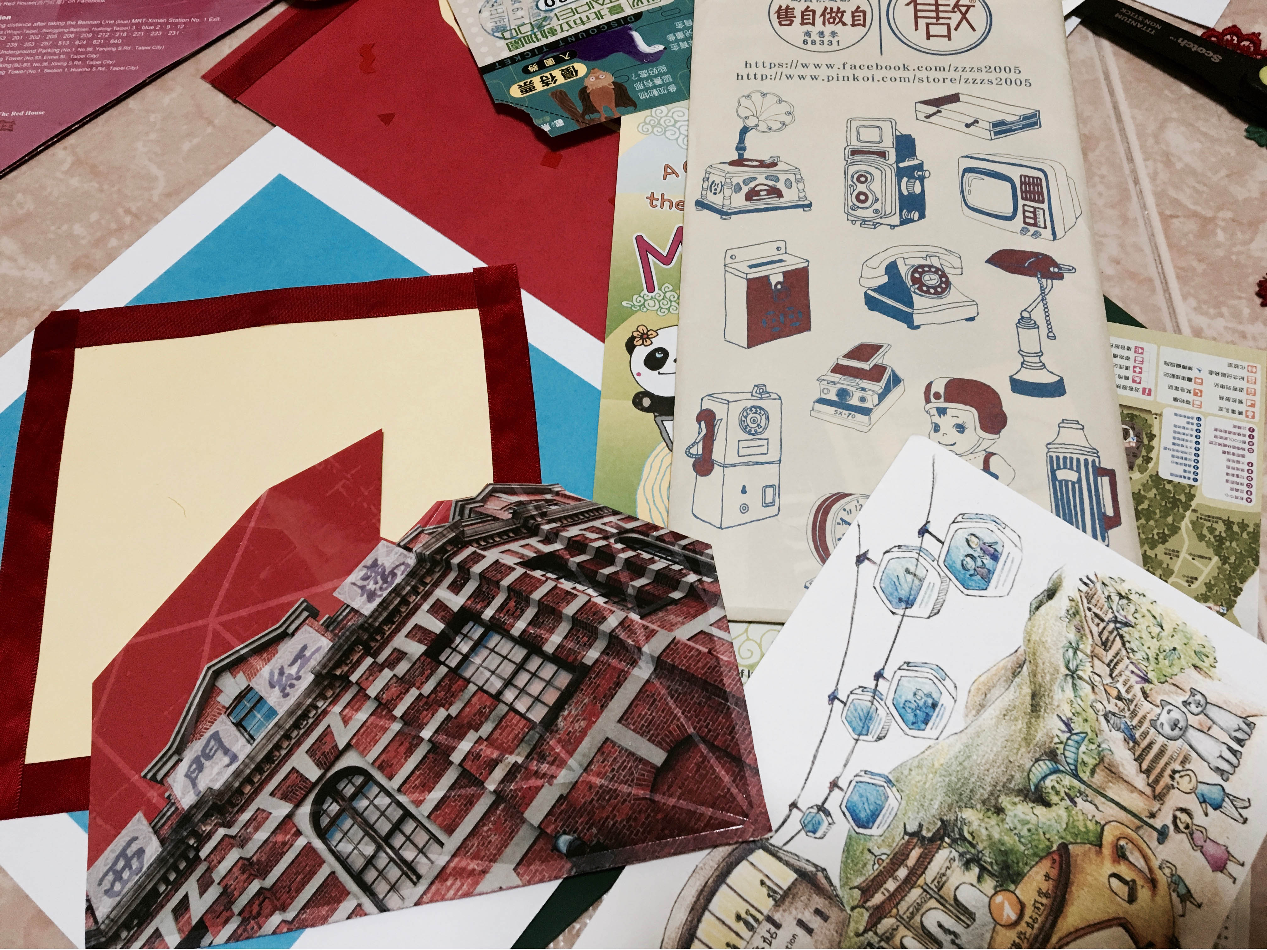
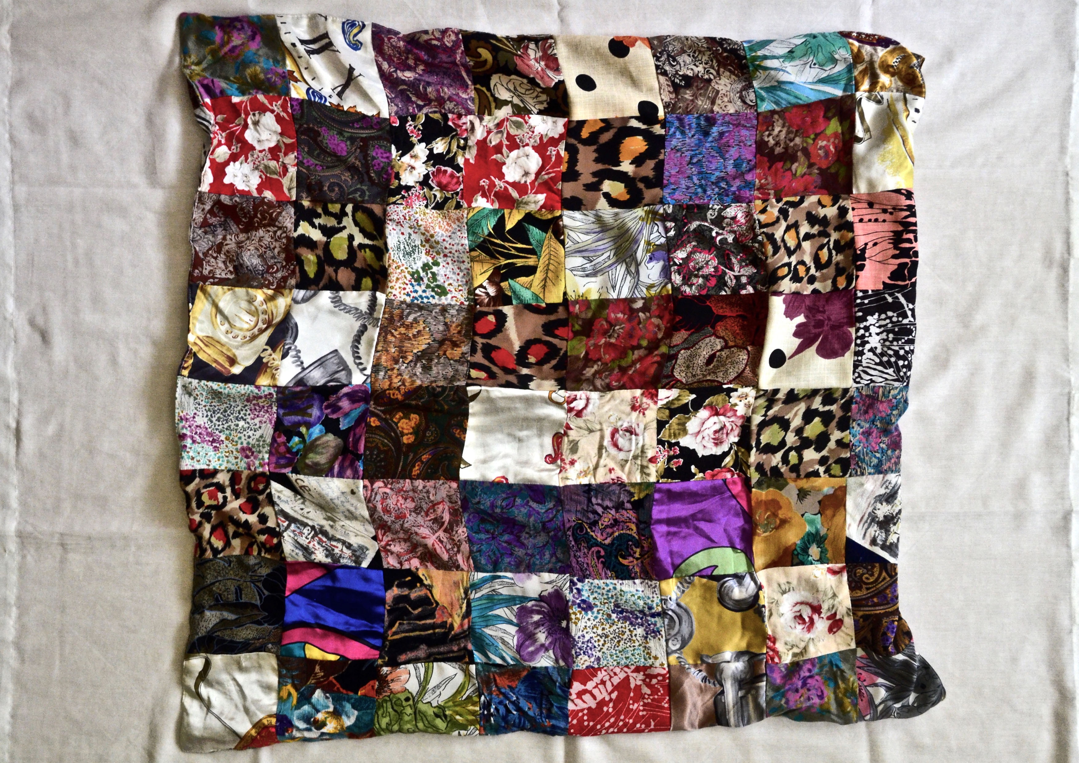
For this equation, I used the medium of collage to bring out tactility and I wanted to share my favourite countries. I’ve travelled to a few countries over the years but these two are my ultimate favourite of all. I think I generally favour Asian countries more.
For this equation in particular, there’s the use of blacks and whites as I wanted to balance out the layers of colours when using the collage medium. I felt the use of the neutral colours made the composition look less messy and helped placed emphasis when necessary (the last composition)
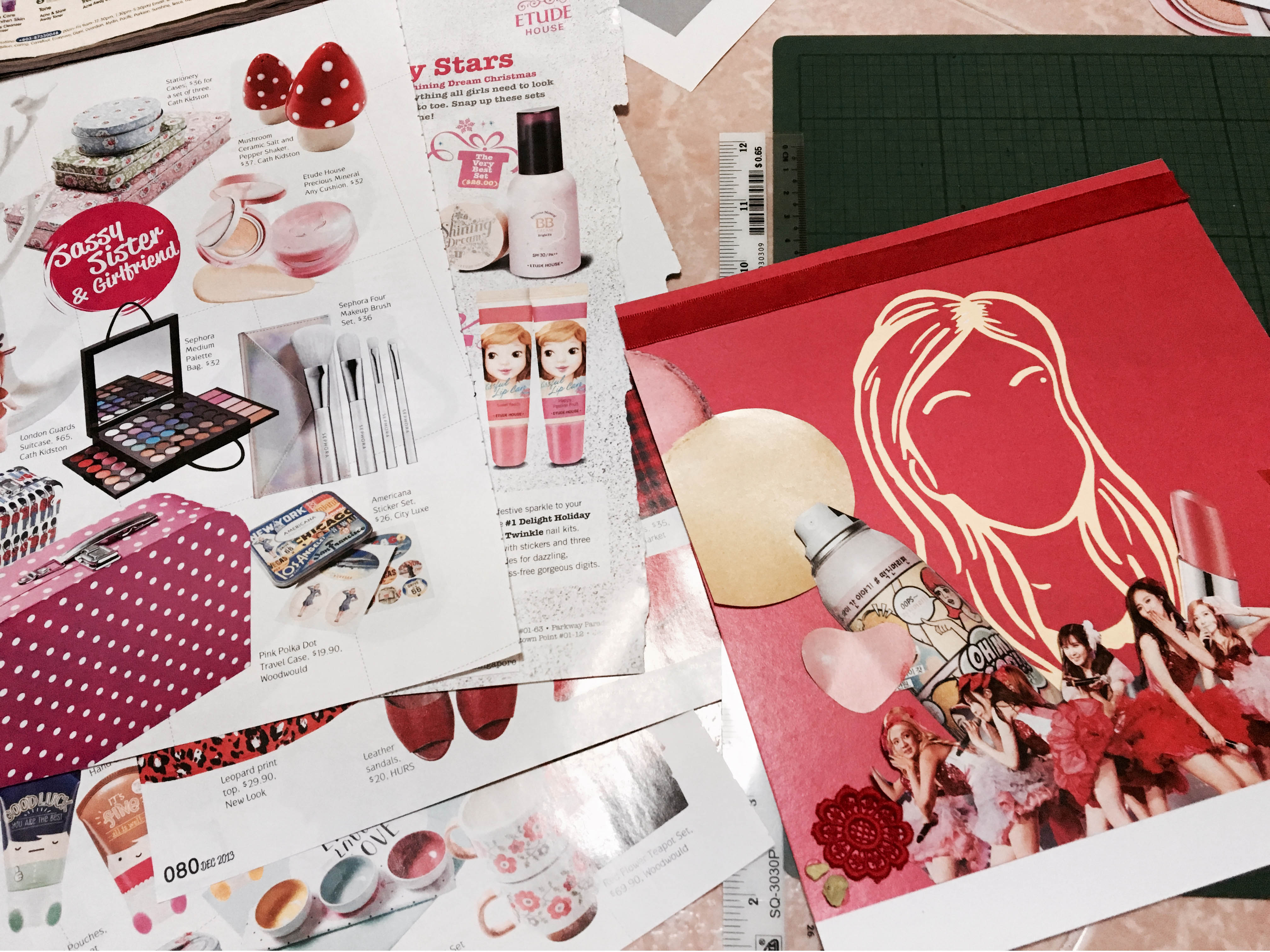
?? Korea (Composition 1): I used the colour red here as it symbolises passion, my passion for the country. I love everything Korean, from the food, the culture, their shows, fashion, music… I guess that’s partially why my friends used to call me “Oriental Korean” haha. I was occasionally disturbed on how I resembled one because of my tiny eyes. Jokes aside, I used magazine and brochures collected from the country, browsed through my old magazine stash to cut out items that are Korean in analogous/monochromatic harmony to fit the colour theory. Collaged it at the bottom of my silhouette.
?? Taiwan (Composition 2): My other favourite country would be Taiwan, similar to the first composition, I made use of tickets, brochures and magazines collected from the trip to create this collage as well.
The Fusion (Composition 3): So since these two countries are my favourites, I decided to make it into a fusion looking composition for the last one. Different elements from each countries are scattered across the composition mixing with each other showing a fusion. For instance, the Korea images that were in line with red monochromes can be found in blue monochromes as well, similarly for the Taiwan images, they can be found in red monochromatic colours too.
Colour theories used:
Monochrome: Different shades of Red and Blue
Triadic: Red, Blue, Yellow (a.k.a. the primary colours)
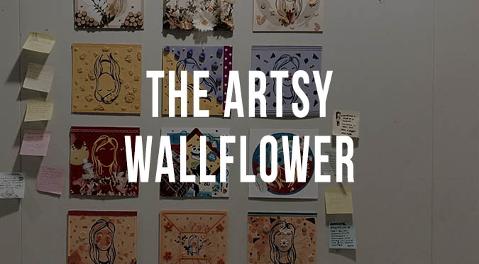
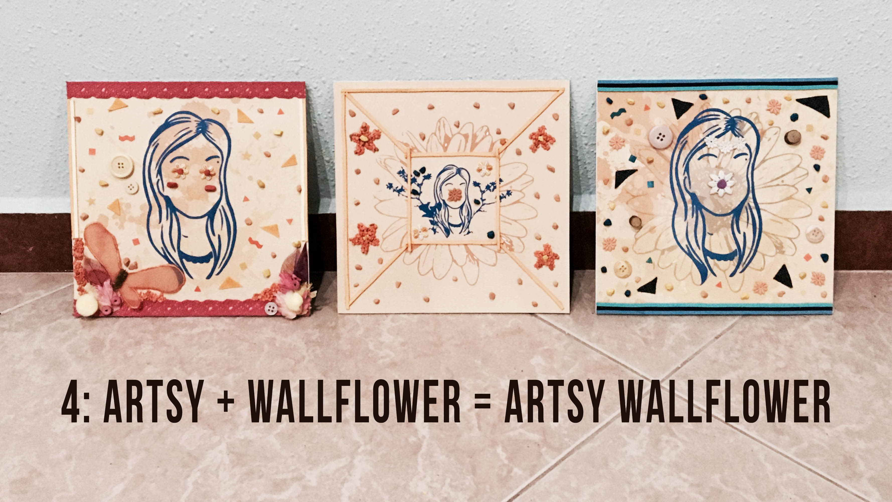
EQUATION 4: Artsy + Wallflower = An Artsy Wallflower
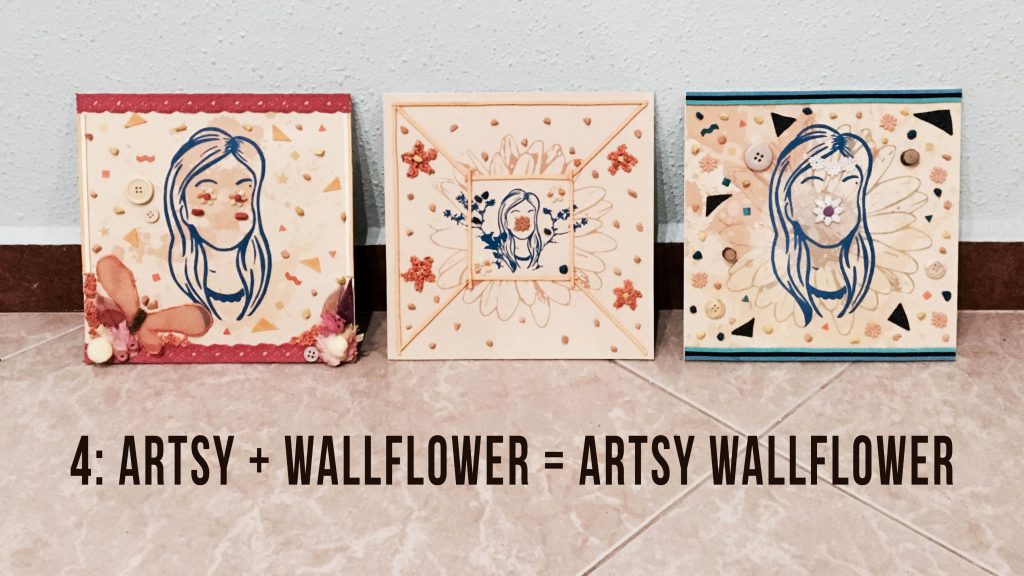
Last equation! Prior to doing it, I was worried that the first composition of the representing idea of ME with the word Artsy would not be clearly shown as the compositions done up so far have been looking rather artsy because of the textures added using various craft materials. I brought it up during group consultations but Joy and my classmates said that it shouldn’t be too much of a concern that I was overthinking. (I guess I tend to do that all the time haha..)
Guess they were right as eventually I established the idea of Artsy in the first composition by having art splatters all over and the mediums used over it to bring across the idea were craft materials that have appeared in the 9 compositions before this – e.g. dried leaves and flowers, felt, gravel, embroidered patches etc. ?
The second composition had to establish the idea of Wallflower. My personality and since it had to be a setting, I tried to create a visual of it by having a wall dimensionality of sorts in the digital “base” (also like a literal representation of the ‘wall’ in Wallflower. Scaling down my silhouette to fit it inside the square that extends out to form the wall to portray the idea of retreat, with the flower symbol hiding behind the flower/square encasing the silhouette. ?
After completing the composition I realised that the “wall” was not expressed well, it lacked something. Aha, to add dimensionality and emphasis of the idea, I eventually grabbed some suede strings of the similar hue and glued it over the lines forming the wall.
The colour used throughout as the base for the equation is the colour orange as it symbolises creativity which is closely linked to the idea of artsy. There you have it, Artsy Wallflower 🙂
Colour theories used:
Complementary: Blue and Orange
Analogous: Yellow, Orange, Red, Pink, Blue, Purple
Monochrome: Different shades of Blue and Orange
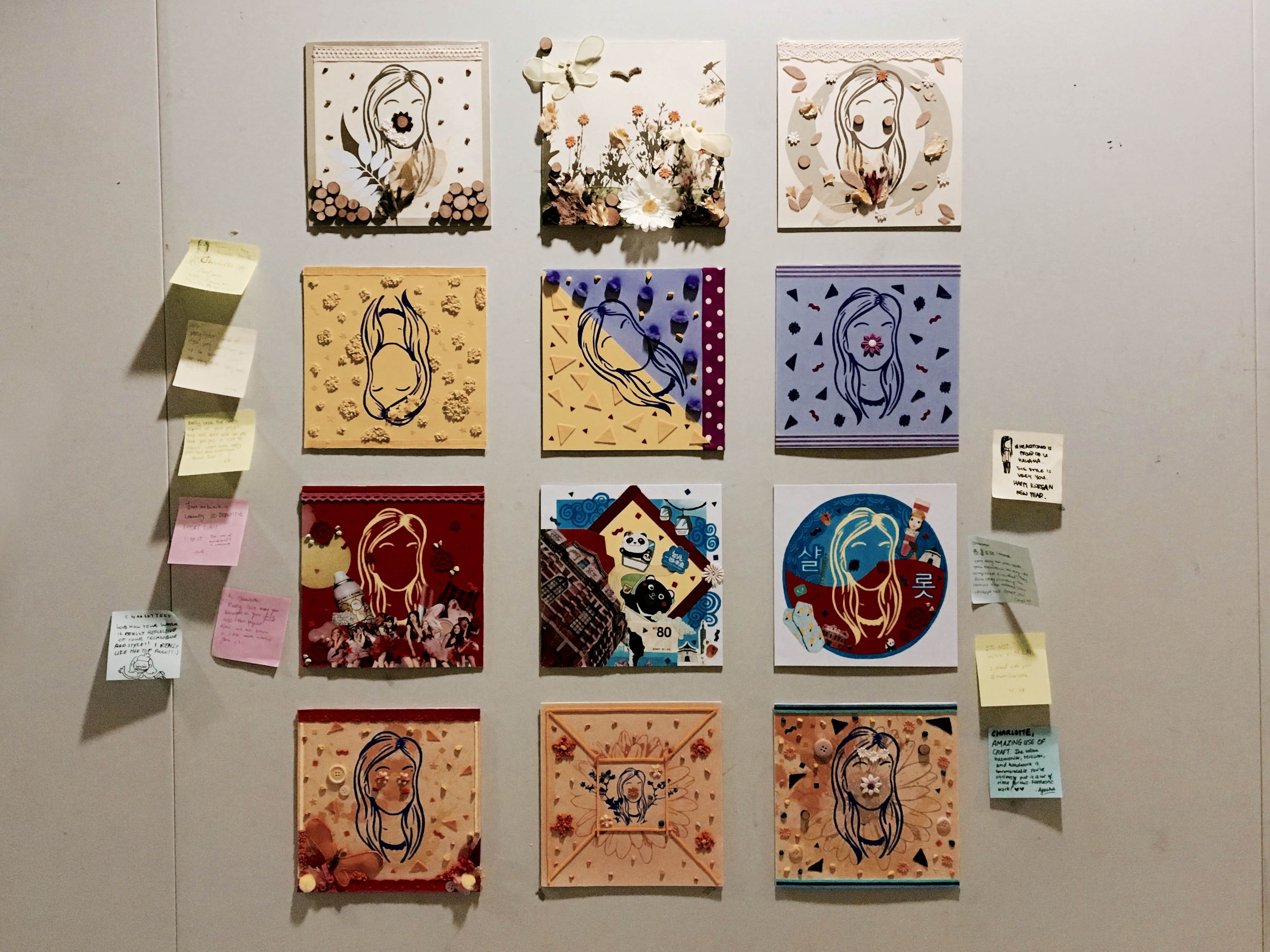
CURATION

This time round for curation, it was based on the big overarching theme that I had in mind: The Artsy Wallflower ??. Friends who follow me on my social media handles or visited my OSS blog might have noticed that under the description bios, I never fail to put the words “artsy wallflower”. At least that’s how I see myself – A wallflower that’s artsy. I’m an introvert by nature and I really love artsy stuff.
I intentionally arranged the equations from the lightest to the darkest shade and I realised they each equation are linked to one another by the analogous colour theory of yellow, red, orange. With the equation of the Artsy Wallflower being the last as I feel it sums up the concept of my project well.
Not sure if you realised but my silhouette is faceless and my facial features are created by a variety of embroidered flower patches taking into consideration the colour theories used in each equation. In some, my face is just covered by a single flower in the centre/they are used to form the cheeks, eyes or even hair accessories. I intended to take the Artsy Wallflower idea up another level by showing it through silhouettes decorated with embroidered flower patches.????????
CHALLENGES FACED
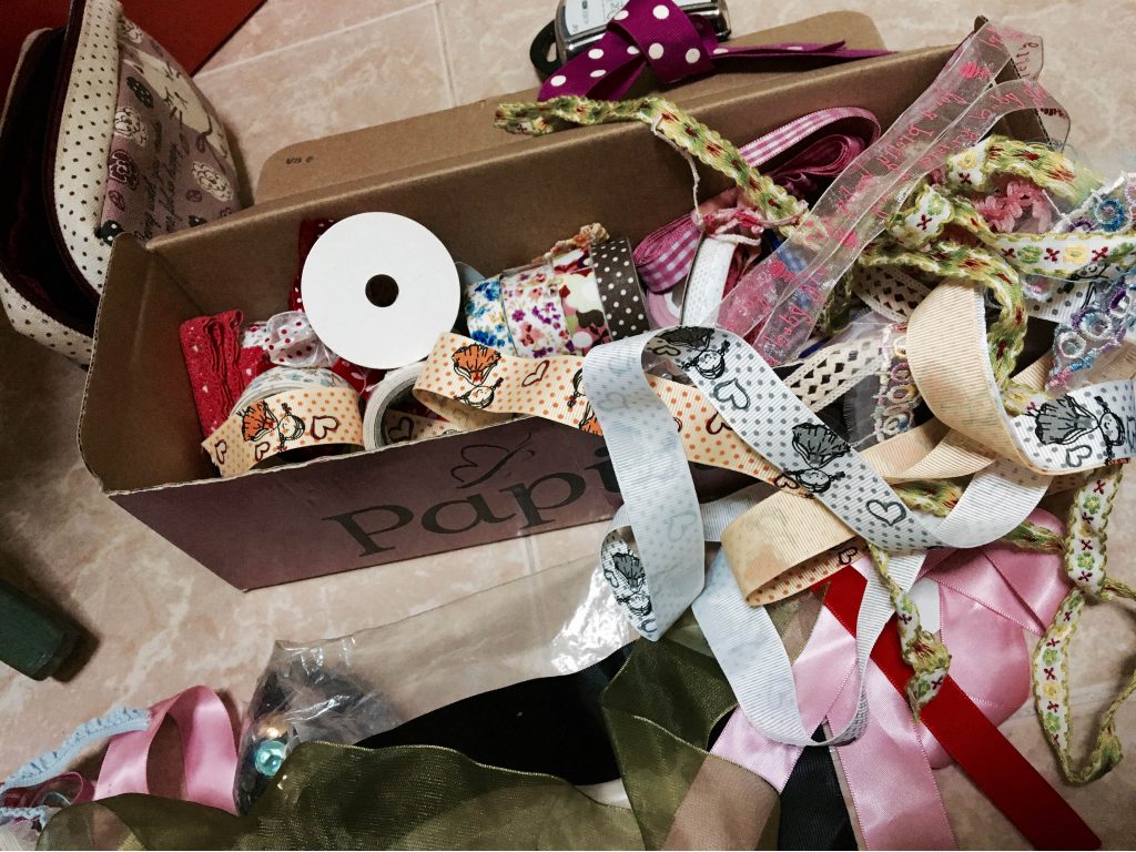
Challenges were inevitable for this project too. Finalising the concept was one of it as I started off shaky and we were working with a really tight timeline of 3 weeks. I had to re-consider my options of wanting to work with various mediums in particular embroidery and patchwork which would definitely take up a lot of time and I managed to find a solution!! ?? I ended up using similar mediums like the already embroidered flower embellishments, patchwork pieces, felt etc.
Another challenge was that as I went ahead to treat the surfaces using the traditional method some of them did not turn out to what I envisioned them to be as my materials did not exactly match the hues of the digital “base” that was designed. I gotta admit the compositions came together pretty much by the feels I got as I did it.
OVERALL THOUGHTS
I loved the project so much as I finally got to do some hands-on craft work again. Thanks to the freedom of the project brief! It didn’t feel like a project per say more like a therapeutic process rather. Just that there was the added slight pressure of a deadline.
I’m so glad I got to bring bring my love for craftwork and my default social media bio to the table for this haha. Personally, I think I’ve gotten way more inspirations and ideas on how to go about doing the project as compared to the previous two.
Also, I think I was lucky with the materials used. As they were all from my art stash, they were one-off materials and I wouldn’t knew if they’d fit the colour theories for each equation but they all did nicely. Thanks to this project I realised how much craft materials I’ve amassed over the years ?
(BONUS) FINAL THOUGHTS ABOUT 2D 1
I SUPER SUPER LOVE 2D 1. It has been such an intense journey of medium exploration and conceptualisation yet it’s still my favourite foundation module of all. Thank you Joy for being such a wonderful teacher to the class. You never fail to provide some of the best suggestions/solutions whenever we’re stuck with our ideas and your inputs on how we can improve are really helpful!
Also, thank you Joy for the class pizza treat last Thursday! 🙂

2D 1, I’ll see you next sem for sure. ?❤️