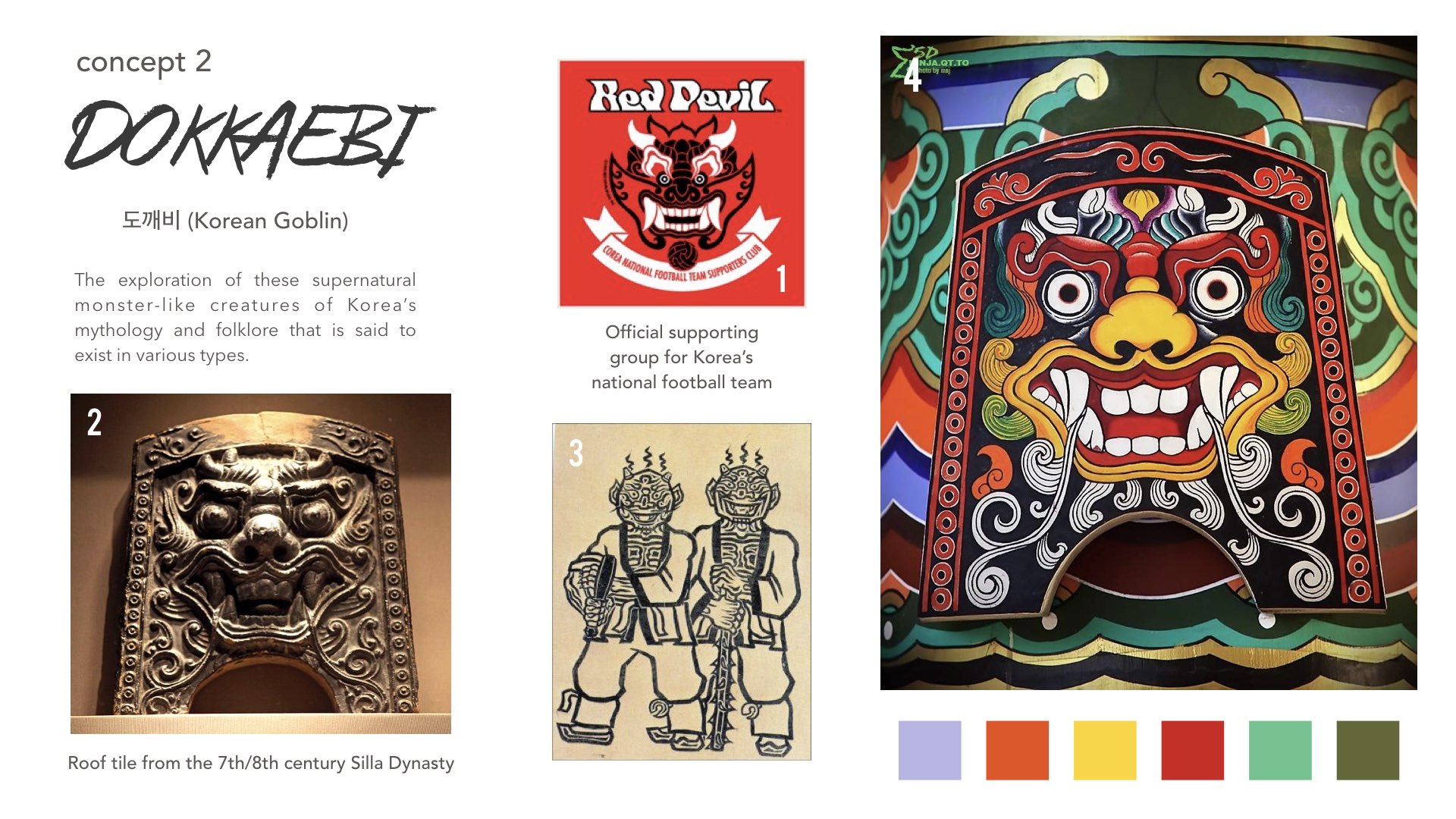
Moving on from last week when we had to present our concept(s) together with our moodboard and collection of images to reference for our designs, it’s on to designing the motifs based on our concept! So over the past week, I’ve been sourcing further for more reference images and ultimately narrowed down to the Korean mythology I would like to develop my project concept from – The Dokkaebi.
The artwork below is by Korean illustrator Dayoung Cho was one of the reasons why. It was one my reference images for my moodboard with colours that stood out and also one with a unique take on the particular Korean mythology, portraying it to be fun/quirky instead of scary – what I intended to achieve for my concept for this project.
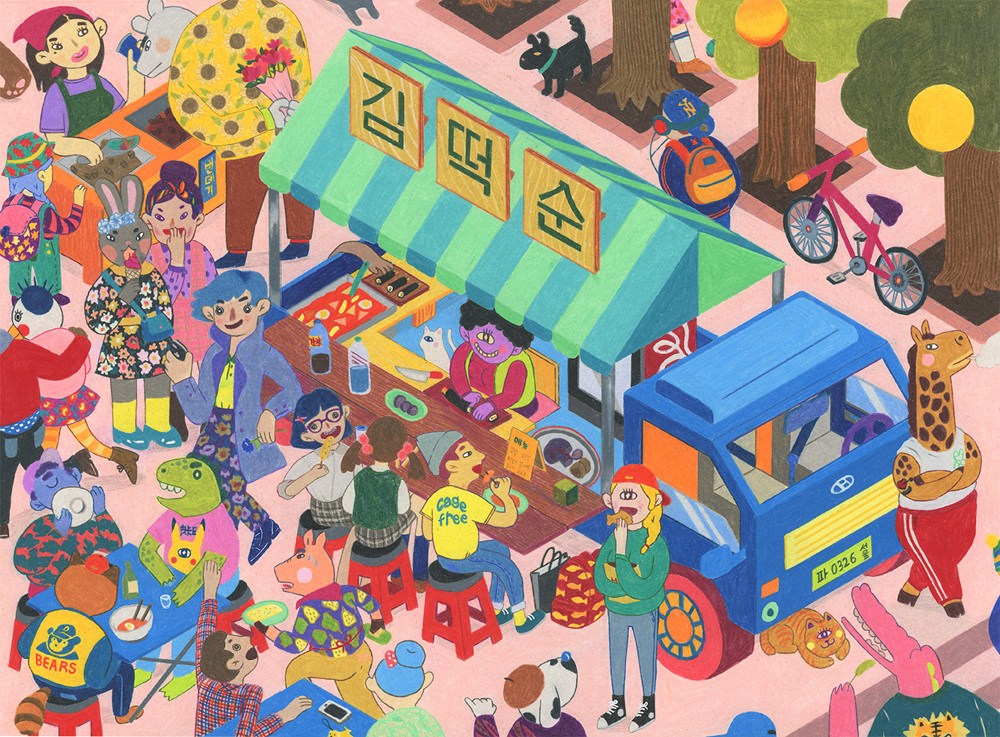
Dokkaebi Food Truck by Dayoung Cho
Starting with an exploration of the original form of the Dokkaebi: Based on reference images of the mythical creature that I found online, I tried adapting it into my own design to make it look less scary than its original look. What I did was to round the edges of its features, making it rounder in volume and reduced the details to make it look more simplified. Colours wise I used more colours and upped the vibrance of it. However I realised that it was hard to tone down the scariness of the Dokkaebi with this features.
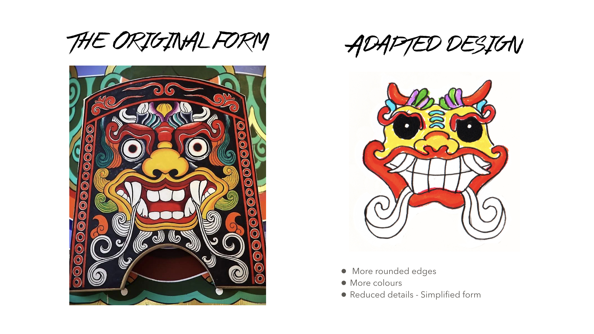
Image Source: http://aminoapps.com/page/mythology/9450197/focus-korean-mythology
Hence I decided to take another approach. As mentioned last week through research I found out that there were different types of the Dokkaebi and one of the ideas I had was to come up with my own interpretations for some of these types of Dokkaebis while referencing existing imageries of them online as I thought the end product might look quite fun and interesting.
Types of Dokkaebi
- Kind (참도깨비)
- Evil (개도깨비)
- Dumb farmer-looking (김서방 도깨비)
- Daylight (낮도깨비)
- Good at fighting / handling weapons – especially arrows (고도깨비)
- One-eyed that eats a lot (외눈도깨비)
- One-legged that likes to play Ssireum
(folk wrestling) (외다리도깨비)
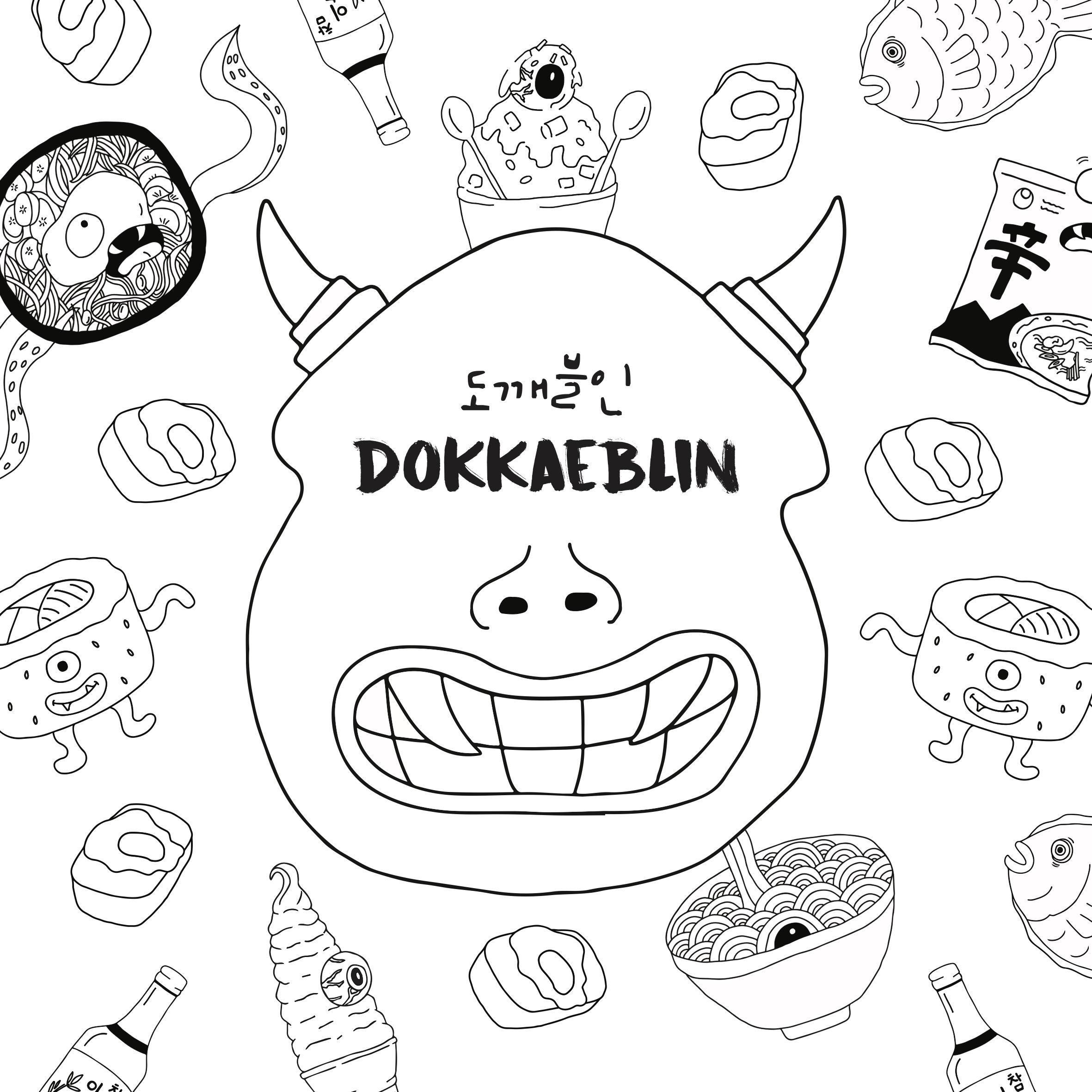
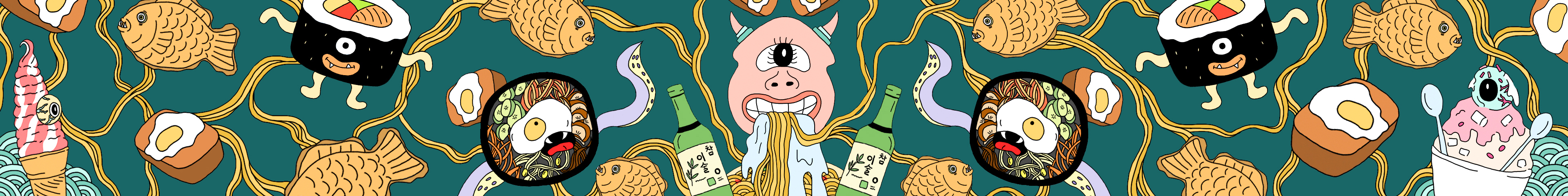
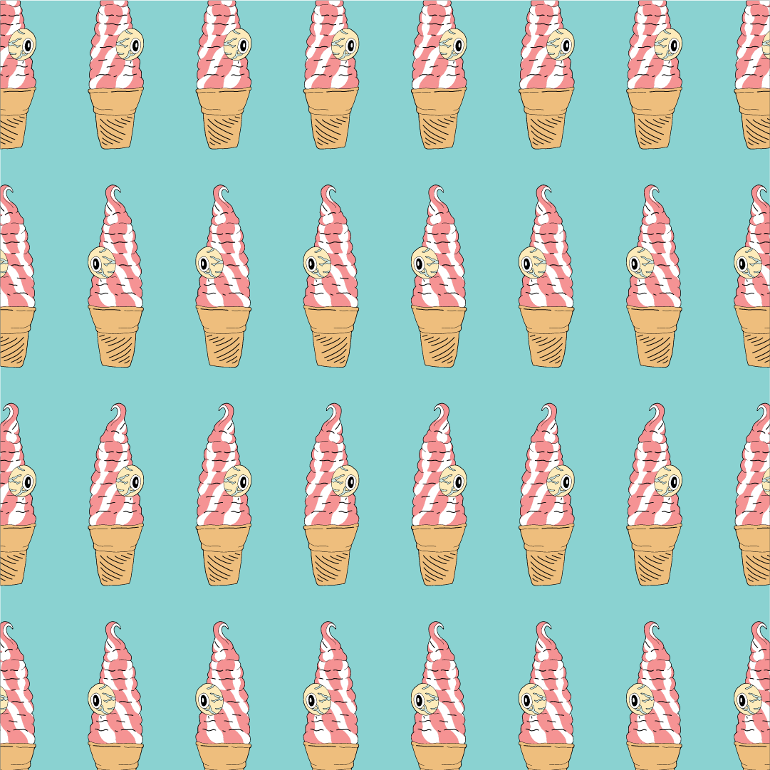
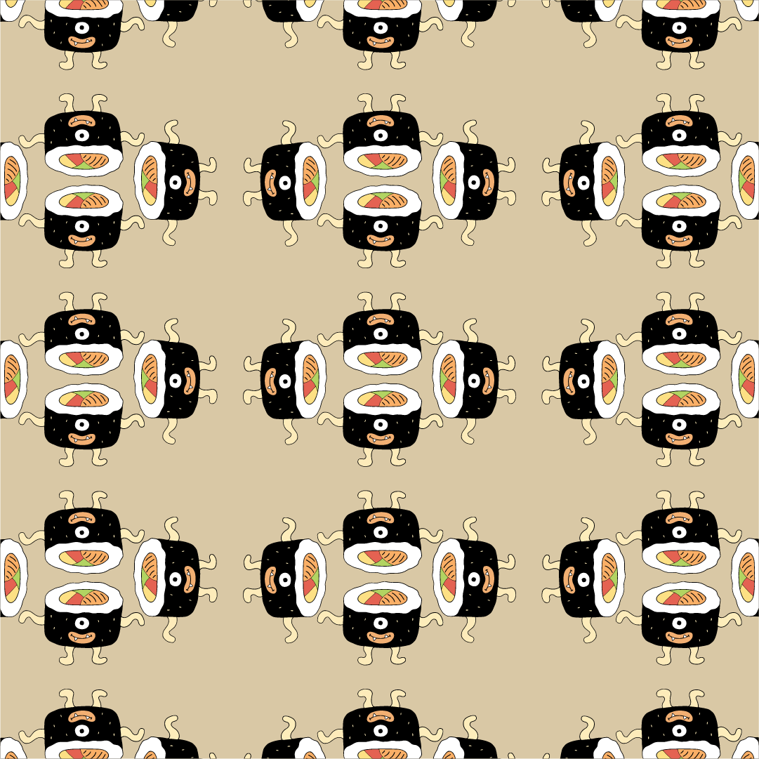
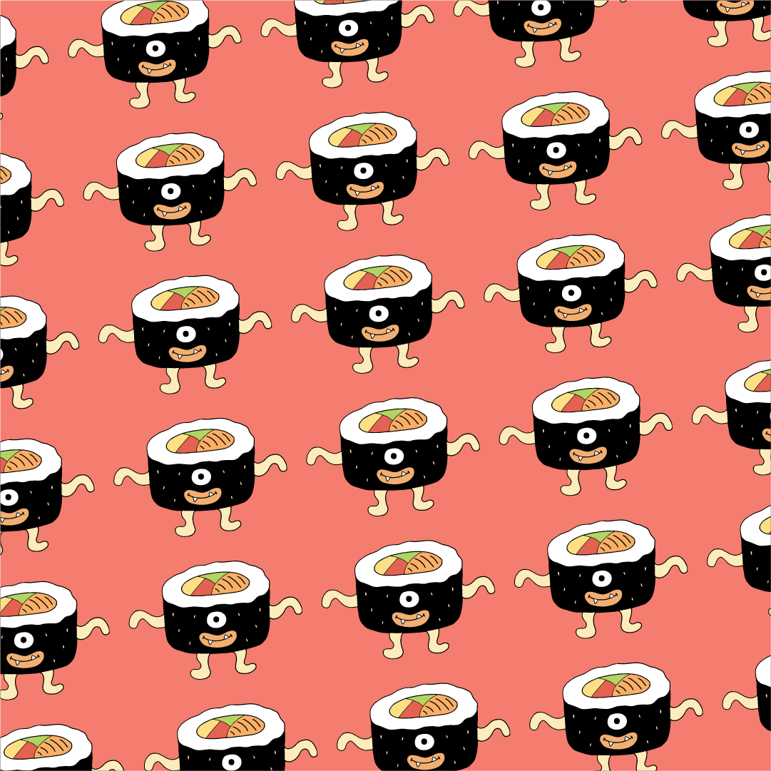
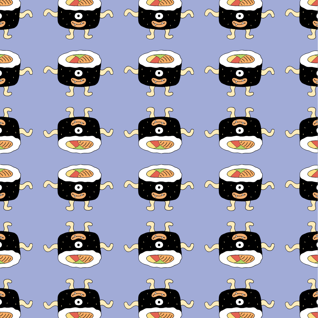
I looked through the various types and decided to explore the Dokkaebi type that is One-eyed and eats a lot and this was partially because I was really drawn to the Dokkaebi artwork as mentioned at the start of the post which happens to be an illustration based on this Dokkaebi type – the Dokkaebis are one-eyed and the artwork is food themed – a food truck.
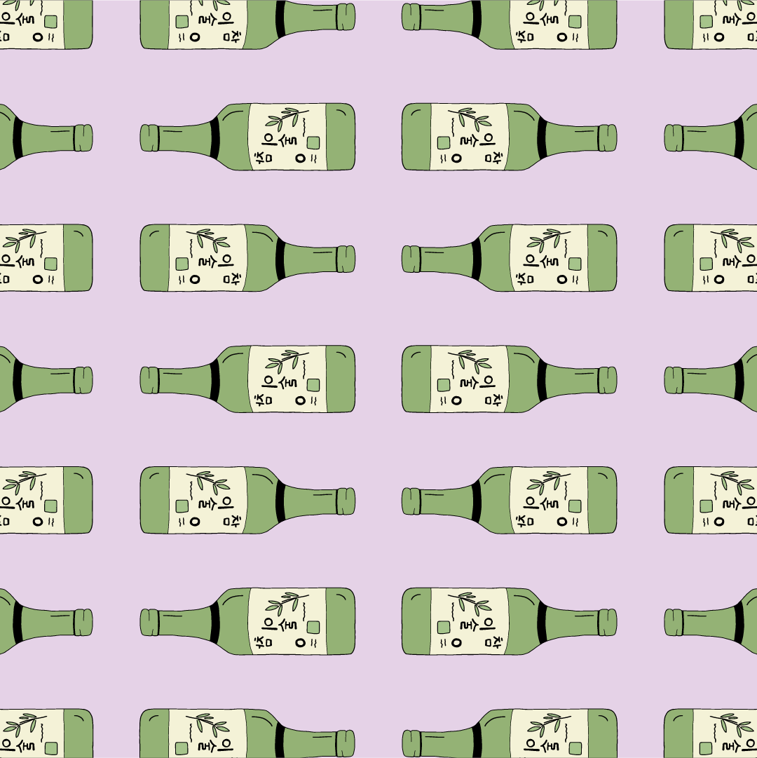
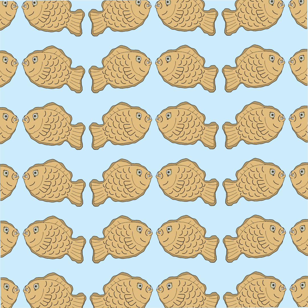
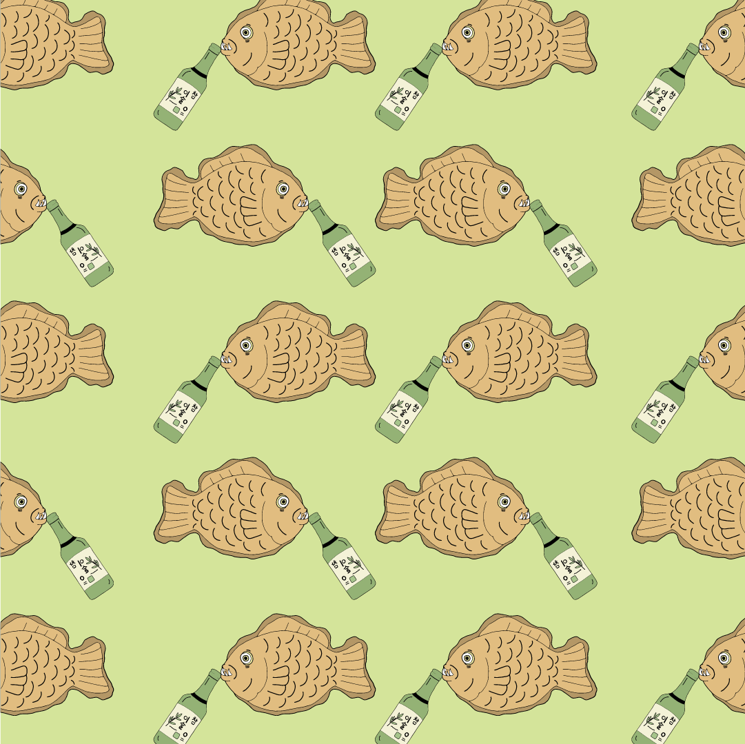
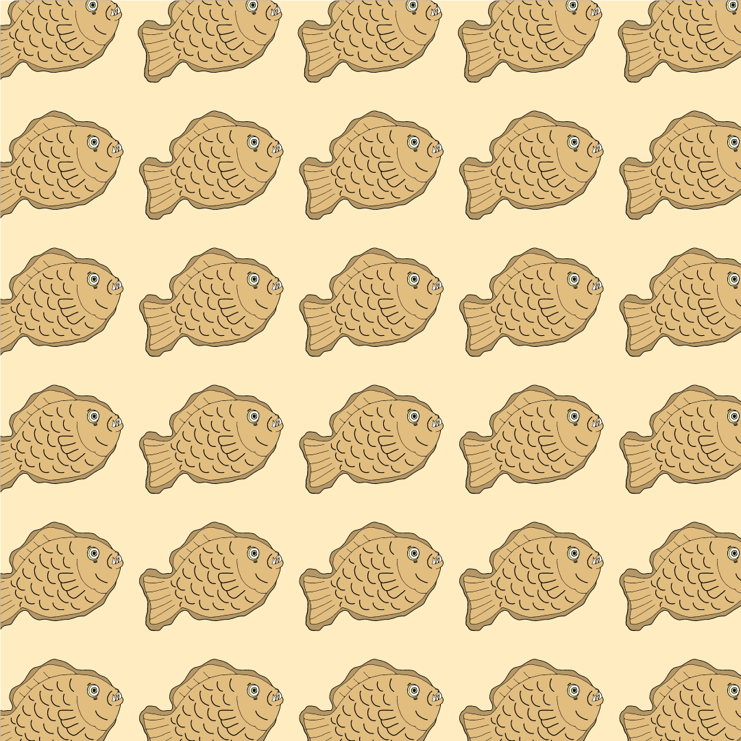
To start off the exploration, I brainstormed a bit for ideas on how to approach this characteristic/type of Dokkaebi in a way so that I can make my motifs fun and quirky, ridding the idea of scary and to follow Ina’s feedback last week of going along the lines of traditional/grotesque yet cute. After much brainstorming, the idea of the Dokkaebi eating a lot made it closely associated with the theme of FOOD. And from food I thought it would be cool to have the food Korean (Korean food), making it stay true to the mythology’s cultural roots – Integrating the features of the Dokkaebi being one-eyed into the particular identified Korean food to form a character-liked motif.
Following which I started searching more indepth and specific reference images of the various Korean food (as seen in the following two images below), analysing their forms and look to see how the features of the Dokkaebi could be incorporated to come up with this motif that captures the essence of this Dokkaebi type entirely.
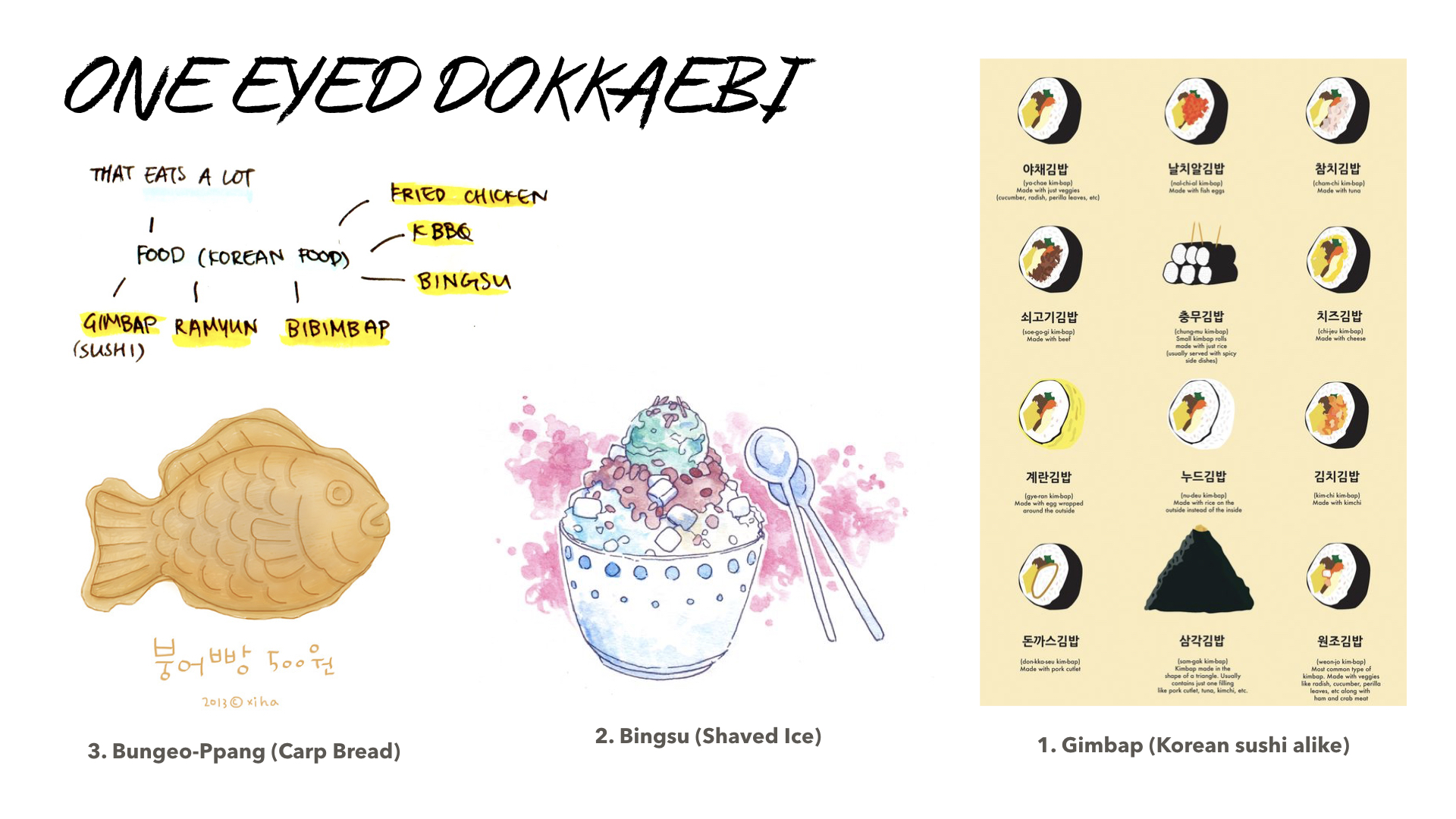
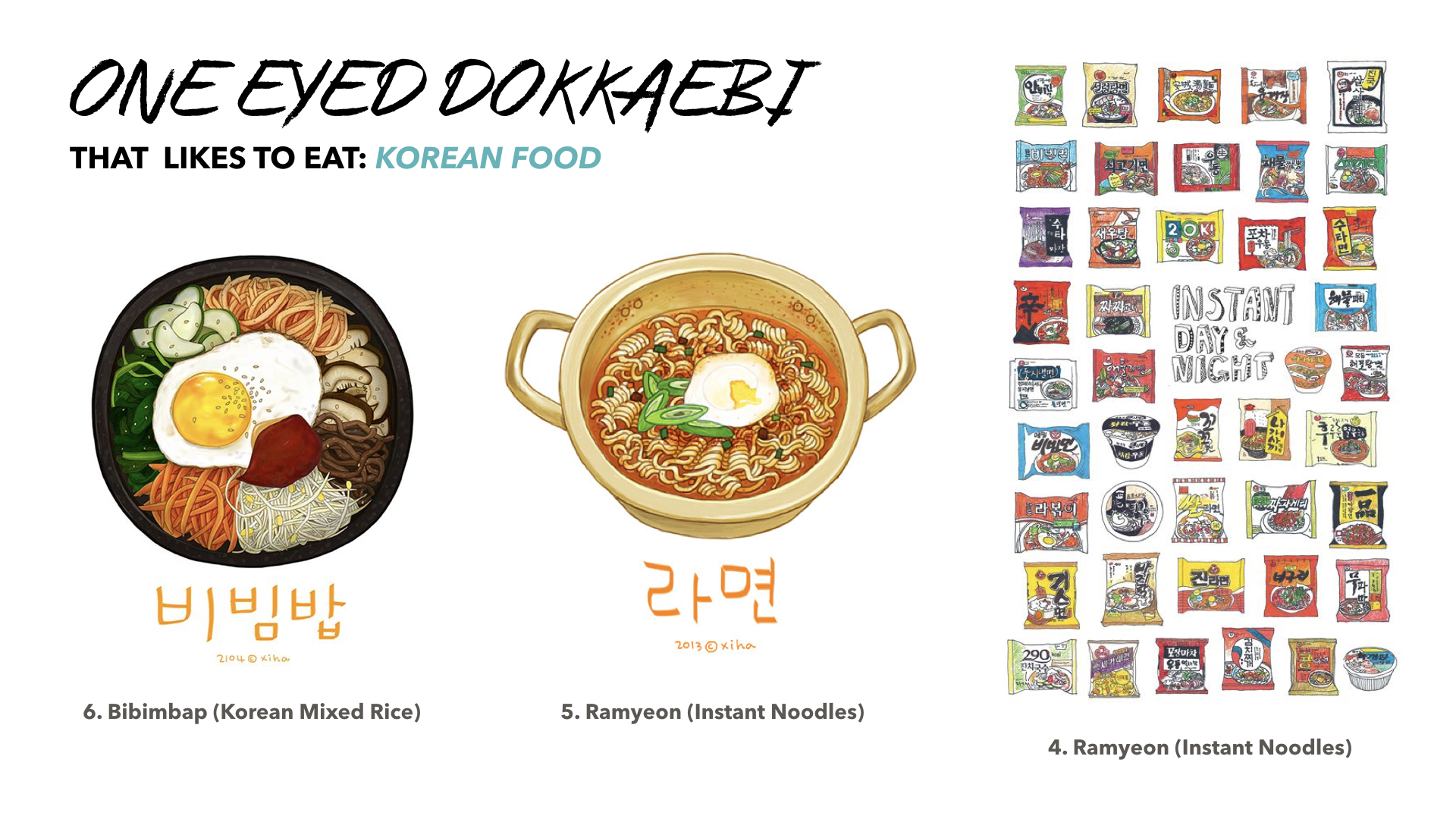
Image Sources (corresponding to the number labelled images):
- https://www.dramafever.com/news/korean-food-12-different-varieties-of-kimbap/
- http://xihanation.tumblr.com/post/67631472243
- https://evydraws.blogspot.sg/2016/07/korean-summer-survival-makeup-favorites.html
- http://heegyum.tumblr.com/post/75659750811/old-drawing-i-did-for-school-project-did-you#sthash.twDCaHia.qjtu
- http://xihanation.tumblr.com/post/70297486954
- https://m.blog.naver.com/PostView.nhn?blogId=xihanation&logNo=70184489013&proxyReferer=https%3A%2F%2Fwww.pinterest.com%2F
Below is another Korean artist apart from the already mentioned who worked on a Dokkaebi art project and this was how he interpreted and came up with a character for the Dokkaebi type.
Image Sources (corresponding to the number labelled images):
- http://www.para-young.com/Dokkaebi-Food-Truck-1
- https://www.behance.net/gallery/11266477/DOKAEBEE-Korean-monster-identity-character-design
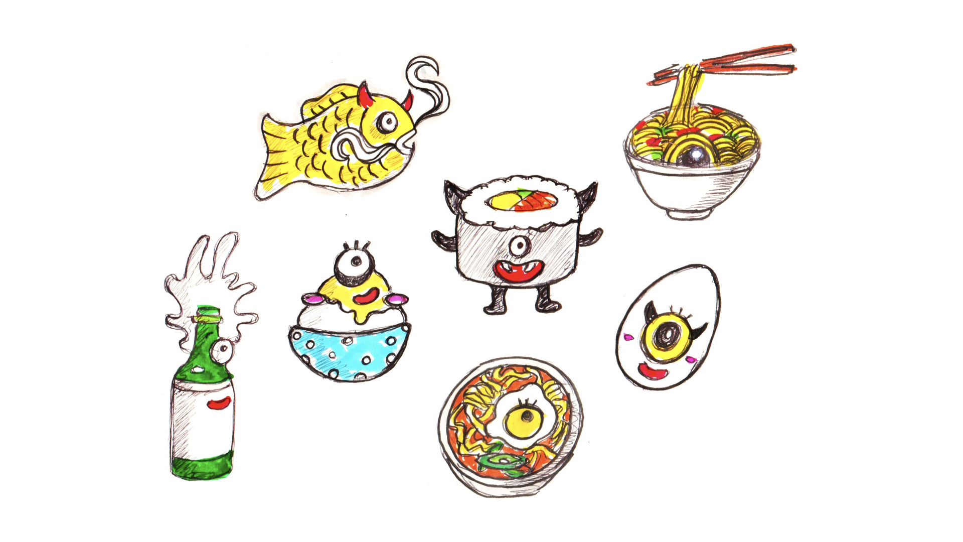
Apart from exploring the appearance and forms of some of the various/more common/popular Korean food, I also went into searching for reference images on how to draw some monster/creature-looking features as I had to figure which eye or mouth feature would best suit and integrate with the chosen Korean food. (some sketches and exploration done on the right hand side of the image)
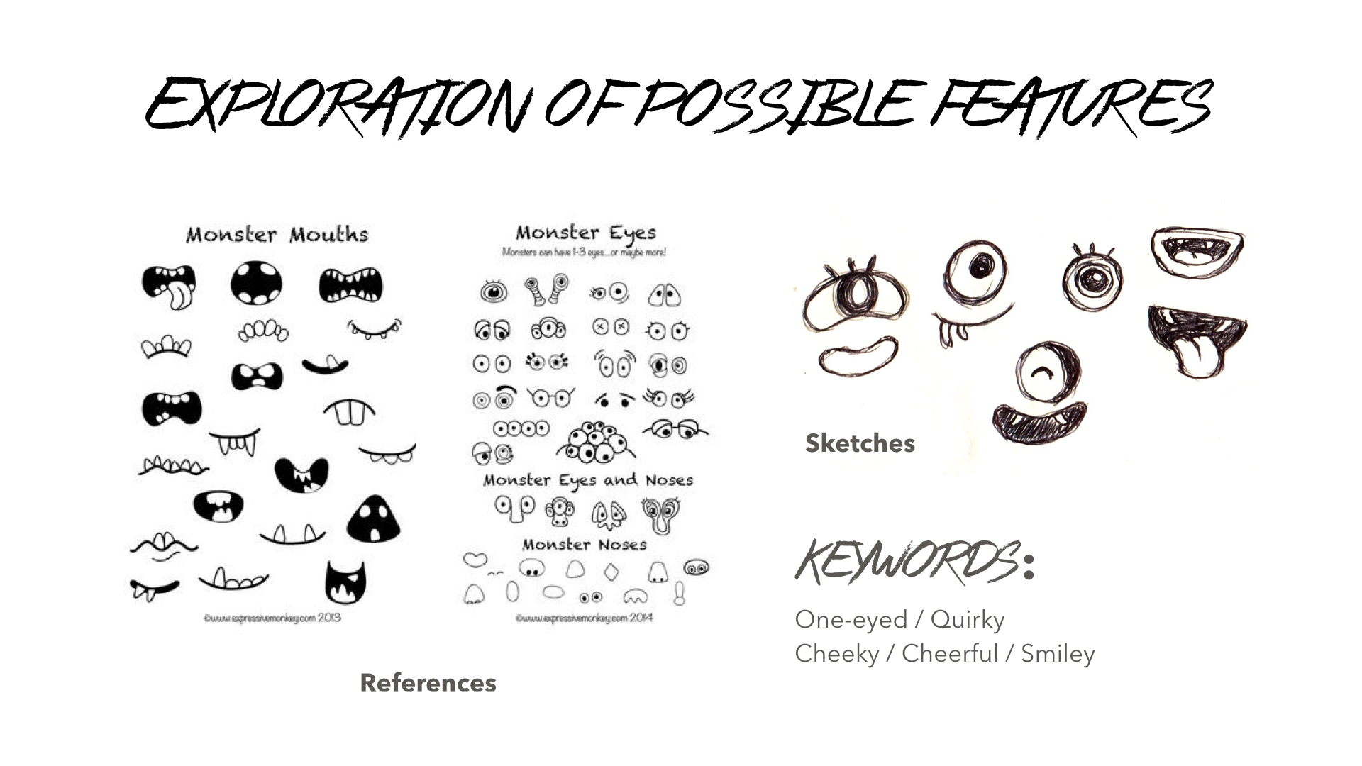 Image Sources: https://www.teacherspayteachers.com/Product/How-to-Draw-Monsters-917949
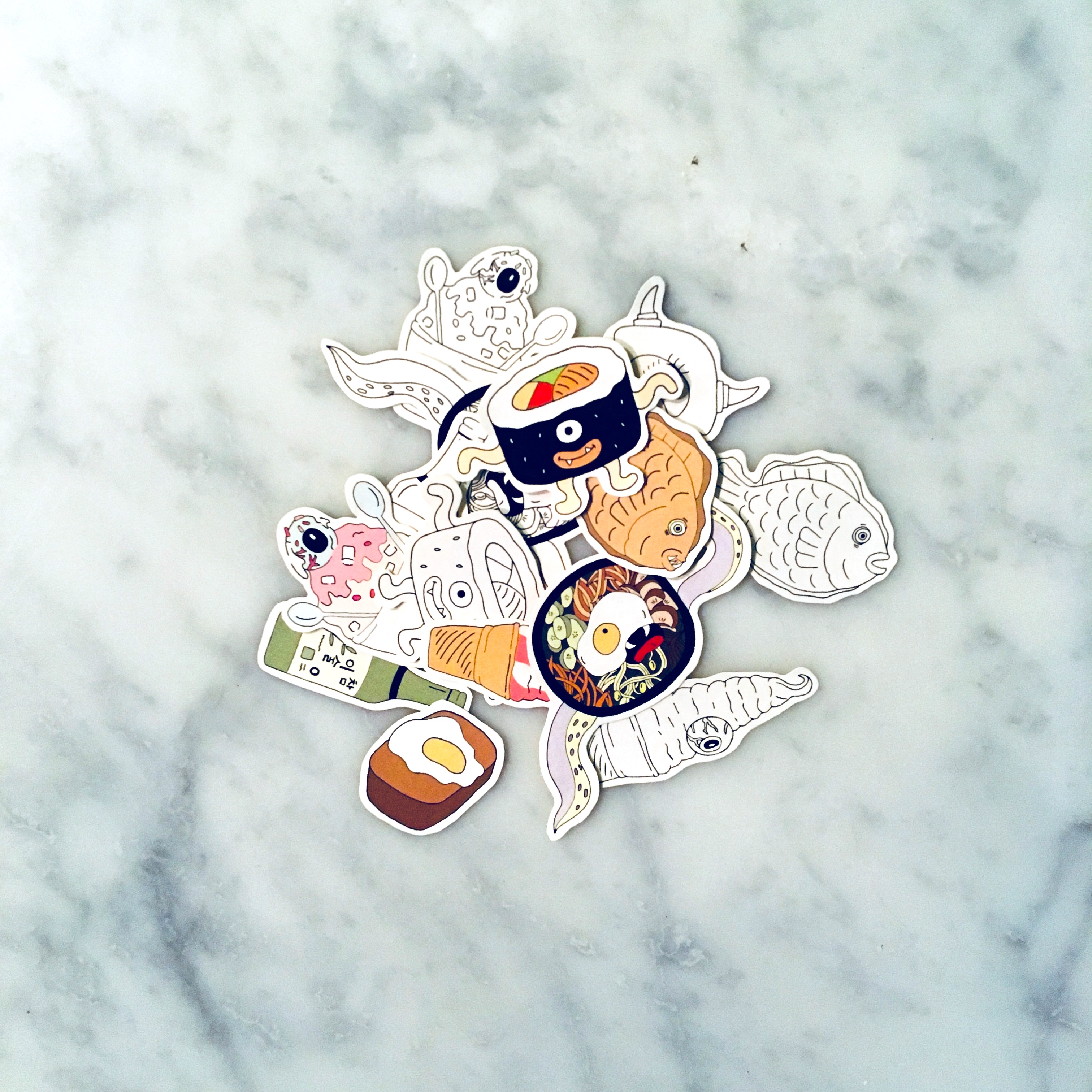
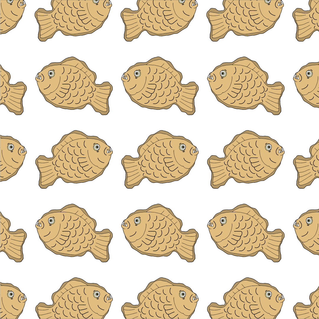
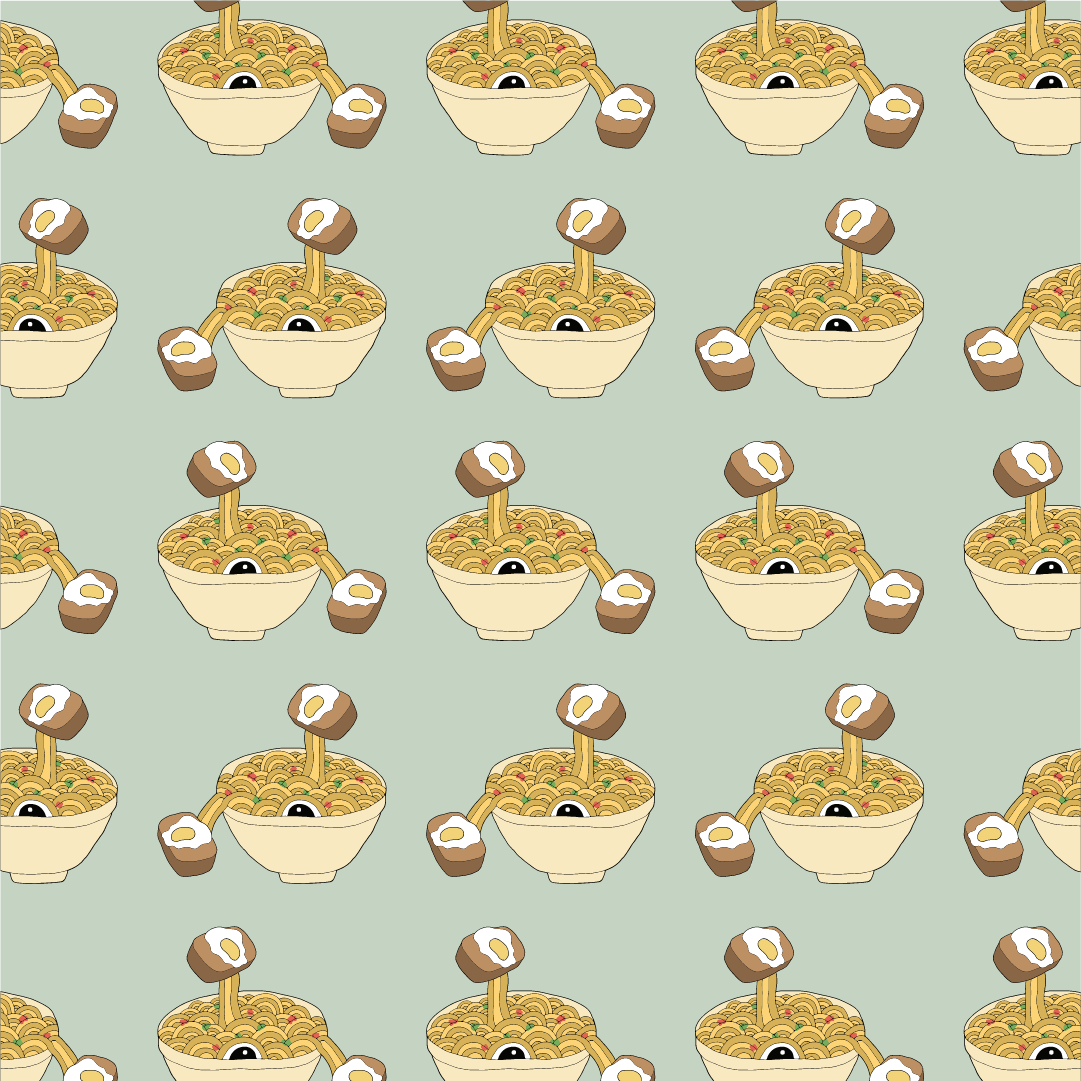
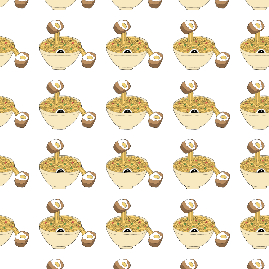
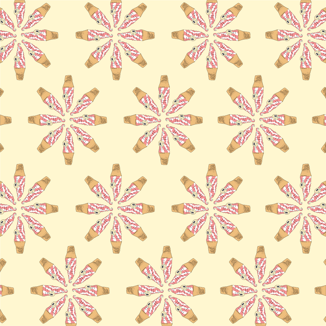
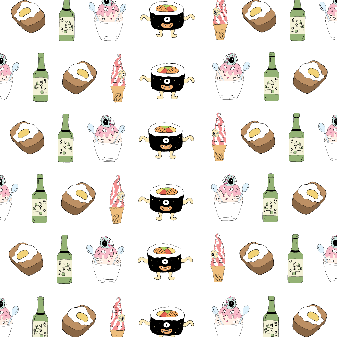
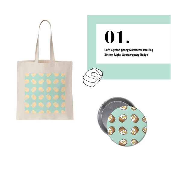
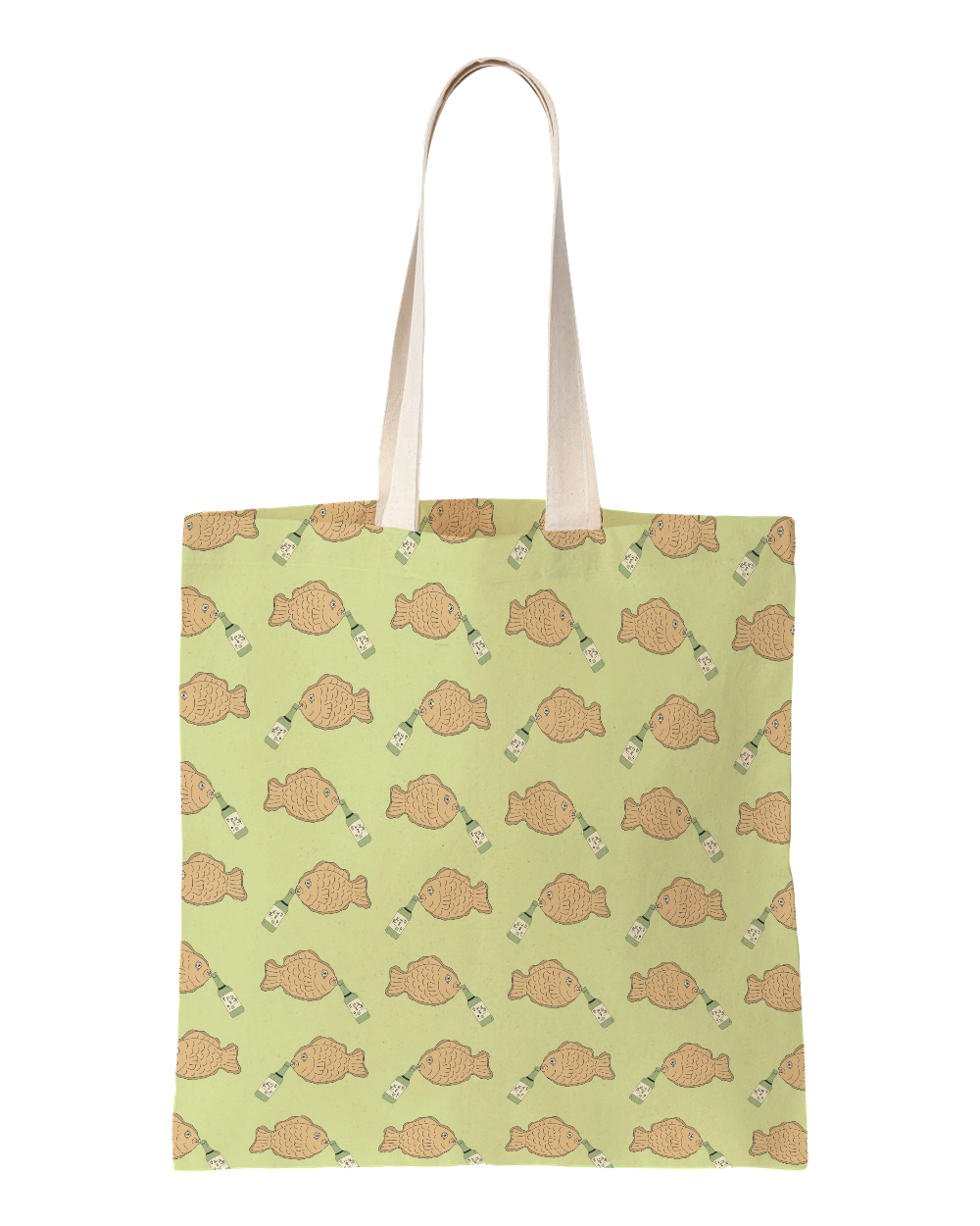
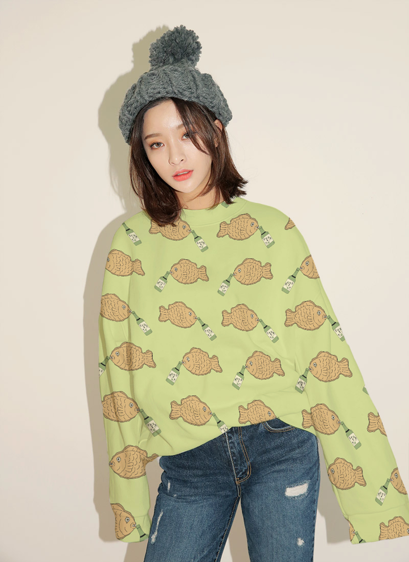
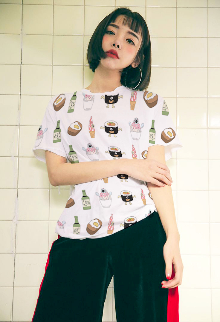
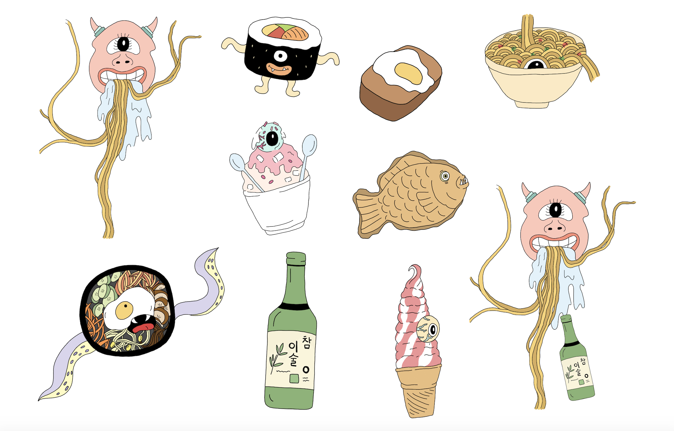
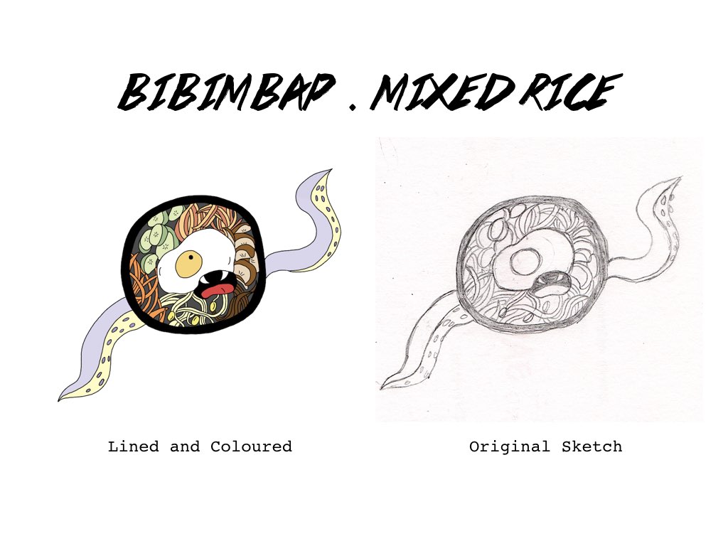
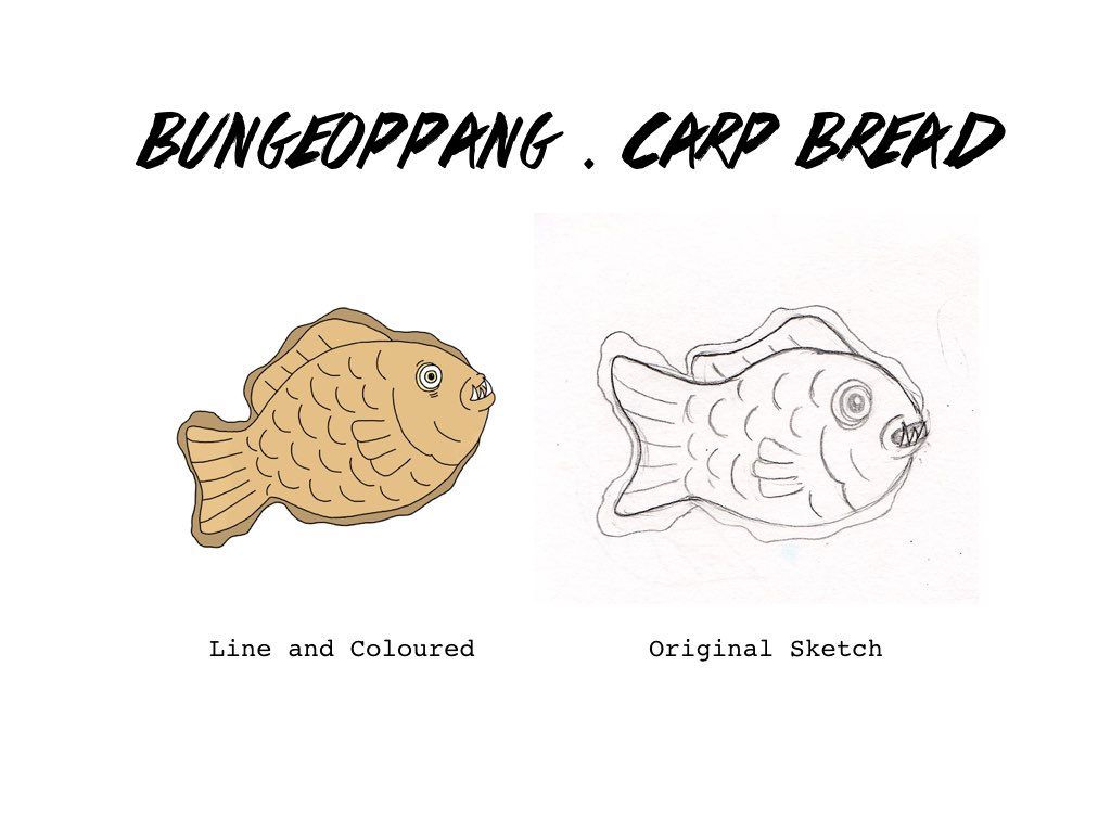
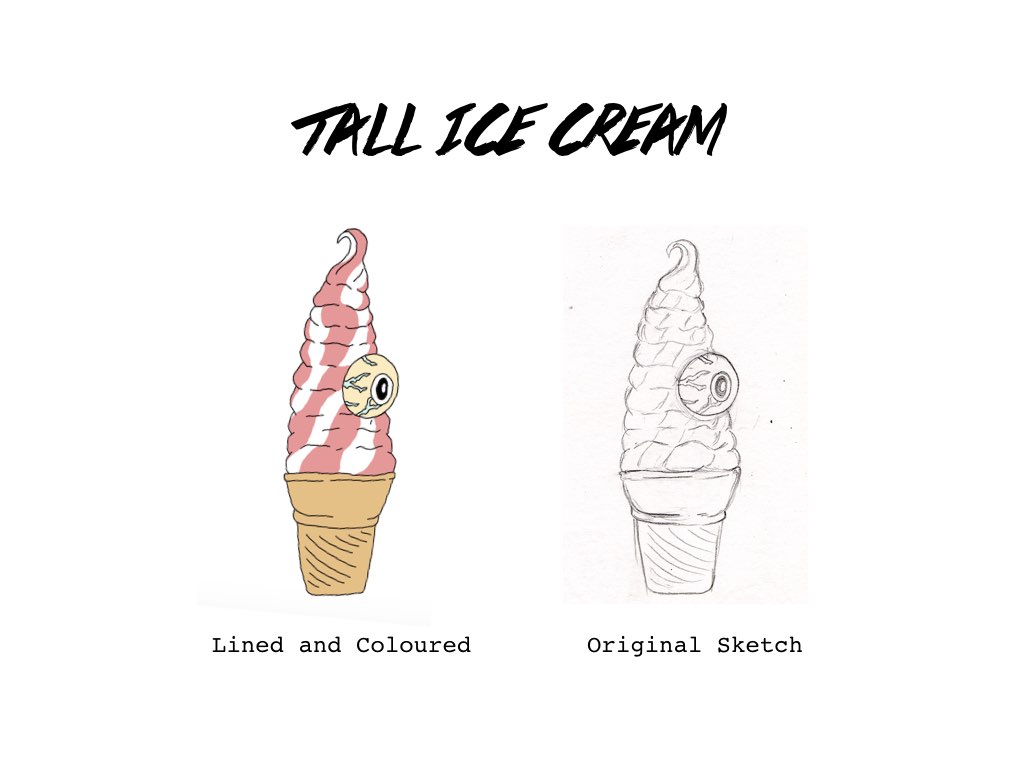
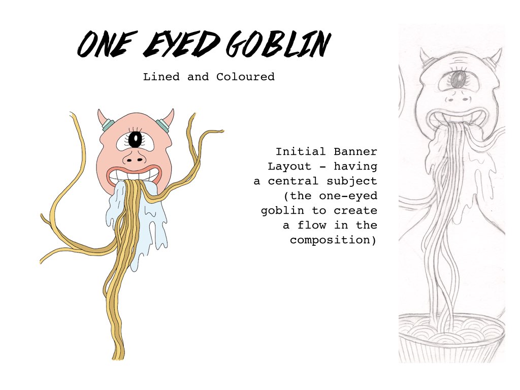
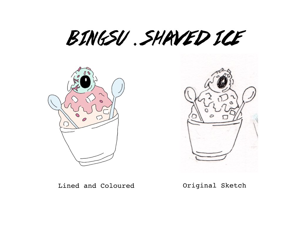
So,,,, after a few hours of developing and sketching out ideas, these were some of the motifs that I came up with! (as labelled) Not sure if these motifs are kind of finalised, but I think that this is the style that I’ll be going for and that I’ll be playing around further with the explorations if any!
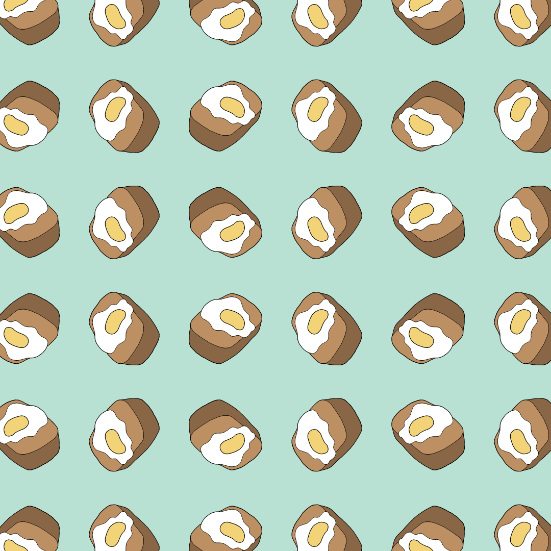
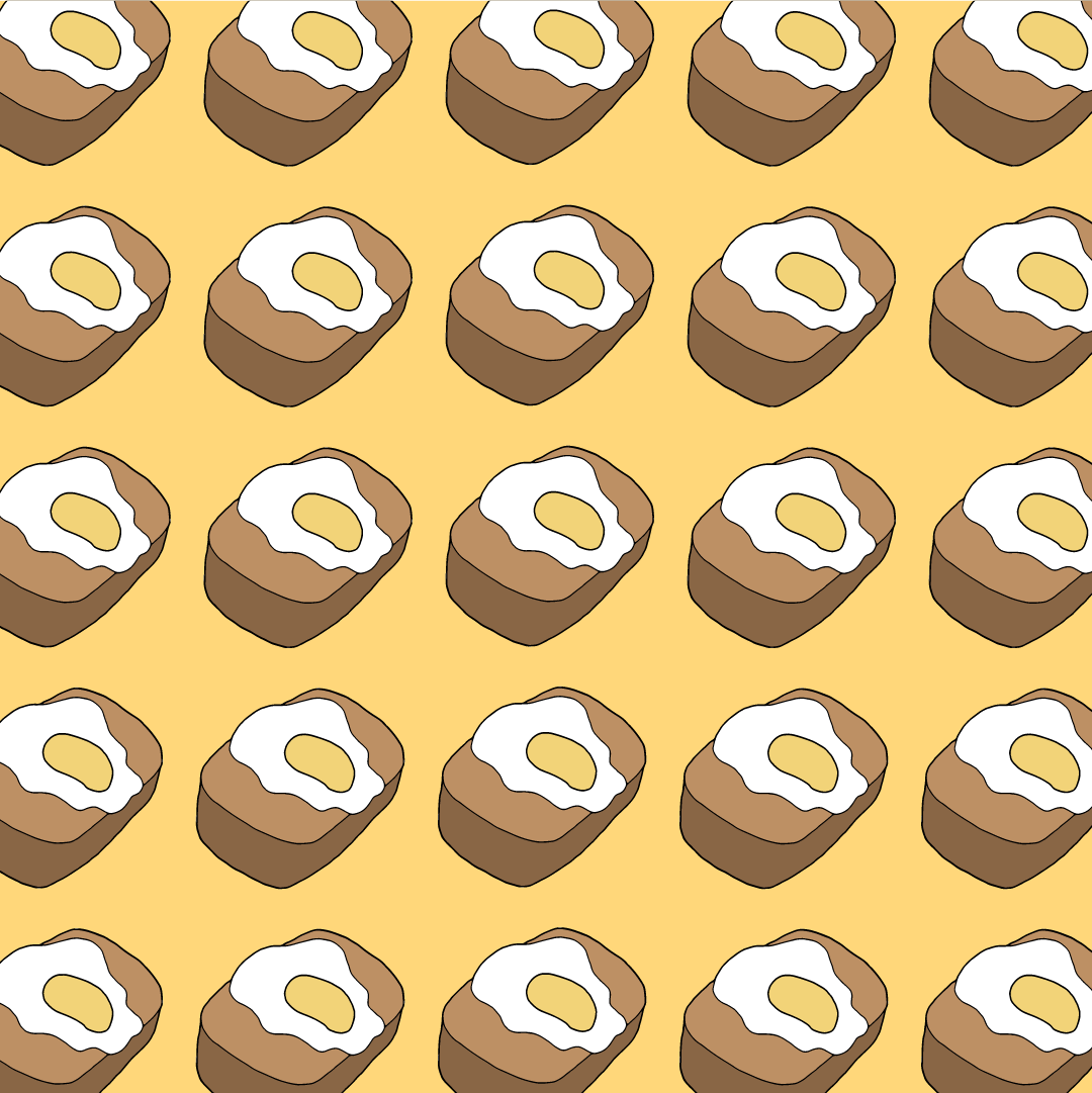
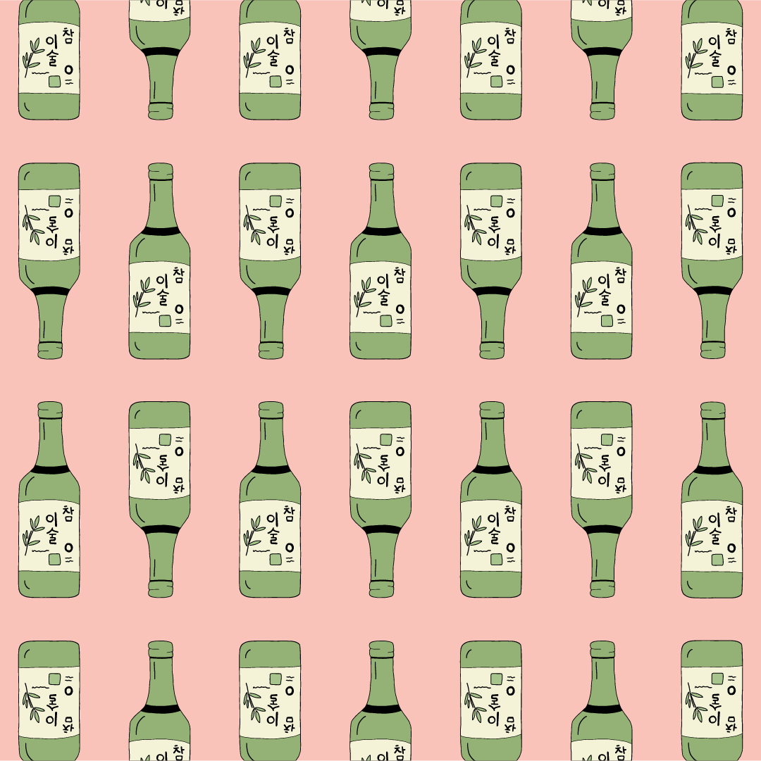
The one-eyed feature and several other prominent features of the Dokkaebi (devil horns/sharp teeth/mischievous look) integrated into the Korean food.


