Emotionally. I honestly did not think the project would come through, that I would be able to express the 18 different emotions since I struggled a lot throughout. But I’m so glad it worked out eventually. ?

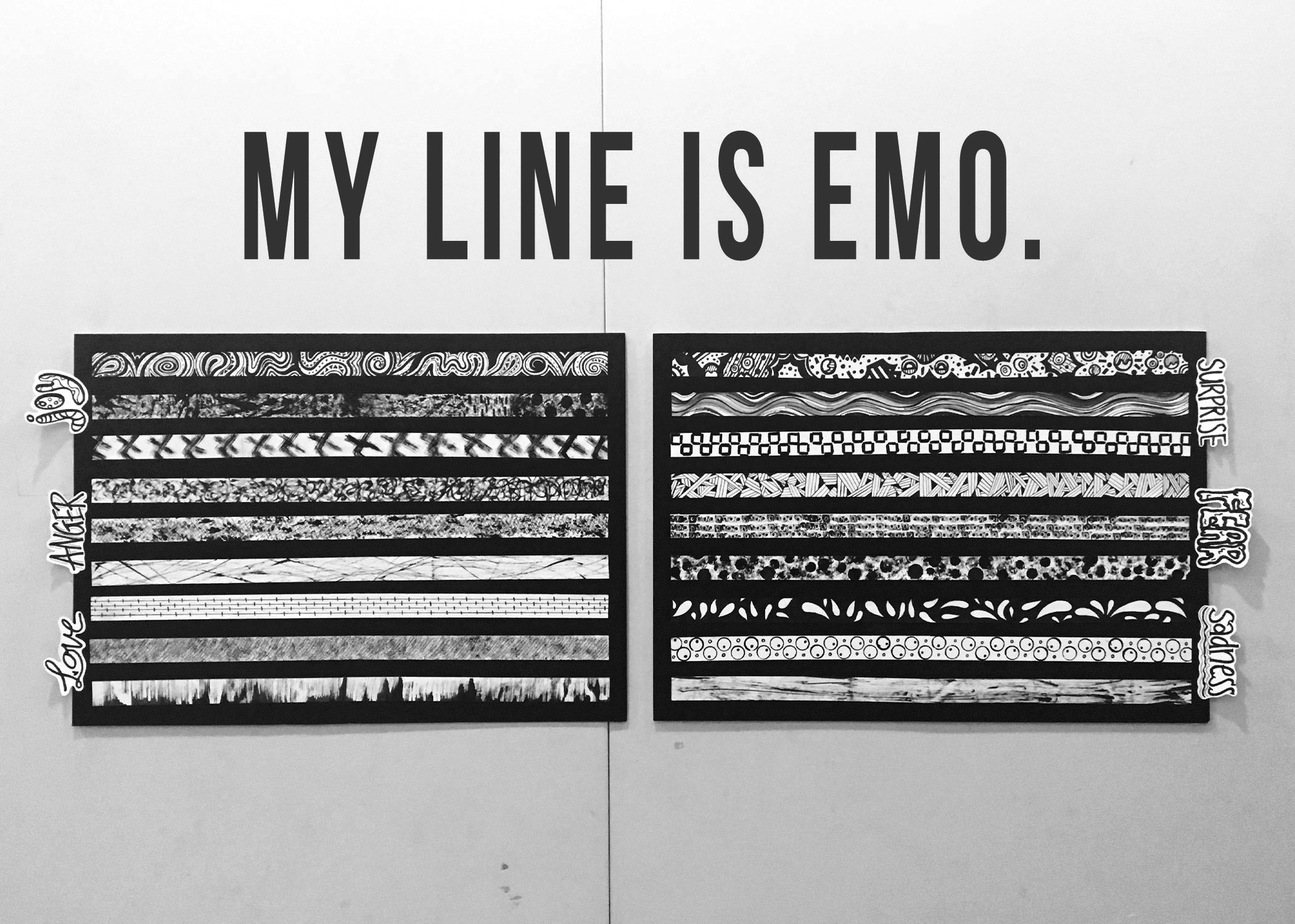
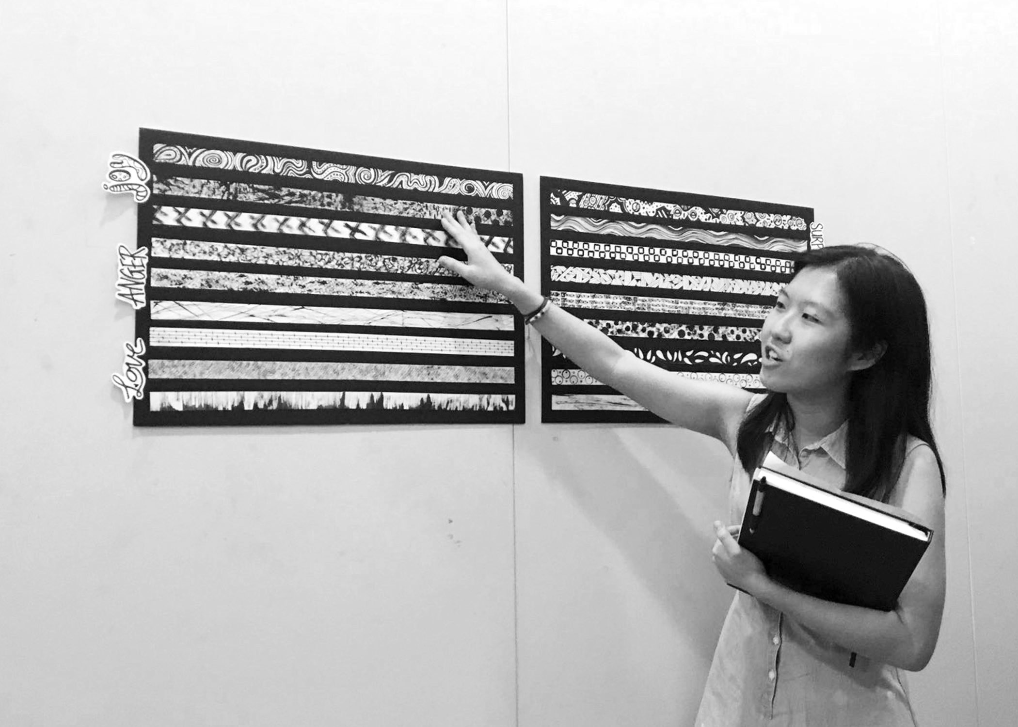
The final presentation layout.
Below is the documentation process of the final stages of my project, a deeper look into the emotions expressed in each line broken down into four areas – Concept, Approach (materials used/things tried), explanation behind the marks made behind each emotion and the challenges faced. There might be a little overlap of documentation that may/may not have been mentioned in my previous work-in-progress posts.
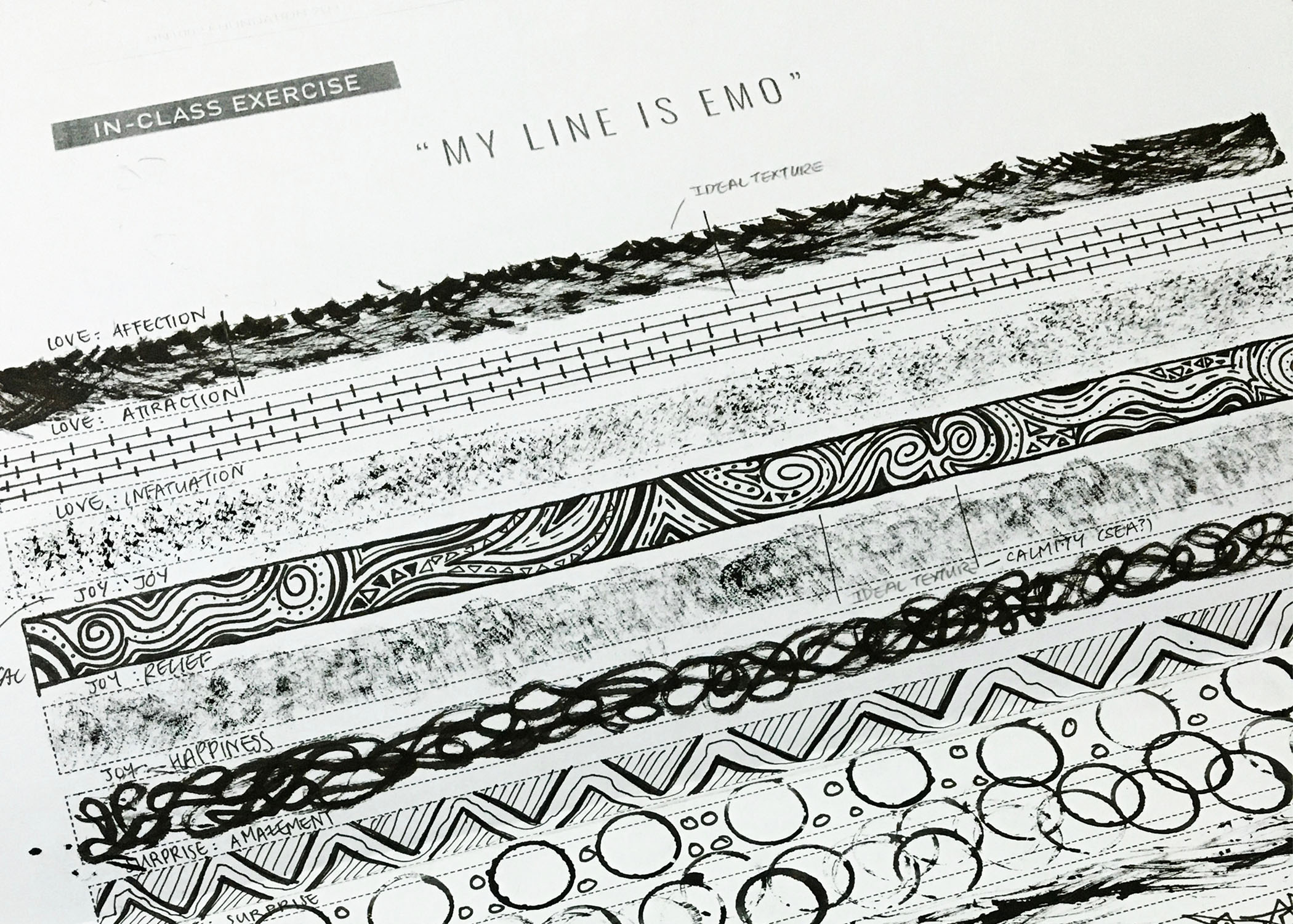
CONCEPT: Unlike the rest of my peers who mostly had a story to their lines (somewhat like a big idea), mine lacked that aspect. Rather, I went for the technique approach expressing the emotions according to increased intensities based on my personal interpretation – From the simplest form of a particular primary emotion to the most intense through expression of my comfort levels with the techniques applied which were drawing and mark making. When I was least comfortable with the technique used, my level of control over the marks and drawings was the lowest as well.
As mentioned in my latest work-in-progress post, I’m definitely more comfortable when it comes to drawing as compared to making marks since it can be rather abstract and that the possibilities are endless thus the decision to go ahead with such an approach for my lines. As to why these two techniques, these are techniques that I really enjoyed applying during the exploration process.
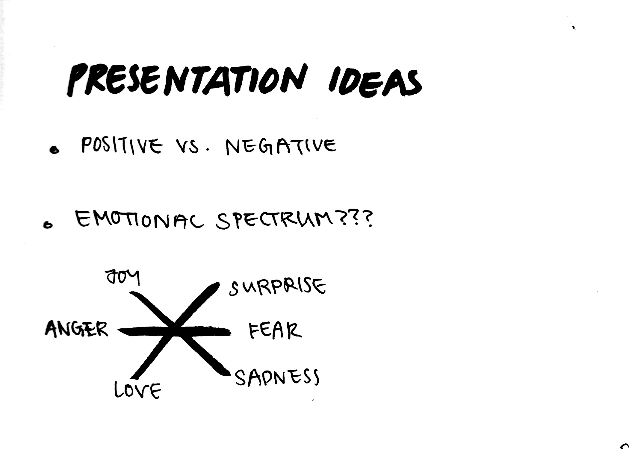
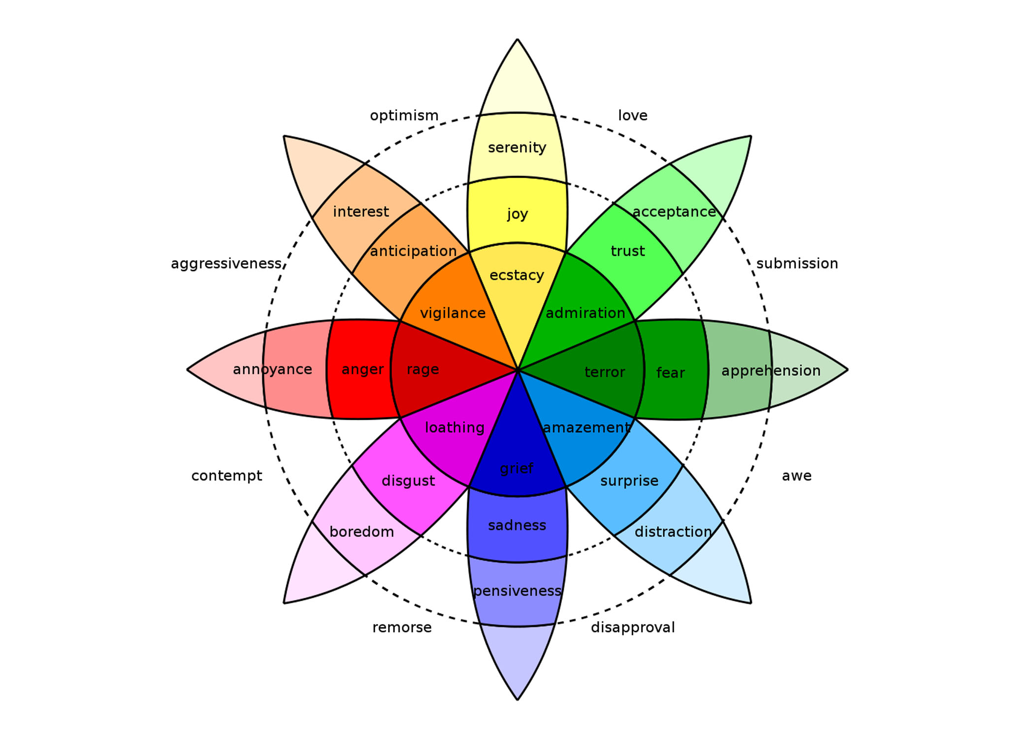
With regards to the layout of the lines, I decided to take reference from Plutchik’s Wheel of Emotions having chanced upon it while researching for the primary emotions and sub-emotions I could use for the lines.
I found it to be rather interesting and so happen it fits the primary emotions that were suggested for the assignment. With the opposite ends being contrasting emotions of one another: Joy-Sadness, Anger-Fear and Love-Surprise which is not reflected in the wheel of emotions but I felt applicable as well in the way that you can either really love something or be surprised by it until the extent of hating it.

I created handwritten labels for the primary emotions inspired by the emotions to add a personal touch and for easier presentation.
APPROACH:

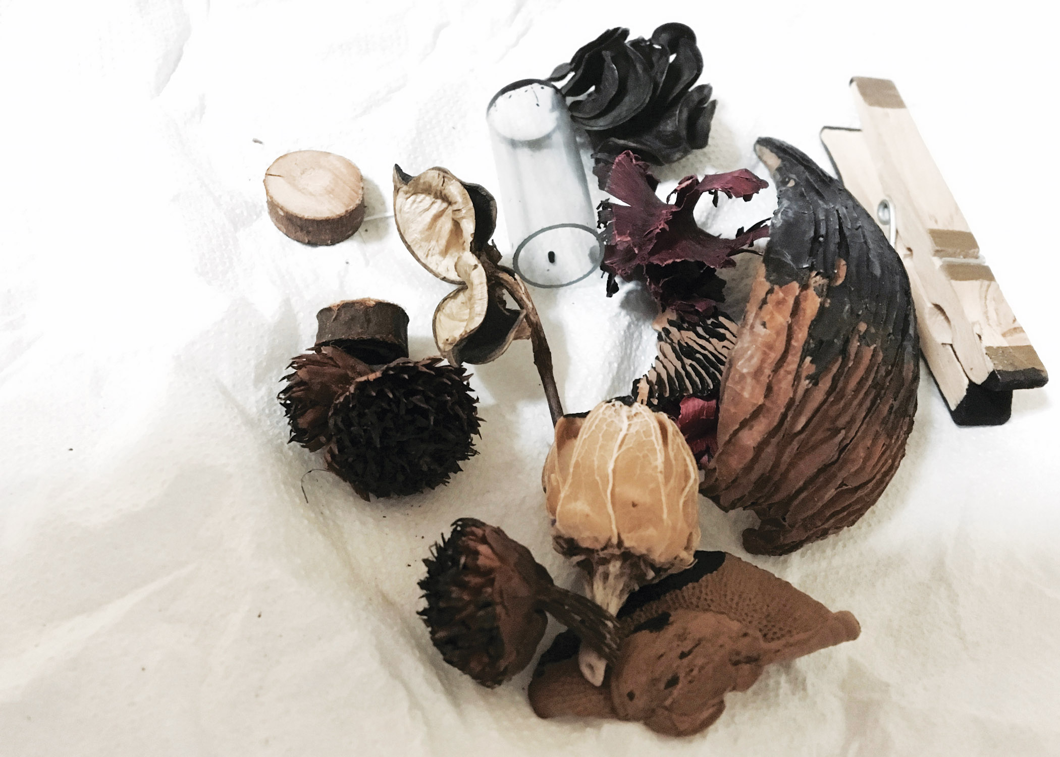
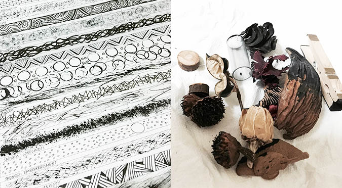
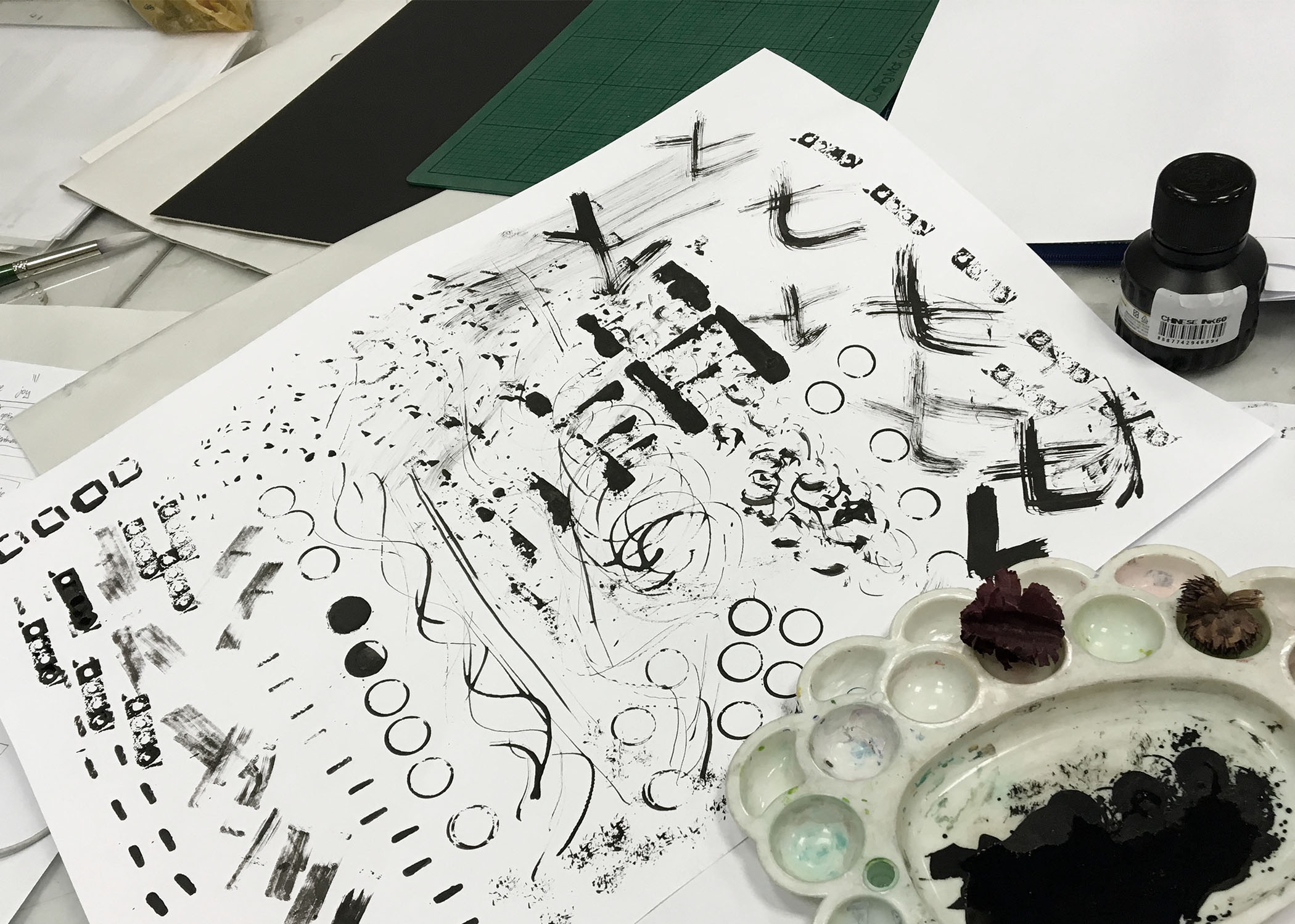
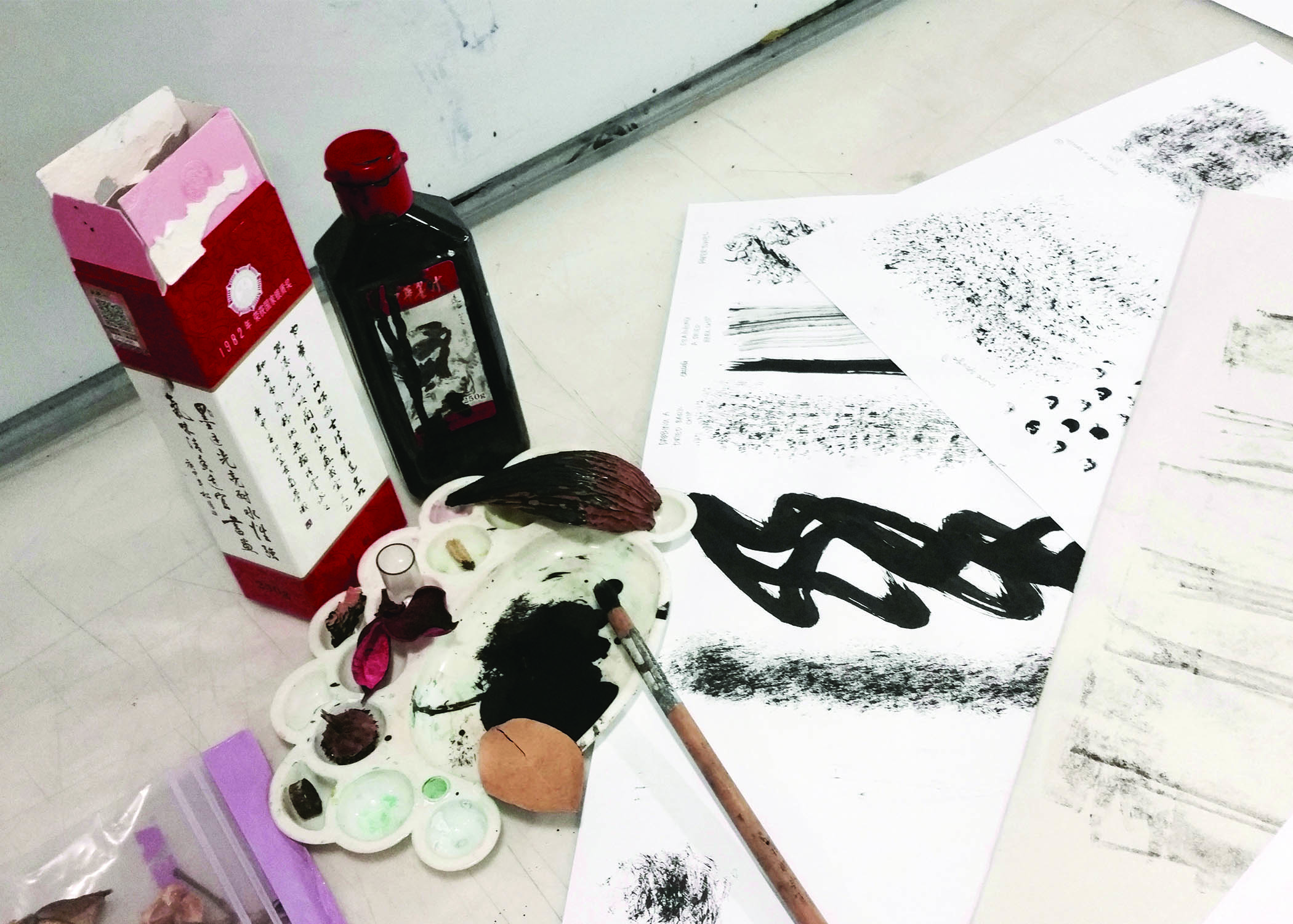
Materials used for mark making
The two main techniques used to create my lines were drawing and mark making. We were introduced to both mark making and monoprinting in class and mark making really fascinated me. I eventually ahead with the bag of loose potpourri (dried scented flowers) at home that I brought to class to experiment with for the mark making session in the second week of class since it worked out well. The various textures of each individual dried object was really fun to work with, gave a variation of marks.
As a follow-up to the potpourri and since I liked nature a lot, the eureka moment hit. Aha, I could use nature related objects – wood, dried flowers, plants etc. to create the marks which could be rather cool. There wasn’t any link to the overall curation of my lines but the idea of wanting to use objects that I like to create the marks for the emotions came up thus this.
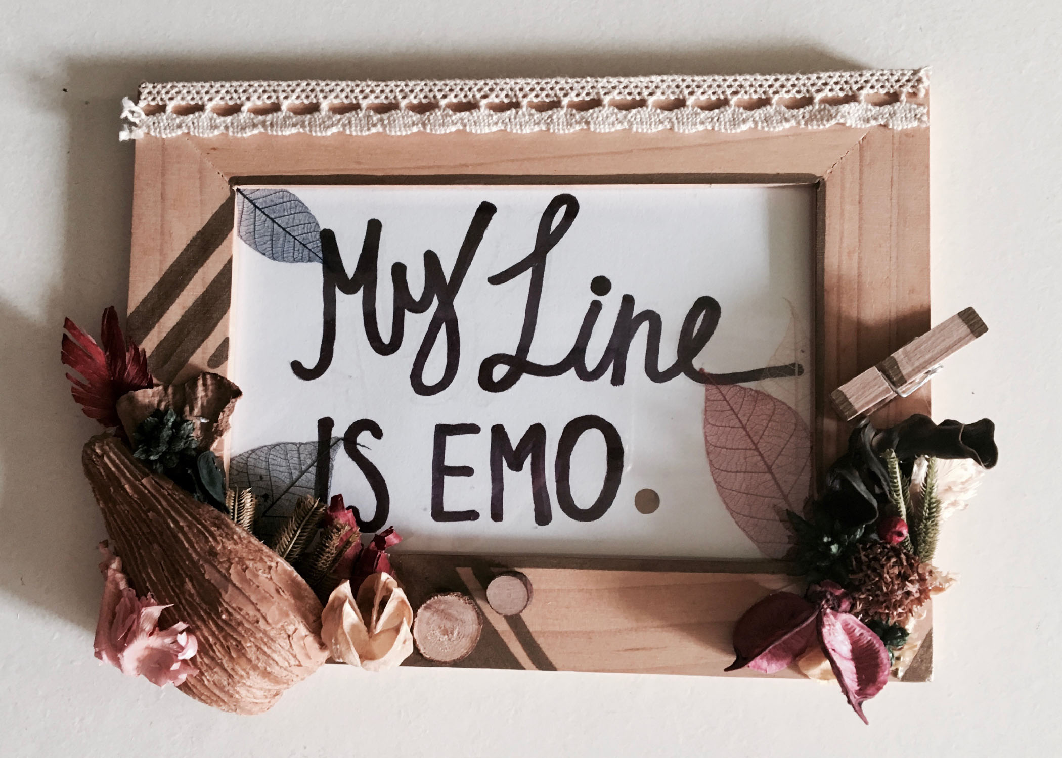
Glued the items used for creating the marks on the emotion lines on a frame and brought it for presentation to share with the class.
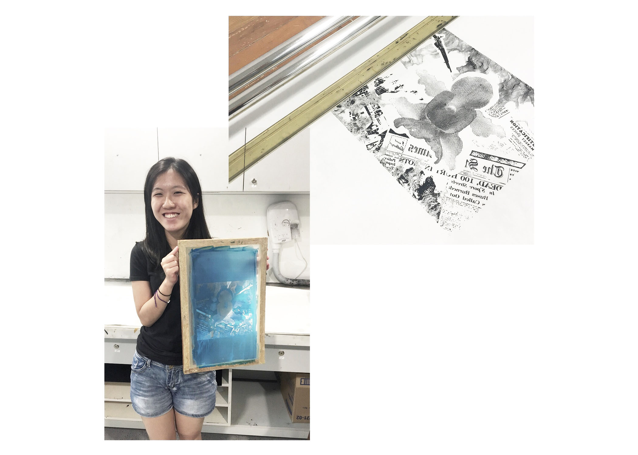
Ah also, quick confession about the frame seen during presentation. It wasn’t part of the plan at first. I only thought about this the night before presentation day while thinking of ideas on how to make my presentation slightly interactive. Figured sharing the materials I used with the class would be interesting… especially through such a way.
Not so fun-fact (since i think the class would’ve know it by now): I’m a really hands-on handicraft lover so doing this up was a rather therapeutic activity haha 🙂
There wasn’t any particular type of paper and ink used. Just normal cartridge paper and chinese ink since my focus was more on the techniques.
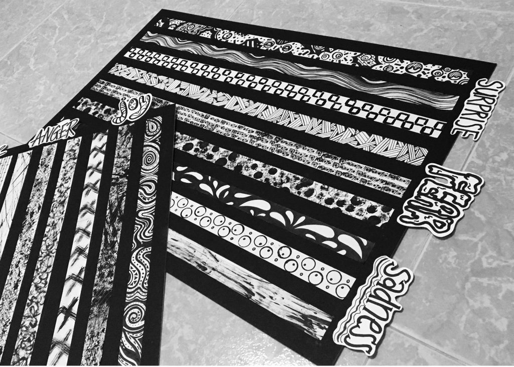
THE EMOTIONS:

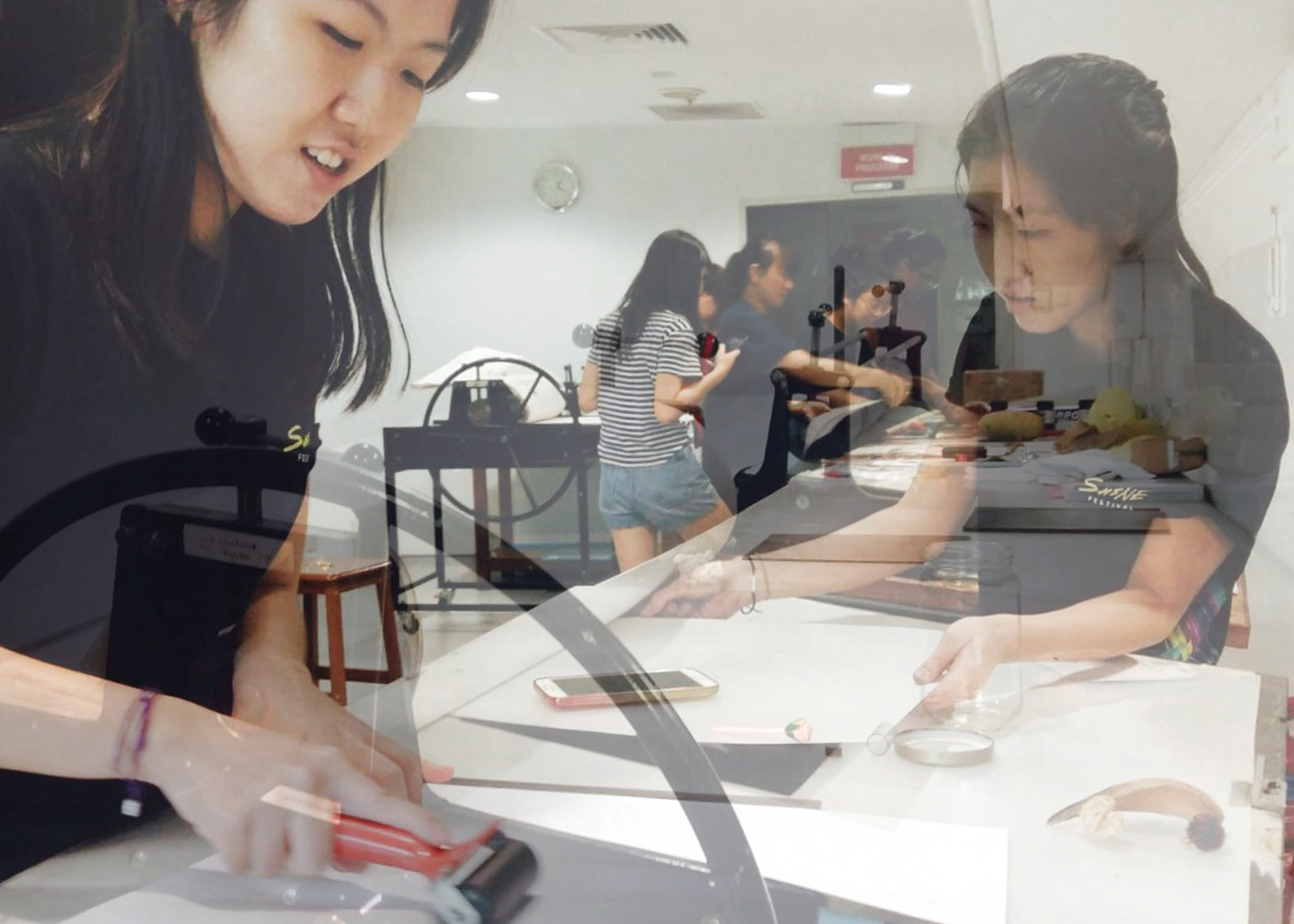
Picture Credit: (the class photographer), Xuan Fei
In no particular order, here are the emotions that I’ve chosen from each primary emotion category for this project in its final presentation layout. The emotion creations were based either on personal feelings through experience or symbols/meanings associated with the emotion through research and my first thoughts.
ANGER
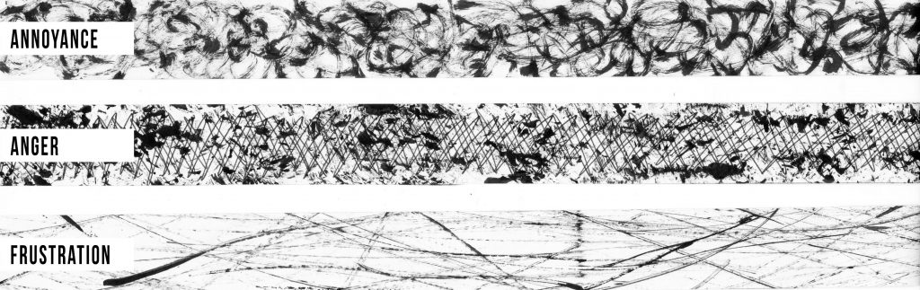 The first line signifies the simplest form of anger, Annoyance. It was drawn using a brush pen of messy scribbles to portray one’s emotions when annoyed. I drew it as messily as possible to bring out a sense of distortion, where your emotions are heightened.
The second line, Anger. It’s a combination of mark making and drawing. The marks make were spatial, with cross-hatches drawn using a pen to show confliction of emotions. Sometimes one can
The third line would be the most intense form of anger, Frustration which was created using the tip of a dried fig. I let my mind take over rather than have control over it for this line as I wanted to express helplessness in a situation of frustration. It’s like that for me.
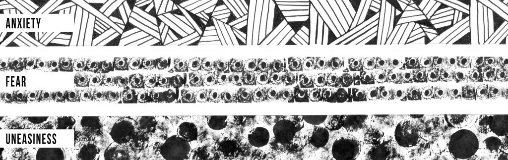
FEAR
 These set of emotions was rather personal and of the same theme – My phobias on different levels. In the first line, Anxiety. I wanted to reflect claustrophobia through the direction of the lines, how they converge towards the black point showing a confined space. This is what I perceive it to be and I personally feel a little claustrophobic in crowded places. Fun Fact: I don’t particularly enjoy heading to town (Orchard) for the very fact that it’s always crowded.
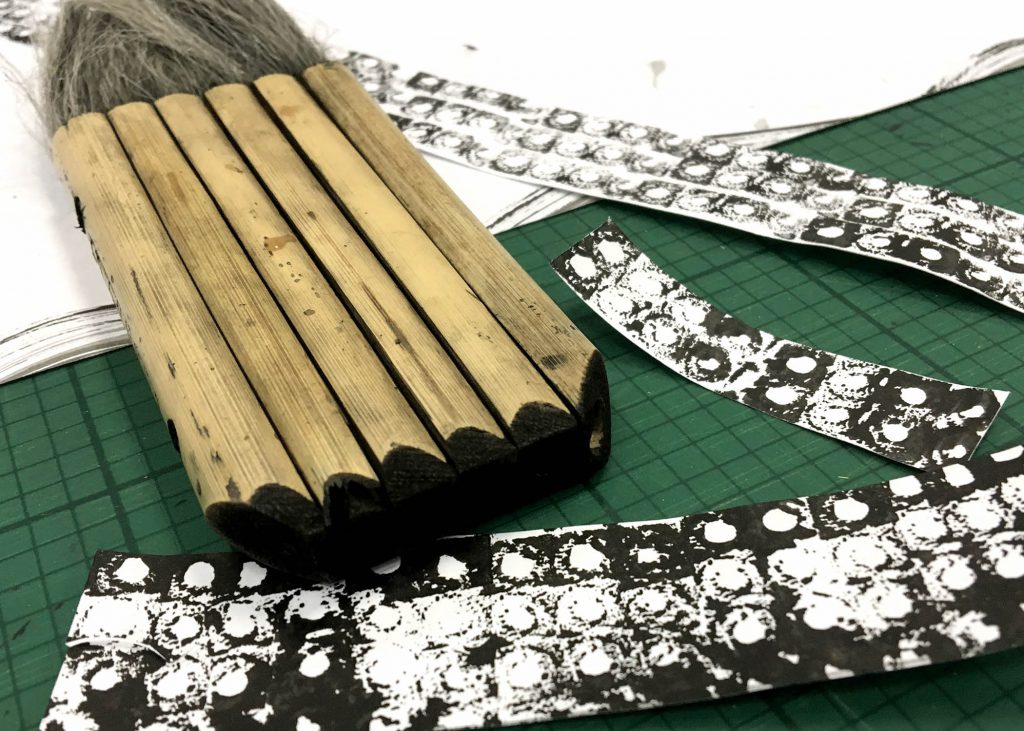
The second line… Fear. It gets me even as I did it. I wanted to depict trypophobia. The marks were created by the base of this bundled up calligraphy brush I found in the 2D studio last week with the black dots in the centre, drawn. Basically trypophobia is the fear of objects with small holes and I thought this tool couldn’t be more perfect to show it. I have trypophobia and probably you have it too. Don’t believe? Just try searching for trypophobia images on Google. (I’m sorry ??)
Okay moving on to the third line, Uneasiness. To me, it’s when I see something that is not consistent/regular. I’m rather OCD (obsessive-compulsive disorder) and can’t stand it when something’s not the way it should be. Thus I wanted to reflect this emotion of uneasiness through the irregular marks of solid blotches and faint ones made using round chips.
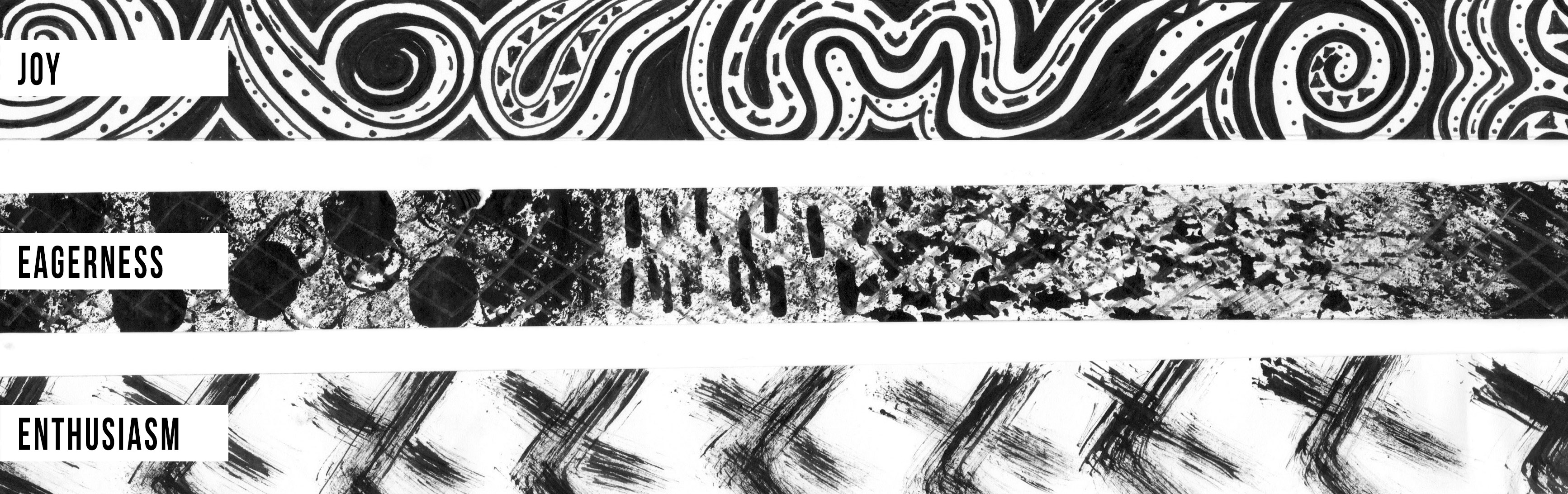
JOY
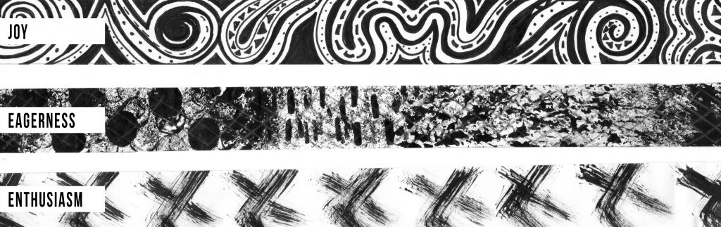
While doing this set the hardest was probably the third line, Enthusiasm. After much research, the mark idea came about using symbolism through body language thus the pattern. I wanted to portray it as a swift and light feeling as well so I used the dried petals to create this brush-looking stroke.
The first line, Joy. I associated it with a whimsical feeling and started to draw in patterns of such based on my personal interpretation and feeling with spirals, curves, dots and geometric shapes.
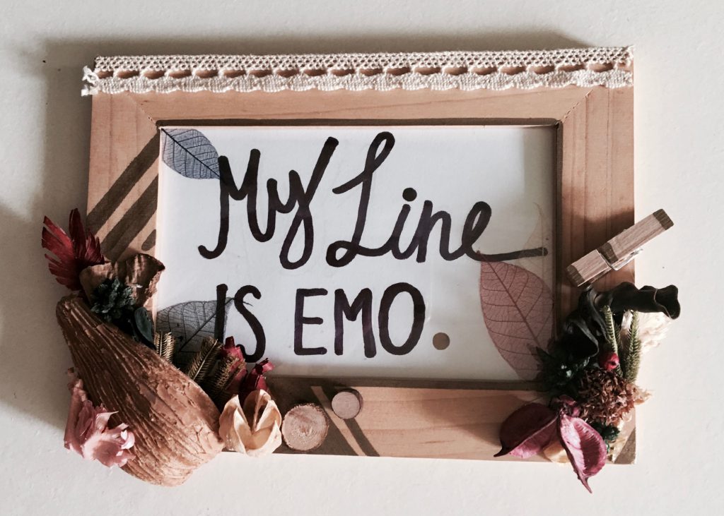
The second line, Eagerness was the last line that I created out of all the 18 lines and surprisingly Joy mentioned that it would most probably be the HIGHLIGHT of all my 18 lines. And it’s backstory was probably the most interesting out of all the 18 lines to me. Another eureka moment I must say ?, I went a roundabout before getting to this in the simplest way possible – I was really eager to try out the various techniques (mark making/drawing/a combination of both) and ta-da, I arrived at this line. The marks and combinations made for this line was done in chronological order, of how the lines were conceived with the objects used to create the marks. This I thought was a really nice way of combining aspects from all the other 17 lines to create this one line that somehow gelled/summed up the whole project nicely 🙂
LOVE
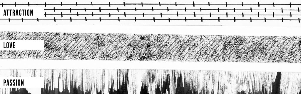
For some unexplainable reason this set of emotions, the idea for expressing each line came quite quickly and naturally. In fact this was the first set of emotions that was produced.
The first line, Attraction. The idea came about from its literal meaning. Be it in the scientific context or human context. It’s of opposites and what came to mind was magnets – its positives and negatives attract. Just like in human context, opposites attract.
For the second line, Love. It was to show a warm fuzzy feeling thus the use of mediums. The tip of a spiky dried flower amongst the potpourri to create the fuzzy feel and the thin pen strokes to portray brush strokes.
The final line was interesting. Passion. How the mark came about was while researching for inspirations for the emotion. I chanced upon this palmistry article where there’s a line called the heart line (also called the love line) one your palm which is considered as one of the three main lines of palm reading. (Source: http://www.yourchineseastrohlogy.com/palmistry/heart-line-reading.htm) Which got me thinking, I could use the concept of the love line to create a mark for Passion. Line – String – using string dipped in ink and rolling it upwards to create marks that resemble fire, burning passion.
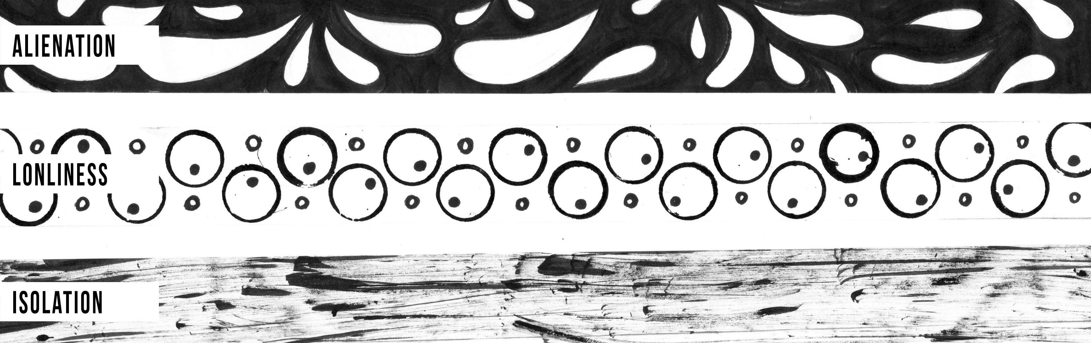
SADNESS

The idea for the first line, Alienation came about through the research process for the emotion and inspiration by having the shapes facing away from each other and the negative spaces to show distance and ignorance that’s felt as part of the emotion.
Loneliness for the second line was shown through circular shapes. The bigger circles were marks created by the rim of a wooden bark and the smaller circles hand drawn with some null and some solid. No solid black circles were created to show emptiness across the whole strip of line and the circles aren’t facing each other in the same direction/asymmetrical to portray loneliness.
Isolation was reflected in the third emotion line through hazy and blurred marks made, showing despair when feeling isolation.
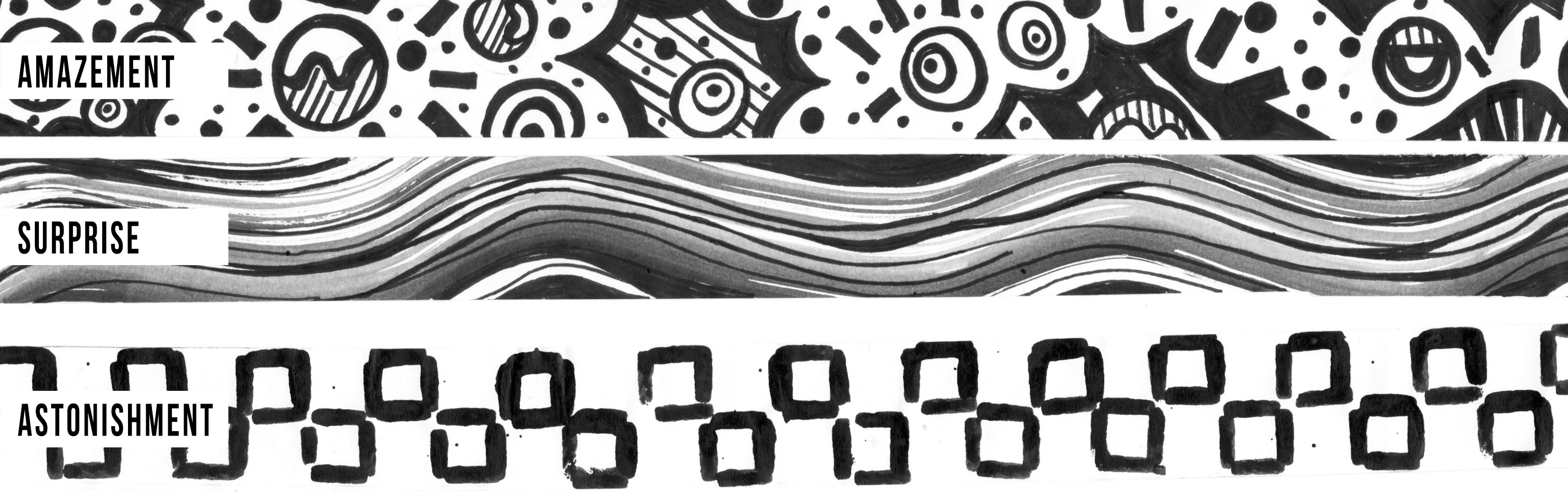
SURPRISE
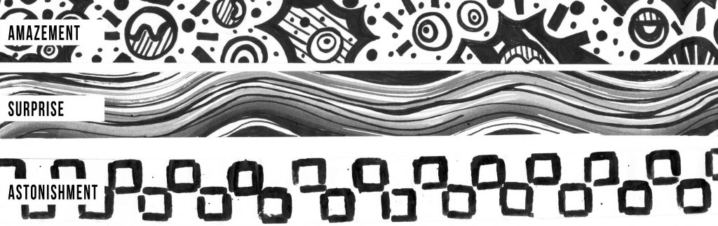
The first line, Amazement reflects the idea that bold patterns and prints never fail to amaze me and this is one of such based was created based on my own personal interpretation through drawing.
Surprise makes up the emotion of the second line and it was created in a wave-like form to show how our senses are heightened when we are surprised.
For the final line Astonishment, it was created with the tip of a wooden peg. I struggled with this emotion a little too but eventually found a way around it by using symbolism. I showed the chinese character for mouth for the emotion.
CHALLENGES FACED | AREAS FOR IMPROVEMENT | FINAL THOUGHTS
Challenges faced hmmm… definitely at the start where I had no idea on where my prints and marks that I made were going. As mentioned previously, I created a lot of prints during the exploration period but did not know how to go on from there but the consultation with Joy helped a lot and I was able to get a better grasp and direction of my approach for the project thereafter. 🙂
As for the areas of improvement, during presentation I remembered Joy saying that my lines for the emotion category, SURPRISE in particular the second and third lines might be a little confusing. Since my concept was to go from most comfortable technique (drawing) to least comfortable (mark making). Which would make sense if the line looked the most out of control for the third emotion of that category. In this instance, it seemed as though it was reversed. I had less control over Surprise than Astonishment. What could have been better was that I made the mark for Astonishment less geometrical and controlled. Guess I let the idea of wanting to show the chinese character for mouth overrule the concept in that moment.
Also, I could have labelled each of the 18 emotions rather than just its primary emotion as I realised:
1)The viewers may not understand my concept of increased intensity in emotion. Labelling might have helped them visualise it better and 2) For easier presentation. I had to occasionally refer to my notes as I forgot the progression of the emotions (the first line was emotion, the second, so on and so forth)
But on the whole, I’m really satisfied with the curation of my lines, how they turned out and I especially loved those tiny post-its of encouragement from my peers. They really made my day and I was really inspired by their works. Each one really stood out in their own special way! I’ve learnt so much from this first project and am quite excited for the next one. Hope that I will be able to apply what I’ve learnt from My Line is Emo for the next project.
The highlight line of My Line is Emo – Eagerness (under the primary emotion Joy)
P.S. Did you get my subtle curation of this final OSS post for the project? I started and ended off with this highlight line that well summed up all my 18 lines in marks. 🙂