Before coming up with a proposal and a solid idea to execute as a group effort for this final project for 4D II we are asked to do individual research on works on either video/sound/performance art and analyse the respective artists and their works, how some of them might be controversial. I am leaning more towards the exploration of using sound for the final art installation project.

Before searching up some examples, I searched up the meaning of sound installations and got the impression that it is a time-based art which sometimes can involve the element of visual to help support/complement the installation as a whole or change it to become a video art installation altogether. With the intention to explore the idea of using sound for the final project’s art installation, below are some that I’ve found interesting and possibly usable as references and inspiration.

I couldn’t really find much sound art installations that were deemed as controversial but my personal take on this would be that the whole idea of a sound art installation itself is actually controversial. Reason being that if you were to take in a sound art installation that is purely made up of sounds only, sure it’s meant to evoke a feeling in the consumers through the listening experience however the sounds are subjected to one’s perception as it’s pretty abstract. And because of that, artists that work with solely sound for their installations are able to get away with touching on controversial ideas. Unless the work includes the other elements like visual in the form of a video/image accompaniment where the audience gets an even clearer idea of how they are supposed to interpret the installation piece.


Haroon Mirza

Here’s one sound artist that has faced a little controversy though with his work I suppose – Cross Section of a Revolution (2011) which has two films being juxtaposed. One on cultural tradition and the other, a political movement and accompanying the installation is an electronic sound that gives a sense of anxiety to the work as the whole. Looking further, one is of drummers at a ceremony in Kenya and the other is about a man in Lahore making a speech about terrorism.

Quoting an article by theguardian on his work:

Mirza recorded his drummers at “a stick-fighting ceremony where the groom has to fight for his bride. My attention shifted to the drummers, who provided the driving force to the ceremony.” They drum on plastic bottles, anything that comes to hand. “A subtext,” he says, “is the place of music in Islamic culture. In some Islamic cultures, music is forbidden. An underlying theme to my work is a criticism of religious faith, and the dogmas involved in religious faith.

Easily when there’s culture/religious faith involved in a work of art, there’s bound to be controversy involved, people questioning the work as it could be sensitive to the identified groups. In this case, the people of that religious faith. It could get a little touchy with how the artist portrayed his topic through the installation piece.


John Cage

Taking a look at his famous or rather infamous piece 4′33″ (1952), this work of his probably fits the idea of performance art more since there’s a subject involved during the performance but I’ll be looking more at his interesting take on the use of sound in this piece.

Cage’s intention with the piece was to have the composition be made up of sounds present in the environment encouraging people to listen to the sounds around them but the impression they got in return was that they were subjected to silence because there was an a pianist present but he did not play anything after taking his place on stage. The sounds of the piece were actually made by the whispers that came from them which became louder as they grew more curious about what was happening in front of them.

Cage’s intentions eventually sparked controversy about the piece since the audience thought they were treated to silence for the whole performance duration of 4 minutes and 33 seconds.


Susan Philipsz

Next looking at how sound art has developed over the years, the public has definitely become more receptive about it possibly thanks to Susan Philipsz who was awarded the Turner Prize in 2010. One of the most controversial awards around because of its history, the questioning on how some past awardees works could’ve possibly been that good to actually have a meaningful effect on the reputations of well-established artists because of their actions and approach.

Philipsz primarily works with sound and her works often consist of nothing more than an empty gallery and a recording of her own singing and sometimes she would build soundscapes into unusual locations i.e. playing a entirely unrelated recording at her selected site for the installation. Nonetheless, her receiving the award helped sound art gained increasing exposure and is now in a better state of reception.

Lowlands Away (2010) is one such example of Philipsz’ style as mentioned above. She recorded three versions of this particular song which is of a man drowned at sea returning to tell his lover of his death and it was first performed under three bridges over the River Clyde in Glasgow and later on in an empty room at Tate Britain.
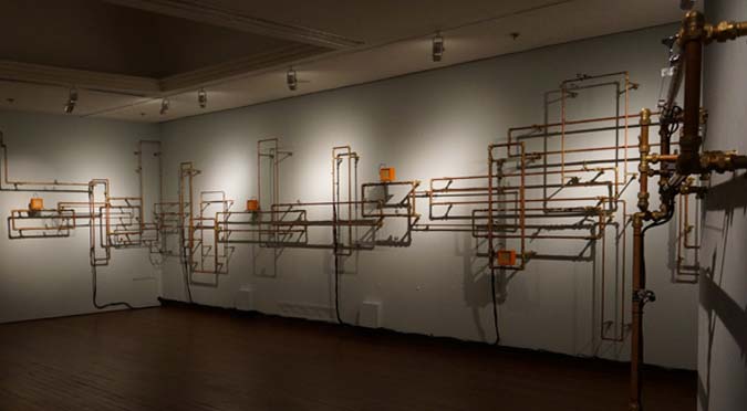

Jim Green

Leaning away from the controversial side of sound installations and looking at the idea of having an environment as part of a installation just like Cage’s intention with the use of environmental sounds,  I came across sound artist Jim Green who does it rather well.

For instance with his work below, Talking Fence (2010). How the installation functioned was when people walked past the installation site lined with fencing, activated by a sensor, it would trigger the fence to talk and interact with the passersby giving them compliments etc.as they walk by. Below’s a documentation of the installation piece and the responses from the public were great.

While browsing through more his works I chanced upon another of his installations which was amusing and brilliant – Laughing Escalator (2004). What I get out of this earlier dated work of his is that it has  the same intention like his later piece, Talking Fence above which aims to encourage greater interaction from the public with his works and bring across the connection with everyday life.

What I like about these two particular works of his is his attempt to make relatable and approachable to the public with that light-hearted and amusing touch to it. Keeping this in mind, it’ll be interesting to explore the idea of making our final installation art work based on something that the audience can resonate with.


References:

Pins & Needles

The soundscape is best experienced using earpiece/headphones 🙂


ARTIST STATEMENT

Inspired by Foley and how the mind works when asleep, Pins & Needles is a psychological soundscape that evokes a sense of anxiety through three kinds of common nightmares painted using sounds. A dreamscape of broken continuity, the soundscape is layered with sounds that stimulate nervousness, the ticking sound provides a built-up and countdown. Or perhaps the suggestion that it is all just a dream – The sound of a clock ticking. A specific sound is used to draw the listener back to reality at the end.


CONCEPT DEVELOPMENT

Concept wise when we first got the brief I had zero idea on what to make my soundscape about. I was thinking of doing a sonic portrait since it sounded pretty cool – Making one paint a picture of the person just based on sounds but at the same time I figured it would’ve challenging as the person you have in mind (if taken the personal approach of creating a sonic portrait of your loved one), the sounds would’ve been very personal, unique and only recognisable to you yourself. It could be solved actually if I were to do a sonic portrait of someone famous perhaps… but didn’t go ahead with that anyway.

Still clueless, I just played around with the SFXs available on GarageBand first and put together some free sounds downloaded from freesound.org . Boy, GarageBand offered some really great sound effects for use! Eventually I came up with something for consult and the idea of an anxiety-invoking dreamscape kind of worked out from there.

Especially after I came across this website that lists the types of common nightmares one tends to get and I got ideas: http://listverse.com/2012/10/31/top-10-nightmares-and-their-meanings/

Painting scenes of claustrophobia, being chased, and being followed, these were some I had in mind and kind of went ahead with them.

Feedback was to have more layers (foreground/midground/background), to have a focus in each ‘scene’, have more variations (ASMR, Left & Right sounds) as it sounded kinda flat and a bit soft initially.


RESEARCH: THE REFERENCES

For research, the artists and video links were really helpful in getting a sense of what soundscapes are about and how we could go about them. I was super fascinated by Foley in particular and while browsing more videos of it on YouTube I chanced upon this TED Talk about sound design and it was a really interesting watch on how sounds can be deceiving sometimes.

One of the Foley videos I chanced upon (below). Foley was the main reference/style used to get the sounds for this soundscape. There wasn’t any specific artist/film that I referenced for my soundscape in particular.

Even Disney films in the past used the Foley technique!


CHALLENGES FACED

Plenty. Conceptualising was really hard. When we first got the brief I thought, yeah a soundscape would be easy, especially when it was just a minute long initially. I underestimated the difficulty of it. We just needed to come up with the idea and when the right sounds are produced, everything will just work out. I thought wrong. Especially when producing the sounds, there’s a lot of trial and error, a lot of exploration to get the right sounds needed for the soundscape. And also, to avoid producing sounds effects that when mixed together sound tonal (like there’s a tune to it).

For me my soundscape is made up of a variety – Self-produced sounds, sounds from online sources, and readily available sounds on GarageBand, the software I used for mixing the sounds to create the soundscapes some of the sounds I wanted to use were really hard to produce. Sounds that sound like a person’s drowning,  some muffled noises, hollow sounds. Ambient noise wise, it was pretty easy to record, just leave the recorder on and alone for probably 10 minutes, it’s good enough to get some good background noises.

Overall this was a challenging but fun project. It made me more aware and appreciative of the sounds around me. I think my senses have heightened now haha.


Sound Attribution

Those used from online source freesound.org

On to the next and final project for 2D II which is probably the most intense too. Each student is assigned a neighbourhood and my assigned area was Outram. Before heading down to the place for a visit, I searched online for possible places around Outram I could explore (so as to save time) and had an individual consultation with Joy prior to my site visit.

It’s probably because these sites were often seen on Instagram feeds for being rather ‘insta-worthy’ that made me notice them more and wanted to explore/delve deeper into since they would be more recognisable in a way. Each site had their own unique rich history and heritage which I found interesting and had potential to be featured in the zine. However, I figured focusing on just one site/neighbourhood would be better since the zine would only be 8 pages thick.

The more known areas/iconic buildings around Outram that caught my attention were:

1. Keong Saik Road

This place once used to be a famous red-light district back in the 60s but is now transformed into a popular hip and cool enclave lined with food outlets ranging from restaurants to cafes and bars and it’s a rather happening place at night.

16649269_1732563773720632_8017385927518994262_n

Also there’s this group of people, Lopelab that looks into creating events that allows for human and space interaction. The most known event being the road closure at Keong Saik Road project – Urban Ventures where the street is transformed into a platform for arts, culture and people to gather to enjoy free music performances, art and more. The first event was successful and another just happened last evening, how cool!

2. Pearl’s Hill City Park

pearlbankapt

Where the famous iconic Pearl Bank Apartments were located. It’s one of Singapore’s pioneers of high-rise buildings and one of the tallest and densest to date. The architecture of this building is an interesting one but not ideal for those who have vertigo cause of how the building’s extremely vertically structured and tall. It was built in 1976 as part of the Government’s attempt to push for condominiums catering to the middle and upper-middle classes back then.

3. Everton Park

evertonpark

After weighing my options, I’m was kind of settled for featuring this place for my zine, having it as the sole subject particularly because of it’s quiet charm and the chance to explore the idea of New & Old with a tinge of nostalgia. More to be explained about this neighbourhood below.


QUICK HISTORY/BACKGROUND OF MY CHOSEN NEIGHBOURHOOD:
EVERTON PARK

It’s a quaint 50-year-old HDB estate that’s one of Singapore’s earliest neighbourhoods around. It’s also walking distance from the nearest MRT station (Outram Park) and the estate is located directly opposite The Pinnacle at Duxton just across the road. Despite being one of Singapore’s earliest neighbourhoods, it’s slowly becoming a rising hipster enclave and present among the estate are several new and old generation business owners.

So I headed down to location after consult on Thursday afternoon (no time to lose! this first oss post is due on Sunday!) and the research I’ve got so far are mostly secondary research from online together with a little bit of primary research having had the chance to talk to several business owners there that day. However most bosses of the shops/cafes I found interesting and wanted to approach weren’t around that day so I’m planning to go down some other day this week.

And yes, interviewing residents too are on my list. Coincidentally I have a distant relative who lives there and has been living there for many years already. My family and I would come by here every year for Chinese New Year visitations. So that’s great, I’ve got one more interviewee. 🙂

Here were some of my findings from my visit to the neighbourhood on Thursday:

comparison

I find it interesting how there was a contrast of a modern 50-storey high-rise building and an 50 year-old HDB estate located just opposite each other across the road. Managed to capture a few shots of how they are located so near each other with both buildings in frame. I loved the contrast and had the sudden thought of including this in my infographic as a quirky fact since both have the numbers ’50’ in them haha…

As I explored the perimeters of the small cosy 7 block HDB estate, I noticed how just below each block there would be a line of various cafes and other businesses and some of the businesses that are located beside each other were like new (a cafe) vs. old (a provision shop etc.) Below was one such example, the first block I went to. Located almost just beside each other is a cafe and a confectionery shop that has been selling traditional Ang Ku Kueh here for many years already. It was an interesting sight!

dsc_0037


The staff at the confectionery shop selling traditional Ang Ku Kueh were real friendly and nice. They were open to me taking pictures and invited me in to take pictures of them making the kueh too. Unfortunately they were done with production for that day and they were really apologetic about it as they told me to come on another day instead. When asked if I could interview the store owner, they told me that I could search up their website and contact this person who’s the son of the store owner as he would be able to help me more with the questions and all. How nice of them!

dsc_0042

Marble Bistro at Block 6

Walking deeper into the estate, I spotted more cafes and businesses. This time round the locations were interesting – They were rather hidden, located just beside the lift lobbies and letter box area of the blocks but still drew business. I would think that most of their customers were old patrons or residents living there. (see above and below images) I’ll probably try to get an interview with one of these stores!

dsc_0035

Exploring further, I finally managed to speak to several shop owners. One of which was the store owner of this fruit store as seen in the image below. Looking at the facade of the store, I thought there’s a chance that it might have been around for quite sometime already thus I approached the store. I was wrong, the store owner told me that they weren’t as old as some of the businesses around. They only started business here about 4 years ago after seeing a newspaper listing that the place was up for rental.

Oh based on research done, I learnt that store rental here at Everton was considerably cheap hence the reason for most choosing to open their business here unless they had personal reasons like they used to live here.

I was then kindly referred by the fruit store owner to perhaps try the minimart next door as it had been around for rather long. I managed to strike up a conversation with the uncle, Mr Yap from the store (the store owner wasn’t around that day but he was kind enough to answer my questions in between serving customers) and found out that it has been around for 10 over years, not exactly considerably long. To my surprise, he lives in the area and has been working for this business till now.

He mentioned that business was competitive as there were about 4 provision shops around in the neighbourhood. He went on to share his thoughts about the area place he lives here, saying how it’s moving along with the times with more cafes popping up over the years. He also voiced his opinion on how the area might eventually end up being claimed and have to make way for redevelopment plans just like what’s happening with the other old estates in Singapore – Rochor Centre and Dakota Crescent.
But personally, I feel that it won’t be anytime soon for Everton Park especially now when people are coming by on weekends for the cafes and when it’s known to be “the next Tiong Bahru”.

dsc_0067

Everton Minimart at Block 7

What I particularly love about this neighbourhood was it’s quaint, quiet charm. Not many sightings of people around but it gives off a really warm feeling. Maybe it’s because of how closely placed everything is – the businesses, apartments and all; the architecture of the neighbourhood. I felt it especially when walking through this walkway pictured below.

dsc_0142

dsc_0144

While exploring, I noticed an old uncle walking to and fro the above shown walkway settling down at one spot of the stretch of marbled bench and shortly after he stood up and shifted to another spot. He even shifted over to this area with chairs (see image above). It gave me the impression that he was a resident there but when I approached to strike up a conversation after a little hesitation I found out that he was just here for exercise. And being an old folk I thought he would know this area well but apparently he only came by twice, wrong judgement… but it was nice striking up conversations with friendly old folks. I remembered he asked what I was doing here too.

walnut

Came by this Korean confectionery that sold traditional hand-made Korean rice cakes and snacks after researching online. I particularly wanted to interview the owner of this business as it was an interesting sighting – A Korean business among a neighbourhood that’s highly populated with residents who belong to the older generation. I would think once again that it’s because of the rent but I may be wrong! Unfortunately I was told that the lady boss of the store wasn’t around too so I’m coming back another day I guess!

Last stop for my first visit to the place was this area located just opposite Everton Park. There were 2 series of wall murals done by this local artist, Mr Yip Yew Chong back in 2015. I’ve read up online about them, how it seemingly has a story behind each and why they were placed there –  Mr Yip used to live near Everton Road and walked along that same road every day for about 20 years.

I’ve seen people interacting with the wall murals before, taking photos beside it and posting them on their socials but never knew it was located here until that day. But when I went by on Thursday there wasn’t anyone around that area so I guess maybe I’ll go by on one of the weekends to see if there are any and could probably do a timelapse of sorts as suggested by Joy to capture their interactions and maybe I could even interview the people then to get some thoughts as well.

mural

mural01

Amah by Yip Yew Chong

mural02

Barber by Yip Yew Chong

Coincidentally he’s having an upcoming talk this coming Tuesday evening at the National Library about his series of wall murals across Singapore (including these two) and I thought it would be a perfect opportunity to sit in and hear the stories behind it and gain some insights to his works which might be beneficial for the zine. I was thinking to even approach him after the session and speak to him a little if possible, to gain more insight.

Am most likely heading back on more weekday and a weekend to conduct more interviews and at the same time observe the weekend crowd since I heard that more people are heading over to the cafes there more now because it’s less crowded as compared to the Tiong Bahru.

Would probably be a good idea to call up the shop prior my next visit to arrange or ask if I could interview them as some businesses there were second generation/the owners live in the estate. It would be great to get their thoughts on the community, how the place as changed over the years etc.


ETHNOGRAPHY: First look at the word ethnography and I thought, this research method must be related to ethnicity. Well if you search up the definition not related to research, it’s somewhat there! But in research terms, it’s meant to be a form of qualitative primary research done with the intention to provide detailed in-depth descriptions of everyday life and practices by others.

PARTICIPANT-OBSERVATION: 

Similarly, participant-observation is another form qualitative data collection method. It often takes place in community settings (like this project for example) and requires the researcher to approach people (as participants) in the environment and learn about what their lives are like as an outsider. The researcher are more often than not recording down what they observe and get through interactions and conversations with the members of the community (participants). It’s one research method that is based heavily on observations and interpretations.

Collecting data can also be done through other forms such as conducting questionnaires or surveys.


QUALITATIVE DATA: This kind of data obtained from research is not in numerical form/numbers. They are usually more descriptive unlike quantitative data and are useful for finding out how people feel about a particular subject.

E.g.: Through conducting interviews, questionnaires/surveys

QUANTITATIVE DATA: This kind of data obtained from research is in numerical form/numbers. They can be translated into categories, ranked in order, measured in units and of course presented visually through infographics and other forms of visual data representation.

E.g. Through conducting surveys that require the participant to rate something on a scale of maybe 1-10 / Yes or No questions – Basically questions that would generate numerical data.

Primary sources of data are the kind that you personally obtain it through your efforts. It can be through interviews, or the above mentioned two other forms of data collection – ethnography and participant-observation. Put it simple, original data. On the other hand, Secondary sources of data are those you get from other existing sources. It can be from books, magazines, articles be it in electronic forms or print form.


INFOGRAPHICS

Infographics are ways of simplifying complicated subjects/topics/statistics into an interesting visual representation of various types (charts the most common type) for viewers. It especially helps turn boring subjects into something interesting if done right. A good infographic would be one where the presentation of data of your subject matter is visually engaging and appealing to your target audience.

Happen to chance upon this infographic of sorts (see below) that shows the many other ways we can visually represent our data besides through infographics which now looking at it I perceive it to be a sometimes mixture of many various types of these visual analogies combined together with annotations.

visualdata

There’s just so many ways we can visually represent our data! From the usual charts to having vectorised graphics reflective as symbols of the subject matter with related annotations, the possibilities are endless and I guess we can really exercise our creativity here. But at the end of the day, main point again is to really boil down these data, simplifying it and making it interesting for your target audience.

Here were some infographics I found while browsing through Pinterest for the next deliverable part of the project. Figured they could help me get inspired with mine when the time comes. I really like the use of colours, the quirkiness and the way data is presented. Will be browsing through Pinterest again for more inspiration!

info info01


REFERENCES:

  1. https://www.lopelab.com/
  2. https://lionraw.com/2014/07/15/a-journey-up-pearl-bank-apartments/
  3. http://psc.dss.ucdavis.edu/sommerb/sommerdemo/observation/partic.htm
  4. http://www.museum.red-dot.sg/design-district-singapore/everton-park/
  5. http://brianhoey.com/research/ethnography/
  6. https://assessment.trinity.duke.edu/documents/ParticipantObservationFieldGuide.pdf
  7. http://www.simplypsychology.org/qualitative-quantitative.html
  8. https://www.customermagnetism.com/infographics/what-is-an-infographic/
  9. http://designtaxi.com/news/376549/Infographic-72-Ways-To-Think-Present-Your-Ideas/


Update time! Had to bid my favourite traditional approach goodbye this time round because of my concept. Bye paper cutting and layering techniques…☹️ Will be sharing more about individual and group consults we had for the project.

INDIVIDUAL CONSULTATION

The week after getting our project briefs we were already down for first consultation, individual first. Having a concept and message in mind for the project, we had to share them with Joy and bounce off some ideas. I roughly had one in mind already, going along the lines of growing up and how I had different job aspirations at different points in my life. However I was unable to establish a message for my concept and Joy gave me a few suggestions. Eventually went ahead with the message of how growing up, my perceptions and sensitivity towards things change. I paid attention to specific parts of a magazine which led me to the different job aspirations that would be shown in the four different compositions.

The jobs I decided on were:

  1. Cover Designer
  2. Lifestyle Writer
  3. Graphic Designer
  4. Editorial Designer

FIRST GROUP CONSULTATION

For the first group consultation in the following week, we had to come up with 2 done compositions and I did up those for Cover Designer and Lifestyle Writer.

More on each individual composition’s conceptualisation will be explained in the final post

Cover Designer

cover-initial

For the cover designer composition there was too many typefaces involved for the first cut as I tried to replicate the different features of a cover. I manage to resolve the problem by representing the text as lines and the features as simple shapes resembling the headlines etc.

Lifestyle Writer – for this I came up with 3 different designs, two of which were similar.

 I came up with the second design as based on the same job aspiration as I suddenly had an inspiration to have my curation to be in a magazine form: magazine spread. But the problem once again, clutter and too many typefaces going on at once.There was no focus. Here’s what they looked like initially.

lifestylewriter

Joy said I was taking a step forward going into the second project already because the next project involves layouts etc. Was asked to keep this as reference for our next project instead ?

lifestyle-01

The design i eventually went with.

The final one I went with after suggestions from the group is the one just above (the one with a close-up on the hands and keyboard).

FINAL GROUP CONSULTATION

Final week of consults before submission week! By then, we were supposed to have 3/4 of our compositions test printed (if doing digital) or done up (if doing traditional). The additional composition I came up with for the consult was the one on being a Graphic Designer.

graphicdesigner-initial

Suggestions were given by Joy and friends to play around with scaling to create more focus and perhaps have my name incorporated into a logo form to further to bring out the job essence as it would be something you’ll associate with a Graphic Designer’s job scope. Rather than having my name appear/stretch across various items that a Graphic Designer usually would use and work with (printer, pantone swatches, notebook-pencil, post-its etc.)

As for the revisions on the first two compositions as suggested in the previous week… for Cover Designer, it worked well after changing the text and features to lines and simple vector forms.

cover-improved

But new problem. As I was trying to replicate the title style of the magazine referenced (there’s a meaning behind it, more explanation in the final post!) the kerning suited the title of that magazine but not my name. My name started to look a little different and off because of the kerning. The ‘r’ , ‘l’ and ‘o’ looked like joined alphabets – ‘l’ and ‘o’ was starting to look like a ‘b’. So the suggestion to increase the kerning further was given by Joy for the final composition if not that was pretty much good to go!

How I tried to replicate the style of the magazine title:

As small as this may seem, I sure felt like a million bucks when I managed to figure out the similar if not exact same font and character style they used for their magazine’s title. Oh, the magazine I’m referencing is Teenage Magazine, the very first publication I bought with my own savings.

cover-designer-typography

Playing with kerning and using the font Century Gothic

As for the Lifestyle Writer composition sticking with the composition where it’s the close-up of supposedly “my hands” typing on the keyboard, Joy mentioned that the design looked a little… flat.

lifestyle-01-draft

She thus suggested that I could make the characters on the keyboard slightly faded or add some stains to the keyboard so that the composition doesn’t look too static. The final look to be revealed in the final post!

For the final composition, Editorial Designer was still a work in progress. I was still unsure on how to go about it still but already had a visualisation that I’d want it to resemble a back cover of the magazine, tying back to my whole idea of my job aspirations being influenced by magazines and also my late silly realisation that a Cover Designer job doesn’t exist but such a job scope is covered under that of an Editorial Designer whereby they will oversee the appearance and layout of a magazine.

More to be shared in the final post!

Alas, the video for this project has finally come together. The journey to finalising my concept for this 1-min video was not easy at all… but I guess I had the easier hand when putting the video together as it was largely made up of past footages based on my concept (so I did minimal filming). All in all, I’ve learnt a lot from this project – How to write monologues and also developing a story from a tiny little small idea you have at the beginning.

It was a challenging but super fruitful project. 🙂

The Dreamer

password: srt

Alter Ego: Sandra Riley Tang

14607118_1650007945291233_171089300681654272_n


CONCEPT
DEVELOPMENT & RESEARCH | CHALLENGES

Identifying which character to portray was my first problem. I wasn’t sure which character to go ahead with. Even during the first in-class inspiration file exercise we did – writing a letter as a monologue, I was still undecided. I went ahead with Emma Watson, one of the characters I’ve narrowed down under the public figure category because of how I found an affinity with her because of her introverted personality beneath all the confidence she exudes when under the public eye.

Then came my second problem, the storyline. After consulting Lei, she advised me to go deeper into the character. If I was portraying Emma Watson though the quality I’m focusing on is the introvert side of her, I would have to give thought as to why she’s like this. Is it because of her family background? (the reasons behind it) but I was unable to get answers. Especially on the surface she comes of as a feminist with strong confidence but I’m the total opposite of that.

So I gave up portraying Emma Watson as my alter ego and moved on to the character as eventually portrayed in my final video, Sandra Riley Tang from local band The Sam Willows. Somehow it was much easier for me to come up with a storyline and act out the alter ego based on her. As mentioned in the earlier post, my affinity with her was her determination and drive to pursue the things she love and then the achievements you get out of being as such.

The concept:  An inspirational one of sorts, with an influencer tone for the monologue. From young to me now present day, the things I achieved through the same passion I had since young using footages from my archives of the interviews I’ve done, the events I partook in etc. It will end of with flashbacks of my achievements and then an open-ended kind of feel for the end.

The underlying message: The last sentence in the monologue “Dream big and never stop trying. Who knows what you can achieve”. Basically being determined/driven to pursue what you love and to have dreams, the qualities of my character.


STORYLINE

Moving on to storyline… Following the identified affinity I had with my character, I came up with my own storyline of my journey in pursuing what I love, the arts and the things I was able to achieve with that same one passion since young across the span of growing up.

FILM/ARTIST REFERENCES

For my particular concept, it was more of referencing empowering speeches, inspirational and motivational videos of sorts given and done by public figures/influencers so as to figure out the right tone to have when writing the monologue.

Count myself REALLY lucky. Sandra recently put up a 2-part motivational video on her Instagram account. It even had a monologue. Thus, bulk of my reference for this project came from these videos. Taking inspiration from her video,  I came up with my own monologue based on my story and had myself narrate it in an influencer tone to get the inspirational/motivational effect.

PART ONE: One of my major highlights of 2016 was seeing my own face on Nike.com. TBH I still can't believe it happened; it was seriously a dream come true. I was having a conversation with a friend 3 years ago, and the question was, if you could be the face of ANY brand in the world what would it be? Instead of a like Gucci, I said Nike. Hahaha. And these kinds of questions are always just hypothetical, you know? Like I want a pony as a pet kinda thing. Haha. 2016 was an amazing year with a lot of firsts and achievements. And there's only one thing left to do for 2017, just keep moving. Being a #nikewomen has pushed me to be #betterforit. To accomplish things I never thought I had the guts to do. If you're looking for a sign, that push you need to do something that scares you; here it is. Don't overthink it, just do it. 2017 is your year. ?? P.S Dreams really do come true. ?:@oszkid Special thanks to @najeeb_rahim, @zahidmukhlis, @sarahjusto, @kkbyong, @benjaminkheng, @evolvemma, @fitnessfirstsg and of course the @nike team for making this possible. ❤️ #NikeBeautifulxPowerful

A video posted by SANDRA RILEY TANG (@sandrarileytang) on

PART TWO: '…and every journey starts from nothing.' I've realised in my life that everything I have or have achieved started from just simply a thought. A little mental note sent out to the universe. And perhaps that's all you need to begin with, faith as small as a mustard seed. And then you start to water it with love, trimming off the negativity and just growing among others that love and support you. Even if you get crushed, don't lose hope, you have to keep growing. I find myself being an optimistic realist, excited by small things, because the truth is, nothing great was ever achieved without enthusiasm. ?❤️ The journey with The Sam Willows has been incredible and almost unbelievable. Thank you to everyone that has supported us. We wouldn't be where we are today without you. This year is going to be incredibly exciting. NEW MUSIC coming soon. ?? Special thanks to @oszkid for shooting this, @najeeb_rahim and @zahidmukhlis, @benjaminkheng for his writing prowess, @hypebong for shooting the throwback shots, @thesamwillows for being family and the @nike team for making this happen in the first place. 🙂 I am filled with gratefulness. ❤️✨ #nikewomen #Nike #sandraxnike #parttwo

A video posted by SANDRA RILEY TANG (@sandrarileytang) on

As for video angles since I was using a lot of past footages, camerawork was everywhere and somehow I felt that my video comes off seemingly like a vlog… And because of that my references were mostly of YouTubers and how they vlog to get an idea of how I’d like the remaining shots that I’ll be filming to look like. 


STORYBOARD

To be honest, I don’t have the habit of doing up storyboards just because I’m unable to visualise my shots prior to shooting them. I think that I’m more of a get-the-feel-on-the-spot person. Meaning I’ll just try out a variety shots on the spot and go with the flow from there. Same thing happened for this project again. Only several storyboard frames went according to prior planning. The rest were spontaneous shooting or already existing camerawork by other videographers since I mainly used past footages of myself.

storyboard1 storyboard2

MONOLOGUE

Growing up,
I’ve always had a penchant for all things creative.

Took up art classes at 5,
the one subject in school I would always score the highest in.
It was my favourite

Flash forward to 17,
I went into media studies.
Dabbled in areas like broadcast and even got to interview celebrities through assignments.
Still, I enjoyed the creative modules most.

That was also when I found craftwork.
I was able to create something out of nothing as friends see it.
I love doing it as a pastime.

Showcased my works through an art mentorship programme
and won my very first design competition all in the same year at 20.

Those were things I never thought I could achieve with that very same passion I had since young. It was self-affirmation for me.
It made me feel like I was doing something… right.

Dream big and never stop trying.

Who knows what you can achieve.


VIDEO FOOTAGE & MUSIC CREDITS
Since my video was pretty heavy on using past footages/online footages of the events that had me in it…(Footages not credited were self-taken)

SHINE Festival Urban Arts Mentorship Programme:
https://www.facebook.com/shinefestival/videos/1026106494092598/
https://www.facebook.com/shinefestival/videos/1021363687900212/
https://youtu.be/NCc65mjjfpA?t=1m51s

*SCAPE The Invasion 2016 (Design Competition):
https://youtu.be/kVwmT33VkoE?t=59s

Music: in love with a ghost – we’ve never met but, can we have a coffee or something? 
https://youtu.be/0XZJ5mD6nSU

For the first part of the project, we were tasked to list out 5 characters whom we have a special affinity with from across three different categories – literature or fiction/public figures/people we know or met. It can be qualities that we find similar with the identified characters or qualities that we admire and aspire to have. And so I realised my affinity with most of the characters identified are mostly on the quality of being an introvert…

Here’s mine:

CHARACTERS FROM LITERATURE/FICTION

  1. Piglet from Adventures of Winnie The Pooh
  2. Go Dok Mi from Flower Boy Next Door 
  3. Charlie from Perks of Being a Wallflower
  4. Dara Morgendoffer from Daria 
  5. 8th Prince from Moon Lovers: Scarlet Heart Ryeo

PUBLIC FIGURES

  1. Emma Watson – actress
  2. Audrey Hepburn – actress
  3. Oon Shu An – actress/influencer
  4. Mark Zuckerberg –  co-founder of Facebook
  5. iNCH (Inch Chua) – musician

PEOPLE YOU KNOW/HAVE KNOWN/MET IN PERSON

  1. Sandra Riley Tang – musician
  2. Nathan Hartono – musician
  3. Bernadette – friend
  4. Hsien Wei – cousin
  5. Abigail – cousin

Top 2 in each list & my affinity with the character

LITERATURE/FICTION

Piglet from Adventures of Winnie The Pooh

piglet

Piglet’s known to be a small and timid character who braves up when when faced with a crisis and given sufficient encouragement from his friends. These were traits of him that I identified myself to have an affinity with. I’m petite sized and I guess more often than not I’ll brave up and step up taking the role as a leader when the situation calls for it. If not most of the time I’ll just stay in my little bubble and shy away.


Go Dok Mi from Flower Boy Next Door 

godokmi

The character in this show acted by Park Shin Hye is an introvert who refuses to leave her apartment. She hides from the world and dislikes interacting with people. I identified ‘the apartment’ as her comfort zone and her character I dare say is pretty much me 70% of the time. I see her in me after hanging out at gatherings and taking part in socialising activities, drained.

PUBLIC FIGURE

Emma Watson

emmawatson1

One of my all time favourite actresses and probably one I’m slightly more biased to too because we somewhat share a bit of the same name. Her full name is actually Emma Charlotte Duerre Watson. That aside, I was surprised to have chanced upon interviews of her revealing that she’s actually quite an introvert behind the confident and feminist image she exudes. (read: http://www.wonderlandmagazine.com/2014/02/the-bloom-of-the-wallflower-by-derek-blasberg/) The introvert quality is an aspect of hers I can relate to, being socially awkward at parties and all and her confidence is definitely something I look up to.

Audrey Hepburn

audreyhepburn

The classic actress. It’s hard to believe especially when these public figures are actresses and constantly under the public eye, taking interviews and appearing on shows. Especially with the characters Audrey Hepburn played. She was quoted: “I have to be alone very often. I’d be perfectly happy if I spent Saturday night until Monday morning alone in my apartment. That’s how I refuel.” Which is totally me, introverts tend to take time spent with themselves as time to recharge.


PEOPLE I KNOW/HAVE KNOWN

Sandra Riley Tang

sandrarileytang

A member of local band, The Sam Willows. I’ve interviewed her before for an assignment and through interviews, I’ve got the impression that she’s really quite a talent. She ran her own art collective previously, co-founded a home concept yoga studio, makes music dabbles in acting… She’s also an individual who is extremely driven and motivated to pursue the things she love and she never stops trying, something I find an affinity with in the aspect of my passion. Plus she loves doing hands-on DIY stuff too.


Nathan Hartono

nathanhartono

Another local musician I’ve interviewed for an assignment too back in poly days. Through the interviews done with him, I’ve learnt that he’s a learnt extrovert but introvert by nature because of his profession as a musician. He has to perform in front of crowds and mingle with people. And I guess because of that he believes in throwing yourself into situations you fear most and to take on what you think might be impossible to achieve will only make you stronger and you might just surprise yourself along the way. #inspiration

Right from the start I had trouble identifying a character as my alter ego for this assignment as most of my shortlisted characters/figures from each category only had small aspects which I felt an affinity to. I was stuck between choosing characters that were public figures at first – Mostly celebrities. Realised it was quite a challenge unlike fictional/literature characters that originally had a story to backup their personality and qualities.

My chosen character for the project is Sandra Riley Tang from local band, The Sam Willows. More about her, the qualities of hers I have an affinity with and also how I eventually got to choosing her as my alter ego in the final post coming up! (it’s a long story)

missbish-flex-zone-sandra-riley-tang-04-1680x1125


1. SONG LYRICS

Roar by Katy Perry

“I got the eye of the tiger, a fighter, dancing through the fire
‘Cause I am a champion and you’re gonna hear me roar
Louder, louder than a lion
‘Cause I am a champion and you’re gonna hear me roar’

I identified my character as a fighter, one who always challenges herself to break her own boundaries and come out successful and confident.

Ain’t No Mountain High Enough by Marvin Gaye & Tammi Terrell

” Don’t you know that
there ain’t no mountain high enough.
Ain’t no valley low enough,
ain’t no river wide enough.
To keep me from getting to you, baby.”

For this song, as literal as the lyrics are it shows that no matter how hard obstacles and circumstances may be, never give up as continuing is the only way to get to the end point. I feel that this song reflected my identified character’s personality well, very driven and motivated to get to the end point.

Survivor  by Destiny’s Child

“I’m a survivor
I’m not gonna give up
I’m not gonna stop
I’m gonna work harder.”
This song sings of one staying committed and working hard to reach their goals. Having a strong mindset and to never stop chasing their dreams. The message of the song is very similar to the song above and is very much alike to the character’s motto.

2. POEMS

Dreams by Langston Hughes 

Hold fast to dreams
For if dreams die
Life is a broken-winged bird
That cannot fly.

Hold fast to dreams
For when dreams go
Life is a barren field
Frozen with snow.

A Time To Believe by B.J. Morbitzer (excerpt)

To believe is to know that
every day is a new beginning.
Is to trust that miracles happen,
and dreams really do come true.

To believe is to know
that wonderful surprises are just
waiting to happen,
And all our hopes and dreams are within reach.

If only we believe.

The Road Not Taken by Robert Frost (excerpt)

Two roads diverged in a yellow wood,
And sorry I could not travel both
And be one traveler, long I stood
And looked down one as far as I could
To where it bent in the undergrowth;

I shall be telling this with a sigh
Somewhere ages and ages hence:
Two roads diverged in a wood, and I—
I took the one less traveled by,
And that has made all the difference.

The above three poems inspires me to come up with the monologue for my alter ego as my character’s all about pursuing her dreams, determined to succeed. She takes on challenges and is optimistic about life. To which I feel that all these poems have same message in common –to never give up on chasing your dreams and not miss out on golden opportunities as once they are gone, they are gone forever and it’s hard to come by.


3. ARTICLES/SPEECHES/QUOTES

“If you can dream it, you can do it.” – Walt Disney

“Success seems to be connected with action. Successful people keep moving. They make mistakes, but they don’t quit.” – Conrad Hilton

10 Success Tips from Today’s Most Inspirational Women

http://www.lifehack.org/articles/communication/10-success-tips-from-todays-most-inspirational-women.html

These pieces I believe would serve as inspiration for my character to push herself even further, knowing that there are women figures out there who’ve done it/made it possible. Especially with the speeches/quotes by Walt Disney and Conrad Hilton, they speak on behalf of her spirit.


4. PICTURES

picture01

Finishing a marathon

picture3

Yoga practice

picture2

Concert scenario

The three pictures chosen reminded me of my character’s accomplishments in life. Especially the first picture, I felt it portrays one accomplishing something in life – the finishing point being a metaphorical representation and pretty much like my character’s personality, making sure to see that she work on her dreams until their fulfilled. It inspires me to write about my character and her accomplishments. For her story, it was reaching a milestone in her music career, venturing into her newfound passion and also learning more about herself (self-discovery).


5. HEADLINES

These are the headlines I chanced upon while researching and below are my reasons for choosing them and the stories I’m able to come up with based on them.

“Ups and downs of actor-directors”
Being a public figure, what you see of my character may not always be the truth. More often than not it may be all facade/a front my character is putting up to the public. So it can be a story to show the life she lives behind all the glitz and glamour.

“Seven tips to organise your closet”
My character is an avid DIYist, used to run her own YouTube channel project (The DIY Project) and this headline inspires me to write a story based on how this creative side of her came about and how this idea started and branched out into her pre-existent art collective business RileyArt.

“Chameleon of a performer”
This particular headline helps me in coming up with a story riding on the fact that my character is creative and very much all-rounded in different areas not only musically. She’s also a fitness inspiration, takes up BJJ and practices yoga. Plus she’s dabbled in acting, theatre and business ventures too. The headline works as a supporting title.


6. PERSONAL CREDO

I firmly believe that every individual is able to attain success and it’s possible so long you have a never say die attitude.


7. EMOTIONS

  1. Optimistic
  2. Eager
  3. Short-tempered
  4. Intrigued
  5. Stubborn
  6. Bubbly
  7. Challenged
  8. Confident
  9. Spirited
  10. Timid

Favourite: Spirited

I feel this particular emotion encompasses the qualities of my identified character really well. She’s full of energy, enthusiasm and determination and that trait of hers is very much evident in everything she does in life. She dares to take risks, venturing into a businesses and pursuing her interests.

Least Favourite: Timid

It’s the total opposite of my identified character’s personality. She’s one who never shy away from challenges and strongly believes in challenging herself.


8. SENTENCE STARTERS

  1. I love a good challenge.
  2. I have always wanted to do martial arts.
  3. I know what it’s like to have many interests and the struggle to stay committed to them.
  4. I remember my first failure.
  5. I would like to try out new things.


9. FOCUS OBJECTS

focus01

Bronze & Gold Medals

Medals signify a milestone in my character’s life, when she won her very first competition in something she was passionate about. It served as her motivation.

focus02

Yoga Wear

Yoga wear is important to my character as it’s a representation of a passion she found a few years back that led her to where is she currently, at another milestone/success in her life, the co-founder of a home-concept yoga studio.

focus03

Nike Shoes

A pair of Nike shoes. My character’s a strong advocate of the brand and she lives by their slogan – ‘Just Do It’. The brand is something iconic of my character. You’ll find her often dressed in sportswear, sporting a pair of Nike shoes.

Accessories - Rings

Accessories – Gold Rings

Rings are another iconic look of my character. Aside from her sportwear fashion, she would usually accessorize herself  with unique looking rings, often in the colour gold.

Percussion Set

Percussion Set

The final object that is important to my character is a percussion set, something I believe my character holds close to her heart. It reminds her of how everything started, her beginnings in music. In the band that she is in, she plays the percussion.

Hannah Höch

hh

Still one of my favourite artists I’ve come across last semester for 2D while researching for technique inspirations for our final project (Ego In Different Settings). I love how Höch uses the photomontage and collage technique to create those abstract yet quirky looking artworks of hers.

The overlapping of images, and different compositions/angles of the different pieces of the photomontage helps to create some dimension and a dynamic feel to her works which is definitely something I can explore once again in this project since I really enjoy working with textures & tactility.

hh1


DADA

To sum up, an art movement that was meant to go against the values of culture of what was believed to have caused the First World War. DADA eventually became recognised an a type of avant-garde art which included works in mediums of visual, literary, music, collage, cut-up writings and more.

One famous DADA art would be the Fountain (1917) by Marcel Duchamp

dada

But in this case for our project, I think the more relevant forms of DADAism that we’ll be able to adapt would be the collage and cut-up writings technique of creating art. Back to artist Höch, she too had works that likened to the DADA art movement. Below are more examples during DADA:

dada2 dada1


Paper Cut-Outs

papercutAnother technique I found interesting and a possible exploration for this project, paper cut-outs! They can help create some sort of spatial depth and achieve a really cool effect. Not sure if this would work for the concept I’m going for but definitely keeping this in mind 🙂 I particularly like how it creates texture and at the same time a minimalistic feel (for the designs below)

papercut1


Layering

The last technique I found interesting, pretty much the same idea of treating surfaces but in this case it’s layering – Done through various mixed mediums. For example, it can be all embroidery based (layering threads over one another layer after layer to achieve more dimensionality) or doing it through painting.

Basically it’s just going over layer after a layer (if that makes sense…)
This technique just screams tactility and textures 😀

layering1 layering


So after much researching, what you see above are the artists, art movements and techniques I found interesting for this project. As I enjoy exploring the idea of tactility in my works, guess the research below would be helpful!

Seems like I can’t escape the idea… but treating the surfaces to achieve tactility in my compositions would probably only be for one or two as I intend to somehow create a link between the technique used with the job I’ve selected – Saving the further explanation for the process post later on!


Processed with VSCO with hb1 preset
Oh no, I realised I missed out quite a bit on what I wanted to share during the presentation on Thursday… The one project where I’m supposed to be the most calm since it’s something really personal. Guess my nervousness got the better of me, especially since I was the second last to present (for the first time)… Thankfully there’s still this OSS post. Hopefully it makes up a little for the lost content. I felt that the presentation could have been so much better if I did not momentarily blank out! ???


CONCEPT

For this project I knew I wanted to focus on tactility and textures. Thus my initial idea was to do different interpretations based on one same equation using the mediums and colour theories as the varying factors which Joy said was possible. But after going into the brainstorming process, I realised that it wouldn’t be exactly feasible. It’ll probably turn out too monotonous by just having repeating motifs throughout with the change of colours and mediums used.

Scratch that idea, I came up with another based off the project brief that is You + A Setting = You and The Setting Interacting. I decided to make the 12 compositions very me and personal by sharing 4 THINGS ABOUT ME with the application of the colour theories learnt and exploration of mixed medium/techniques that I personally enjoy.


EXECUTION

The basic approach for each of the 12 compositions was to do up a digital “base”/surface first  and then treat the surface using various traditional mediums/hands-on art techniques. I vectorised a drawn silhouette of myself to establish a recurring motif of sorts throughout the 12 compositions as well as to use it as a representative motif of “ME” in the equation.

silhouette

There was also the use of geometric shapes in the background for the compositions for consistency as I didn’t want the background of the compositions to be too plain. On the other hand, colour theories used were mainly analogous, complementary, triadic and monochrome harmonies with some colours used intentionally because of it’s colour symbolism which would be subsequently explained in the respective equations created.


EQUATION 1 – Me + nature/floral = A Calm State Of Mind

img_1613

I had in mind colours of nature while working on this first equation. I felt that muted light “woody”-brownish colours would best for this as I intended to treat the surface using nature related materials such as dried flowers, leaves, potpourri and wooden chips.

For the first composition I slowly established the theme of the equation by surrounding my silhouette with some of the nature related materials and the second is pretty much establishing the nature setting. In the final composition, a zen and calm state with the leaf patterns being spatially spaced away from one another and a zen symbol surrounding the silhouette is used.

Colour theories used:
Monochrome: Different shades of Brown
Analogous & Triadic: Yellow, Orange, Green , Brown


EQUATION 2: An Uncomfortable Me + More Purple, Less Yellow = A Happier Me

img_1610

The idea for this second equation came by surprise. I was trying to think of one while exploring the complementary colour theory on Adobe Kuler and these two colours came out which led to my idea!

My favourite and hated colours by coincidence haha. Yellow’s a colour that I dislike because of how in Primary and Secondary School I was placed in the yellow house. Yes, that’s 10 years of being in the same house… ? and not forgetting my hate for anything cheese (cheese is yellow too) which often turns out to be an irony since I still take some cheese foods like pizza… So yes, this was a super appropriate colour. And purple for no particular reason is my favourite colour, 80% of my items owned used to be in this colour.

For the first composition, I flipped my silhouette upside down so as to show discomfort with my disliked colour and by creating a various sized textured circles in the background, I wanted to bring across the idea of a cheese patten. In the second composition I start to balance out the colours on both sides, introducing my favourite colour and my silhouette orientation slowly going back to a normal orientation. Then the last composition, the silhouette’s finally in a normal orientation (a happy me) since it’s totally now in my favourite colour 🙂

Colour theories used:
Complementary: Purple and Yellow
Monochrome: Different shades of Purple and Yellow in the geometrical background


EQUATION 3: Me in Korea + Taiwan = My favourite countries (fusion)

img_1605

For this equation, I used the medium of collage to bring out tactility and I wanted to share my favourite countries. I’ve travelled to a few countries over the years but these two are my ultimate favourite of all. I think I generally favour Asian countries more.

For this equation in particular, there’s the use of blacks and whites as I wanted to balance out the layers of colours when using the collage medium. I felt the use of the neutral colours made the composition look less messy and helped placed emphasis when necessary (the last composition)

?? Korea (Composition 1): I used the colour red here as it symbolises passion, my passion for the country. I love everything Korean, from the food, the culture, their shows, fashion, music… I guess that’s partially why my friends used to call me “Oriental Korean” haha. I was occasionally disturbed on how I resembled one because of my tiny eyes. Jokes aside, I used magazine and brochures collected from the country, browsed through my old magazine stash to cut out items that are Korean in analogous/monochromatic harmony to fit the colour theory. Collaged it at the bottom of my silhouette.

?? Taiwan (Composition 2): My other favourite country would be Taiwan, similar to the first composition, I made use of tickets, brochures and magazines collected from the trip to create this collage as well.

The Fusion (Composition 3): So since these two countries are my favourites, I decided to make it into a fusion looking composition for the last one. Different elements from each countries are scattered across the composition mixing with each other showing a fusion. For instance, the Korea images that were in line with red monochromes can be found in blue monochromes as well, similarly for the Taiwan images, they can be found in red monochromatic colours too.

Colour theories used:
Monochrome: Different shades of Red and Blue
Triadic: Red, Blue, Yellow (a.k.a. the primary colours)


EQUATION 4: Artsy + Wallflower  = An Artsy Wallflower

img_1612

Last equation! Prior to doing it, I was worried that the first composition of the representing idea of ME with the word Artsy would not be clearly shown as the compositions done up so far have been looking rather artsy because of the textures added using various craft materials. I brought it up during group consultations but Joy and my classmates said that it shouldn’t be too much of a concern that I was overthinking. (I guess I tend to do that all the time haha..)

Guess they were right as eventually I established the idea of Artsy in the first composition by having art splatters all over and the mediums used over it to bring across the idea were craft materials that have appeared in the 9 compositions before this – e.g. dried leaves and flowers, felt, gravel, embroidered patches etc. ?

The second composition had to establish the idea of Wallflower.  My personality and since it had to be a setting, I tried to create a visual of it by having a wall dimensionality of sorts in the digital “base” (also like a literal representation of the ‘wall’ in Wallflower. Scaling down my silhouette to fit it inside the square that extends out to form the wall to portray the idea of retreat, with the flower symbol hiding behind the flower/square encasing the silhouette. ?

After completing the composition I realised that the “wall” was not expressed well, it lacked something. Aha, to add dimensionality and emphasis of the idea, I eventually grabbed some suede strings of the similar hue and glued it over the lines forming the wall.

The colour used throughout as the base for the equation is the colour orange as it symbolises creativity which is closely linked to the idea of artsy. There you have it, Artsy Wallflower 🙂

Colour theories used:
Complementary: Blue and Orange
Analogous: Yellow, Orange, Red, Pink, Blue, Purple
Monochrome: Different shades of Blue and Orange


CURATION

curation

This time round for curation, it was based on the big overarching theme that I had in mind: The Artsy Wallflower ??. Friends who follow me on my social media handles or visited my OSS blog might have noticed that under the description bios, I never fail to put the words “artsy wallflower”. At least that’s how I see myself – A wallflower that’s artsy. I’m an introvert by nature and I really love artsy stuff.

I intentionally arranged the equations from the lightest to the darkest shade and I realised they each equation are linked to one another by the analogous colour theory of yellow, red, orange. With the equation of the Artsy Wallflower being the last as I feel it sums up the concept of my project well.

Not sure if you realised but my silhouette is faceless and my facial features are created by a variety of embroidered flower patches taking into consideration the colour theories used in each equation. In some, my face is just covered by a single flower in the centre/they are used to form the cheeks, eyes or even hair accessories. I intended to take the Artsy Wallflower idea up another level by showing it through silhouettes decorated with embroidered flower patches.????????


CHALLENGES FACED

Challenges were inevitable for this project too. Finalising the concept was one of it as I started off shaky and we were working with a really tight timeline of 3 weeks. I had to re-consider my options of wanting to work with various mediums in particular embroidery and patchwork which would definitely take up a lot of time and I managed to find a solution!! ?? I ended up using similar mediums like the already embroidered flower embellishments, patchwork pieces, felt etc.

Another challenge was that as I went ahead to treat the surfaces using the traditional method some of them did not turn out to what I envisioned them to be as my materials did not exactly match the hues of the digital “base” that was designed. I gotta admit the compositions came together pretty much by the feels I got as I did it.


OVERALL THOUGHTS

I loved the project so much as I finally got to do some hands-on craft work again. Thanks to the freedom of the project brief! It didn’t feel like a project per say more like a therapeutic process rather. Just that there was the added slight pressure of a deadline.

I’m so glad I got to bring bring my love for craftwork and my default social media bio to the table for this haha. Personally, I think I’ve gotten way more inspirations and ideas on how to go about doing the project as compared to the previous two.

Also, I think I was lucky with the materials used. As they were all from my art stash, they were one-off materials and I wouldn’t knew if they’d fit the colour theories for each equation but they all did nicely. Thanks to this project I realised how much craft materials I’ve amassed over the years ?


(BONUS) FINAL THOUGHTS ABOUT 2D 1

file_000

I SUPER SUPER LOVE 2D 1. It has been such an intense journey of medium exploration and conceptualisation yet it’s still my favourite foundation module of all. Thank you Joy for being such a wonderful teacher to the class. You never fail to provide some of the best suggestions/solutions whenever we’re stuck with our ideas and your inputs on how we can improve are really helpful!

Also, thank you Joy for the class pizza treat last Thursday! 🙂

img_1633

2D 1, I’ll see you next sem for sure. ?❤️

Prior to the execution of the project, Pinterest was my go to site for inspirations. You can pretty much call it a heaven/library for art inspirations. I’ve never used it so Pinterest intensely before and every time I end up browsing off topic because one pin leads to another interesting one. ?

It helped me identified the medium and feel I was going for as this round’s project allowed us to explore any medium we wanted to. Here comes the problem. Whenever there’s more freedom in a project given, there’s so many possibilities and there comes the headache of narrowing down the ideas. It’s hard but it eventually worked out. 🙂 Right off the bat, I had mediums in mind that I wanted to try out on the compositions.

Below are some I was intrigued by and those I already had in mind as mentioned.

EMBROIDERY/PATCHWORK

embroidery

I love how embroidery is so versatile. It can even be done on plastic bags!!

Izziyana Suhaimi: http://www.izziyanasuhaimi.com/ 

An artist who does fashion illustrations with embroidered accents and accessories.izziyana-suhaimi

COLLAGE

Linking back to the Dadaism art movement, this medium was pretty relevant to the tactility I has in mind for the project as well. Here are some artist references I chanced upon while browsing through Pinterest.

research

beciorpinworks

More of her works: http://beciorpin.com/ 

CRAFTWORK

craftwork

More of her works: http://anneten.nl/

TYPOGRAPHY (EXTRA)

typography1

Example

Another idea I had was to try using word typography and translate it into a literal image from the words. Example would be like the image above. Using the word Cat to form an image of an cat from it. I thought I could apply idea/technique this to this project to form each equation and composition which I thought could’ve been rather interesting.

So in this case, something that represents ME, e.g. A flower. So using the word flower form an image of a flower. But I figured that it’d take a super long time to get the image-typography thing going as it would’ve been a challenge visualising.


 COLOUR THEORY RESEARCH & COLOUR INSPIRATIONS ? 

For this project a huge component of it was for use to apply colour theories. So before starting on the compositions our homework was to research on what they were. This was a table that I found to be a really helpful summary of the various kinds of colour theories around.

colourtheory

Another interesting aspect of colours was that it could represent one’s emotions and feelings. It could also symbolise something. Some examples of emotions as seen below in the chart. I later on applied this to my compositions as well.

colourmeanings

For colours, I really wanted to go for pastel hues or pop hues as they were colours that I recently took a liking to after follower a local embroidery artist and a local designer on Instagram. I particularly enjoy the range of colours they worked with and was inspired to take on a similar colour schemes for my compositions.

@teeteeheehee: https://www.instagram.com/teeteeheehee/

teeteeheehee

@ultraaviolets: https://www.instagram.com/ultraaviolets/

ultraaviolets

Besides the above inspirations, I got ideas from design seeds too. It’s this account on Pinterest that provides a wide range of ready mixed colour palettes. Based on these, I generated a colour scheme for each row of compositions using Adobe Kuler since we had to make apply colours in accordance to the colour harmonies we learnt and also taking in account my theme for each equation.

Bright Hues

brighthues

kateshaw

Another artist that used vibrant colours in her works, Kate Shaw

More of her works: http://www.kateshaw.org/?doing_wp_cron=1478882812.2931230068206787109375

Pastel/Muted Hues

pastelnmuted

Eventually I think I was leaning more towards the pastel and muted range of colours as my eventual rows of compositions weren’t highly saturated and hard on the eyes. You can see the end-product in my final post so keep reading 🙂

Through all these research, I’ve decided to go with the basic idea of having every composition start off with a digital “base” first and I will treat the surface thereafter with a traditional medium since during consultation Joy mention that the composition shouldn’t be fully 3D, ideally it should still have some 2D flat elements to it.