By: Charlotte & Jane

Link to research and development of project: https://drive.google.com/open?id=1Fx4K48Hh_3htUWrdHrAhKPe-LWyhPWjf

A quick site analysis of our identified site for this project


Below are the final presentation boards of our project with in-depth descriptions and explanations included:

Feedback for the above was that the colour palette could possibly be toned down. It came off a little way too bright and vibrant and somehow might draw attention away from some of the structures (i.e. The Main Structure) as the Main Structure was primarily going to be constructed with natural materials (e.g. wood) so the colours were going to be very earthly and brown especially with the brown rubber mulch ground cover as well. Thus with the sudden pop of colour in the space with the obstacle courses etc. the attention seems to be drawn away / there is too much contrast.

A suggestion was that we could possibly just do away with the bright colours and just work with a nature coloured palette instead since our concept was pretty much nature-liked as well.

Another superimposed image of the structures at the identified site.


Overall, it was a really interesting project for both of us as we got to look into a specific site thoroughly, coming up with a placemaking solution for our identified site within the location – The playground area. Through this project we have also learnt a lot along the way with regards to the technical aspect of things and more, how we could possibly look into our various  Also hearing the feedback from our peers during the critique and sharing sessions also provided us with many valuable insights and suggestions to improvements for our proposed idea, opening up more possibilities of the project.

Our site visit to Labrador Park last lesson had us exploring the space within the park and doing a sensory ethnography exercise within the space. We recorded down our findings and eventually came up with a presentation deck to document our journey to and inside the park.

The route we took for our site visit that lesson had us exploring from:
Labrador Park MRT > Berlayer Creek Boardwalk > Park Trail

Here’s a reference from the circulation analysis we did of the site, mapping out the route we travelled in highlighted yellow:


For the first half of the walk into the park from Labrador Park MRT to along the Berlayer Creek Boardwalk had us taking turns to be blindfolded as we were guided along the path by each other – making stops along the way to feel and sense our surroundings. We made use of a lot of our hearing, touch, and smell since we were blindfolded and our sense of sight is completely removed. This exercise alone made us realise how our other senses were heightened and how more aware we were about our surroundings in that moment – it was pretty amazing.

Later on we arrived at the coastal part of the trail that slowly led us further deeper into the nature reserve where all the historical elements that made this park unique in its own way slowly made their appearance which we felt added a nice touch to the whole park atmosphere.

We spotted a variety of signs along the way and were able to make many interesting observations along the way, taking into consideration the original functions of the park how the objects/elements may have been placed that way etc.

Here’s our presentation:
https://docs.google.com/presentation/d/1427G2bPtQM8DUU6Q-j1vrsWn-UOQO21c97HVadMtFbk/edit?usp=sharing 


Time really flies, the end of the semester is here and so are all the final submission deadlines! For this final project, we were  really “free” in the sense that we got to explore any area of our interest, a physical product/publication etc. produced as an expansion of one of our past few projects – 2A: Vernacular Type / 2B: Organic Type/ 3A: Type As Image / 3B: Type As Pattern / 3C: Type As Emotion

I eventually went ahead with an expansion of Project 3A out of subject interest – A zine titled: Playground of Our Yesteryears and here’s my journey at arriving at my final idea:

Ideation

This final project being an expansion of Project 3A, the subject matter I based my compositions on were the iconic mosaic playgrounds in Singapore – the Dragon Playground and Dove Playground respectively. For reference:

3A: Type as Image

As mentioned in that process documentation, I was naturally drawn to these playgrounds and always had this “something” for nostalgic stuff. I wanted to explore this theme of nostalgia again for this final project. Thus I was considering to create a zine that’s a collection of typographic compositions of several popular childhood snacks or stick with the same mosaic playgrounds.

After much thinking, the playgrounds it was! I initially wanted to have the zine include a little of Project 2A (Vernacular Type) as well, coming up with quotes related or said about the playgrounds and formed with Vernacular Type as observed from the form of the playground structures to strengthen/solidify the concept further. Even with the title of the zine as well on the cover page, I wanted to incorporate the techniques of Project 2A. However after much consideration, it was not practical at all given the tight deadline that we were given for this final project – 3 weeks.

How unfortunate! But I’ll definitely keep this idea in mind if I were to ever expand further on this project 🙂


Choice of Typeface

I stuck through with the previous typeface used for Project 3A, Cochin reason being that it evoked a nostalgic vibe and I liked how it had various weights and its Italic font had a unique anatomy to it. Unlike Project 3A where our reasoning for choosing the typeface could be just as simple as this, for this final project the rationale had to be deeper. It must be related/be of significance to the subject matter that the compositions are based on. In this case, the typeface Cochin had to be related to these mosaic playgrounds – The feedback I received during the first consultation for the project.

Thus I had to do further research to see if I could find similarities. If not, I have to change my typeface. Thankfully there were some connections! This was what I found:

In 1977, Cochin was later adapted an expanded for Linotype that is used as a system font that can be found in our MacBooks. This 70’s period that it was adapted is the same period when these mosaic playgrounds were created around the various HDB estates in Singapore

Therefore that similarity, and additionally the typeface has an old text feel that evokes a feel of nostalgia to which I feel is an apt tone to convey with these iconic mosaic playgrounds of the past as they were part of most people’s childhood.

Reference: https://www.fonts.com/font/linotype/cochin/story 


The Zine Format
I wanted to opt for the normal staple bind zine, working with page spreads and all but I was thinking further on how I could make it less “dull”. After much digging around online I found out that there’s really a wide variety of zine formats and actually it’s really up to one’s preference, how they want their zine to look like.

Then I chanced upon the one-page mini zine template! Pretty decent and quite an interesting layout to work with. There’s a slit in the middle though.


Looking further, I came across this typography publication that was one-paged as well just not 8-page and mini. It had a poster on the flip-side (back-side) of it’s front which sparked the idea of packaging it to come with a freebie of sorts in poster form (folded). The contents of the zine and the poster would be further elaborated later on.

Cr: https://www.behance.net/gallery/33539703/Typographic-Zine 


The Compositions

THE BIGGEST STRUGGLE OF THIS PROJECT. Going ahead with the project as an expansion of Project 3A, I could foresee it was going to be quite a struggle as I already was that time during the project. This was the first version of compositions I came up with:

Went in to consultations and sure enough, I struggled. Sure the compositions came out, the respective playgrounds can be identified. However, feedback was that similar to the two that were created in Project 3A, the compositions looked quite flat and way too simplified. The reader would not be able to identify the letters used/see the typeface and the compositions could easily pass off as being drawn using the pen tool.

Shirley suggested to search online for examples of Type as Image  to get a better sense of how the compositions when formed should look like – Definitely the anatomy of the letters could still more or less be identified and that should be the way to go!


^ Reference Works

Thus I changed up the compositions a little by cutting up the anatomy less, some retaining it’s full form and the use of the letter’s descenders and ascenders rather than it’s stems. The list of mosaic playgrounds around Singapore is pretty long and people might ask, why feature just these mosaic playgrounds and not all of them? My reason for choosing these playgrounds to be featured is because these seven I personally believe are the more iconic ones around, I see them popping up/being mentioned in most if not all the articles/materials I’ve read about these playgrounds. Furthermore, several of these playgrounds were popular designs till they had replicas of it built about Singapore but these selected ones are the original ones that were created, the first version to exist.

Below, each revised composition labelled as follows in a gallery of its own and the process of getting to the final composition used in the zine with the colouring for some: (click on the images to enlarge as slideshow)

DRAGON PLAYGROUND


DOVE PLAYGROUND


SAMPAN PLAYGROUND


ELEPHANT PLAYGROUND


CLOCK PLAYGROUND


WATERMELON PLAYGROUND


PELICAN PLAYGROUND


Content

As I felt that it would be rather boring to just have the typographic image compositions make up the content of the zine, I eventually decided to include several fun facts/information that readers will not likely be aware of about these playgrounds complement the compositions.

I have to say, bulk of my inspiration on what should be included in the zine came from this digital pdf that I chanced upon while researching on the playgrounds (link): Mosaic Memories – Singapore Memory Project

From there I got the inspiration for the main content to complement the compositions:

And the poster: Somewhat like the map as seen in the Mosaic Memories project referenced, but in my own take and style. The map that the designer came up with for that project featured way more playgrounds and it was even more detailed with a  descriptive paragraph beside each playground. As for mine, I decided to have it just feature the playgrounds that I’ve created compositions for on a map silhouette of Singapore. The playgrounds placed roughly at where it’s located across the island (North, South, East, West side) with simple header text above it made up of their addresses’. The poster works as a tiny prompt/suggestion for readers to visit/re-visit their childhood while they still can (the design can be seen later on below)

And after much revising and printing…. here’s the final look of the zine 🙂

To make the background of the zine look less flat, I added texture to create a vintage rustic look that somewhat gives a nostalgic feel and also something spontaneous; a pattern like wallpaper design overlay on the already textured background with lowered opacity 🙂

HERE IT IS!!

(click on images to enlarge as slideshow) 

References:


Overall, I’ve learnt A LOT from this project and module. Not just applying the usual typography concepts that we’ve learnt so far, but in this case to even analyse how the choice of typeface can affect the readers’ interpretation of the work. Also, layout and almost every design aspect needs to be taken into consideration. In fact, all the projects we had throughout this module had its own learning points. But if there’s one biggest learning point/takeaway at the end of the day, I would say is that my observation skills and appreciation for typefaces/fonts have really grown 😀

Looking forward to what Typography II has to offer!!


For this project, we had to select a traditional typeface and create a series of composition explorations from it using the varied fonts from that one typeface to create variations in thickness for dimension of the image form. Basically we could ‘dismember’ the anatomy of each letter of the font, combine them to form our image composition which I thought sounded pretty fun but at the same time worrisome since the possibilities were endless! The end deliverable was two best compositions and I thought it would be nice if I could have it as a series/themed kind of sorts rather than two compositions that are entirely different 🙂

On to brainstorming the themes for this project, I had way too many in mind of my favourite things – Studio Ghibli animation films, Harry Potter (I liked the minimalistic designs I found online), and of course Singaporean things. Here were those I wanted to explore (click on image to enlarge and view):

I had to narrow the themes down somehow and since I felt like doing something more close to heart and more iconic it was down to the last two ideas and my determining factor was since I’ve been drawn to those iconic heritage playgrounds of Singapore having worked on it for an art project last year… the Singapore heritage playgrounds it is!

I chose both the Dragon playground at Toa Payoh and the Dove playground at Dakota Crescent reason being that these two stood out to me most in terms of their iconic feel and rich heritage of the location they are located at. Also, there’s just something beautiful, nostalgic and iconic about these playgrounds though I haven’t been to any yet and some are soon to be demolished/have been. Just seeing them in images, the rustic mosaic design and brilliance of incorporating playground elements like the slide/see-saw to its form it’s pretty intriguing.

As for the choice of typeface, advice given was to use a serif font as it allows for strokes that go from thick to thin, basically variations in thickness of lines which actually helps to create dimension for the image composition. The typeface I chose was Cochin and I particularly liked the Italic font of the typeface because of its unique curvature at the ears and tails for some of the letters.

This was the first version I had for both playground compositions and for the subsequent consultation it was said that the Dragon playground composition pale in comparison to the Dove one in the sense that the Dragon playground’s looked flat unlike the Dove one whereby there were variations in the thickness of the playground structure using the Bold Italic/Italic fonts of the typeface and breaking up of the individual letters.

Following the feedback from Shirley and after further refining, I managed to achieve the variation in thickness for the Dragon playground composition playing with the idea of depth as the three different parts forming the Dragon’s body fall under foreground, mid-ground and background – I thought it’d be cool to bring out my observation that way and at the same time to create dimension within the composition. The final revised look of the Dragon playground below:

And these were the final two compositions I had for Project 3A:


Overall the project was really fun and the process of bits and pieces of the various letters from the typeface to form the composition was rather therapeutic, almost like putting together a puzzle I feel! For some unexplainable reason I love this theme so much that I’m already considering to expand on it for the next and final project for Typography! We shall see 🙂

Concept: An informative guide to bring out the best of Everton park, its quaint charm and how it boasts a mix of old and new businesses. The purpose of the guide is to entice people to come visit Everton Park, showing readers what they can check out there, do there and also some facts about the place so that they will have a better understanding of the place as well.

Art direction: Overall I took on a consistent pastel colour scheme for the zine and the original colours were inspired by the architecture colours of Everton Park. However, the original colours of the architecture seemed a little too bright and a bit of mismatch as a publication look thus I took to playing around with the intensity and colour harmonies and went for a more pastel and warm colour scheme eventually. (see image below)

Apart from the use of a consistent colour scheme throughout the zine, you will notice later on that I have also used speech bubbles on most of the pages and spreads for some of the headers and subheaders to bring out the personal touch even further.

Content – I felt that the mix of old and new businesses in this quaint neighbourhood, Everton Park was definitely one of it’s unique charm and I wanted to feature it in my zine so I brainstormed a little and listed down a few things that could be worth including in the zine prior:

  • Ji Xiang Ang Ku Kueh Confectionery
  • The various cafes
  • Unique stores
  • Anecdotes from the residents (for that personal touch)

Curation – I decided to go from broad to narrow after consults and finalising the content I wanted to have in the zine. As for imagery to complement the content, I decided to go for a mix of digital photographs to retain the textures of the food features and used illustrations for the rest.

Typeface – For the typefaces used, I was going for those that were more nostalgic/handwritten to complement the warm colour scheme of the zine.


Inspiration (aka Moodboard)

These were some of the inspirations i got from pinterest to help with the designing of my covers and design layout of the pages and spreads:

The above are some examples of illustration styles I wanted to try out in my zine and the image on the right was an early inspiration I had for the cover design – something simple and minimalistic. Riding on that idea, I came up with a cover design as seen later on in the next section.

As for the above inspiration, it was for the layout design in particular the background. Since I was going for a illustrative look I felt that the background should be left simple and I happened to chance upon this inspiration – geometric looking borders and dual-colour background fills which you can see appearing in my zine later on.

Some more inspirations for the colour and design. I initially wanted to go for a risograph feel you can see but after hearing how it costs a bomb, maybe not. But I really like the neon colours and the very comic/sketchy feel of it. Next section will be the digital look of my zine.


Flow of Zine (What each page/spread features)

  • The Front Cover (right) and Back Cover (left)

For the front and back cover design I initially intended to have it look like a cropped/framed view of one of the HDB block floor in the front with the hint of potted plants and all with the back cover a back view of the block like what you would see – the hanging of laundry, balcony etc. but eventually felt that by having such a design the architecture thing would be too overwhelming as you can tell that on the subsequent pages there’ll be hints of the HDB block again. Plus, doing up the details would’ve been too time consuming and having too many objects to look at takes away the main focus on the covers – the credits and title of the zine.

Thus I only kept the idea same for the front cover, suggesting more levels of the HDB block in the design instead of going with my original look which made the design look more like a frame/border surrounding the potted plants. As for the back cover, I decided to go with just a simple look, the credits: my social media handles and something like a logo design? (i’m not sure what that looks like but i’m very sure i’ve been excessively using that silhouette of mine since last semester’s final project for 2d; i think it’s becoming like an identity of sorts hahaha).

  • Now diving into the contents of the zine. When you flip the cover, the first 2 pages you see forms a spread layout with the contents presented as an infographic.

Going with the idea of having the content flow from broad to narrow, the first spread featured an overview of Everton Park, what the place has to offer in a quirky fun infographic form using phrases, quotes and numbers and making use of the box grids from the architecture silhouette of the HDB block. You would have probably realised that this is an expansion of my earlier infographic for Part 1 of this project (visit the link at the bottom of the post to read more). In addition There’s also a small part which provides readers with directions on how to get to the place by MRT and what they should look out for in order to find the place after.

  • The next spread. Instead of having a second spread, I decided to make them as pages. Continuing the flow of content, from an overview I started narrowing down firstly to a brief history of Everton Park for the page on the left and Ang Ku Kueh for the page on the right.

For the left page, I felt it would be pretty nice to start off with a brief history of Everton Park as with all other publications or anything whenever there’s a subject involved, there would be background information about it in the beginning. As the year it was established and how old the HDB estate was was pretty much all the historical information I could gather online about the place, I decided to pair it up with some anecdotes from the residents who have lived there, store owners and those who are living there to make it more personal and a little nostalgic. One of the interviewees I managed to get an anecdote from was Mr Yip Yew Chong, the local artist whom I have constantly mentioned throughout my past few posts because of the 2 wall murals he has painted just round Everton Park – They look super gorgeous!!

Whereas for the right page, I decided to do a feature solely on Ang Ku Kueh. Why Ang Ku Kueh you may ask, it is because of an observation I gathered. I realised when mentioning Everton Park to others, first thing they would mention about the place would be that it is home to the famous Ang Ku Kueh confectionery, Ji Xiang Confectionery that has been around for close to 30 years to date (since 1988). And rather than having a full boring page of information just dedicated to the store like an interview feature of quotes by the store owners, reviews and what flavours they have to offer etc. I thought it would be more fun to have it as a thematic feature page with Ang Ku Kueh as the theme. So I started with a brief description of the confectionery followed by fun facts and Ang Ku Kueh related content after. How I came up with the fun fact idea was from online research I chanced upon on Ang Ku Kueh. Turns out the Ang Ku Kuehs that you receive at a baby’s full month comes in different shapes and it is determined by the newborn’s gender! For baby boys, the Ang Ku Kuehs you get are in a simple pointed shape whereas for the baby girls, the couple will give out the normal round ones with the intricate mould design that you will usually see when you buy the confectionery. Thought it would be an interesting fun fact to know! I personally was fascinated by it! For the remaining space, I featured some Ang Ku Kueh themed merchandises like keychains, totes, plushies from local designers and their brands like Ang Ku Kueh Girl, wheniwasfour etc.

  • The final spread and the last content for the whole zine features 5 cafes to check out at Everton Park. As simple as it looks, it is really just a quick food guide to follow up on the previous page’s theme of food.

Curation of the content on this page wise is really just the address of the place, its opening hours, and ratings shown through the commonly used stars symbol. I had intended to add descriptions of what each cafe has to offer but to prevent the page from looking too wordy and making the information hard to digest, I settled for simple and short phrases to describe the food place and it surrounds the circle-cropped image for each cafe. As to how I decided on these 5 cafes to feature: Uniqueness (e.g. different country’s cuisine how they prepare their food) and of course, the ratings! This definitely required some researching… and ah, spot the speech bubble that I mentioned early on under art direction too!

Change(s) in idea/execution 

Actually there weren’t much changes in ideas and execution along the way. Overall it was more of change in the order of content (going for a old to new/broad to specific), which content goes onto which page and also playing around with the design layout.

If there were any major changes it would be for this page as during group consults, most of my classmates and Joy brought up the issue of not knowing where to look (the visual hierarchy was missing). The “Did You Know” seemed like the header for both the fun-fact and the “Ang Ku Kueh Companion” bit.  Eventually I went ahead with a classmates’ suggestion of colour blocking since I had this consistent geometric background thing going on as my background and it worked! Thanks Yi Ling 🙂

Challenges

One of the challenges faced was definitely printing the zine. Having printed a publication before in polytechnic, I thought printing wouldn’t be a problem at all.  As mentioned during the inDesign workshop, some printing shops are able to help you settle printing just by saving in pages but some you had to save in spreads and with spreads came proper visualisation of the pagination like which page match would match with which.

A visual aid for better visualisation – Basically what you see in inDesign vs the layout you’re supposed to have when you export as spreads to achieve the correct pagination:

A HUGE HUGE PITY: Firstly, I think I’ve wasted quite a bit of money as I couldn’t get the printing right in terms of alignment (the bulk of it) and pagination (initially) and because of these continuous errors, I eventually got so focused on getting them right that I overlooked if all my content was printed out properly. Only till presentation day and after the silent round-table peer critique did I realise that an image on my first spread got cut off after reading my classmates comments AHHH. Internal panic but I guess I had to acknowledge that, if not the zine would’ve been perfect. The printing shop was super nice to actually help manually align the pages for me so that when printing on double sides, the alignment wouldn’t be off. Lesson learnt!

Enjoyable moments, etc.

Pretty sure that majority would’ve found this particular part of the zine project rather dreadful but as much as inDesign was a “pain” I believe to many, I really enjoyed the process! And especially when you print the zine, that feeling when you see your own fruit of labour… :”) Personally I really enjoy designing, editorial design so this project felt like my way to destress except since we were given a tight deadline it felt rather pressing at times when you get art blocks.

All in all, I really enjoyed 2d so much, those sweet post-it messages of feedback my classmates for every critique session, and being under Joy for the past 2 semesters have been so fruitful. I’ve learnt so much. Thank you Joy for being so encouraging and nice!!

I’m bummed, my utmost favourite foundation module is officially over 🙁

And finally, here you go! The links to Part 1 my of Zine: Neighbourhood Explorer (Infographic): 
Research: https://oss.adm.ntu.edu.sg/char0066/neighbourhood-explorer-zine-research/
Final: https://oss.adm.ntu.edu.sg/char0066/neighbourhood-explorer-infographic/

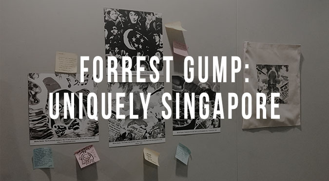
Here’s a documentation of the final stages of Forrest Gump, a more in-depth explanation of the execution of each of the four compositions, some challenges faced and the concept. Similarly as with the first project, there might be a little overlap of documentation that may/may not have been mentioned in my previous work-in-progress posts.

CONCEPT:  This project somehow took on a patriotism theme where all compositions were in Singapore context – the issues/happenings in the Singapore scene. As the first 2 compositions that I’ve came up with were swaying towards that direction.


EXECUTION: In terms of execution, it took me a few tries for some of the compositions to get to how they looked like for submission but there were some that came naturally too.

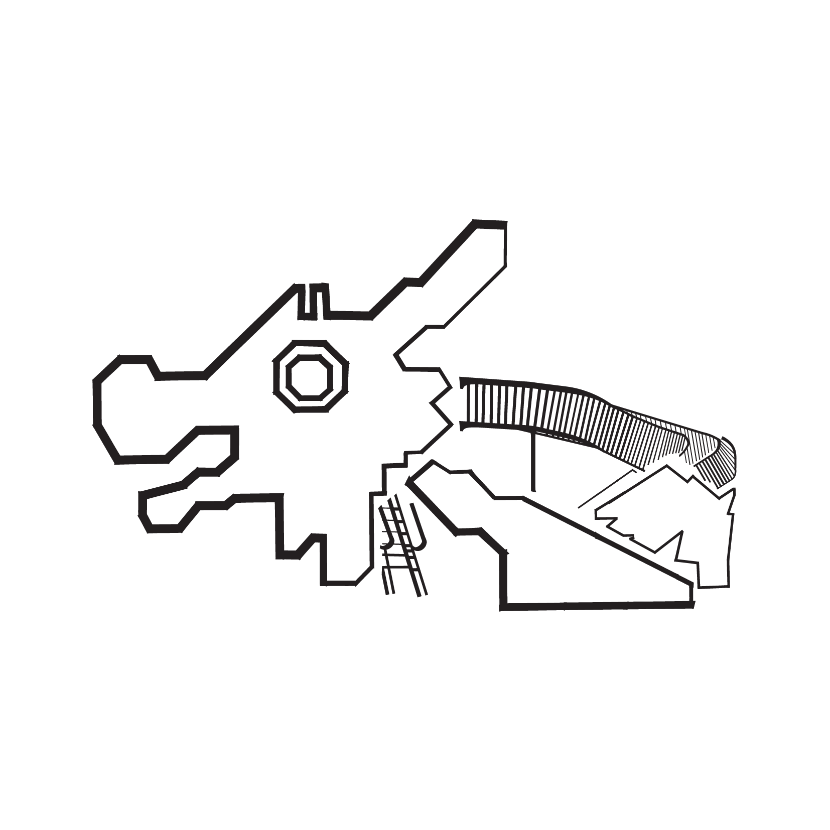
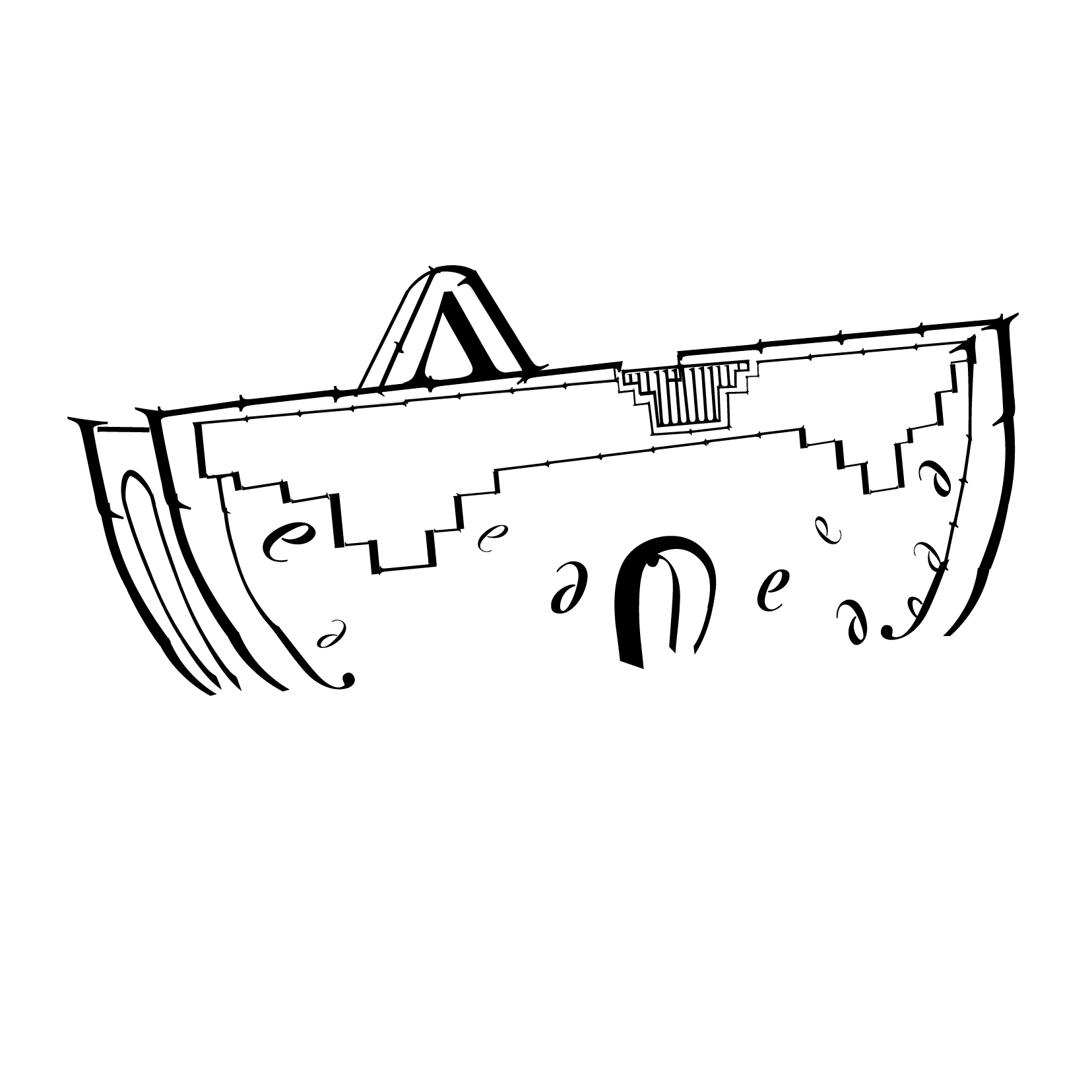
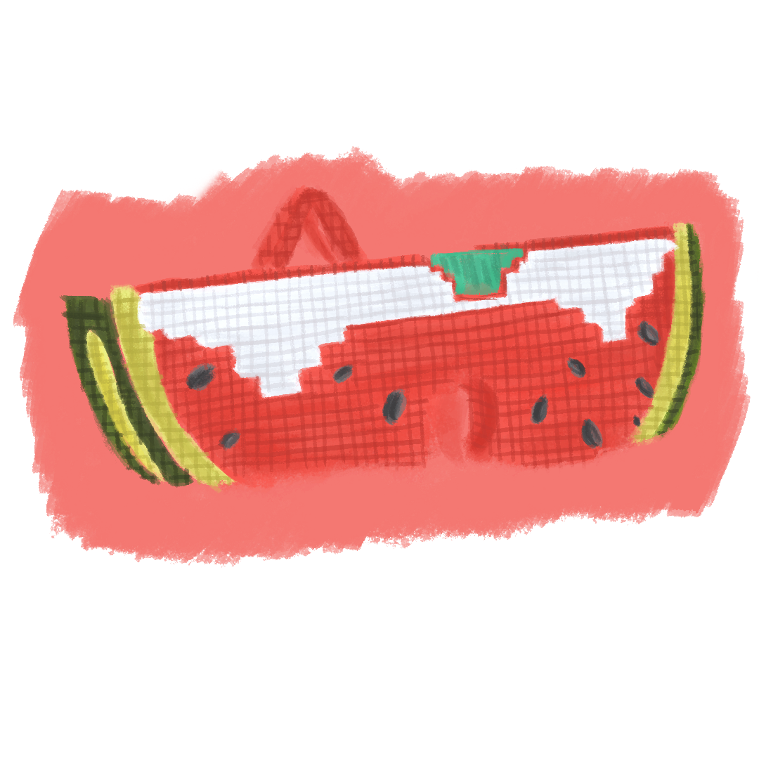
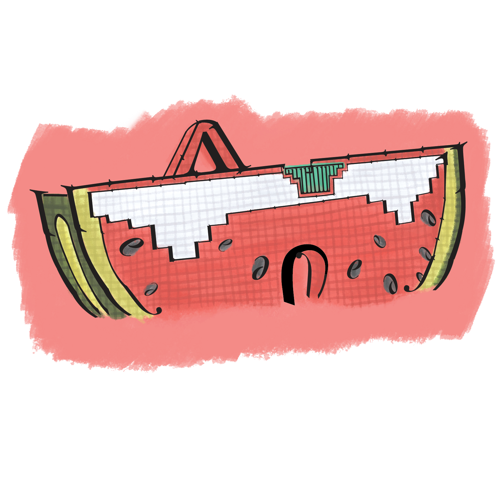
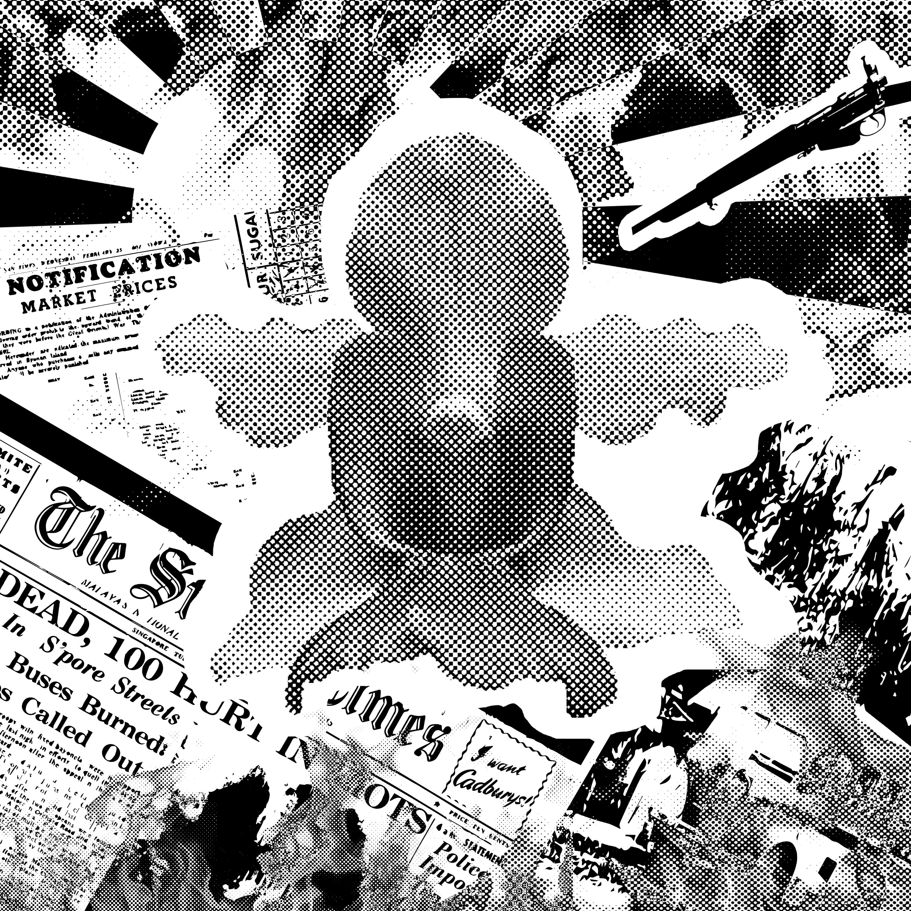
1. “The flower that blooms in adversity is the most rare and beautiful of all.” – Mulan (1998)

adversity-final

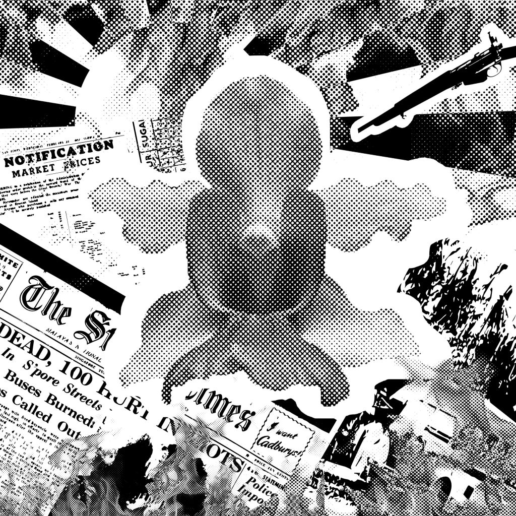
Based on Singapore’s history

The first composition which also turned out to be the chosen composition for printing onto the tote bag as I felt that it had significance. It felt like the core of all the 4 compositions which would be further explained in the CURATION part of this post at the back.

This quote is based on one of my all-time favourite Disney movies, Mulan and the idea came about after a clarification with Joy on the execution of the assignment and thereafter sharing with her several ideas that I’ve came up with for the chosen quotes. What I did  (as with all the other 3 compositions) was to mark out the keywords from the quote and then bring out its essence in the composition created. So I thought it should be literal but I was then told that the quote could totally take on a whole new interpretation – giving it a storyline etc. It need not be related to the movie.

I went back thinking about the quote, the word flower and adversity was still stuck in my head. Then suddenly the thought of Singapore going through the tumultuous times came to mind. Adversity: Represented through the tumultuous times of Singapore – The bus riots, Japanese occupation etc. I found some visuals from that period online. Flower: The national flower of Singapore, Vanda Miss Joaquim. It could represent Singapore in this case, and I intentionally placed it in the centre of the composition, it in bloom to bring out the phrase “blooms in adversity”  as well as to show the beauty of it having been through all these adversities.

What you see is the revised version of the composition after having gone through consultation with Joy where she suggested for all the elements to be pointing towards the national flower so that when viewed

If you compare the composition shown in the consultation post and this composition , you’d realise that the bus which reflects the Hock Lee Bus Riots was pointing in another direction whereas the bus here is following the approach of convergence.


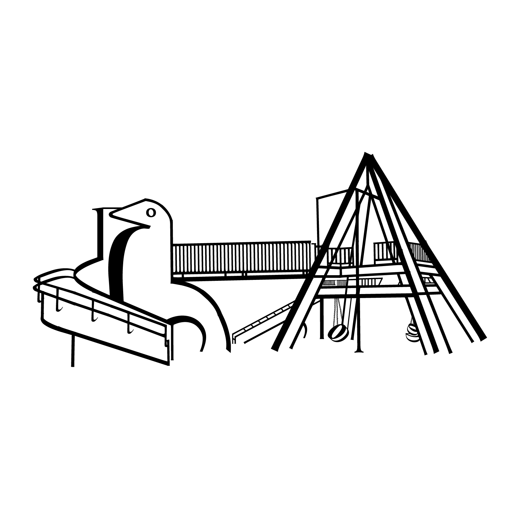
2. “I can taste so many flavours!” – Grave Of The Fireflies (1988)

flavours-final

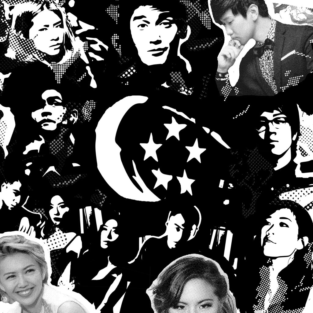
Based on the Singapore music scene

This was the second composition I came up with. It’s based on a quote from one of my favourite Studio Ghibli movies from 1988, Grave of The Fireflies. I couldn’t think of how I want to  create the composition at first but wanted to closely relate it to the word taste and bring out the word flavours as well (my identified keywords from the quote).

I searched for the definition of taste and found:

taste

v.tast·ed, tast·ing, tastes

v.tr.

1. To distinguish the flavor of by taking into the mouth.
2. To eat or drink a small quantity of.
3. To partake of, especially for the first time; experience: prisoners finally tasting freedom.
4. Archaic To appreciate or enjoy.
v.intr.
1. To distinguish flavors in the mouth.
2. To have a distinct flavor
3. To eat or drink a small amount.
4. To have experience or enjoyment; partake

It could also mean the taste of something you’ve experienced. It need not necessarily be related to tasting food. As I studied Mass Communication in polytechnic, we were exposed heavily to the media scene. Singapore especially. That’s when I slowly got to know of Singapore music and took a huge liking to it. So I figured why not base it on that? This composition is rather personal I guess.

Flavours:  In this context, it is the different music genres in the Singapore music scene and Taste: The different music genres I’ve listened to. My reason for choosing these few singers in particular when there are so many around is because over the years and in recent times, these singers have one way or another represented Singapore in countries like China, Korea and many more. They are pretty much the country’s pride and the more popular and prominent ones around to date. Also, they each represent a different music genre. e.g.

The Sam Willows: Folk-pop
Charlie Lim: Jazz/Blues
iNCH: Indie Rock
Gentle Bones: Pop, R&B
Nathan Hartono: Pop, Jazz
JJ Lin/Stefanie Sun: Mandopop

and more. After creating this composition, I realised I was swaying towards the theme of patriotism.


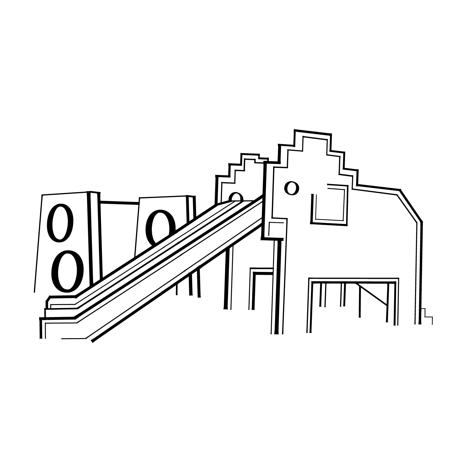
3.“You’re entirely bonkers. But I’ll tell you a secret, all the best people are.”  – Alice in Wonderland (2010)

bonkers-final

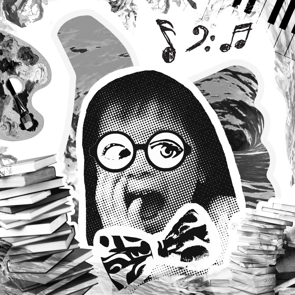
Based on kiasuism in Singapore

The third composition did not turn out like this. If you’ve been following my earlier post on the consultations I had with Joy, you would have realised that it was based off the movie itself (Alice in Wonderland) with the Mad Hatter as the main character not a kid.

The keywords in this quote were bonkers and best. Since I was going along with the concept of patriotism, I changed up the composition with the intention of showing the kiasu (a.k.a scared lose) culture that’s present in Singapore among parents and their young kids, still preserving some of the elements from the initial composition featuring the Mad Hatter.

The phrase “you’re entirely bonkers” is directed to the parents who send their kids to pick up many different skill sets when they young e.g. tuition, arts, music – as seen in the images used in the composition and then “all the best people are” is shown through the focus on the kid where they would definitely stand at advantage as compared to other families’ kids by being the smarter one when they grow older (note: the bow tie used as a symbol for smart).

As mentioned in the consultation post, by having a flat bitmap/image traced image I didn’t think it would bring out the word bonkers in the quote. Through the research done for the original composition,  I tweaked the current one to fit the patriotism concept and applied the various art styles of adding a nerdy looking spectacle frame over the kid’s face with blown up proportions of the facial features for emphasis.

I remembered that Joy had suggested that I could use recognisable Singapore logos like the Popular Bookstore logo etc. to give it the additional Singapore touch. I tried but it somehow did not match the aesthetics/look I was trying to achieve for the composition.


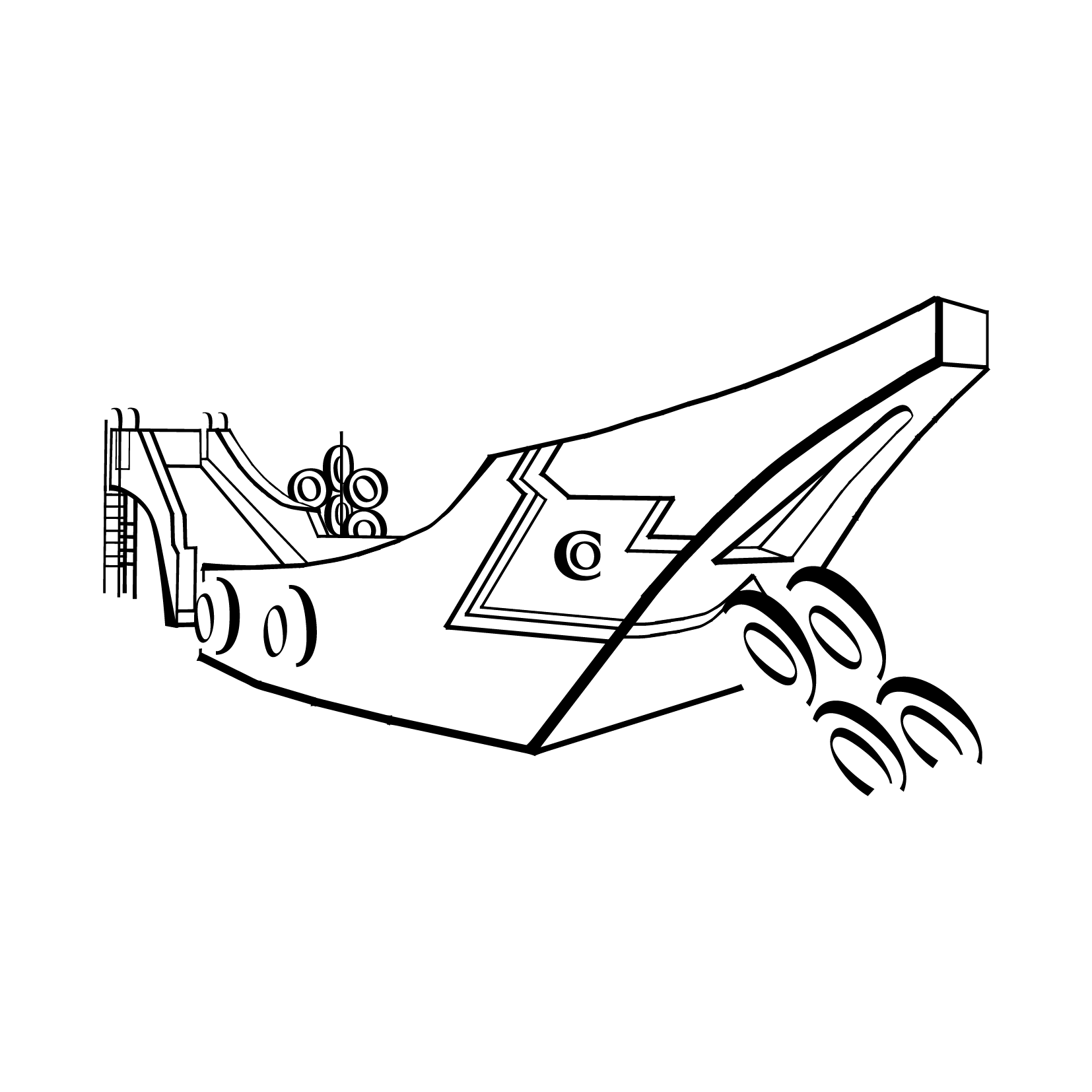
4.“Sometimes the right path is not the easiest one.” – Pocahontas (1995)

noteasy

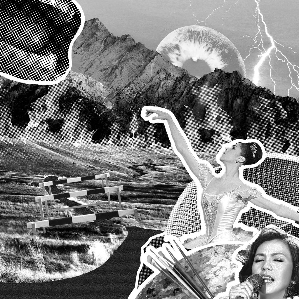
Based on a stigma in Singapore

A little backstory about this last composition… I didn’t intend on using this quote. I wanted to create another composition based on the second quote: “I can taste so many flavours” but with a more literal approach of having many various flavours in food and how it we taste it through our tastebuds: sweet, salty, sour, bitter, spicy and more.

And for a Singapore context, I wanted to use our local delicacies, each dish/food representing one taste but as i got down to doing it it was tough. As there were way too many local delicacies around and placing them in the composition would just create yet another collage-looking direct representation composition of the same quote. It will look very much similar to the music one.

Plus after exploring bitmap and image trace on the dishes and food, they still looked flat despite trying out the various techniques. It didn’t turn out that nice. So based on another quote, I came up with this composition that’s inspired by this stigma in Singapore quite last minute.

The keywords I identified this time round were right path and not the easiest. In Singapore context, right path: interpreted as following what you think is right in your heart, for example chasing/pursuing your passion. And for the passions that has got to do with the arts, it is more often than not not the easiest path to take. Some parents are still apprehensive of such passions and I portrayed it in the composition through the use of symbolism.

  • Path: I literally used a path, a winding one in particular and it seems like there’s no end point to show how arduous the journey might be. Placing further emphasis on the phrase “not the easiest path” in the quote.
  • Hurdles, mountains: Literal representations of obstacles
  • Flames: As fury from disapproving parents on pursuing the arts in Singapore plus a disapproving looking mouth at the top left corner of the composition
  • A collage of various arts in Singapore at the bottom right corner of the composition: Esplanade (representing theatre), famous local singer Kit Chan (for music), a ballerina (for dance), art palette (for fine arts) I purposely chose the images based on Singapore context.

CURATION

final-02

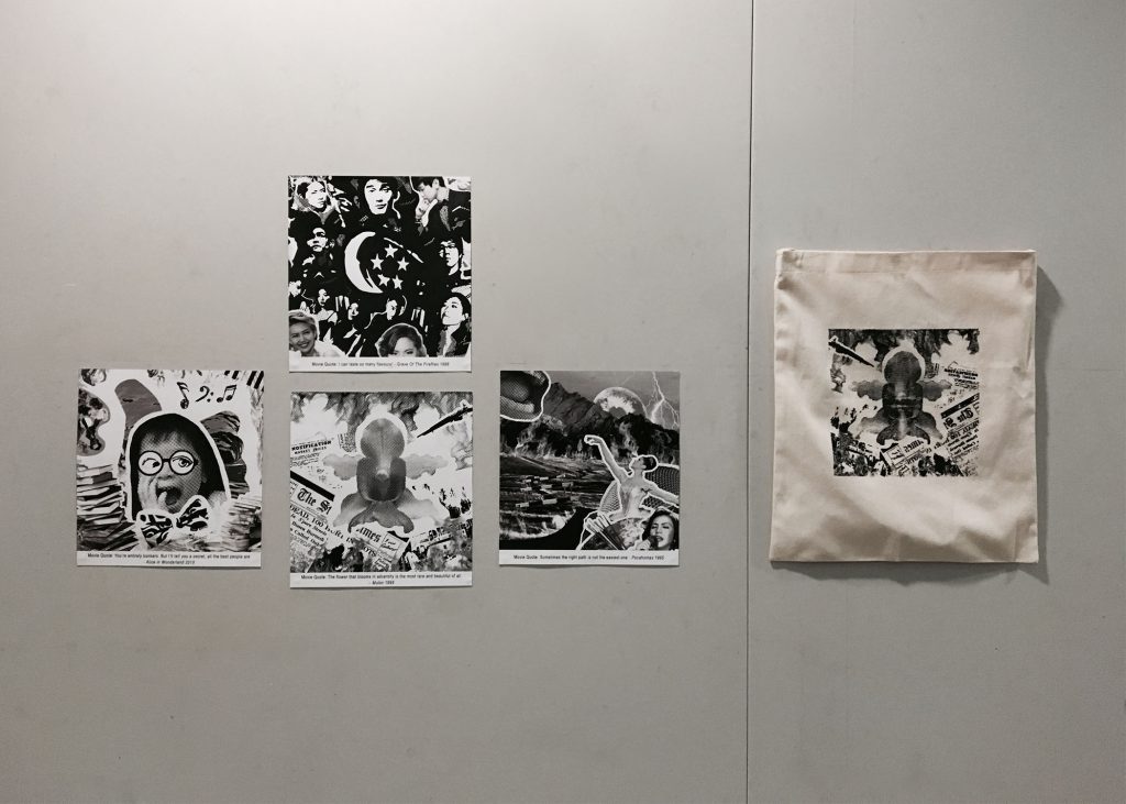
I had a eureka moment for curating my compositions for presentation day. As I was doing the compositions, the thought of arranging them to form another flower came to mind, bringing me back to the point of the first quote as being the core of all the compositions as mentioned at the start of the post.

The first composition is the bud of the flower (the core) and the other 3 branching out as the flower petals. All of these makes up Singapore, reflects the beauty of the country how it has blossomed over the years.


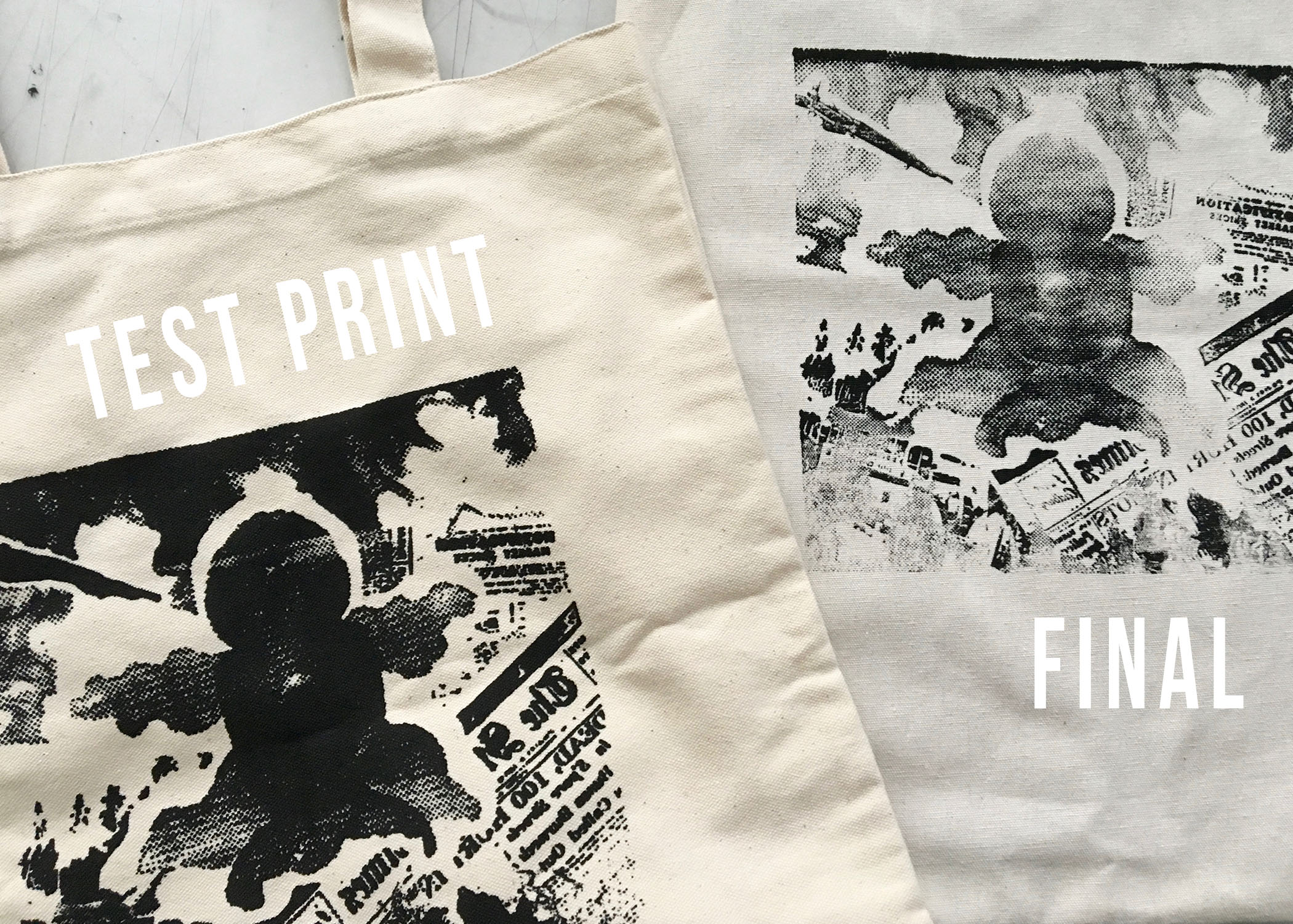
CHALLENGES FACED: As with all assignments, none of it would be exactly smooth sailing. Maybe slightly better but there’s bound to be hiccups along the way. For  this project, it kind of came at close to the end. I believe with most of us, it’s the silkscreen bit where we had to print our chosen design onto the tote bag for submission. Sure it may have turned out fine previously on newsprint paper during the trial week but on the tote bag it came out otherwise… (W-H-Y)

What Joy suggested for us to do before printing onto the tote bag was to test print the design onto a similar material so as to check its results. I only brought one recycled tote bag of similar material to try out but I might have used too much ink and force resulting in a heavily smudged print (bottom left). So I had no choice but to gauge and try out on the final tote bag the second time round.

Failed once again… the fine details of the composition did not come out fully and I was really apprehensive of trying out the third time as it was the last side I had of the tote bag and if I fail once again that meant I had to invest in a new one as it was required for submission on presentation day. Guess it was do or die… Surprisingly the fine details of the composition were printed on nicely this time round and I managed to get l my desired print  (bottom right) so yay and phew! 🙂

final

final-01

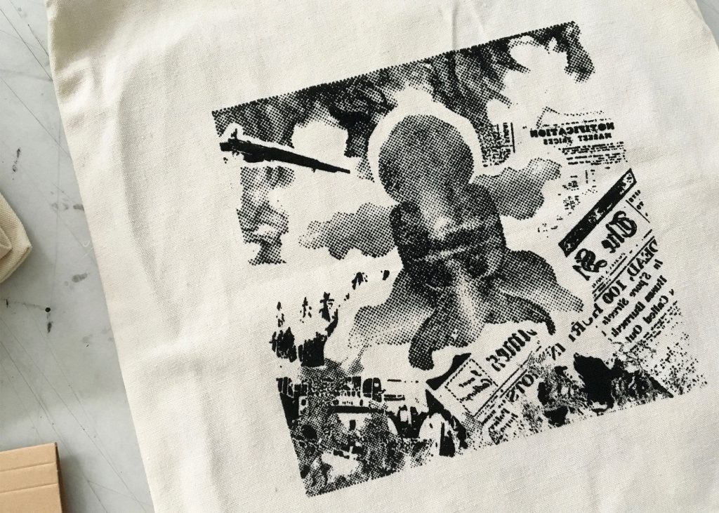
Silkscreen end product

Overall I really enjoyed this assignment from start to end. At the beginning of the assignment, I would’ve never expected that I would create 4 entirely different patriotic compositions from 4 very different movie quotes. I guess that’s the beauty of art, you’ll never know what you’ll end up creating.

Even though we all were given the same project brief, all of us came up with very different compositions which were all interesting in their own way.

Now onto the final project!! 🙂