After all my research, and deciding on the medium I wanted to use – Illustration (to be honest I was really keen in embroidery but it is too time consuming). I started asking my friends to describe me in 1 word. 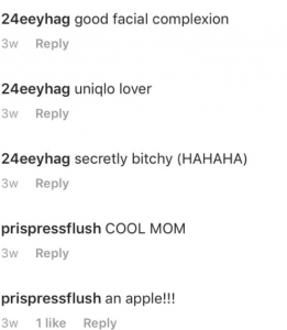


I started expanding my idea on what my friend describe me as and wrote it out on my sketchbook. I was quite keen on the idea as a uniqlo lover as described by one of my friend, since i own mostly uniqlo clothes.
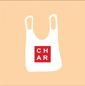
I started illustrating myself as a plastic bag, but I found it difficult to proceed on as there was not much linkage between me and a plastic bag, except for the fact that I LOVE uniqlo…
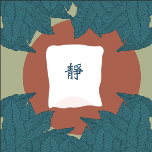
I went on to be a Chinese sky lantern in nature after much thoughts and planning.
Chinese Sky Lantern: Sky lantern are used by many countries in the Southeast Asia region, and they are commonly sent up in air after people have written their wishes on the exterior of it. Since I cal myself a dreamer, and one who always have many wishes, I felt that the lantern would best represent me, and since it is a Chinese lantern, it best explains my love for the Chinese culture.
静: “Jing” is the Chinese word I wrote on the exterior of the lantern. The word means silent/quiet in Chinese, which is not what many associate me with. However, internally, I see myself as quite an introvert, more than an extrovert. Hence I have the word plastered on the exterior of the lantern.
Nature: I love the nature, it is a place where I find my peace. I feel most comfortable being in nature! Which I felt that it would be best to use it to compare me being in a foreign environment.
I had all 3 panels of ideas drawn out in my sketchbook. However, I could not come up with a consistent theme for the remaining 3 equations which was what I planned to do. Hence, I scrapped off the idea and decided to explore even further.
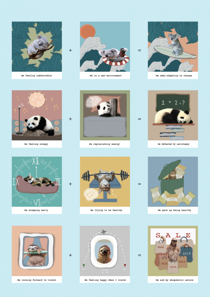
Eventually, I settled on the theme of animals, but not just any other animals but top 20 laziest animals who sleeps the most. 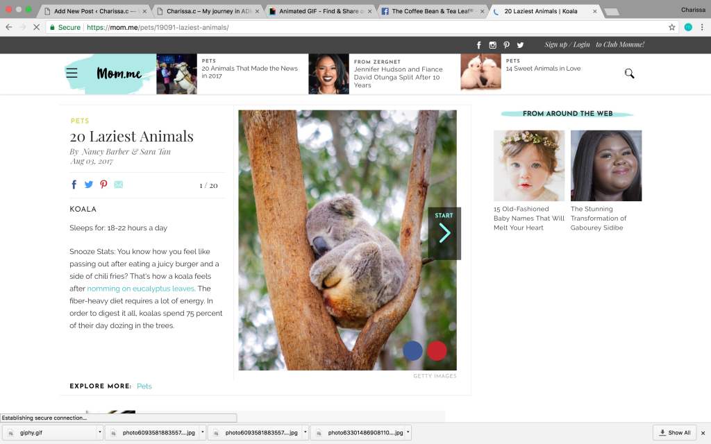
No, I am not implying that I am lazy!!! I just resonate with the fact that I sleep as much as them!!!! I always get caught sleeping/dozing off in class (something I am still trying to improve on!!)

I decided to use the top 5 animals who sleeps the most – Koala, Panda, Cat, Sloth!
I switched up my medium, and used mixed medium – photography + digital illustration.
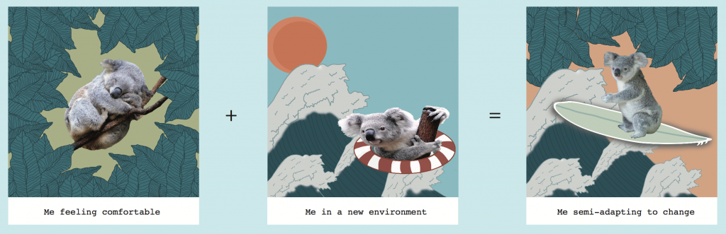

For the first panel of my equation, I decided to use a Koala as they sleep the most! I explored into colour and space, and tried using complimentary colours but it seems a little weird so I removed the orange/reddish circle at the back. I decided to stick to one colour, but played with the tone of it. Using dark green and light green as the key colour.
The difficulty I had was to decide the colour used, as I had to make sure that it suits the Koala, and also finding the correct image.
For my second panel, I drew my wave with reference to the famous Kanagawa wave by Hokusai. 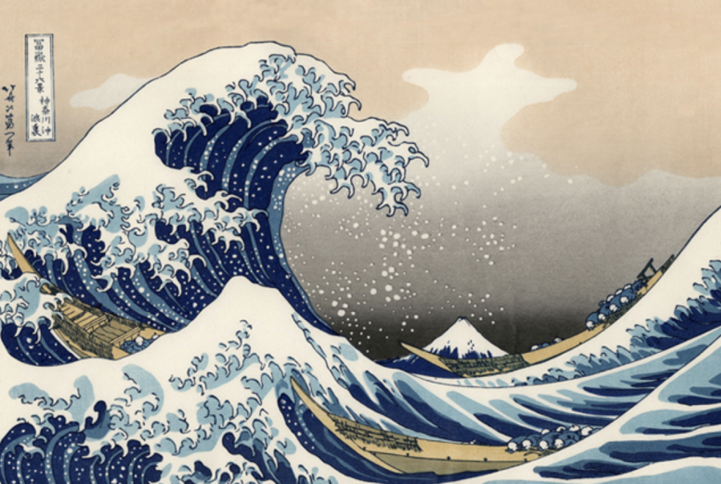 cr: http://mentalfloss.com/article/66591/15-things-you-might-not-know-about-great-wave-kanagawa
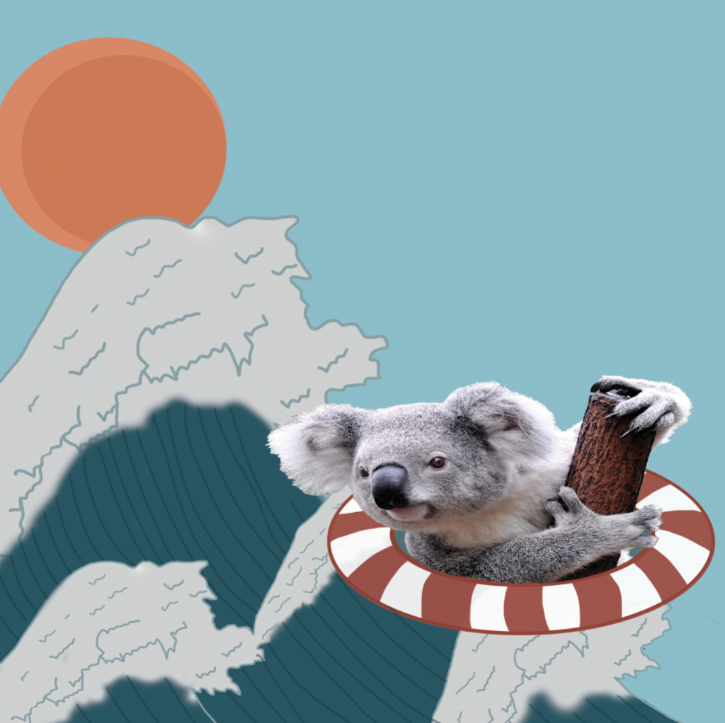
Wave: Although to many, the sea is where they find peace or calmness, I am actually terrified of going near it. I am afraid of the sea due to the fact of the unknown beneath my feet when I enter the water. Hence it also represents me being thrown into a foreign place, a new environment. I personally do not fancy a change in environment, as I am afraid of the unknown. Hence I drew myself on a lifebuoy, trying to survive this change.
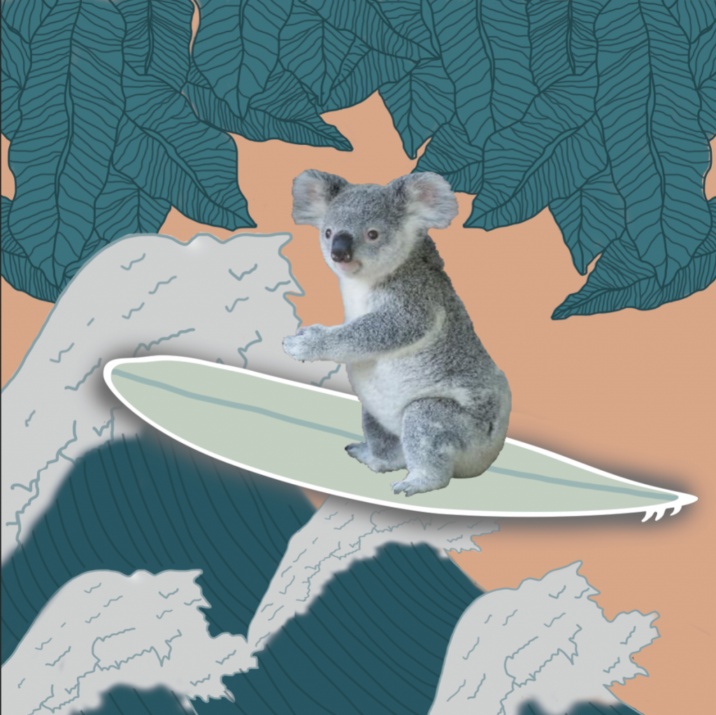
The last panel shows me trying to surf, as a symbol of me semi-adapting into the environment, while maintaining the comfort level I am feeling.
For my second equation, I chose the sleepy panda to represent me.
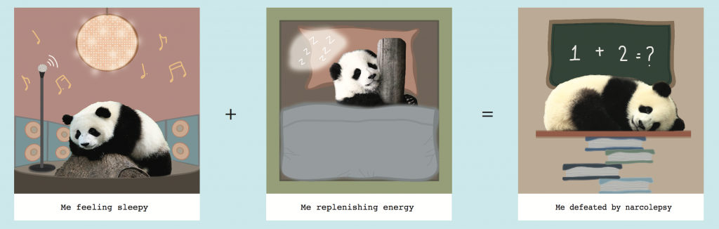
Initially I included a vinyl disc, and speaker to with a disco ball to represent a noisy place, and how I feel sleepy in the midst of such environment.
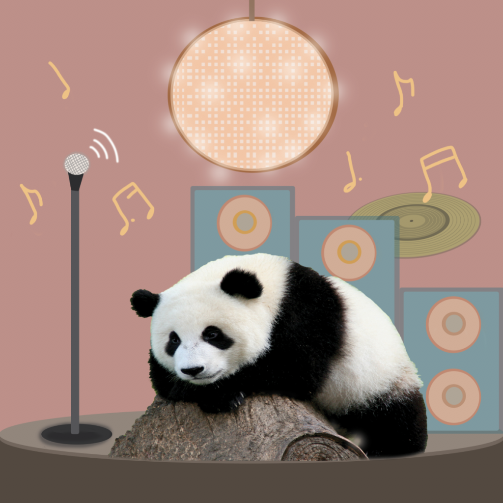
I attempted spilt complimentary colour scheme for this illustration, but the vinyl disc appears to be out of place as it is floating. Hence I removed it and settled on using speakers.
The hardest part of this illustration was to adjust the perspective of the speaker and also making the disco ball, look like a disco ball.
For the second and third panel, it shows how after I replenish my sleep I still fall asleep in class. This is because of a genetic sleeping disorder – narcolepsy, that I suffer from. I am unable to control when I fall asleep, especially during daytime.
Third equation, I chose the cat!
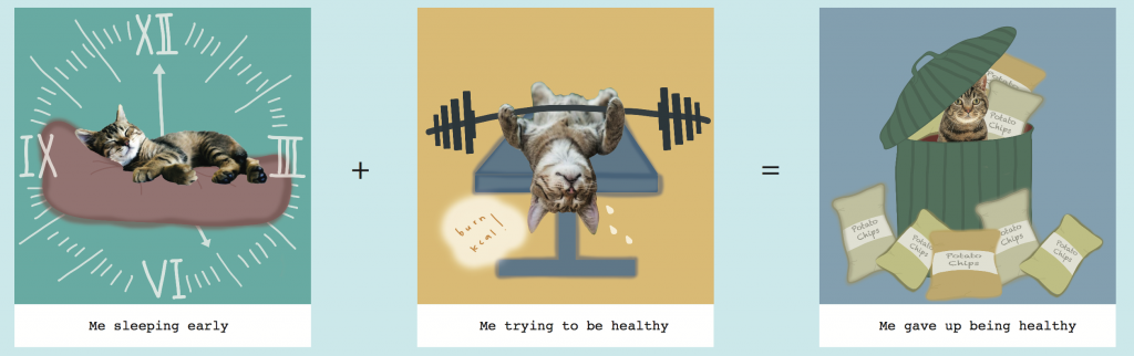

For the first panel, I tried using the text font on photoshop to draw my clock, however, I felt that it was too non-illustrated. 
I wanted it to look more organic, hence I wrote in the numbers on my own. In addition, I did not want to clock to look too circular as I want the design to be consistent. Due to the fact that my illustration style is more curved and rounded, which does not make it look vectorised, I wanted that style to be consistent throughout.
I referenced how a pillow looked like to draw the bed my cat is lying on. The lines on the bed where the cat lies on, provides more realism to it, making it seemed like there is pressure on the bed.
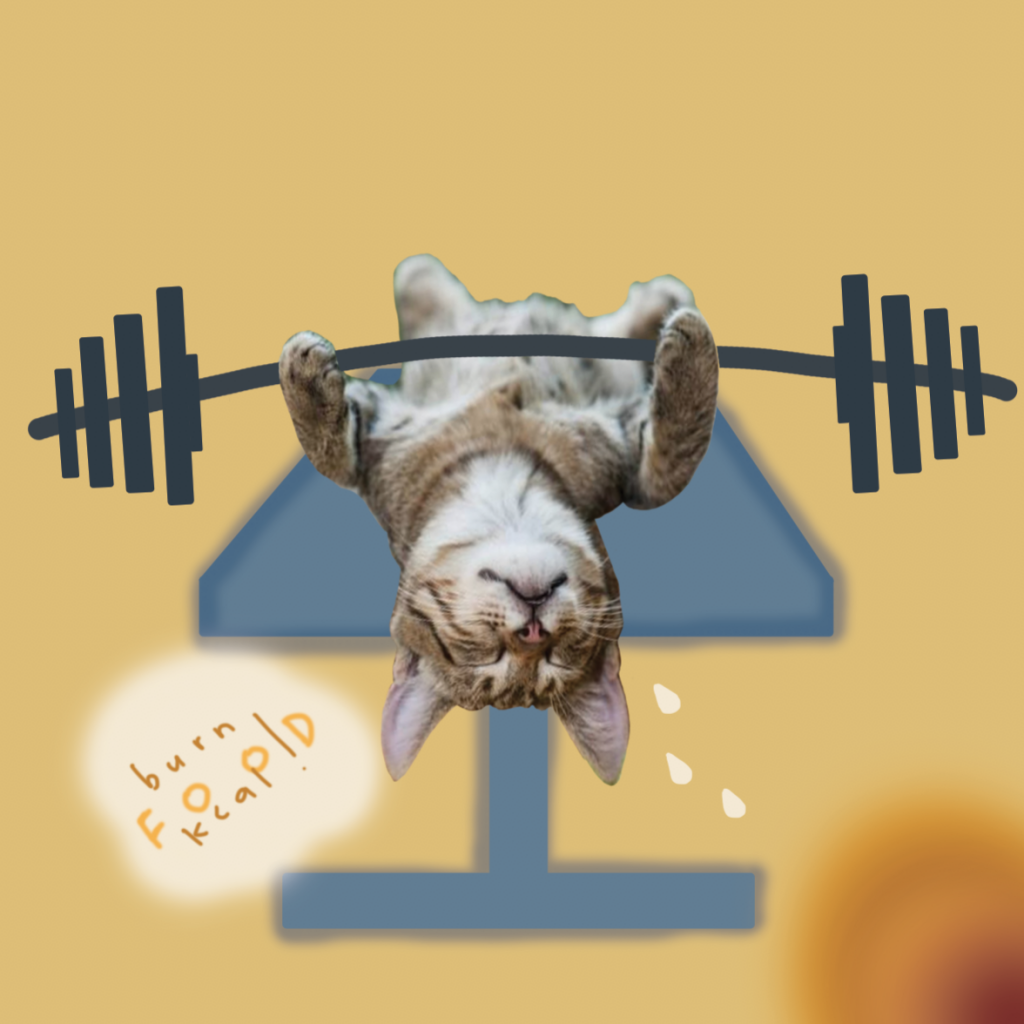 For my second panel, I tried drawing fire with a brush, but not only does it look weird, it did not really make sense. Hence I eliminated the idea, and kept it simple.
 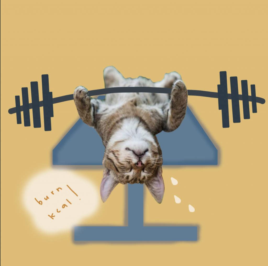 I did not know what the gym chair was called so my search history was like “gym chair”, “weights chair”, “gym chair lying down” AND I COULD NOT FIND THE CHAIR I WANTED……

I FINALLY FOUND THE IMAGE I WAS LOOKING FOR!!!
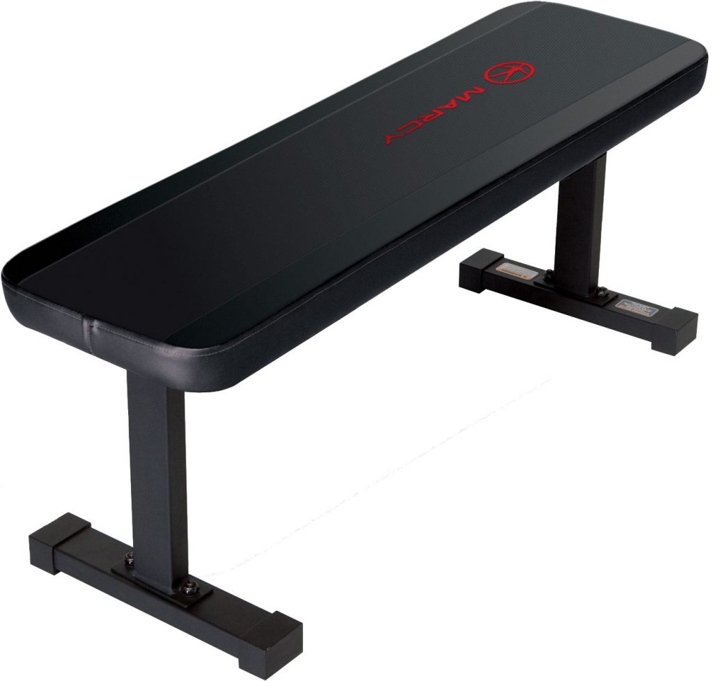 cr: https://www.dickssportinggoods.com/products/weight-benches.jsp
For the last panel, I got the idea from Oscar & Cookie Monster from Sesame Street!!
 cr: https://www.pinterest.co.uk/pin/223280094000952810/
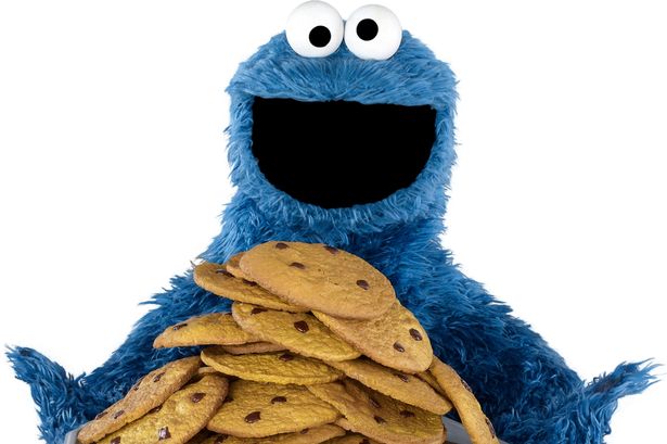 cr: https://jhwink.deviantart.com/art/Cookie-Monster-630269212
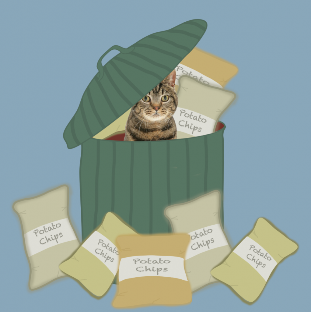
I felt that covering my cat with food and being in a bin will show the idea of greediness and how trashy junk food is! However, my trash bin is a watermelon, which juxtapose the idea of it being trashy. I wanted it to show how I try to be healthy, but consuming all the trash.
To draw the packet of chips, I went to search how the creases on a real packet look like, to give it some realism in the illustration.
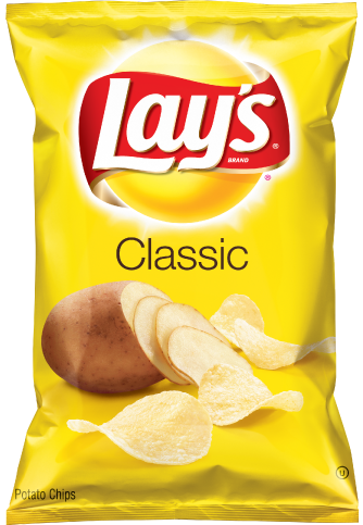 cr: https://www.fritolay.com/snacks/product-page/lays
Moving on to the last equation
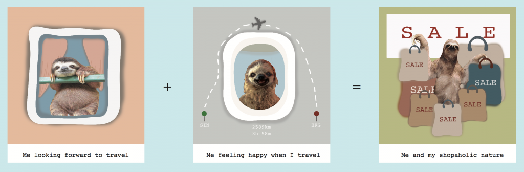
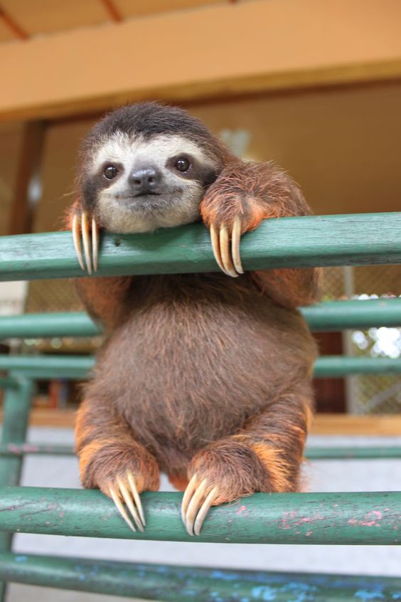
I chose a sloth!!! Sloth has so many emotions which makes them very adorable, but the downside is, it was very difficult to find images of sloth!!
Hence, for my last equation, I tried to manipulate my sloth to fit the equation.
The first panel I had to erase and crop out to make the pole look like a window grill.
The second panel, I referenced how an aeroplane window look like 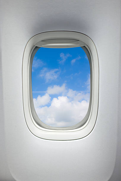
However, what i forgot was this is the inside of the aeroplane. Lucky Hannah pointed it out!!! So i changed it and swap it around. 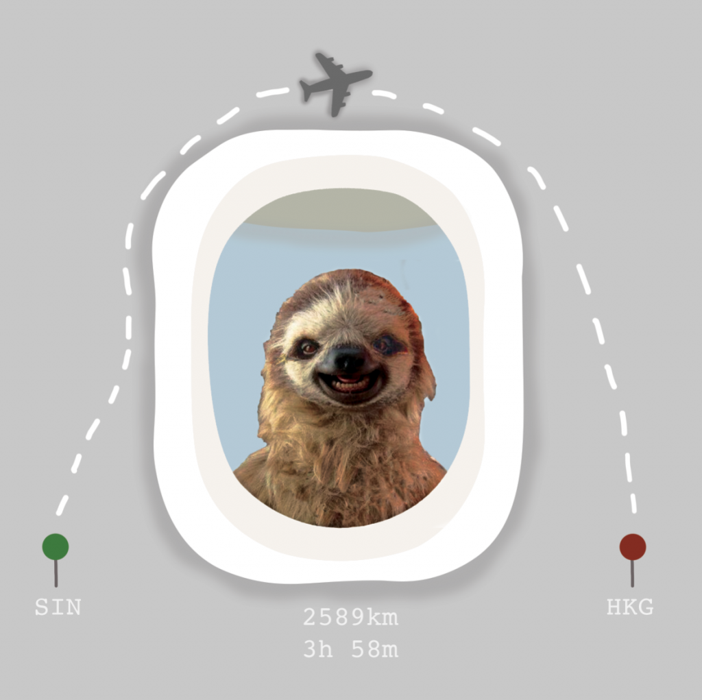
I added in a plane vector because I could not draw a plane, but I guess it fits in nicely!!!
The last panel was just me covered in shopping bag, and I got the idea from the movie “Confession of a Shopaholic”

cr: https://www.rogerebert.com/reviews/confessions-of-a-shopaholic-2009
The multiple plastic bags to signify excessive shopping!!
For all my panels, I got my inspiration from digital illustration & photograph manipulation that I came across on pinterest.
 cr: https://www.pinterest.com/pin/417357090459660936/
 cr: https://www.pinterest.com/pin/266416134186797686/
 cr: https://www.pinterest.com/pin/488218415847081972/
 cr:
cr: 
 cr:
cr:  cr:
cr: 
 cr:
cr: 
 cr:
cr: 
 cr:
cr: 
 cr:
cr: 
 cr:
cr: 
 cr:
cr: 
 cr:
cr:  cr:
cr: