
After my first research around Telok Ayer, I felt that I was still lacking information, hence I went back down a second time to get more pictures for my zine, and did more research on my own. I studied the map of Telok Ayer, and decided to expand my area to Chinatown, since Telok Ayer is a subset of it.

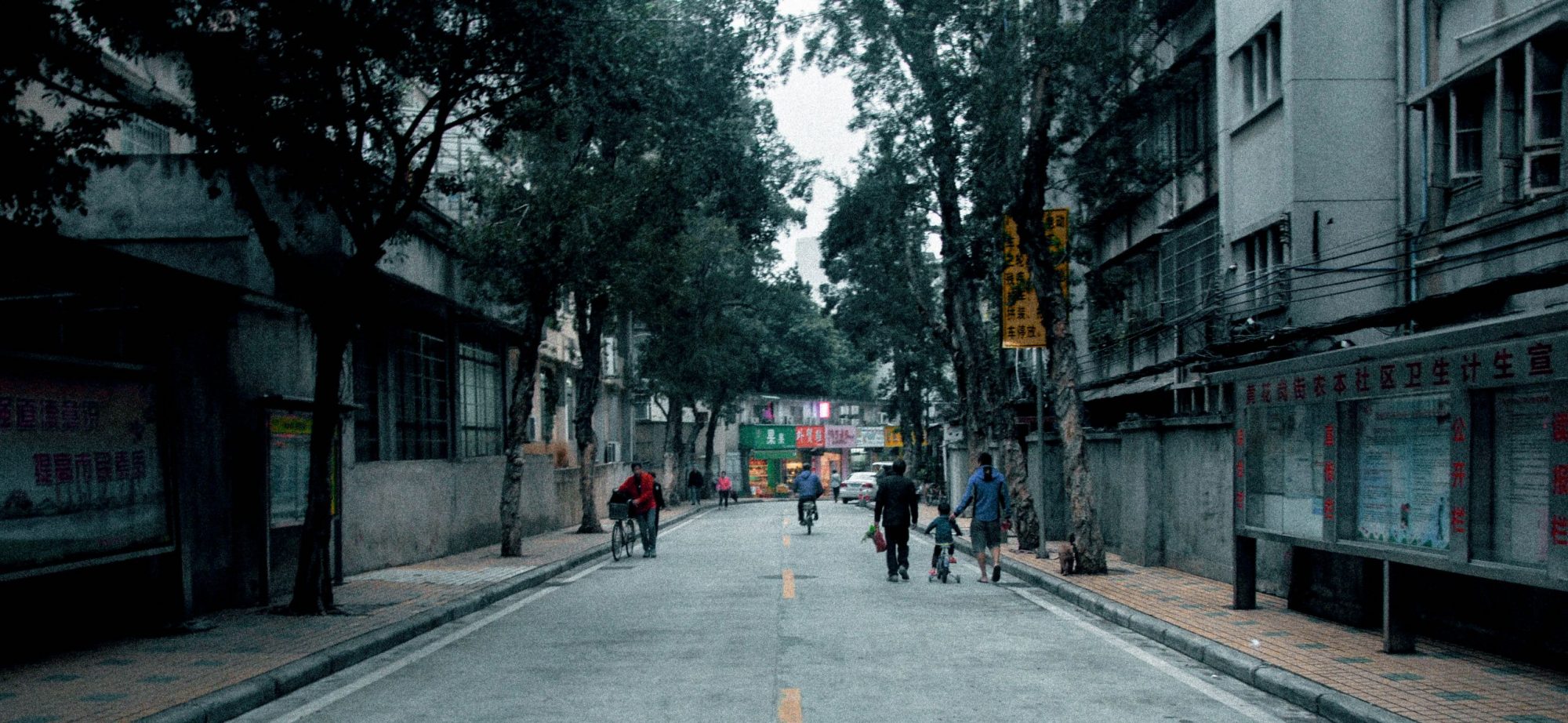
Hence, the second time I went, I decided to explore further up into the OG People’s park area, which I did not cover the other time. In addition, I went online to do a little more research and I found out about this 3 places in Chinatown – Jalan Kukoh, Jalan Minyak, and York Hill. These 3 places are nested in the same area, however, it is commonly overlooked due to its location. It is in between Chinatown and Outram, but no where near both. However, based on the map, these 3 places are counted as Chinatown. Hence, I decided to cover the area too.
 When I went there, I came to realized that the area was heavily populated with elderly and the flats are mostly rental flats, or one-room flats. The picture above was an elderly man that I met while I was there. He is deaf and mute, but he had this positive energy shining through him. He kept smiling, and even though we could not communicate verbally, we managed to do so through body language. Aside from this elderly uncle, I met his neighbours, which reminds me of the kampong spirit that I read very often from my textbook.

With the initial idea of using colours, I scrapped it off after a consultation session with Mimi, as she mentioned that it should be more personal rather than editorial. Hence, I decided to go with create social awareness as my overarching theme, since it is something that resonates well with me.
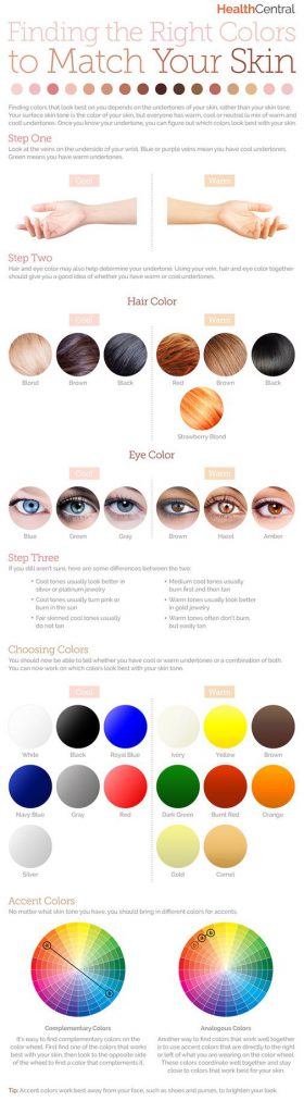
Initial research on colour:


Before editing all the pictures, and deciding on the layout, I started off by grouping them into the various colours that I see around Chinatown. As mentioned, it appeared too editorial, hence I decided scrap it off.
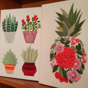 cr:
cr: 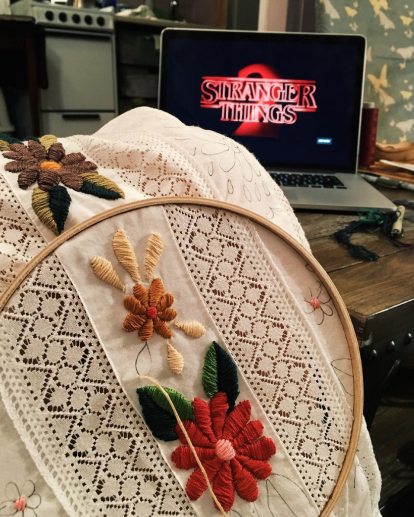
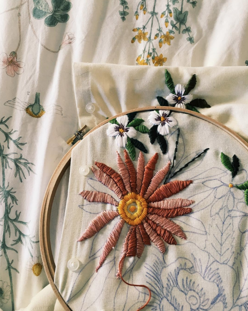 cr:
cr: 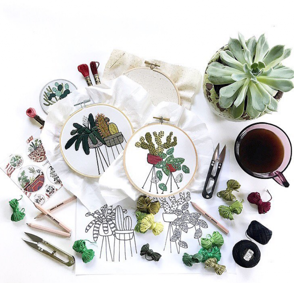 cr:
cr: 
 cr:
cr: 
 cr:
cr: 
 cr:
cr: 
 cr:
cr: 
 cr:
cr: 
 cr:
cr: 
 cr:
cr: 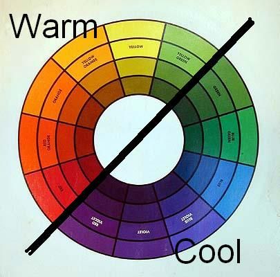 cr:
cr: