“Cassette Memories” // [DN1004] Foundation 4D Untitled #2

“People talk about having an inner child. I don’t. I have an inner old lady who says inappropriate things, tells everyone to be quiet, and wants to go to bed at 8 pm.” — Unknown aka. A Fridge Magnet


View on Vimeo @ https://vimeo.com/360067067


I always felt as though I was born in the wrong generation. The wrong time. Being brought up by my grandparents in the laid-back and more rural parts of Singapore, I spent more than half of my lifetime listening to songs on the jukebox or playing old cassette tapes my aunts recorded when they were younger.

Songs Used:
    • 譚詠麟 (Alan Tam) – 水中花 (Flower in Water) // First Released 1988
    • 周華健 (Wakin Chau) – 朋友 (Friends) // First Released in 1997

These two tracks were digitally arranged into a cassette like audio format and not through a real cassette, creating an illusion of a faded memory I have of cassette tapes. The audio ends quite abruptly with a series of exaggerated tape windings and fervent clicks of the buttons.

Sound

Tapes in the past were often recorded with a lot of background noise and the actual audio being rather muffled (the signifier). So for the first song, I used Audacity to work a high-pass filter on the track while overlaying it with a clip of static and background noise. Afterwards, I reduced the entire track by 12 dB, and was mostly able to bring out the intended effect of a playing cassette tape.

The second song is of a higher quality than the first, and other than lowering it by -16 dB, I didn’t want tamper much with it (the signifier). Being first recorded in 1997, the song had a slight hint of background noise, especially at the start where it opened with an overlaid recording of people talking.

Together with the opening sequence of the track, the snippet of the first song mimics the past (the signified), where cassette tapes were the only portable option of cheap and good audio. The second song on the other hand, mimics and signifies the present (the signified), where no matter how much we try to live in the past, we can only listen to old recordings of songs on our digital devices.

The abrupt ending then signifies the present as transiting into the future where there is no telling what would happen and if the past will ever be remembered or cared about.

Image

While looking through various photo albums of younger me, I came across a lot of photos in which I looked quite forlorn. The image used is a photo of 3 year old me on a bench outside McDonald’s smiling like an eccedentesiast (someone who tends to be reluctant when displaying genuine emotion). I don’t think it was with that intention that I smiled when the picture was took, but the mood of the image as seen, was what I imagined when I listened to the created track.

McDonalds was quite a luxury for schooling me and back then, I could choose between the sweet sweet 60 cent vanilla cone or a small bowl of fishball noodles. (well of course when the choice came, I chose the ice cream cone) Furthermore, the closest McDonalds from my grandparent’s house was 8 bus stops with lots of walking, or 30 mins away. The only way I could ever have a taste of other children’s childhood was if my aged grandma brought me out. McDonalds was a bittersweet luxury close to my heart.


“You are an old soul with a young heart; naive enough to love, wise enough to learn.” — Unknown


Thank you 🙂

[DN1003] Project #1 – Rectilinear Volumes (Research & Process)

Good design is intelligence made visible.” — Le Corbusier

Elements of Design

    • Dot / Point
    • Line (1D)
    • Shape (2D)
    • Form / Volume (3D)
      • As long as it has form, breadth & volume, it can be
        • Negative / Subtracted Spaces
        • Enclosed / Open
        • Implied / Imagined / Incomplete


Inherent Proportion → proportions within a form (length – width – breadth ratio)

Comparative Proportion → proportions of one form in relation to another (tall & thin vs short & stout)

Overall Proportion → refers to the character / overall configuration of a group of forms


Rectilinear Volumes’ Rule of Thumb

Contrast (all 3 need to be showcased in a structure)

    • Dominant: the main and the biggest piece
    • Sub-Dominant: the lead / supporting piece
    • Subordinate: the complementing piece

Main Forms (all 3 need to be showcased in a structure)

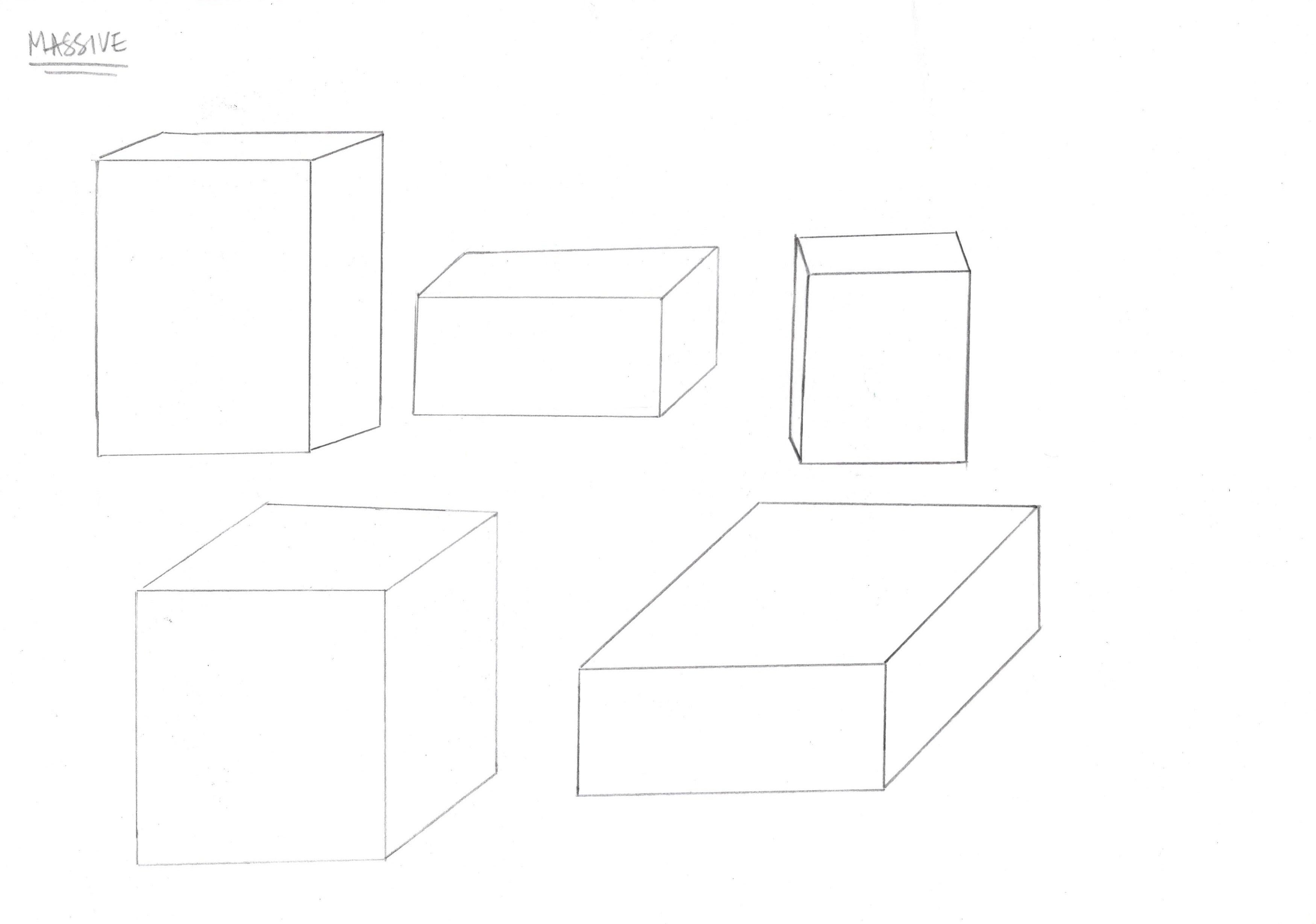
    • Massive / Heavy (cuboid structure // never a cube due to the lack of a dominant axis)
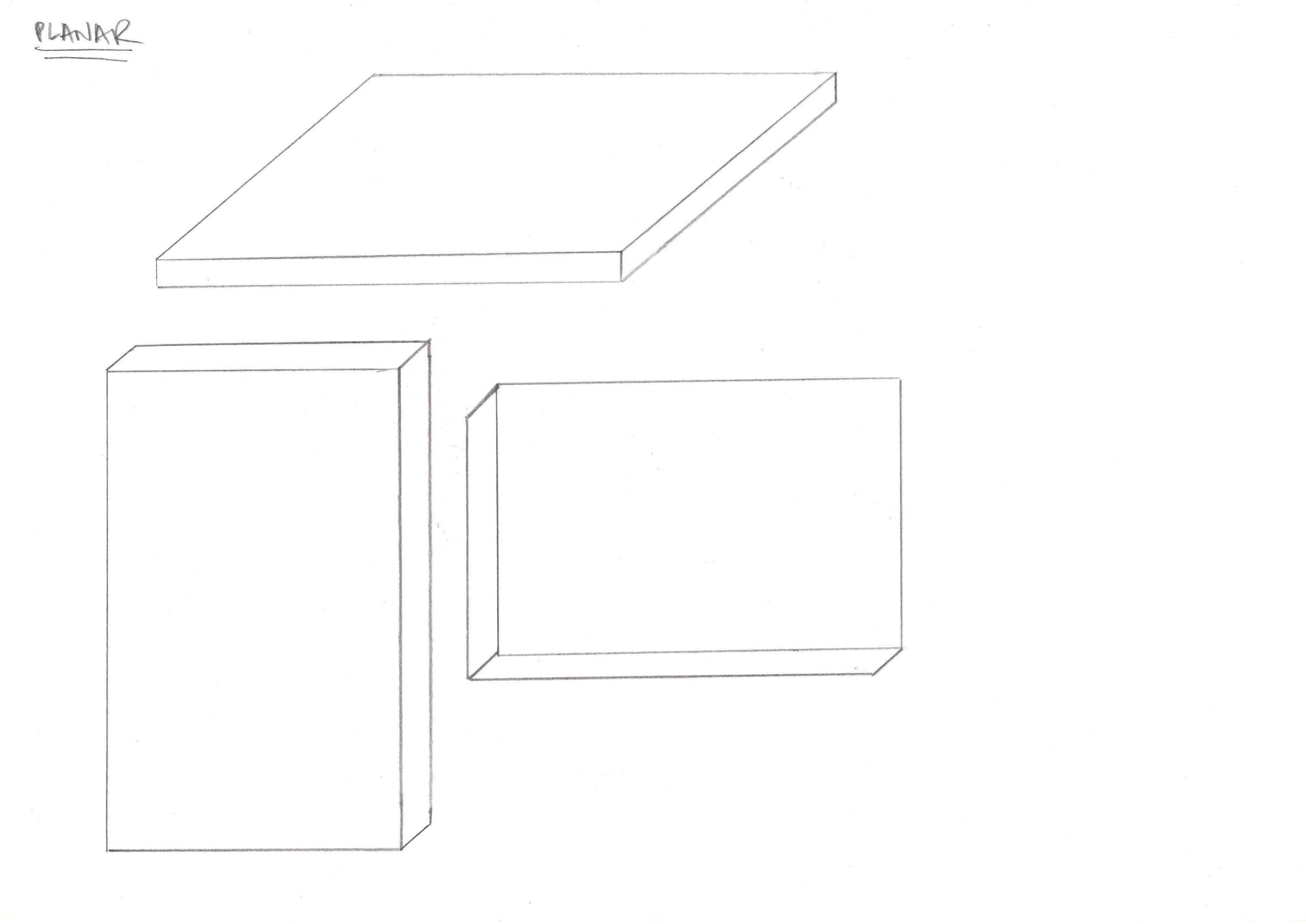
    • Planar (flat/thin plane)
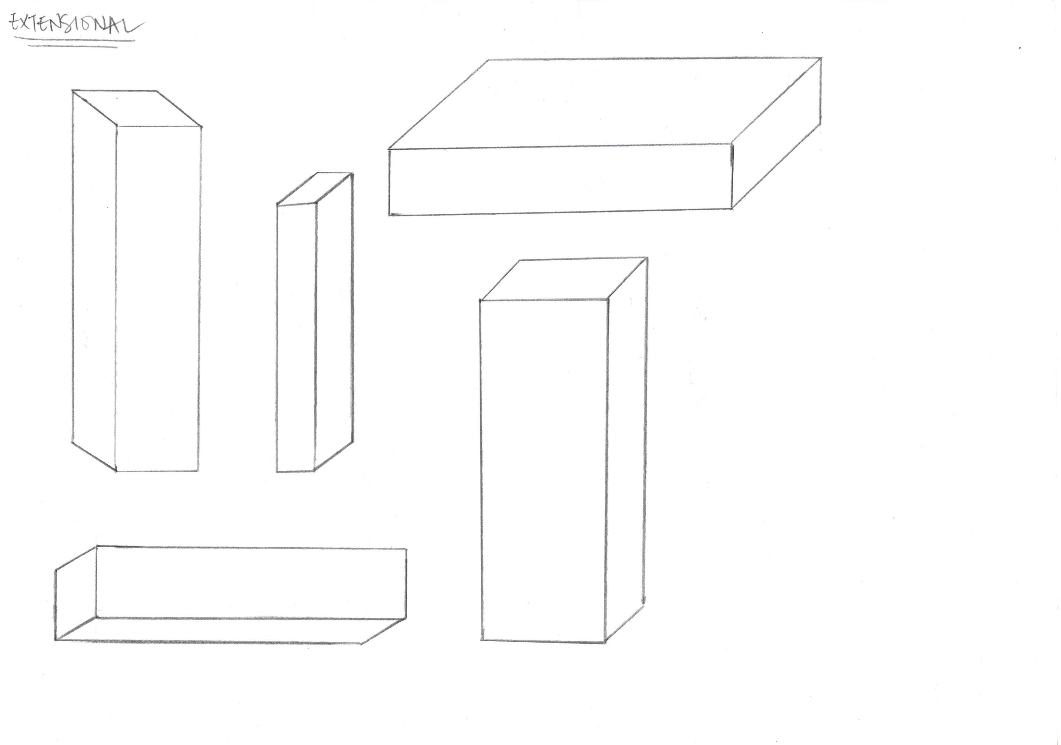
    • Extensional (long extended piece)

Axis

    • An imaginary line through the centre of the longest dimension of the form
    • It indicates the strongest movement in the form, giving the form its position in space
    • Take Note:
      1. axes of the volume static must be perpendicular to each other
      2. all axes must be in different directions (x, y & z axis as on an isometric paper)
      3. a design must be conceived from all positions and perspectives
      4. consider the inherent comparative and overall proportions (play with contrast and complements)

Joint Types

    1. Wedging → creating an indent in one piece to jam one into the other.
    2. Cradling → two pieces that support another on the top
    3. Piercing → all the way through (can be “faked” by using UHU Por glue or toothpicks)

** butt joints are not permitted because they result in the loss of rectilinear properties and a new un-rectilinear volume created)


“I think it’s really important to design things with a kind of personality.” — Marc Newson
EXERCISE 1

Sketch as many variations of rectilinear volumes that fall into
each of the following categories.

EXERCISE 2

Make 20 rectilinear volumes in blue foam in a wide variety of proportions,
shapes and sizes.
The edges should be clean.
90 degrees and all planes of the volumes should be perpendicular to one
another.

EXERCISE 3

Design & sketch 3 three-dimensional rectilinear compositions in your
sketchbook or paper.
*Indicate the axes in all the volumes.

Rules of the compositions:

    • Only 3 rectilinear volumes are allowed.
    • All the axes of the volumes must be perpendicular to each other.
    • All axes must be different in directions.
    • Display Dominant, sub-dominant and subordinate relationships.
    • Consider the inherent, comparative and overall proportions.
    • Play of contrast & complimentary, Interesting, dynamic, tensional
      qualities
    • Visual balance
    • Look interesting from all sides

Keeping in mind that each rectilinear volume had to have a recognisable dominant, sub-dominant and subordinate piece, I tried my best to ensure a proportional visual balance in the composition.

It was not mandatory to include all three, massive, planar and extensional pieces in the composition, but I did my best to work them in to make the volume more dimensionally interesting.

There were a few crop ups in the previous drafts as some compositions’ volumes were comparatively disproportionate to each other, but after scaling and some rearrangements, they became more theoretically proportionate.


Addressing my Rectilinear Volumes
1. Positive & Negative Feedback
2. Possible Solutions to Problems (if present)

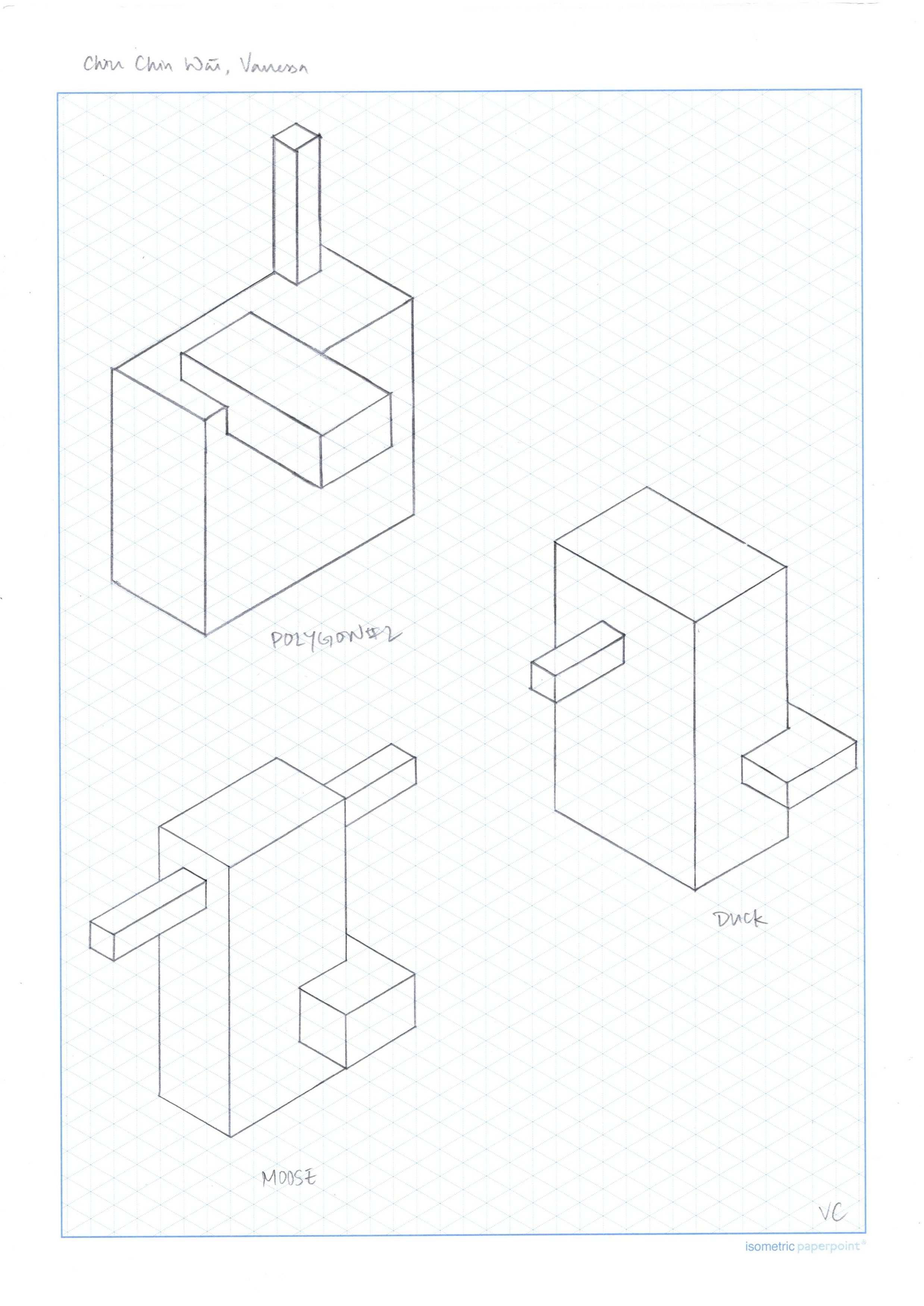
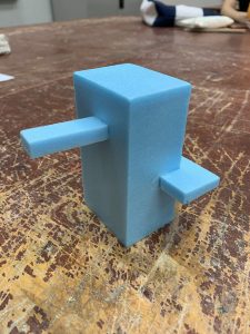
“Duck”
During the group feedback session, Osh pulled out “Duck” with a few other rectilinear volumes and asked us what was characteristic of the group formed. The volumes identified were symmetrical in nature and not desirable for this rectilinear volume project. Furthermore, with the sub-dominant/extensional piece so protruding from the heavy piece like a butt joint, it was a piece that flouted many guidelines of creation.

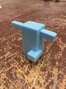
“Moose”
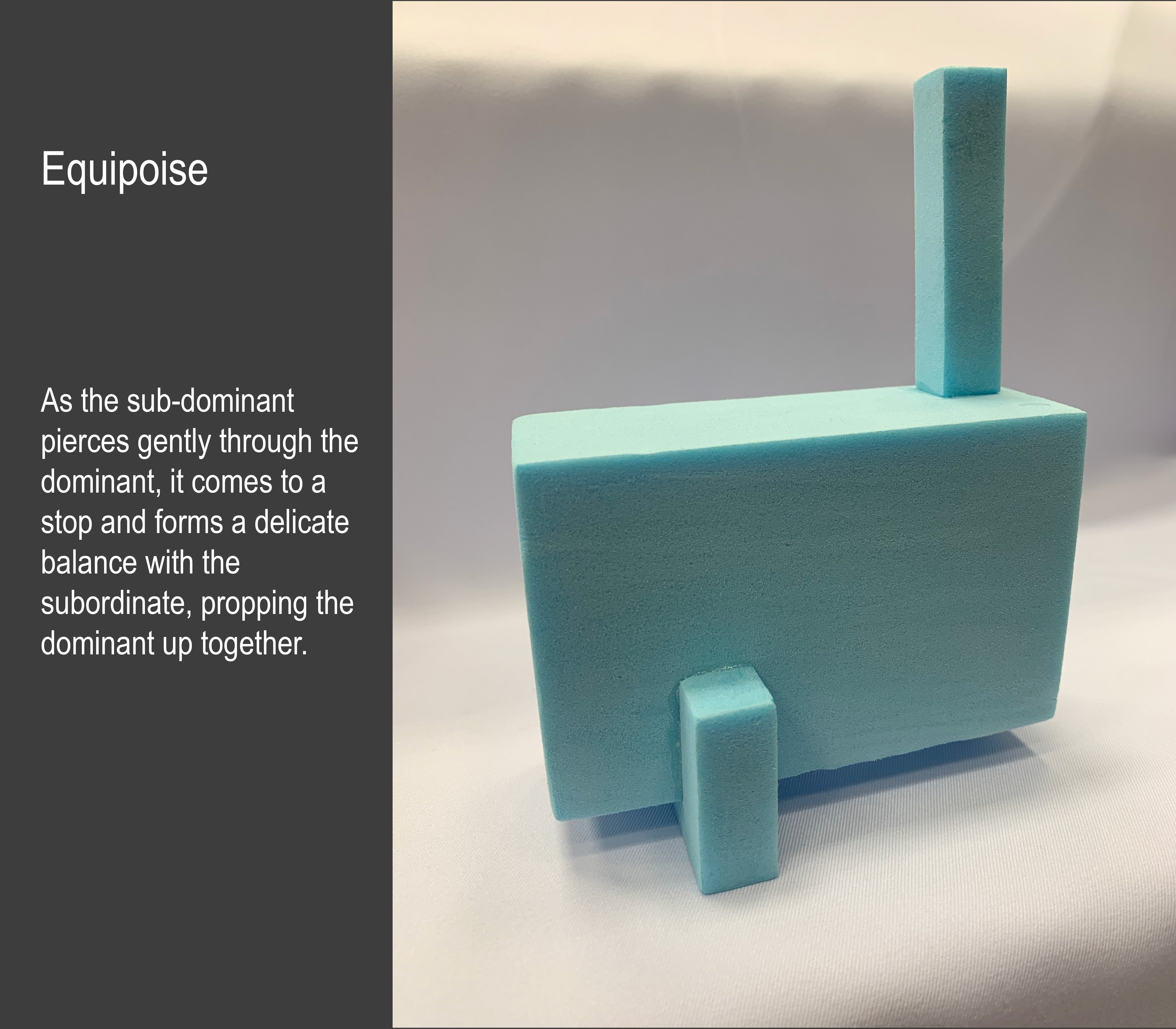
This rectilinear volume was the one that had the least problems as dominant, sub-dominant and subordinate was very clearly visible. The only concern was that the extensional piece at the top was too centred on the heavy piece. This prototype was further developed later on to form my final work after flipping it to lie horizontally and propped by the subdominant and the subordinate piece.

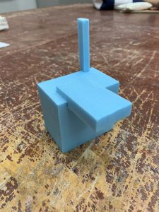
“Polygon #2”
This rectilinear volume did not have too big of an issue with the composition but Osh felt that the subdominant and the subordinate could have bigger contrast which I agreed with. Despite the evidently larger volume, the subdominant/planar piece did not come across clearly as the subordinate/extensional piece due to its striking height.


My final work, Equipoise, can be found on the post titled “[DN1003] Project #1 – Rectilinear Volumes (Final)”.

[DN1003] Project #2 – Planar Construction (Research & Process)

“Make it simple, but significant.” — Don Draper (fictional character from Mad Men)

Planar Construction

What is a Plane??
– An element that has surface direction unaccompanied by mass
– Is a path of a moving line
– Has width and length
– Has a shape / surface
– Has a specific orientation / position
– Expresses direction and movement
– Expresses different axial quality
– Can be 2D or 3D

A plane has ‘no depth’ unlike volume. In a 3D space, it can be horizontal, vertical or even bent. They have axises and express direction & movement + axial properties.

Planes
1. Suggests movement → Ribbon Arch
2. Defines and encloses space → Heydar Aliyev Centre, Zaha Hadid
3. Axes in planes indicate direction → Vitra Fire Station, Zaha Hadid
4. Forms pattern (repetition) and textures (cleats) → 2D Textured Designs
5. Adopting different geometries → Pierre Cardin + Viktor & Rolf (fashion design)
6. Implies mass or volume → Richard Serra, TTI London, (2007)

As applied in Design
– Abstract Wave Graphics by Andrea Minini
– Bicho de Bolso (Pocket Creature), 1966, by Lygia Clark
– “The Matter of Time”, 2005, by Richard Serra
– Curved Creased Sculptures by Erik Demaine // creating mountain & valley folds
– 3-D printed Ceramic Carafe and Cups by Unfold (Belgium)
– Blue Carpet, Public Art Project (Newcastle) by Thomas Heatherwick
– Handbag by Finell
– Project 27 by Roman Vlasov
– Richard Sweeney, Origami Artist
– Issey Miyake
– Zaha Hadid


bending is organic // folding is angular & dynamic

Types of Axises

    1. Neutral (any part of a circle)
    2. Resting
    3. Supporting (will “spring up” if pressed)
    4. Trajectory
    5. Hyperbolic (like a boomerang, going back)
    6. Parabolic (more open ended than the hyperbolic axis)
    7. Reverse (can also be a figure 8)
    8. Catenary (created by gravity)
    9. Directional (has a dramatic change in direction)
    10. Accentual (one part is straighter and the other is more curved)
    11. Spiral (primadonna curve)
    12. Straight

** The axis follow the longest line through the shape 🙂

Types of 2D Planes

    1. Straight Axis Planes
    2. Bent Axis Planes (has a sharp change in axial direction)
    3. Curved Axis Planes (has a curvature & the axial direction is curved)
    4. Complex Axis Planes (has more than one axis within the shape itself)

Types of 3D Planes

    1. Curved Planes (encloses space)
    2. Twisted Planes
    3. Broken Planes (has a sharp change in axial direction)
    4. Grouped Planes (group of planes e.g. twist + curve + broken)

What makes a Good Structure?

    • Each planar construction should have 3-5 planes.
    • Consist of one dominant, 1-2 sub-dominants & 1-2 subordinate pieces
    • It should appear dynamic from all angles (should not have a overly heavy and blocking piece)
    • It should not be be symmetrically designed.
    • It can have an implied volume but it should not form a closed structure!
    • Pleats, Curved Creases and Repeated Strips are allowed!!
    • Establish a hierarchy planar mass and/or axis & use only the following key operations to join the final model:- Cut
      – Slot
      – Crease
      – Fold
      – Twist

First Round

First Planar Construction
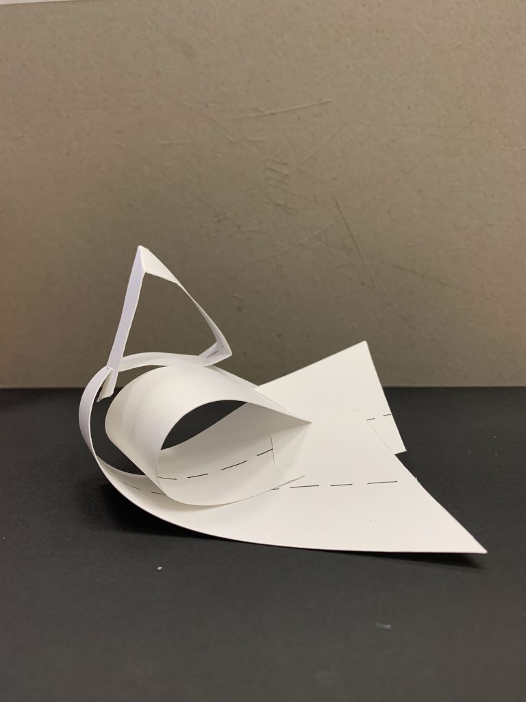
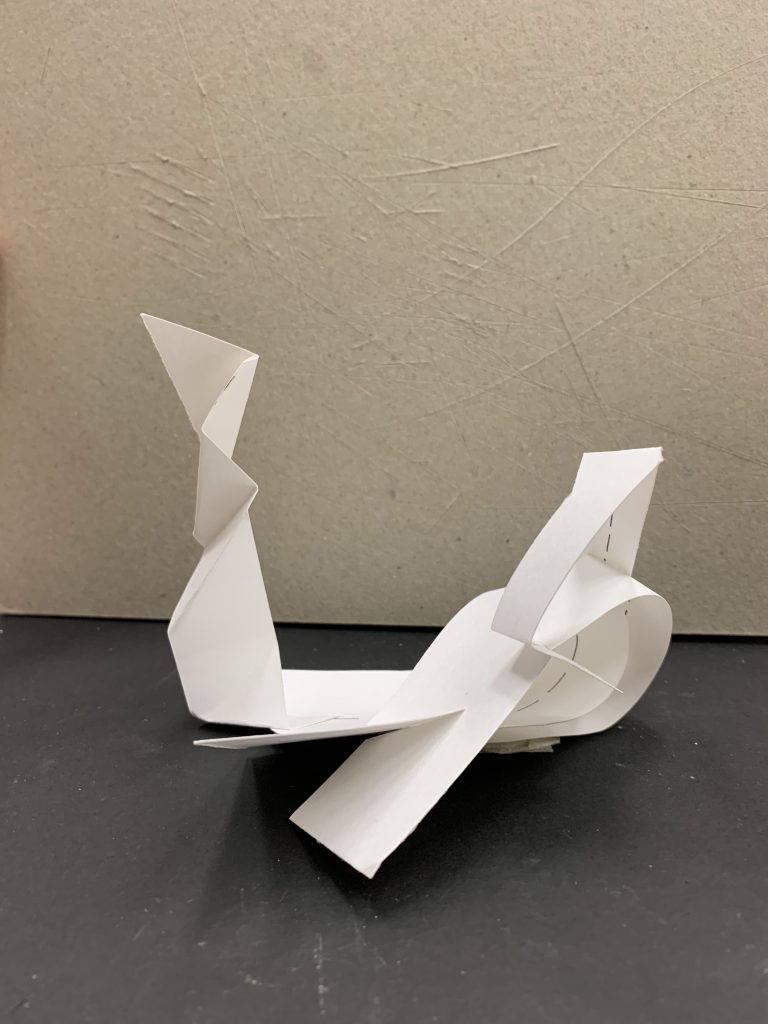
This is the first model I created for the preliminary round of construction and I throughly loved how the complex axis of the dominant piece twisted and wedged on each other. However, as I continued to build on around and on the dominant piece, it started to look rather flat as everything was placed in the same strip of the mounting board.

Second Planar Construction
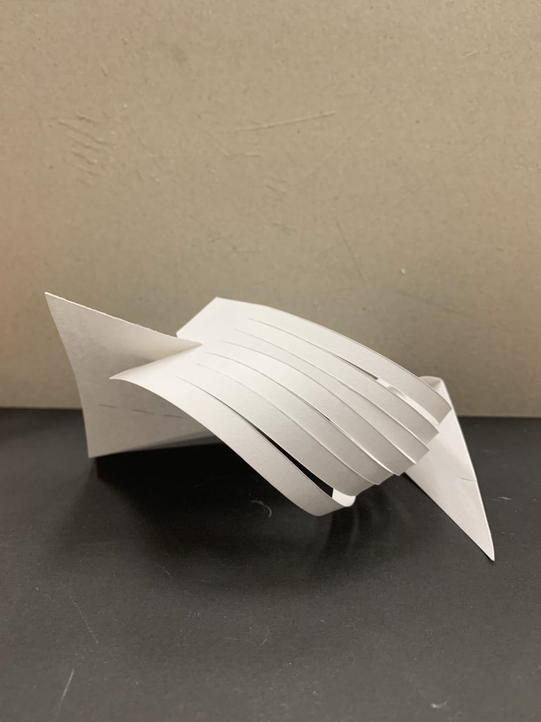
With the axis of each plane drawn for the preliminary round of construction, it was visible and relatively straightforward to make a fairly dynamic model. However, with the longer I worked on one face of the model, I realised that I had neglected the other faces and it was starting to look rather flat and blocked from other angles.

The pleats and the planes were also very neatly edged onto each other, but it was done at a wrong angle, resulting in a very ‘closed up’ looking model. The planar construction also looked rather heavy and one-dimensional because I didn’t play much with height and breadth.


Second Round
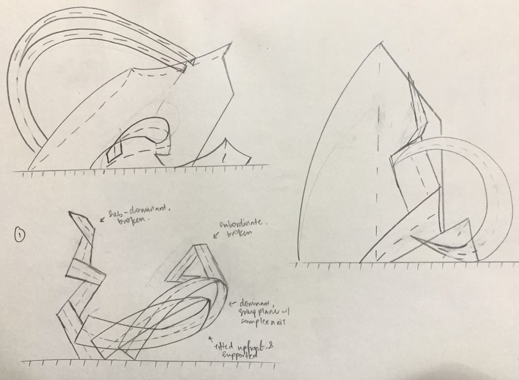
First Planar Construction
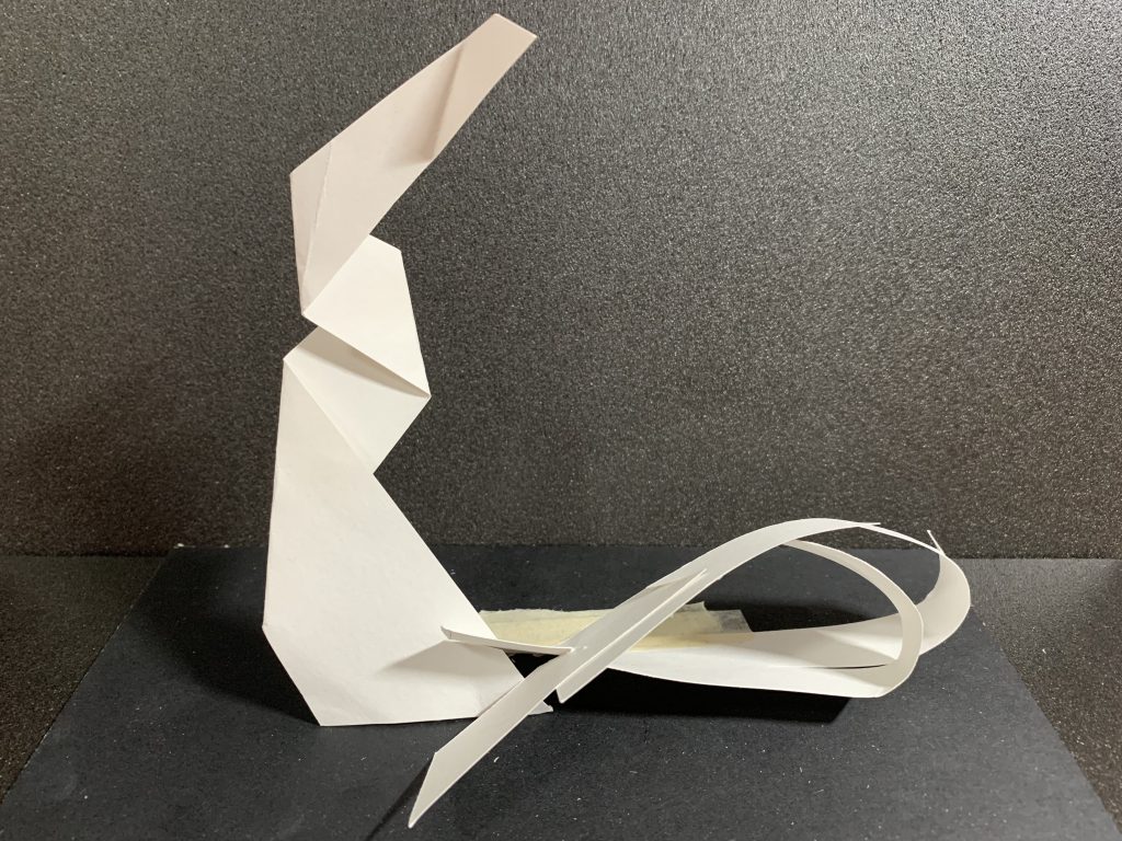
I remade this model with a new cut of planes that were supposedly more dimensional than the previous few but they didn’t work out as expected. The dominant broken plane turned out way smaller than the subdominant when comparatively measured. The subordinate plane was also wedged insecurely due to the inaccurate placements of the slits, resulting in its displacement on the journey home.

For this round’s review, Osh also mentioned that the composition was not a good one due to the twisting of the dominant plane. The two ribbon-like tails of the broken plane were too closely wedged onto each other that it lacked dimension from all sides of the composition. I attempted to prop it up in a more drastic manner and make a bigger dominant piece but it did not work out as expected so this idea was not developed further.

second Planar Construction
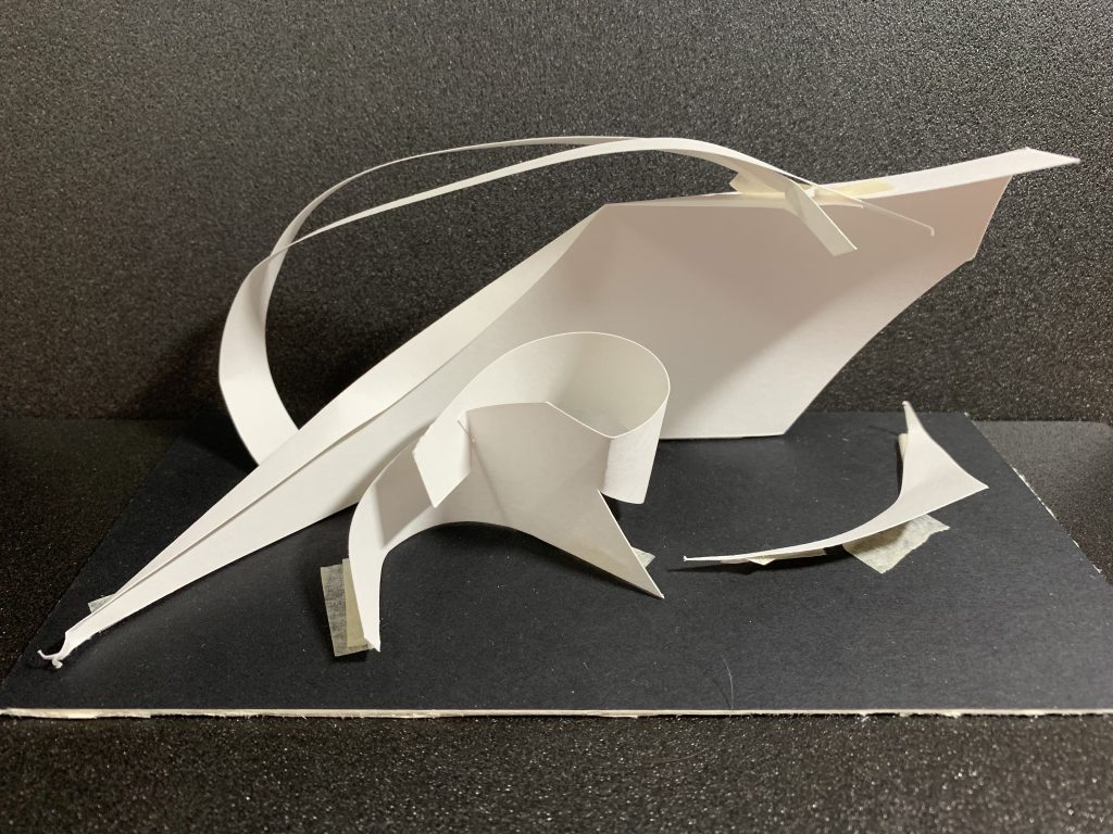
During the feedback session, Osh mentioned that this planar construction had pieces that were very nicely done, like the curved fold on the dominant piece, as well as the subordinate broken plane that guided the movement of the construction. Osh also mentioned that the subordinate piece was a nice addition, although it could’ve been a little bit smaller. The other subdominant piece however, was not a good addition to the model as it was a closed up piece of its own due to the broken piece wedging onto the main piece, forming a looped shape.

One other matter brought up was that the dominant piece was a very heavy and expansive piece that blocked out the whole construction when viewed from the back. There were very nice elements from this construction, but the main concern was the lack of a dynamism. This idea was not further developed after an attempt to upscale the planes to A4 fitting proportions, as it appeared lopsided with a lack of stability when untouched.

Third Planar Construction
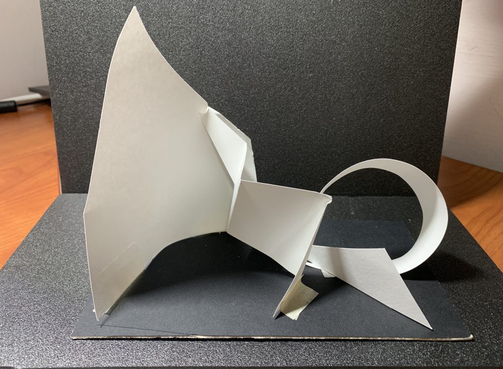
During the consultation, Osh mentioned that the dominant plane would be better transfigured to have an arch or a smaller breadth as it was blocking out the majority of the model when viewed from the side. The angular planes were working well together, however, the curved plane forming a mirrored ‘C’ on the right as seen in the picture was not well integrated into the model.

There was also an issue with the subdominant bent plane in the centre of the construction as it fought with the dominant plane for attention. The bents were too distinct and too widely spread that made it eye-catching and more interesting than the dominant piece.  This planar construction was thus, the first to be eliminated due to the oddly contrasting planes that were being employed.


Third Round

First Planar Construction
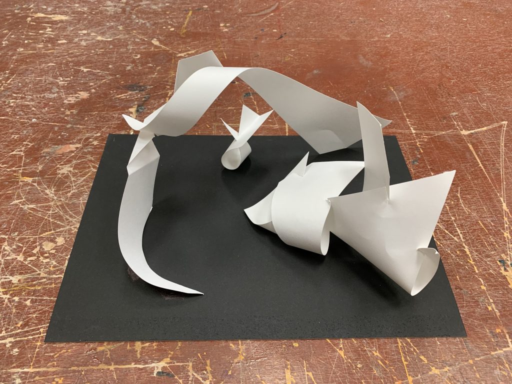
For the third round of constructions, I did a completely new one using 4 different planes but the feedback given was that there were too many ‘closed up’ planes, making it non-dynamic. The angular ends that jut up from the subordinate and subdominant structure were too jarring in the whole composition. It was not a bad structure on its own, but as a whole piece with the long arching curves from one end of the board to another, it didn’t fit as a whole.

There was not much feedback for this construction but I did not choose it for my final work as it was hard to expand on the design due to the closed off nature of the planes.

Second Planar Construction
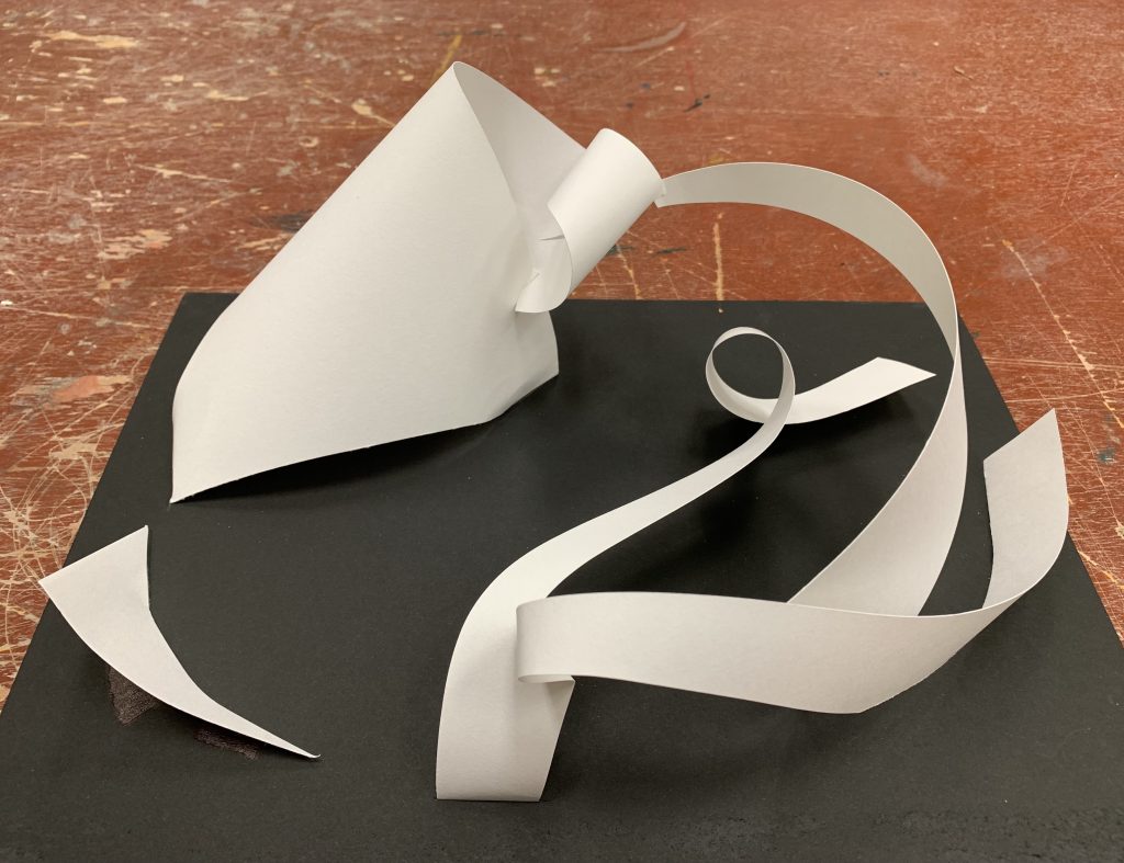
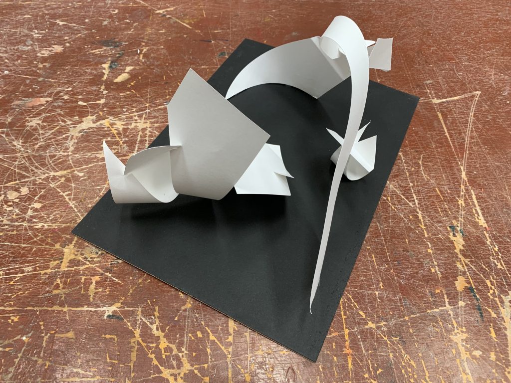
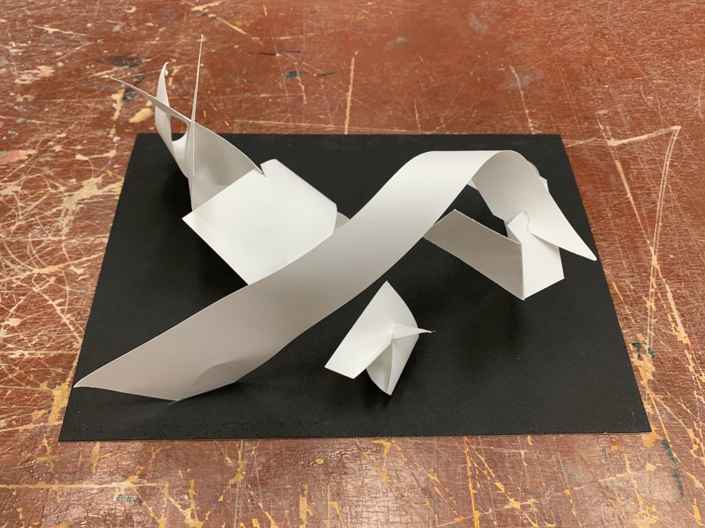
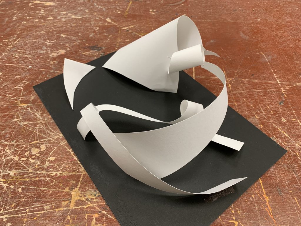
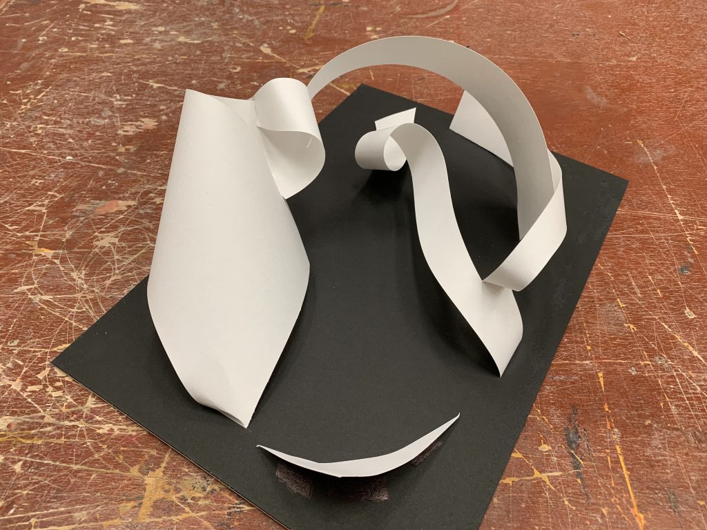
For this model, I tried to reinvent the twists from the second round’s second construction and the dominant plane’s presence from the third. The results took me by surprise when I first created it as I felt very drawn to how the curves flowed from one plane to another naturally. It was fluid, but one thing that stuck out the rather thick width of the broken subdominant plane that twisted on the ground of the construction.

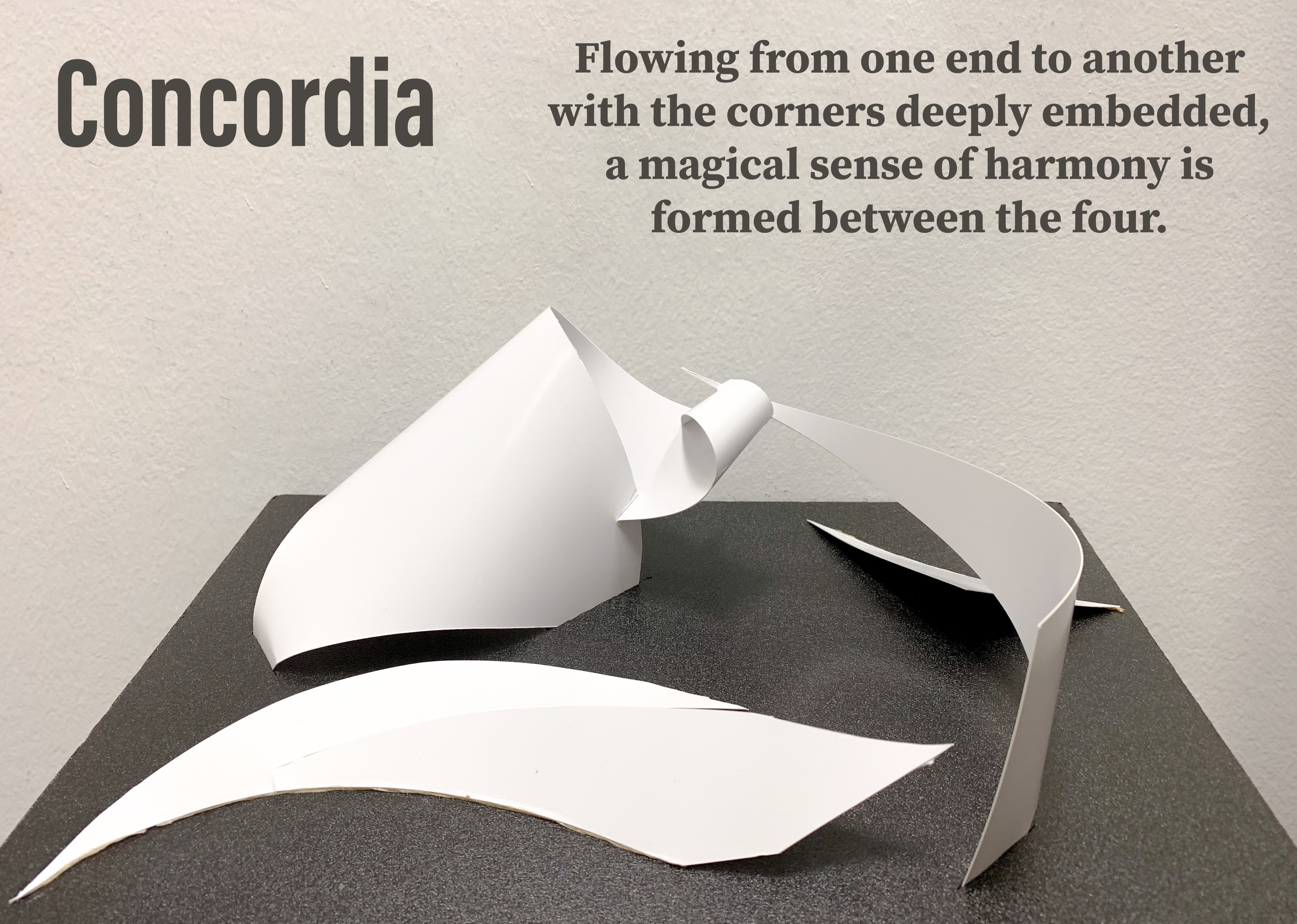
It was drawing attention away from the heavy dominant plane on the corner of the mounting board. This was also likewise for the vertical arch that sprung out from the bottom right corner as seen in the first picture due to it towering the dominant structure. However, I eventually decided on using this planar construction for the final model after switching to art card and a foam board for better control over the end piece.


Final Results 🙂

My final work, Concordia, made by art card on black foam, can be found on the post titled “[DN1003] Project #2 – Planar Construction (Final)”.