A picture is worth a thousand words. Sometimes they’re only worth one, but if you put those pictures together, they may not tell you a thousand words but convey a quote from a movie instead!
Our second Foundation 2D project is Forest Gump. We have to pick 4 movie quotes, then piece together images – symbols, pictograms, dingbats (ornaments), icons and engravings as my visual vocabulary – to create my visual narrative.
QUOTES
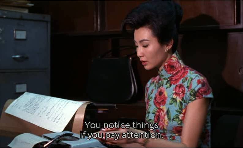

Quote 1: “You notice things if you pay attention.” – In the Mood for Love, 2000
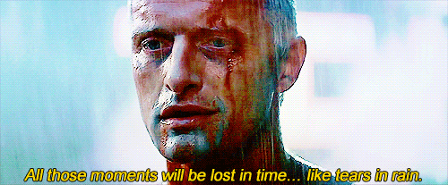
Quote 2: “All these moments will be lost in time, like tears in the rain.” – Blade Runner, 1982
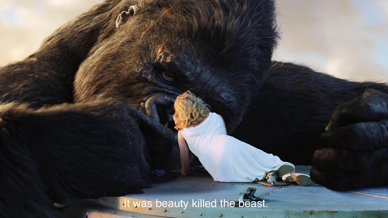
Quote 3: “It was beauty killed the beast” – King Kong, 1933
Quote 4: “They call it Royale with cheese” – Pulp Fiction, 1994
RESEARCH

Image from: https://www.dadart.com/dadaism/dada/022-dada-berlin.html
Accessed on: 9th October 2017
90×144 cm,
Image from: https://en.wikipedia.org/wiki/Dada
Accessed on: 9th October 2015
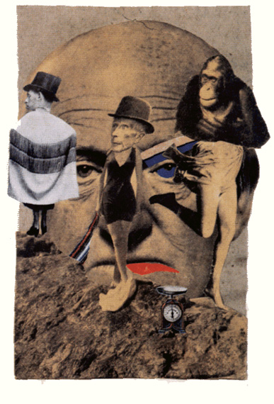
Image from: https://www.dadart.com/dadaism/dada/022-dada-berlin.html
Accessed on: 9th October 2015
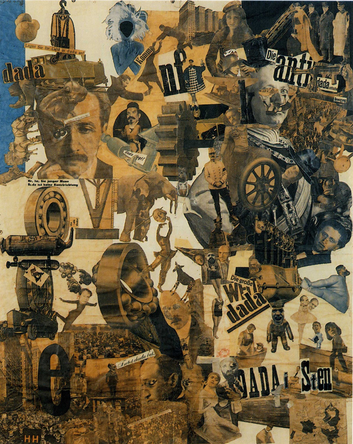
Before starting on this project, I researched on collage work during the Dada period and found the Berlin female artist Anna Therese Johanne Höch. Her works centre around the theme of women’s roles in the working world and convey this through collages made of cutouts from popular media such as newspaper and magazines.
What I like about her work and feel that I can take from her work is her ability to put two objects that can be very different together. For instance, with The Art Critic, the subjects head is too big for his body. Unusual objects like a shoe are also placed on the man’s forehead. All of this, of course, is intentional as Höch uses the uncanny to grab the viewers attention and bring forward what she wants to discuss or convey.
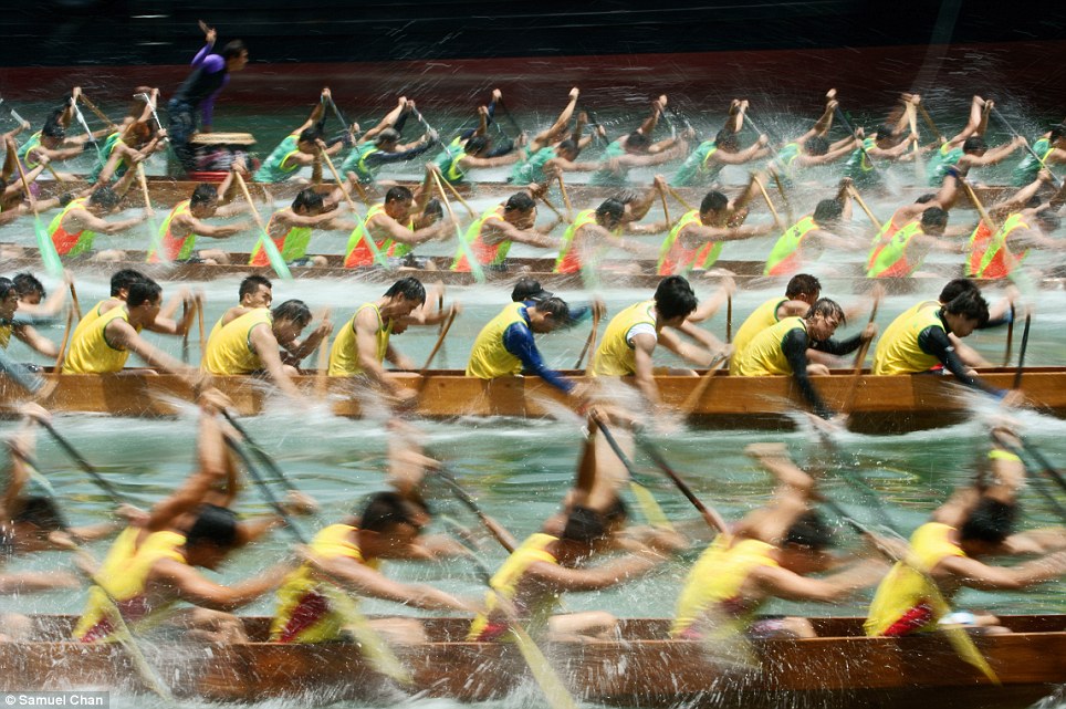
Image from: http://www.dailymail.co.uk/news/article-2095791/Sony-World-Photography-awards-shortlist-2012-provides-real-challenge-eye.html
Accessed on: 9th October 2017
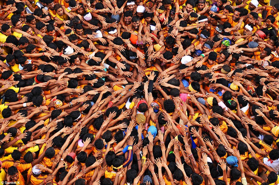
Image from: http://www.dailymail.co.uk/news/article-2095791/Sony-World-Photography-awards-shortlist-2012-provides-real-challenge-eye.html
Accessed on: 9th October 2017
Compositional wise, I will be applying Gestalt principles to create interesting compositions. For example, like in image 1, I can repeat an image to create a pattern, and play with its size to create depth. I also want to have leading lines in my work like in image 2 above.
PROCESS and FINAL
Quote 1: “You notice things if you pay attention.” – In the Mood for Love, 2000
Of course, I had to pick a quote from my favourite movie!
For this specific quote, my work went through very dramatic changes.
Initially, when I thought” of paying attention”, I thought of open eyes and ears and keeping quiet. Noticing things to me would be about noticing people around me, including what they’re saying.
Taking inspiration from the movie itself, I created the piece below:
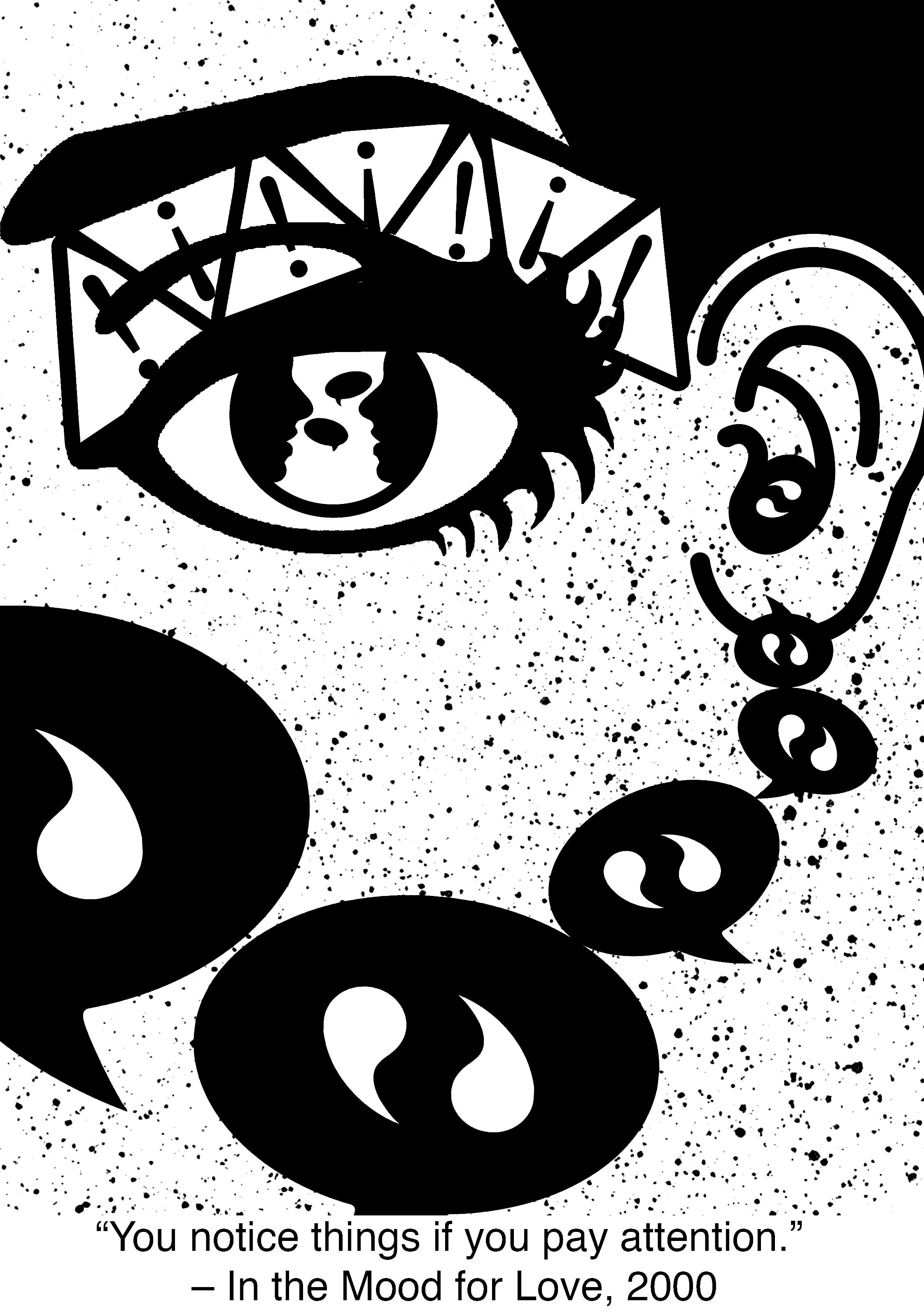
As shown, I included an eye and an ear for “paying attention”, as well as the warning or attention signs above the eyes. For “notice things”, I added a silhouette of people talking in the iris of the eye to show that the eye is watching and paying attention, and speech bubbles that slowly travel towards the ear. The splatters created was to add some texture to the work.
The feedback I received for this composition was that the image created was too literal and that while I wanted the eye to be the focus of the composition, the biggest speech bubble took away some of the focus as it was just as big or even bigger than the eye.
Redo!!
Taking more inspiration from Dada collages, I created the piece below:
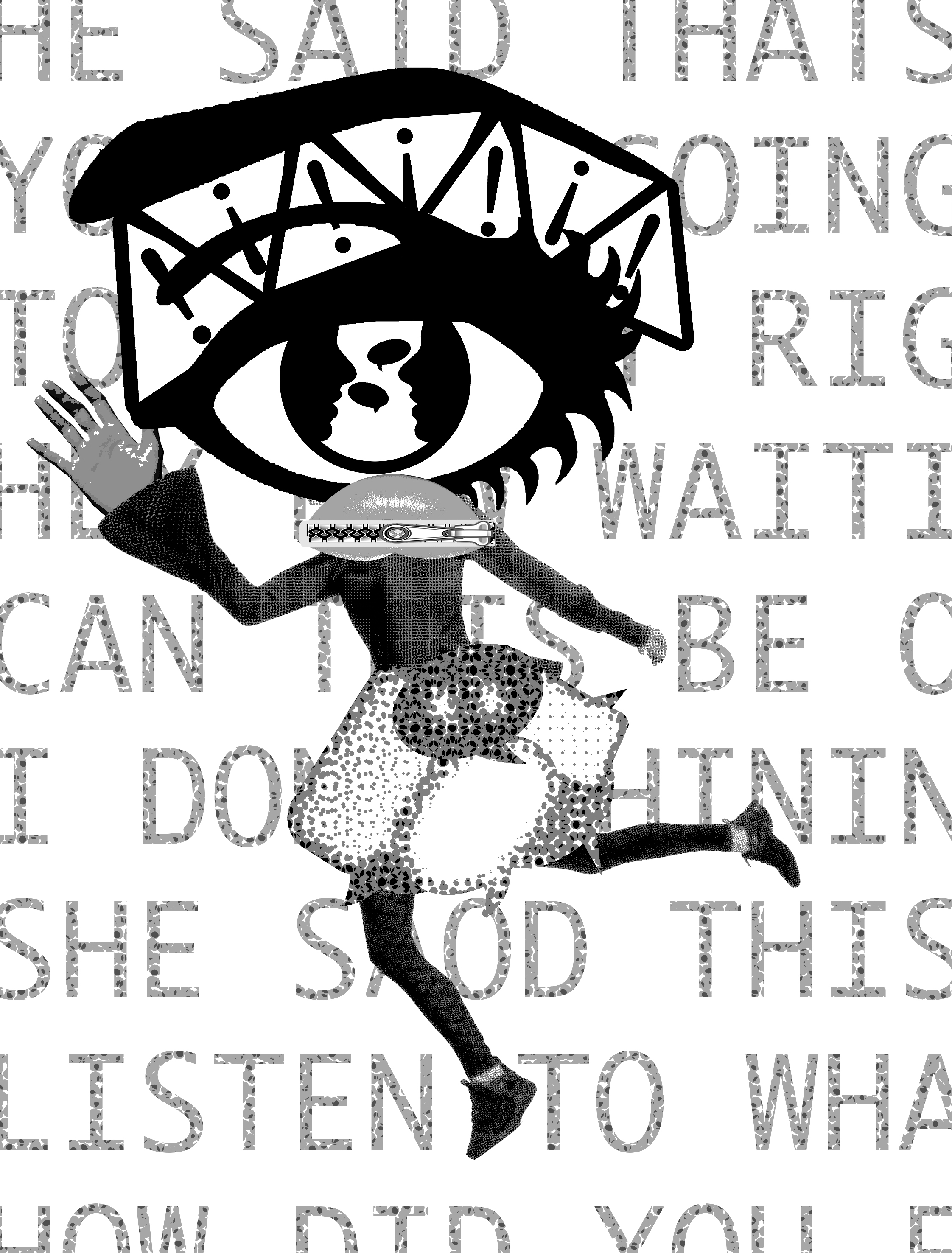
This time I tried to be a little more unconventional with the way I put my images together. I kept the eye with the notice signs above it as I really liked it. I added a mouth that was closed with a zipper and a skirt made of speech bubbles. I used a dynamic stance for the figure to make it more interesting but made the hand closest to the eyes big to make it look like the hand is being placed behind its ear and trying to listen to something. I added text in the background (thinking if it was cut off and made no sense it would be alright haha – it was not) to add texture.
While I picked up on putting images together in a more unconventional way, there was not many compositional techniques or Gestalt principles used and the image itself was not easy to decipher. SCRAPPED
I then re-thought about the quote, what each word or phrase meant to me and how I can represent it through composition. When I thought of “paying attention”, I thought of it in a modern context, in our here and now. I thought of how people nowadays don’t pay attention and are always on their electronic devices. I wanted to then create a sea of objects not paying attention surrounding one object that is. This idea was based off comic book-style drawings that use black lines that surround a subject with some white space between the subject and the lines to make it look as if it is being surrounded.
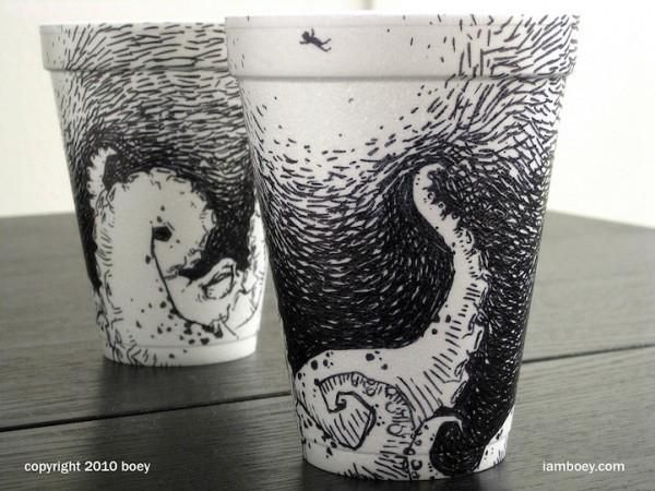
Image from: http://comicsalliance.com/styrofoam-cup-art-cheeming-boey/
Accessed on 9th October 2017
Image from: http://comicsalliance.com/styrofoam-cup-art-cheeming-boey/
Accessed on: 9th October 2017
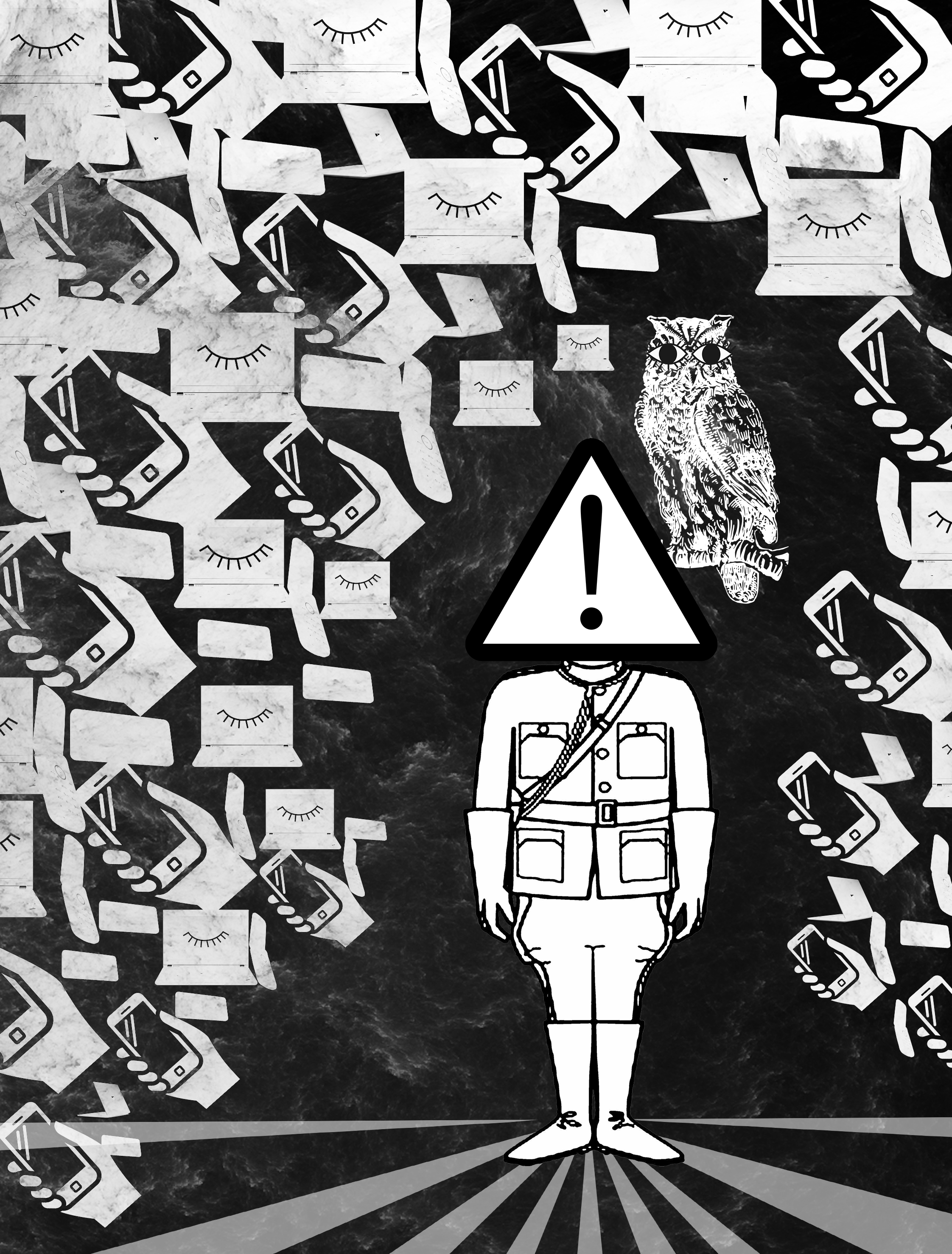
In this image, I used repeated images and symbols of technological devices to surround the man, having the images diminish in size as they get closer to the subject. I also used some lines that fan out under his feet like sun rays as leading lines to bring the focus to the man. I also placed the subject off-centre to make the composition more visually appealing. The subject is standing at attention with a signboard as its head, symbolizing “pay attention”. There is an owl with human-like eyes attached to its head. I used an owl as an owl has very good vision, but I also gave it human-like eyes, too big for its face, to draw attention to its sight or the act of looking. Comparatively, there are closed eyes on the screens of computers to show that looking at these smart devices is equal to not paying attention to one’s surroundings. I made the background black so that the subject stands out, and changed the background textured layer mode to “difference” creating the above effect on the mobile gadgets. By darkening the surrounding images and decreasing their contrast with the background, the subject stands out much more.
Quote 2: “All these moments will be lost in time, like tears in the rain.” – Blade Runner, 1982
Another classic movie! Let’s break down the quote.
Moments: A very short period of time. Also an image/photo, hence the saying capturing moments.
Time: Life and death
Tears in the rain: being disguised or blending in.
Here is my initial composition:
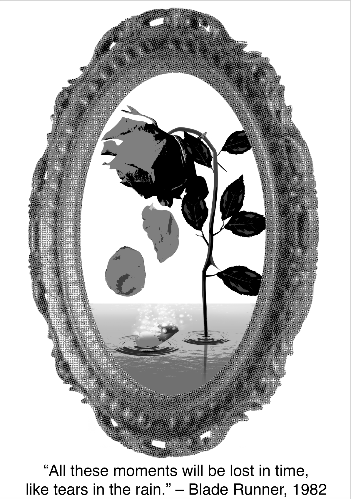
In this composition, I used a photo frame to represent “moments” as moments are like pictures to me. I used a rose to represent life and death, and the falling petals to mimic how rain falls. To represent “lost in time”, I made a petal disintegrate in a magical manner when it touches the water. Personally, I quite liked this composition. However, I found it too symmetrical and static, and I felt that the white space on the canvas was not being utilized.
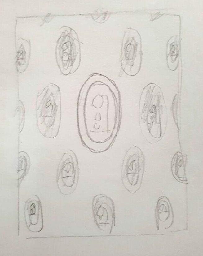
I then thought about duplicating it to create a wall of “moments”, and instead of making the pattern uniform, I wanted to have the frames diminish in size as they moved away from the centre. I thought of making the centre frame the subject and posterizing the other frames to make it stand out more. After thinking it through, I didn’t really like this idea as it still felt static and too symmetrical.
Again, going with a more Dada-like style, I created my final composition:

For this image, I wanted to show moments in time floating out of the man’s head, showing him literally losing his memories of these moments. I also added a heart as memories tie in very much with emotion. The spilt water in my composition gives the image some movement. Here, I have the water spill over the moments, letting the moments be washed away.
For this composition, I focused on the diagonal line composition which would make my image more visually interesting. I used the warped shapes of the frame and the spilt water as leading lines for the viewer towards the top half of the work.
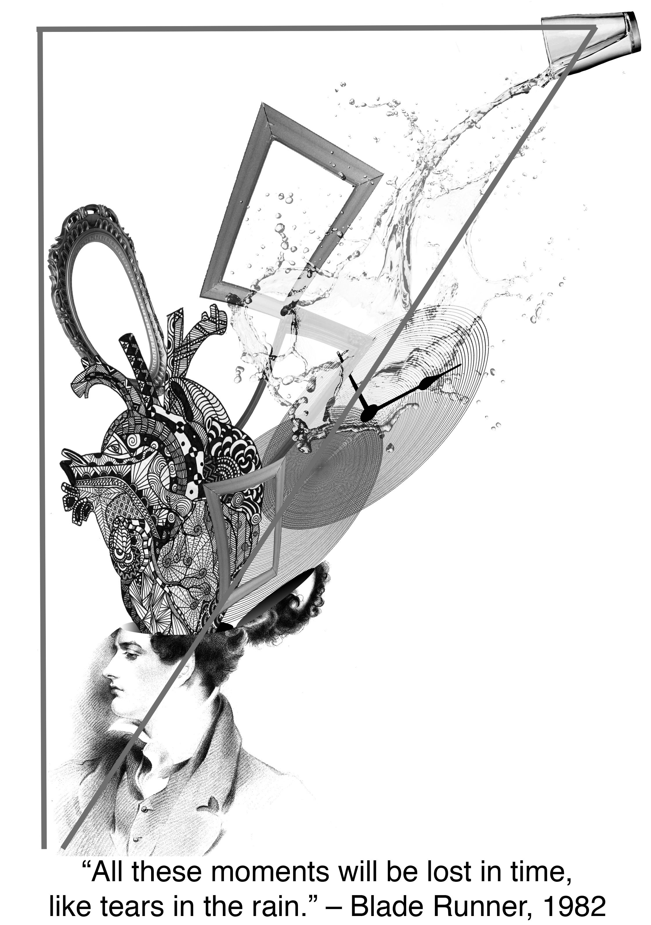
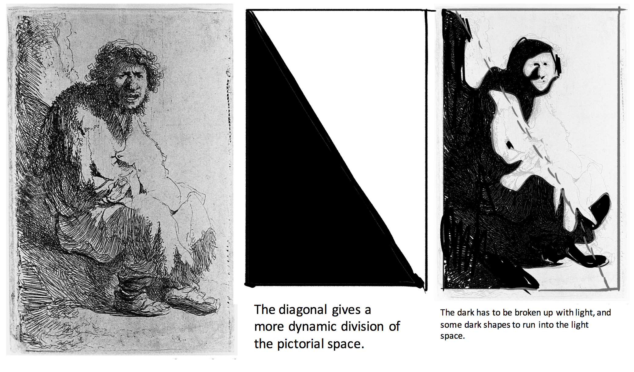
The rule splits the canvas into two separate sections diagonally. One dark and one light. Following this, my darker tones in my composition are all placed more towards the upper diagonal of the canvas while the bottom diagonal remains mostly white.
Quote 3 – “It was beauty killed the beast” – King Kong, 1933
Breaking down the quote:
Beauty: Luxury, fashion
Beast: Some sort of animal.
Killed: Murder, blood, grim reaper.
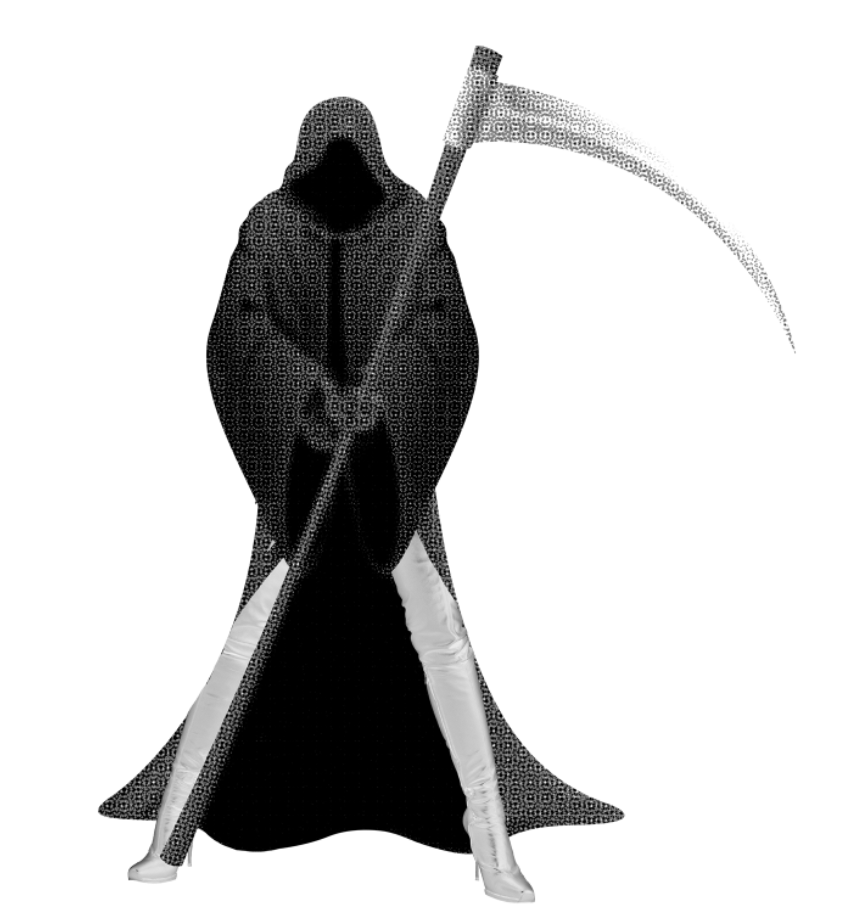
For my initial composition, I wanted to include an image of a grim reaper with female legs to literally show beauty killing the beast but again, I realised it might have been too literal of a portrayal of the quote.
I thought of wanting to create an image with more depth or perspective. I thought of referencing this poster:

Image from: http://collider.com/movie-poster-rolling-roadshow-2010-there-will-be-blood-dirty-harry-jackie-brown-robocop-olly-moss-movie-poster/
Accessed on 12th October 2017
Here is my composition:
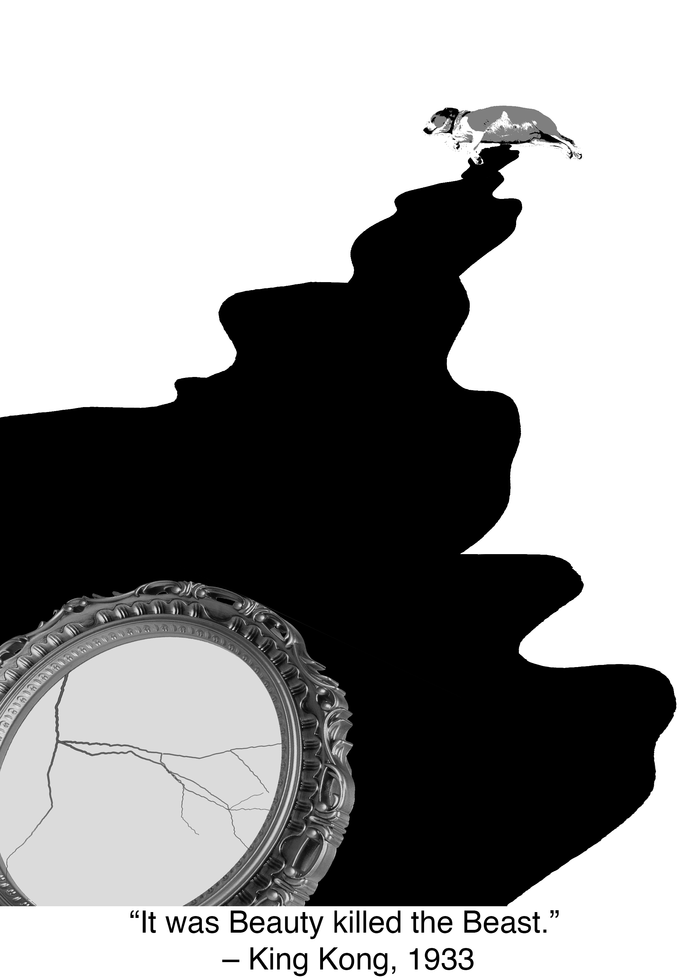
I used a dog to represent beast, and a mirror to represent beauty, with the crack on the mirror to hint some sort of murder, and the blood to link the mirror and the dog together.
Talking with Shirley, she told me I could make my mirror bigger and add some sort of texture to my work as it was looking a little flat. I realized this made it quite hard to see the depth in the photo.
I thought about how to improve that. I thought of what beauty was to me and decided to use lipstick stains as an overlay layer over the blood. Here is my final composition:

In this image, there is a much stronger sense of depth and perspective because of the relative size of the mirror to the dog, and the diminishing size of the lipstick stains. I decided to also leave the surrounding space white to add a sense of mystery to the image as there is no clue where the dog is.
Quote 4: “They call it Royale with cheese.” – Pulp Fiction, 1994
Another great film with entertaining characters and funny lines, it was hard to decide which to pick but I was hungry and a Royale with cheese was hence the perfect choice.
Breaking the quote down:
Royale: Royalty and luxury
with: together, a couple (a boyfriend with a girlfriend).
Cheese: Cow, milk, cheese wheel
For this specific quote, I found it quite difficult to come up with an idea for the composition.I set myself an aim for this image and it was to create tiled or layered images. I first churned out a little bit of a symmetrical piece, just to get that out of my system:
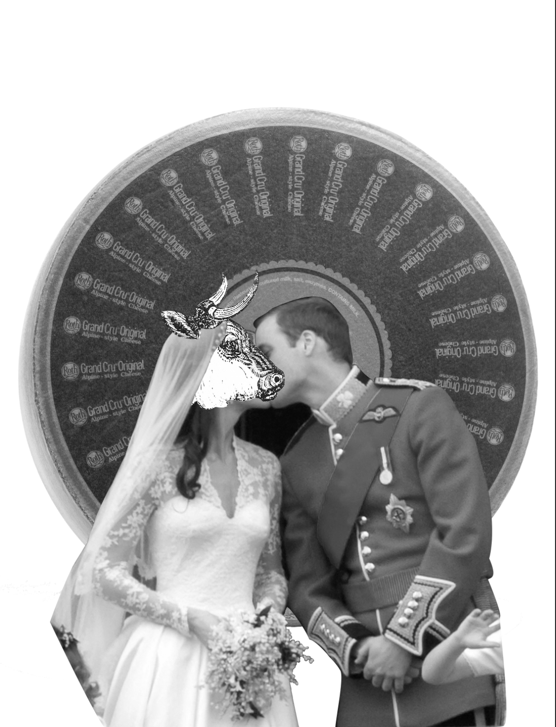
Here, I chose wedding photos of Prince William and Kate Middleton, but have Kate’s head replaced with a cow, making it look like the prince was marrying the cow, hence “royale with cheese”! For this design, I wanted to play with the roundness of the cheese wheel and the nice pattern created by the text by layering it. Here is the result with a different composition:
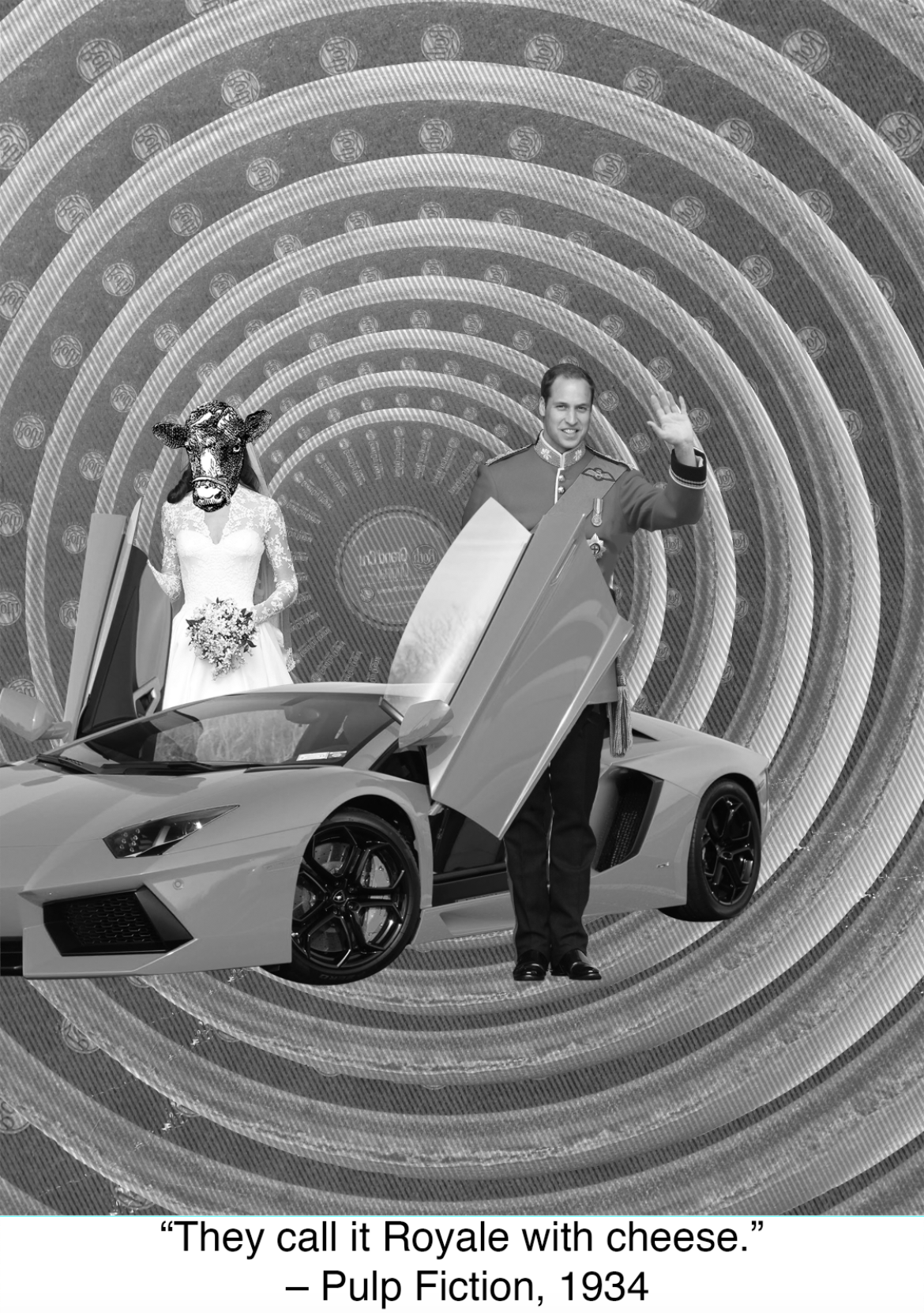
This time I had the royal couple look like they stepped out of a luxury car. This composition turned out a lot plainer than I expected. The background looked plain as it was just a repetition of the same image, and the royal couple and their car were floating in mid-air. There were no design principles applied to the subjects. I scrapped the royal couple idea but kept my layering idea and came up with this final result:
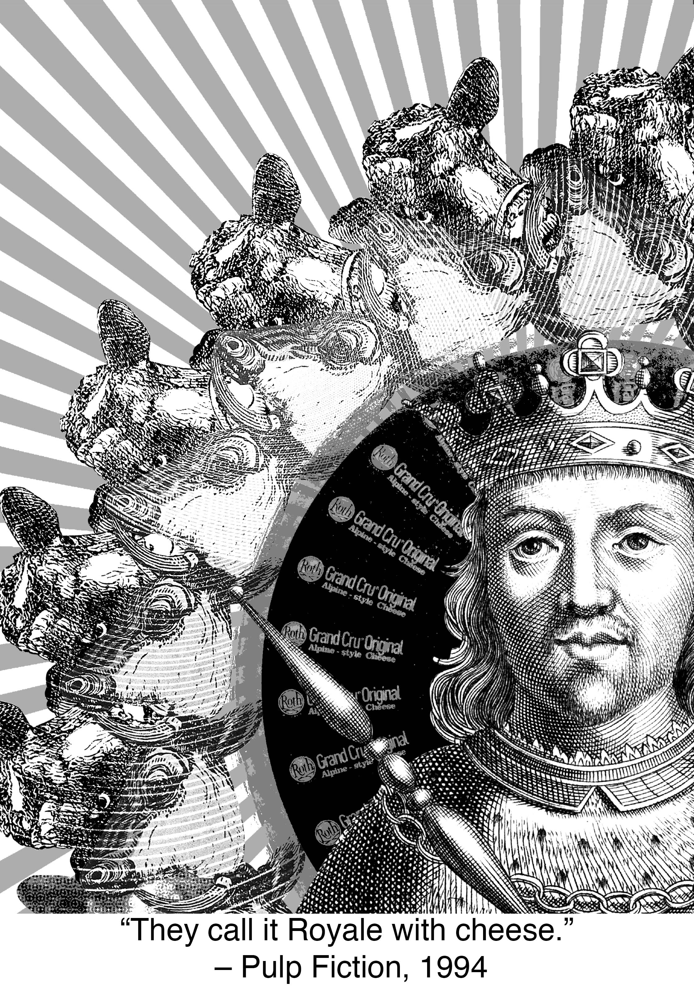
I switched up the royal couple for an engraving of a king instead but kept the cheese wheel background. I posterized the cheese wheel, creating a black colour that allowed the king to stand out more. I then made tessellations of two cow heads and overlayed them with a radial line pattern, using the divide layer mode to remove some detail, and hence emphasis from the cow, allowing the king to stand out. Following my design for my first quote, I used the sunray-like lines to lead the viewers’ eyes to the King.
Silkscreen Printing!
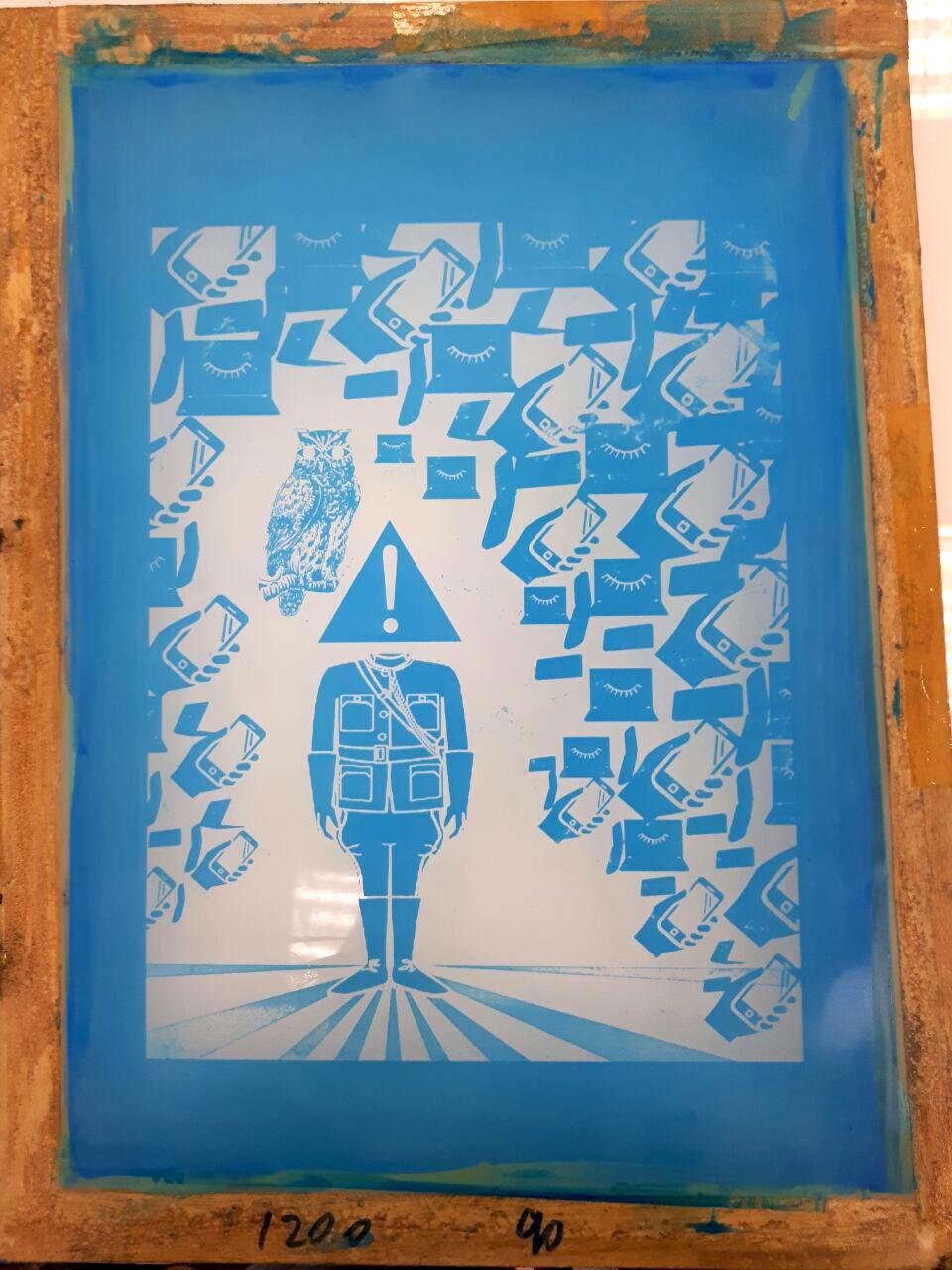
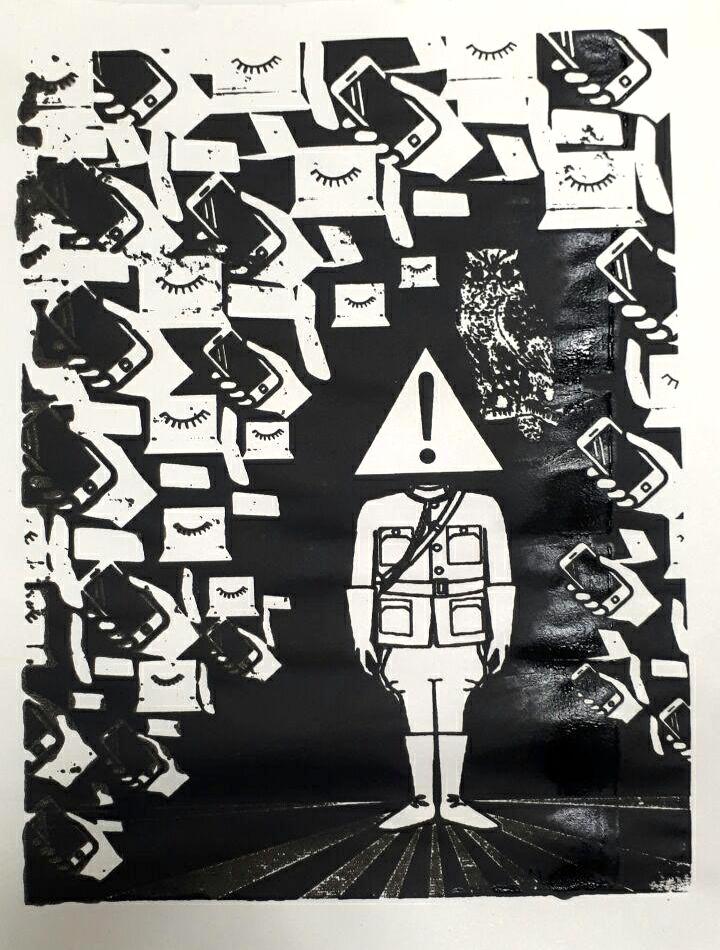
The ink on the test print bled a little because I went over the silk screen multiple times. The trick was to get it in one swipe and that’s what I did for my tote bag print.
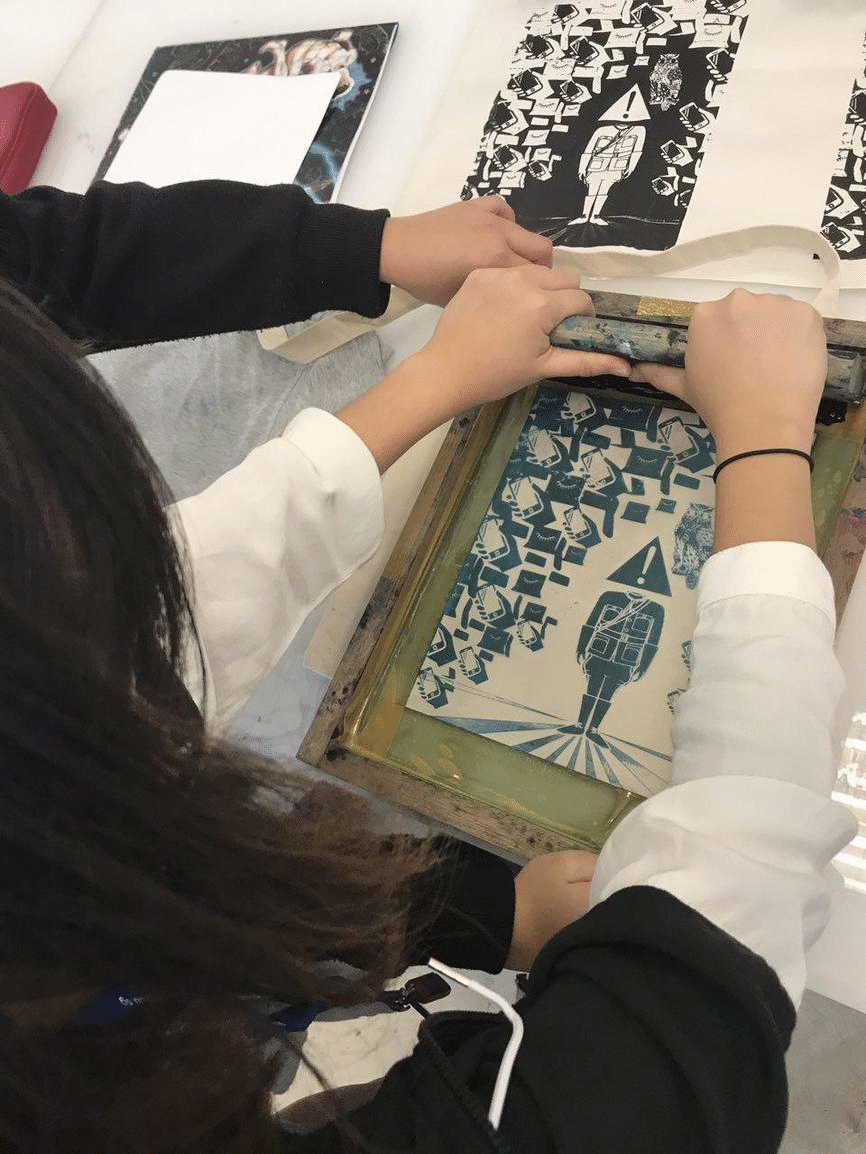
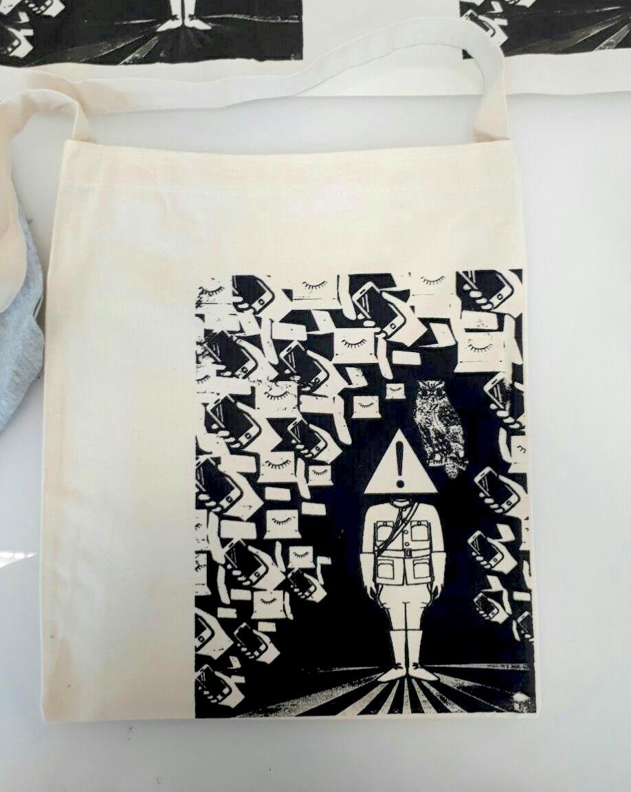
My finished design! I decided to have it at the corner of the bag to make my tote bag a little more original and less conventional.
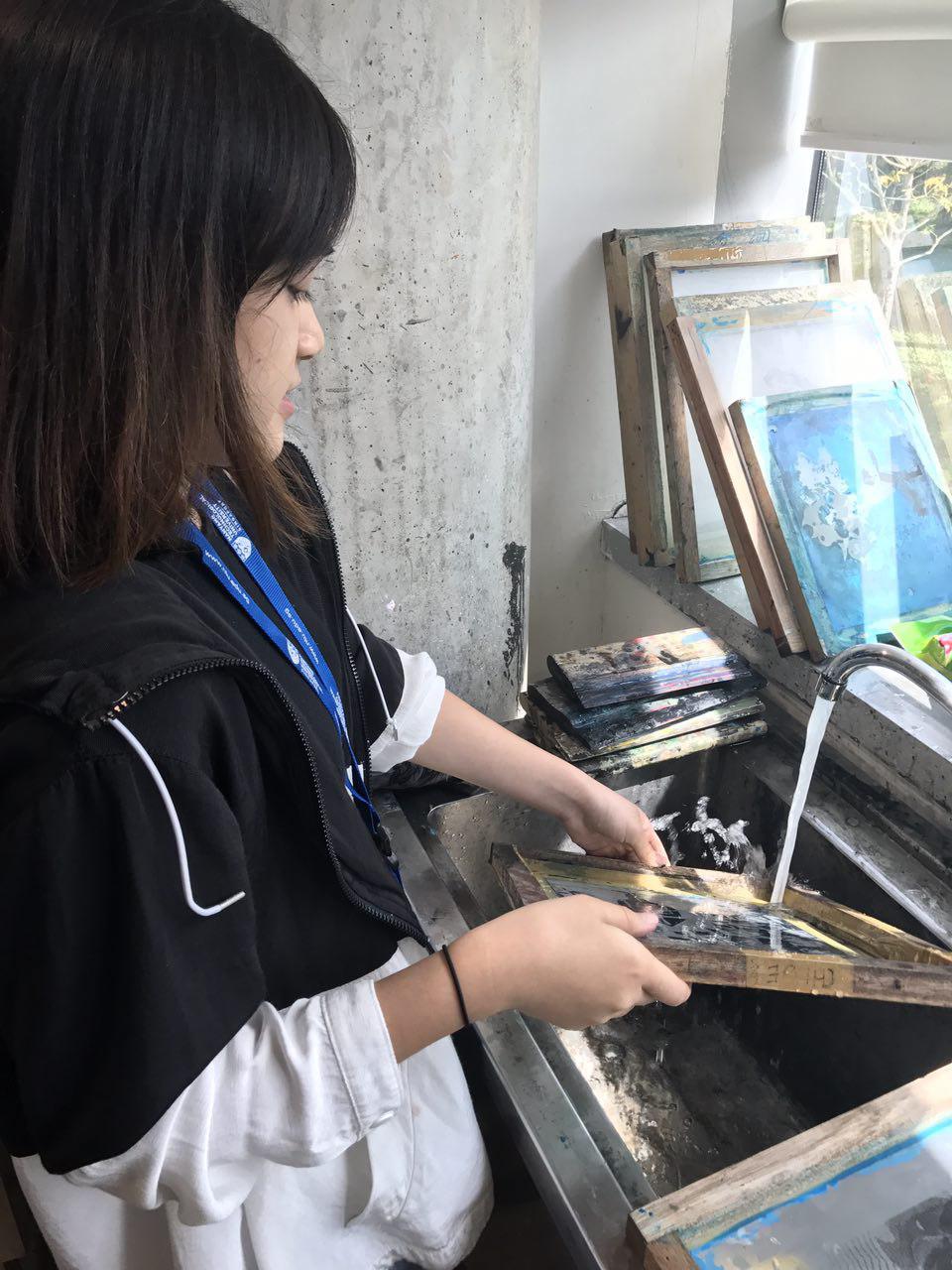
… And finally, saying goodbye to the silkscreen!
Post-project THOUGHTS
After this project, I’ve come to realise that I shouldn’t be scared or re-doing my designs and trashing my previous one completely, also that I shouldn’t “hoard” or try to keep an object in my composition just because I like it – if it doesn’t work with the composition, it doesn’t work and means it needs to be SCRAPPED! I’ve also learned how to see things in a more uncanny or unconventional manner as well as to see how to compose images, in other words, I think my seeing and composing abilities went up a notch. Although, I think I can improve on showing less to tell more, less is more.
I’ve also learnt so much about composition. I used to think it would be quite an easy thing to do and that it came naturally to a lot of people, but I’ve realised that composing an image can take a lot of thought. I’ve wrecked my brains quite a bit for this project but, overall, it was really fun and I finally got to try out silkscreen printing!