This is it, the last submission for Foundation 2D!
Halloween Horror Nights
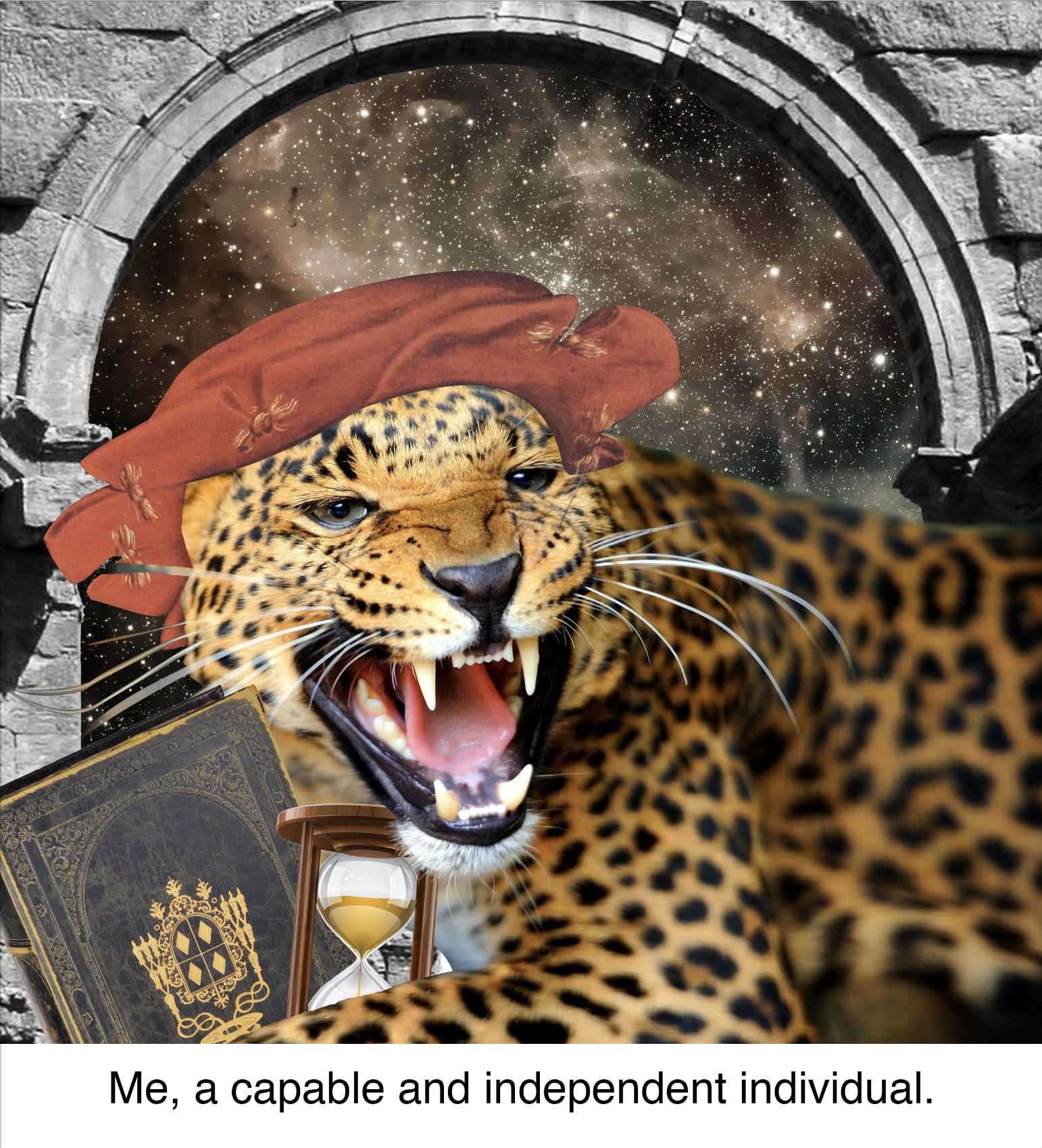

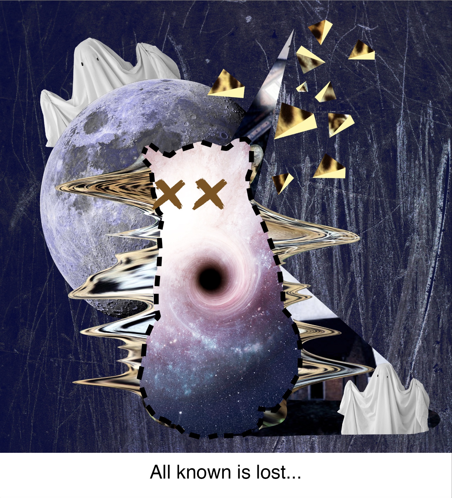


October has recently passed and with that, Halloween Horror Nights as well. I’m not good with scary things at all. They totally break my calm composure that I always like to maintain.
Here I chose a jaguar to represent me at my peak, agile and capable. However, when I’m faced with a haunted house, I completely lose my sense of composure and become a blind log that my friends have to drag through the haunted house. I placed the haunted house in a space like setting because haunted houses are definitely not a part of what makes up my world. When I enter this house as a jaguar, I am so scared that my entire being disappears into a blackhole and my spots fall (or fly) off my body.
For this equation, I used two adjacent colour schemes and one triad complementary which is made up of the first two colour schemes. I used this to show the two separate emotions and atmospheres associated with the two panels, and how they react together in the last panel. I used warm orange/brown tones for my first panel to give a sense of ease and warmth, cool and dark purple/blue tones to create a sense of fear and mystery, and a mixture of the two at the end to show a clash between me and the situation.
My Broken Brick Wall
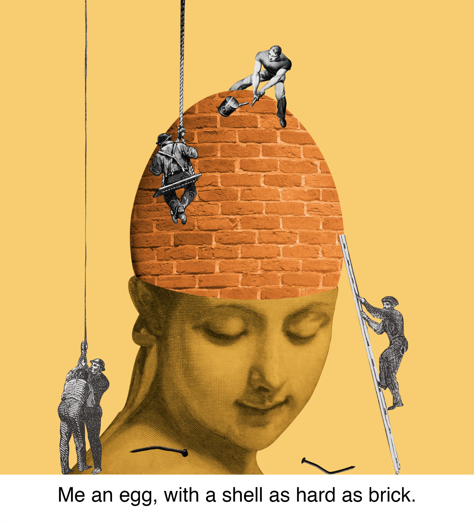


I’m no open book and I’m not very talkative either but when someone comes along and showers me with enough love and affection I would start to open up.
Here, I am an egg but my shell is not the usual fragile one – it is made out of bricks. Note the broken nails and hammer. My walls are not easy to penetrate. Following the same colour pattern as the first equation, I chose to have the egg remain in its usual colour and have the shades of the background and surrounding elements match to the egg. This keeps the contrast minimal and gives the image an overall soothing, neutral look, which is also the atmosphere I am going for with the image. I then chose pastel pink hues to represent love and create a soft and welcoming atmosphere. For the last image, both colour schemes are combined and made more vibrant giving an overall bright look, representing the new found happiness in being able to be myself with somebody.
A Sea of Homework (and the Wheel of Death)
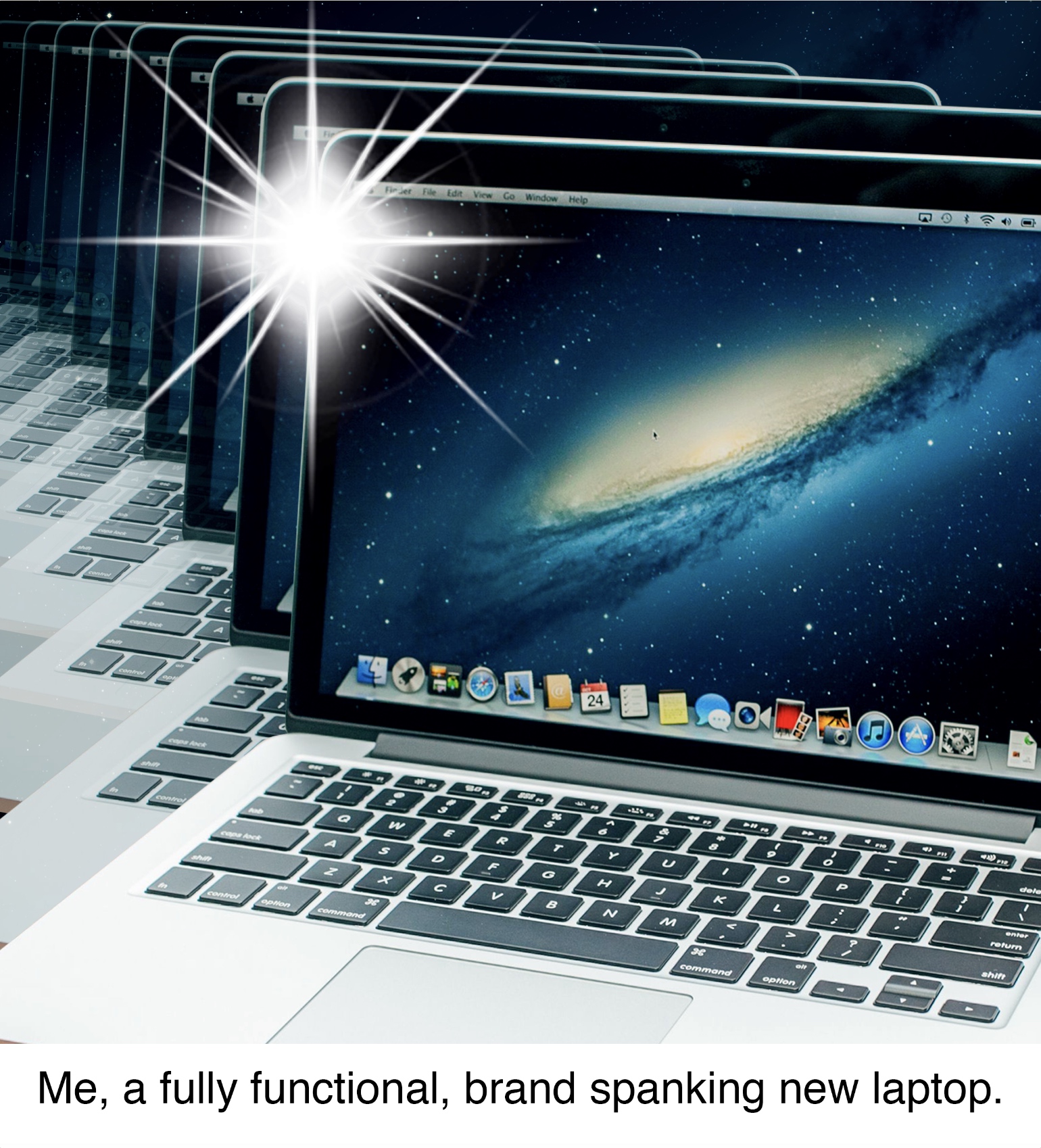
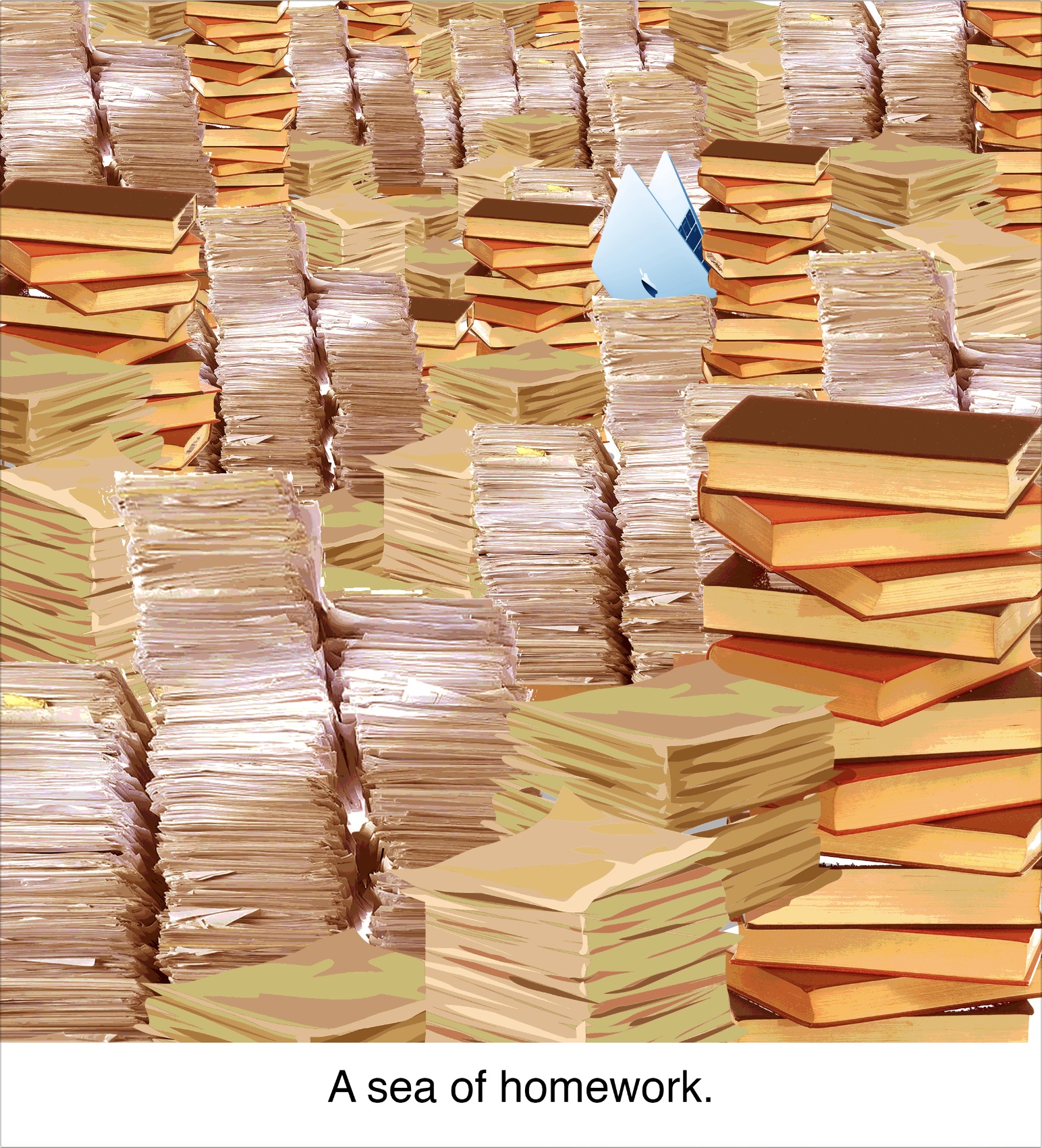
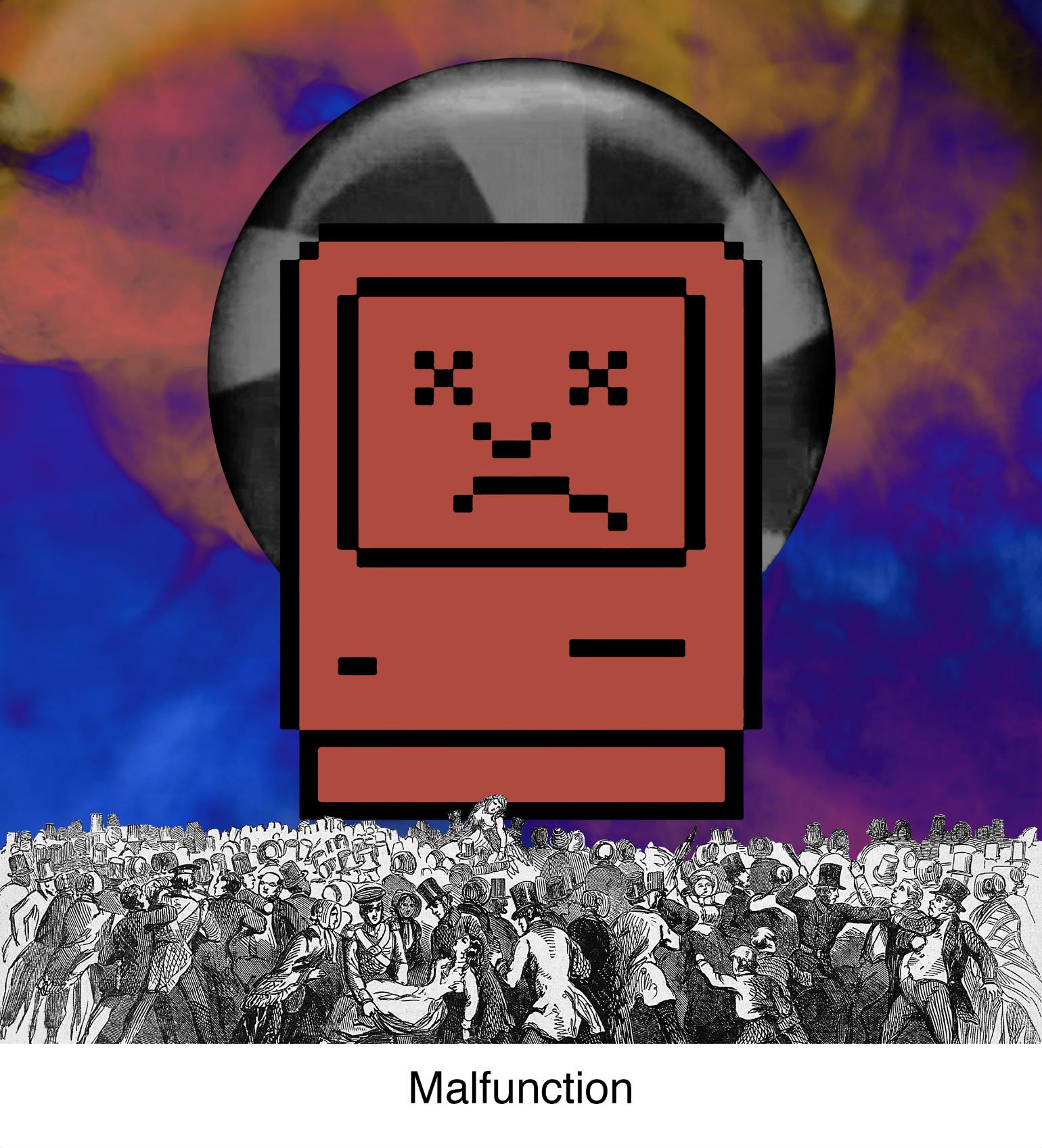


As with many other people, even though we may be fully functional and ready to get out there and do things, when we are given too much of it we can burn out.
I used the same colour pattern for this equation as with the first one. Cool blue tones are used for the first panel which is often used for tech related design to show new, innovative, efficient technology. In this case, that would be me, a laptop. Using colours from the opposite end of the colour wheel, I contrasted the laptop with a sea of homework which completely consumes the laptop as it struggles to stay on top of things. The contrast shows how the two just don’t go. For the last panel, the same contrast is used but much more obviously and with deeper colours showing the chaos the situation brought me.
No Hoodies at Social Events


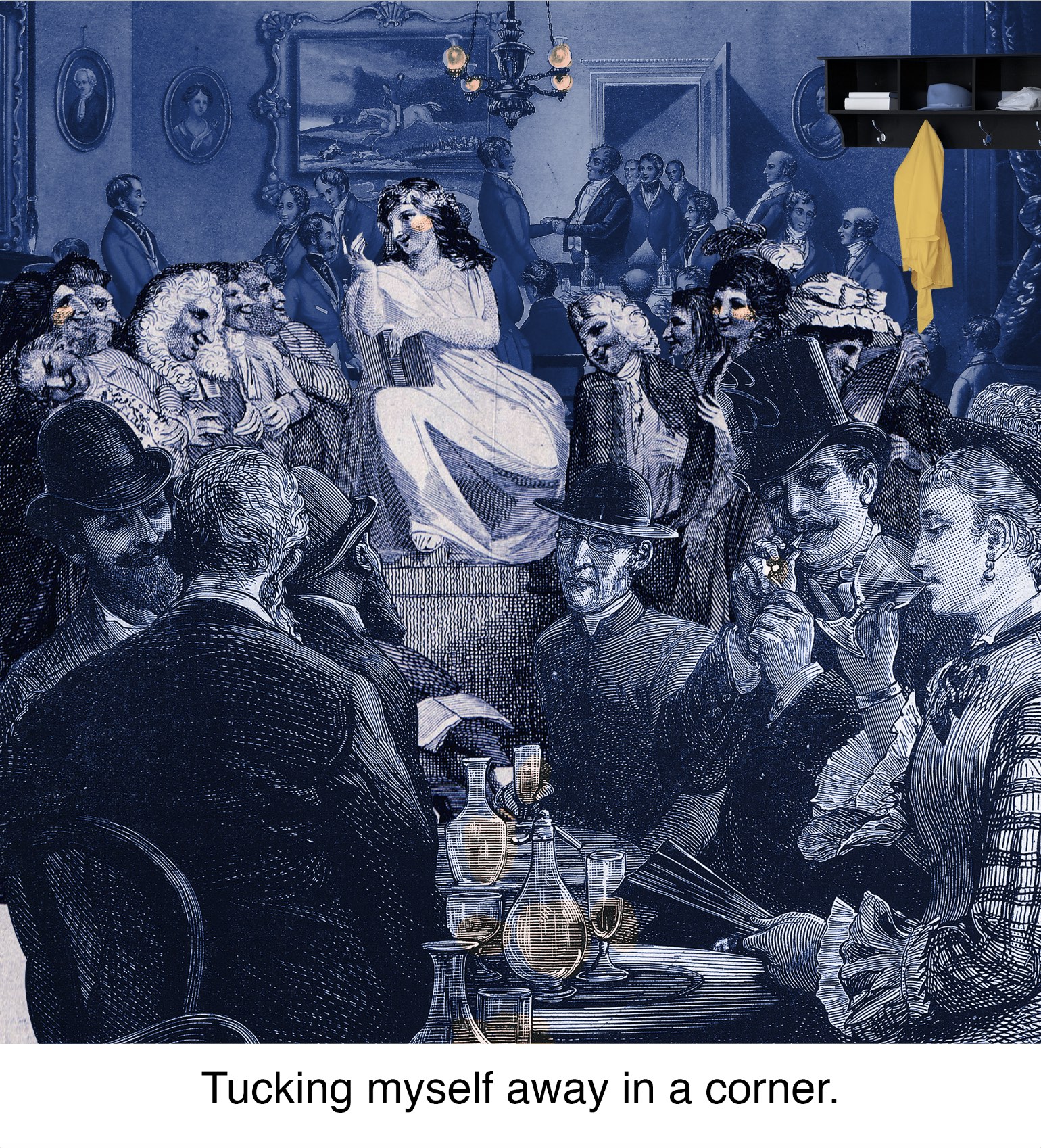


Growing up, and even now, I was very quiet and never had much to say. I end up usually just listening to the conversations of the people I’m with and I enjoyed doing that; but because I didn’t talk much I often ended up being casted out sooner or later. So I just find my little corner in the space and people watch.
With the same colour pattern, I start out with cool and dull tones of blues and greens. These colours, to me, reflect my personality – chill, easy going, and calm. I then move to some brighter and more vibrant colours on the opposite side of the colour wheel in my next panel showing the happiness and liveliness of big social events. In the last panel, the two colour schemes are put together to form a triad complementary. The only difference is that I inverted the colours as I wanted to make my hoodie stand out more in this composition.
Final Thoughts
I really liked this project. It was definitely one of the hardest ones for me because it pushed me to think a lot about my compositions and also to push myself to think out of the box. I had a lot of fun finally being able to play with colour and make my images look more harmonious with them. For this project, I applied quite a few techniques I had learnt from our previous two projects and I’m happy to see that what I have learnt didn’t fly out of my brain and go to waste! Also I got to create some sick photo collages (not as sick as the real deals of course but it’s a start) like the ones I see on the internet and I think I might go on to create more of them in the future (-:
This is not goodbye! I will always be re-visiting all that I’ve learnt here and constantly apply them (consciously and unconsciously) in all the other work that I will be doing. Twas a good semester. Thanks Shirley!