OBJECTIVE
Create an awareness and encourage the public to motivate one another towards finding the Joy Of Missing Out “JOMO”
(Main) To Educate the teens to be aware of the issue and start encouraging towards themselves and their peers leading them to feel the “JOMO” joy of missing out
CHALLENGE
Changing and improving the target audience’s mindset of the fear of missing out.
STRATEGY
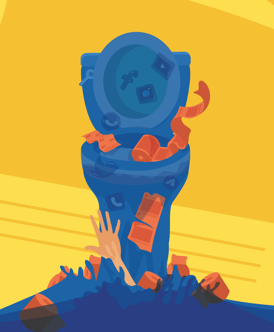
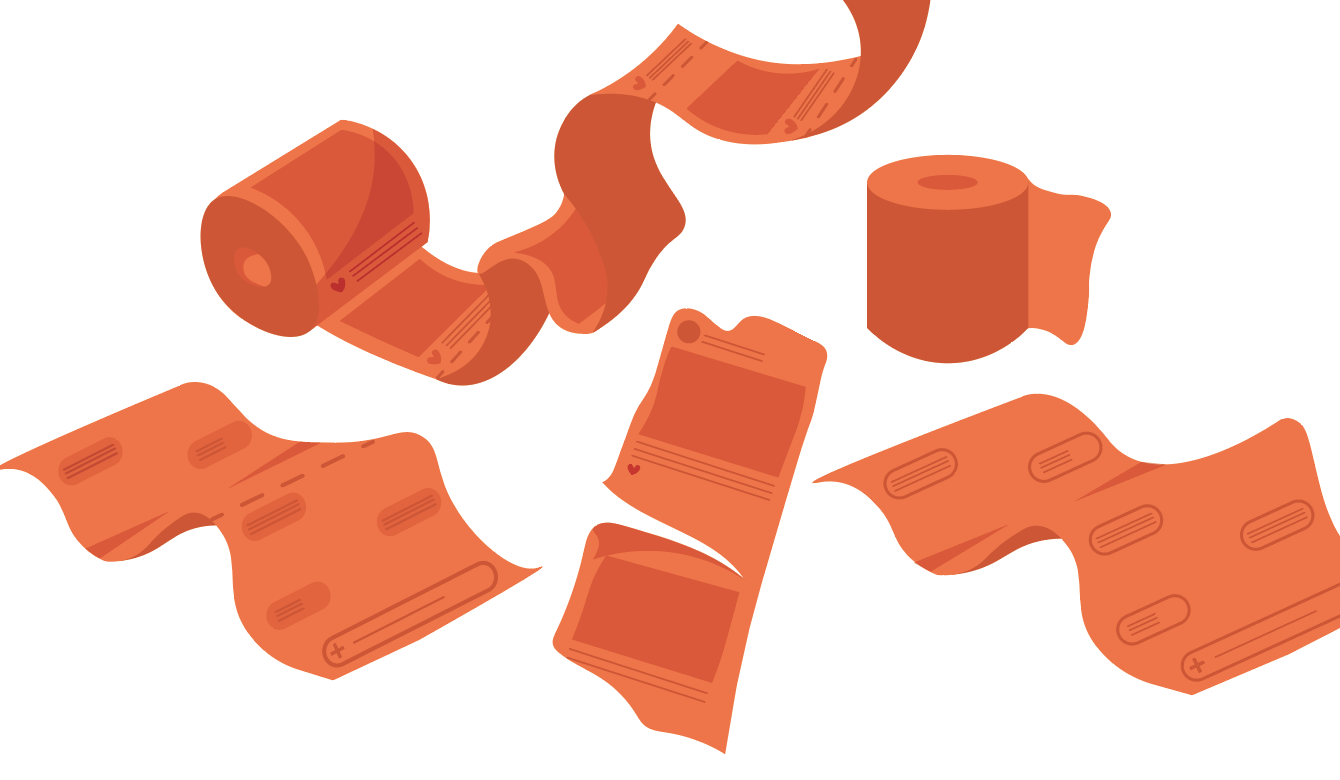
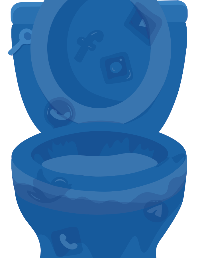
I want to create deliverables that are portable and user-friendly. The deliverables will be stored in a machine. It will be an interactive installation. This machine (e.g. ATM, Vending machine, washing machine or Toliet bowl) is designed in a way that will pique student body interest. This begins its journey of becoming every student “go to/ must use” item on their social media checklist. in student populated areas e.g. canteen makes it accessible to the target audience. This machine will store the deliverables and with a press of a button, the deliverable will drop out of the machine. A deliverable could be a phone case which quotes hypothetical questions or includes designs that allow the receiver to be aware that they are “FOMO”. As the receiver realise that they are “FOMO” they would be more self-conscious and learn ways to cope to be “JOMO”.
TARGET AUDIENCE
Primary Audience – Teachers, Peers and Parents
Secondary Audience – Public
Targeted Audience – Teens ( 13 to 20 years old)
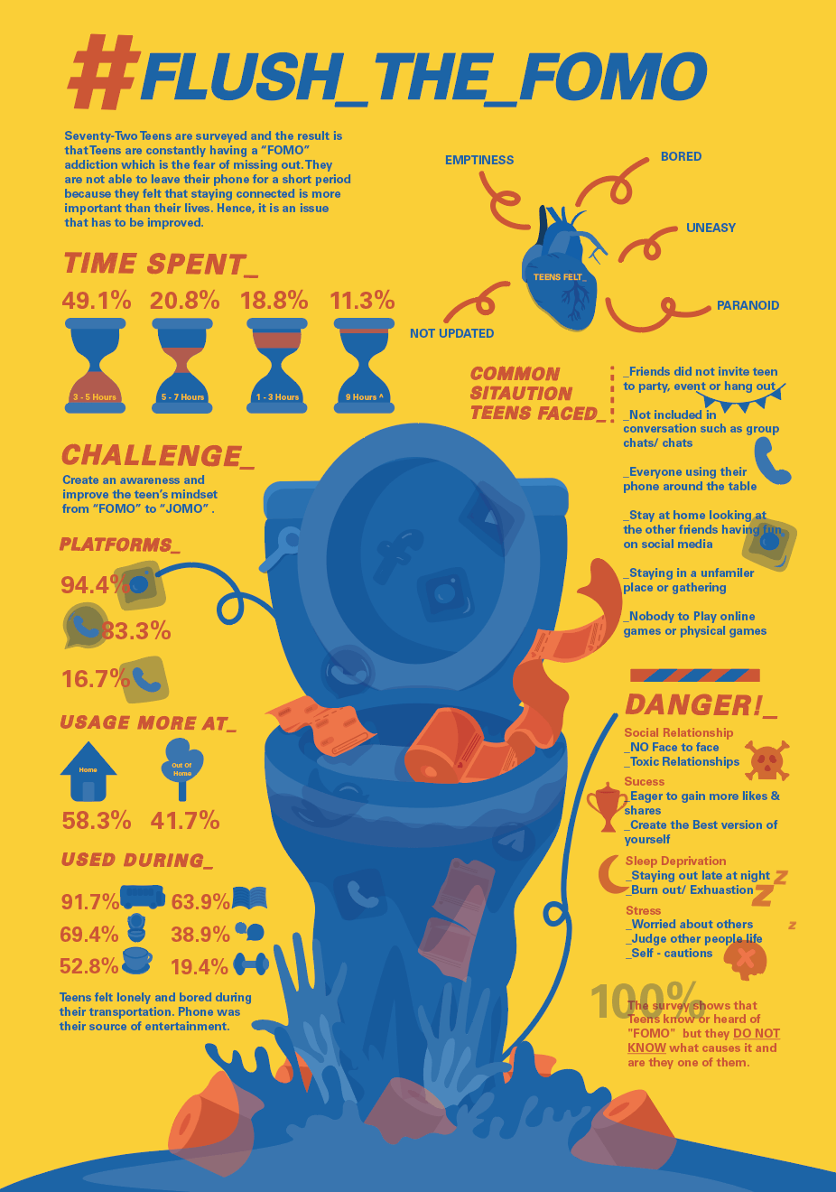
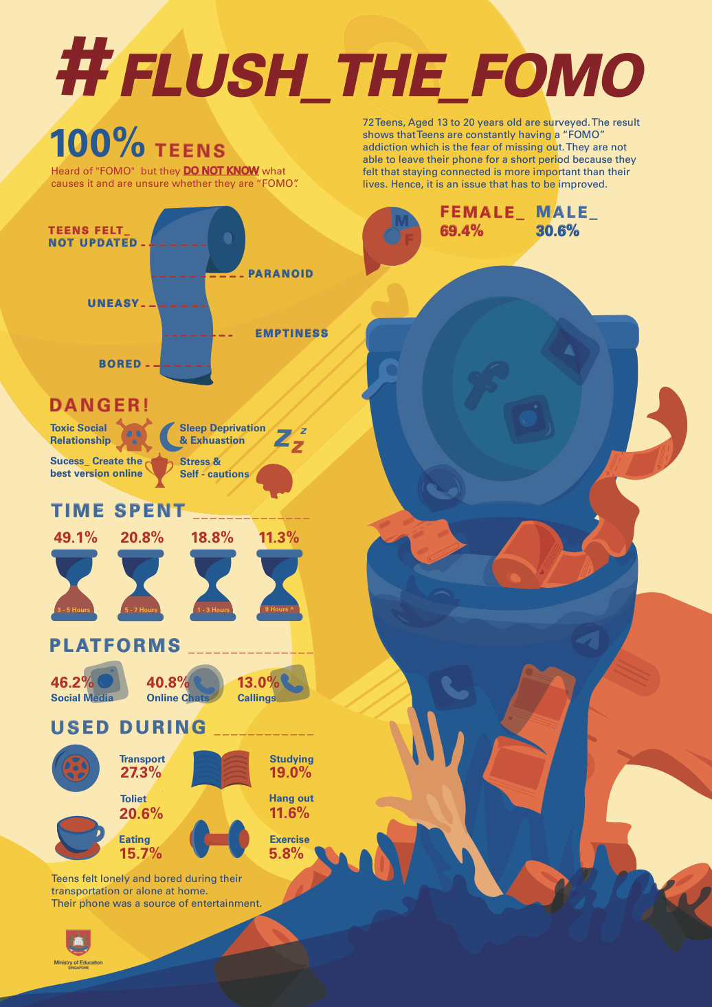
SURVEY RESULTS
Observatory
- In secondary school, they are allowed to use their phone in the canteen and front of teachers ( In the past/ generation, schools do not allow the student to bring their phone)
- While I am eating my lunch in the secondary school canteen, many students will be playing with their phone after they have finished their lunch
- Many people mention “FOMO” in their instant story as a form of sarcasm

I felt that many people use the word “FOMO” but do they really know what is the meaning and how it leads to being fearful of missing out.
(Insights)
1st Online Survey
Below is the link to the online survey:
https://feriga.typeform.com/to/yoOusn
Below is the link to the online survey results:
https://feriga.typeform.com/report/yoOusn/GS3GVtaZ3CRSa9nm
Total interviewee – 36 people
Apps
- The majority will use social media more often ( Instagram/ Youtube/ Twitter)
Hours spent
Situation while using Phone
- Many people use their phone while taking public transport
- At home or outside, they will tend to use it In the toilet
- The phone is regularly used in Studying/ revision
- Nowadays many would use their phone while eating
How do you feel when you are not scrolling on the phone?
- Many of them felt bored because their phones are their only source of entertainment
- Common feelings stated are panic, uneasiness, emptiness, tingling sensation to seek out for their phone
- They tried to put away their phone to be more focused at work, however, they felt a need to be on a constant lookout for their text messages from friends/ family
- They felt a need to constantly check on the latest news and updates of their friend’s social life
- They will feel lonely if the people around them are strangers
- They will find activities to occupy them when they do not have a phone with them
Face to Face Interview
Total interviewee – 17 people
Below is the link to the results/ summary/ insights of information from the Face to face Interview :
https://docs.google.com/document/d/1-yHvWx-ljVnJM09nJm5v99JAxAxKFu1XjxBtxPRN7kI/edit?usp=sharing
Image of results:
I printed out questions that I will ask the teens. I went to different schools to interview them. Targeted aged 13 to 20 years old.
This is the link to the result paper
https://drive.google.com/drive/folders/17FkMwl2_aunDuDnnyFX98MspaaJ3GUtE?usp=sharing
Final Online Survey
Total interviewee – 20 people
Below is the link to the online survey:
https://feriga.typeform.com/to/sphUoS
Below is the link to the online survey results:
https://feriga.typeform.com/report/sphUoS/EbYM54NjE5L2ZEPy
After gathering the information from the first survey online and face to face interview. I then use the information I got and did a final survey.
I found out that there are some points on why Teens are feeling “FOMO”
- Toxic friendships
- Competitiveness and addiction to online statues and social life
- comparing with each other on their life statues
- Unsatisfied ( want to be included in everything, be “Pops” )
- Addiction on the social networking
Danger
- No more face to face conversation
- Failed to discriminate what is important
- No self-reflection in their social relationship
- Wrongly define what is a success (Getting approvable from the number of likes on social media )
- Create the best version of oneself online
- Sleep deprivation ( Staying up to reply and looking at other people Instagram)
- Could not control our usage of phone ( Check every few seconds)
- Instant update on social media
- Adding stress to oneself
- Worrying about others than themselves
- Instead of enjoying life, they tend to judge others when they are stalking people
- We tend to be very self cautious ( why he/she do not want to reply to his/her message)
Conclusion
I felt that I should make an informative poster to inform my targets audience about the issue. The poster will let them know the current result of someone who is feeling the fear of missing out. From there, they will be further improved from feeling “FOMO” with the package that I will provide them within my deliverables.