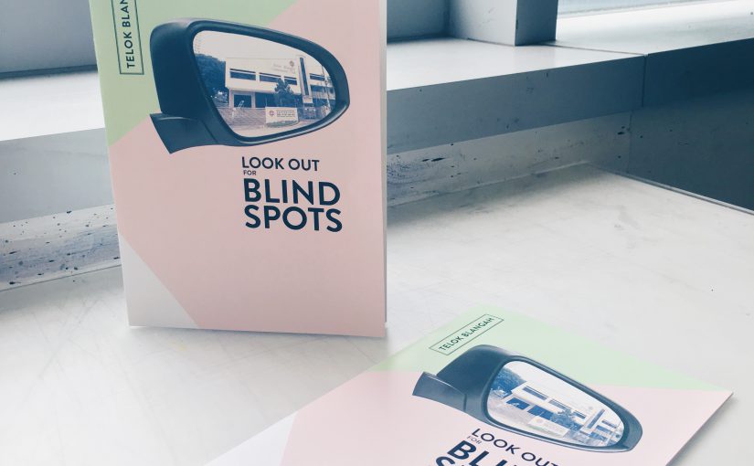
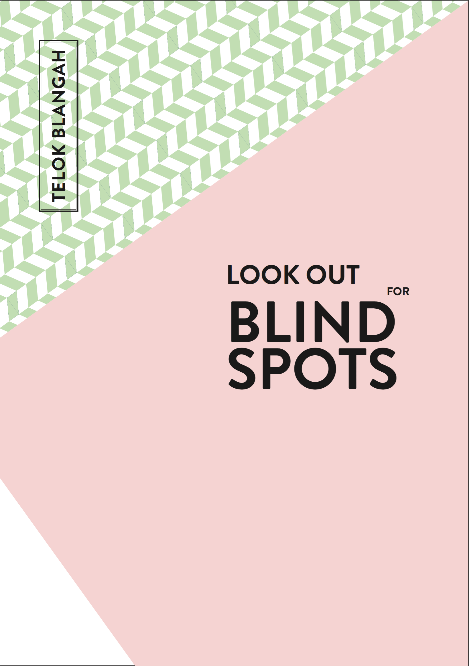
“Look Out for Blind Spots” is a saddle-stitch zine that provides brief information on Telok Blangah neighbourhood, an informative guide for drivers and what they should look out for.
When I was test printing my zines in school, there were gaps between the spreads as the document was printed in pages instead of spreads. Some of the pages were in different orientations too.
In the second test print, I figured that I was supposed to select “print on short-edge”. Although this time round the page orientation is correct, the spreads remained to have gaps. After asking around, I realised that Mac users have to export it into PostScript files and then convert it into PDF. However, the exported PostScript file is in portrait but the spreads are in landscape. Thus, the contents are cropped abruptly. Therefore, I decided to look up online for solutions.
What I found online will be beneficial for future students who need this tip. The reason why PostScript file doesn’t allow me to change its orientation is because I didn’t have a printer option in the PPD tab. Some old mac users might have this pre-installed, but newer mac users doesn’t have any available option. Thus, I have to download ADPDF9.PPD file online and go to Applications > InDesign > Presets > Create a new folder, case-sensitive [PPDs] > and paste the file in this folder. Make sure that InDesign application is not opened in the background. Afterwards, Adobe PDF 9.0 will appear in the PPD tab, then I am able to select A3 size paper and spread orientation for the PostScript file.
I printed my zine from True Colours Print House Pte Ltd. They do not have a wide variety of papers to choose from. There were mostly art cards, according to the feedback for my paper type during presentation. Honestly, do not come to this shop to print due to the limited paper choices, unless you are running late (they open until 10pm, ColorVizio closes at 9pm).
Reflections
Overall, I enjoy the process of making this zine, from concept to production, as this is my first experience in doing so. Comparing the first draft of my zine to the final product, there is a vast difference and I am proud that I managed to complete this zine with the helpful inputs from Joy and my peers. Things that stood out in my zine was the minimalistic style (which I wanted to produce) abd the consistent colour palette.
Things to take note from the final zine: Headers consistency and the first spread’s contents (is varied from the other two spreads).
Before I start on my Zine, I researched on example over Pinterest. I found myself more drawn towards a more minimalistic style. To convey information with mainly pictures and as little text as possible.
Below are the few references I found online which I took interest in.
After which, I tried to work with different grid systems to come up with a layout that I prefer. I know that I want to focus on a few categories in my zine.
Neighbourhood
Places of interests
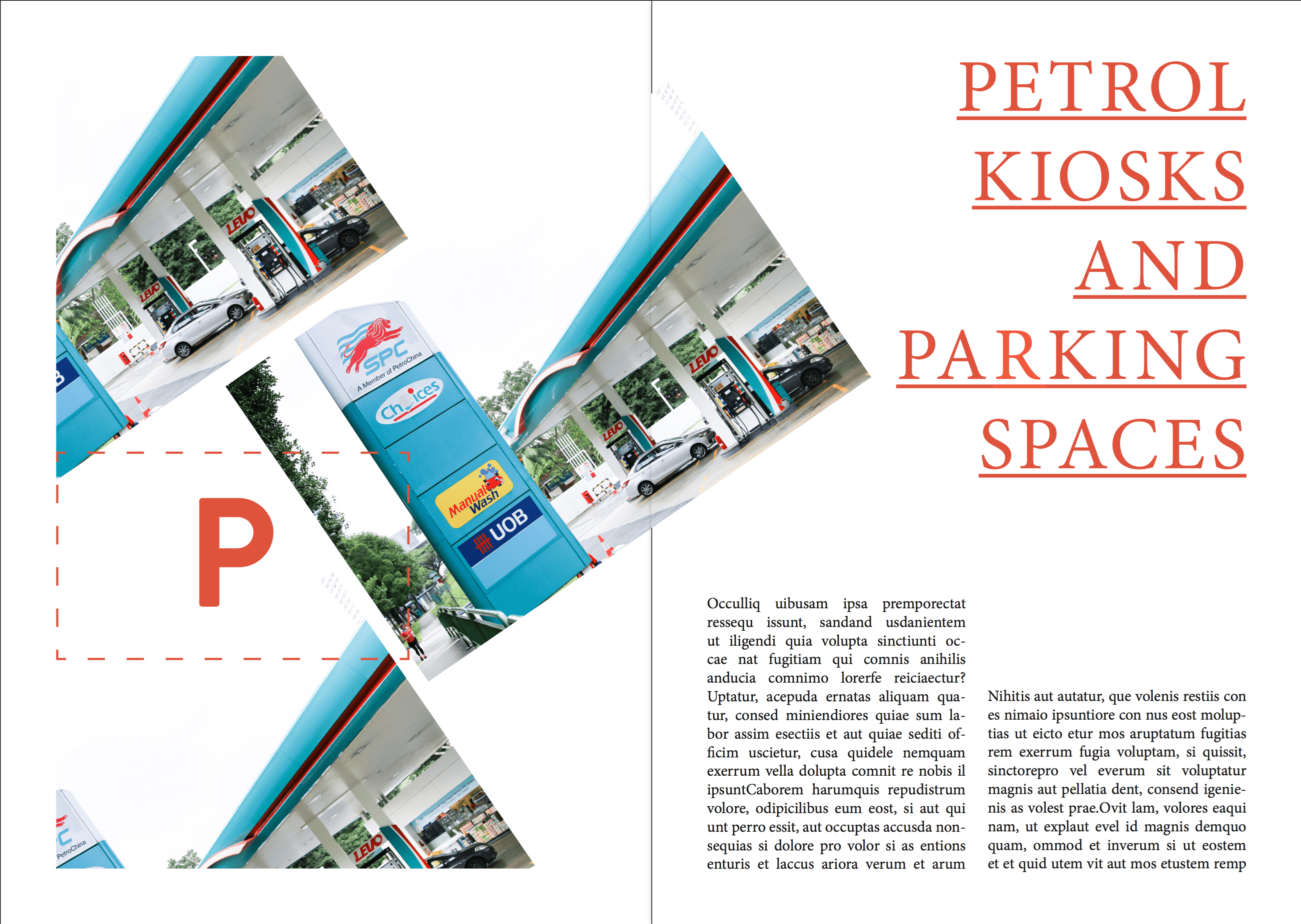
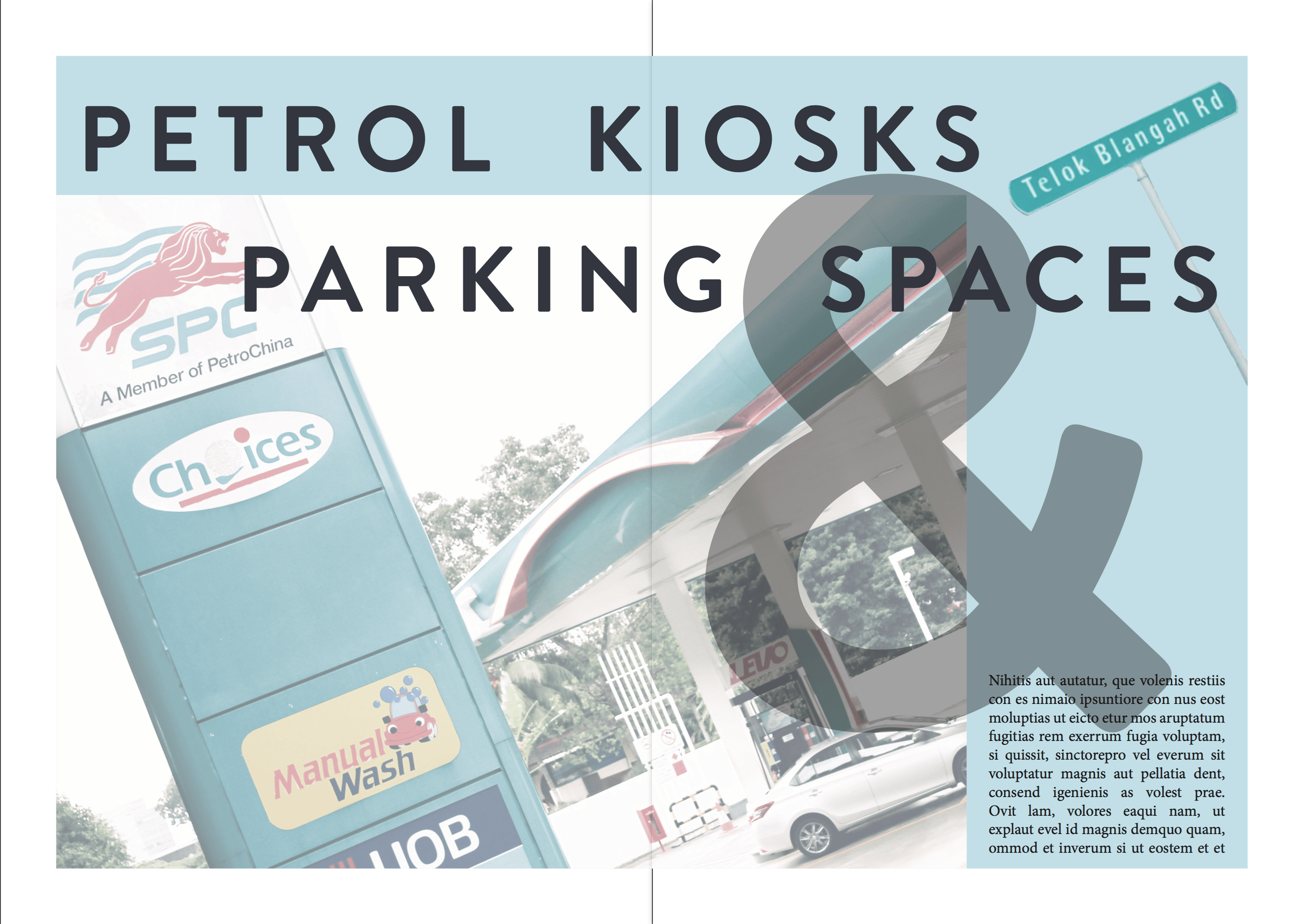
Petrol kiosks and Parking spaces
These categories will be sufficient for all the three spreads in my zine, which is targeted to drivers (informative guide for drivers).
This is my first draft of my Zine.
I chose a pastel palette as it reflects the nostalgic feeling of the neighbourhood.
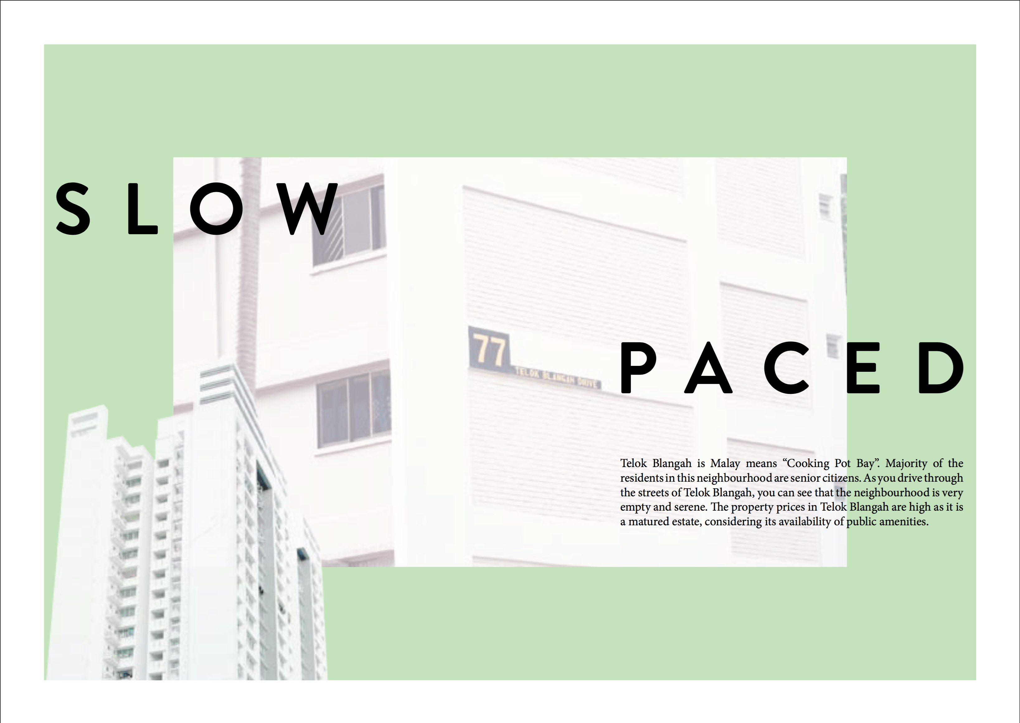
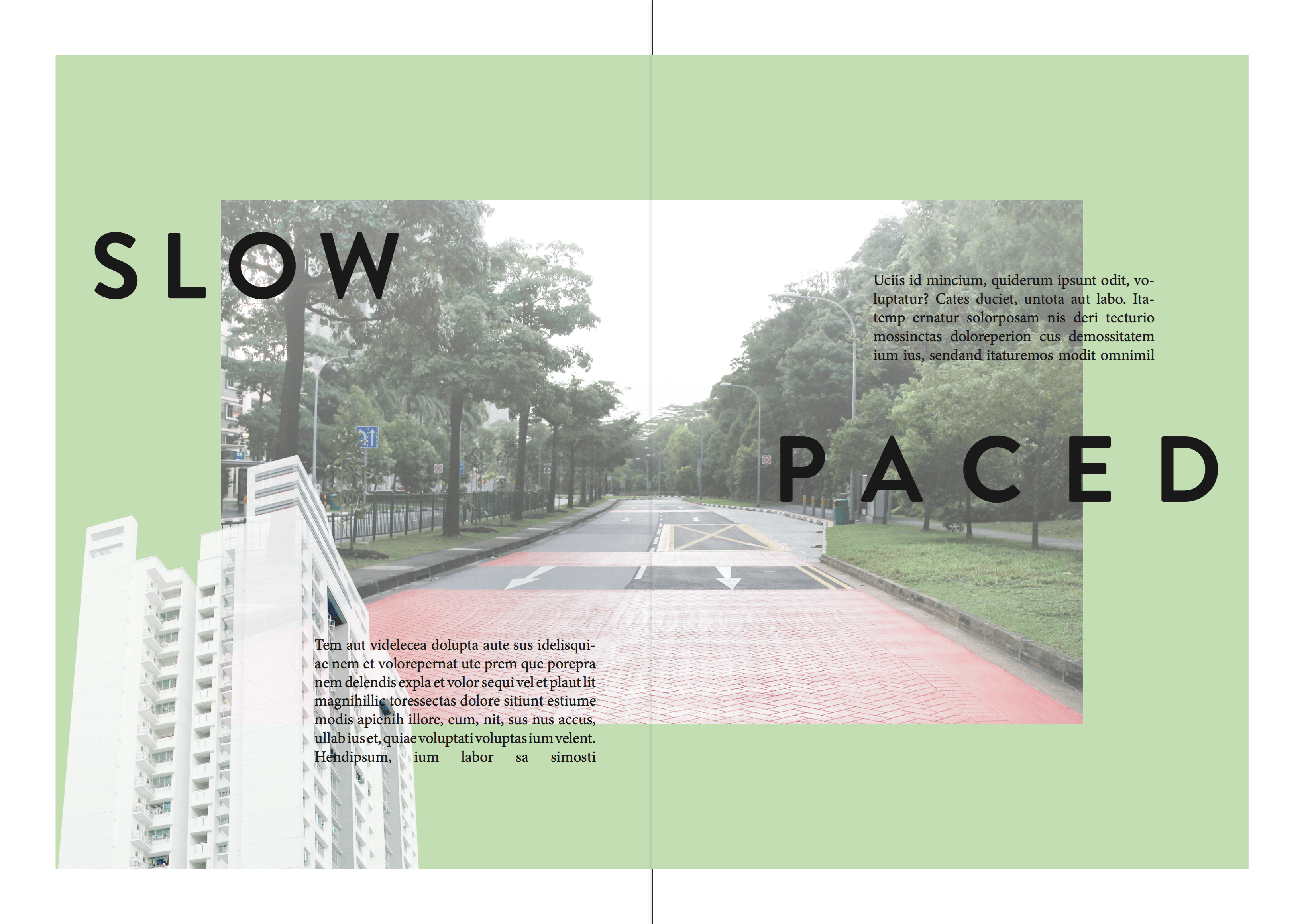
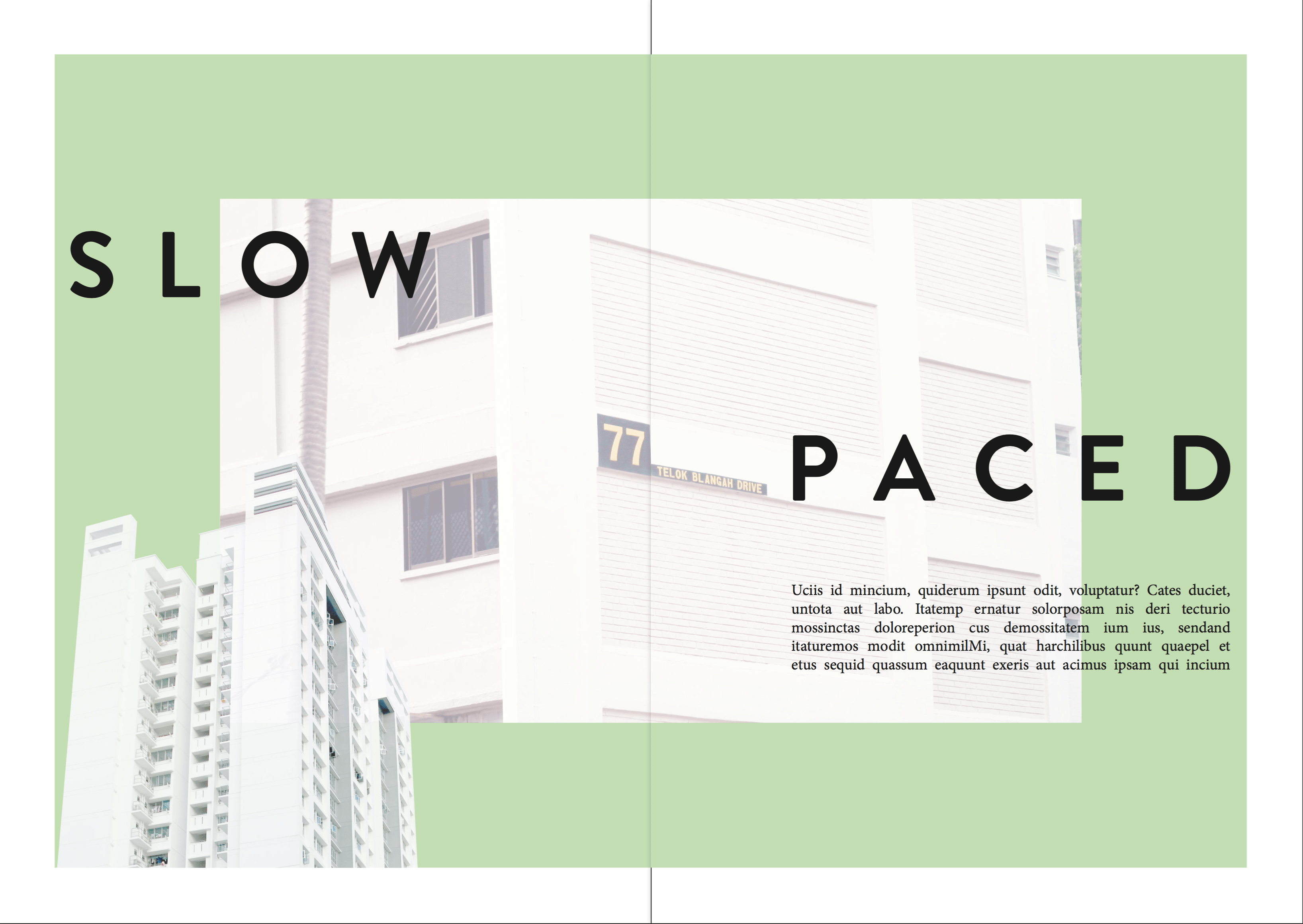
This spread includes a photo in the center and a cropped photo from the bottom. The headers and body texts are overlay-ed on top of the photo and the background. The contents will be mainly on the slow paced life in the neighbourhood.
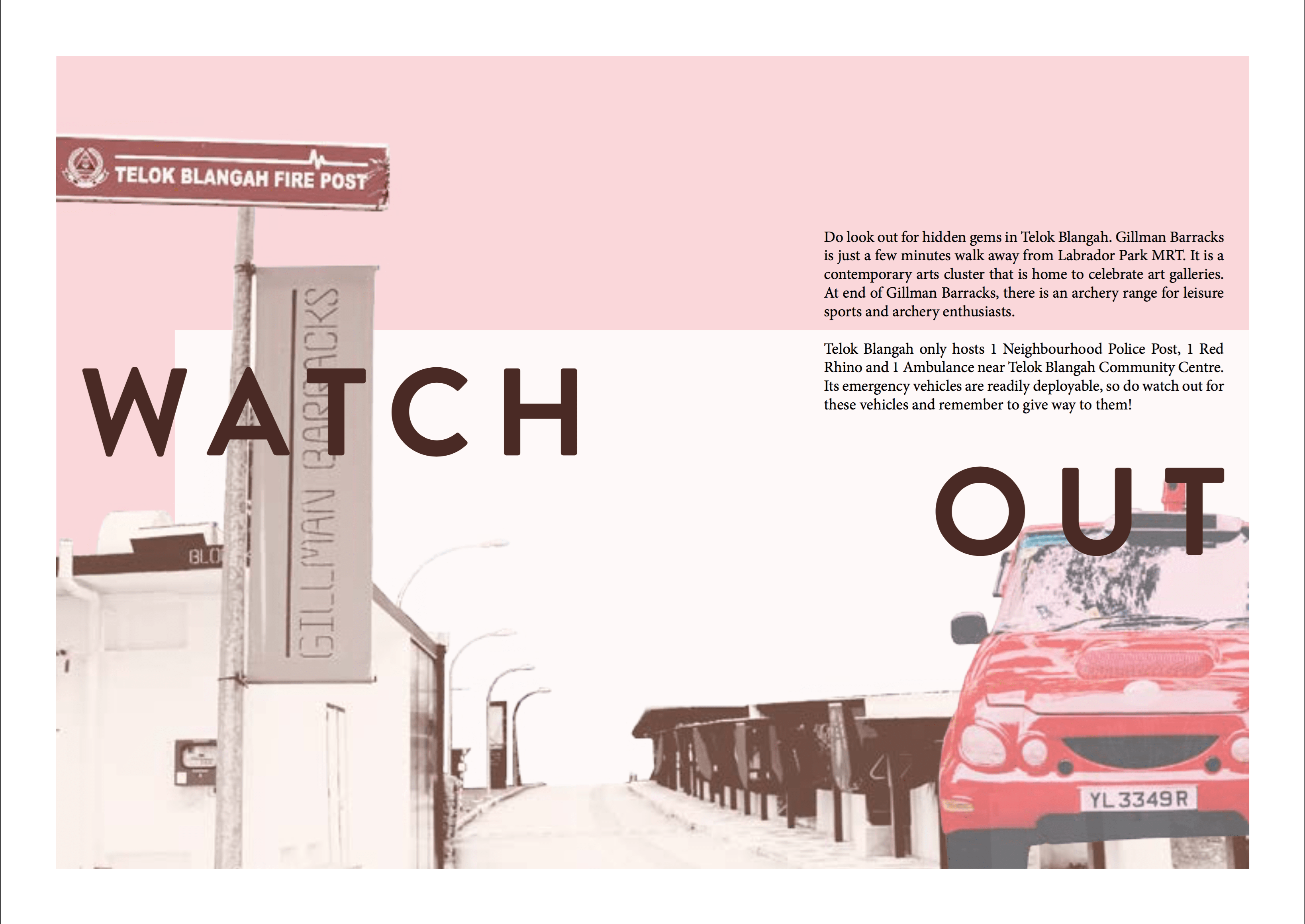
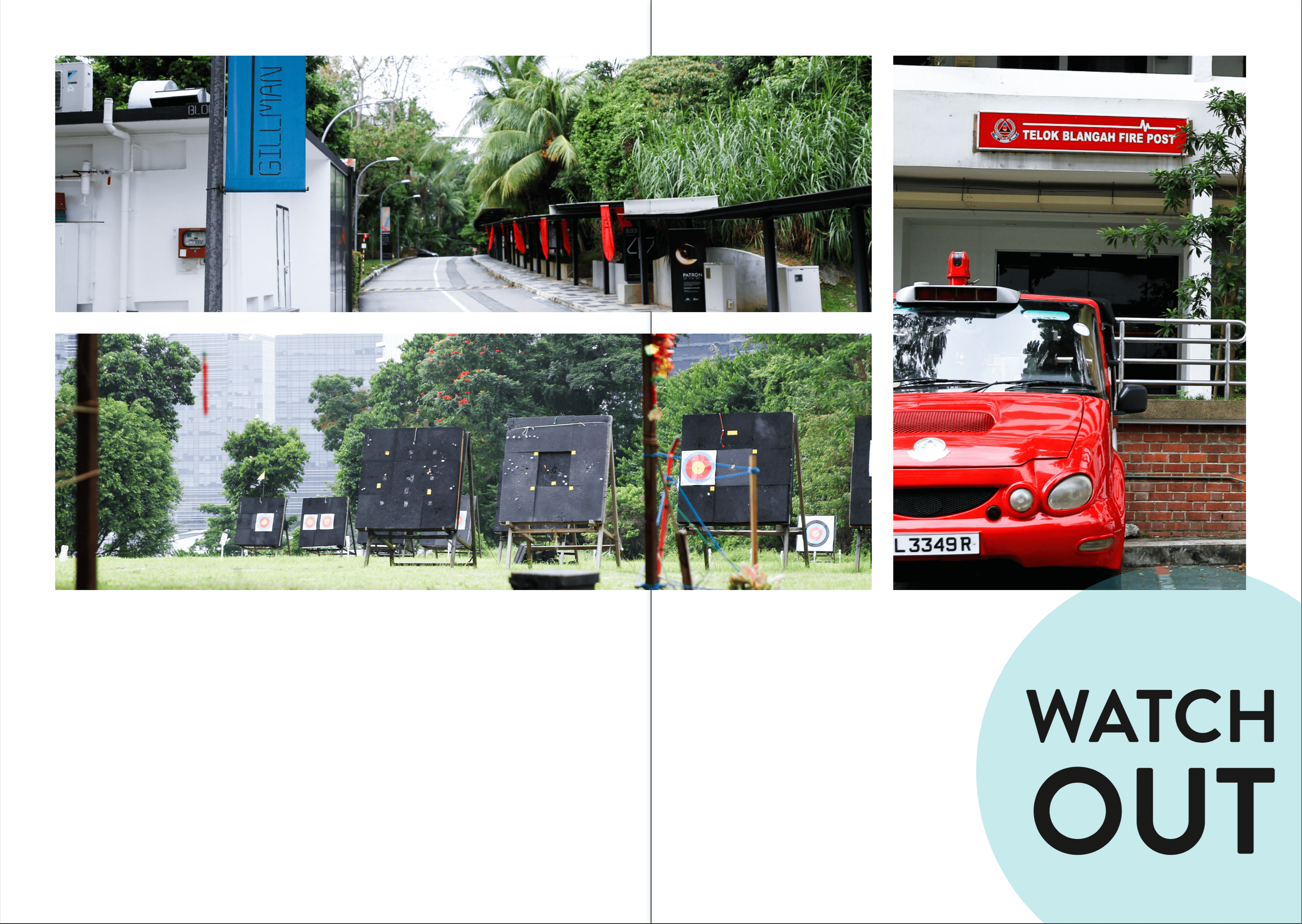
In the second spread, I want to talk about what to watch out for in the neighbourhood. There are places of interests and emergency helplines which will be helpful. I wanted to have a grid-like minimalistic feel, but I guess there must be more explorations towards my final Zine.
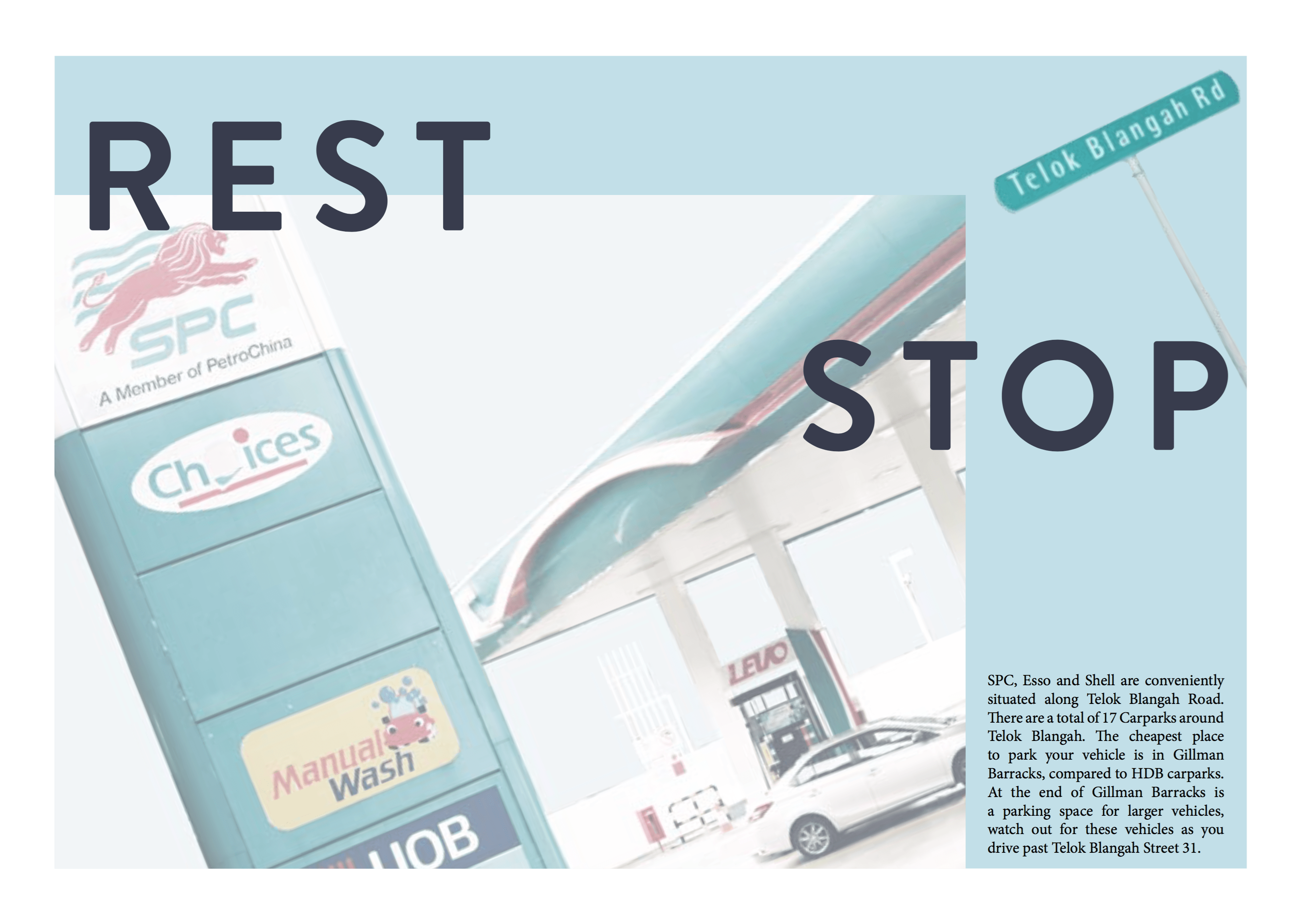
In the third spread, I will talk about where to find the easily accessible petrol kiosks and where to find the carparks with cheap parking rates. I tilted the photos to have a different approach to the former spreads as I didn’t want the whole approach to be bland and stale.
In the back cover, I wanted a circle frame so that a picture could be fitted inside and texts to be filled in the blue column.
After the first consultation with Joy, the following is the second version that was revised.
Compared to the first version, The green patterns have been changed to solid green as I have to keep the consistency throughout the zine; there were no green patterns reflected in zine.
As the previous photo in this spread was too cluttered, I have changed the photo to a HDB to show that the neighbourhood is quiet and slow paced. I reduced the number of paragraphs as too much information will misdirect the reader.
In this spread, a lot of changes have been made. I included the thematic colours, cropped photos of the Red Rhino and Gillman Barracks to again, show consistency. The header has been changed to catch the reader’s attention. The hierarchy is clearly established in this version – Header > Photo > Body texts.
I have decided to remove all other pictures of petrol kiosks as I wanted to keep to a minimalistic style. The header is working fine now here because of its consistency. However, the photo is too complexed and is fighting for attention, thus, some amendments have to be made. The rectangular frame is included to keep the style consistent as well.
I included the photo of a sticker that was on Gillman Barracks pathway, which I feel that I relates to the exit/ending of the zine. However, through consultation, this looks like a logo instead of a photo.
Through these consultations, there is a clear direction to work towards to.
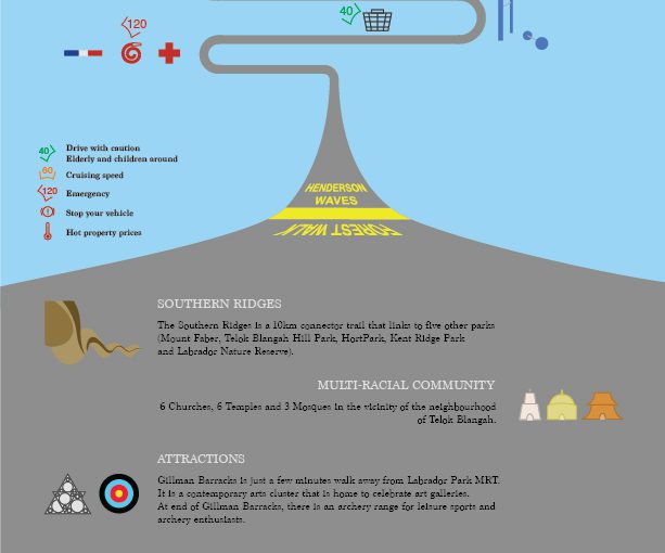
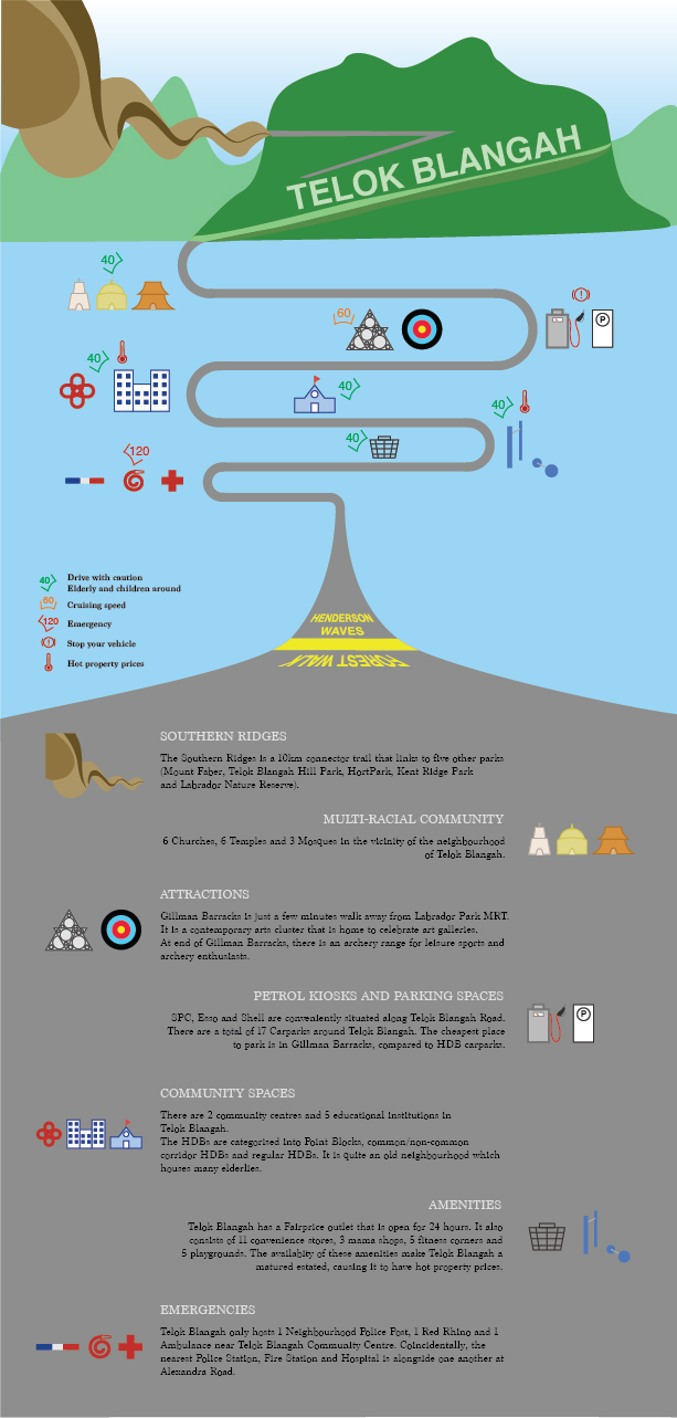
After my exploration around Telok Blangah, I have decided to make an infographic as a guide for drivers (Target Audience). The road the bends around in the middle of the composition brings the audience’s eyes around the context, which will inform them about things in Telok Blangah.
At the top of the composition, there’s the Southern Ridges which includes Henderson Waves, Telok Blangah Hill and Mt Faber. It then leads to temples, Gillman Barracks, petrol kiosks, schools, markets and emergency responses. At the bottom of the composition, I included a short write-up to include information on the icons of the neighbourhood so that they can find out more about the place.
In the middle of the composition, I have included some speed limits to advise drivers to keep while driving past the areas as there are elderlies and children around the neighbourhood. They can increase to cruising speed when they are travelling to attraction sites like Gillman Barracks and archery range. The high speed is to indicate that the emergency responses will travel at a high speed, so drivers should be aware of their surroundings and keep a good lookout to prevent accidents. The “hot temperature” symbol is to indicate that Telok Blangah is a mature estate which offers high property prices even though it is a quiet neighbourhood. I have also included petrol kiosks and parking spaces in the infographic as I find it intriguing to have 3 different petrol kiosks down the same road on Telok Blangah Road. It is very convenient for drivers to find them on the main road.
In conclusion, I find that this Infographic exercise allow us to better appreciate the neighbourhood and know what information we want to bring across to our audience.
2. What is ethnography and participant-observation? What are some ways of collecting data?
Participant Observation: A method of data collection method typically used in qualitative research. One of the many methods used for Ethnography. Aims to gain a close and intimate familiarity with a given group of individuals and their practices through an intensive involvement with people in their cultural environment, usually over an extended period of time. E.g. Informal interviews, direct observation, participation in the life of the group, collective discussions, analyses of personal documents produced within the group, self-analysis, results from activities undertaken off or online, and life histories.
Ethnography: The systematic study of people and cultures, where the researcher observes society from the point of view of the subject of the study. A means to represent graphically and in writing the culture of a group. The recording and analysis of a culture or society, usually based on participant observation and resulting in a written account of a person, place or institution. E.g. Narrative interviews and artefact analysis, recording observations with due attention to the cultural context and the meanings assigned by the culture’s practitioners.
3. What is qualitative and quantitative data? What is the difference between primary and secondary sources of data? How would you go about collecting the two?
Qualitative research: Gathers information that is not in numerical form, typically descriptive data. To find out the ways in which people think or feel. E.g. Diary accounts, open-ended questionnaires, unstructured interviews and observations.
Quantitative Research: Gathers data in numerical form which can be put into categories. It can be used to construct graphs and tables of raw data. E.g. Experiments, observations and questionnaires.
Primary Sources of Data: Provides Direct or firsthand evidence about an event, object, person or work of art. E.g. Historical and legal documents, eyewitness accounts, results of experiments, statistical data, pieces of creative writing, audio and video recordings, speeches and art objects. Interviews, surveys, fieldwork, and Internet communications.
Secondary Sources of Data: Describes, discuss, interpret, comment upon, analyse, evaluate, summarise and process primary sources. E.g. Articles in newspapers or popular magazines, book or movie reviews, or articles found in scholarly journals that discuss or evaluate someone else’s original research.
I visited Telok Blangah on Saturday with a friend who lives in Telok Blangah Drive. He gave me descriptions and history of the neighbourhood and I witnessed the “kampung” culture of the residents there. I have documented my findings using photography and will elaborate with the photos.
After the neighbourhood visit, I tried to find scholarly articles that talks about the history of Telok Blangah and statistics reports of Telok Blangah. It should be able to support my on-site findings.
4. What are infographics and how are they used to effectively communicate data? What other ways can we visually represent data?
Infographics – Information Graphics. It is a form of content marketing that can help to simplify a complicated subject or turn an otherwise boring subject into a captivating experience.
It should:
– Be visually engaging
– Contain a subject matter and data
– Appeal to target audience
– Build awareness
– Easy for readers to engage
– Include a diversity of sources and statistics
Ways to visually represent data:
Indicators – Displaying one or two numeric values such as a number, gauge or ticker, using the Indicators visualisation.
Line Chart – (1) Comparing data over time to view trends. (2) Comparing changes over the same period of time for more than one group or category.
Column Chart – Comparing items and comparing data over time.
Bar Chart – Comparing many items/categories.
Pie Chart – Aiming to display proportional data or percentages.
Area Chart – Display absolute or relative (stacked) values over a time period.
Pivot Table – Quickly summarise and analyse large amounts of data.
Scatter Chart – Display the distribution and relationship of two variables.
Scatter Map/ Area Map – Visualise geographical data across a region as data points on a map.
Treemap – Displays hierarchical data in the form of nested rectangles.
Distribution plot – Lets viewers see where each media outlet lies on a spectrum. (Fishbone)
Simple Visuals – Using scale, static data visualisation to illustrate your point, using length (depth).
Journey
My friend, who is a resident in Telok Blangah, brought me around the neighbourhood to understand its culture, history and background. There were a lot of interesting discoveries which were covered in the pdf document attached (in the hyperlink) in the first section of this post.
Click to enter photo gallery
Major Interesting Findings
Community formed mostly by Malay
A lot of old people
Very quiet neighbourhood, but its property price is expensive due to the availability of amenities
Red Rhino will respond and reach within the vicinity of Bukit Merah in 10 minutes
Merger of neighbourhood primary school
Neighbourhood swimming complex closed down, but opened in Mt Faber SAFRA when it was moved into Telok Blangah
Blocks of the same digits caught my eye (mostly 2-digit Block numbers) E.g. 44, 55, 66, 77, 88
Running trail of 17km connecting from Hort Park to Mt Faber
The tone for my assignment is element of surprise, challenging the assumptions that the audience have, comparing both Dreams and Reality of an individual.
Animation Curator
Animation Curator [Final]Animation Curator [GIF]Message: Singapore restrains the creativity of Singaporeans, thus, we have to take risks and pursue our goals.
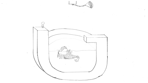
Concept: Yes, Singapore encourages creativity, but government still censors the media. The plate of gold represent the incentives that encourages artists in Singapore to generate creative content. The Merlion represents Singapore trying to devour anyone who drops into the water; limiting the creative contents. I showed the character jumping off the platform to grab the gold, this illustrates that we should should not be afraid to take risks. We should venture out of Singapore to pursue our dreams and make a name for ourselves.
Naval Officer
Naval Officer [Final]Message: Having a job in the government sector doesn’t guarantee a stable career.
Concept: The rice bowl represent the job I am earning a living from. It is of porcelain material, which shows that it is fragile. Many people think that people who signed on to the military earns a lot and is well taken care of by the Government, but it actually depends on the performance of that individual. The responsibility is huge and we must be tactful and capable in whatever we do. Thus, this composition is to force the audience to think in our shoes.
Hairdresser
Hairdresser [Final]Message: Not all hairdressers are college drop-outs.
Concept: Many people think that hairdressers are those who could not get into universities, thus resorting to Beauty and Wellness industry. I beg to differ, I feel that it is a job for anyone who has a passion in it. Students who graduate with a degree can also step into this industry. The brush strokes represent creativity and hard work of an art student who is still pursuing his education. It represents hair too, the colours apply to both elements in a design (that a student studies) and the aesthetics of hairdressing patrons who wants their hair to be coloured with. The hair clipper represents “tool” – for job and education; a tool to get the job done.
Backpacker
Backpacker [Final]Message: Parents doesn’t like their kids to explore around the world when they are young. They think that they should save up for Mortgage.
Concept: Most young adults have the desire to travel to foreign countries, as illustrated by the backpack. The compartments of the backpack represents the 5 “C”s of Singapore – Cash, Car, Condo, Credit Card and Country Club. These are the ideals that most parents want their children to achieve. Tied down by these expectations, these young adults’ freedom are restrained.
Challenges Faced
Naval Officer: It was difficult to achieve a balanced lighting for the porcelain bowl as the specular highlight (white spot) was too jarring. If I reduced the glossiness of the bowl, it will not look like a porcelain bowl, but a just a matte texture. Thus, I did post-processing to balance the image.
Hairdresser: It was a difficult time to come up with a good visual representation for the Hairdresser job as I have tried to use paintbrush bristles and real hair to form the composition previously, it just didn’t work out.
Backpacker: I wanted a minimalistic approach to the whole composition, but it was too limited to illustrate Country Club and Condo with just the compartments of the backpack. Thus, I had to display it in the background, which made the whole composition very cluttered.
During the printing process, it was a challenge to pick a suitable paper. I test-printed my designs on Toile-M, Zeta Hammer B and White Card. Toile-M had a canvas texture but it made the printing look uneven. Zeta Hammer B was the paper choice I used for last semester’s Ego project. In this semester, I felt that this choice will not work out as well because the texture appears to be like a cartridge paper, it had a rough surface, which does not work well with the glossiness texture I had with Naval Officer composition and other flat solid colour designs. I decided on using White Card for all my compositions, it have much a smoother surface and made the white colour in the compositions stand out more.
I have decided that traditional animation can work for this design. It is able to illustrate the essence of being an animator and bring across the point of creativity being constrained in Singapore.
I have drawn them in different layers, namely: Background, Merlion, Character, Water and Pot of Gold.
It has a total of 26 frames, I have applied some of the 12 principles of animation in it. However, I will be only using some of the frames, to form the final composition. The final composition will be a Capital ‘G’ formed by the Gold pendulum and the Character jumping. The Merlion will also form a ‘G’ when it jumps out of the water.
Message: Singapore restrains the creativity of Singaporeans, thus, we have to take risks and pursue our goals.
Naval Officer
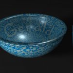
Bowl Image
Ambient Occlusion
Pxielised Camo texture
I decided to model a porcelain bowl with Navy pixelised texture in 3D. I searched for a pixelised texture and colour-corrected it to resemble a Navy military uniform. The intention of using a bowl is to represent a job that we earn a living from. I have added a pair of chopsticks for scale comparison. I have utilised the pixelated texture to form my name. The lighting was difficult to achieve as the material attributes is reflective; it was difficult to balance between a shiny texture and reducing the distraction of the specularity.
Message: Having a job in the government sector doesn’t guarantee a stable career.
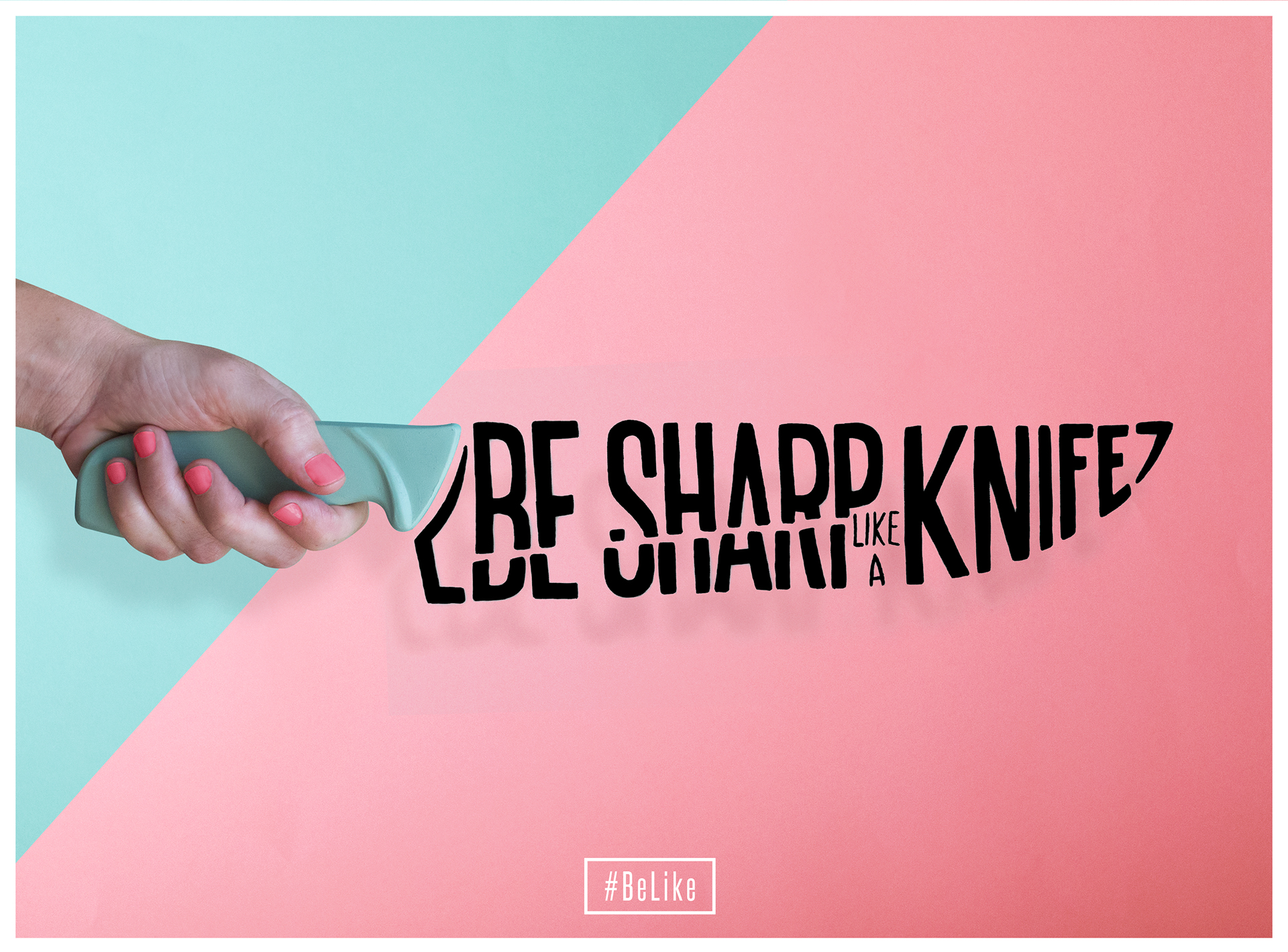
Hairdresser
This was my initial idea, using paintbrush, layering scissors, hair and hair clipper to form the letterform “G”. However, the backdrop seemed like from a surgical setting. Joy suggested to use the bristles of a brush to form the letterform. However, the post processing seemed too forced with digital imaging.
I have decided to reference from Jenifer Blanco Monzon as her style is minimal and yet best illustrates her message and object. My composition is made up with a hair clipper, brush strokes and a two toned background. I used “J’ as my initials as “J J CHUA” was the name that my peers in Navy call me.
This colourful brush strokes also represents Hair. Which links creativity, education and passion together.
Message: Not all hairdressers are college drop-outs.
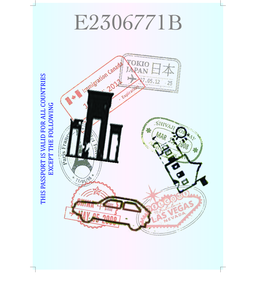
Backpacker
This was my initial design. It was supposed to be an alphabet “G” formed by travel stamps and building chops on a passport. The background didn’t work out great, thus I had to change the entire look of it.
My inspiration comes from the different compartmentalisation of items. Each compartment can represent different things that we are concerned about. My composition is a backpack with 5 ‘C’s of Singapore, represented by the 5 compartments. The 5 ‘C’s of Singapore – Cash, Car, Condo, Credit Cards and Country Club. The backpack represents the desire to travel as a young adult, but the 5 ‘C’s are the mindset of parents, holding them back from doing what they want. They are the restraints that most Singaporeans have. As there are a lot of content in the composition, I decided to use solid colours to balance with each element.
Message: Parents doesn’t like their kids to explore around the world when they are young. They think that they should save up for Mortgage.
(assuming the blue colour is in place of yellow colour) The two jugs represents binge drinking, where it represents socialising. The waves represents Navy, which I have committed to sign on. The little circular patterns represents my interest in calligraphy and illustrations.
A cluttered space filled with a chinese character from my name, shows that I cannot settle down with many ideas. The other colours represent the different interests I have picked up over the years.
I’ve cut out a space, which is able to see through, shows that I am transparent and willing to share the knowledge that I have with my fellow peers. It shows that I am frank too, to speak up what’s on my mind.
In this project, we are to create Typography graphics using part of our names to illustrate our future jobs. Hence, we have to come up with the concepts for typefaces and letter forms.
The names/nicknames that I will be using are: Gerald, Gerald Chua, GC, JJ.
The jobs that I wish to pursue: Animation curator, Naval Officer, Hair Dresser and Backpacker.
The following are the artists that I have researched for visual reference.
Artem Sukhinin
Friendly Robot
Woody Pirtle
Jenifer Blanco Monzon
Budi Kwan
Monique Goossens
Peter Saville
Ivan Capote
Dario Devic
Like Minded Studio
Jon Contino
Stas Gotsulyak
SAWDUST
Marion Luttenberger
Alessio Joseph
Melanie Burk
Sabeena Karnik
Challenging Assumptions
To convey intended message to audience and challenge the social stigma towards selected occupations.
Animation Curator:
To produce films that appeal more to teenagers and adults, rather than focusing on kids
Singaporeans are afraid to explore, pursue their dreams thus the industry is still small in Singapore
Naval Officer:
Not all naval personnel are divers
Not all naval officers work in a submarine
Working in the government sector not necessarily secure a stable income
Hairdresser:
Not all male hairdressers are flamboyant
Not all hairdressers are drop-out students
Backpacker:
Senior Citizens are still fit and able to backpack
Parents doesn’t like their kids to explore around the world when they are young. They think that they should save up for Mortgage


![Animation Curator [Final]](https://oss.adm.ntu.edu.sg/chua0803/wp-content/uploads/sites/786/2017/02/G_Anim_Final_oss.jpg)
![Animation Curator [GIF]](https://oss.adm.ntu.edu.sg/chua0803/wp-content/uploads/sites/786/2017/02/G_Anim_Colour_Small.gif)
![Naval Officer [Final]](https://oss.adm.ntu.edu.sg/chua0803/wp-content/uploads/sites/786/2017/02/Bowl_Final_02_oss.jpg)
![Hairdresser [Final]](https://oss.adm.ntu.edu.sg/chua0803/wp-content/uploads/sites/786/2017/02/Hairdresser_02_oss.jpg)
![Backpacker [Final]](https://oss.adm.ntu.edu.sg/chua0803/wp-content/uploads/sites/786/2017/02/Backpacker_02a_oss.jpg)


