Dreams & Reality

Tone
The tone for my assignment is element of surprise, challenging the assumptions that the audience have, comparing both Dreams and Reality of an individual.
Animation Curator
![Animation Curator [Final]](https://oss.adm.ntu.edu.sg/chua0803/wp-content/uploads/sites/786/2017/02/G_Anim_Final_oss.jpg)
![Animation Curator [GIF]](https://oss.adm.ntu.edu.sg/chua0803/wp-content/uploads/sites/786/2017/02/G_Anim_Colour_Small.gif)
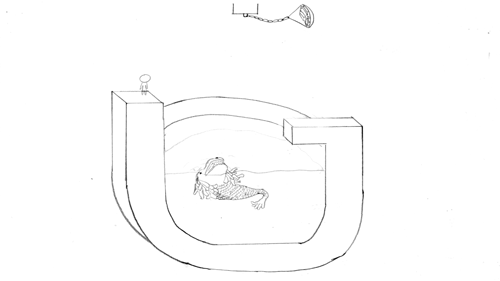
Concept: Yes, Singapore encourages creativity, but government still censors the media. The plate of gold represent the incentives that encourages artists in Singapore to generate creative content. The Merlion represents Singapore trying to devour anyone who drops into the water; limiting the creative contents. I showed the character jumping off the platform to grab the gold, this illustrates that we should should not be afraid to take risks. We should venture out of Singapore to pursue our dreams and make a name for ourselves.
Naval Officer
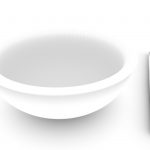
![Naval Officer [Final]](https://oss.adm.ntu.edu.sg/chua0803/wp-content/uploads/sites/786/2017/02/Bowl_Final_02_oss.jpg)
Concept: The rice bowl represent the job I am earning a living from. It is of porcelain material, which shows that it is fragile. Many people think that people who signed on to the military earns a lot and is well taken care of by the Government, but it actually depends on the performance of that individual. The responsibility is huge and we must be tactful and capable in whatever we do. Thus, this composition is to force the audience to think in our shoes.
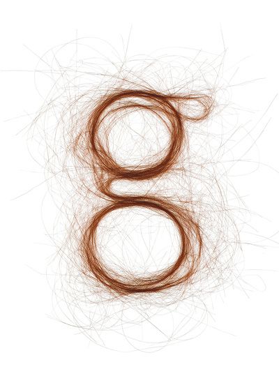
Hairdresser
![Hairdresser [Final]](https://oss.adm.ntu.edu.sg/chua0803/wp-content/uploads/sites/786/2017/02/Hairdresser_02_oss.jpg)
Concept: Many people think that hairdressers are those who could not get into universities, thus resorting to Beauty and Wellness industry. I beg to differ, I feel that it is a job for anyone who has a passion in it. Students who graduate with a degree can also step into this industry. The brush strokes represent creativity and hard work of an art student who is still pursuing his education. It represents hair too, the colours apply to both elements in a design (that a student studies) and the aesthetics of hairdressing patrons who wants their hair to be coloured with. The hair clipper represents “tool” – for job and education; a tool to get the job done.
Backpacker
![Backpacker [Final]](https://oss.adm.ntu.edu.sg/chua0803/wp-content/uploads/sites/786/2017/02/Backpacker_02a_oss.jpg)
Concept: Most young adults have the desire to travel to foreign countries, as illustrated by the backpack. The compartments of the backpack represents the 5 “C”s of Singapore – Cash, Car, Condo, Credit Card and Country Club. These are the ideals that most parents want their children to achieve. Tied down by these expectations, these young adults’ freedom are restrained.
Challenges Faced
Naval Officer: It was difficult to achieve a balanced lighting for the porcelain bowl as the specular highlight (white spot) was too jarring. If I reduced the glossiness of the bowl, it will not look like a porcelain bowl, but a just a matte texture. Thus, I did post-processing to balance the image.
Hairdresser: It was a difficult time to come up with a good visual representation for the Hairdresser job as I have tried to use paintbrush bristles and real hair to form the composition previously, it just didn’t work out.
Backpacker: I wanted a minimalistic approach to the whole composition, but it was too limited to illustrate Country Club and Condo with just the compartments of the backpack. Thus, I had to display it in the background, which made the whole composition very cluttered.
During the printing process, it was a challenge to pick a suitable paper. I test-printed my designs on Toile-M, Zeta Hammer B and White Card. Toile-M had a canvas texture but it made the printing look uneven. Zeta Hammer B was the paper choice I used for last semester’s Ego project. In this semester, I felt that this choice will not work out as well because the texture appears to be like a cartridge paper, it had a rough surface, which does not work well with the glossiness texture I had with Naval Officer composition and other flat solid colour designs. I decided on using White Card for all my compositions, it have much a smoother surface and made the white colour in the compositions stand out more.