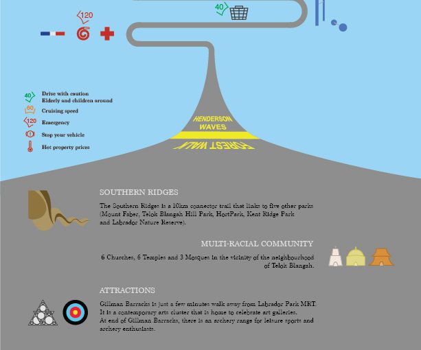
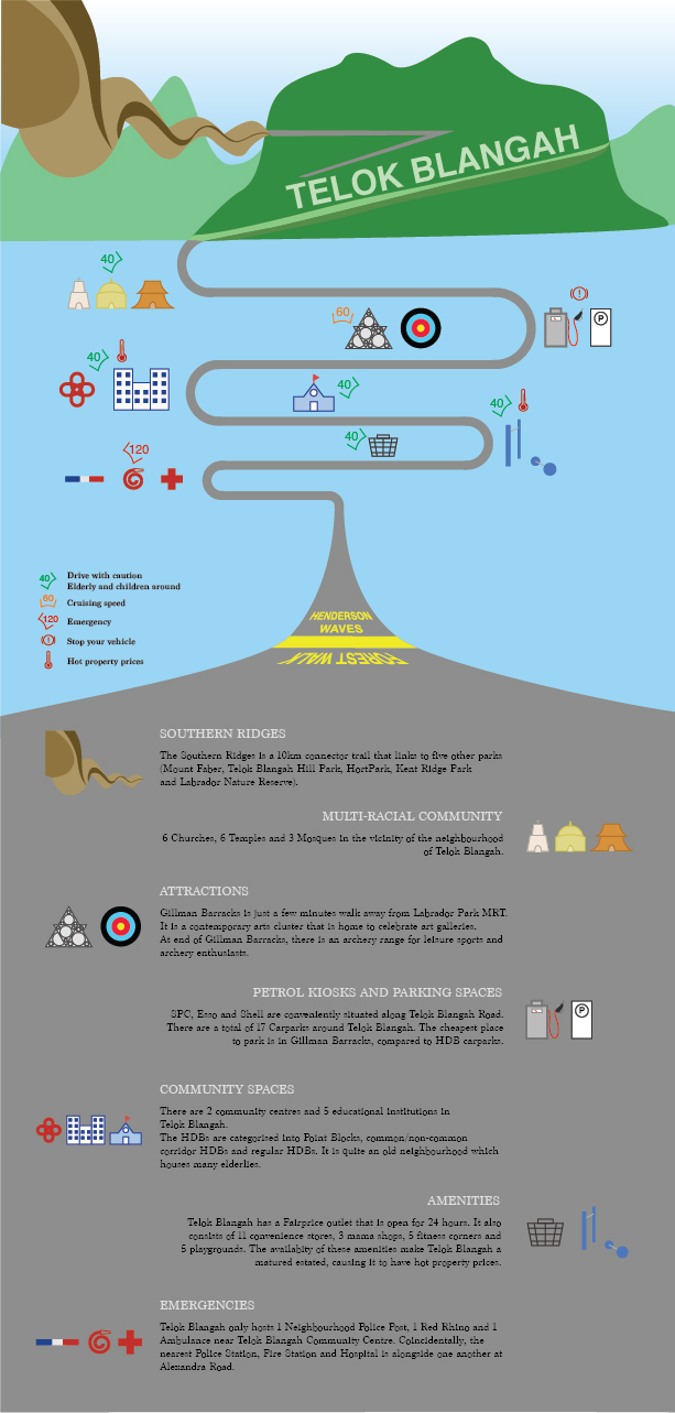
After my exploration around Telok Blangah, I have decided to make an infographic as a guide for drivers (Target Audience). The road the bends around in the middle of the composition brings the audience’s eyes around the context, which will inform them about things in Telok Blangah.
At the top of the composition, there’s the Southern Ridges which includes Henderson Waves, Telok Blangah Hill and Mt Faber. It then leads to temples, Gillman Barracks, petrol kiosks, schools, markets and emergency responses. At the bottom of the composition, I included a short write-up to include information on the icons of the neighbourhood so that they can find out more about the place.
In the middle of the composition, I have included some speed limits to advise drivers to keep while driving past the areas as there are elderlies and children around the neighbourhood. They can increase to cruising speed when they are travelling to attraction sites like Gillman Barracks and archery range. The high speed is to indicate that the emergency responses will travel at a high speed, so drivers should be aware of their surroundings and keep a good lookout to prevent accidents. The “hot temperature” symbol is to indicate that Telok Blangah is a mature estate which offers high property prices even though it is a quiet neighbourhood. I have also included petrol kiosks and parking spaces in the infographic as I find it intriguing to have 3 different petrol kiosks down the same road on Telok Blangah Road. It is very convenient for drivers to find them on the main road.
In conclusion, I find that this Infographic exercise allow us to better appreciate the neighbourhood and know what information we want to bring across to our audience.
2. What is ethnography and participant-observation? What are some ways of collecting data?
Participant Observation: A method of data collection method typically used in qualitative research. One of the many methods used for Ethnography. Aims to gain a close and intimate familiarity with a given group of individuals and their practices through an intensive involvement with people in their cultural environment, usually over an extended period of time. E.g. Informal interviews, direct observation, participation in the life of the group, collective discussions, analyses of personal documents produced within the group, self-analysis, results from activities undertaken off or online, and life histories.
Ethnography: The systematic study of people and cultures, where the researcher observes society from the point of view of the subject of the study. A means to represent graphically and in writing the culture of a group. The recording and analysis of a culture or society, usually based on participant observation and resulting in a written account of a person, place or institution. E.g. Narrative interviews and artefact analysis, recording observations with due attention to the cultural context and the meanings assigned by the culture’s practitioners.
3. What is qualitative and quantitative data? What is the difference between primary and secondary sources of data? How would you go about collecting the two?
Qualitative research: Gathers information that is not in numerical form, typically descriptive data. To find out the ways in which people think or feel. E.g. Diary accounts, open-ended questionnaires, unstructured interviews and observations.
Quantitative Research: Gathers data in numerical form which can be put into categories. It can be used to construct graphs and tables of raw data. E.g. Experiments, observations and questionnaires.
Primary Sources of Data: Provides Direct or firsthand evidence about an event, object, person or work of art. E.g. Historical and legal documents, eyewitness accounts, results of experiments, statistical data, pieces of creative writing, audio and video recordings, speeches and art objects. Interviews, surveys, fieldwork, and Internet communications.
Secondary Sources of Data: Describes, discuss, interpret, comment upon, analyse, evaluate, summarise and process primary sources. E.g. Articles in newspapers or popular magazines, book or movie reviews, or articles found in scholarly journals that discuss or evaluate someone else’s original research.
I visited Telok Blangah on Saturday with a friend who lives in Telok Blangah Drive. He gave me descriptions and history of the neighbourhood and I witnessed the “kampung” culture of the residents there. I have documented my findings using photography and will elaborate with the photos.
After the neighbourhood visit, I tried to find scholarly articles that talks about the history of Telok Blangah and statistics reports of Telok Blangah. It should be able to support my on-site findings.
4. What are infographics and how are they used to effectively communicate data? What other ways can we visually represent data?
Infographics – Information Graphics. It is a form of content marketing that can help to simplify a complicated subject or turn an otherwise boring subject into a captivating experience.
It should:
– Be visually engaging
– Contain a subject matter and data
– Appeal to target audience
– Build awareness
– Easy for readers to engage
– Include a diversity of sources and statistics
Ways to visually represent data:
Indicators – Displaying one or two numeric values such as a number, gauge or ticker, using the Indicators visualisation.
Line Chart – (1) Comparing data over time to view trends. (2) Comparing changes over the same period of time for more than one group or category.
Column Chart – Comparing items and comparing data over time.
Bar Chart – Comparing many items/categories.
Pie Chart – Aiming to display proportional data or percentages.
Area Chart – Display absolute or relative (stacked) values over a time period.
Pivot Table – Quickly summarise and analyse large amounts of data.
Scatter Chart – Display the distribution and relationship of two variables.
Scatter Map/ Area Map – Visualise geographical data across a region as data points on a map.
Treemap – Displays hierarchical data in the form of nested rectangles.
Distribution plot – Lets viewers see where each media outlet lies on a spectrum. (Fishbone)
Simple Visuals – Using scale, static data visualisation to illustrate your point, using length (depth).
Journey
My friend, who is a resident in Telok Blangah, brought me around the neighbourhood to understand its culture, history and background. There were a lot of interesting discoveries which were covered in the pdf document attached (in the hyperlink) in the first section of this post.
Click to enter photo gallery
Major Interesting Findings
Community formed mostly by Malay
A lot of old people
Very quiet neighbourhood, but its property price is expensive due to the availability of amenities
Red Rhino will respond and reach within the vicinity of Bukit Merah in 10 minutes
Merger of neighbourhood primary school
Neighbourhood swimming complex closed down, but opened in Mt Faber SAFRA when it was moved into Telok Blangah
Blocks of the same digits caught my eye (mostly 2-digit Block numbers) E.g. 44, 55, 66, 77, 88
Running trail of 17km connecting from Hort Park to Mt Faber