for the last assignment, we are to create a self portrait in motion graphics.
I wans’t really sure what motion graphics were? i thought it had to be like an animated graphic design but then it turns out this assignment didnt really Require us to do that so! phewhwhw
kind of realising that the Look of a work comes after the concept, so i tried focusing on the aspect of a self-portrait to direct the look of this project.

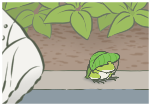
decided on using plantguy! he is this plant.. thing.. i made?? for my a lvls coursework and he is 2 years old now . 
anyway he??it?? functions? as an avatar of sorts because he is a plant..guy..
cant really remember why he’s like so; something about pistachios + walnut shell shape + contentment that goes into his form, and plants bc.. i really like plants hahaha
more specifically like the small bud kinds and wildflower kinds? those are the cutest kinds and plants are always so quiet and unassuming but also they grow slowly and they seem to be the most easily content of all things n so its like! wow! life goals
(basically my dream is to become a plant )

as far as self-portraits go ! i thought of some things that could help represent myself .

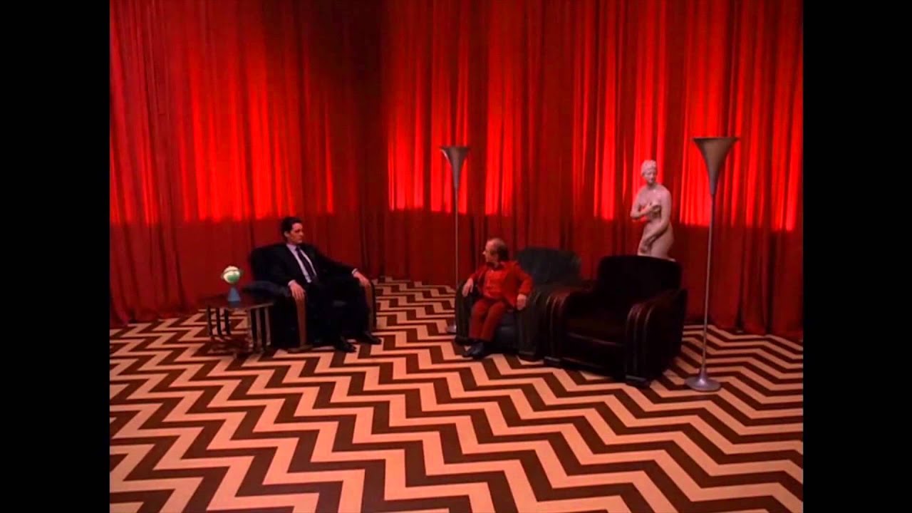
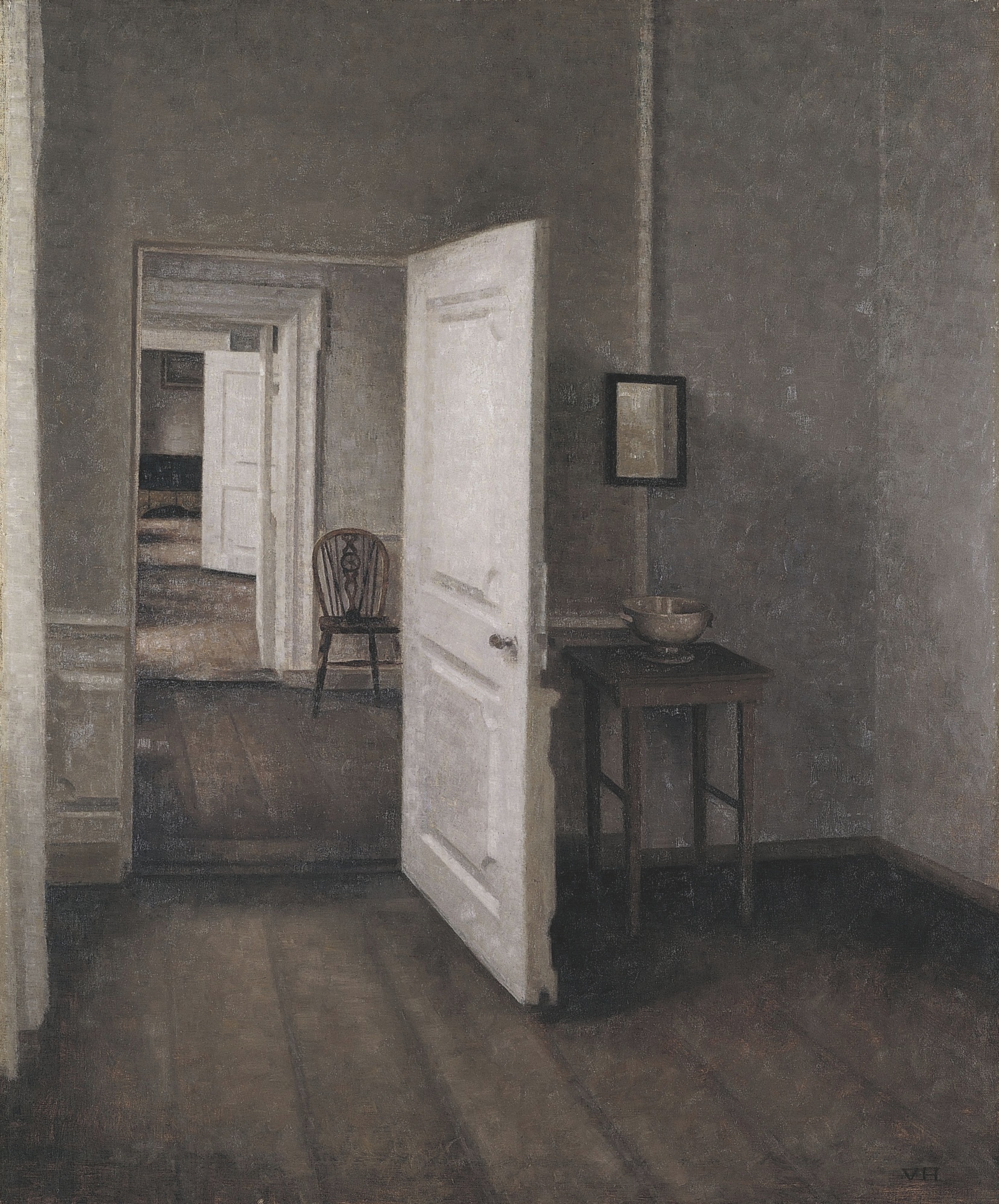
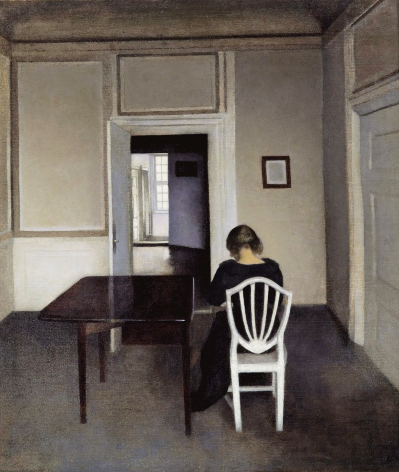
ended up sticking to why plantguy was born bc i wanted to portray how my dream self is the animal crossing lifestyle , or like just traveling around in a nice landscape n then coming home . wow just like tabikaeru the travelling frog game!
anyway here is a mood board?? hm
- plants!!
- the specific kinds of plants where its earthy and grounded and tiny plants and also bonus points if theres like a river because rivers n plants always look nice


surprise its plant guy but irl!

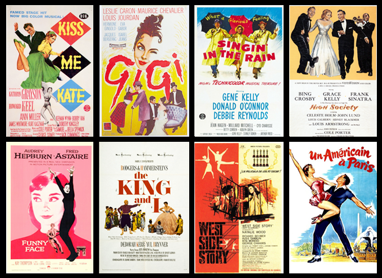
- arietty

- animal crossing
- basically my dream i just want to go fishing and chill around all day in a small river town :’)
- its so hard to find screencaps n i dont have my ds on hand to dig out screenshots n im too lazy to reopen pocket camp so hv these generic screenshots frm google instead 🙁
- basically my dream i just want to go fishing and chill around all day in a small river town :’)


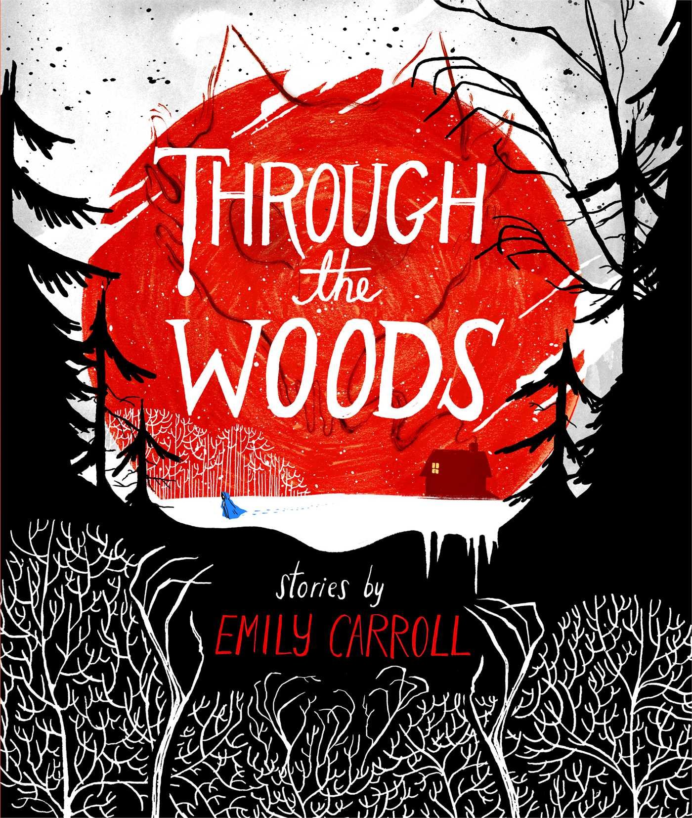
- moomin!!!
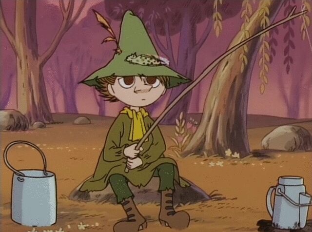
- snufkin haha
- tabikaeru!!
- (tbh this game came out after plantguy was born so it counts more like a.. o wow!! same hat )
https://78.media.tumblr.com/d8b67484aec378acedaef4429ad41fd5/tumblr_p5842u3oYK1wmmkvwo1_500.png

- louie zong

http://louiezong.com/post/166280288119/theres-a-banjo-player-on-my-fire-escape
i really wanted to try the motion tracker function of AE because! it could do the thing that ive always wanted to do for plantguy which is to put him in real life haha

wow i dug this up frm way back 2k16 aaaa its plantguys foetus form
PROCESS
shot a bunch of footage first so id know where to draw in plantguy

Storyboards + 2 column script

initial board ideas. originally i wanted to do a simple animated illustration throughout w/o the motion tracking thing but then aa… time constraints….
(actual storyboard + written 2 column script… ):


painting in photoshop
 colour palettes r hard even though ive painted plantguy so many times because this time i had to balance it with the background footage and the colors for that were all over the place aa hopefully i did balance it out enough in the end?? hmmm


included an opening because in my mind the plantguy adventure is episodic and slice of life. (added in a little turbulent displacement for the lines to give it some movementt)
Compositing
i wanted the illustration to stay in one place in the video so i had to learn how to use the motion tracking tool

used the puppet tool to add some slight movement to the animation so that it wouldnt look so stilted.
 exported everything to premiere pro to stitch together because after effects can only handle so much 🙁
 sound was a scrapped recording of a ukelele that was originally meant for visual storytelling hahaah
–
final thoughts:
- AE is .. rly tough because there r so many things ?? that being said im really glad that we were able to learn how to use it in this class because its a necessity i gues
- if i had more time i would try out something more ambitious because it did feel like a cop out to revisit something i had worked on before, but if anything this project was a technical exercise for me because i rly need to learn how to use… AE….
- (anyway i always use plantguy as a means of exploring new mediums so expect to see him again… next sem… when i have to learn 3d……. aaaaaaaaaa)
- n ya it was fun bc it fulfilld /checked off an Art Thing that ive always wanted to try out so!!! :’v
- (is that a tear or an eyebag??? who knos!!)