Movie Poster
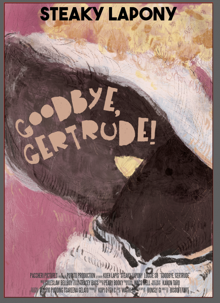
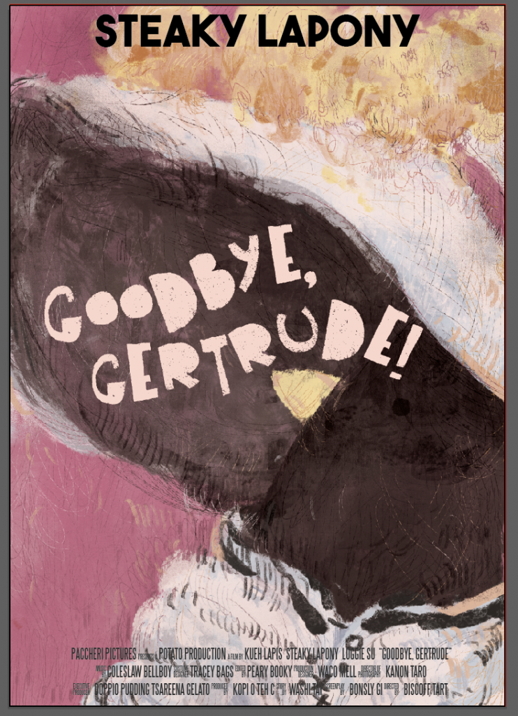
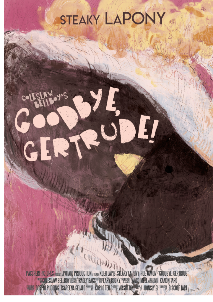
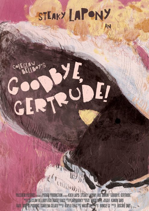
Here is the poster:
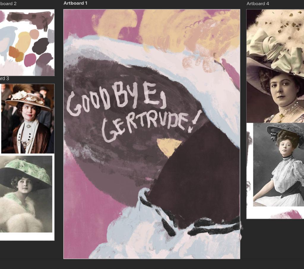
This movie’s title is Goodbye, Gertrude! and it is a 2h jazzy jukebox musical big band bonanza starring Patti LuPone Steaky LaPony as some rich widow or something,, like a maid who won the lottery???? featuring songs from Cole Porter Coleslaw Bellboy ??? ( the name+’s before the movie title is like how u kno all the Rodgers and Hammerstein things always say Rodgers and Hammerstein’s ______ thing…) the bad naming sense is because i wasnt sure if real ppls names were allowed o wel. (((like ngl its ripoff of stuff like this:
(like… hello…->… goodbye… okay okayokay)
anyway!
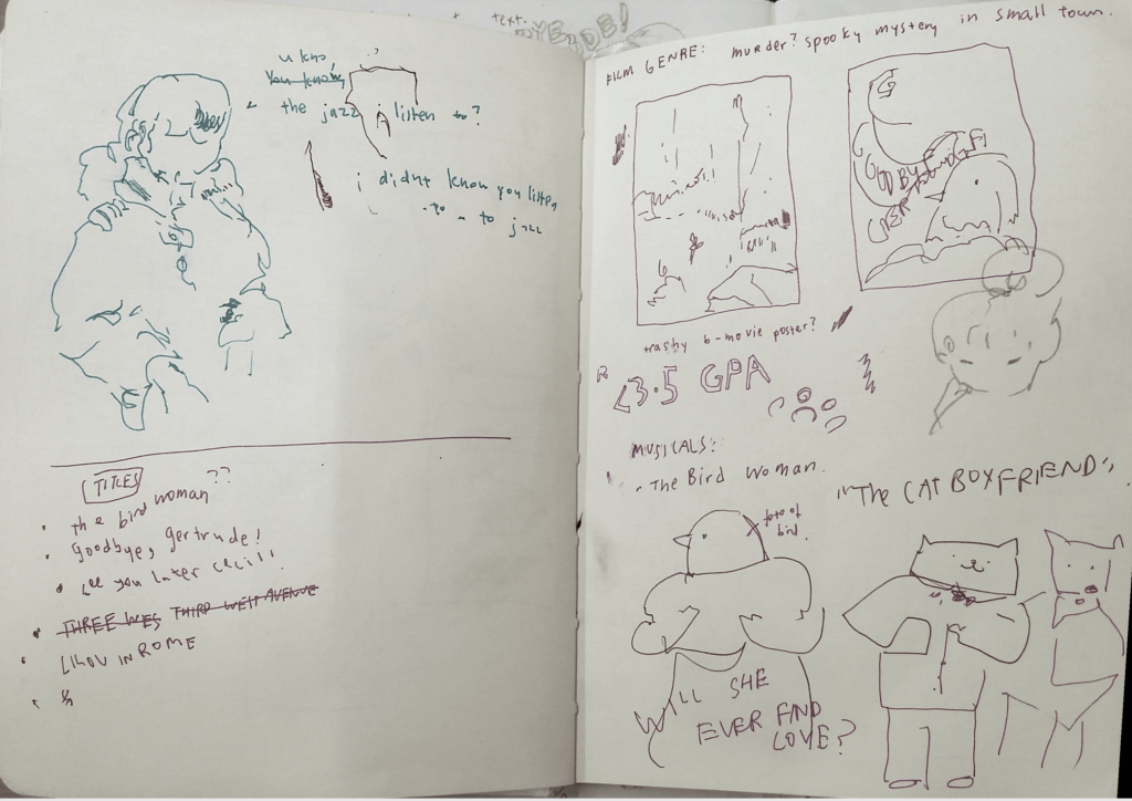
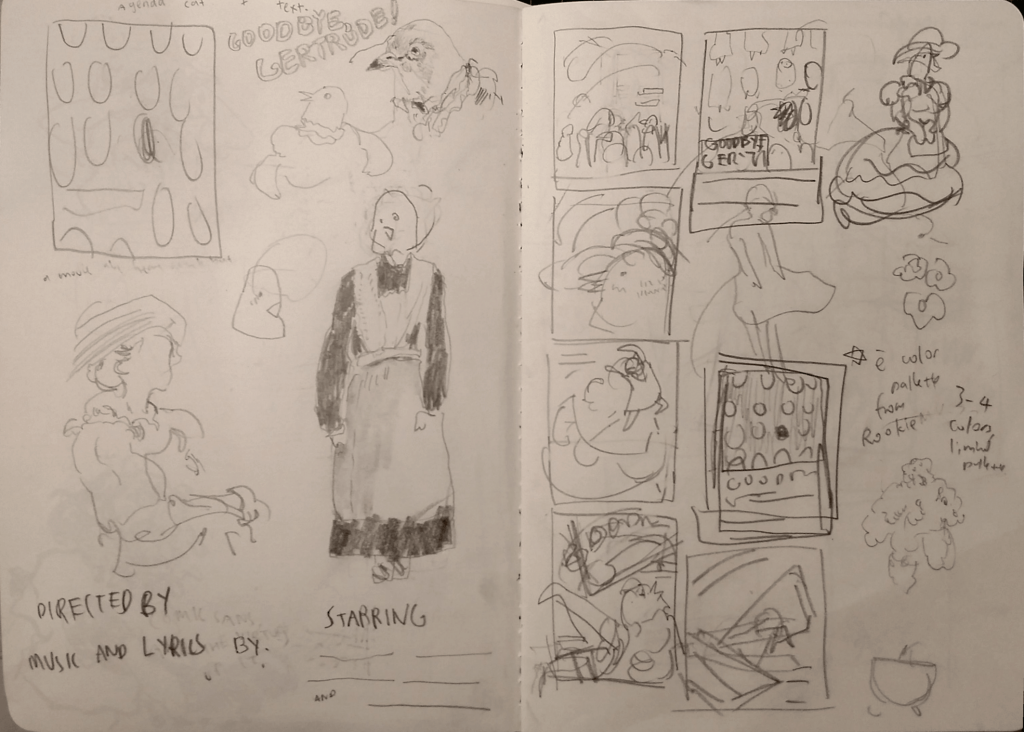
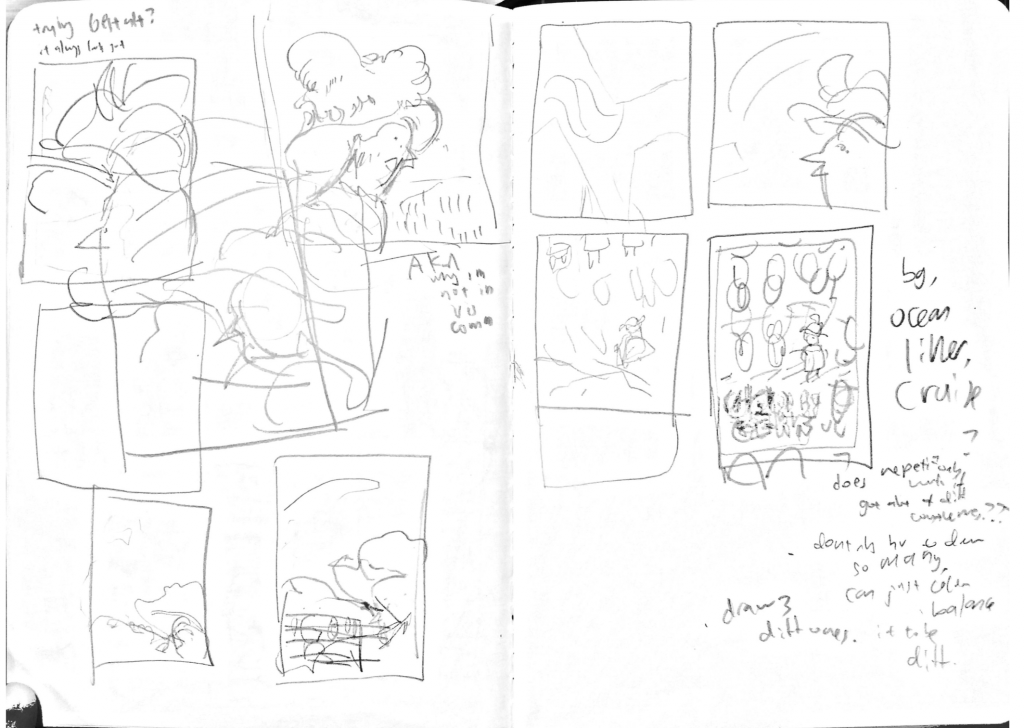
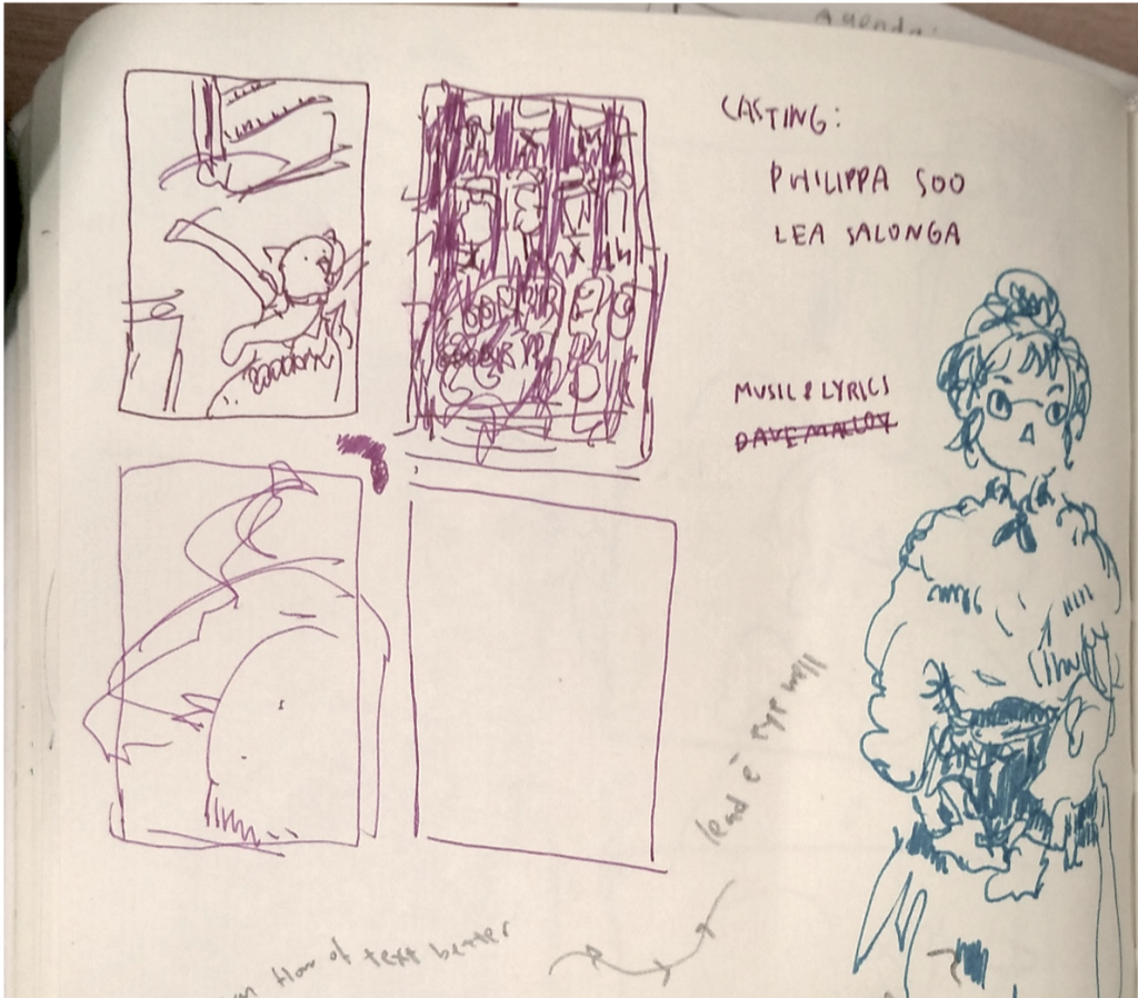
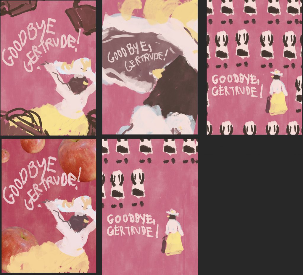
here are some initial thumbnail sketches:
- the ones on the left:
- at first i tried putting in the apples just for fun bc like mayb i can try using some photog thing! but then it just felt weird because suitcases fit the Aesthetic Vibes more
- trying to b more dynamic?? w the composition,
- the ones with the tiling:
- was trying to go for .. a Magritte’s Golconda kind of thing,, with something of high contrast
- haha these feel the most like a meg cabot novel cover , as in they feel strangely too static to be a movie poster??
- middle hat one:
- actually the first one??? i drew
- felt the most like… an “English goodbye at the train aesthetic” where u wave a handkerchief n run after the train or wave out of a train window w ur hand outstretched or something lol ?
- as in, it fits the title the most??
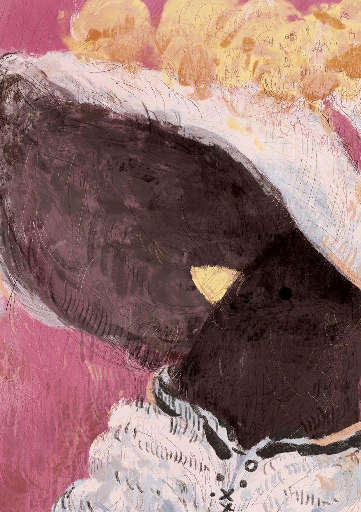
Final one without the text over it:

Saul Bass was a reference.. ish, in terms of typography? I’m not familiar with typography and graphic design things but I do like how the designs r all so simple-looking but impactful?? and not so cold-looking at the same time.
anyway I found some of the fonts through the magic of google:

other font things! uh those retro poster kinds…

this one was called “the bold font” or something??? i probably downloaded like 10 other diff variants of this sort of font uh
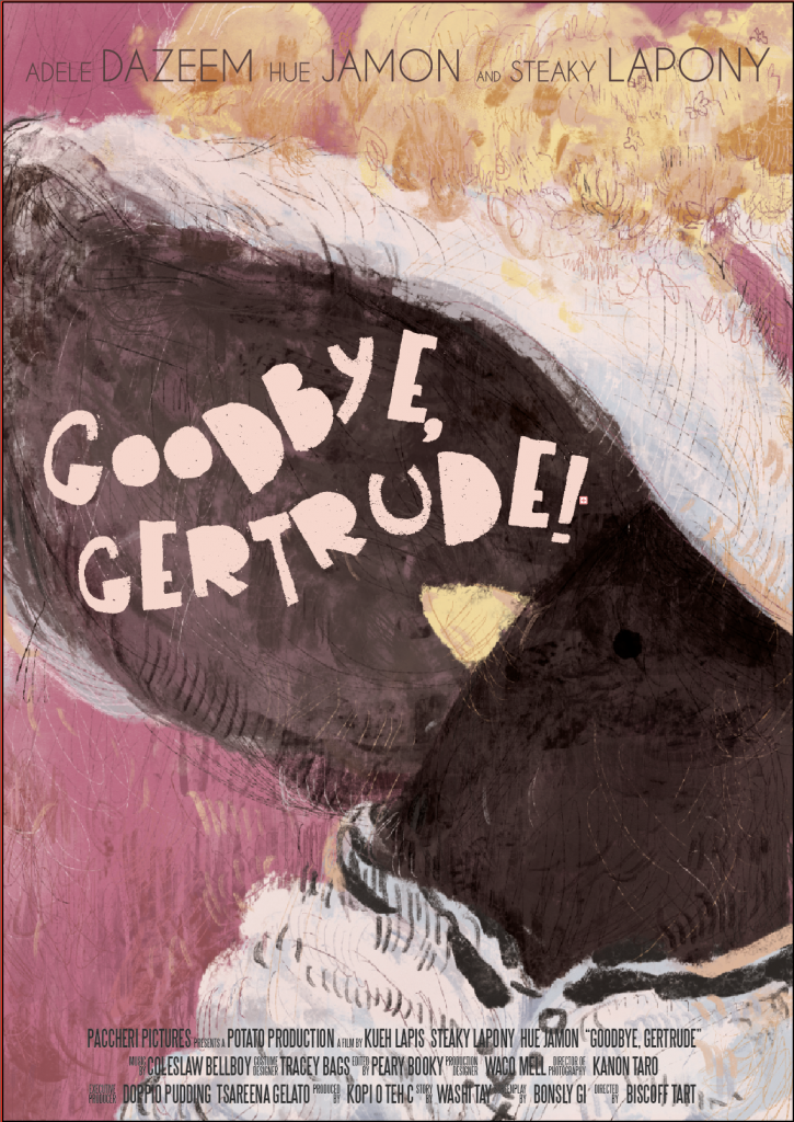
trying to make the actor credits less distracting??? but i dont know,,, maybe this one is better than the one i printed??? o well….. 🙁
the film credits at the bottom were made using this template. I hope it makes the poster look more legit?? considering how it’s a template of those barely discernible credits u find at the bottom of movie posters a lot:
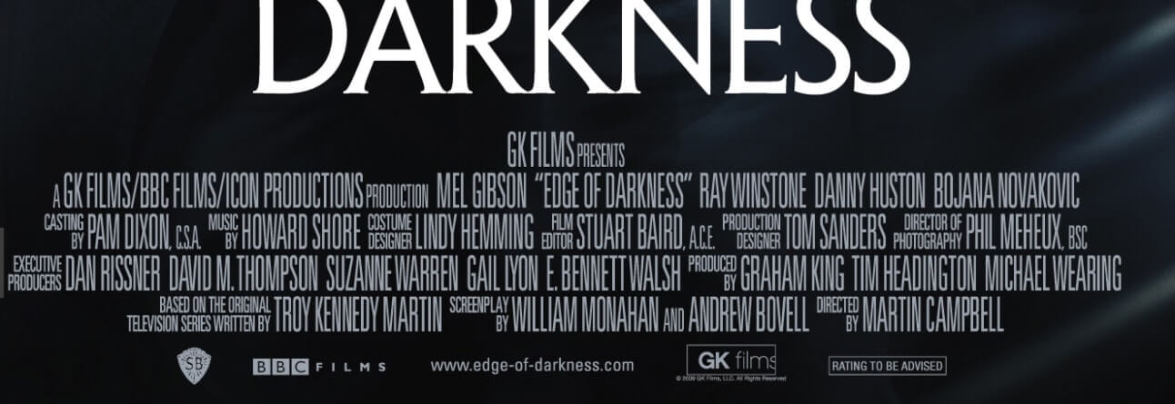
anyway i spent way too long fiddling with the font ?? hm here are some more refs i used anyway n also yay mood music:

–
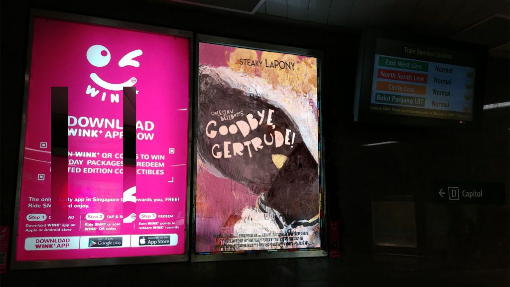
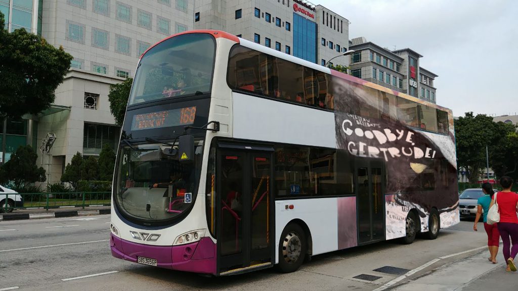
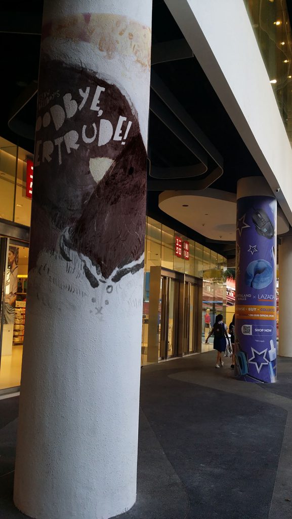
Composited Images – Different Outlets of Media
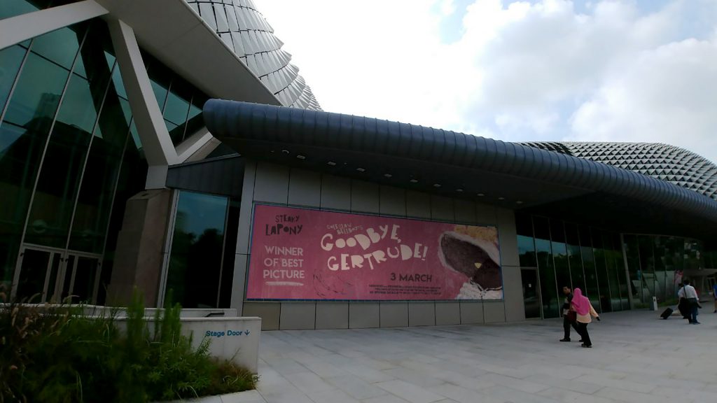
Ads in public spaces help reach a larger audience. I suppose if the movie stars a famous person who is on par w patti lupone ???? or like meryl streep or something just their name would be enough to be noticeable for the general public.
but also considering how in my head this is some fancy jazzy movie the esplanade seems like an apt location for the artsy fartsy musical kind of things.
and also those annoying popup youtube ads that i never see because bless adblock.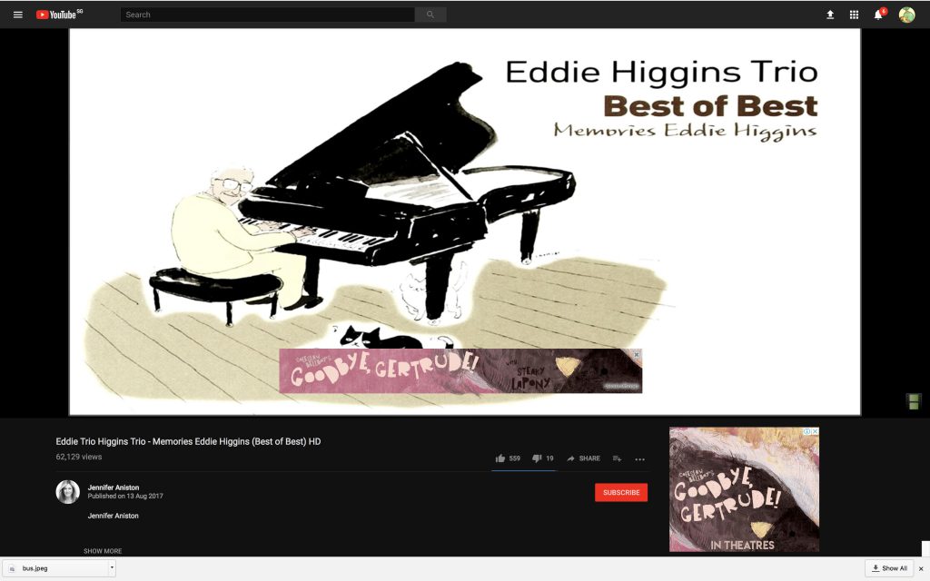
–
here is the poster, all printed out!
–
final thoughts
- i want to be friends with illustrator but it doesnt seem to want to be friends with me even though i’m only using it for the font
- that being said! the path-text tool was very helpful although i really wish it would obey me more.. 🙁
- i should rly decide on a font thing properly before printing!!! like rly hv better font sense because i spetn 3 hrs in regret after printing n oh well
- maybe this is why im no viscommy person but this is school n we r all here to learn things ?
- up till now i stil want to adjust some of the things but i should maybe just let it go ????
- photoshopping things is strangely but harder and easier than expected
- wow warp tool! but also, i need to understand shadows n proportions better.
- anyway!! this was a fun assignment to do :v


