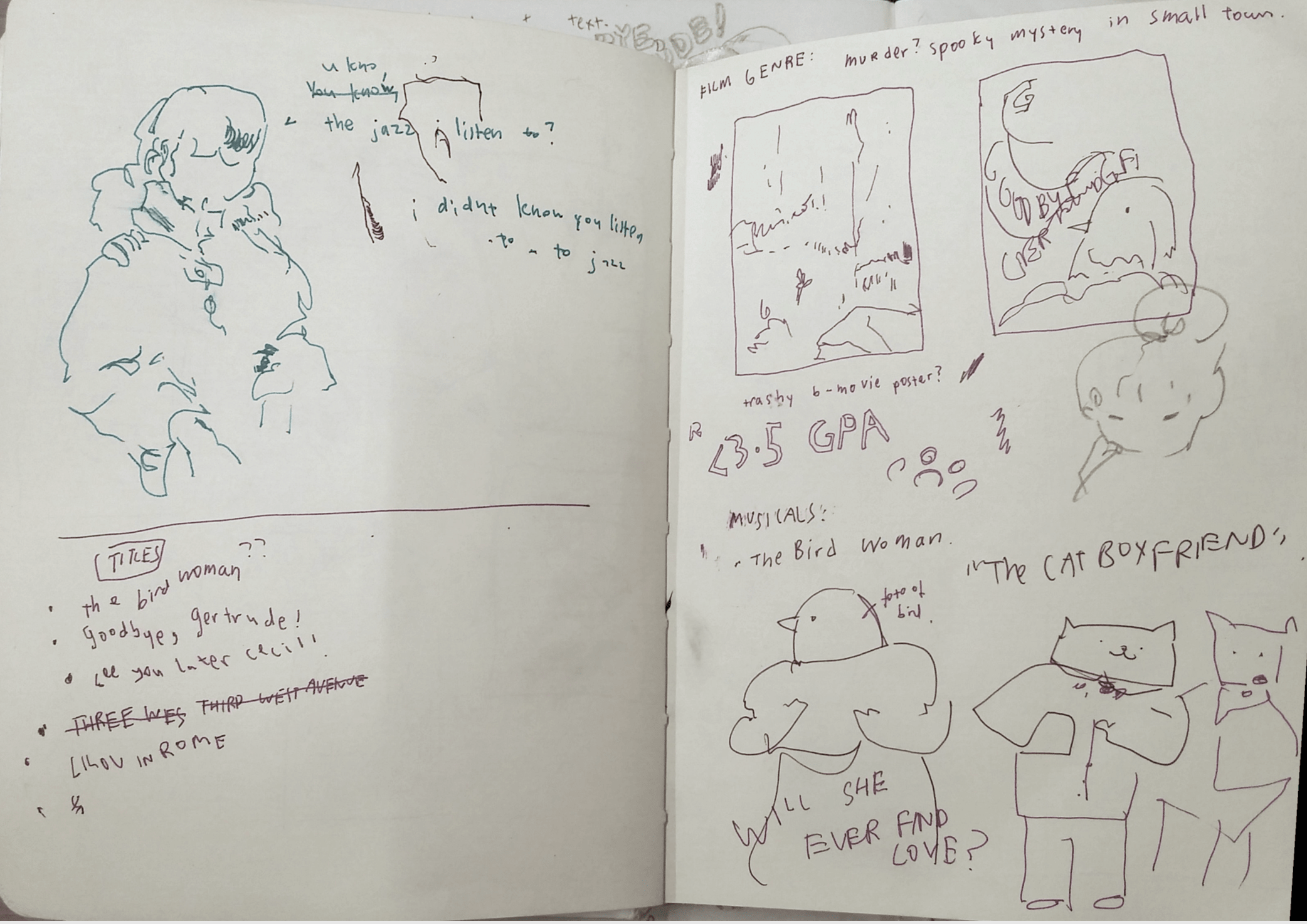
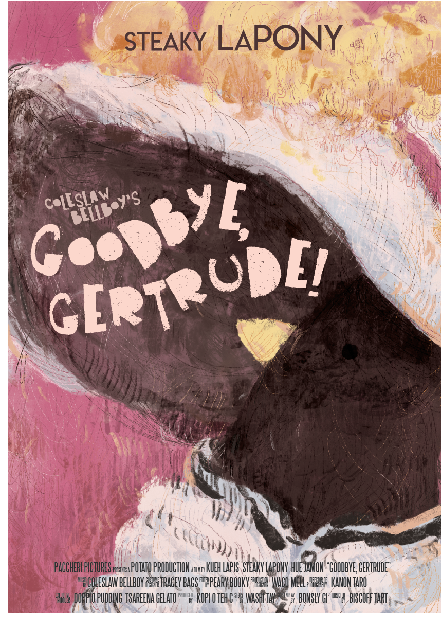
digital imaging assignment 02! movie campaign — PROCESS + FINAL

Movie Poster

Here is the poster:

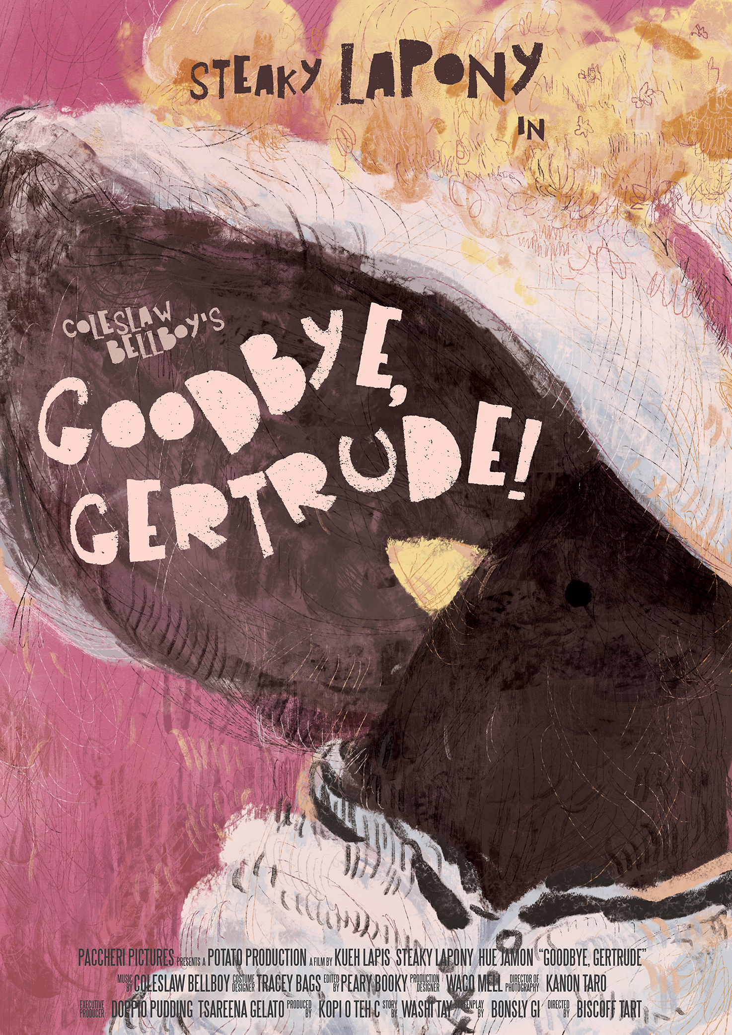
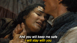
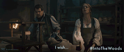
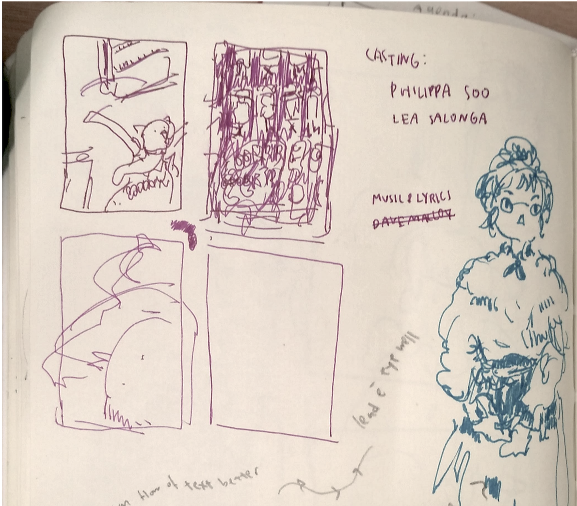
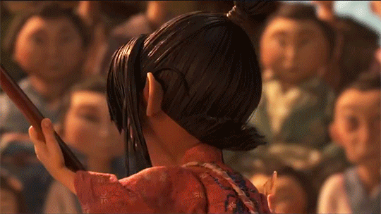
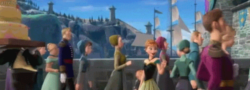
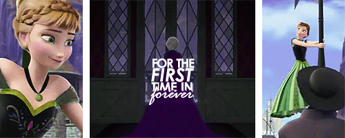
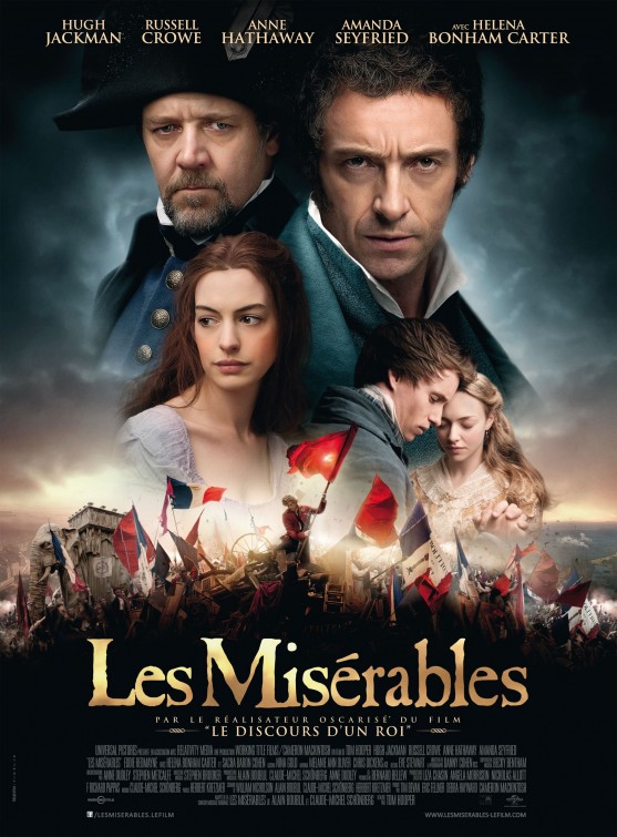
This movie’s title is Goodbye, Gertrude! and it is a 2h jazzy jukebox musical big band bonanza starring Patti LuPone Steaky LaPony as some rich widow or something,, like a maid who won the lottery???? featuring songs from Cole Porter Coleslaw Bellboy ??? ( the name+’s before the movie title is like how u kno all the Rodgers and Hammerstein things always say Rodgers and Hammerstein’s ______  thing…)  the bad naming sense is because i wasnt sure if real ppls names were allowed o wel. (((like ngl its ripoff of stuff like this:

(like… hello…->… goodbye… okay okayokay)

anyway!

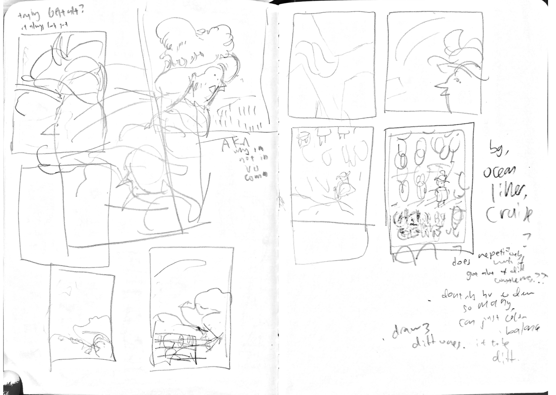
here are some initial thumbnail sketches:

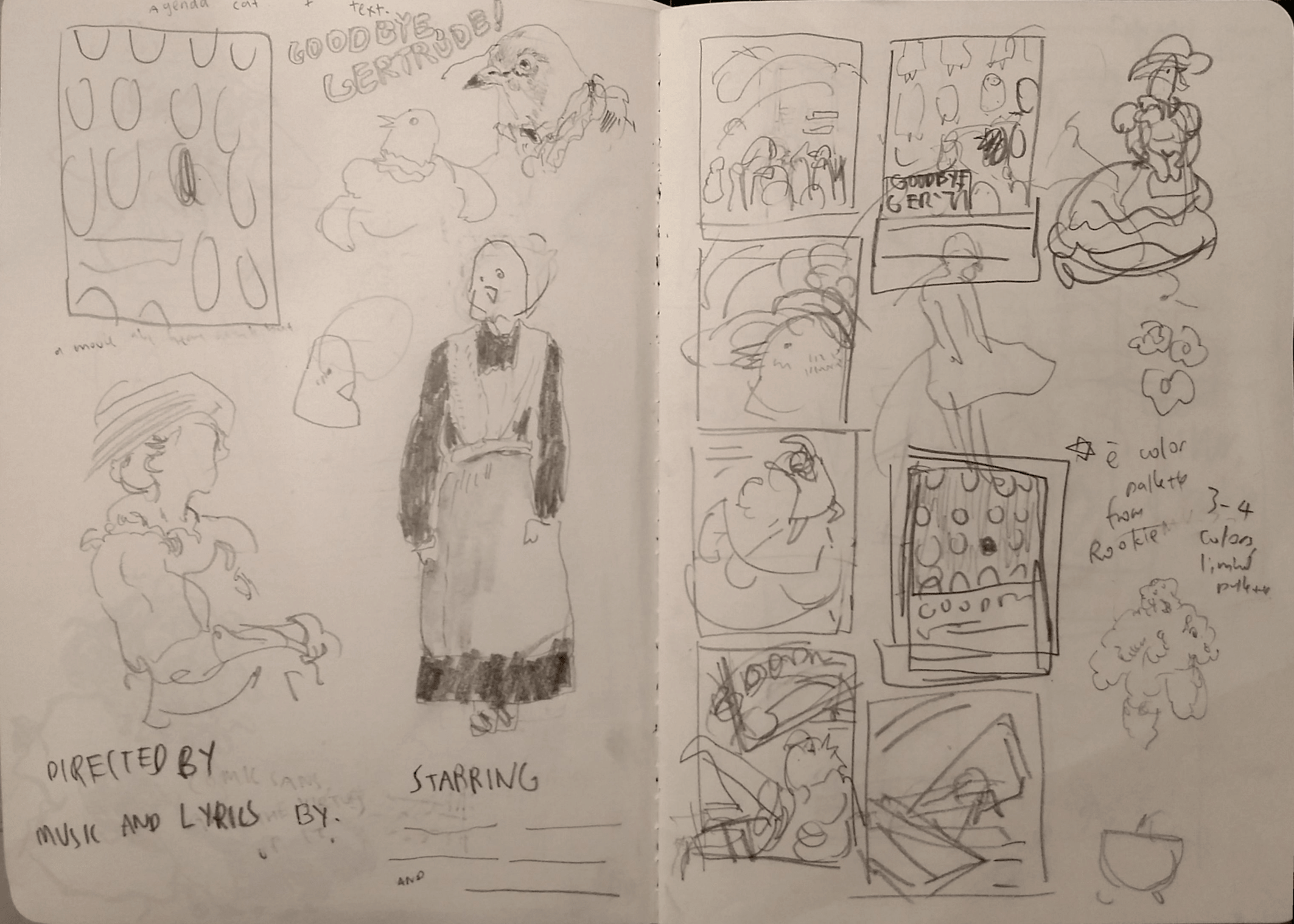
pink and yellow are happy colours and i want this movie to be a happy movie !

  • the ones on the left:
    • at first i tried putting in the apples just for fun bc like mayb i can try using some photog thing! but then it just felt weird because suitcases fit the Aesthetic Vibes more
    • trying to b more dynamic?? w the composition,
  • the ones with the tiling:
    • was trying to go for .. a Magritte’s Golconda kind of thing,, with something of high contrast
    • haha these feel the most like a meg cabot novel cover , as in they feel strangely too static to be a movie poster??
  • middle hat one:
    • actually the first one??? i drew
    • felt the most like… an “English goodbye at the train aesthetic” where u wave a handkerchief n run after the train or wave out of a train window w ur hand outstretched or something lol ?
      • as in, it fits the title the most??

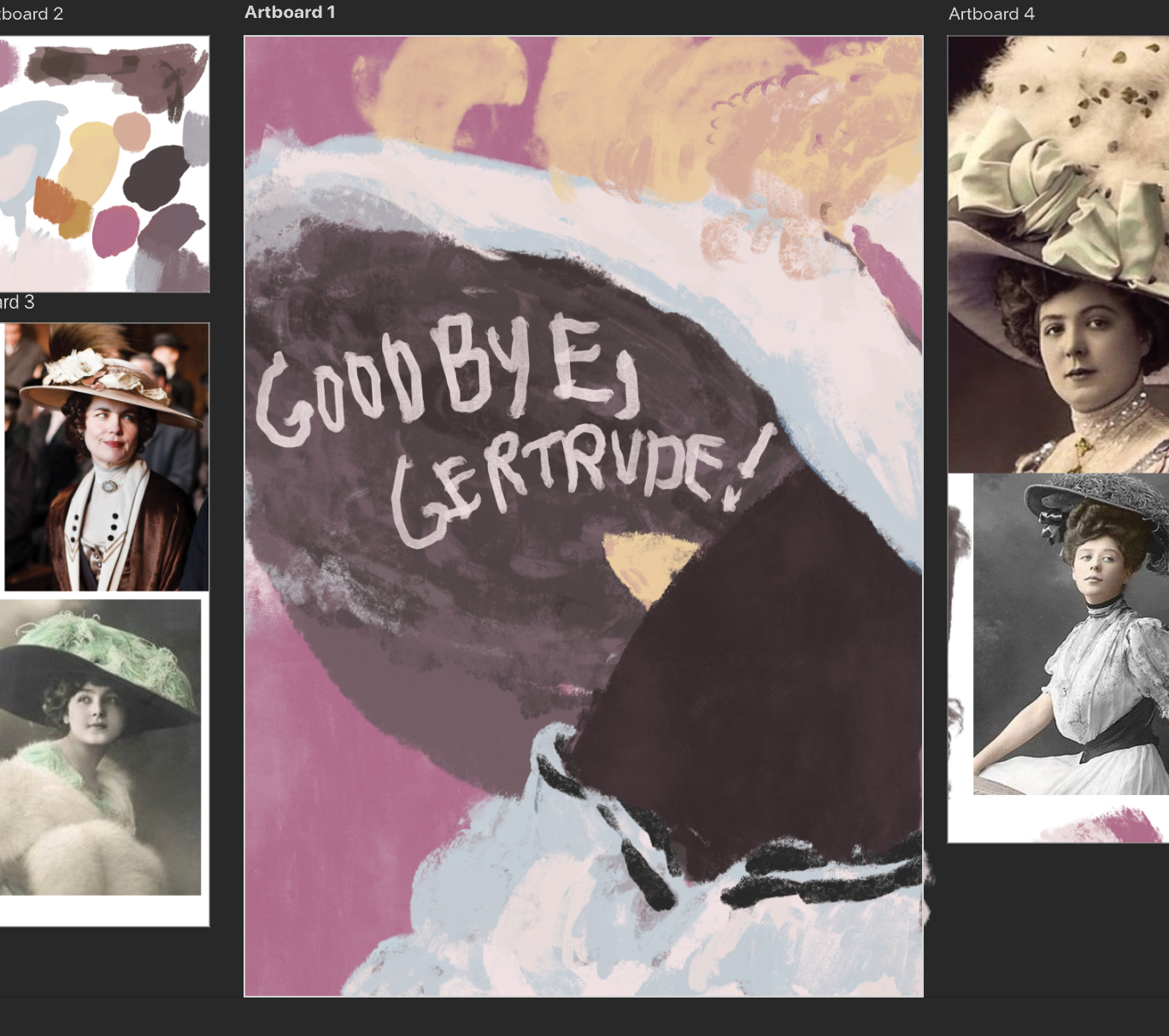
references used were fancy edwardian hats

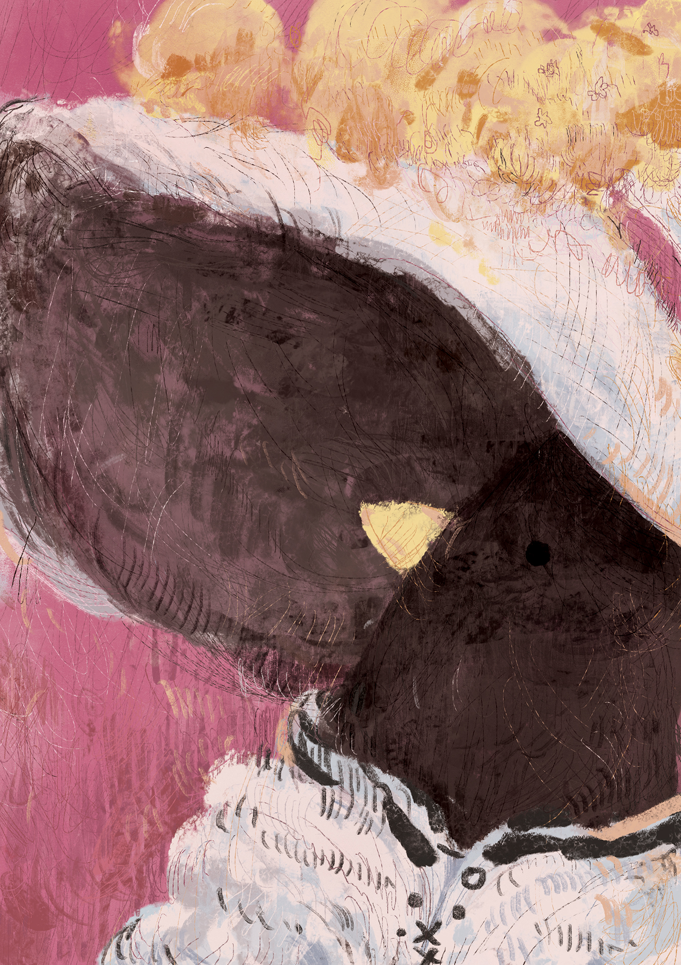
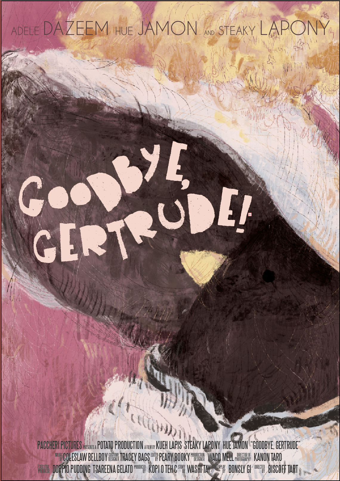
Final one without the text over it:

Text and Fonts

Saul Bass was a reference.. ish, in terms of typography? I’m not familiar with typography and graphic design things but I do like how the designs r all so simple-looking but impactful?? and not so cold-looking at the same time.

anyway I found some of the fonts through the magic of google:

other font things! uh those retro poster kinds…

this one was called “the bold font” or something??? i probably downloaded like 10 other diff variants of this sort of font uh

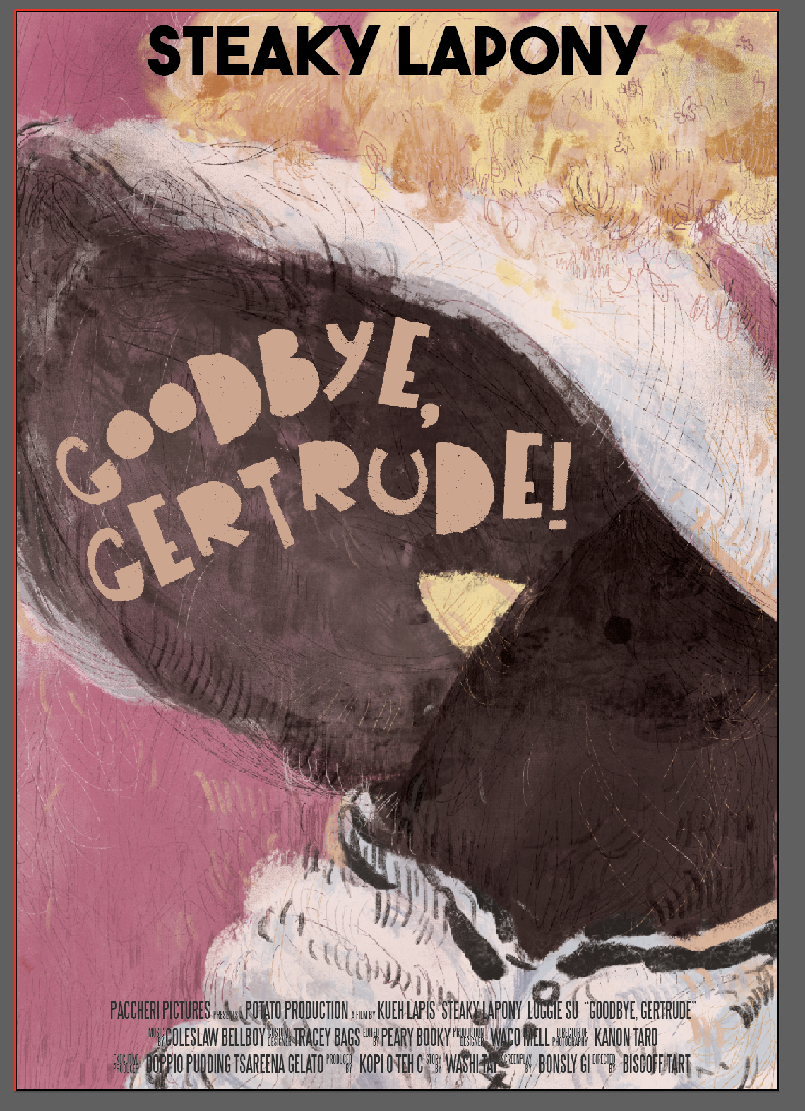
kind of following how the old posters had funky title cards. title font is “Art Post Black”

pls forgive my terrible naming choices!!!!

trying to make the actor credits less distracting??? but i dont know,,, maybe this one is better than the one i printed??? o well….. 🙁

the film credits at the bottom were made using this template. I hope it makes the poster look more legit?? considering how it’s a template of those barely discernible credits u find at the bottom of movie posters a lot:

anyway i spent way too long fiddling with the font ?? hm here are some more refs i used anyway n also yay mood music:

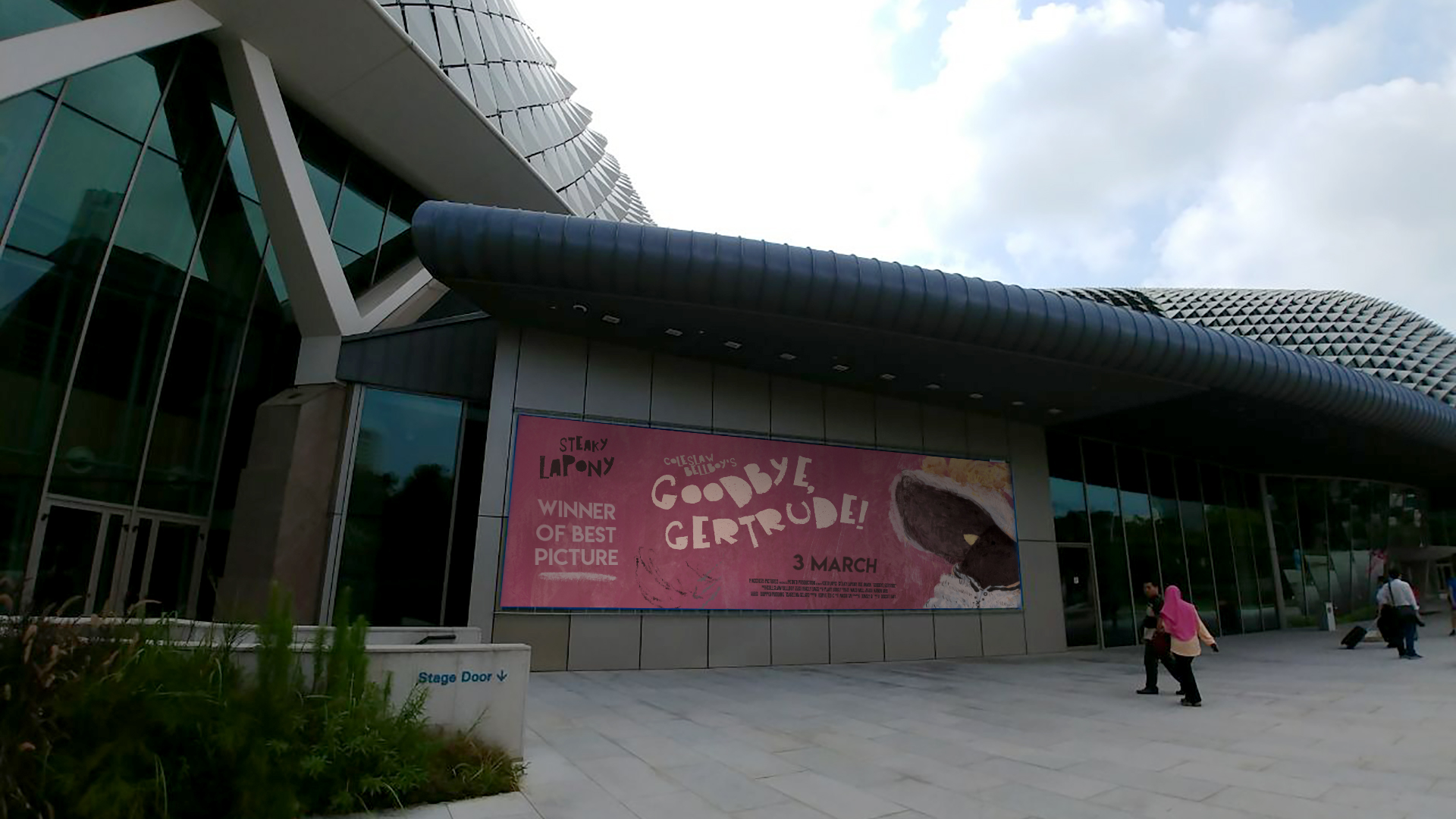
Composited Images – Different Outlets of Media

Ads in public spaces help reach a larger audience. I suppose if the movie stars a famous person who is on par w patti lupone ???? or like meryl streep or something just their name would be enough to be noticeable for the general public.

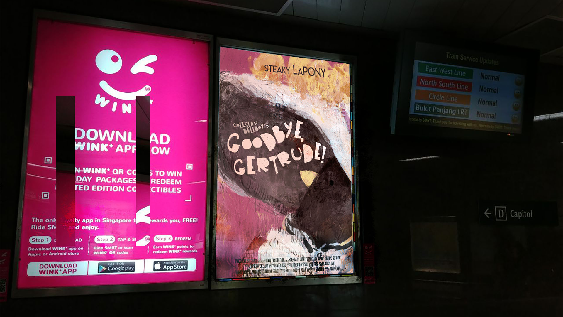
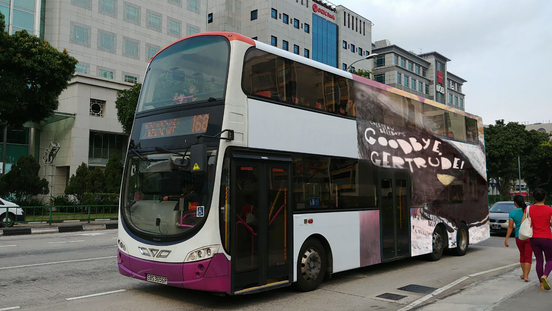
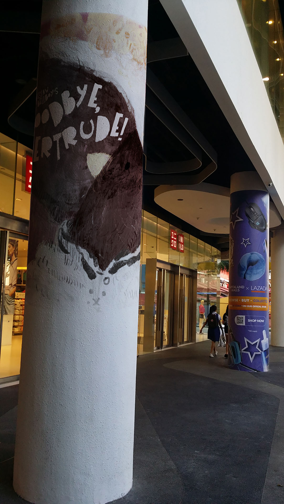
but also considering how in my head this is some fancy jazzy movie the esplanade seems like an apt location for the artsy fartsy musical kind of things.

and also those annoying popup youtube ads that i never see because bless adblock.
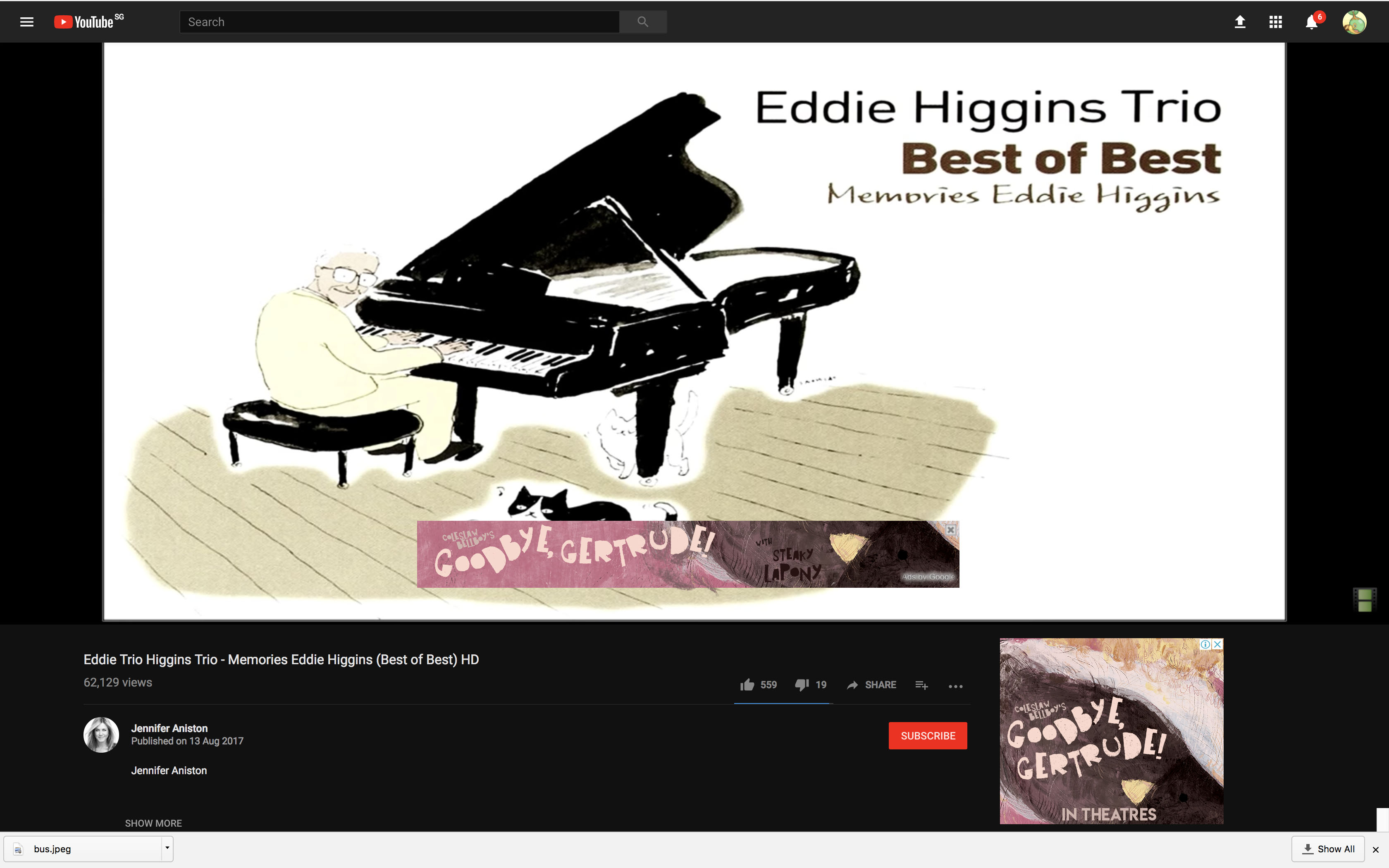
 

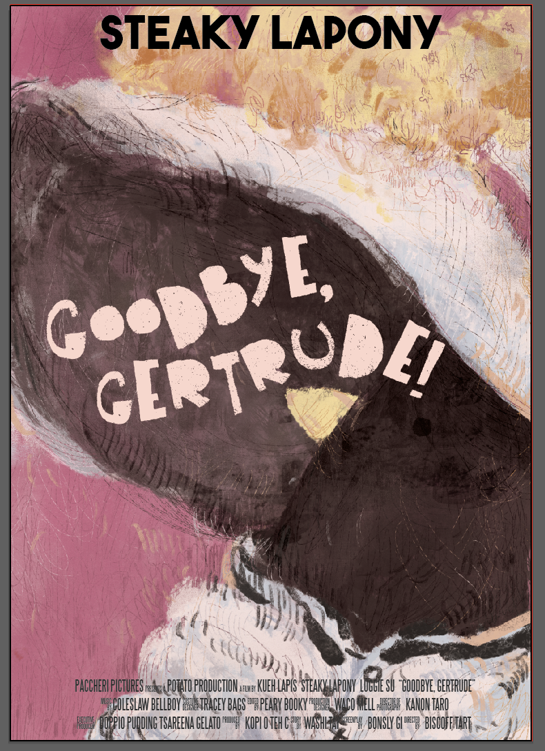
here is the poster, all printed out!


final thoughts

  • i want to be friends with illustrator but it doesnt seem to want to be friends with me even though i’m only using it for the font
    • that being said! the path-text tool was very helpful although i really wish it would obey me more.. 🙁
  • i should rly decide on a font thing properly before printing!!! like rly hv better font sense  because i spetn 3 hrs in regret after printing n oh well
    • maybe this is why im no viscommy person but this is school n we r all here to learn things ?
    • up till now i stil want to adjust some of the things but i should maybe just let it go ????
  • photoshopping things is strangely but harder and easier than expected
    • wow warp tool! but also, i need to understand shadows n proportions better.
  • anyway!! this was a fun assignment to do :v

movie quotes

it’s Project 2! wow! :00 so fast!
this time it is about Movie Quotes, and I tried to pick quotes from movies that I like , or hold a lot of importance to me hahaha.

1. Kubo and the Two Strings

If you must blink, do it now. 

actually the full quote is: “If you must blink, do it now. Pay careful attention to everything you see and hear, no matter how unusual it may seem. And please be warned: If you fidget, if you look away, if you forget any part of what I tell you – even for an instant – then our hero will surely perish.”

but it’s too long, but anyway the first sentence a phrase that is repeated throughout the movie, the opening lines to Kubo’s storytelling.

word associations!

  • blink – eyes, opening and closing but at the close
  • must, now– sense of immediacy: arrows? a sun blinding into an eye (the thought of it evokes an instinctive reaction of blinking)


i chose this movie also because of its aesthetics — a lot of its visual inspiration was from ukiyo-e woodblock prints, shown not explicitly and really incorporated seamlessly into the visual design, and since we are to use woodblocks to make our compositions! :v I thought it might be very apt to pick this movie.

But also the main reason is that Kubo is really one of my favourite movies, because of its story (like WOw ok ay its story) and how it revitalises and pushes the medium of stop-motion, something really refreshing among animation films.


2. Frozen

For the first time in forever

why not "do you want to build a snowman?" ?? bc the :((( i feel when i listen to that song is a joke alr

I picked this quote because it uses my favourite musical song tropes ? : the “i want” song, the fact that it has a reprise and sung dialogue, and that thing where two characters sing diff things at the same time and the musical motif and at the same time the lyrics contrasts their motivations and insecurities and sets the scene for the story and :’o

yah I think its also a rather?? exposition heavy song!!!  Which r my favourite thing in the world

(as for the movie itself, i really love its art direction and concept art, and was 110% caught up in it when it was first released hahHAHAH ) (in retrospect, there are so many plot holes especially in the latter half , but this movie still holds a really special place in my heart lol)

breakdown of quote!

  • for first time in forever: sense of liberation, build up and release
  • liberation: freedom, wings, hands in an open gesture, a cloth flying
  • first time : fragility, butterfly
  • forever : time, clocks, sundials, buildings (set in stone),
    having been repressed, closed off for the longest time –> hands clasped, clenched, held back, closed windows and doors


3. Les Misérables

i really like musicals! so happy that there r such things called Movie Adaptations so i can pick the next two movies.

i like les mis because its very sad and the songs are very nice. but also all the Deep and Meaningful things like how it portrays the human condition–suffering and tragedy, redemption and forgiveness, humanity as it is for all its good and bad.

quote time!

A little fall of rain can hardly hurt me now

i know its not like an Iconic les mis song as much as "i dreamed a dream", "one day more", "do u hear the ppl sing", or even "On My Own" which is the best solo btw so much so that i bother to give it proper capitalisation, but "a little fall of rain" is like. the song that affects me the most??? also sam barks is like, no1 eponine

  • little: small, bird? ,  something being overwhelmed
  • fall of rain: rain, dark clouds, a small semblance of a sun, something descending, a butterfly hiding under a leaf, puddles, dew drops
  • hurt: numbness, thorns, wounds and salt, heart, blood,
  • death, because éponine dies 🙁
    • a dead bird, crumpled letter, a single lily growing, coffins?, shovels, cloth covering a face (like the magritte paintings)


4. Into the Woods

i admit the movie was so-so in contrast to what the original soundheim musical has, but it was still!!! rly !! good!! and!! anna kendrick!! yay

  • wish: clouds, stars and comets in the night sky,star, clasped wishing hands?, fairy tale books, those tanabata wish slips, dandelions, eyelashes, 11:11 HAHAHA, closed eyes, monkey’s paw, candles,
  • cow, hair, cape, slipper:
    • the key items in the story, but it may be too literal so–
    • cow: milk, white, hoof, cheese, the rope used to lead the cow, flour, things that are white like … snow??, the average cast diversity of a hollywood production ayyy yy (jkjkjkk)
    • hair: corn, hairbrush, tower, the frayed ends of a rope
    • cape: blood, basket, ribbon, obscuring something
    • slipper: gold, glass, feet, tiara, pumpkin, mouse, dress

“I wish” is one of the key running themes of the story, dealing with wish fulfilment and its consequences, being responsible for your decisions etc. And anyway “i wish” is what propels most stories to begin with!

I chose this movie because it has rly interesting visual motifs to work from, though i do understand that the project task requires me to move away from predetermined images, and try to think more laterally. i’ll try!! my best to do so ? , like with the composition and arrangements.

misc refs

http://muddycolors.blogspot.sg/2017/09/the-white-lodge-returns.html