Quantum Theory – Gravitational Waves
I initially intended to approach this project with a narrative and various motifs and elements related to said narrative. However, upon consultation, I decided to focus solely on trying to embody the various keywords related to gravitational waves instead.
Mind Map:
Below is the mind map I made with descriptions and keywords from the words ‘Gravitational’ and ‘Waves’ separately, as well as together as ‘Gravitational Waves’. The keywords I derived were ‘Push and Pull’, ‘Ripples’, ‘Movements (Up/Down)’ and ‘Oscillation’

Mood Board:
My mood board consists of line interpretations of the word ‘wave’ as well as literally depictions of waves in traditional art. I’ve also included some inspirations drawn from fashion as I think they very creatively represent the rippling effect I’m attempting to replicate, using concentric shapes.

Graphic Mark Explorations:


The first 2 pages of my sketches are done on the Procreate app with various brushes and smudge tools. I had fun experimenting with using the basic form of a circle to create a variety of textures and effects. I am especially fond of those that give the illusion of dynamism and depth.
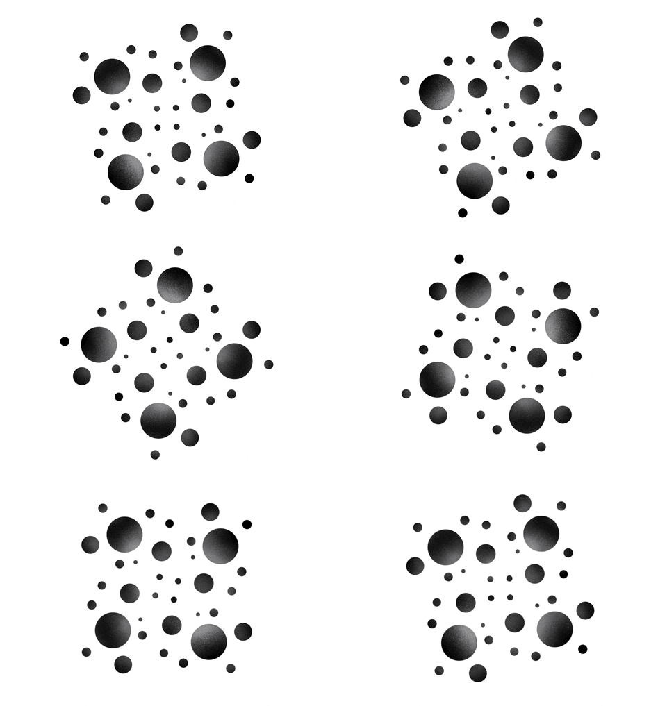
 These marks as well as the ones below, are created on Illustrator. I played around with using circles of varying sizes and repeating them on both white and black backgrounds to see which brings out the quantum vocabulary best. I feel that the repetition of the circular shape embodies the oscillating and rippling that I visualise when I think of the words ‘Gravitational Waves’.
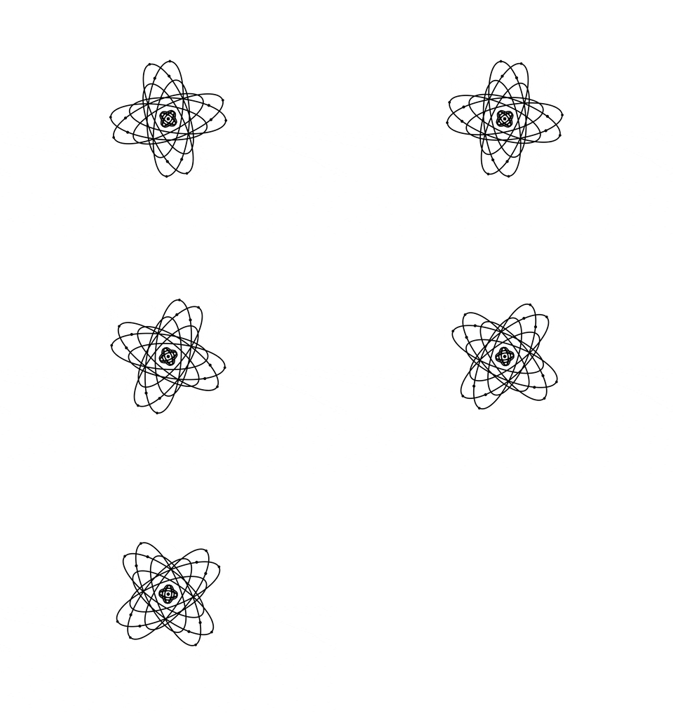
 Most of my line works are made using a basic graphic mark design and repeating them over and over, or applying different treatments such as distortion, extruding and bevelling. I feel that the repetition of concentric shapes help bring out my keyword, ‘ripple’.


Using some of the marks I’ve made, I tried to animate them by converting them into GIFs. These however do not really exemplify the radiating, rippling effect of gravitational waves, but are fairly okay for depicting the oscillating movement.
Colour & Texture Explorations:

Here are some monochromatic explorations of the first chosen mark. I filled in the shapes and applied different treatments to the gradient effect. In the green and blue explorations, I experimented with gradients in opacity, shifting them along different points of the graphic mark, and also choosing between white and coloured outlines for the linework. I was not especially satisfied with the overall look of these marks and the colours chosen as I felt they didn’t represent ‘Gravitational Waves’ very well.

For the second chosen mark, I experimented with both changing the colours of the outlines as well as the fill colours. The effects created on the right column were extremely interesting as the direction change of the gradients were evocative of such different feelings. 
 The third chosen mark to me was the most exciting as I went ahead and attempted many variations of colours, colour treatments, gradient effects, as well as grain texture. I felt that this mark and the different attempts were the most effective in embodying the keywords as well as my chosen quantum vocabulary.
Final Layout:
Here are my final layouts with some very brief descriptions!
The first page is a compilation of some of my attempts to depict my quantum vocabulary, both effective and failed attempts. The second page delves into my exploration of colours, effects and textures.

Mock Ups:
During our consultation, Prof Ina suggested projecting my graphic marks on a much larger scale. With this, I briefly explored the different possibilities my graphic marks could take on, on both small and large scales.
This billboard mock up with a very simple poster design. I tried using a gradient in the background colour.


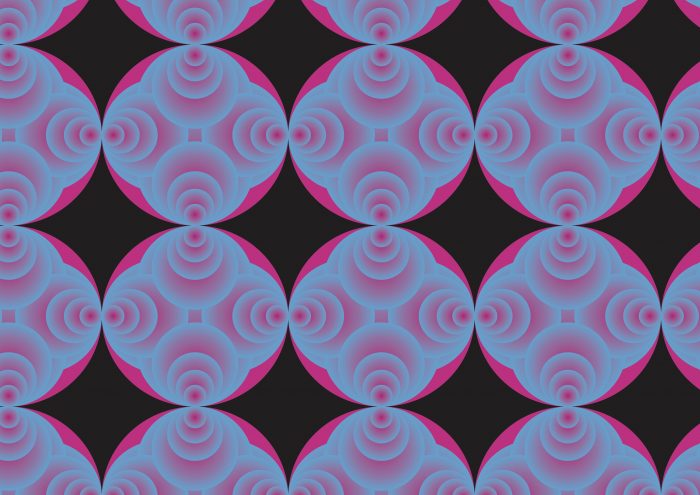
I really like this graphic mark as a pattern, seeing how the negative spaces create an entirely different form and overall appearance on the final mock up. The print here reminds me of the brand Shanghai Tang.

I felt like this mock up attempt was not the most effective in utilising the graphic mark. However, it was fun nevertheless to try and envision the mark on different medias.

Here I imagined a very simple (lacklustre) poster design. Kind of reminds me of the Looney Tunes Space Jam movie logo haha.

I’m quite fond of this exhibition booth mock up. The large scale of the graphic mark would be pretty great at showing off the grain texture unique to this design I made (apparently not evident here).

 Again, trying out patterning the graphic mark, this time with a wider width between each mark. The repetition creates an entirely different look and feel, in my opinion, compared to the large, singular version prior.

excellent works – it will be hard to pick finals!
Hi Ina! Thank you for your kind words ☺️ I’ve updated the post with more marks and colour explorations, as well as the final layout! I’ll be including more in depth write ups too as well! See you on Monday!