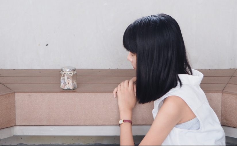
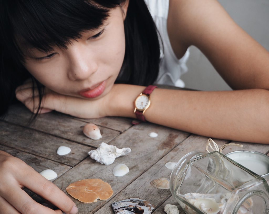
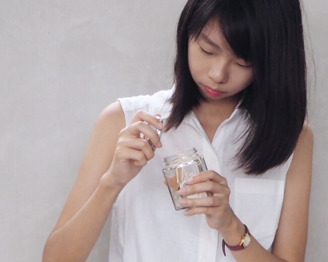
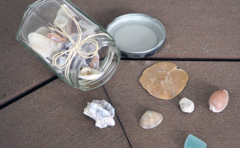
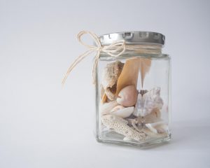
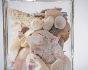
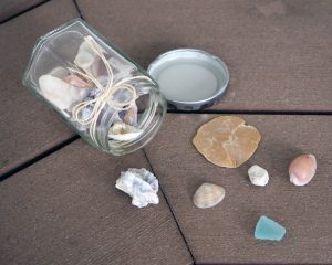
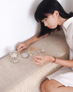
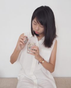
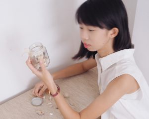
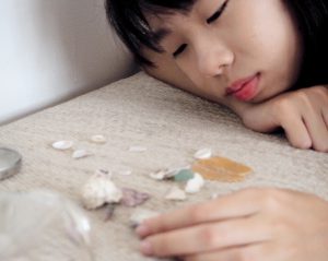
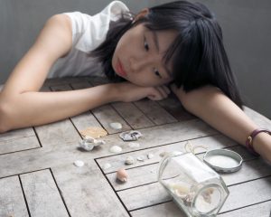
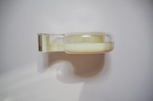
I chose a glass jar of seashells as my object as it represents the memories that I treasure in my life. I have many jars filled with seashells that I’ve picked up whenever I visit beaches over the years. This particular jar holds memories with my classmates in polytechnic. Transitioning into university, I miss my classmates a lot. There were plenty of ups, and many downs, but I miss all of it. Reminiscing about the past is what I catch myself doing very often. I think that we are all made out of memories and whatever experience that I’ve undergone has contributed to who I am today. I felt that seashells best represent that concept. There are many shells in the ocean, but there’s only a handful that I pick to keep. Likewise, there are many moments in life but we cherish only a handful of them.
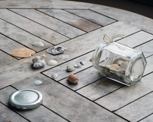
Shells symbolise emotions, memories and friendship, which are important in my life. In this photo series of representation of self, I decided to keep the photos clean looking with minimal props. I wanted to let the jar of shells stand out, and a cluttered background with poor execution could have potentially taken the viewer’s attention away from the main subject. I worked with a 4:5 aspect ratio for a tighter crop.
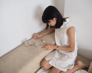
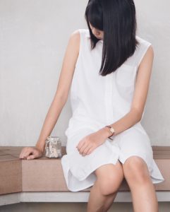
Keeping mise en scene in mind, I opted to go for a very clean look to match the look of the jar. Browns, beiges and earthy tones. I chose to wear a white dress because it symbolises purity and innocence – characteristics that can often be associated with reminiscing nice memories. I wore my watch, because it symbolises the passing of time. The burgundy red colour gave a nice pop of colour in the photos.
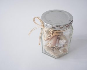
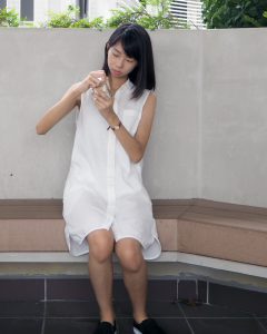
Close up + slightly high angle shot. Wanted to convey how much I miss that period in my life.High angle shot. In this image I wanted to convey innocence and helplessness through the angle. The past is in the past and there is nothing that I can do about it.Medium close up shot. Am I opening or closing the jar? Am I revisiting memories or leaving them behind?
Task 2: My World
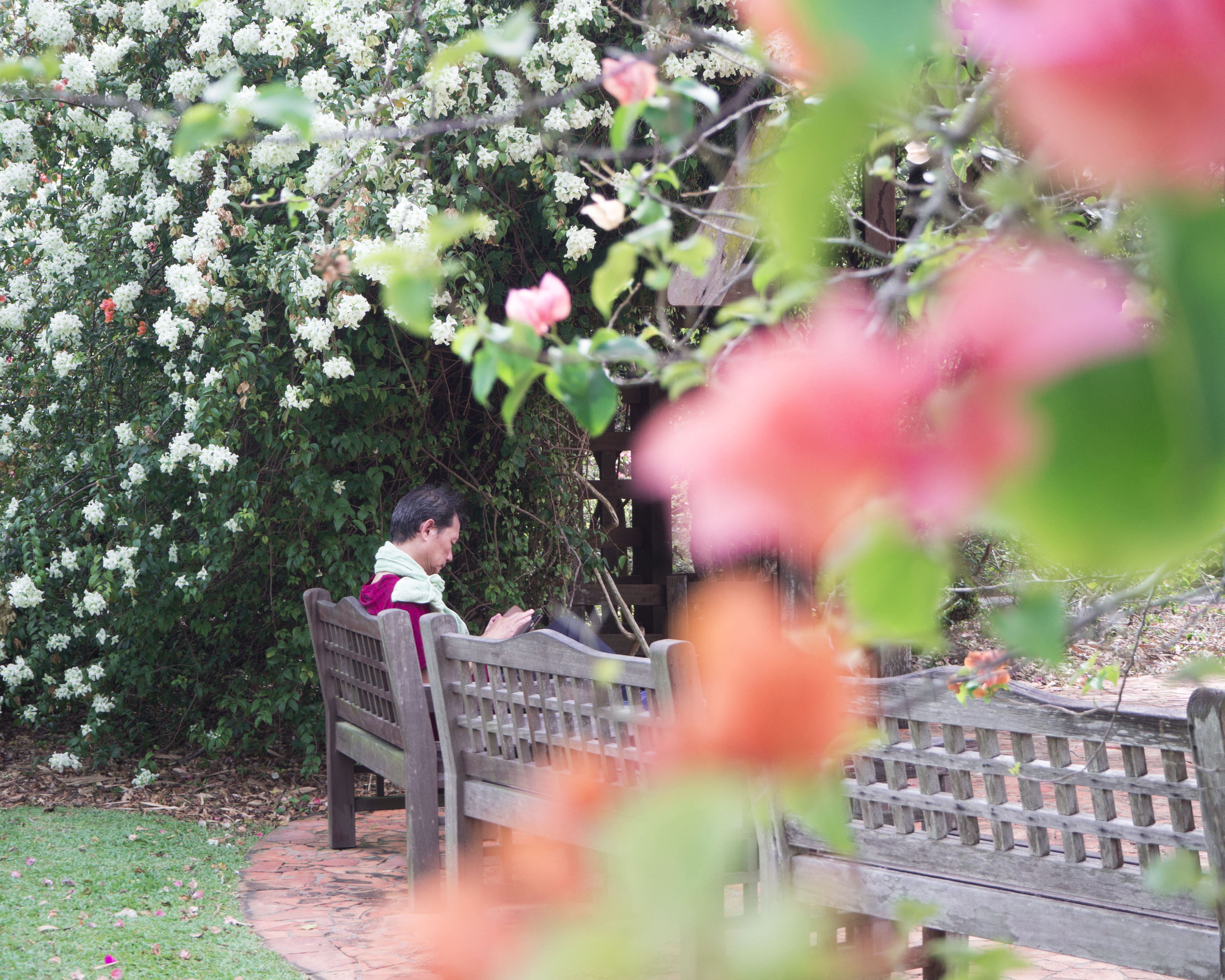
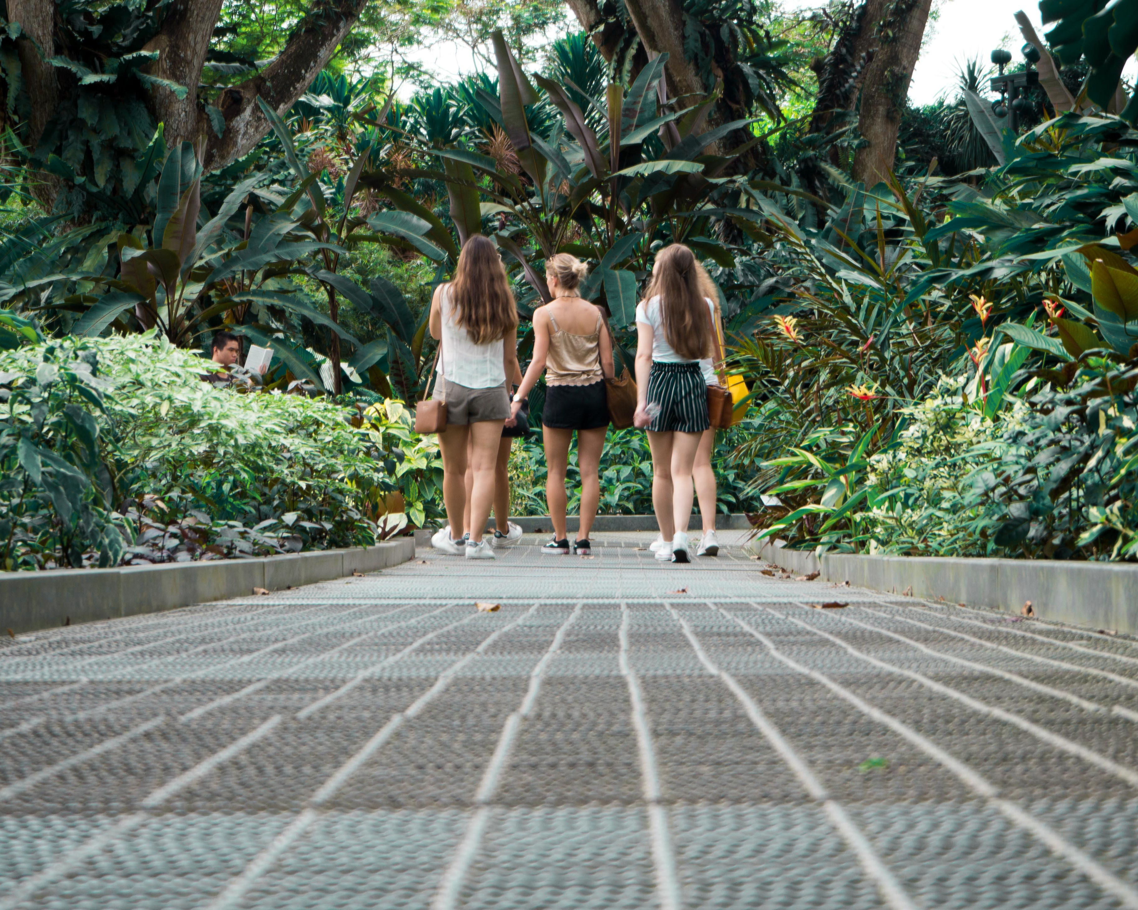
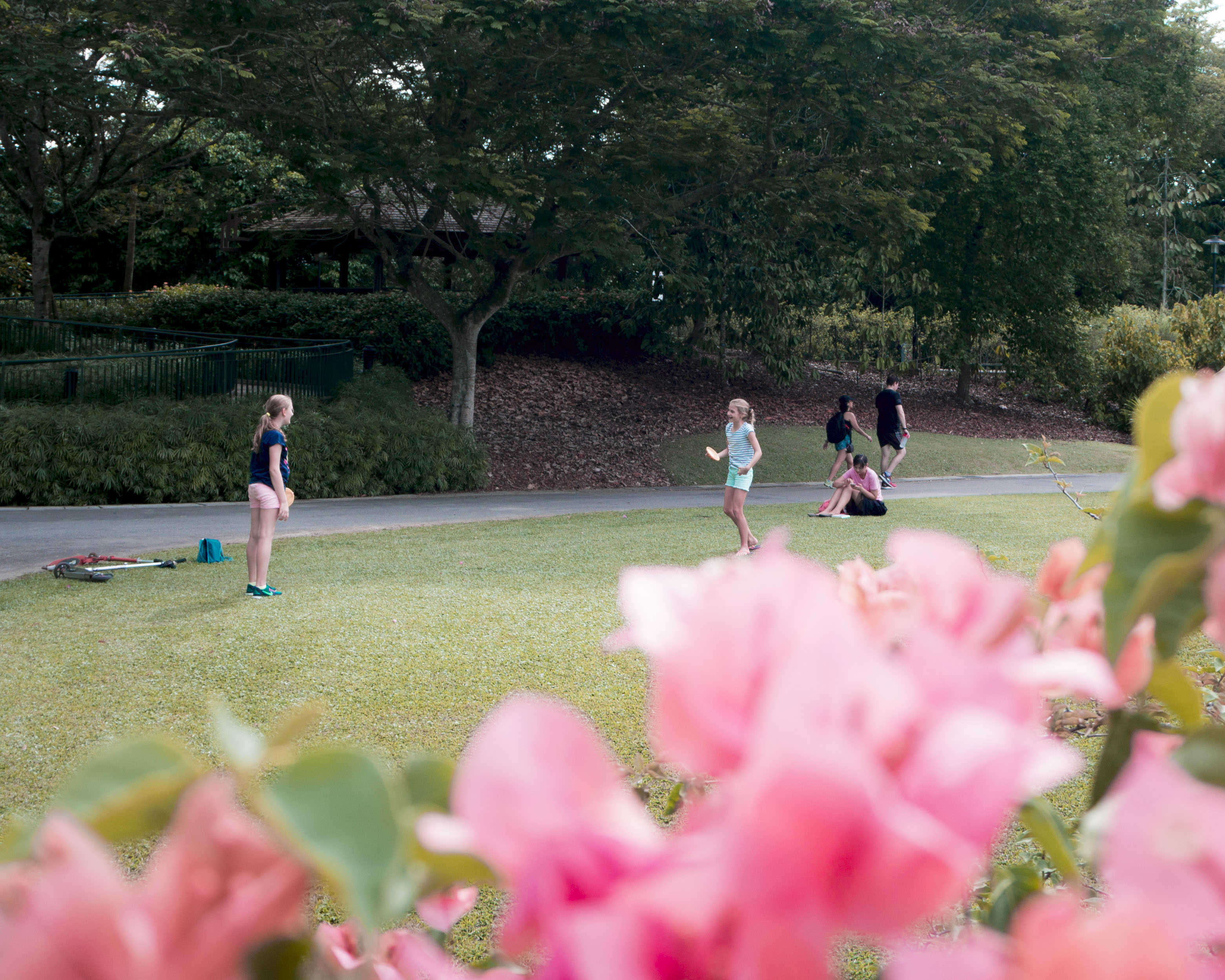
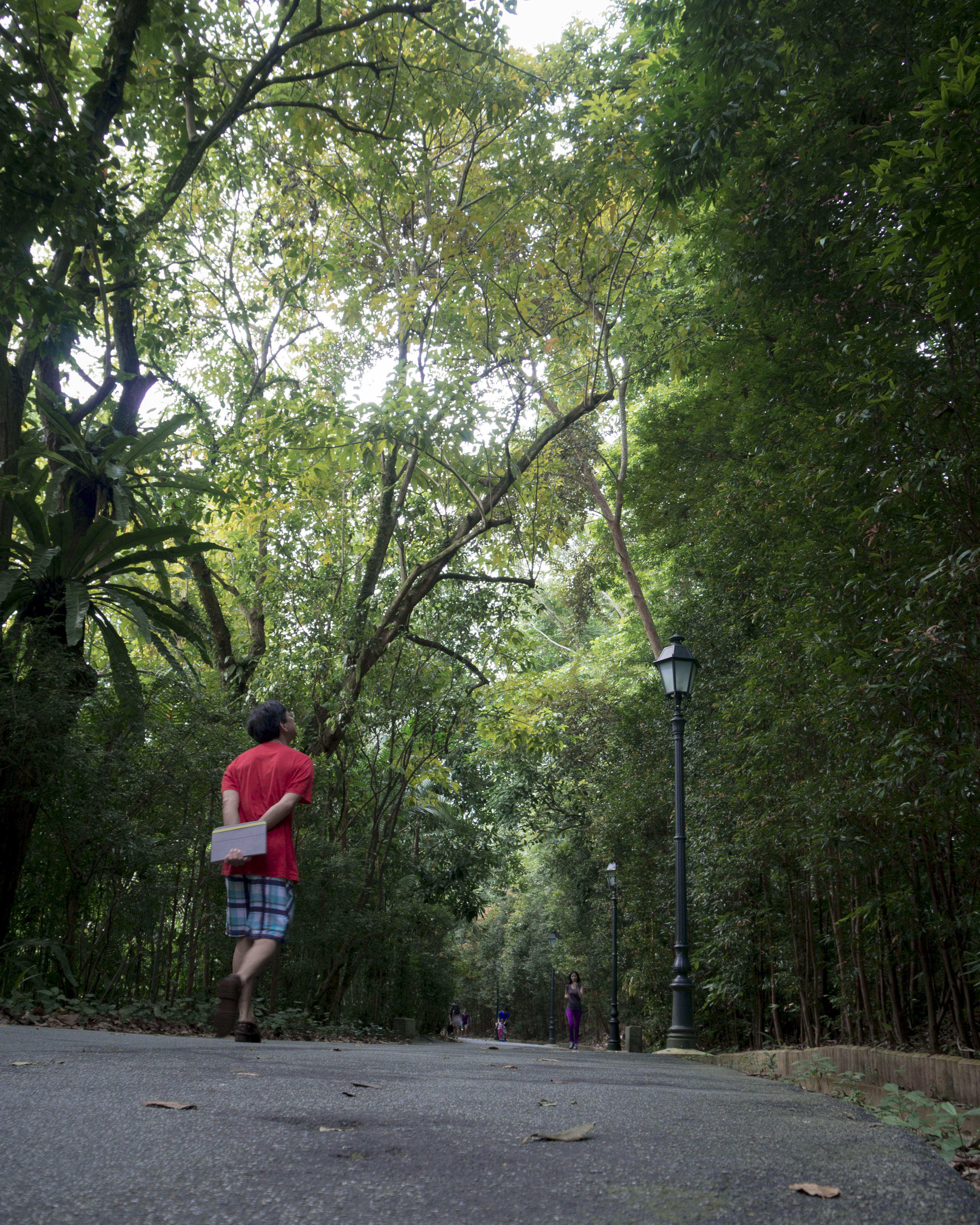
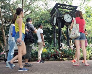
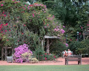
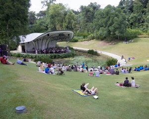
Botanic Gardens is a place that I have a personal connection with. Whenever I feel stressed or sad, I will make time to visit Botanic Gardens for a walk. When the season is right, the flowers will be in full bloom. It is a rather beautiful sight. I will walk around the garden aimlessly then, until I feel better. Sometimes, I will find a quiet spot to sit just to think. I’ve always been a nature person. I find that the visits always refresh me, especially after sitting in a cubicle in school doing work for weeks. I am a flower person too, so I am in my element whenever I visit the garden. Welcome to my world.
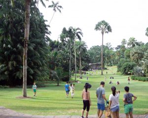
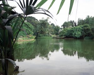
I tried to capture its beauty, peacefulness and grandness in the photos. For serene shots, I stuck to eye level, wide shots. The horizon line parallel to the edge of the photo conveys the garden’s peacefulness. In contrast, to show the grandness of the tall trees, I crouched down and tried to take low angle shots. I played around with selective focusing on the photo of the man surrounded by flowers, to give the image more depth and to draw attention to my subject. It was also a happy accident that the man was glued to his phone. It kind of has a sub message that sometimes we are so busy focusing on little things that we fail to notice the natural beauty that is around us. What makes a place special is not just its environment, but the people who visit the place, which is why I made sure to include people in my photographs too. They act as a point of interest because nature photography tends to get lost without a focal point. I kept the overall series saturated because it can be a lively place.
There are people from all walks of life visiting Botanic Gardens, which is fascinating to me. Majority are with family, lovers or friends. Sometimes I see individuals like me just wandering around and I wonder what’s their story. Of course, the flowers convey the beauty of the place, and frames the man nicely. I think this photo really represents the place – a place where you can just relax in and be surrounded by lovely nature.Wanted to use these leading lines for my photo. I waited for people to walk by. It kind of looks like they are entering the place.I wanted to capture the different people that visit because it’s something that I do notice when I visit. It makes me happy to see people enjoying themselves. It conveys the liveliness of the place. I like this photo as it has a foreground, mid ground and background element to it.This man was really immersed in the environment and enjoying his walk. Like I always do. I used a low angle to show how tall the trees are in comparison to a human. It conveys the grandness of nature.
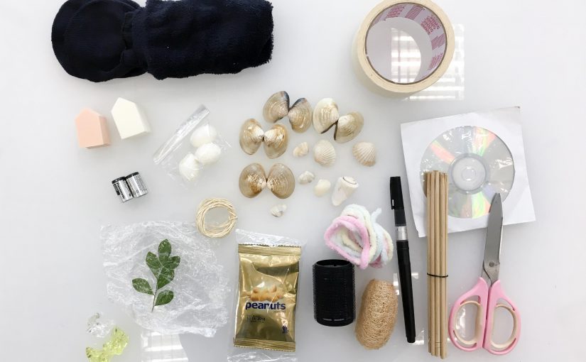
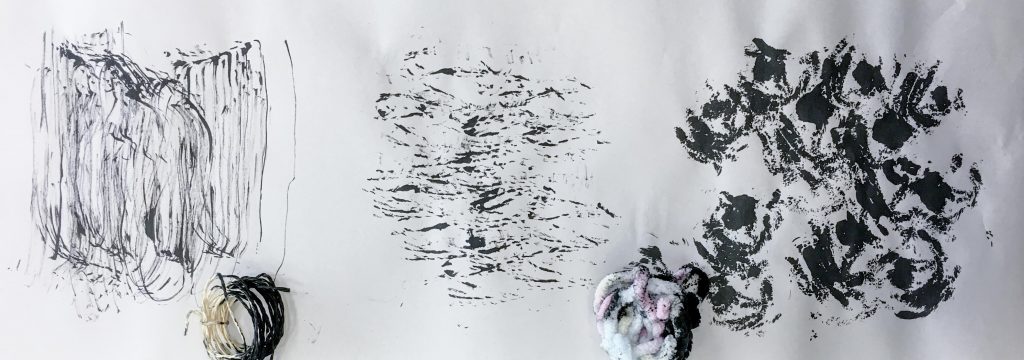
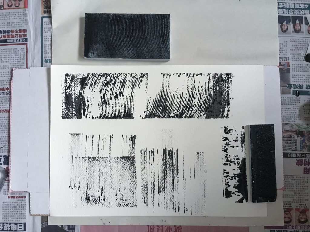
We spent class time to do some mark making so here is the documentation of the process! I brought a variety of materials – mostly organic because from my research I found that the textures created by organic materials are very appealing in general and are very versatile. I made sure to use different techniques to maximise the potential of the tools.
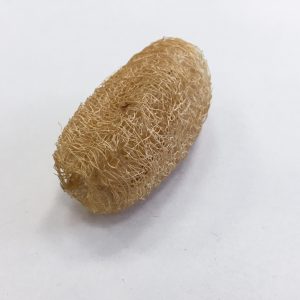
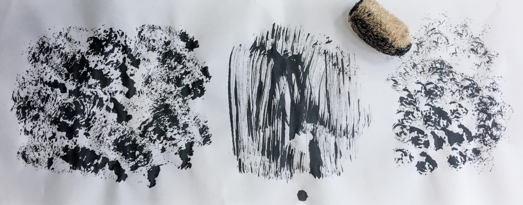
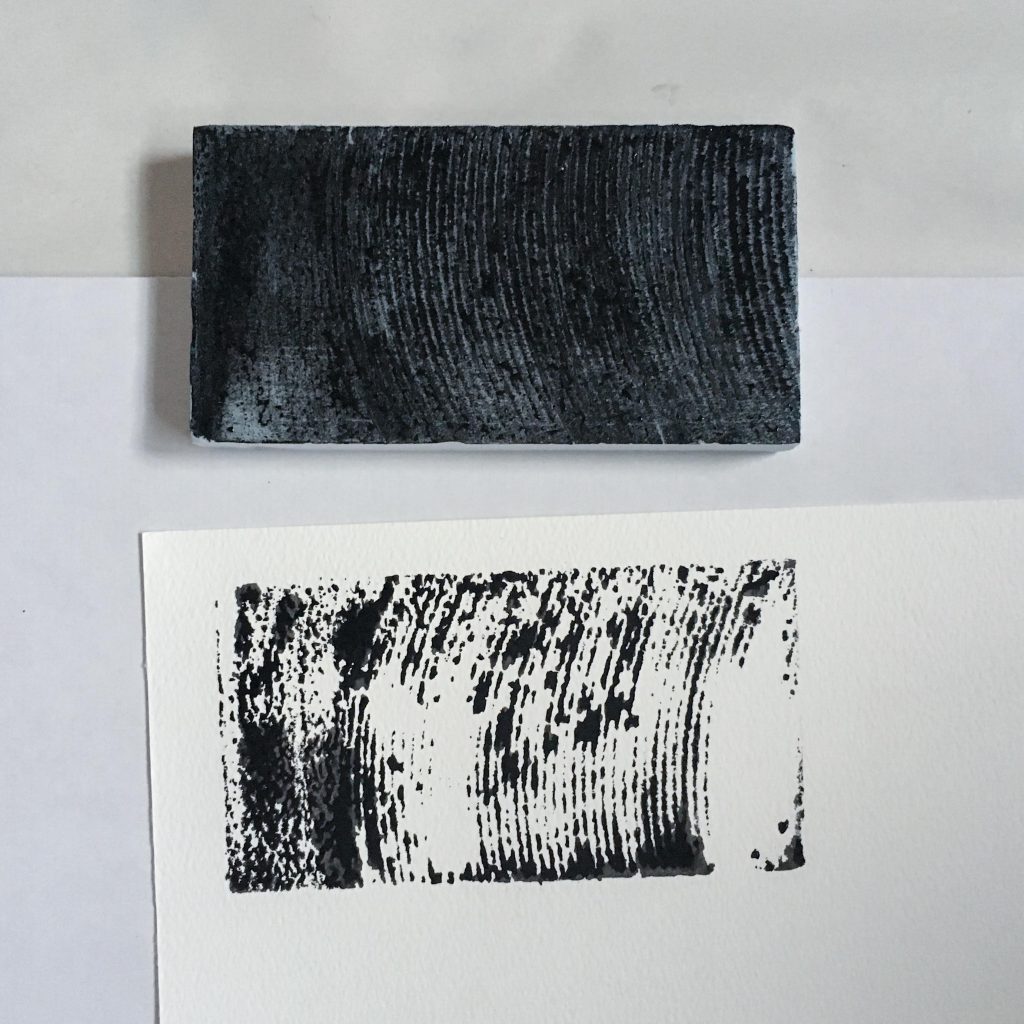
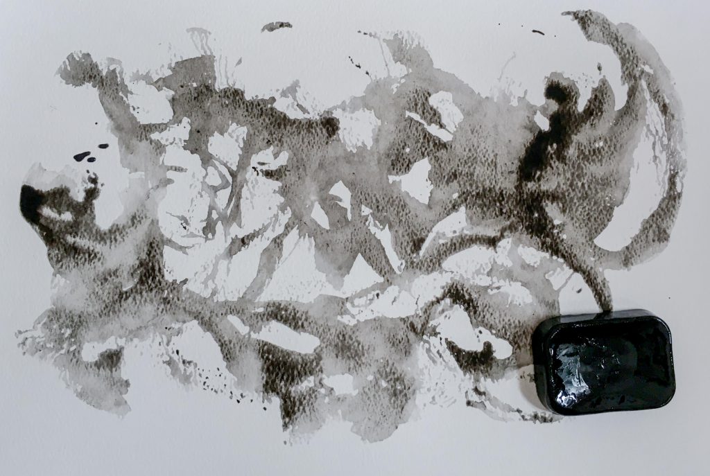
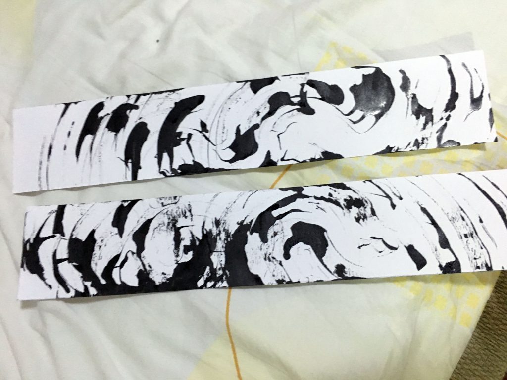
The first tool that I experimented with was a small body scrub. I dipped it in Chinese calligraphy ink so that it would soak up the ink.
I tried to manoeuvre the scrub differently on the paper to produce different textures. I used different stamping and swiping motions to achieve the results below. I find that it is a very versatile tool that can convey a variety of emotions.
Left: Stamping. Middle: Swiping. Right: Stamping while holding it vertically.
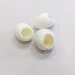
Silkworm cocoons
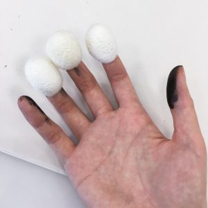
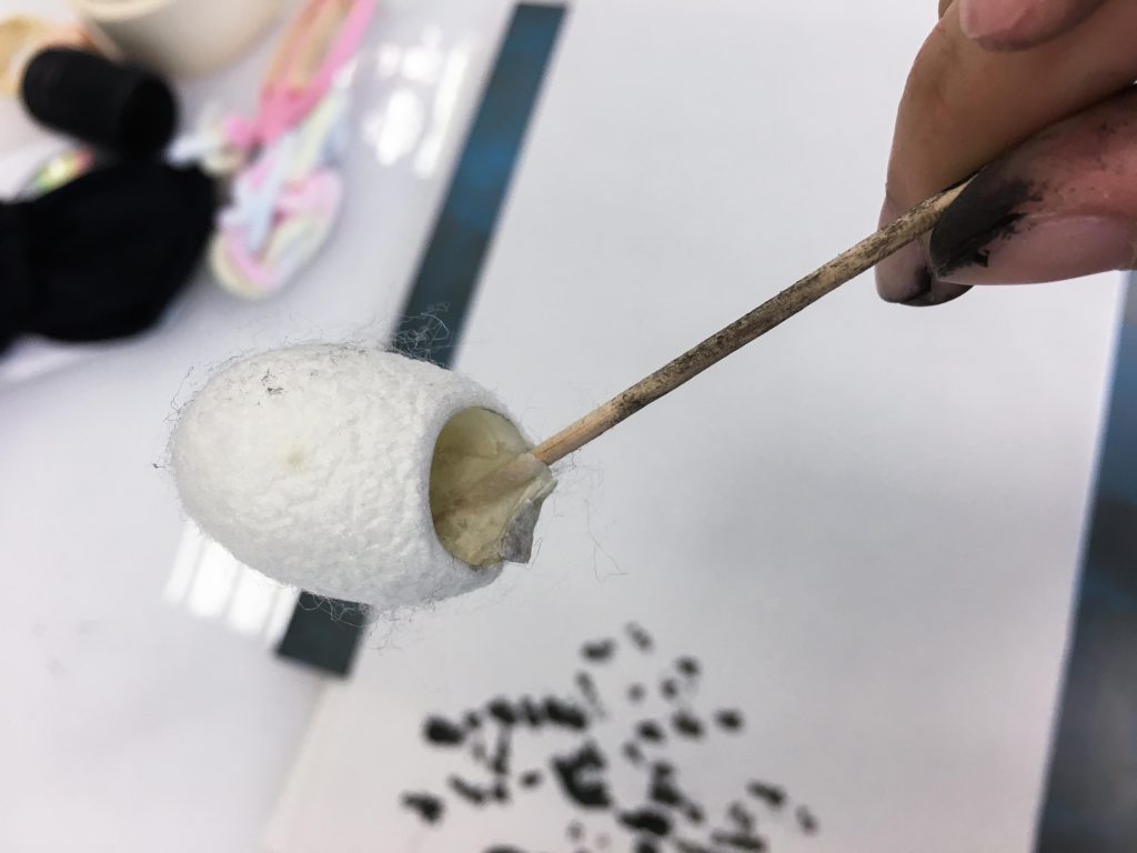
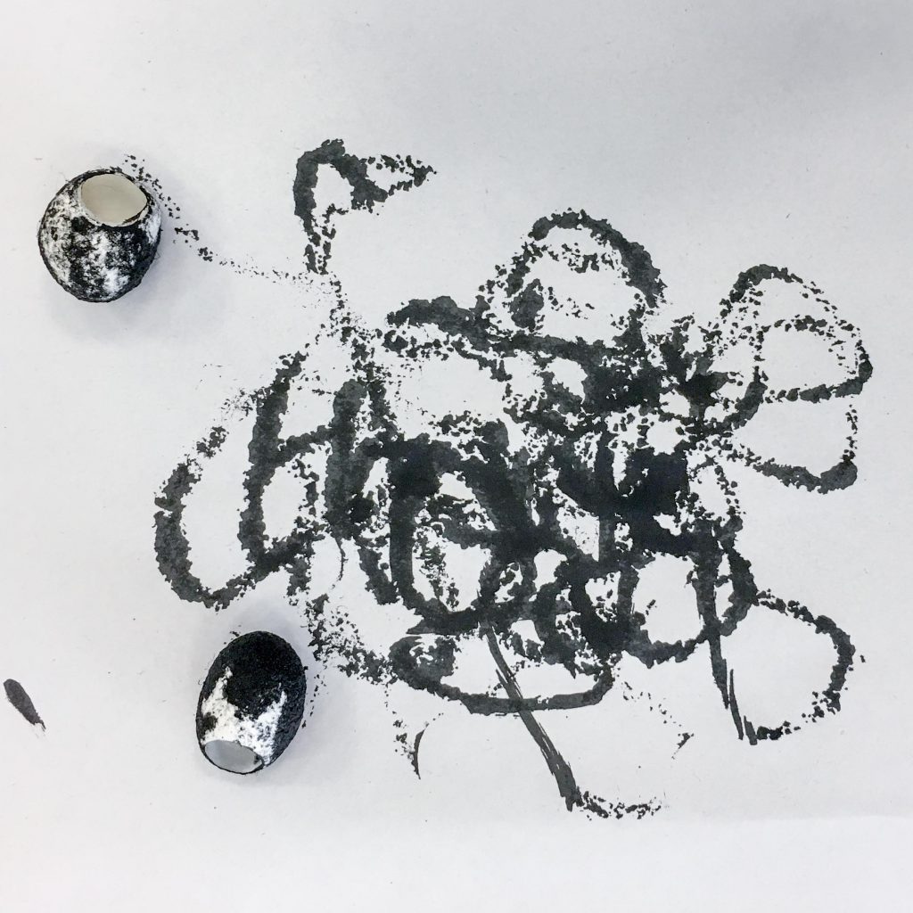
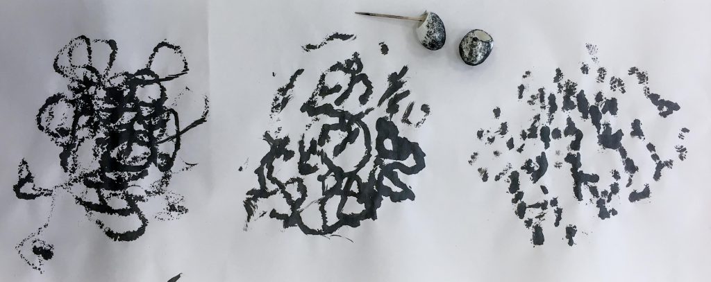
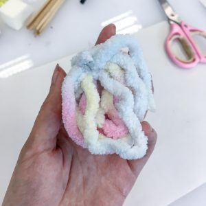
Next, I used some silkworm cocoons. Again, I tried to use different techniques with this one too. I tried rolling these around on paper, attaching them to my hands to tap on the paper, and even attaching one to a stick to see if the different movement would produce different results.
Slikworm cocoons
Attaching it to a toothpick produced a different movement over the paper which created different textures as opposed to just stamping.Rolling around silkworm cocoons on paper.Left: Rolling on paper. Middle: Attaching a toothpick to one. Right: Putting on fingers and using a tapping motion on paper.
Masking Tape
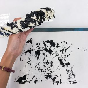
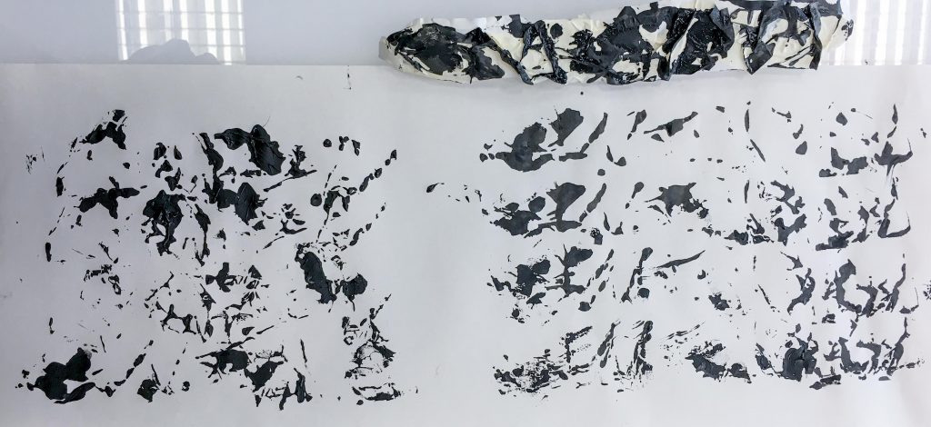
I said in my first post that I’d bring tape so I did. I brought masking tape so that I wouldn’t struggle with the adhesive and have problems like it ripping the paper. I tried stamping patterns using crumpled tape and some acrylic paint. The pattern produced at a good variety of small and large splotches.
Crumpled tapeStamping on paper.
Stamping using crumpled tape.
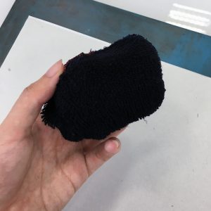
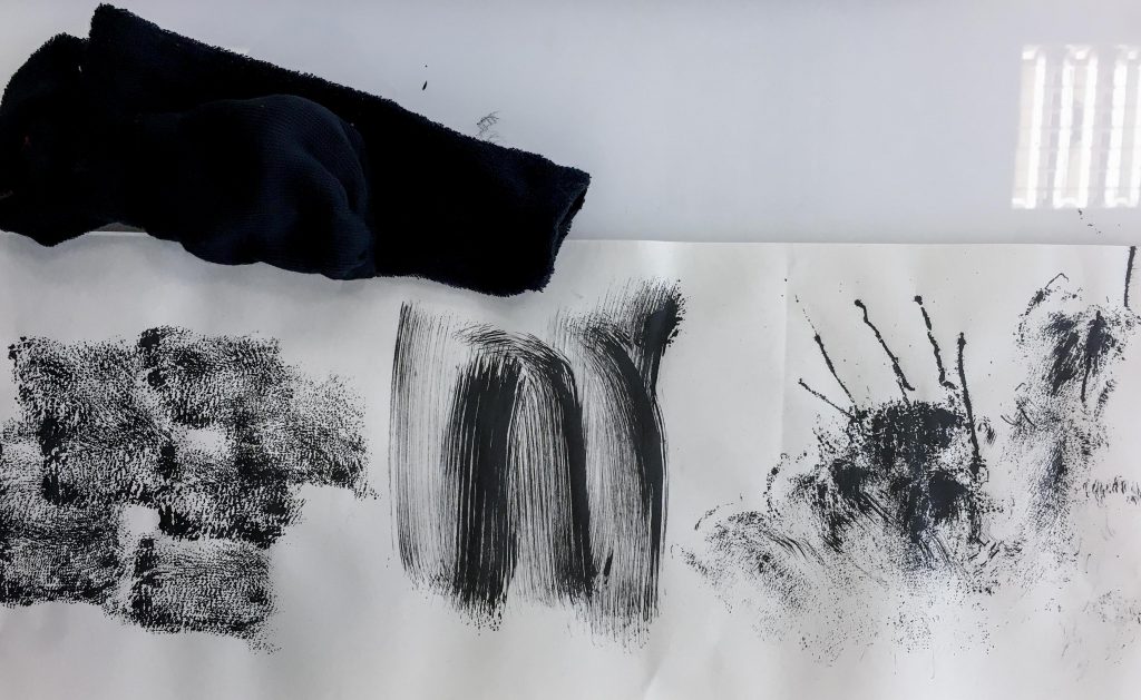
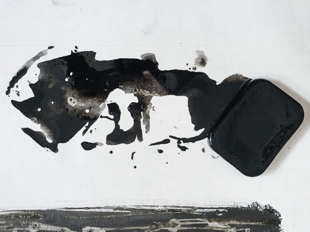
Airplane socks
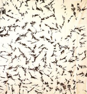
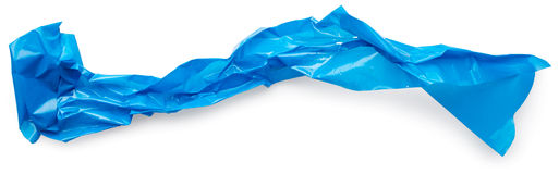
I found some airplane socks so I rolled one up to create a stamper. I swiped it across the paper too, and it produced strokes that resembled a paint brush. In the third column I flung the sock on the paper. The loose threads created long tense looking lines that reminds me of the emotion “frustration” so I may want to consider it as one of my final pieces for that emotion.
Rolled up sock.Left: Stamping. Middle: Swiping. Right: Flinging.
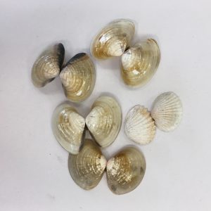
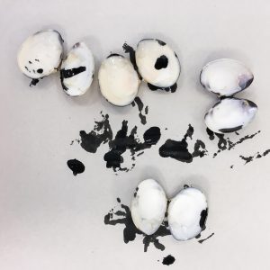
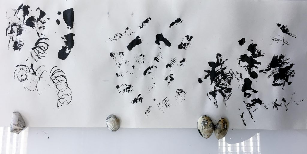
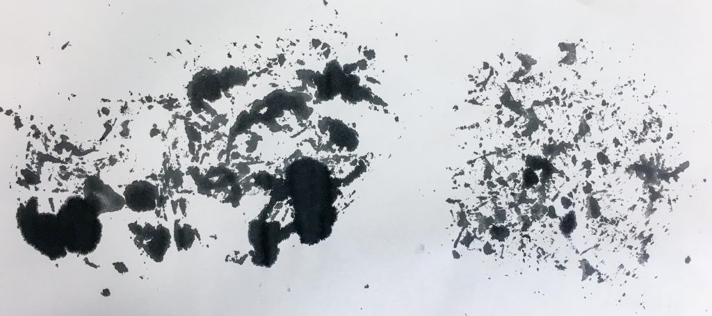
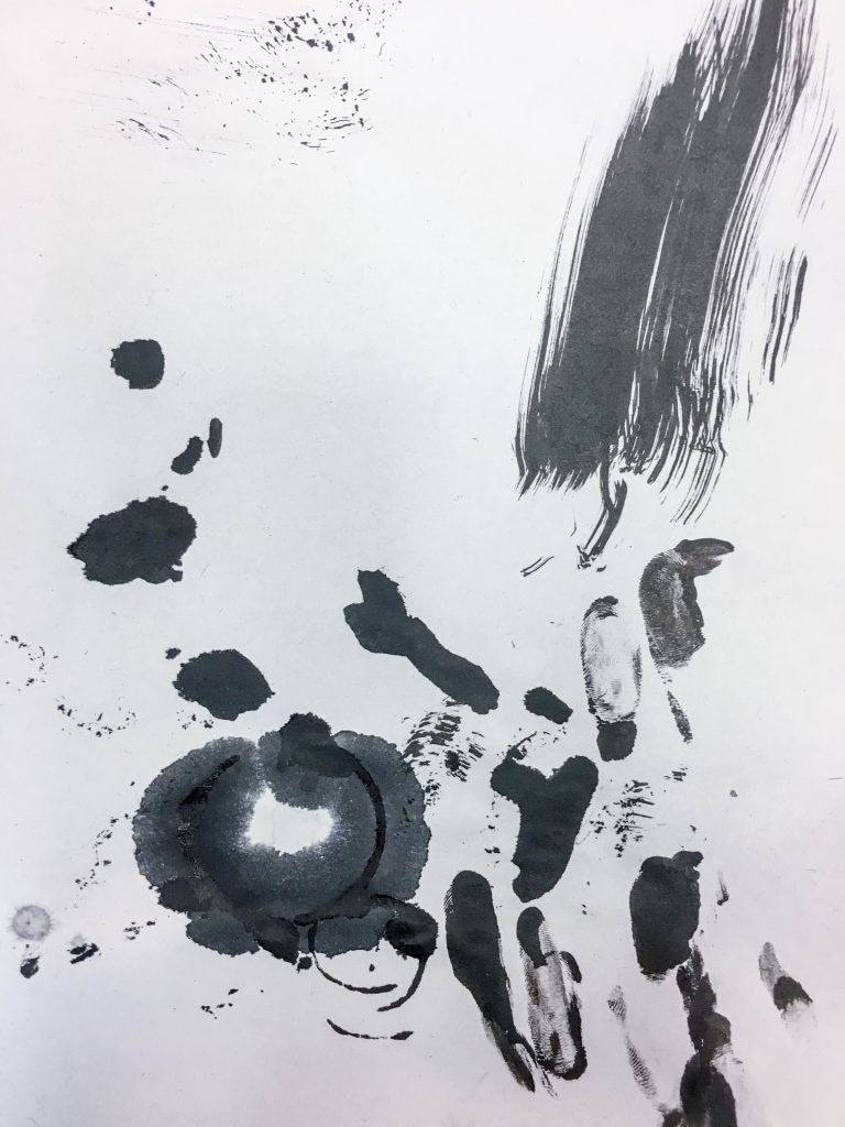
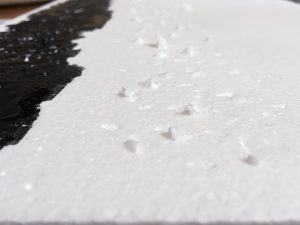
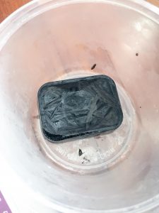
Seashells
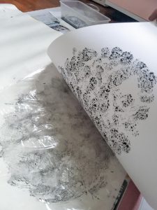
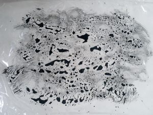
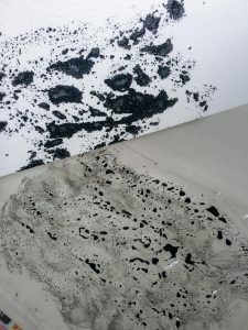
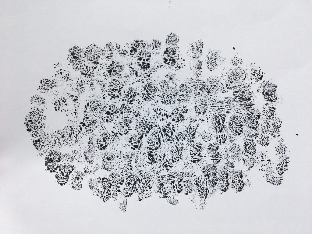
Using seashells didn’t exactly produce the results that I wanted. It’s shape covered a very small surface area and the paint was very concentrated. The patterns do convey enthusiasm to me, however I may want to experiment with them some more. The shell with protruding jagged points convey “timidness” to me as it produced these small clutters of lines that seem to fade away.
ShellsAttempt to stamp using the back of shells.Left: Spiral seashell. Middle: Shell with protruding jagged points. Right: Smooth regular seashell.
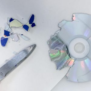
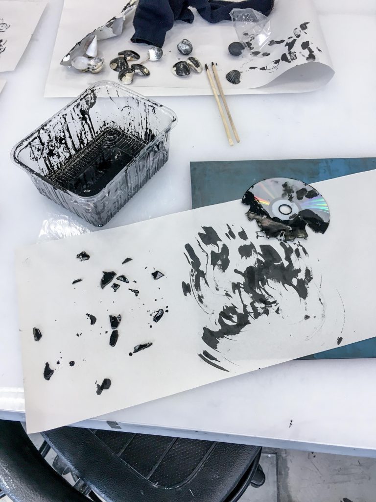
CD
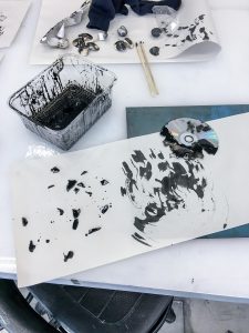
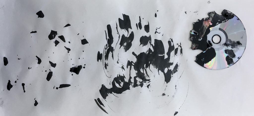
The CD was one of the few hard surface objects that I brought. It produced very hard-edged prints. Cutting it up was a challenge. I was inspired by the torn paper collage technique and tried to use shattered CD bits but it was difficult as cutting up a CD was not easy. In the end I cut just enough to see if the idea works. The print had more defined shapes as compared to the other prints. tried using the shattered edge of the CD as a brush too – this worked pretty well. The unusual strokes produced are not easily replicated by other objects in my opinion.
Cutting up a CD!Printing using a CD.Left: Scattering CD bits. Right: Using shattered edge of CD as a brush.
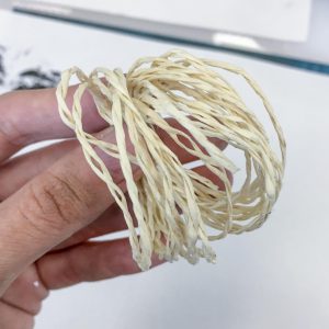
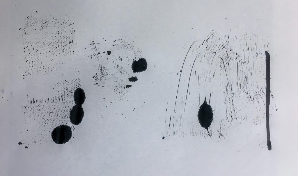
String
I brought two types of string to play with. The fluffy string produced textures similar to the sock. It conveys “panic” to me. The paper string conveys “apprehension” through the thin strokes produced.
Fluffy stringPaper stringLeft: Swiping motion using paper string. Middle: Stamping using paper string. Right: Stamping using fluffy string.
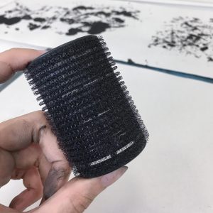
Hair roller
The hair roller produced patterns that would be difficult to replicate as well. It reminds me of “sadness” when I look at the print. A child-like sort of sadness if you will.
Hair rollerLeft: Rolling motion. Right: Swiping motion.
Cling Wrap
In school I tried stamping using cling wrap. But at home I tried to do it the other way instead. I laid out my cling wrap and put paint on it first. I then placed my paper on top of the cling wrap.
Left: Stamping using cling wrap. Right: Secondary stamping using the same cling wrap.
Ink on cling wrap using cotton ball.Outcome of the ink placed on cling wrap using cotton balls.Ink on cling wrap using body scrub.Outcome of ink placed on cling wrap using a scrub.
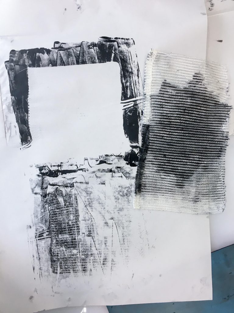
Using a press
The first time I used the press was a fail because the paint was too thinly spread that it didn’t seep through the tiny holes of the cloth. However I improvised and stamped the leftover paint on the board onto the paper which showcased the texture of the cloth better. I then tried again with cotton fluffs instead. The paint didn’t seep through either, but instead gave me a print with negative space.
Stamped using a textured cloth with the help of a press.Fluffs of cotton on top of block printing ink.Marks from the objects with ink resting on top of it.
Foam pieces
I picked up from foam pieces from Foundation 3D class because I noticed that they were uniquely textured! One of the pieces had this rounded pattern already on it, the other had imperfect machine cutter marks. I tried both stamping and dragging the pieces. Both performed well and I am pleased with the outcome of the prints.
Glue on cardboard
I tried using glue to create some negative space in my prints. I put the glue on a piece of cardboard and waited for it to dry before putting some ink on it and pressing a piece of paper over it. Some of the cardboard texture got transferred on it as well, which gave an interesting look.
Glue on cardboard.
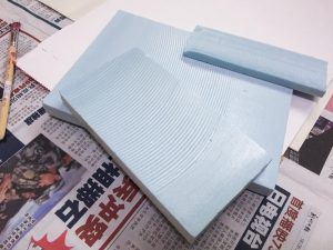
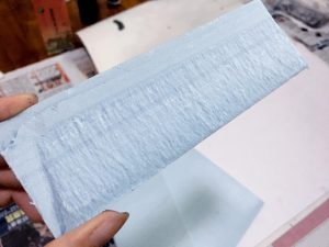
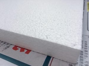
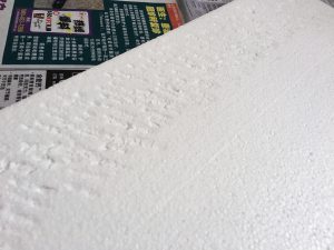
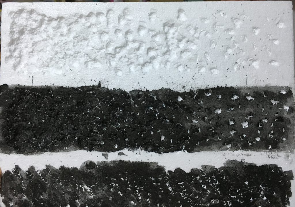
Styrofoam
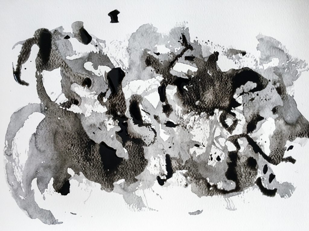
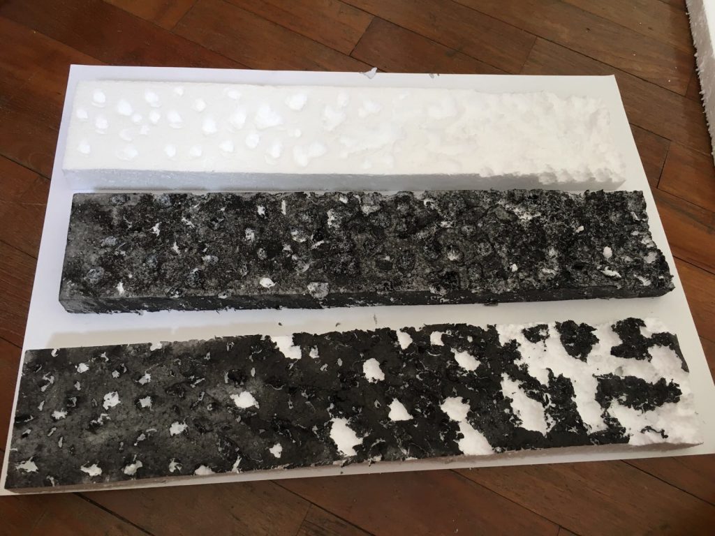
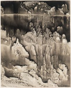
I got myself a styrofoam board to play with since it is a very textured material on its own. I first jabbed it using the end of a paintbrush to further texture it and then stamped the ink onto paper. I really like the outcome, I think it is a good interpretation of depression. I then jabbed a pair of scissors into it to create “crumbs” of styrofoam and printed with that too.
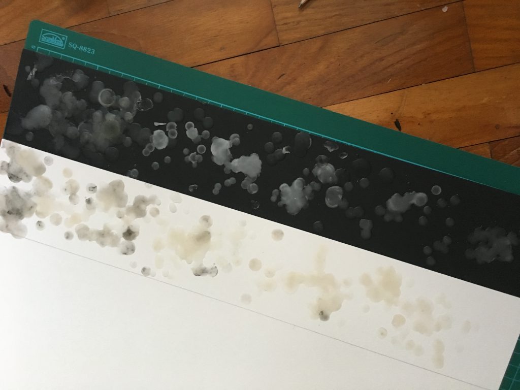
Ice
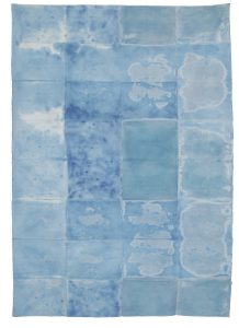
I froze some ink water because why not. Since I had no control of the ice melting, it gave wonderfully flowy results. The ink did come out diluted though, which is why I decided to go over the paper a second time after the first layer dried. That produced contrast. The advantage of using water colour paper was that the texture of it shows through the print.
Some of the textures above convey these emotions, but some was questionable so I had to go make more stuff focusing on those emotions.
Thrill
The dynamic shapes produced by the broken CD was great for expressing thrill. It just lacked circular motion to convey the “crazy” and “excitement” element, so I made a few variation prints at home and picked one best one for my final submission.
Printing using a CD.Two variations of “thrill” excluding final pick.
Love
At first I wanted to go for a passionate sort of love and came up with this, but it did not translate very well.
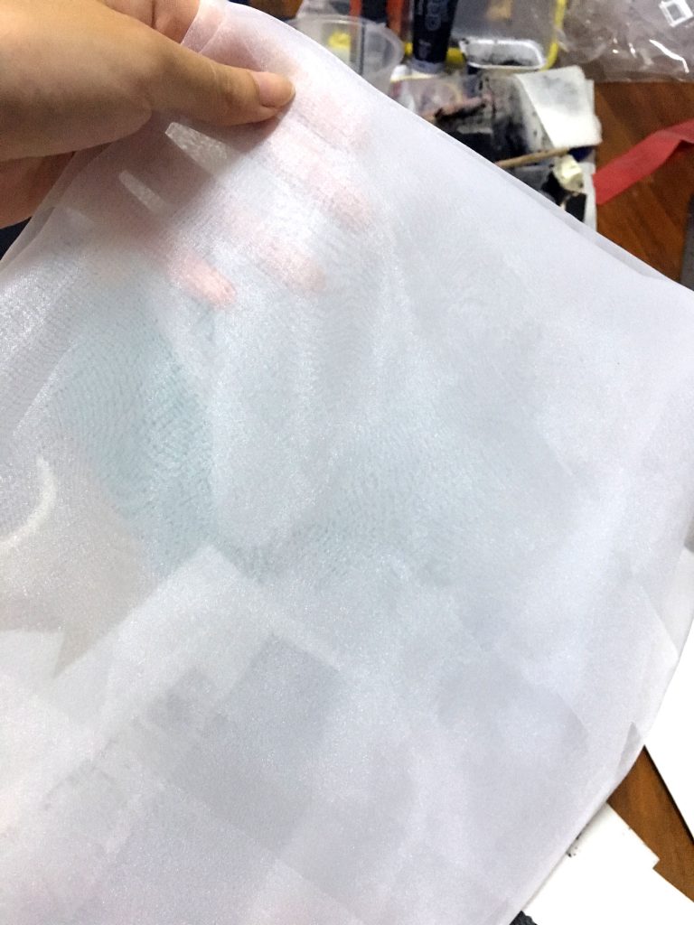
Since we are encouraged to experiment with 3D methods too, I tried to look for soft, white material to manipulate on a black background to fit my definition. I found this cloth called organdy. It is a very sheer and crisp type of cloth. I thought it would be perfect for “love”. I cut off a strip and twisted it to create wave like patterns on a black board. It was actually a very difficult material to work with, because glue didn’t adhere very well to the fine cloth. Final outcome in final submission post.
Organdy cloth.
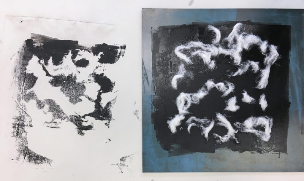
Sadness
I had two prints that portray different forms of sadness. First one is a more aggressive sort of sadness, and the second one is one that is more quiet. Second one produced very interesting textures that resemble tear stains. Plus the grey tone went went with the definition of sadness. Hence I chose the second print.
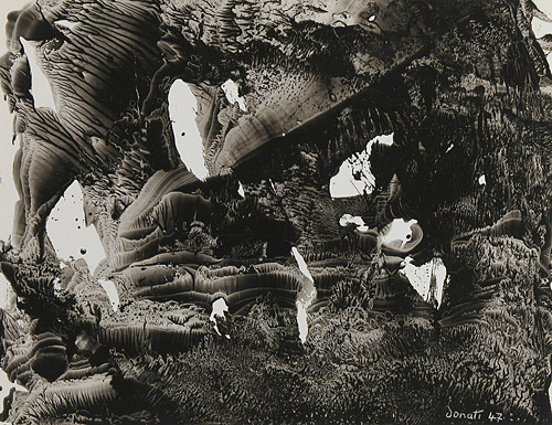
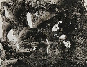
Printing using styrofoam. It looks like a heavy downpour almost.Dragging the ice block of ink on water colour paper.
Uneasiness
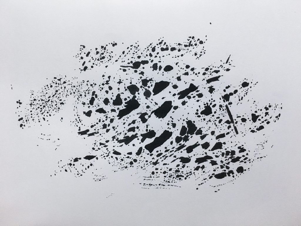
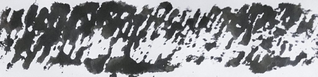
I had a few prints to consider for uneasiness. First one makes the viewer pretty uncomfortable. It does convey the emotion, however the look is constant throughout and kind of boring. Second one shows pacing which is nice, but I think it’s a pretty common portrayal. I chose the last one because it had the best contrast in terms of patterns. There are many small tiny dots to show the thoughts running through my mind. The little random splatters kind of reminds me of sweat – which is possible when you’re uneasy.
Rolling around silkworm cocoons on paper.Monoprinting.
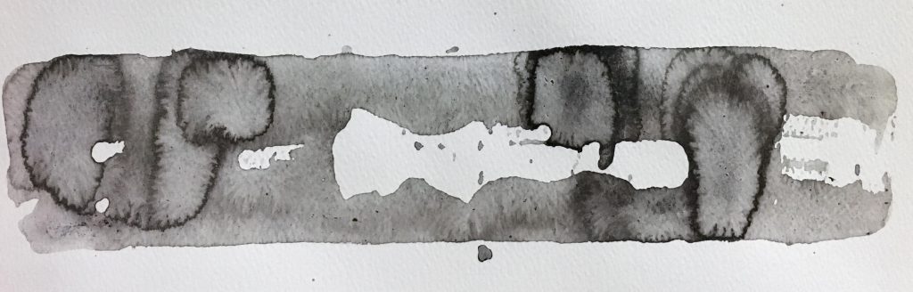
Suffering
For this one, I had no intention to create the emotion suffering, I was just experimenting with melted wax because it produced beautiful textures. I melted the wax on top of both white and black paper to see what difference the background makes. I initially couldn’t interpret the emotion from both at all. Then I thought about how your heart and mindset sort of “hardens” in suffering. So I decided to do one extra step and layer black paint over the wax to make it less white and blend in more with its black background. I made sure to leave some whitish areas for contrast. That helped add darkness to the overall look and convey “suffering” better.
Melting wax.Outcome of melting wax.
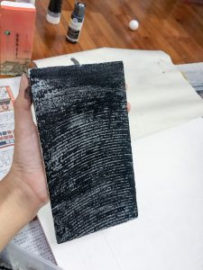
Bitterness
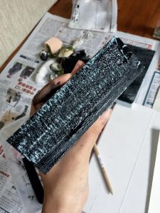
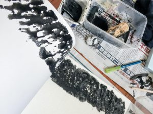
I was going for the emotion “frustration” in this one, but after looking at the outcome, I adjusted it to “bitterness” as it is more accurate. I had a styrofoam board that I used for mono printing but why not use it for the actual work instead. I tried different ways of stabbing and digging at the board. I thought of the emotion which to me sort of builds up with time so I knew I wanted a progression of stabbing/digging. After I decided on how the digging should look like, I tried to put black paint over it, since it was a negative emotion. However the black paint distracts the viewer from the textures, so I opted to go with the clean, white one instead for my final piece.
The black paint was too distracting and didn’t let the texture show through.
I looked up some of the reference artists given in the assignment brief to get some inspiration. I think analysing their photos would be a good place to start my research.
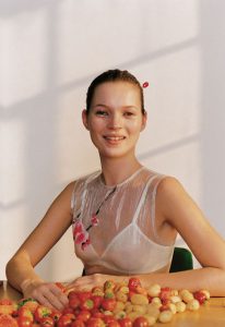
Wolfgang Tillmans Kate McQueen 1996 | https://www.pinterest.com/pin/464081936593995846/
I felt that this portrait photo by Wolfgang Tillmans tells me a lot about the lady. As a viewer, I am able to interpret what sort of person she is through the visuals. The “object” that she is interacting with are strawberries. The choice of fruit tells me that perhaps she is a sweet, nice, cheerful lady. Her clothes – a sheer flower embroidered tank with a white bra-let – tells me that she is a feminine person. Her hair up in a bun paired with the clothes gives me the impression that she may be a dancer or ballerina. The lighting of the scene also plays a part in portraying her character and personality as well. The photographer chose to shoot using natural lighting, which brings out the liveliness of the subject. The medium shot of the lady still clearly shows her expression and enough information for the viewer to interpret.
I may not be accurate in my interpretation, but it shows that what you place within your frame is important (mise en scène) and it helps with the narrative. I will try to think carefully about what object to use, and how I set up my photos for project 1.
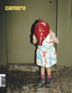
Photo by Nan Goldin | Taken from https://www.pinterest.com/pin/464081936593995936/
This photo by Nan Goldin caught my attention because of the way the photograph was staged. There are a few questions that arise when I look at this photo. Why is the girl putting on or removing the mask? Where is this place? Who is she with?
The red mask that the girl is holding is rather peculiar. The colour red also brings attention to the image. Though it is a full body shot, the way that the photo is cropped does not give much information about the environment that the girl is in. All we see is a door and the gravelled ground. The girl seems to be either putting on the mask or removing it. The lighting of the image is rather harsh, so one may assume that it is night time and there is one strong light source lighting the scene.
I think what intrigues me the most about this photo is the action of the girl, so in my photos for the project I hope that I can think of an interesting action that isn’t static and conveys emotion at the same time.
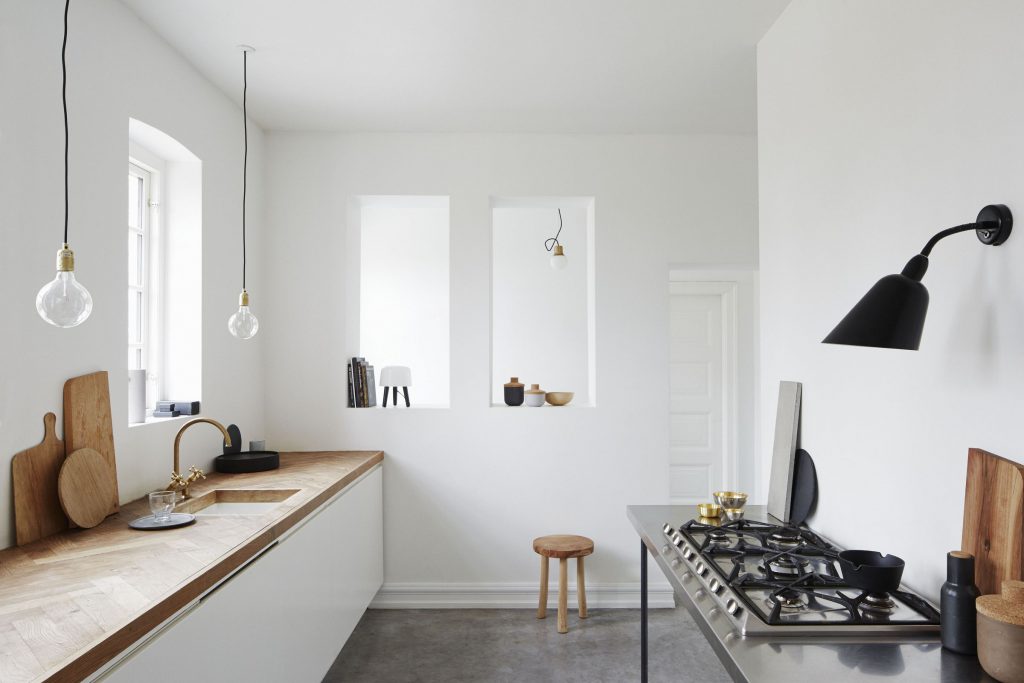
For my object, I intend to use the aesthetic of those photos found in kinfolk magazine. The colours are earthy and muted with simple backgrounds.
Taken from https://www.racked.com/2016/3/14/11173148/kinfolk-lifestyle-magazines
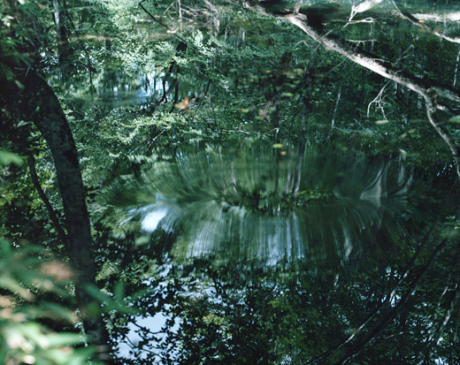
A photographer’s work that I am going to use as reference for my environment photos is Risaku Suzuki. She is a nature photographer, and I intend to take nature related photos so I can use her works as reference when I edit my photos. What catches my attention about her photos is the colours that she uses. The colours in her photos are very calming and easy to view. Greenery is often very difficult to make them look appealing in my opinion, but she is successful in capturing the serenity and class of the colour. Her photos often capture repetitive textures very well, and she is able to compose her shot in such a way that the focal point isn’t very obvious, and the viewer studies the photo on their own to discover the magic within the photo. What is interesting about the photo below is definitely the reflect of the water that is cleverly camouflaged by the surrounding vegetation.
Photo by Risaku Suzuki | Taken from http://www.risakusuzuki.com/
Process
Task 1: Object and representation of self
For this task, I knew I wanted to try to tell a story through the photographs. The object I chose was a jar of sea shells that I picked from visits to the beach over the past few years. This particular jar holds memories that I have with my class from polytechnic. Beach outings were always with them. Transitioning into university away from the people that I get along very well with is hard. I guess I am someone who revisits the past very often (I catch myself rereading journal entries, looking at old photographs etc). Shells symbolise emotions, memories and friendship, which are important in my life.
I thought a lot about mise en scene. I opted to go for a very clean look to match the look of the jar. Browns, beiges and earthy tones. I chose to wear a white dress because it symbolises purity and innocence – characteristics that can often be associated with reminiscing nice memories.
I purposely wore my watch, because it symbolises the passing of time. My only prop was my main prop with was the jar of shells because it is very tiny, and it could get lost in a cluttered, colourful background. In addition to that, colours didn’t really go with what I had in mind, because the memories to me are bittersweet and almost faded?
Started off with close up images of the object in a neutral background. I just used white paper since it is in line with what I had in mind for the other shots. I experimented on non-white backgrounds too. I think they all work, depending on which photos I want to choose for my final submission, and in which order I want the photos to be.
I chose to work with a aspect ratio of 4:5 for a tighter crop. I didn’t need so much negative space in my photos. All photos are taken by me using the help of a tripod.
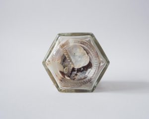
Full figure shots I find didn’t work for me at all, so I sort of gave up shooting that early on in the project. My jar was simply too small for a full figure shot. Furthermore given its material of glass which refracts light and the shells being white, you couldn’t tell what was in the jar at all. I felt that that wasn’t effective. I did improvise, and tried to shoot myself sitting down, full figure, but crouching to fit myself in the frame so that the jar can appear bigger in the frame.
One of the failed shots.For “full figure” shots, I generally tried to make myself smaller so that the jar can appear bigger in frame. This is a photo I don’t intend to present.I experimented with cropping.I tried this weird crop by cropping the head and legs off but I’m not sure what to think about it.
Mid range shots and close-up shots ended up being more effective in presenting my narrative. Though I’m not a good model and emotions don’t seem to be clear, these shots are more personal overall, and I think the viewer will feel more connected to them as opposed to wide shots. I generally have high angle shots to convey vulnerability, or else they are pretty flat to keep the simplicity.
Medium – Long shotMedium shot from a slightly high angle. The blur destroys the image in this case. Plus the emotion is not there.Close up shot that I don’t intend to use. Composition and framing is weak compared what I intend to use for my final submission.It was difficult to shoot yourself for close up shots, I ended up being out of frame for a lot of shots.Still not satisfied with lighting and all. Framing is weird here.
Task 2: My World
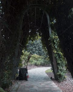
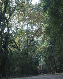
Walking around Botanic Gardens, I tried to take photos of the place in general, though it was tempting to to take close up shots of flowers there. Below are photos that I won’t be including for my final submission. I’ve included the reasons why I didn’t like each photo / why they don’t work in the captions. The reasoning behind the chosen photos for submission and my connection with the place further elaborated in the write up of the final submission post.
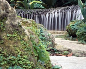
One of the low angle shots that I attempted. I think I was trying to capture the tourists/people visiting since it is a heritage site, but I didn’t like the way it turned out.This photo turned out very flat and I didn’t like the cluttered overall look. Too much texture makes the photo very hard to look at.I initially thought that this looks interesting and conveys the peacefulness of Botanic Gardens very well. But after looking at it for a while, the subject which is the waterfall isn’t exactly very exciting. It formed this almost parallel line to the edge of the photo which I didn’t like.Tried to capture the vastness of the place in this one by trying to get on higher ground, but it’s not dynamic enough. I would have liked a higher angle but it is difficult without a drone or tall building to take from. Pity that the sky is white that day too.This one has a foreground, mid ground and background which I like. But there isn’t a point of interest per se.Experimenting with framing.I wanted this shot to be more high angle but that was the highest that I could get.Trying out a more dynamic low angle by tilting the camera!Another dynamic camera angle but no subject interest.
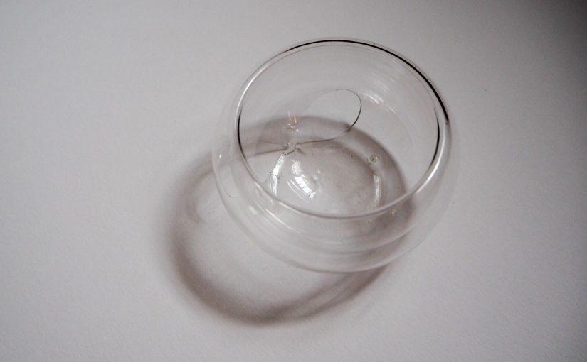
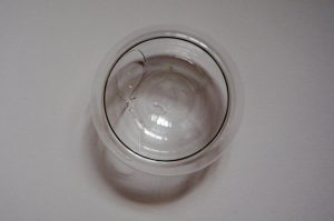
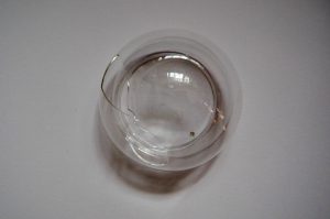
The bowl that I brought to class for analysis broke before I could photograph it, so the analysis below will ignore the holes in the bowl, since it’s an unintentional part of the design now.
Initial observations:
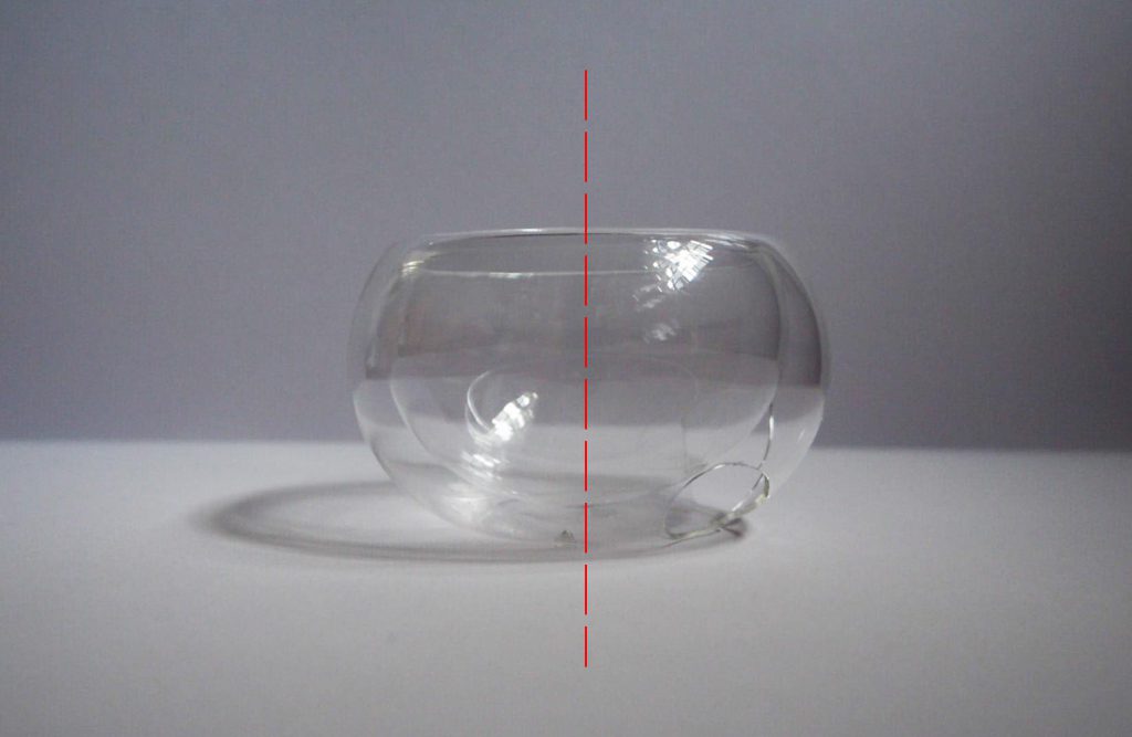
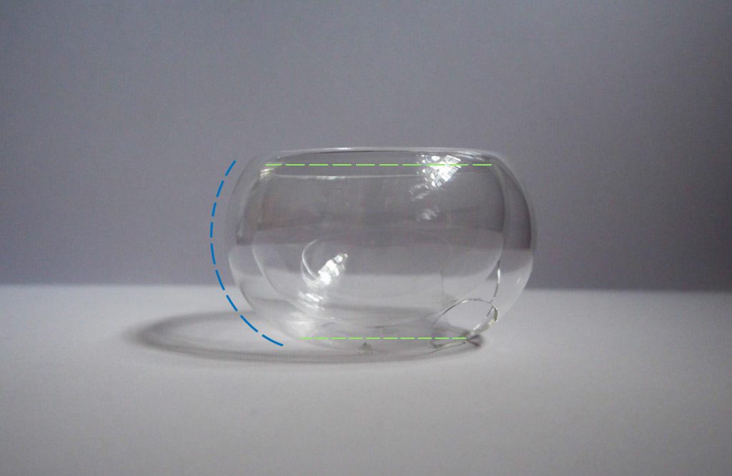
The bowl is made out of smooth, transparent thin glass. The glass is double layered, with gives it an interesting cross-section. It has no sharp or angular edge, as the double layer does not have any fusion point. It is a continuous piece of glass cleverly moulded into its shape.
Edit: The two layers create a void in-between, and the transparent glass showcases that. It can be categorised as a cluster of similar volumes, as the size difference of the two layers isn’t very significant.
The bowl is symmetrical on all views.
Bowl – Side view
There is balance in the design as the side of the bowl has a single beautiful curve that does not give it any “bumps” or neck. The proportions of the base and opening however is not equal. The diameter of the base is slightly smaller.
Bowl – Side viewBowl – Top viewBowl – Bottom view
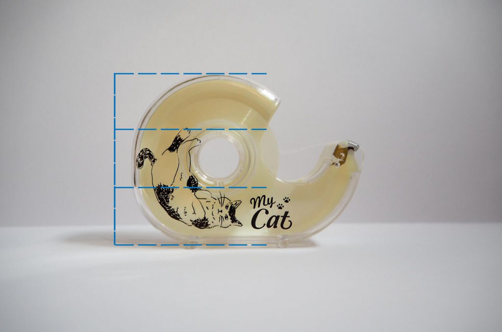
Since there is limited things to comment on for the bowl, I decided to analyse another object to see if I understand the other terms we’ve learnt. I chose to analyse a tape dispenser.
The most prominent feature that I noticed was that the diameter of the hole was one-third of the height of the dispenser, following the rule of thirds.
Tape Dispenser – Side view
There is a significant difference in its proportions of the mass and void – mainly due to its function of containing the tape. However there is still a good balance of design as the proportions in volume are roughly 2:1. The white/transparent plastic makes up the dominant volume, the printed cat design on it to me acts as a subdominant feature, and the silvery metal cutter is the subordinate.
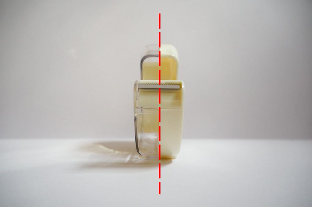
Tape Dispenser – Side view
From the front, back, bottom and top views, it is clearly symmetrical. The side view would be asymmetrical.
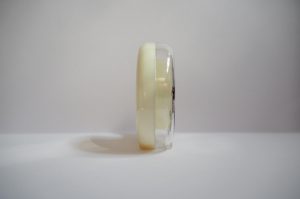
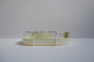
Tape Dispenser – Front viewTape Dispenser – Back viewTape Dispenser – Bottom viewTape Dispenser – Top view
Edit: From the bottom view, we see that the little stands split the base into roughly three sections as well.
Before experimenting and trying out mark making in class next week, I thought I’d go do more research on it so that I am aware of the possibilities of this form of art.
Mark making is used to describe lines, patterns and textures on any surface of our art piece. I suppose any form of mark – be it a dot, scratch or smudge – is deemed mark making. It is interesting that although a mark on its own may be insignificant, a series of markings may mean something. It is able to express emotion, be conceptual or symbolic.
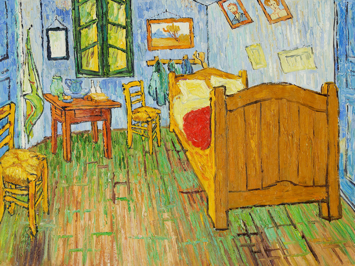
I found an article on thoughtco.com about how marks are used in paintings which I thought was interesting and not exactly what people think about. I learnt that the different styles of artists can originate from a simple mark. For instance, the example given by the website is Vincent Van Gogh’s “Starry Night” (1889) and “The Bedroom: (1889). The paintings are completely different. Different themes, different colours. However it is still recognisable as Van Gogh’s work because of the distinct layers of strokes that he uses. Another painter with distinct strokes or marks that I already know of is Claude Monet.
Link to the website: https://www.thoughtco.com/how-does-mark-making-affect-your-paintings-2577630
Van Gogh, Starry Night (1889) | Taken from http://www.huffingtonpost.com/paul-dalio/starry-nights-from-the-film-touched-with-fire_b_9227378.htmlVan Gogh, The Bedroom | Taken from http://www.jackygallery.com/index.php?main_page=product_info&products_id=498
Mark making is closely related to automatism (or automatic drawing) and mono printing. Automatic drawing is drawing without thinking, and avoiding conscious control of your actions. Here are the types of techniques categorised under automatism (and my own explanations/definitions to refer back to):
Frottage – brass rubbing
Decalcomania – method similar to the ink blot test
Torn Paper Collage – torn paper randomly dropped onto canvas and then glued
Grattage – scraping wet / dry paint on canvas using a scraping tool
Sand Painting
Froissage – soaking a crumpled piece of paper in ink, creating a veined effect
Coulage – pouring molten metal materials into water to solidify into shapes
There is an artist that creates interesting, mystical images using the decalcomania technique. Oscar Dominguez primarily uses black gouache on canvas. He spreads the gouache thinly on a sheet of paper before pressing it to his canvas. Despite the lack of colours, the images created are fantasy like and show some sort of narrative. There are various textures on the canvas which bring attention to his work.
Oscar Dominguez, Decalcomania | Taken from https://decalcomaniaproject.wordpress.com/decalcomanias/art-2/Oscar Dominguez, Decalcomania | Taken from https://www.pinterest.com/pin/134756213822517034/
A piece of work that is done using the frottage and grattage technique that I really like is Snow Flowers by Max Ernst (1929). Though he uses colours for this piece, I can observe that the scraped white paint on the black canvas gives a very interesting effect, something that I may want to try for my own project. Depending on the tool used for scraping, I think it will give different results every time which would be fun for experimenting.
Snow Flowers by Max Ernst (1929) | Taken from https://www.artsy.net/artwork/max-ernst-fleurs-de-neige-snow-flowers
André-Pierre Arnal is an artist that uses the froissage technique. It reminds me of tie-dye. What is interesting about the froissage technique is that you do not necessarily need any other tool other than your “canvas” to produce the patterns and textures. It shows that choosing the right canvas for your work makes a difference in the final outcome of the art piece. Combining the froissage method with decalcomania and frottage / grattage might produce more interesting textures in my opinion.
André-Pierre Arnal, Froissage | Taken from https://www.ceyssonbenetiere.com/en-exhibition-Andre-Pierre-Arnal-2015-luxembourg-1011.htmlAndré-Pierre Arnal, Froissage | Taken from https://www.wikiart.org/en/andre-pierre-arnal/froissage
Mono printing is similar to stamping. The following are the techniques:
Printing from glass
Printing from acetate
Overprinting
Linear drawing – paper placed over rolled out ink on a glass slab, use pencil to go over it
Developing textures – making blobs onto paper directly from the paint tube
I found artists that found their own method of making mono prints! Mitch Lyonsdyes wet clay with paint, scrapes of some layers off of it and then lays his canvas on top of it to create prints.
Mitch Lyons, Clay Mono print | Taken from https://www.pinterest.com/pin/477944579175418370/
Martha Castillow is another such artist that does clay mono prints. I never thought of printing this way before. It is unlikely that I am able to do something like that in a few weeks for my assignment, but I can definitely gain some inspiration from their technique.
Martha Castillow, Clay Mono Print | Taken from https://www.pinterest.com/pin/277745501997329908/
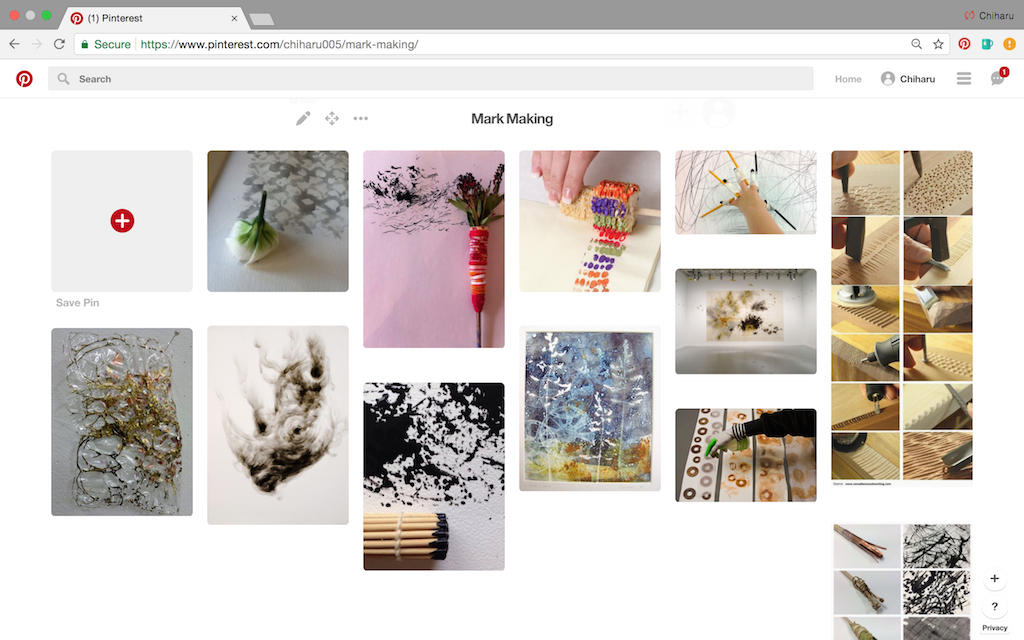
I also went on to Pinterest to gain ideas on what I can use for my mark making assignment. I created a mini board for some of my favourite images.
Looking through Pinterest, I see that marks created by organic items seem the most interesting, though marks created by hard surface objects can look interesting too depending on how you use them. Binding stuff together to make your own brushes seem to be popular.
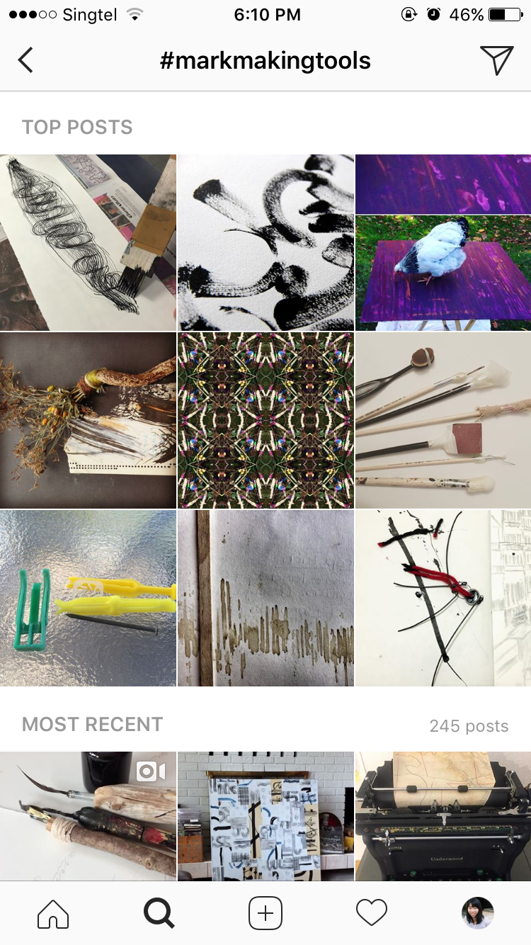
I turned to Instagram next to see what ordinary artists / people like us are using for mark making. It does not seem to be a popular form of art on Instagram, but I found some images that I can gain inspiration from.
A number of people liked to stick materials to the ends of sticks / brushes to make their own custom brush, while a handful of people liked to use branches, twigs and leaves for their prints.
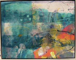
I really like this image above, because this artist used a variety of organic and inorganic materials. The patterns produced are definitely of interest.
After scrolling and looking at more work, I have some ideas for my tools but I’m still looking for an “aha!” material. Something that is different and fun. I am going to bring organic and inorganic items to experiment during class time.
Other than the materials used, the techniques used can also make interesting marks. I am inspired by the Torn Paper Collage method and intend to experiment with broken CD parts instead of paper. Combining materials is also something that I’d like to try.