
COLOURS
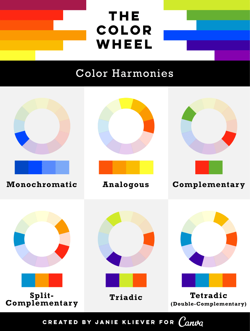
I found this chart from Canvas.com, I think it summarises the colour harmonies simply and clearly!
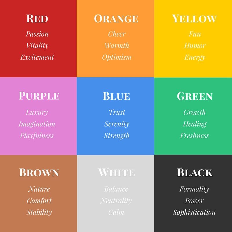
This chart shows the different moods and words associated with each colour, which can be useful when choosing which colours to use. I know my panels will incorporate a lot of orange and yellow hues because I am a cheery person!
ME + SITUATION + OUTCOME
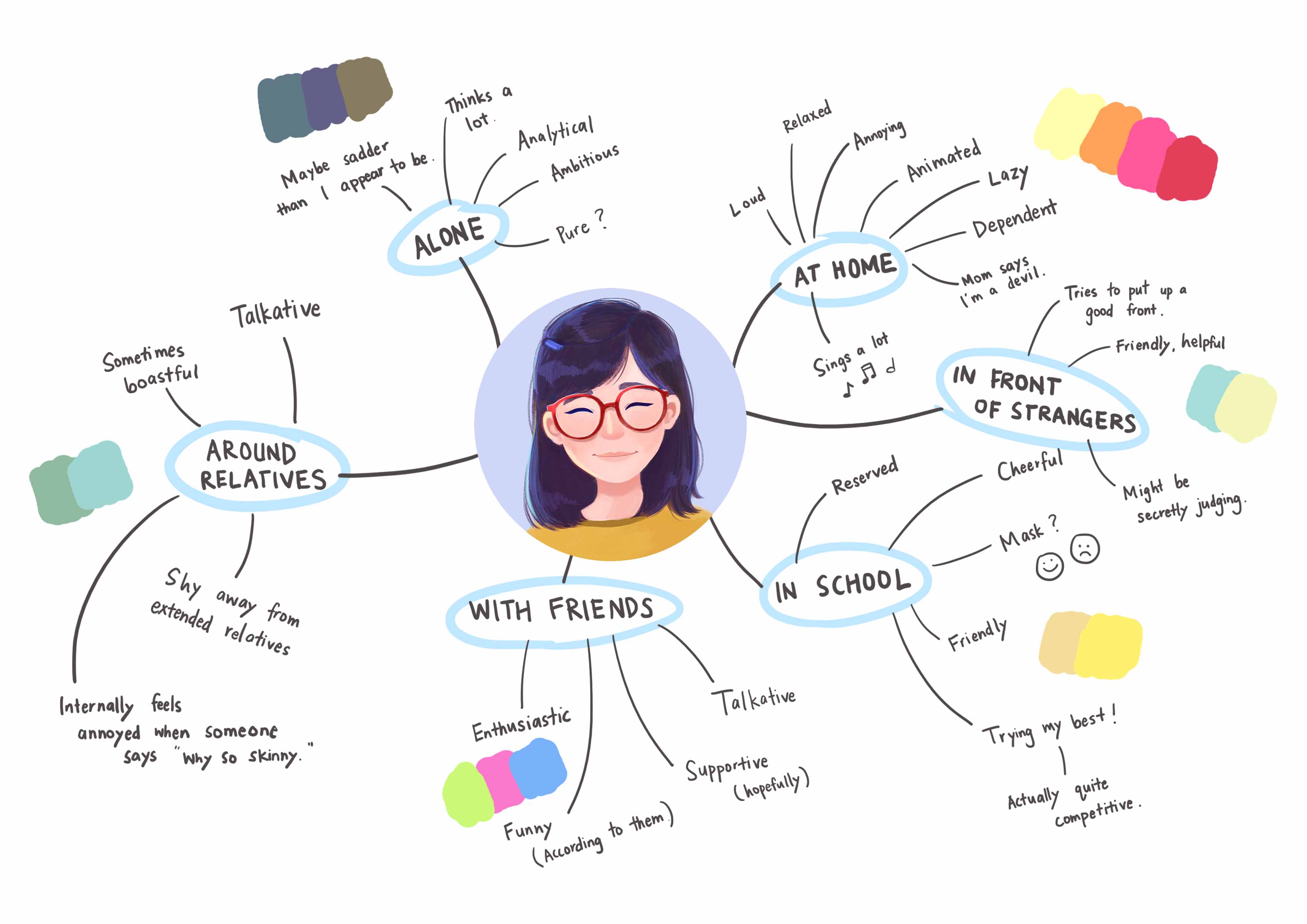
Mindmap
For this assignment, we are required to apply our understanding of colours and colour theory to visually represent the multifacted nature of our personality. I decided to start mind mapping the many sides of who I am. This alone was interesting because I see how different I am around different groups of people.
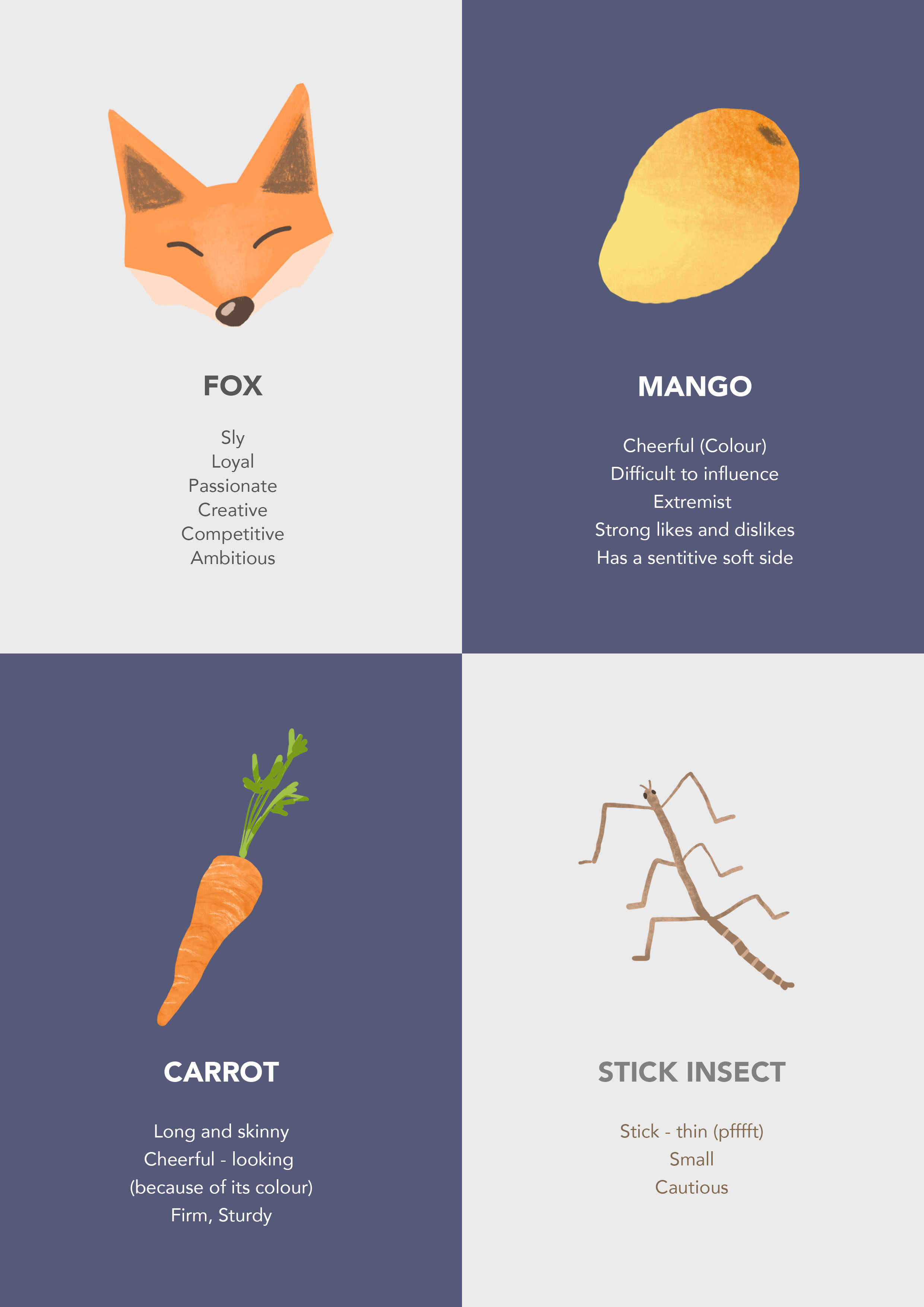
Based on the above mind map, I tried to represent myself using various objects. Below are some examples that I thought off that I’d likely use for my final pieces.
Situations
Through the mind map and a bit of imagination, I came up with a few situations to pick from.
- In a robot social gathering
- At home after a long day
- In the deep blue sea
- Chilling on a leaf in a pond
- At the movies
- Cycling with friends
From here, I mix and match the different characters and situations to see what sort of interesting or funny outcome I can think of.
Artist References
1. Andy Harkness
He is a visual development artist at Disney. This particular piece is produced using watercolour/mix media. What I like about his work is his use of monochromatic colour schemes. It is interesting how he used different shades of blue – greens, which gives the the piece a very calm and “quiet” — yet dynamic — feel. The lighting of his piece really catches my eye too. The shapes in the painting is stylised and designed using simple shapes which in my opinion is simple and appealing!
2. Dice Tsutsumi
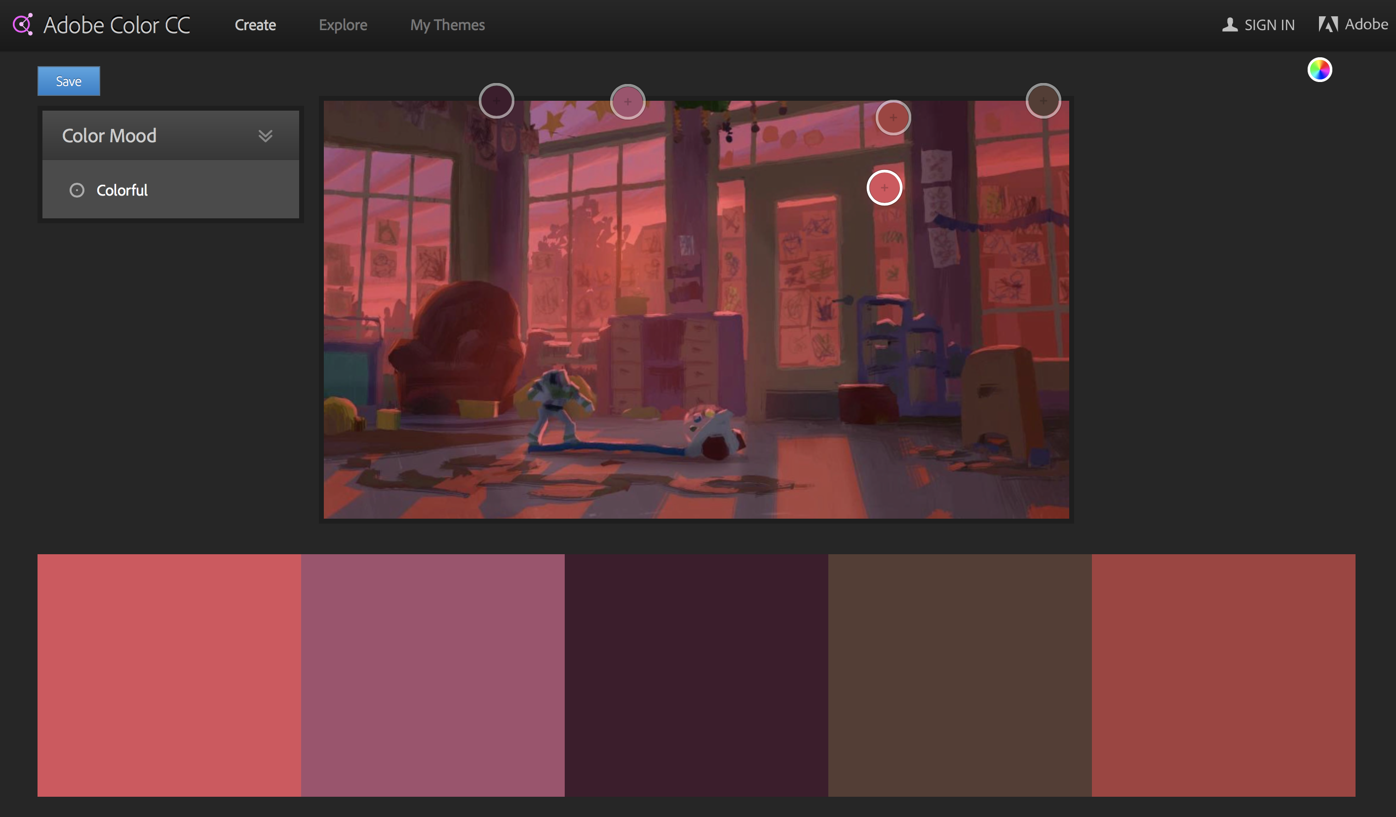
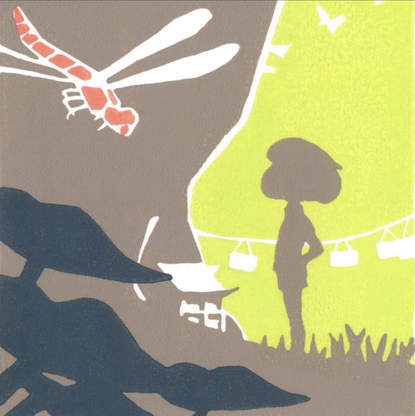
Artist at Tonko House, he also plays with monochromatic colour schemes. His work is done digitally. There is no outline, just a play with light and shadow with fantastic saturated lighting, similar to Andy Harkness’s. We can see that he uses other colours like purple and green (local colours) for the environment, except that they are bathed in a red tint to convey the mood of this particular scene.

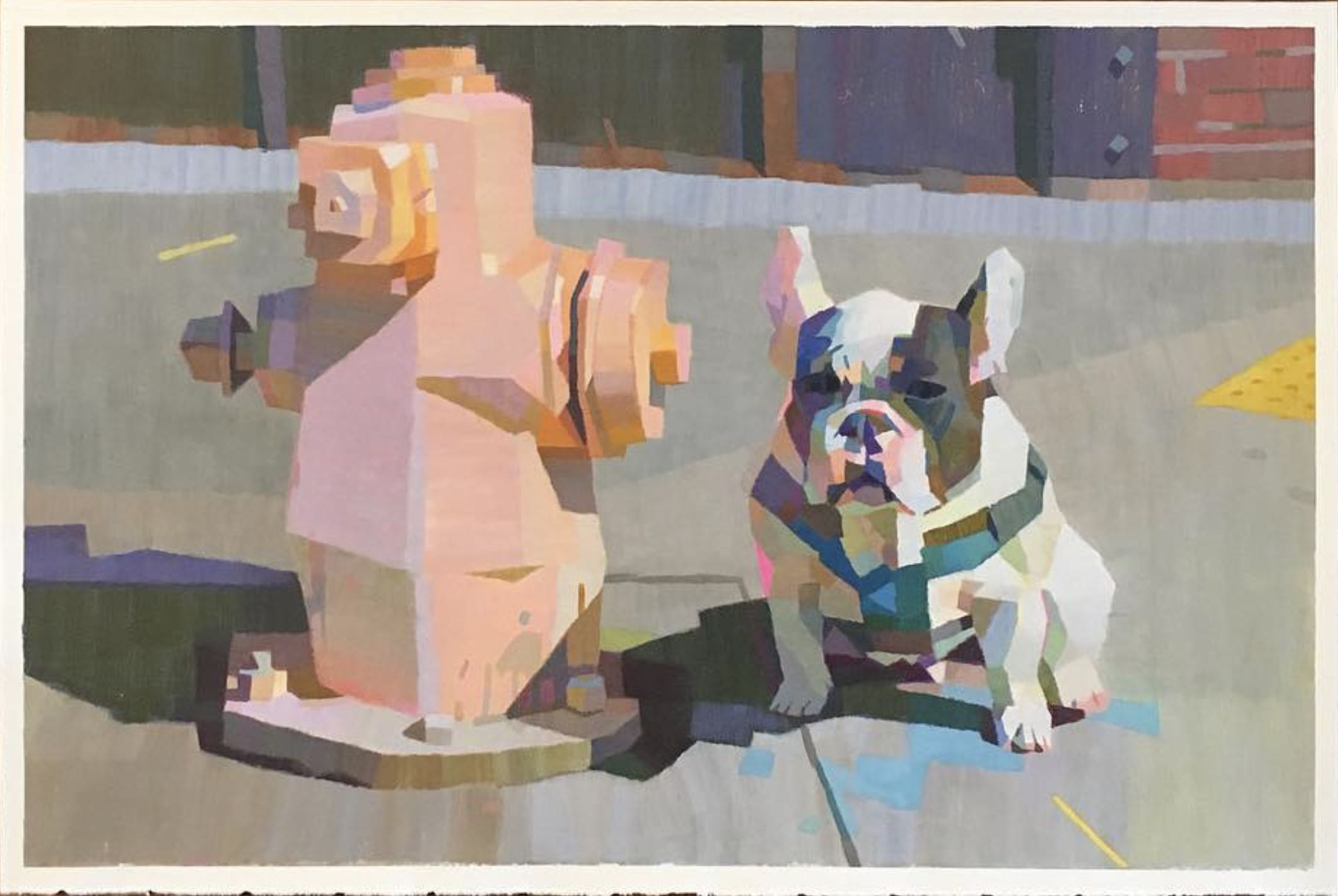
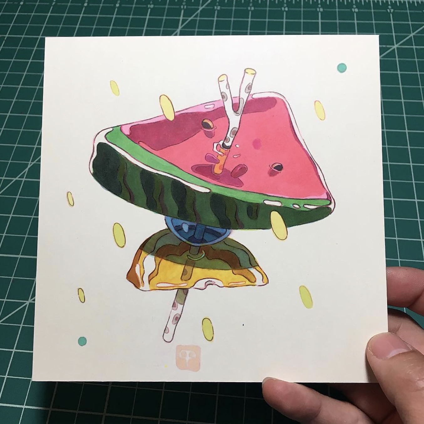
3. @pixelpchan on instagram
He is an artist that I follow on Instagram. He paints using gouache. All of his paintings uses blocky strokes which gives a very interesting look. I also like the fact that the colour payoff of gouache is usually very good and vibrant — perfect for this assignment. I have been wanted to try out his painting style so I think I’ll attempt it in this assignment!
He also has this other “jelly” style that I like. Colours are vibrant and the weird jelly look would definitely make illustrations stand out.
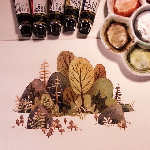
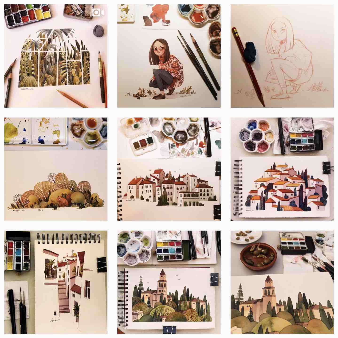
4. Ira Sluyterman van Langeweyde | @iraville on instagram
She uses gouache for her illustrations, and simplifies complex shapes in an effective manner. The colours that she uses are generally on the muted, darker side, but there is good contrast. I love the texture produced by the combination of paper and paint.