

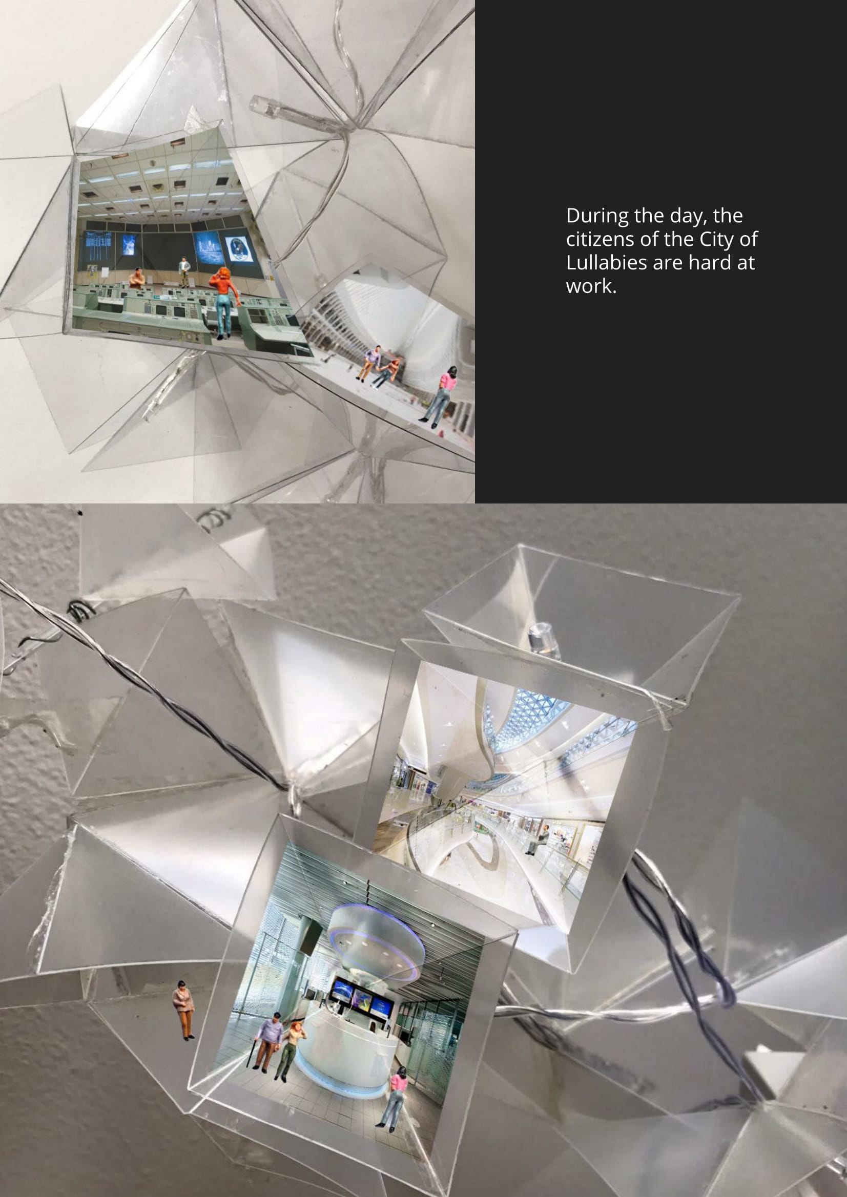
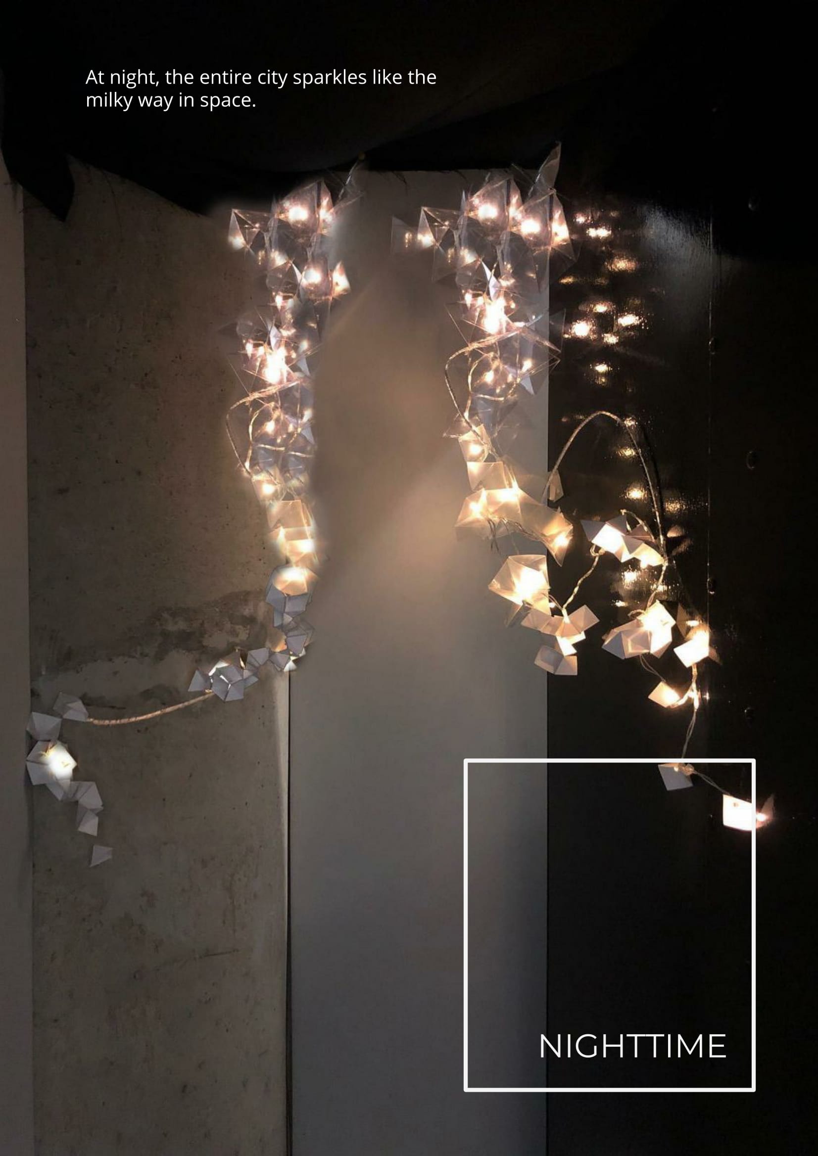
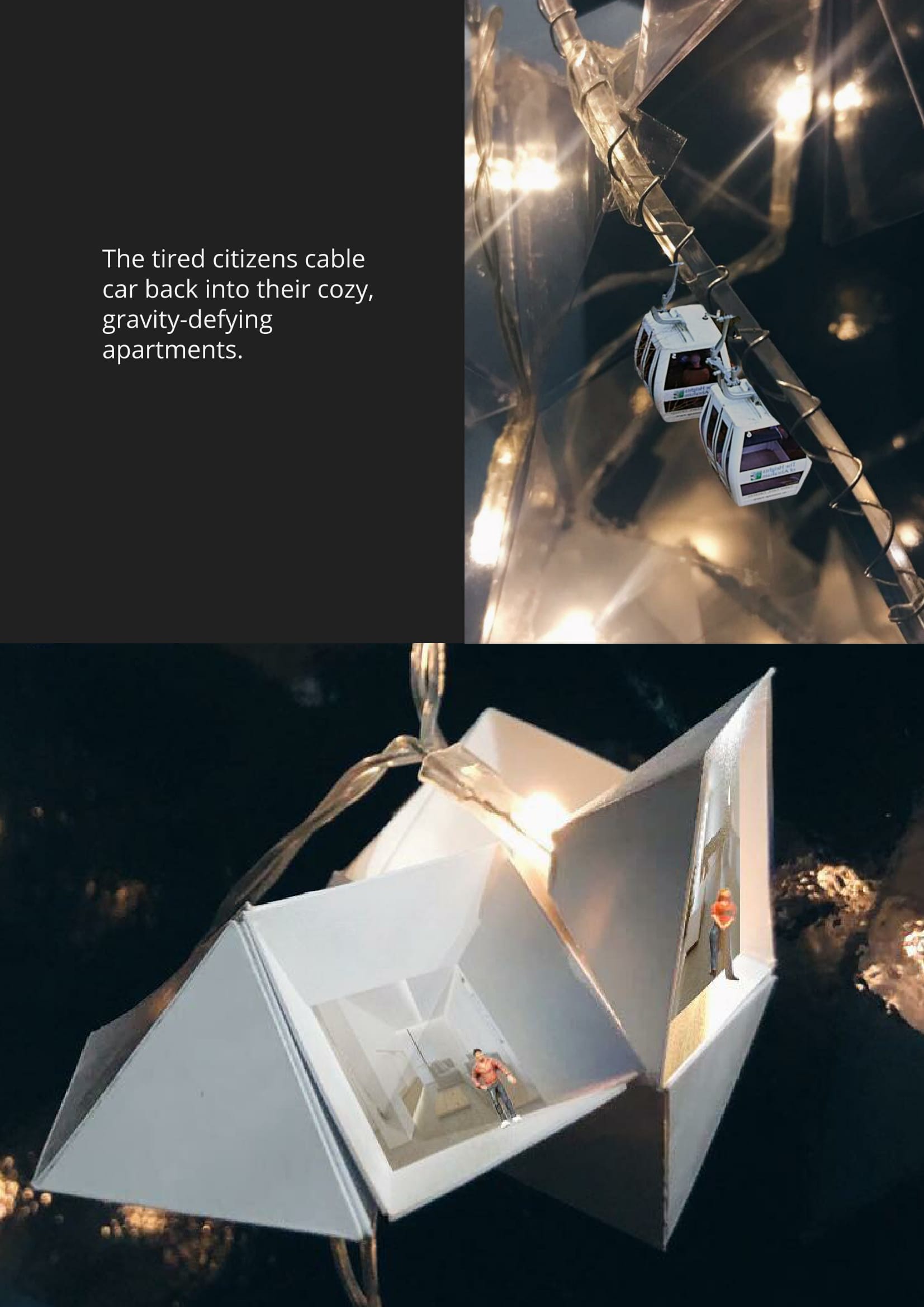
I compiled a list of modular structures from a few categories that I think is cool!
I thought this modular bathroom design was pretty interesting. Though it isn’t a repetition of similar modules, each component can be rearranged in a certain way to fit different aesthetics and user needs.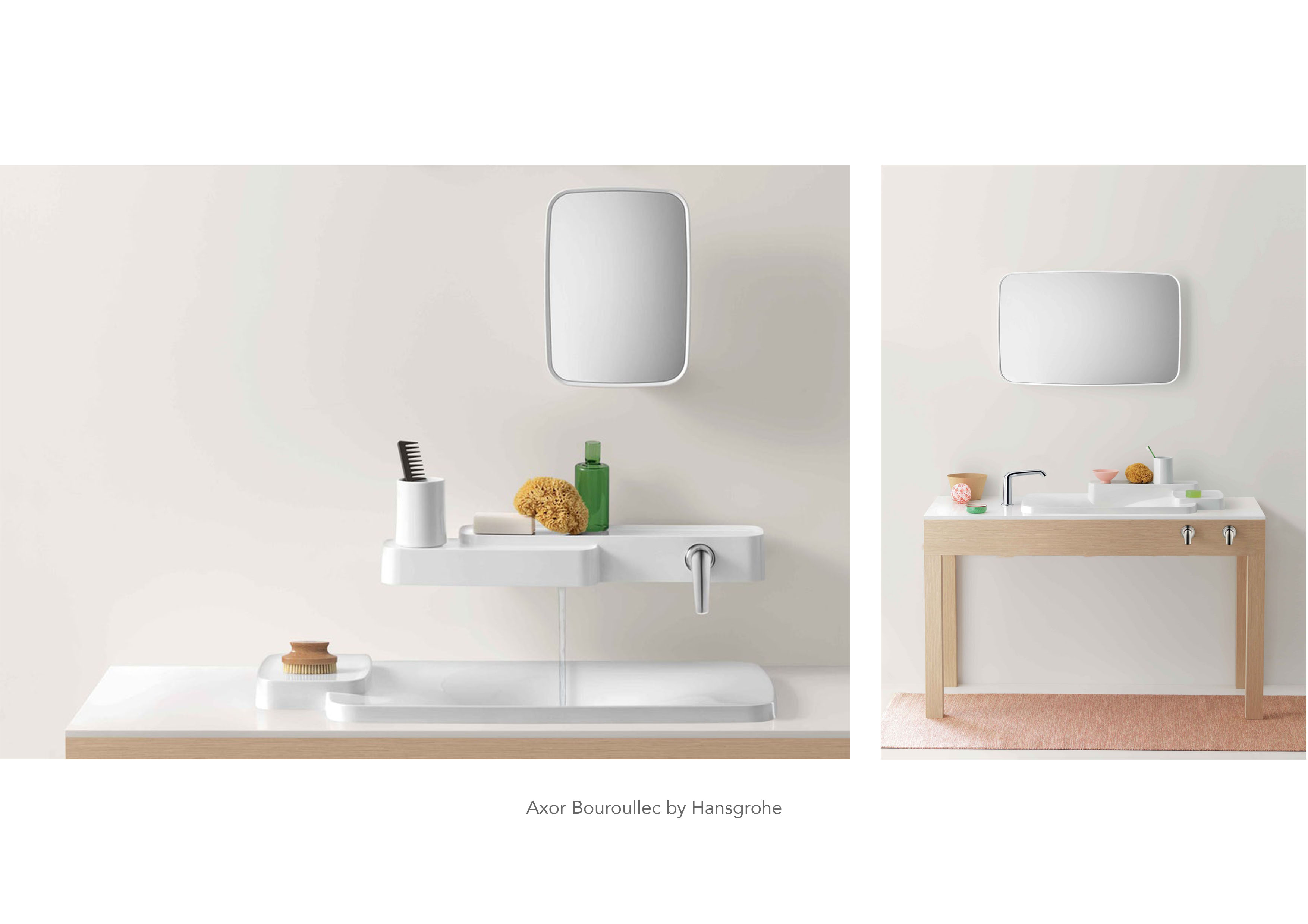 Furniture design is one area that makes use of modules. Below is a coffee table with interchangeable parts to meet the functional needs of users.
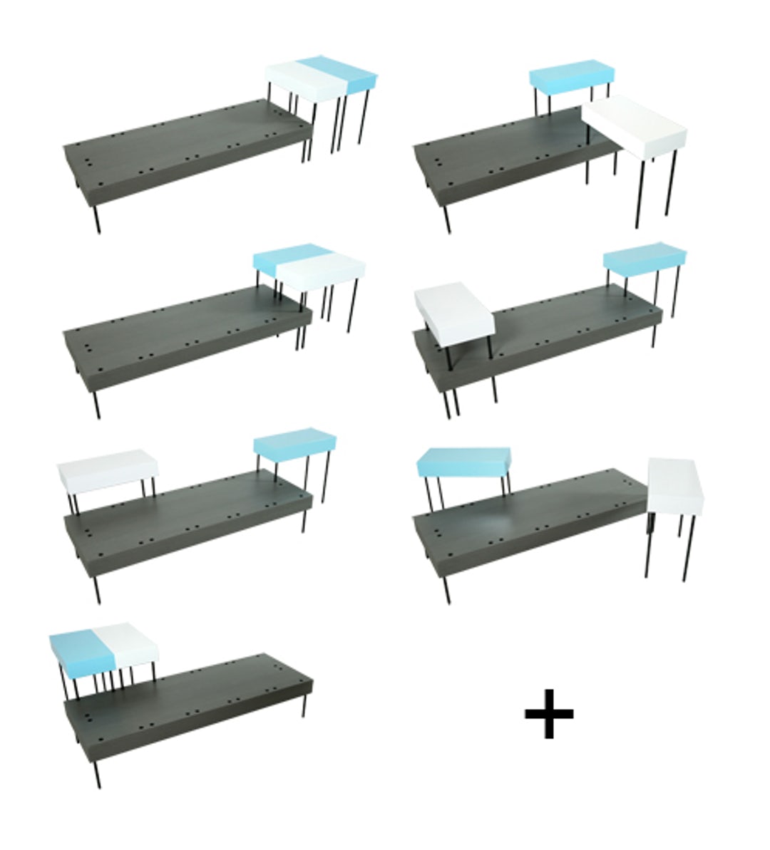
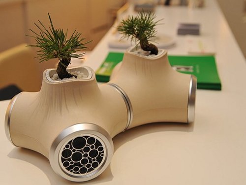
These plant holders / speakers are connectable with multiple uses.
Source: https://architizer.com/blog/all-modular-everything/
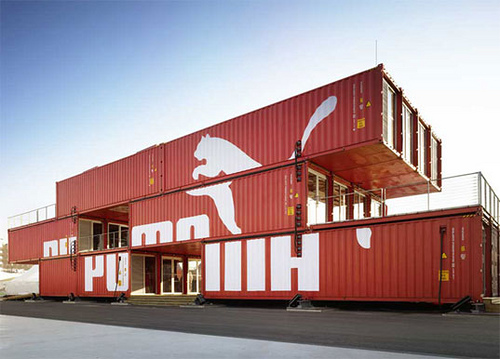
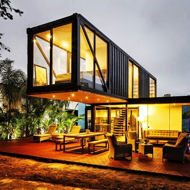
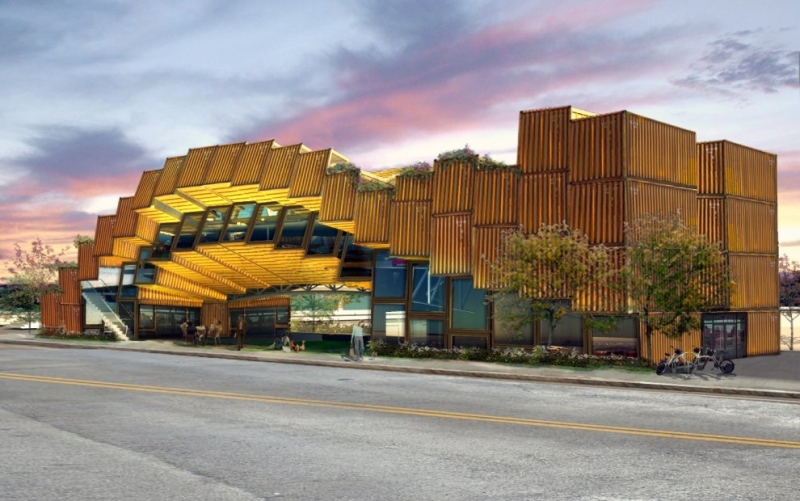
An architectural example could be container buildings!
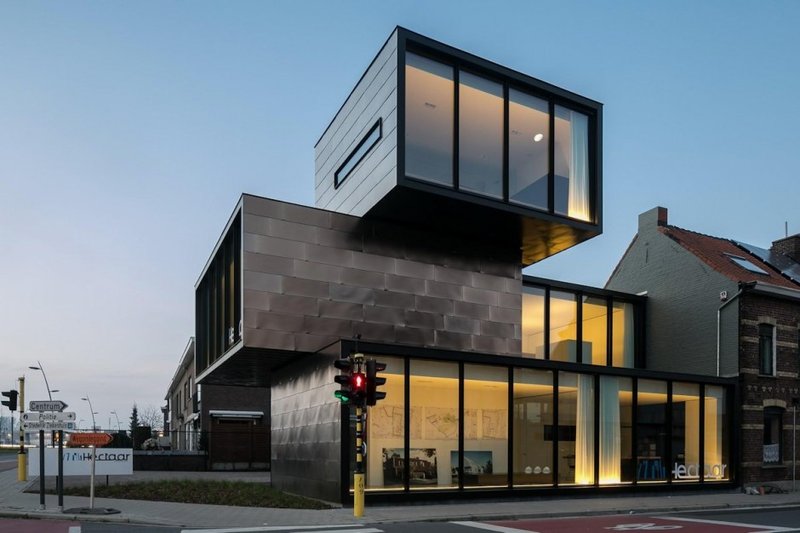
I like this building below because it shows that rectilinear forms need not be boring and well, rectilinear in its overall composition.
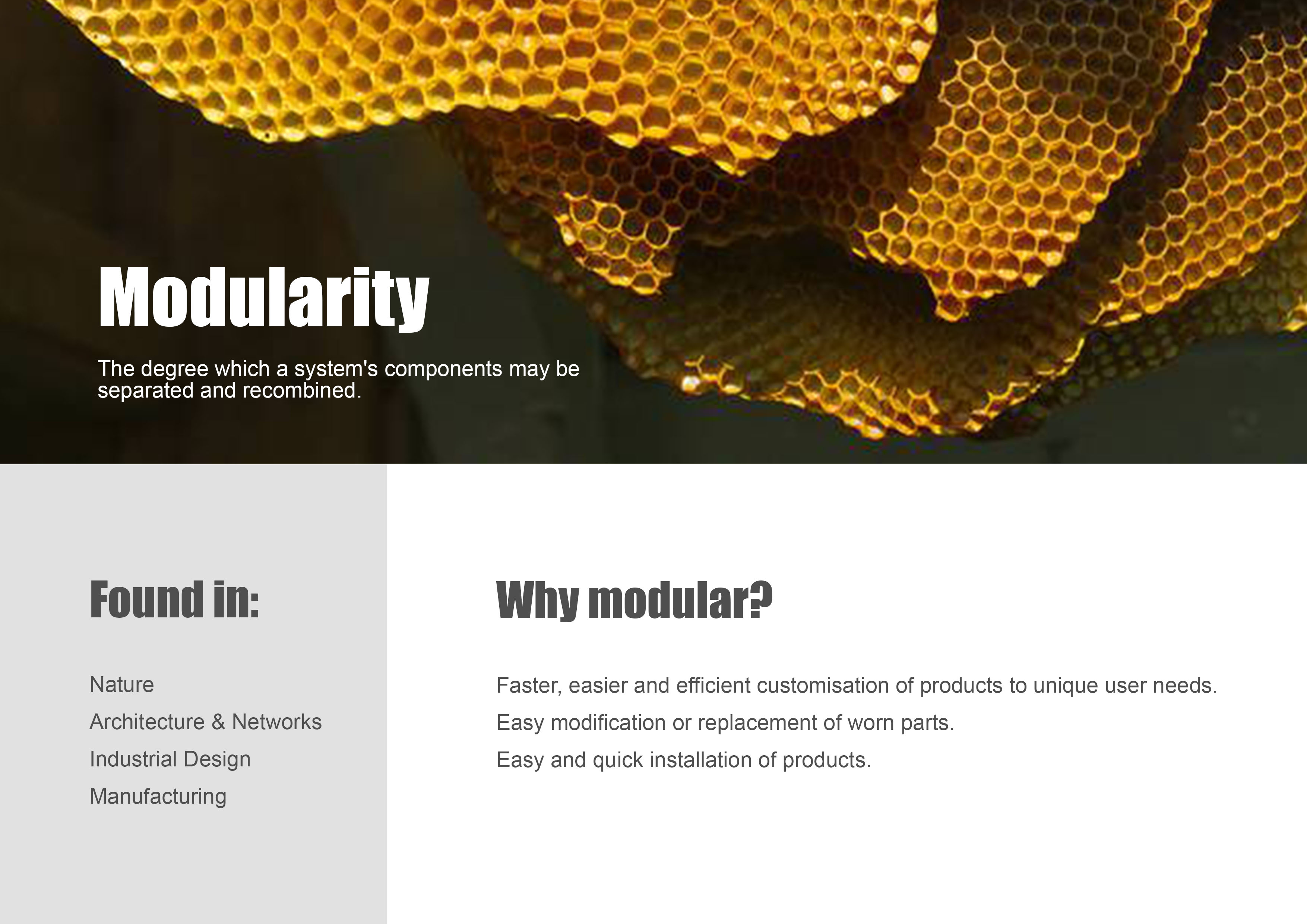
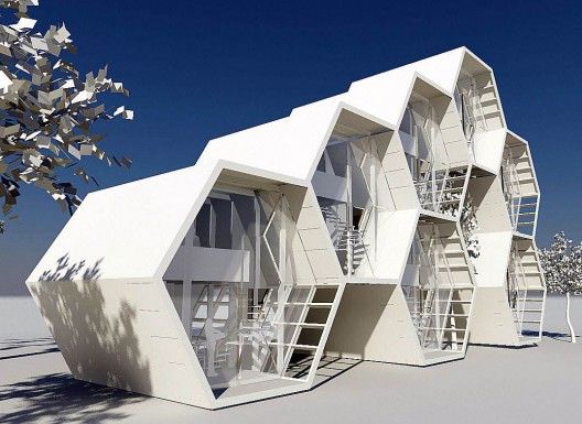
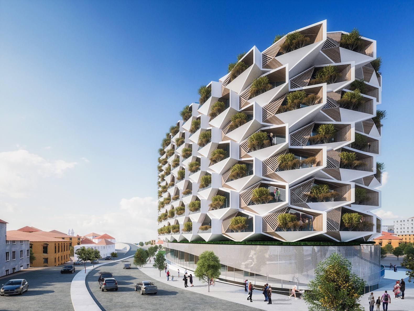
Many of these designs, like the examples below, remind me of the bee hive honey comb pattern which shows that design can be inspired by nature.
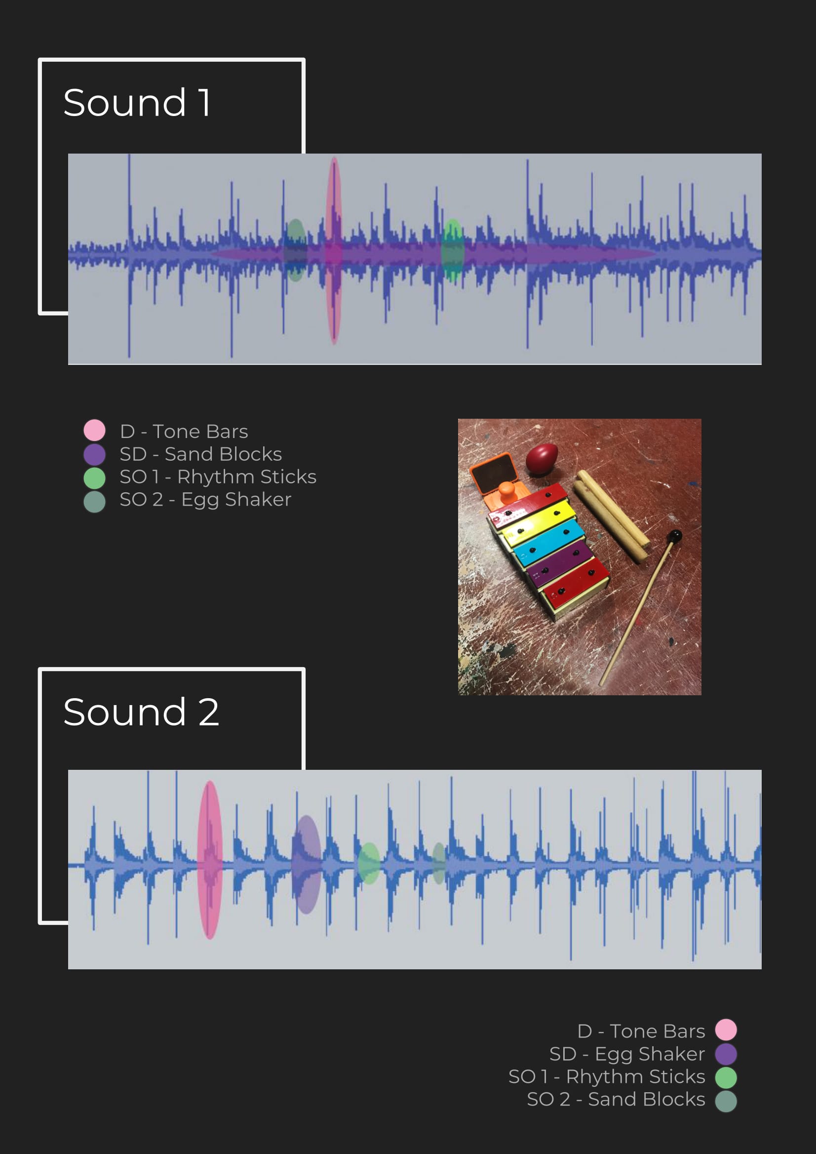
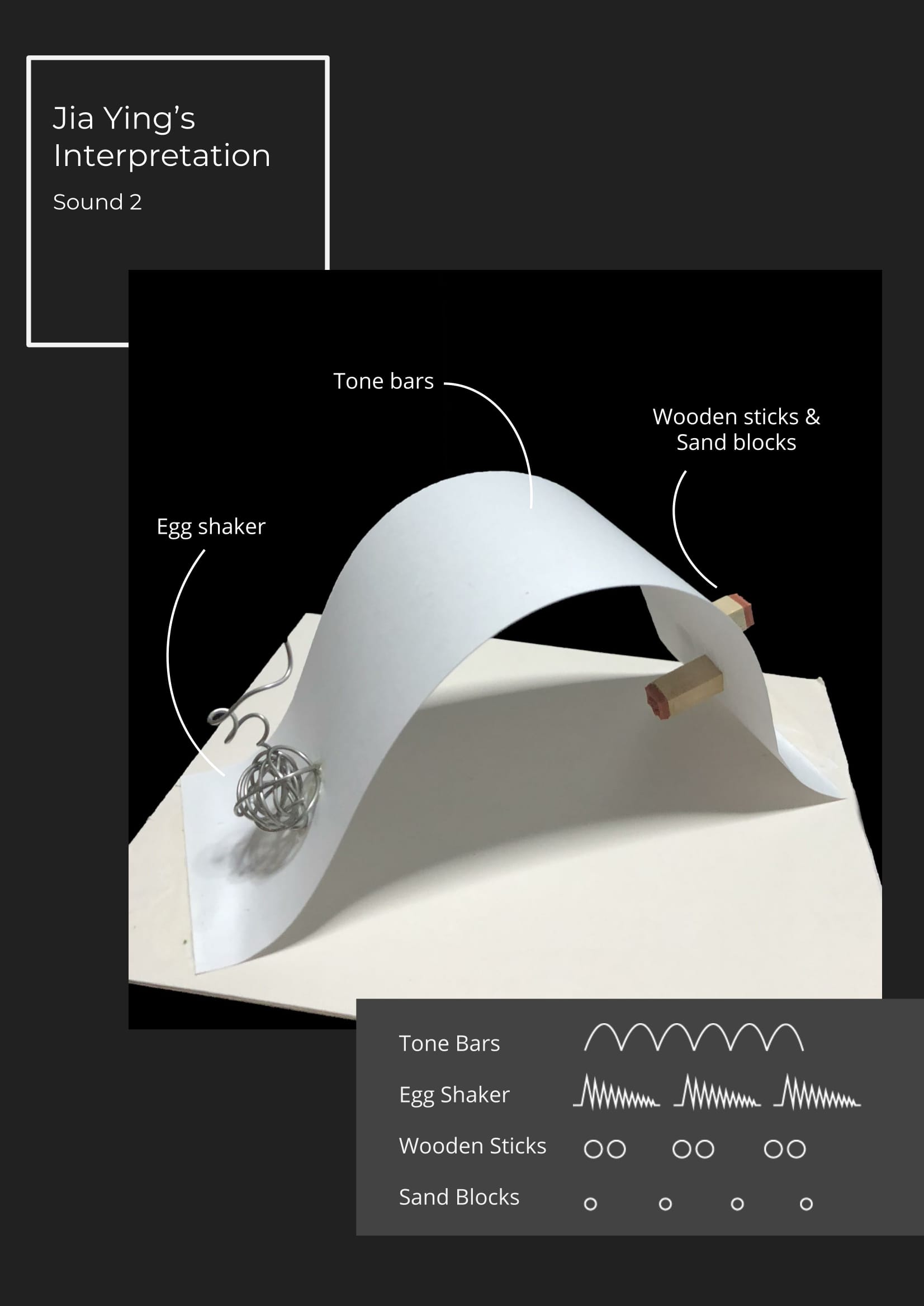
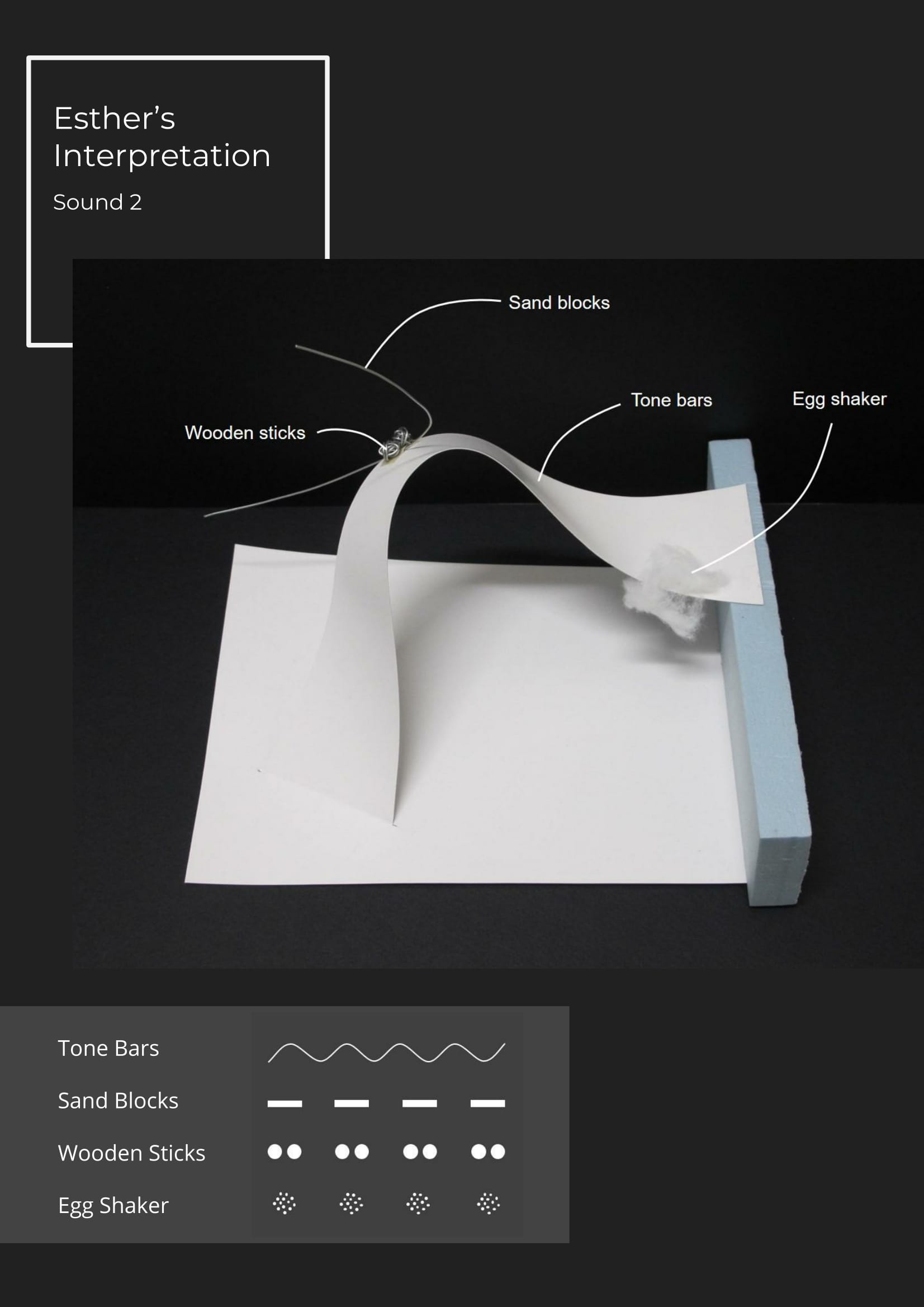
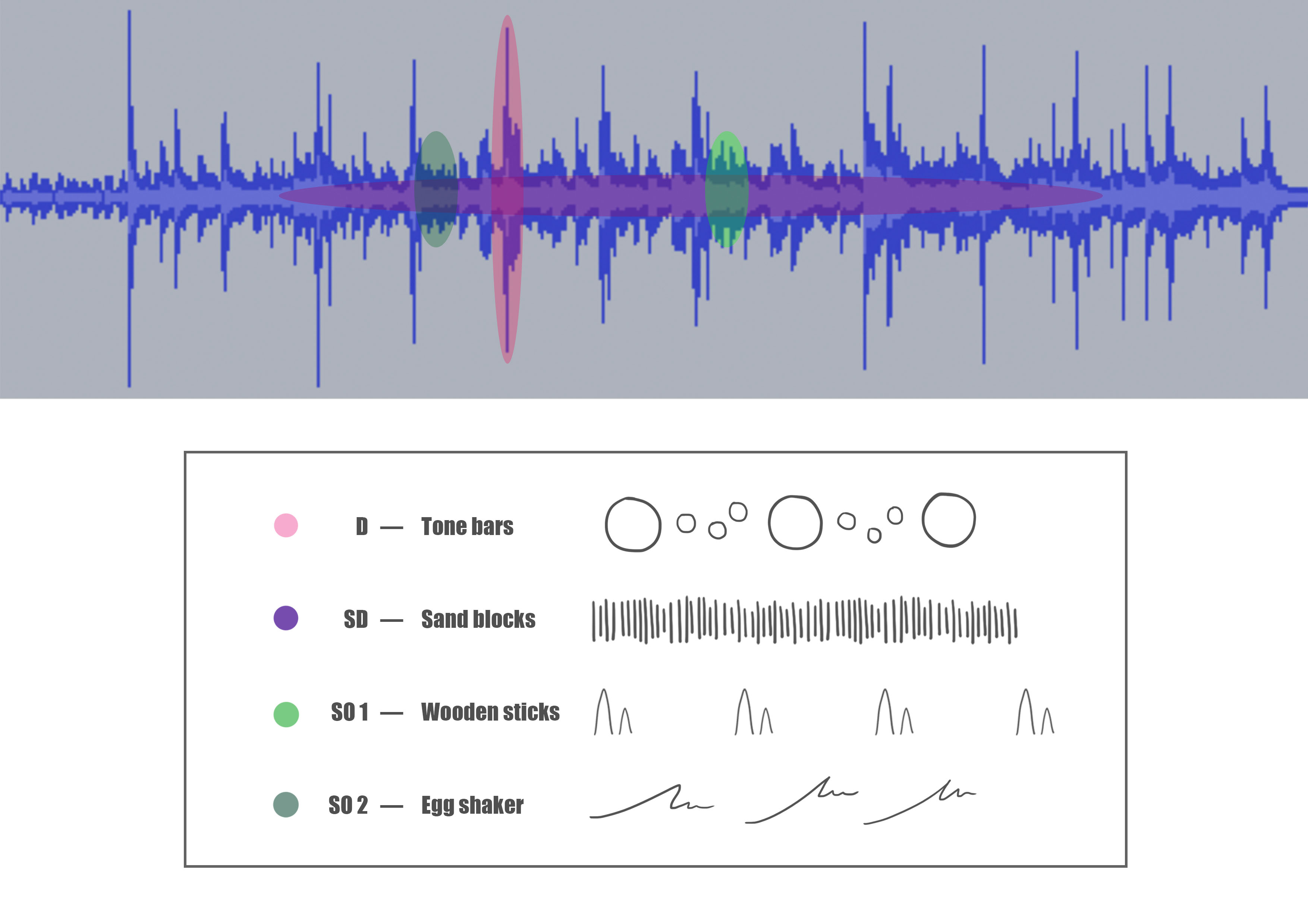
I found it easier to break down the sounds using shapes while listening to the recording. The tone bars had a resonating quality, so I interpreted them as circles. The sand blocks produced a consistent scratching noise so they are represented using a variety of short lines. The wooden sticks occured periodically, and they sound like short beats so I interpreted them as “mountains”. The egg shakers were almost negligible, I couldn’t hear them at first because it camouflaged so well with the tone bars. It is almost as if it is disappearing, hence the squiggles.
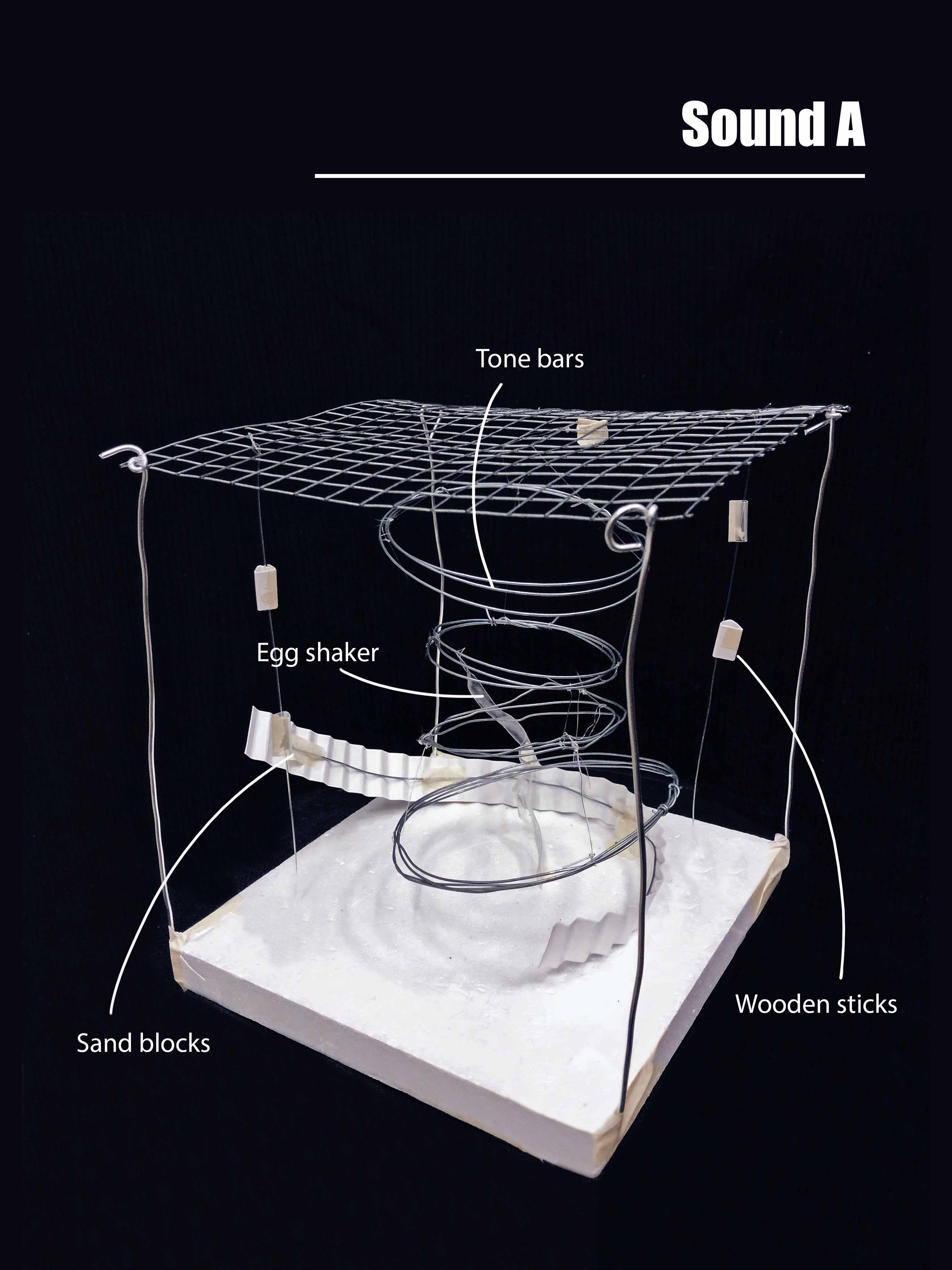
After interpreting the sounds into shapes I did some sketches to help me visualise my mood box better. One mistake I made here was that I interpreted the recording as a whole instead of a single unit of sound. Which is why the final mood box did not accurately depict the sound unit.
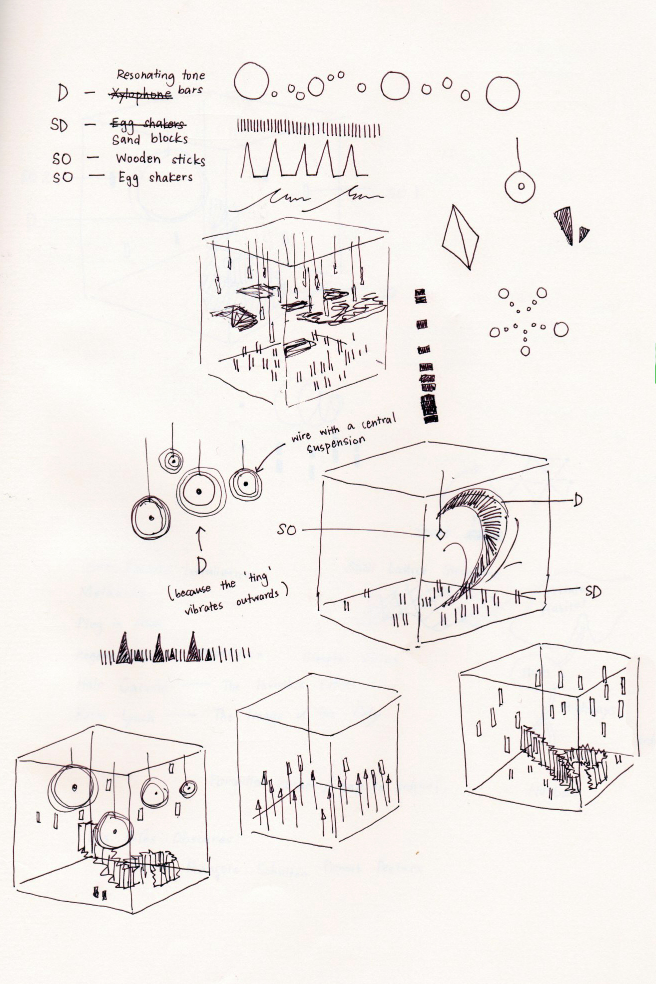
Because I had a misconception, my mood box focused more on composition instead of accurately representing the sounds. It needs to be a bit more literal than it is.
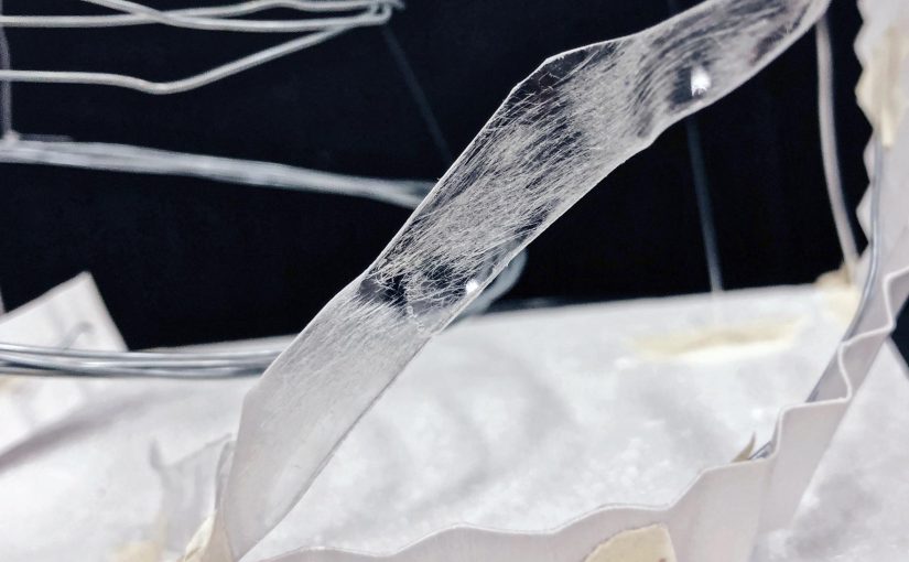
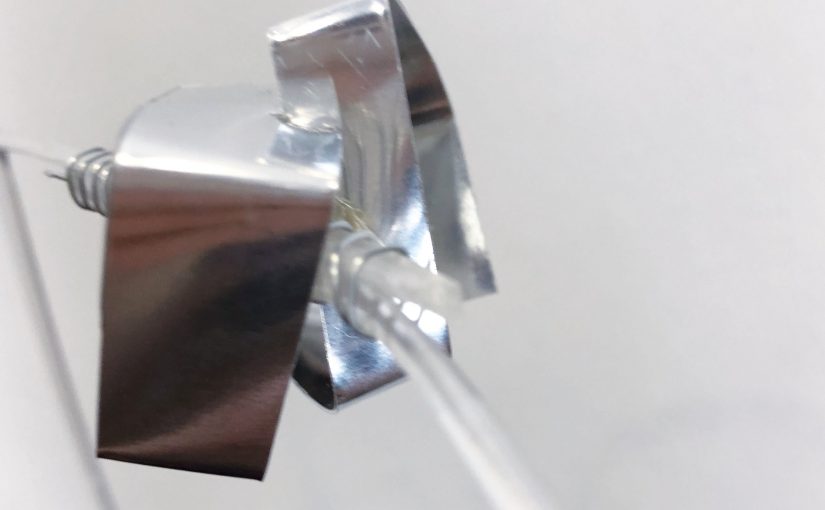
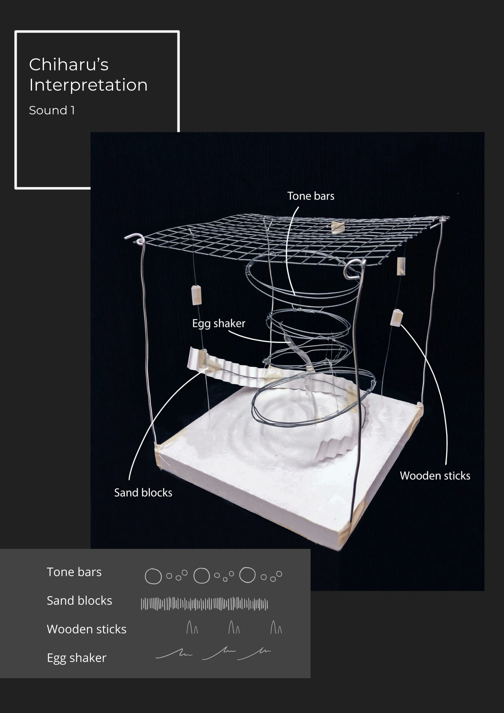
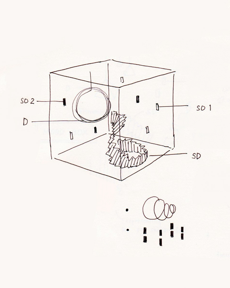
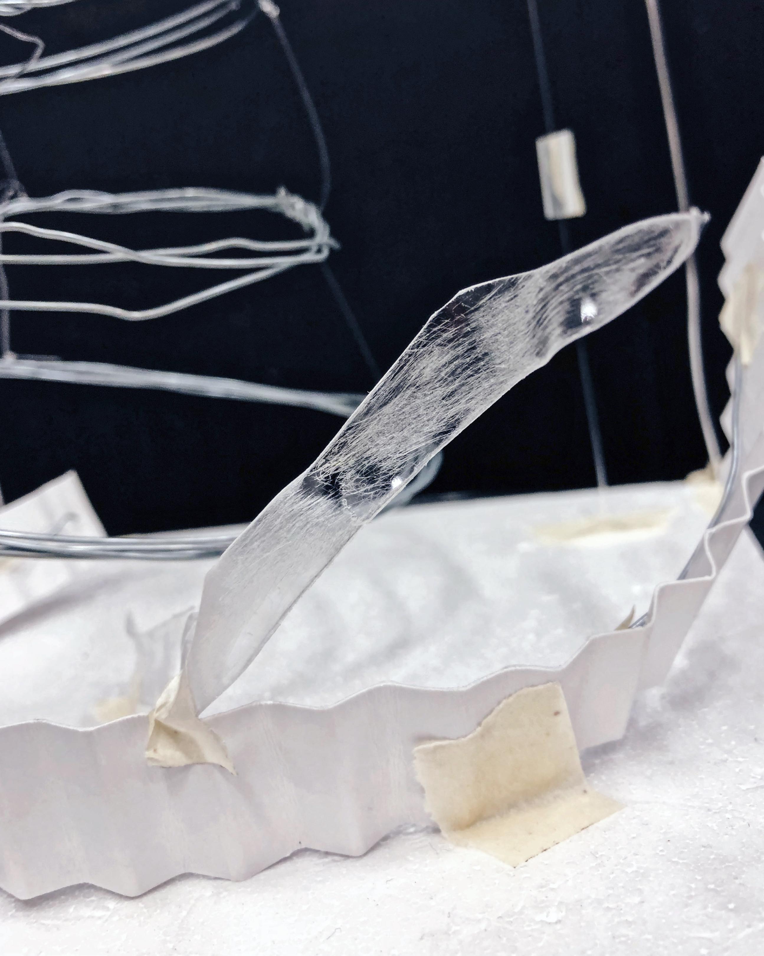
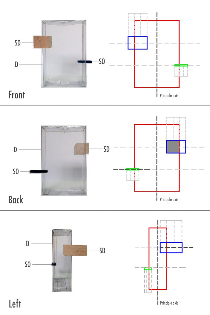
The tone bars (D) are represented by the metal sphere because of its resonating quality. I need to change the spacing of the metal and perhaps the size of the loops to make it a literal representation of the sound.
The sand blocks (SD) are represented by the bent plane — this I am pleased with how it represents the sound.
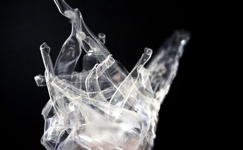
However, the two SOs were not clear. I interpreted the wooden sticks and egg shaker as the floating pieces but because of their randomised positions, it does not represent the sound very well. And after thinking about it the egg shaker should be interpreted differently, instead of it being just a transparent piece.
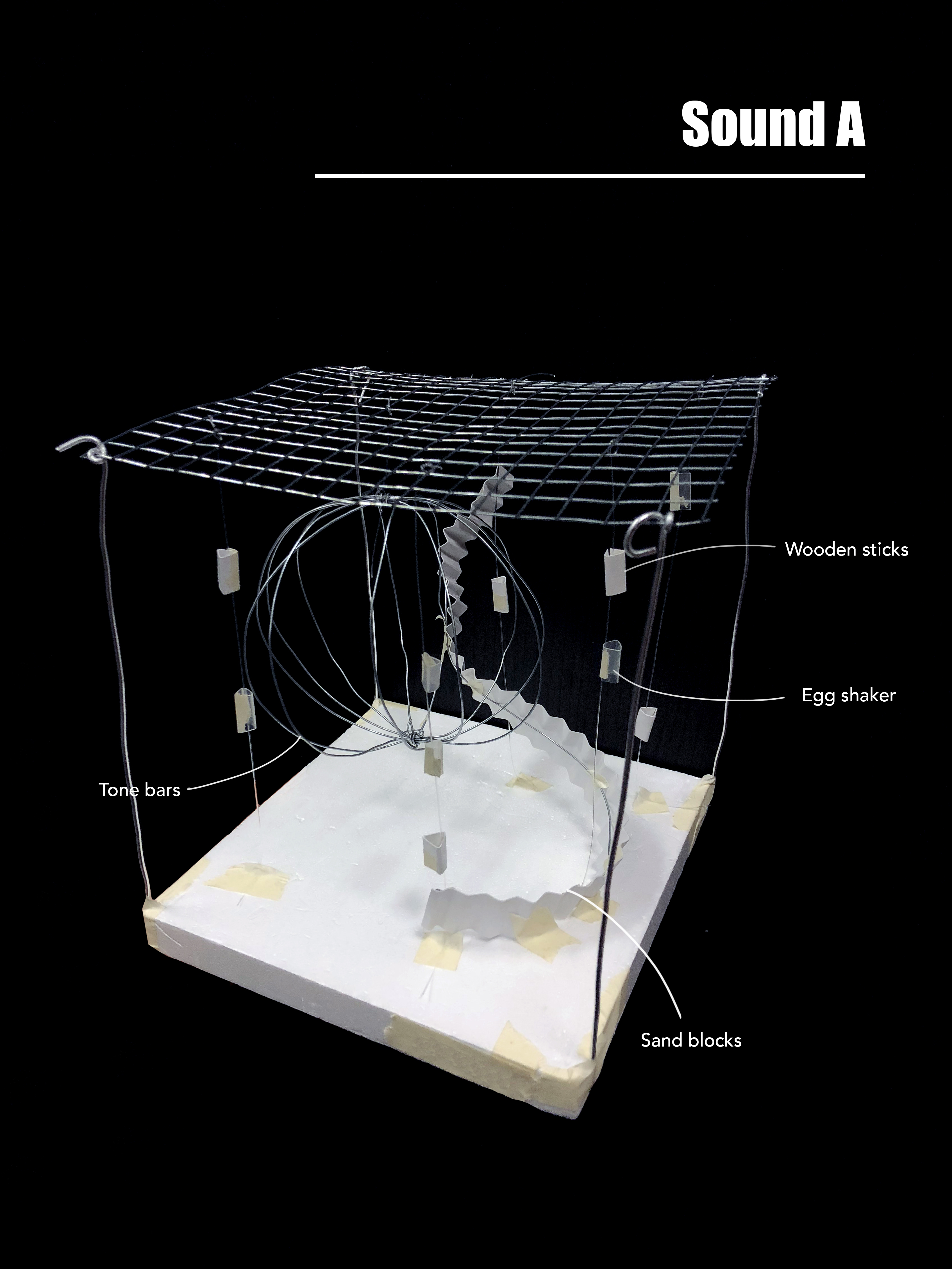
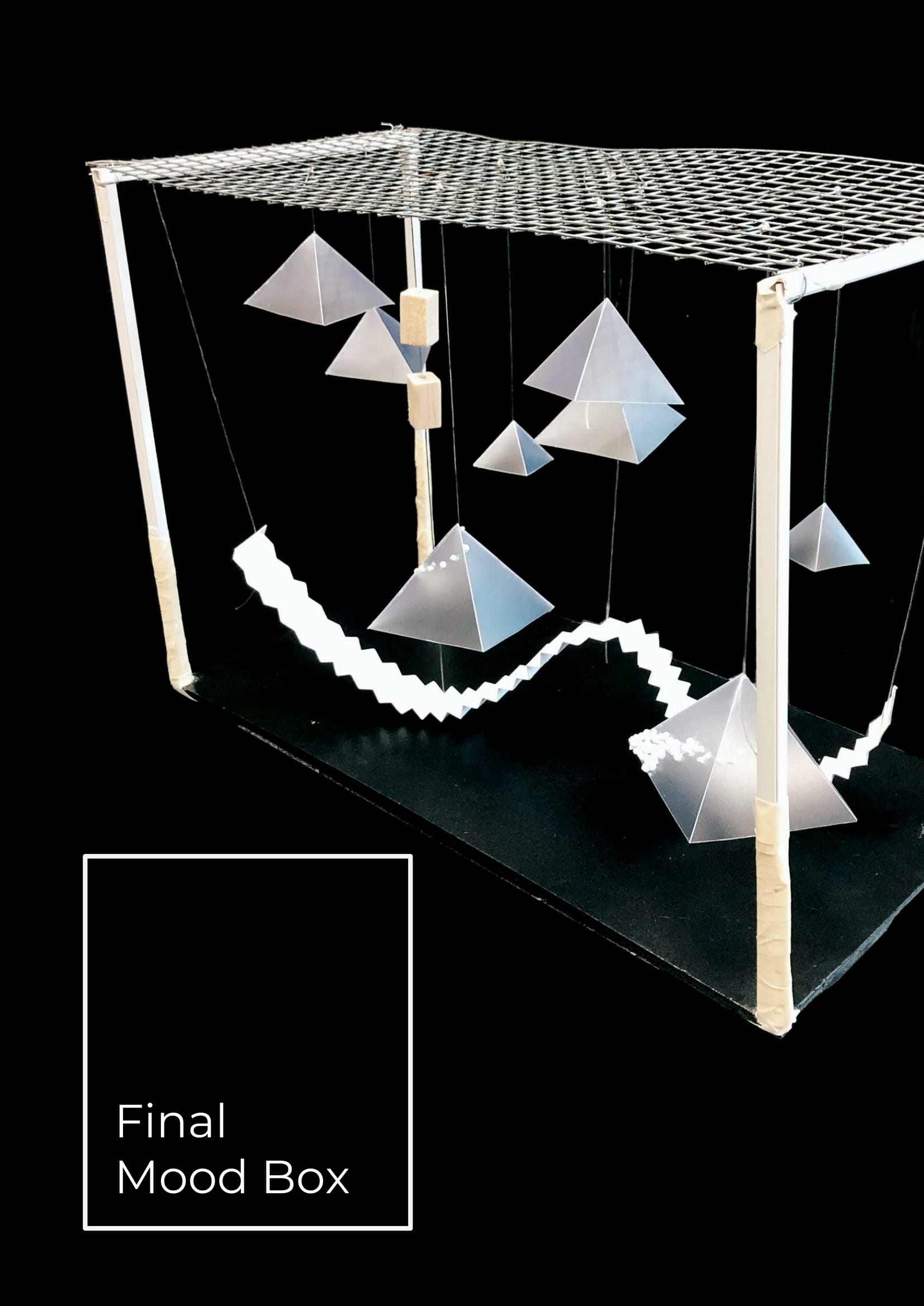
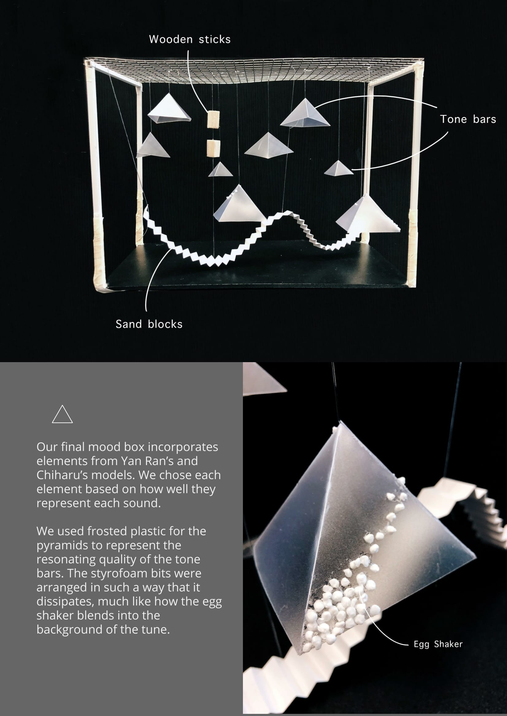
I changed the circular representation of the tone bars into levitating rings instead, which is think is more accurate. I reduced the number of beads for the wooden sticks and adjusted the spacings between them. The egg shaker is newly interpreted with the sanded piece of plastic, as it has is soft, disappearing quality in the sound.
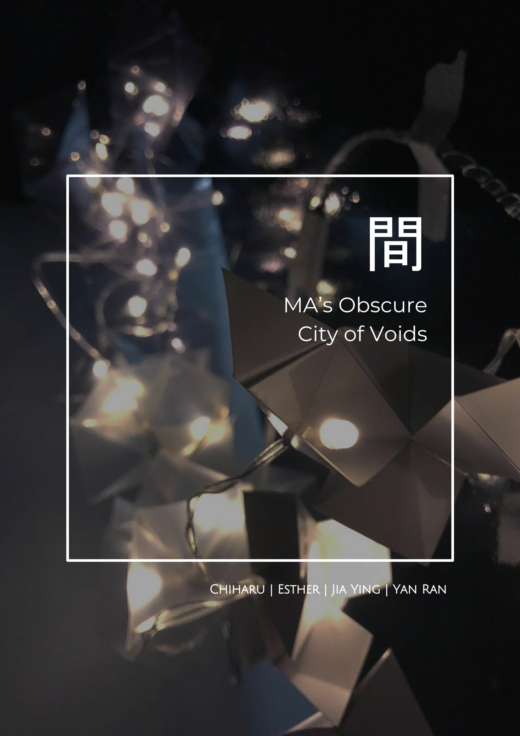
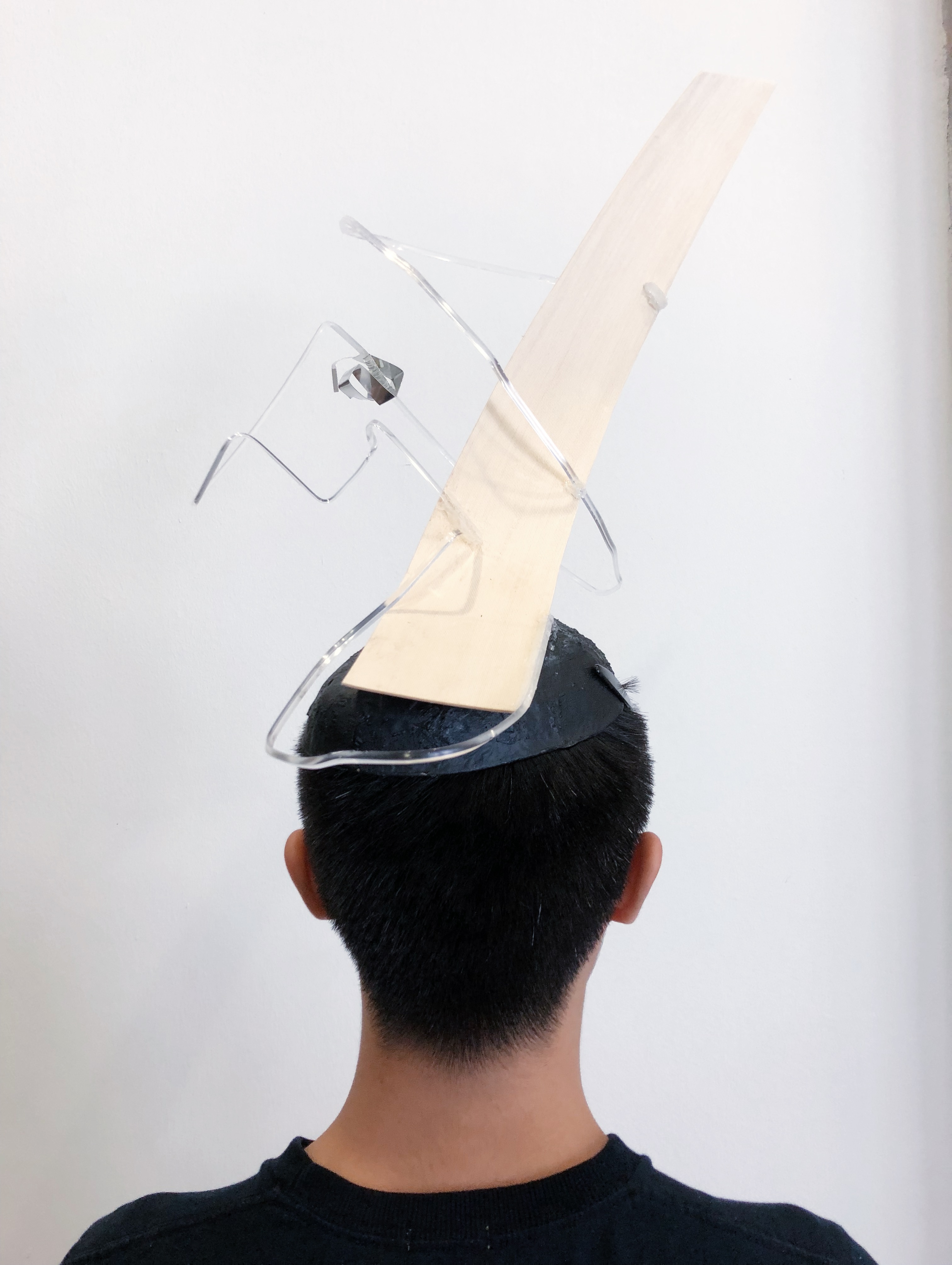
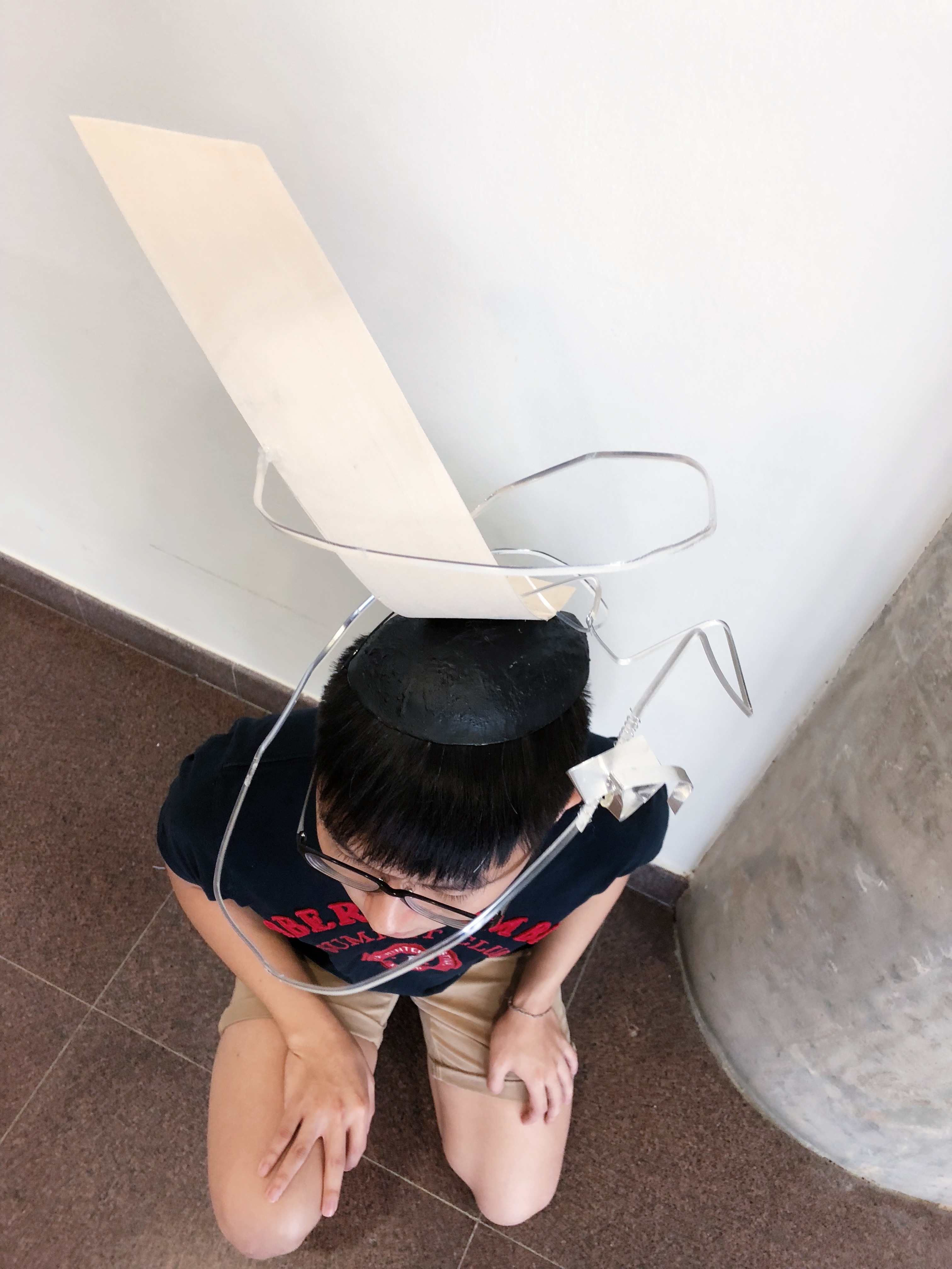
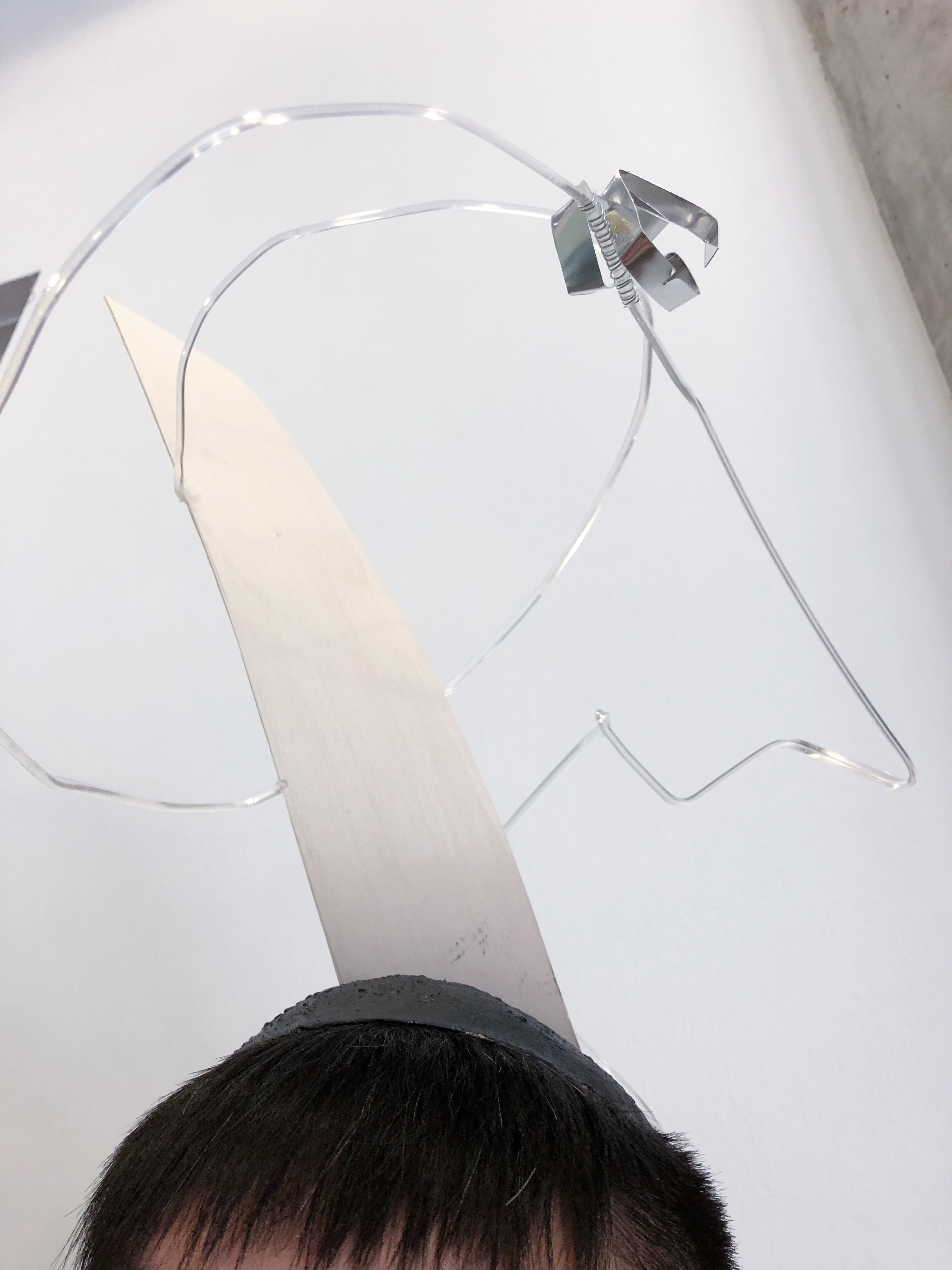
Chiharu & Jun Ming
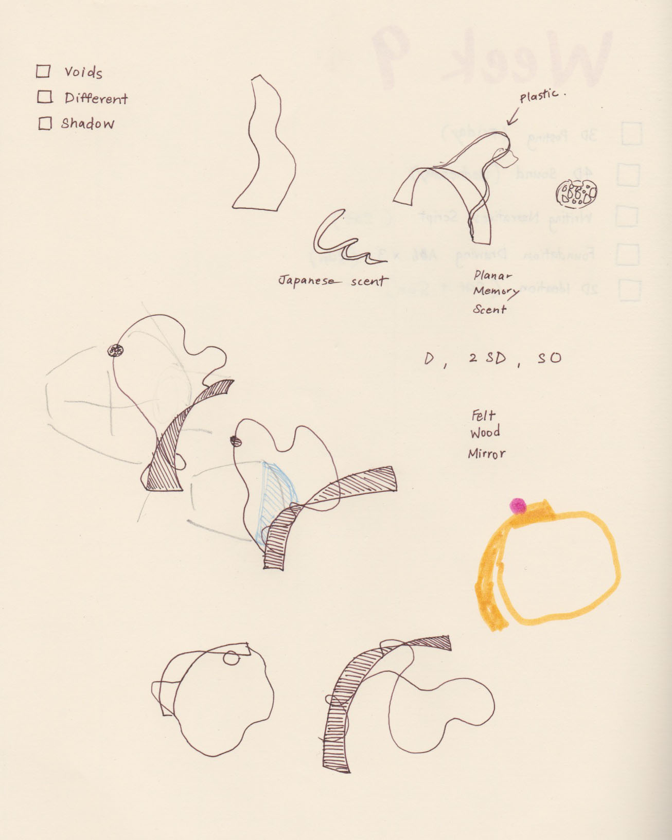
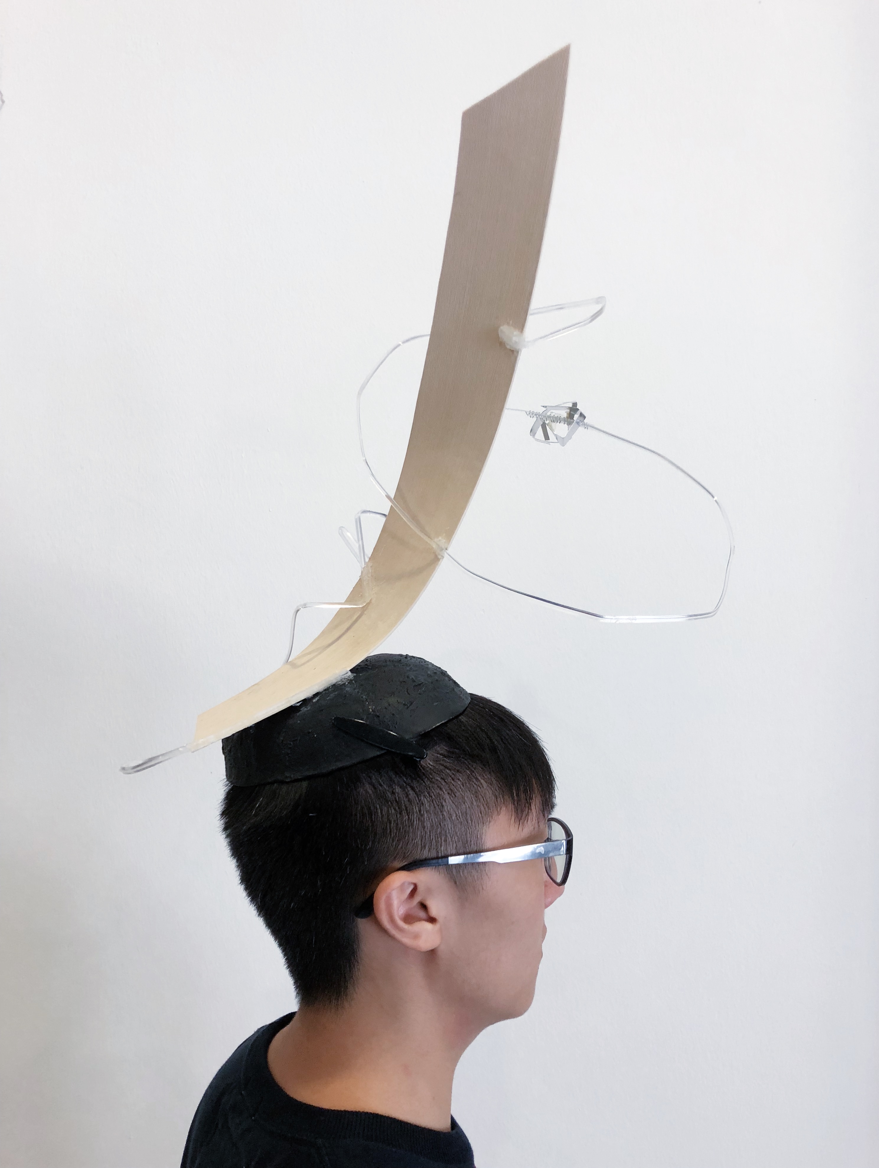
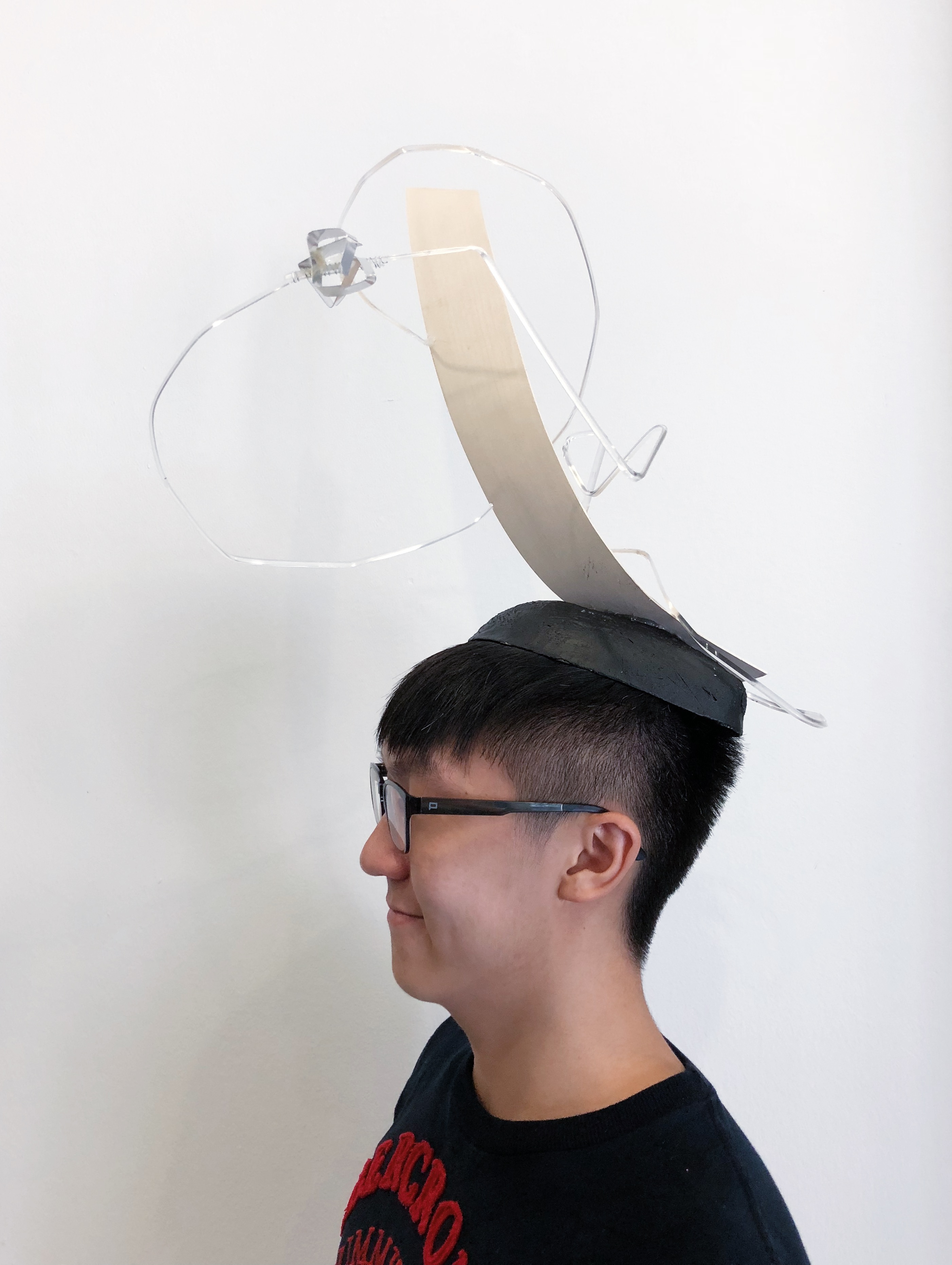
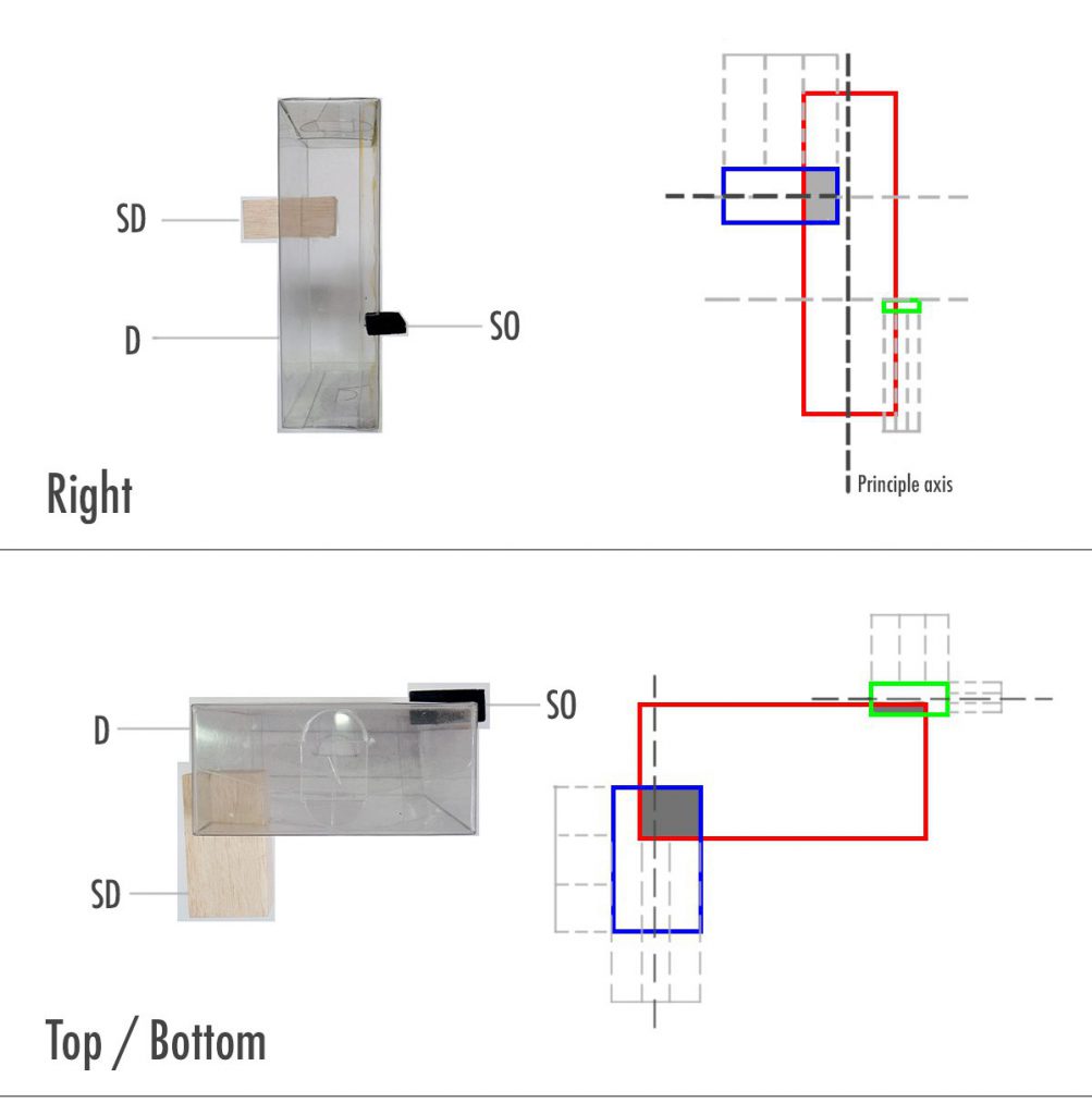
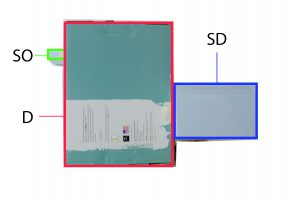
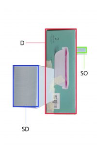
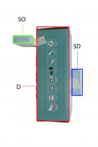
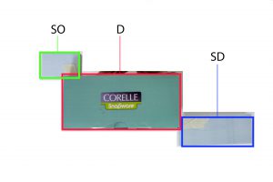
Following 003A, we were to work in pairs to create a fashion accessory incorporating both planar elements and our scents. We started by observing both our planar and plastic bottle models and picking out elements that we liked.
One of the elements that we ended up using was the dominant component of this sketch model. We felt that it would be interesting to include into our final piece because it plays with verticality.

Next we did some sketches to help visualise our model better. We decided that the SD, which is the long strip that wraps around the dominant, would represent our scents.
Our initial sketches actually was of a different orientation (as seen below). When we were figuring out what sort of accessory we should make, we changed the orientation of our sketch, and found out that it worked better in a different orientation. It started to look like a headpiece, which explains the sideway head sketches.
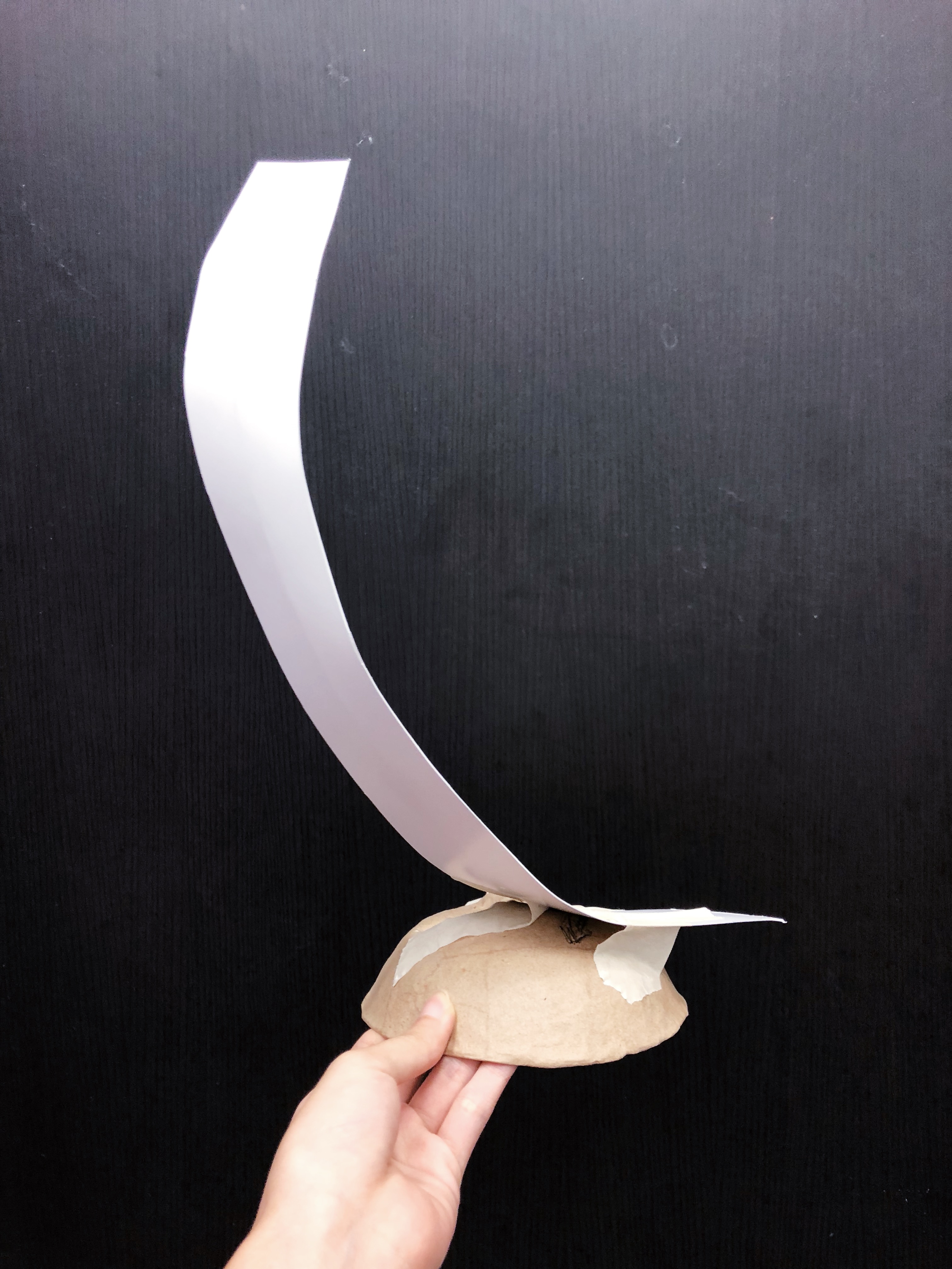
We faced challenges with every component due to our choice of materials. Bending wood required patience and teamwork as one of us had to hold the heat gun while the other shaped it. If we pointed the gun too close, we’d end up charring the wood or burning our partner. After bending, we decided to taper the end to make it seem like its disappearing upwards.
The piece of plastic below was originally going to be our SO, taking inspiration from Jun Ming’s unpleasant scent in his plastic bottle model. However there were burnt parts which made it not aesthetically pleasing. We didn’t want to paint it because it would not have the same effect that we intended it to have. So we scraped this idea. We replaced the SO with a reflective mirror – like material instead to complement the other materials.
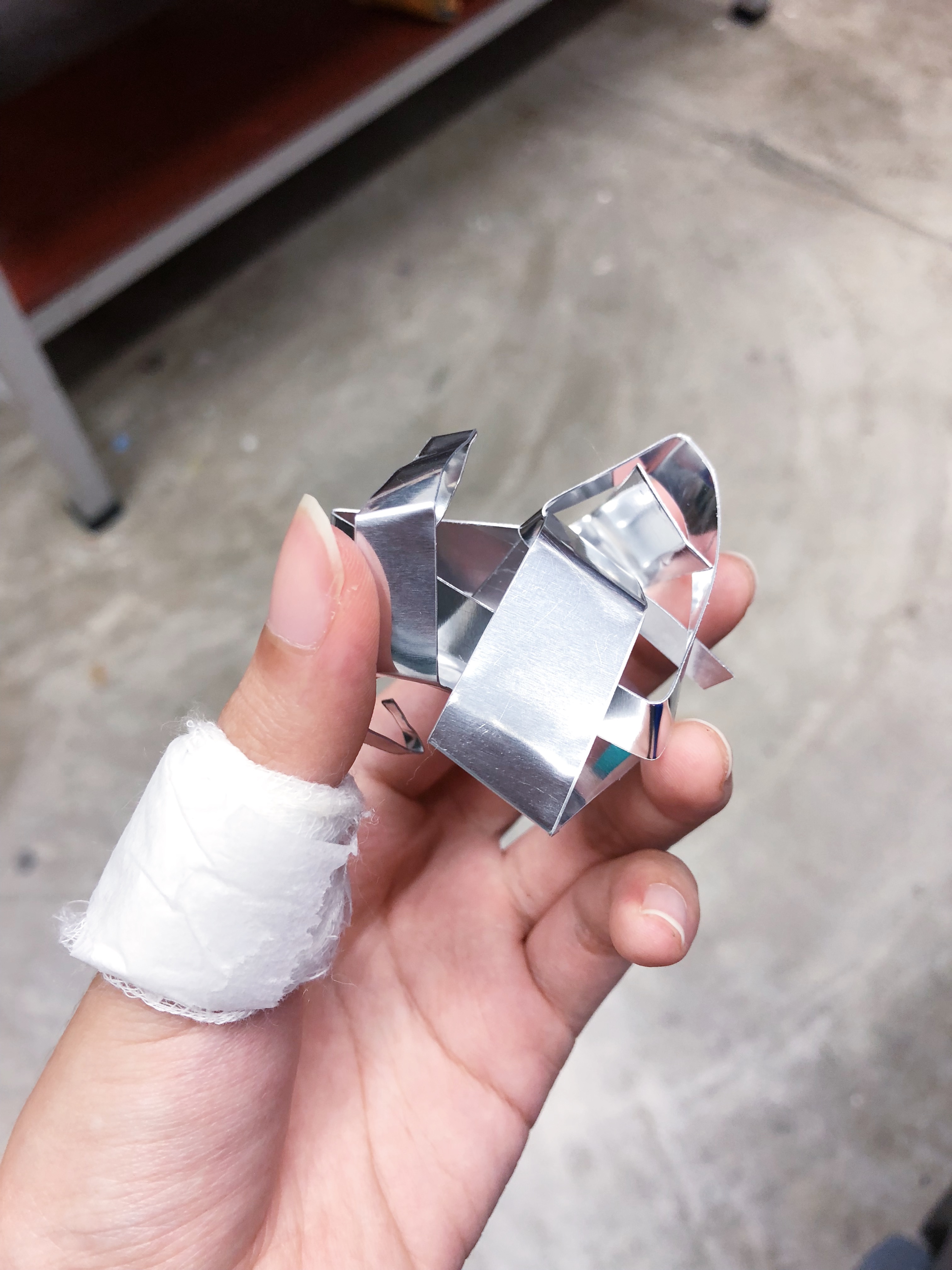
Acrylic rod bent with heat but it was difficult to control the curves. Sharp turns on the other hand were easy to create. It also would not stick to the wood nor base even though we tried many types of glue. Hot glue melted the acrylic and did not make it stick. In the end, we waited for the hot glue to cool a little before apply it to the acrylic, so that it wouldn’t melt.


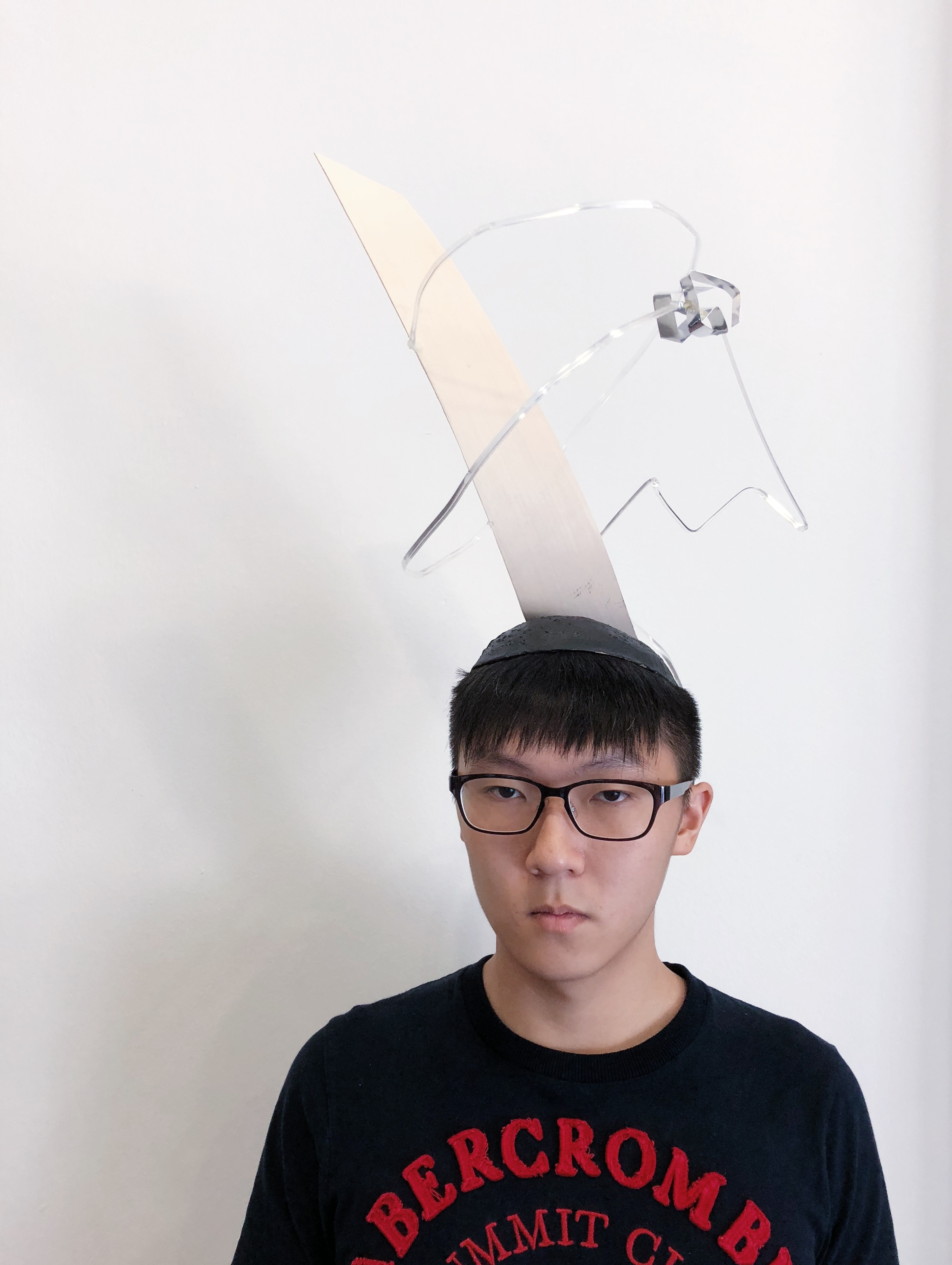
Since we were to keep memory and scent in mind, the choice of materials was an important consideration that we made. We looked into transparent and reflective surfaces, because those elements are closely associated with memory and scent. For instance, mirrors may symbolise the threshold between reality and imagination.
The dominant wooden piece is the bridge that connects our scents.
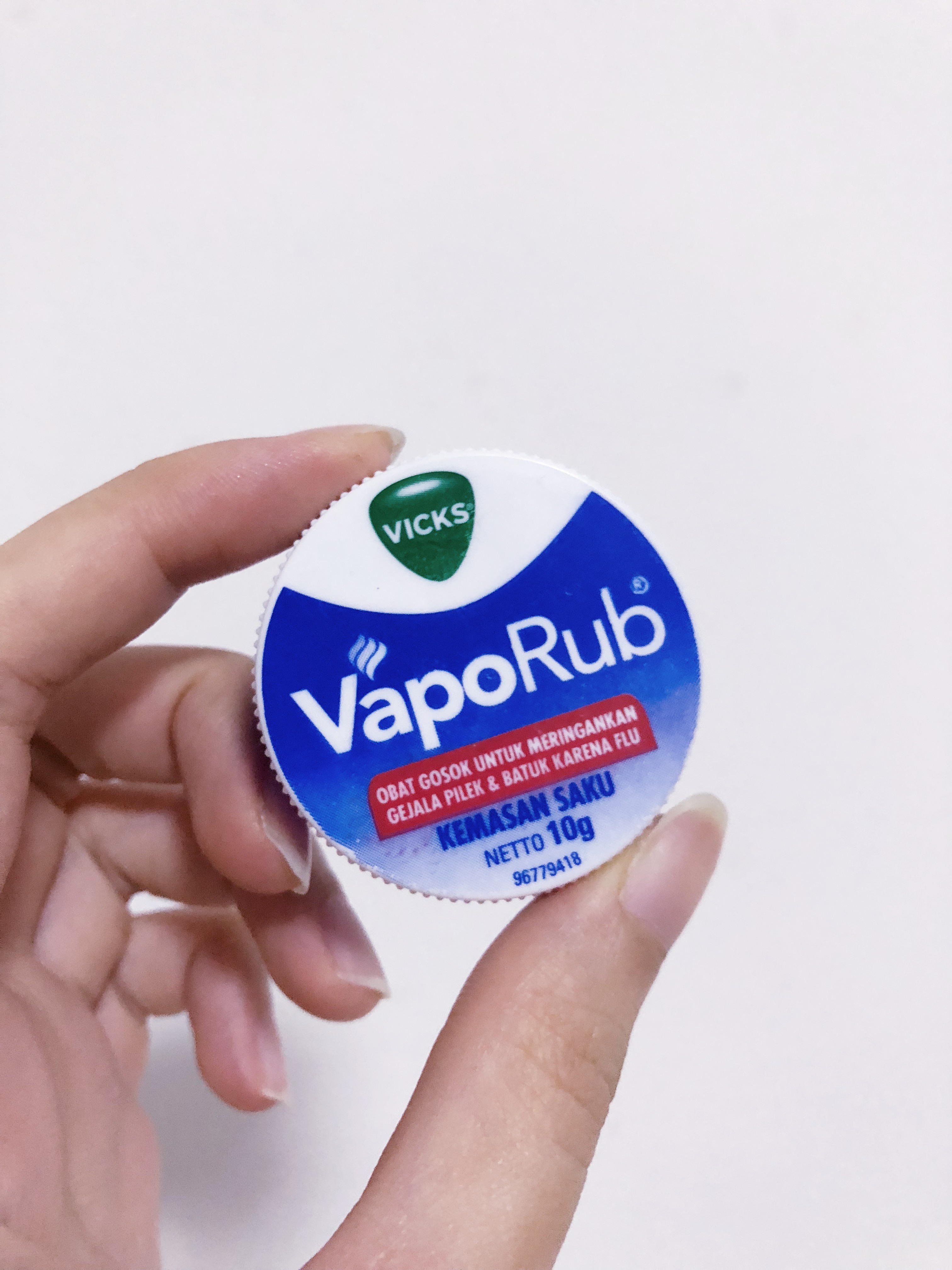
The acrylic rod is our SD, and it is made of grouped planes. The portion with the broken plane represents Jun Ming’s unpleasant scent — the groundsheet — because his scent makes him remember his NS days. The words associated with it are rough, tough, uncomfortable etc. The curve plane is my pleasant scent — Vicks Vaporub, because I associate it with comfort.
The reflective SO reflects our scents into our memories (if that even makes sense).
We were also inspired by old vintage flapper hats, whereby the wooden piece is a replacement of the feather, and the swirl is a replacement of the rim of the hat.
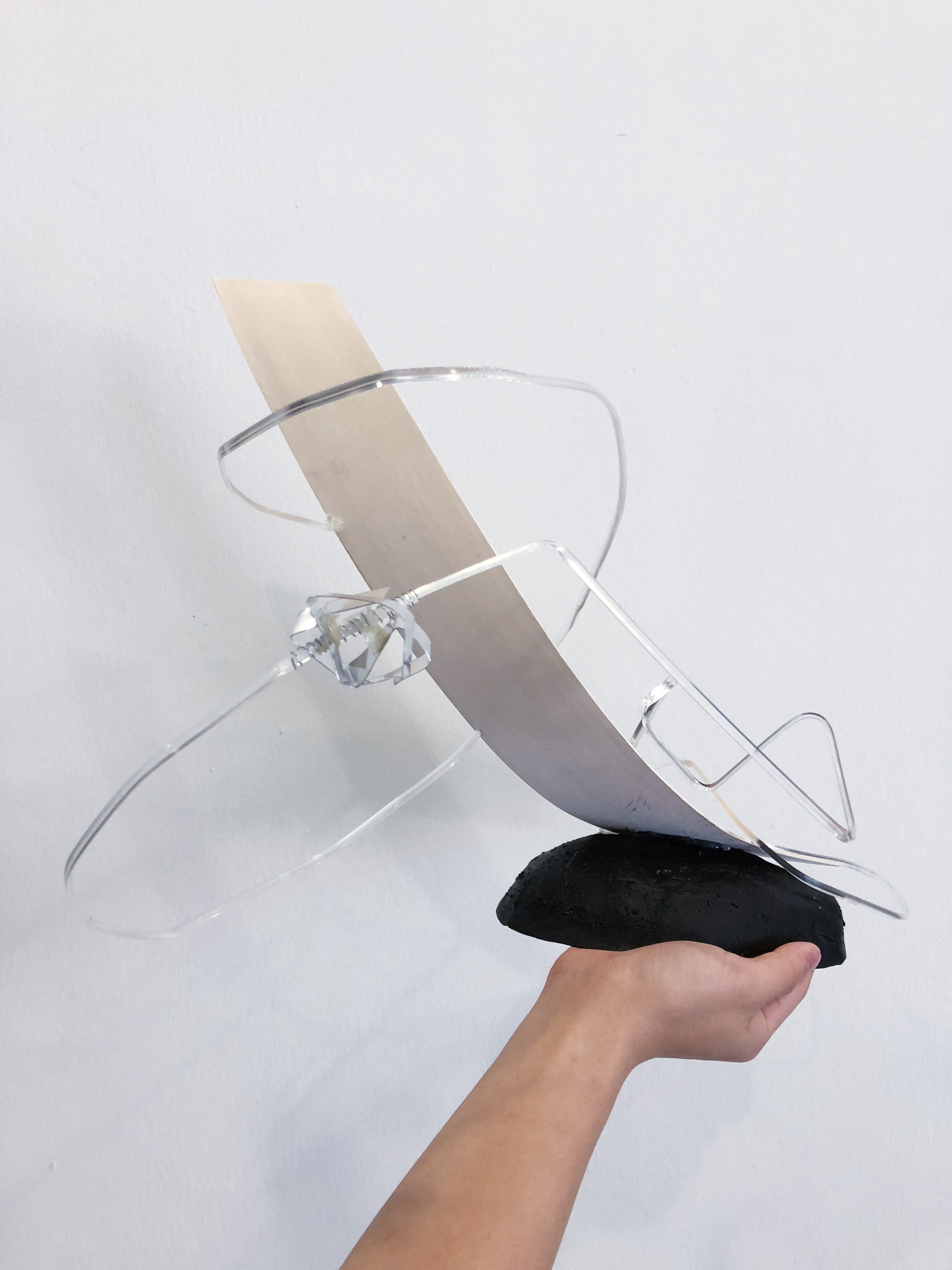
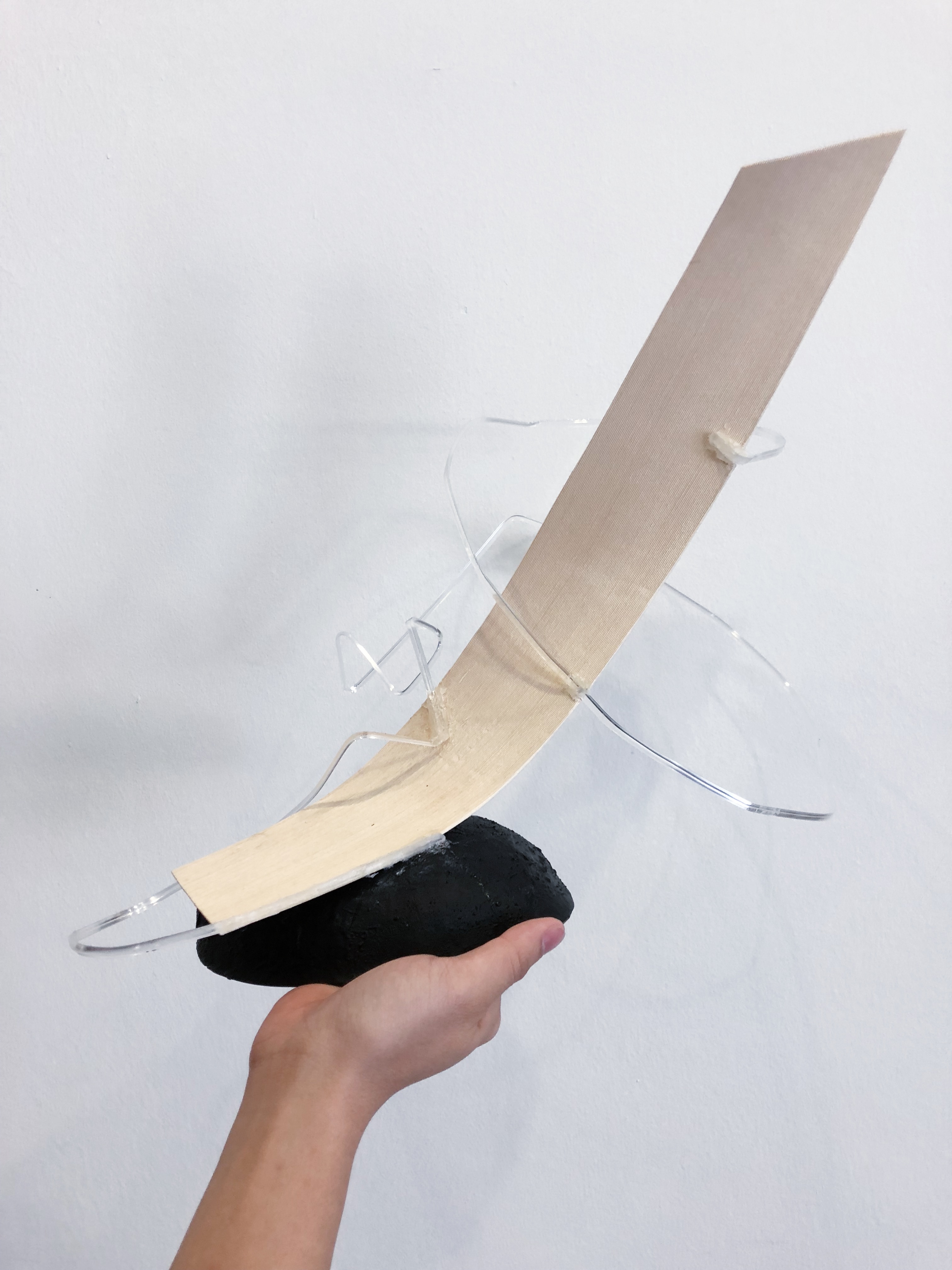
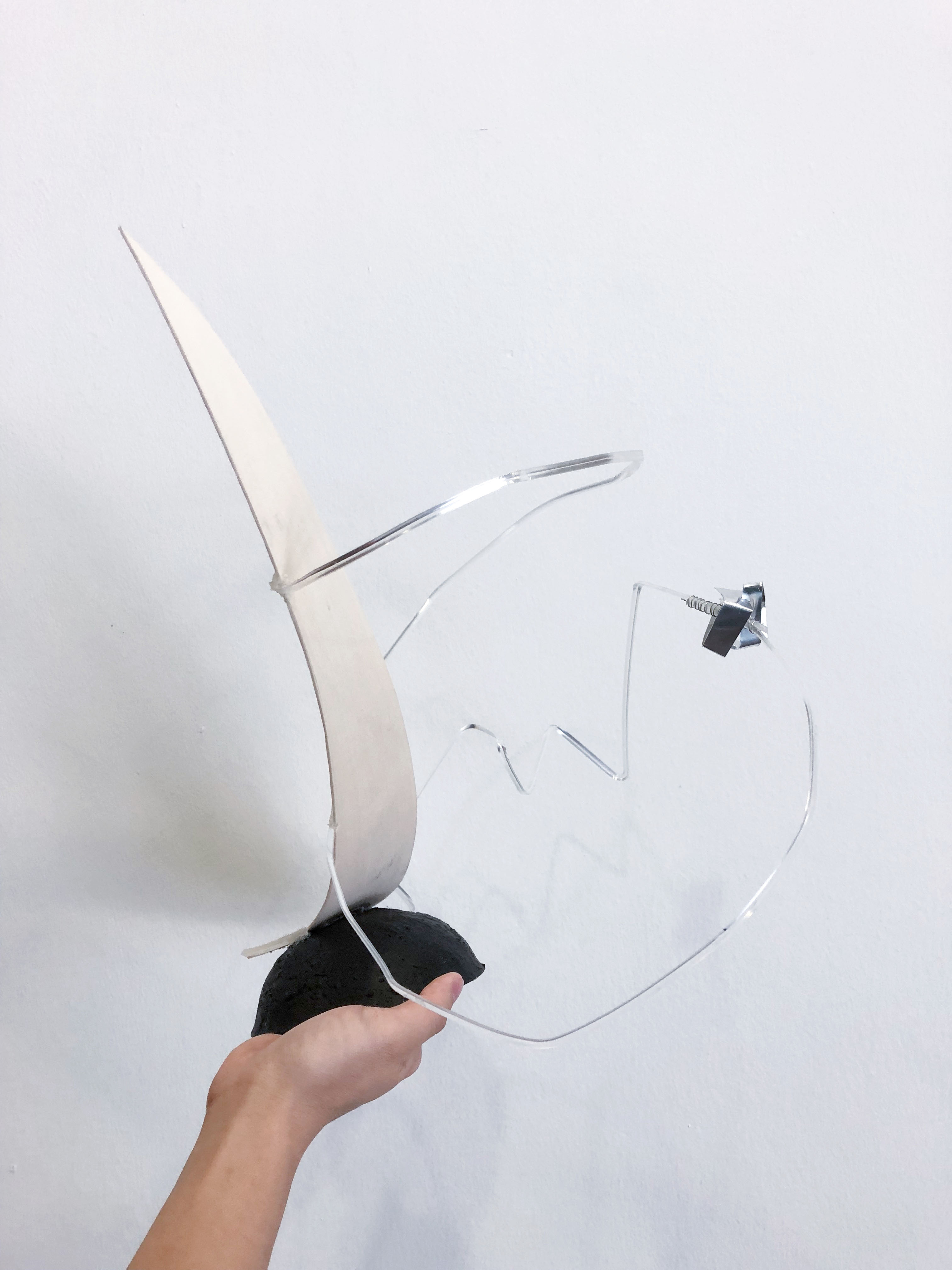
We played with voids through the swirly acrylic rod. Our original intention was to let the the acrylic rod droop down to the face area to create interesting voids. However the piece was too heavy and would not hold so we had no choice but to improvise and stick it higher up.
Despite the challenges faced and the immense amount of patience required, this project was fun to execute!
Feedback given was to reposition the SO such that it casts a shadow / reflections onto the wood!
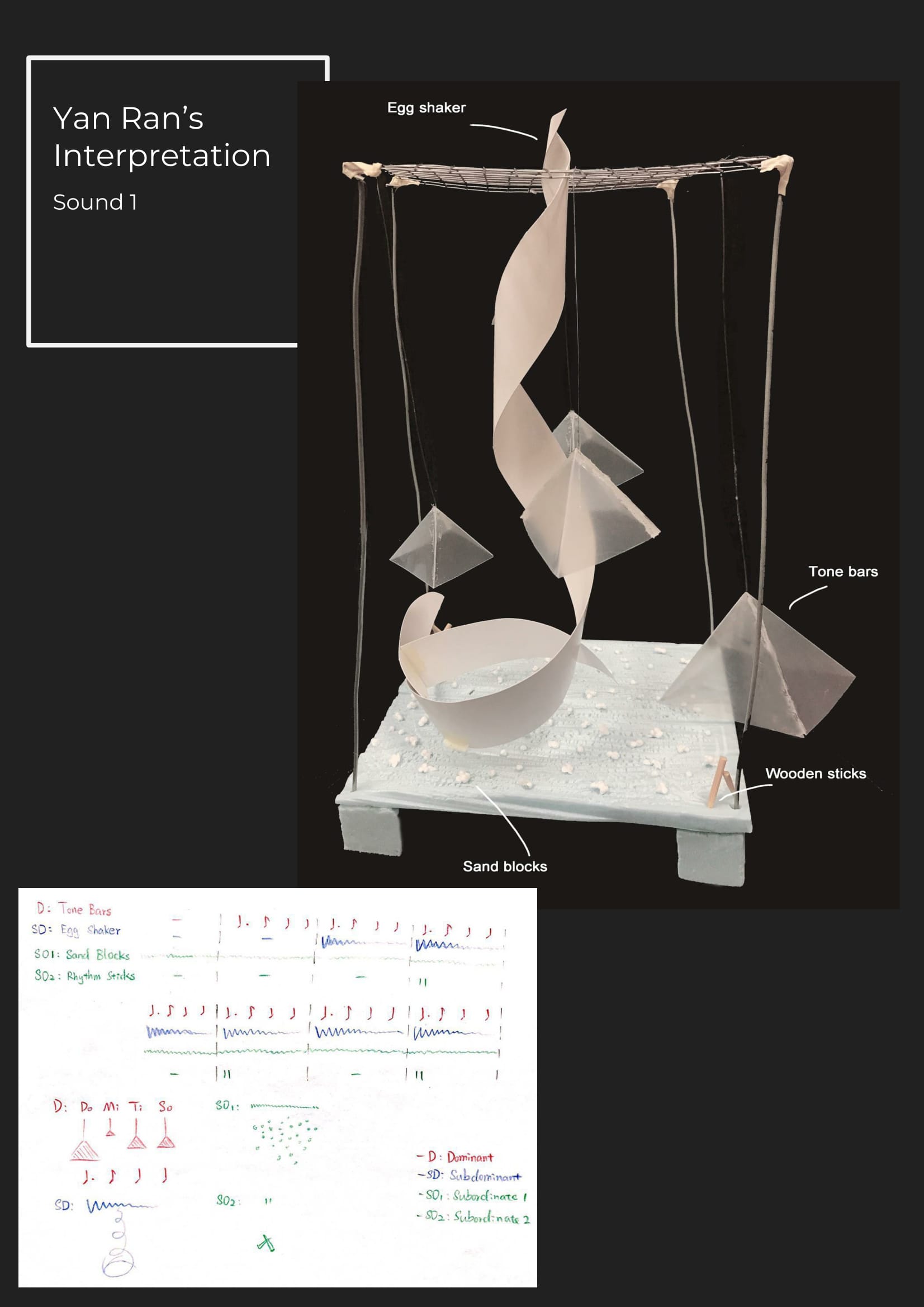
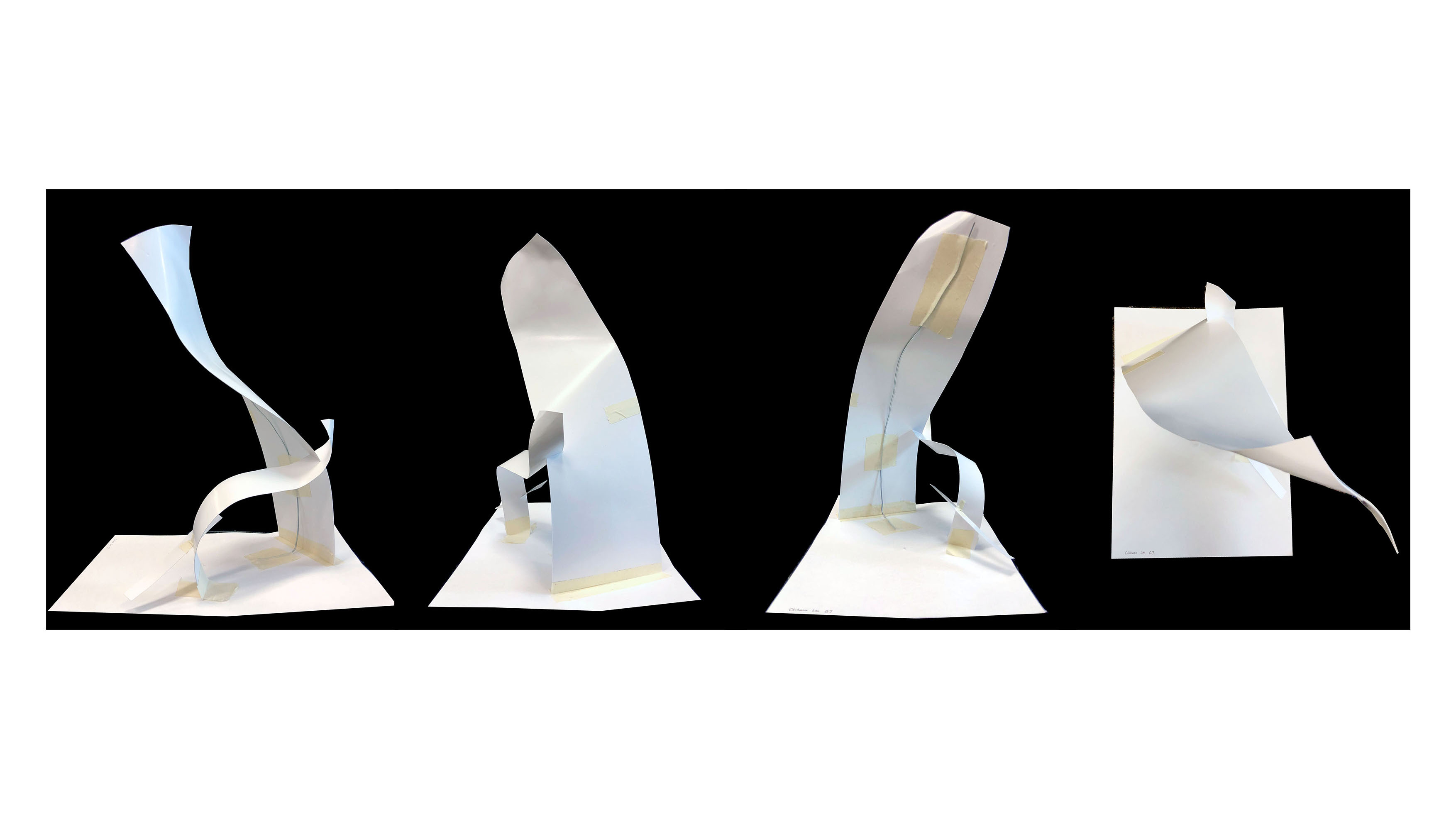
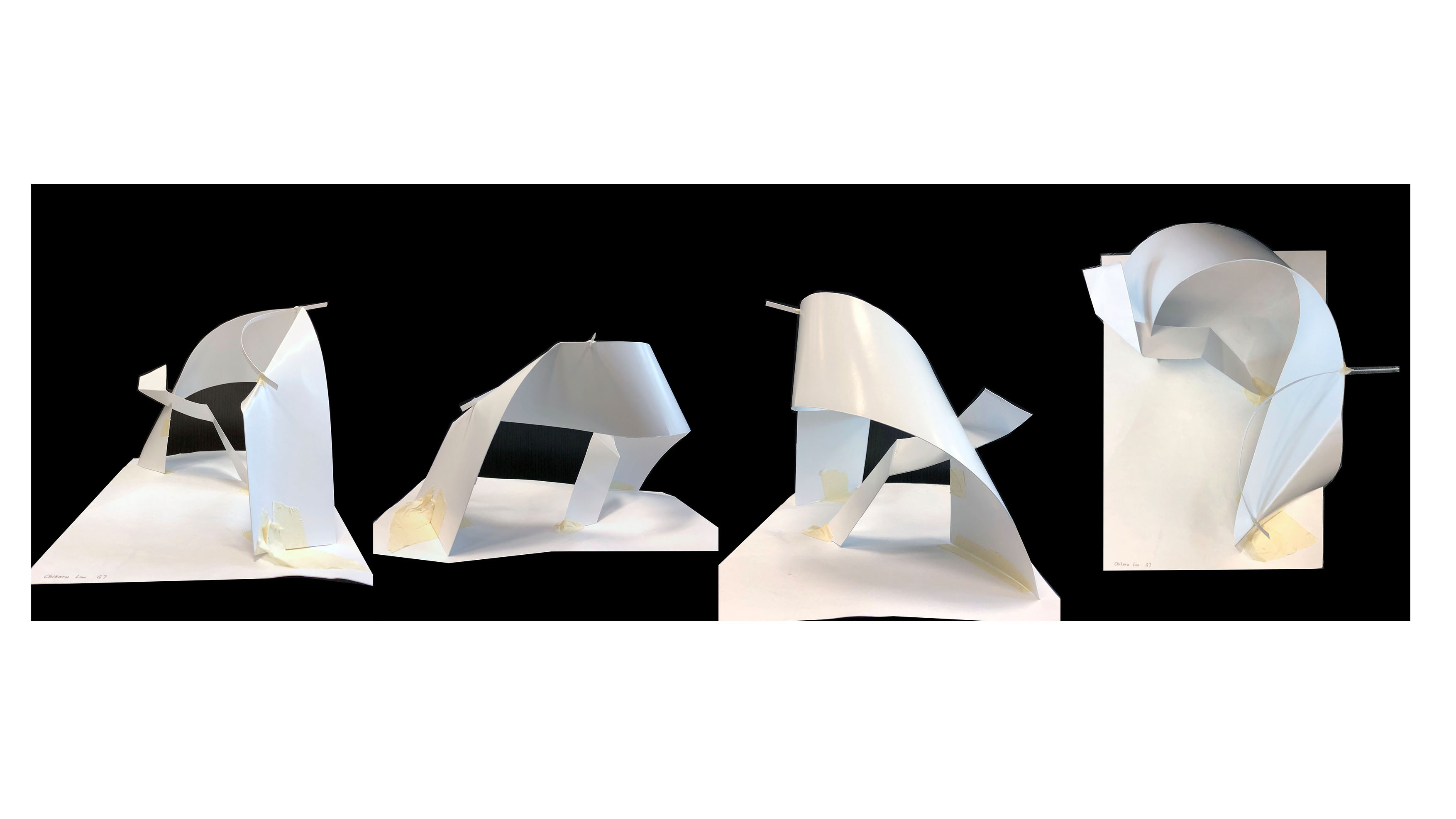
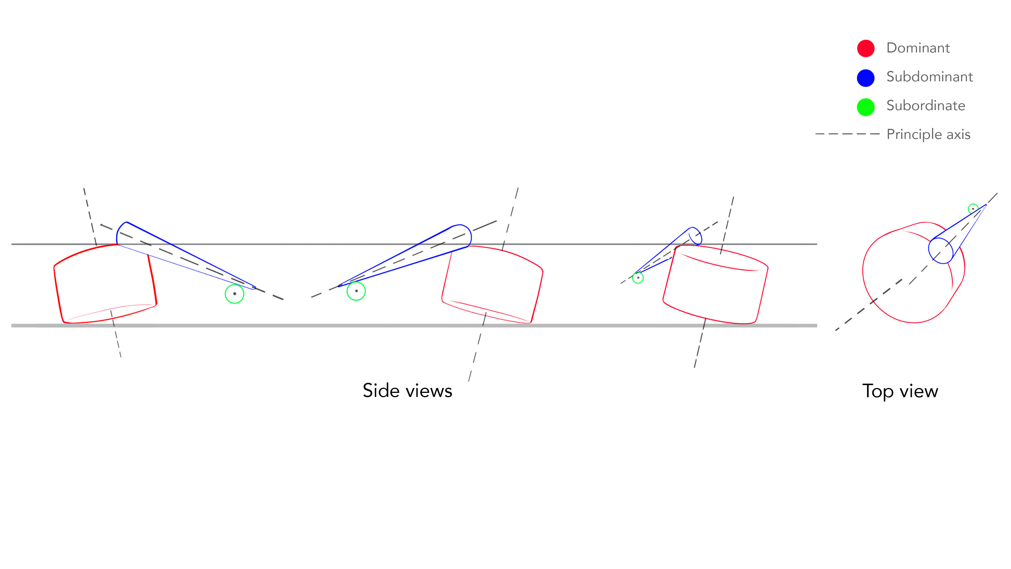
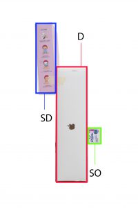
This exercise required us to construct sketch models using a variety of planes, while keeping the dominant, subdominant and subordinate in mind.
For this model I tried to think of verticality. The D, SD, and SO are of different heights. I decided to keep the D and SD as curved planes, and juxtapose it with a straight plane as the SO. The design is relatively simple, and the direction of the planes almost looks as though they are spiralling upwards. I wanted the volumes to cluster to one side of the page when we view from the top, instead of spreading them out.

 Sketch analysis
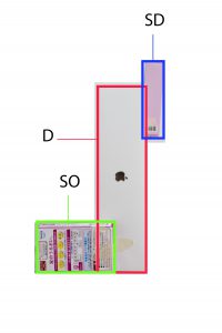
Sketch model 1 is a revised version of the sketch model below. The D and SO were too big. The D has been adjusted to tower over the SD and SO, to add more interest.

For this sketch model, I tried to incorporate complex-axis and broken planes. The overall composition feels heavy due to its emphasis on being horizontal. The S is a curve plane to juxtapose the broken planes. After analysing this composition, maybe it would have been more interesting if the one end of the D was not attached to the ground, or if it were attached at an angle.

 Sketch analysis
This model is a reworked version of this earlier version. It was confusing because it had too many voids. There was lack of variation in the type of planes used too.

Olfactory art – art concerned with smell.
The part of the brain called the olfactory bulb is closely associated with memory and feeling, so smells can call up memories almost instantaneously. When we smell a new scent, it seems that we will link it to an event, person, a thing, or even a moment. Different scents mean differently to different people. The olfactory bulb has intimate access to the amygdala (part of the brain that processes information) and the hippocampus (responsible for associative learning), hence smell is capable of recalling memories and emotions.
Smell blindness / Anosmia : Some scents are undetectable to some people. For instance, “75% of people can’t detect the distinctive grassy tang of urine produced following the ingestion of asparagus.”
Scent marketing is being used to put clients/customers at ease. Usually the scents are “imperceptible to the unwitting sniffer”.
Source: https://health.howstuffworks.com/mental-health/human-nature/perception/smell3.htm
I found an artist that makes art using scent. New York artist Martynka Wawrzyniak did a hyper-personal self portrait. The scents she incorporated into her project Smell Me (2012) include a vial of her own tears and her sweaty workout shirt. Apparently she put actual biological oils extracted from her own body into ten glass vials. The audience would “enjoy” her scent through a scent chamber perfumed with synthetic versions of the oils.
Source: http://theconversation.com/olfactory-art-makes-scents-and-who-nose-where-it-might-lead-us-25643
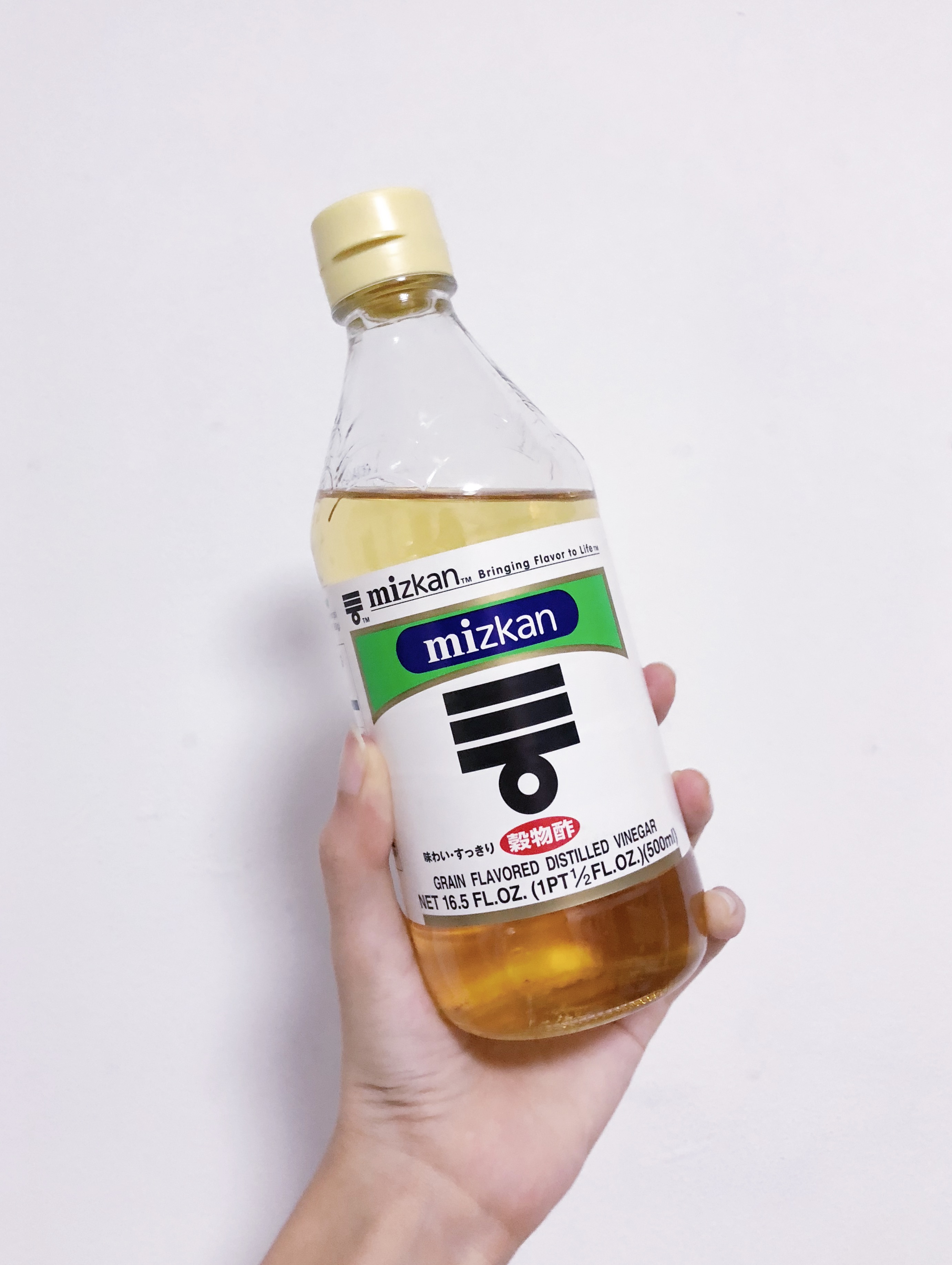
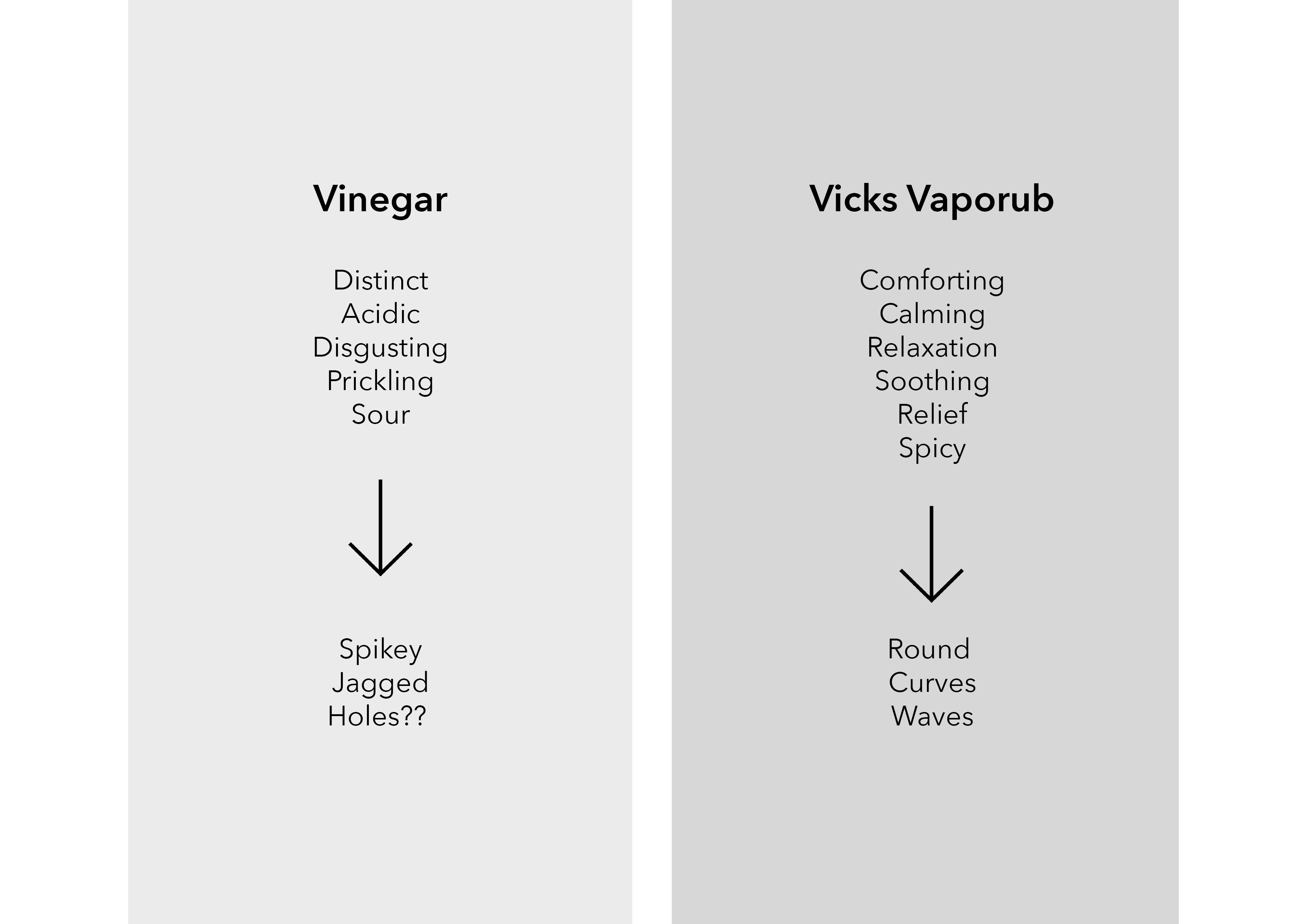
This scent is linked to a relatively recent memory. Just a few months ago I suffered from pretty severe nausea due to stress, to the extent that it hindered my social activities. Though I learnt to control my emotions/stress and the nausea has subsided a lot, I am still sensitive to a lot of smells. Vinegar triggers a specific memory, a particular incident. I was out with someone that I liked, everything was okay until we decided to eat poke (the sashimi like salad thing). Unfortunately the vinegar triggered my nausea and it was so bad I had to excuse myself. The emotions I felt back then were some of the worst. I was upset that I spoilt the happy mood of the day and embarrassed with myself. I guess it had to do with my overall emotional state at that point in time too, so I over-thinked everything. Now whenever I smell vinegar, I remember him, this particular day and the emotions linked to it.
This scent is linked to the nausea too. When it was really bad almost every smell just made me want to puke — even scents that were supposedly pleasant, like maybe desserts or something. My father came up with this solution which was Vicks Vaporub. Due to the menthol, this scent was extremely comforting. While some people associate it with being sick, I immediately feel more relaxed after application, hence it is pleasant to me!
I thought of some keywords to describe each scent, and from there churned out visually descriptive words. After that I did simple sketch to help me visualise my final product.

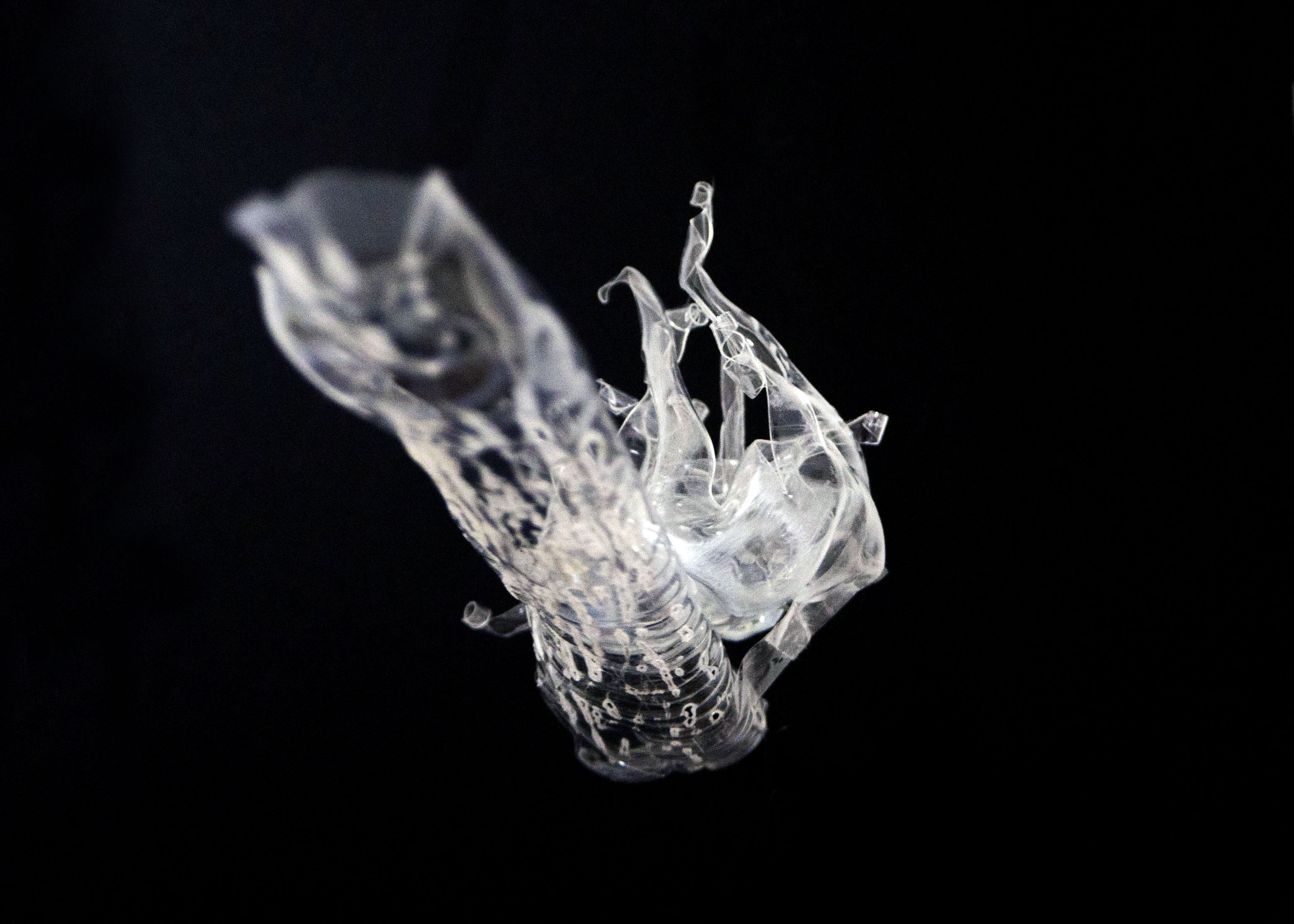
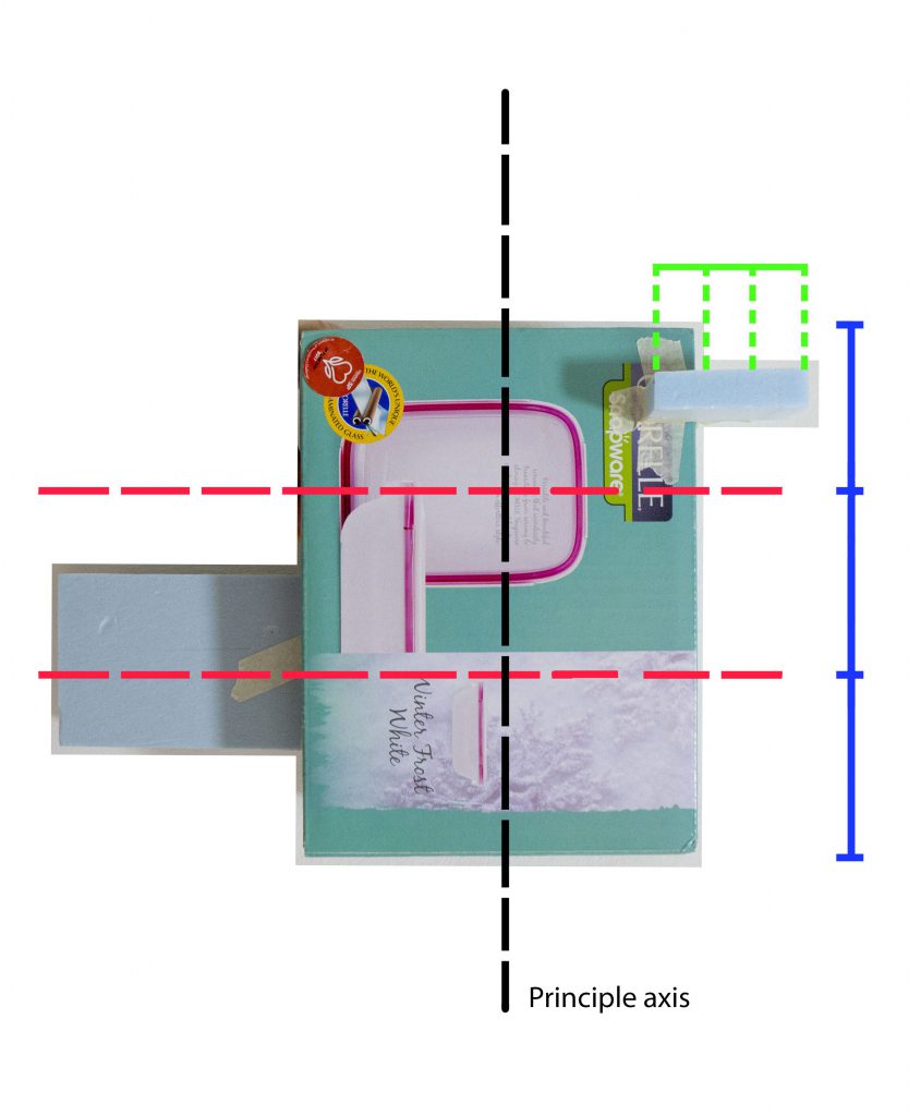
I experimented with a few pieces of plastic before arriving at my final model, because the plastic did not react the way I wanted it to when it came into contact with heat. The composition / arrangement was decided after I figured out each element was going to look like. Naturally, with an elongated strip juxtaposed with a round shape, I placed the round part on the lower third of the strip to act as an anchor.
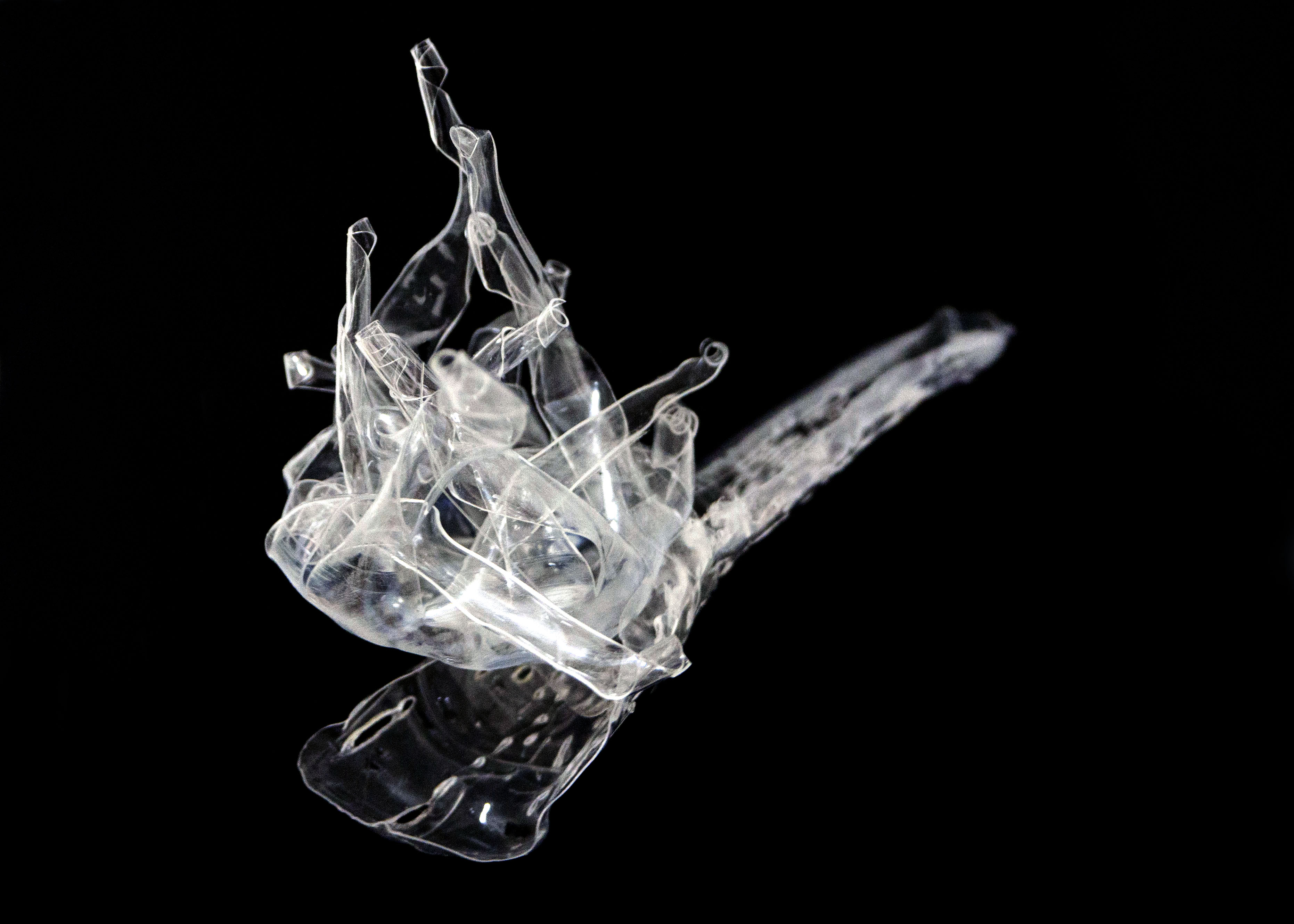
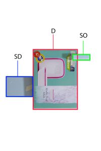
The pleasant scent is represented by this flowery looking component. I tried to go for a curvy, wavy language that envelopes, since the word that I associate with the scent is comfort. The challenge that I faced was that it was difficult to control the strips as they were heating as the heat gun covered a wide area which cause all the strips to simultaneously curl. The overall shape of this component is round because it the scent is “contained“, to match the language of the strips.
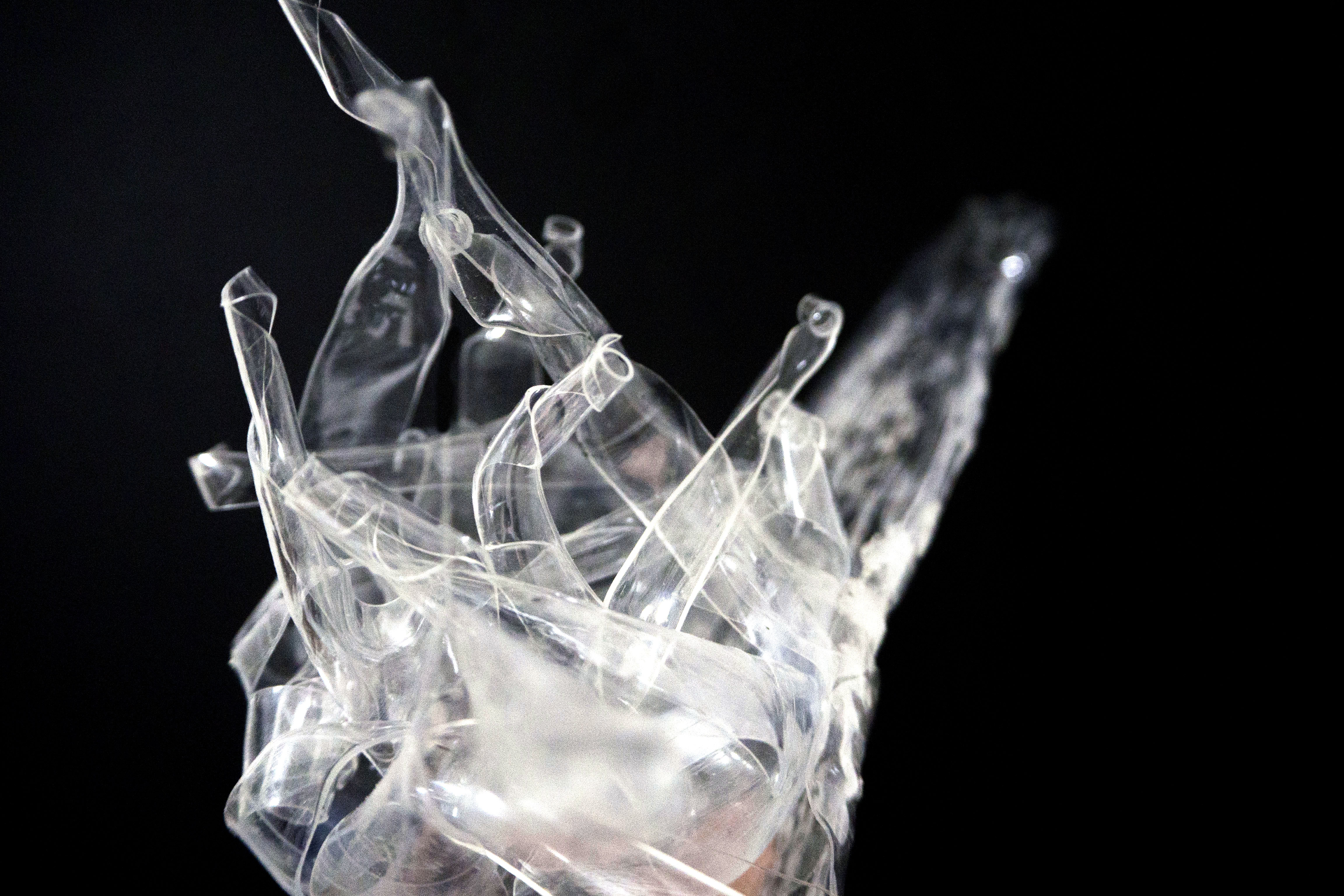
The unpleasant scent is represented by this long strip. Because vinegar has a distinct scent, I felt that it needs to have presence, especially since the other component is already pretty wild looking. Hence I settled for a long strip. In order to convey “disgust“, I used the soldering iron to poke holes. I elongated the holes to follow the axis of the strip.
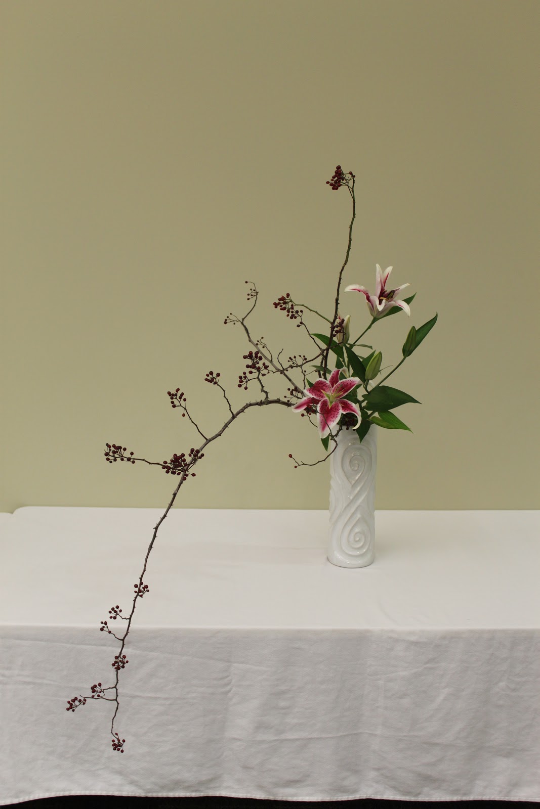
It is the Japanese art of flower arrangement. Ike meaning ‘alive’ and bana meaning ‘flower’. A form of creative expression, following certain rules of construction. Originated in 7th century when Buddhism was introduced to Japan. Formalised version of ikebana begun in the Muromachi period in the 15th or 16th century. Intention of the artist is shown through a piece’s colour combinations, natural shapes and graceful lines.
Characteristics of Ikebana:
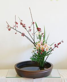
Two main styles: Moribana & Heika.
Materials are arranged as if they are piled up in low flat containers with a wide surface area of water. There are 3 different styles.
Upright Style
Slanting Style
Water-Reflecting Style
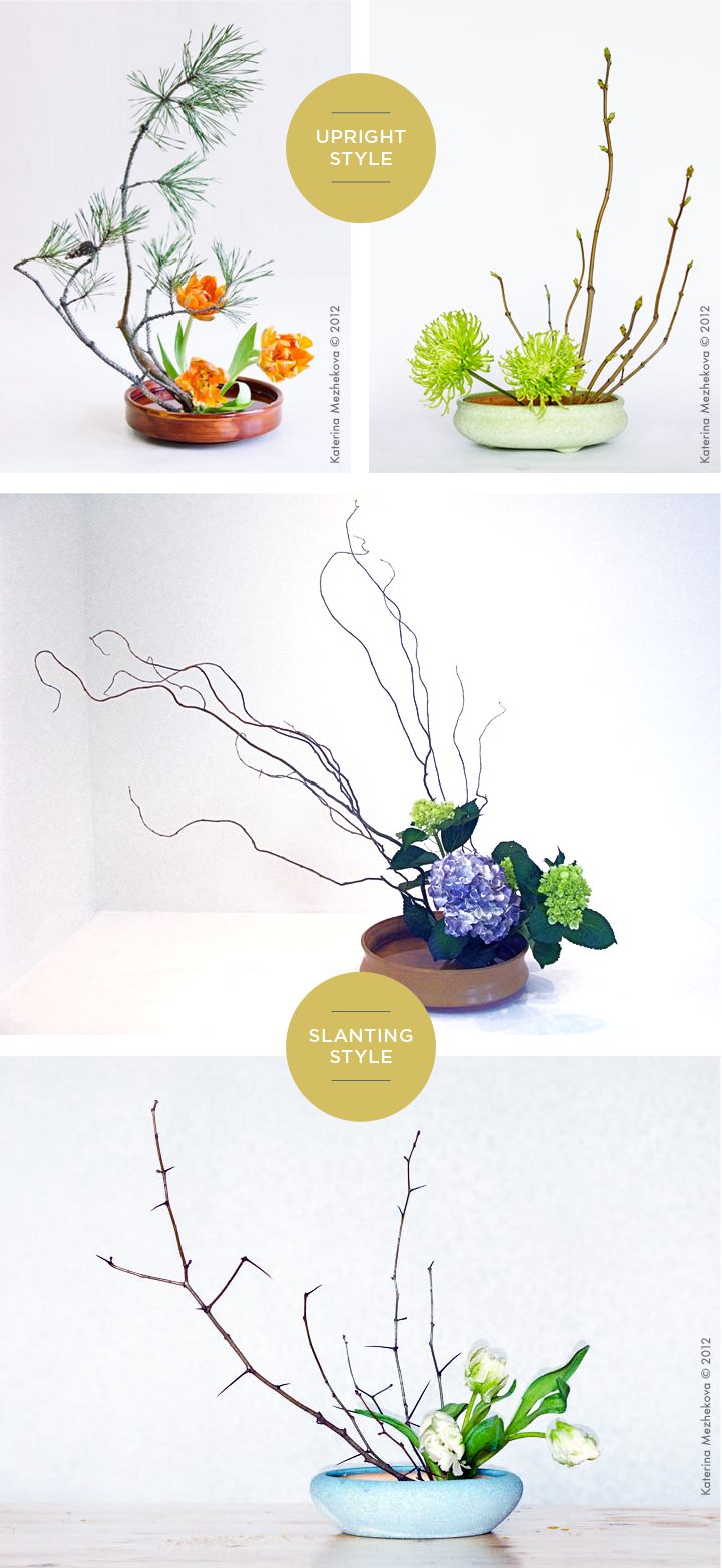
Other forms:
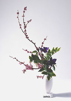
Literally means “vase flowers” . Created in tall, deep containers, unlike Moribana. The three establish floral styles resemble Moribana methods, but there is a difference in the way the branches are placed.
Slanting Style
Upright Style
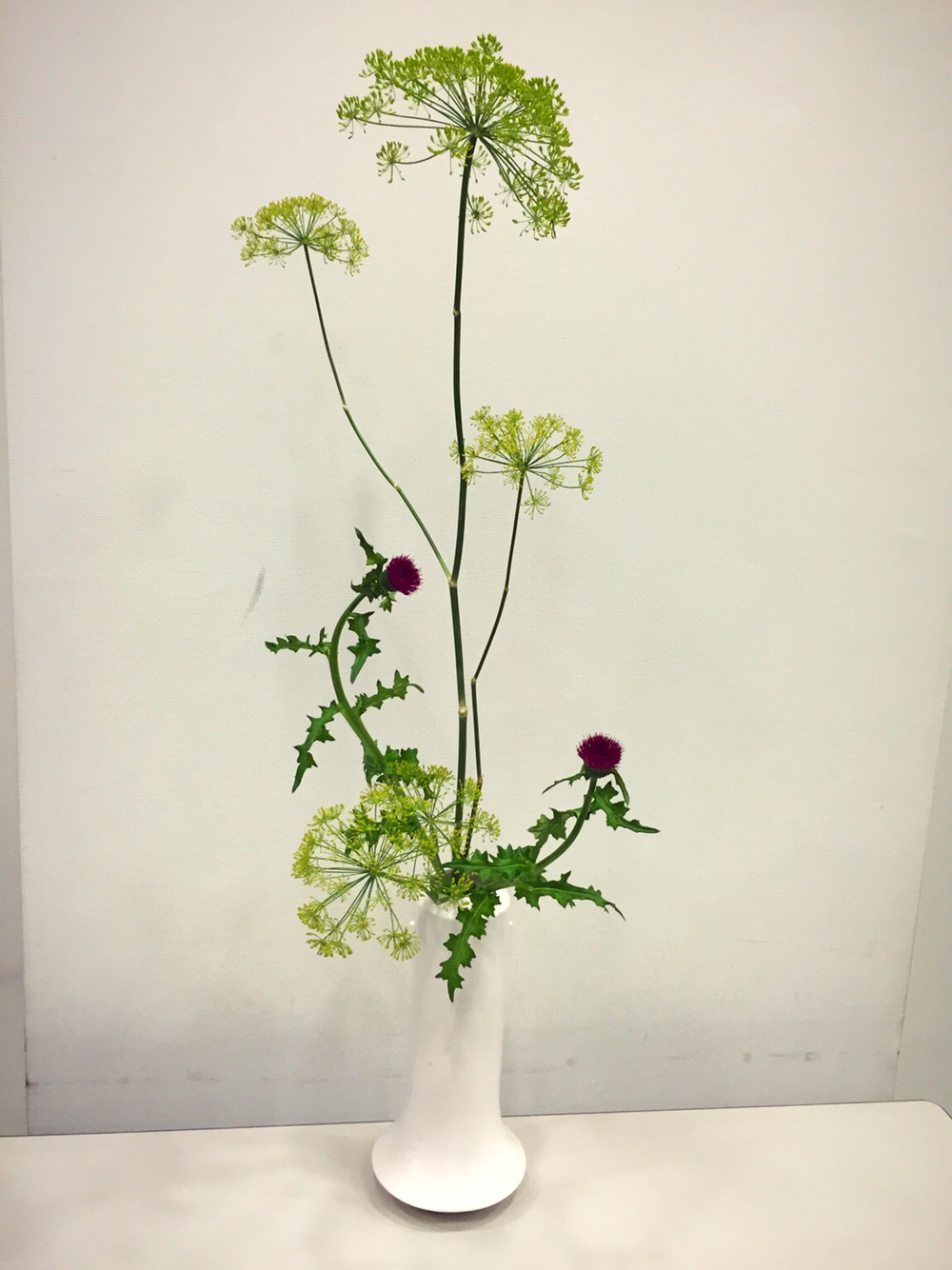
Cascading Style
Sources:
For my taste research, I decided to research on something a bit different. Instead of research how we taste, which everyone is doing, I wanted to find out what factors change our sense of taste. I found my answer on this website called Popular Science. I have included the relevant points below and summarised some parts.
Language
Temperature
Colour
Environment
Source: http://www.popsci.com/article/science/7-things-affecting-your-sense-taste
For my season mind map, I am a little influenced by Japanese summer so some visuals and elements are very specific –– like fireworks and watermelons –– though they can be considered universal too. Summer can be interpreted in two ways to me. Either fun-filled, or peaceful.
Which is why for colour schemes, I put two different types below. One is a more muted colour scheme, to show the calmer, more peaceful sort of summer. Whereas the colour scheme on the right is more pop and dynamic to show the fun, wild sort of summer. Colours are generally bright and colourful.
Though we aren’t using actual flowers, I still included them to serve as a visual guide.
A lot of foods are cold and could melt, so for my final model I will try to find drier types of food instead. 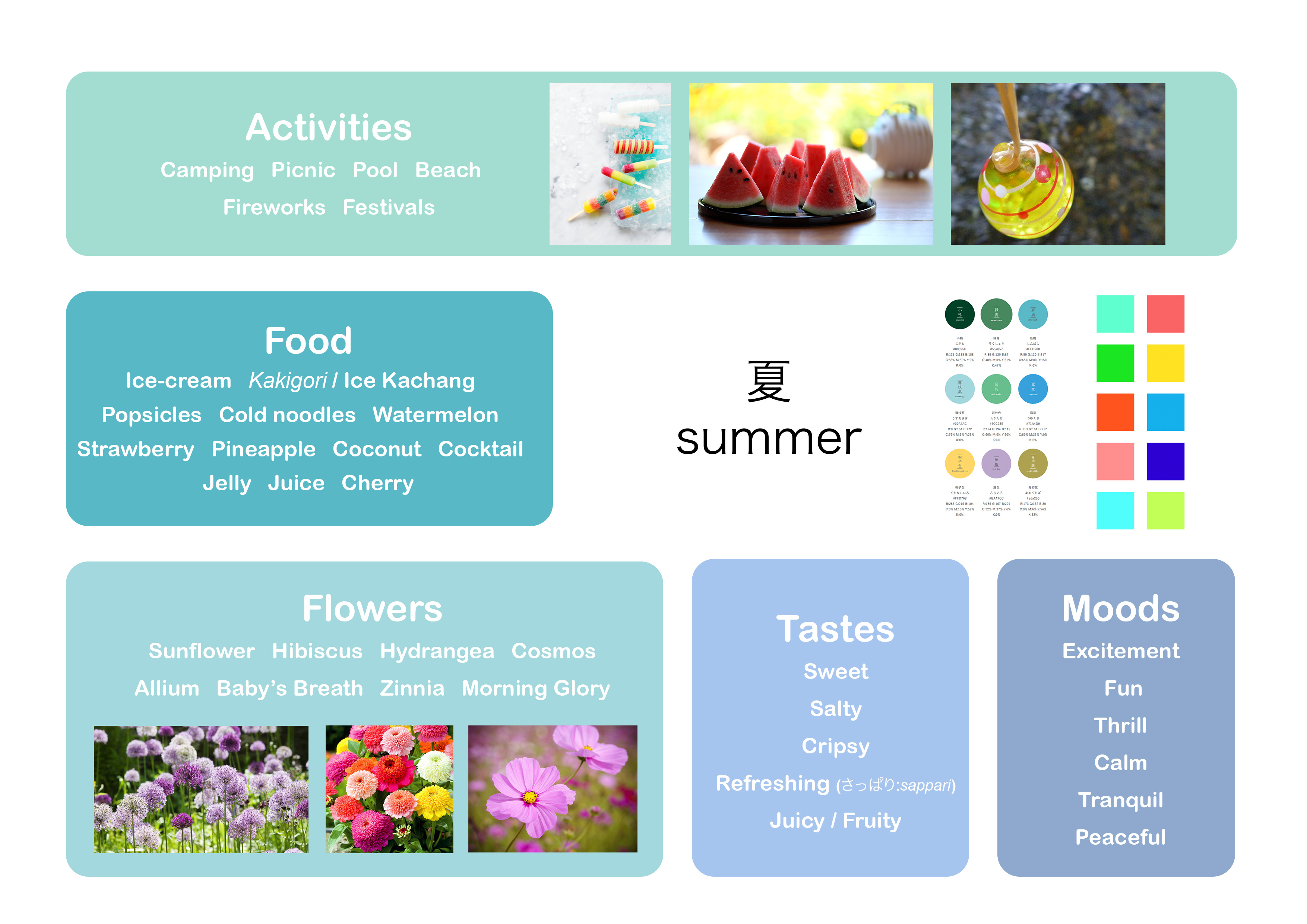
We were to play around with the different types of balance for this assignment –– independent, dependent and precarious balance. I did some models before getting my theme, and then made changes to them after I knew about the theme.
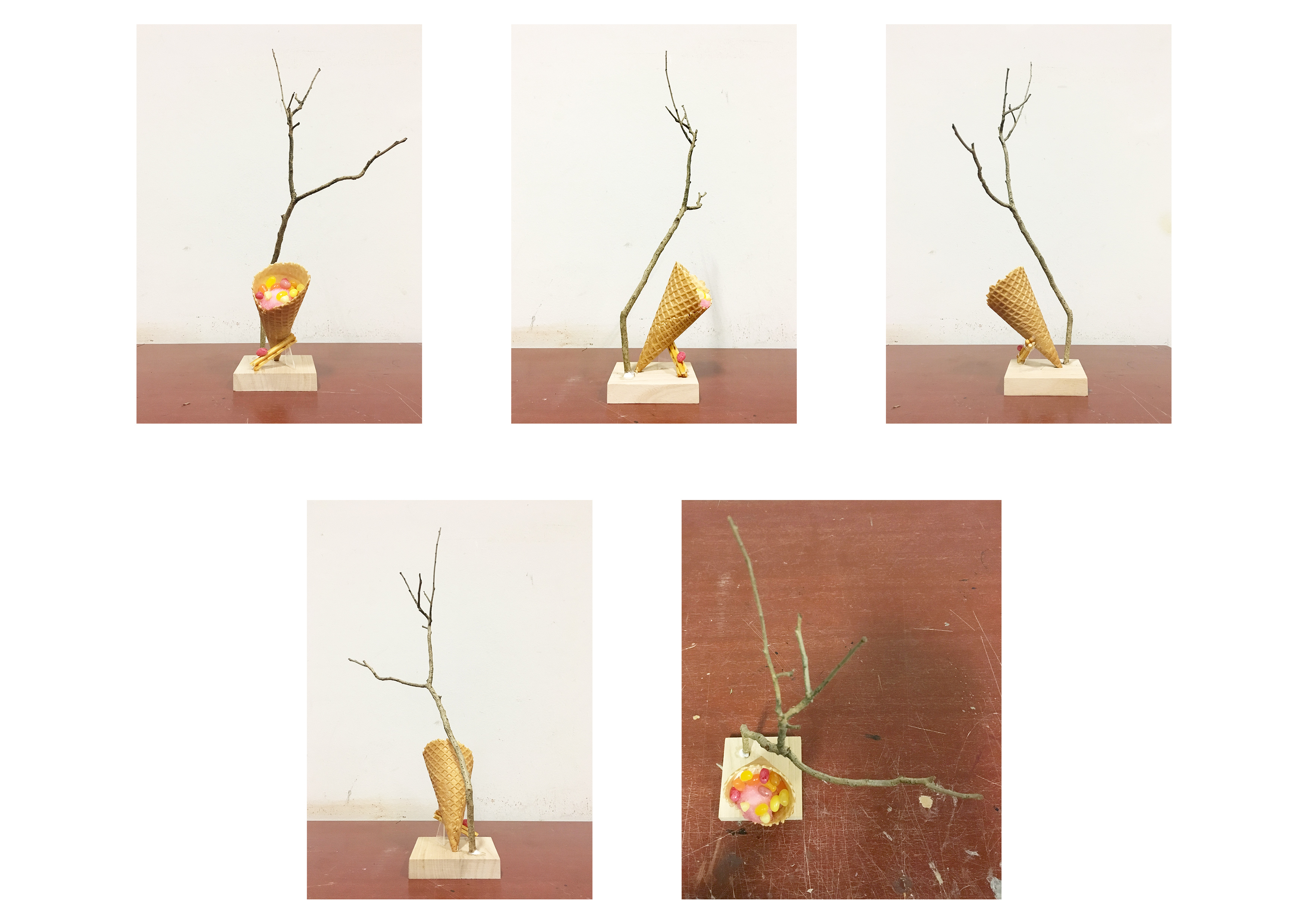
I experimented with precarious balance for this sketch model. I tried placing the SD and SO one-third at the edge of the D. By placing the elements at the edge, it sort of “explains” why the cone is almost toppled over. The D, SD and SO can be seen from almost all angles. However, I did not think this model was aesthetically pleasing, hence I did not choose to work on it. 
This model borrows similar elements from the first model in the sense that I place the SD and SO at the edges. It plays around with independent balance. It looks very zen and calming, as the line of action is a curve. It would have been nice to further play with this model. But I thought that it looked a bit too calm for summer, hence I did not choose this model.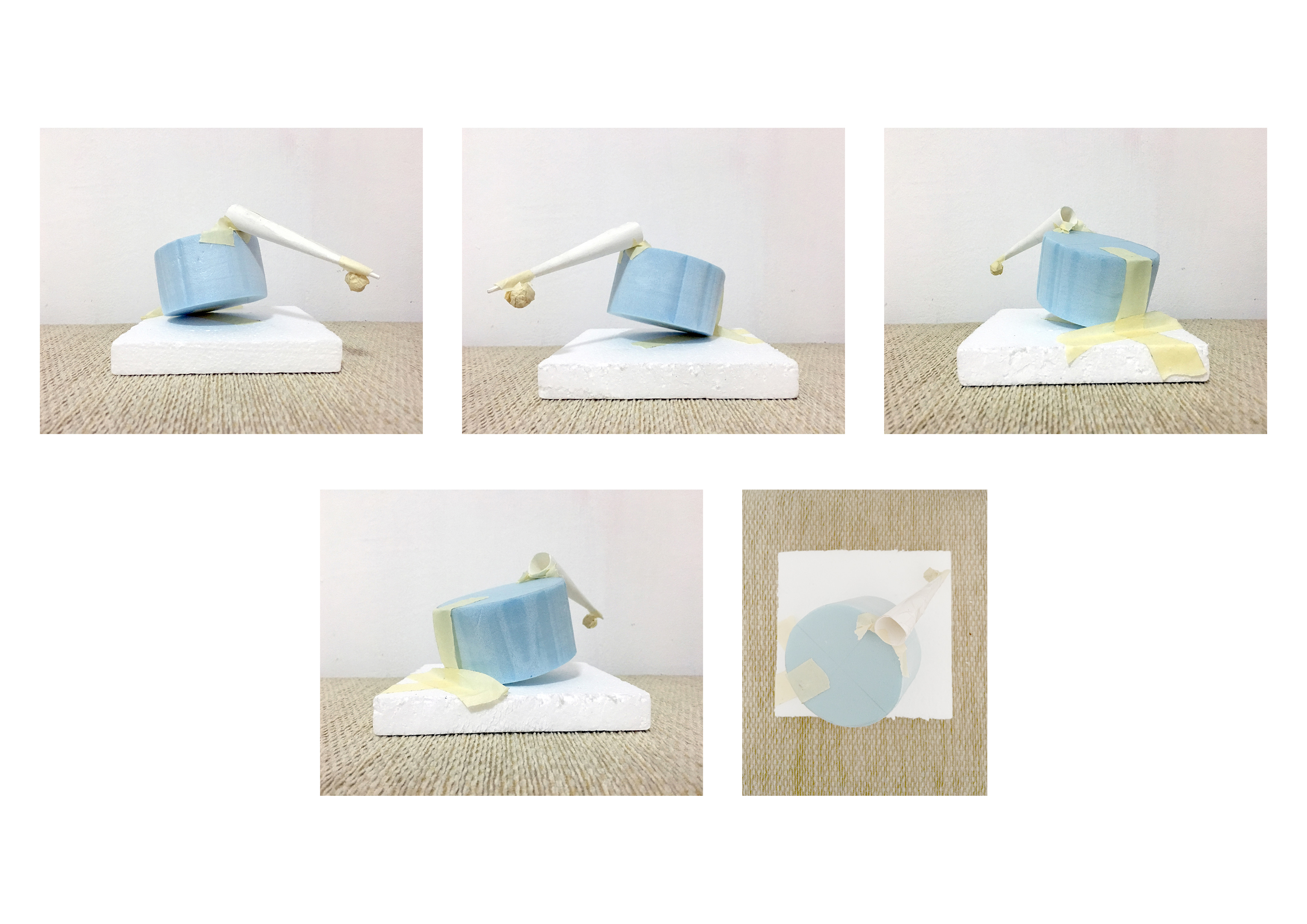
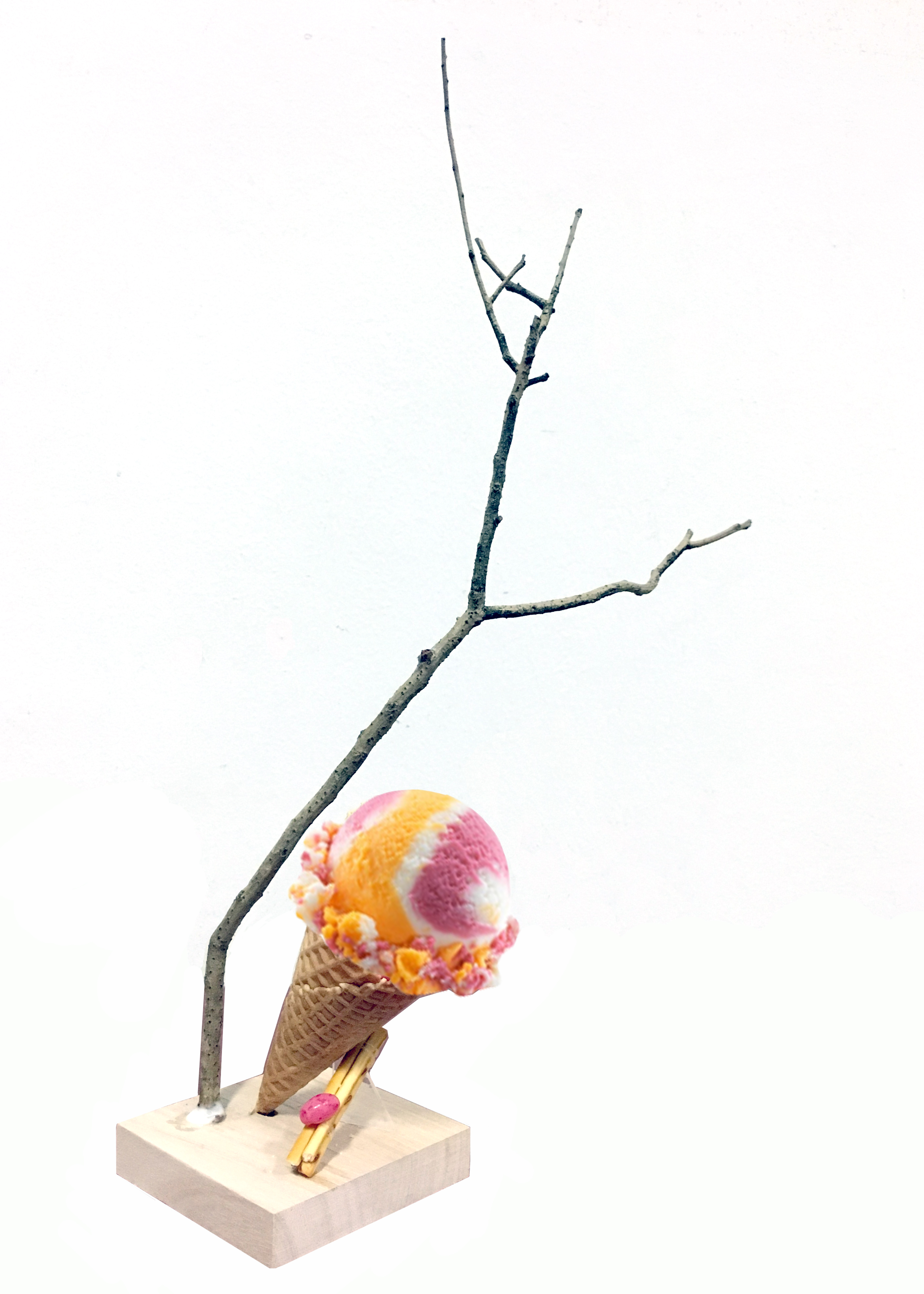
This is the sketch model that I based off my final model from. I felt that the inverted cone at a diagonal best represents summer because it is very dynamic. D, SD and SO can be seen from most angles. The cone is leaning onto the SD –– dependent balance.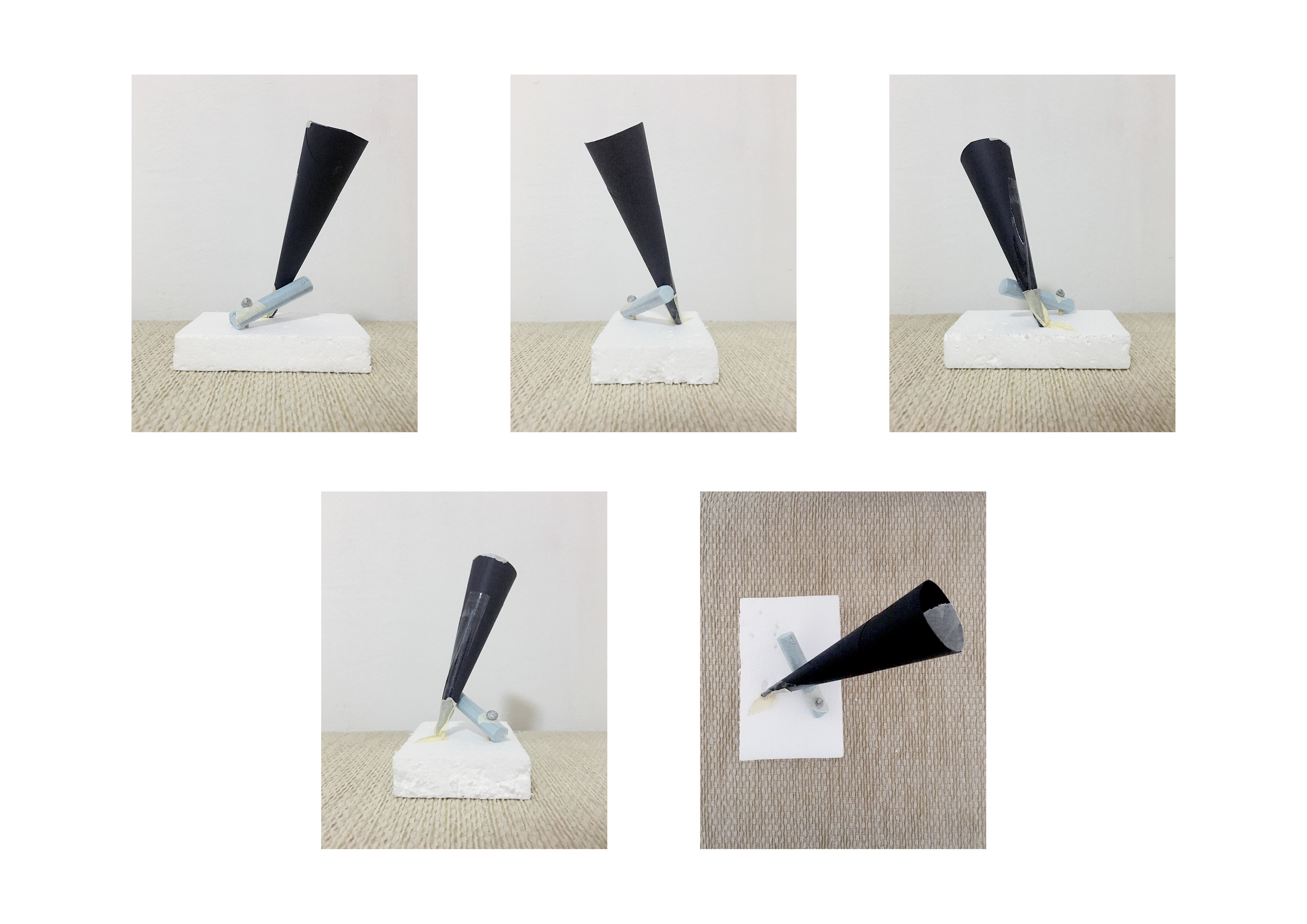
I chose my third model to be my final model. Since I was relatively happy with my composition, I decided to leave it as it is. A small transparent acrylic piece is used to hold the structure in place. I chose an acrylic piece so that It would seem that the composition is standing on its own.
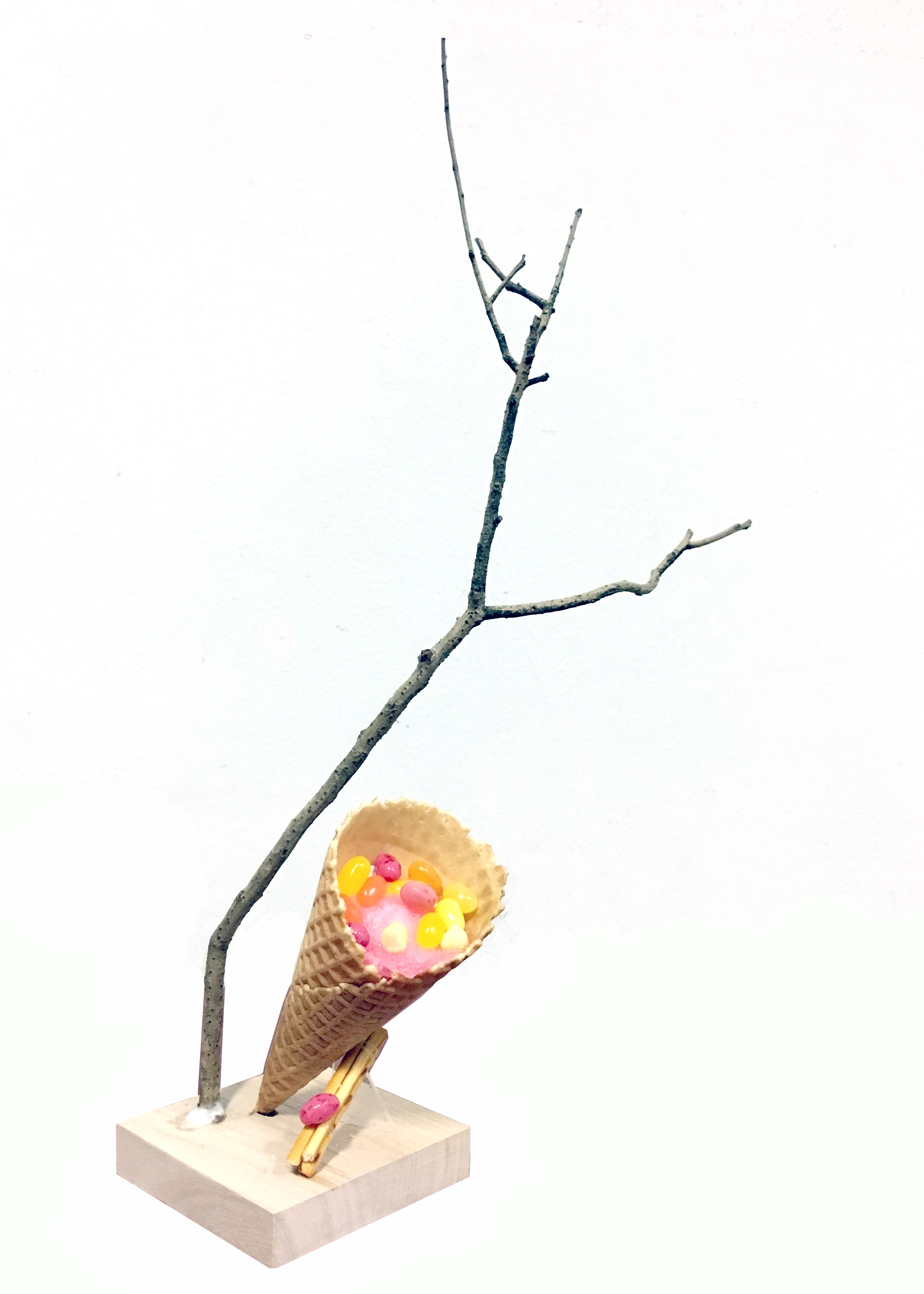
A wooden base was chosen as it is the colour of sand. It matches with the warm browns.
The hardest part of the assignment for me was to find a suitable branch. A lot of branches that I saw were pin straight and did not have aesthetically pleasing line of action. I initially thought of choosing a curved branch to juxtapose the vertical composition, but I felt that a curved branch conveyed calmness/lethargy so I opted for a straighter one instead. One thing that I would have done differently in my final model would be to adjust the placement of the branch, as I’m not entirely happy with the placement of the branch.
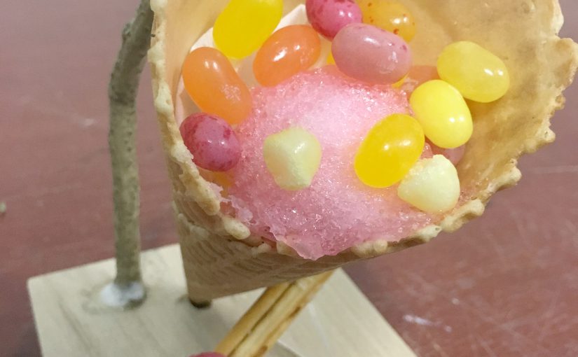
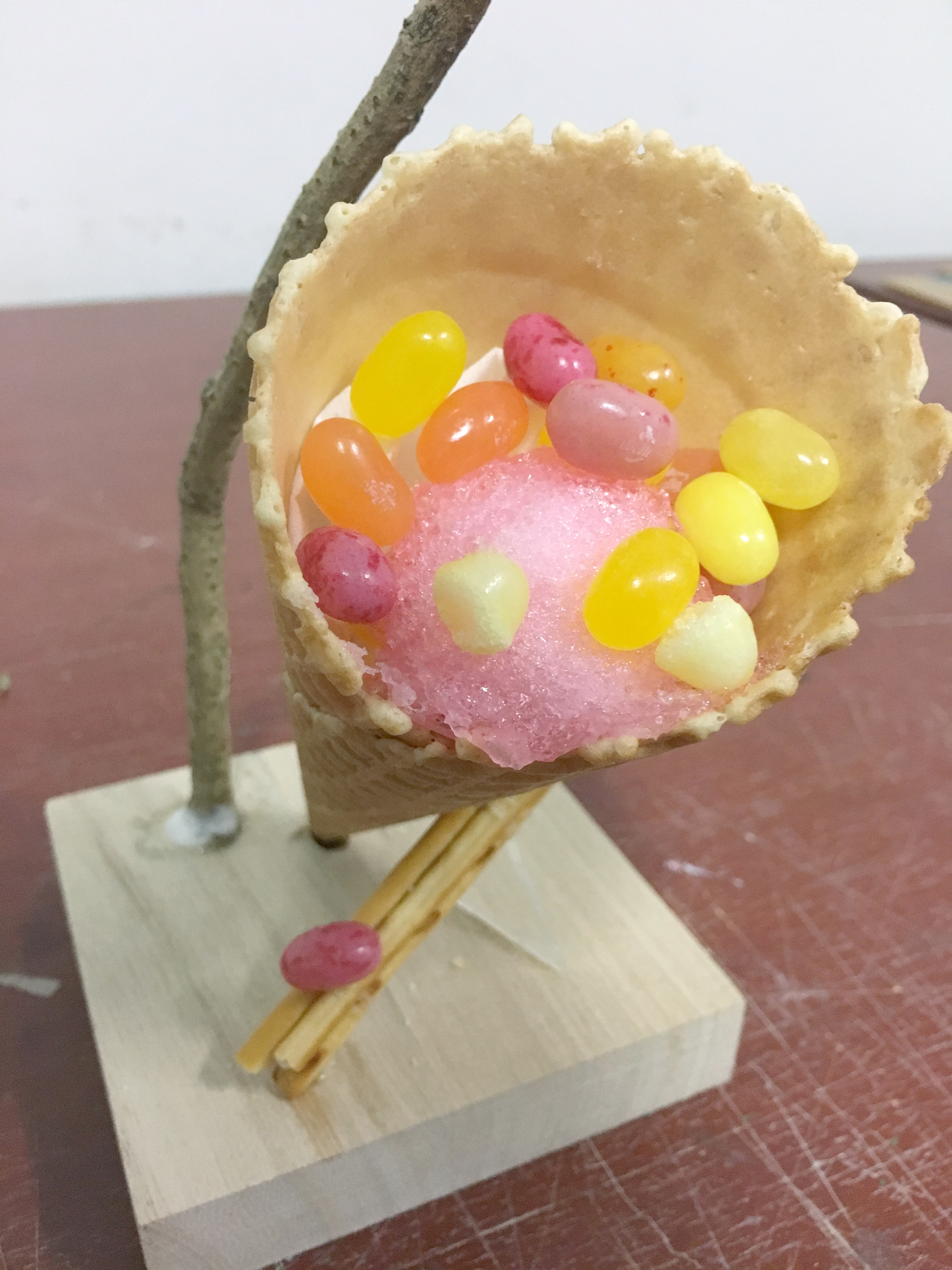
For the cone, it was very obvious to me that I had to use an ice cream cone. It fit my theme nicely so I did not think much about it. I wish it was possible to bring actual ice cream (or ice shavings) to fill the cone but I think it would have gotten really messy so I filled it with some cotton candy and jelly beans instead to help illustrate the concept that I was going for.
I used Pretz sticks for the cylinder part, because I imagine that if the cone had actual ice-cream, you can dip the Pretz sticks in it.
The jelly bean which is the SO / sphere element to the composition was just an accent.
There is a mix of salty and sweet taste in my final model. The cone is salted-caramel flavour which is very summer, and the Pretz sticks are salted flavour. The jelly beans that I used taste like tropical fruit. The accent jelly bean taste like strawberry, which is a summer fruit. If you included the ice cream / ice shavings you would have the refreshing taste too.
I knew I wanted a pop sort of colour scheme to go with the dynamic composition so I chose warm colours like pink, orange and yellow jelly beans.
The theme that I got was Rule of Thirds.
Rule of Thirds is aligning your subject along the guidelines that split the plane into 9 faces or its intersections. It is a useful composition technique in many forms of art such as in design, photography and film. It usually helps to create a point of interest in your compositions.
Since we were supposed to present our theme in our model, I decided to use rule of thirds for many aspects of the model. For instance, if I intended to wedge in a piece, I’d make sure that 2/3 of it is hanging off. Or maybe I’d align the centre lines where the intersections are.
Sketch Model 1
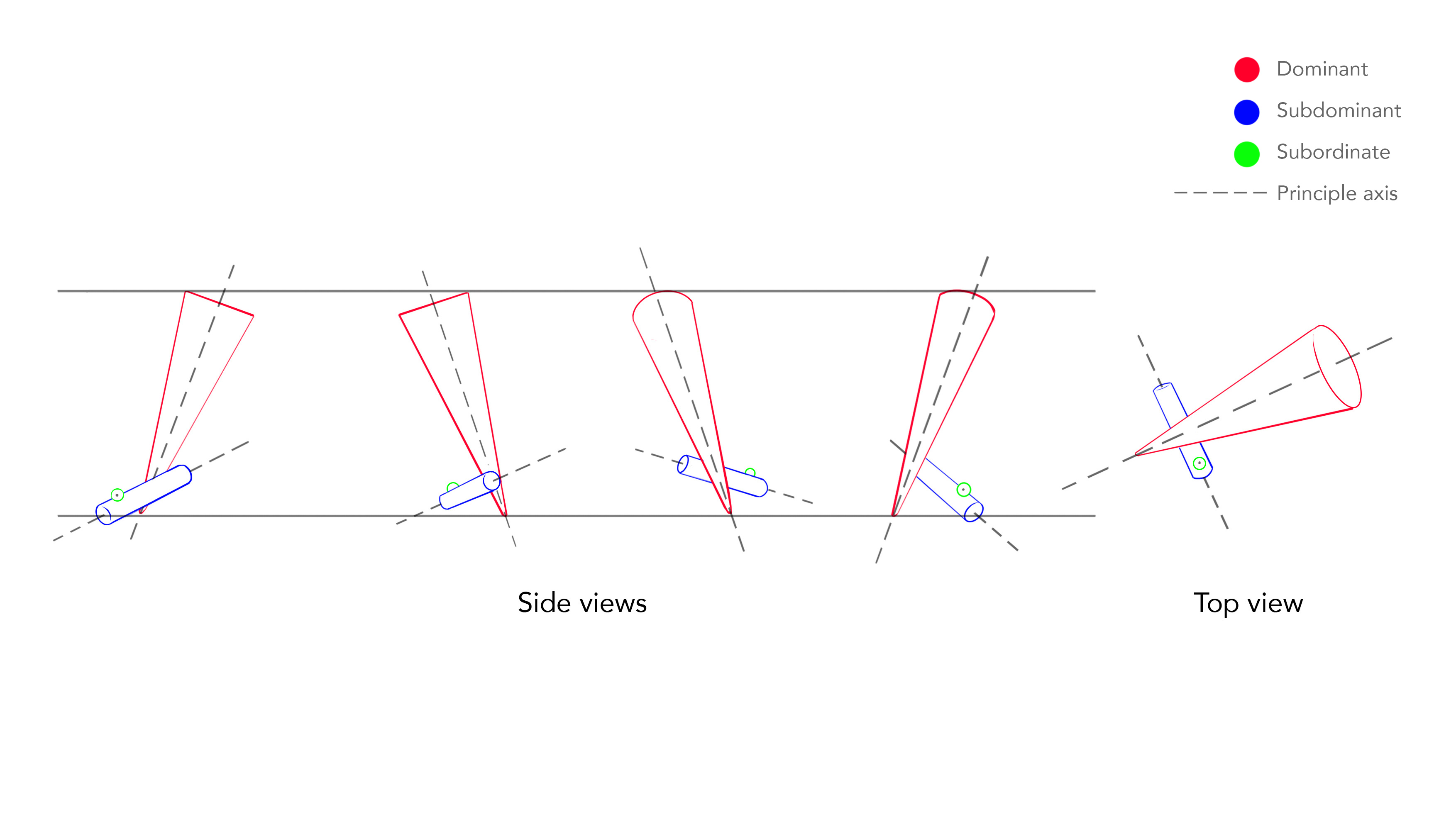
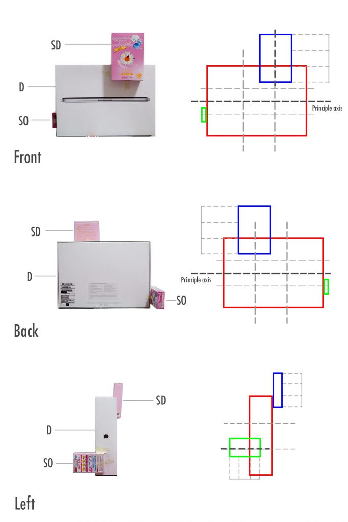
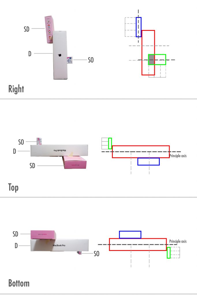
As my theme is relatively simple, there is no reason to “break” the rules or criteria. So I made sure that the D, SD and SO are consistent throughout all views. I managed to do so in this particular sketch model as well. The challenge that I faced when making this model was with the lengths of the pieces. Avoiding similar lengths was especially tough, and changes had to be made to the other blocks if the length of something changed. The dominant block didn’t have much variation in surface area when viewed from all angles either. What I like about this model however, is that the principle axis of all three volumes are facing different directions.
Sketch Model 2

In this sketch model I tried to break away from fixing both the SD and SO to the D, and instead tried to fix the SO to the SD. I placed the volumes following the 1/3 rule. It had variation and was more dynamic in comparison to the other models. However, the final composition was unappealing to look at in my opinion and I decided to ditch it.
Sketch Model 3
This model is similar to sketch model 1. However I didn’t like the flatness, since all the boxes were relatively flat. I suppose in a way, the choice of boxes reflect the 1/3 rule, in the sense that they are three different sizes of similar shapes. Still, I didn’t want my model to be this flat so I didn’t choose this.
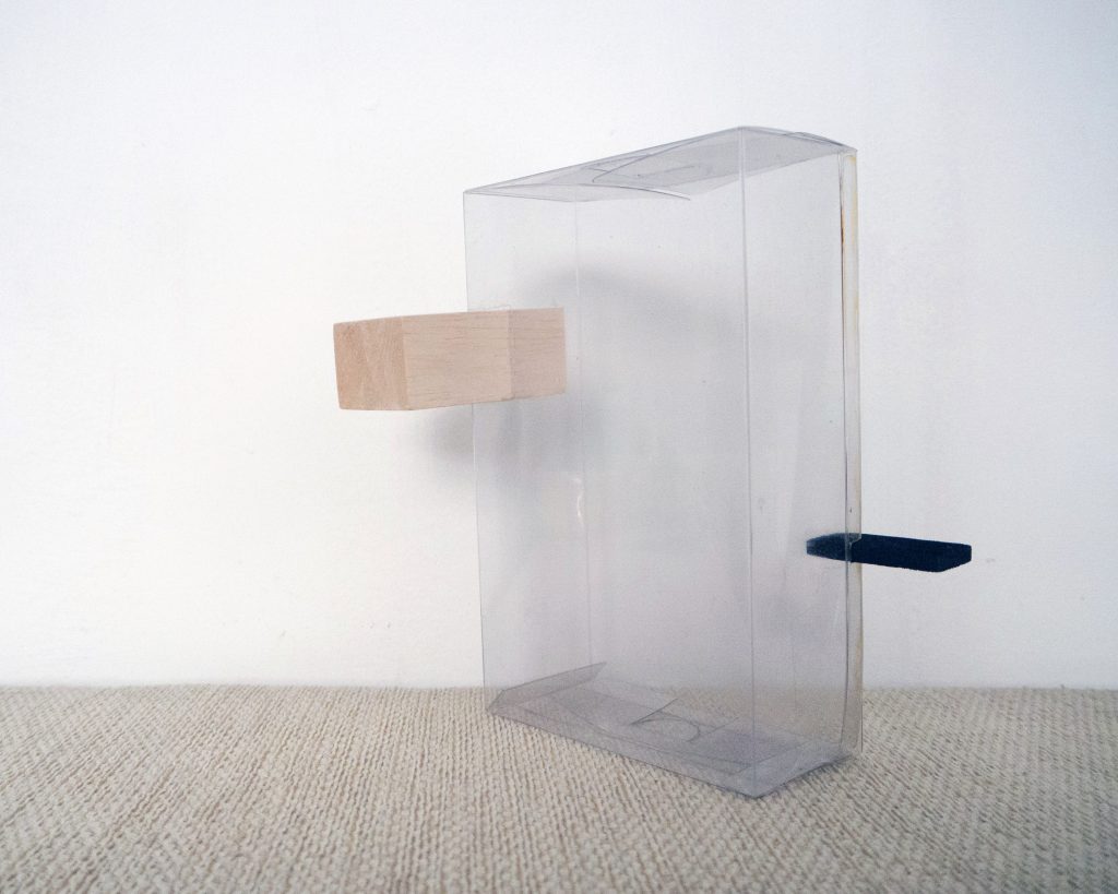
Rule of Thirds is a basic principle, so in order to add more interest to my model I tried to incorporate other themes. I challenged myself to include as many themes as possible.
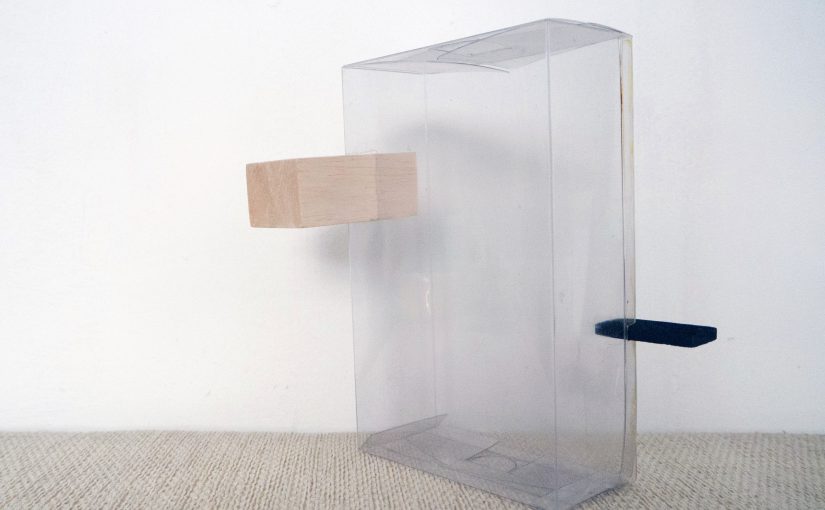
The most obvious theme might be contrast, as I chose my materials carefully. I chose a transparent box for the D because I knew I wanted to attempt the idea of levitation, especially since the SD is a relatively big block. For the SD and SO, I used Balsa wood, which to me is a “soft” material when compared to the transparent plastic. The contrast in man-made and natural material is complementary. I painted the SO black, so that there is visual balance. Big volume paired with a light colour, and small volume paired with a darker colour. Just by painting the SO black, it looks heavier. And it counterbalances with the SD.
I think that the transparent box, natural wood, and painted wood complements one another and is aesthetically pleasing. What is interesting is that the D, which is supposed to be the most dominant out of the three, doesn’t not fight for attention with the SD and SO at all.
The different views have variation while having consistent D, SD, SO, and the principle axis of each box faces in different directions.
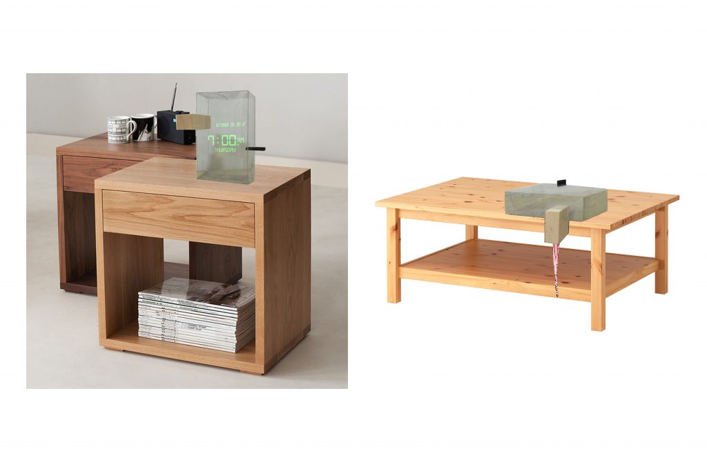
Besides the obvious – a building, the final model can inspire a modern digital clock design, or a horizontal juice dispenser, where one can pull the black tab to dispense juice.
I was confused as to why we needed to have consistent D, SD and SO, but after doing this exercise, I realised that a lot of products that I use in my daily life make use of this principle. And that it is an essential principle of design, which can be applied to almost everything. Even things like character design in animation which I intend to pursue.
For future assignments I hope to have a “story” behind my projects. I felt slightly restricted by my “simple” theme this time round, and found it hard to add a story element to it.
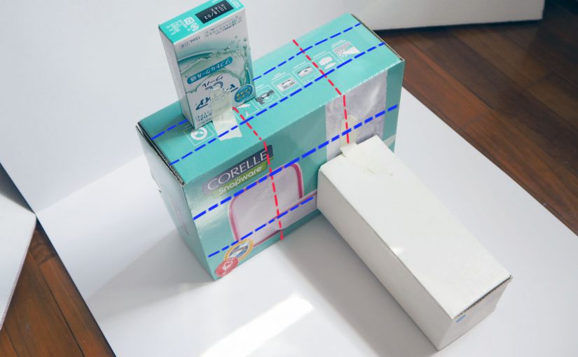
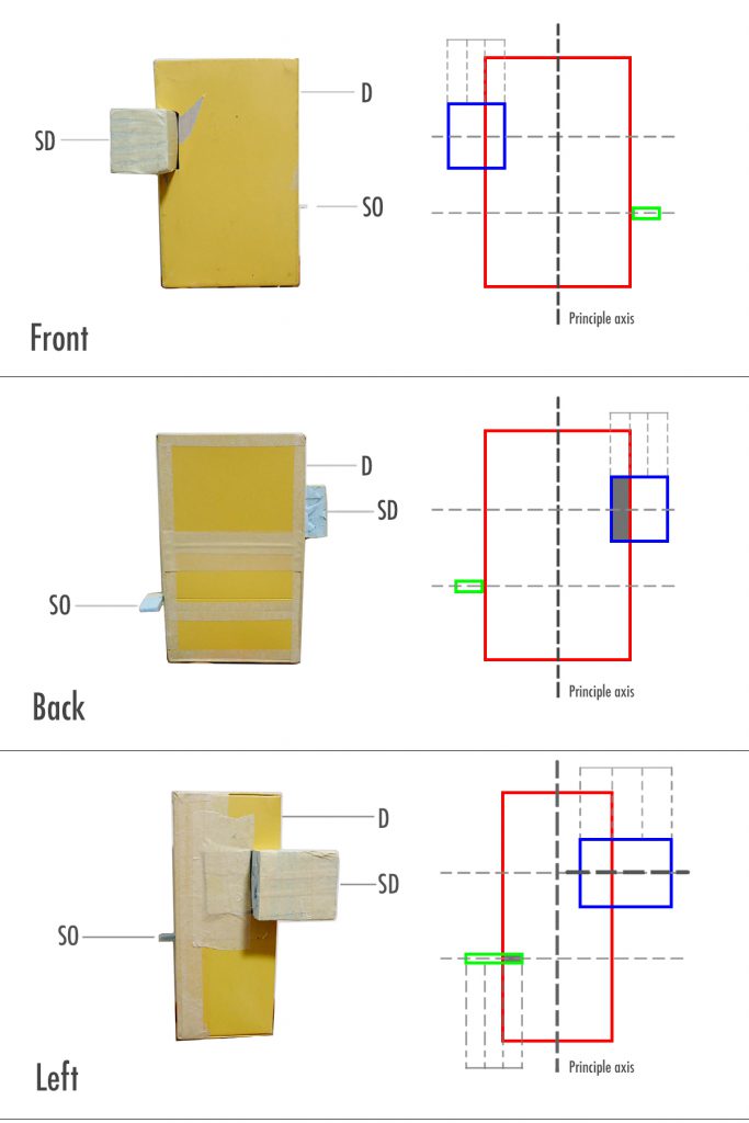
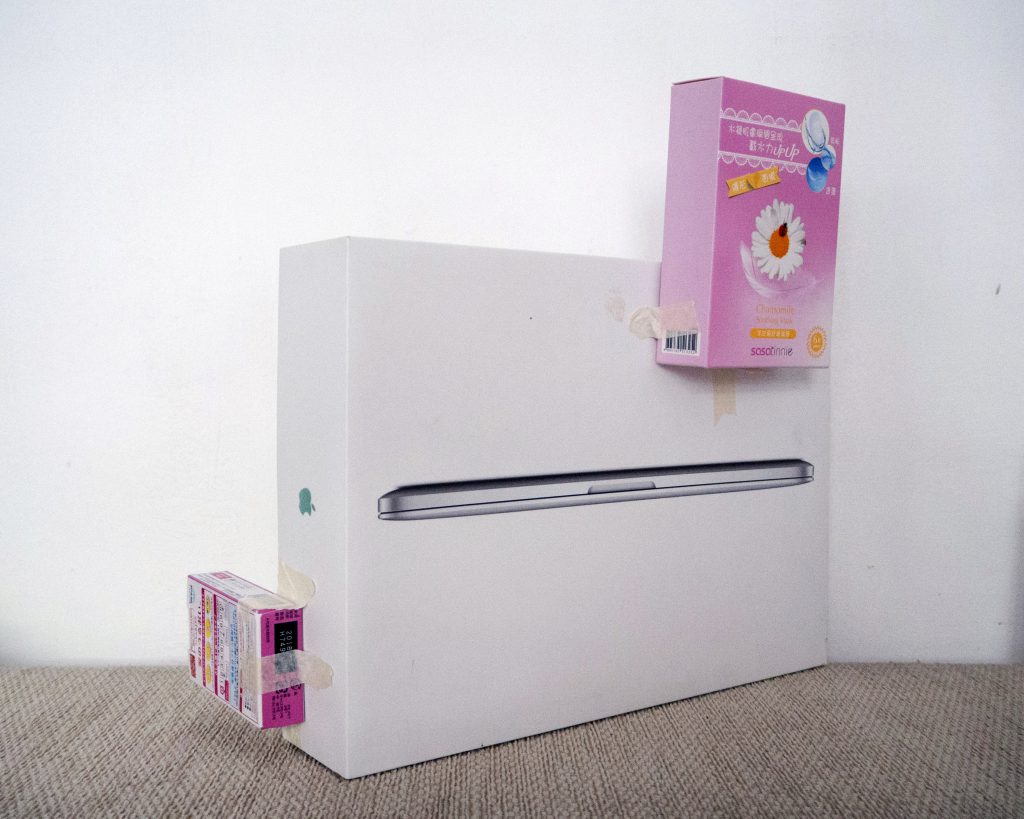
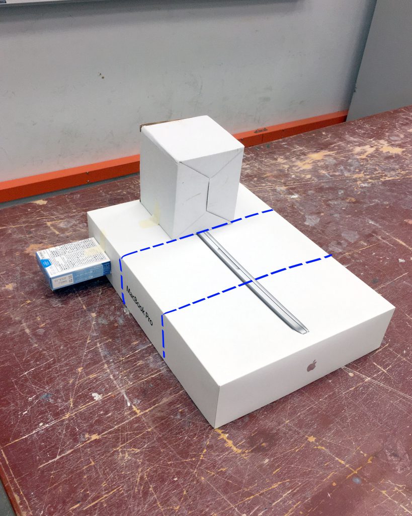
The theme that I got for my box compositions was Rule of Thirds.
Rule of Thirds is generally aligning your subject along the guidelines or intersections. It is a useful composition technique in many forms of art such as in design, photography and film.
Since week 1, we were told to experiment with different compositions using boxes of three different sizes, while keeping our theme in mind. However I am not used to this and found it difficult to come up with effective compositions. After week 2’s lesson, I am more aware of what to look out for in my compositions. For instance:
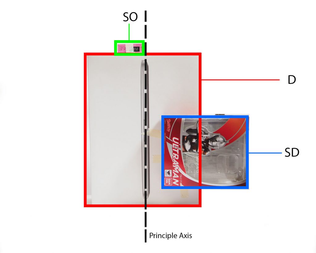
_____________________________________________________________________________
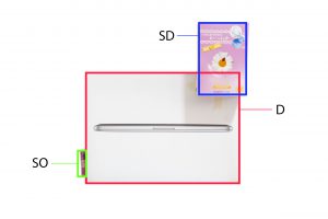
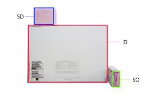
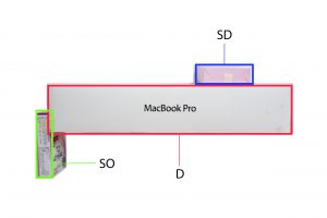
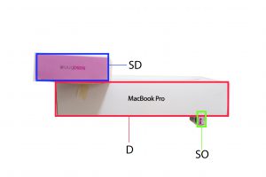
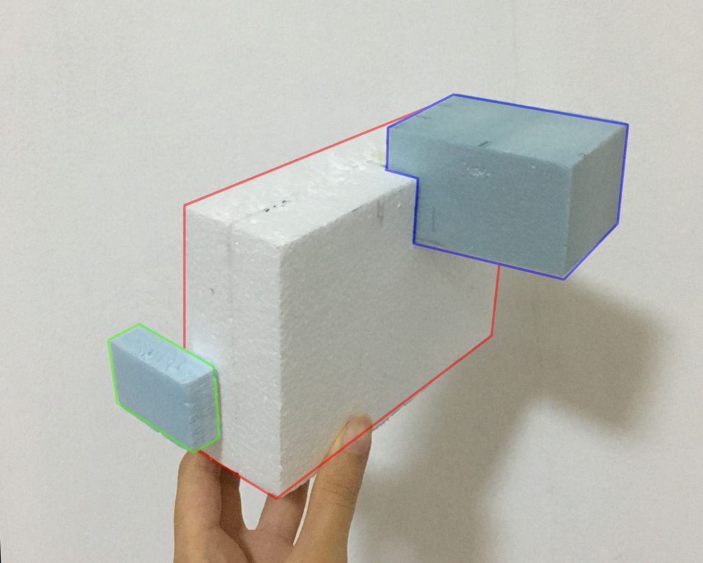
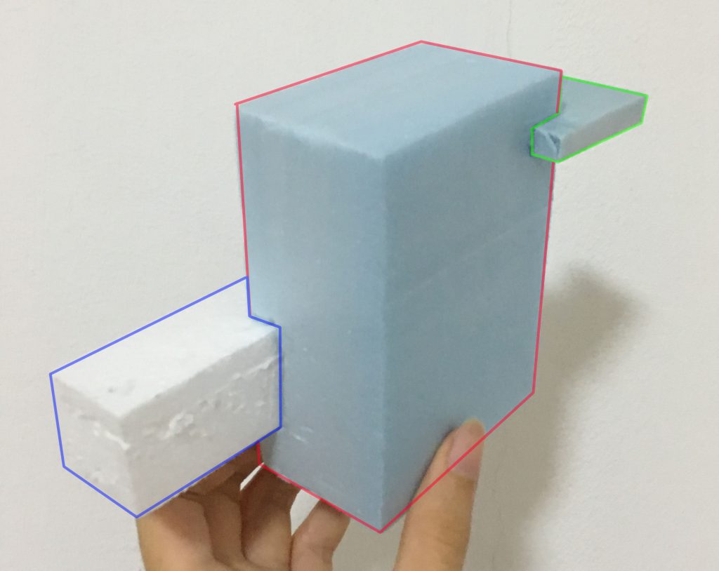
Legend:
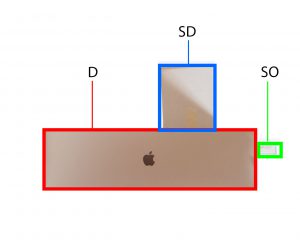
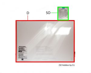
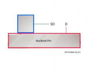
Red box – Dominant (D)
Blue box – Subdominant (SD)
Green box – Subordinate (SO)
_____________________________________________________________________________
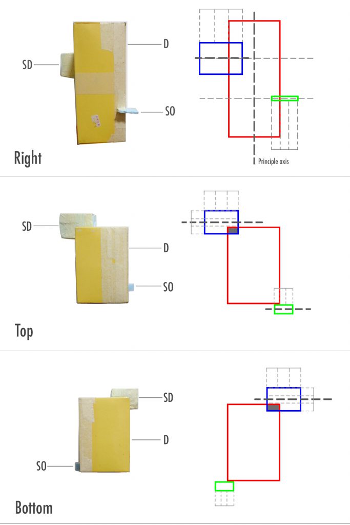
These are the compositions that I arrived at after week 1 class. I made minor improvements than those that I showed in class, However these compositions still do not work and for learning purposes I thought I’d analyse and record why they don’t work.
Composition 1

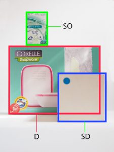

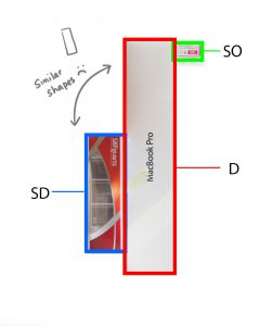
For composition 1, I tried to centralise my SD and SO’s centre line on the intersecting points of D, following rule of thirds. Although it fulfils the rule, did it not work for various reasons which have been noted in the captions. The main problem was that the shape and size of the boxes were too similar, which made boring compositions.
_____________________________________________________________________________
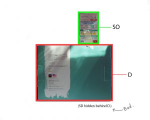
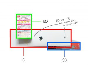
Composition 2


For composition 2, the main problem was that I had missing boxes in various views which is something that is discouraged. Placement of SD and SB isn’t that great either. The SB is within the confines of one of the boundaries of rule of thirds.
_____________________________________________________________________________
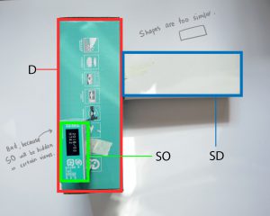
Composition 3

Composition 3 is meant to be an improved version of composition 2 which I did before week 2 class. There is sliiiiight improvement in the consistency of the D, SD, and SO shapes on all views (Top view didn’t work) but not satisfactory because only half the views work. No box is hidden in any view for this composition. However the shape of the D and SD in the side view is rather unappealing so I need to replace that box with something else.
_____________________________________________________________________________
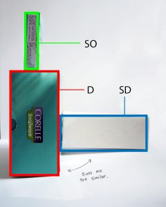
Composition 4

Composition 4 follows the rule of thirds and has 4/6 views with consistent D, SD and SO! This one has potential. I think I can continue developing this model by slightly varying the placement of the SD and SO to include another theme and make it more interesting?
_____________________________________________________________________________
Composition 5
Composition 5 has 4/5 consistent D, SD and SO views! It also incorporates a bit of the theme counter balance. However through compiling these images, I noticed that it may be a bit unstable. I would need to adjust the SD’s position. In fact, I think by wedging both the SD and SO I think it could work. I will develop on this for the final sketch model. I think material wise, if the SD was a transparent box, it could be “lighter” and balance out the entire sketch model visually.
I am pleased with my progress so far, as I have been able to keep the D, SD and SO relatively consistent. There are no more missing volumes compared to previous weeks. I just need to refine my models and adjust the placements to make the models look more interesting. I think using foam boards helped me in making my sketch models as I can easily create a piece that I need compared to finding a pre-made box that matches my requirements.
_____________________________________________________________________________
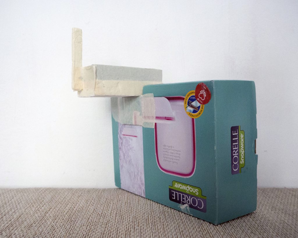
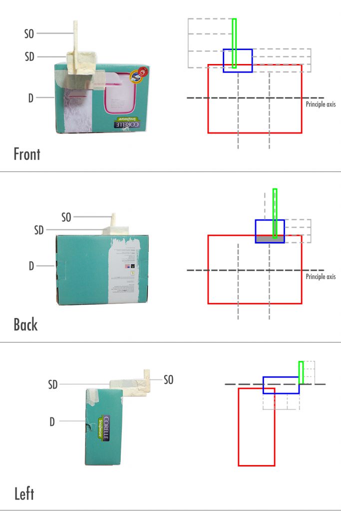
Wedging – Using Composition 4 and 5
This is a improvement of Composition 4. I used foam blocks because I wanted try out wedging. I changed the SD to give the shape more variation. After lesson, I realised that this does not work because when we wedge long blocks, 1/3 of it has to be wedged into the base, or else it will produce a rotational force on the entire composition. The widths of the blocks turned out to be very similar too, something that I didn’t take note until it was pointed out. So I’d have to adjust those.
This is a improvement of Composition 5. I used wedging to attach the SD and SO to the D. I modified the SD’s shape from Composition 5 so that there is more variety in shape. However again, I realised the lengths and widths are pretty similar so I need to figure out the measurements to the boxes.
Both models have consistent D, SD and SO for at least 4/5 of the views, following Composition 4 and 5, so my final sketch models would have similar configurations to them, with adjusted lengths and widths.
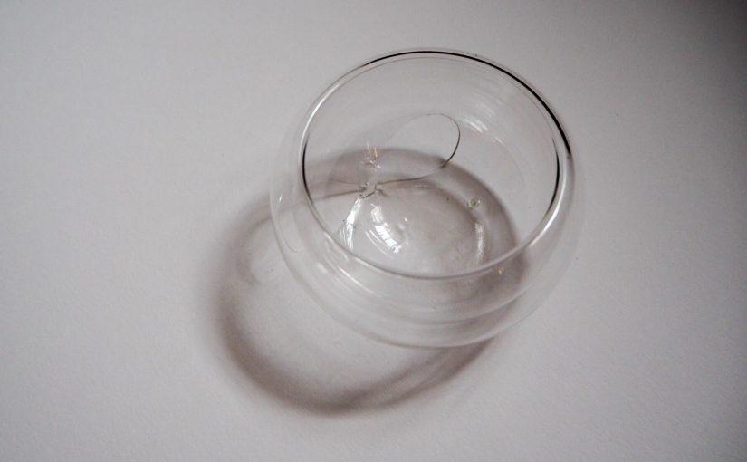
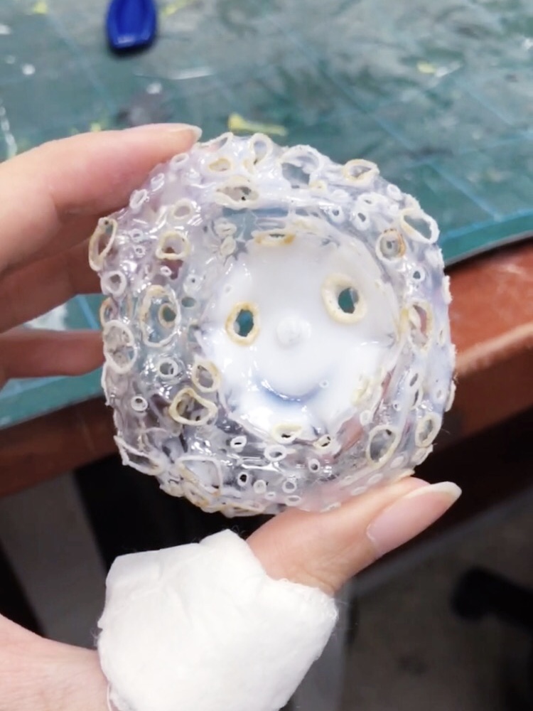
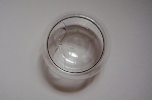
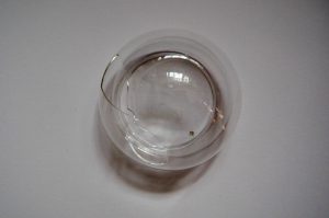
The bowl that I brought to class for analysis broke before I could photograph it, so the analysis below will ignore the holes in the bowl, since it’s an unintentional part of the design now.
Initial observations:
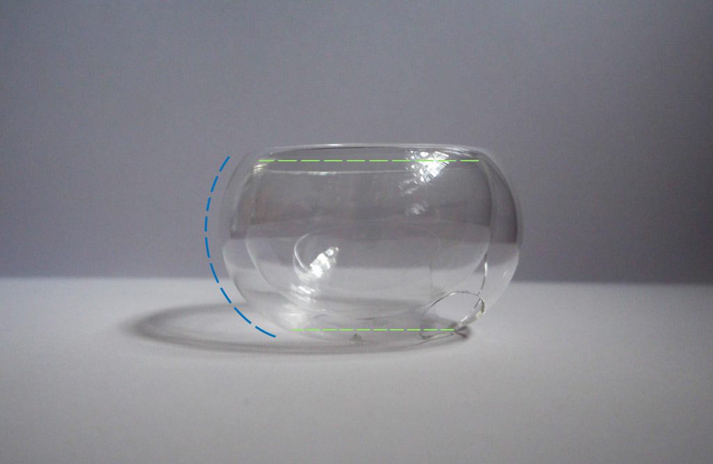
The bowl is made out of smooth, transparent thin glass. The glass is double layered, with gives it an interesting cross-section. It has no sharp or angular edge, as the double layer does not have any fusion point. It is a continuous piece of glass cleverly moulded into its shape.
Edit: The two layers create a void in-between, and the transparent glass showcases that. It can be categorised as a cluster of similar volumes, as the size difference of the two layers isn’t very significant.
The bowl is symmetrical on all views.
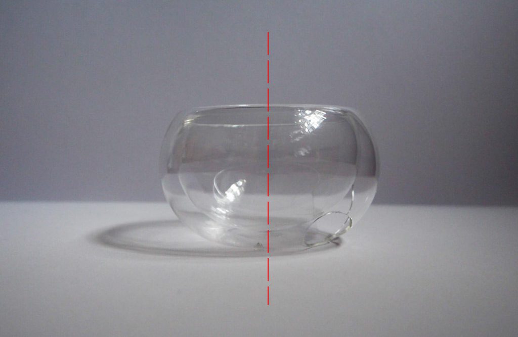
There is balance in the design as the side of the bowl has a single beautiful curve that does not give it any “bumps” or neck. The proportions of the base and opening however is not equal. The diameter of the base is slightly smaller.
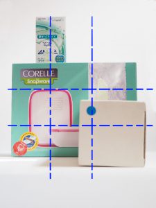
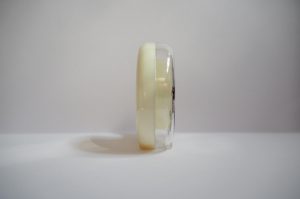
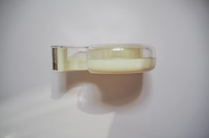
Since there is limited things to comment on for the bowl, I decided to analyse another object to see if I understand the other terms we’ve learnt. I chose to analyse a tape dispenser.
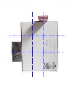
The most prominent feature that I noticed was that the diameter of the hole was one-third of the height of the dispenser, following the rule of thirds.
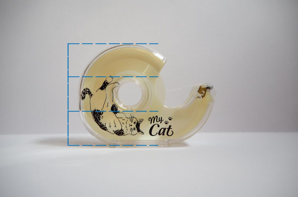
There is a significant difference in its proportions of the mass and void – mainly due to its function of containing the tape. However there is still a good balance of design as the proportions in volume are roughly 2:1. The white/transparent plastic makes up the dominant volume, the printed cat design on it to me acts as a subdominant feature, and the silvery metal cutter is the subordinate.

From the front, back, bottom and top views, it is clearly symmetrical. The side view would be asymmetrical.
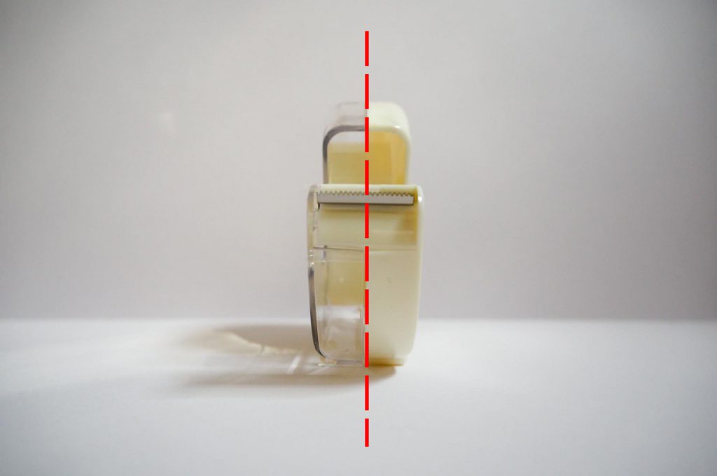
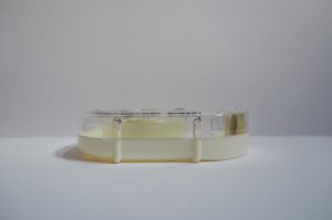
Edit: From the bottom view, we see that the little stands split the base into roughly three sections as well.