生け花とは Ikebana is…
It is the Japanese art of flower arrangement. Ike meaning ‘alive’ and bana meaning ‘flower’. A form of creative expression, following certain rules of construction. Originated in 7th century when Buddhism was introduced to Japan. Formalised version of ikebana begun in the Muromachi period in the 15th or 16th century. Intention of the artist is shown through a piece’s colour combinations, natural shapes and graceful lines.
Characteristics of Ikebana:
- Asymmetrical form
- Use of empty space (void)
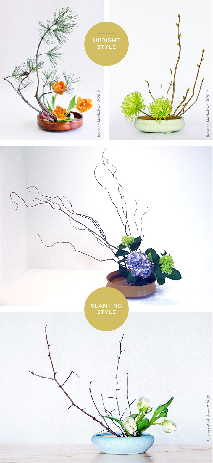
Two main styles: Moribana & Heika.
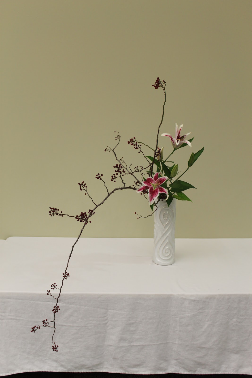
盛り花 Moribana
Materials are arranged as if they are piled up in low flat containers with a wide surface area of water. There are 3 different styles.
Upright Style
- Standard floral style
- Principle stems are positioned to evoke a sense of movement.
Slanting Style
- Expresses the beauty of branches and grasses that grow slanting down.
- Evokes even greater sense of movement.
Water-Reflecting Style
- Subject is placed in a slanted position over the container such that you can see its reflection on the surface of the water.
- Arranged such that a wide surface of the water is visible.
Other forms:
- Colour scheme moribana – colour harmony and contrast are of importance.
- Landscape moribana – representing natural landscapes / scenic beauty in the flower containers.
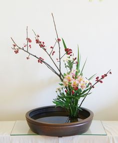
瓶花 Heika
Literally means “vase flowers” . Created in tall, deep containers, unlike Moribana. The three establish floral styles resemble Moribana methods, but there is a difference in the way the branches are placed.
Slanting Style
- Basic floral style in Heika.
- Expresses beauty of branches that reach out horizontally.
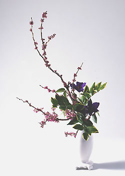
Upright Style
- Expresses beauty of branches that rise forward.
Cascading Style
- Expresses beauty of lines that flow gracefully downwards.
Sources:
- https://www.ftd.com/blog/design/ikebana
- http://www.ohararyu.or.jp/english/form_moribana.html
- http://www.ohararyu.or.jp/english/form_heika.html
食感 Taste
For my taste research, I decided to research on something a bit different. Instead of research how we taste, which everyone is doing, I wanted to find out what factors change our sense of taste. I found my answer on this website called Popular Science. I have included the relevant points below and summarised some parts.
Language
- The description of the food affects how we perceive it. For instance, “Succulent Italian Seafood Filet” sounds more appetising than “Seafood Filet”.
Temperature
- Warm beer tastes horrible, and so do cold rice.
Colour
- The colour of the food matters. From Popular Science website: Forty-eight percent of participants thought soda in a blue glass was more thirst-quenching than in other colors, likely because they associated blue with cold.
Environment
- The environment in which people taste the food plays a part in our sense of taste too. From Popular Science website: People were asked to describe the qualities of the same Scotch whisky in three rooms themed as grassy, sweet, or woody. (For example, the first room smelled of grass and played recordings of bleating sheep.) They largely responded with “grassy,” “sweet,” or “woody,” respectively.
Source: http://www.popsci.com/article/science/7-things-affecting-your-sense-taste
夏と言えば… Summer: Season Mind Map
For my season mind map, I am a little influenced by Japanese summer so some visuals and elements are very specific –– like fireworks and watermelons –– though they can be considered universal too. Summer can be interpreted in two ways to me. Either fun-filled, or peaceful.
Which is why for colour schemes, I put two different types below. One is a more muted colour scheme, to show the calmer, more peaceful sort of summer. Whereas the colour scheme on the right is more pop and dynamic to show the fun, wild sort of summer. Colours are generally bright and colourful.
Though we aren’t using actual flowers, I still included them to serve as a visual guide.
A lot of foods are cold and could melt, so for my final model I will try to find drier types of food instead. 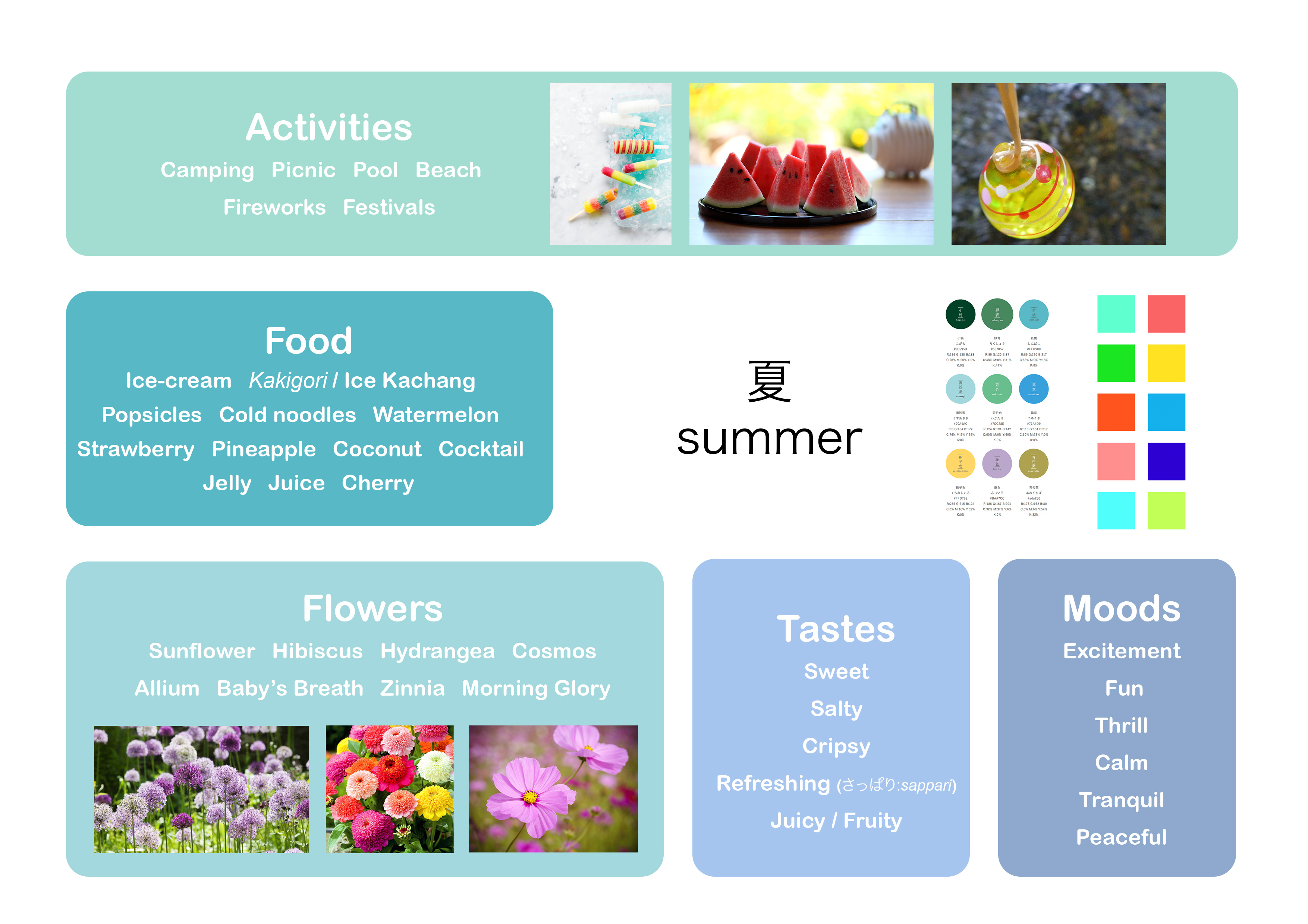
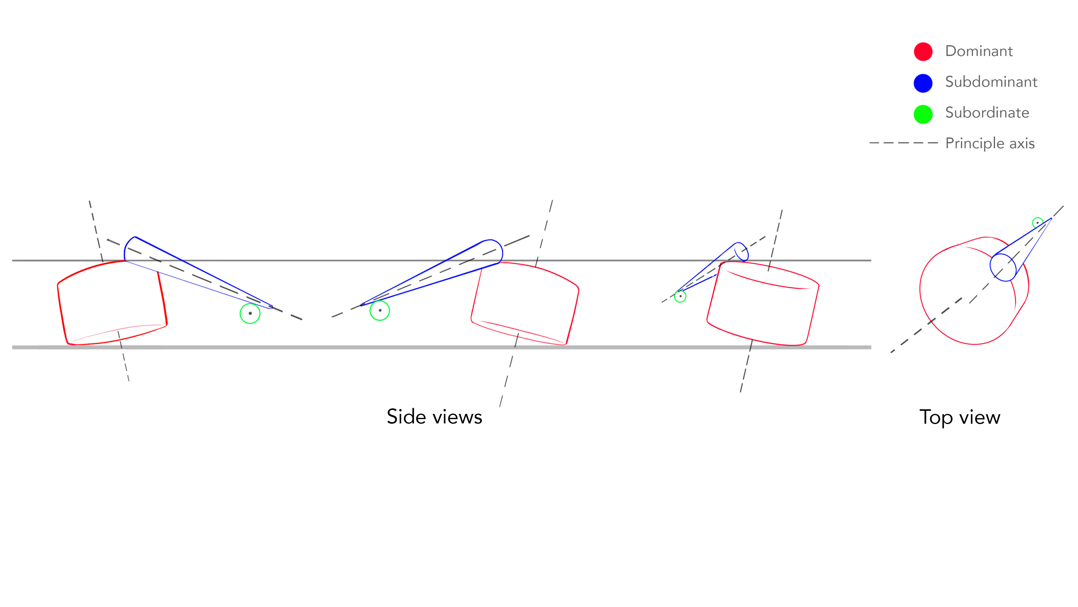
プロッセス Process
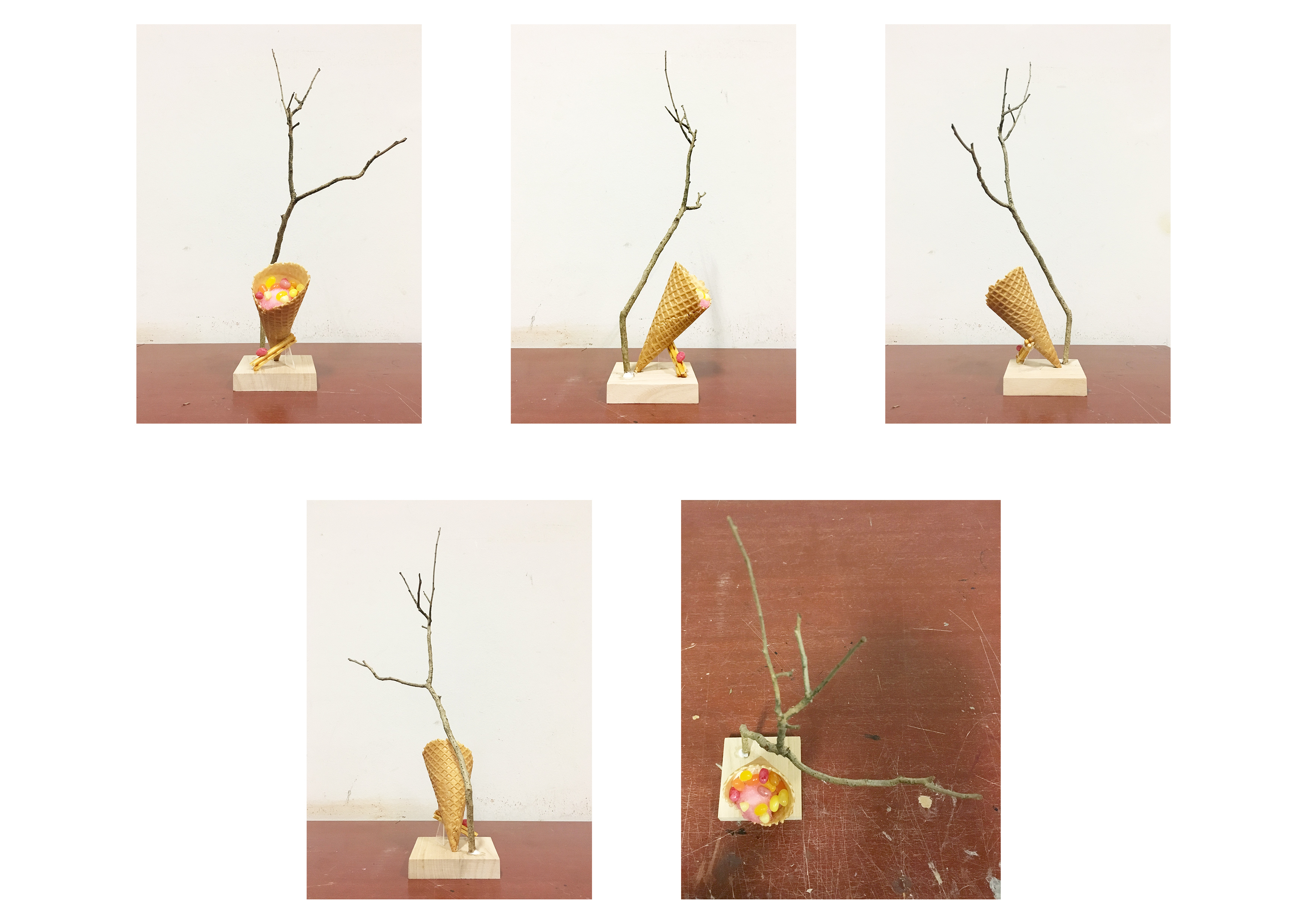
We were to play around with the different types of balance for this assignment –– independent, dependent and precarious balance. I did some models before getting my theme, and then made changes to them after I knew about the theme.
Sketch Model 1
I experimented with precarious balance for this sketch model. I tried placing the SD and SO one-third at the edge of the D. By placing the elements at the edge, it sort of “explains” why the cone is almost toppled over. The D, SD and SO can be seen from almost all angles. However, I did not think this model was aesthetically pleasing, hence I did not choose to work on it. 
Sketch Model 2
This model borrows similar elements from the first model in the sense that I place the SD and SO at the edges. It plays around with independent balance. It looks very zen and calming, as the line of action is a curve. It would have been nice to further play with this model. But I thought that it looked a bit too calm for summer, hence I did not choose this model.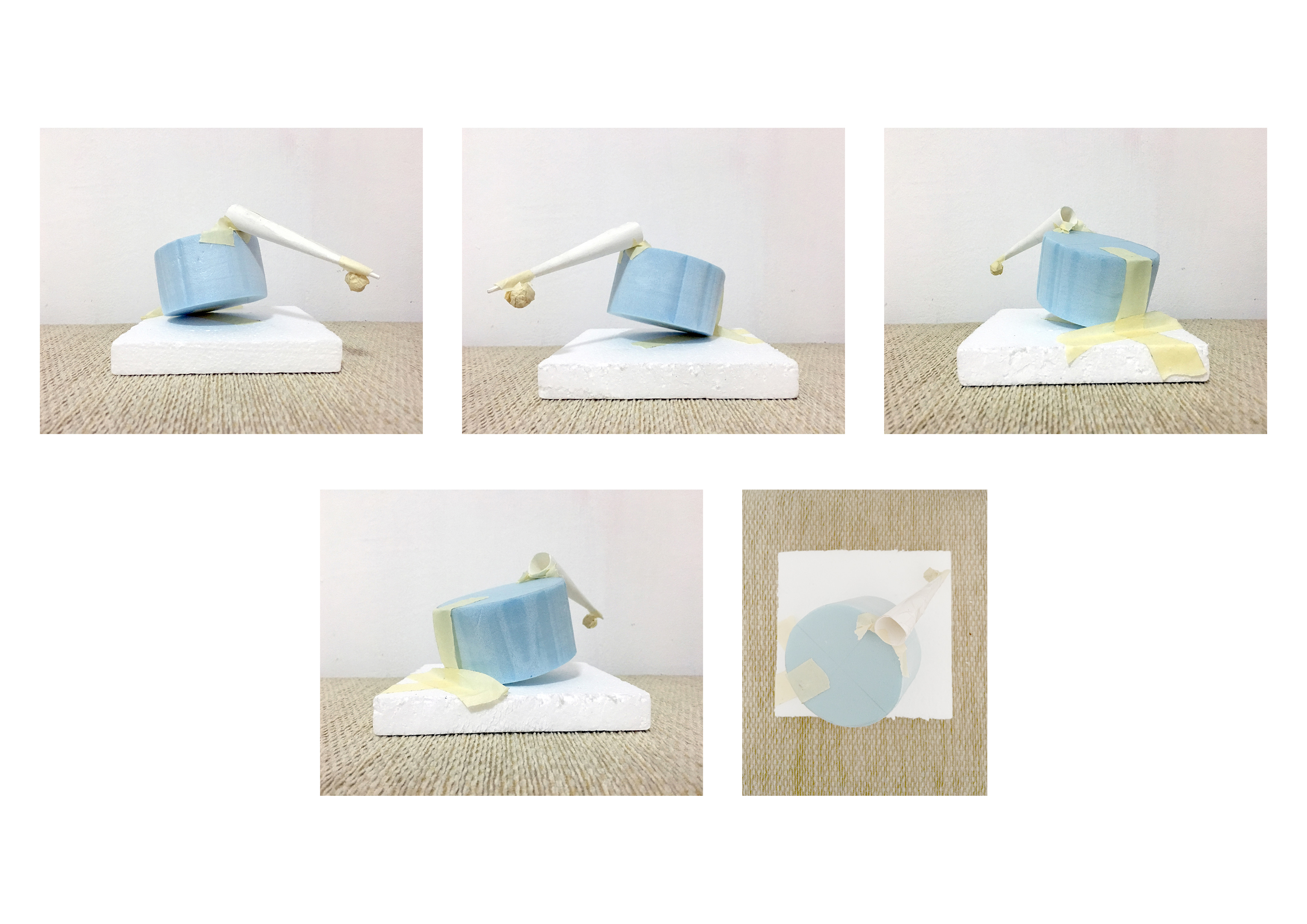
Sketch Analysis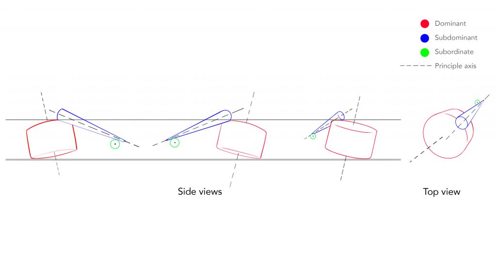
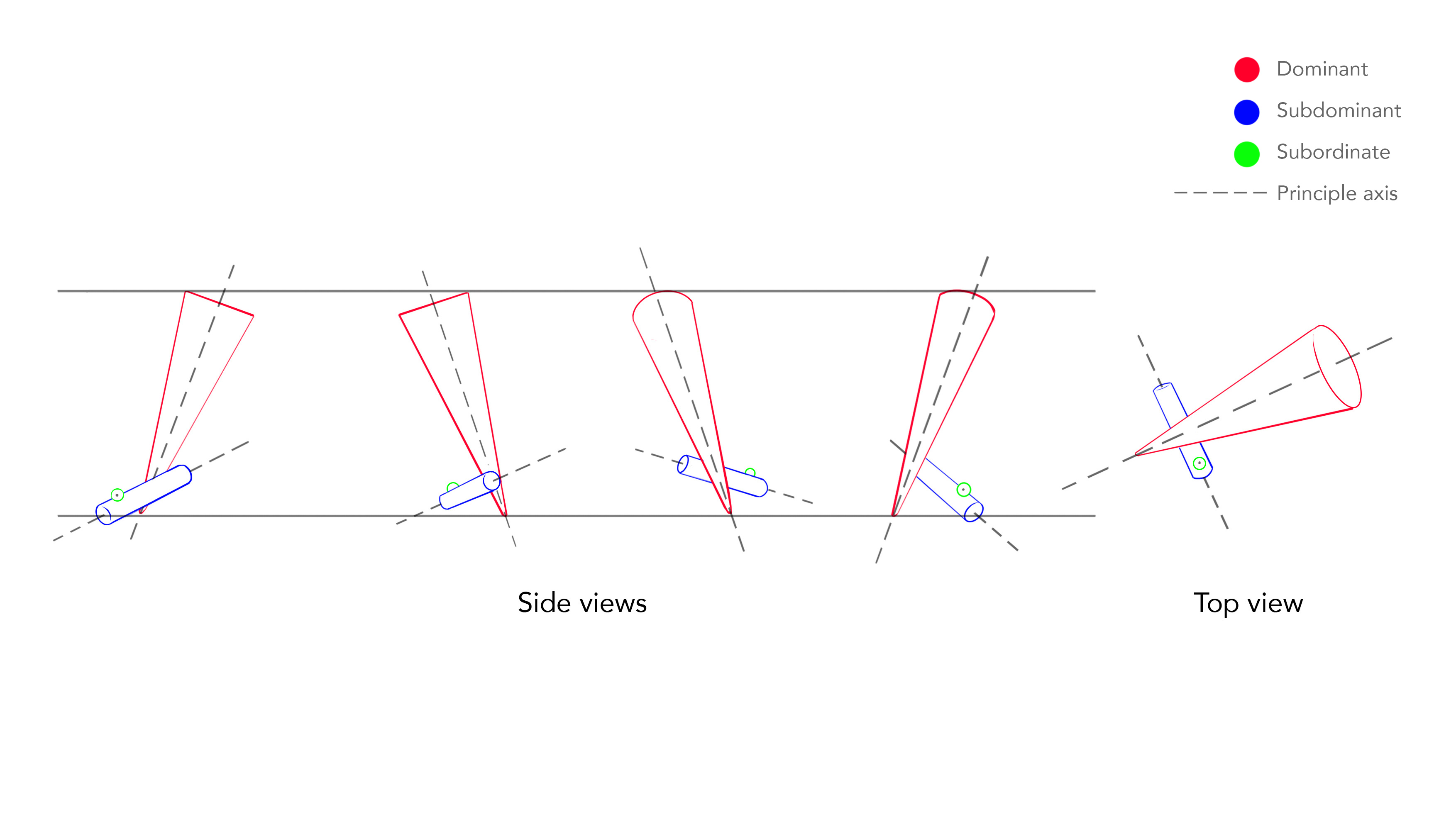
Sketch Model 3
This is the sketch model that I based off my final model from. I felt that the inverted cone at a diagonal best represents summer because it is very dynamic. D, SD and SO can be seen from most angles. The cone is leaning onto the SD –– dependent balance.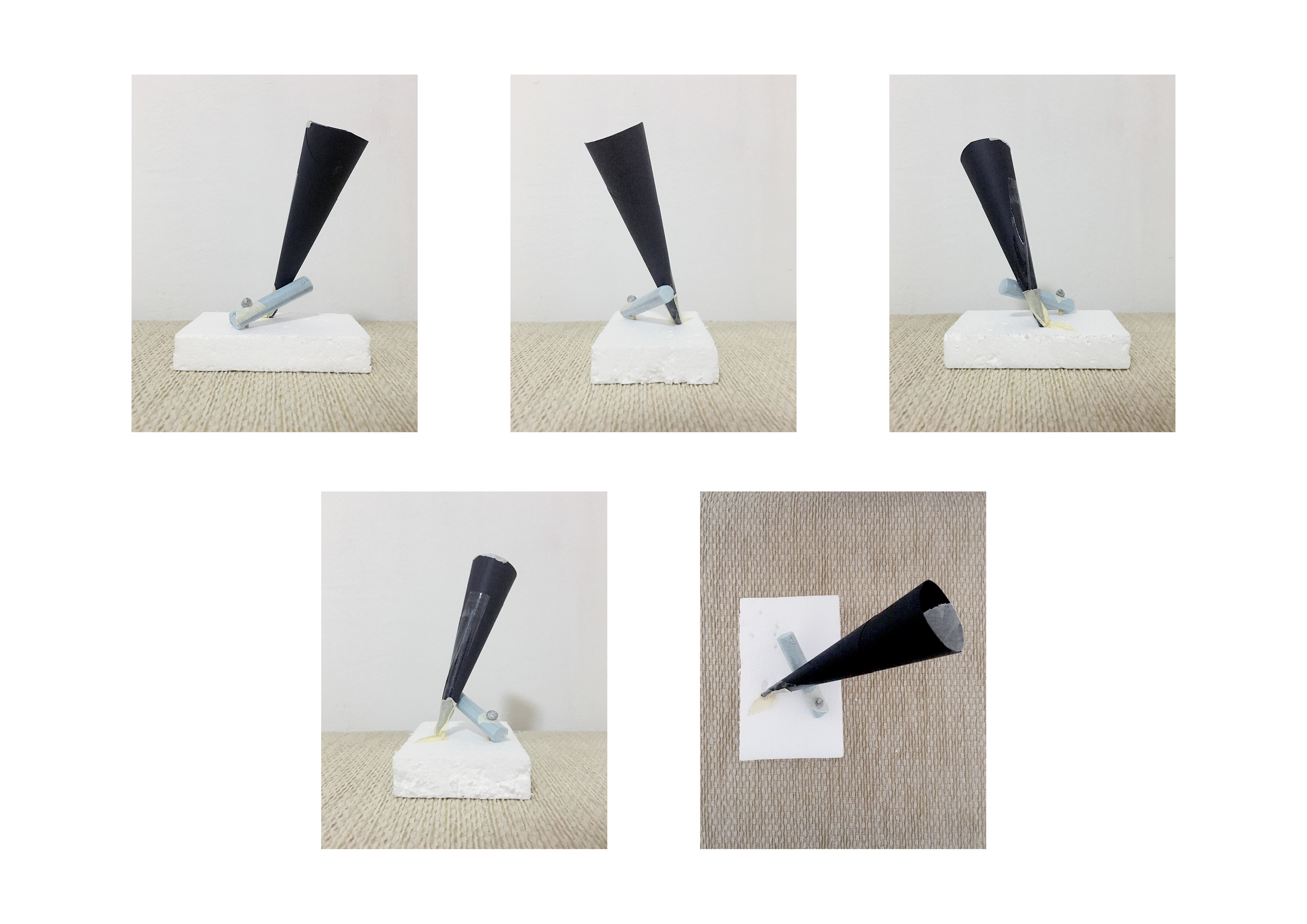
Sketch Analysis
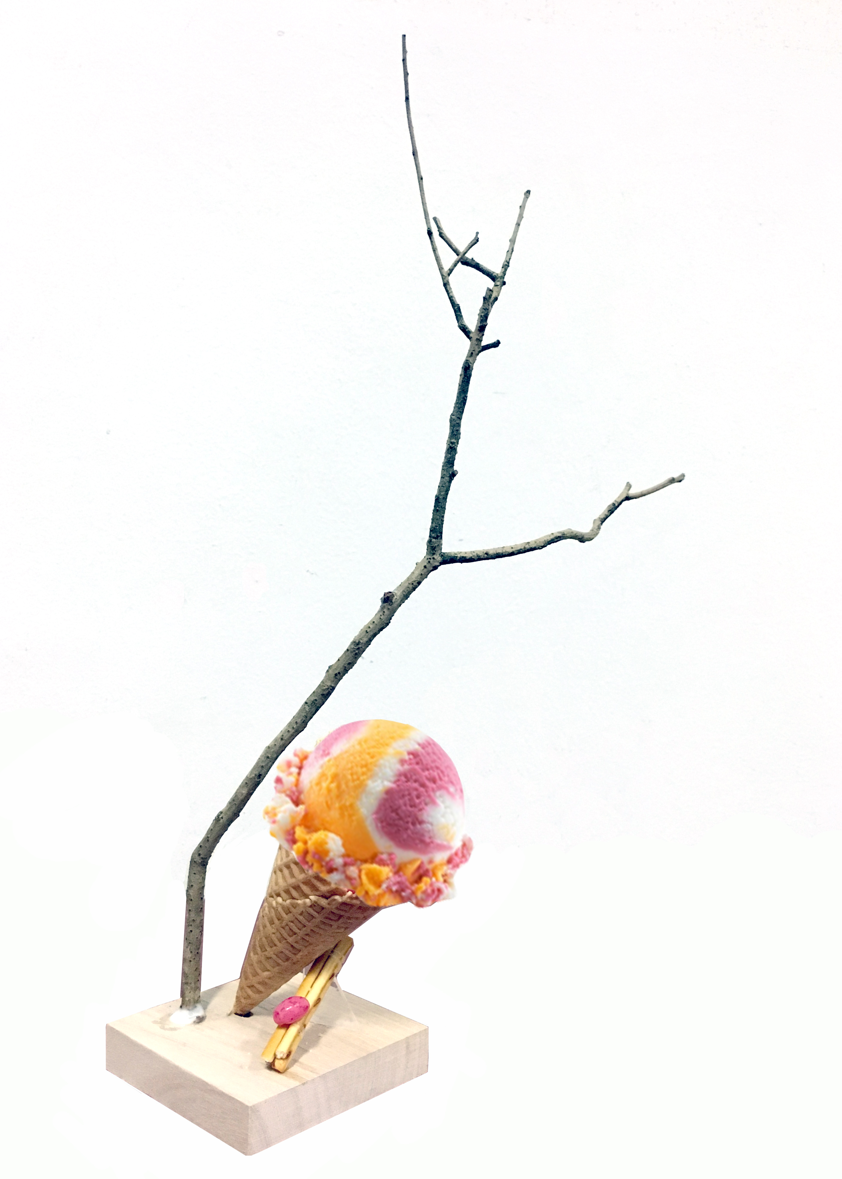
最終作品 Final Model
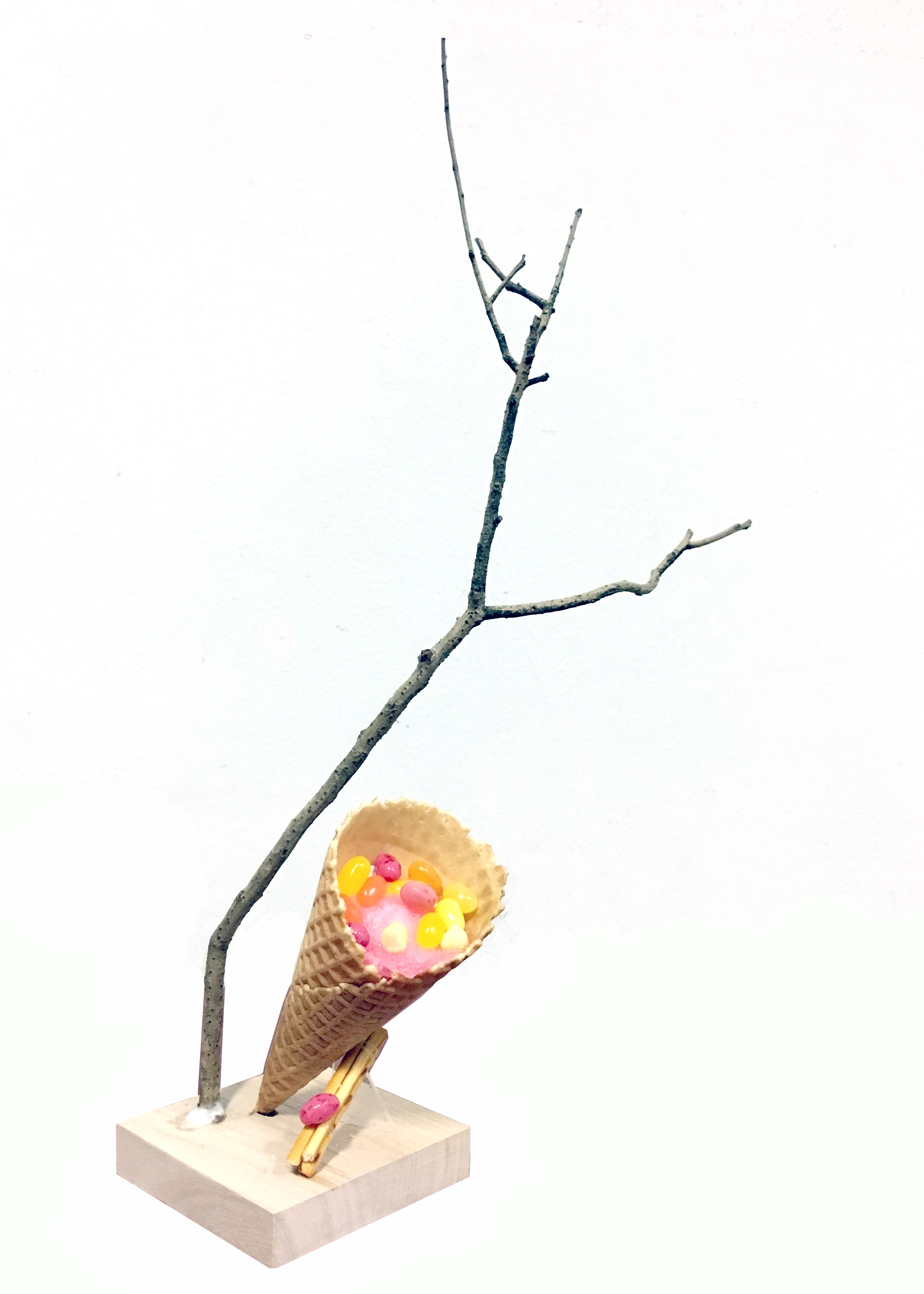
Composition
I chose my third model to be my final model. Since I was relatively happy with my composition, I decided to leave it as it is. A small transparent acrylic piece is used to hold the structure in place. I chose an acrylic piece so that It would seem that the composition is standing on its own.
A wooden base was chosen as it is the colour of sand. It matches with the warm browns.
Choice of branch
The hardest part of the assignment for me was to find a suitable branch. A lot of branches that I saw were pin straight and did not have aesthetically pleasing line of action. I initially thought of choosing a curved branch to juxtapose the vertical composition, but I felt that a curved branch conveyed calmness/lethargy so I opted for a straighter one instead. One thing that I would have done differently in my final model would be to adjust the placement of the branch, as I’m not entirely happy with the placement of the branch.
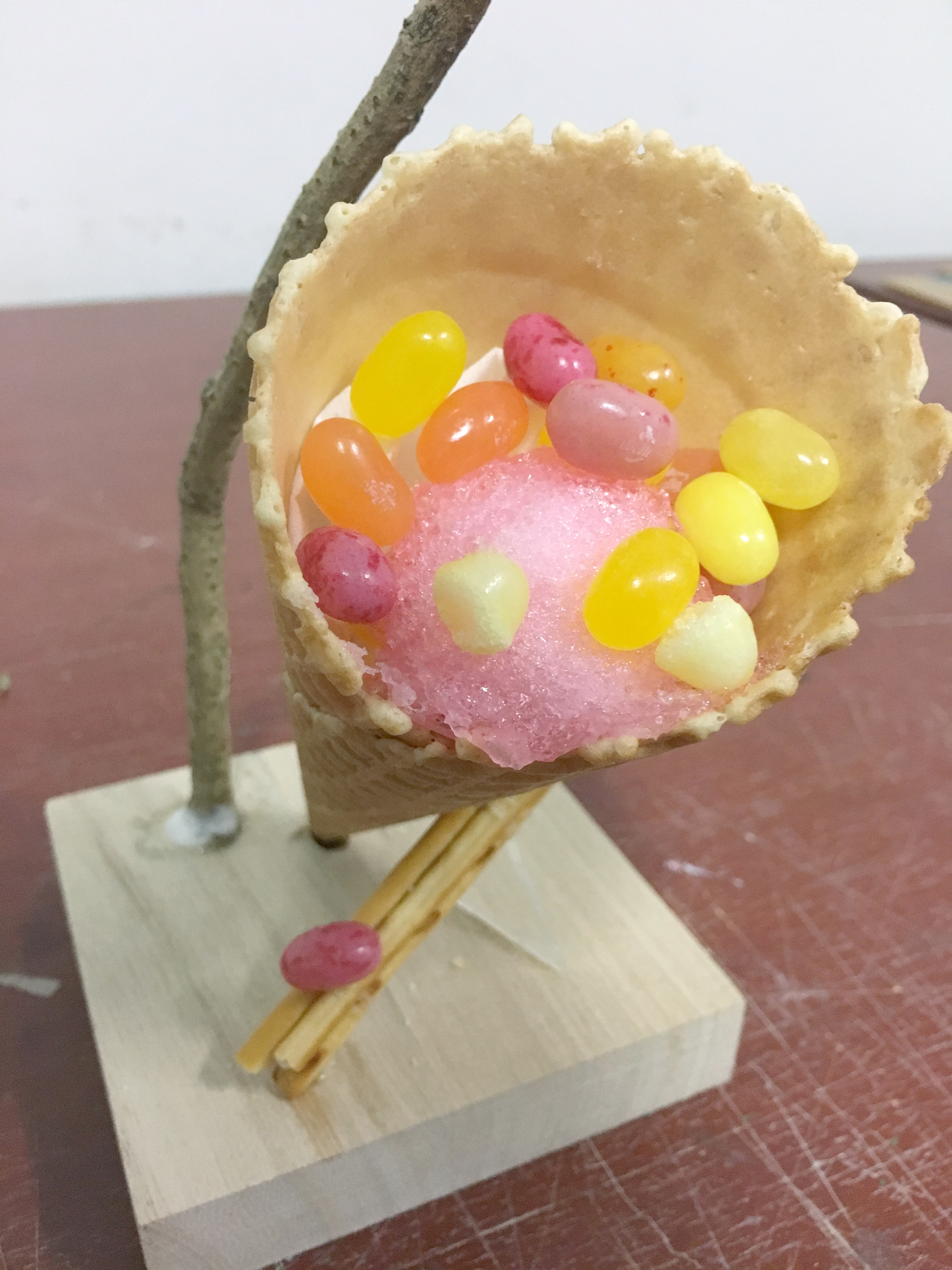
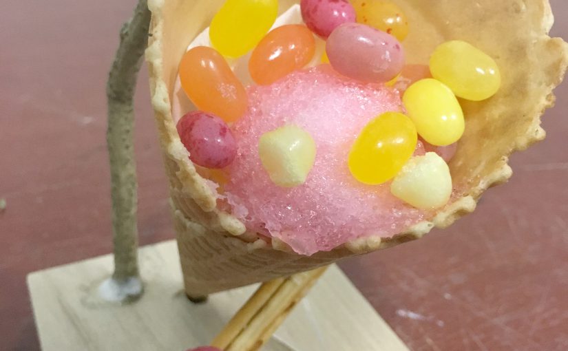
Choice of food
For the cone, it was very obvious to me that I had to use an ice cream cone. It fit my theme nicely so I did not think much about it. I wish it was possible to bring actual ice cream (or ice shavings) to fill the cone but I think it would have gotten really messy so I filled it with some cotton candy and jelly beans instead to help illustrate the concept that I was going for.
I used Pretz sticks for the cylinder part, because I imagine that if the cone had actual ice-cream, you can dip the Pretz sticks in it.
The jelly bean which is the SO / sphere element to the composition was just an accent.
Taste
There is a mix of salty and sweet taste in my final model. The cone is salted-caramel flavour which is very summer, and the Pretz sticks are salted flavour. The jelly beans that I used taste like tropical fruit. The accent jelly bean taste like strawberry, which is a summer fruit. If you included the ice cream / ice shavings you would have the refreshing taste too.
Colour
I knew I wanted a pop sort of colour scheme to go with the dynamic composition so I chose warm colours like pink, orange and yellow jelly beans.