Interactive Storytelling | 90s vs 00s

Chiharu | Christina | Naomi | Yi Ting

About

We wanted to explore the possibilities of storytelling through the use of social media and digital space. Social media is something that most people can relate to — especially people in our age range. Using similar storylines, we decided to do a comparison of someone born in the 90s and someone born in the 2000s, and explore how characters of different time periods may react to similar situations.

+ LINKS at the end.

Character profiling & Story

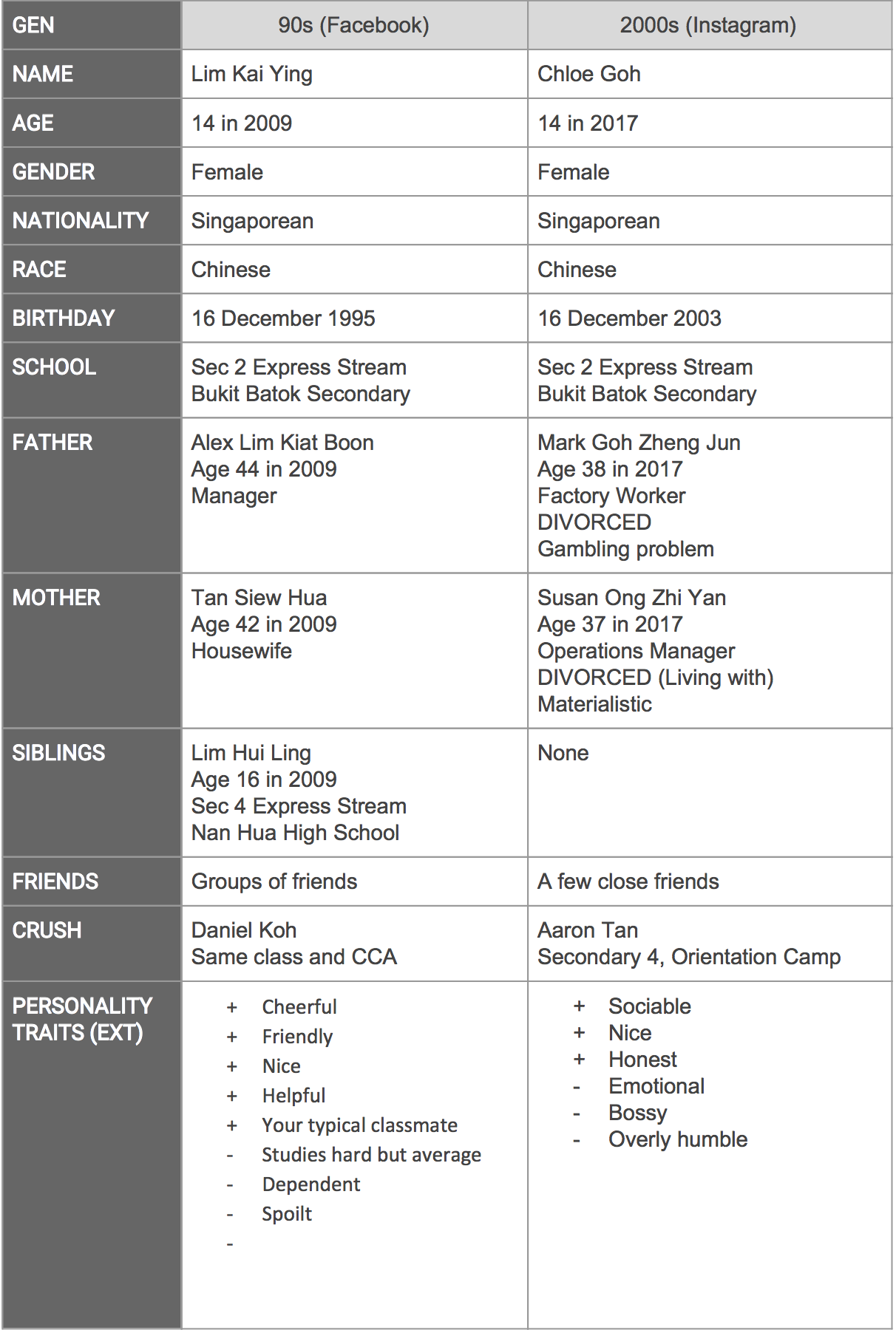
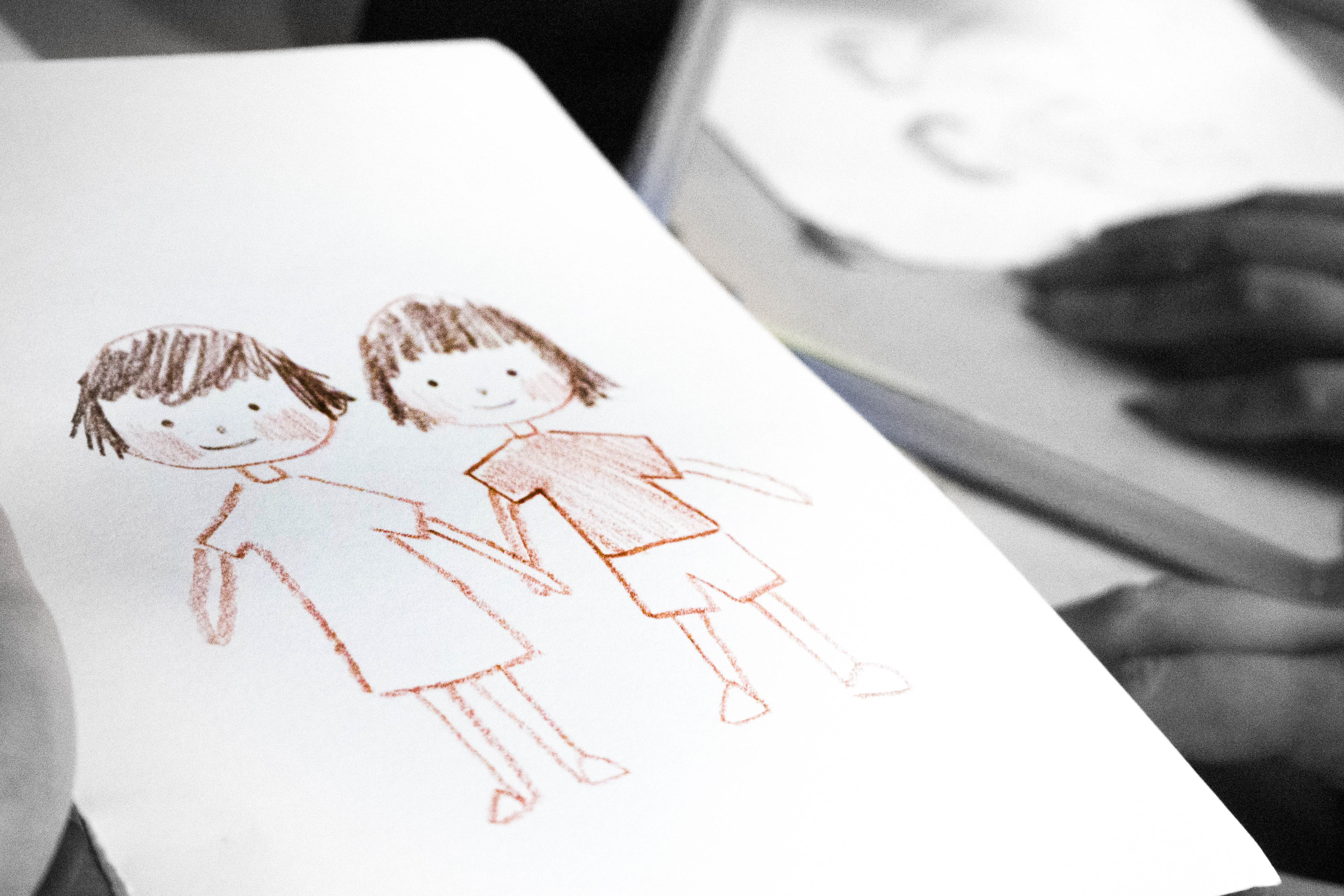
The first step was to create their respective character profiles. In the beginning, we came up with characters that were too stereotypical with not much depth. But after consultation, we rethought their personalities and the things they might post. We thought of their character arcs and the problems that they might face in their respective eras. External and internal personality traits/emotions were also something that we considered.

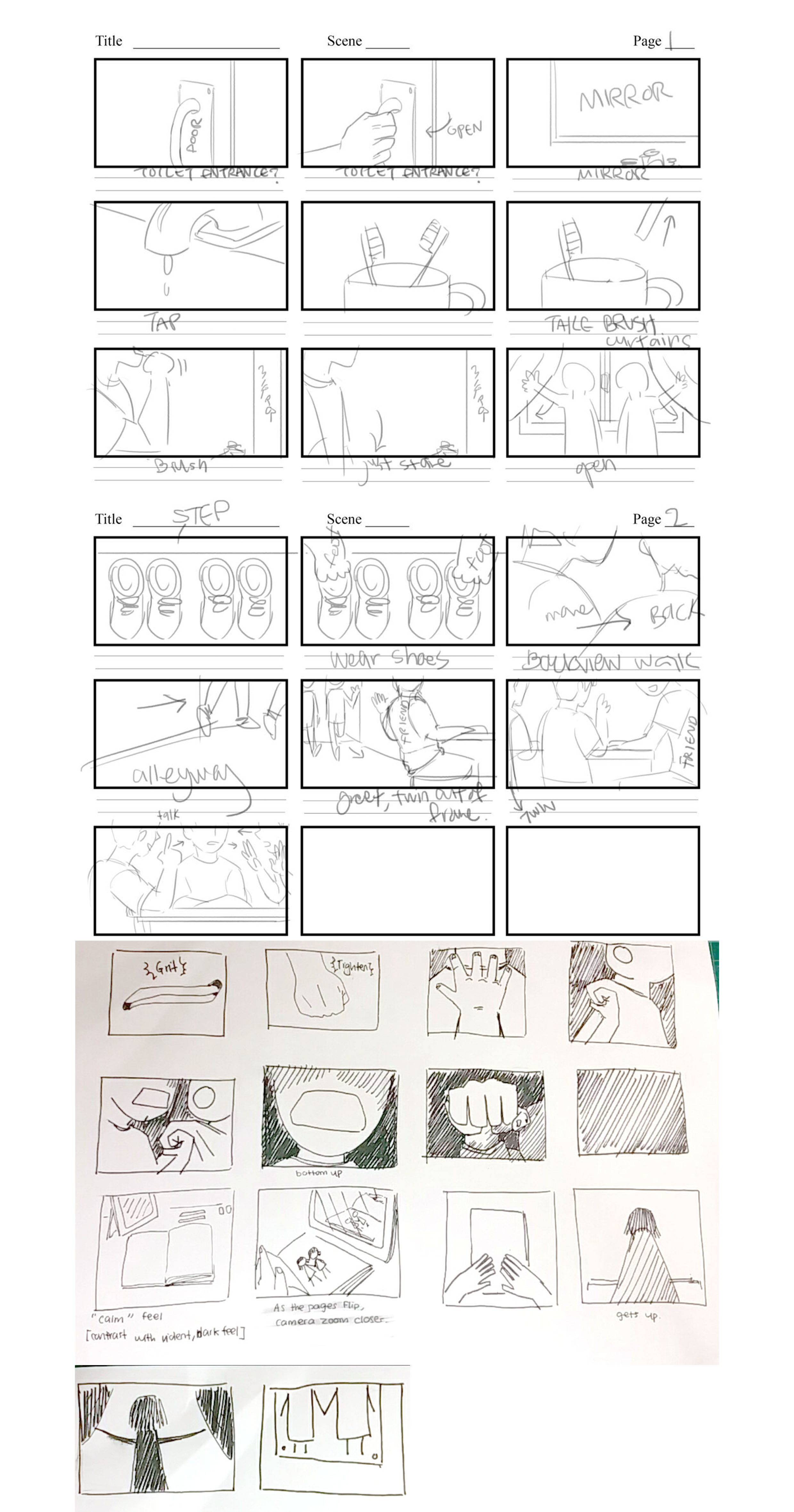
After we settled their personalities, we worked on their stories and the rough timelines of each platform.

Problems faced by both characters are generally common problems a teenager in Singapore might face, such as stress from streaming year, financial difficulties, gambling, quarrelling parents etc.


Research

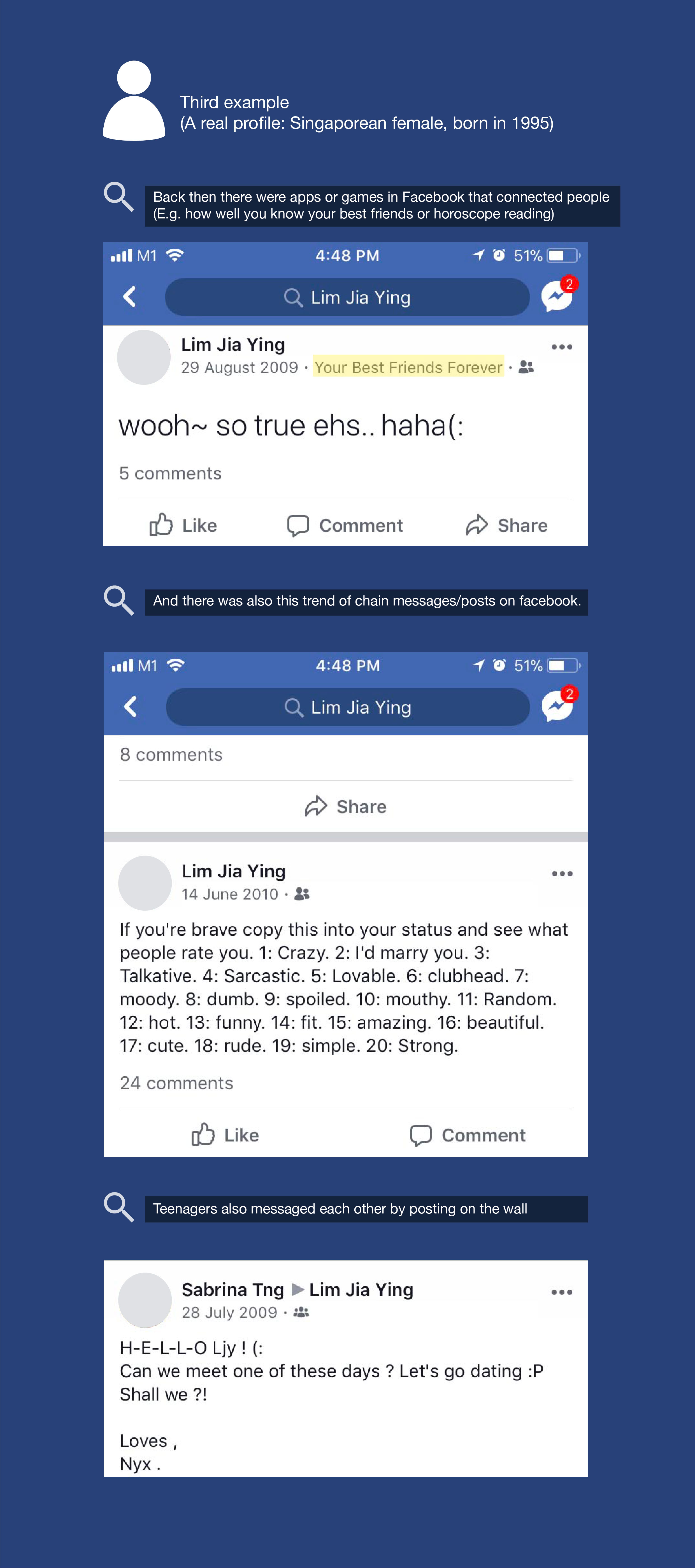
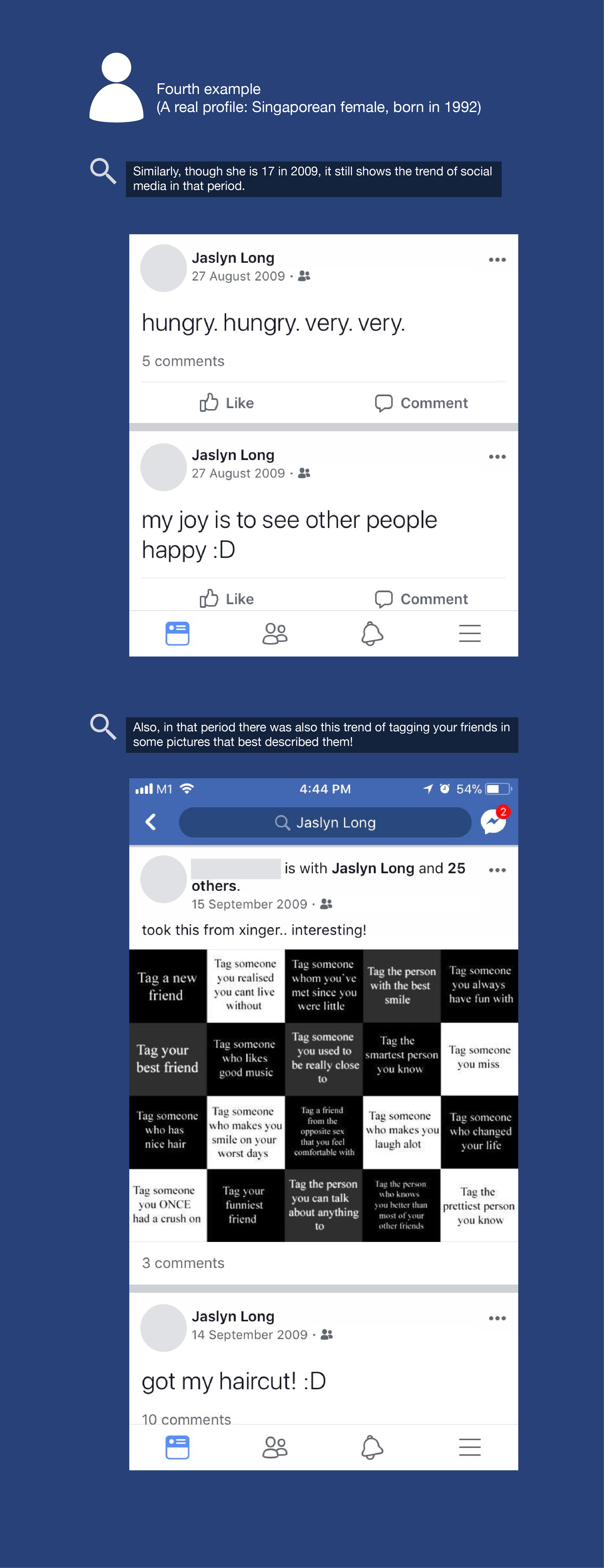
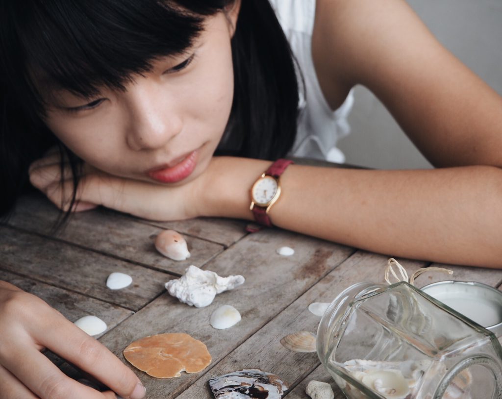
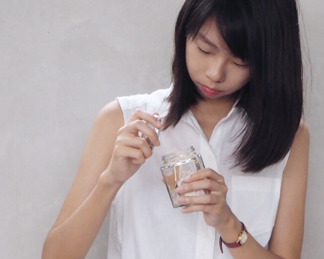
We then proceeded to do some research on the posting habits of people to make the posts look authentic. We took note of language used, and the extent of information that people usually reveal in their postings.


For Instagram posts, we took note of what sort of photos and captions are posted. Some information are censored for privacy reasons.


website

This was used as a platform to tie in the entire project. The audience should view this website before proceeding to view the content on the social media, or they’ll be confused. The homepage includes audio narrations to ease the audience into the narrative. It also includes the respective character profiles, and instructions on what to do.


AUDIO

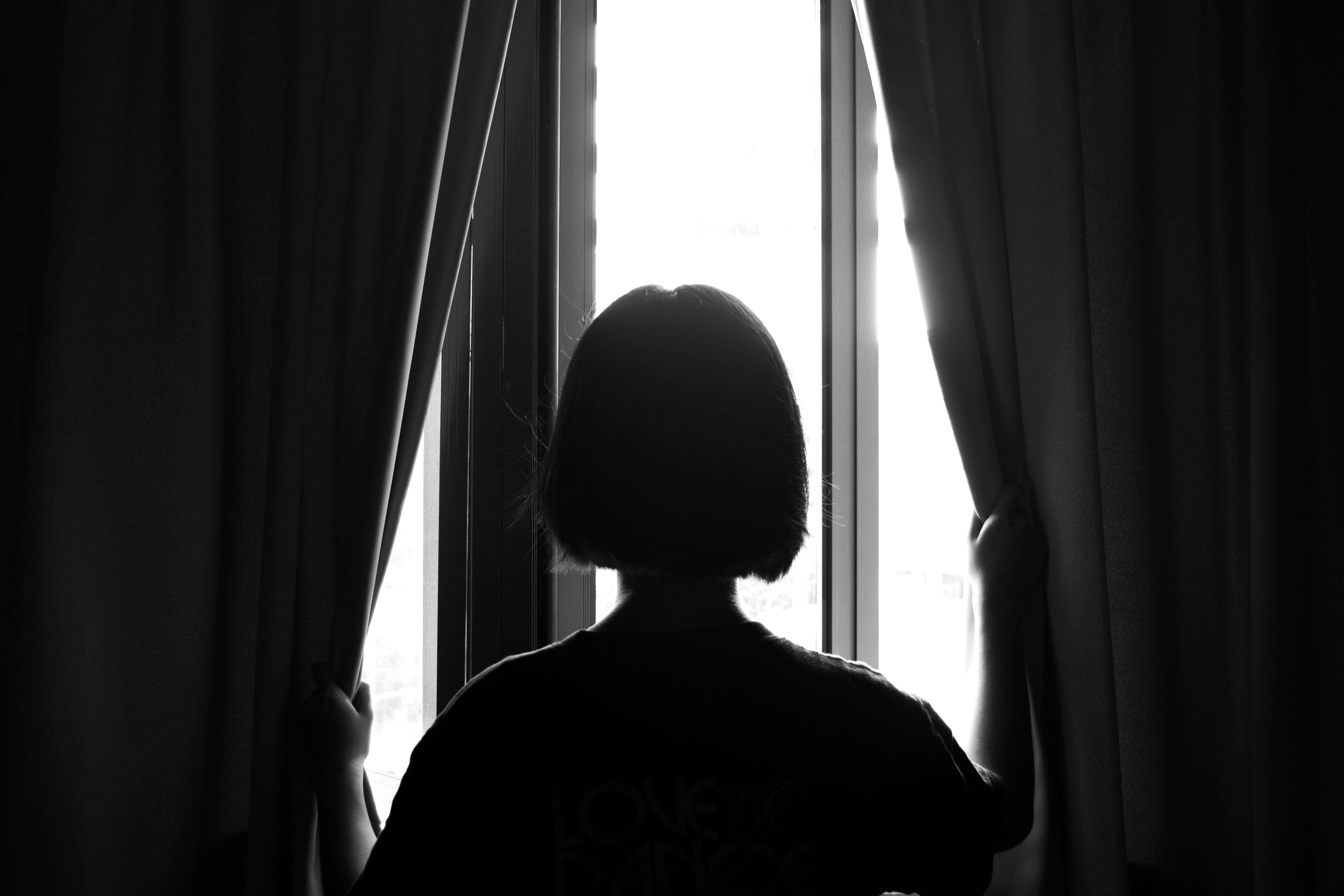
As we worked on our project, we began to realise the limitations of digital spaces. We wondered if visuals on a screen was really enough to connect with the audience. Hence, we decided to include audio as part of the character storylines.


Kai Ying’s:


Chloe’s:


Blogs

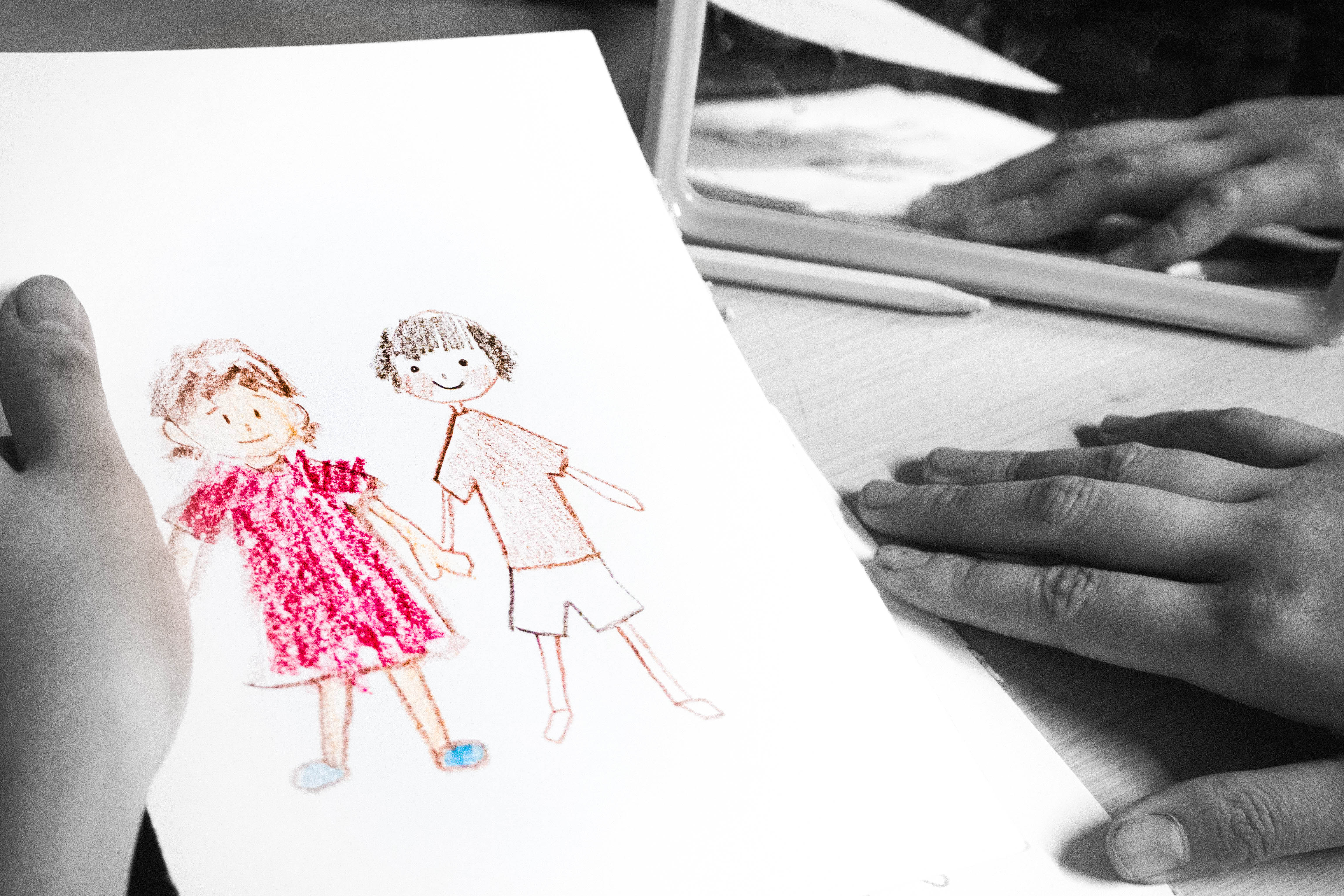
The character’s blogs are used to reflect their internal emotions. Audience needs to view both their blogs and social media in order to get the full story. The blogs can be accessed through the main website. The design of both blogs is carefully thought out. Kai Ying’s blog design is one reminiscent of blogs belonging to actual 90s kids. It is something that people can relate to. Chloe’s blog follows the minimalistic, modern design.

The blogging styles of the girls are determined by their personalities and time period. The language used by Kai Ying is very informal with a bit of Singlish, whereas Chloe’s use of language is a little more formal.

Chloe’s blog is a little special because the audience would need a password in order to access it. The password is hidden in her Instagram post. We made sure that the keyword used is not to difficult, and relates to her problem. It appears multiple times in her Instagram posts if you pay attention.


Social media platforms

We picked Facebook for the 90s kid as it is one of the most used social media platforms by people in the age age. The photos/posts are carefully curated and posted by Christina and Naomi. Posts are very informal and includes a lot of acronyms and short forms.


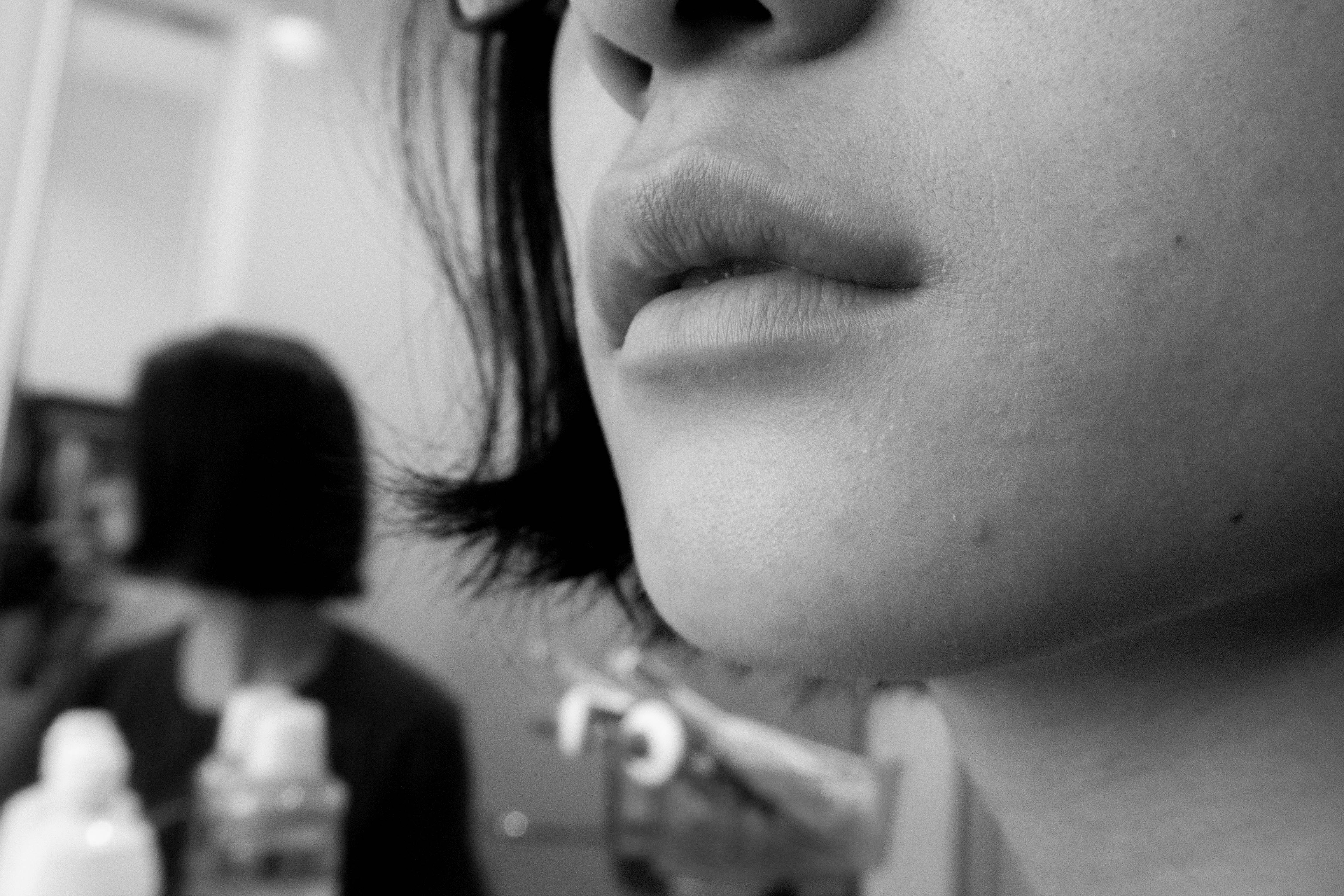
Instagram is the most used social media platform for a kid born in the 2000s hence we decided to use it for Chloe. We needed someone who looks like a 14 year old to act as Chloe, and thankfully Rebecca agreed to help us with this! We borrowed Christina’s old uniform and took a bunch of photos to add to the Instagram timeline. We also got Rebecca to use some of her personal photos with friends, in order to make the posts look authentic. Then, the photos were meticulously chosen and arranged by Yi Ting. The arrangement was especially important, because what they post reflects the character’s inner workings too. In Chloe’s case, she starts out happy and normal — so she posts quite a few photos of her smiling. As the problems in her life escalates, she is stressed and depressed, hence the posts are of random objects accompanied by moody captions.


Layout

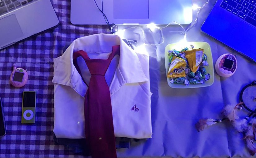
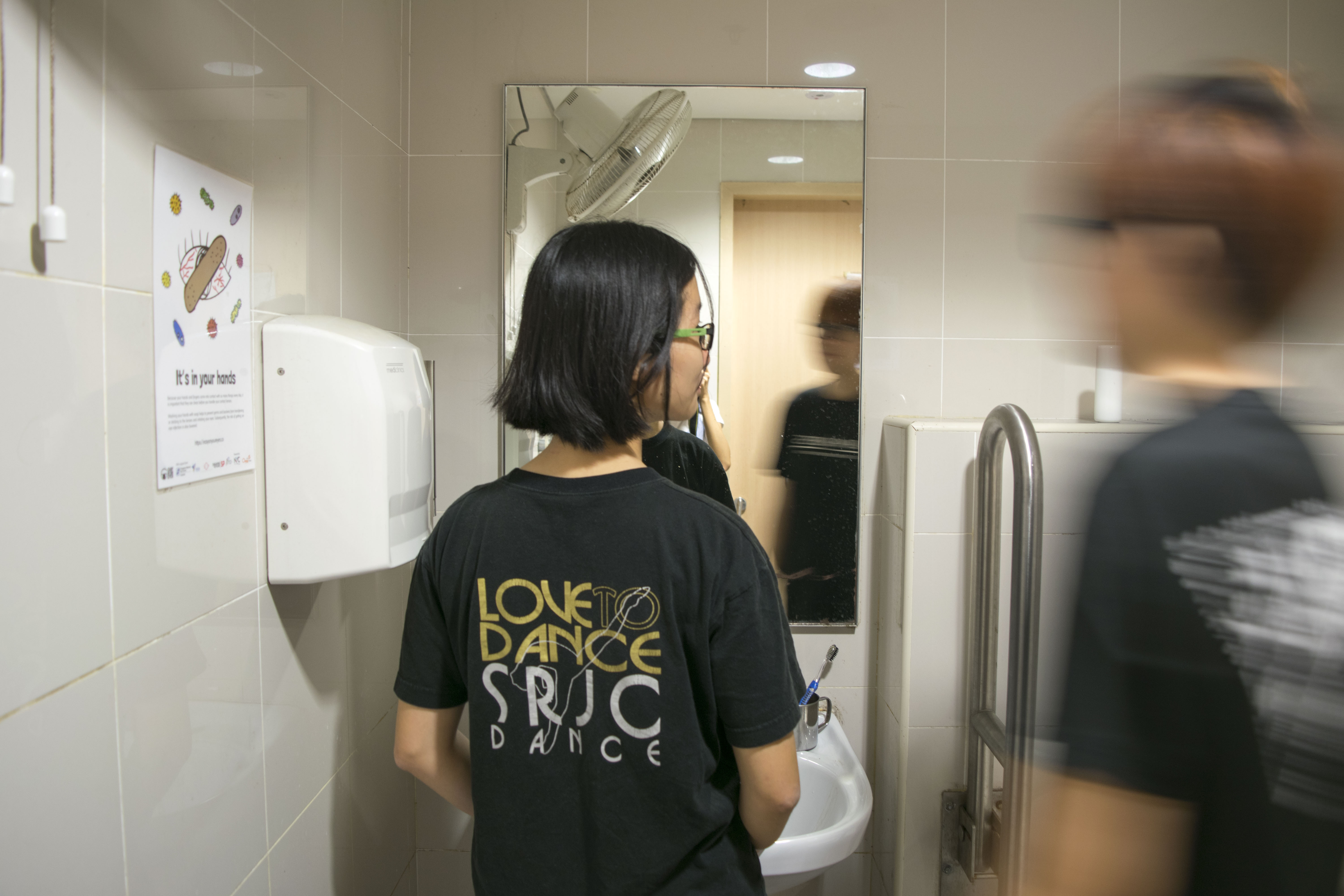
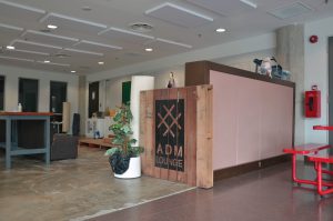
Since our project focuses more on digital space, we kept the physical space simple. We laid out the laptops with the websites and social media opened. We then decorated the surroundings with items from our childhood to go along with our theme of the 90s and 2000s. Though initially not intended, the lighting coming from Jun Ming’s group’s project matched our theme as well and worked beautifully for us.


Links

Website: https://4dx4ofus.wixsite.com/90svs2000s

Kai Ying’s blog: https://4dx4ofus.wixsite.com/90svs2000s/blog

Kai Ying’s Facebook: https://www.facebook.com/fourd.xfourofus.5

Chloe’s blog: https://4dx4ofus.wixsite.com/90svs2000s/blog

Chloe’s Instagram: https://www.instagram.com/not_chloe03/

(password: money)

Interactive Storytelling | Proposal

90s VS. 00s

Chiharu | Christina | Naomi | Yi Ting

Concept

As times change, so does the way of living, people and habits. Being born in the 90s ourselves, we are fortunate enough to experience the world before it revolves around technology, and after. This project aims to use digital space — social media — to explore and compare the minds and behaviours of teens from those born in the 90s and 2000s.

Research

The internet was a new concept to people born in the 90s. It was a period when computers started to become a common household item. This was before we could carry the internet our in our pocket.  Social media was simple, yet fascinating. Everyone was eager to hop onto MSN, Myspace and Friendster. These chat rooms and digital spaces connected us with our friends and people in other countries. People shared funny photos, videos and moments sparingly. It was a tool that enhanced our lives.

With the rise of smartphones, social media became easily accessible. According to an article by The Business Times, a report by Hootsuite in 2017 has recorded that 7 out of 10 singaporeans uses social media on mobile, which is more than double of the global average of 34%.

By navigating through a few buttons, we can easily upload content to be viewed by our followers. 00s kids tend to overshare everything on social media — from selfies to which boys they like. Many treat social media platforms like their diary, using them to “document” temporary over-emotional adolescent moments common at their age. While previous generations derive feelings of self worth and achievement through career progression or sorts, it seems that 00s kids fill that void with social media. Likes and retweets translate into real world approval, and people without remarkable skills or substantial talent gain thousands of followers through pithy tweets and well-curated Instagram photos.

Relationship between content and form

Social media exposes the characters of the people using it. We decided to portray the lives of two 14 year old kids born in the 90s and 2000s, using Facebook and Instagram respectively. The two characters exist in their respective timelines, and react to actual events that occurred in those timelines. Posts made by both generations would reflect their influences and attitudes, as well as the culture and society of their time. The social media platforms were chosen based on proliferation of its use by the respective age group and its format of posts. Platforms such as Snapchat would be difficult to keep a record of posts as they disappear, eliminating it from our choices.

Experimentation

There are many articles and videos that compare a 90s kid to a 00s kid, but very rarely done on “fake” accounts on social media platforms. By faking the personas of these two characters on relatable social media platforms of their respective generations, it feels more realistic and intimate to the viewer. With the new advancements and additional functions these platforms now have – like the Instastory on Instagram, we will be able to execute the concept somewhat in real time to further enhance the experience.

The short-lived Instastories will disappear after 24 hours, so to ensure the viewer does not miss any part of it, we will be posting within optimal time range to assure its presence without losing its chronological quality.

Presentation

The posts uploaded will be a reaction to various world issues or epidemics from 2 of our characters. Through their posts on social media, we wish to portray the differences in the influence of different time periods towards the thought-processes and personalities of our characters.

As we have chosen to execute the concept mainly on digital means, there will be plenty of precise management and thought to make the experience as realistic and relatable as possible through a simple flat screen and finger swiping.

Some examples of similar major situations for them to react to:

  • Financial crisis/depression
  • Global politics: Election in USA (Obama/Trump)
  • War/Conflict overseas (Iraq war/Ferguson riots)
  • Widespread diseases (SARS/Ebola etc)
  • Haze
Difference between Facebook and Instagram

The differences in the purposes, functions and content of each platform can reflect the personality of the users that engage in them. Facebook is a platform that 90s children engage in more due to the tendency to share interests, articles of current issues and a touch of personal posts. On the other hand, children from 2000s seem to prioritize original content that reveal much of their daily lifestyle.

Facebook (Founded 2004)

  • Detailed bio and personal information
  • Photo/ Video sharing
  • Events
  • Live Video
  • Sharing of links
  • Curated content
  • Groups

Instagram (Launched 2010)

Instagram is a platform which encourages the capturing of moments. The interaction between users are different as compared to that of Facebook. Below are some of the differences:

  • Photographs and short video clips
  • Original content
  • Interaction only through commenting, liking, following.
  • Mobile-based
Website

We created a main website to explain our project and link to the Facebook and Instagram pages.

https://4dx4ofus.wixsite.com/90svs2000s

(Link to be updated.)

Assignment 2 Final: UNREALITY

Group members

Chiharu, Pei Wen, Rebecca, Yi Ting

Premise

How would you react if you lost someone you cared about? This short film uses sequential images to tell a story about a girl who is mentally unsound. In her world, her dead sister never died.

Genre

Psychological

The story was created based off a real person’s personality and character.

She met a guy during her secondary 2 overseas school trip but didn’t really take notice of him until a year later when they ended up in the same class. At first, she thought that it was a coincidence that he would be around wherever she was, but she started to catch on that he had feelings for her. She didn’t feel the same way back. Once, he confessed to her about how he had dreams about her and having nightmares about her being trapped in a cage. A few years later, he sent her a text saying that they should “forget each other” and that they “should move on” when there was nothing between them in the first place. She later found out that he suffers from depression.

Synopsis

The main character, the girl,  is seen going through pages of drawings alone. In the next scene, we find ourselves in the bathroom with the girl. She engages in her usual routine of brushing her teeth, washing her face and fixing her hair. She pauses and stares into the mirror. She is joined by her sister, and they share an intimate moment before leaving to meet a friend. Upon meeting the friend, the girl wonders why her friend was not giving attention to her sister. In this very moment she begins to realise the truth about her sister’s “presence”. Being in a state of delusion and emotional instability, she reacts by hitting her friend. We see the girl going through the drawings again, this time accompanied by mini flashbacks of memories with her sister. The end is vague, we don’t know what action the character is going to take. It is purely up to the viewer’s imagination.

Interpretation

We borrowed elements from a real life account and threw in a scenario for the character to react. From the real life story, we came up with a mentally unsound and delusional character possibly experiencing schizophrenia.

We attempted something a little different by not including the full faces of each character. This helped give the film some mystery, and hopefully give more impact to the viewer.

The film is mostly in black an white to allow the viewer to focus on the story instead of being distracted by the colours on screen. The only element in the film that is in colour are the drawings of the two sisters. This portrays the emotion of the character. The happy times that she spent with her sister are captured in the drawings they did.

We used a few props to signify the presence of someone dear. For instance, the toothbrushes that appear in the beginning and at the end. Toothbrushes are seen to be an intimate object. We see that in the beginning there were two. In the end, we see only one because the presence of the sister was a delusion by the character. Another prop (or props) that we used are mirrors. They symbolise the threshold between the conscious mind and the unconscious mind. By looking into a mirror, one may look towards the depths of their unconsciousness.

Individual choices

I made the arrangement of my film different from the others to experiment with how sequencing images differently give a completely different effect to the story. While the others placed the scene where she is flipping the drawings right at the back, I decided to introduce some shots right at the beginning to foreshadow the fact of the dead sister since drawings are sentimental.

I also chose not to include some photos that we shot. There was a scene with the main character opening the curtains with her sister. We had shot a similar scene with just the main character opening the curtains. However I did not include that as I felt that it did not go with my sound design, and there were too many of such overlapping elements (e.g. the toothbrushes in the beginning and end) which I thought was overkill.

A few of my decisions made were based on what kind of person the main character was. I see her being in a state of depression almost, hence the slow pacing of the film.

Sound design

The sound of water droplets was used to convey stillness and the slow passing of time. It is present in the beginning, and reused at the end even though the character is not in the bathroom.

Details such as the sound of bathroom ventilation was purposely included, to convey loneliness, because the character takes in every sound that she hears. It complements the sound effects of the action by action shots as well.

Processed shimmer is used to convey surrealism and unreality. It gives the impression to the viewer that something is off, and it foreshadows that something bad is about to happen.

The increasing volume / intensity of the reversed cymbal sound is used to build to the climax of the story.


Assignment 2 Sequencing Images: Research & Process

images

Task 1 was to choose someone of our past and re-write about the life they’ve been leading ever since we’ve  lost touch. This task is group work.

My group shared some stories between ourselves. In the end, the person / character that we picked was someone Pei Wen used to be friends with. Here is a brief summary of her story:

She met a guy during her secondary 2 overseas school trip but didn’t really take notice of him until a year later when they ended up in the same class. At first, she thought that it was a coincidence that he would be around wherever she was, but she started to catch on that he had feelings for her. She didn’t feel the same way back. Once, he confessed to her about how he had dreams about her and having nightmares about her being trapped in a cage. A few years later, he sent her a text saying that they should “forget each other” and that they “should move on” when there was nothing between them in the first place. She later found out that he suffers from depression.

Through her story, we came up with the idea of a delusional and mentally unsound character. We thought, what if the character lost someone special , how would he/she react? We researched a little about how people may react after losing a loved one and on mental illnesses. Schizophrenia was something that we looked into. I remember seeing once in a drama that the person is delusional into thinking that the person didn’t die and is still alive. We then crafted our story based on that idea. We tried to incorporate some symptoms of schizophrenia into our images.

  • Hallucinations
  • Delusions
  • Bizarre or disorganised behaviour
  • Anger
  • Violence

Yi Ting and Rebecca did some storyboards.

Storyboards by Yi Ting and Rebecca.


Since we were an all girl’s group, we changed the main character to be a girl, just so it’d be convenient for us to do the shoot.

We asked ourselves some questions before the shoot. What is the overall mood of the short film? How do we show that the sister is actually dead, in the scenes where she is seemingly alive?

We decided to blur the dead sister so that it represents the idea of a person that is not really there. But after shooting, we realised that instead of making the appearance of the sister surreal, it looks more like she was moving very fast. Plus the bathroom was clearly not a personal bathroom. We also find that our story lacked some images that made the flow of the story weird. So we decided to reshoot.

I lowered the shutter speed to attempt to blur Yi Ting but it didn’t produce the result that we wanted.
Here it looks like she’s moving very fast.

Taking inspiration from Schindler’s List (Steven Spielberg, 1993) and Sin City (Frank Miller & Robert Rodriguez, 2005) whereby the film is in black and white but they selectively saturate the colour red, we did the same for one scene. The drawings are supposed to tell viewers about the truth that the sister is dead, but  it wasn’t clear when we converted the image to black and white. So we decided to saturate just the drawings to bring viewer’s focus to the drawings.

Schindler’s List
Sin City


Sound

Task 2 was to tell this story using sounds. I had a rough idea of what sounds to use. For the parts where the our main character is alone, I used diegetic environmental sound. I made sure that the ventilation sound of the bathroom is prominent. The water dripping sound is also heard throughout the bathroom scene to convey the slow passing of time and “stillness”.

This is based on personal experience. Though I have never actually experienced full fledged depression, I had a period of time when I was extremely down and had low motivation. Back then, I remember each day passing very slowly. Every action that I took seemed to feel like eternity. I really took in every sound of my environment when I was alone. Hence, I recreated that mood / environment for this character.

Action by action worked together with the sound to help convey the message that time was passing slowly. Each action is emphasized.
Reverb helped create the mood.

Then, I faced a problem. How do I use sound,to show that the sister, who is actually dead, isn’t actually there?! All I knew was that I didn’t want to include every single sound that could’ve been heard in the scene because when you’re with someone you love, sounds around you are negligible.

I initially used the sound of a music box tune. But it felt extremely out of place since there was no music box in our entire film. In the end, I solved this problem by thinking about words that describe the scene. Keywords like surrealism, dreamy, imagination, fake and unreality came to mind.

From there I thought of what sounds best convey those words. I vaguely recall this whistle like sound made by twirling a PVC tube, but there weren’t any recordings of that sound online, and I don’t have anything like a PVC tube so I couldn’t recreate that distinct sound. Thankfully, I found a sound called “processed shimmer”. It conveys the surrealism and unreality part very well. So I used that for the parts where the sister appears.


4D: Picture Story, Curating Self.

Task 1: Object and representation of self.

I chose a glass jar of seashells as my object as it represents the memories that I treasure in my life. I have many jars filled with seashells that I’ve picked up whenever I visit beaches over the years. This particular jar holds memories with my classmates in polytechnic. Transitioning into university, I miss my classmates a lot. There were plenty of ups, and many downs, but I miss all of it. Reminiscing about the past is what I catch myself doing very often. I think that we are all made out of memories and whatever experience that I’ve undergone has contributed to who I am today. I felt that seashells best represent that concept. There are many shells in the ocean, but there’s only a handful that I pick to keep. Likewise, there are many moments in life but we cherish only a handful of them.

Shells symbolise emotions, memories and friendship, which are important in my life. In this photo series of representation of self, I decided to keep the photos clean looking with minimal props. I wanted to let the jar of shells stand out, and a cluttered background with poor execution could have potentially taken the viewer’s attention away from the main subject. I worked with a 4:5 aspect ratio for a tighter crop.

Keeping mise en scene in mind, I opted to go for a very clean look to match the look of the jar. Browns, beiges and earthy tones. I chose to wear a white dress because it symbolises purity and innocence – characteristics that can often be associated with reminiscing nice memories. I wore my watch, because it symbolises the passing of time. The burgundy red colour gave a nice pop of colour in the photos.

Close up + slightly high angle shot. Wanted to convey how much I miss that period in my life.
High angle shot. In this image I wanted to convey innocence and helplessness through the angle. The past is in the past and there is nothing that I can do about it.
Medium close up shot. Am I opening or closing the jar? Am I revisiting memories or leaving them behind?


Task 2: My World

Botanic Gardens is a place that I have a personal connection with. Whenever I feel stressed or sad, I will make time to visit Botanic Gardens for a walk. When the season is right, the flowers will be in full bloom. It is a rather beautiful sight. I will walk around the garden aimlessly then, until I feel better. Sometimes, I will find a quiet spot to sit just to think. I’ve always been a nature person. I find that the visits always refresh me, especially after sitting in a cubicle in school doing work for weeks. I am a flower person too, so I am in my element whenever I visit the garden. Welcome to my world.

I tried to capture its beauty, peacefulness and grandness in the photos. For serene shots, I stuck to eye level, wide shots. The horizon line parallel to the edge of the photo conveys the garden’s peacefulness. In contrast, to show the grandness of the tall trees, I crouched down and tried to take low angle shots. I played around with selective focusing on the photo of the man surrounded by flowers, to give the image more depth and to draw attention to my subject. It was also a happy accident that the man was glued to his phone. It kind of has a sub message that sometimes we are so busy focusing on little things that we fail to notice the natural beauty that is around us. What makes a place special is not just its environment, but the people who visit the place, which is why I made sure to include people in my photographs too. They act as a point of interest because nature photography tends to get lost without a focal point. I kept the overall series saturated because it can be a lively place.

There are people from all walks of life visiting Botanic Gardens, which is fascinating to me. Majority are with family, lovers or friends. Sometimes I see individuals like me just wandering around and I wonder what’s their story. Of course, the flowers convey the beauty of the place, and frames the man nicely. I think this photo really represents the place – a place where you can just relax in and be surrounded by lovely nature.
Wanted to use these leading lines for my photo. I waited for people to walk by. It kind of looks like they are entering the place.
I wanted to capture the different people that visit because it’s something that I do notice when I visit. It makes me happy to see people enjoying themselves. It conveys the liveliness of the place. I like this photo as it has a foreground, mid ground and background element to it.
This man was really immersed in the environment and enjoying his walk. Like I always do. I used a low angle to show how tall the trees are in comparison to a human. It conveys the grandness of nature.

Foundation 4D: Class Exercise on Perspective

The task was to take photos around school relating to one-point, two-point and three-point perspective.

One-Point Perspective 

  • Involves a single vanishing point.
  • By placing your subject at the vanishing point, the lines guide the viewers to focus on your subject.
  • Gives a sense of depth.
One-point perspective


Two-Point Perspective

  • Two vanishing points on a horizon line.
  • Vertical edges are parallel.
  • Creates illusion of space on a flat screen.
Two-point perspective


Three-Point Perspective 

  • Involves three vanishing points, creating a bird’s eye view or worm’s eye view.
  • Used to convey different moods
  • e.g. high angle shot conveys vulnerability, low angle makes subject look powerful (Citizen Kane, Star Wars)
Three-point perspective

Foundation 4D: Project 1 Research & Process

Research

I looked up some of the reference artists given in the assignment brief to get some inspiration. I think analysing their photos would be a good place to start my research.

Wolfgang Tillmans Kate McQueen 1996 | https://www.pinterest.com/pin/464081936593995846/

I felt that this portrait photo by Wolfgang Tillmans tells me a lot about the lady. As a viewer, I am able to interpret what sort of person she is through the visuals. The “object” that she is interacting with are strawberries. The choice of fruit tells me that perhaps she is a sweet, nice, cheerful lady. Her clothes – a sheer flower embroidered tank with a white bra-let – tells me that she is a feminine person. Her hair up in a bun paired with the clothes gives me the impression that she may be a dancer or ballerina. The lighting of the scene also plays a part in portraying her character and personality as well. The photographer chose to shoot using natural lighting, which brings out the liveliness of the subject. The medium shot of the lady still clearly shows her expression and enough information for the viewer to interpret.

I may not be accurate in my interpretation, but it shows that what you place within your frame is important (mise en scène) and it helps with the narrative. I will try to think carefully about what object to use, and how I set up my photos for project 1.

Photo by Nan Goldin | Taken from https://www.pinterest.com/pin/464081936593995936/

This photo by Nan Goldin caught my attention because of the way the photograph was staged. There are a few questions that arise when I look at this photo. Why is the girl putting on or removing the mask? Where is this place? Who is she with?

The red mask that the girl is holding is rather peculiar. The colour red also brings attention to the image. Though it is a full body shot, the way that the photo is cropped does not give much information about the environment that the girl is in. All we see is a door and the gravelled ground. The girl seems to be either putting on the mask or removing it. The lighting of the image is rather harsh, so one may assume that it is night time and there is one strong light source lighting the scene.

I think what intrigues me the most about this photo is the action of the girl, so in my photos for the project I hope that I can think of an interesting action that isn’t static and conveys emotion at the same time.

For my object, I intend to use the aesthetic of those photos found in kinfolk magazine. The colours are earthy and muted with simple backgrounds.

Taken from https://www.racked.com/2016/3/14/11173148/kinfolk-lifestyle-magazines


A photographer’s work that I am going to use as reference for my environment photos is Risaku Suzuki. She is a nature photographer, and I intend to take nature related photos so I can use her works as reference when I edit my photos. What catches my attention about her photos is the colours that she uses. The colours in her photos are very calming and easy to view. Greenery is often very difficult to make them look appealing in my opinion, but she is successful in capturing the serenity and class of the colour. Her photos often capture repetitive textures very well, and she is able to compose her shot in such a way that the focal point isn’t very obvious, and the viewer studies the photo on their own to discover the magic within the photo. What is interesting about the photo below is definitely the reflect of the water that is cleverly camouflaged by the surrounding vegetation.

Photo by Risaku Suzuki | Taken from http://www.risakusuzuki.com/


Process

Task 1: Object and representation of self

For this task, I knew I wanted to try to tell a story through the photographs. The object I chose was a jar of sea shells that I picked from visits to the beach over the past few years. This particular jar holds memories that I have with my class from polytechnic. Beach outings were always with them. Transitioning into university away from the people that I get along very well with is hard. I guess I am someone who revisits the past very often (I catch myself rereading journal entries, looking at old photographs etc). Shells symbolise emotions, memories and friendship, which are important in my life.

I thought a lot about mise en scene. I opted to go for a very clean look to match the look of the jar. Browns, beiges and earthy tones. I chose to wear a white dress because it symbolises purity and innocence – characteristics that can often be associated with reminiscing nice memories.

I purposely wore my watch, because it symbolises the passing of time. My only prop was my main prop with was the jar of shells because it is very tiny, and it could get lost in a cluttered, colourful background. In addition to that, colours didn’t really go with what I had in mind, because the memories to me are bittersweet and almost faded?

Started off with close up images of the object in a neutral background. I just used white paper since it is in line with what I had in mind for the other shots. I experimented on non-white backgrounds too. I think they all work, depending on which photos I want to choose for my final submission, and in which order I want the photos to be.

I chose to work with a aspect ratio of 4:5 for a tighter crop. I didn’t need so much negative space in my photos. All photos are taken by me using the help of a tripod.

Full figure shots I find didn’t work for me at all, so I sort of gave up shooting that early on in the project. My jar was simply too small for a full figure shot. Furthermore given its material of glass which refracts light and the shells being white, you couldn’t tell what was in the jar at all. I felt that that wasn’t effective. I did improvise, and tried to shoot myself sitting down, full figure, but crouching to fit myself in the frame so that the jar can appear bigger in the frame.

One of the failed shots.
For “full figure” shots, I generally tried to make myself smaller so that the jar can appear bigger in frame. This is a photo I don’t intend to present.
I experimented with cropping.
I tried this weird crop by cropping the head and legs off but I’m not sure what to think about it.

Mid range shots and close-up shots ended up being more effective in presenting my narrative. Though I’m not a good model and emotions don’t seem to be clear, these shots are more personal overall, and I think the viewer will feel more connected to them as opposed to wide shots. I generally have high angle shots to convey vulnerability, or else they are pretty flat to keep the simplicity.

Medium – Long shot
Medium shot from a slightly high angle.  The blur destroys the image in this case. Plus the emotion is not there.
Close up shot that I don’t intend to use. Composition and framing is weak compared  what I intend to use for my final submission.
It was difficult to shoot yourself for close up shots, I ended up being out of frame for a lot of shots.
Still not satisfied with lighting and all. Framing is weird here.


Task 2: My World

Walking around Botanic Gardens, I tried to take photos of the place in general, though it was tempting to to take close up shots of flowers there. Below are photos that I won’t be including for my final submission. I’ve included the reasons why I didn’t like each photo / why they don’t work in the captions. The reasoning behind the chosen photos for submission and my connection with the place  further elaborated in the write up of the final submission post.

One of the low angle shots that I attempted. I think I was trying to capture the tourists/people visiting since it is a heritage site, but I didn’t like the way it turned out.
This photo turned out very flat and I didn’t like the cluttered overall look. Too much texture makes the photo very hard to look at.
I initially thought that this looks interesting and conveys the peacefulness of Botanic Gardens very well. But after looking at it for a while, the subject which is the waterfall isn’t exactly very exciting. It formed this almost parallel line to the edge of the photo which I didn’t like.
Tried to capture the vastness of the place in this one by trying to get on higher ground, but it’s not dynamic enough. I would have liked a higher angle but it is difficult without a drone or tall building to take from. Pity that the sky is white that day too.
This one has a foreground, mid ground and background which I like. But there isn’t a point of interest per se.
Experimenting with framing.
I wanted this shot to be more high angle but that was the highest that I could get.
Trying out a more dynamic low angle by tilting the camera!
Another dynamic camera angle but no subject interest.