Chi’s World – Self Portrait Motion Graphics

Task: Create a motion graphic piece that uses animated images, shapes or footages to express yourself. The piece can be a literal expression or yourself or a projected/imaginary self in the future.

Final Piece

Concept

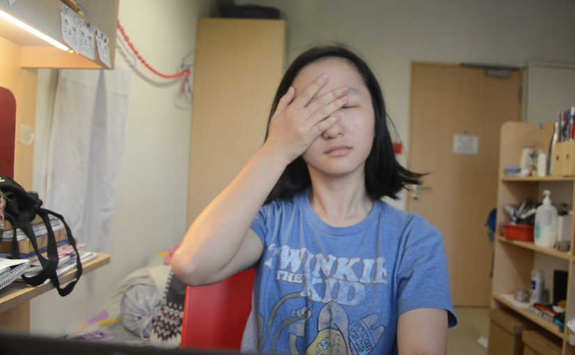
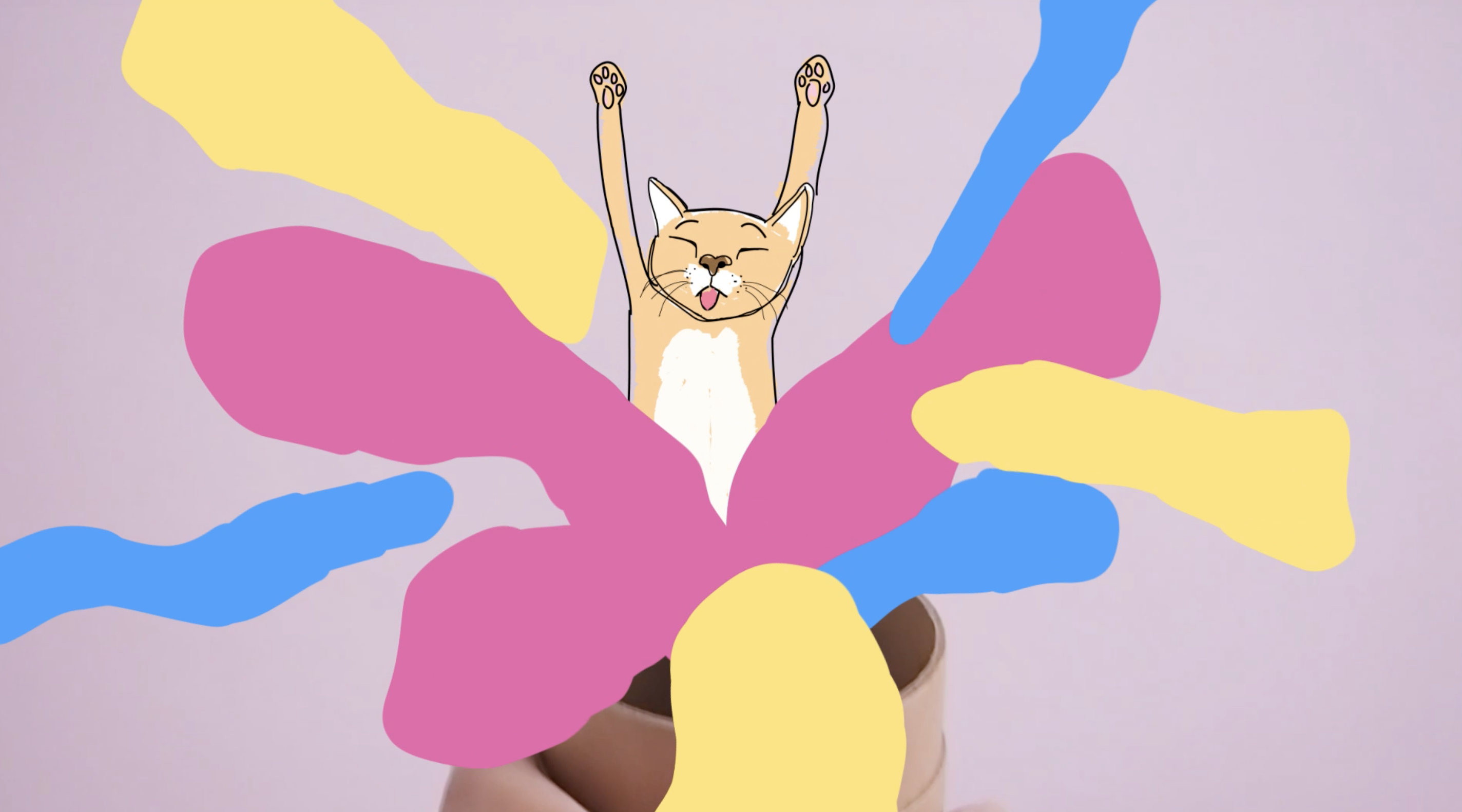
What a lot of people don’t know is that under the reserved facade that I show, I am in fact a little bit crazy as my mom would like to call me, haha. I thought it’d be interesting to show that aspect in the form of animation. I used a plain container box to represent this facade. I would then open up the box to reveal colours spilling out, to represent the “inner” me that is often reserved for family/close friends.
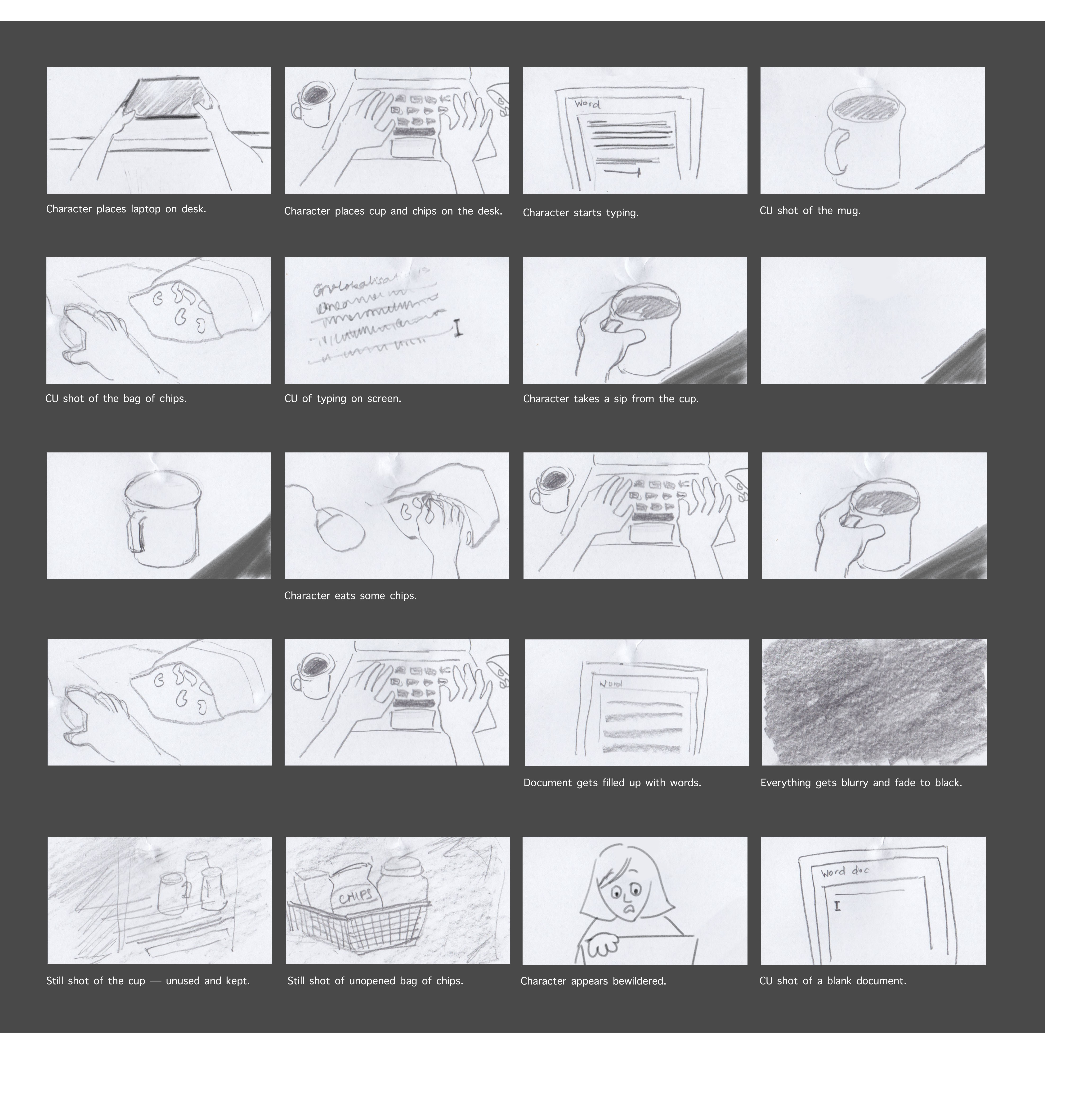
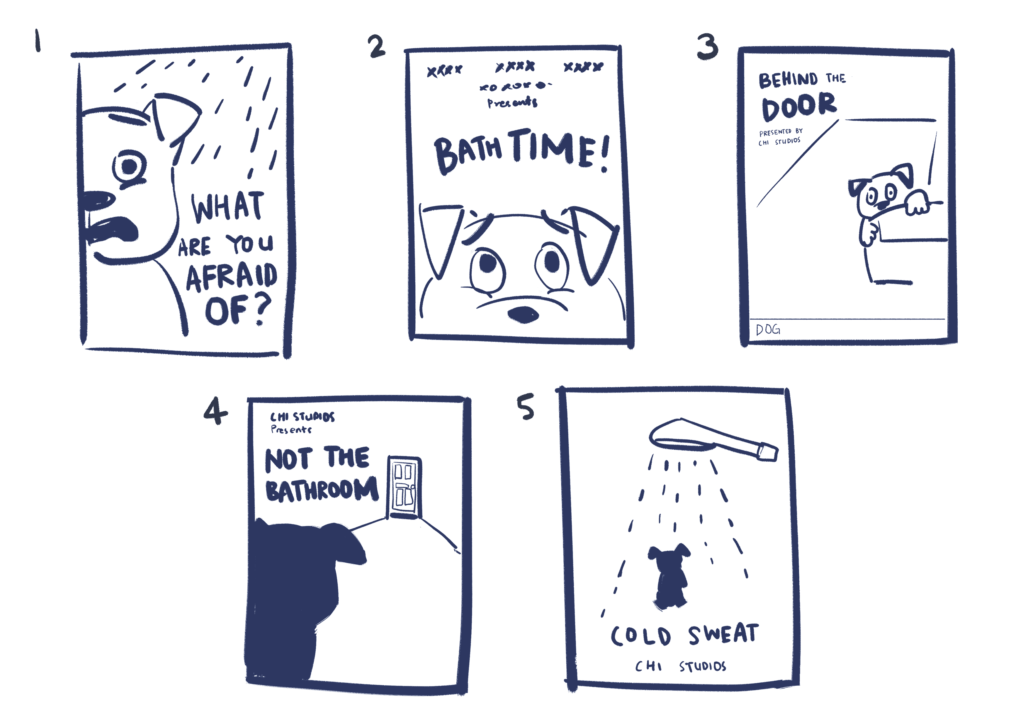
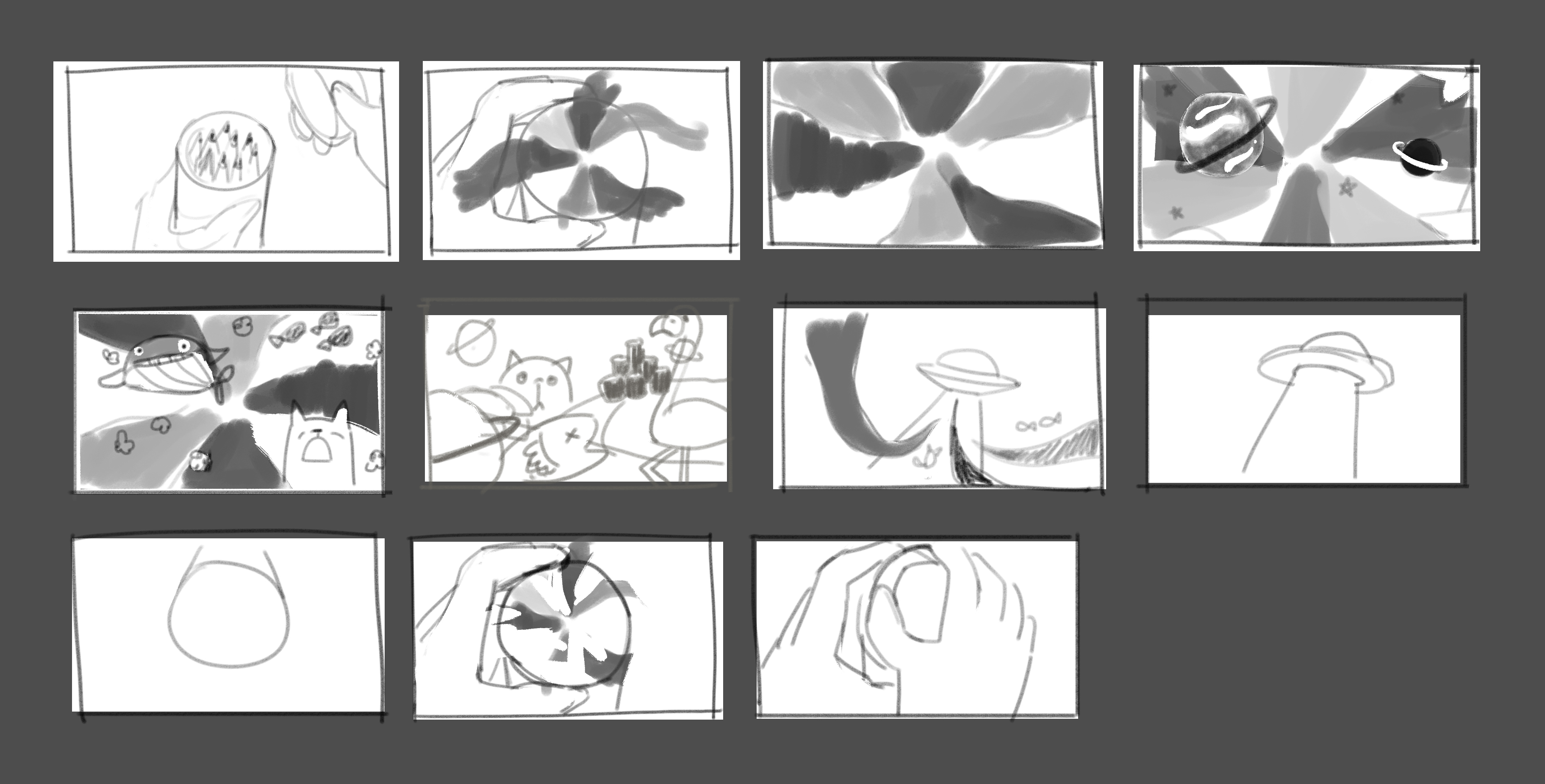
Storyboards

The initial idea of colours spilling out was kept. However in the end I cut out the alien part (that was meant to represent an “external force”) due to time constraint (and also uncertain of solution). I added in scenes as I executed the shots, based on what feels right.
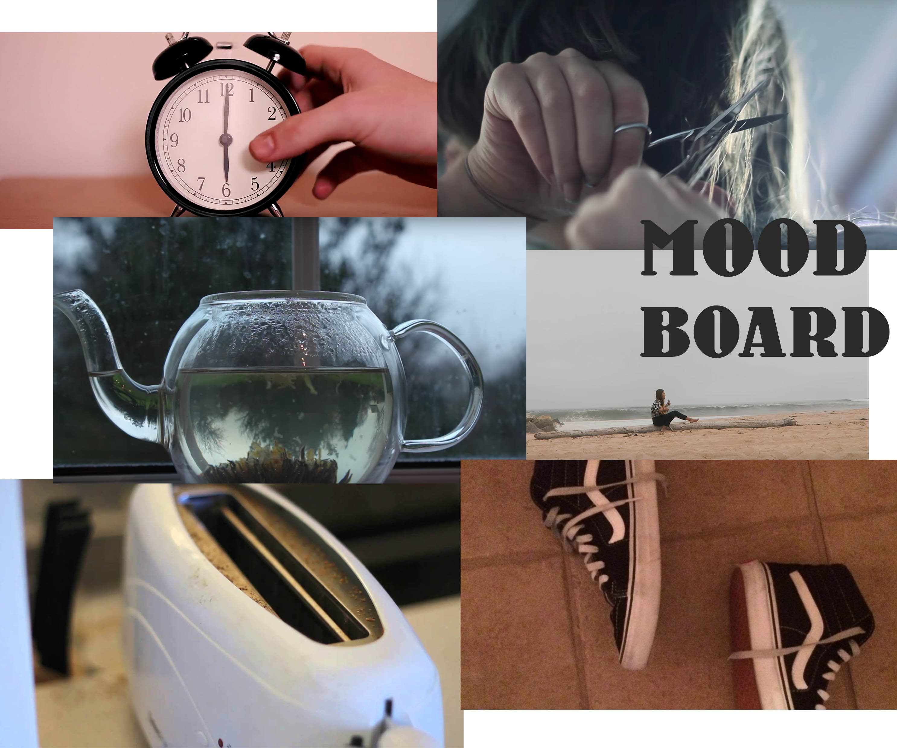
Inspiration

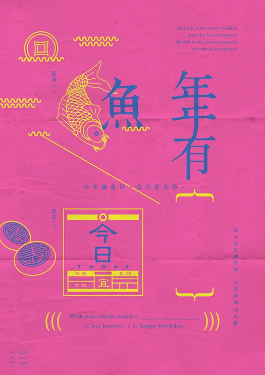
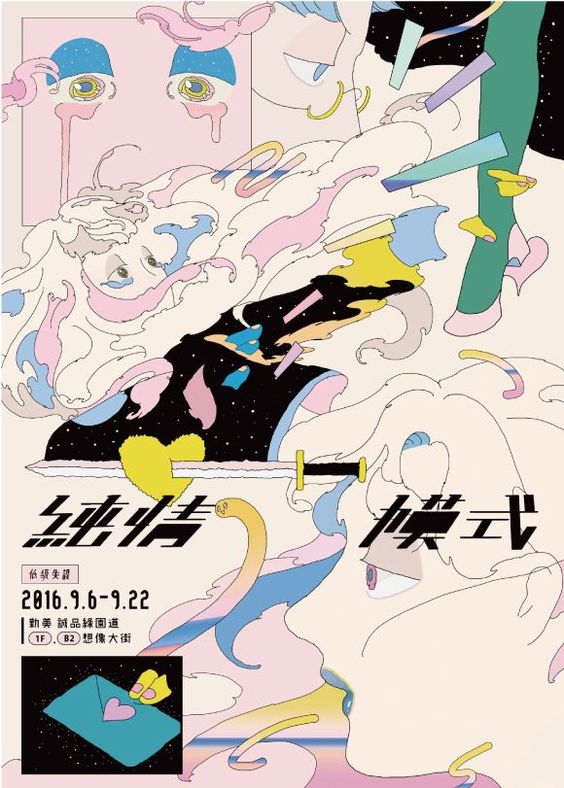
Besides actual motion graphic animations, I was actually inspired by Japanese poster designs. The colour schemes are extremely striking yet harmonised. The visuals of the posters also prompted me to think back on things that relate to me back then and now, which became the motifs included in the short.
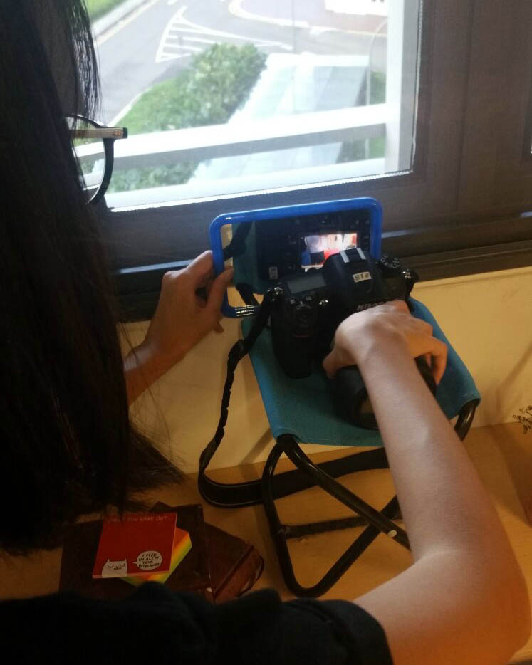
PROCESS

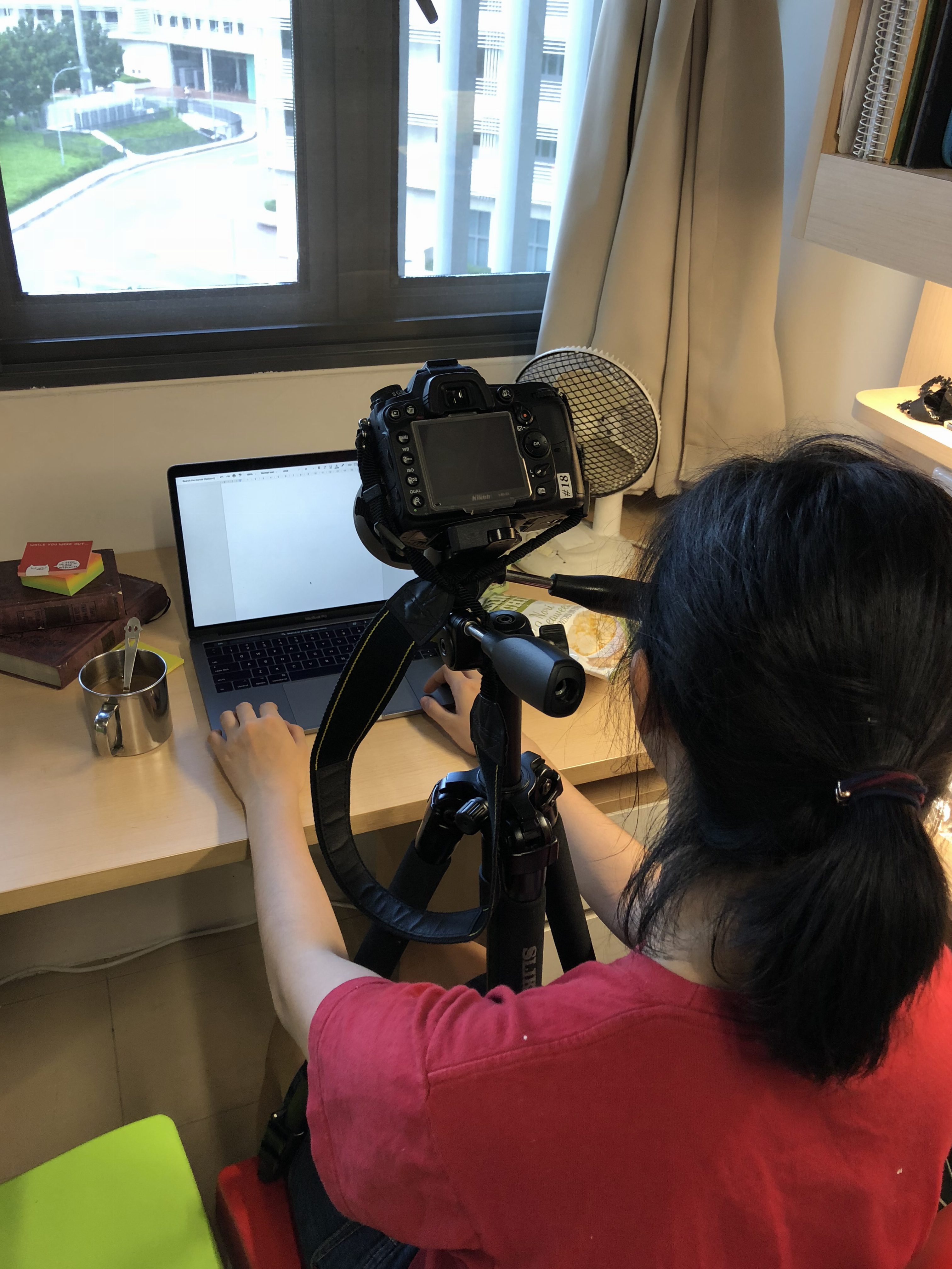
I tried to visualise the final outcome through more detailed storyboards. The toughest part of this project was planning out the shots and transitions.

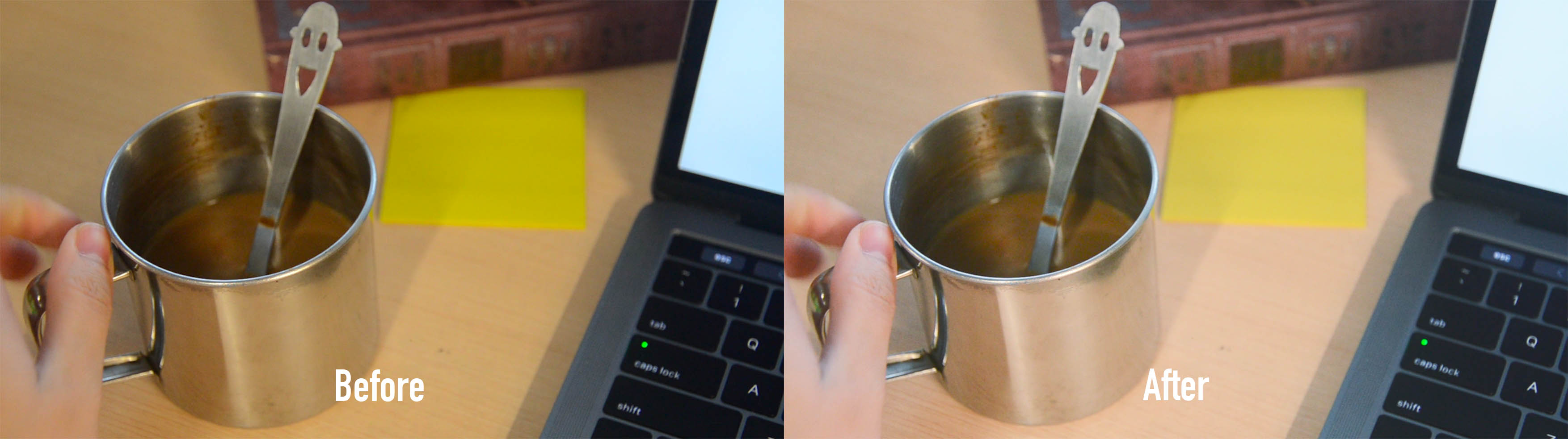
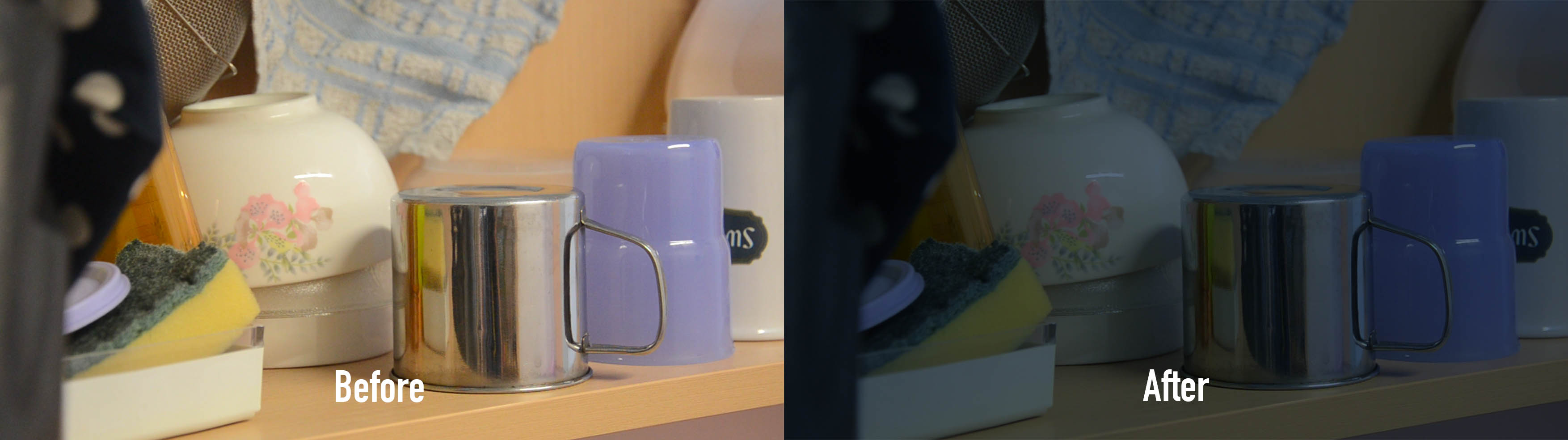
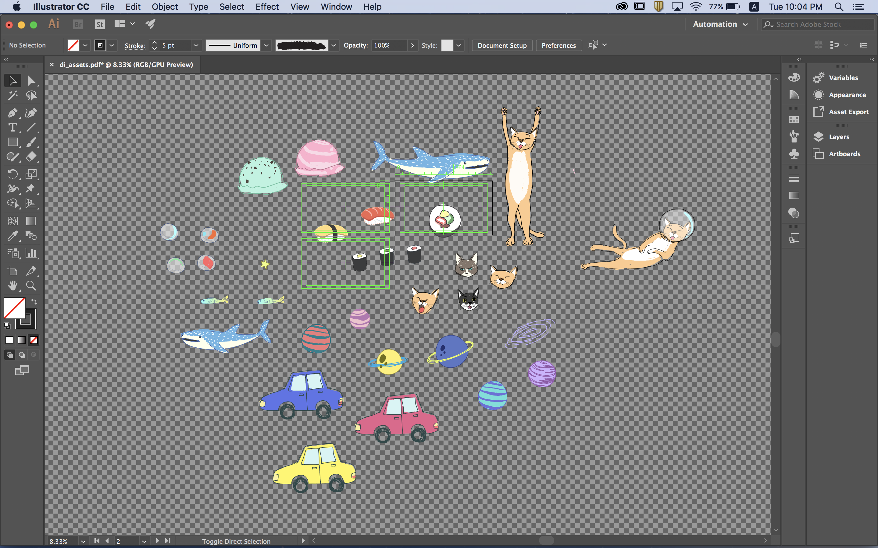
I created the assets in Illustrator (characters / motifs) and Photoshop (background). I animated them fully using After Effects.


I had trouble with this cat popping out sequence as I did not know how to go about animating swirly lines at first. I thought of using Stroke but the lines were too rigid for what I was going for. I decided to look around for tutorials and found that using Roughen Edges and Turbulent Displace helped achieve the soft liquidly feel. I was still dissatisfied with the look as the lines had uniform width throughout. So I installed a Tapered Stroke plugin to achieve the tapered ends.


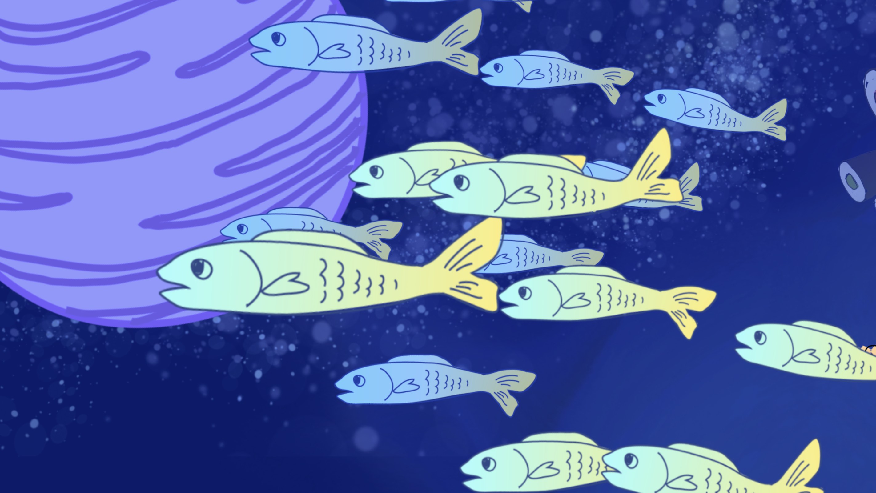
I also tried using the Puppet Tool for simple fish animation.


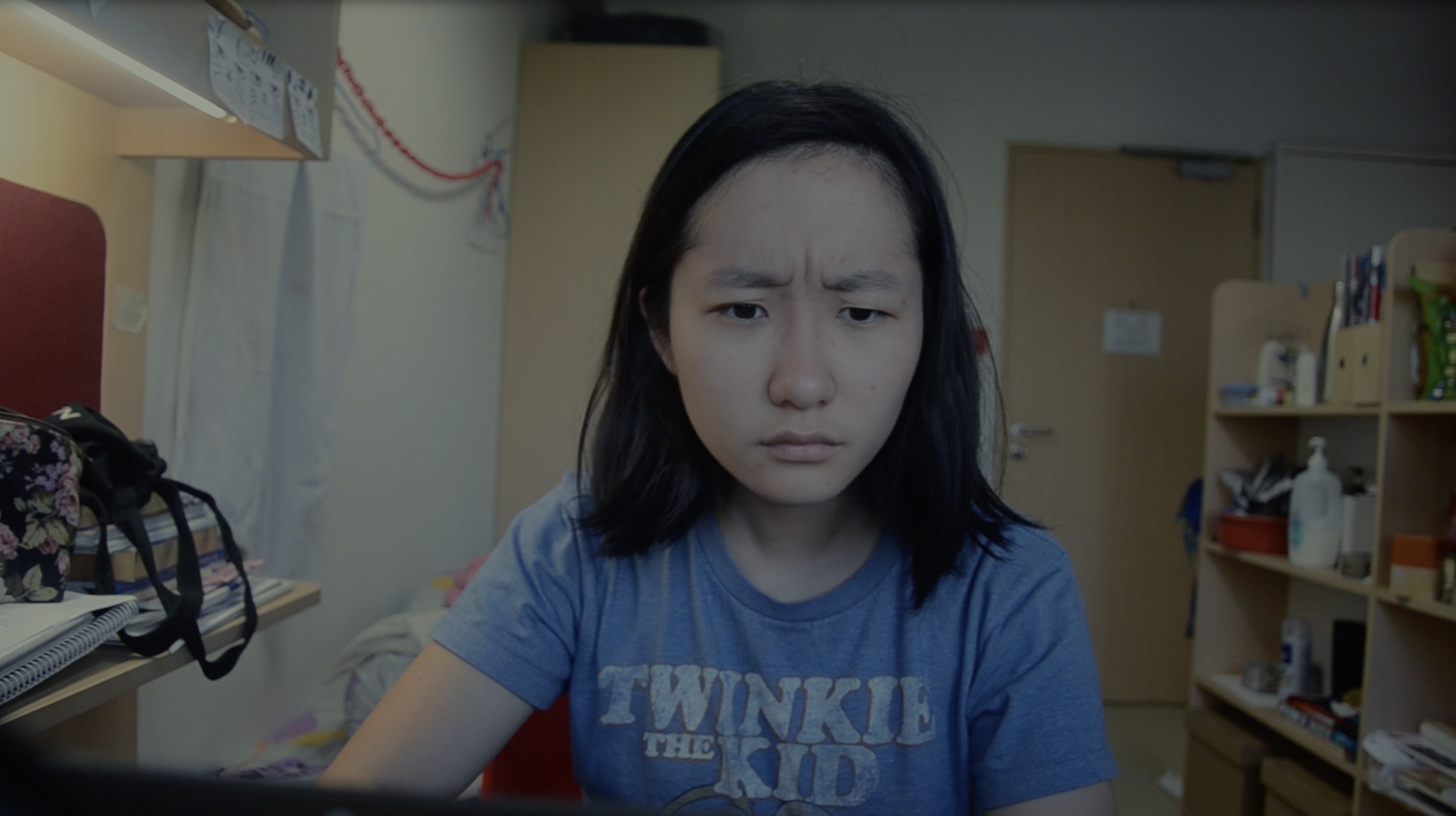
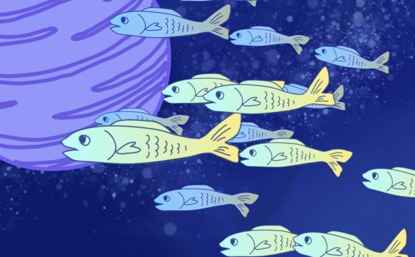
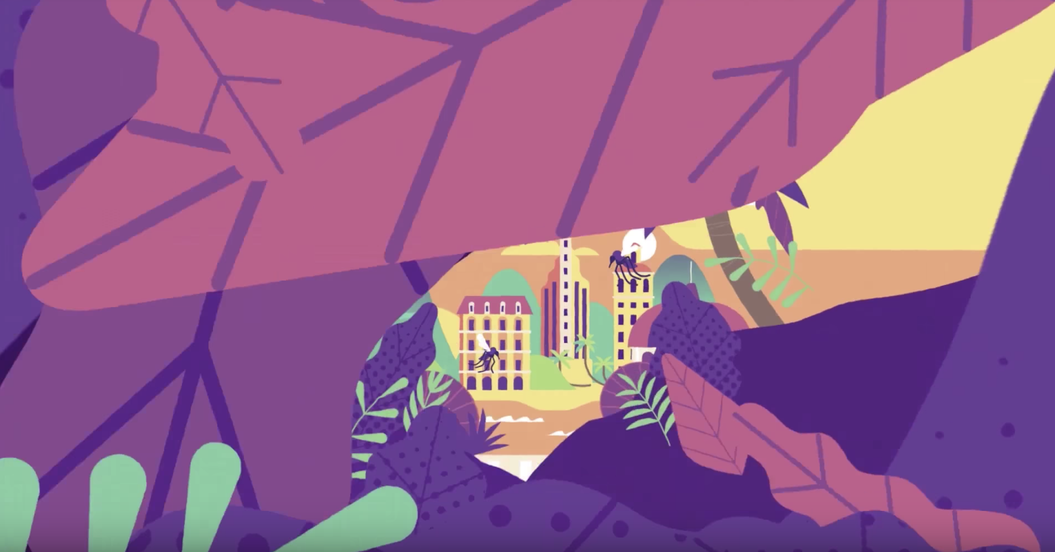
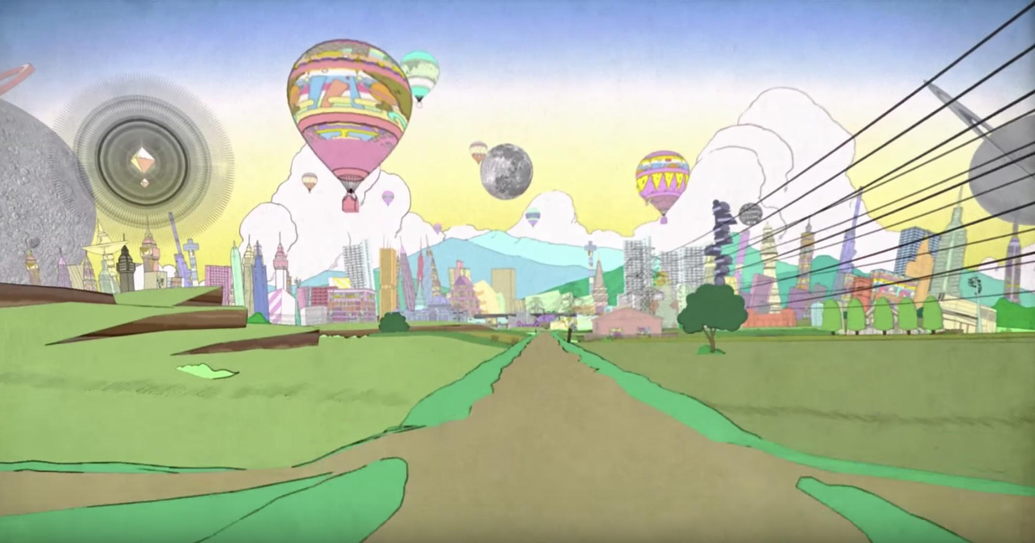
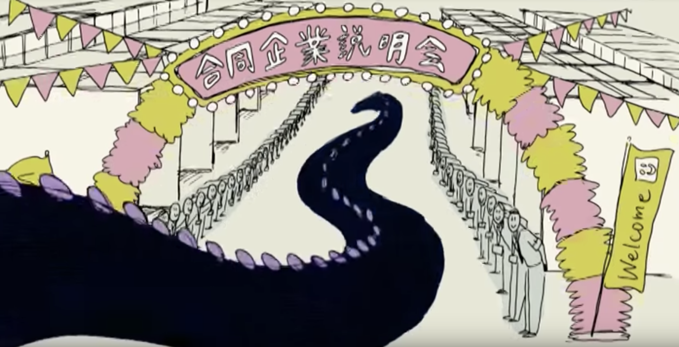
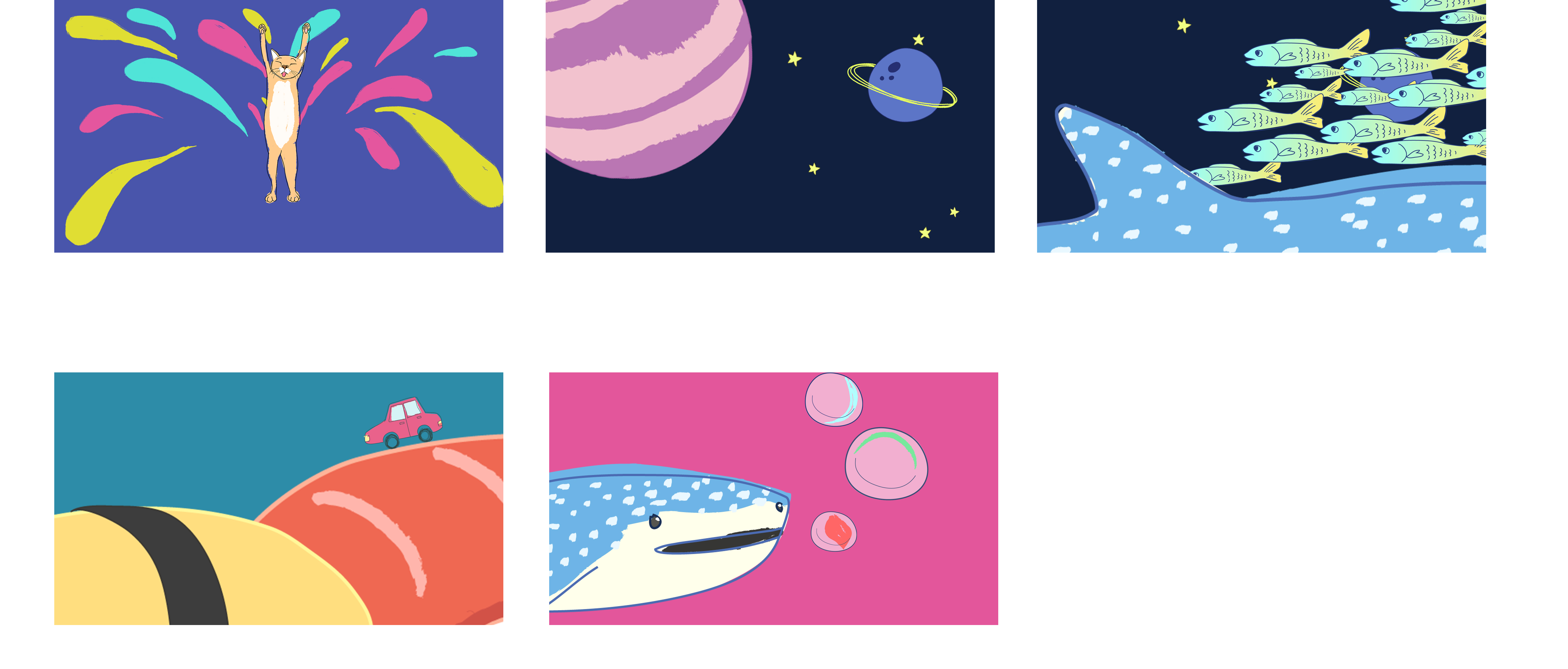
The worlds that I created convey a childlike innocence and playfulness, which reflects who I am inside. The art style is pretty flat and hand drawn to go with the playful theme of the animation.

Takeaways

This is my first ever project done using After Effects. The main takeaway would be that projects using After Effects requires lots of planning. Surprisingly I did not face much problem with the actual execution since I could easily look for solutions online. I was mainly stuck at the transitions because I did not plan those well enough. I also underestimated how much assets I’d need to create.

Through the project I learnt how to use different effects, some of which were not taught in class like Turbulent Displace and Roughen Edges. Overall, I think I am now less intimidated by the software.

Assignment 03: A Short film about Dreams

TASK

Create a Mise-en-scene short film depicting ‘Dreams’.

Final film

IDEA / CONCEPT

Dreaming about doing work and waking up to find that the piece of work is not completed is something that I experience quite often myself. I decided to create a somewhat experimental short film that is relatable to the viewer. The start of the film feels ambiguous, we do not know that we are looking at a first person view of the character in her dream. Only at the end then it is made clear that it is a dream. I wanted the overall look and feel of the film to be on the mellow side.

Reference videos

I gained a lot inspiration from experimental films with slow pacing.

STORYBOARD

I intentionally used a lot of close up / medium close up first person view shots as that is all we see or remember in our dreams (unless the dream is third person view). By not showing the character in the beginning and only revealing the face at the end, it would make it clearer that this whole sequence was a dream. I use the drink and chips to show the passing of time in addition to all the typing.

Shooting & EDITING

The film was shot over 2 days (1 day for reshooting shots that I didn’t quite nail on the first day) at Rebecca’s dorm, using the Nikon D7000. Framing the shots was difficult in the small space of her dorm since most of the shots were “first-person view”. The shot of her waking up had to be shot “blindly” because there was not enough room to place a tripod on the table and the lens was not wide angle enough.


Since the concept is very simple with a lot of repetitive shots, I tried to play around with pacing. The build-up was particularly difficult to achieve — I had to rework that part multiple times. It might have to do with my choice of shots. Increasing the speed of the clips helped in quickening up the pace of the film.

I also faced some problems with colour grading as the lighting was not ideal. I tried to shoot in natural daylight as much as possible but towards the late afternoon the daylight was not sufficient. We had no choice but to turn on the room lights, which gave the footage a warm tone which was difficult to work with in post production.

I colour graded the shots after the character wakes up to be darker and a cooler tone to give contrast between the two states of being in a dream vs. real life.


Sound

Instead of pacing the film around a piece of music, I decided to just include diegetic sound. It was tough sourcing for music that fits the theme and duration of the film as it has to increase in tempo at the right timing. I also tried using softwares to compose my own music but figuring out the softwares took too long.

The audio from the footage was noisy, so I borrowed the Zoom H4n record my own sound effects. I used Audacity to do some simple editing with the sounds after that (mainly noise reduction). Any other sound effects that I couldn’t replicate nicely was taken from freesound.org.

I increased the volume of the sound effects when the cuts of the clips speed up. Reverb was added to the ticking sound of the clock during the dream so that it hints that something is amiss.


Movie Campaign // Cold Sweat

Task: Create an original movie campaign for a brand new film.

Ideation

In the beginning, I was stuck on what kind of movie poster I should do. I thought of working based off the fear panel from the previous assignment, which was a dog being afraid of baths, and create a movie poster for an animated film. I wanted the poster to “troll” people in a sense. So I looked into both animated and horror film movie posters. I intended to combine elements from both genres and find a balance that suits the theme that I was going for.


Process

After researching on movie posters, I drew some thumbnail sketches to decide on the composition. I tried to apply design principles such as symmetry, asymmetry, leading lines, framing etc in the arrangement of elements.

My criteria for selecting the final composition was that it had to be simple and yet stand out. I asked around for other people’s opinions too — some agreed that 2 stood out the most so I picked that one. I also liked 3 because of its asymmetry but I felt that it wouldn’t make a statement as compared to 1 or 2. I did not pick 1 because it was inspired from/similar to an existing film (Puppy! A Hotel Transylvania Short by Sony Pictures Animation) so I didn’t want to be too influenced by their film.


Featuring cringey movie titles.
Thumbnail 1 was too similar to this.


From the chosen thumbnail, I roughly figured out what sort of colour I want my poster to be. Following the horror theme, I knew it needed to be dark and not as saturated. I also decided to add a beam of light (supposedly coming from a bathroom door) to help with the composition in terms of values. 

I use these thumbnails as a rough guide, because the colours of the my final work are usually adjusted again based on my preferences after completing the painting then. Below are some of the edits that I considered using.

Left: The least colourful of the three — it works, but I preferred something with a bit more colour. Especially since it is an animated film.

Middle: Need more colour.

Right: The blue/green tones make the dog look cold instead of scared in my opinion.

Final work

I opted for a subtle purple tint in the end. Composition wise, every element is centralised, and I use the beam of light (coming from a bathroom door) to offset the balance a little. The font of the title is not following the horror theme — I did not want the poster to look like a full fledged horror film. From the references that I have, animation film posters had dynamic fonts so I picked a font that is spontaneous looking and not scary. I added water droplet and dirty mirror stains to keep to the bathroom element.


cold sweat
noun
  1. a state of sweating induced by fear, anxiety, or illness


Movie Campaign Shots

Most movie campaigns can be seen around MRT stations in Singapore, so I composited the poster into some of these boards.


I also modified the poster into a banner type so that it could be placed in MRT cabins.