Task: Create an original movie campaign for a brand new film.
Ideation
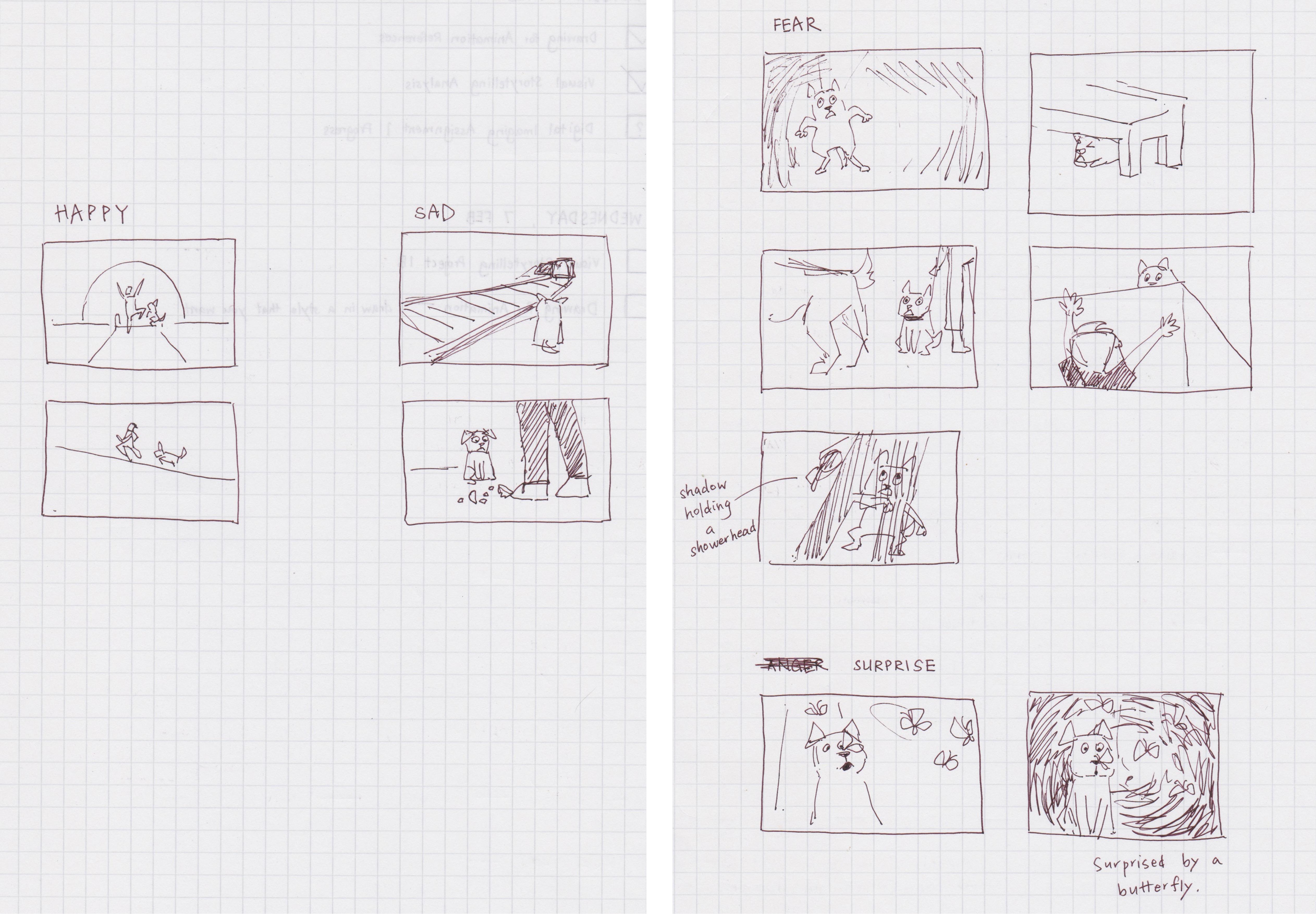
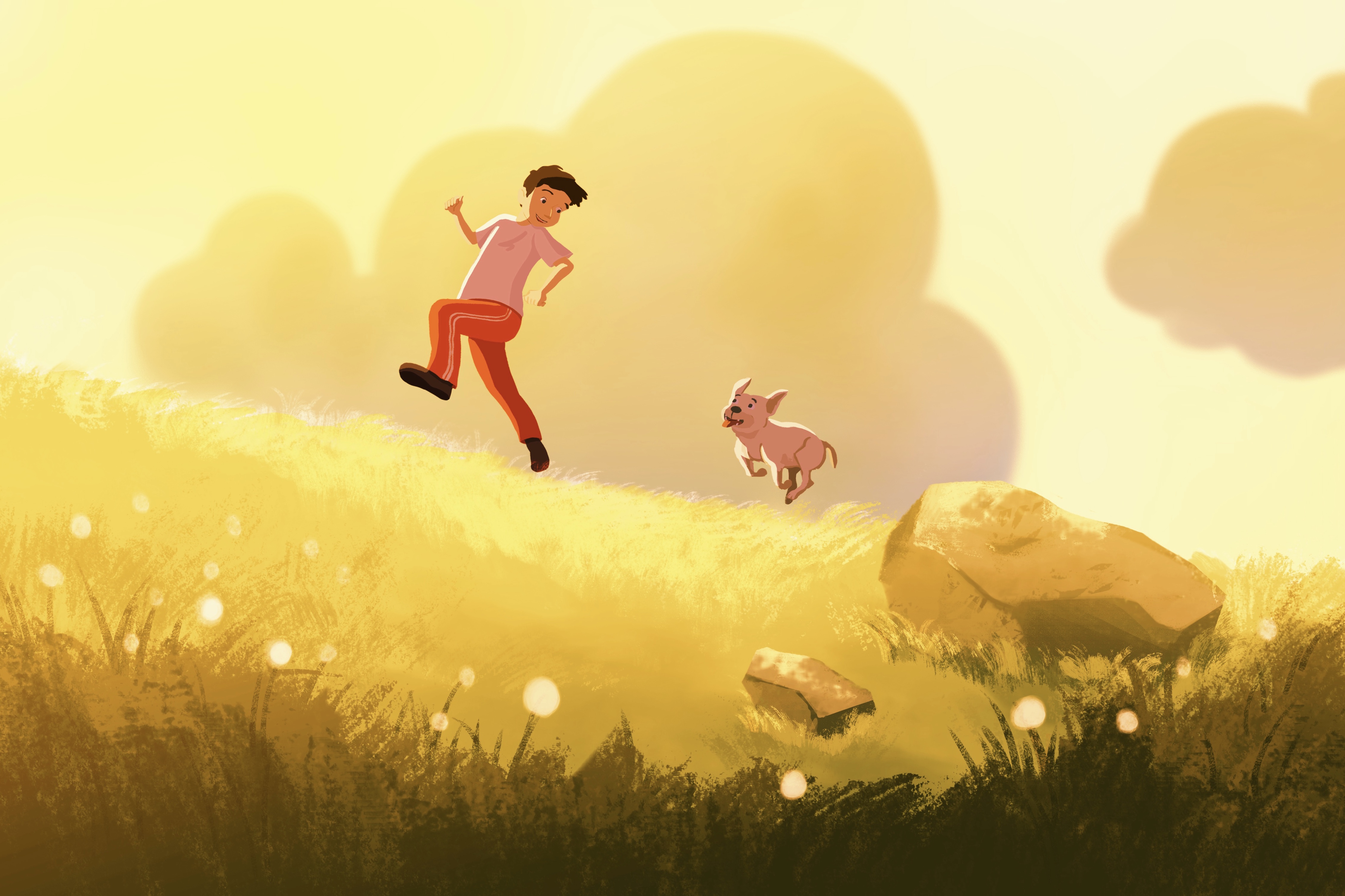
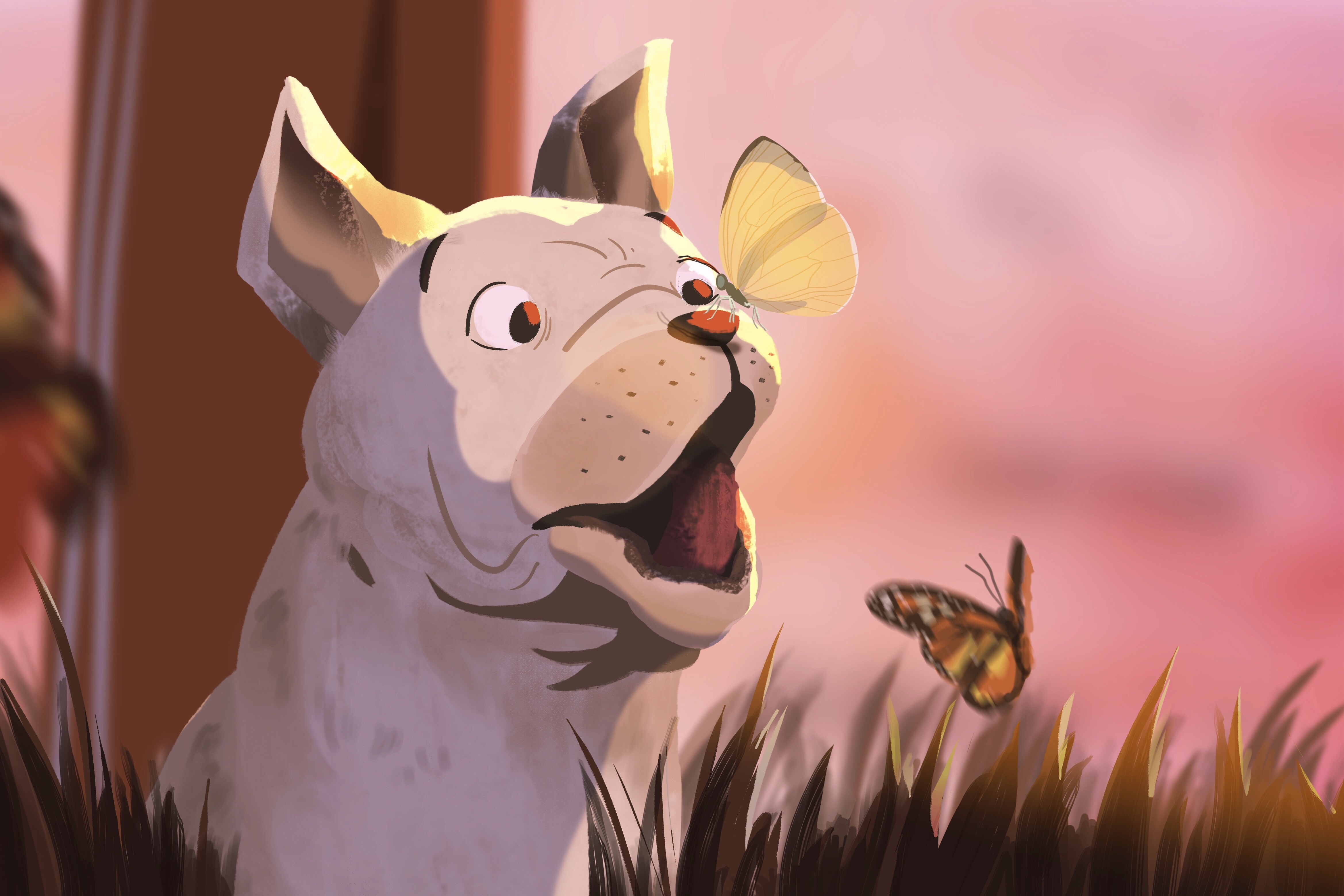
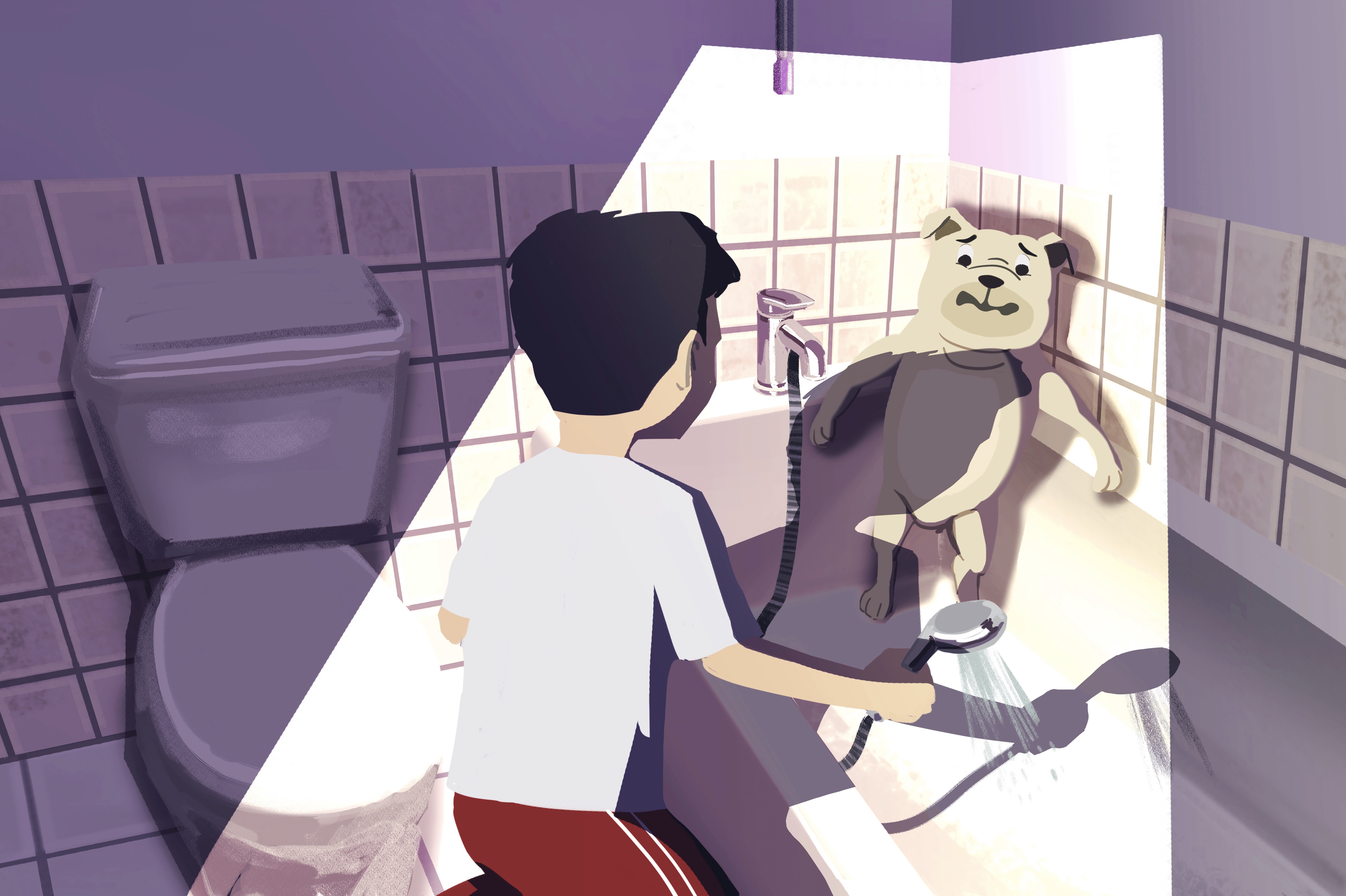
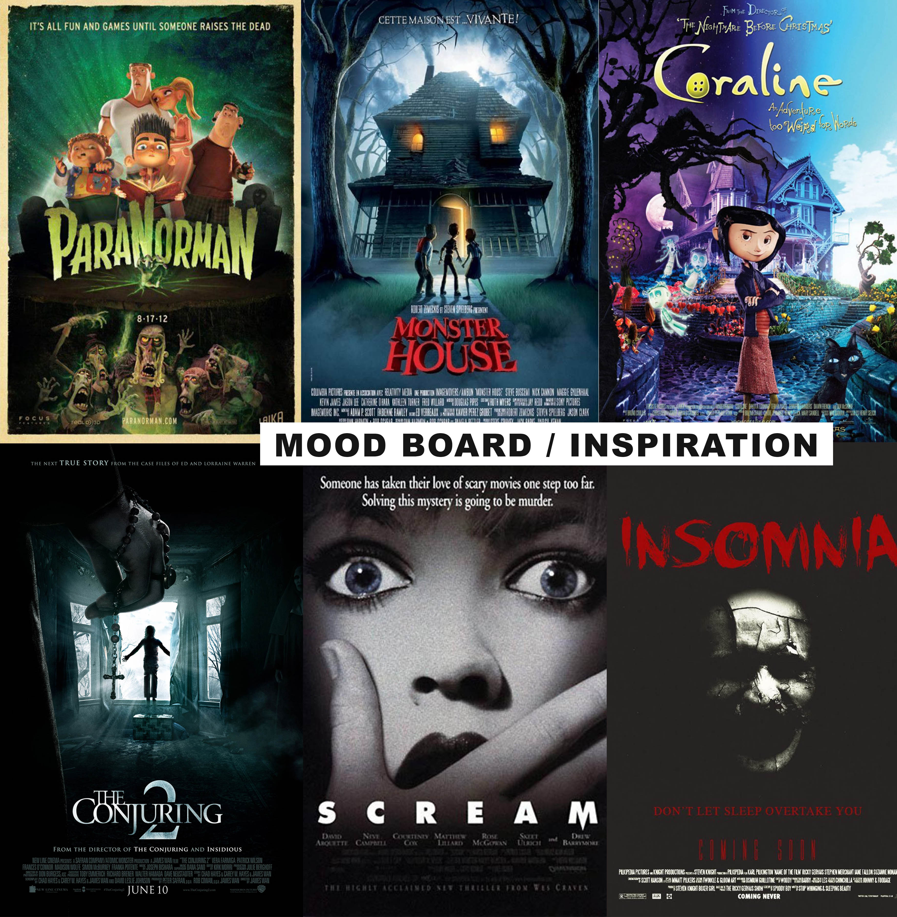
In the beginning, I was stuck on what kind of movie poster I should do. I thought of working based off the fear panel from the previous assignment, which was a dog being afraid of baths, and create a movie poster for an animated film. I wanted the poster to “troll” people in a sense. So I looked into both animated and horror film movie posters. I intended to combine elements from both genres and find a balance that suits the theme that I was going for.
Process
After researching on movie posters, I drew some thumbnail sketches to decide on the composition. I tried to apply design principles such as symmetry, asymmetry, leading lines, framing etc in the arrangement of elements.
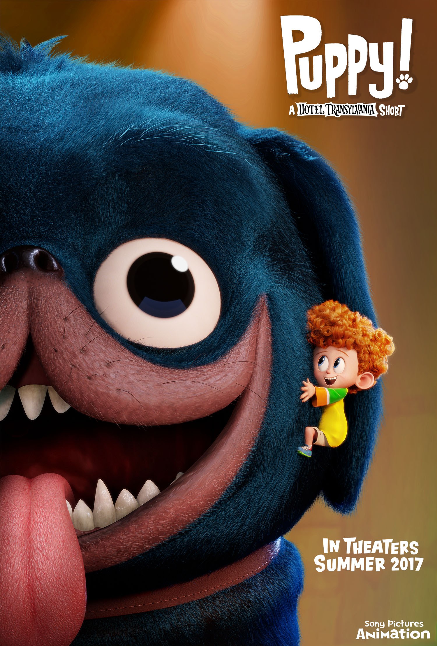
My criteria for selecting the final composition was that it had to be simple and yet stand out. I asked around for other people’s opinions too — some agreed that 2 stood out the most so I picked that one. I also liked 3 because of its asymmetry but I felt that it wouldn’t make a statement as compared to 1 or 2. I did not pick 1 because it was inspired from/similar to an existing film (Puppy! A Hotel Transylvania Short by Sony Pictures Animation) so I didn’t want to be too influenced by their film.
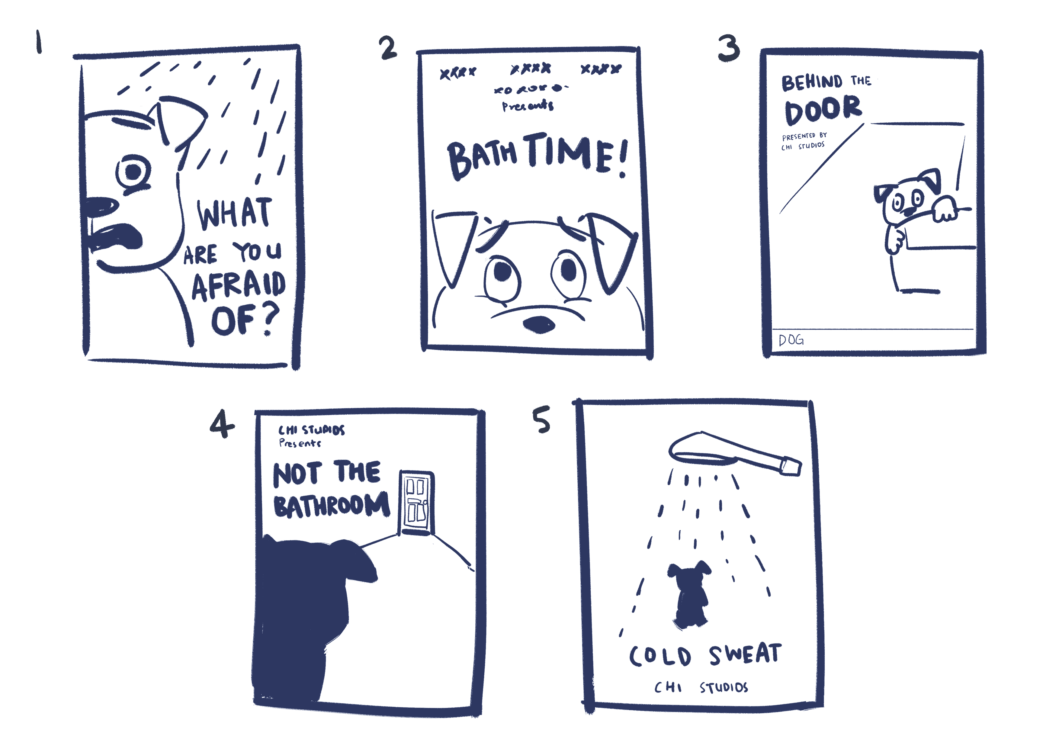
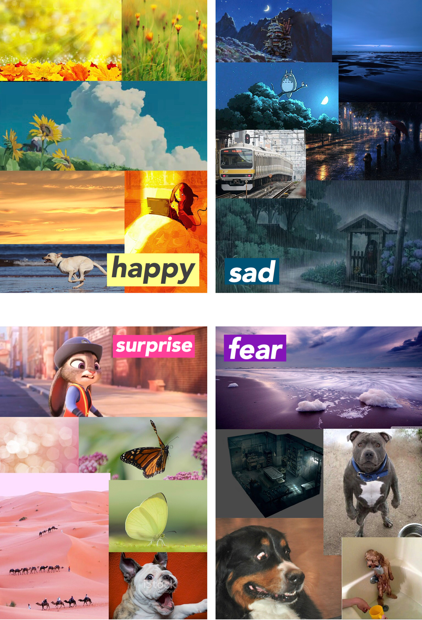
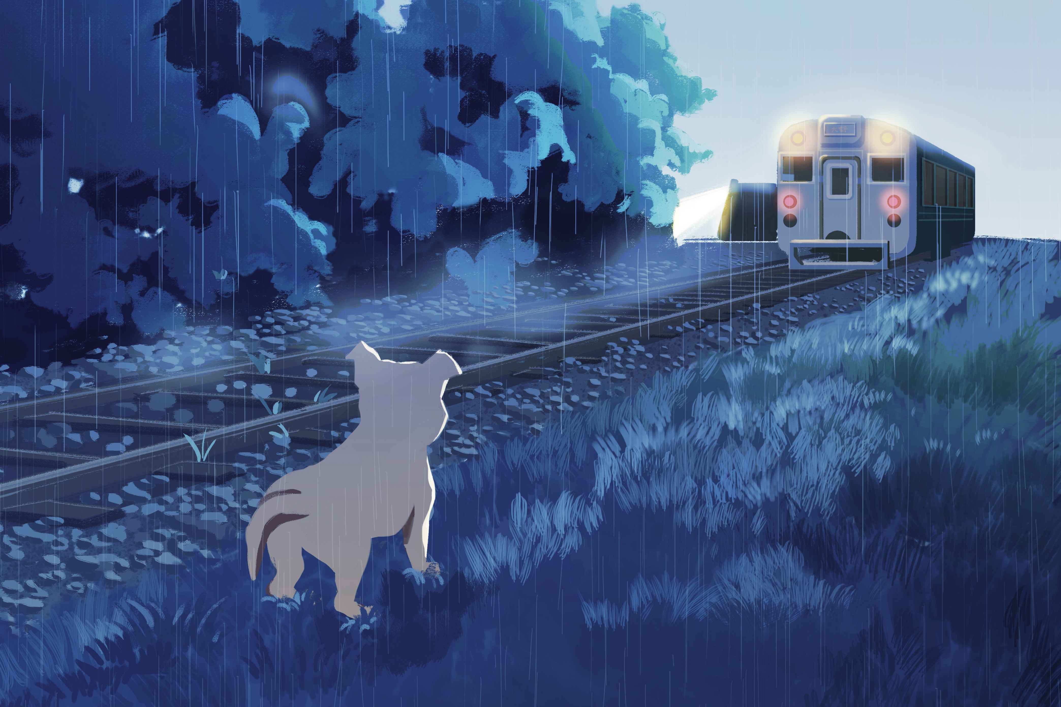
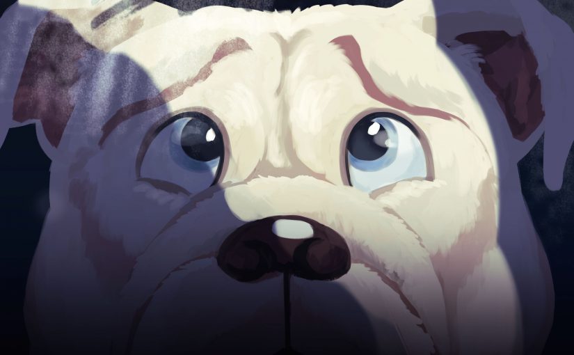
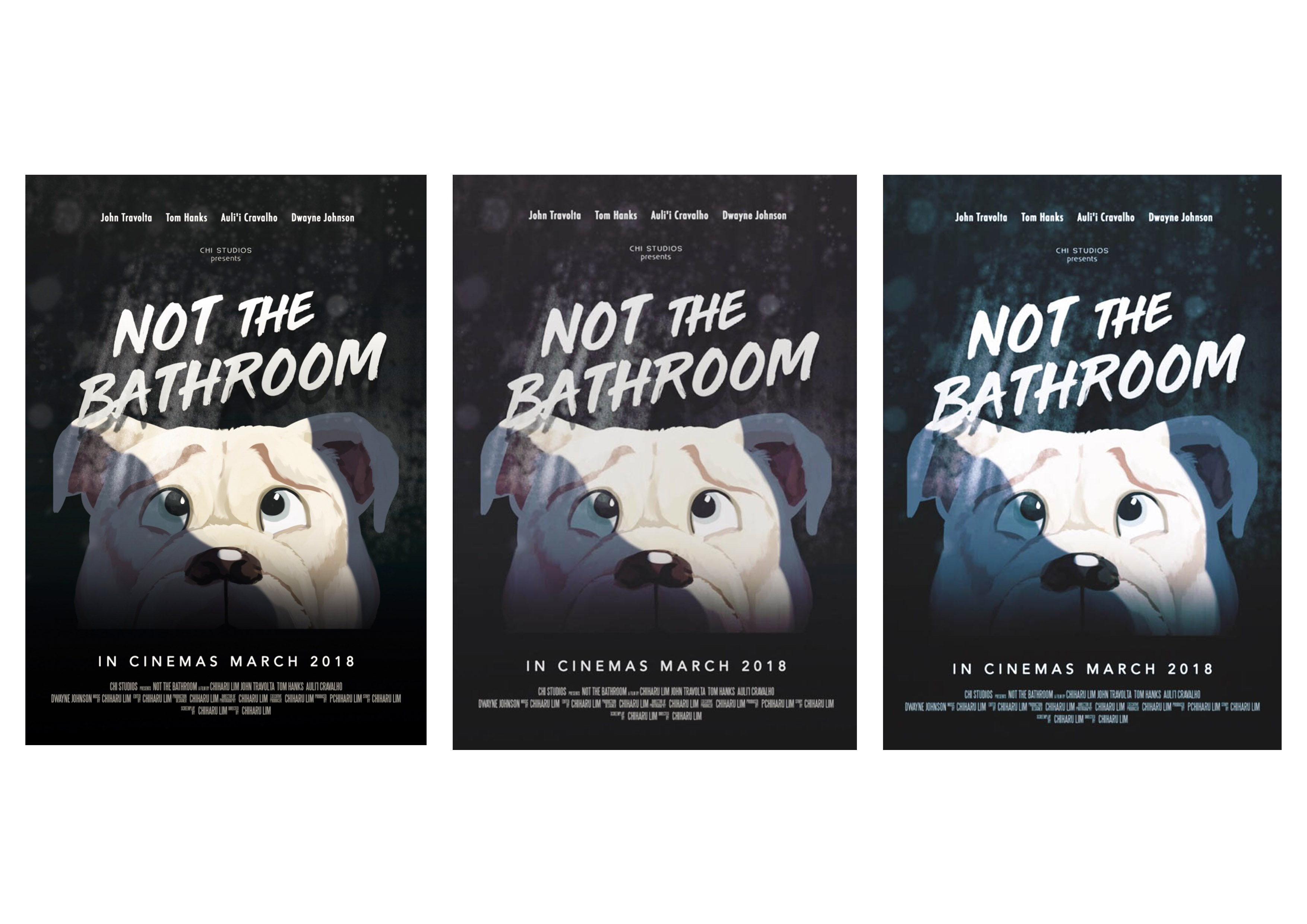
From the chosen thumbnail, I roughly figured out what sort of colour I want my poster to be. Following the horror theme, I knew it needed to be dark and not as saturated. I also decided to add a beam of light (supposedly coming from a bathroom door) to help with the composition in terms of values. 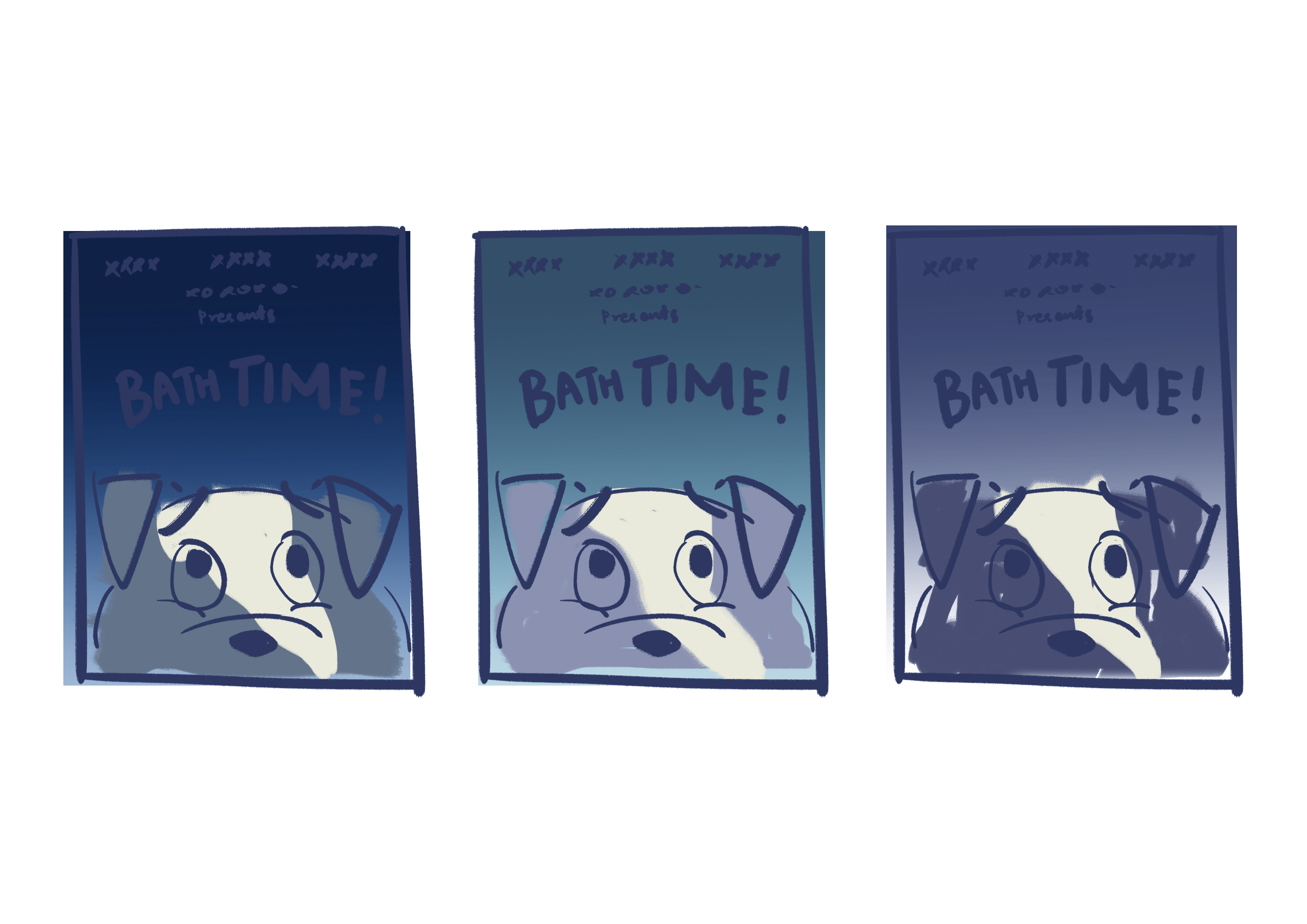
I use these thumbnails as a rough guide, because the colours of the my final work are usually adjusted again based on my preferences after completing the painting then. Below are some of the edits that I considered using.
Left: The least colourful of the three — it works, but I preferred something with a bit more colour. Especially since it is an animated film.
Middle: Need more colour.
Right: The blue/green tones make the dog look cold instead of scared in my opinion.
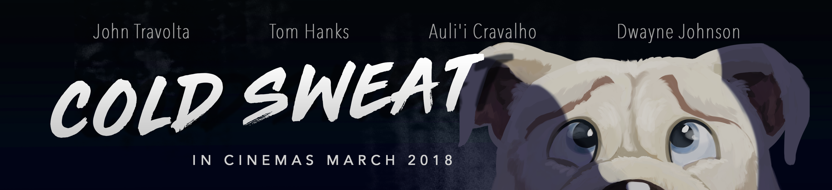
Final work
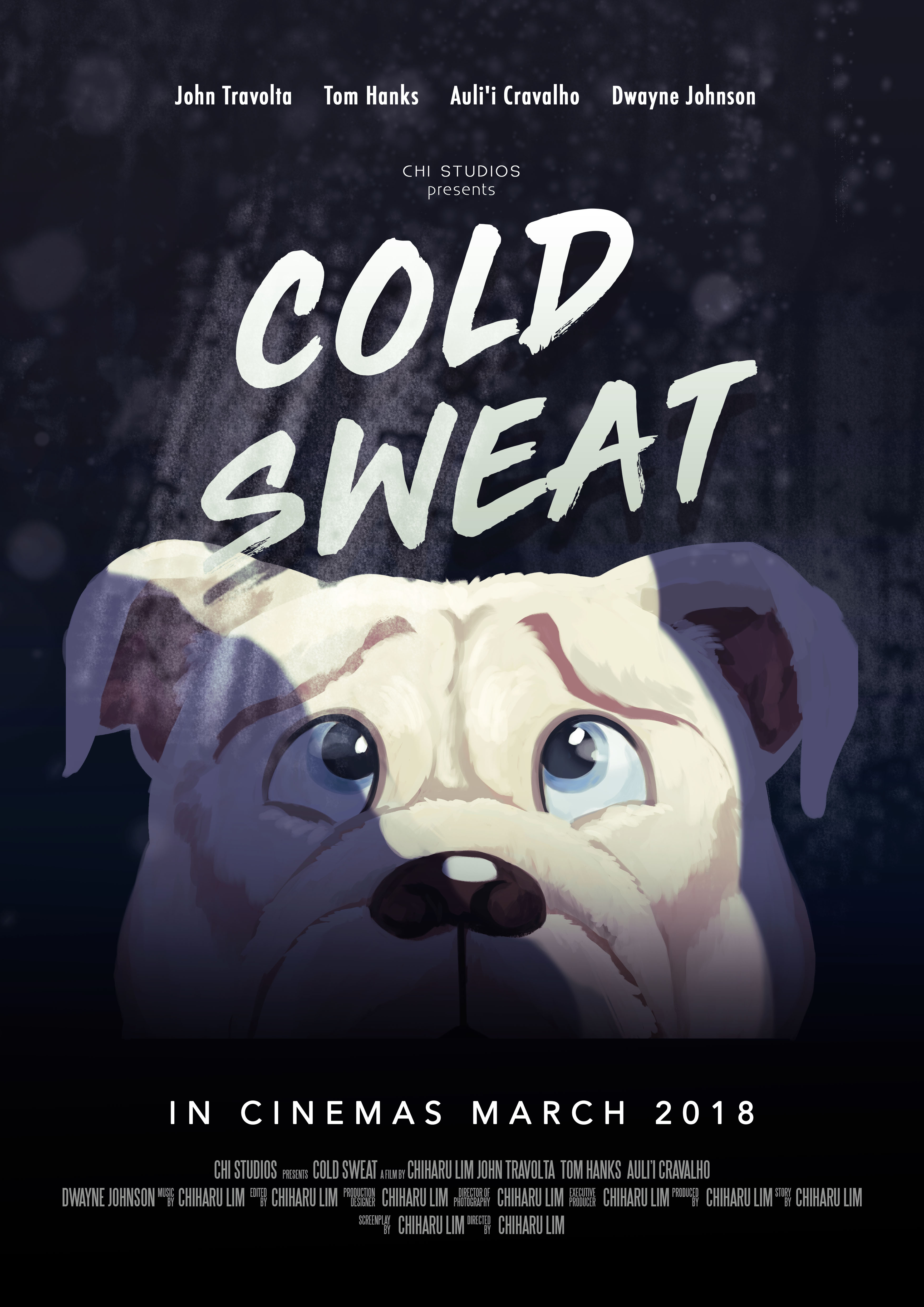
I opted for a subtle purple tint in the end. Composition wise, every element is centralised, and I use the beam of light (coming from a bathroom door) to offset the balance a little. The font of the title is not following the horror theme — I did not want the poster to look like a full fledged horror film. From the references that I have, animation film posters had dynamic fonts so I picked a font that is spontaneous looking and not scary. I added water droplet and dirty mirror stains to keep to the bathroom element.
cold sweatnoun
- a state of sweating induced by fear, anxiety, or illness
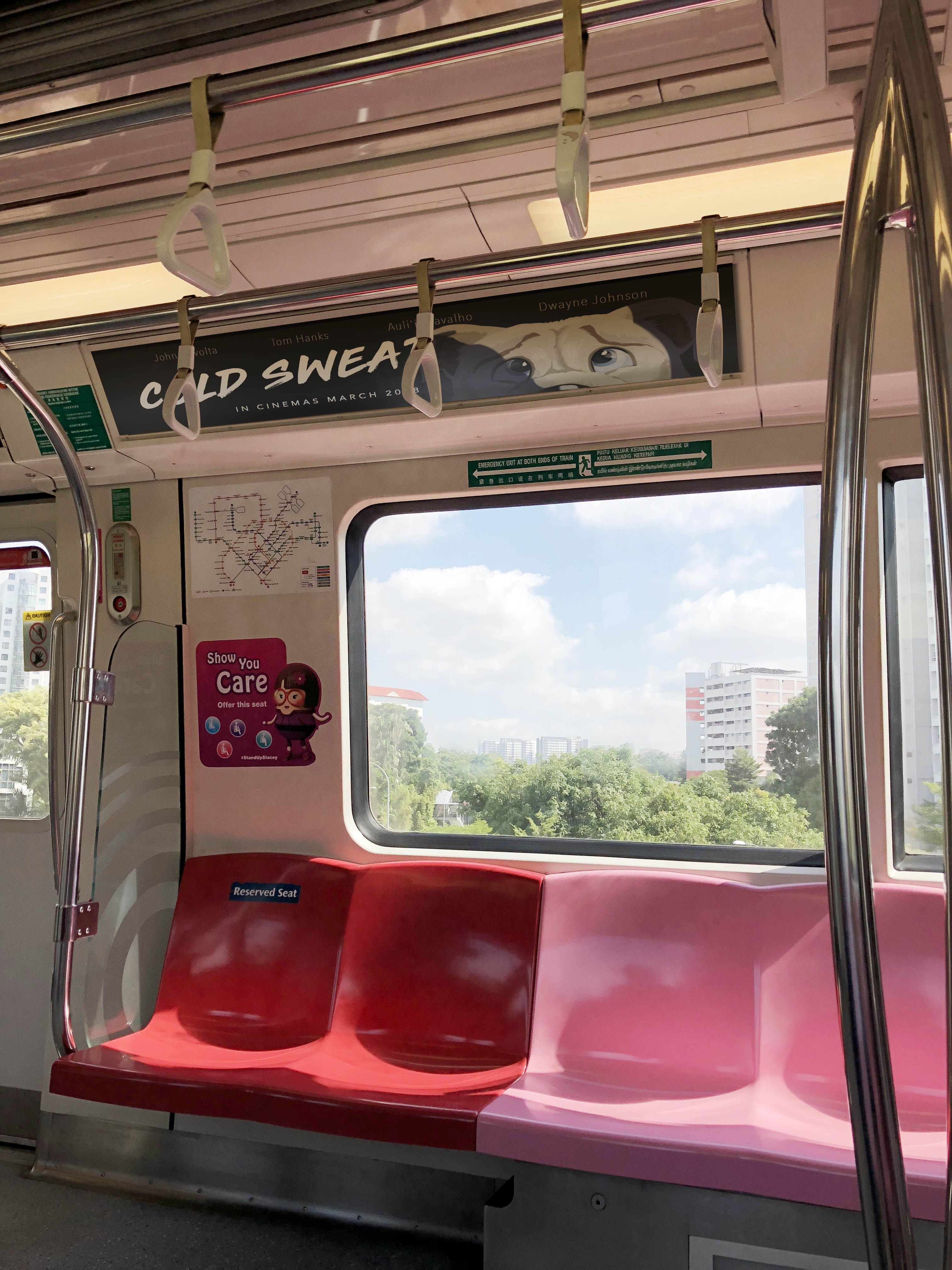
Movie Campaign Shots
Most movie campaigns can be seen around MRT stations in Singapore, so I composited the poster into some of these boards.
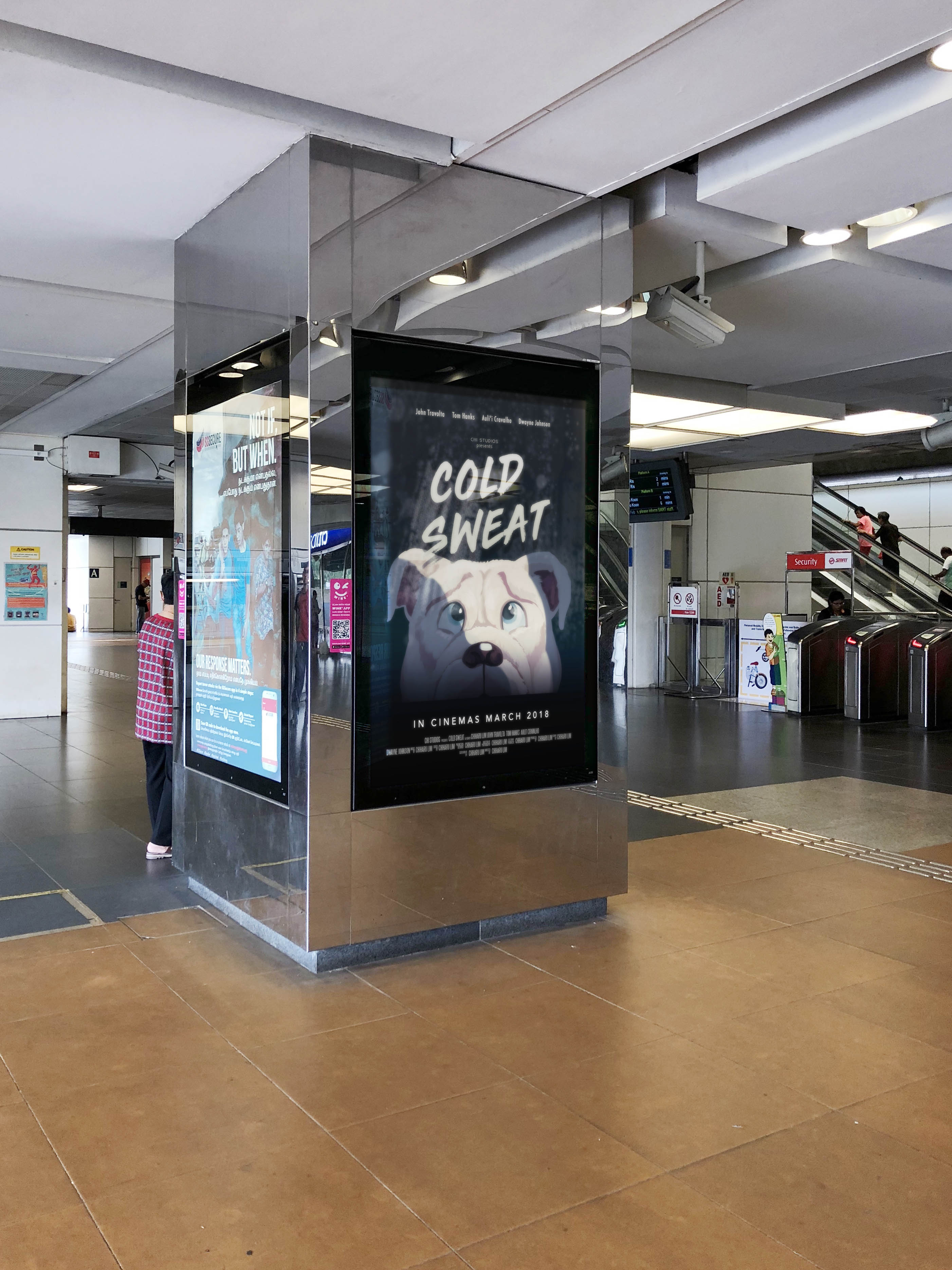
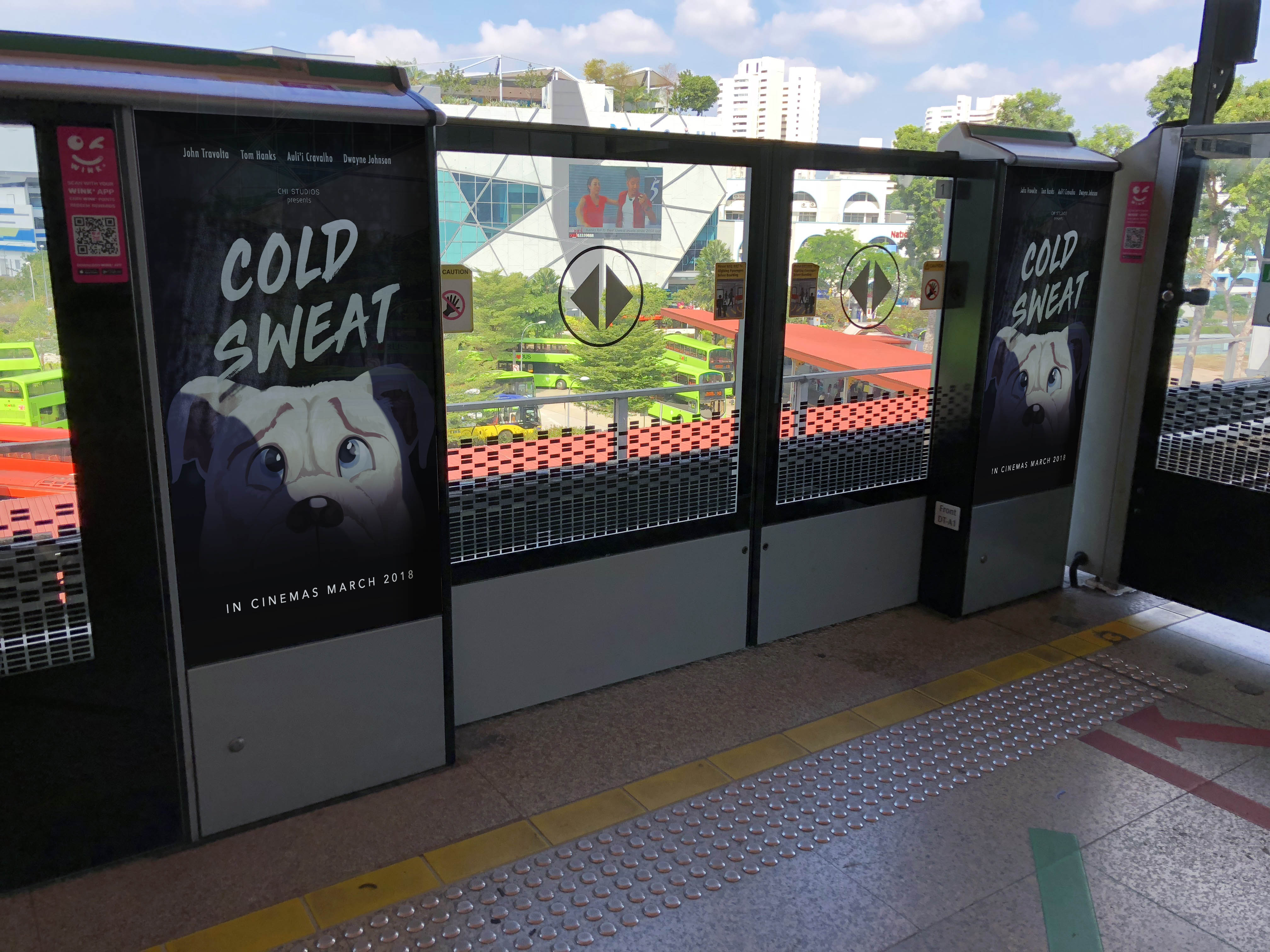
I also modified the poster into a banner type so that it could be placed in MRT cabins.