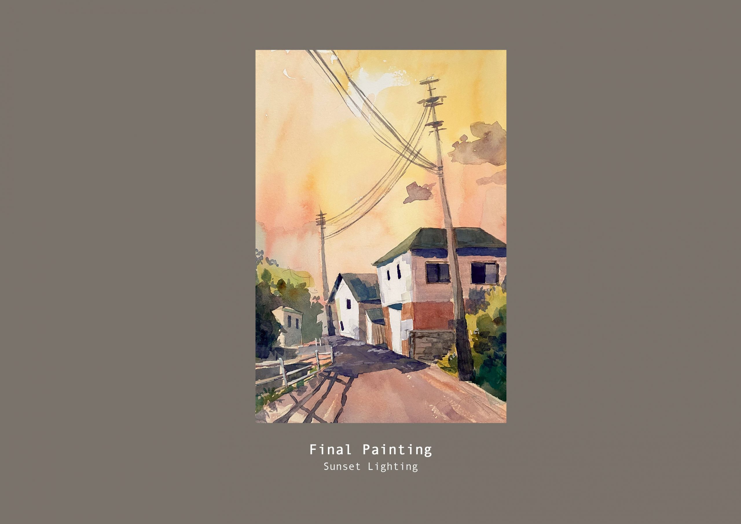
Topic 1: Depict certain weather or atmospheric condition
I reworked the perspective of the houses to be a bit more wonky to give it character. I think the overall colour harmony could have been better, I was trying to be a bit more spontaneous while referring to my colour tests but I think the colours of the houses can be less muddy looking.
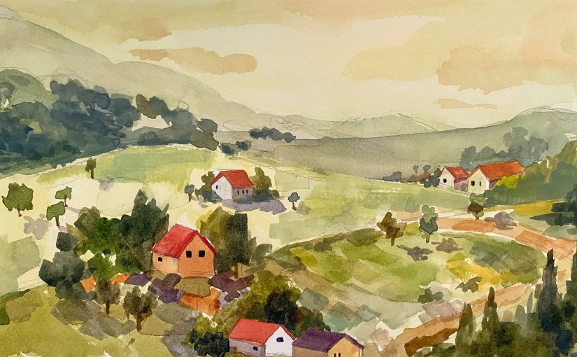
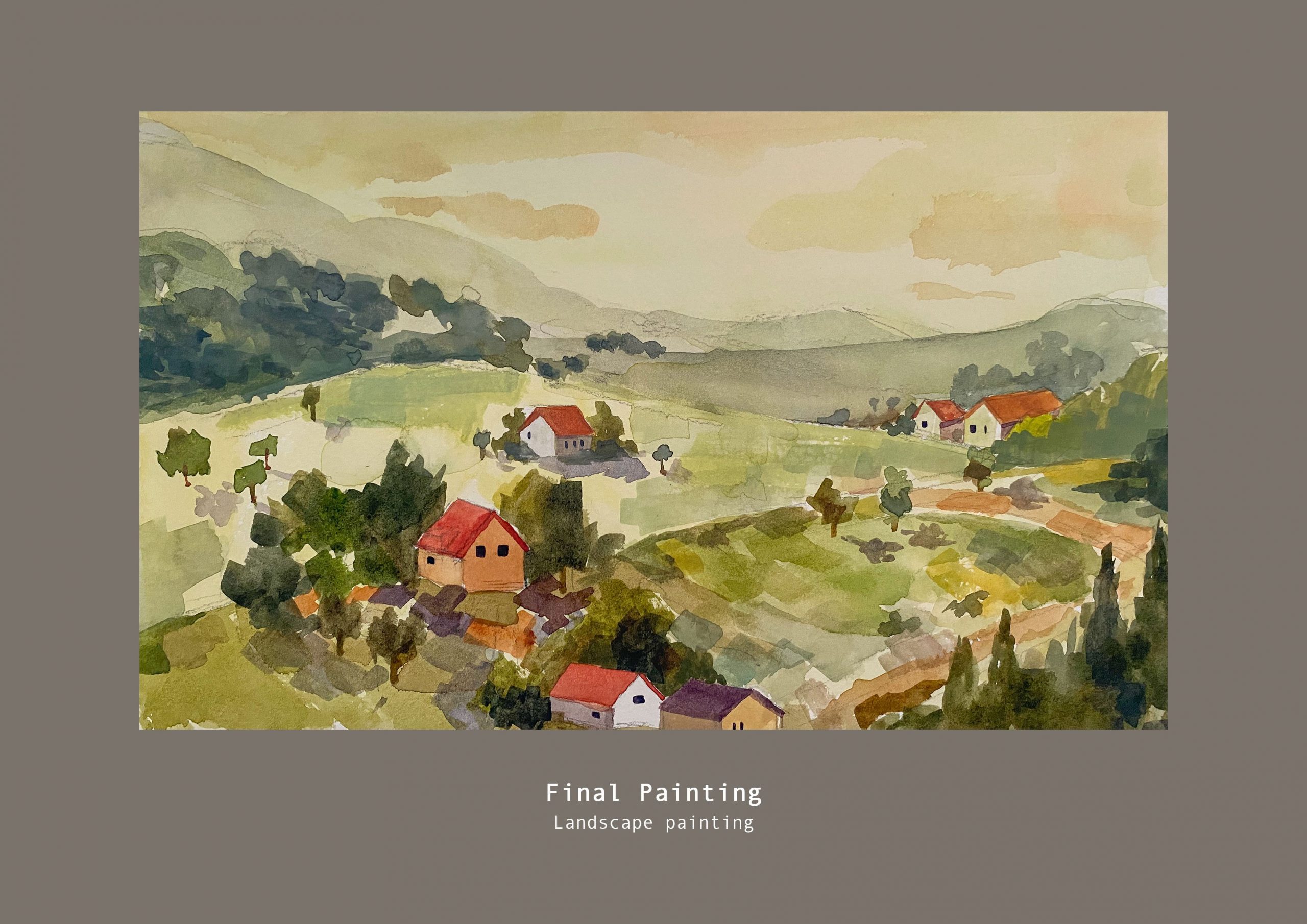
Topic 2: Landscape painting
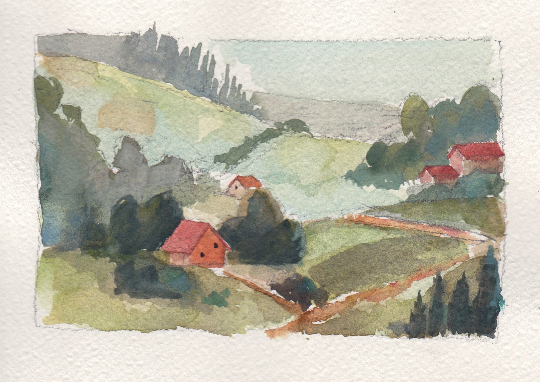
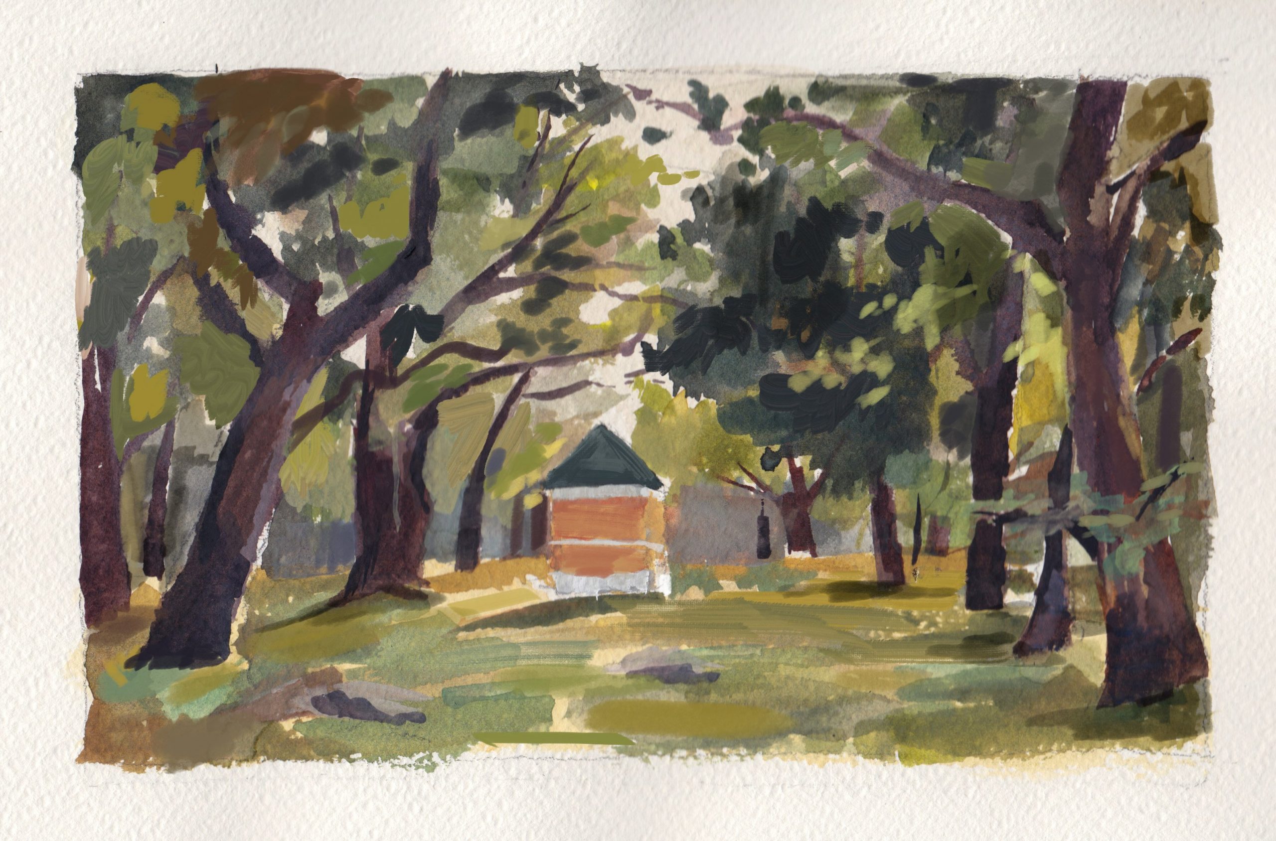
For this landscape painting I tried to focus more on achieving a range of warm greens and yellows with red/orange as the accent colour. I tried my best to redesign the angles of the slopes to have more variation after receiving feedback that the shape design was a bit repetitive. I also took note of the amount of detail I add so that I don’t overwhelm the viewer. Overall I am pleased with how this turned out.
I’ve compiled all of my works into a pdf for submission:
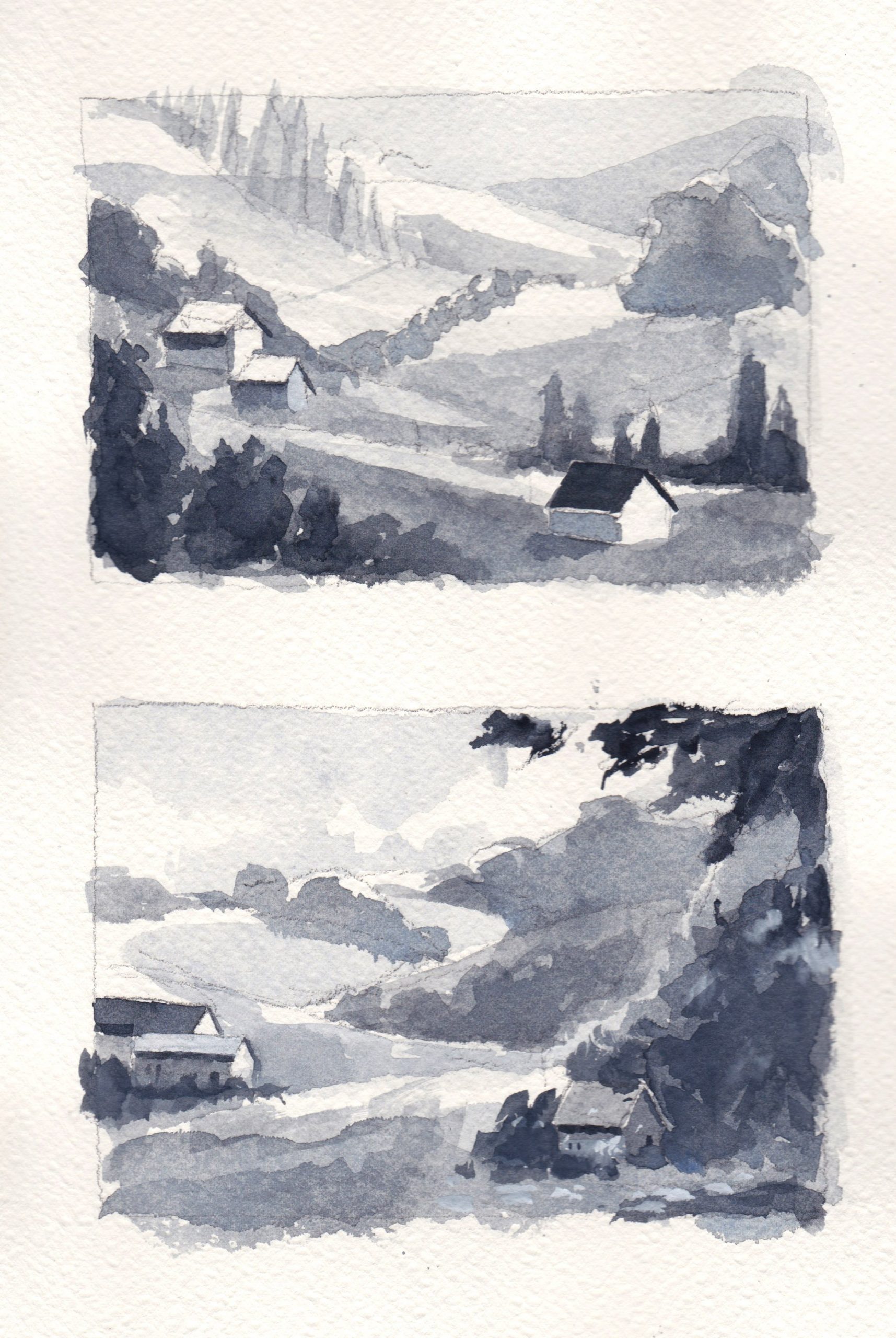
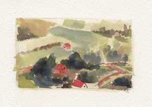
This is my progress for the landscape painting topic as I only just started working on it in my previous post. Did some value paintings to further explore possible compositions.
But I still prefer what I posted previously in terms of composition, so for my colour test I tried to incorporate what I liked from these compositions. This colour test one has more blue – cyan tint and has a cool tone compared to the previous colour test that I did. I think the previous test worked better in terms of colour harmony. I also feel that there can be a greater jump in values for the atmospheric perspective as now it looks very cluttered.
Comparison to previous colour test:
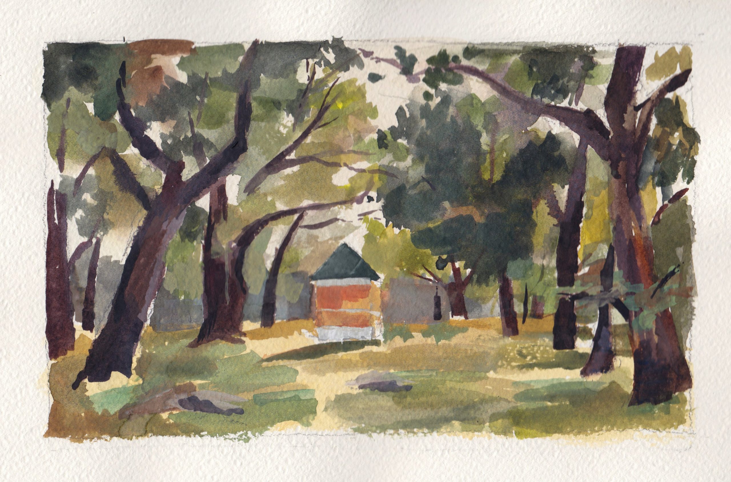
I also did a rough master study of Ivan Shishkin’s work to practice colour mixng. After working on it I realised how many layers he needed to paint over in order to achieve the density and richness and I was unable to replicate it in my quick study.
I further refined it digitally because I layered too much in some areas and couldn’t get the lighter colours to show.
Overall I think I got the shades of green slightly off as the original had more of a yellowish warmness to them.
It was still a much needed painting practice. 🙂
Will work on the final pieces after this!
Link to previous post: https://oss.adm.ntu.edu.sg/clim101/final-assignment-process-part-1/
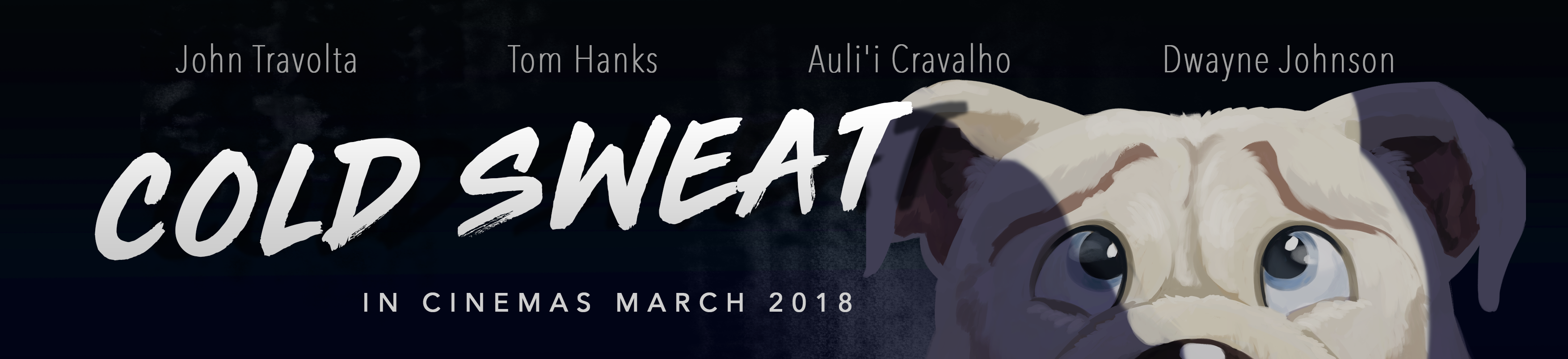
Task: Create an original movie campaign for a brand new film.
Ideation
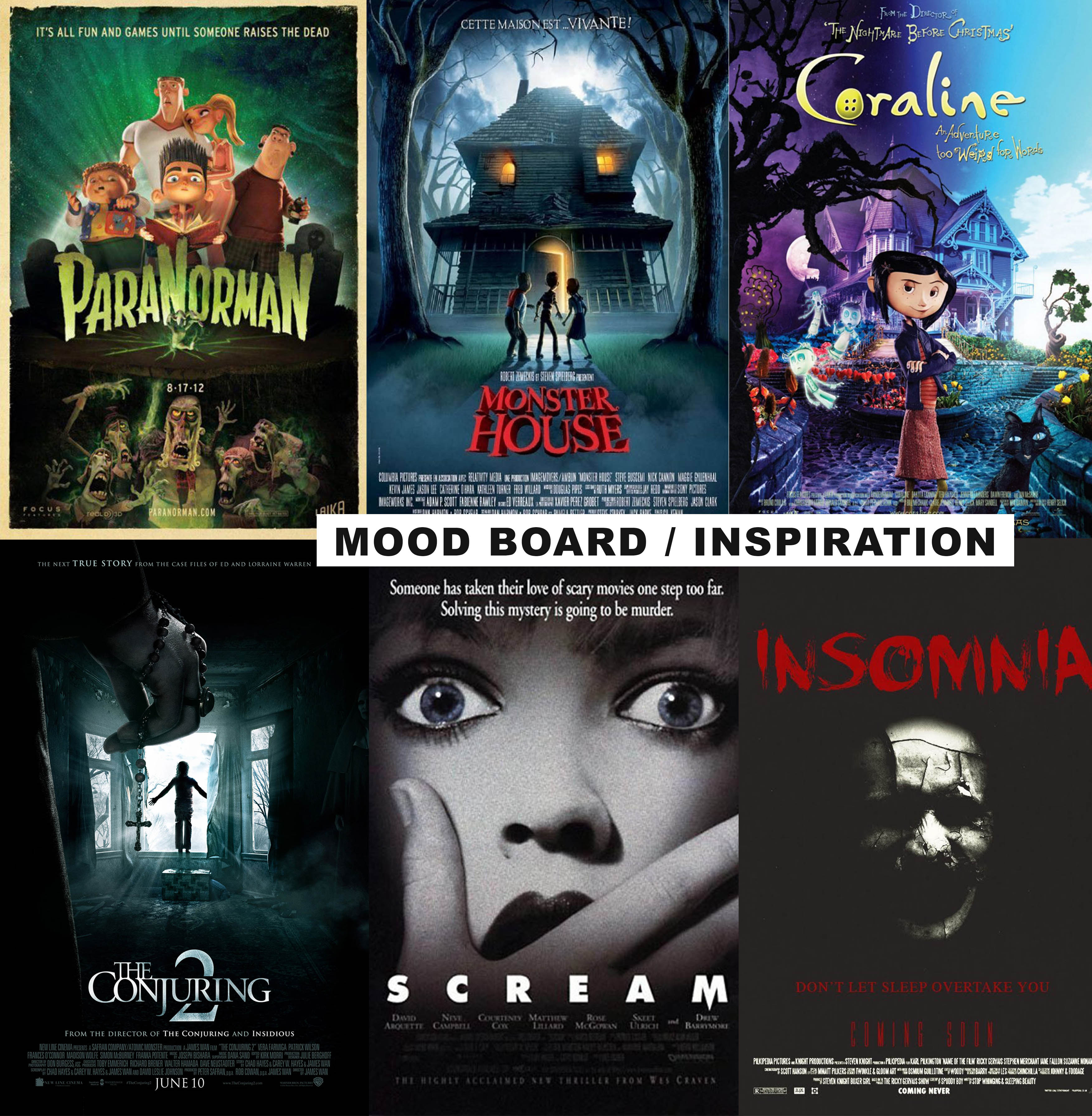
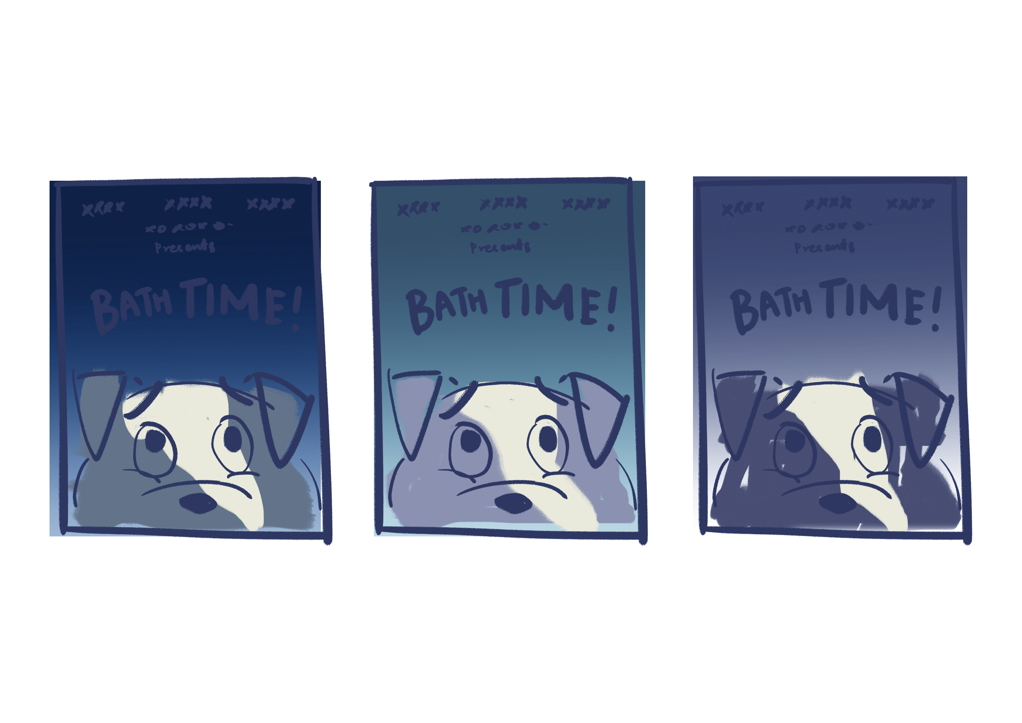
In the beginning, I was stuck on what kind of movie poster I should do. I thought of working based off the fear panel from the previous assignment, which was a dog being afraid of baths, and create a movie poster for an animated film. I wanted the poster to “troll” people in a sense. So I looked into both animated and horror film movie posters. I intended to combine elements from both genres and find a balance that suits the theme that I was going for.
Process
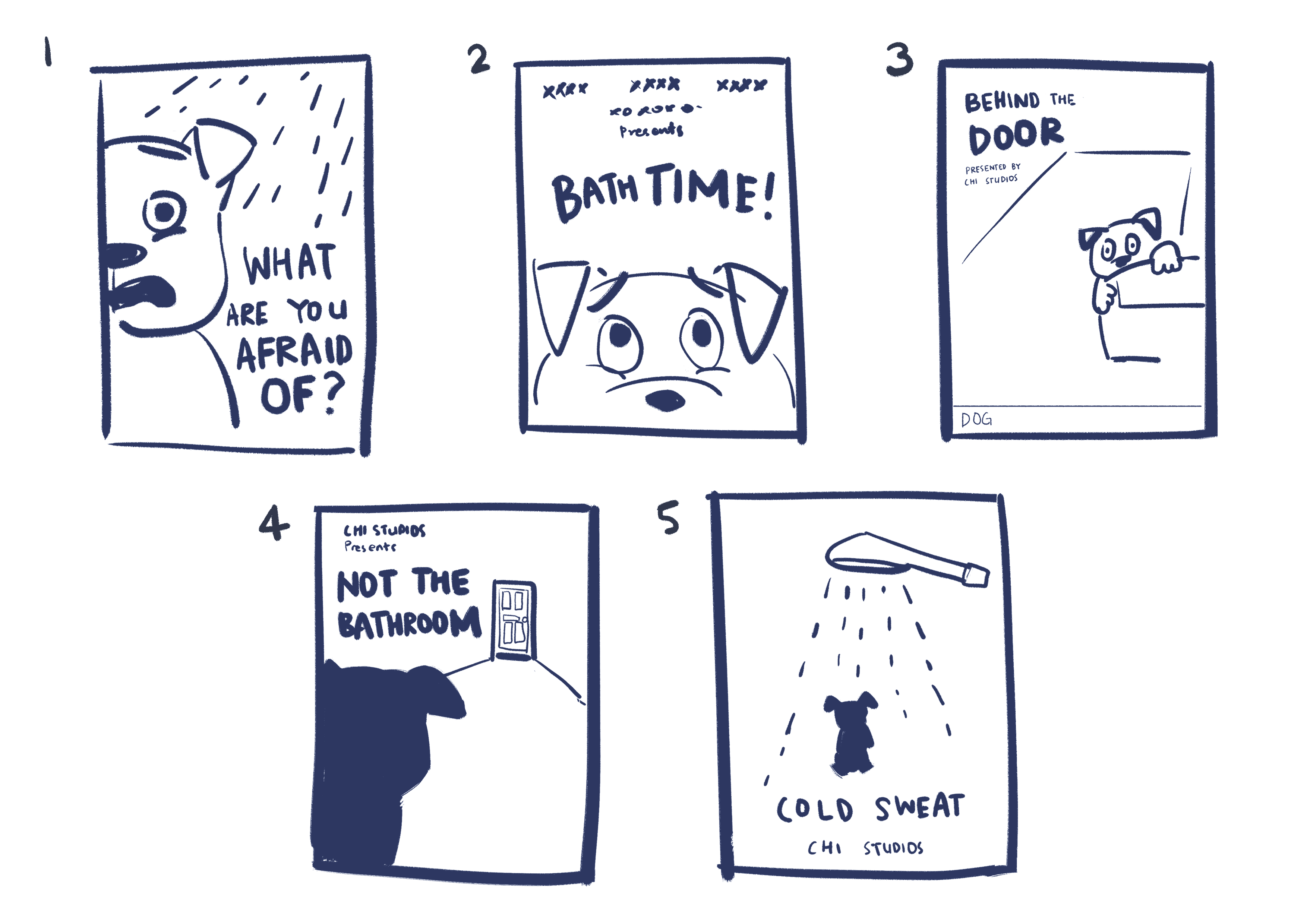
After researching on movie posters, I drew some thumbnail sketches to decide on the composition. I tried to apply design principles such as symmetry, asymmetry, leading lines, framing etc in the arrangement of elements.
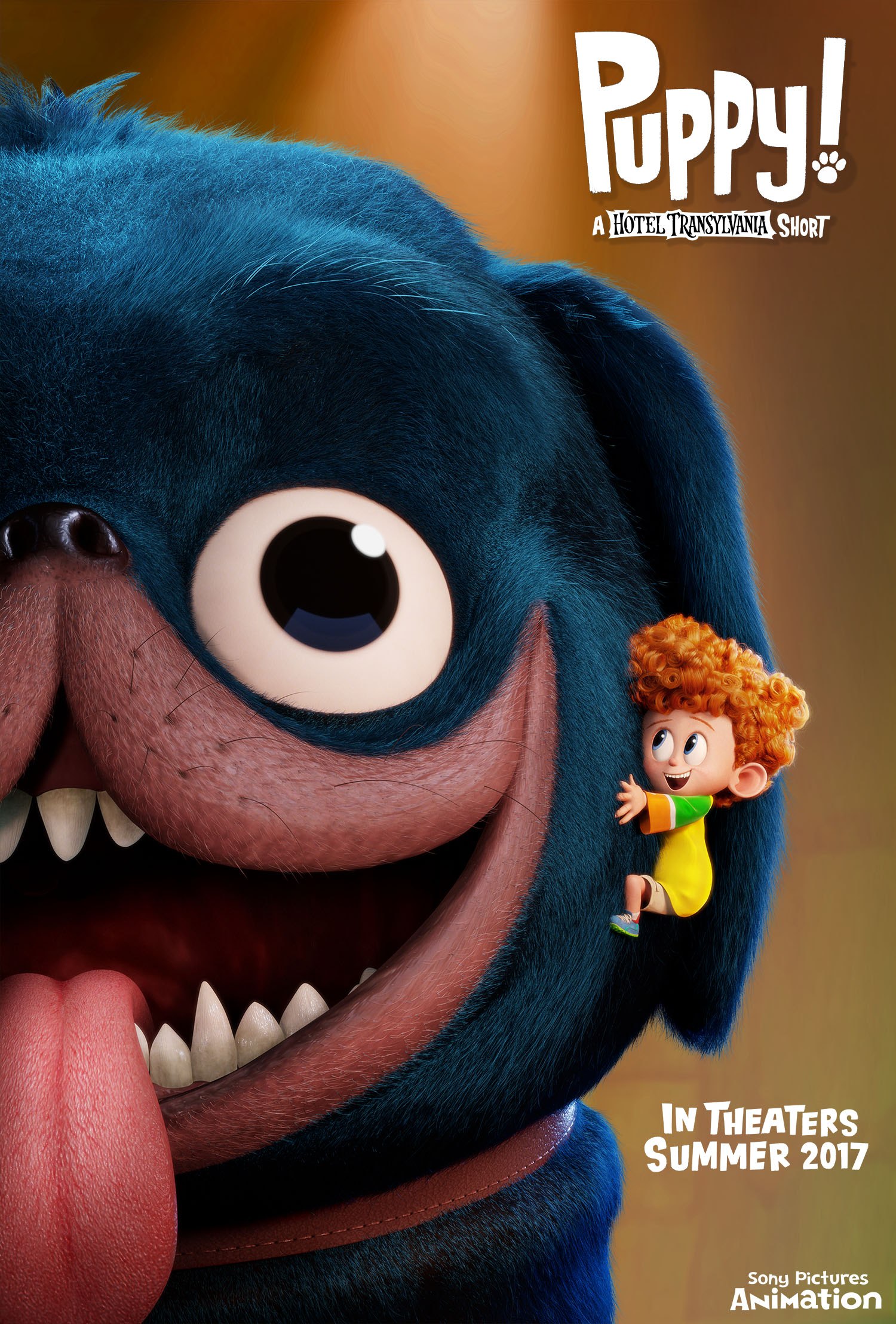
My criteria for selecting the final composition was that it had to be simple and yet stand out. I asked around for other people’s opinions too — some agreed that 2 stood out the most so I picked that one. I also liked 3 because of its asymmetry but I felt that it wouldn’t make a statement as compared to 1 or 2. I did not pick 1 because it was inspired from/similar to an existing film (Puppy! A Hotel Transylvania Short by Sony Pictures Animation) so I didn’t want to be too influenced by their film.
Featuring cringey movie titles.Thumbnail 1 was too similar to this.
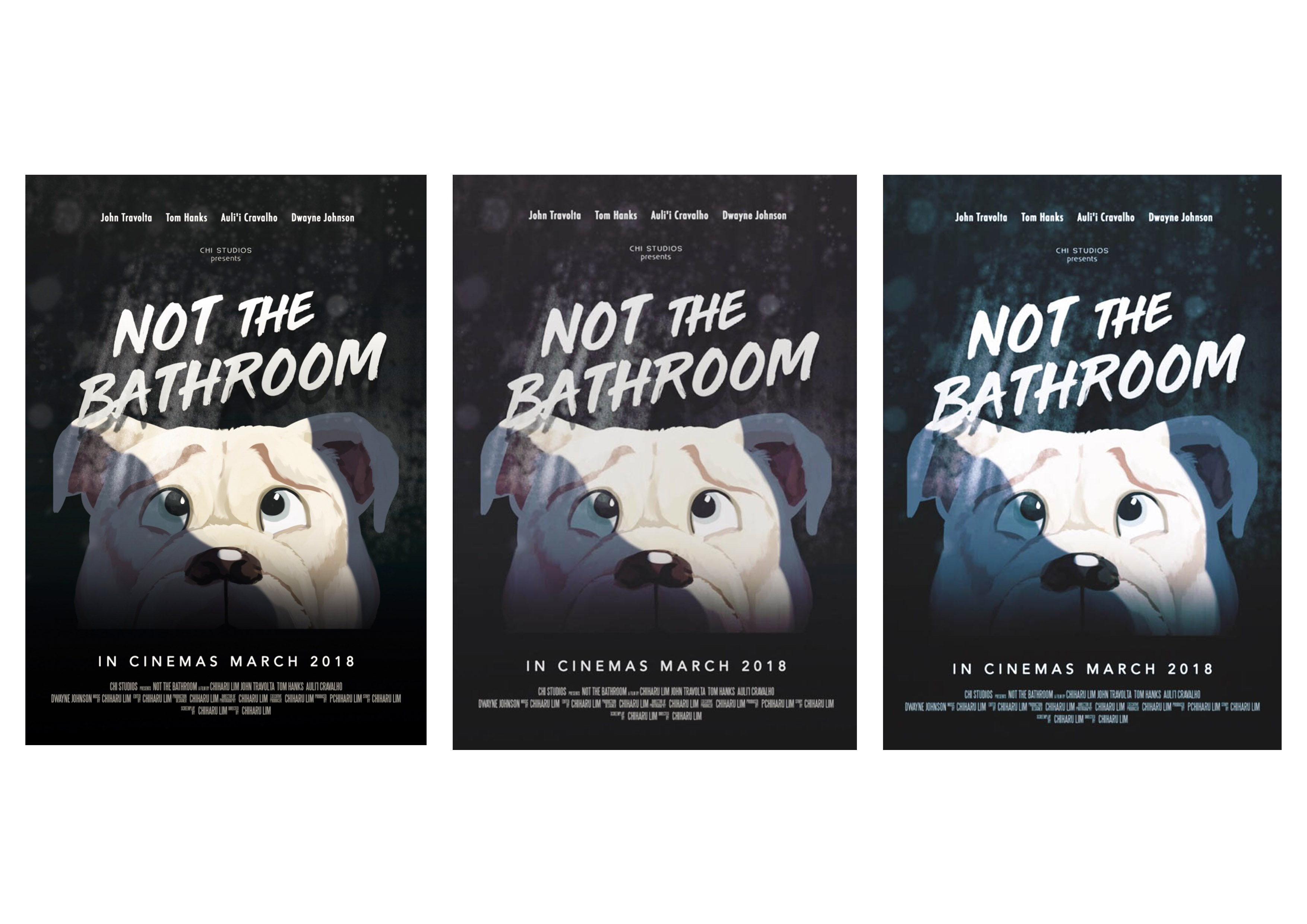
From the chosen thumbnail, I roughly figured out what sort of colour I want my poster to be. Following the horror theme, I knew it needed to be dark and not as saturated. I also decided to add a beam of light (supposedly coming from a bathroom door) to help with the composition in terms of values.
I use these thumbnails as a rough guide, because the colours of the my final work are usually adjusted again based on my preferences after completing the painting then. Below are some of the edits that I considered using.
Left: The least colourful of the three — it works, but I preferred something with a bit more colour. Especially since it is an animated film.
Middle: Need more colour.
Right: The blue/green tones make the dog look cold instead of scared in my opinion.
Final work
I opted for a subtle purple tint in the end. Composition wise, every element is centralised, and I use the beam of light (coming from a bathroom door) to offset the balance a little. The font of the title is not following the horror theme — I did not want the poster to look like a full fledged horror film. From the references that I have, animation film posters had dynamic fonts so I picked a font that is spontaneous looking and not scary. I added water droplet and dirty mirror stains to keep to the bathroom element.
cold sweat
noun
a state of sweating induced by fear, anxiety, or illness
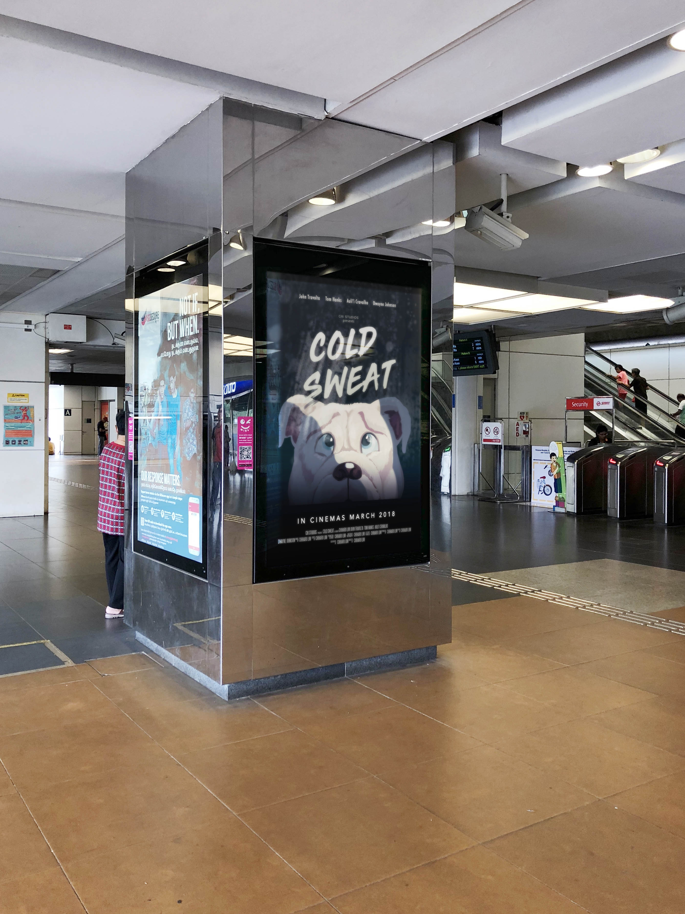
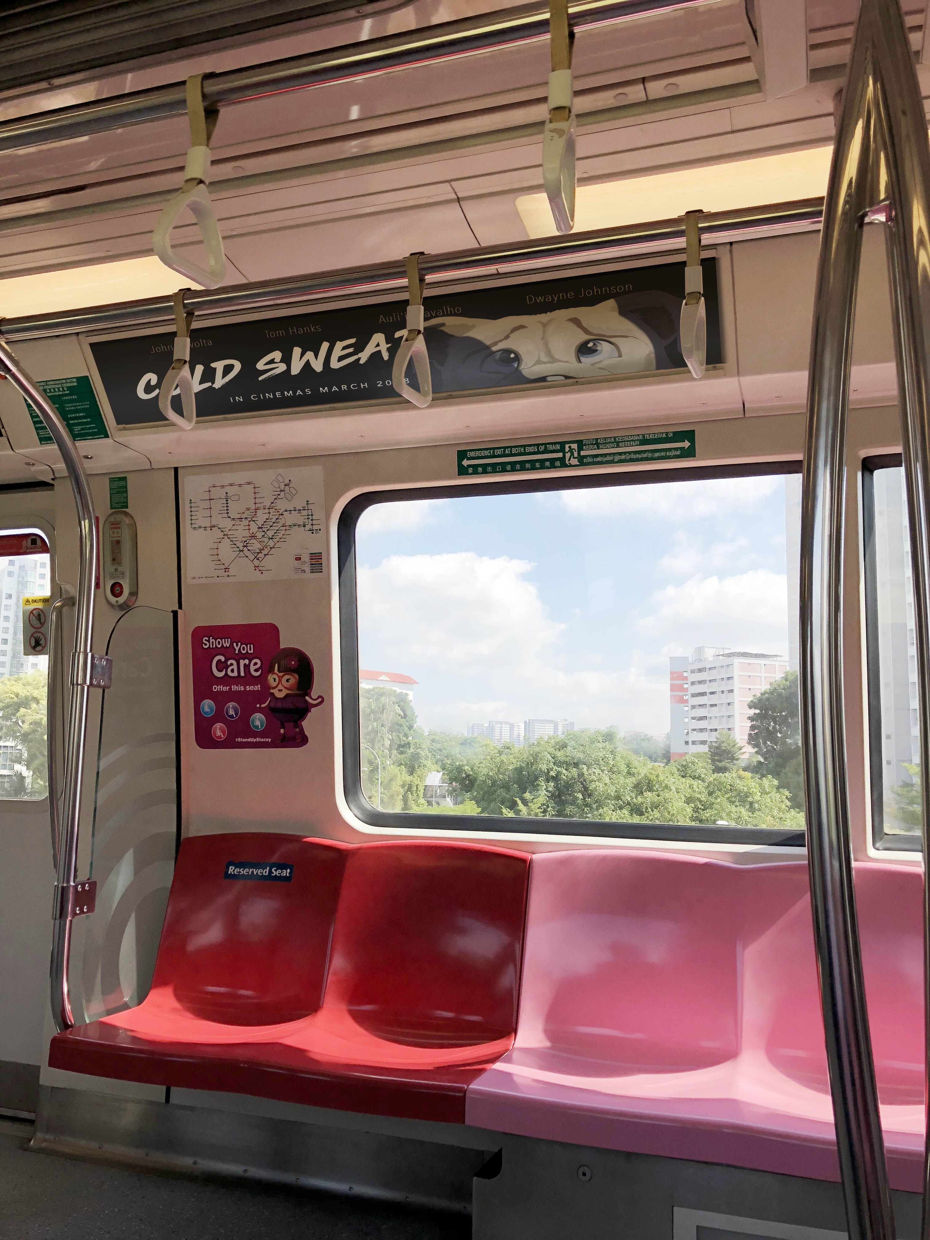
Movie Campaign Shots
Most movie campaigns can be seen around MRT stations in Singapore, so I composited the poster into some of these boards.
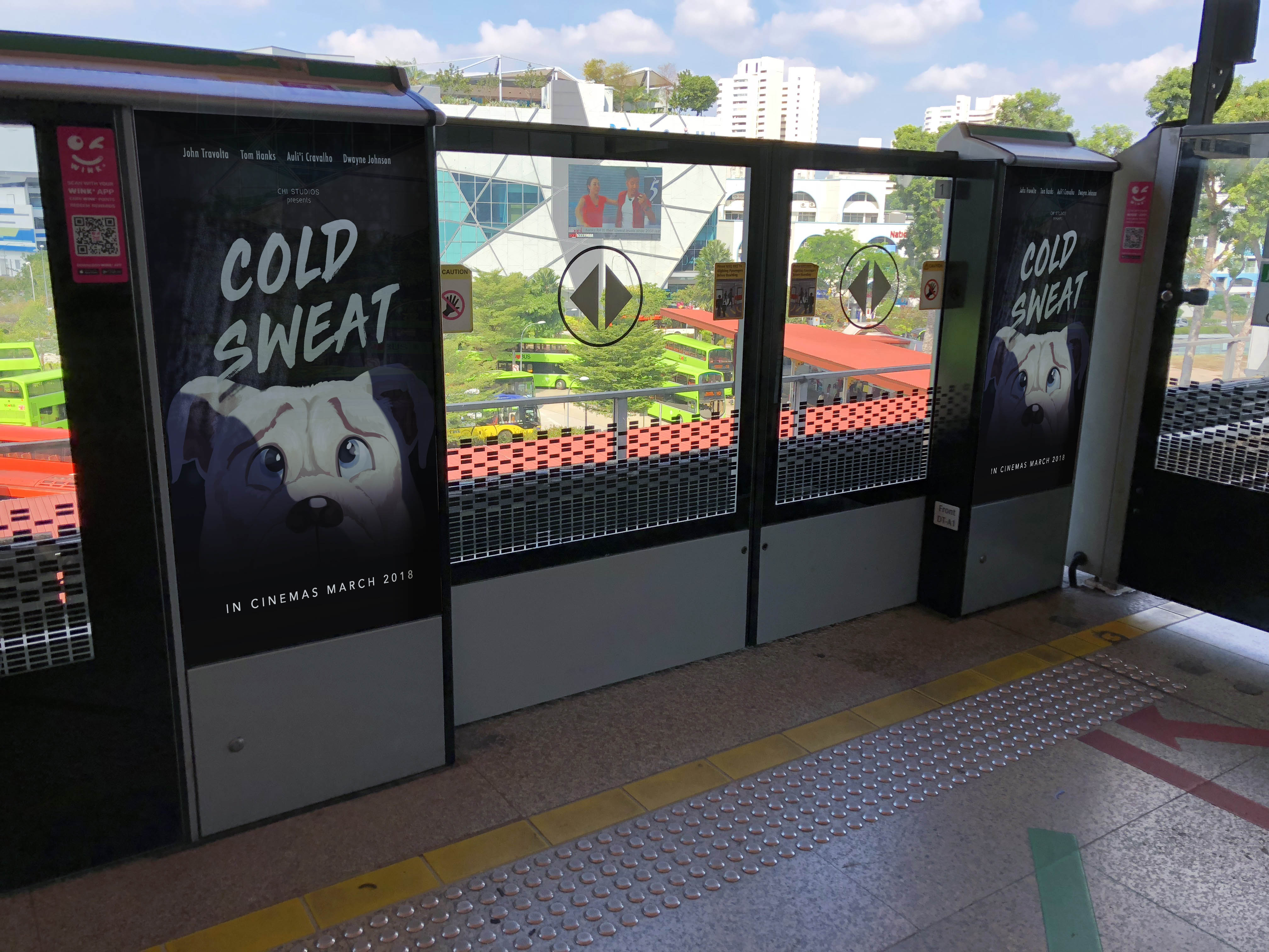
I also modified the poster into a banner type so that it could be placed in MRT cabins.
Mise en scène is used in this scene to warn the audience of upcoming events and inform them about hidden character traits to create suspense when Vincent goes to visit Mia in her house. Mia is the wife of Marsellus Walace.
Setting
The colour scheme of the house is mainly white — very clean and crisp. White is usually a symbol of innocence and purity. However in this case is ironic because Mia and Mr. Wallace the complete opposite (drug addict and mob boss). The juxtaposition of colour scheme and personality is interesting. Every furniture is neatly placed, the setting seems uncomfortable to be in.
Lighting
High key front lighting accentuates stark white colour scheme, which makes the character stand out.
Props
We see technological devices around their home — intercoms, video cameras — which suggest that characters in living in the house (Mia and Marsellus Wallace) are wealthy. It gives viewers a hint of their personalities and lifestyle. It can also suggest that characters have something to hide — a sign of insecurity.
Costume
Vincent is in a black suit which makes him stand out in the white environment. It suggests that he does not belong in the environment and foreshadows the fact that something bad might happen if he stays in the environment for long.
Space
Director makes use of deep space. Vincent appears very small in the large room, as if entering a lion’s den.
Staging and Acting
Vincent’s pose conveys a sense of inferiority. He is cautious and keeping to himself.
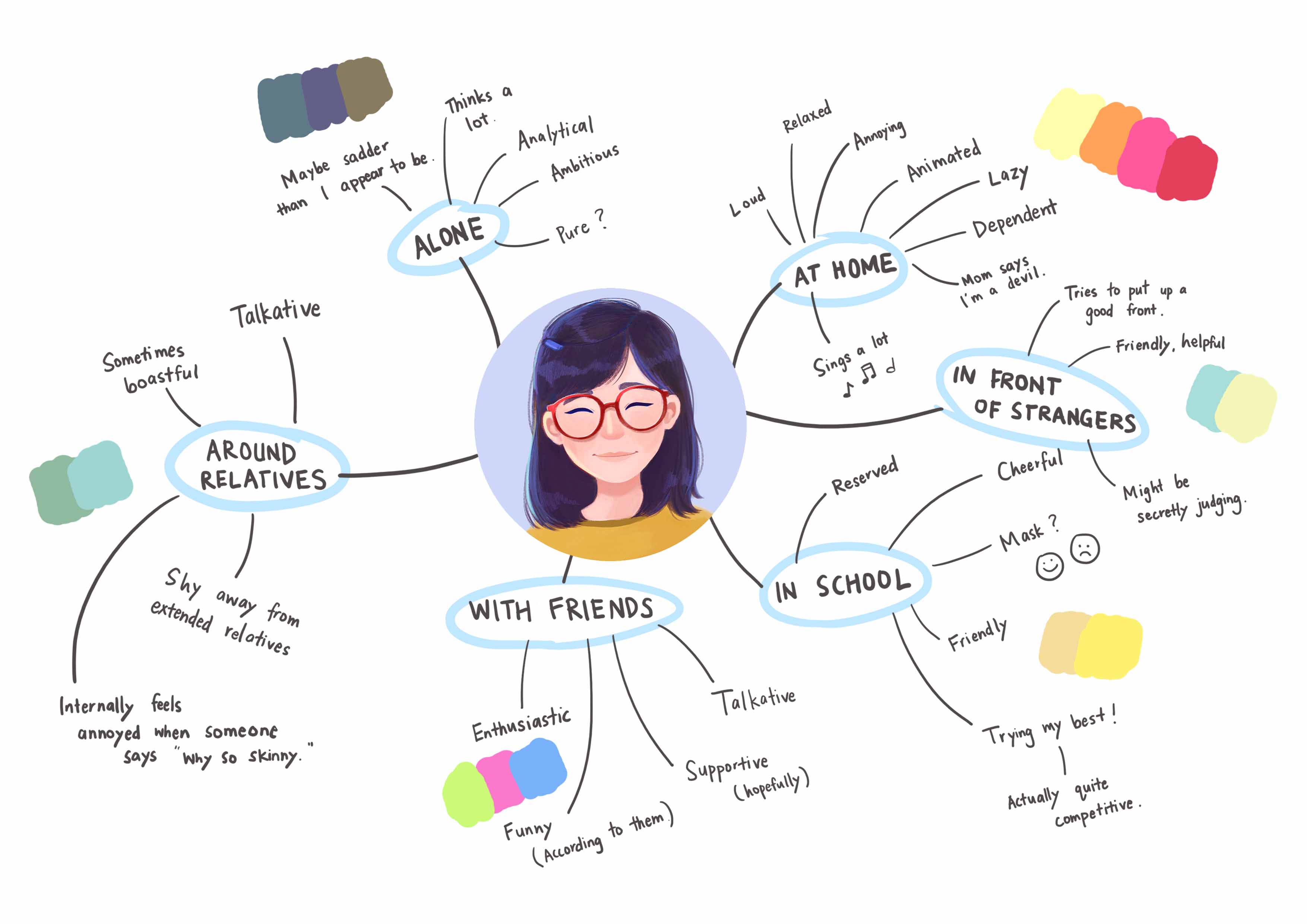
For this assignment, we are required to apply our understanding of colours and colour theory to visually represent the multifacted nature of our personality. I decided to start mind mapping the many sides of who I am. This alone was interesting because I see how different I am around different groups of people.
Mindmap
Based on the above mind map, I tried to represent myself using various objects. Below are the things that used for my final pieces.
Sketches
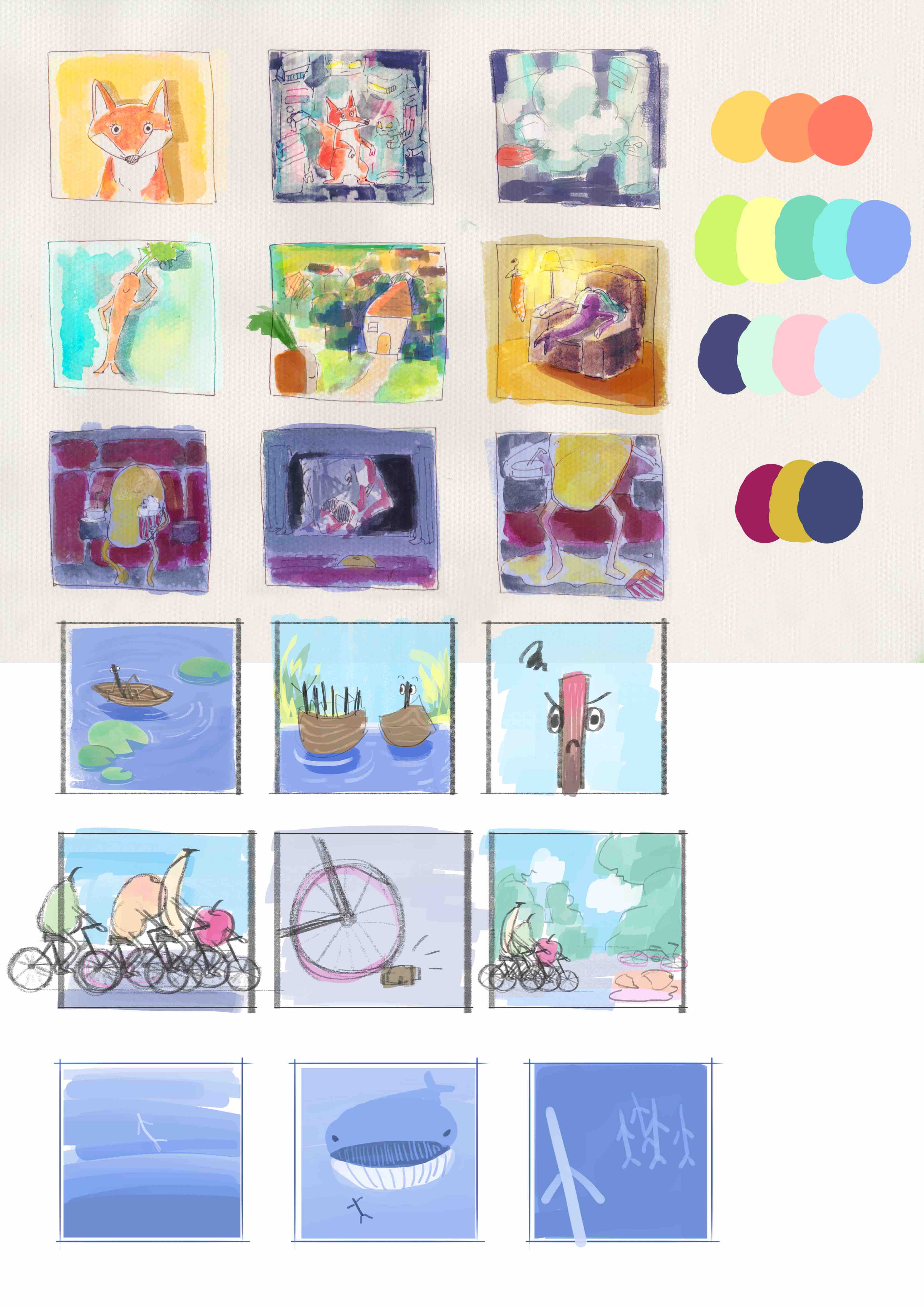
After doing the mind map and coming up with the situations, I started sketching out my ideas. I found that using colours in my sketches helped me to visualise my final pieces better. Even if I did not stick to the colour schemes, they served as a guide.
Some of these panels are rejected. Some were used but the colours and composition changed drastically!
I find that the sketches helped people understand my ideas better too. Ideas that people were skeptical about became clearer once I showed them the sketch.
From there, I chose and adjusted the colours for the final pieces as I worked on them. The colours that I use are generally bright and bold because I love vibrant colour schemes. I tried out some of the colour schemes covered in class — triadic, complementary, analogous and monochromatic. Below, I describe the my process according to the order that I did the panels.
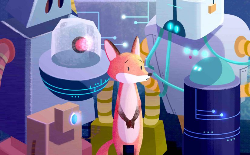
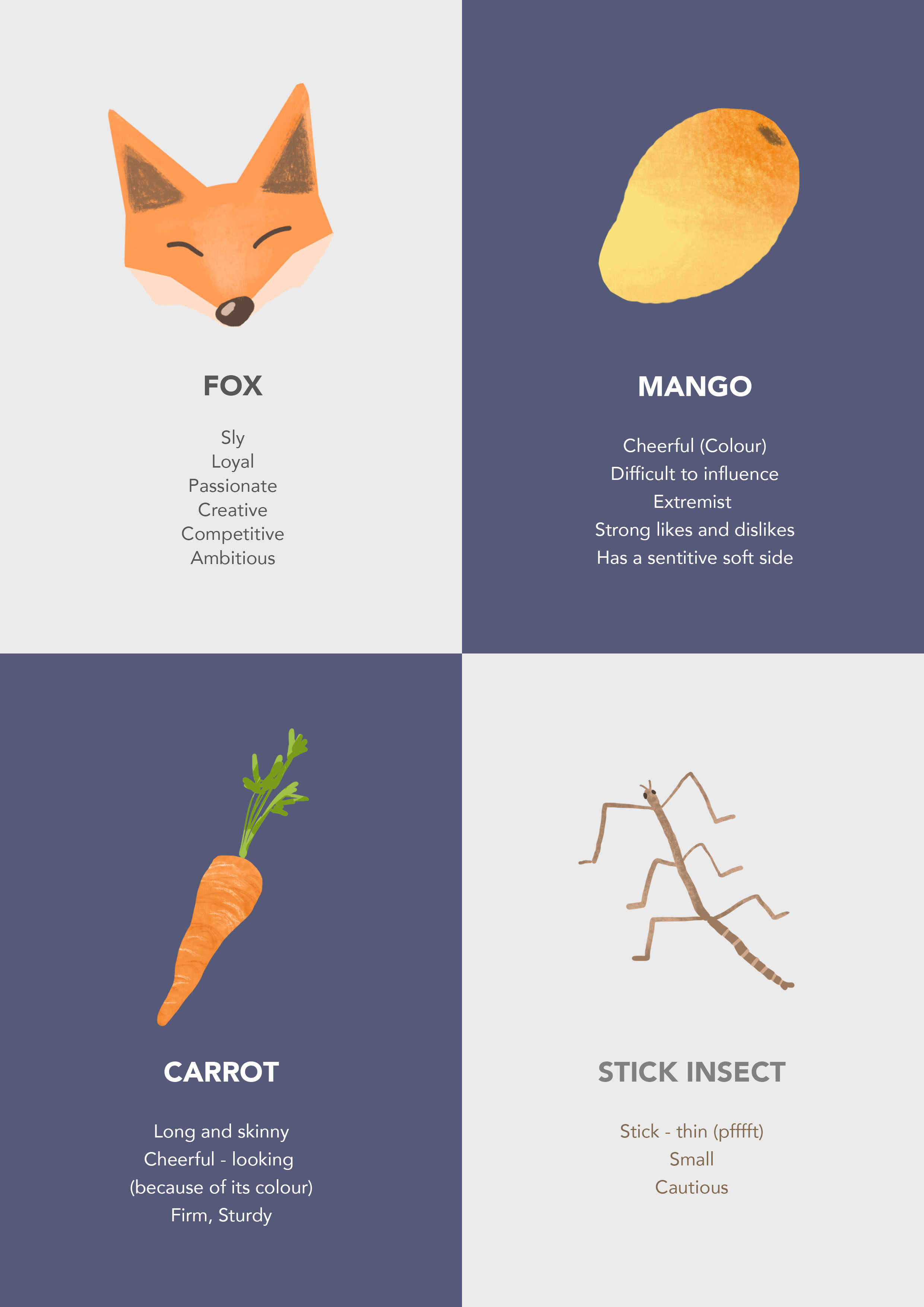
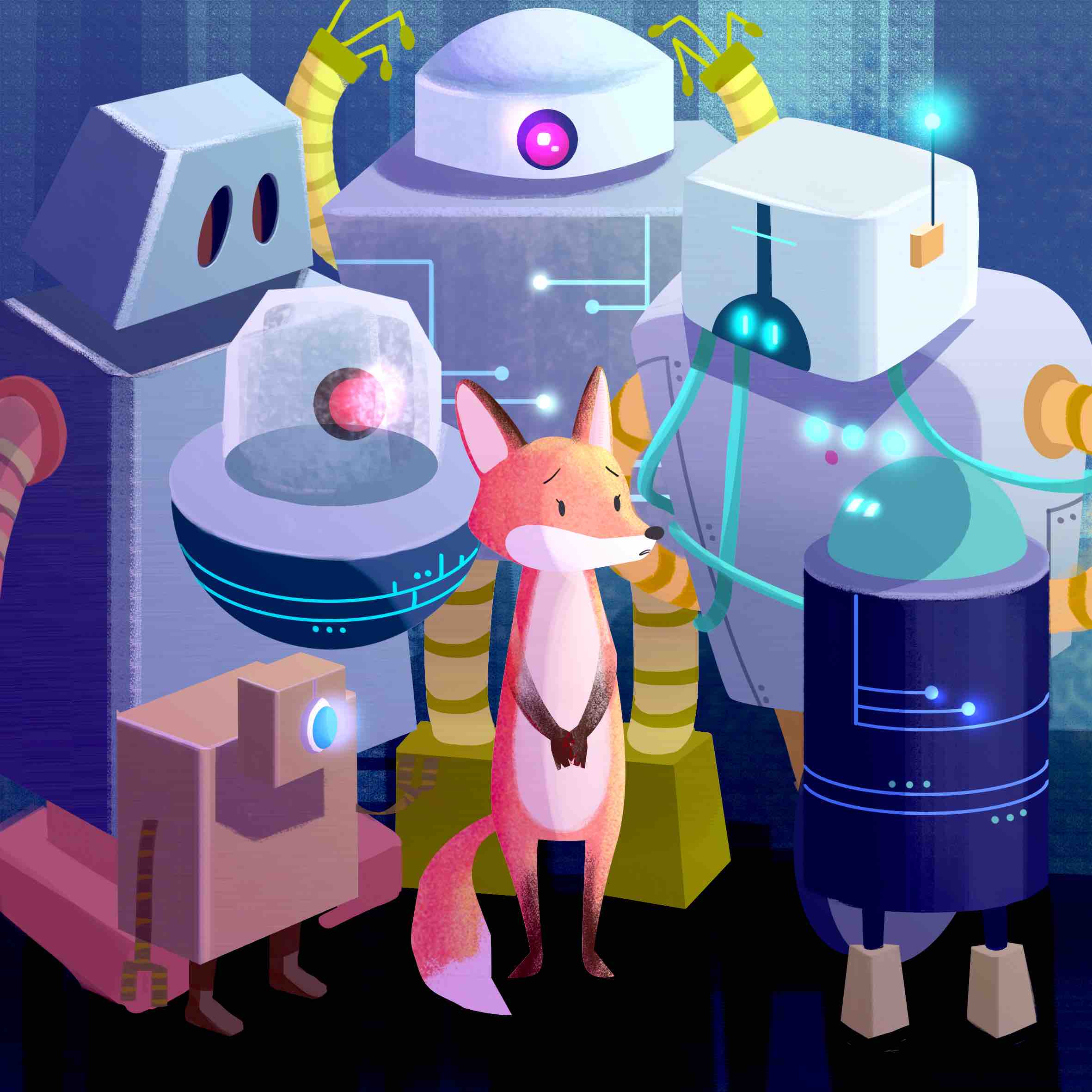
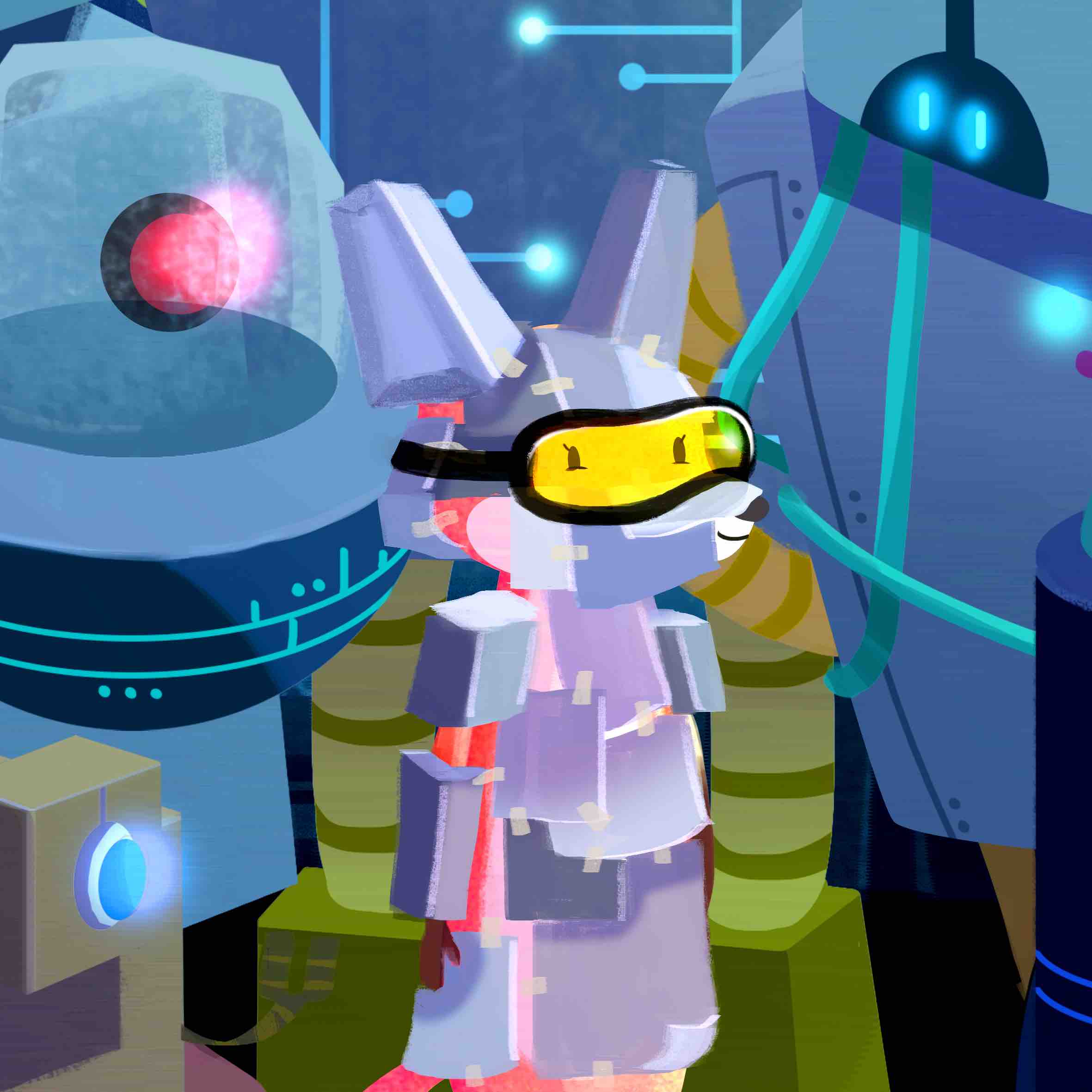
The Shy Fox
The fox represents the shy side of me. Also, people have pointed out that I look like a fox. The situation I picked for the fox is a group of robots. The robots represent the uncomfortable social situations that I sometimes face. I’d then put on a facade, so the fox blends into the surrounds by pretending to be a robot.
I started on this set first because I had a clear idea of the style and working steps! Since I am from animation, I am influenced by animation drawing styles and our way of designing. But I’ve never tried photoshop’s pen tool to illustrate before so I decided to try it out! I watched a youtube tutorial on noise and grain. The person who made the tutorial shared with us his working steps which was very helpful! I find that I work faster by blocking out silhouettes. The lines appear much cleaner and I can edit without wasting time!
Me: A fox
The colours used here are complementary. Since the fox is a warm orange-red, I decided to make it stand out by using a cool blue.
Setting: An uncomfortable social situation.
I used Dice Tsutsumi’s painting as a guide for this panel. His colours seem to blend and create this really nice harmony even though some colours are contrasting. The colour scheme used here is triadic. The purple background contrasts nicely with the subject.
Reference image
The third panel below is more of a analogous colour scheme with a hint of the fox’s red fur peeking out of the paper and boxes.
Outcome: Blend in.
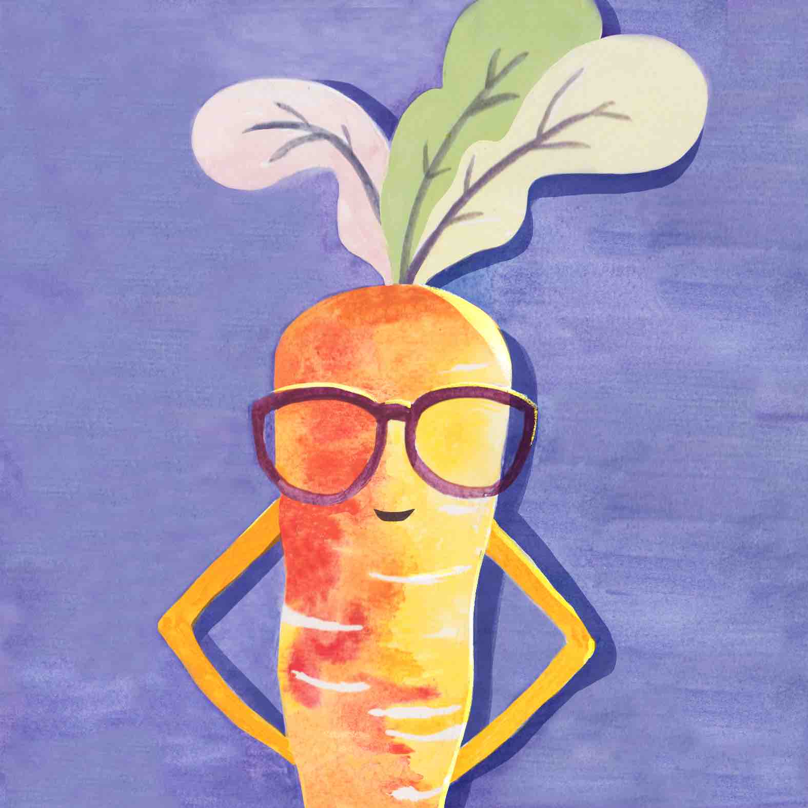
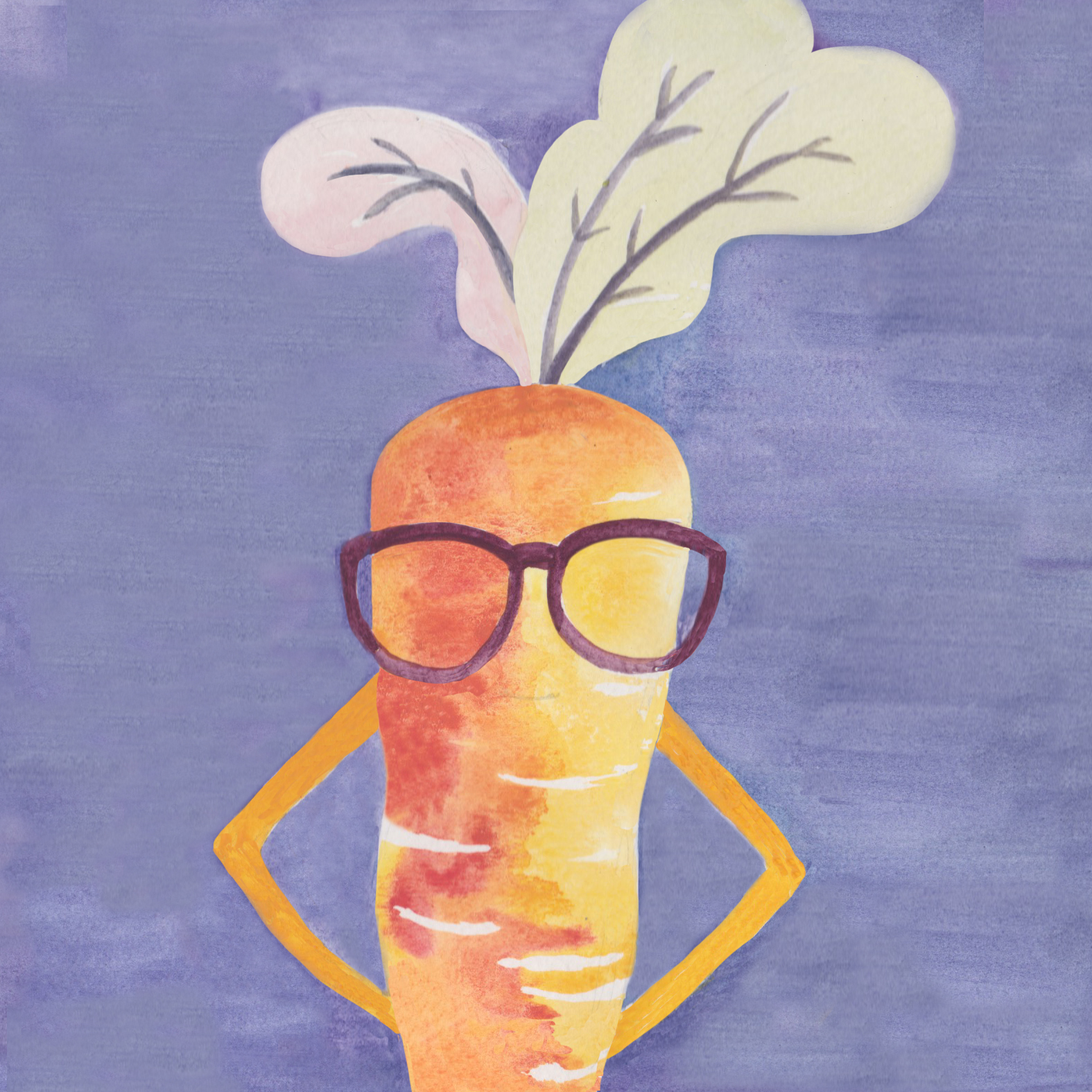
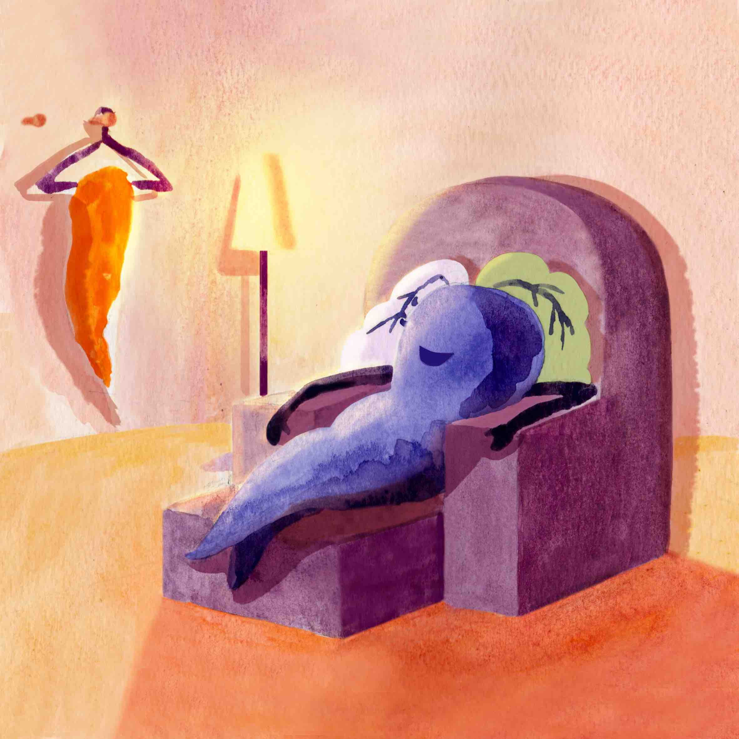
The carrot with another face
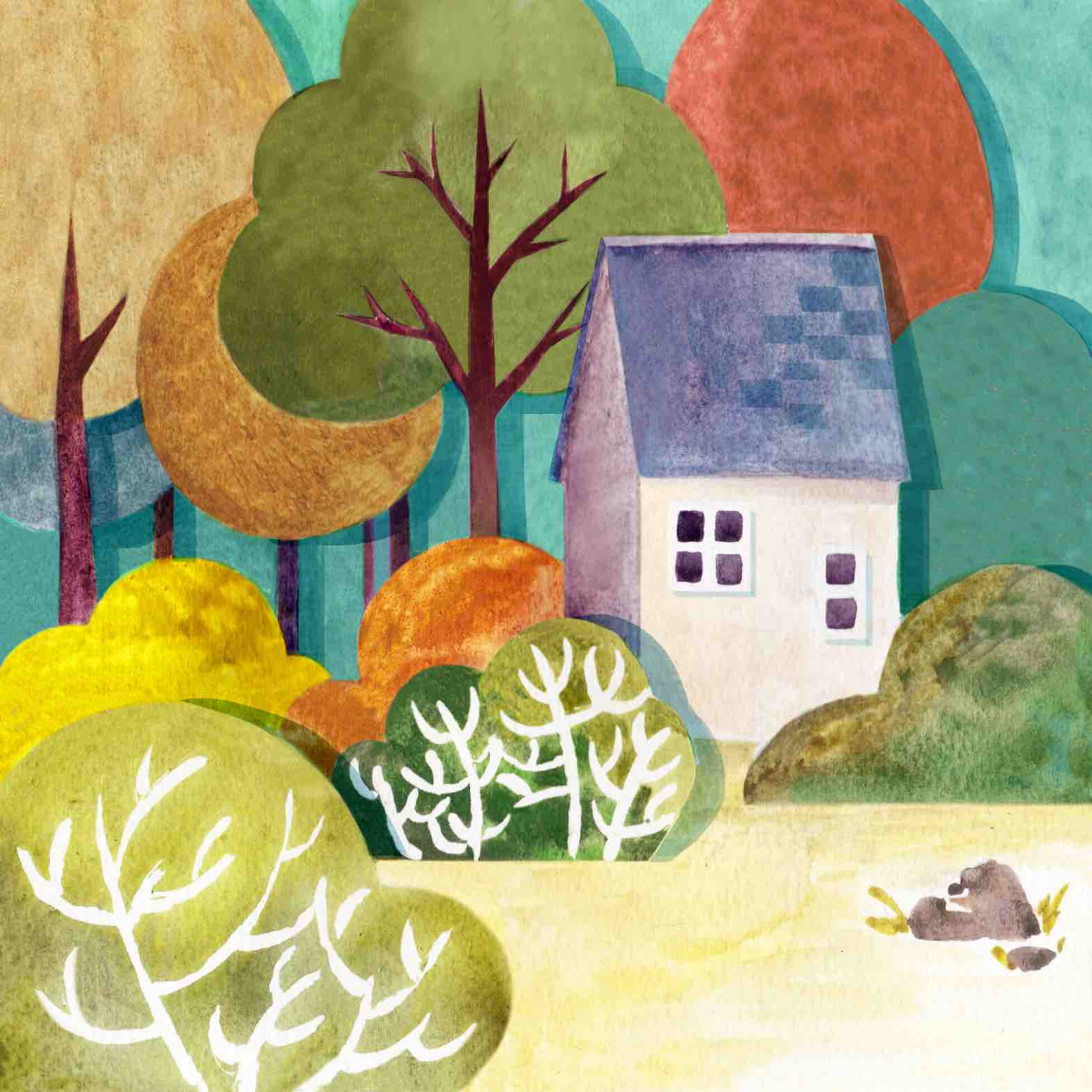
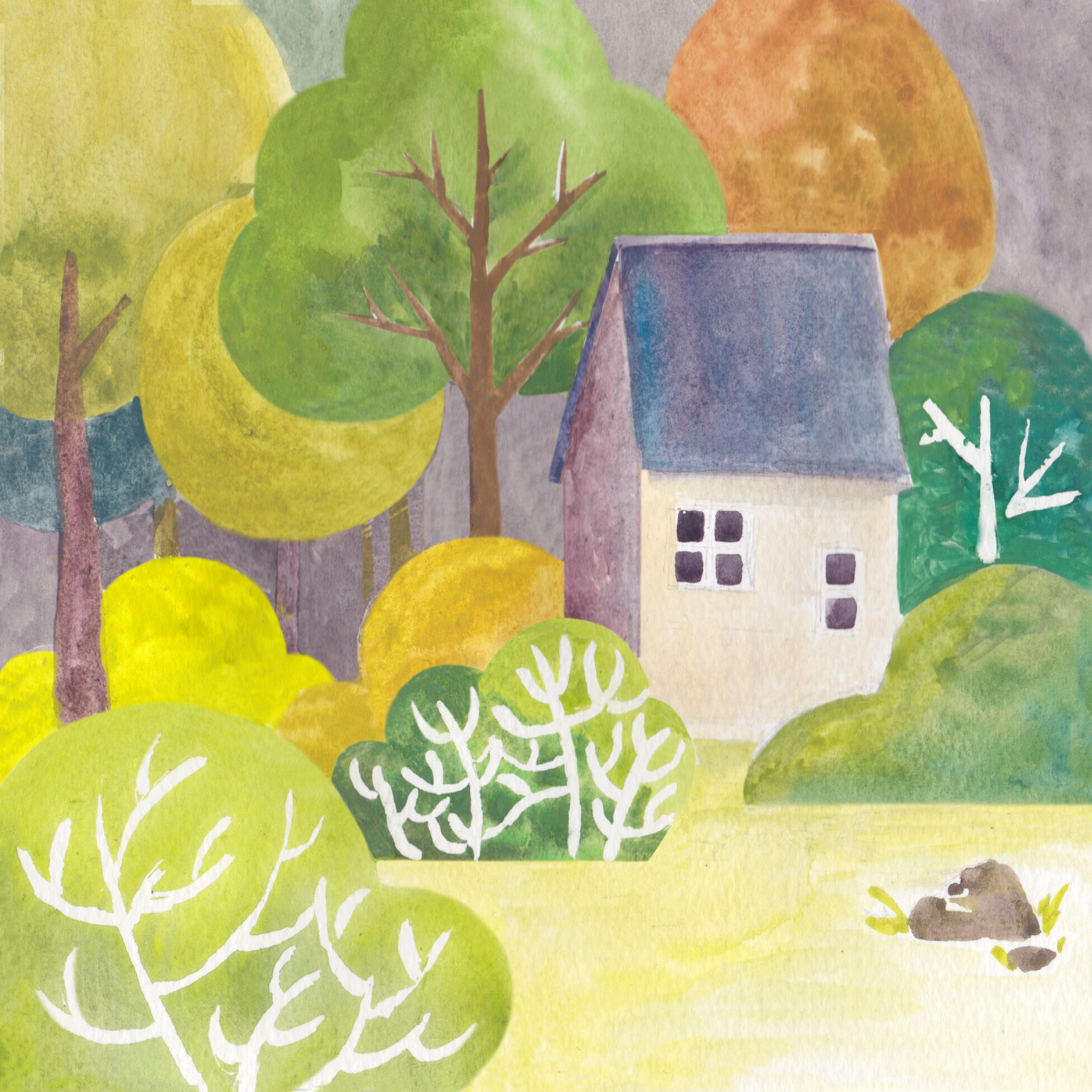
Carrot represents me because it is slender yet firm. I think everyone including me behaves differently in their home vs. outside, so I depicted a carrot lazing on a couch in its home, with its orange peel hanging on a hanger to reveal its true self — its purple self.
For this set I tried to use gouache, but I found that I didn’t like the outcome of the paintings. I lacked the patience and time to work on them (oops) so I improvised and edited the panels digitally on photoshop. On photoshop I had more freedom to control colours and clean up any edges that I don’t like. I like the final outcome. I played with a more muted colour scheme for this set.
Me: A carrot
Colour scheme used is clearly complementary. I made sure to retain the texture of the paint on paper — something that might be difficult to replicate digitally. Added the shadow to give the carrot more contrast too.
Original scan with edited edges. Colours unedited. Oh the power of technology.
Setting: My home.
This panel had a drastic change in colour scheme from the original painting because I decided I didn’t like the sky to be so dull. Colour scheme is triadic. Also, masking fluid is hard to work with. I need more patience!!
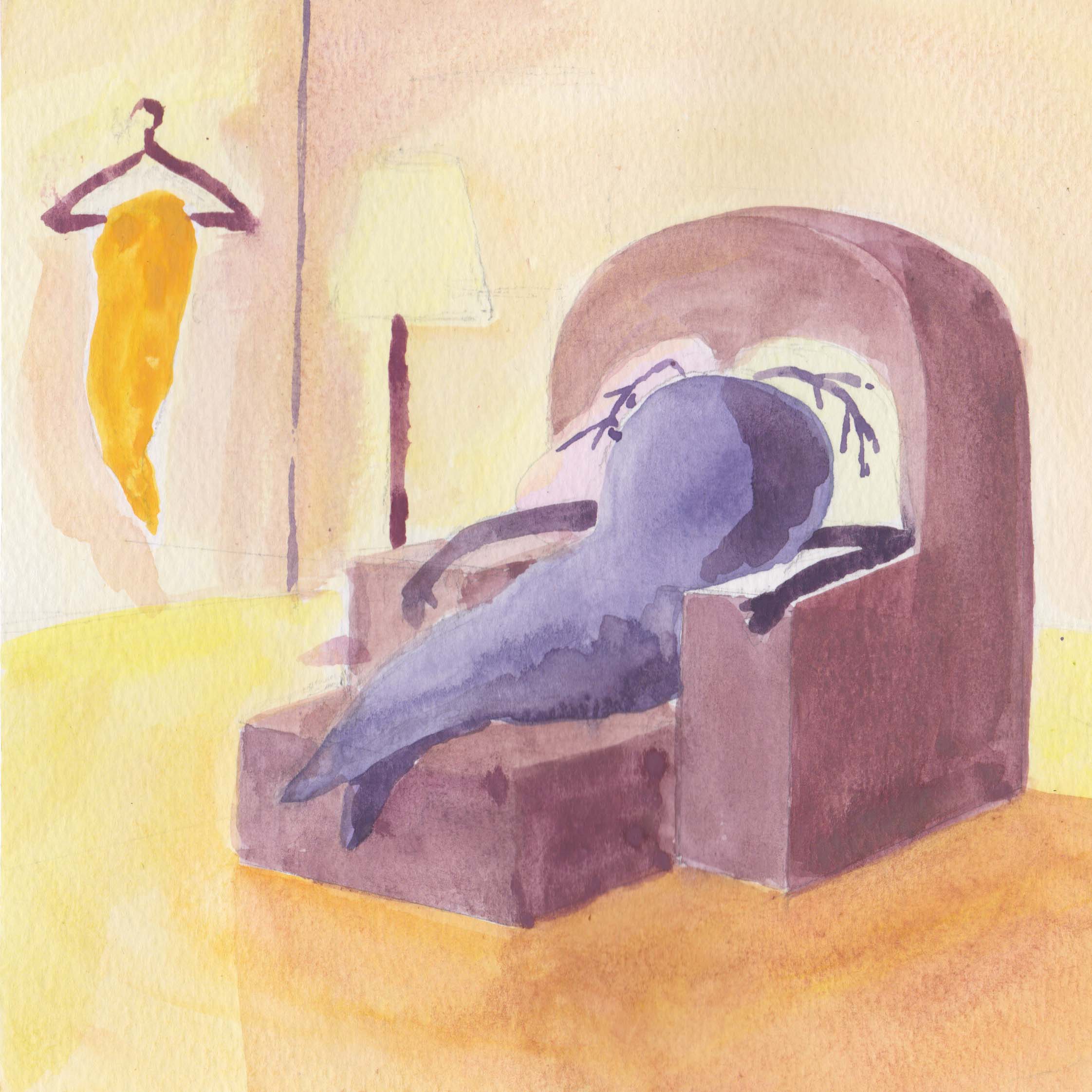
Scan of original painting. Again, with edited edges.
Outcome: Comfortable and relaxed.
Colour scheme use is complementary. I used warm colours to show how comfortable and cosy home is. Again, this panel was edited and cleaned up digitally.
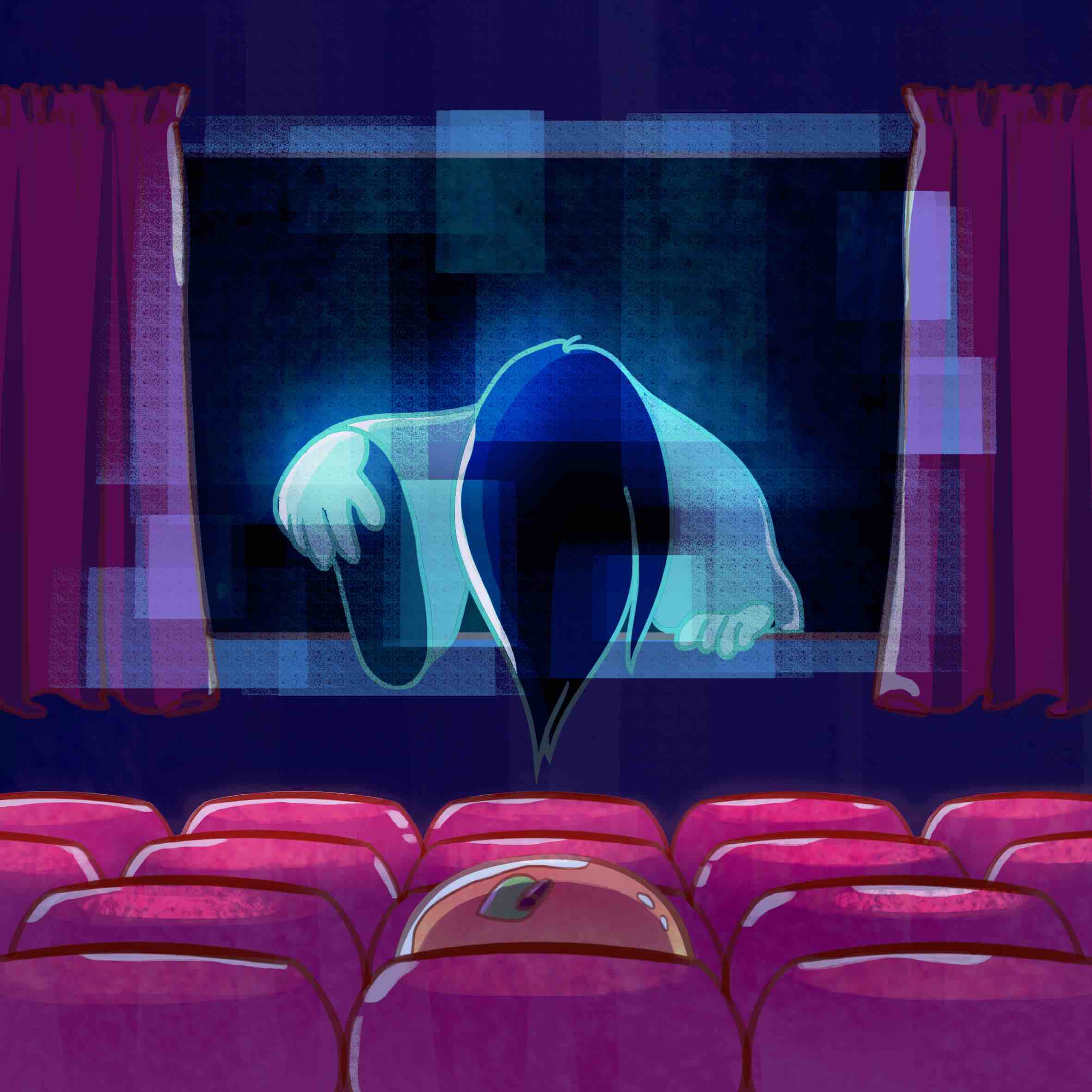
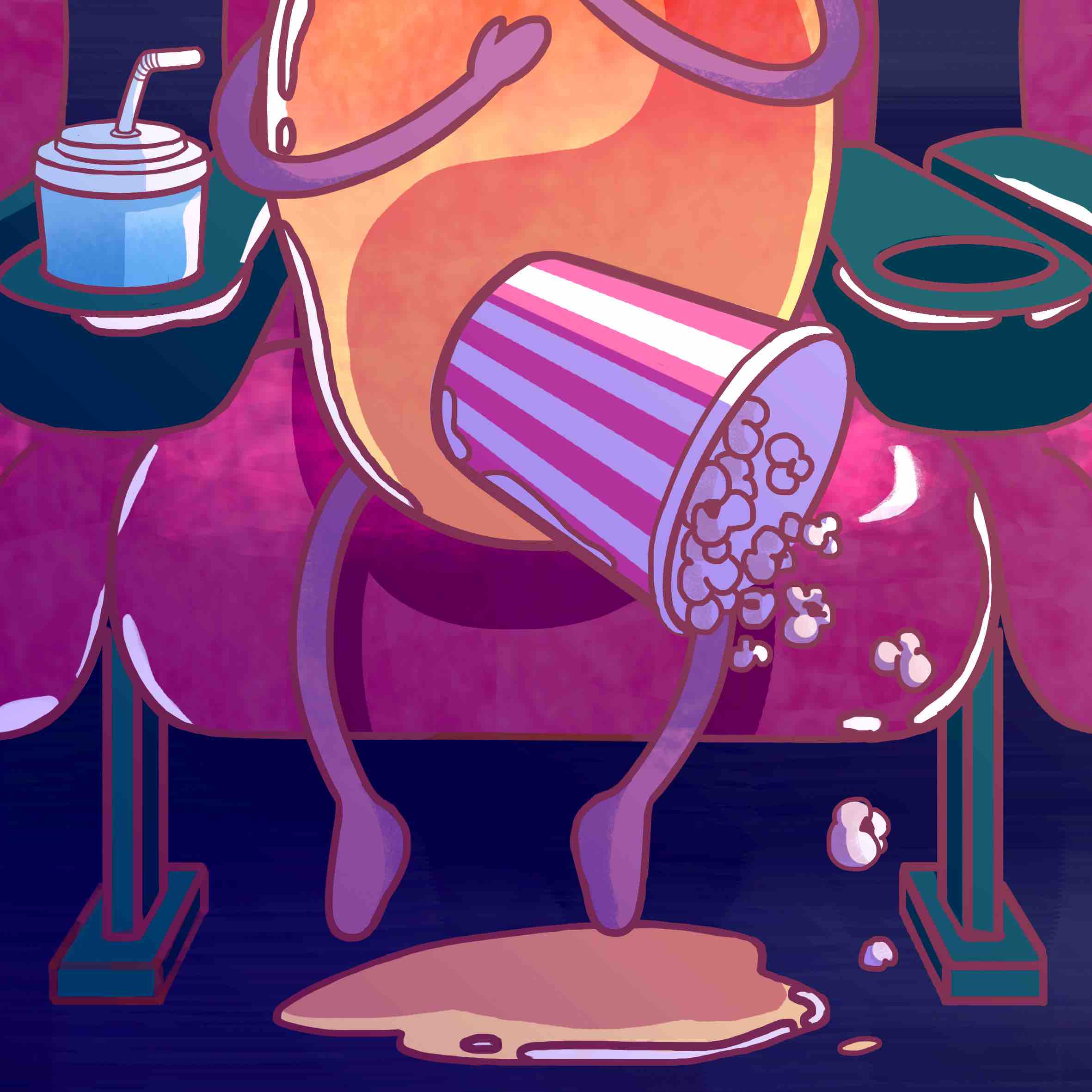
The scared mango
I’m a mango because I’m soft and sensitive! And I enjoy watching movies alone. But not when it’s a scary film! So I depict the scared mango peeing on the ground. I think I enjoyed doing this set the most, especially the first panel with its bright vibrant juicy colours.
I used pixelpchan’s work as reference for this set. I used vibrant colours to depict the mango, and used a much muted, darker colour scheme for the cinema panels to create the scary mood. Colour dodge was used for the cinema movie screen glow for a more dynamic look, as opposed to using all dark colours. The colours for this set was pretty much restricted due to its dark setting but I tried to work around that.
pixelpchan’s work as image reference
Me: A mango
Colour scheme for first panel is largely analogous, with the blue and green as accents (does that make it triadic?!). Made sure that the lines were not black as that would make the look of the illustration “heavy”.
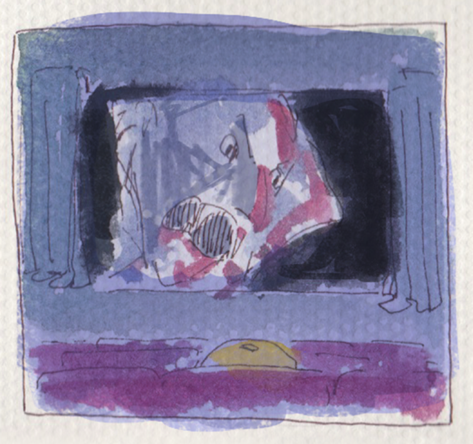
Setting: Alone at a horror movie.
This panel was difficult to execute because I didn’t like that the colours were so dark. But to create the setting / mood, it had to be dark colours. So I used colour dodge for the Sakako coming out of the screen. The bright blue stands out against the dark purple / red tones. Thank you Yan Ran for suggesting: “Draw Sadako, but cute.” ? My original Dracula idea did not match the cutesy theme so I changed to Sadako. I am pleased I asked for her opinion!
Original Dracula idea.
Outcome: I’m scared!
The dependent stick insect
My poly friends used to call me a stick insect (how mean!) and I love jogging so I merged the two ideas together. I also think that I’m a dependent person, so that is how I came up with the idea of a stick insect who loves jogging but in the end clings on to someone else instead of running itself.
I deviate from dark colours and used brighter, pastel colours. The style of this set is a fusion of the previous fox and mango style. It ended up looking very graphic design-ish. For this series I had a mood board as reference for the colours.
MOOD BOARD. Artwork from pinterest, and some pieces from Kiyomi Aritake.
Me: A stick insect
For this first panel, I tried to go for a dynamic composition because first panels tend to be a bit more static. I thought about what pose the stick insect should have and whether should it wear shoes or not.
Setting: A marathon.
Since the first and last panels are a bit more dynamic, I stuck to a static composition for the second panel for overall balance. The colours used are triadic.
Outcome: Clinging on to someone.
Final
Overall, I made sure that as a series and as a whole, the colours have a sort of unity and harmony. I find it interesting that some people pointed out that even though they understand that I attempted different styles, they still look “unified” or “the same” in a sense. Probably because of a particular style that I already have.
Thoughts
I’m happy that I was able to apply the things that I’ve learnt throughout the entire semester. I feel that the course has added on to what I have learnt previously and I am a bit more satisfied with the outcome of my work this time! This assignment was the most fun to work on for the entire semester for me personally.
Difficulties
Interpretation – Initially I was a bit confused about the assignment but by the second consultation I was much clearer about what I needed/wanted to do. I talked to some of my classmates too and bounced ideas around with them.
Painting – I was rushing for time and had no patience. This was resolved with the help of photoshop.
Takeaways
I discovered new painting steps through watching youtube tutorials which I am thankful for because I am going to incorporate those steps into my future animation concept art work in the future! This shows that things we learn in one field can be applied in another.
Combining traditional medium and digital medium produces an interesting look with texture. In future I might want to start illustrating traditionally first, and then edit the piece digitally. It has a great “handmade” yet professional look.
Even though I did not use Adobe Illustrator for this project, I still learnt some skills that I can apply in future. After showing people my sketches, including Shirley, they taught me how the same effect can be achieved in Illustrator. Things like the Line Weight function is quite useful even as a animator when I want to do line art for my work so I might actually use that personally! Image Trace is also pretty useful.
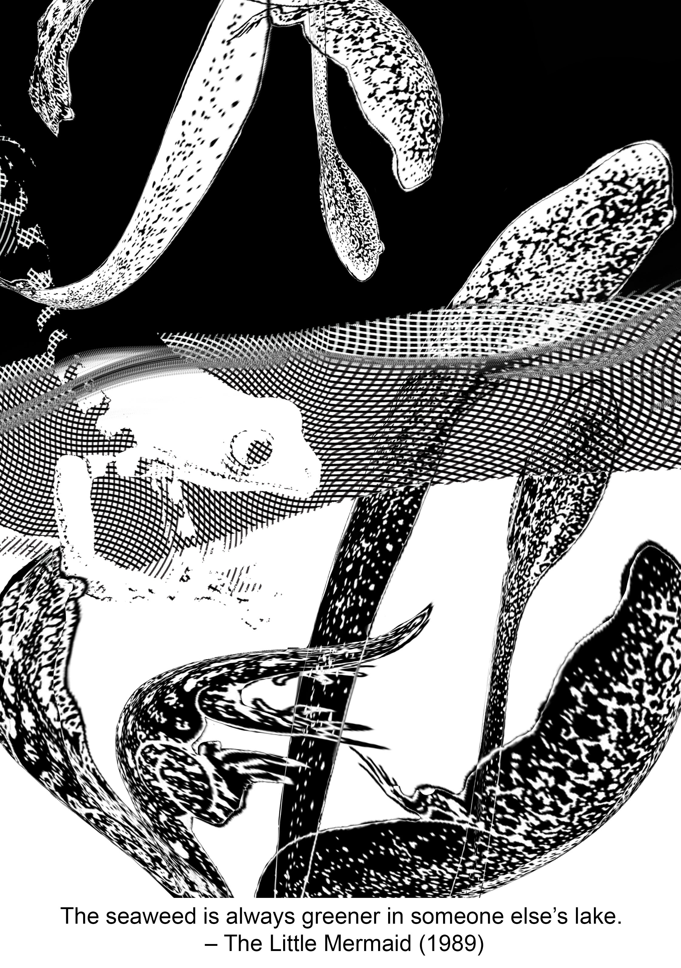
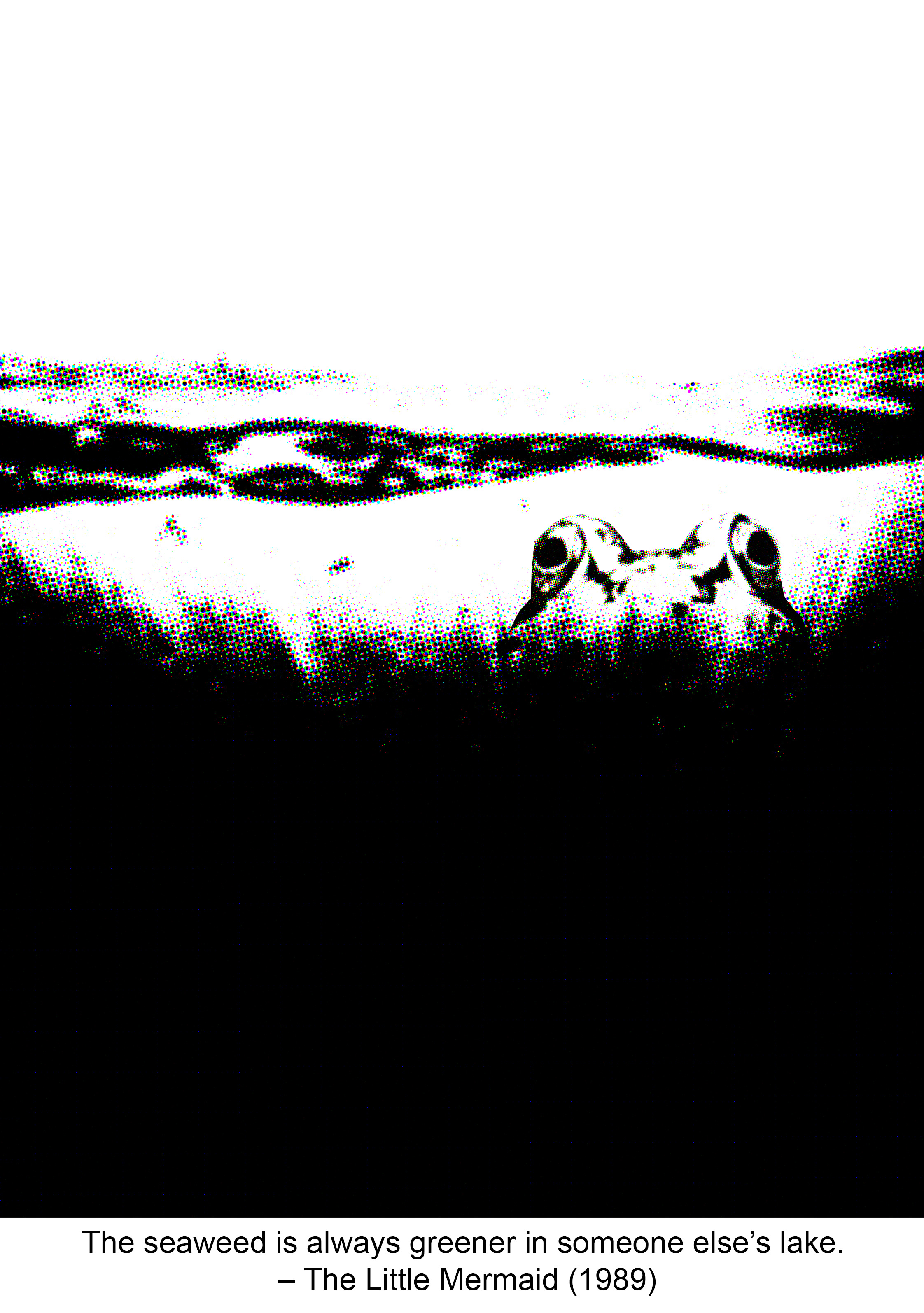
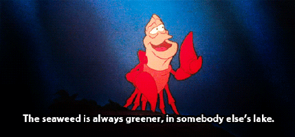
The seaweed is always greener, in somebody else’s lake. – The Little Mermaid (1989)
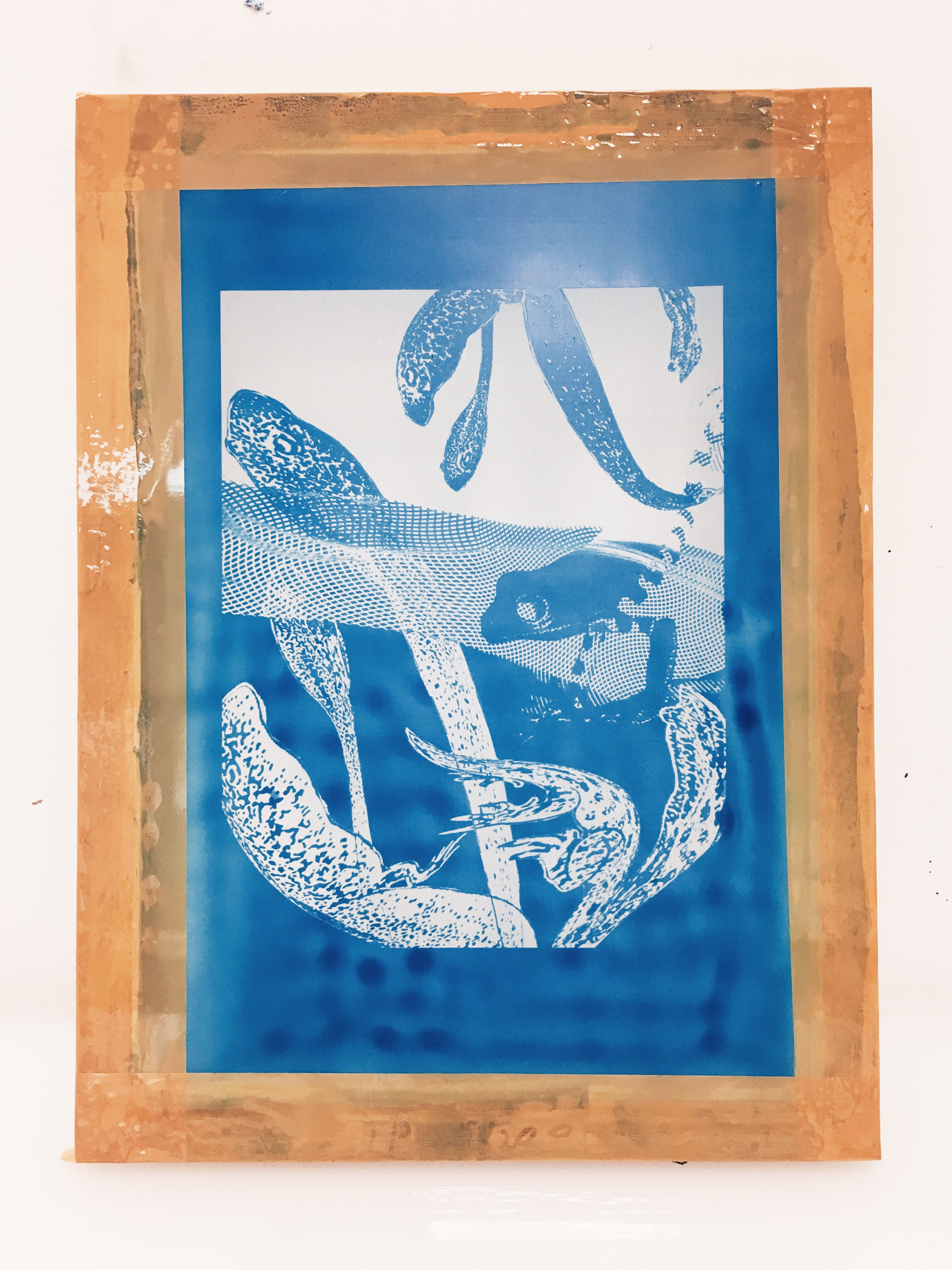
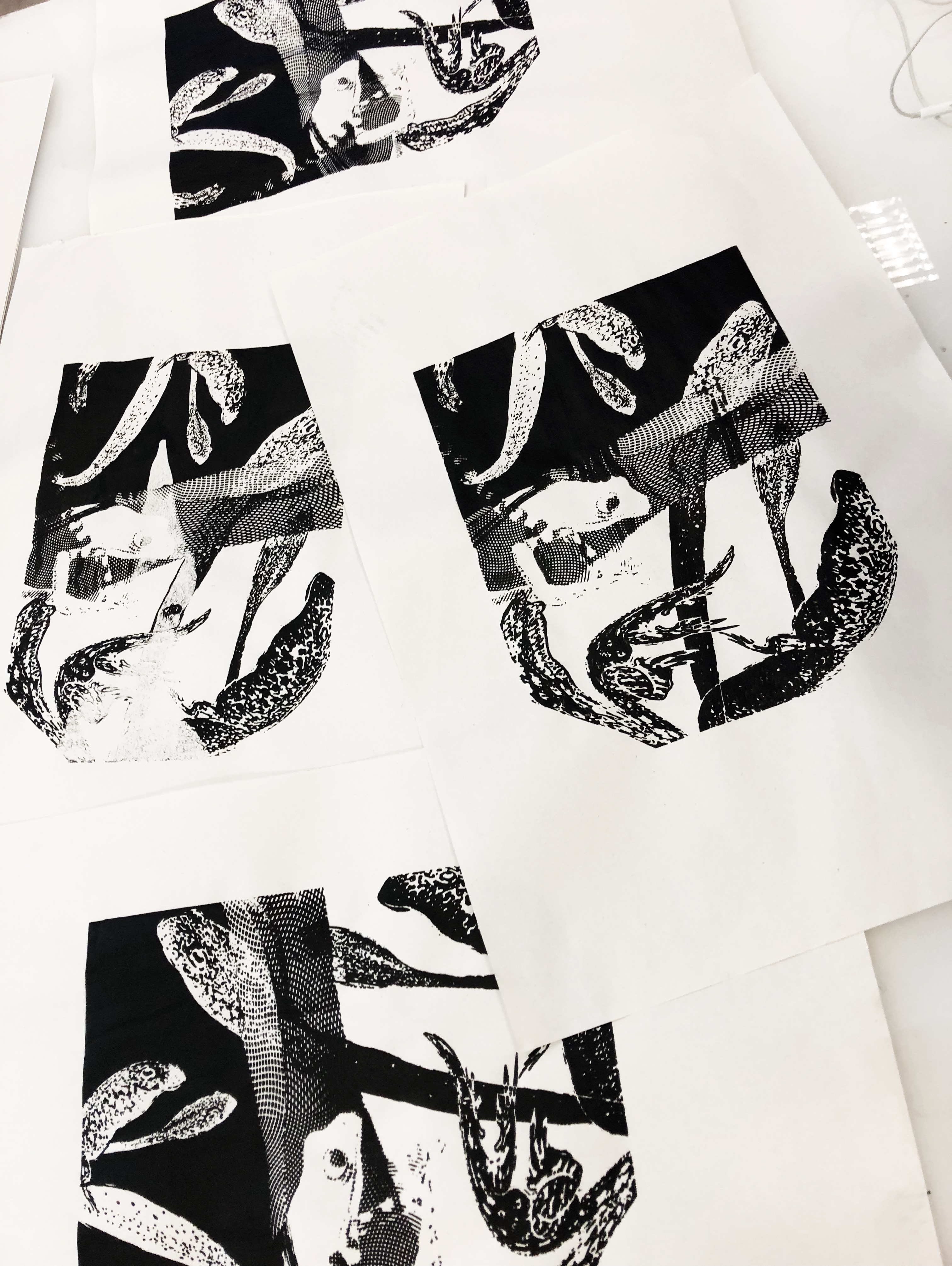
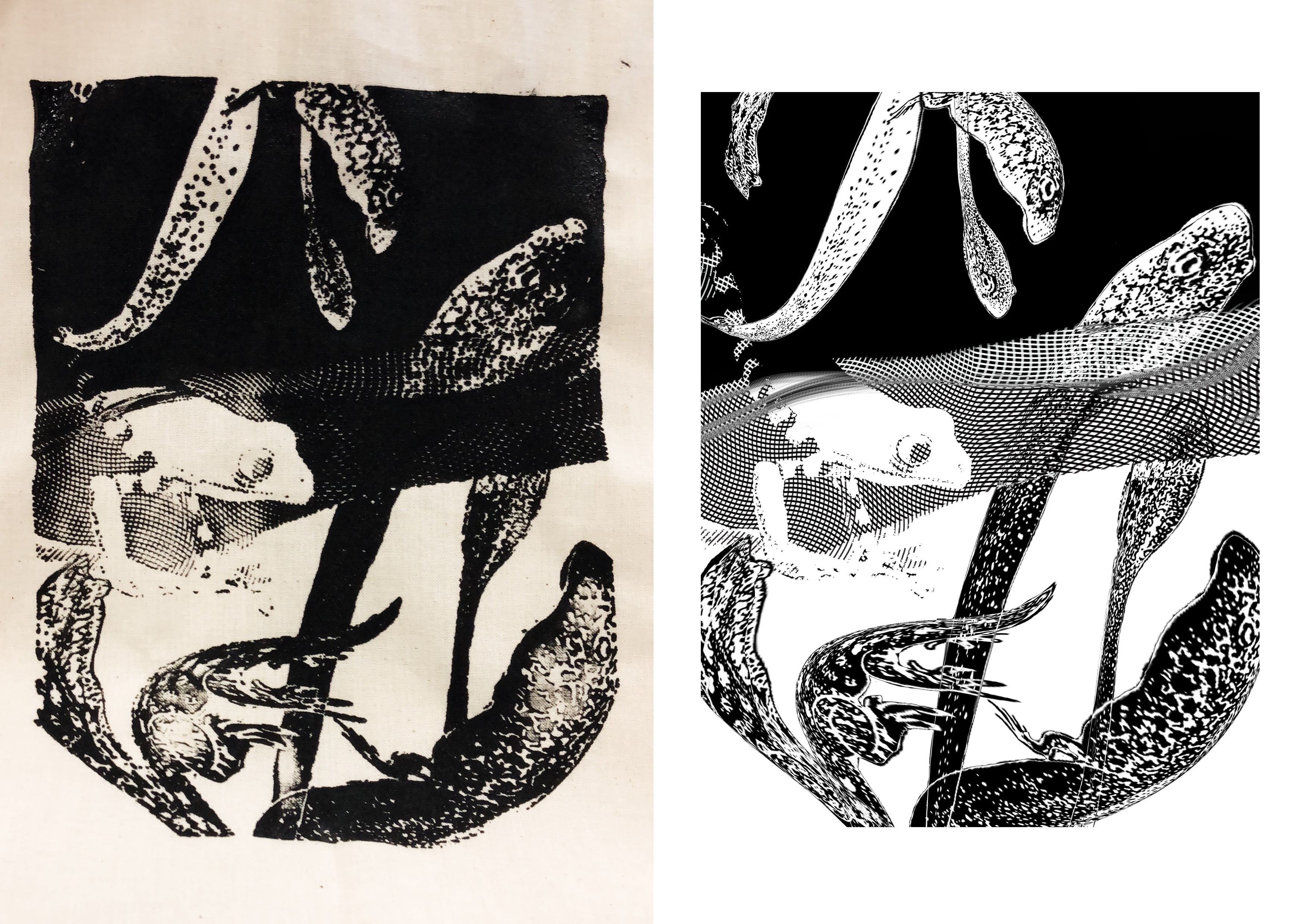
The keywords are “greener” and “someone else’s”. To show “greener” I used contrasting values — black and white. I interpret “someone else’s” as something territorial. I chose a frog for my subject since they are known to be territorial. Instead of using an image of a pond or lake, I suggest the idea of water through the engraving pattern running through the middle of the composition. “Seaweed” is replaced by the wrapped tadpoles.
I placed the elements in a dynamic manner to prevent the composition from looking static. I applied the following principles of design: contrast, texture, rhythm.
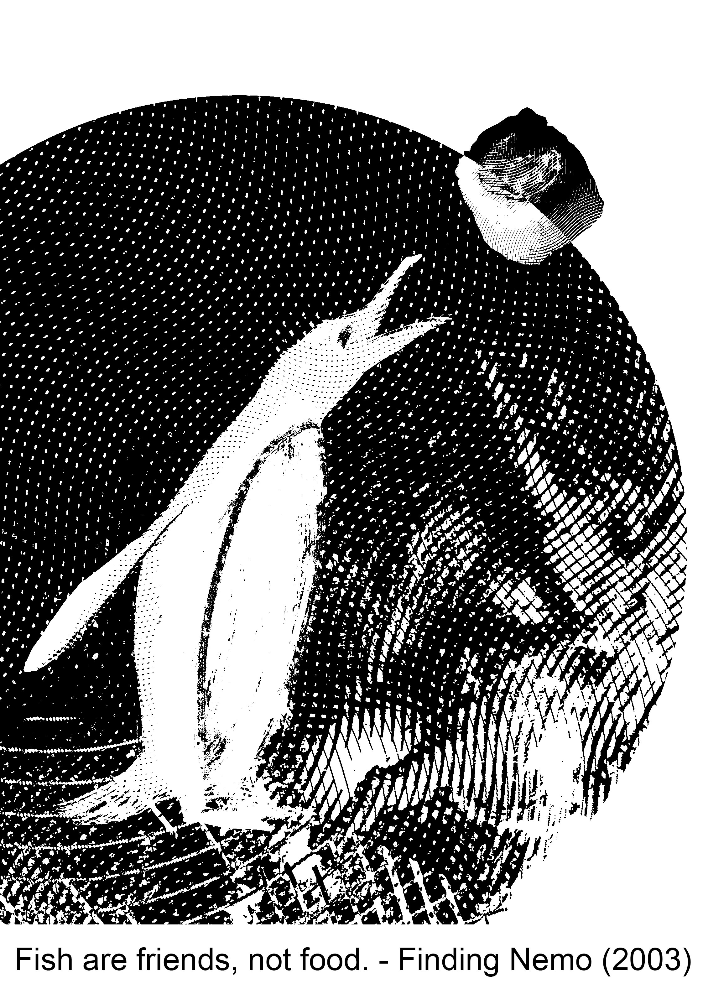
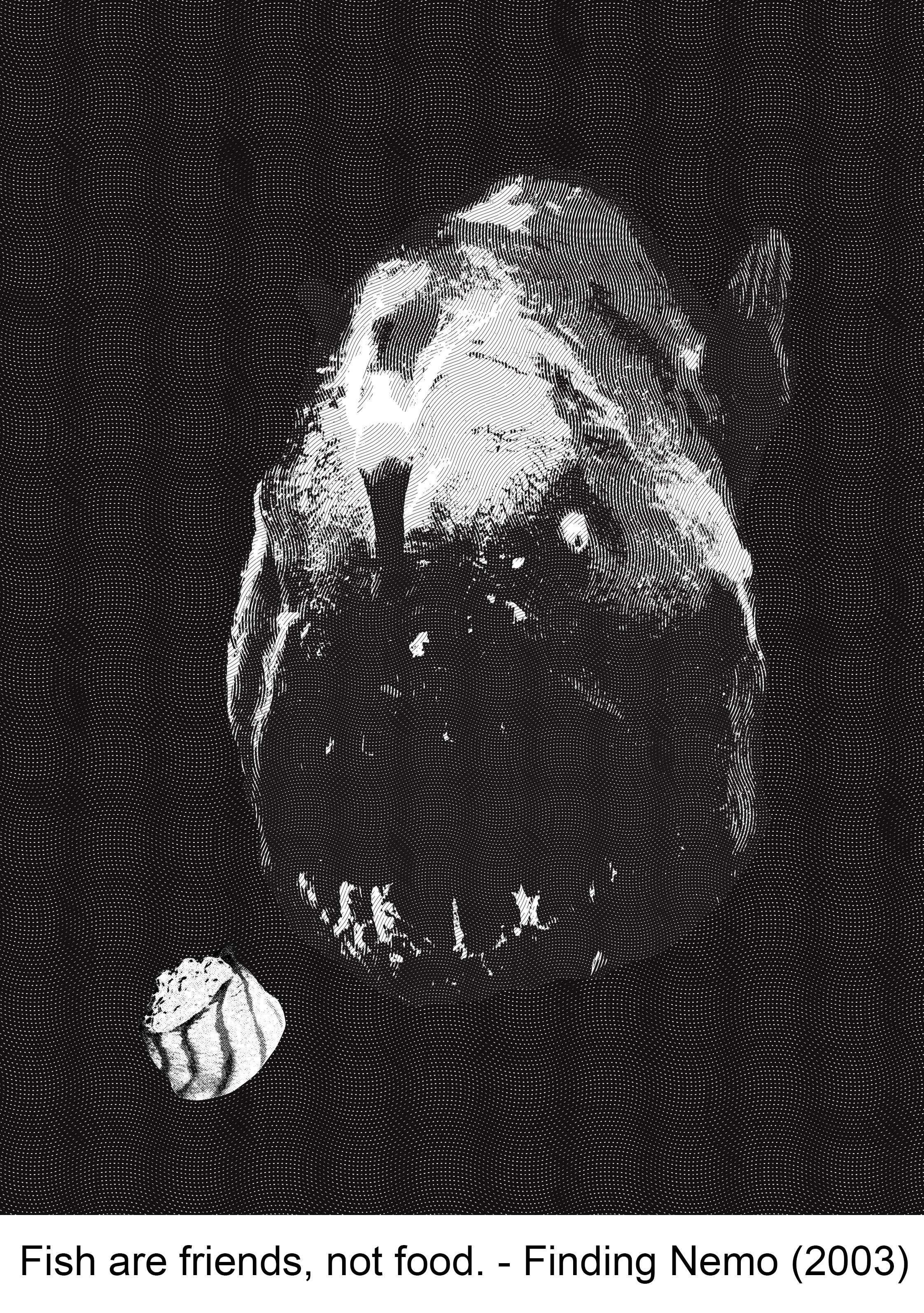
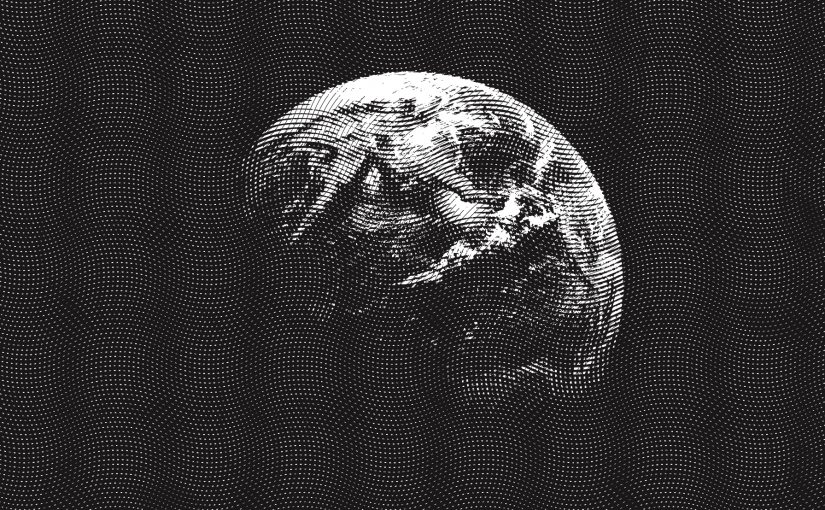
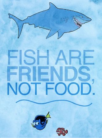
Fish are friends, not food. – Finding Nemo (2003)
For this simple quote, I used sushi to merge “fish” and “food” together. I chose a penguin as their main diet consist of mostly fish. I wanted to convey irony, since the character in the movie who said this quote is a shark that eats fish (or attempted to). The sushi is half black, half white — to suggest whether the fish is friend or foe. To depict the “friends” part, I included a circle in the composition, which is actually a photo of the earth that I changed into an engraving in photoshop. Th earth is used to show that we are all on the same planet, hence the “friends” part.
The following principles of design are applied in this composition: Rule of thirds, balance, scale (big circle, small circle).
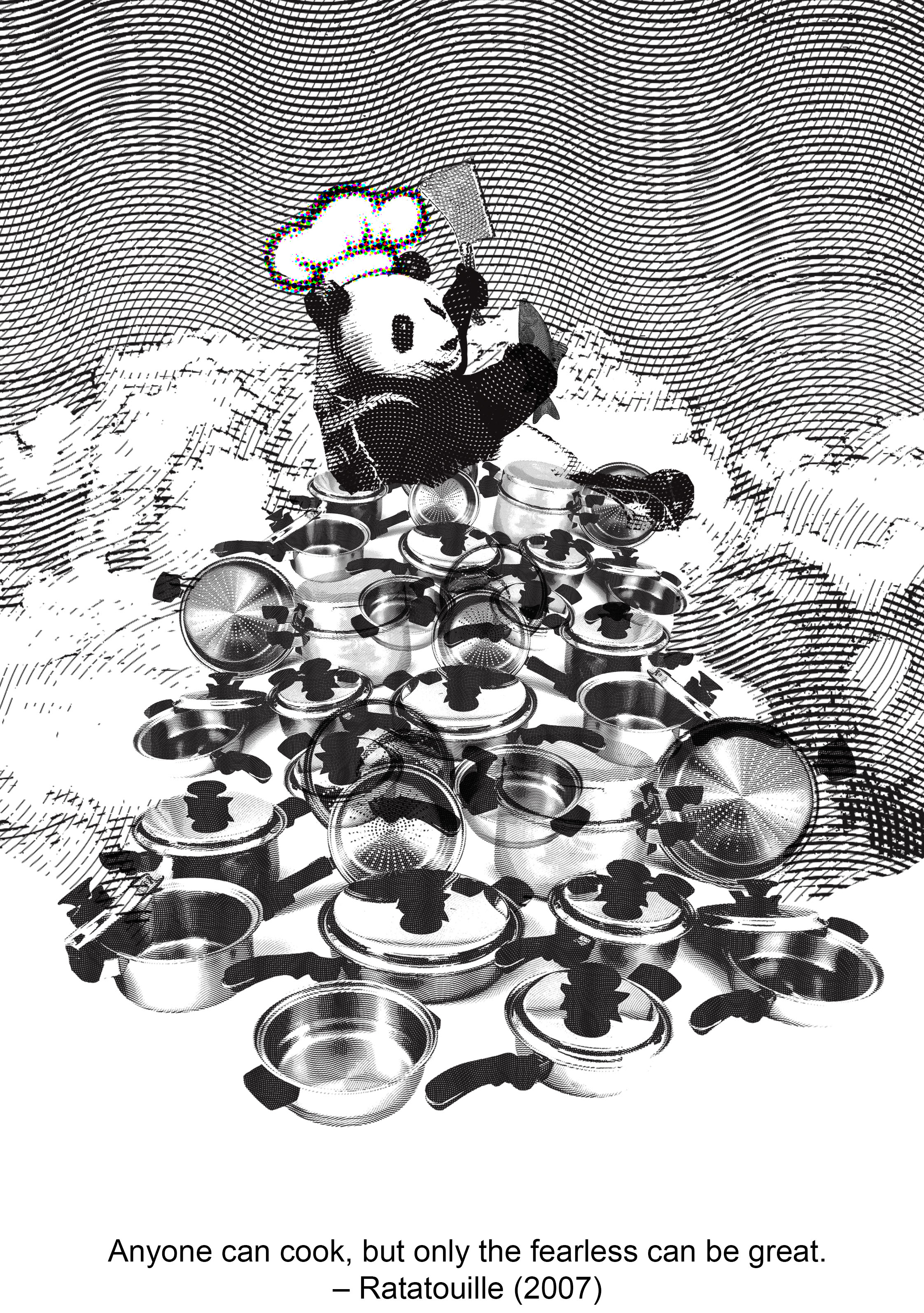
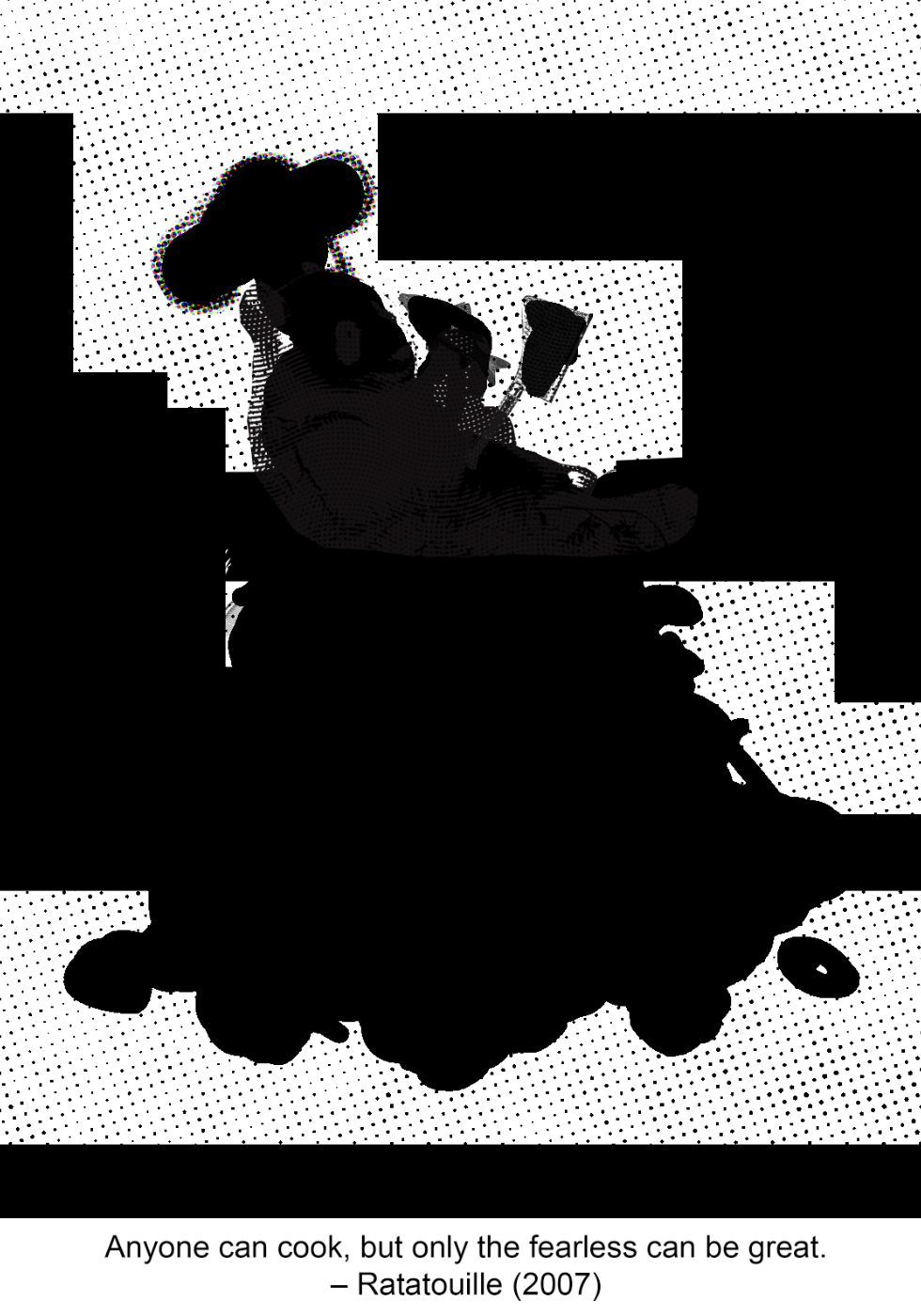
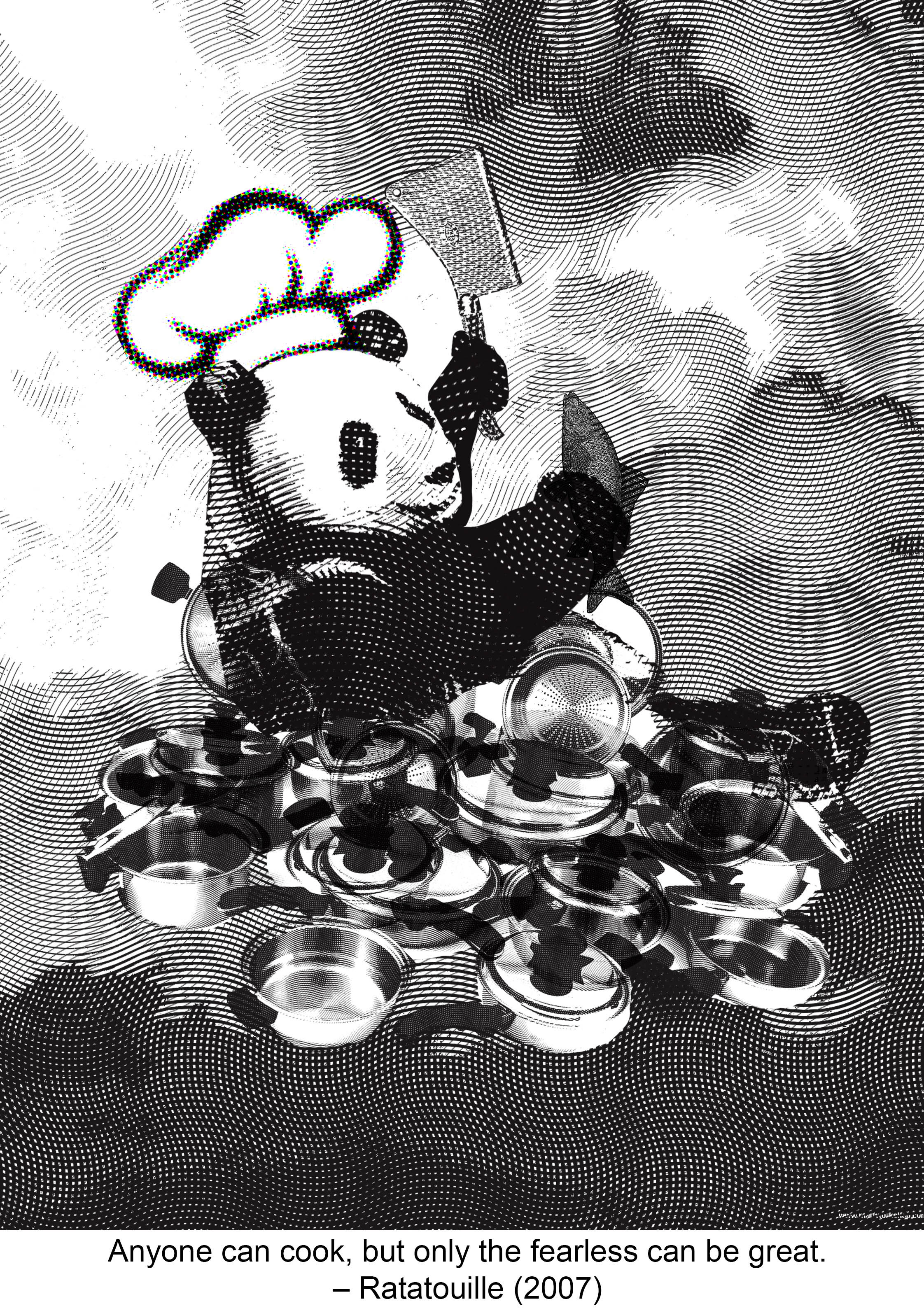
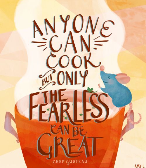
Anyone can cook but only the fearless can be great. – Ratatouille (2007)
“Anyone can cook“, means the dumbest of animals can cook! I used a panda in this composition as it is ranked the number 1 dumbest animal on some websites. “Fearless” is shown through the cloud motifs. I interpret that only the fearless would dare to reach for the skies, so the panda is in the sky. “Can be great” is shown through the stacked pots and pans. The panda is at the top of the pyramid. In this composition I attempted a more symmetrical design, with only the panda’s pose to offset the symmetry.
I applied the following principles of design: symmetry, hierarchy.
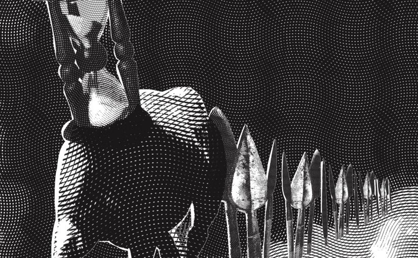
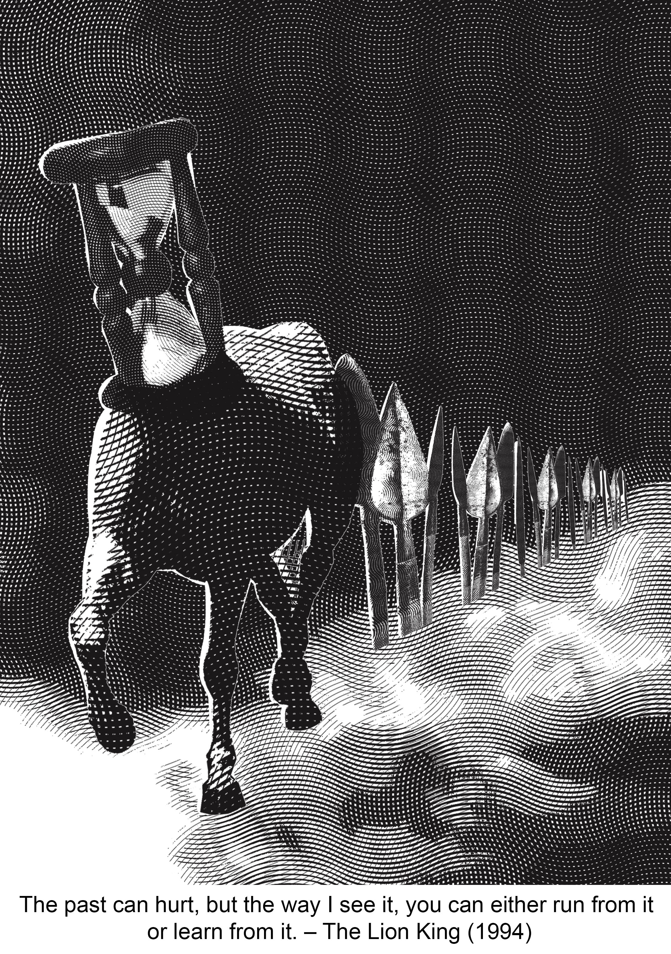
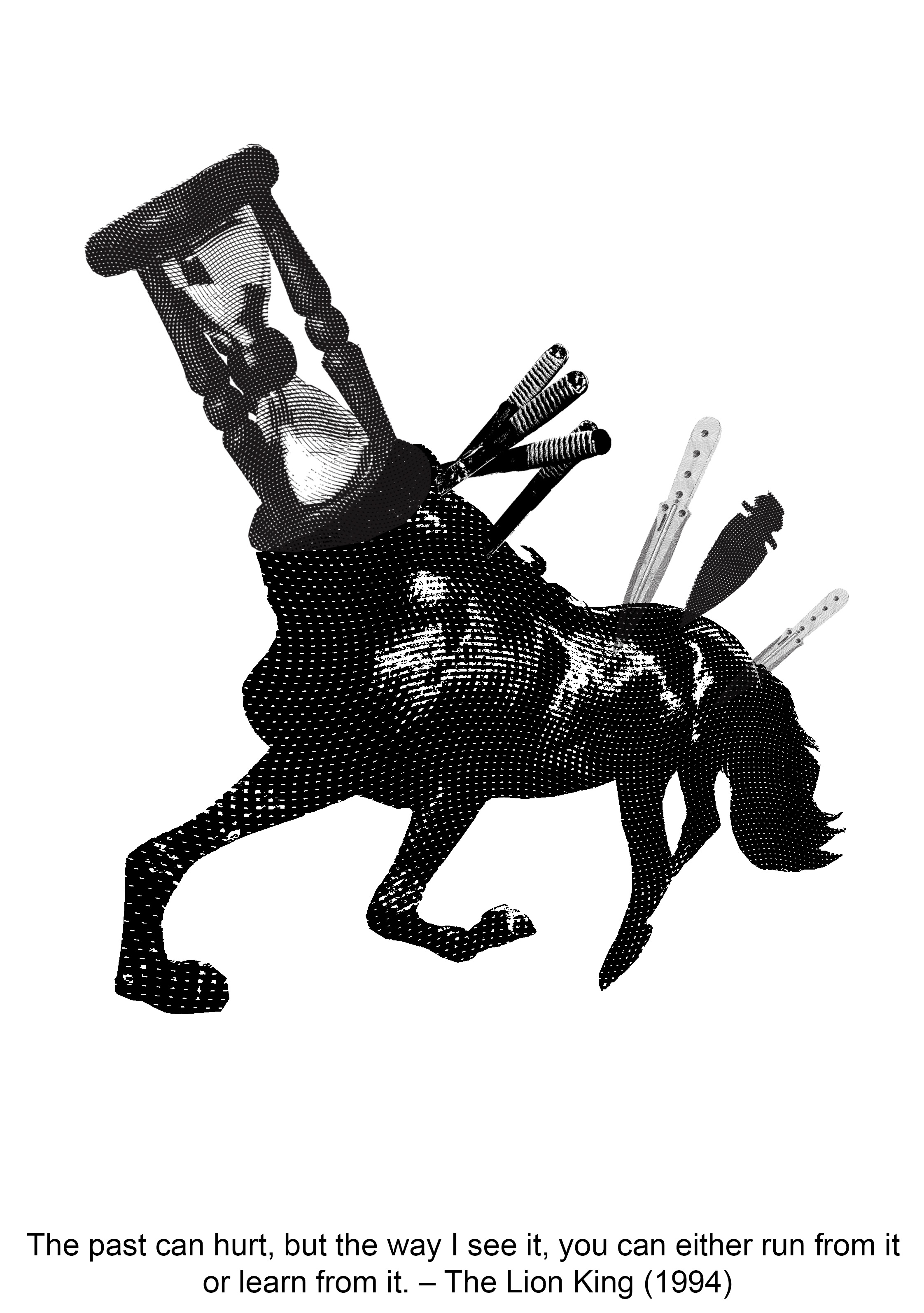
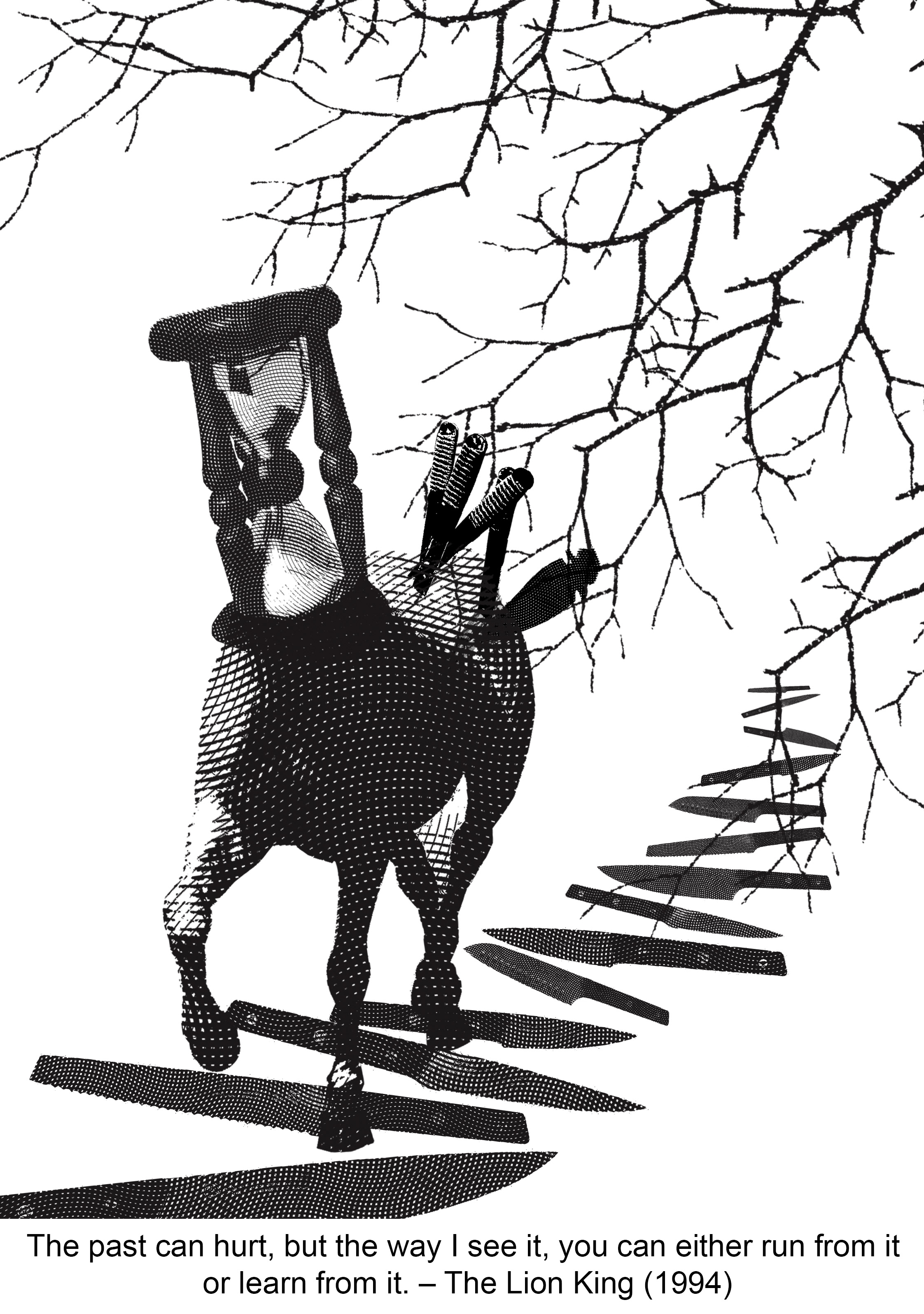
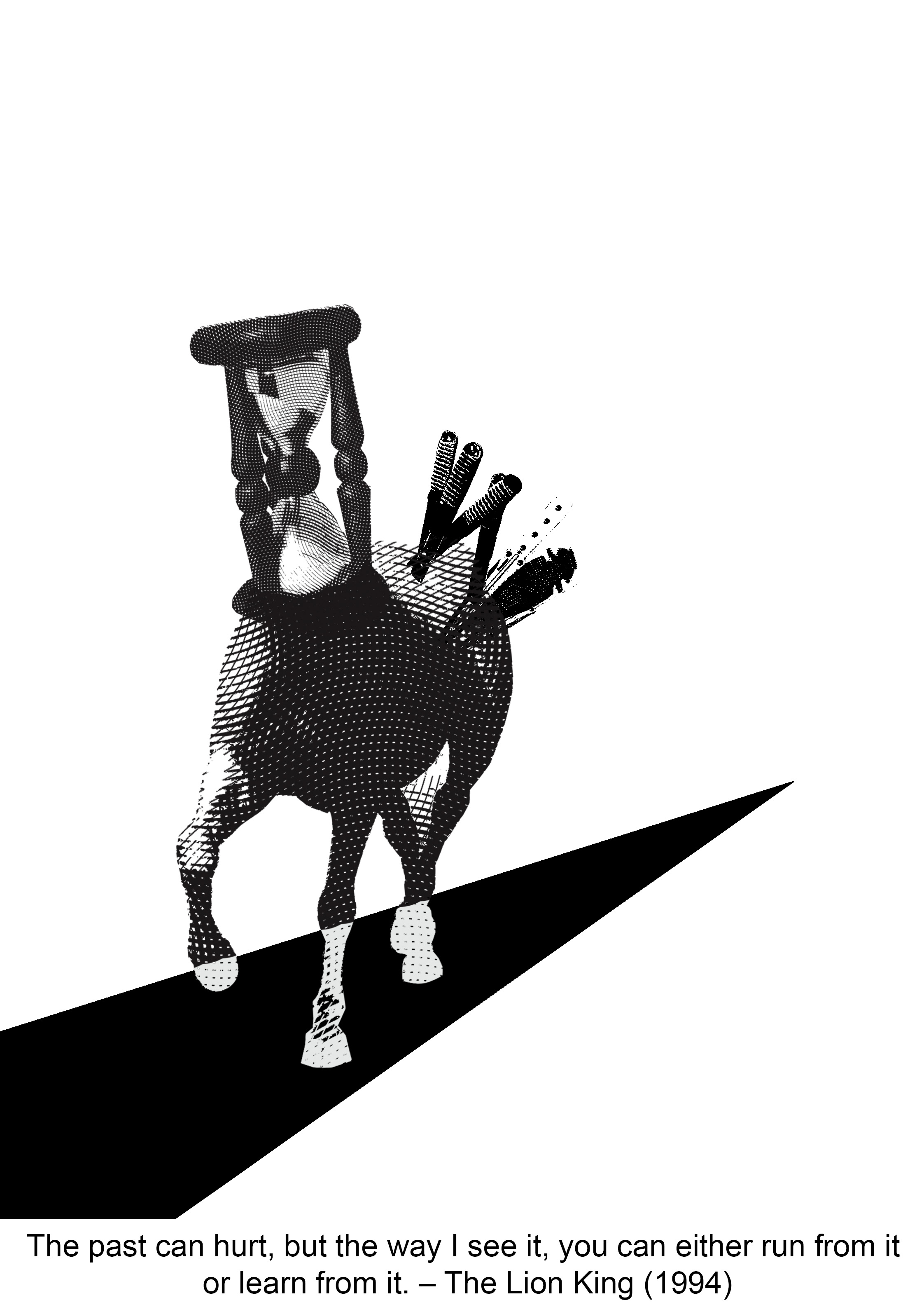
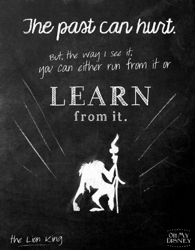
The past can hurt, but the way I see it, you can either run from it or learn from it. – The Lion King (1994)
I kept the overall look of the composition dark to portray a dark past. “Run” is shown through the horse. The spears convey “hurt“. I arranged the spears such that they lead the viewer’s eyes to the horse. It also creates a more dynamic and less static composition. This design principle also helps depict the “learn from it” part. We learn from our journeys, hence I used the pathway to signify journeys. The white smokey path further accentuates the leading lines created by the spears.
The design principles applied are: Repetition, rhythm, scale, balance.
Final Print
I managed to get a perfect print on my third try! The engraving showed up well so I’m glad I added that into my design.
Reflection
The most challenging part of this project was to not be literal. I think I could have done a better job in choosing the images or elements. I think some of my designs thread on the fine line of being literal. I think for future projects, I need to try to see things from another perspective. Another problem that I had was, after arriving at one composition, I have the tendency to stick to it and run out of ideas to create a completely new one. Which is probably not good as an artist.
In terms of design principles, I think I have took risks in one or two compositions by steering away from safe design principles. I focused mainly on avoiding symmetry for most of my designs. However I think I could have experimented with other design principles grouped under the gestalt theory, such as similarity and closure.
The silkscreen process overall was very good experience. It is something completely new that I had never done before, and the end result is satisfying after all the tests. I found that it helps to observe other people doing their printing. And try to mimic the actions of those successful. It was tricky adjusting the pressure exerted and motion of the hand. The amount of paint used matters too.
In the process of this project, Photoshop corrupted one of my files (ironically, while I was saving it). Though I managed to redo my work quickly, it was a reminder for me as an artist to always back up my work.
The outcome of the “class voting” was not surprising to me as I know which composition works well and which doesn’t. My classmates liked the frog and horse one the most. I think I’d need to improve more on idealization and conceptualisation more. I can start by making mind maps for my next assignment!
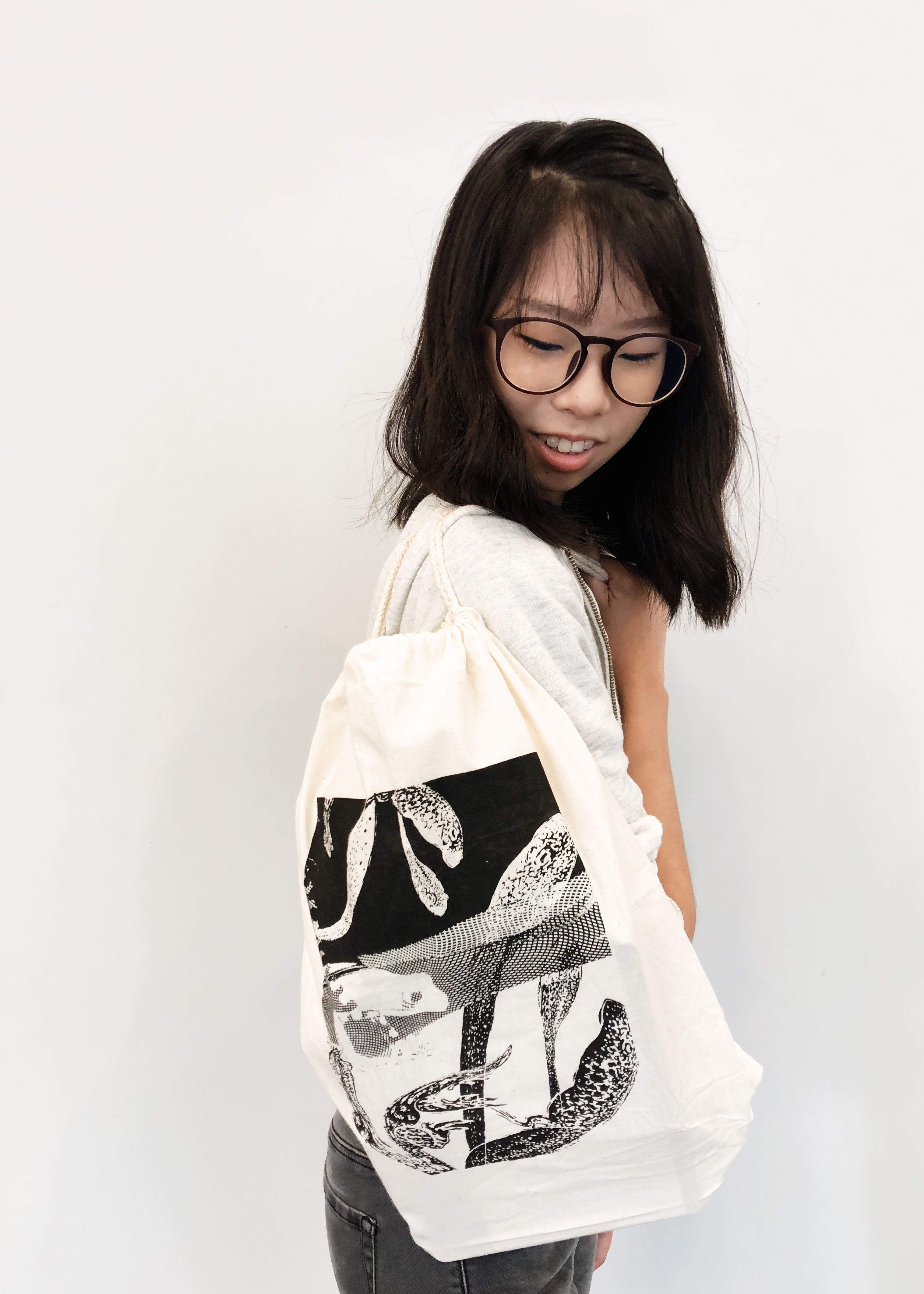
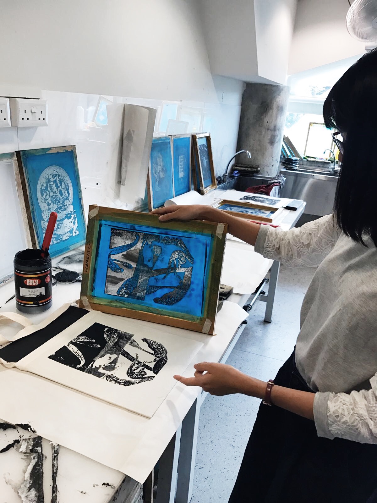
I document my designing and silk screening process here!
Compositions
The seaweed is always greener, in somebody else’s lake. – The Little Mermaid (1989)
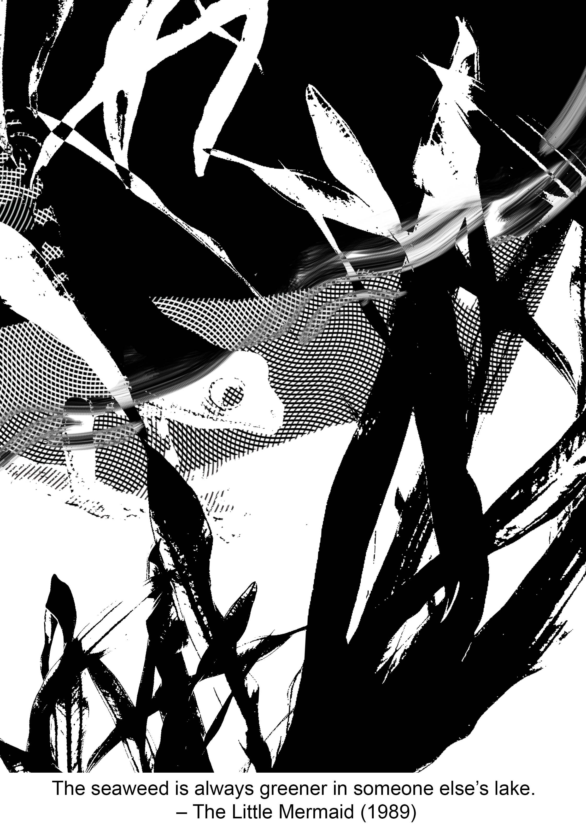
As explained in the previous post, I wanted to show contrast in the image to convey the idea of “somebody else’s”. However, I made the mistake of starting off with a pretty literal choice of image which is the water / lake. The line going across the page made the composition very static. I chose a frog as my subject since it is known to be a territorial creature. After combining the two elements I could not think of other images to include. Hence I ditched this composition totally.
While looking for a suitable frog image to use in this composition, I came across a good photo so I imported it into photoshop and edited it to become an engraving. It was a happy accident that the background become a nice engraved pattern. So I thought of using it to suggest the idea of water, instead of literally using images of ponds and lakes. I erased some parts so that it’d look more graphic. The engraved pattern provided good separation between the black and white areas, so I decided to keep that in the composition. I inverted the colours of the seaweed so that it’d stand out against their respective backgrounds. But admittedly it was too literal. During consultation, Shirley suggested using something else to represent the seaweed, like tadpoles maybe. Below is the design that I worked on before the final.
Fish are friends, not food. – Finding Nemo (2003)
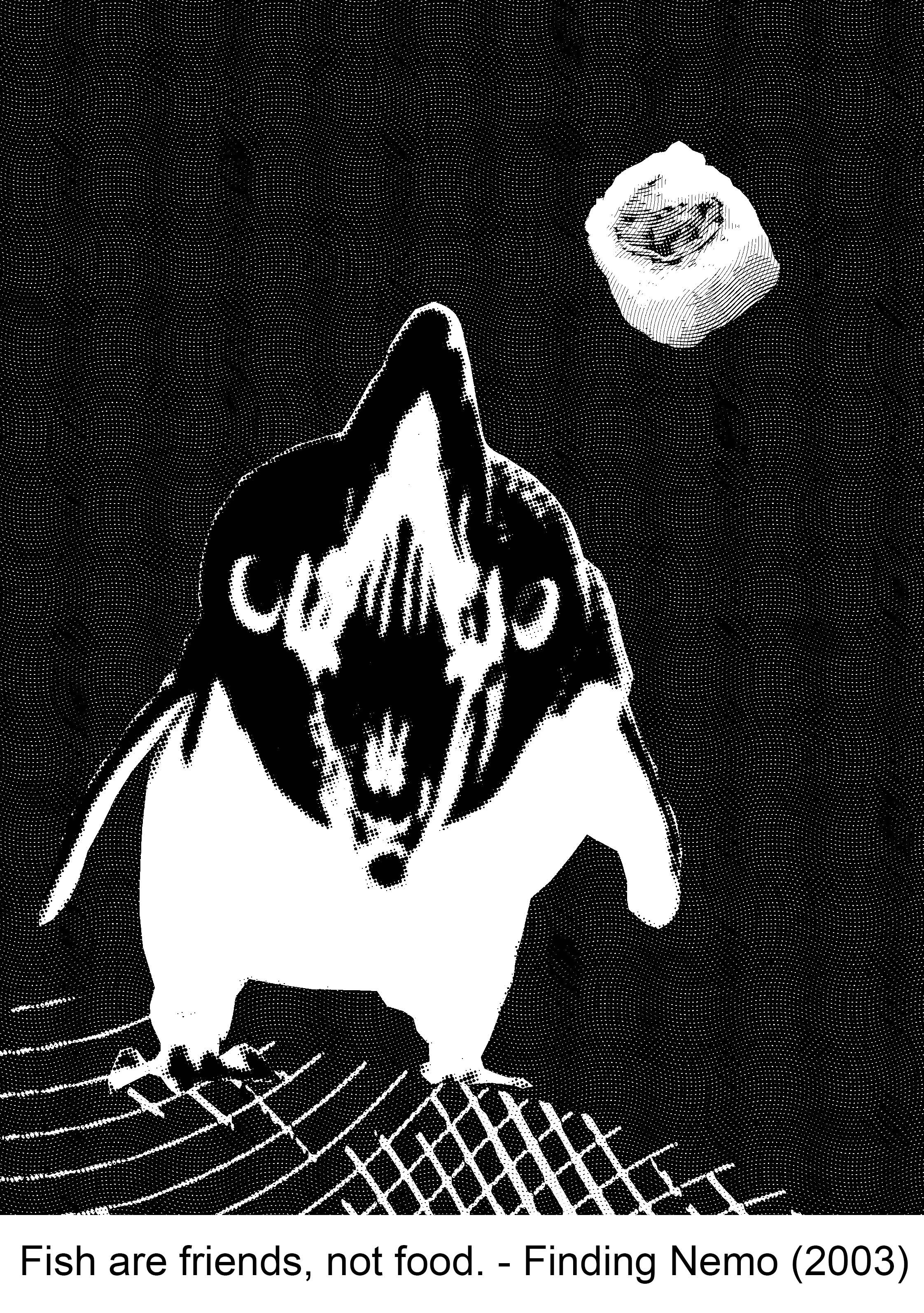
My initial design was a bit too literal again since it is a fish, that seems to be a problem for me. I liked the irony of a fish eating another fish though. Composition wise, I like its simplicity. But I think this design would not have printed well so, rejected!
Since I liked the simple composition, I tried going for a similar concept. I tried replacing the fish with something else. I looked up animals that feed on fish. A lot of them were birds and bears. I didn’t want to work with a bear because I already have a panda in my other quote. I opted for a penguin and came up with the composition below. But I didn’t like the final outcome. Something about the penguin puts me off. So rejected.
Anyone can cook but only the fearless can be great. – Ratatouille (2007)
Photoshop messed up my file for this composition! I pressed SAVE but it corrupted the file. The irony. So I redid my work, and thankfully, it actually turned out better than what I had originally.
THE CORRUPTED FILE. Sigh.
This is the new and improved design of what I had originally. I think the image is quite reflective of the quote. I didn’t chose this because it doesn’t convey the “can be great” part very well.
The past can hurt, but the way I see it, you can either run from it or learn from it. – The Lion King (1994)
I used a horse to substitute the word “run”. The difficult part about this composition was finding suitable images. I couldn’t find an angle that I like initially so I warped the horse image but that was a bad choice. It looked amateurish and bad overall. So I decided to ditch this.
After I found a suitable image and combined the elements of time and hurt, I worked on the “learn from it” part. I chose to create a pathway with knives because paths represent journeys and journeys are our learning processes! The next step was to think about the background. It was hard thinking about what elements to introduce into the compositions. The branches are supposed to show the passing of time too but it turned out to be very awkward in this composition.
I tried going for a simple approach too, by using a solid black path. But I’m not sure about all the abundance of white. I think it’s more interesting to have an actual background. So I rejected this too.
Silk screening process
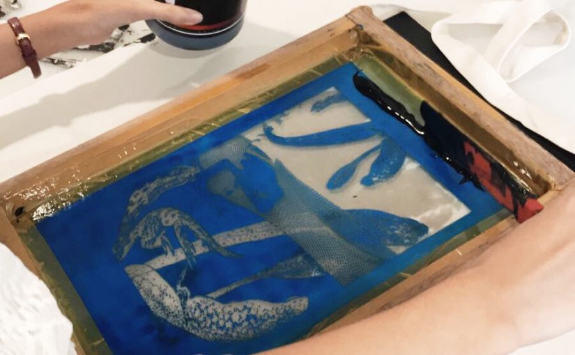
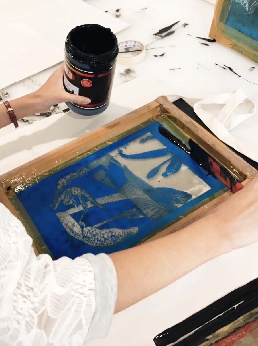
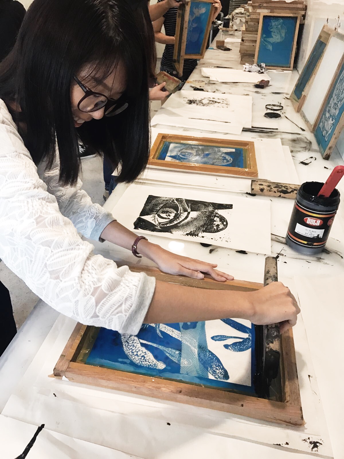
The fun part! First, we had to print our design onto transparency. After we have coated our silkscreen with the blue emulsion, we let it dry. We then place our transparency with the design on it and expose it to light.
After scrubbing off the unexposed parts, this is what I got:
Pleased that it turned out fine. I proceeded to do some test prints on paper. At first I thought “Wow, so simple”…
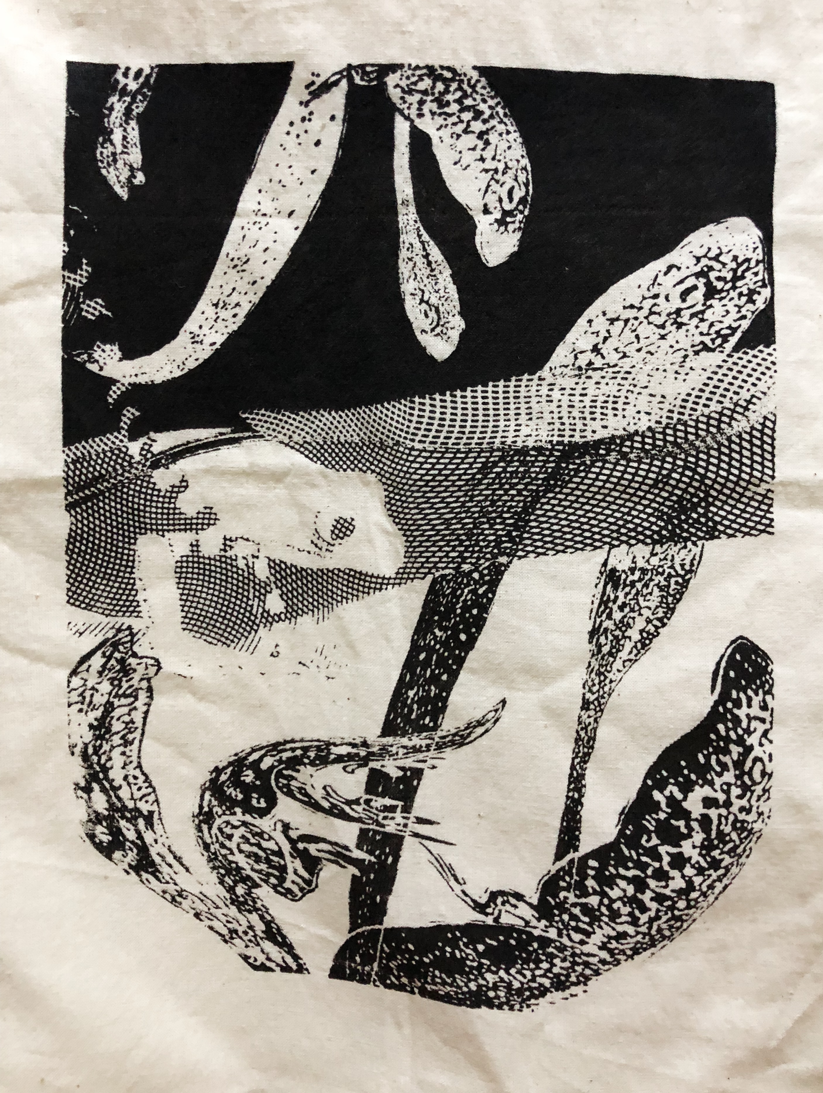
I WAS WRONG. I attempted a print on my personal tote bag but it failed. I went over my design too many times because the ink wouldn’t distribute well. If we compare it with my final design, we can see that some of the tadpole in the black background and the engraved pattern didn’t show up. The bottom part of the design is faded. The white details against black backgrounds didn’t show up well. I guess the trick is to have the right amount of paint, and the right “feeling” as you drag the swipey thing down once.
Left: personal tote bag print, right: design
Placing the paint. We masked the edges of the screen with tape to avoid smudges!
Then using one swift motion, we drag the paint down. My second try, with the provided tote bag this time.
Is it a success?!
Final designs and final print to be revealed in final submission post!
This assignment requires us to come up with interesting compositions using dingbats based on movie quotes! It seems a lot harder than it sounds.
My chosen quotes are:
The seaweed is always greener, in somebody else’s lake. – The Little Mermaid (1989)
The key words are greener and somebody else’s. In this composition, I knew I wanted to show distinct contrast by using positive and negative space to depict “greener”. “Somebody else’s” suggests a territorial space to me. So I think I would want to create an environment in my composition. I might stick to the seaweed part, though I’ll need to be careful to not be literal.
Fish are friends, not food. – Finding Nemo (2003)
Keywords are friends and not food. It is a fairly simple quote which might be difficult to make less literal. I can substitute fish for something else — another animal perhaps. I searched for animals that have fish as their diet, and then I realised there’s actually quite a few choices. Birds, sea otters, penguins, bears just to name a few. As for the food part, I thought of using sushi images because it is related to fish but not too literal in terms of visuals.
Anyone can cook but only the fearless can be great. – Ratatouille (2007)
This quote is interesting because I can easily depict this in my composition. “Only the fearless can be great” can be seen through hierarchy. So in my composition will make use of that design principle. Leading lines can depict this phrase too. Keywords are anyone and cook. To me if anyone can cook, it means the dumbest of animals can! So I researched on the dumbest animal on earth and it seems that it is the panda. So I might want to play around with a panda attempting to cook.
The past can hurt, but the way I see it, you can either run from it or learn from it. – The Lion King (1994)
Keywords here are past, hurt, run away, and learn. “Past” can be conveyed through items related to time like clocks and hourglasses. “Hurt” can be seen through jagged lines, or sharp objects like knives, spears, arrows etc. Wounds and bandages might be possible signifiers too. I wanted to portray “run away” through an animal because having a living thing as a subject serves for a focal point in the composition in my opinion. So I thought of horses and cheetahs. “Learn” is a tricky keyword to portray. I researched on signifiers for learning and knowledge, but they were mostly generic stuff like books and brains. Learning is a journey, so I can probably signify that using a pathway.
I also did a simple search on what silkscreen artists are producing and found one that I can learn from. Below is illustrator and screen printer, Rob Corradetti’s company Killer Acid’s piece. The composition has a balance of white, black and “grey” areas, with the grey areas being lines. There is more white areas than black areas, so that the ink will show up better I think. Plus it gives the overall composition some breathing space in the chaotic design.
Taken from http://www.peopleofprint.com/general/people-of-print-20-screen-printers-you-should-know-about/
Here are two works that I can gain inspiration from. I like the composition below because of its use of negative and positive space complemented with a touch of engraving. It really draws my attention to the moon. There is balance in the entire composition as well. It’s a simple statement.
Taken from Pinterest.
Compared to the simple image above, the illustration below is very textured. There is application of design principles involved — such as asymmetry, and there is a good balance of textures and white space.
Taken from Pinterest. The Devil Makes Six (detail), ink on Bristol, 2016. Aaron Horkey art
Compositions and silkscreen process to be documented under Process.
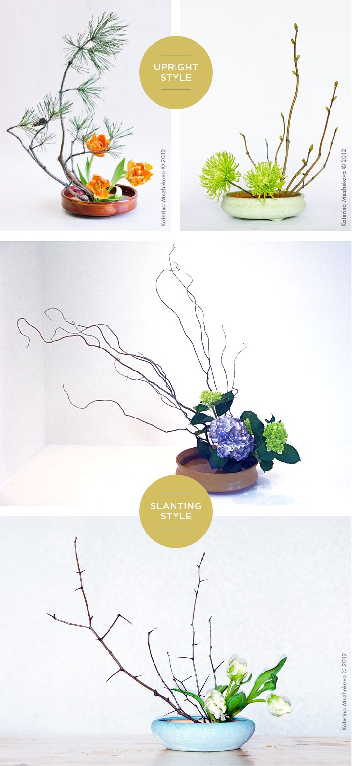
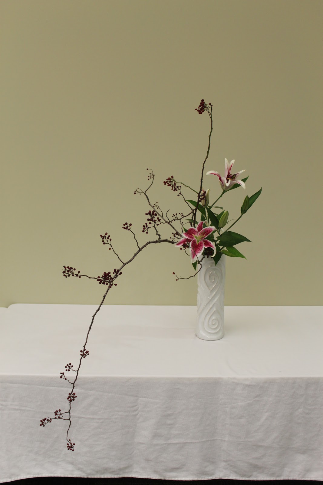
It is the Japanese art of flower arrangement. Ike meaning ‘alive’ and bana meaning ‘flower’. A form of creative expression, following certain rules of construction. Originated in 7th century when Buddhism was introduced to Japan. Formalised version of ikebana begun in the Muromachi period in the 15th or 16th century. Intention of the artist is shown through a piece’s colour combinations, natural shapes and graceful lines.
Characteristics of Ikebana:
Asymmetrical form
Use of empty space (void)
Two main styles: Moribana & Heika.
盛り花 Moribana
Materials are arranged as if they are piled up in low flat containers with a wide surface area of water. There are 3 different styles.
Upright Style
Standard floral style
Principle stems are positioned to evoke a sense of movement.
Slanting Style
Expresses the beauty of branches and grasses that grow slanting down.
Evokes even greater sense of movement.
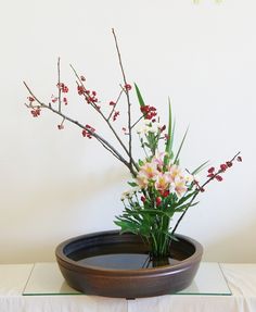
Water-Reflecting Style
Subject is placed in a slanted position over the container such that you can see its reflection on the surface of the water.
Arranged such that a wide surface of the water is visible.
Taken from https://www.ftd.com/blog/design/ikebana
Water-reflecting style
Other forms:
Colour scheme moribana – colour harmony and contrast are of importance.
Landscape moribana – representing natural landscapes / scenic beauty in the flower containers.
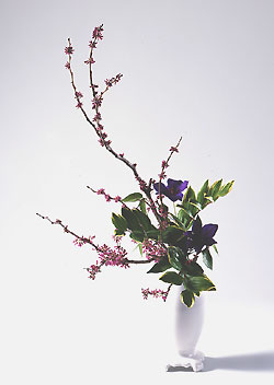
瓶花 Heika
Literally means “vase flowers” . Created in tall, deep containers, unlike Moribana. The three establish floral styles resemble Moribana methods, but there is a difference in the way the branches are placed.
Slanting Style
Basic floral style in Heika.
Expresses beauty of branches that reach out horizontally.
Taken from http://www.ohararyu.or.jp/english/form_heika.html
Upright Style
Expresses beauty of branches that rise forward.
Cascading Style
Expresses beauty of lines that flow gracefully downwards.
Taken from http://hanamai-theikebanablog.blogspot.sg/2013/01/ikebana-living-flowers-living-art.htmlheika
For my taste research, I decided to research on something a bit different. Instead of research how we taste, which everyone is doing, I wanted to find out what factors change our sense of taste. I found my answer on this website called Popular Science. I have included the relevant points below and summarised some parts.
Language
The description of the food affects how we perceive it. For instance, “Succulent Italian Seafood Filet” sounds more appetising than “Seafood Filet”.
Temperature
Warm beer tastes horrible, and so do cold rice.
Colour
The colour of the food matters. From Popular Science website: Forty-eight percent of participants thought soda in a blue glass was more thirst-quenching than in other colors, likely because they associated blue with cold.
Environment
The environment in which people taste the food plays a part in our sense of taste too. From Popular Science website: People were asked to describe the qualities of the same Scotch whisky in three rooms themed as grassy, sweet, or woody. (For example, the first room smelled of grass and played recordings of bleating sheep.) They largely responded with “grassy,” “sweet,” or “woody,” respectively.
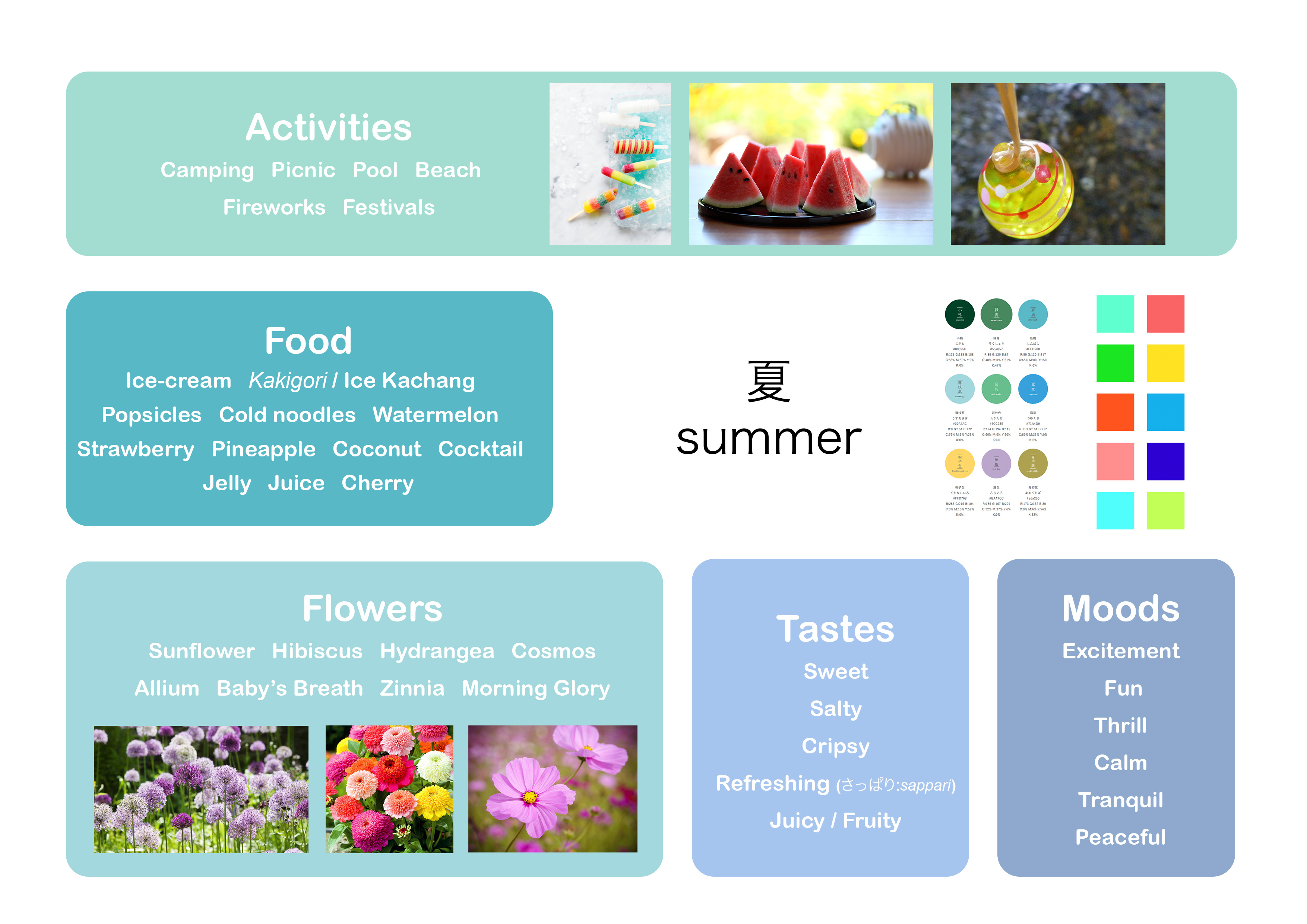
For my season mind map, I am a little influenced by Japanese summer so some visuals and elements are very specific –– like fireworks and watermelons –– though they can be considered universal too. Summer can be interpreted in two ways to me. Either fun-filled, or peaceful.
Which is why for colour schemes, I put two different types below. One is a more muted colour scheme, to show the calmer, more peaceful sort of summer. Whereas the colour scheme on the right is more pop and dynamic to show the fun, wild sort of summer. Colours are generally bright and colourful.
Though we aren’t using actual flowers, I still included them to serve as a visual guide.
A lot of foods are cold and could melt, so for my final model I will try to find drier types of food instead.
プロッセス Process
We were to play around with the different types of balance for this assignment –– independent, dependent and precarious balance. I did some models before getting my theme, and then made changes to them after I knew about the theme.
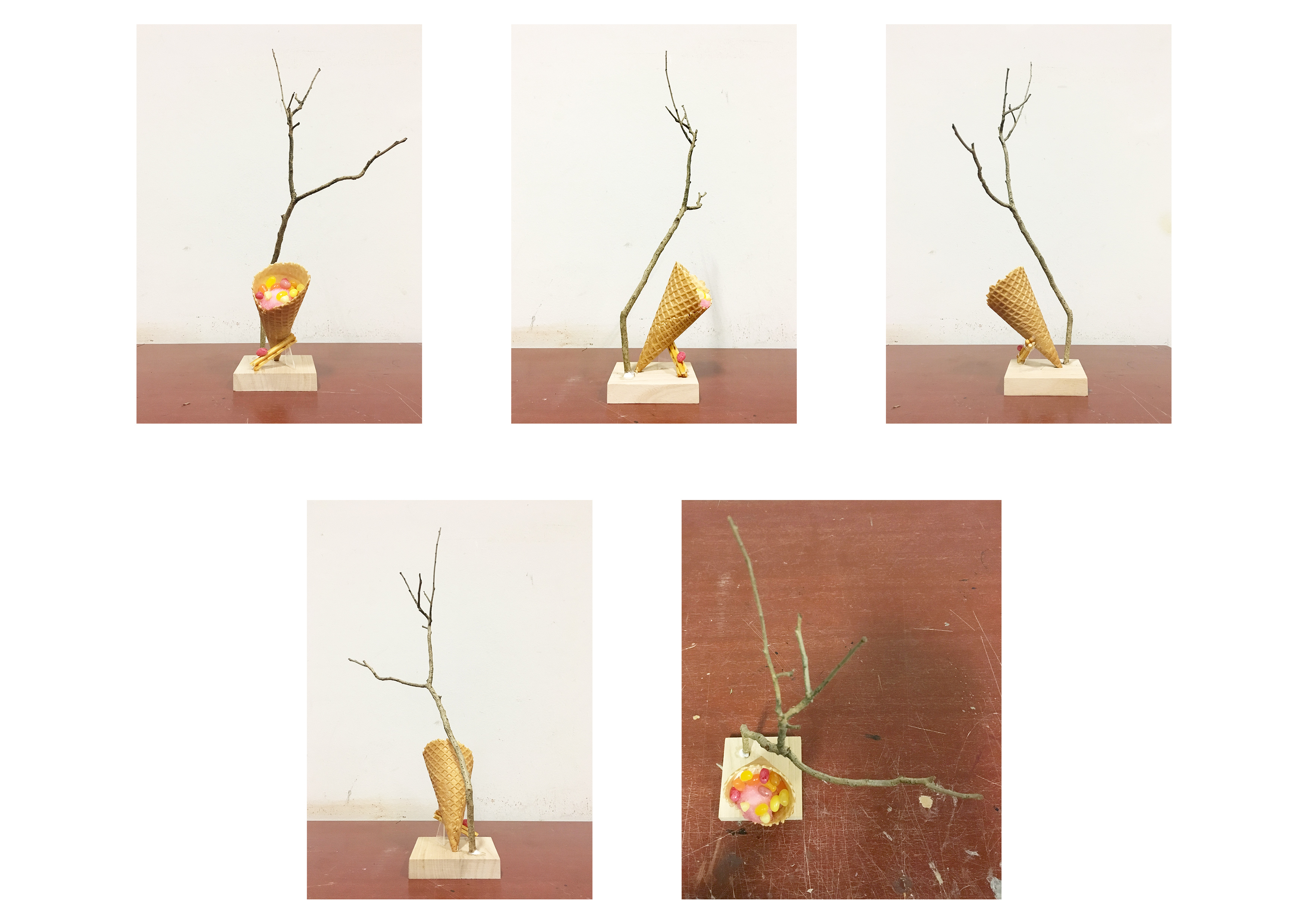
Sketch Model 1
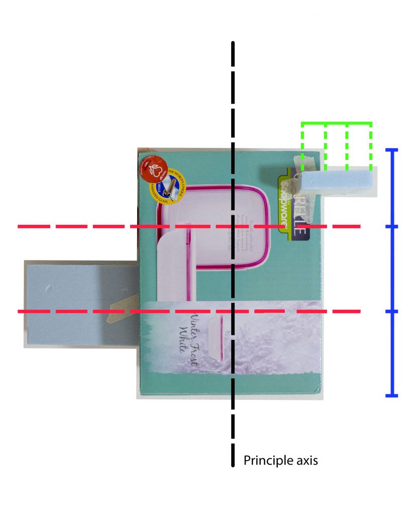
I experimented with precarious balance for this sketch model. I tried placing the SD and SO one-third at the edge of the D. By placing the elements at the edge, it sort of “explains” why the cone is almost toppled over. The D, SD and SO can be seen from almost all angles. However, I did not think this model was aesthetically pleasing, hence I did not choose to work on it.
Sketch Model 2
This model borrows similar elements from the first model in the sense that I place the SD and SO at the edges. It plays around with independent balance. It looks very zen and calming, as the line of action is a curve. It would have been nice to further play with this model. But I thought that it looked a bit too calm for summer, hence I did not choose this model.
Sketch Analysis
Sketch Model 3
This is the sketch model that I based off my final model from. I felt that the inverted cone at a diagonal best represents summer because it is very dynamic. D, SD and SO can be seen from most angles. The cone is leaning onto the SD –– dependent balance.
Sketch Analysis
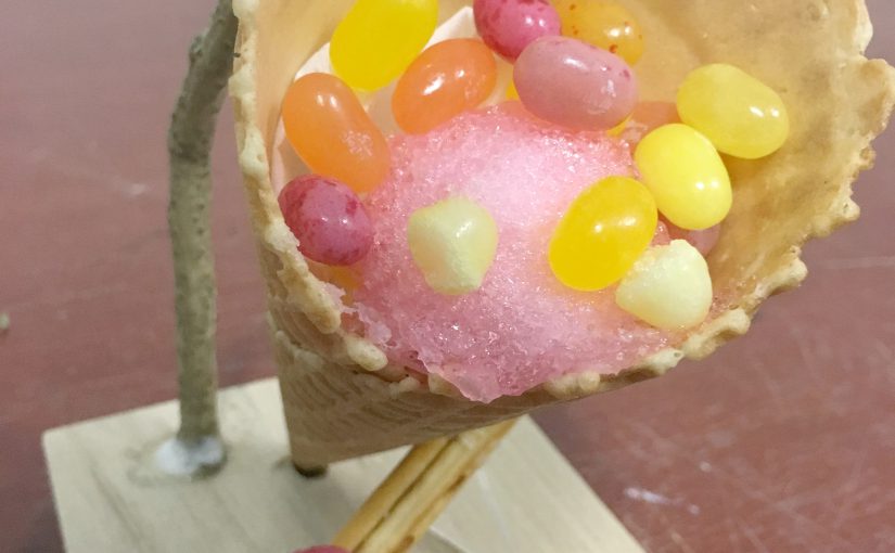
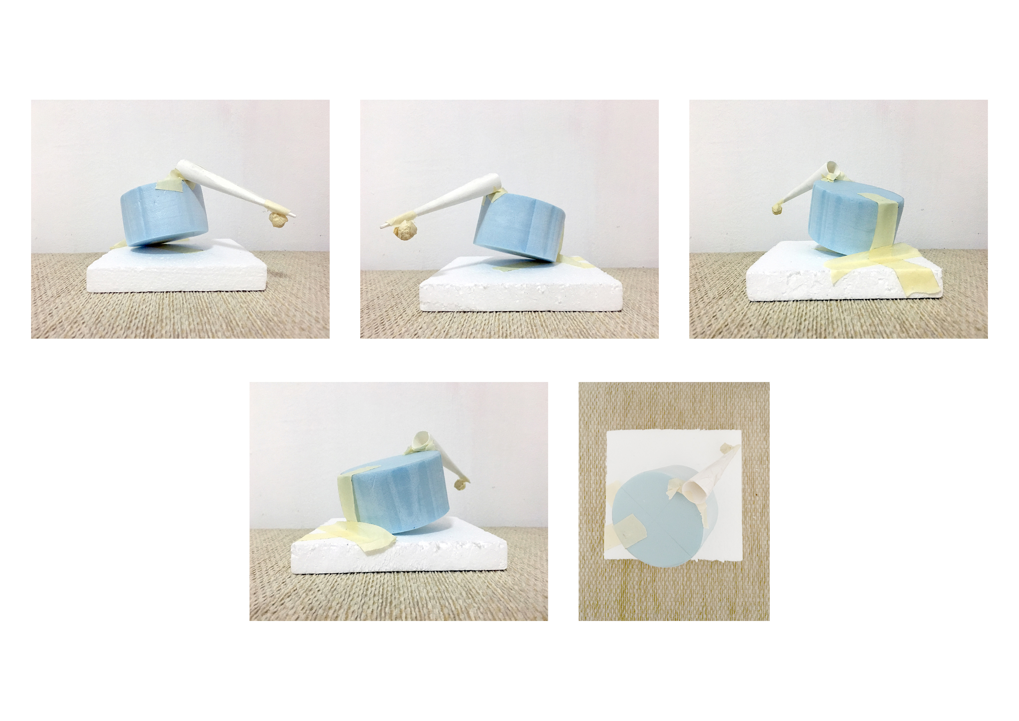
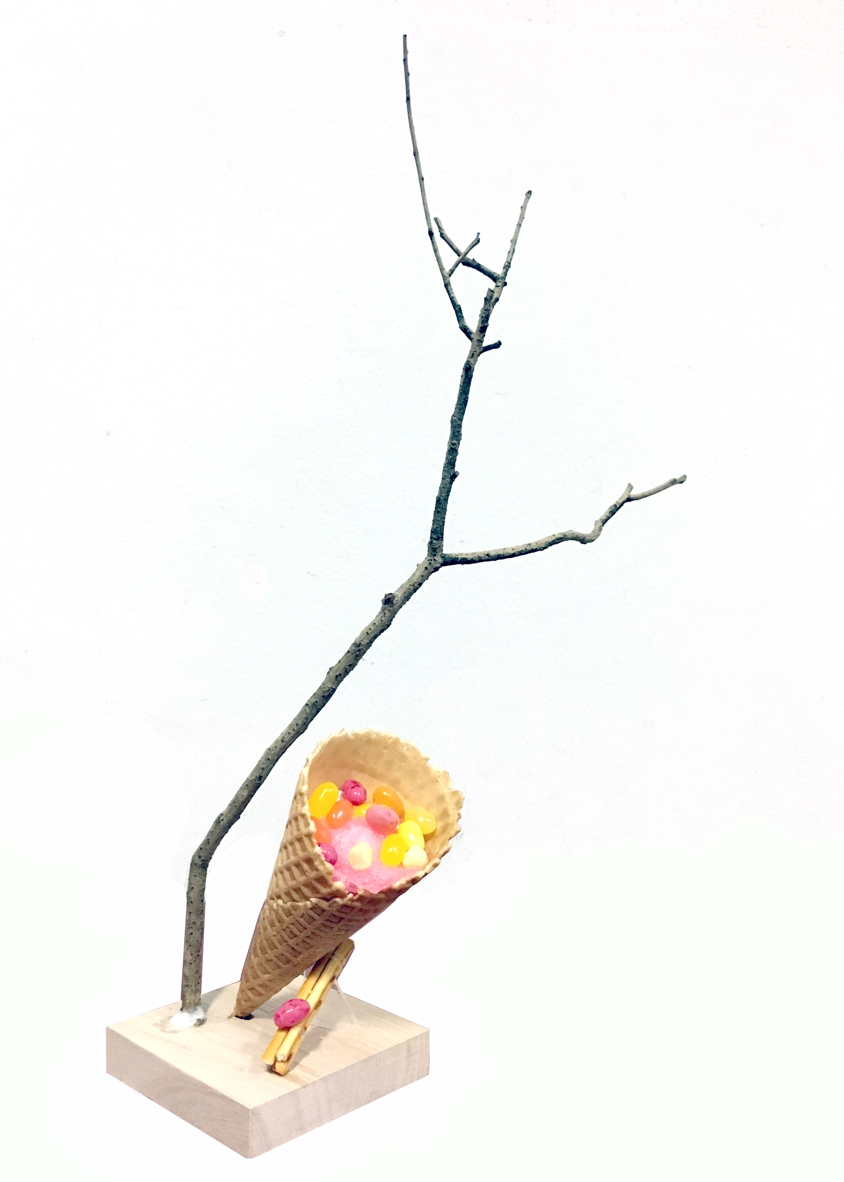
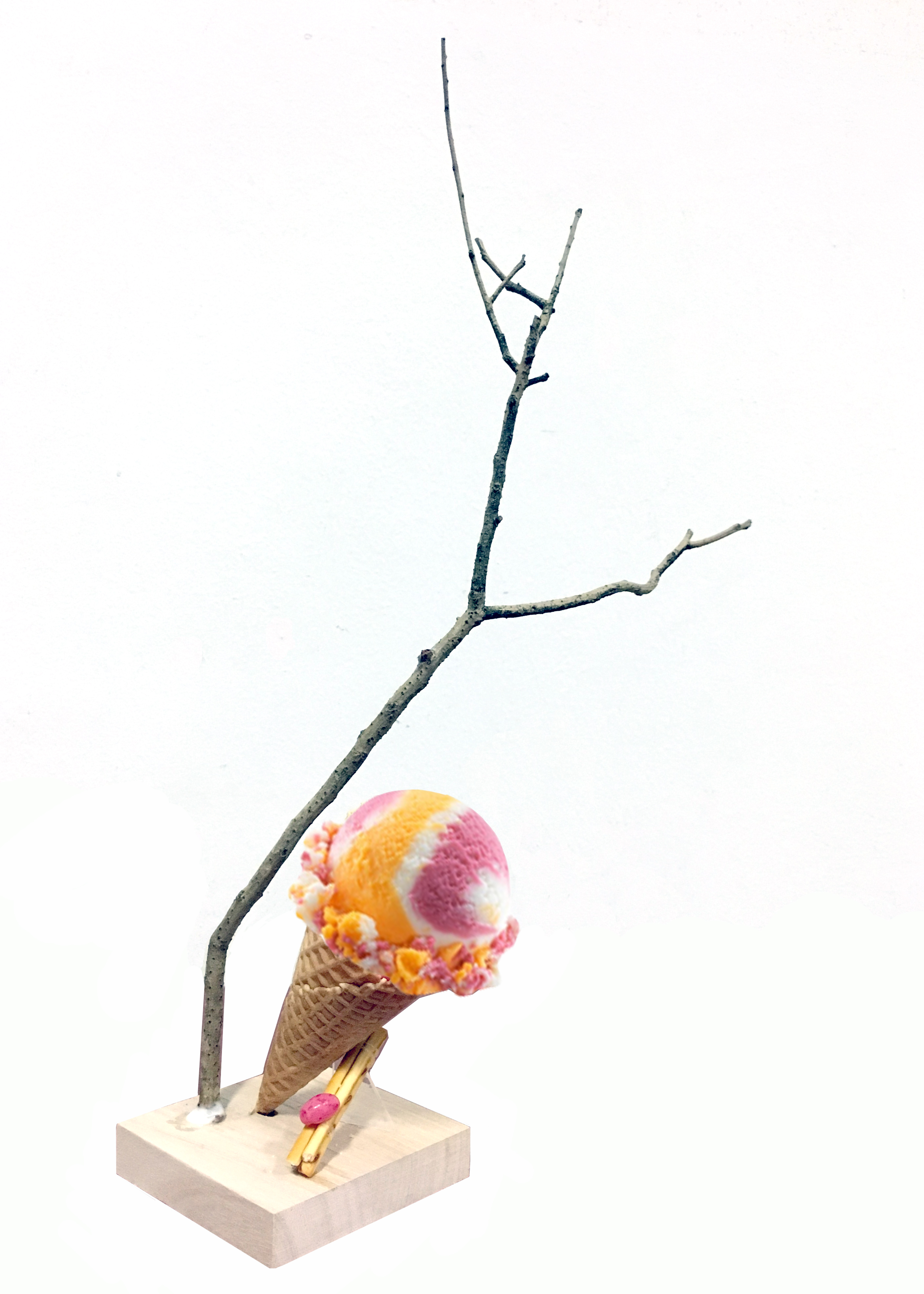
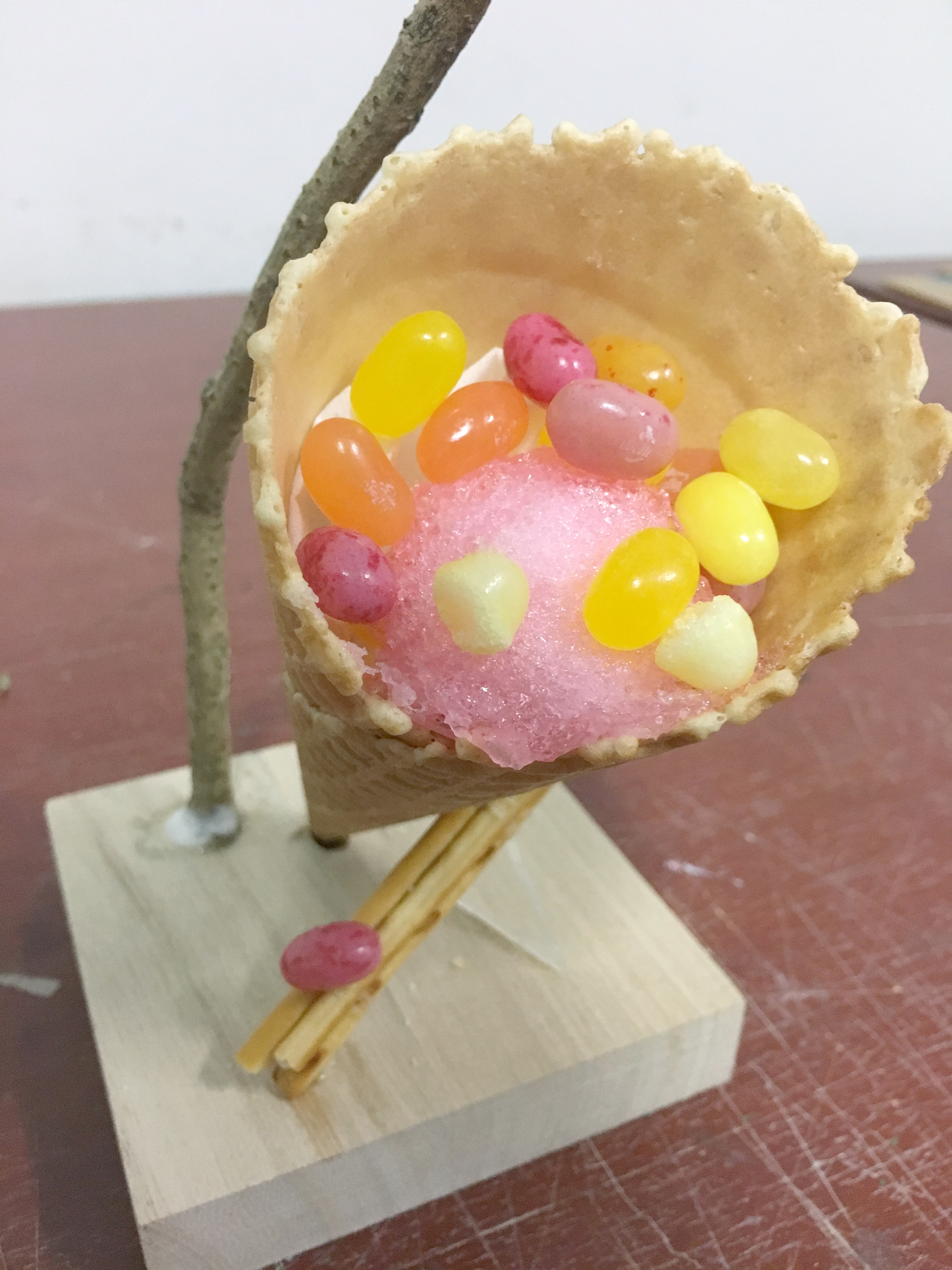
最終作品 Final Model
Composition
I chose my third model to be my final model. Since I was relatively happy with my composition, I decided to leave it as it is. A small transparent acrylic piece is used to hold the structure in place. I chose an acrylic piece so that It would seem that the composition is standing on its own.
A wooden base was chosen as it is the colour of sand. It matches with the warm browns.
Choice of branch
The hardest part of the assignment for me was to find a suitable branch. A lot of branches that I saw were pin straight and did not have aesthetically pleasing line of action. I initially thought of choosing a curved branch to juxtapose the vertical composition, but I felt that a curved branch conveyed calmness/lethargy so I opted for a straighter one instead. One thing that I would have done differently in my final model would be to adjust the placement of the branch, as I’m not entirely happy with the placement of the branch.
Choice of food
For the cone, it was very obvious to me that I had to use an ice cream cone. It fit my theme nicely so I did not think much about it. I wish it was possible to bring actual ice cream (or ice shavings) to fill the cone but I think it would have gotten really messy so I filled it with some cotton candy and jelly beans instead to help illustrate the concept that I was going for.
I used Pretz sticks for the cylinder part, because I imagine that if the cone had actual ice-cream, you can dip the Pretz sticks in it.
The jelly bean which is the SO / sphere element to the composition was just an accent.
Taste
There is a mix of salty and sweet taste in my final model. The cone is salted-caramel flavour which is very summer, and the Pretz sticks are salted flavour. The jelly beans that I used taste like tropical fruit. The accent jelly bean taste like strawberry, which is a summer fruit. If you included the ice cream / ice shavings you would have the refreshing taste too.
Colour
I knew I wanted a pop sort of colour scheme to go with the dynamic composition so I chose warm colours like pink, orange and yellow jelly beans.
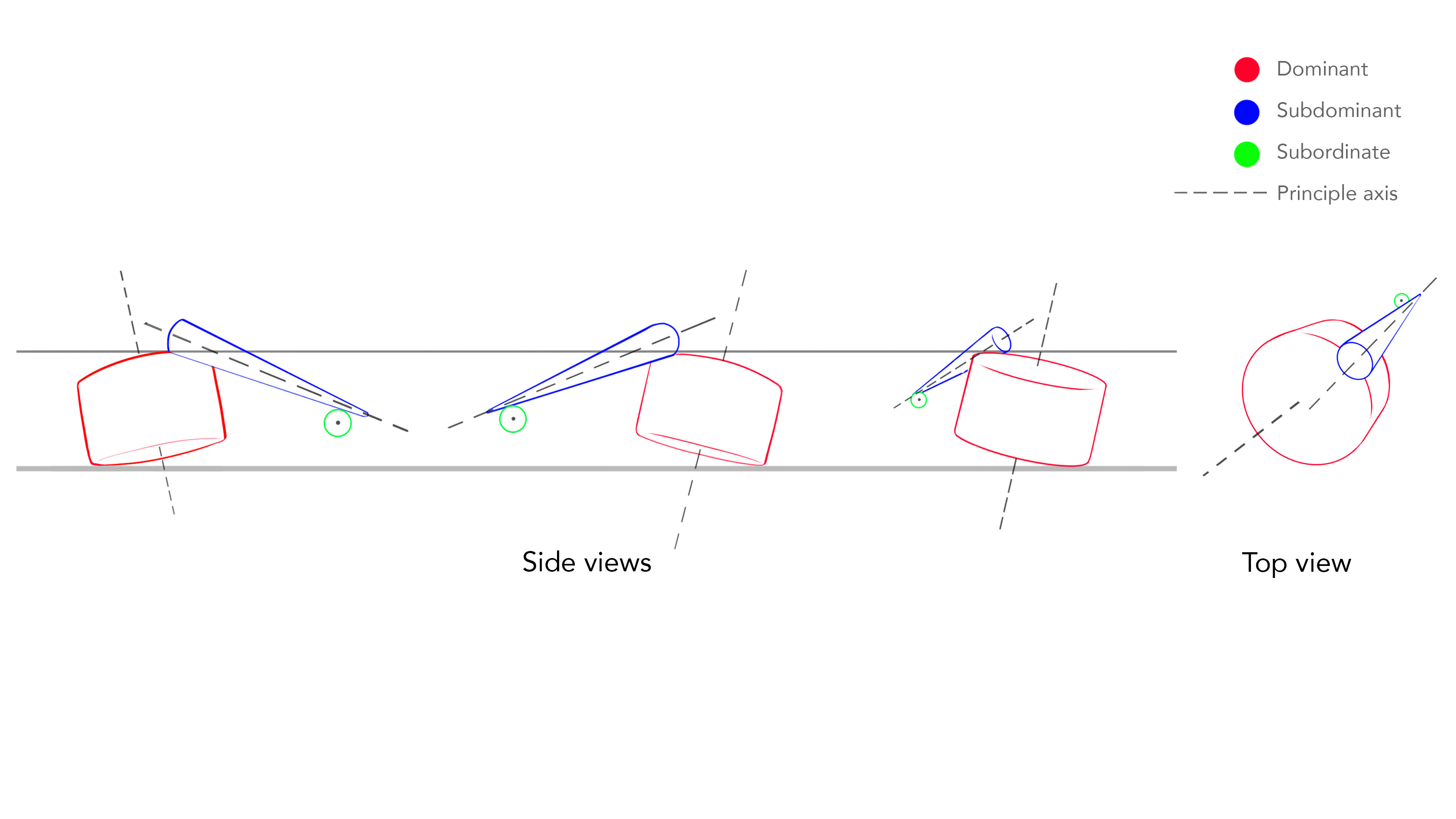
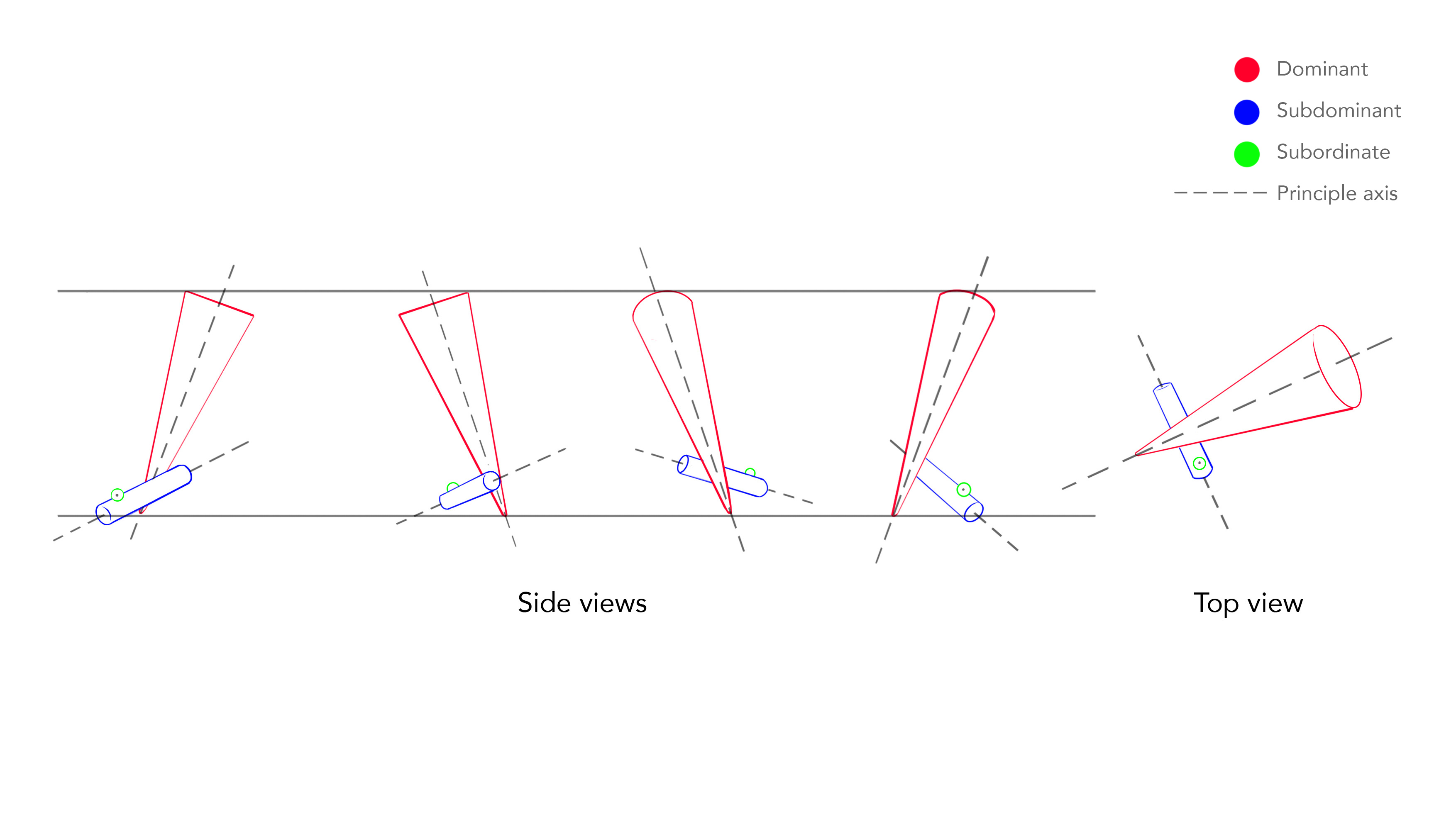
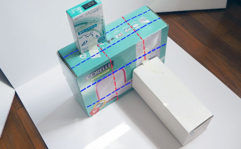
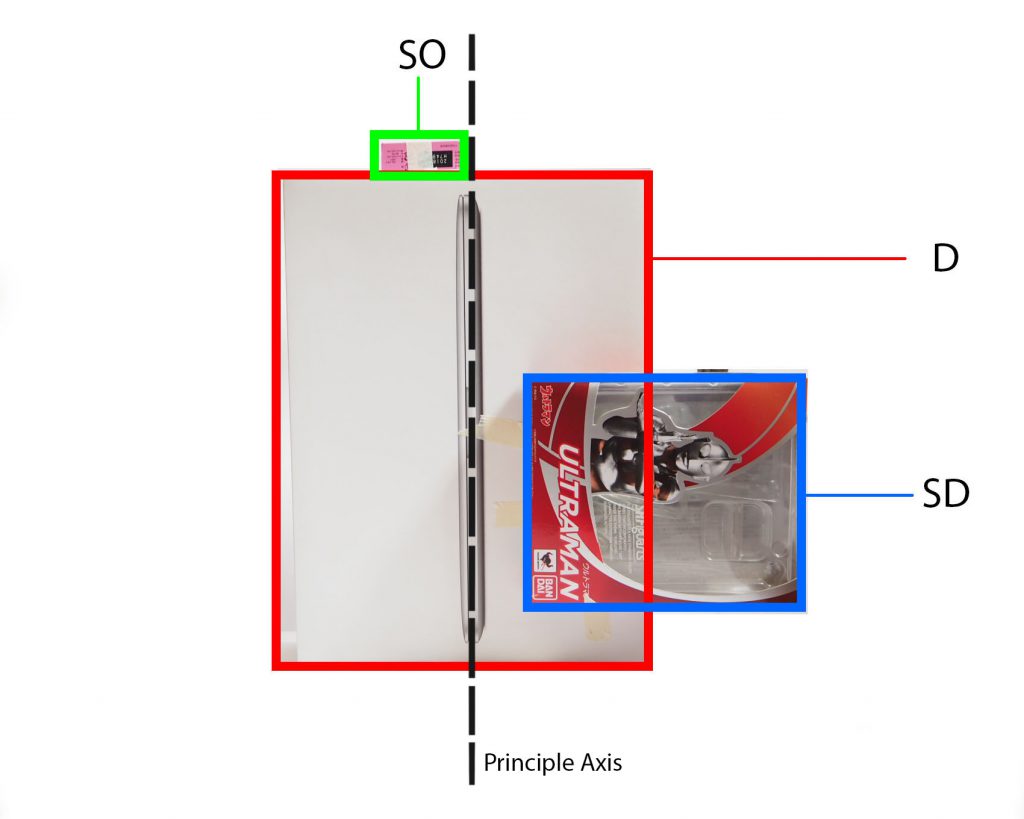
The theme that I got for my box compositions was Rule of Thirds.
Rule of Thirds is generally aligning your subject along the guidelines or intersections. It is a useful composition technique in many forms of art such as in design, photography and film.
Since week 1, we were told to experiment with different compositions using boxes of three different sizes, while keeping our theme in mind. However I am not used to this and found it difficult to come up with effective compositions. After week 2’s lesson, I am more aware of what to look out for in my compositions. For instance:
All three boxes should be able to be seen on all views.
The dominant volume, subdominant and subordinate should stay constant throughout most if not all views.
Avoid flushing.
Try to avoid similar shapes, instead have a variety of sizes with varying height and width.
These are the compositions that I arrived at after week 1 class. I made minor improvements than those that I showed in class, However these compositions still do not work and for learning purposes I thought I’d analyse and record why they don’t work.
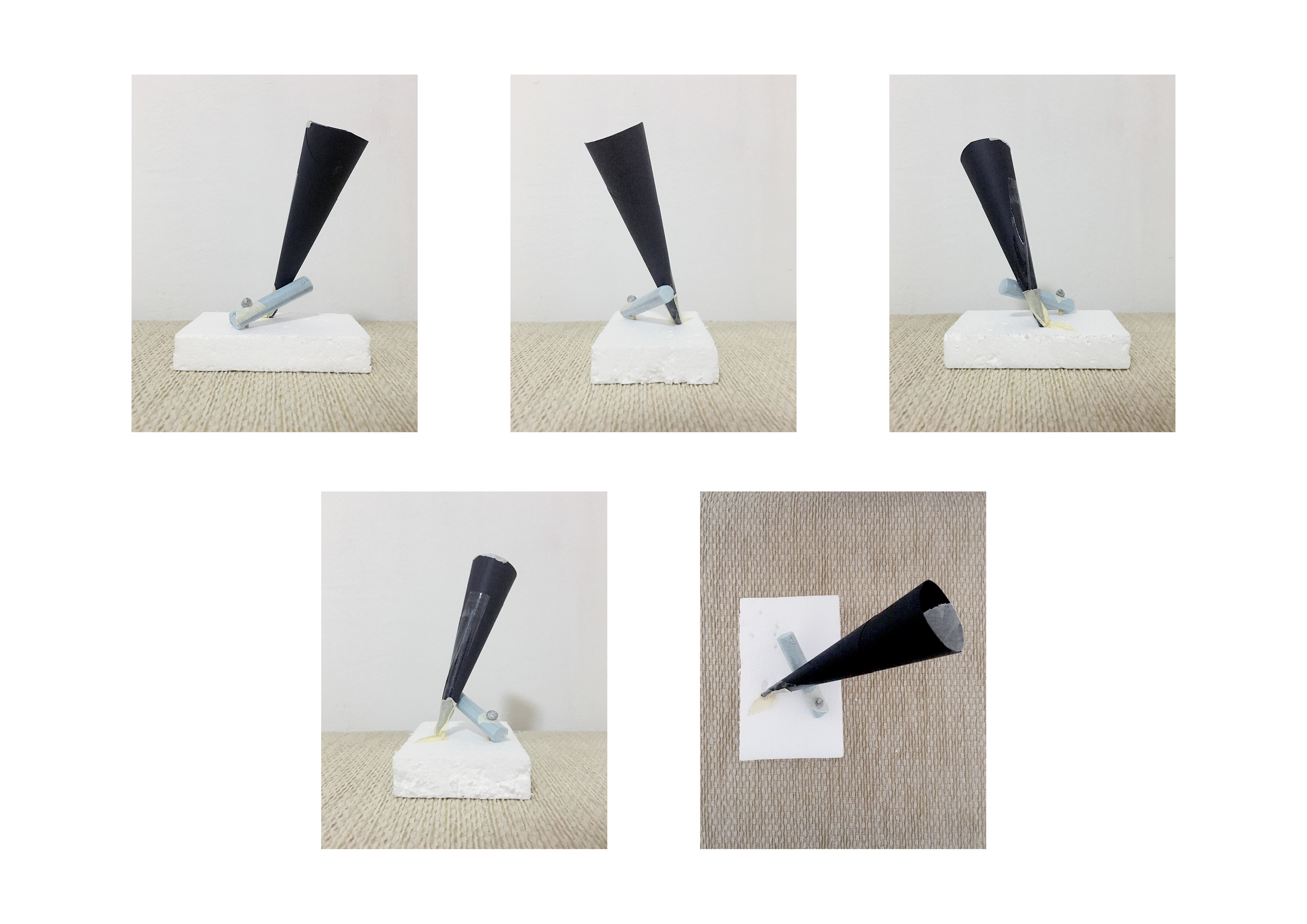
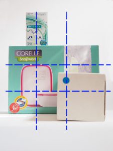
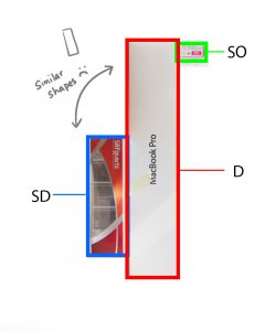
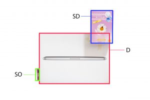
Composition 1
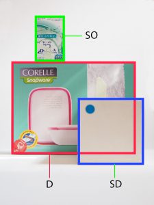
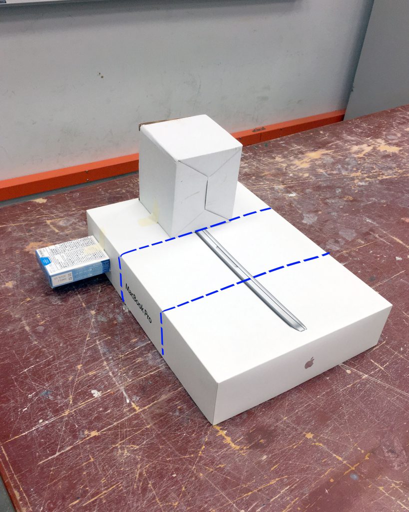
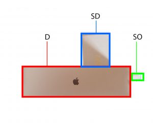
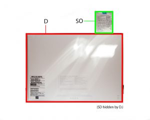
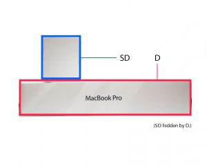
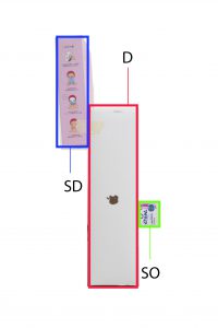
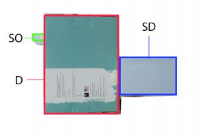
Composition 1 – OverallFront view – Centre line of the SD is off because of camera and perspective.Front view.Bottom view – Size of D and SD are too similar!Back view – SD is hidden which is not good.Top view – Shapes are too similar.Side view – Again, sizes are too similar In this view.
For composition 1, I tried to centralise my SD and SO’s centre line on the intersecting points of D, following rule of thirds. Although it fulfils the rule, did it not work for various reasons which have been noted in the captions. The main problem was that the shape and size of the boxes were too similar, which made boring compositions.
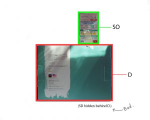
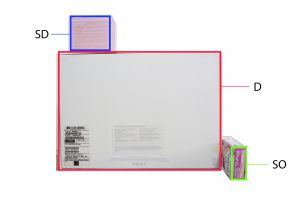
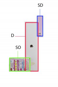
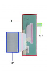
*I found some inaccuracy in this picture. I think I adjusted the SD when I got home, which is why the placement is slightly different in the analysis photos.Front / Back view – I tried aligning the centre line of the SD and SB along the rule of thirds line.Front / Back view – Works okay in this view, but then there’s problems in other views.Top view – I seem to have forgotten to take a picture of the top view so there is a sketch of it. It’s not good because of the entirely overlapping elements.Bottom view – The SD is missing!Side view – The SO is missing!
For composition 2, the main problem was that I had missing boxes in various views which is something that is discouraged. Placement of SD and SB isn’t that great either. The SB is within the confines of one of the boundaries of rule of thirds.
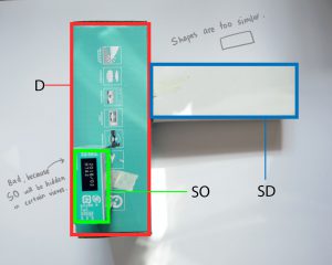
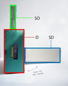
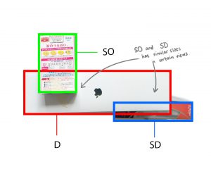
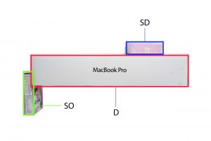
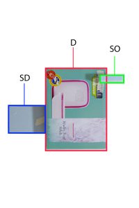
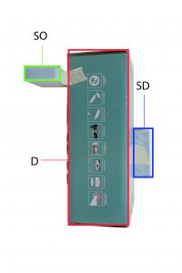
Front view – Front view looks okay in general.Back view – D, SD, SO remains the same.Side view – D, SD, SO, remains the same but I noticed that the shapes were too similar. (i.e. long rectangles)Top view – This view doesn’t work because the SO seems to be bigger than the SD! Plus again, the similar area size.How I aligned my SD and SO. Centre lines at the guidelines.
Composition 3 is meant to be an improved version of composition 2 which I did before week 2 class. There is sliiiiight improvement in the consistency of the D, SD, and SO shapes on all views (Top view didn’t work) but not satisfactory because only half the views work. No box is hidden in any view for this composition. However the shape of the D and SD in the side view is rather unappealing so I need to replace that box with something else.
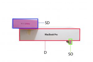
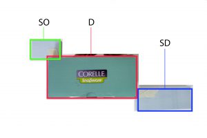
I placed SD and SO in the third section. Here I forgot to avoid flush so I’d need to tweak the position of the SD.Front viewBack view – D, SD, SO remains the same.Bottom view – SD and SO are similar here.Top view – D, SD and SO remains the same.Right side view – D, SD, SO remains the same.Left side view – SD and SO has switched.
Composition 4 follows the rule of thirds and has 4/6 views with consistent D, SD and SO! This one has potential. I think I can continue developing this model by slightly varying the placement of the SD and SO to include another theme and make it more interesting?
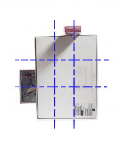
Front view – Following the rule of thirds, the SD is placed at the intersection line while the SO is placed in the one-third fraction. This one has a sub-theme counter balance too.Front viewBack view – D, SD, and SO remain the same.Left side view – D, SD and SO remain the same.Right side view – SD and SO are slightly similar.Top + Bottom view (same) – D, SD and SO remain the same. This view seems to be the least interesting of all views.
Composition 5 has 4/5 consistent D, SD and SO views! It also incorporates a bit of the theme counter balance. However through compiling these images, I noticed that it may be a bit unstable. I would need to adjust the SD’s position. In fact, I think by wedging both the SD and SO I think it could work. I will develop on this for the final sketch model. I think material wise, if the SD was a transparent box, it could be “lighter” and balance out the entire sketch model visually.
I am pleased with my progress so far, as I have been able to keep the D, SD and SO relatively consistent. There are no more missing volumes compared to previous weeks. I just need to refine my models and adjust the placements to make the models look more interesting. I think using foam boards helped me in making my sketch models as I can easily create a piece that I need compared to finding a pre-made box that matches my requirements.
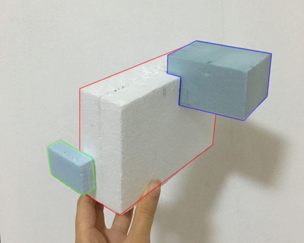
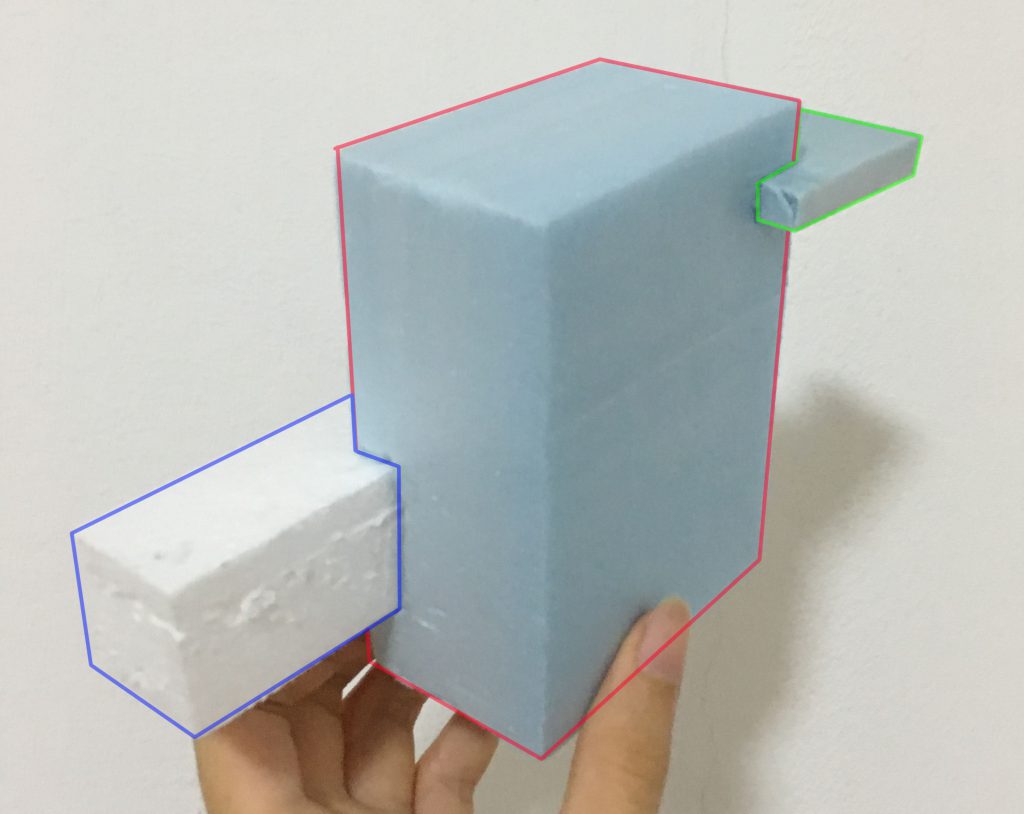
This is a improvement of Composition 4. I used foam blocks because I wanted try out wedging. I changed the SD to give the shape more variation. After lesson, I realised that this does not work because when we wedge long blocks, 1/3 of it has to be wedged into the base, or else it will produce a rotational force on the entire composition. The widths of the blocks turned out to be very similar too, something that I didn’t take note until it was pointed out. So I’d have to adjust those.
Composition 7
This is a improvement of Composition 5. I used wedging to attach the SD and SO to the D. I modified the SD’s shape from Composition 5 so that there is more variety in shape. However again, I realised the lengths and widths are pretty similar so I need to figure out the measurements to the boxes.
Both models have consistent D, SD and SO for at least 4/5 of the views, following Composition 4 and 5, so my final sketch models would have similar configurations to them, with adjusted lengths and widths.