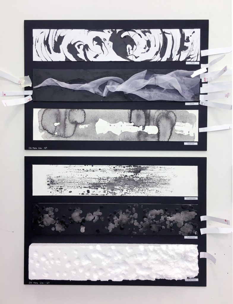
Here are my explanations and personal interpretation for each panel. My understanding is that although this is a 2D assignment, we are allowed to experiment with textures and protruding elements. I made sure that the 3D entries still conveyed their emotions in a 2D form, i.e. a photograph.
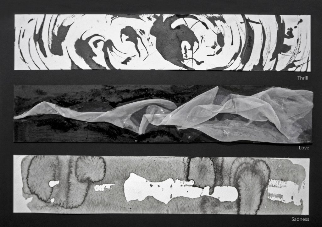
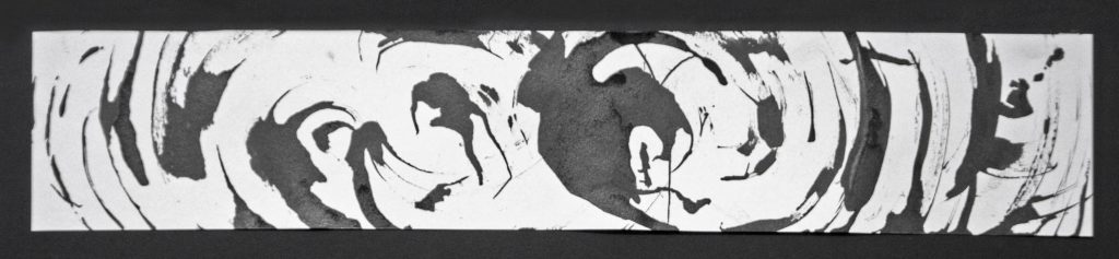
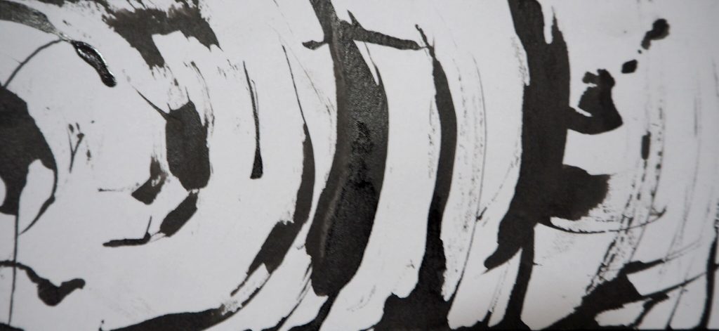
Thrill – Sudden feeling of excitement. A wild wave of emotion that “moves” tremendously.
The keyword here is wild. I associate it with giddiness, which is why I tried to make dynamic circular strokes in the print. There is a focal point in the swirl, making the strokes seem like they are spiralling outwards.
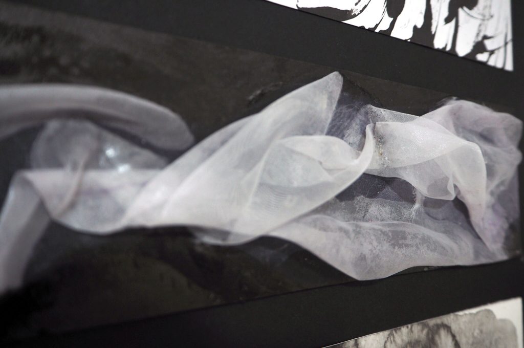
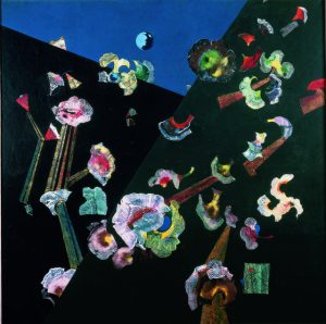
Love – The feeling of affection and care for someone that grows even in dark times.
I tried to imagine flowy, elegant lines. I found this easier to achieve using sheer organdy cloth. In order to create rhythm, the flow starts out thin, then slowly bellows out. This portrayed growing love effectively. The soft material is effective in portraying gentleness and care.
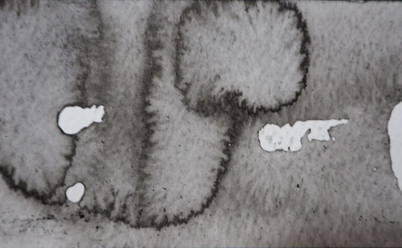
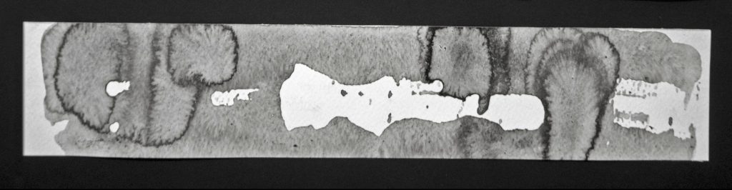
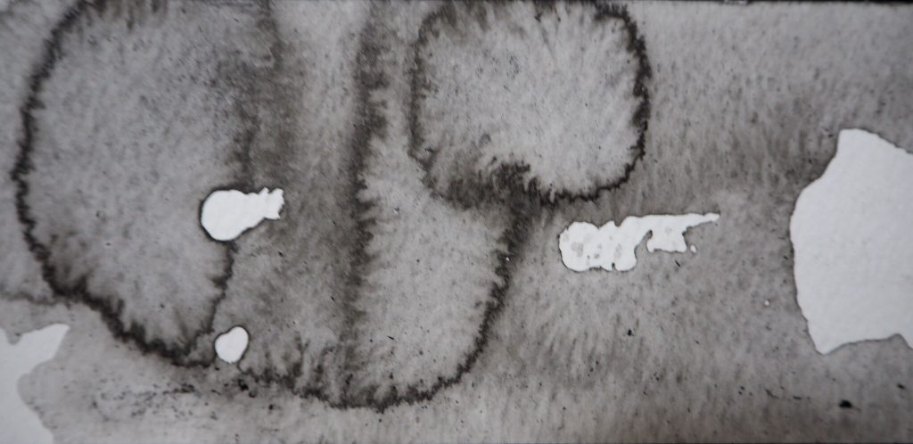
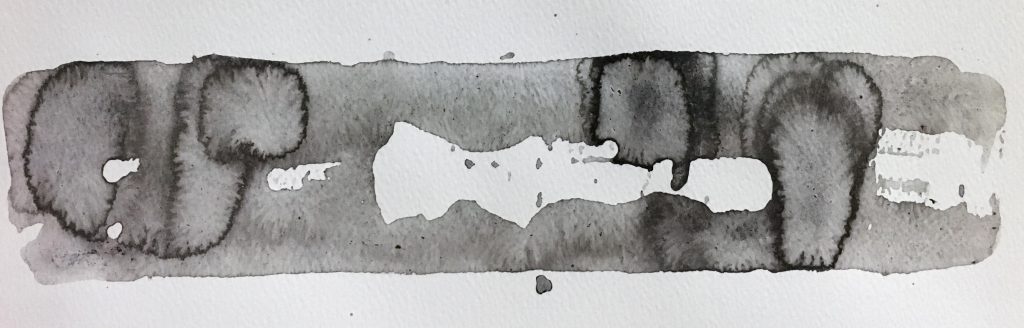
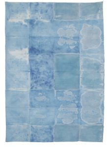
Sadness – A quiet and lethargic feeling of helplessness. Grey, rainy mentality.
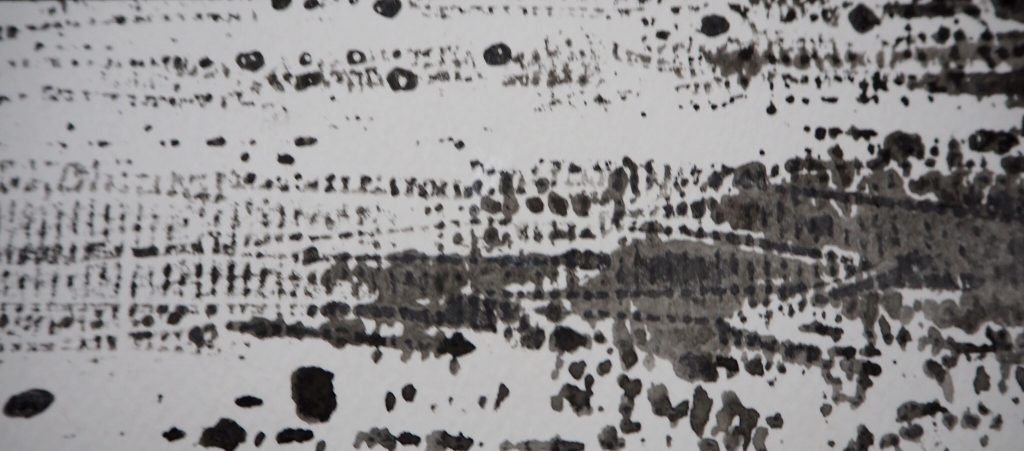
I tried to portray a quiet sort of sadness. I used a lot of water for this emotion, to water down the intense black ink. The use of watercolour paper produced interesting patterns resembling tear stains. The white areas represent periodic emptiness.
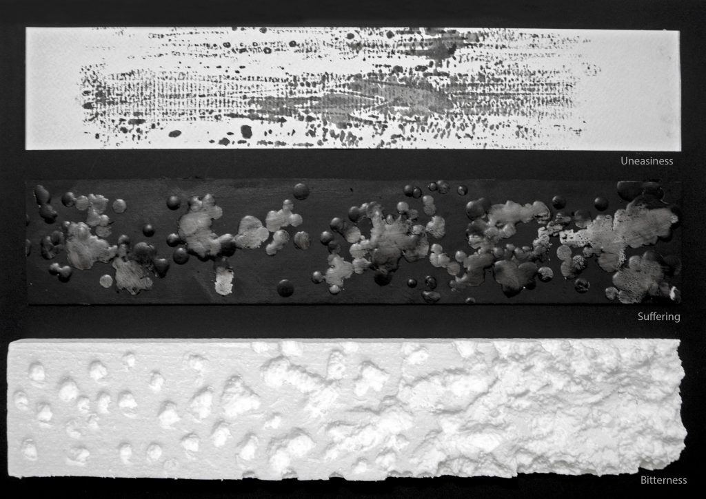
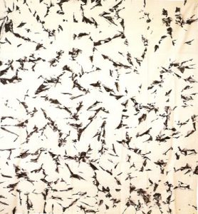
Uneasiness – Discomfort in both body and mind. Inability to relax.
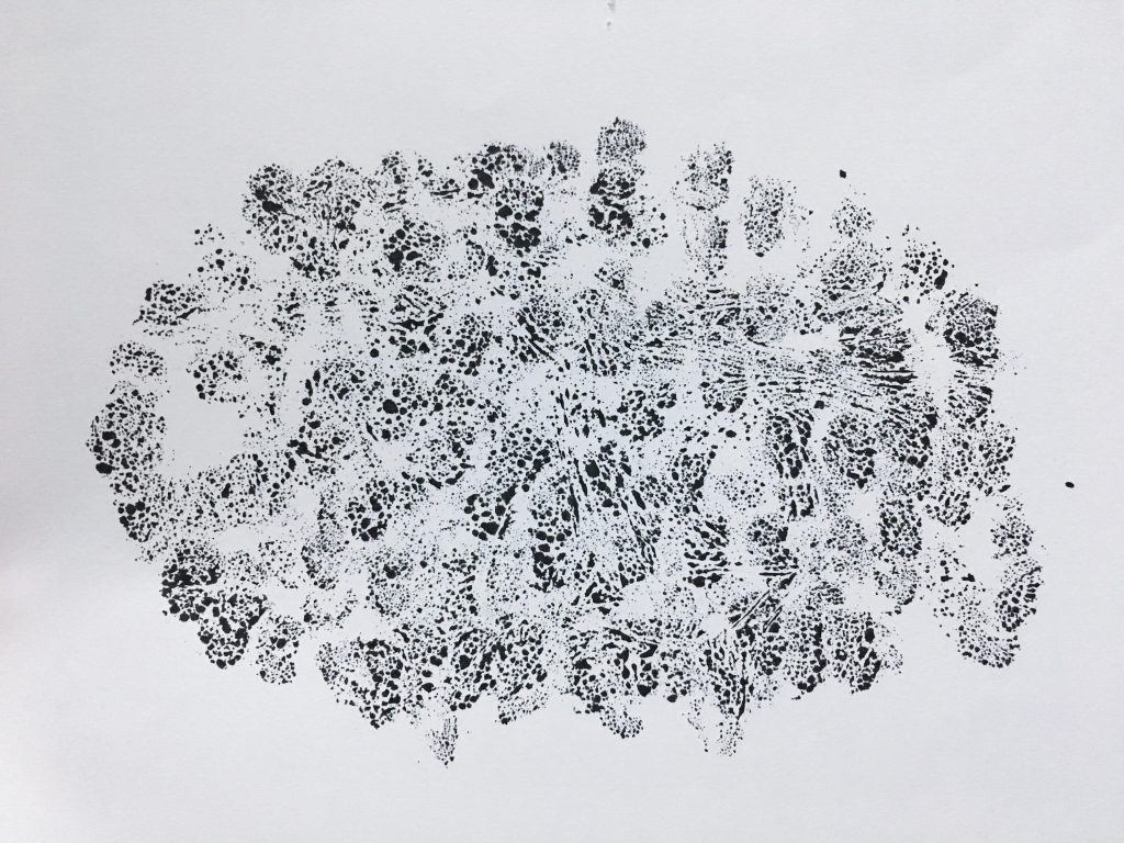
I tried to show how thoughts run through our mind when we’re uneasy using repetitive tiny dot like marks. The random splatter of paint reminds me of sweat stains – physical discomfort. The voids at the side of the paper also makes me sort of uneasy.
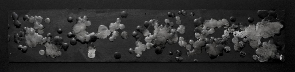
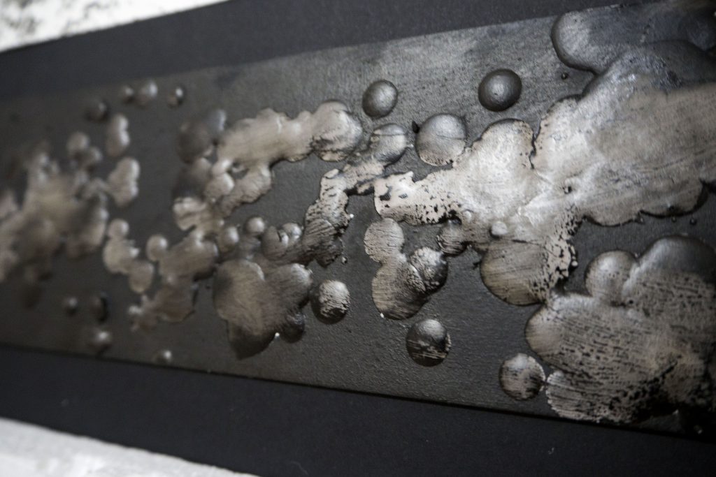
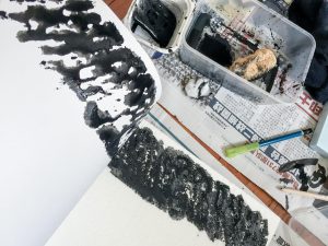
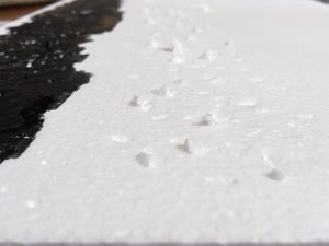
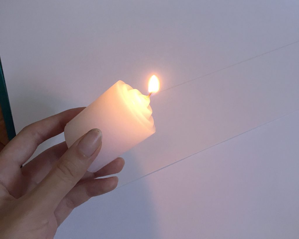
Suffering – A conscious endurance of pain. Emotional baggage.
I wanted the look of this emotion to be “heavy”. The hardened wax represents the emotional baggage we carry. It is latched onto our heart. It accumulates over time as we suffer. I layered a bit of black paint over the wax to darken the overall mood since it is a negative emotion.
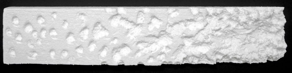
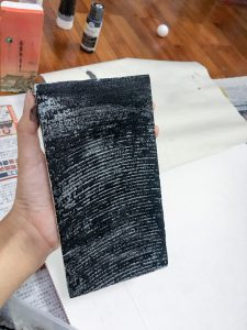
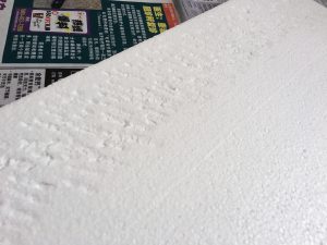
Bitterness – A form of anger and resentment that starts out small and burrows its way into our hearts.
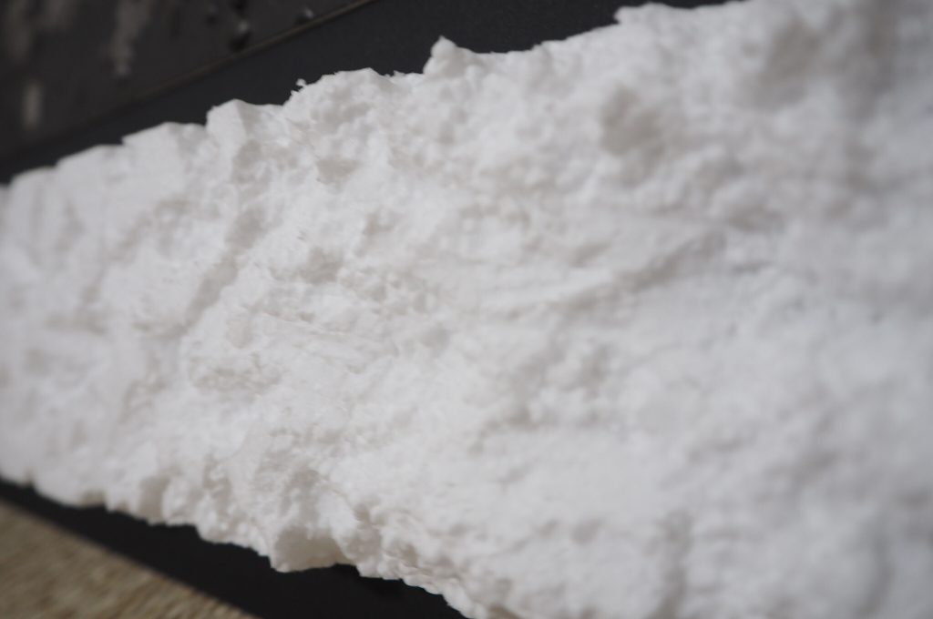
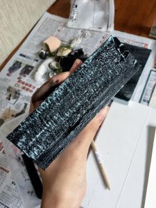
The stabbing/digging of the styrofoam progresses from left to right to match the definition of bitterness eating away at our hearts. I experimented with layering black / grey paint over the texture, but for some reason black paint took away depth and distracted the viewer from the texture of the styrofoam.
It bothered me that the outcome of some panels aren’t what I originally intended them to be. Sometimes they turn out better than the original intended emotion, sometimes they turn out worse. It made me explore other emotions, to see what else I can improve on to make the pattern convey the emotion better.
Before the presentation, we went around looking at everyone’s work and tagging our favourite pieces. It was interesting to find that “love” resonated with my classmates the most. I guess out of the six pieces it does convey the emotion more accurately and strongly. The material and how I arranged it probably caught people’s attention.
As suspected, “uneasiness” was not popular. I asked a lot of people about my portrayal of this emotion before submission and it was either a hit or miss. Some people agreed with my interpretation and could feel the uneasiness, while others were unsure. I suppose it really is up to your own personal interpretation. But it does feel good when people agree unanimously to a particular interpretation.
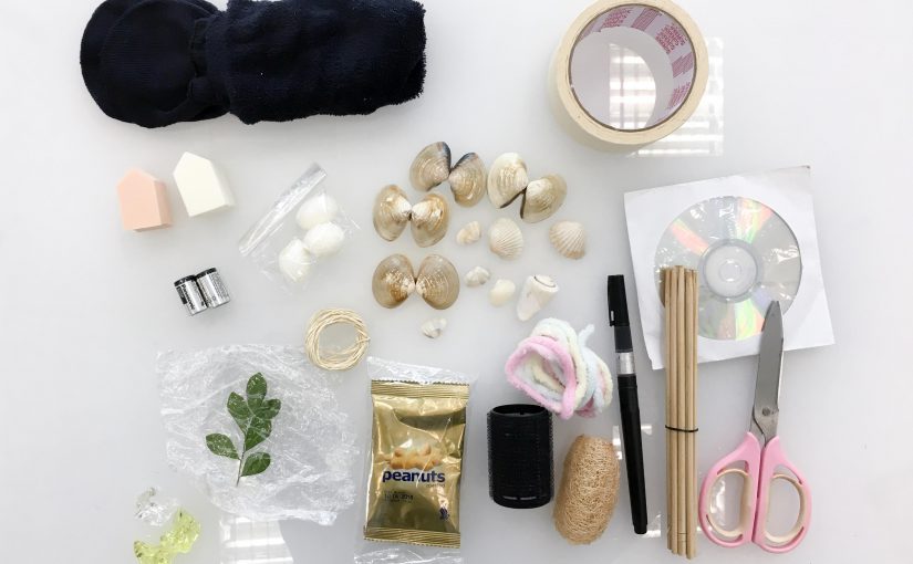
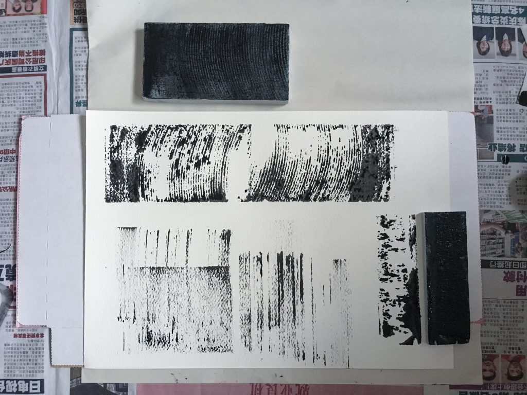
We spent class time to do some mark making so here is the documentation of the process! I brought a variety of materials – mostly organic because from my research I found that the textures created by organic materials are very appealing in general and are very versatile. I made sure to use different techniques to maximise the potential of the tools.
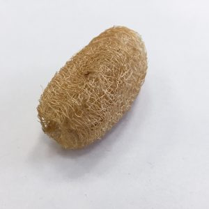
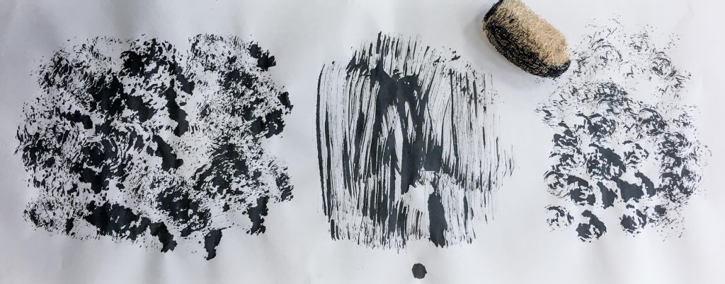
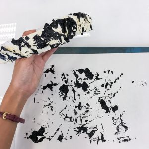
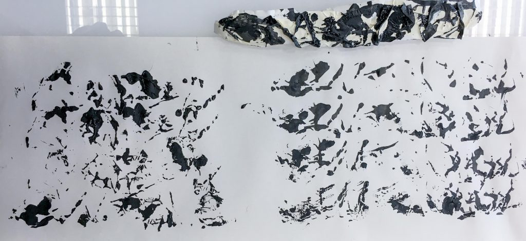
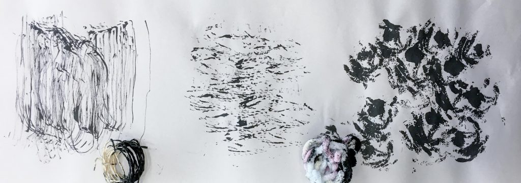
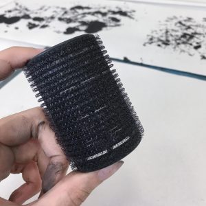
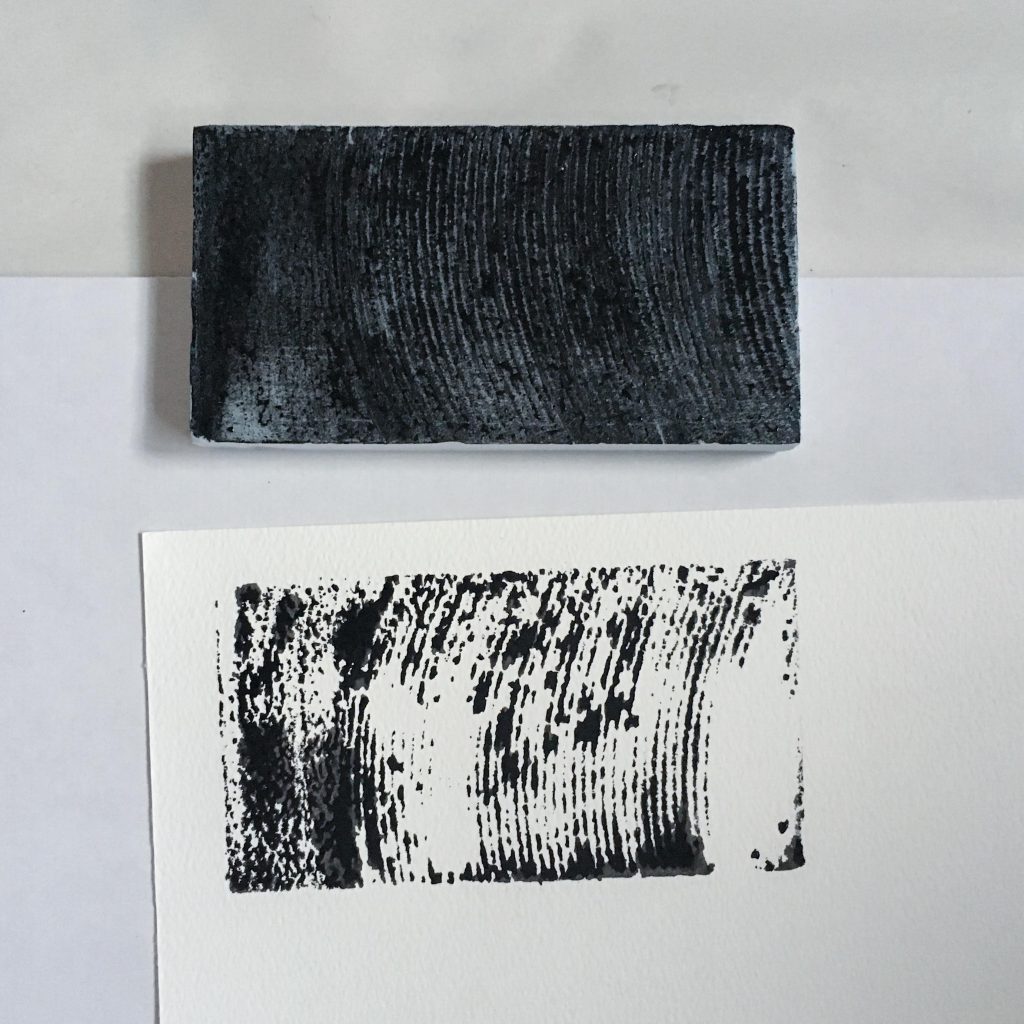
The first tool that I experimented with was a small body scrub. I dipped it in Chinese calligraphy ink so that it would soak up the ink.
I tried to manoeuvre the scrub differently on the paper to produce different textures. I used different stamping and swiping motions to achieve the results below. I find that it is a very versatile tool that can convey a variety of emotions.
Left: Stamping. Middle: Swiping. Right: Stamping while holding it vertically.
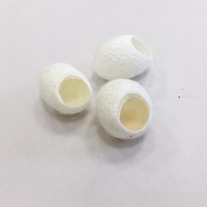
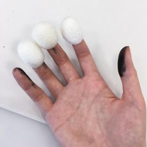
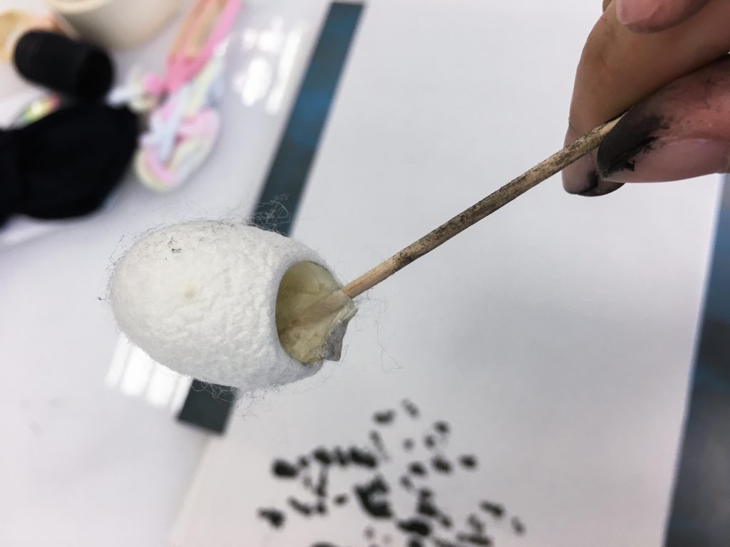
Silkworm cocoons
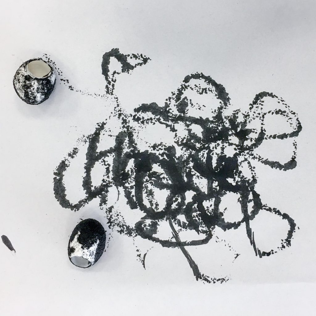
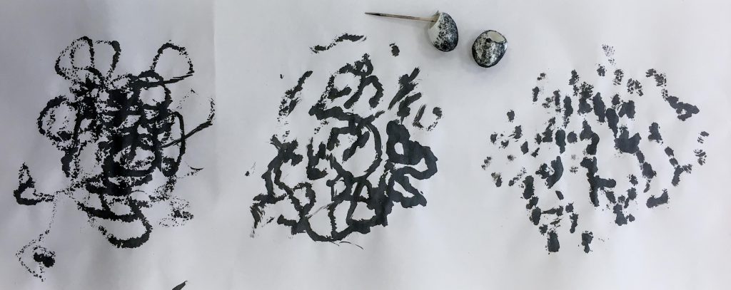
Next, I used some silkworm cocoons. Again, I tried to use different techniques with this one too. I tried rolling these around on paper, attaching them to my hands to tap on the paper, and even attaching one to a stick to see if the different movement would produce different results.
Slikworm cocoons
Attaching it to a toothpick produced a different movement over the paper which created different textures as opposed to just stamping.Rolling around silkworm cocoons on paper.Left: Rolling on paper. Middle: Attaching a toothpick to one. Right: Putting on fingers and using a tapping motion on paper.
Masking Tape
I said in my first post that I’d bring tape so I did. I brought masking tape so that I wouldn’t struggle with the adhesive and have problems like it ripping the paper. I tried stamping patterns using crumpled tape and some acrylic paint. The pattern produced at a good variety of small and large splotches.
Crumpled tapeStamping on paper.
Stamping using crumpled tape.
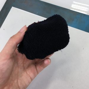
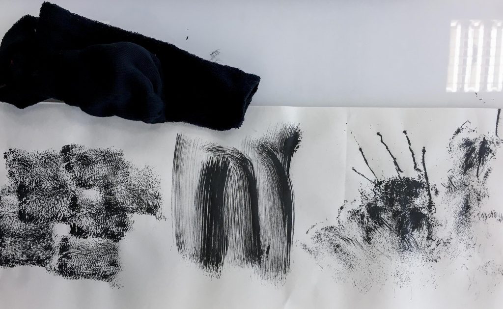
Airplane socks
I found some airplane socks so I rolled one up to create a stamper. I swiped it across the paper too, and it produced strokes that resembled a paint brush. In the third column I flung the sock on the paper. The loose threads created long tense looking lines that reminds me of the emotion “frustration” so I may want to consider it as one of my final pieces for that emotion.
Rolled up sock.Left: Stamping. Middle: Swiping. Right: Flinging.
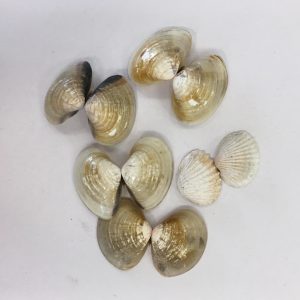
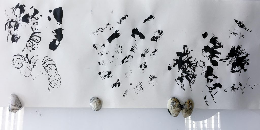
Seashells
Using seashells didn’t exactly produce the results that I wanted. It’s shape covered a very small surface area and the paint was very concentrated. The patterns do convey enthusiasm to me, however I may want to experiment with them some more. The shell with protruding jagged points convey “timidness” to me as it produced these small clutters of lines that seem to fade away.
ShellsAttempt to stamp using the back of shells.Left: Spiral seashell. Middle: Shell with protruding jagged points. Right: Smooth regular seashell.
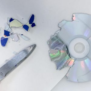
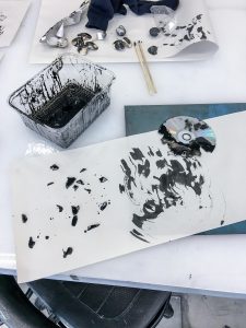
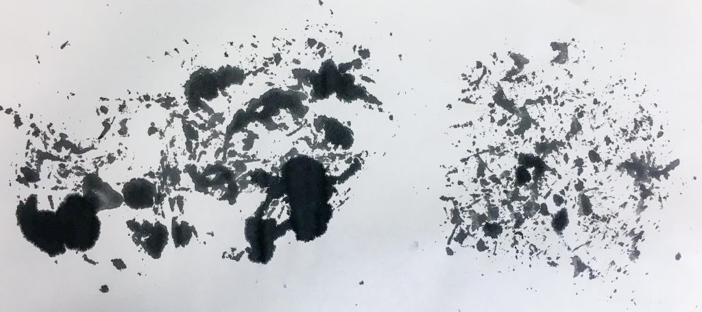
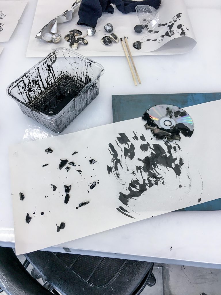
CD
The CD was one of the few hard surface objects that I brought. It produced very hard-edged prints. Cutting it up was a challenge. I was inspired by the torn paper collage technique and tried to use shattered CD bits but it was difficult as cutting up a CD was not easy. In the end I cut just enough to see if the idea works. The print had more defined shapes as compared to the other prints. tried using the shattered edge of the CD as a brush too – this worked pretty well. The unusual strokes produced are not easily replicated by other objects in my opinion.
Cutting up a CD!Printing using a CD.Left: Scattering CD bits. Right: Using shattered edge of CD as a brush.
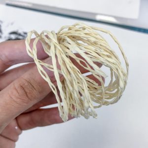
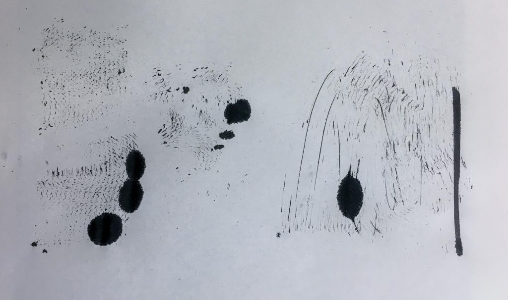
String
I brought two types of string to play with. The fluffy string produced textures similar to the sock. It conveys “panic” to me. The paper string conveys “apprehension” through the thin strokes produced.
Fluffy stringPaper stringLeft: Swiping motion using paper string. Middle: Stamping using paper string. Right: Stamping using fluffy string.
Hair roller
The hair roller produced patterns that would be difficult to replicate as well. It reminds me of “sadness” when I look at the print. A child-like sort of sadness if you will.
Hair rollerLeft: Rolling motion. Right: Swiping motion.
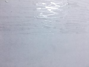
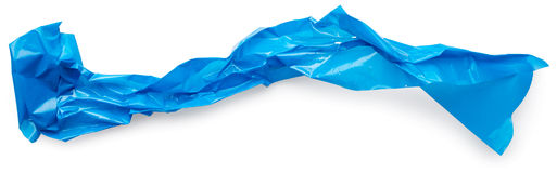
Cling Wrap
In school I tried stamping using cling wrap. But at home I tried to do it the other way instead. I laid out my cling wrap and put paint on it first. I then placed my paper on top of the cling wrap.
Left: Stamping using cling wrap. Right: Secondary stamping using the same cling wrap.
Ink on cling wrap using cotton ball.Outcome of the ink placed on cling wrap using cotton balls.Ink on cling wrap using body scrub.Outcome of ink placed on cling wrap using a scrub.
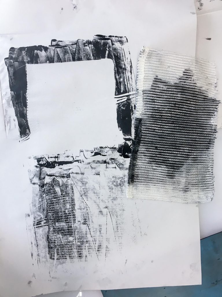
Using a press
The first time I used the press was a fail because the paint was too thinly spread that it didn’t seep through the tiny holes of the cloth. However I improvised and stamped the leftover paint on the board onto the paper which showcased the texture of the cloth better. I then tried again with cotton fluffs instead. The paint didn’t seep through either, but instead gave me a print with negative space.
Stamped using a textured cloth with the help of a press.Fluffs of cotton on top of block printing ink.Marks from the objects with ink resting on top of it.
Foam pieces
I picked up from foam pieces from Foundation 3D class because I noticed that they were uniquely textured! One of the pieces had this rounded pattern already on it, the other had imperfect machine cutter marks. I tried both stamping and dragging the pieces. Both performed well and I am pleased with the outcome of the prints.
Glue on cardboard
I tried using glue to create some negative space in my prints. I put the glue on a piece of cardboard and waited for it to dry before putting some ink on it and pressing a piece of paper over it. Some of the cardboard texture got transferred on it as well, which gave an interesting look.
Glue on cardboard.
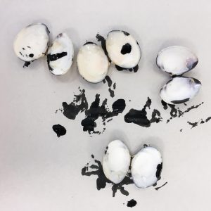
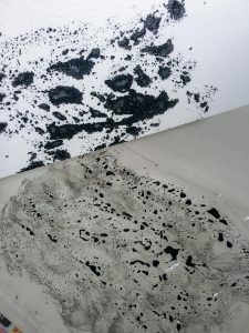
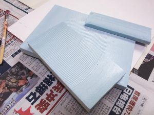
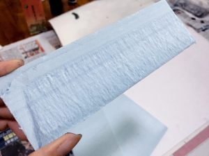
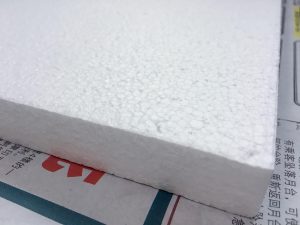
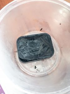
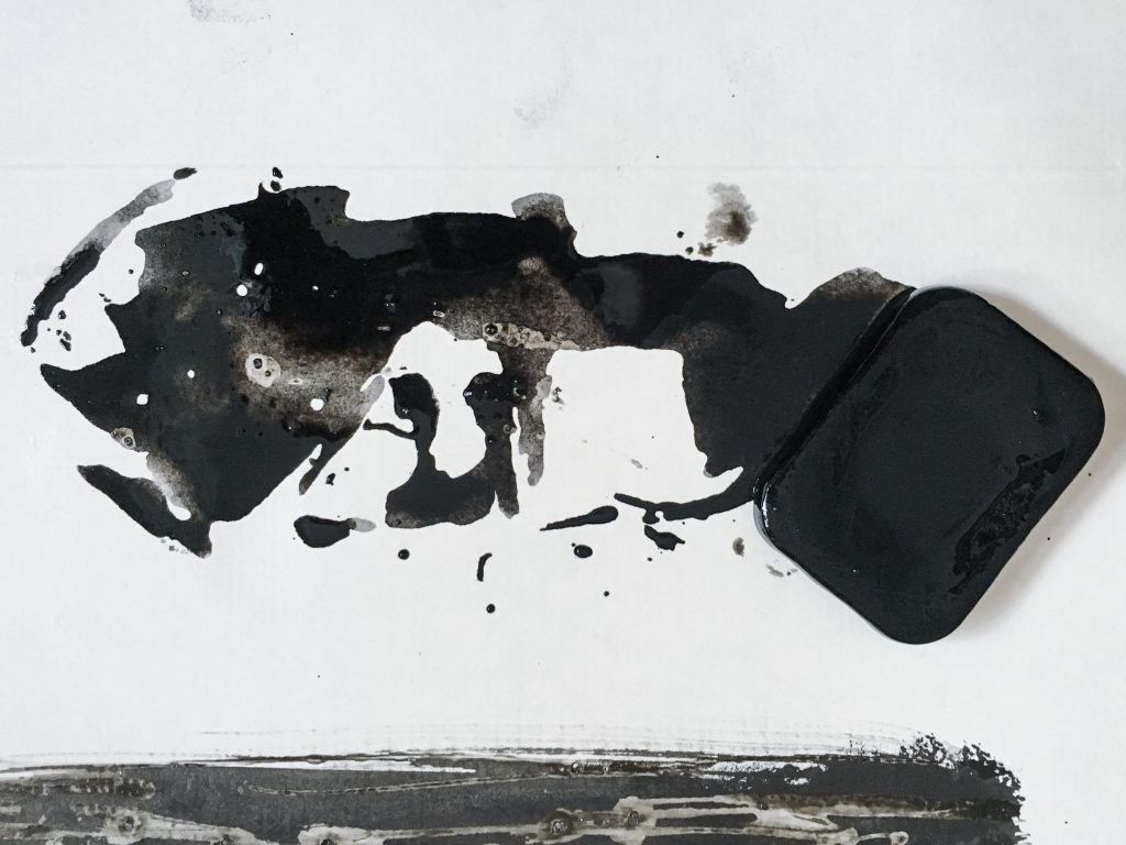
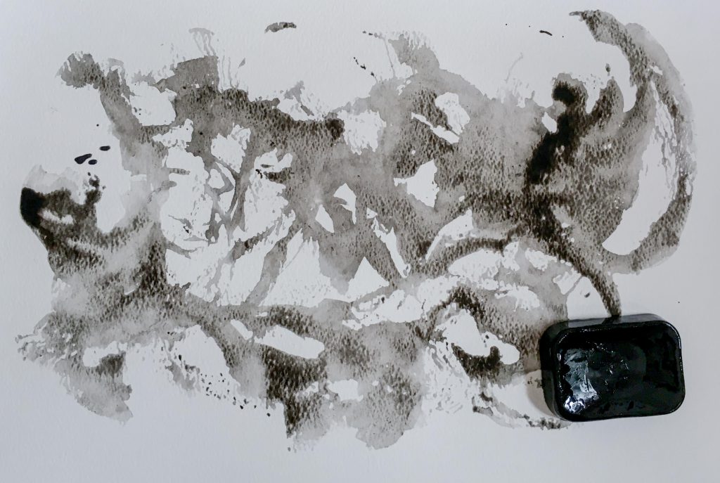
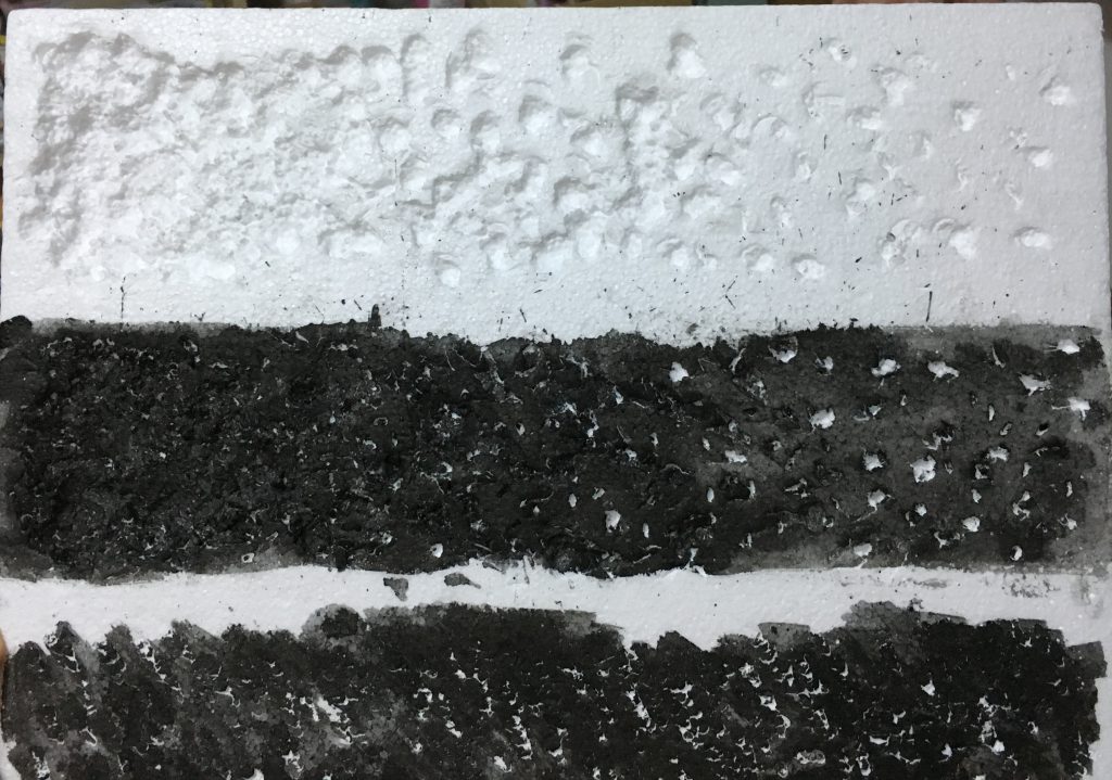
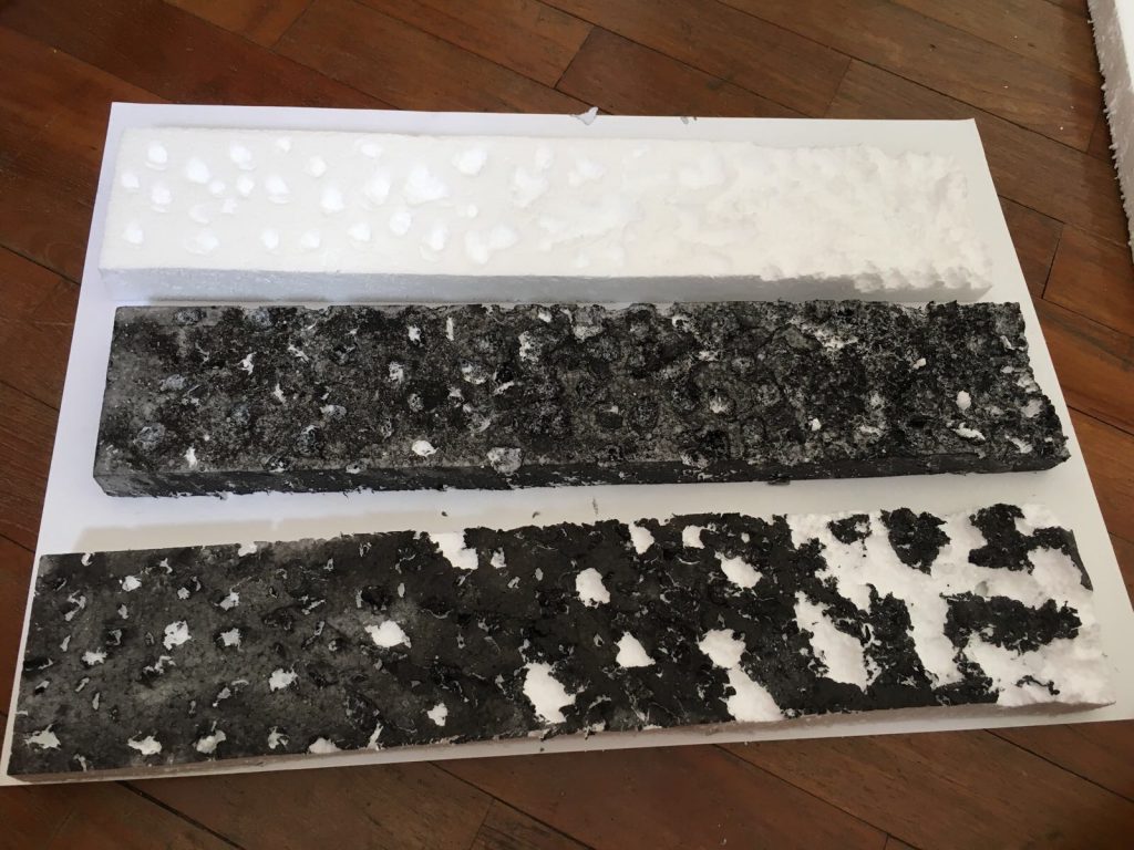
Styrofoam
I got myself a styrofoam board to play with since it is a very textured material on its own. I first jabbed it using the end of a paintbrush to further texture it and then stamped the ink onto paper. I really like the outcome, I think it is a good interpretation of depression. I then jabbed a pair of scissors into it to create “crumbs” of styrofoam and printed with that too.
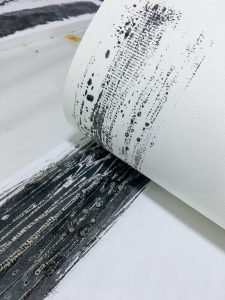
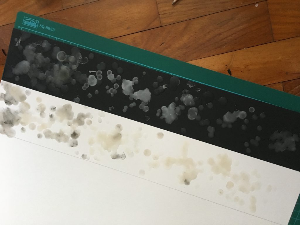
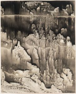
Ice
I froze some ink water because why not. Since I had no control of the ice melting, it gave wonderfully flowy results. The ink did come out diluted though, which is why I decided to go over the paper a second time after the first layer dried. That produced contrast. The advantage of using water colour paper was that the texture of it shows through the print.
Some of the textures above convey these emotions, but some was questionable so I had to go make more stuff focusing on those emotions.
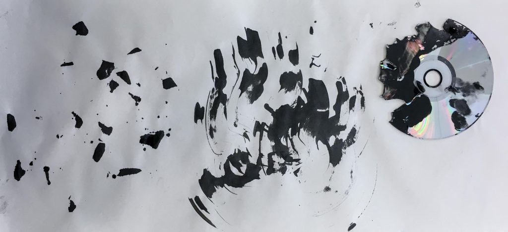
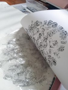
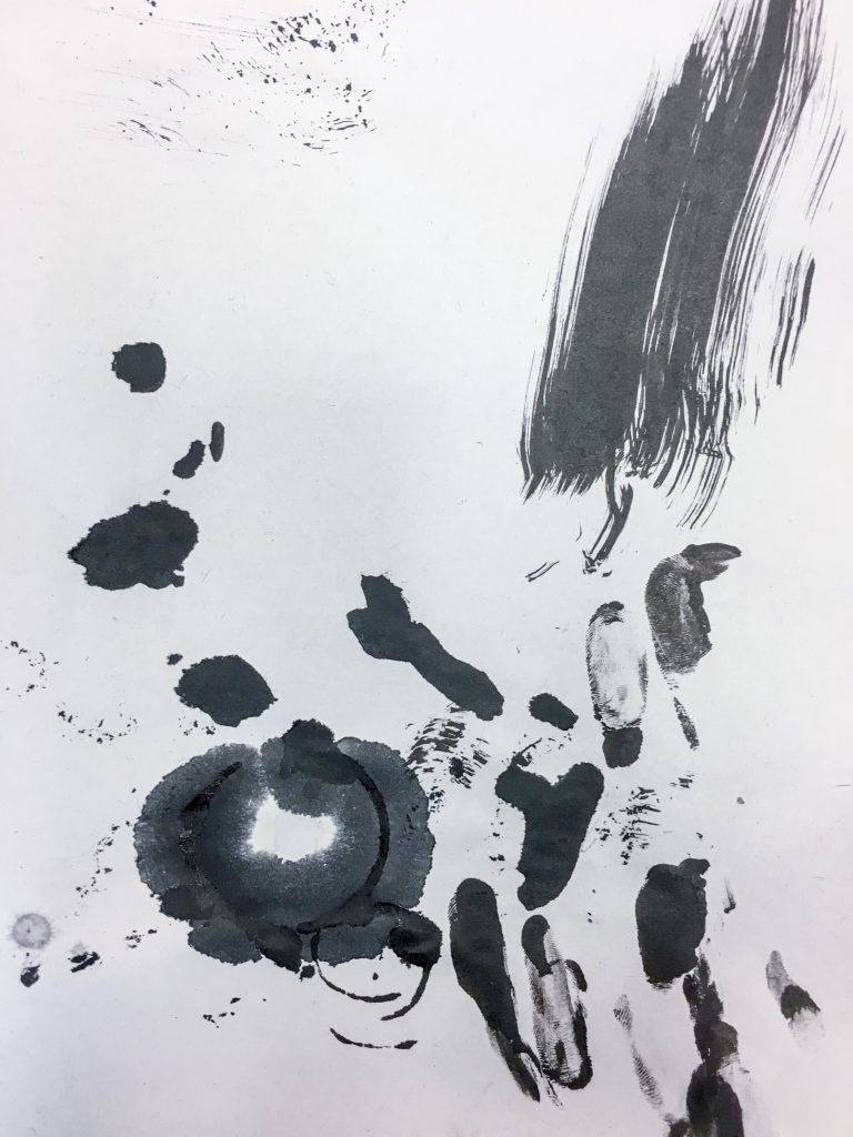
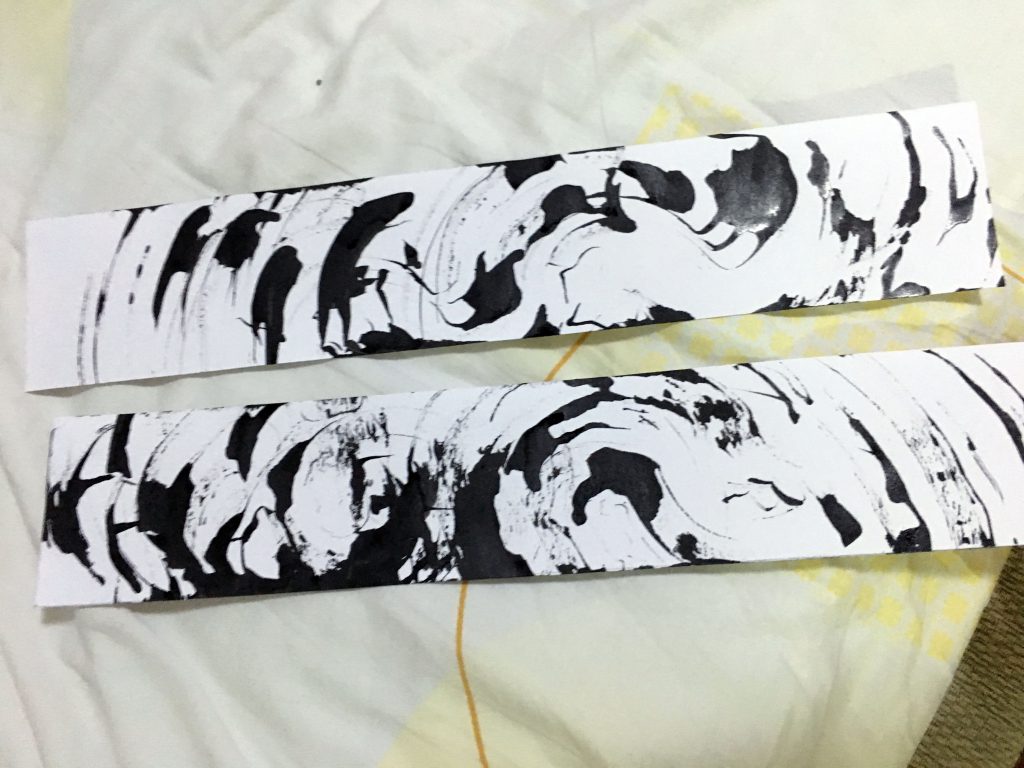
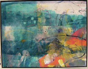
Thrill
The dynamic shapes produced by the broken CD was great for expressing thrill. It just lacked circular motion to convey the “crazy” and “excitement” element, so I made a few variation prints at home and picked one best one for my final submission.
Printing using a CD.Two variations of “thrill” excluding final pick.
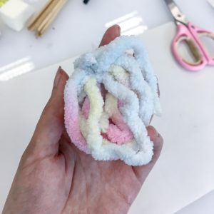
Love
At first I wanted to go for a passionate sort of love and came up with this, but it did not translate very well.
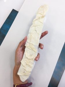
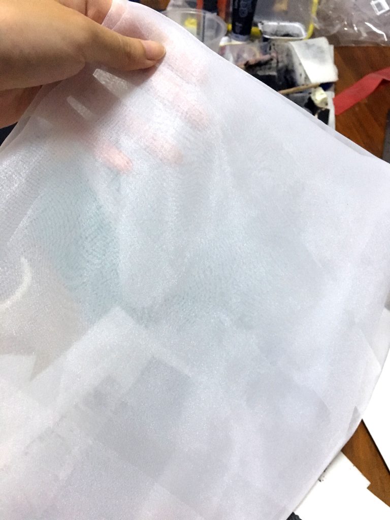
Since we are encouraged to experiment with 3D methods too, I tried to look for soft, white material to manipulate on a black background to fit my definition. I found this cloth called organdy. It is a very sheer and crisp type of cloth. I thought it would be perfect for “love”. I cut off a strip and twisted it to create wave like patterns on a black board. It was actually a very difficult material to work with, because glue didn’t adhere very well to the fine cloth. Final outcome in final submission post.
Organdy cloth.
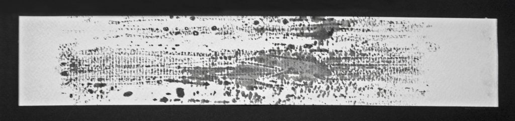
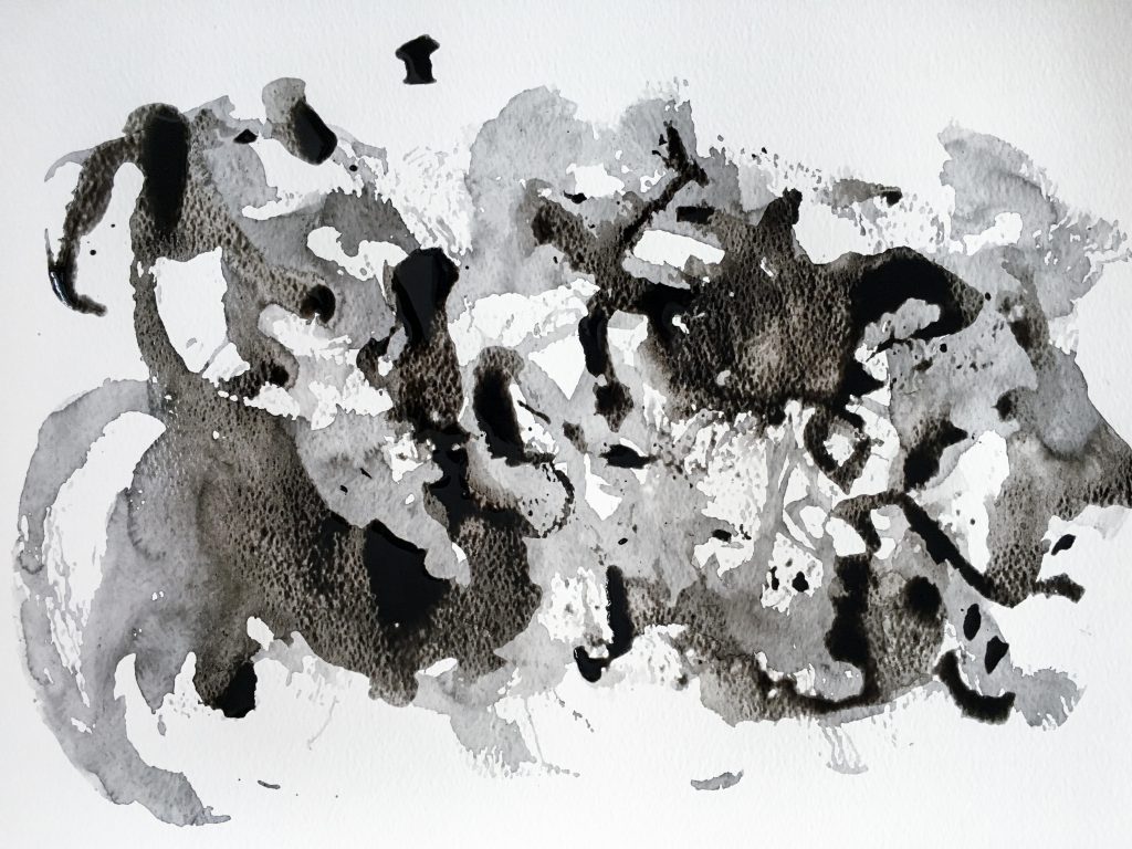
Sadness
I had two prints that portray different forms of sadness. First one is a more aggressive sort of sadness, and the second one is one that is more quiet. Second one produced very interesting textures that resemble tear stains. Plus the grey tone went went with the definition of sadness. Hence I chose the second print.
Printing using styrofoam. It looks like a heavy downpour almost.Dragging the ice block of ink on water colour paper.
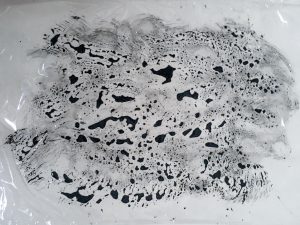
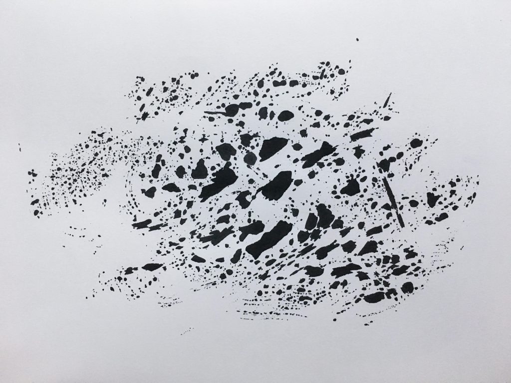
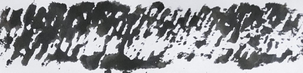
Uneasiness
I had a few prints to consider for uneasiness. First one makes the viewer pretty uncomfortable. It does convey the emotion, however the look is constant throughout and kind of boring. Second one shows pacing which is nice, but I think it’s a pretty common portrayal. I chose the last one because it had the best contrast in terms of patterns. There are many small tiny dots to show the thoughts running through my mind. The little random splatters kind of reminds me of sweat – which is possible when you’re uneasy.
Rolling around silkworm cocoons on paper.Monoprinting.
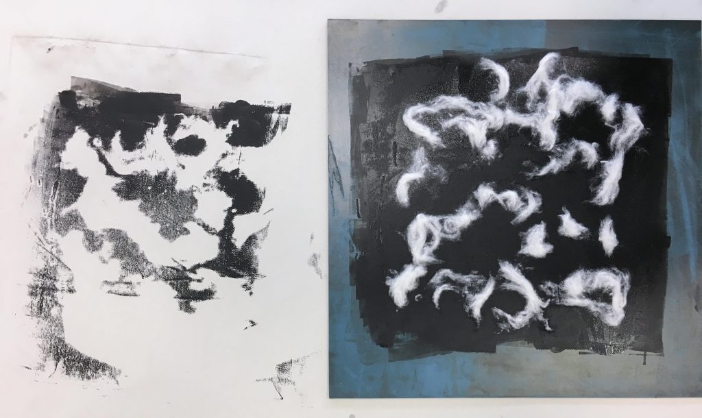
Suffering
For this one, I had no intention to create the emotion suffering, I was just experimenting with melted wax because it produced beautiful textures. I melted the wax on top of both white and black paper to see what difference the background makes. I initially couldn’t interpret the emotion from both at all. Then I thought about how your heart and mindset sort of “hardens” in suffering. So I decided to do one extra step and layer black paint over the wax to make it less white and blend in more with its black background. I made sure to leave some whitish areas for contrast. That helped add darkness to the overall look and convey “suffering” better.
Melting wax.Outcome of melting wax.
Bitterness
I was going for the emotion “frustration” in this one, but after looking at the outcome, I adjusted it to “bitterness” as it is more accurate. I had a styrofoam board that I used for mono printing but why not use it for the actual work instead. I tried different ways of stabbing and digging at the board. I thought of the emotion which to me sort of builds up with time so I knew I wanted a progression of stabbing/digging. After I decided on how the digging should look like, I tried to put black paint over it, since it was a negative emotion. However the black paint distracts the viewer from the textures, so I opted to go with the clean, white one instead for my final piece.
The black paint was too distracting and didn’t let the texture show through.
Before experimenting and trying out mark making in class next week, I thought I’d go do more research on it so that I am aware of the possibilities of this form of art.
Mark making is used to describe lines, patterns and textures on any surface of our art piece. I suppose any form of mark – be it a dot, scratch or smudge – is deemed mark making. It is interesting that although a mark on its own may be insignificant, a series of markings may mean something. It is able to express emotion, be conceptual or symbolic.
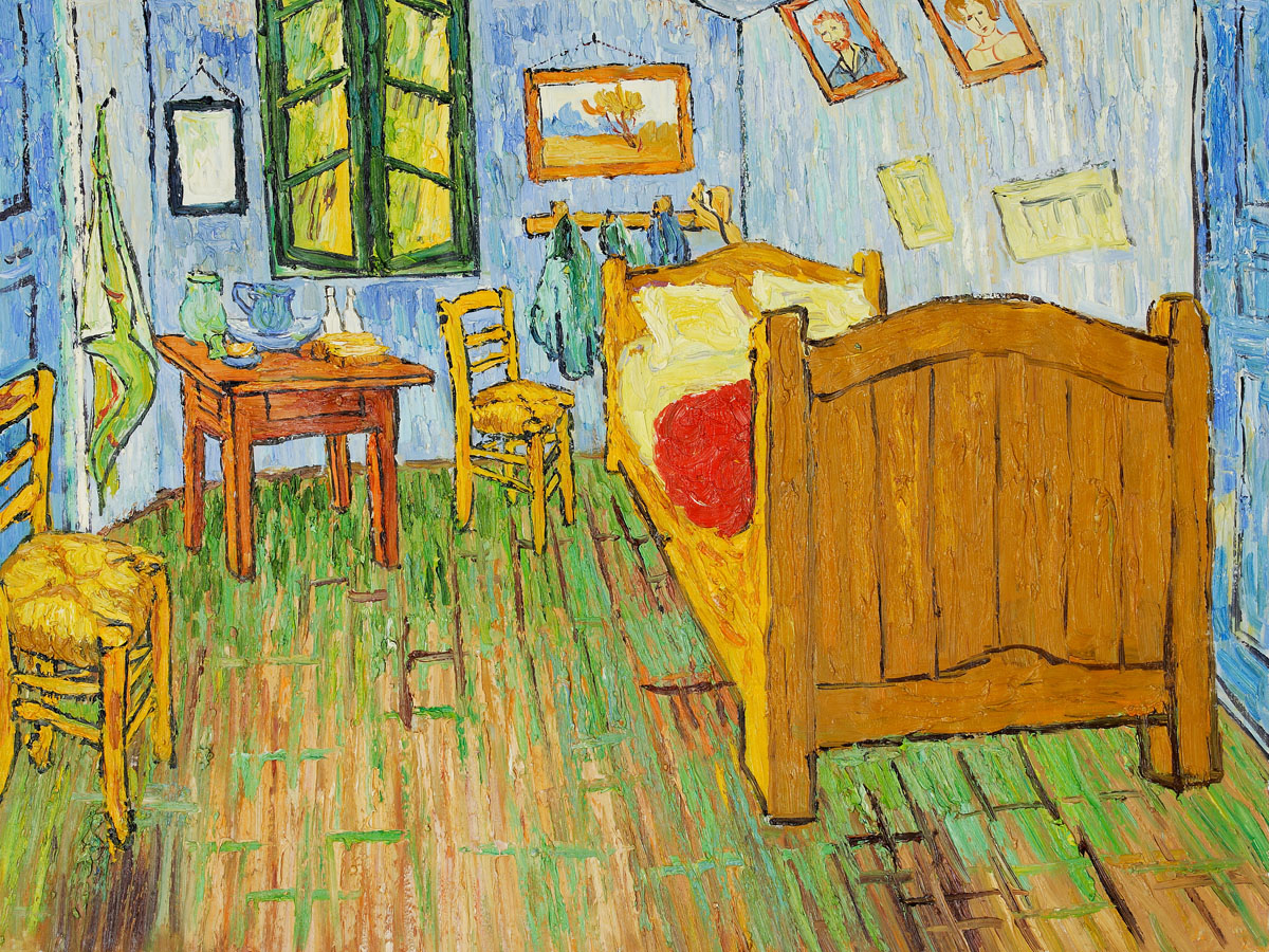
I found an article on thoughtco.com about how marks are used in paintings which I thought was interesting and not exactly what people think about. I learnt that the different styles of artists can originate from a simple mark. For instance, the example given by the website is Vincent Van Gogh’s “Starry Night” (1889) and “The Bedroom: (1889). The paintings are completely different. Different themes, different colours. However it is still recognisable as Van Gogh’s work because of the distinct layers of strokes that he uses. Another painter with distinct strokes or marks that I already know of is Claude Monet.
Link to the website: https://www.thoughtco.com/how-does-mark-making-affect-your-paintings-2577630
Van Gogh, Starry Night (1889) | Taken from http://www.huffingtonpost.com/paul-dalio/starry-nights-from-the-film-touched-with-fire_b_9227378.htmlVan Gogh, The Bedroom | Taken from http://www.jackygallery.com/index.php?main_page=product_info&products_id=498
Mark making is closely related to automatism (or automatic drawing) and mono printing. Automatic drawing is drawing without thinking, and avoiding conscious control of your actions. Here are the types of techniques categorised under automatism (and my own explanations/definitions to refer back to):
Frottage – brass rubbing
Decalcomania – method similar to the ink blot test
Torn Paper Collage – torn paper randomly dropped onto canvas and then glued
Grattage – scraping wet / dry paint on canvas using a scraping tool
Sand Painting
Froissage – soaking a crumpled piece of paper in ink, creating a veined effect
Coulage – pouring molten metal materials into water to solidify into shapes
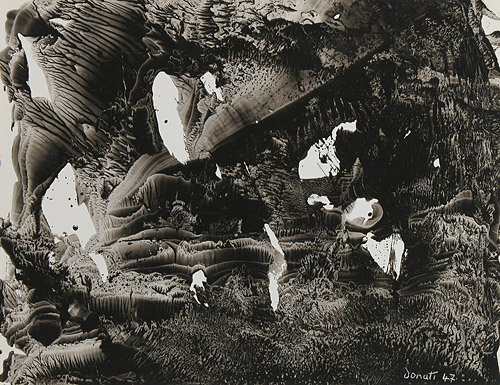
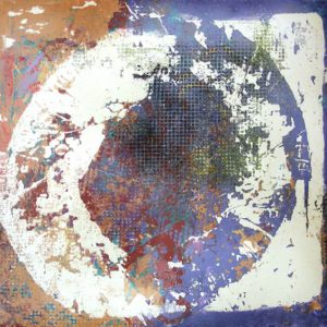
There is an artist that creates interesting, mystical images using the decalcomania technique. Oscar Dominguez primarily uses black gouache on canvas. He spreads the gouache thinly on a sheet of paper before pressing it to his canvas. Despite the lack of colours, the images created are fantasy like and show some sort of narrative. There are various textures on the canvas which bring attention to his work.
Oscar Dominguez, Decalcomania | Taken from https://decalcomaniaproject.wordpress.com/decalcomanias/art-2/Oscar Dominguez, Decalcomania | Taken from https://www.pinterest.com/pin/134756213822517034/
A piece of work that is done using the frottage and grattage technique that I really like is Snow Flowers by Max Ernst (1929). Though he uses colours for this piece, I can observe that the scraped white paint on the black canvas gives a very interesting effect, something that I may want to try for my own project. Depending on the tool used for scraping, I think it will give different results every time which would be fun for experimenting.
Snow Flowers by Max Ernst (1929) | Taken from https://www.artsy.net/artwork/max-ernst-fleurs-de-neige-snow-flowers
André-Pierre Arnal is an artist that uses the froissage technique. It reminds me of tie-dye. What is interesting about the froissage technique is that you do not necessarily need any other tool other than your “canvas” to produce the patterns and textures. It shows that choosing the right canvas for your work makes a difference in the final outcome of the art piece. Combining the froissage method with decalcomania and frottage / grattage might produce more interesting textures in my opinion.
André-Pierre Arnal, Froissage | Taken from https://www.ceyssonbenetiere.com/en-exhibition-Andre-Pierre-Arnal-2015-luxembourg-1011.htmlAndré-Pierre Arnal, Froissage | Taken from https://www.wikiart.org/en/andre-pierre-arnal/froissage
Mono printing is similar to stamping. The following are the techniques:
Printing from glass
Printing from acetate
Overprinting
Linear drawing – paper placed over rolled out ink on a glass slab, use pencil to go over it
Developing textures – making blobs onto paper directly from the paint tube
I found artists that found their own method of making mono prints! Mitch Lyonsdyes wet clay with paint, scrapes of some layers off of it and then lays his canvas on top of it to create prints.
Mitch Lyons, Clay Mono print | Taken from https://www.pinterest.com/pin/477944579175418370/
Martha Castillow is another such artist that does clay mono prints. I never thought of printing this way before. It is unlikely that I am able to do something like that in a few weeks for my assignment, but I can definitely gain some inspiration from their technique.
Martha Castillow, Clay Mono Print | Taken from https://www.pinterest.com/pin/277745501997329908/
I also went on to Pinterest to gain ideas on what I can use for my mark making assignment. I created a mini board for some of my favourite images.
Looking through Pinterest, I see that marks created by organic items seem the most interesting, though marks created by hard surface objects can look interesting too depending on how you use them. Binding stuff together to make your own brushes seem to be popular.
I turned to Instagram next to see what ordinary artists / people like us are using for mark making. It does not seem to be a popular form of art on Instagram, but I found some images that I can gain inspiration from.
A number of people liked to stick materials to the ends of sticks / brushes to make their own custom brush, while a handful of people liked to use branches, twigs and leaves for their prints.
I really like this image above, because this artist used a variety of organic and inorganic materials. The patterns produced are definitely of interest.
After scrolling and looking at more work, I have some ideas for my tools but I’m still looking for an “aha!” material. Something that is different and fun. I am going to bring organic and inorganic items to experiment during class time.
Other than the materials used, the techniques used can also make interesting marks. I am inspired by the Torn Paper Collage method and intend to experiment with broken CD parts instead of paper. Combining materials is also something that I’d like to try.