Process
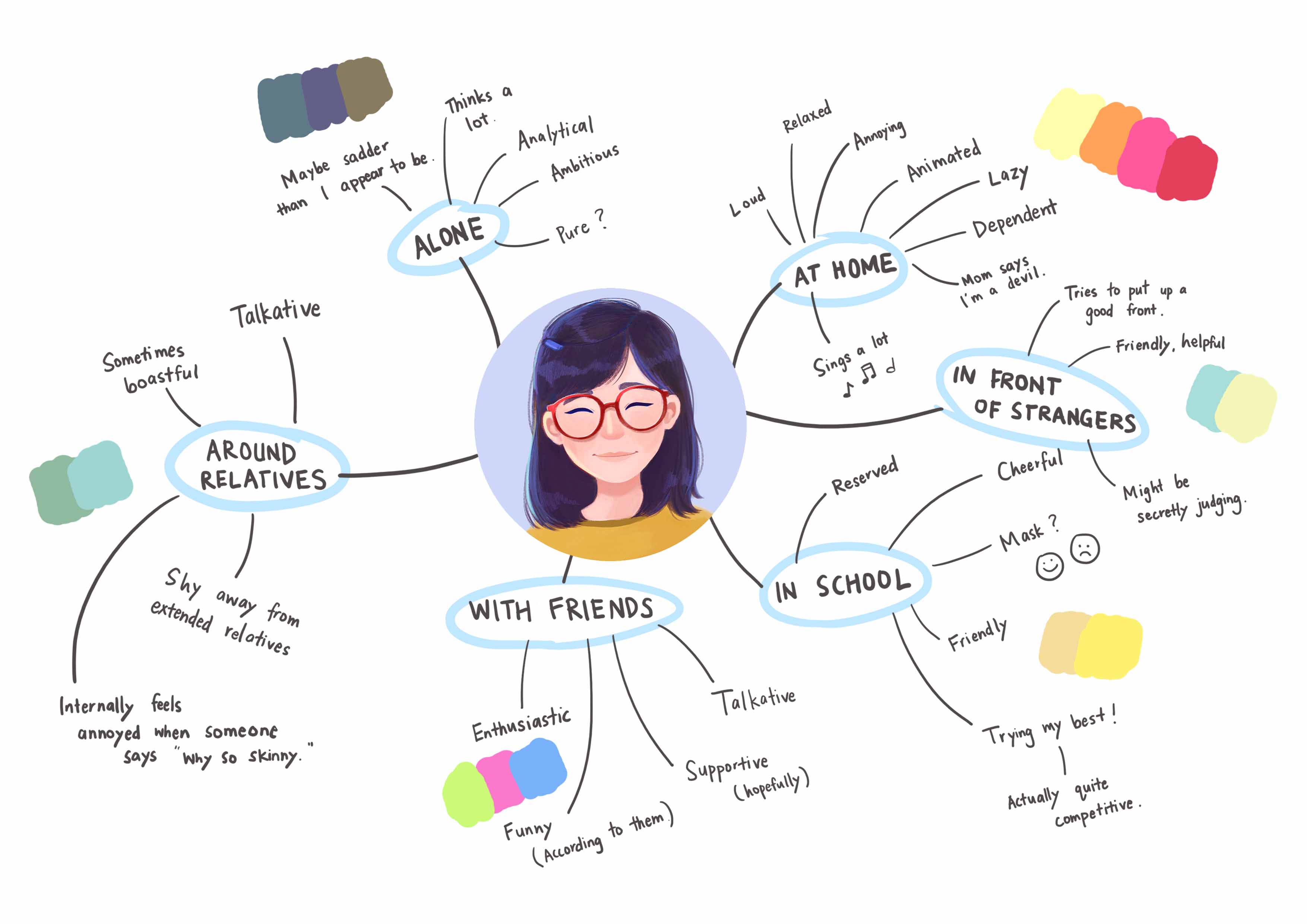
For this assignment, we are required to apply our understanding of colours and colour theory to visually represent the multifacted nature of our personality. I decided to start mind mapping the many sides of who I am. This alone was interesting because I see how different I am around different groups of people.
Mindmap
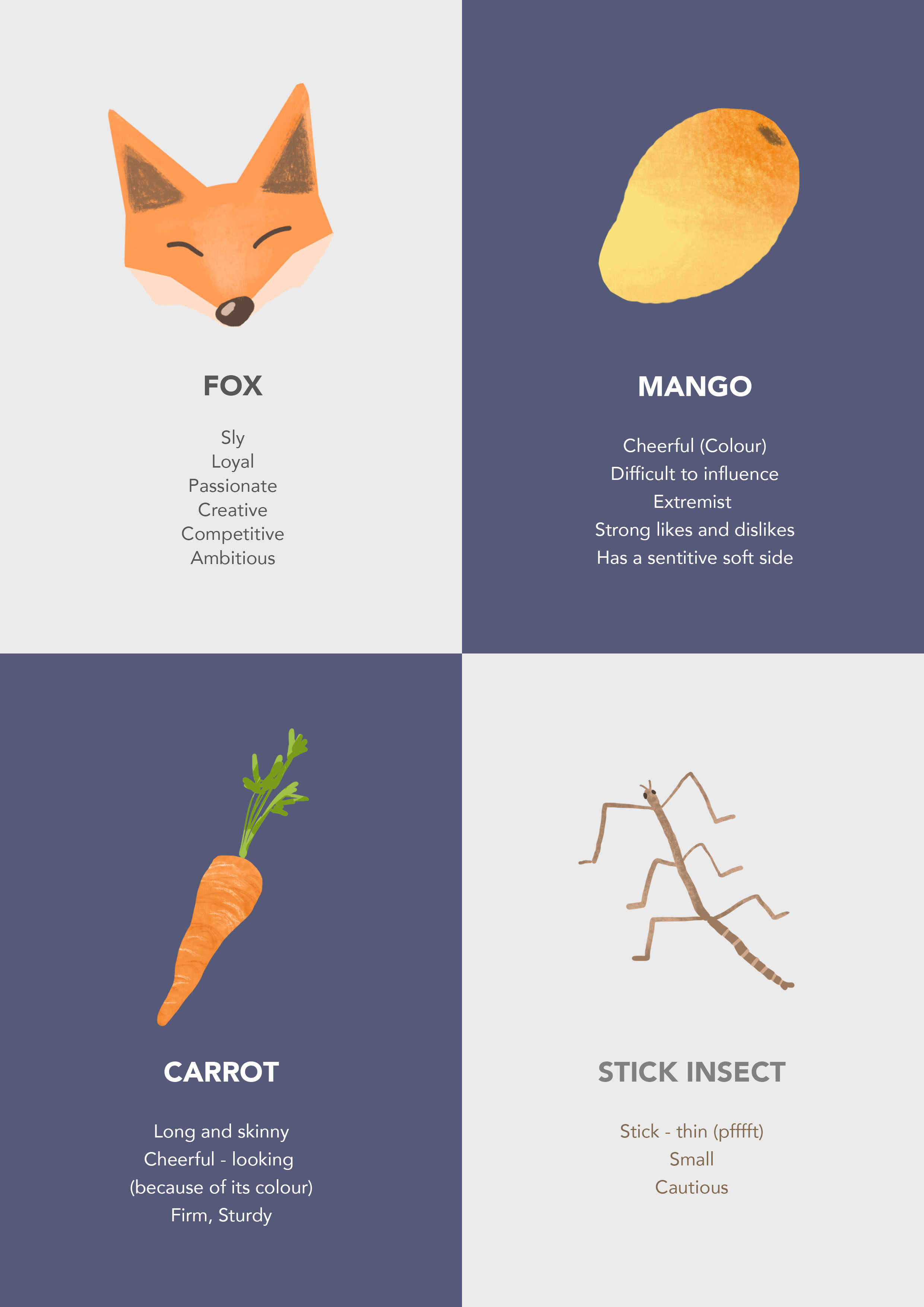
Based on the above mind map, I tried to represent myself using various objects. Below are the things that used for my final pieces.
Sketches
After doing the mind map and coming up with the situations, I started sketching out my ideas. I found that using colours in my sketches helped me to visualise my final pieces better. Even if I did not stick to the colour schemes, they served as a guide.
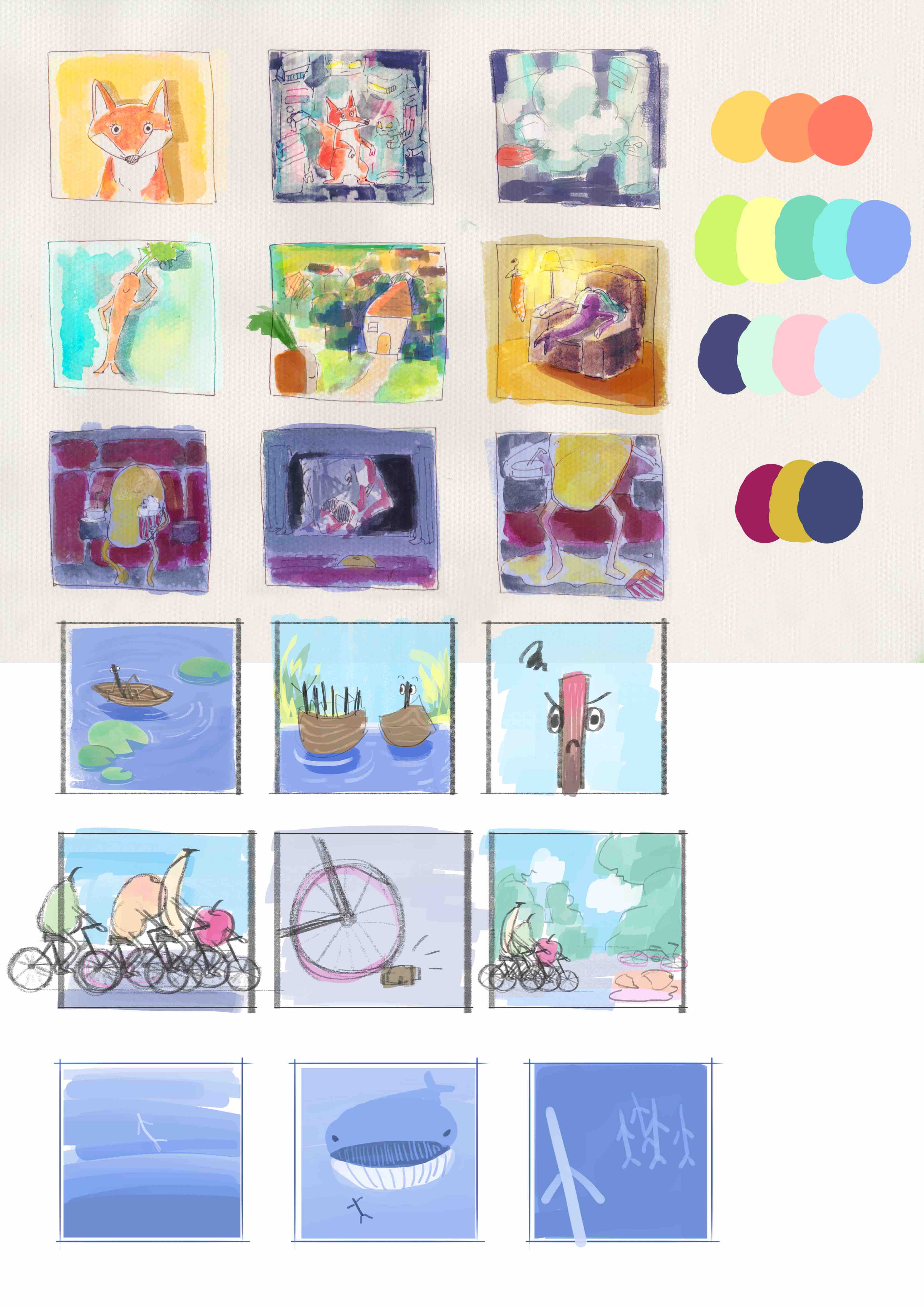
I find that the sketches helped people understand my ideas better too. Ideas that people were skeptical about became clearer once I showed them the sketch.
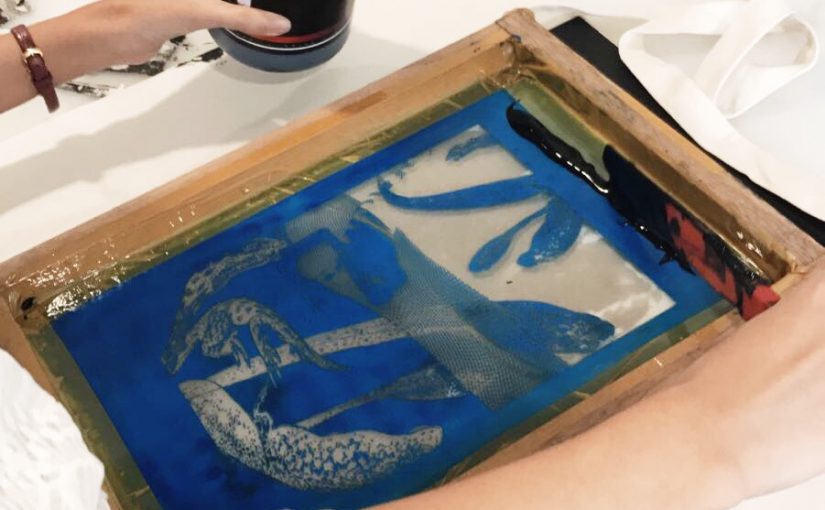
From there, I chose and adjusted the colours for the final pieces as I worked on them. The colours that I use are generally bright and bold because I love vibrant colour schemes. I tried out some of the colour schemes covered in class — triadic, complementary, analogous and monochromatic. Below, I describe the my process according to the order that I did the panels.
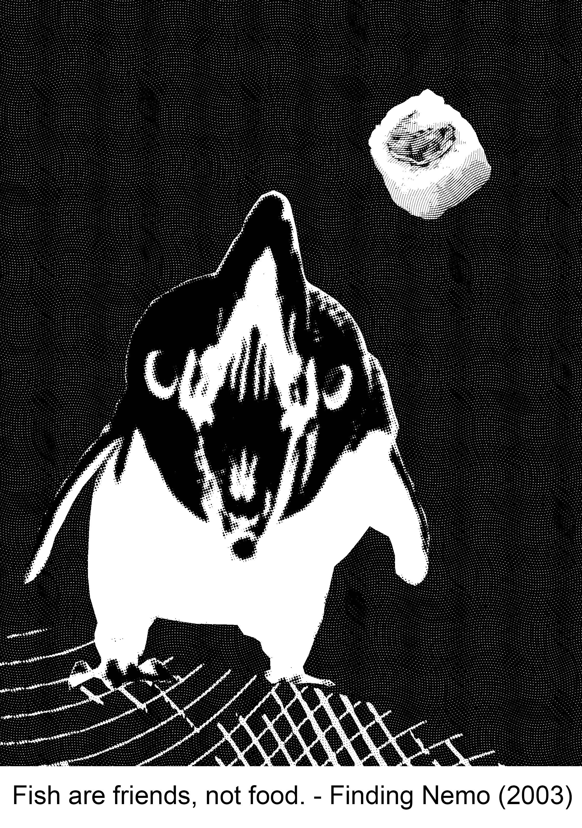
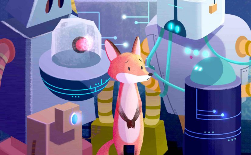
The Shy Fox
The fox represents the shy side of me. Also, people have pointed out that I look like a fox. The situation I picked for the fox is a group of robots. The robots represent the uncomfortable social situations that I sometimes face. I’d then put on a facade, so the fox blends into the surrounds by pretending to be a robot.
I started on this set first because I had a clear idea of the style and working steps! Since I am from animation, I am influenced by animation drawing styles and our way of designing. But I’ve never tried photoshop’s pen tool to illustrate before so I decided to try it out! I watched a youtube tutorial on noise and grain. The person who made the tutorial shared with us his working steps which was very helpful! I find that I work faster by blocking out silhouettes. The lines appear much cleaner and I can edit without wasting time!


The colours used here are complementary. Since the fox is a warm orange-red, I decided to make it stand out by using a cool blue.
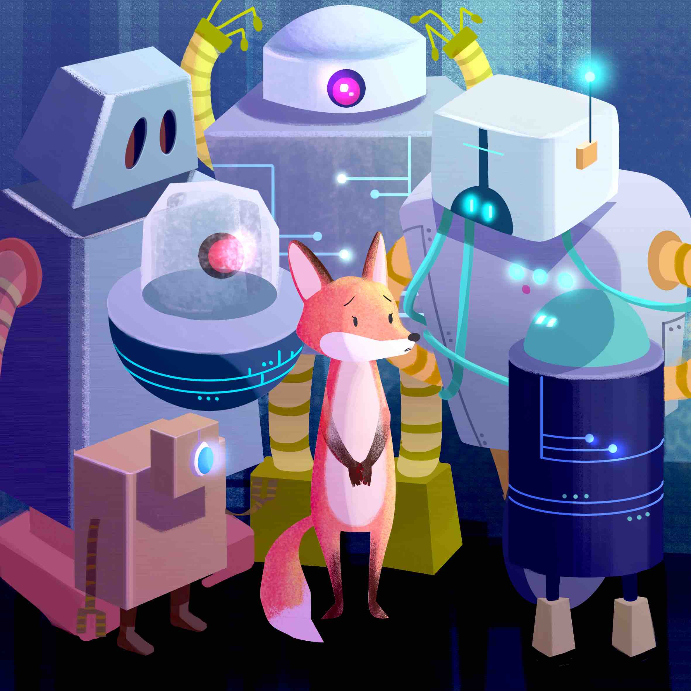

I used Dice Tsutsumi’s painting as a guide for this panel. His colours seem to blend and create this really nice harmony even though some colours are contrasting. The colour scheme used here is triadic. The purple background contrasts nicely with the subject.

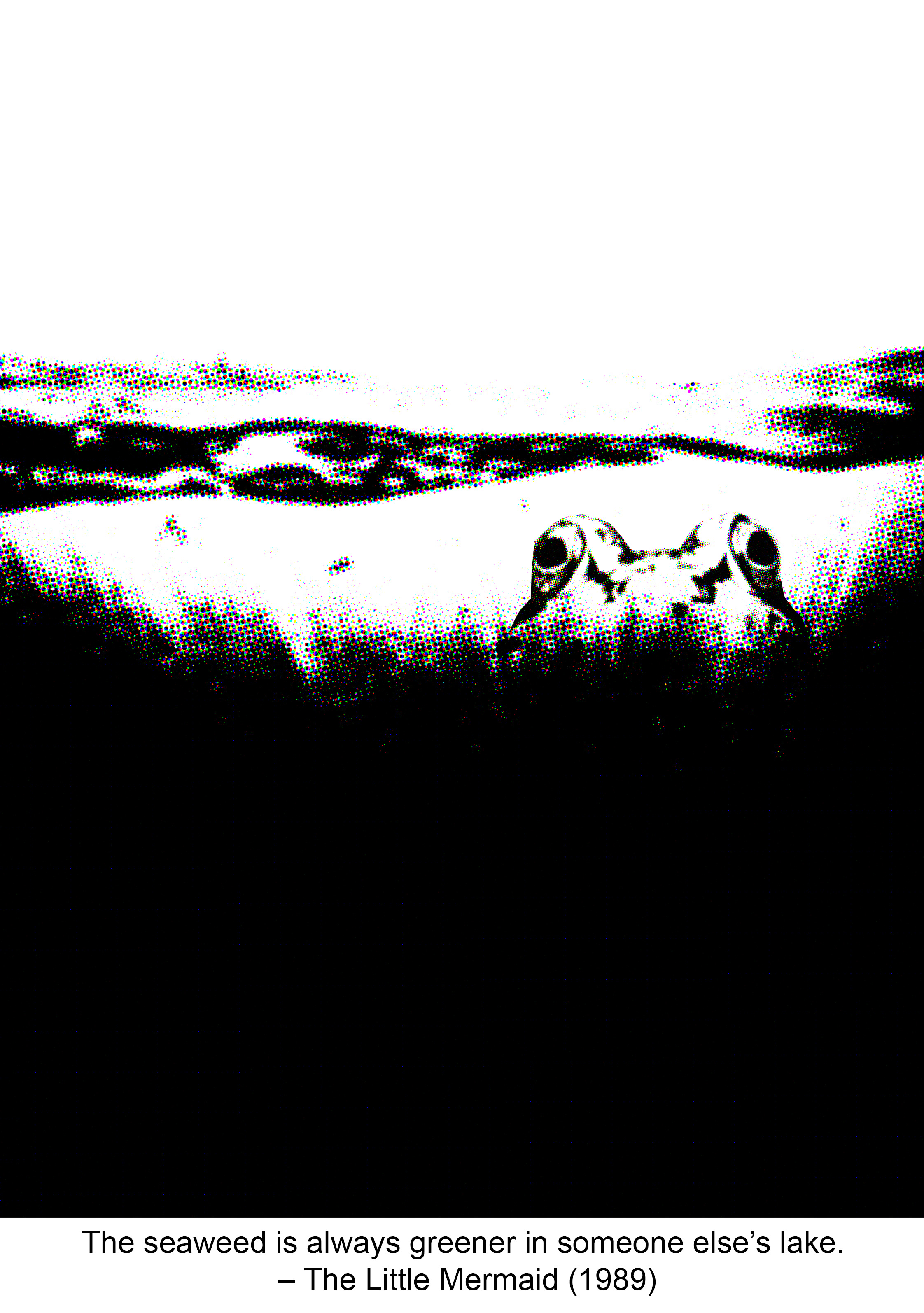
The third panel below is more of a analogous colour scheme with a hint of the fox’s red fur peeking out of the paper and boxes.


The carrot with another face
Carrot represents me because it is slender yet firm. I think everyone including me behaves differently in their home vs. outside, so I depicted a carrot lazing on a couch in its home, with its orange peel hanging on a hanger to reveal its true self — its purple self.
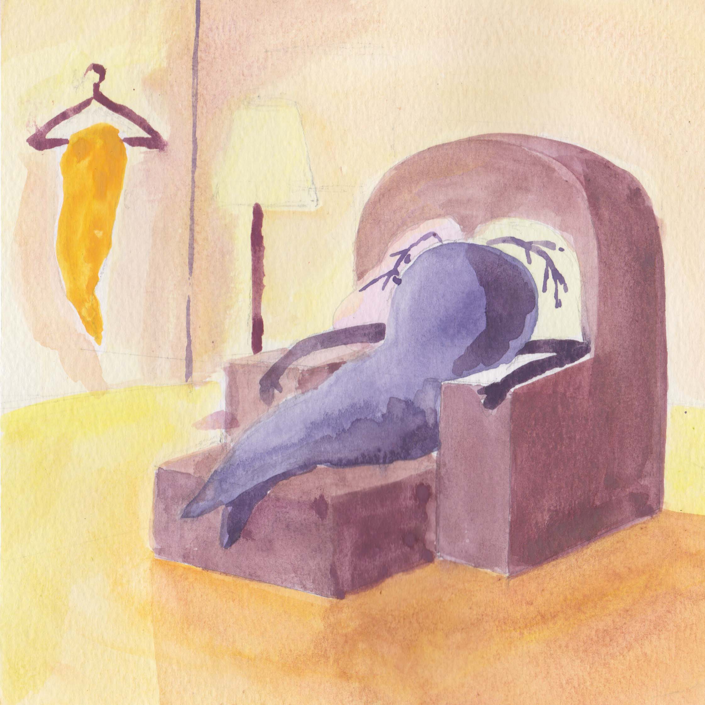
For this set I tried to use gouache, but I found that I didn’t like the outcome of the paintings. I lacked the patience and time to work on them (oops) so I improvised and edited the panels digitally on photoshop. On photoshop I had more freedom to control colours and clean up any edges that I don’t like. I like the final outcome. I played with a more muted colour scheme for this set.
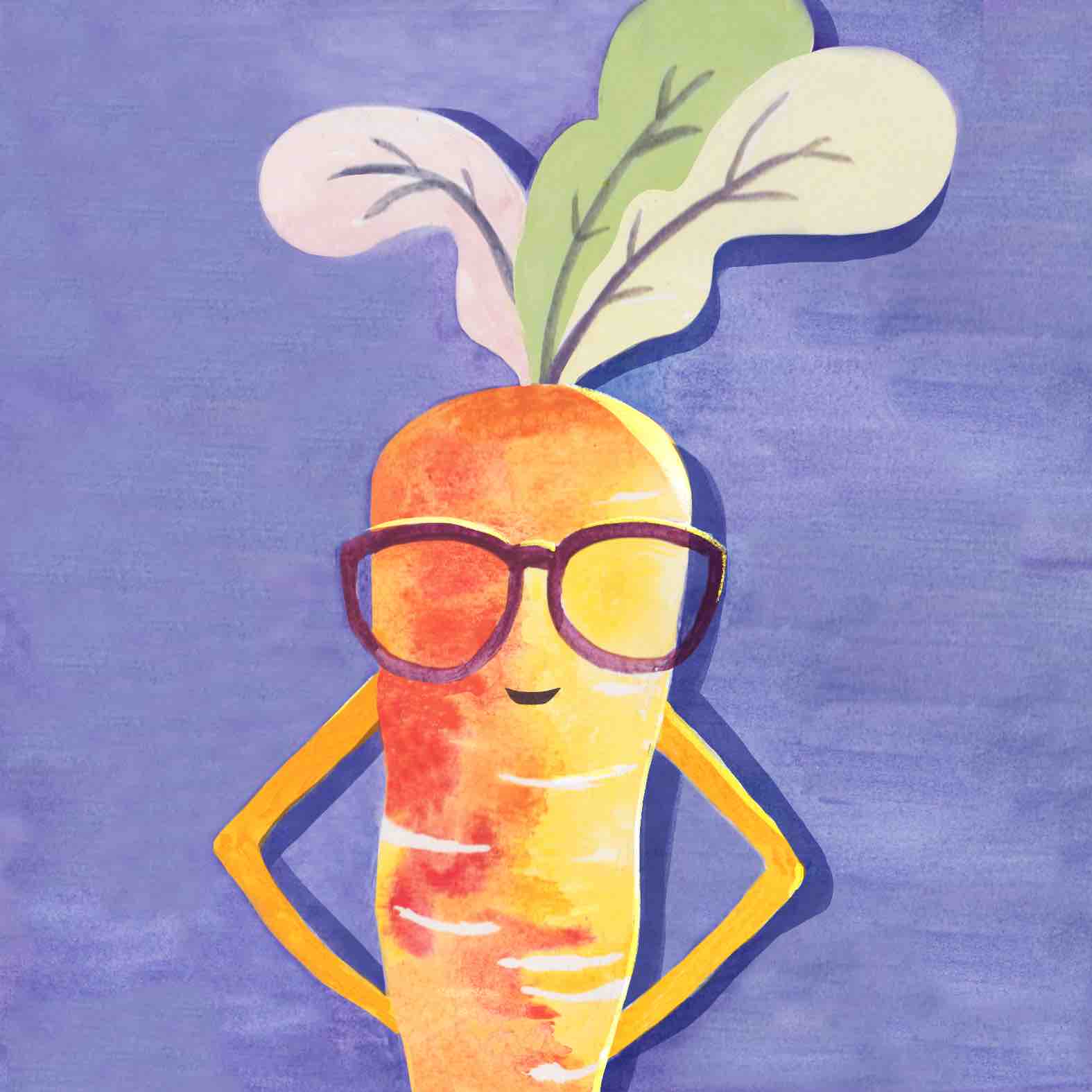

Colour scheme used is clearly complementary. I made sure to retain the texture of the paint on paper — something that might be difficult to replicate digitally. Added the shadow to give the carrot more contrast too.

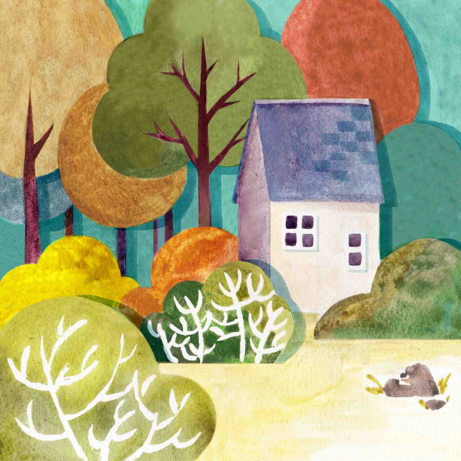

This panel had a drastic change in colour scheme from the original painting because I decided I didn’t like the sky to be so dull. Colour scheme is triadic. Also, masking fluid is hard to work with. I need more patience!!
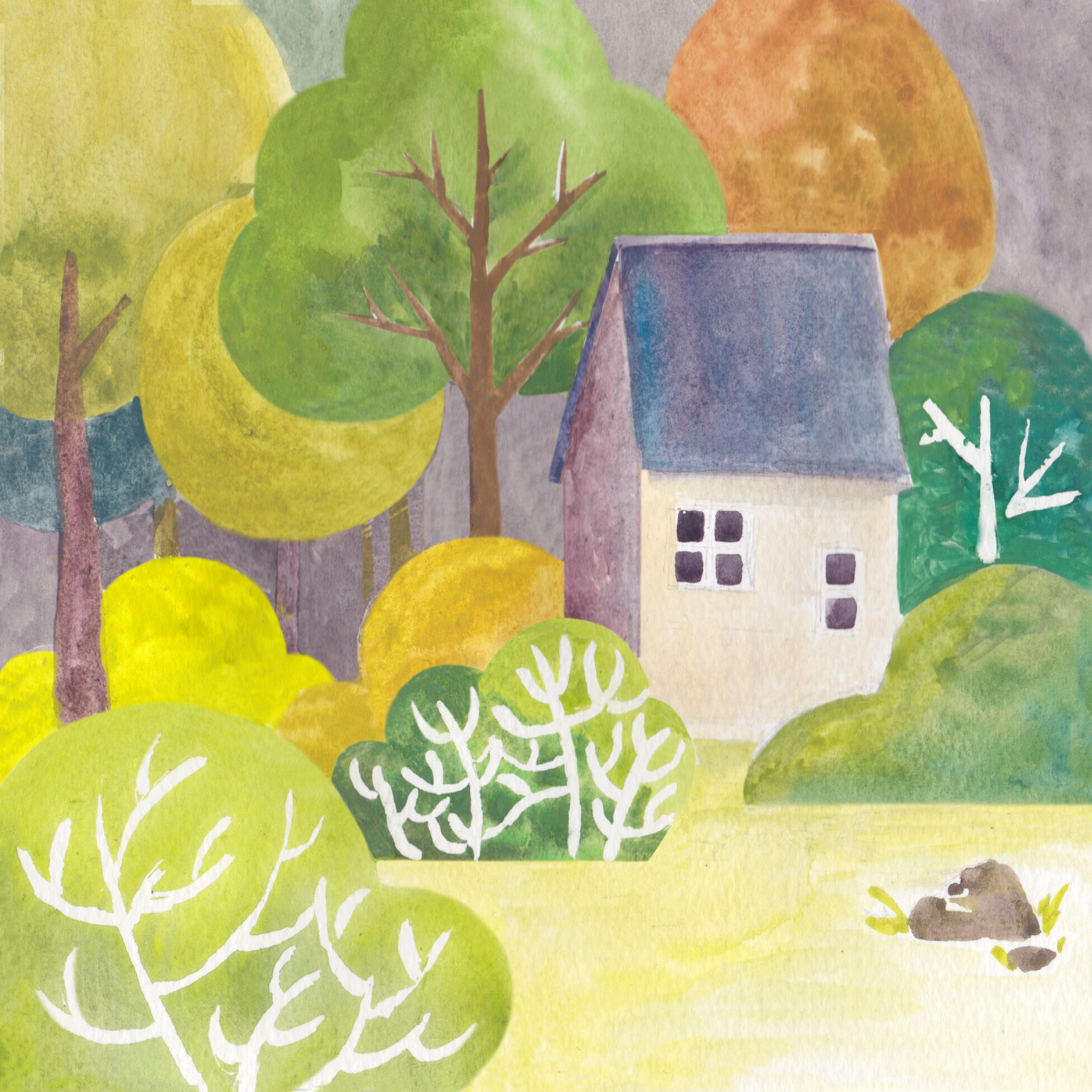
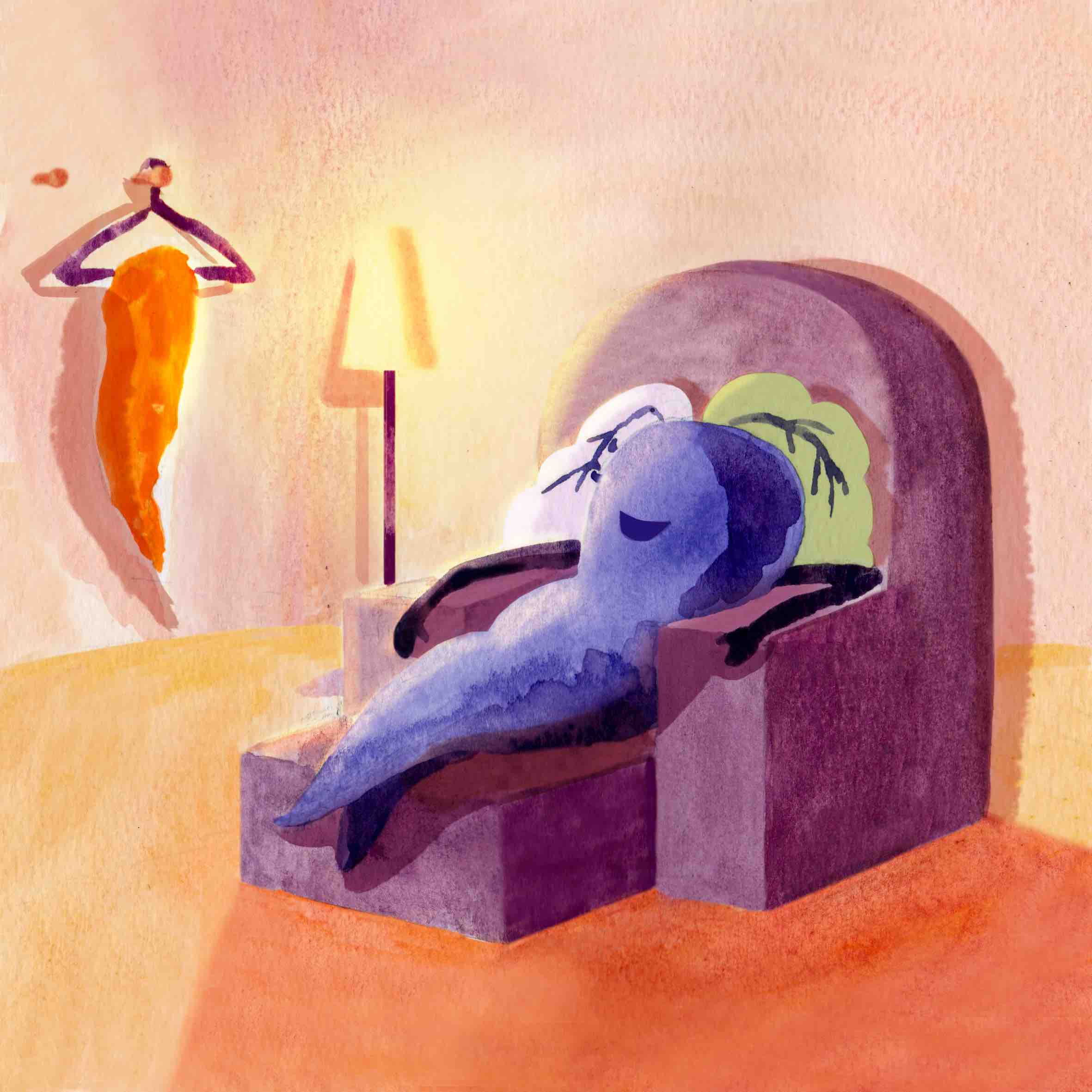

Colour scheme use is complementary. I used warm colours to show how comfortable and cosy home is. Again, this panel was edited and cleaned up digitally.
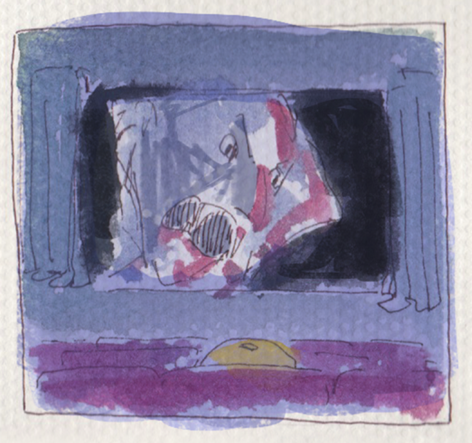
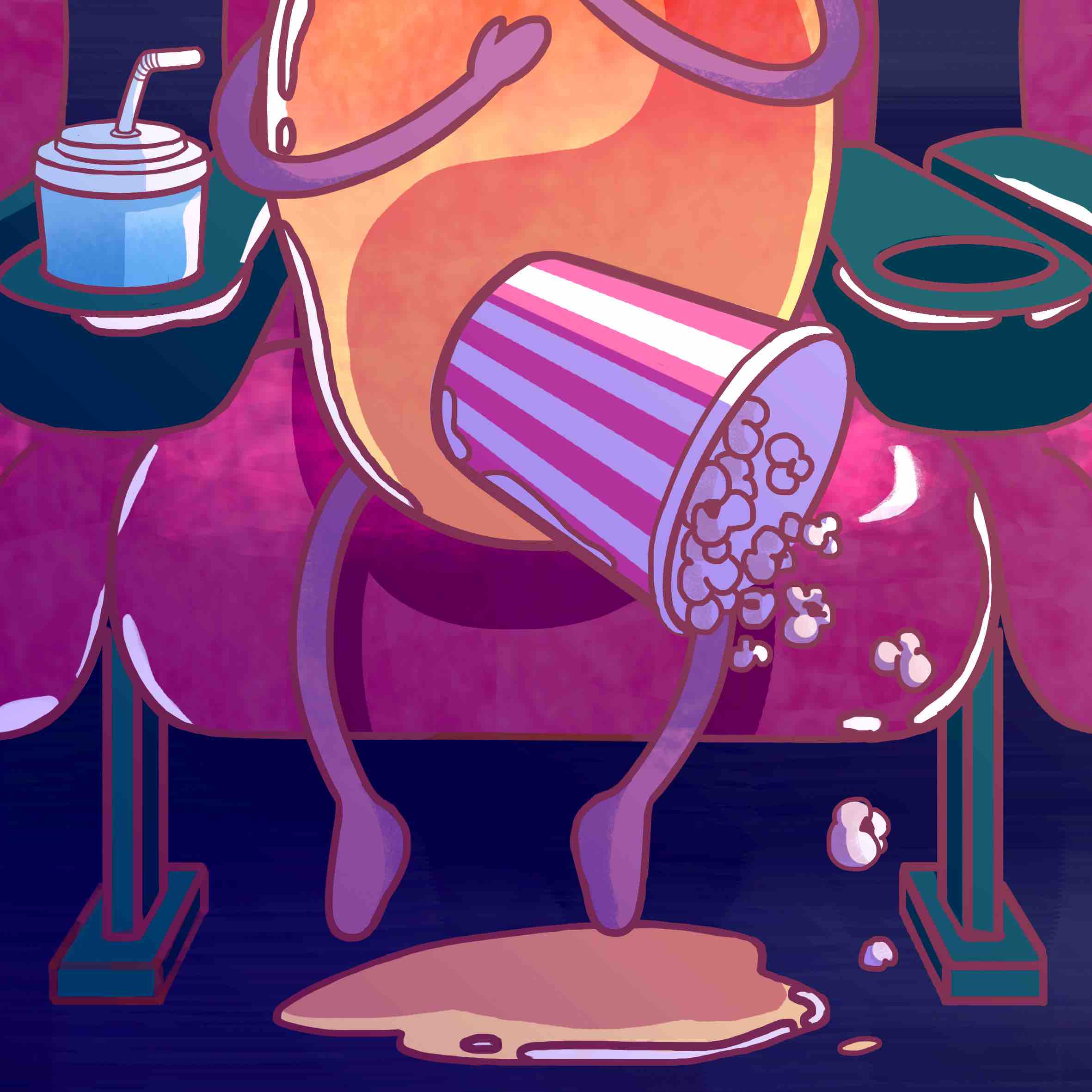
The scared mango
I’m a mango because I’m soft and sensitive! And I enjoy watching movies alone. But not when it’s a scary film! So I depict the scared mango peeing on the ground. I think I enjoyed doing this set the most, especially the first panel with its bright vibrant juicy colours.
I used pixelpchan’s work as reference for this set. I used vibrant colours to depict the mango, and used a much muted, darker colour scheme for the cinema panels to create the scary mood. Colour dodge was used for the cinema movie screen glow for a more dynamic look, as opposed to using all dark colours. The colours for this set was pretty much restricted due to its dark setting but I tried to work around that.


Colour scheme for first panel is largely analogous, with the blue and green as accents (does that make it triadic?!). Made sure that the lines were not black as that would make the look of the illustration “heavy”.
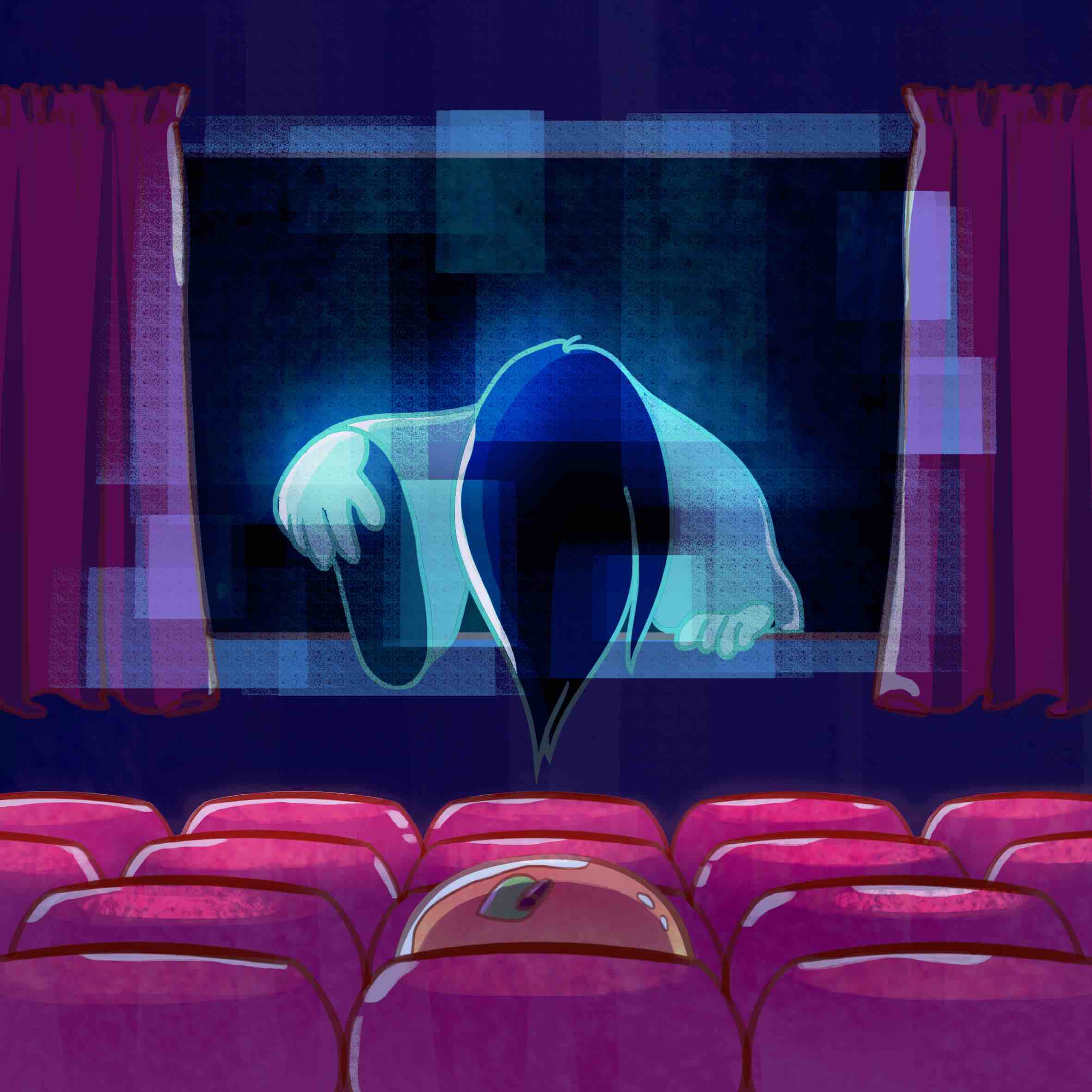

This panel was difficult to execute because I didn’t like that the colours were so dark. But to create the setting / mood, it had to be dark colours. So I used colour dodge for the Sakako coming out of the screen. The bright blue stands out against the dark purple / red tones. Thank you Yan Ran for suggesting: “Draw Sadako, but cute.” ? My original Dracula idea did not match the cutesy theme so I changed to Sadako. I am pleased I asked for her opinion!

The dependent stick insect
My poly friends used to call me a stick insect (how mean!) and I love jogging so I merged the two ideas together. I also think that I’m a dependent person, so that is how I came up with the idea of a stick insect who loves jogging but in the end clings on to someone else instead of running itself.
I deviate from dark colours and used brighter, pastel colours. The style of this set is a fusion of the previous fox and mango style. It ended up looking very graphic design-ish. For this series I had a mood board as reference for the colours.
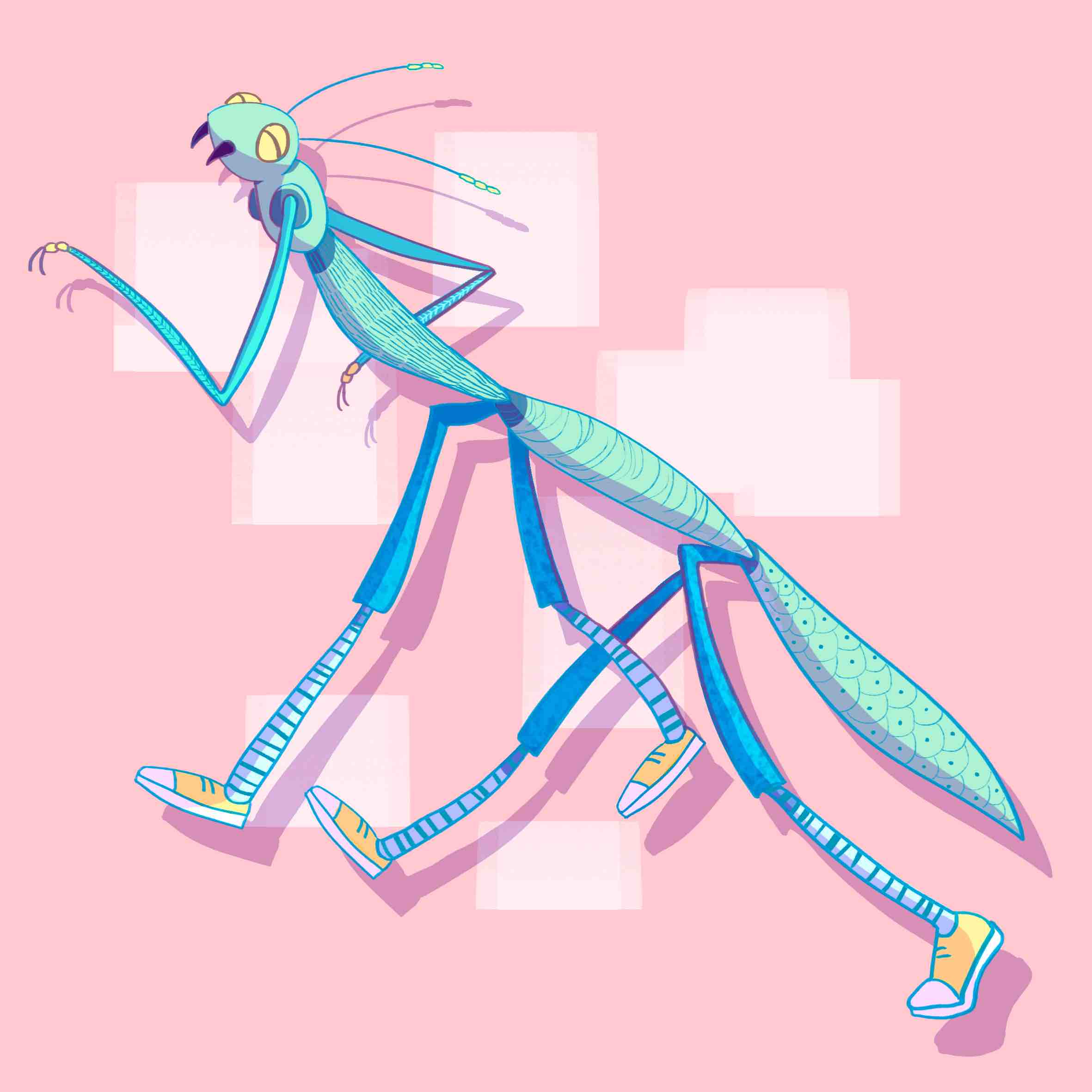

For this first panel, I tried to go for a dynamic composition because first panels tend to be a bit more static. I thought about what pose the stick insect should have and whether should it wear shoes or not.

Since the first and last panels are a bit more dynamic, I stuck to a static composition for the second panel for overall balance. The colours used are triadic.


Final
Overall, I made sure that as a series and as a whole, the colours have a sort of unity and harmony. I find it interesting that some people pointed out that even though they understand that I attempted different styles, they still look “unified” or “the same” in a sense. Probably because of a particular style that I already have.
Thoughts
I’m happy that I was able to apply the things that I’ve learnt throughout the entire semester. I feel that the course has added on to what I have learnt previously and I am a bit more satisfied with the outcome of my work this time! This assignment was the most fun to work on for the entire semester for me personally.
Difficulties
Interpretation – Initially I was a bit confused about the assignment but by the second consultation I was much clearer about what I needed/wanted to do. I talked to some of my classmates too and bounced ideas around with them.
Painting – I was rushing for time and had no patience. This was resolved with the help of photoshop.
Takeaways
I discovered new painting steps through watching youtube tutorials which I am thankful for because I am going to incorporate those steps into my future animation concept art work in the future! This shows that things we learn in one field can be applied in another.
Combining traditional medium and digital medium produces an interesting look with texture. In future I might want to start illustrating traditionally first, and then edit the piece digitally. It has a great “handmade” yet professional look.
Even though I did not use Adobe Illustrator for this project, I still learnt some skills that I can apply in future. After showing people my sketches, including Shirley, they taught me how the same effect can be achieved in Illustrator. Things like the Line Weight function is quite useful even as a animator when I want to do line art for my work so I might actually use that personally! Image Trace is also pretty useful.