Compositions
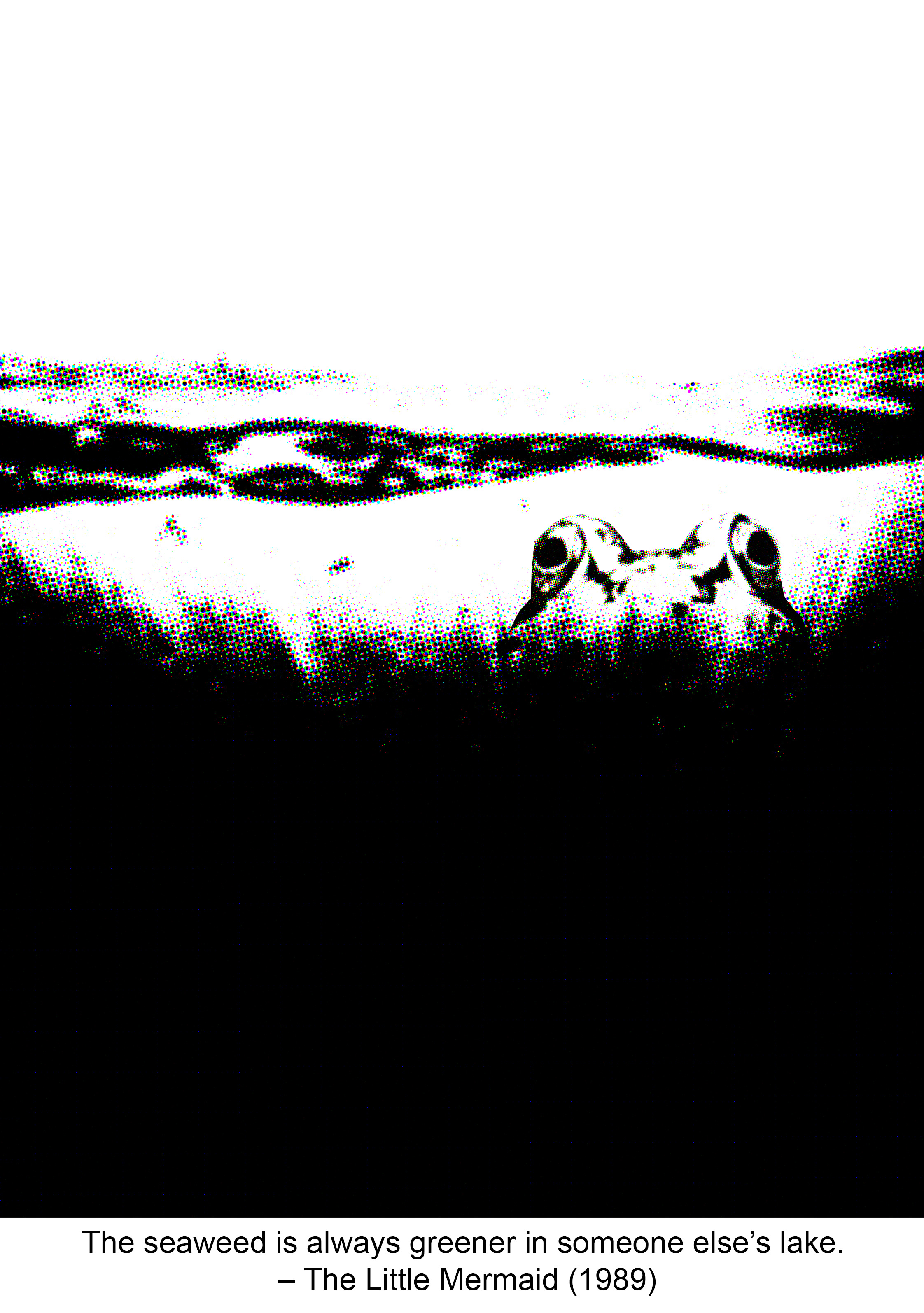
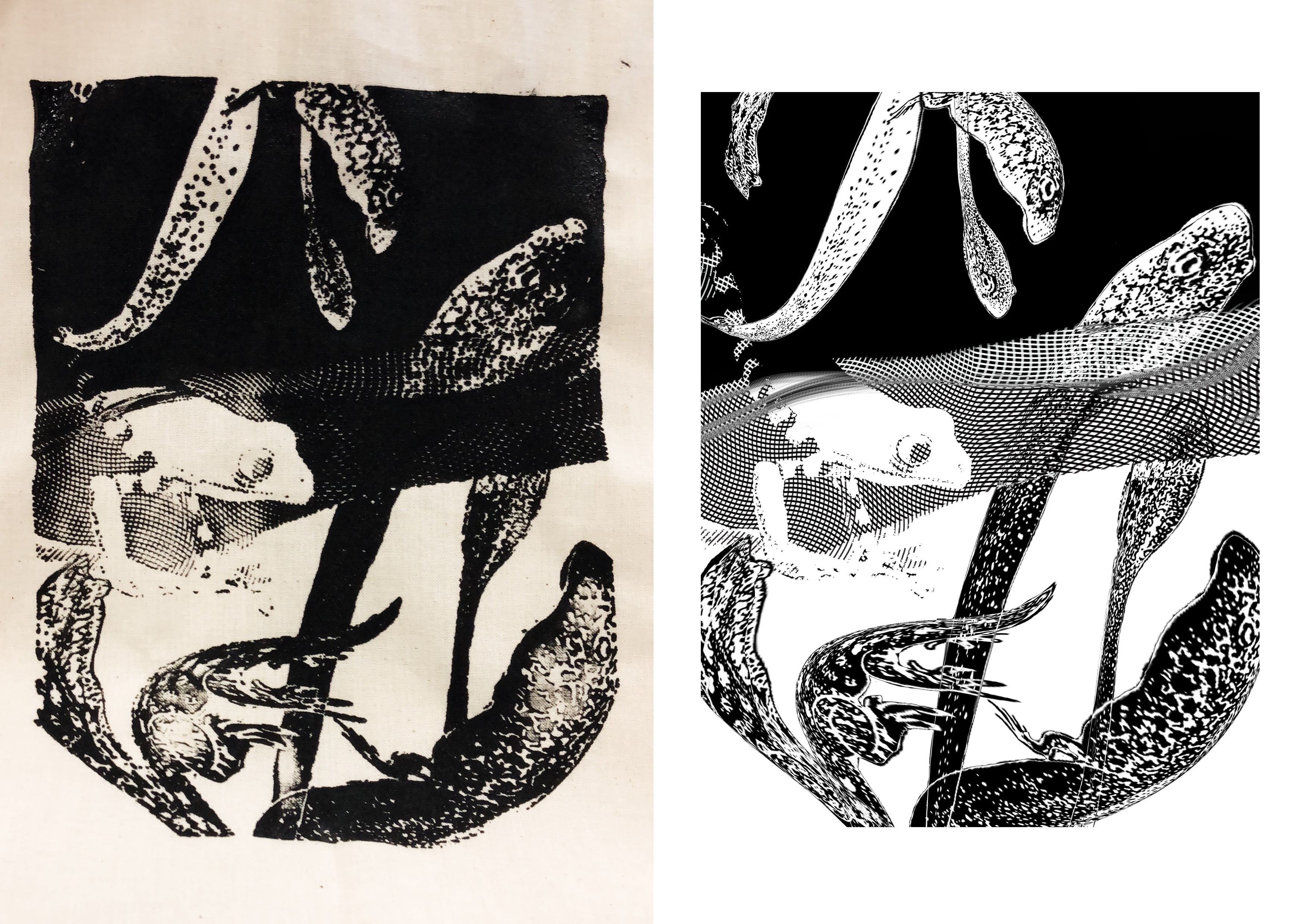
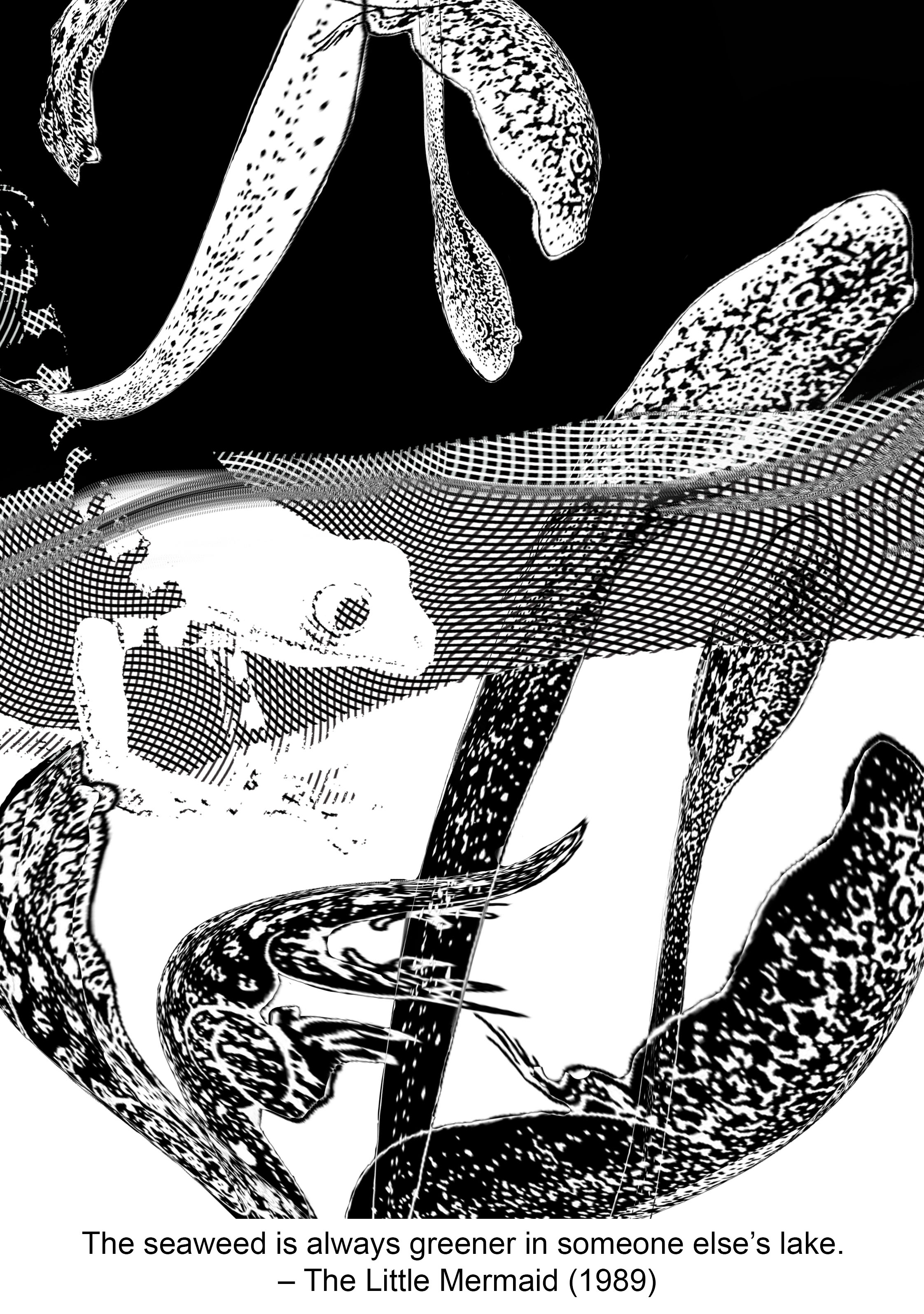
The seaweed is always greener, in somebody else’s lake. – The Little Mermaid (1989)
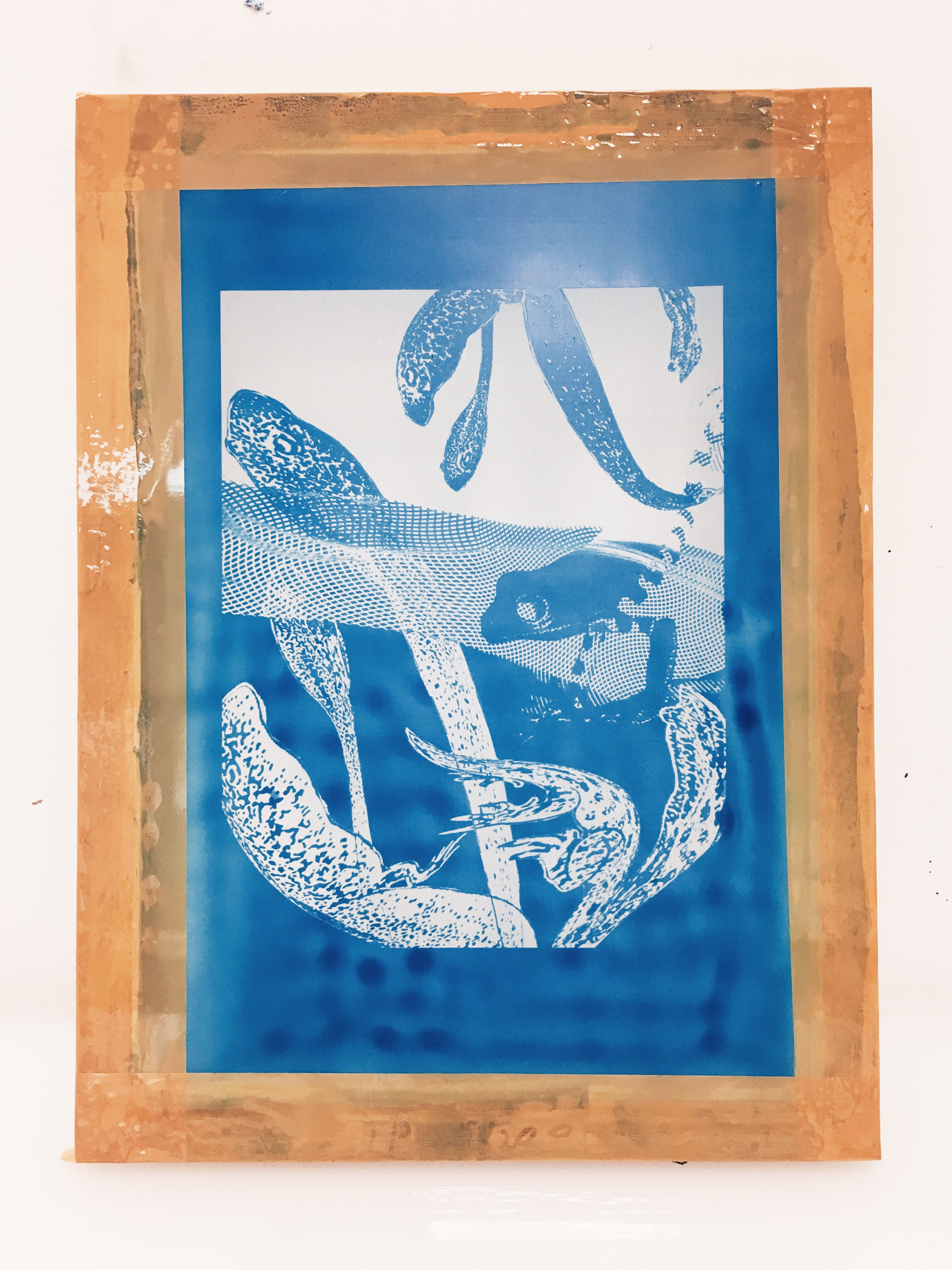
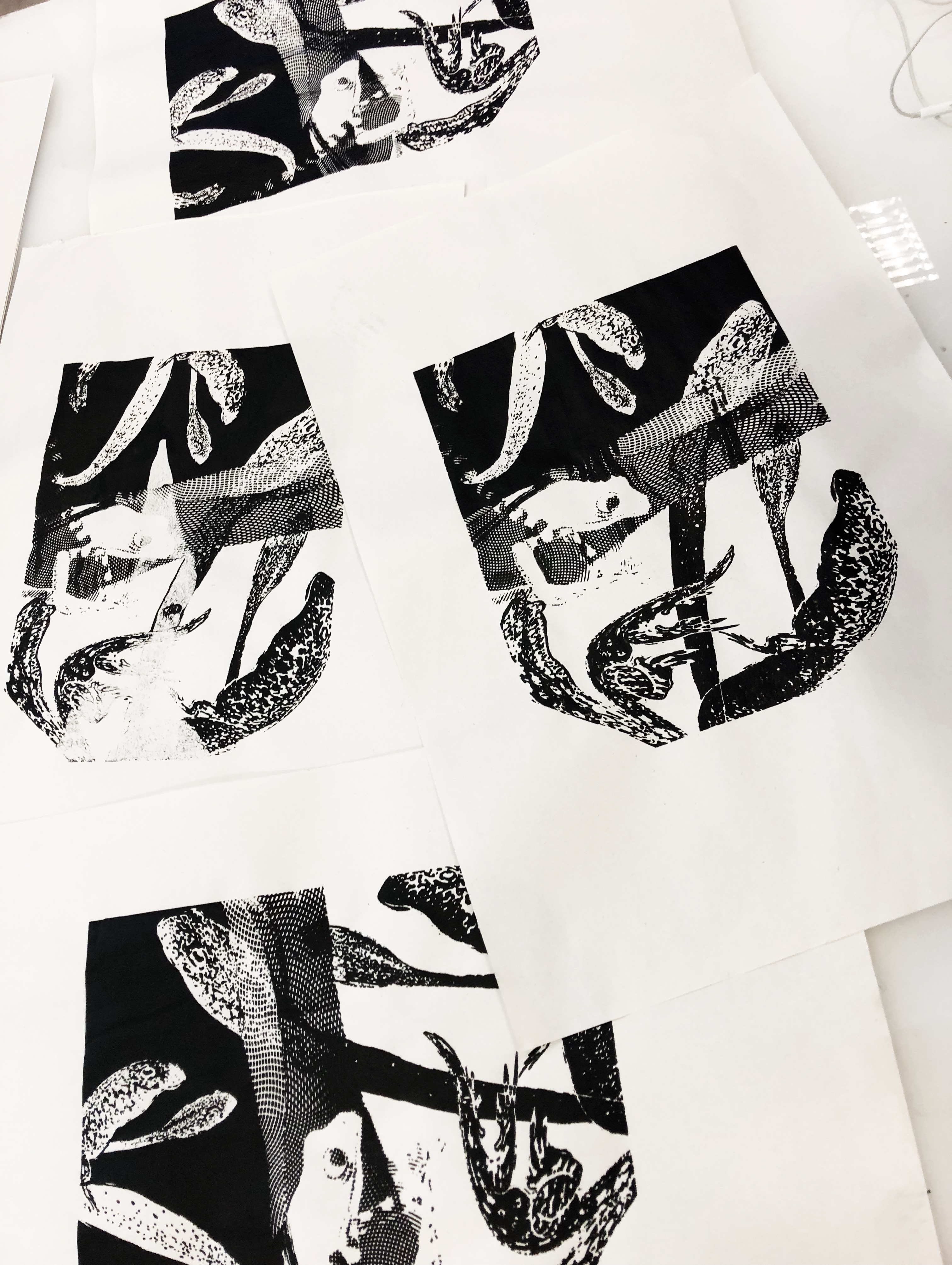
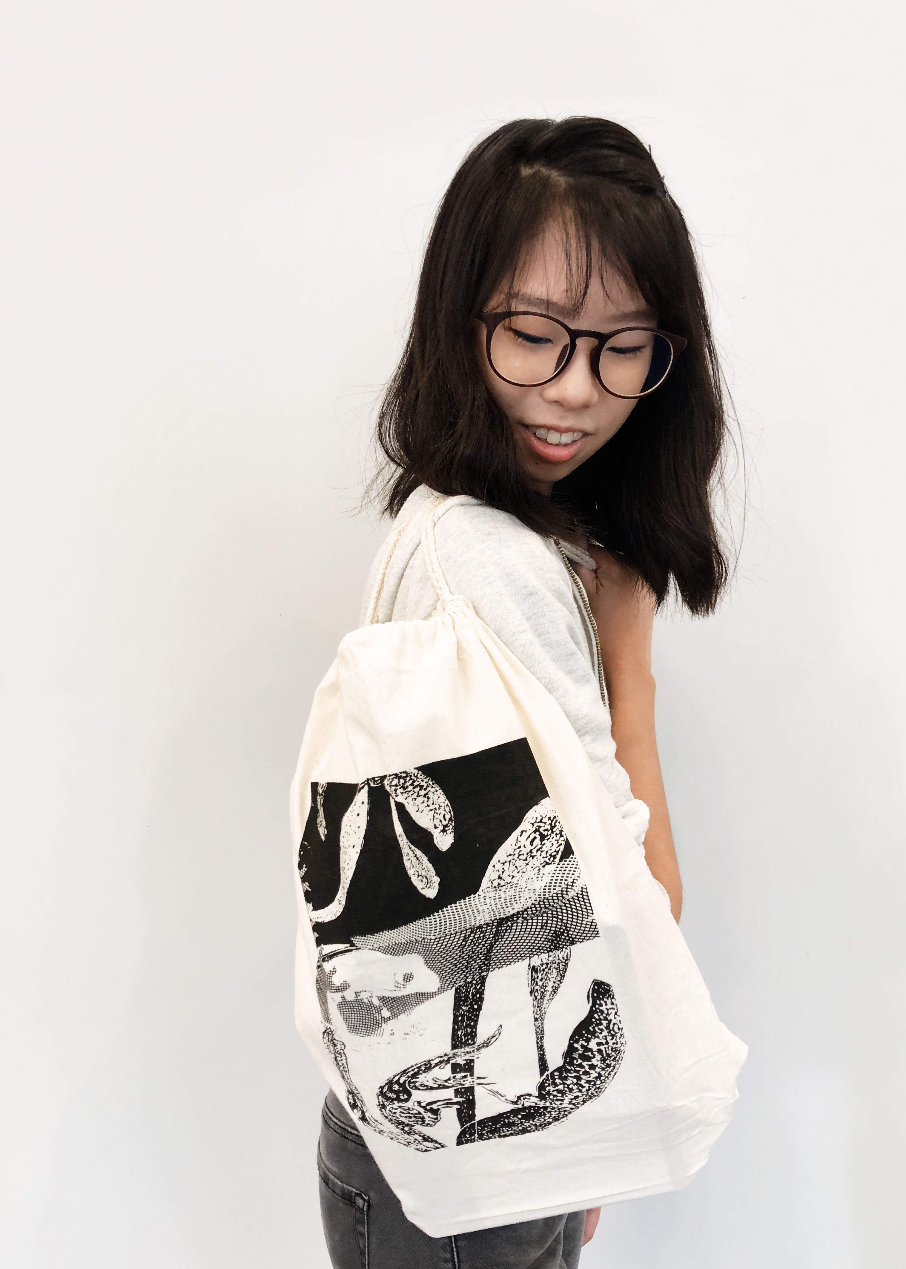
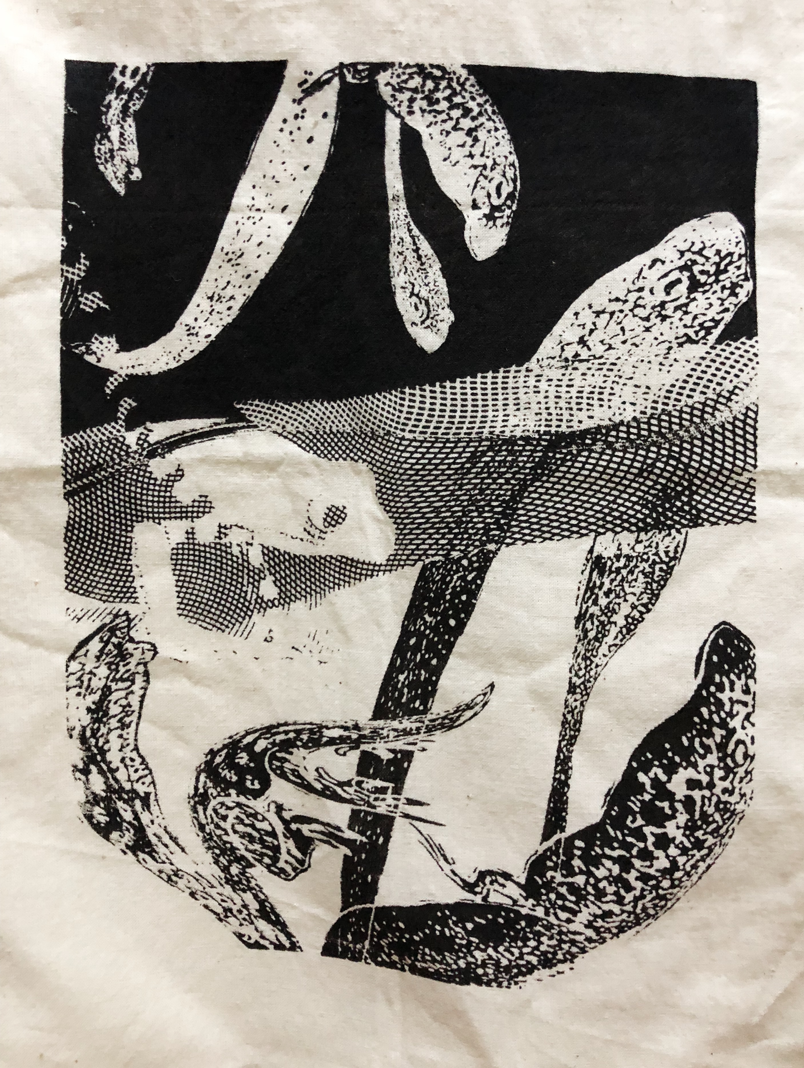
The keywords are “greener” and “someone else’s”. To show “greener” I used contrasting values — black and white. I interpret “someone else’s” as something territorial. I chose a frog for my subject since they are known to be territorial. Instead of using an image of a pond or lake, I suggest the idea of water through the engraving pattern running through the middle of the composition. “Seaweed” is replaced by the wrapped tadpoles.
I placed the elements in a dynamic manner to prevent the composition from looking static. I applied the following principles of design: contrast, texture, rhythm.
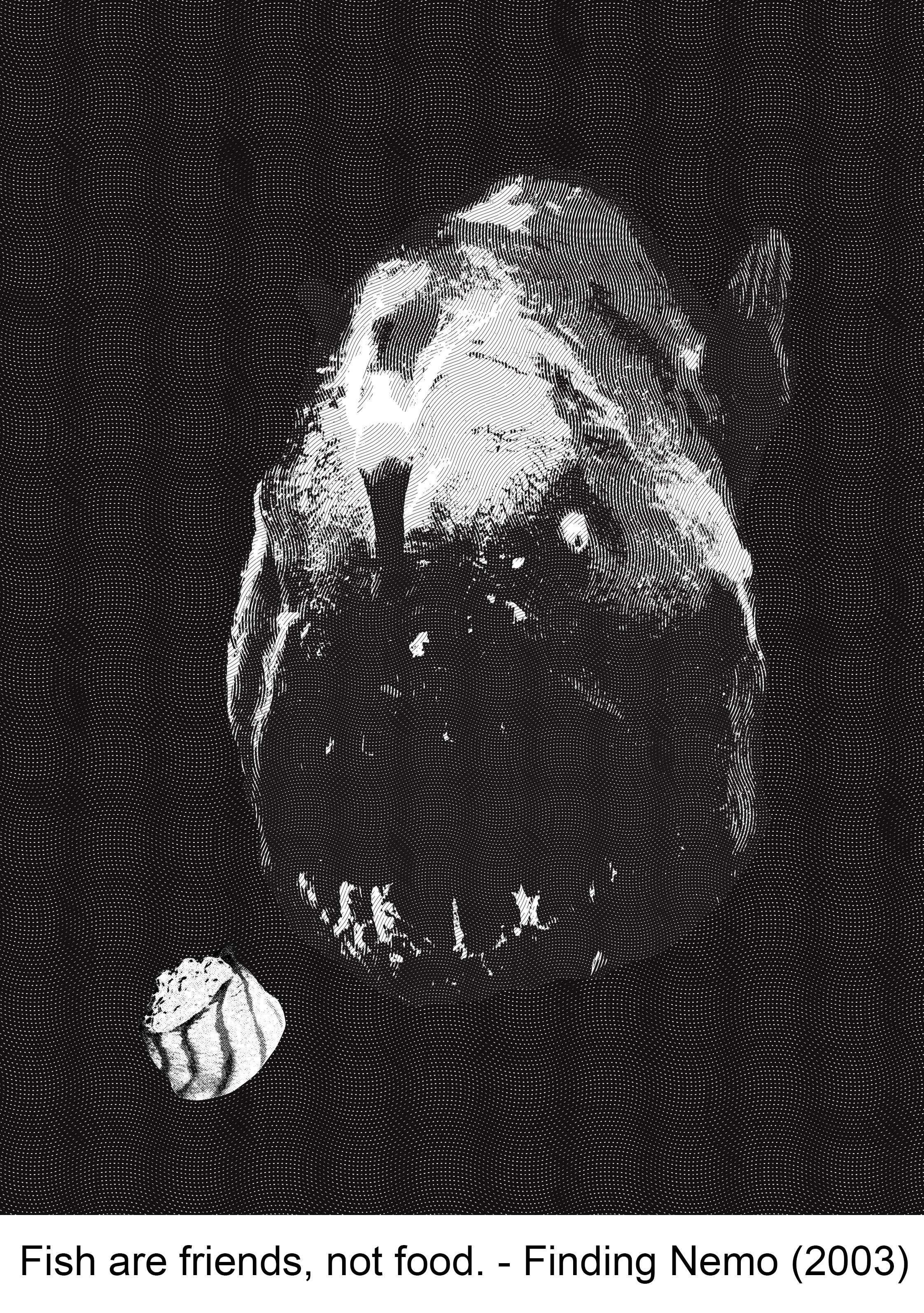
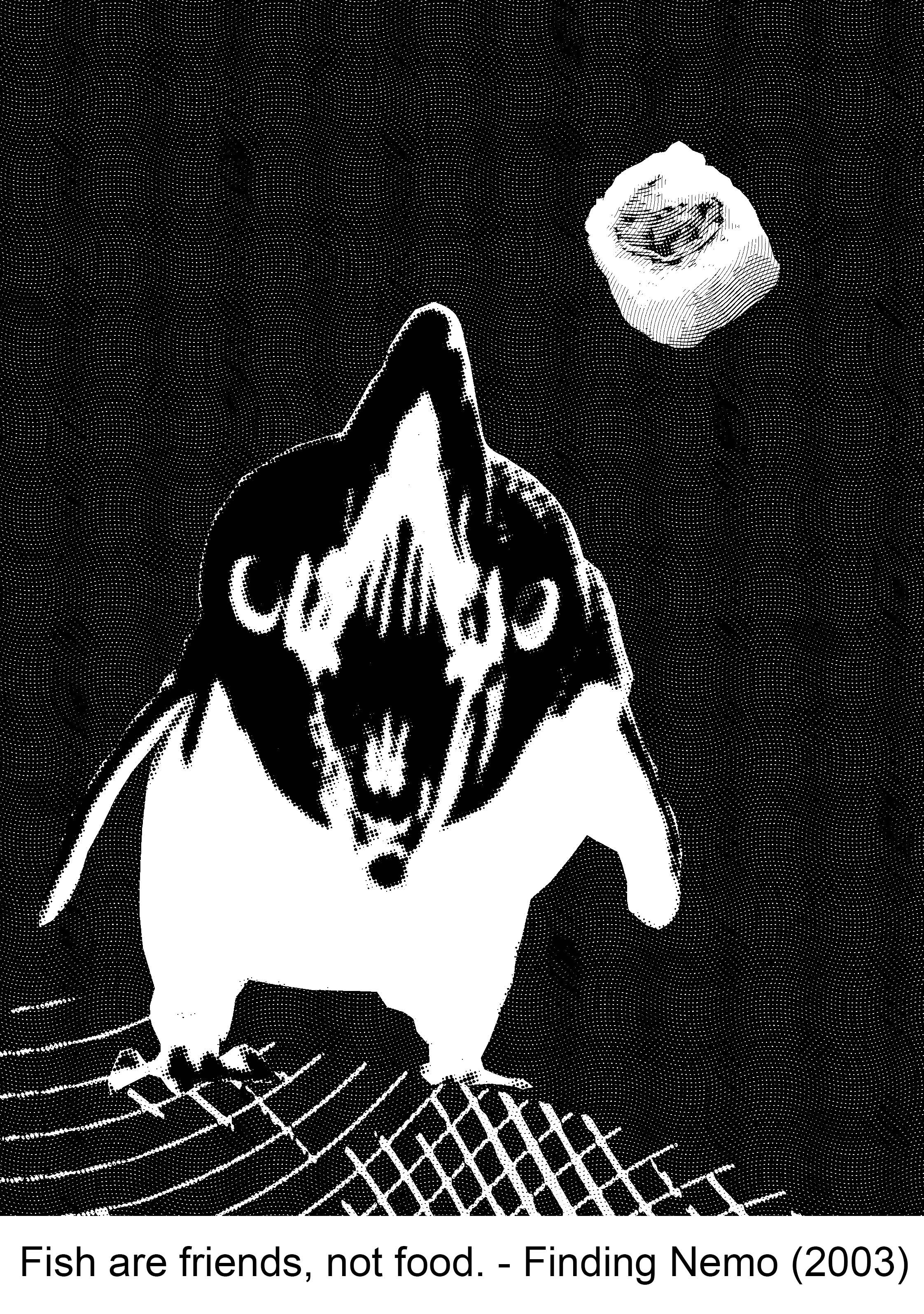
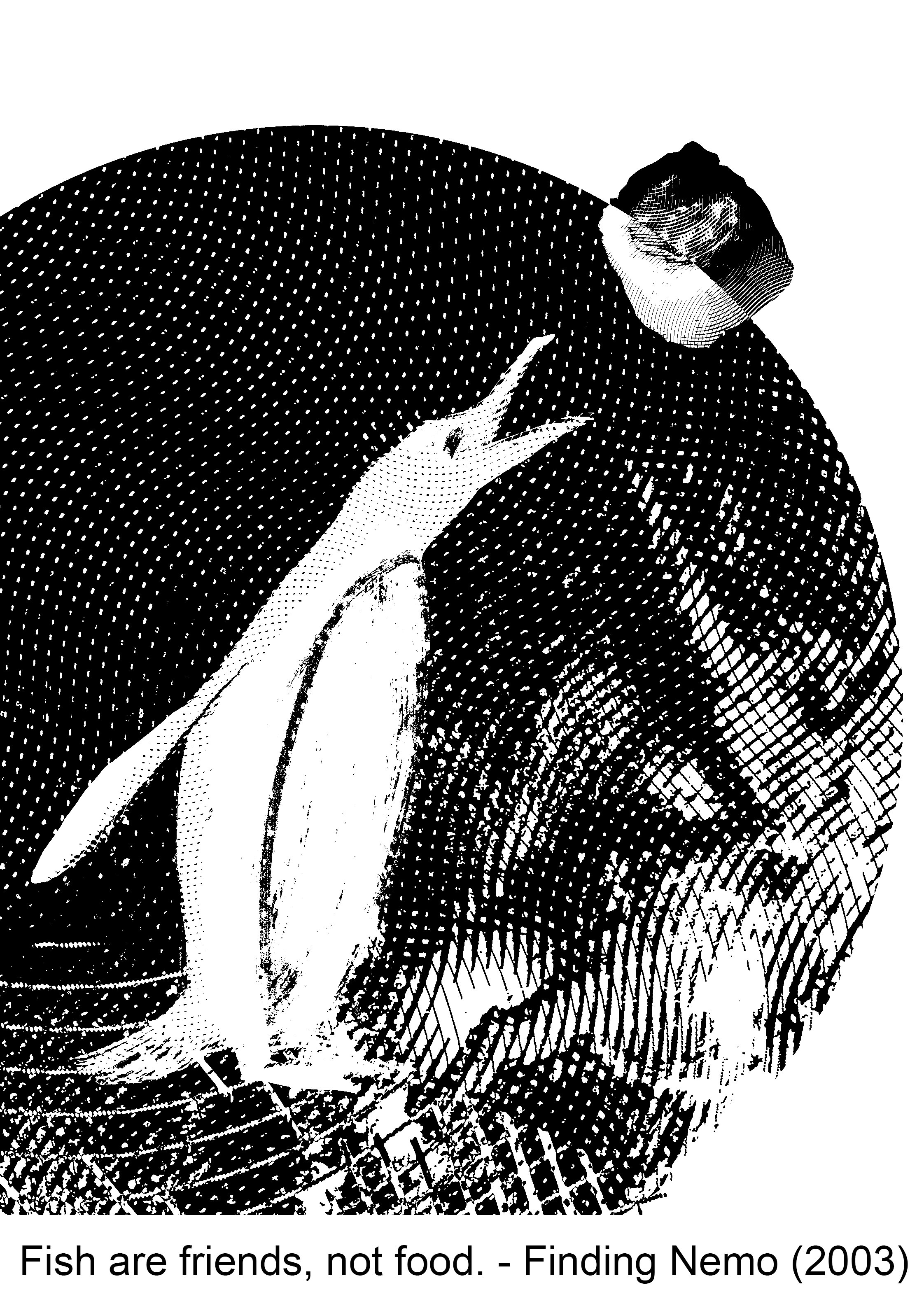
Fish are friends, not food. – Finding Nemo (2003)
For this simple quote, I used sushi to merge “fish” and “food” together. I chose a penguin as their main diet consist of mostly fish. I wanted to convey irony, since the character in the movie who said this quote is a shark that eats fish (or attempted to). The sushi is half black, half white — to suggest whether the fish is friend or foe. To depict the “friends” part, I included a circle in the composition, which is actually a photo of the earth that I changed into an engraving in photoshop. Th earth is used to show that we are all on the same planet, hence the “friends” part.
The following principles of design are applied in this composition: Rule of thirds, balance, scale (big circle, small circle).
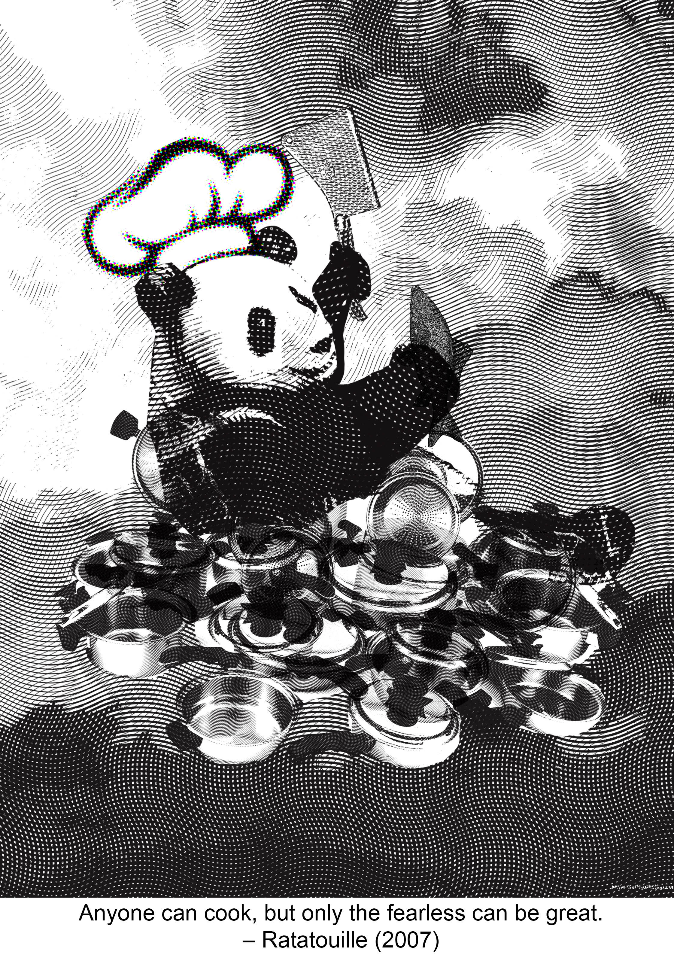
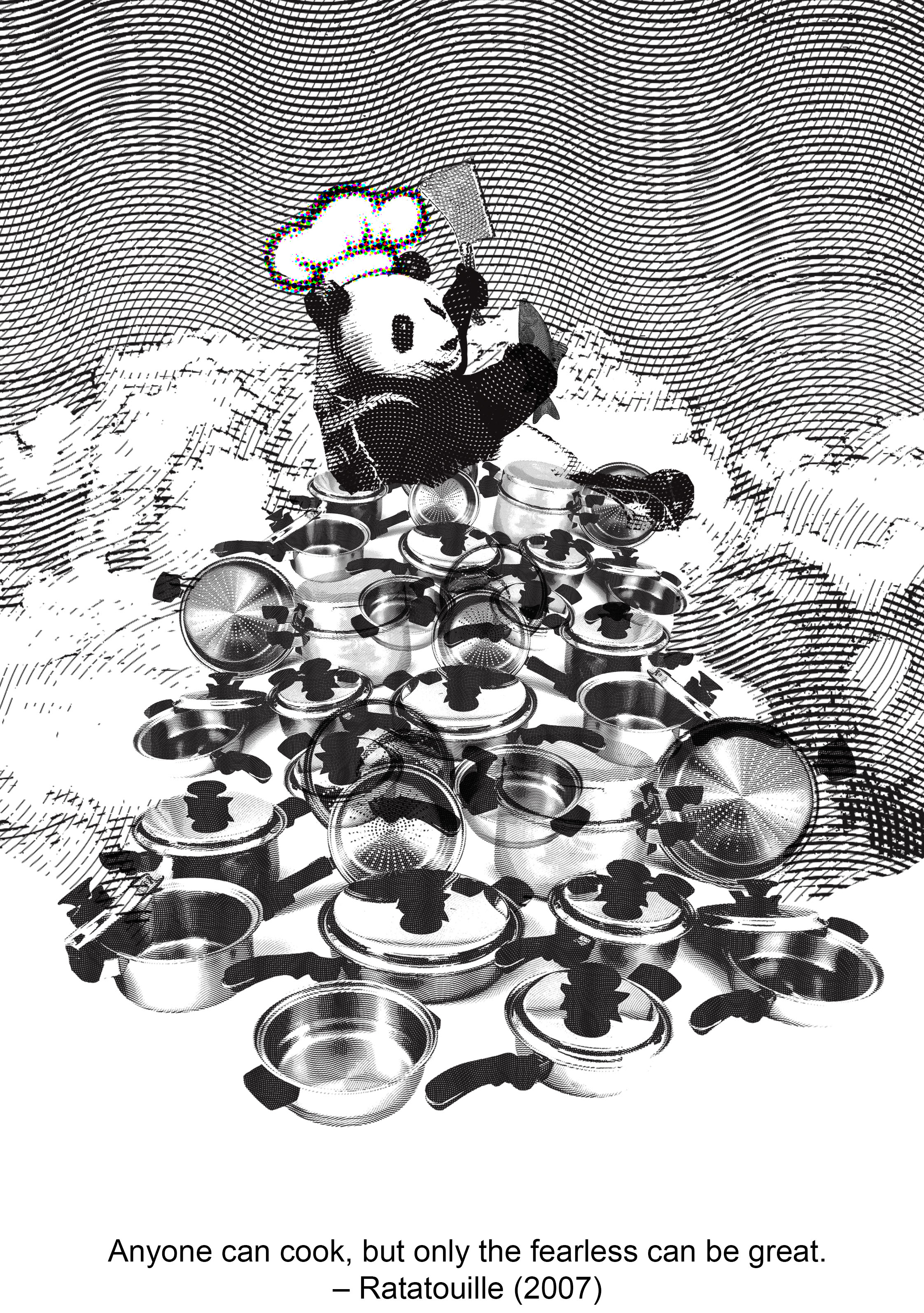
Anyone can cook but only the fearless can be great. – Ratatouille (2007)
“Anyone can cook“, means the dumbest of animals can cook! I used a panda in this composition as it is ranked the number 1 dumbest animal on some websites. “Fearless” is shown through the cloud motifs. I interpret that only the fearless would dare to reach for the skies, so the panda is in the sky. “Can be great” is shown through the stacked pots and pans. The panda is at the top of the pyramid. In this composition I attempted a more symmetrical design, with only the panda’s pose to offset the symmetry.
I applied the following principles of design: symmetry, hierarchy.
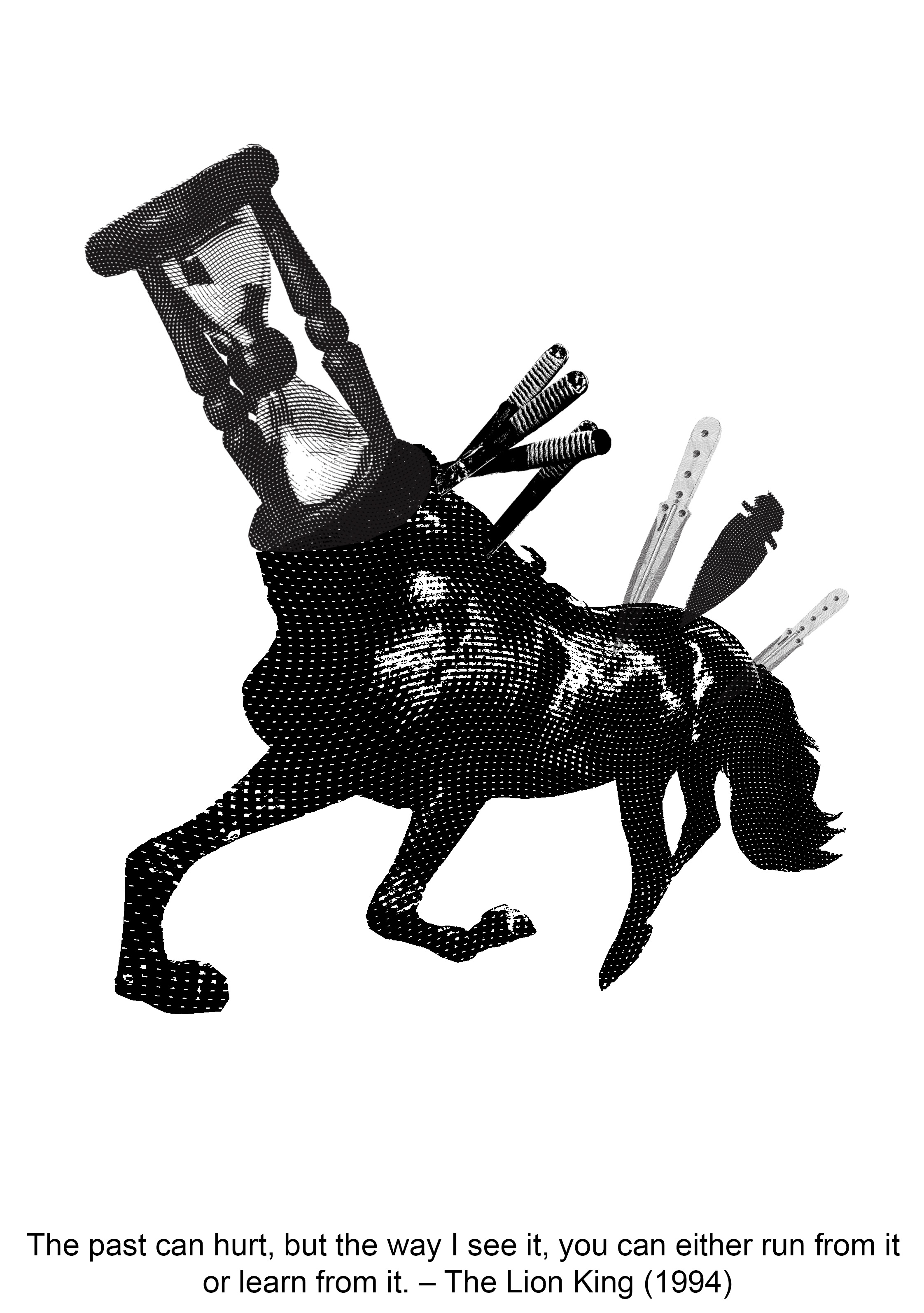
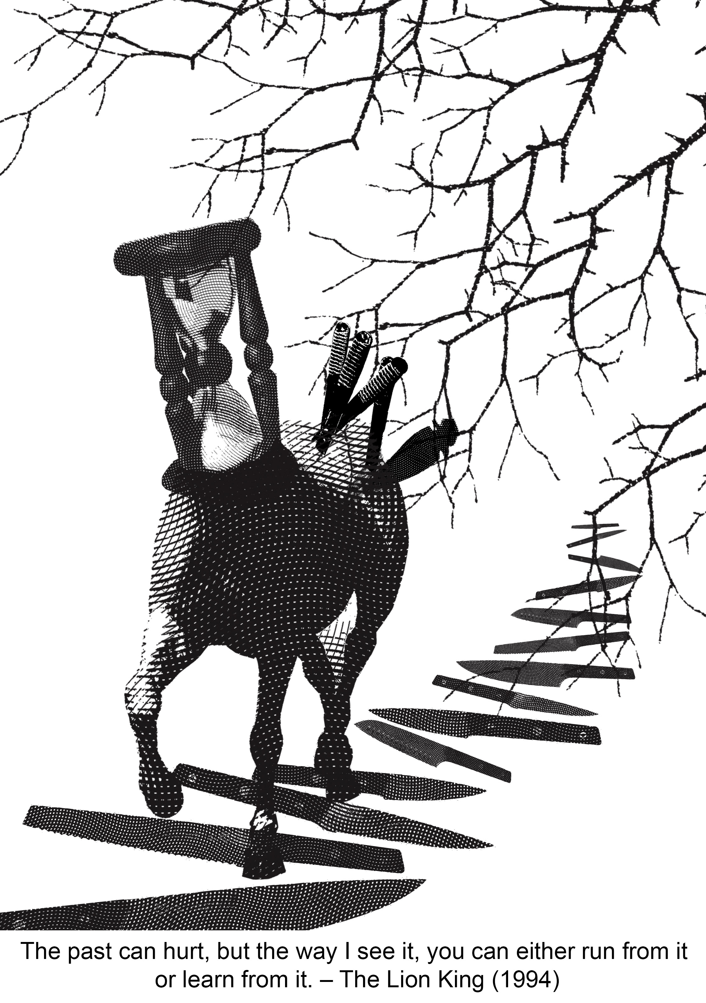
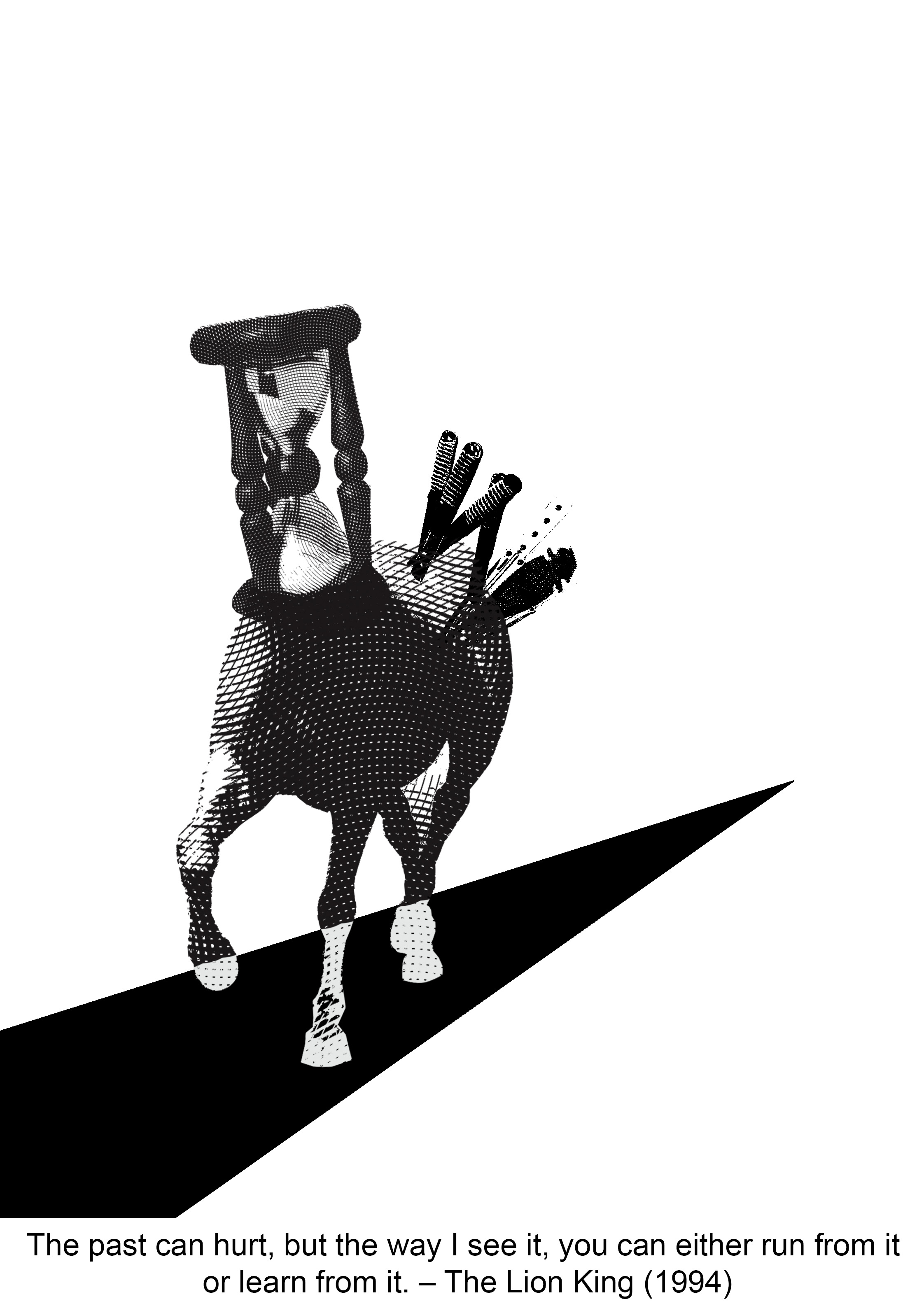
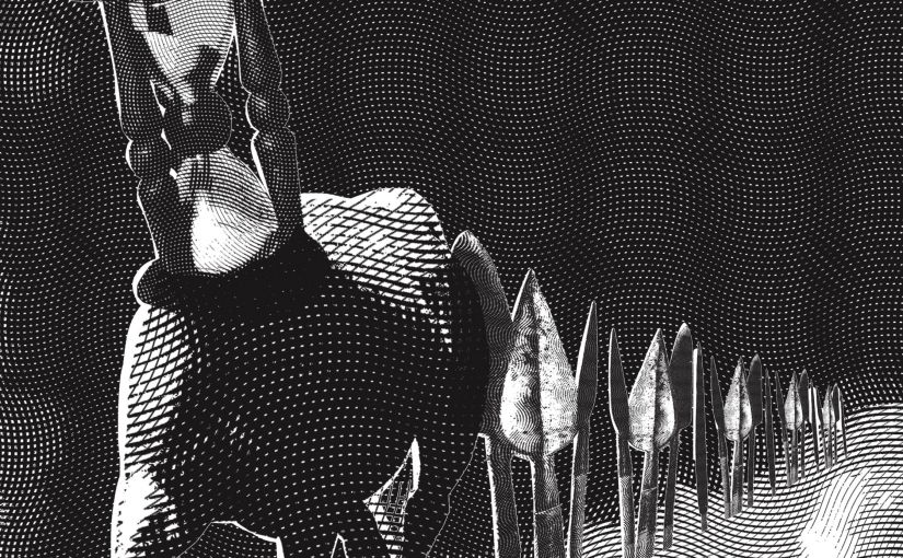
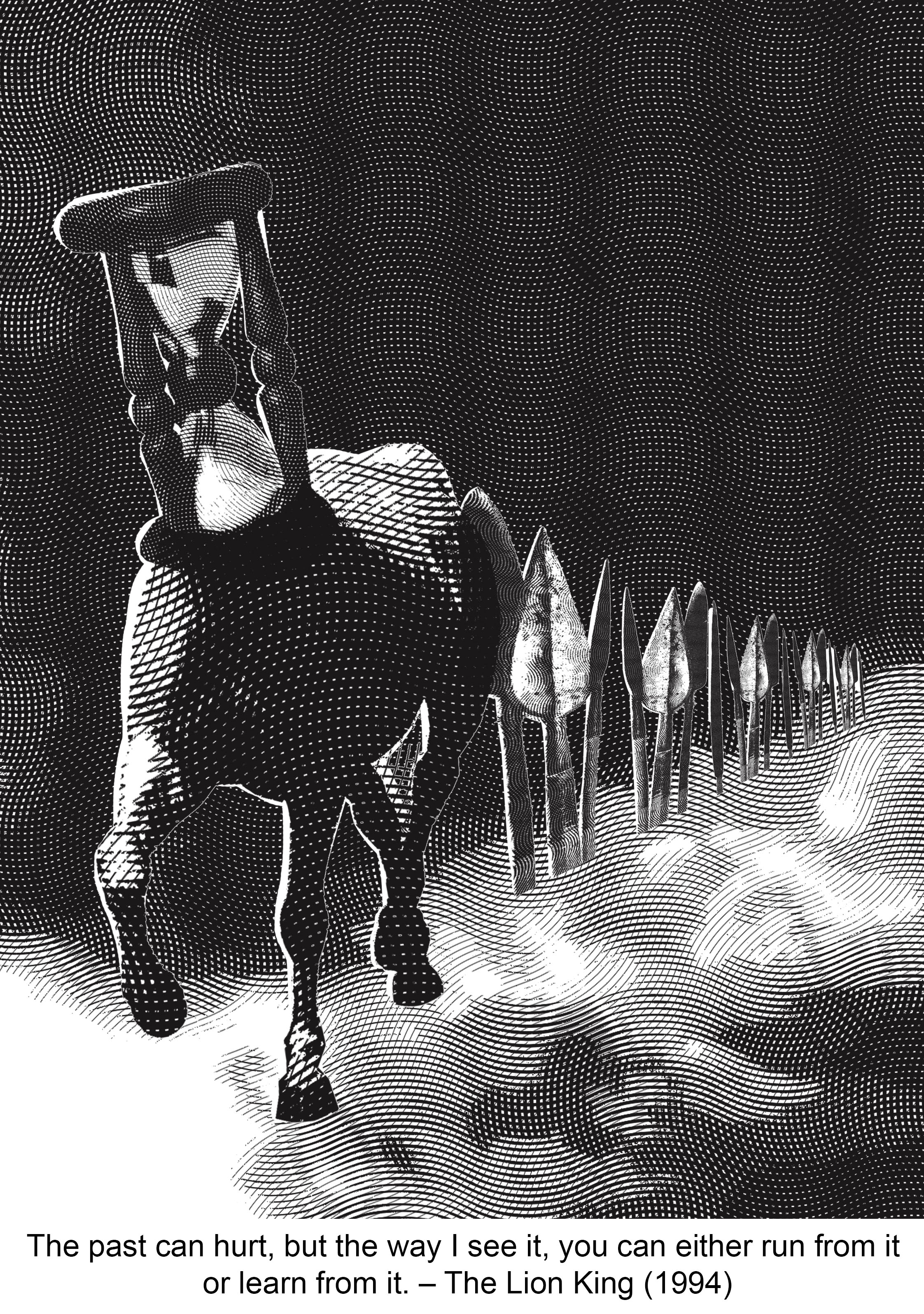
The past can hurt, but the way I see it, you can either run from it or learn from it. – The Lion King (1994)
I kept the overall look of the composition dark to portray a dark past. “Run” is shown through the horse. The spears convey “hurt“. I arranged the spears such that they lead the viewer’s eyes to the horse. It also creates a more dynamic and less static composition. This design principle also helps depict the “learn from it” part. We learn from our journeys, hence I used the pathway to signify journeys. The white smokey path further accentuates the leading lines created by the spears.
The design principles applied are: Repetition, rhythm, scale, balance.
Final Print
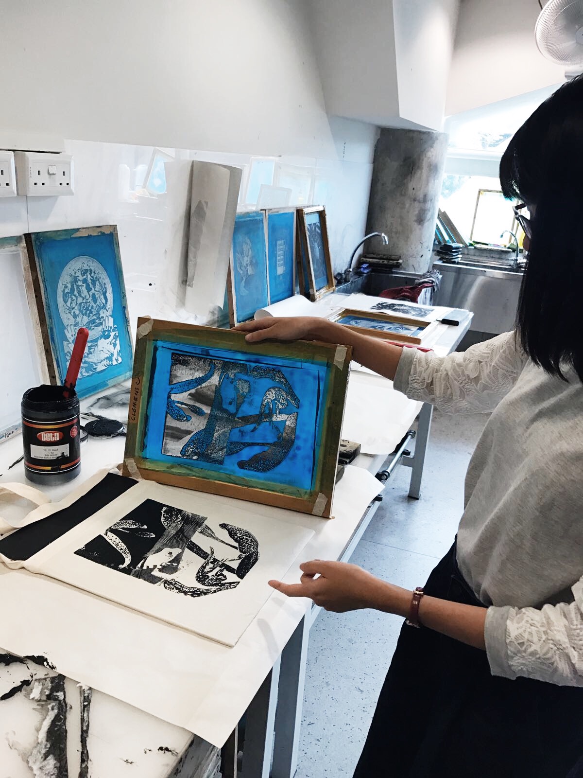
I managed to get a perfect print on my third try! The engraving showed up well so I’m glad I added that into my design.
Reflection
The most challenging part of this project was to not be literal. I think I could have done a better job in choosing the images or elements. I think some of my designs thread on the fine line of being literal. I think for future projects, I need to try to see things from another perspective. Another problem that I had was, after arriving at one composition, I have the tendency to stick to it and run out of ideas to create a completely new one. Which is probably not good as an artist.
In terms of design principles, I think I have took risks in one or two compositions by steering away from safe design principles. I focused mainly on avoiding symmetry for most of my designs. However I think I could have experimented with other design principles grouped under the gestalt theory, such as similarity and closure.
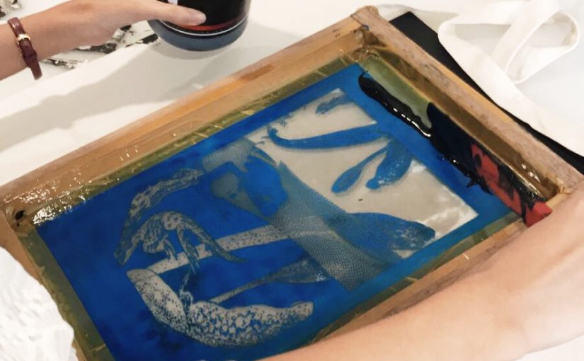
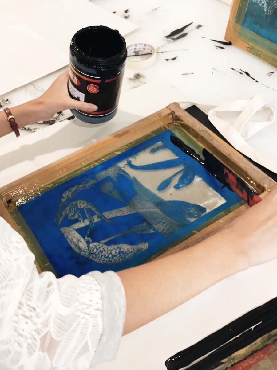
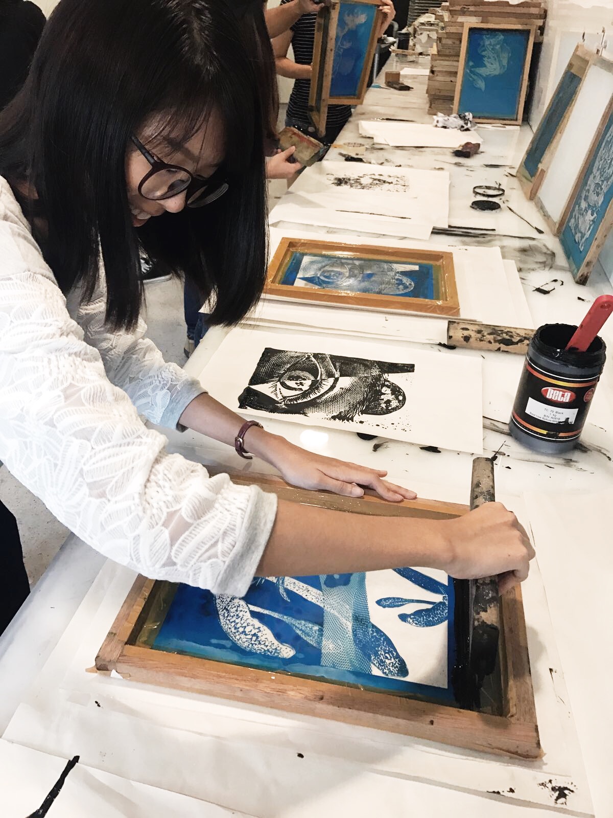
The silkscreen process overall was very good experience. It is something completely new that I had never done before, and the end result is satisfying after all the tests. I found that it helps to observe other people doing their printing. And try to mimic the actions of those successful. It was tricky adjusting the pressure exerted and motion of the hand. The amount of paint used matters too.
In the process of this project, Photoshop corrupted one of my files (ironically, while I was saving it). Though I managed to redo my work quickly, it was a reminder for me as an artist to always back up my work.
The outcome of the “class voting” was not surprising to me as I know which composition works well and which doesn’t. My classmates liked the frog and horse one the most. I think I’d need to improve more on idealization and conceptualisation more. I can start by making mind maps for my next assignment!