Mise en scène is used in this scene to warn the audience of upcoming events and inform them about hidden character traits to create suspense when Vincent goes to visit Mia in her house. Mia is the wife of Marsellus Walace.
Setting
The colour scheme of the house is mainly white — very clean and crisp. White is usually a symbol of innocence and purity. However in this case is ironic because Mia and Mr. Wallace the complete opposite (drug addict and mob boss). The juxtaposition of colour scheme and personality is interesting. Every furniture is neatly placed, the setting seems uncomfortable to be in.
Lighting
High key front lighting accentuates stark white colour scheme, which makes the character stand out.
Props
We see technological devices around their home — intercoms, video cameras — which suggest that characters in living in the house (Mia and Marsellus Wallace) are wealthy. It gives viewers a hint of their personalities and lifestyle. It can also suggest that characters have something to hide — a sign of insecurity.
Costume
Vincent is in a black suit which makes him stand out in the white environment. It suggests that he does not belong in the environment and foreshadows the fact that something bad might happen if he stays in the environment for long.
Space
Director makes use of deep space. Vincent appears very small in the large room, as if entering a lion’s den.
Staging and Acting
Vincent’s pose conveys a sense of inferiority. He is cautious and keeping to himself.
This assignment requires us to come up with interesting compositions using dingbats based on movie quotes! It seems a lot harder than it sounds.
My chosen quotes are:
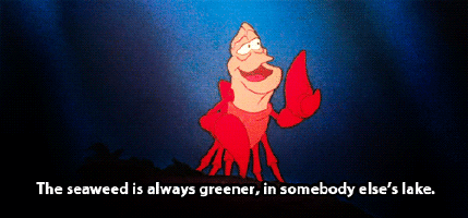
The seaweed is always greener, in somebody else’s lake. – The Little Mermaid (1989)
The key words are greener and somebody else’s. In this composition, I knew I wanted to show distinct contrast by using positive and negative space to depict “greener”. “Somebody else’s” suggests a territorial space to me. So I think I would want to create an environment in my composition. I might stick to the seaweed part, though I’ll need to be careful to not be literal.
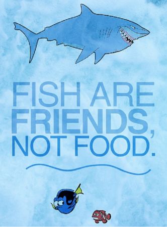
Fish are friends, not food. – Finding Nemo (2003)
Keywords are friends and not food. It is a fairly simple quote which might be difficult to make less literal. I can substitute fish for something else — another animal perhaps. I searched for animals that have fish as their diet, and then I realised there’s actually quite a few choices. Birds, sea otters, penguins, bears just to name a few. As for the food part, I thought of using sushi images because it is related to fish but not too literal in terms of visuals.
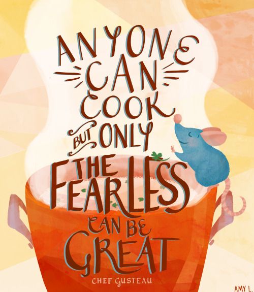
Anyone can cook but only the fearless can be great. – Ratatouille (2007)
This quote is interesting because I can easily depict this in my composition. “Only the fearless can be great” can be seen through hierarchy. So in my composition will make use of that design principle. Leading lines can depict this phrase too. Keywords are anyone and cook. To me if anyone can cook, it means the dumbest of animals can! So I researched on the dumbest animal on earth and it seems that it is the panda. So I might want to play around with a panda attempting to cook.
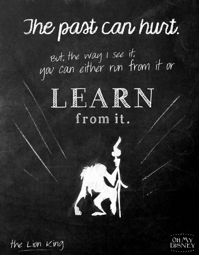
The past can hurt, but the way I see it, you can either run from it or learn from it. – The Lion King (1994)
Keywords here are past, hurt, run away, and learn. “Past” can be conveyed through items related to time like clocks and hourglasses. “Hurt” can be seen through jagged lines, or sharp objects like knives, spears, arrows etc. Wounds and bandages might be possible signifiers too. I wanted to portray “run away” through an animal because having a living thing as a subject serves for a focal point in the composition in my opinion. So I thought of horses and cheetahs. “Learn” is a tricky keyword to portray. I researched on signifiers for learning and knowledge, but they were mostly generic stuff like books and brains. Learning is a journey, so I can probably signify that using a pathway.
I also did a simple search on what silkscreen artists are producing and found one that I can learn from. Below is illustrator and screen printer, Rob Corradetti’s company Killer Acid’s piece. The composition has a balance of white, black and “grey” areas, with the grey areas being lines. There is more white areas than black areas, so that the ink will show up better I think. Plus it gives the overall composition some breathing space in the chaotic design.
Taken from http://www.peopleofprint.com/general/people-of-print-20-screen-printers-you-should-know-about/
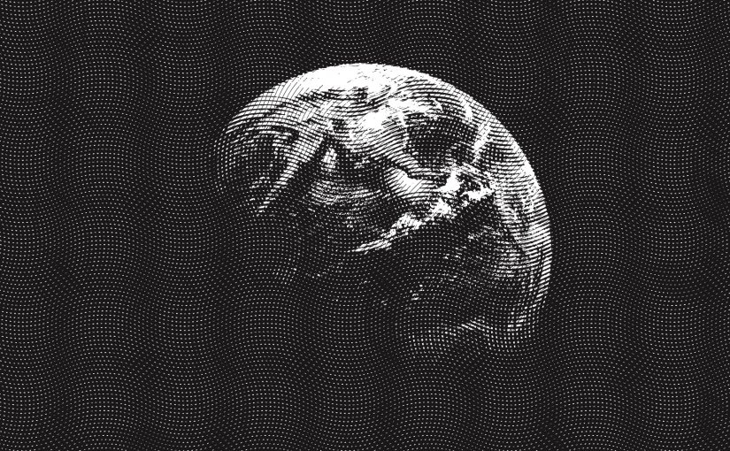
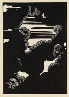
Here are two works that I can gain inspiration from. I like the composition below because of its use of negative and positive space complemented with a touch of engraving. It really draws my attention to the moon. There is balance in the entire composition as well. It’s a simple statement.
Taken from Pinterest.
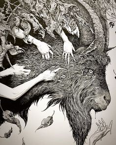
Compared to the simple image above, the illustration below is very textured. There is application of design principles involved — such as asymmetry, and there is a good balance of textures and white space.
Taken from Pinterest. The Devil Makes Six (detail), ink on Bristol, 2016. Aaron Horkey art
Compositions and silkscreen process to be documented under Process.
I looked up some of the reference artists given in the assignment brief to get some inspiration. I think analysing their photos would be a good place to start my research.
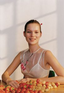
Wolfgang Tillmans Kate McQueen 1996 | https://www.pinterest.com/pin/464081936593995846/
I felt that this portrait photo by Wolfgang Tillmans tells me a lot about the lady. As a viewer, I am able to interpret what sort of person she is through the visuals. The “object” that she is interacting with are strawberries. The choice of fruit tells me that perhaps she is a sweet, nice, cheerful lady. Her clothes – a sheer flower embroidered tank with a white bra-let – tells me that she is a feminine person. Her hair up in a bun paired with the clothes gives me the impression that she may be a dancer or ballerina. The lighting of the scene also plays a part in portraying her character and personality as well. The photographer chose to shoot using natural lighting, which brings out the liveliness of the subject. The medium shot of the lady still clearly shows her expression and enough information for the viewer to interpret.
I may not be accurate in my interpretation, but it shows that what you place within your frame is important (mise en scène) and it helps with the narrative. I will try to think carefully about what object to use, and how I set up my photos for project 1.
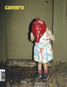
Photo by Nan Goldin | Taken from https://www.pinterest.com/pin/464081936593995936/
This photo by Nan Goldin caught my attention because of the way the photograph was staged. There are a few questions that arise when I look at this photo. Why is the girl putting on or removing the mask? Where is this place? Who is she with?
The red mask that the girl is holding is rather peculiar. The colour red also brings attention to the image. Though it is a full body shot, the way that the photo is cropped does not give much information about the environment that the girl is in. All we see is a door and the gravelled ground. The girl seems to be either putting on the mask or removing it. The lighting of the image is rather harsh, so one may assume that it is night time and there is one strong light source lighting the scene.
I think what intrigues me the most about this photo is the action of the girl, so in my photos for the project I hope that I can think of an interesting action that isn’t static and conveys emotion at the same time.
For my object, I intend to use the aesthetic of those photos found in kinfolk magazine. The colours are earthy and muted with simple backgrounds.
Taken from https://www.racked.com/2016/3/14/11173148/kinfolk-lifestyle-magazines
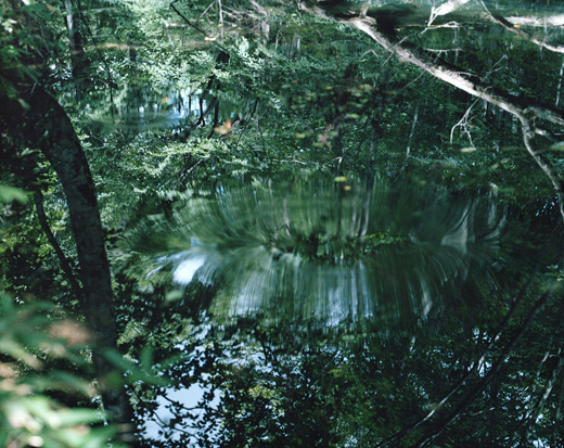
A photographer’s work that I am going to use as reference for my environment photos is Risaku Suzuki. She is a nature photographer, and I intend to take nature related photos so I can use her works as reference when I edit my photos. What catches my attention about her photos is the colours that she uses. The colours in her photos are very calming and easy to view. Greenery is often very difficult to make them look appealing in my opinion, but she is successful in capturing the serenity and class of the colour. Her photos often capture repetitive textures very well, and she is able to compose her shot in such a way that the focal point isn’t very obvious, and the viewer studies the photo on their own to discover the magic within the photo. What is interesting about the photo below is definitely the reflect of the water that is cleverly camouflaged by the surrounding vegetation.
Photo by Risaku Suzuki | Taken from http://www.risakusuzuki.com/
Process
Task 1: Object and representation of self
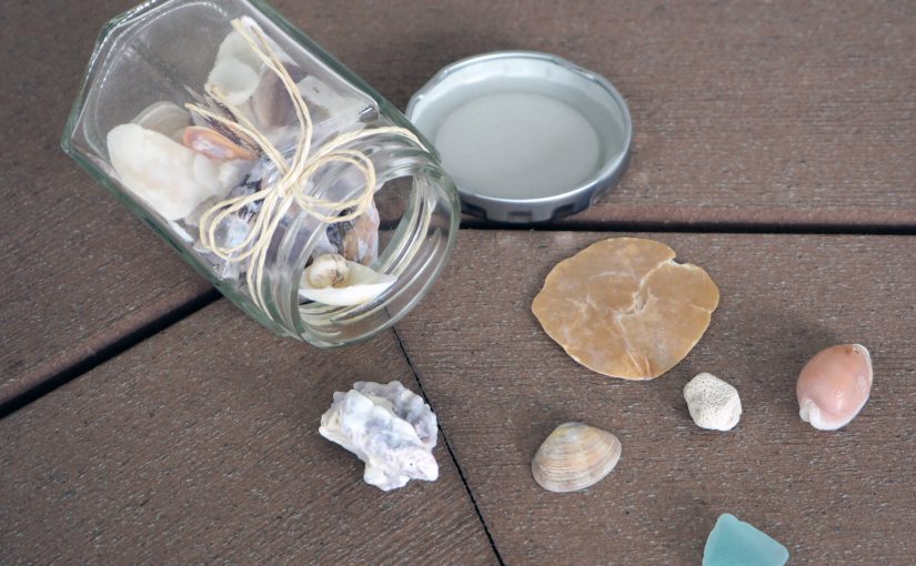
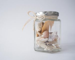
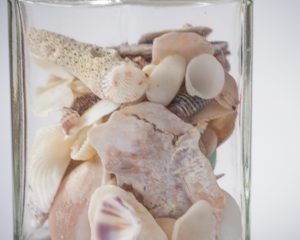
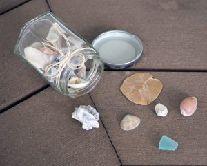
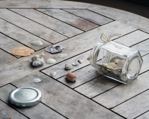
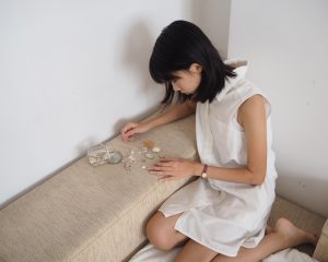
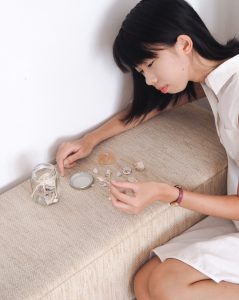
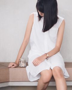
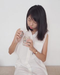
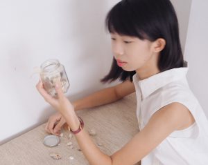
For this task, I knew I wanted to try to tell a story through the photographs. The object I chose was a jar of sea shells that I picked from visits to the beach over the past few years. This particular jar holds memories that I have with my class from polytechnic. Beach outings were always with them. Transitioning into university away from the people that I get along very well with is hard. I guess I am someone who revisits the past very often (I catch myself rereading journal entries, looking at old photographs etc). Shells symbolise emotions, memories and friendship, which are important in my life.
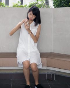
I thought a lot about mise en scene. I opted to go for a very clean look to match the look of the jar. Browns, beiges and earthy tones. I chose to wear a white dress because it symbolises purity and innocence – characteristics that can often be associated with reminiscing nice memories.
I purposely wore my watch, because it symbolises the passing of time. My only prop was my main prop with was the jar of shells because it is very tiny, and it could get lost in a cluttered, colourful background. In addition to that, colours didn’t really go with what I had in mind, because the memories to me are bittersweet and almost faded?
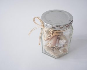
Started off with close up images of the object in a neutral background. I just used white paper since it is in line with what I had in mind for the other shots. I experimented on non-white backgrounds too. I think they all work, depending on which photos I want to choose for my final submission, and in which order I want the photos to be.
I chose to work with a aspect ratio of 4:5 for a tighter crop. I didn’t need so much negative space in my photos. All photos are taken by me using the help of a tripod.
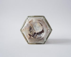
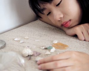
Full figure shots I find didn’t work for me at all, so I sort of gave up shooting that early on in the project. My jar was simply too small for a full figure shot. Furthermore given its material of glass which refracts light and the shells being white, you couldn’t tell what was in the jar at all. I felt that that wasn’t effective. I did improvise, and tried to shoot myself sitting down, full figure, but crouching to fit myself in the frame so that the jar can appear bigger in the frame.
One of the failed shots.For “full figure” shots, I generally tried to make myself smaller so that the jar can appear bigger in frame. This is a photo I don’t intend to present.I experimented with cropping.I tried this weird crop by cropping the head and legs off but I’m not sure what to think about it.
Mid range shots and close-up shots ended up being more effective in presenting my narrative. Though I’m not a good model and emotions don’t seem to be clear, these shots are more personal overall, and I think the viewer will feel more connected to them as opposed to wide shots. I generally have high angle shots to convey vulnerability, or else they are pretty flat to keep the simplicity.
Medium – Long shotMedium shot from a slightly high angle. The blur destroys the image in this case. Plus the emotion is not there.Close up shot that I don’t intend to use. Composition and framing is weak compared what I intend to use for my final submission.It was difficult to shoot yourself for close up shots, I ended up being out of frame for a lot of shots.Still not satisfied with lighting and all. Framing is weird here.
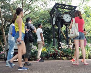
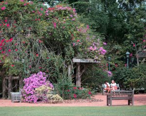
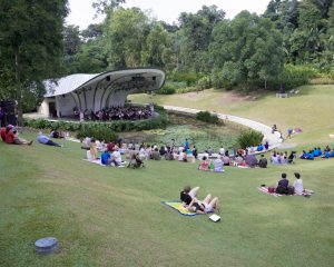
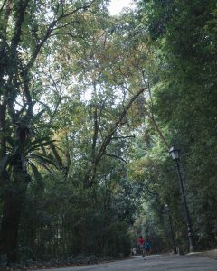
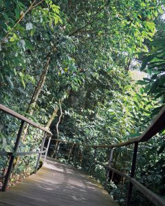
Task 2: My World
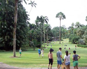
Walking around Botanic Gardens, I tried to take photos of the place in general, though it was tempting to to take close up shots of flowers there. Below are photos that I won’t be including for my final submission. I’ve included the reasons why I didn’t like each photo / why they don’t work in the captions. The reasoning behind the chosen photos for submission and my connection with the place further elaborated in the write up of the final submission post.
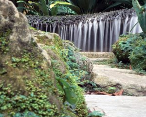
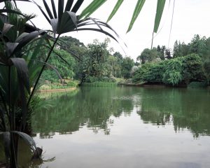
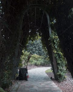
One of the low angle shots that I attempted. I think I was trying to capture the tourists/people visiting since it is a heritage site, but I didn’t like the way it turned out.This photo turned out very flat and I didn’t like the cluttered overall look. Too much texture makes the photo very hard to look at.I initially thought that this looks interesting and conveys the peacefulness of Botanic Gardens very well. But after looking at it for a while, the subject which is the waterfall isn’t exactly very exciting. It formed this almost parallel line to the edge of the photo which I didn’t like.Tried to capture the vastness of the place in this one by trying to get on higher ground, but it’s not dynamic enough. I would have liked a higher angle but it is difficult without a drone or tall building to take from. Pity that the sky is white that day too.This one has a foreground, mid ground and background which I like. But there isn’t a point of interest per se.Experimenting with framing.I wanted this shot to be more high angle but that was the highest that I could get.Trying out a more dynamic low angle by tilting the camera!Another dynamic camera angle but no subject interest.
Before experimenting and trying out mark making in class next week, I thought I’d go do more research on it so that I am aware of the possibilities of this form of art.
Mark making is used to describe lines, patterns and textures on any surface of our art piece. I suppose any form of mark – be it a dot, scratch or smudge – is deemed mark making. It is interesting that although a mark on its own may be insignificant, a series of markings may mean something. It is able to express emotion, be conceptual or symbolic.
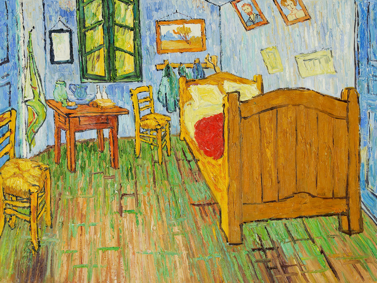
I found an article on thoughtco.com about how marks are used in paintings which I thought was interesting and not exactly what people think about. I learnt that the different styles of artists can originate from a simple mark. For instance, the example given by the website is Vincent Van Gogh’s “Starry Night” (1889) and “The Bedroom: (1889). The paintings are completely different. Different themes, different colours. However it is still recognisable as Van Gogh’s work because of the distinct layers of strokes that he uses. Another painter with distinct strokes or marks that I already know of is Claude Monet.
Link to the website: https://www.thoughtco.com/how-does-mark-making-affect-your-paintings-2577630
Van Gogh, Starry Night (1889) | Taken from http://www.huffingtonpost.com/paul-dalio/starry-nights-from-the-film-touched-with-fire_b_9227378.htmlVan Gogh, The Bedroom | Taken from http://www.jackygallery.com/index.php?main_page=product_info&products_id=498
Mark making is closely related to automatism (or automatic drawing) and mono printing. Automatic drawing is drawing without thinking, and avoiding conscious control of your actions. Here are the types of techniques categorised under automatism (and my own explanations/definitions to refer back to):
Frottage – brass rubbing
Decalcomania – method similar to the ink blot test
Torn Paper Collage – torn paper randomly dropped onto canvas and then glued
Grattage – scraping wet / dry paint on canvas using a scraping tool
Sand Painting
Froissage – soaking a crumpled piece of paper in ink, creating a veined effect
Coulage – pouring molten metal materials into water to solidify into shapes
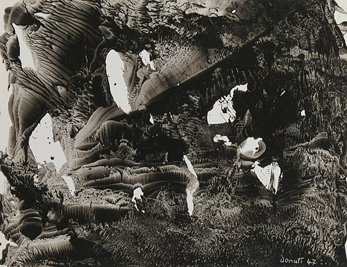
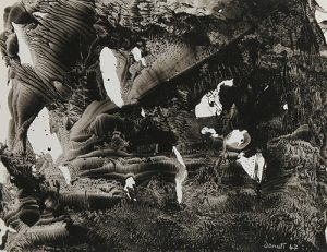
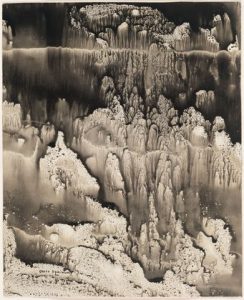
There is an artist that creates interesting, mystical images using the decalcomania technique. Oscar Dominguez primarily uses black gouache on canvas. He spreads the gouache thinly on a sheet of paper before pressing it to his canvas. Despite the lack of colours, the images created are fantasy like and show some sort of narrative. There are various textures on the canvas which bring attention to his work.
Oscar Dominguez, Decalcomania | Taken from https://decalcomaniaproject.wordpress.com/decalcomanias/art-2/Oscar Dominguez, Decalcomania | Taken from https://www.pinterest.com/pin/134756213822517034/
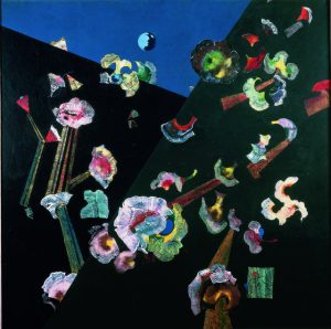
A piece of work that is done using the frottage and grattage technique that I really like is Snow Flowers by Max Ernst (1929). Though he uses colours for this piece, I can observe that the scraped white paint on the black canvas gives a very interesting effect, something that I may want to try for my own project. Depending on the tool used for scraping, I think it will give different results every time which would be fun for experimenting.
Snow Flowers by Max Ernst (1929) | Taken from https://www.artsy.net/artwork/max-ernst-fleurs-de-neige-snow-flowers
André-Pierre Arnal is an artist that uses the froissage technique. It reminds me of tie-dye. What is interesting about the froissage technique is that you do not necessarily need any other tool other than your “canvas” to produce the patterns and textures. It shows that choosing the right canvas for your work makes a difference in the final outcome of the art piece. Combining the froissage method with decalcomania and frottage / grattage might produce more interesting textures in my opinion.
André-Pierre Arnal, Froissage | Taken from https://www.ceyssonbenetiere.com/en-exhibition-Andre-Pierre-Arnal-2015-luxembourg-1011.htmlAndré-Pierre Arnal, Froissage | Taken from https://www.wikiart.org/en/andre-pierre-arnal/froissage
Mono printing is similar to stamping. The following are the techniques:
Printing from glass
Printing from acetate
Overprinting
Linear drawing – paper placed over rolled out ink on a glass slab, use pencil to go over it
Developing textures – making blobs onto paper directly from the paint tube
I found artists that found their own method of making mono prints! Mitch Lyonsdyes wet clay with paint, scrapes of some layers off of it and then lays his canvas on top of it to create prints.
Mitch Lyons, Clay Mono print | Taken from https://www.pinterest.com/pin/477944579175418370/
Martha Castillow is another such artist that does clay mono prints. I never thought of printing this way before. It is unlikely that I am able to do something like that in a few weeks for my assignment, but I can definitely gain some inspiration from their technique.
Martha Castillow, Clay Mono Print | Taken from https://www.pinterest.com/pin/277745501997329908/
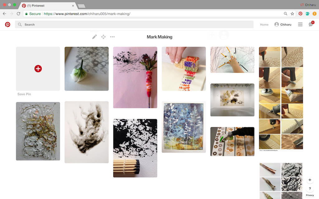
I also went on to Pinterest to gain ideas on what I can use for my mark making assignment. I created a mini board for some of my favourite images.
Looking through Pinterest, I see that marks created by organic items seem the most interesting, though marks created by hard surface objects can look interesting too depending on how you use them. Binding stuff together to make your own brushes seem to be popular.
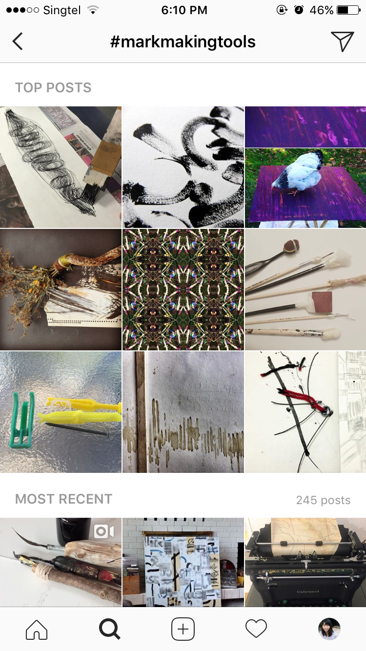
I turned to Instagram next to see what ordinary artists / people like us are using for mark making. It does not seem to be a popular form of art on Instagram, but I found some images that I can gain inspiration from.
A number of people liked to stick materials to the ends of sticks / brushes to make their own custom brush, while a handful of people liked to use branches, twigs and leaves for their prints.
I really like this image above, because this artist used a variety of organic and inorganic materials. The patterns produced are definitely of interest.
After scrolling and looking at more work, I have some ideas for my tools but I’m still looking for an “aha!” material. Something that is different and fun. I am going to bring organic and inorganic items to experiment during class time.
Other than the materials used, the techniques used can also make interesting marks. I am inspired by the Torn Paper Collage method and intend to experiment with broken CD parts instead of paper. Combining materials is also something that I’d like to try.