Final Assignment Submission

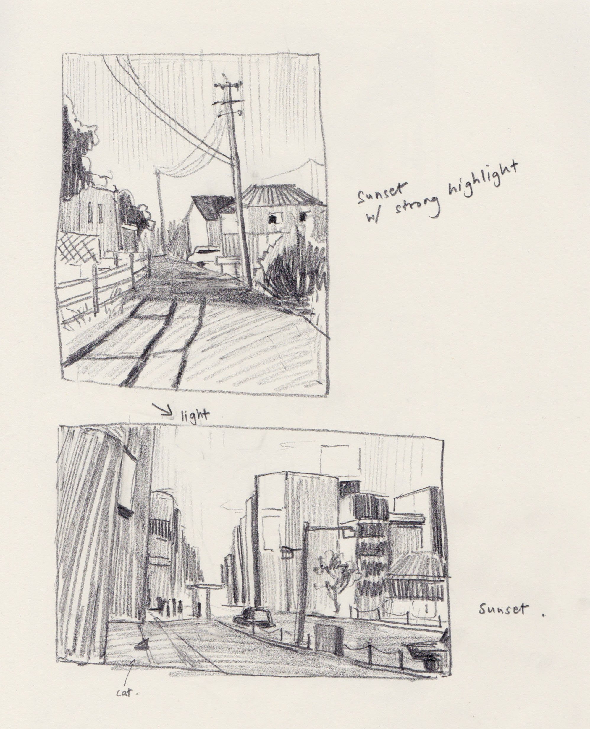
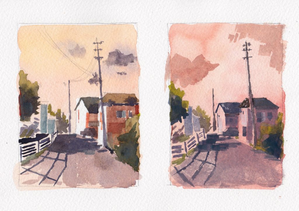
Topic 1: Depict certain weather or atmospheric condition

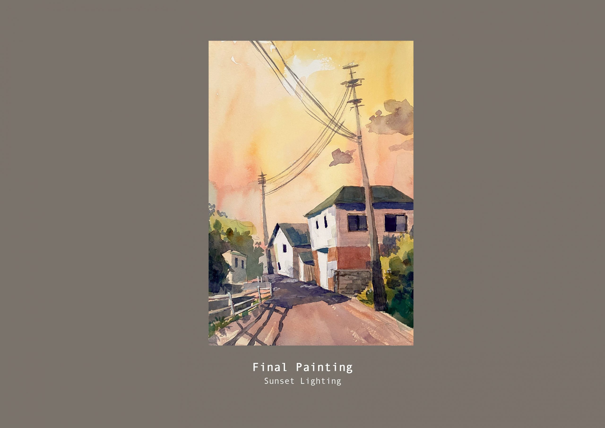
I reworked the perspective of the houses to be a bit more wonky to give it character. I think the overall colour harmony could have been better, I was trying to be a bit more spontaneous while referring to my colour tests but I think the colours of the houses can be less muddy looking.

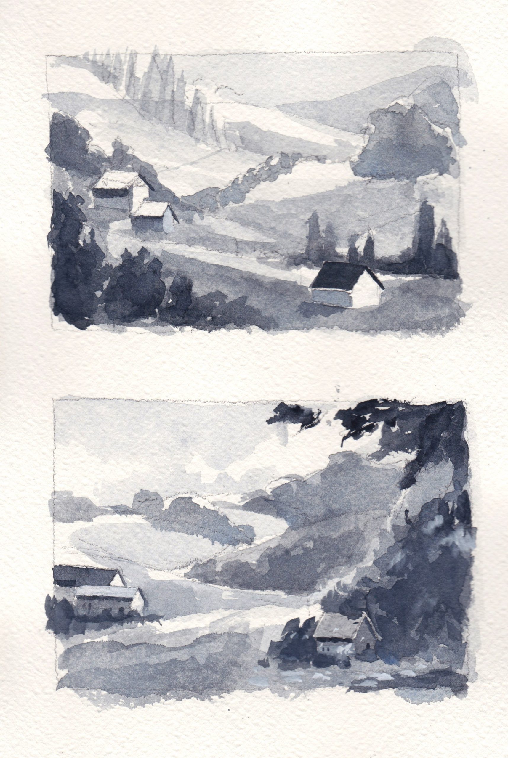
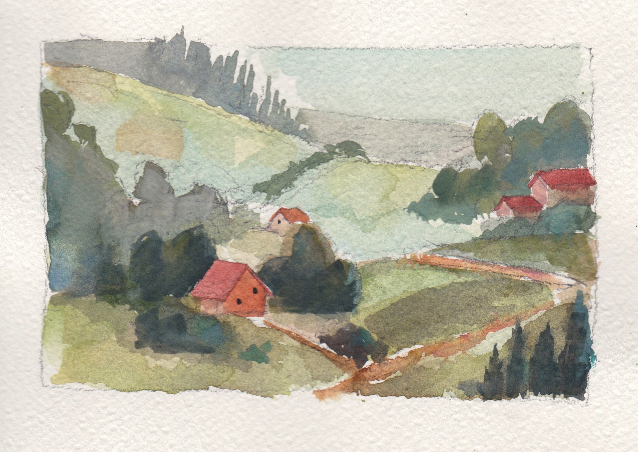
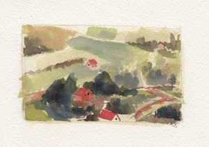
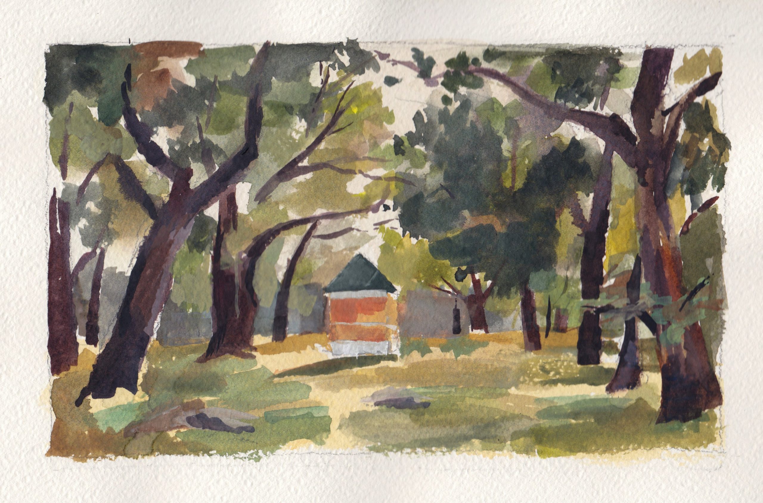
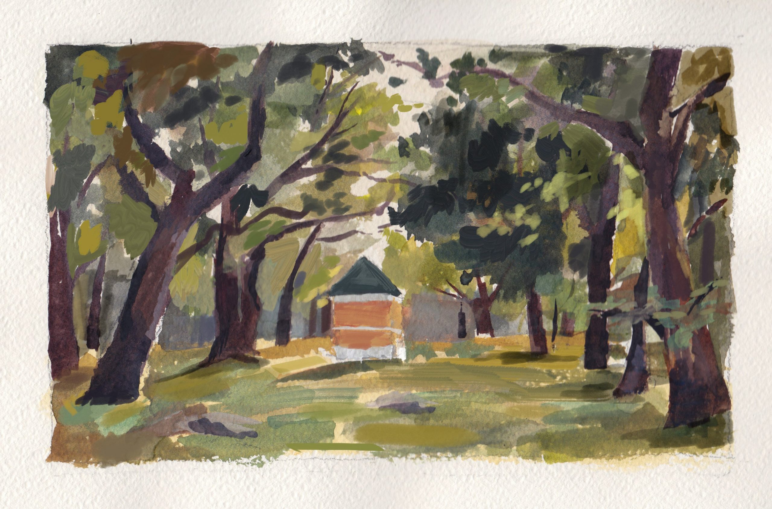
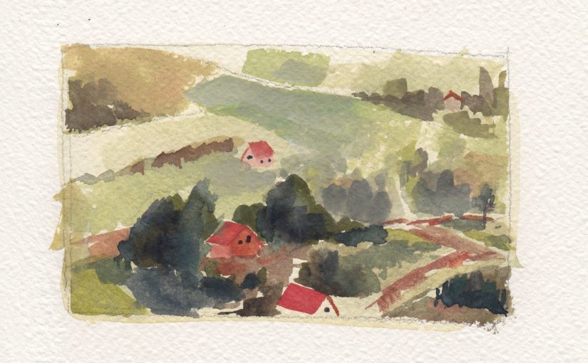
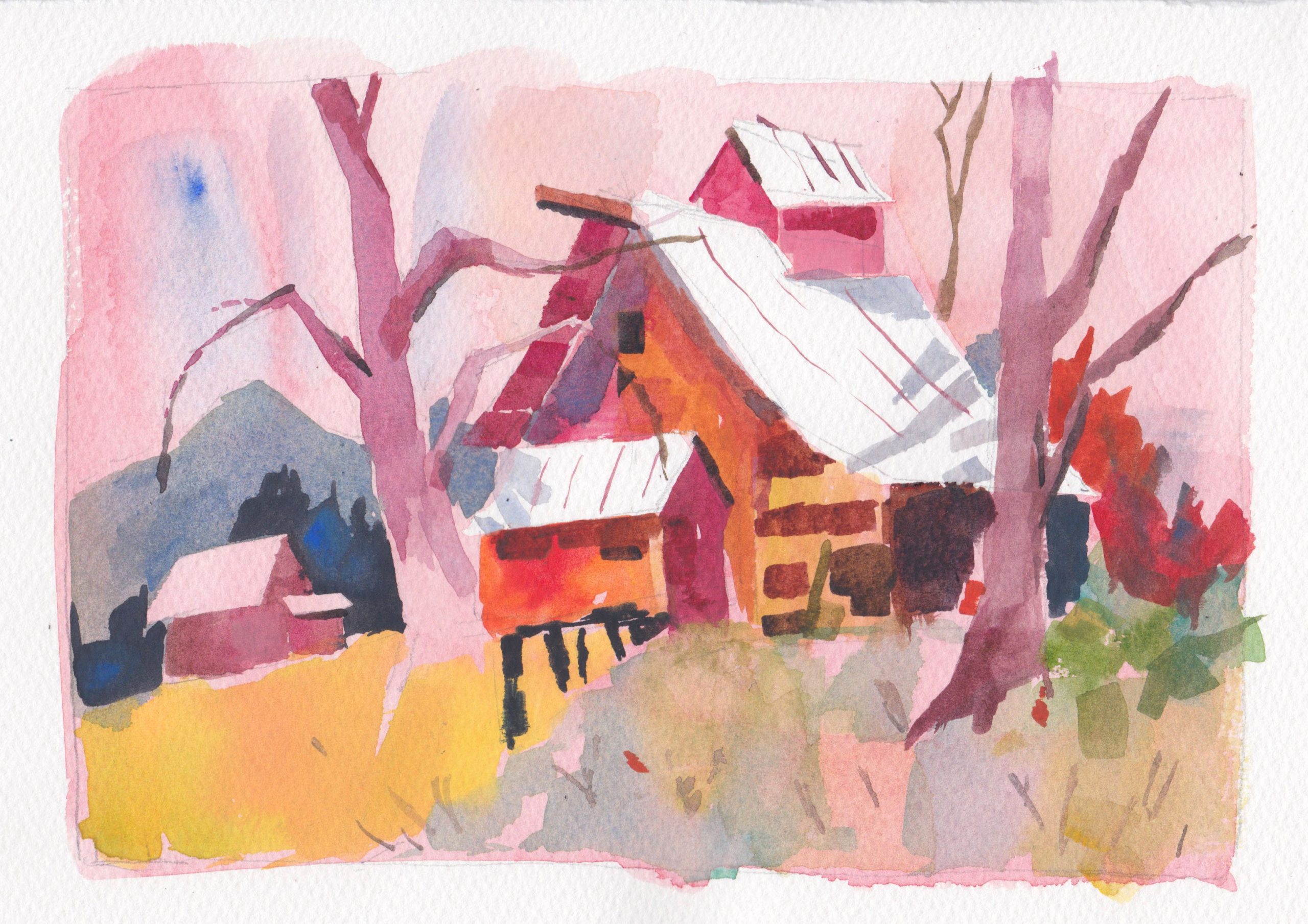
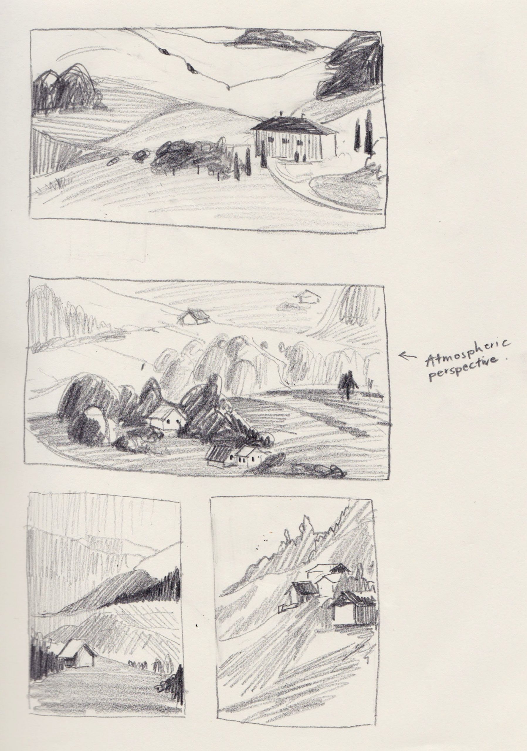
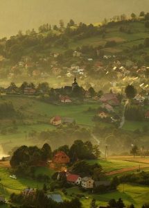
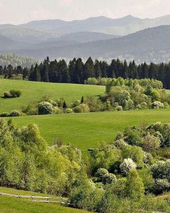
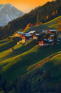
Topic 2: Landscape painting

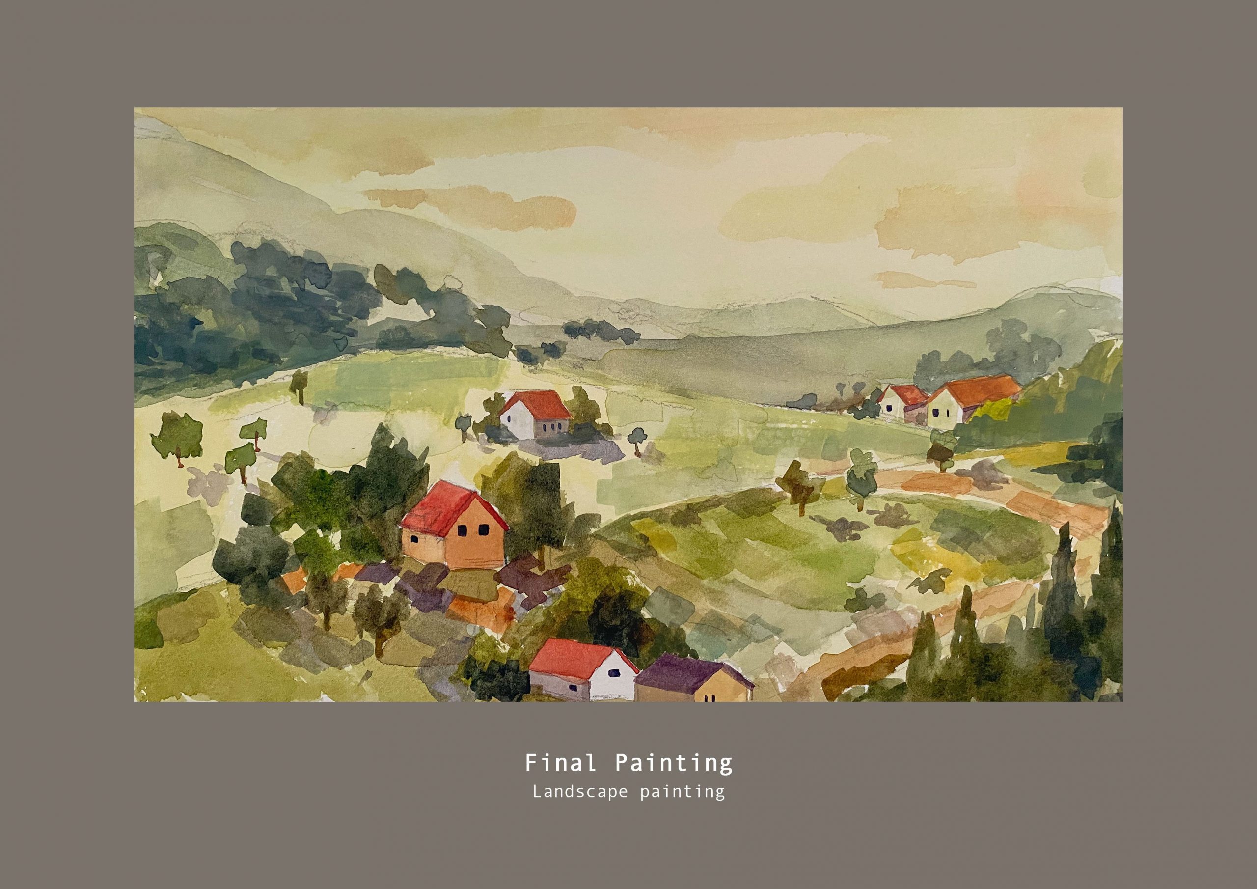
For this landscape painting I tried to focus more on achieving a range of warm greens and yellows with red/orange as the accent colour. I tried my best to redesign the angles of the slopes to have more variation after receiving feedback that the shape design was a bit repetitive. I also took note of the amount of detail I add so that I don’t overwhelm the viewer. Overall I am pleased with how this turned out.

I’ve compiled all of my works into a pdf for submission:

https://entuedu-my.sharepoint.com/:b:/g/personal/clim101_e_ntu_edu_sg/ES3h02Zvf49OjIU5MqiJRzUBwSQuQCfWd7CgUZF2TfAORQ?e=t2qYkO


Final Assignment – Process Part 2

Landscape painting

This is my progress for the landscape painting topic  as I only just started working on it in my previous post. Did some value paintings to further explore possible compositions.


But I still prefer what I posted previously in terms of composition, so for my colour test I tried to incorporate what I liked from these compositions. This colour test one has more blue – cyan tint and has a cool tone compared to the previous colour test that I did. I think the previous test worked better in terms of colour harmony. I also feel that there can be a greater jump in values for the atmospheric perspective as now it looks very cluttered.


Comparison to previous colour test:


I also did a rough master study of Ivan Shishkin’s work to practice colour mixng. After working on it I realised how many layers he needed to paint over in order to achieve the density and richness and I was unable to replicate it in my quick study.


I further refined it digitally because I layered too much in some areas and couldn’t get the lighter colours to show.

Overall I think I got the shades of green slightly off as the original had more of a yellowish warmness to them.

It was still a much needed painting practice. 🙂

Will work on the final pieces after this!

Link to previous post: https://oss.adm.ntu.edu.sg/clim101/final-assignment-process-part-1/

Final Assignment – Process Part 1

Chosen topics:

  1. Depict certain weather condition or atmospheric condition
  2. A Landscape or Cityscape
Weather condition / Atmospheric condition

Thumbnail Sketches

Still deciding on subject matter but most likely urban with some buildings.

Master Studies

I want to try painting buildings with evening lighting. I did some master studies of Alvaro Castagnet and Frank Webb’s work. I think the main issue was that I was too scared to go in with more pigment and tend to dilute a lot of the colours with water, which fades after drying. And also because of the that the value structure is slightly off too after drying.

Colour planning

Have yet to decide on the composition but here are some colour variations that I tried out using one of my thumbnails. I tried to use Frank Webb’s approach of tinting the paper first but I think I layered too much for the colours to show through and also the base colours were weak to begin with.

Landscape painting

Thumbnail Sketches

Colour test

Only did one colour test so far, still figuring out composition and the mood that I want. Here I attempted atmospheric perspective with milky greens for the background.  I think there needs to be a greater jump in values for the atmospheric perspective to work. Have yet to do master studies.

References

Mainly for their composition.


Week 9 – Interior Space