

WEEK 4 – Expressive Words, Opposing Pairs
 WEEK 5 – Haiku

WEEK 6- Play Nice
WEEK 7 -Type as Pattern
WEEK 9 – Menu Text Indesign
WEEK 10 – Drop Caps


FIND ROME (The Point)
All roads lead to Rome (The Point).
All design should have a point.
Art movements have a habit of subverting their predecessors
They also tend to question and ask “Why is this Rome (The Point)?”.
Is your design purposeful? Why must it be purposeful?
Can design be mass produced? Can it NOT be mass produced?
Why is this Rome (The Point)? Why can’t Rome (The Point) be this?
Interesting well worn roads that have all led to Rome (The Point).
Thus the true question every designer should ask is “What is Rome (The Point)?”
Design is finding new applications and expressions of one’s unique perception of life.
Design is learning how they made it to roam and slowly chipping away at your own road to Rome (The Point)
My point is that the point of design is to point people to the point of perspective, point of emotion and point of experience that is unique to only you. And the whole of the work should cumulate coalesce into that point: Rome.
Because all roads lead The Point.
And all designs should lead to you.
What i think of design: I think design is something that is taken for granted a lot. It makes the world a whole lot nicer to look at that we tend to forget the thought that goes behind making it so. However, I think design now has to be churned out at increasing amounts as the world becomes more and more visual and I think sometimes the purpose of design tends to get lost within all the desire for aesthetics or vibes and original and fresh designs are getting harder and harder to achieve.
What design styles appeal to you the most: Surrealism, DADA, post-modernism. I like designs that question, that leaves people questioning. There’s a saying that art should “comfort the disturbed and disturb the comfortable”. I’ve never felt it more truly than in these three styles. I think they express the rawer side of humanity that cannot be seen as clearly in more purposeful art movements and styles like Bauhaus and Art Deco.
What do you think design should be: I think design should have a purpose and concept. While I do not think it’s necessary for it to be invisible as argued by Beatrice Warde, I do not think that they should have a certain look or style simply for aesthetics. I think the design decisions should come from a more visceral part within that is directly linked to how we view and perceive the world. Sometimes that calls for a brilliant neon sign with glitter and sparkles and sometimes less is more and the understated makes a bigger impact.
What defines good design for me: Hierarchy. Sounds boring I know. But I think the best design has a clear focus and a point. And its cohesive point from any angle should eventually coalesce at that point.
What makes me happy about design: It’s a chance to express an experience, an emotion or a perception in ways that would have been intangible in any other form.
Professional ethics: I think my one rule is just that I have to be happy with what I churn out, and what I come up with has to be me and a part of me. Not a Frankenstein creation of everyone’s opinions and feedback in an attempt to please everyone. It’s hard to follow this rule all the time since showing “me” means giving “me” up for judgement.
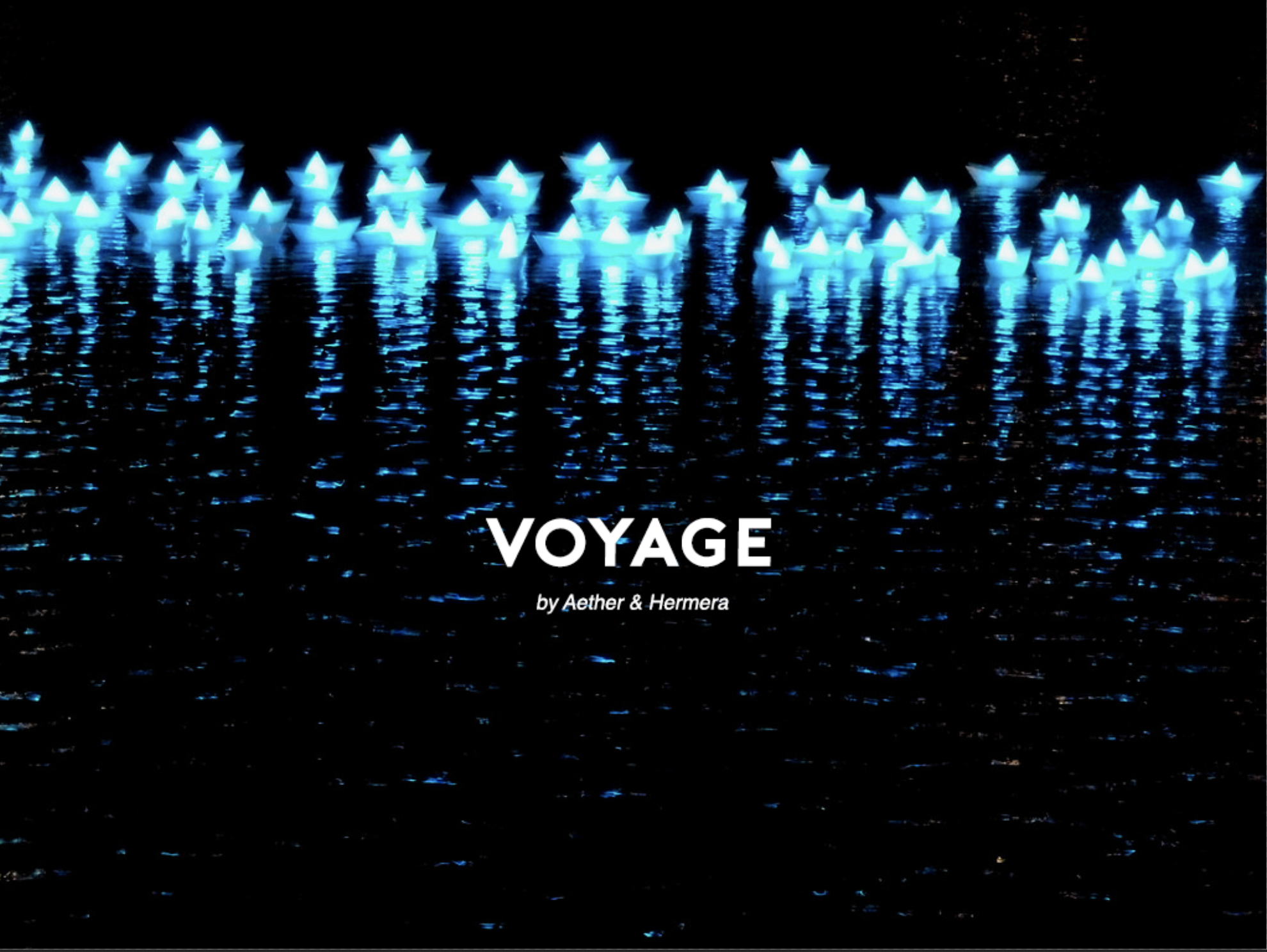
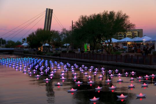
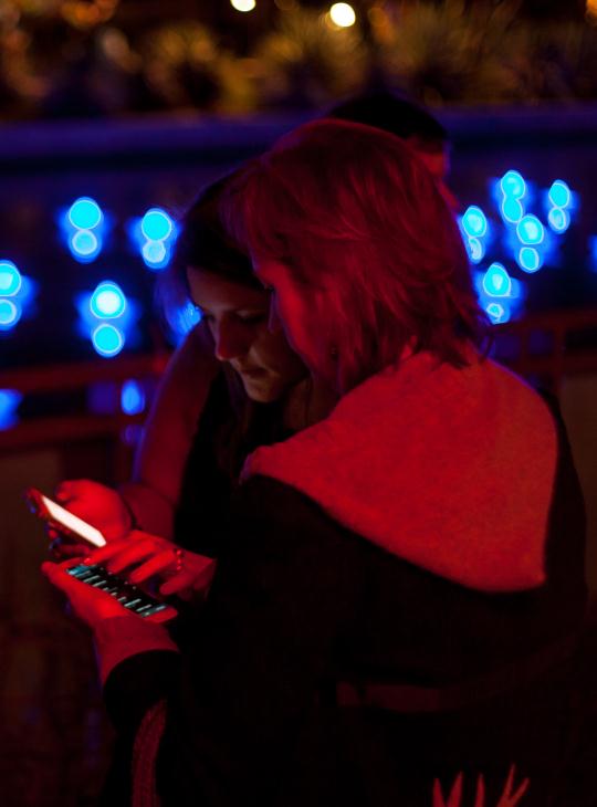
Voyage is an installation art piece that consists of a flotilla of colour changing origami “paper” boats arranged on the water surface with wires connected to the waterbed so that they are able to float in a consistent pattern across any water body. Each boat is illuminated by coloured LED lights that can be controlled via a wifi network. Passersby can simply connect to network and are able to control a boat within the 300 strong fleet creating attractive patterns and colours.
This piece was made by Aether & Hemera, a multidisciplinary art and design studio founded by Gloria Ronchi and Claudio Benghi. Ronchi has a mixed background in Science and Fine Arts and is an established light artist while Benghi is a Architect, specialising in media architecture.
Their combined artistic vision is to “provoke memories, explore aesthetic interactions and elicit feelings of connective human experiences in a required-to-participare audience.
The etymon of the word ‘voyage’ comes from Latin ‘viāticum’ which means ‘ provision for travelling’. The aim of this piece was to allow viewers to travel and sail with absolute freedom to all the places they care to imagine. The use of the nostalgic imagery of paper boats invites the transition from reality to imagination, reliving childhood memories and blurring the lines between real and hyperreal.

Personally, I felt that the impression and the feelings this piece elicited was similar to that of watching the lights on the buildings in the distance while on a high rise. Each light represents someone else life, and from the distance and the scale of everything around, everyone looks small but they do change something in the landscape.
With this piece, the ability to control one boat in the entire fleet is not much, but the choice of colour that someone passing by chooses does affect the entire look as a whole. And with each of the different choices made at once, the fleet will never look exactly the same as in that one moment. The ability to choose a colour as well as the random selection of which boat a person in the network is given is a chance technique that avoids the habitual tendencies of humans. This hands over the control of the piece and it’s outcome from the artists to the viewers thus demonstrating the idea of indeterminacy by creating indeterminate connections between the phones and the piece.
In that way, I felt that Voyage is extremely successful as an interactive piece. In class we talked about the the connectivity of a cybernated society, where a work of art can become dynamic and always changing due to the restless unending nature of of data that is flowing through our screens and devices. By using a wireless network, this art installation has opened itself to a array of data and choices that would affect the piece, limited only by the range in which the wifi network can spread. Also, with the piece being movable, it has already travelled to several countries such as the US, Spain, Australia, the UK and France. As the artwork incorporates the unending flow and restless nature of information itself, it transcended geographical boundaries and has brought about a synthesis of all cultures across borders, playing with the common feeling of childhood nostalgia and self introspection.
This work created a new role for the viewer, rather than being a passive recipient of a work, as with traditional art, the viewer actually helps shape and effect its quality with their choices. While previous forms of art were on order and certainty, art like Voyage tends toward entropy and indeterminacy. This piece is in a continuous state of transformation and is never finished.

I feel that Voyage’s incorporation of wifi is an interesting touch as this is a new form of connectivity in this day and age. First from infrared to bluetooth and now wifi, this is an age where people are more connected than ever before. The world has become both smaller and larger at the same time. People can reach each other easier but the information and feedback generated by everyone is vast and unending. Thus this piece resonates with me as it points out that despite the amount of data, there are things that simplify and brings people together. Intangible but universal emotions and experiences such as growing up and imagination. The use of the viewer not being able to control the whole fleet but only a singular boat not only involves the viewer in the piece but places them in the unique situation where they are important but also insignificant, as is the same with living in this world.

A E T H E R & H E R M E R A
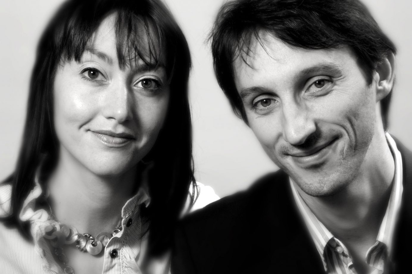
Aether and Hermera is a multidisciplinary art and design studio producing work that lies at the intersections of contemporary installation, lighting art and interaction design. It was founded by Gloria Ronchi, a light artist and Claudio Benghi a media architect. The collective utilises the medium of light combined with digital media to create engaging spaces that connect people with their environment.
Their artistic vision is to provoke memories, explore aesthetic interactions and elicit feelings of connective human experiences in a required to participate audience.
C H O S E N A R T W O R K : V O Y A G E
An installation in London’s Canary Wharf, Voyage is this beautiful fleet of 300 illuminated boats called Voyage. Each floating light is reminiscent of a paper-folded origami boat that is illuminated from within. There is a wireless network in the vicinity that allows audiences to join with a mobile device and alter the colour of the entire installation.

As someone that has never had any formal learning in Typography and it’s use in graphic design until now, I find this article very fascinating. Thus far most of my choices in typefaces, fonts and general sizing and placements are more choices based off instinct. Thus, designs that I could think up often seem very safe and dare I say, a little boring. Classic fonts that went well together, clear hierarchy, obvious colours. Which is all well and good, but when it’s the “nth” design that has been churned out looking the same, one can’t help but dread the monotony. However, the thought of using more adventurous options never occured to me. That is until I realised how many options I have been limiting myself from after reading this article.

The article was very comprehensive and clear in explaining why some fonts don’t go as well together, or why sizing the certain fonts up is a good idea, or how alternating the sizing and playing around within the font family can create a more dynamic typographic pieces. There are many examples provided as well as suggestions and tips.
I particularly enjoyed the section of the article that brought up the description of the type Mrs Eaves and Mr Eaves. It was interesting to note how the difference in their anatomy despite how small could change like the x-height affects the visual impact. I also liked how they talked about the font like they were actually real people. It really aided in helping me understand how the vibes of the font can carry similarly to how the vibes from certain people do.

I think many of the type crimes brought up within the article when it comes to font selection of size variation I have probably committed at some point. Something tells me I would be referring to this article a lot more often the coming weeks as we start on the typographic poster. But seeing the kind of options available, I can’t help but feel a little excited.

The first thing that went through my head when watching this video was “Wow, I’ve never been so glad that I am not living in the past.” The utter tediousness and meticulousness that came with preparing a typeface and the complexity that leads up to the printing process seems as stress inducing as it is awe-inspiring. Considering my indecisive personality, I couldn’t imagine giving the go ahead of a design to a printer whose preparation process was so intricate and painstaking.
However, it did make me think: Is letterpress dead? I did a brief research into letterpress in general and its state right now. It appears that with the advent of computers and digitisation of media, letterpress has been on the downhill since the 1980s. However, back in the 2000s, it has made a comeback.

Source: http://www.neenahpaperblog.com/2013/04/neenah-beauty-of-letterpress/ (Accessed: 13 Sept 2018)
 The main reason being the interesting debasing effect letterpress has on the paper that isn’t commonly seen in digitally printed things. It’s now more commonly seen on name cards and wedding invitations because of how more textured it feels and how well it photographs even from the side. 018)
Some enthusiasts have even claim that every designer should at least give letterpress a try because it forces a designer to be more aware of their design, breaking it down into simple elements where they had to think about hierarchy. While computers offer limitless possibilities, with letterpress, designers have to stop and make sense of their designs before committing to it.

Source:https://realart.com/thought-lab/love-letterpress/ (Accessed 13 September 2018)
I think I can see such a value in such an experience. With the expediency in which designers are now required to churn out their work, it does make one wonder if it takes out some of the meticulous care and passion that was required for the craft that was seen in the past. While I’m not all for the “it was definitely all better in the old days” school of thought, I do believe there are some benefits to stepping away from the computer and getting one’s hands dirty whilst designing. Especially with something where you have to be more hands on and present like letterpress.
Type Speaks does highlight how important Type was, even in the past in communicating information. So much so that people were willing to go through such meticulous processes to create new type to express themselves. However, more importantly, what it did show me was the passion and care that was put into design. It is a presence of mind and a conscious responsibility that I definitely hope to remember and apply to my work.

This is the catchphrase of Massimo Vignelli, whose forays into almost every imaginable field of design has left it’s mark and impact with his interesting perspectives and idea of design. His work covers nearly every field of design including advertising, identity, packaging, product, industrial, interior and architectural design. An avid fan of modernism, his work is always very clear and concise with no clutter or unnecessary material.

Source:https://i.pinimg.com/originals/fc/fa/f6/fcfaf6915ec5c42518edfc74c55ad067.jpg Accessed:13 Sept 2018
The idea that he has behind his quote is that the process behind design and it’s methodology is the same, no matter the end product. In terms of typographic design and branding, some of his most famous works include the identities for international corporations like American Airlines (which is the only airline to have not changed their identity in the past 50 years), Bloomingdales and Knoll. He is also known to be a huge fan of Helvetica, as seen in it’s use across countless of his works.

Source:https://www.google.com/url?sa=i&rct=j&q=&esrc=s&source=images&cd=&cad=rja&uact=8&ved=2ahUKEwiH_cWrtrfdAhVFAogKHb3UB30QjRx6BAgBEAU&url=https%3A%2F%2Flibrary.rit.edu%2Fgda%2Fdesigners%2Fmassimo-vignelli&psig=AOvVaw0oXSK2-a7OprIpAYsCFiKH&ust=1536908918111708 (Accessed: 13 Sept 2018)
I think the thing I found most impressive about Vignelli would be his desire to foray into all the fields within design, not limiting himself in any way, simply on the basis that if he did one thing, he could do the other. Many times I feel like people tend to like to classify or define themselves as graphic designers, product designs, architects etc. I think his motto of “if I can design one thing, I can design any other.” is a healthy mentality to have. In this world where all fields are merging and a job’s scope in the design field is getting more diverse and constantly overlapping, it’s good to dabble and find one’s voice in the mass of information.

Source:https://www.google.com/url?sa=i&rct=j&q=&esrc=s&source=images&cd=&cad=rja&uact=8&ved=2ahUKEwih0MrMtrfdAhWGBIgKHW3AC_EQjRx6BAgBEAU&url=http%3A%2F%2Fsubway.com.ru%2Fmaps%2F1972.htm&psig=AOvVaw0oXSK2-a7OprIpAYsCFiKH&ust=1536908918111708 Accessed: 13 Spet 2018
Source: https://www.google.com/url?sa=i&rct=j&q=&esrc=s&source=images&cd=&cad=rja&uact=8&ved=2ahUKEwju-afotrfdAhVW-WEKHaA4AkkQjRx6BAgBEAU&url=http%3A%2F%2Fwww.designishistory.com%2F1960%2Fmassimo-vignelli%2F&psig=AOvVaw0oXSK2-a7OprIpAYsCFiKH&ust=1536908918111708 Accessed: 13 Sept 2018
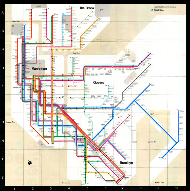
The work that has given him the most range and reach would have to be his designing of the New York Subway map. After all, the use of subway as transportation across New York is commonplace, on top of the fact that New York is infamously known to have complicated train routes. His simple and clear aesthetic suited the project perfectly and many people were exposed to and used to his work. He prefers to call graphic designers nowadays “information architects” which makes sense. With the Internet as it is now, the flow of mass media and information has become more of a tsunami. Getting oneself heard, understood and remembered as fast as possible is becoming quite the task. Thus the ability to sculpt the information into something more palatable and someplace easy for the audience to navigate has increasing become in demand.
When asked if he had any advice for young designers, he shared “I say all the time, particularly to young designers who seem to be always affected by things they have seen: when you have a design to do, don’t look outside. Learn to look inside the problem, because you will find the solution is right there waiting for you to get it out. Your style comes by refining your way of looking inside, not by importing it.” I think designers ourselves have are not unaffected by this information wave. With things like Pinterest and Instagram, most tend to find themselves trying to ride on the wave of the next big thing to get us success. Massimo Vignelli’s success came not from his desire of it, but from his desire to help others or solve a problem. To rid the world of its clutter and misinformation. Or in his words: The life of a designer is to fight against the ugliness. I think that is something to think about and perhaps someday, something I can get behind.

Jan Tschichold is often described as a pioneer of typographic and design modernism. Most prominently during his challenging of design status quo in the 1930s and later in his career after the war where he redesigned Penguin Books.
An aspect of him I found interesting was how he did not stick to one style. He seemed very fond of German blackletter early in his life. However when introduced to the new ideas generated by Bauhaus, instead of clinging to his “style” he gladly threw it out of the window and attacked the new experiments with a gusto. I think as a aspiring designer, it’s normal to end up sticking to what is comfortable without experimenting and taking risks. Even if we do, we also end up shrinking back at the first sign of critics.
Source:http://retinart.net/artist-profiles/jan-tschichold (Accessed: 12 September 2018)

Source:http://www.retinart.net/media/images/jan-tschichold/10.jpg (Accessed: 12 September 2018)
However, what stood out to me the most about him was how his passion for typography and design was never wavering despite the circumstances. Be it doubters early in his career due to how different his designs were compared to the norm at that time, or during the war under the threat of the Germans.

Source: http://www.retinart.net/media/images/jan-tschichold/16.jpg (Accessed:12 September 2018)
His ability to convince the redesign of the penguin books was also very impressive. Being in his situation, a foreigner chased out of his homeland by war, it was probably very to simply just do what was required of you solely to survive. However, he still sought to improve and experiment during his stint with penguin books. Especially considering the processes at Penguin Books have been around for a while. It must have been extremely hard to change people’s minds especially after they have been set for so many years.
Tschihold’s passion and thirst for knowledge in everything related to design and typography was probably what set him apart from others in his time and gave him the means to break the norm and revolutionise type facing and content layout in a way that is still even today,

Bauhaus is a school that rose from Modernism and the Industrial Revolution, inspired by many qualities and ideologies found in the movements that occured before and around the same time. Some such examples are the Aesthetic movement, Art Nouveau’s Deutscher Werkbund, Wiener Werkstatte and De Stijl. Primarily it answered the question “how can an artist be trained to take his place in the machine age?”
The school’s purpose was to serve as the link between crafts and industry. However it’s initial conceptualization in the early 20th century was fought harshly against by German craftsman organizations who feared that it instead was a new factor that would accelerate the decline of crafts by tainting it with industrial development ideologies.
This essay will explore some of the ideologies behind Bauhaus, which movements it was inspired by and finally if it was successful in retaining the character in craftsmanship while incorporating mechanized mass production values. Firstly, we shall explore some of the movements that inspired Bauhaus ideologies.
Modernism is a movement that favoured rational critical thinking over tradition, especially when it came to materials and new ideas. Much of the designs that sprung from the movement were inspired by the simple geometric shapes formed by the machine made urban environment and made use of the latest materials. The lack of ornamentation, experimentation with new materials and simplistic designs are key features that are also present in Bauhaus’s design ethos.
The Aesthetic movement was inspired by the abstract geometric shapes and pure uncluttered lines of Japonism. The movement also carries the belief that art as a product should not have any social ethical or moral bearings. Something echoed later on in Bauhaus teachings.
Deutscher Werkbund is often known for its imitating of nature. Most designs have long sinuous lines and curvilinear organic forms that imitate nature. Its designs, such as the Music Room Chair 1899, is designed for mass production at low cost which brought about the ideology of “Machine Furniture” or basically, furniture that is well designed and inexpensive to build and assemble.
Wiener Werkstetter is a movement that promoted the equality between designer and craftsman. Unlike Deutscher Werkbund, this movement focused more on the artistic integrity of the designs, refusing to compromise for affordability. This unfortunately limited their appeal to the masses. However the ideology that an artist could be a craftsman and designer as well to produce the best, most innovative art can be seen being adopted by Bauhaus.
Constructivism developed as a means of bridging the gap between objects and buildings and their relations to the industrialized world.
Finally, De Stijl is a group of artists and architects who wanted to achieve an objective, modern, anti-individualistic art style which is reflected in the art pieces produced by the group. They often featured horizontal and vertical lines and clean primary colours that challenged the use of visual and physical space as well as the use of colours and their effect on spaces. Everyday spaces and furniture were often simplified and reexamined for their forms. While the furniture produced were often non-functional, they are valued and celebrated for their ideas of ratio balance and simplification.
The Bauhaus School of Design was founded by Walter Gropius a german architect in 1919. It was during the time where World War One had just occured and the Industrial Revoloution was picking up speed. Gropius wanted to “create a new guild of craftsmen without the class distinctions” which he felt was primarily the cause for divide between craftsmen and artists. Something brought up before by the Wiener Werkstatte movement. Bauhaus is the Unification of Art, Handwork & Industry, an apprenticeship programme in applied arts of Carpentry, pottery, metalworking, glasswork, stage design, photography, commercial art.
Most of its progressive, experimental curriculum is centered around the innovative teaching practices of their teachers with the likes of Itten, Klee, Kandinsky, Moholy- Nagy and many more. It consist of two main concepts: zeitgeist and Gesamtkunstwerk and three secondary concepts: Rationalistic industrial art, social arts and aesthetic industrial art.
The concept of zeitgeist was the unification and synthesis of all components of arts in terms of a body of work to symbolize a culture. While the concept of Gesamtkunstwerk means a unity of the whole creative process of all disciplines both in design, craftsmanship and mechanical production. The concept of Rationalistic – industrial art was to view art with a greater emphasis on the ratio, collective desires or values, rejecting of tradition, exclusivity and uniqueness. The Social Arts concept sees art in terms of social commitments. The responsibility that art now carries as a functional massed produced product through industrialization. As such, many of the designs produced from the school had favoured functionality over ornamentation, symmetry based on ratio and experimented with new materials.
When Moholy-Nagy succeeded Itten in the school, he introduced industrially functionalist designs in the metal workshops, discouraging traditional materials and handicrafts in favour of technologically produced modern materials such as steel tubing, glass, plywood. Steel tubing was often only seen in bicycles gave furniture instead a lightweight form associated with the vehicle. Something that was very unique at that time compared to many other designs at that time that were often heavy and bulky with hardwood ornamental bases. The experimentation with plywood and it’s pliability also resulted in chairs that were more lightweight and springy which felt softer and more comfortable. Committing the school to new material technology and mass production also reduced the importance of craft specialization and traditional workshop training; on the artist-constructor, than the artist-craftsman.
However, some criticism that came with the Bauhaus school of thought was that in the process of simplifying and rationalizing in the name of functionality and mass production. Some believe that the character behind the “art” produced is lost as most things are stripped of their cultural traces. Others even go as far to define it as robotic. Considering that Bauhaus’s purpose was to find the balance between art and the mass production of industrialisation, I personally believed it did not produce so much of “fine art” but it did revolutionize the concepts of product design which I believe is an art form in itself. While perhaps Bauhaus did is not the exact answer to the balance between art and craftsmanship, as Hans Heiss aptly says “what made Bauhaus was not so much its achievements, but its spirit,” and following the dictates of technology and economics of production, “if they were not the right answers, at least they were the right questions.”
(1080 words)
References
Bayer, H., & Gropius, W. (1972). Bauhaus. New York: Museum of Modern Art.
Collins, N. (2018). Deutscher Werkbund: German Work Federation: Architecture, Crafts, Design. Retrieved from http://www.visual-arts-cork.com/architecture/deutscher-werkbund.htm
Harimuti, R., Wijono, D., & Hatmoko, A. (2011). Bauhaus Ideology, Concept and Method on Architecture.
Schjeldahl, P., Farrow, R., Thomas, L., Farrow, R., Félix, D., & Toobin, J. et al. (2018). Bauhaus Rules. Retrieved from https://www.newyorker.com/magazine/2009/11/16/bauhaus-rules
Wilk, C. (2008). Modernism (pp. 76-126). London: V & A Pub.
For this assignment, I decided to walk around looking for fonts around school and the supermarket. I think this was the first time I was actually aware of the amount of fonts all around. In fact, I think this was the first time I actually noticed that Food Court 2 at NTU actually uses Comic Sans on their stall signs and surprisingly, it didn’t actually look all that bad.
Here are some of the fonts that I found:
The Nanyang Chronicle uses a san serif font for their headers and subheaders of their paper. It’s an interesting choice considering traditionally most newspapers use serif-ed fonts like Times New Roman since it looks more serious and is easier to read. The choice of sans serif in this case was probably to come across as more friendly and modern looking which is appropriate for their target audience: the students of NTU.

Ah yes, comic sans, we meet again. I’m surprised that the use of the font in this context did not annoy me enough to notice throughout my entire first year of study. I think this is actually one of the cases comic sans is actually an appropriate choice. It looks friendly and welcoming, can be read clearly from a distance and it can be used uniformly throughout all the stalls without affecting impressions of what could be sold there. I vaguely remembered visiting a food court once where all the stall names were in extremely bolded, capitalised and serif-ed. It was a very intimidating eating experience since it almost felt like all the stores were screaming their wares at me.
While looking for some serif font examples, I headed to the supermarket and directly to the wine section. As expected most of their selection was labelled in serif fonts or script fonts. In this case it’s name is in Old Style serif and the wine’s production location is in Script.
I think wine brands often try to portray themselves as refined and expensive, thus the use of serif fonts. Wine labels tend to use traditional, busier typeface styles and design that link to history and authenticity.
It also gives the impression of seriousness and maturity that is often linked to wine.

On the other hand the use of similar font at this hairdressing store seems an opposite effect on me. I think it’s because my impression of haircuts often involve colour, creativity and freshness. Thus I think the application of the font in this case does the opposite.
I think I have always been aware of how I felt about each subject. Such as how I somehow knew that the hair salon was dubiously boring or that the food court was warm and welcoming. But after this little adventure, I now know why.
