[ Introduction ]
When I first heard this project was based on movie quotes, I was very excited since I loved watching movies and movie quotes were something that I always took note of. Sometimes the writers for these movies know the exact words to express exactly how you feel. And in that moment, that quote just speaks to you. I love it when that happens.
I knew that the designs could not be a literal representation of the movie but instead an abstract representation of what we felt about the quote itself. This gave the whole project a more personal feel and an added layer of challenge which was very exciting to me.
[ Let the fun begin ]
1. “Quit blowing smoke up my ass, you’ll ruin the autopsy.”
– Meet Joe Black (1998)
I love the biting sarcasm and cynicism in the quote. Meet Joe Black was a movie about a rich man, Bill, who was coerced into being Death’s tour guide in exchange for time to settle his affairs and the relationships in his family.
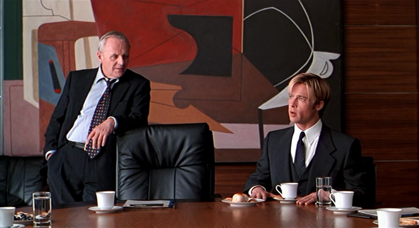
Bill, played by Anthony Hopkins and Joe, or Death, played by Brad Pitt. Source: http://ilarge.lisimg.com/image/1175770/852full-meet-joe-black-screenshot.jpg Accessed on 22 Oct 2017
I think this quote was by far the easiest to work with. I knew from the start what part of the quote I wanted to focus on. “Blowing smoke up my ass.”
I looked up into what that slang means. It means to complement someone insincerely or hiding certain parts of your true feelings..
This made me start thinking about lying and what it did to people.

Source: https://i.pinimg.com/736x/7f/bf/39/7fbf396b1234209ed0c887b8b932476f–godfather-art-the-godfather-movie.jpg Accessed on 22 Oct 2017
I was inspired by the movie posters for The Godfather. A man dressed in a black suit, with darkness that conceals a large part of him giving an element of mystery and danger to him.

Original design
For my initial design, I had a man in a black suit wearing a goat skull as they are often associated with the devil because of the shape of the horns. The devil is symbolic of deceiving, lying and manipulation which were the issues that I was trying to address with my piece. The man wearing the skull concealing his face could have two meanings. Either that the man’s thoughts have been influenced by the devil or that the man was the devil himself.
The man is literally blowing smoke. The initial smoke I was trying did not read well on threshold which was the effect I intended to use on the piece in photoshop. The smoke needed more line work. However I didn’t want the smoke to seem too cartoonish as well since it would clash with the realistic features of the man.
I chanced upon a picture of distorted faces. I decided to crop out a few faces to form the shape of smoke. It turned out pretty well. I felt this gave an additional meaning to the man’s smoking. How what he says about people is often distorted and untrue; most of the time ugly.
The man is also holding a scythe, firstly as a shoutout to the movie’s main character “Death” or “Joe Black” I also partially concealed it in the darkness to show the hidden danger of this individual.
During my first consult, Joy liked the design and the additional layer created by the smoke. Even though they weren’t noticeable off the bat, having something for the audience to notice after looking longer gave it more depth. Additionally she liked how the smoke and the scythe balanced each other on the image. However, she felt the scythe was too literal and suggested changing it into a mouth.

Updated design
This is the updated design. I changed the blade of the scythe to a toucan’s mouth to show how our words and what we say is what is the real danger to others. During the second consult, Joy was okay with majority of this but only felt that the scythe should align with the tie so that it creates a leading line.
This is the final design that I printed onto my tote bag.

Final Design
Quote #2
“What if I fall? Oh but my darling, what if you fly?”
– Peter Pan (1953)

Original design
I had a rough idea for this design by the second consult with Joy. The basic image of the hands controlling paper aeroplanes to reach the child’s mobile. However, Joy felt that this was still too literal a representation of the quote in terms of it being about chasing and flying up to my dreams. She asked me to find a deeper relation of the quote to myself.
Thinking on the concept of chasing my dreams more, I felt a bit cynical about it. I thought about how dream chasing wasn’t as easy as movies made it up to be. Dreams needed funding, and while all we see are the success stories, many dreams my not be what we expect and sometimes, quite often, they crash and burn.
So for my second consult, I updated my image and made the paper planes out of Singapore thousand dollar bills and made some of them crash into the planets hanging on the mobile.

Updated design
Joy felt that this was a more put together version of the design and it’s message was much clearer. However, she felt that the dollar bills weren’t as clear as we can only see a bit of Yusof Ishak’s face and a bit of the numbers. She also felt that in terms of design properties, I could try shifting some of the aeroplanes so that all their directions of flight were in line and created a subtle leading line up towards the planets. She also suggested putting some smoke that could balance the large hand on the bottom left of the image.
This is the final design that I presented.

Final design
I cropped and edited the shape of the dollar bill so more of it could be squeezed onto the shaper of the paper planes. I also shifted some of the flight directions of some planes so that they all look like they are flying roughly in the same direction. Lastly I added a larger paper plane falling back towards the hand. It leaves behind a trail of smoke which overall balances the large hand at the bottom.
Quote #3
“It does not do to dwell on dreams and forget to live.”
– Harry Potter and the Philosopher’s Stone (2001)
On the flip side compared to the previous quote, my interpretation of this one is a lot more hopeful. I love this quote from the first Harry Potter movie and it was always an encouragement when it came to school and trying to motivate myself. I felt that often times, when the workload got tough, I tended to retreat into myself and procrastinate by daydreaming. It was a bad habit that lead to a lot of rushed assignments in the past. It always left me with a certain sense of regret. How was that very well developed daydream about making a zombie movie complete with character arc and design going to stop me from failing school and actually learning the skills needed to film movies in the first place?
Thus I related to this quote greatly. I wanted to portray the sense of reluctance and danger I felt when it actually came to chasing dreams and my desire to cut myself off my bad habit of hiding in my daydreams before it is too late.

Initial design
This is the initial design. To portray my daydreaming, I placed floating balloons to show a sense of weightlessness in the image. I had a lot of trouble with this because many images of balloons disappeared the moment I used threshold and half tone did not have the effect I desired in the image. To solve this issue, I made eyeballs using vectors on parts of the balloons where the shapes weren’t visible. This gave a sense that the whole mass of balloons were actually eyeballs. I also made sure that none of the eyeballs were looking down on the earth which I chose to represent reality. I also placed hands holding cotton candy out to represent the distractions and various daydreams that turn me away from looking at what’s happening in real life. Finally, I placed a falling girl that has just cut herself off from her daydreaming and taking the risk to fall to earth for her dreams.
Joy and the rest of my consult group mates liked the whimsical surreal vibe of this piece. However, Joy suggested that since the main subject of was the girl, I should darken her and make her more prominent if not the large dark mass of balloon eyes will steal the audience attention away from her. Joy also suggested that I turn the cotton candy clouds to point subtly at the girl to lead the viewer’s eyes more to her.

Updated and final design
This is my final design. In order to lighten the darkness of the balloons, I added more eyes and eye whites. I darkened the girl and her hair so that the contrast between her and the background will draw the viewer’s attention more.
I tried to point the cotton candy clouds towards the girl but I felt that it the weird angles detracted from their original intention to create a sense of sky and height from the earth. So instead I altered the size and positioning of some clouds and used them to form the path from which the girl would fall so it would seem like she is falling through the clouds. As you can see from the design, the darkest elements within the picture are the balloons, the girl and the earth. The decreasing amount of balloons form a subtle arrow towards the girl and the gravity and direction of the girls descent will draw the viewer’s eyes towards the earth. This thus allows the viewer’s eyes to follow the girls journey down to reality with her as well.
Quote #4
“I never look back darling, it distracts from the now.”
– The Incredibles (2004)
I love Edna Mode from The Incredibles. She is very decisive, efficient and did not take anything sitting down. Basically everything I wanted to be as a kid. But now that I’m older and I have the benefit of hindsight, I could see a certain flaw in her philosophy. I get that sometimes, being stuck on past failures could hinder your confidence in trying again.
However, I can see the wisdom in remembering failures and their purpose in improving. Even Edna Mode herself stopped using capes because some superheroes died because of their capes; a fatal design flaw. I felt that in order to succeed in the future, one always has to look back in the past for guidance.

Source: https://media.giphy.com/media/dePaPOPNSLDsk/giphy.gif Accessed on 22 Oct 2017

To show that wisdom, I used an owl which is symbolic of wisdom. I also chose an owl because of their ability to turn their heads 360 degrees to look behind and all around them. The owl is wearing a pair of glasses (shoutout to Edna) with which one lens is replaced with a clock to show looking through the past.
The body of the owl is made up of hydrangeas which in the Victorian era was symbolic of pride, because it was a plant with many flamboyant flowers but very little seed. I wanted to use this to portray the pride of the body still facing forward and turning it’s back on the past.
Lastly, I perched the owl on top of a weighing scale to represent choice.
With this piece I tried to play with asymmetry to show how the side that is looking through the past is weighed more heavily by the mistakes but is also the “heavier” and more suitable choice.
In terms of design elements, I made the owl head larger than normal as it is the main subject of the image. I also left one lens open, so that people will notice the owl first. It’s been psychologically proven that human beings seek out eyes on images first before everything else.
I did not have time to consult Joy for this design, however, during the critique, she suggested that while my subject is still very obvious, it’s importance in the image could be greatly multiplied if the size of the scale wasn’t as big. She also suggests that the weights of the scale could be nearer to the bar as well to form an overall triangular shape with the forms, thus making the elements of the piece seem more in harmony with each other.
[ Silk Screen Printing ]
Joy warned me that the blackness of my design might be hard to print. But I never thought it would be this hard. The whole process before of coating the screen with the emulsion and exposing the screens was alright, fun even.

Washing the exposed screen in the red room

Exposed screen after washing
But the nightmare came in terms of printing on the back. Due to the amount of ink needed, there was never enough to reach the bottom of the design.

Attempt #1: What even is this???
Running over the design a second time would get rid of all the small details, especially in the smoke.

Attempt #2: Tried going over it twice. It’s too dark. Now he looks like the Darlie man’s shady older brother.
The work-study that day, Clara, suggested I spread the ink on the screen first before placing it back on the bag and running it over once with the squeegee.

Attempt #3: Much better with Clara’s new method. Still a bit dark so some details are lost. One last bad left, one last try.

Attempt #4: Finally!
Thank God it worked. There were still small patches of white near the bottom but this was my most detailed print yet and I filled the holes in with a paintbrush. (Bet you can’t tell eh?) So overall, a success. Shoutout to Clara for being my saviour.

[ Final critique from Joy ]
Good attempt in conveying my meanings behind the quotes. Good use of design elements to clearly draw the attention of the viewers to the main subject.
Critique from classmates:

Thanks everyone. 🙂