Study of Spaces – Screen Based

G E O R G E S   M É L I È S   –   L E   V O Y A G E   D A N S   L A   L U N E 

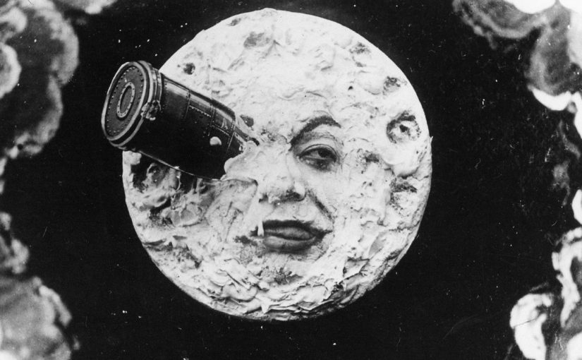
I can’t recall when I first encountered Georges Méliès, but I was reintroduced to him and his works through the movie Hugo, which was directed by Martin Scorsese. I’m not entirely sure how accurate the information presented on Méliès was on the movie, but it did give quite a bit of insight of how Méliès was said to work. I felt that the reproductions of his sets and some behind the scenes of his films gave an apt visual to the documentation of his processes.

One of the forefronts for science fiction, Méliès started off as a magician, an illusionist. When he encountered the Lumiere Brothers’ film, which at that time showed only scenes of real life with motion, Méliès immediately saw its potential to experiment further.  I feel that he brought over his interests from creating illusions in real life, to creating illusions on screen. This was novel at the time, and pushed the boundaries of filmmaking.

P E R C E P T U A L 

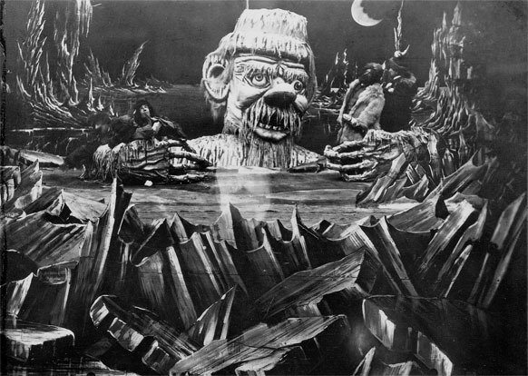
A lot of Georges Méliès’s films are fantastical, they are fictional dreams brought into reality, with early VFX that brought what was once impossible into vision. He was already doing this in his performances as a magician, and his mind as an inventor helped him demonstrate his illusions, however the camera and film helped him bring his work to another level. He was able to have more control over the final piece, without the limitations of a live performance.

He cut the films and pasted them back together, pioneering film trickery, or effects as now known, he had crew to paint over each and every frame, he built a whole glass enclosed studio, he housed over 20 000 costumes, he was over the top and it was awesome.

Bringing his stories across, the viewers are able to enjoy the effects created, and their emotional states are invested since they are introduced to a new form of entertainment.

The films were not made with the point of replicating reality, so there is a fun element to it, with the expressions and body gestures of the actors amplifying the scenes with their interactions with the sets and props.

This is especially more so because the movies were silent, with no dialogue. Hence, the narrative had to be delivered through visuals and music alone.

A R C H I T E C T U R A L

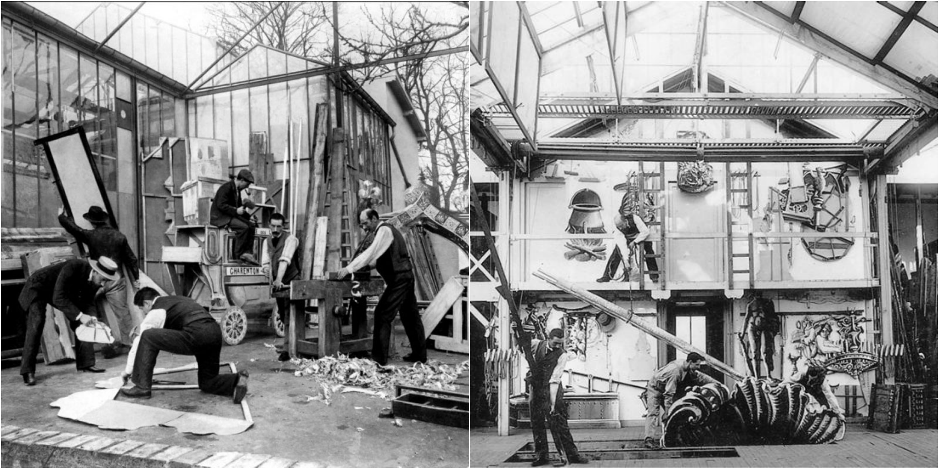
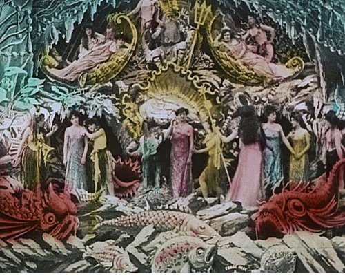
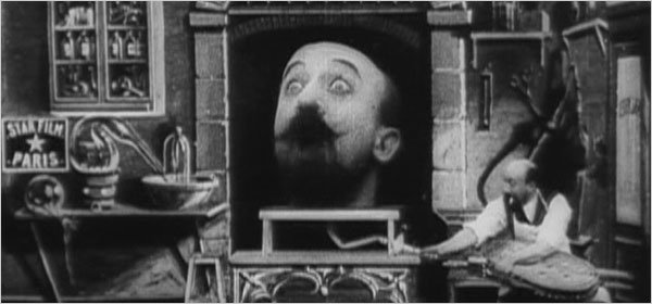
In his glass studio, he created elaborate sets that are many times almost dream-like. These are very similar to stage design. It is as if they were for stage performances and theatre, but recorded instead. These were what early sound stages were like. This way, he was able to explore the mise-en-scène and cinematography of his works.

In such a limited space, Méliès was able to create a sense of depth and volume by playing with planes and scale. By using elevated, depressed and overhead planes, he was able to redefine the space according to the kinds of settings he was going for. This creates a believable space in which the viewers could imagine the three dimensionality and the extension of the space beyond the frame.

C U L T U R A L 

At the time, films were only starting to get popular after its invention. Even though the Lumière brothers stated that the cinema was an invention with no future, they were proved wrong as it has now developed into one of the most prominent mediums of expression in history, with advancements continuously being made and boundaries continuously broken and redefined.

I found this a good short read on the early start of cinema, and what the culture was like, defined by different takes by different artists, inventors and filmmakers.

In Le Voyage Dans La Lune, the culture of theatre and fantasies was showcased through the idea of heading towards the moon and finding extra terrestrial creatures.

I N T E R A C T I O N

While films do not create an immersive physical space for the viewers, I think that when done right, it could create an immersive mental space, when viewers are engaged in the film and can feel themselves in it. I think that Georges Méliès was able to do this in this film, as he made people and sets and movements that were understandable and relatable.

I also feel that the sense of wonder also creates another effect that engages the audience’s imagination, just like how one could be engaged through the words in a book.

Night to Light Festival: Art Skins and Monuments

I haven’t seen much from the Night to Light Festival other than the projection mapped works and the two works outside of ACM (which I originally thought was part of iLight), but I feel that the festival is a getting a little overshadowed as it is held simultaneously with iLight, which is relatively more established and well-known. On top of that, their locations intersect, and they both involve works using light and darkness. It is only expected that a layman is less likely to notice the difference between works participating in iLight or Night to Light.

Nevertheless, it was as exciting, because it was the first time I could actually properly observe projection mapped works on architecture.

However, I have to admit that I was a little underwhelmed, partly because I had way too high expectations from seeing works that appealed to me over the internet. To be fair, I also did not spend sufficient time to understand the works better.

I think that this is one of the more interesting facades, as the segments were used either in symmetry or to display different images. The eyes were particularly… eye-catching. They really were! The placement and sheer size made it noticeable, and was was interesting was how I felt that the eyes almost humanised the building. I felt that the building was personified in a way, and this establishes a connection between the viewer and the building.

This was one of the more disappointing ones, I feel, but it is hard to say because there are so many factors involved that made the experience not as enjoyable as the rest of the projection works.

I am pretty sure a lot of consideration has been put in to making this work, but this is my personal biased take.

The features of the building itself made it challenging to show any clear elements. There is no wide, clear plane, and I felt that the images were projected on anyways, making it hard to focus on them, and I felt that the features weren’t used well. They did have that short segment with the sand filling up the pillars, but that was pretty much it… I became uninterested in the story they were trying to tell because there was too much distraction. The trees were also a hindrance, and blocked the projection.

Is there a better way to use this building for projection mapping? I myself am not sure what would be effective in this case.

This was really interesting because I viewed this work with previous knowledge of the subject matter – I recently did a presentation on William Farquhar and his collection of natural history drawings. I enjoyed watching the drawings transform into a kaleidoscopic animation. I felt that the elements were used well, and the colours worked well too.

However, I do feel that the location was not the best, and that the wall was simply used as a screen. You can easily have this projection showcased anywhere else. There was nothing of it that contributed to the architecture, and there was nothing of the architecture that contributed to the projection.

Unfortunately, I didn’t see this work!

This is one of the works which I enjoyed more! Even though the scale is smaller, I feel that it was still impactful. The message is clearer in this work, and I enjoyed the narrative that it told. I liked how the features of the architecture was used, for example how the workers were projected on to the pillars, likening the two, and effectively illustrating that these workers were the foundation to Singapore. There are also great parts of the building that allowed for space for text, which instead of being disruptive, helps to convey the narrative better.

This work was also fun. I thought that the architectural features were aptly used, since the main focus could clearly be pointed out. The characters shown on the tower stood out, and the animations surrounding it enhanced the storytelling without being too distracting. Moreover, there is an actual space for the audience to lounge around while watching the work. It was much better and more intimate compared to the experience trying to view the ones on National Gallery, since they were so big and there wasn’t enough distance from where we stood to view the work.

They were really fun animations. The colours and patterns definitely catch people’s attention. It reminds me of The Resident as there are kaleidoscopic elements too. Overall, it didn’t stand out as much for me.