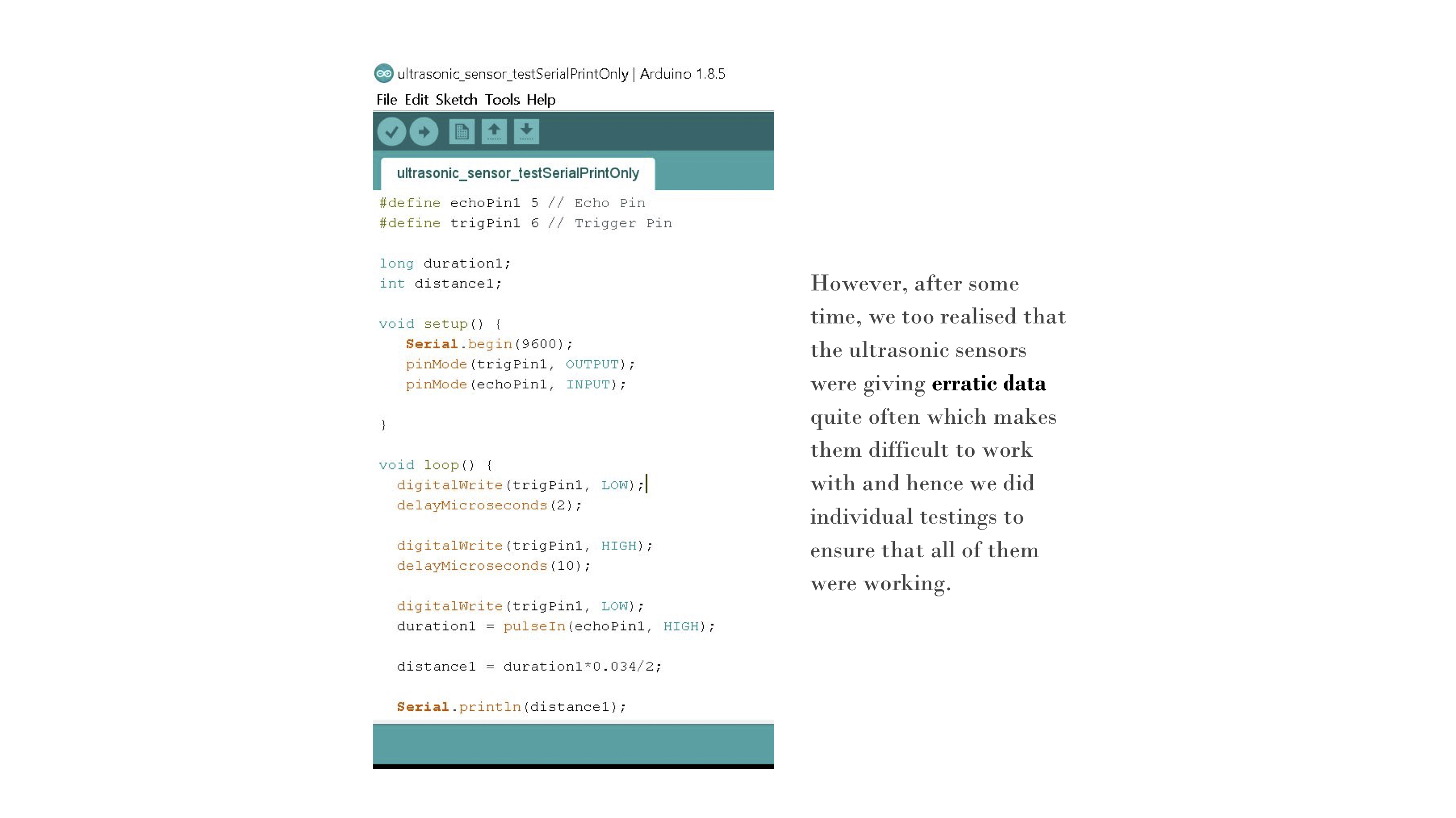
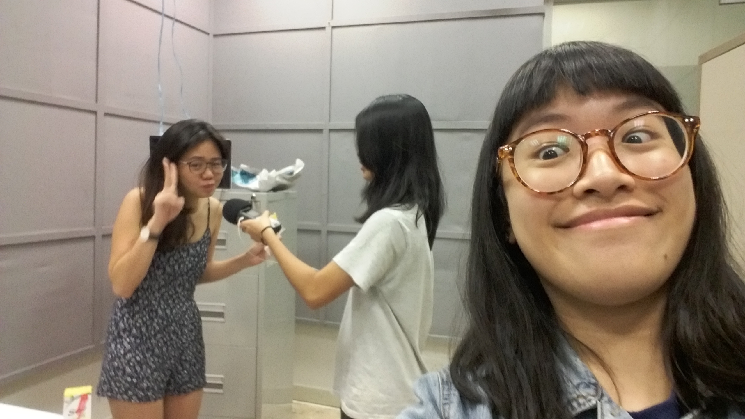
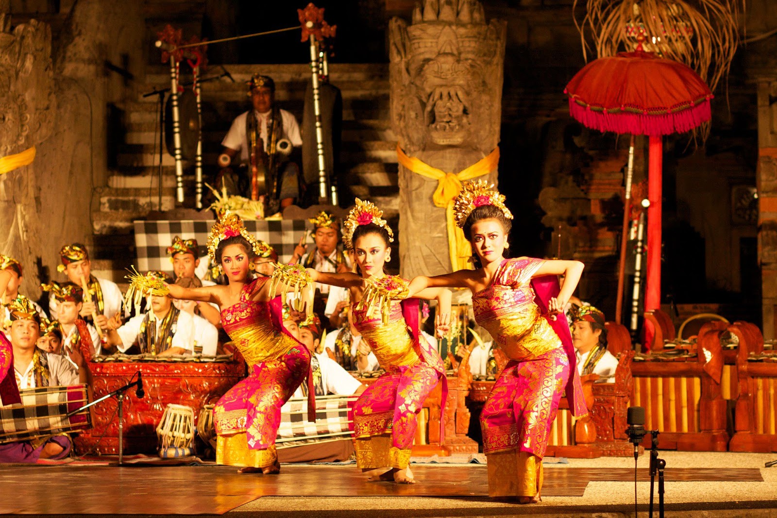
Final Video:
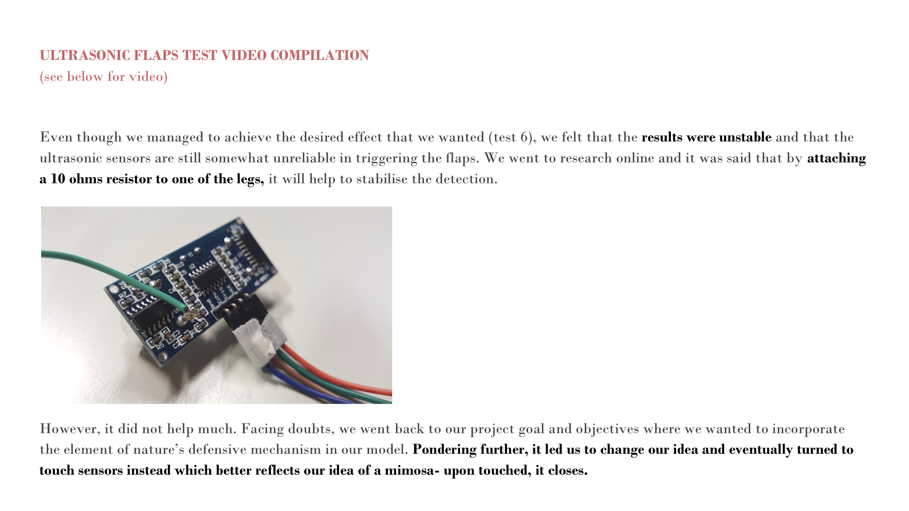
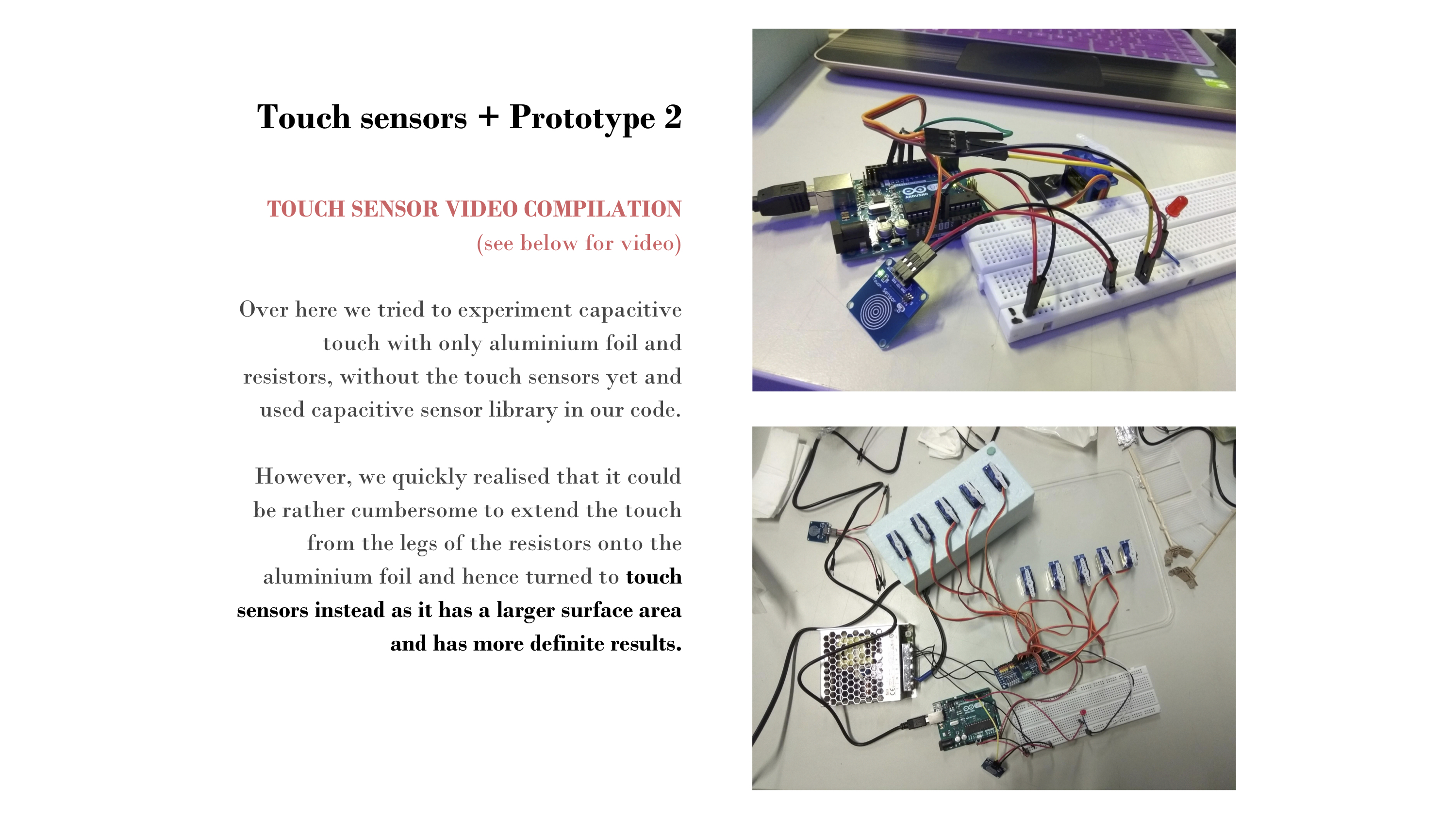


A compilation of our documentation shots:
Final Video:
A compilation of our documentation shots:
For my initial inspiration, check out the first process post!
Previously, I started off brainstorming some ideas.
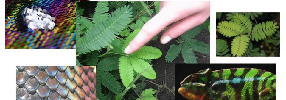
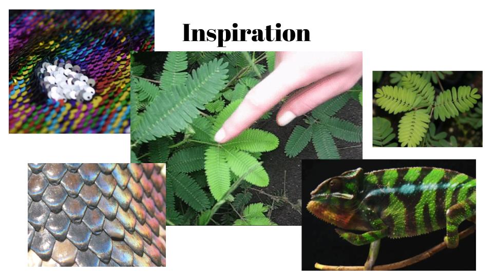
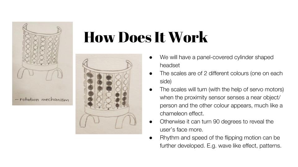
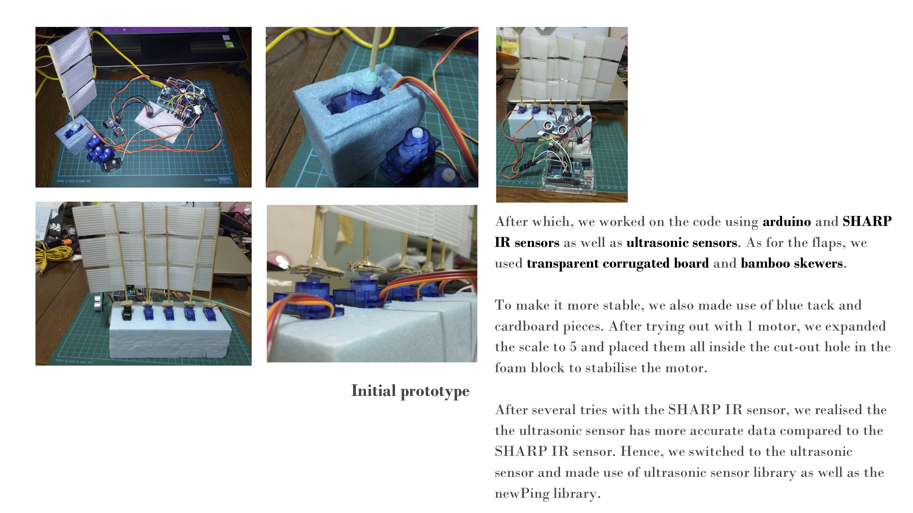
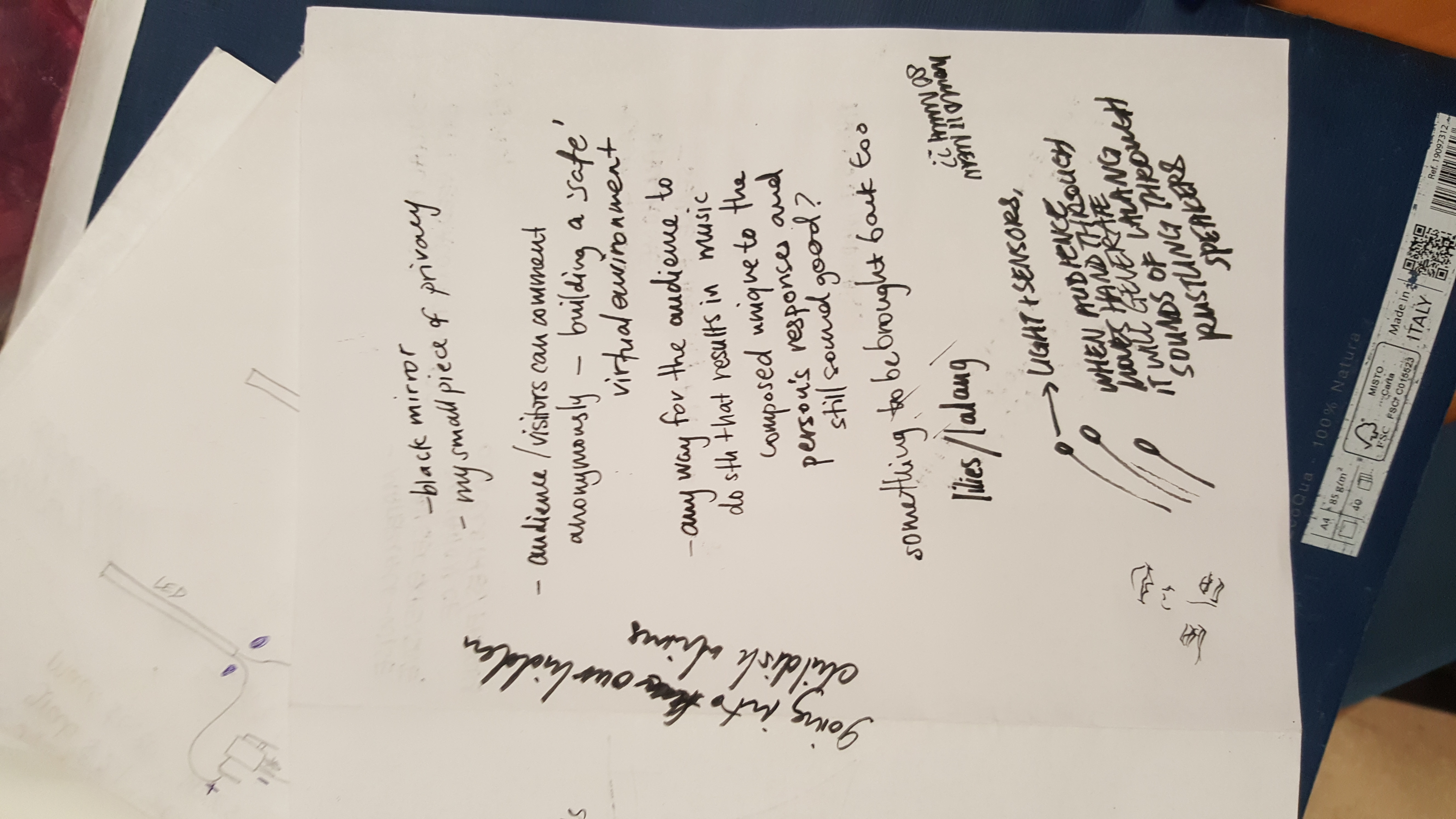 I decided that I wanted to create this modular net of sleeping pods or hammocks which provides space for people to spend some alone time in. People are constantly working and have less and less time for themselves, and I personally feel that sometimes I would love to get a chance to relax in a space by myself.
It would be nice to have a personal-sized hammock where there are speakers that people can plug into, playing their own songs. I would also provide a notebook where people can write about anything they want. Write about their day, their thoughts, or a poem, even.
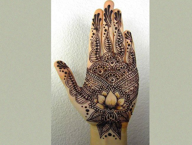
I wanted to crochet the hammock. Due to the material cost, I thought that maybe I can source for old clothes that I can cut into strips and use as yarn. This led to developing the idea from the significance of these old clothes. As I was thinking, it is as if I am weaving memories.

This led to me thinking, what if I create a space for people to think about their memories? Memories make us who we are today, I feel. Since I wanted a modular design which expands into a network of pods, I decided to focus on constructing one pod as a prototype. I then decided that the inner layer would be made out of white crocheted yarn while the outer layer could be covered in the strips of fabric from old clothes. This represents the mental space (internal), and the various experiences that make us (external).


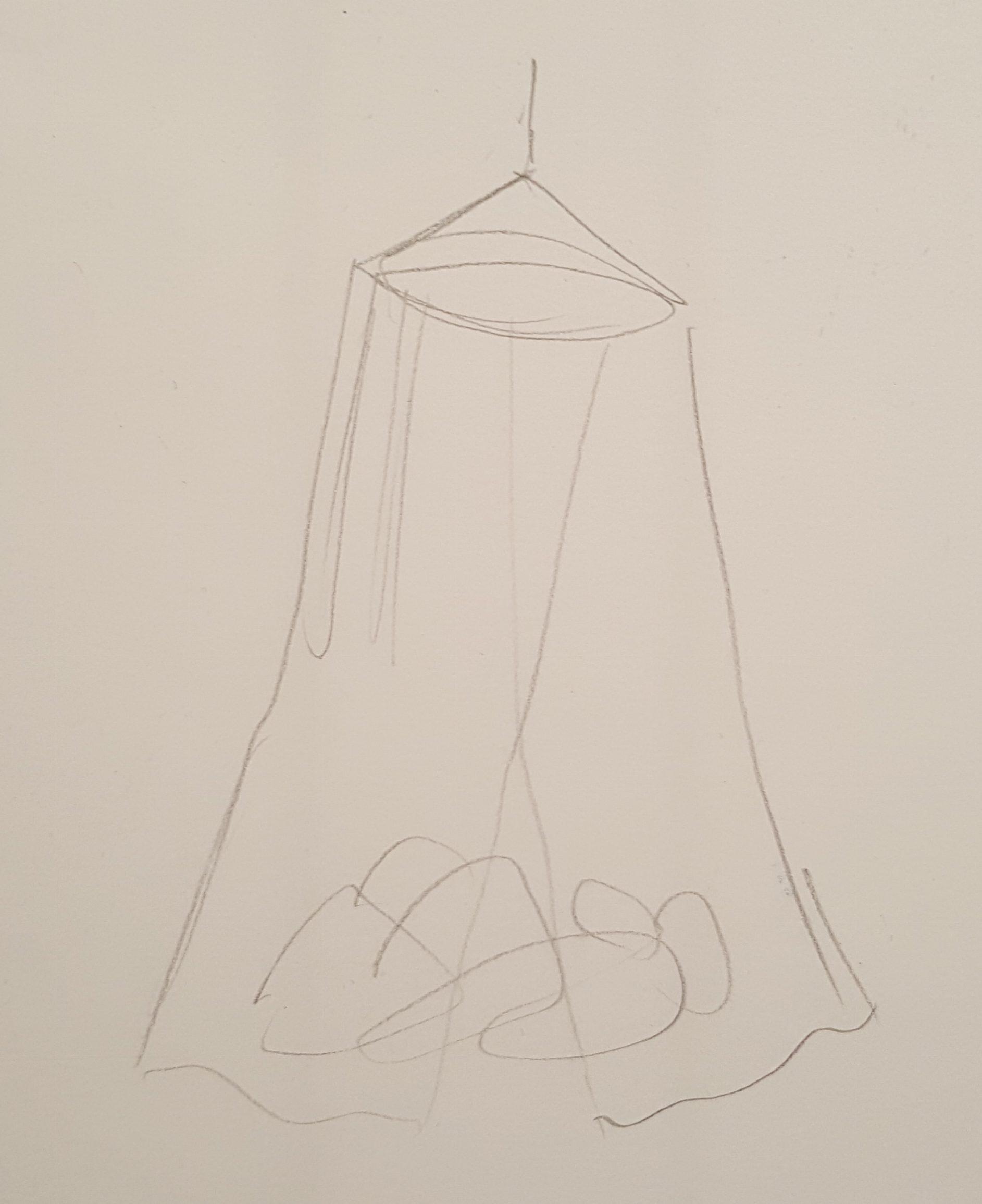
I thought that this space would be perfect – with the opening over on the other side (yellow), facing the window, an enclosed space is created in the midst of a normal setting. The hammock (red) would be covered in strips of cut fabric (purple) from the donations. With this, I made 2 prototypes of how it was possible to create the support. The first is if there was a wire netting support that kind of acts like a swing, and the other is a hoop-based hammock.
(pic)
(pic)

I decided that just crochet would be strong enough as long as I distribute the weight properly.
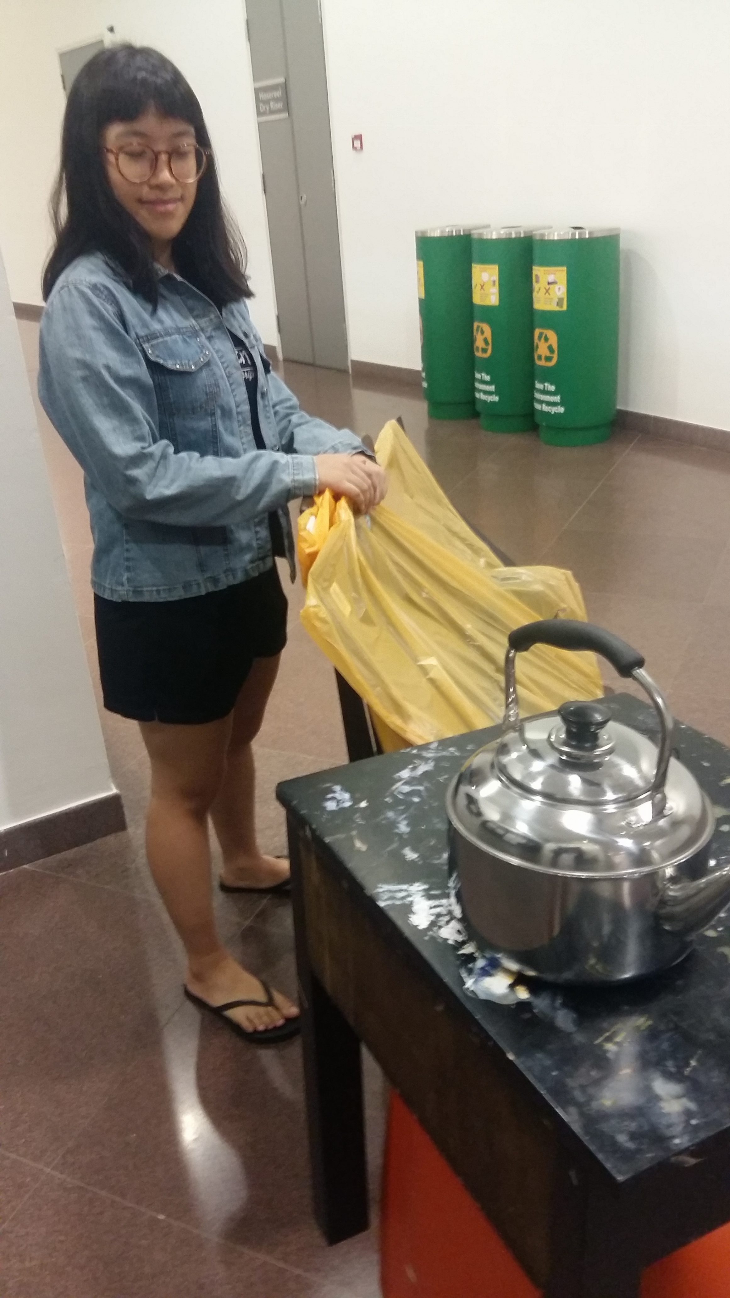
I went back to Jakarta during recess week and during the week, I held a donation drive asking people for their used clothes. Since I have a tuition centre back at my house, it was relatively easy to get people to donate their clothes. I also had a relative who sent us quite a lot of their old clothes. Since I had a baggage limit, I couldn’t bring everything over, but the rest of the clothes should be donated accordingly.


Along with the donation drive, I asked the people to include a memory that is associated with the clothing that they donated. I just thought that maybe this could develop into something more.
Here are some of the messages with the translation.

Cherise’s baby clothes. They were from a relative.

I used to go out in these a lot – I loved wearing these everywhere because it was in season.

This was bought in Mangga Dua (a shopping centre). It was on sale.

This skirt is so well worn it has a hole in it. It was first used on my birthday.
From these, I recorded the translated memories with my own voice. This was a possible soundtrack, however I decided to not use it because it was a little weird and I felt it hindered the audience from thinking of their own memories. Moreover, I wanted the audience to think of memories that are not only associated with the clothes.
I also started crocheting the hammock base. I knew that it would take some time, but I felt that crochet was the apt method because the yarn used is continuous and this acts also as a metaphor of time, continuously winding, adding more and more as more yarn is used.


I was making good progress, however I found out that I did not have permission to use the space under the stairs as it was a fire hazard. I needed some form of support for the hammock and I could not find any other suitable space.
I paused awhile and thought about it. I realised that the hammock was just a point of interest, and that I could still deliver my message about memories even without the hammock. Hence, I explored other ways to create the space. I decided to create a nest of pillows on the floor instead, covered by a crib netting. With this I proceeded to buy materials and crafted the outside netting.

I bought some pillows and started cutting the pieces of clothes. While tying the strips to the outer netting, it came to me that it would be a stronger message if the installation started out completely white, and as the audience come and go, they each tie a piece of fabric, therefore building the installation. This could act as a metaphor of the human mind, and the audience themselves would act as the memory/experience. From a baby, a blank slate, humans go through experiences and make memories, and each is unique, and this is what makes them who they are today.


With this clearer message in mind, all that is left is assembly! It was too late to take off the strips of fabric that I already tied to the outer netting if I wanted a pure white base at the start, so I left them as an example for people to tie their strips of fabric on.

For the final product look, check out this post!
30 August 2017
Today we had a presentation on what our proposed project would be. I collated a few artworks that inspired me through either their looks or their concept.
First of all, I like the idea of having a space within a space. Either transform a space or create an environment where people can do something. I like big scale works that I can gape at, that I can explore like a child playing in a playground. The idea of giving new meaning to an existing space intrigues me as this is exactly how memories work. We give our own context to a space, we attach a particular memory to a particular setting.
As a sentimental person, the way we spend time in a particular place sometimes makes me think of its significance. Time ticks away and we can never bring it back. And of course I like to play too. The inner child in me is attracted to these playground-like spaces.


I also really like when I can interact with lights or music, and I found this artwalk interesting because they remind me of the lalang fields back home in Jakarta. There used to be wide patches of lalang fields near my school and I would walk amongst them, with the wind blowing and I’d twirl around or run across the field with my friends, take photos.
I thought that it would be cool if I could recreate the lalang field except that when a hand is run through it, a recording of the winds of the lalang field in my hometown would play. I am going back this recess week and I could go to record the sound of the winds there. They could also light up accordingly. However I thought that this might be a little too ambitious as I’ve just only learnt programming. Moreover, I wouldn’t say that this is too significant of a memory for me to base an entire artwork out of.
So then I tried listing out some things that I like or are important to me.

This list is not fully representative of topics that matter to me, but these are just some things I had in mind. I decided that for this project, I would like to expand on my project from my Foundation 3D class. Based on a Kandinsky painting, I created this theoretical playspace equipped with napping pods. In this world where people are constantly working and/or studying, with the fast pace of life and high level of stress, sometimes I find that all I want to do is escape for a while and take a nap. This is why I thought that it would be nice to have this multi-level structure with slides and different sizes of napping pods.
I’m not yet sure what kind of space I would like to create, but I would really love to create maybe a large crocheted web across a room with pods where people can sleep in or rest in. Of course I would only be making a prototype of sorts, since there will probably be not enough time to fully realise the whole thing.

I am looking to crochet since I have considerable experience crocheting and the nature of crocheting is quite interesting. It takes up a lot of time, but it is very easy to manipulate to our liking.

I’ll explore my idea more and we’ll see where it takes us!
For the next process post, click here!
For the final product, click here!
I can’t believe year 1 has come to an end! The past semester has been a great learning experience for me. I learnt so much in 4D and I have to say, it really is a journey of self-discovery.
This last project is a culmination of everything I’ve learnt in the past year. In the form of an installation, we were challenged to make use of a specific site in order to construct a narrative (hence the title of the project). We got together and discussed what topic we would like to expand on.
IDEATION ◊ RESEARCH ◊ PLANNING
We did a lot of sharing on drive, and the bulk of our planning was done there.
This resulted in our project proposal.
The week leading up to the installation date, we did not really do much real preparation. We weren’t confident that out proposal would be accepted, and we were already anticipating on changing our ideas. To be honest, I knew that our installation idea had potential and that maybe Ruyi would want us to change just a few aspects to have more of a storytelling aspect. This anticipation made us discuss more about the storyline and fortunately, our idea was accepted.
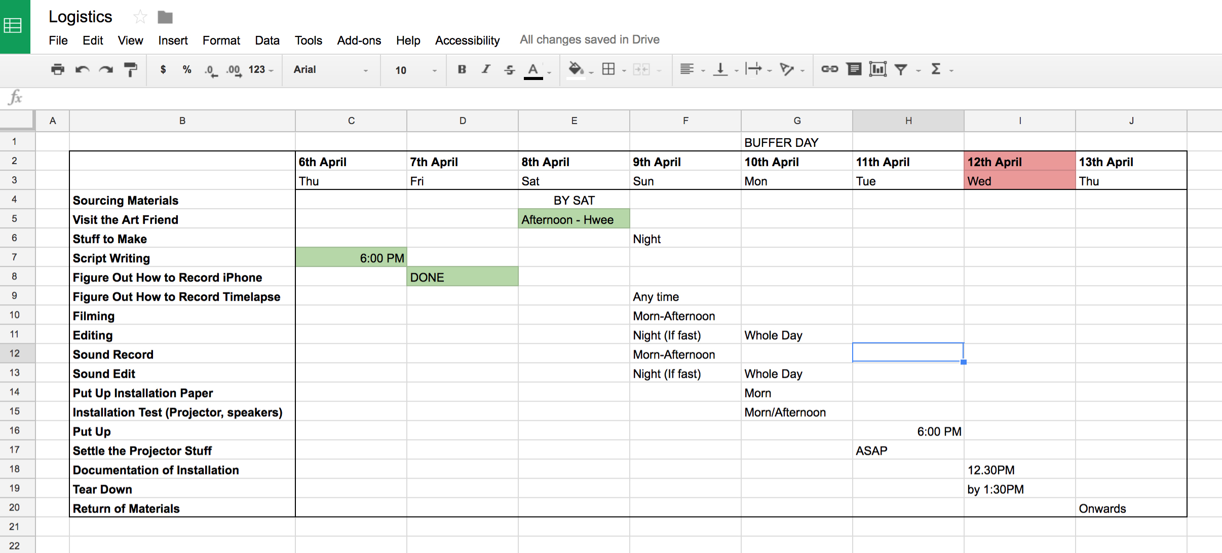
With less than a week to prepare, we planned on how we were going to go about doing things. This is where my love for planning comes up and I am just in love with the spreadsheet Hwee Ann came up with. I mean, without it I will just waste my time and go about doing things blindly, so I’m very appreciative of the spreadsheets.
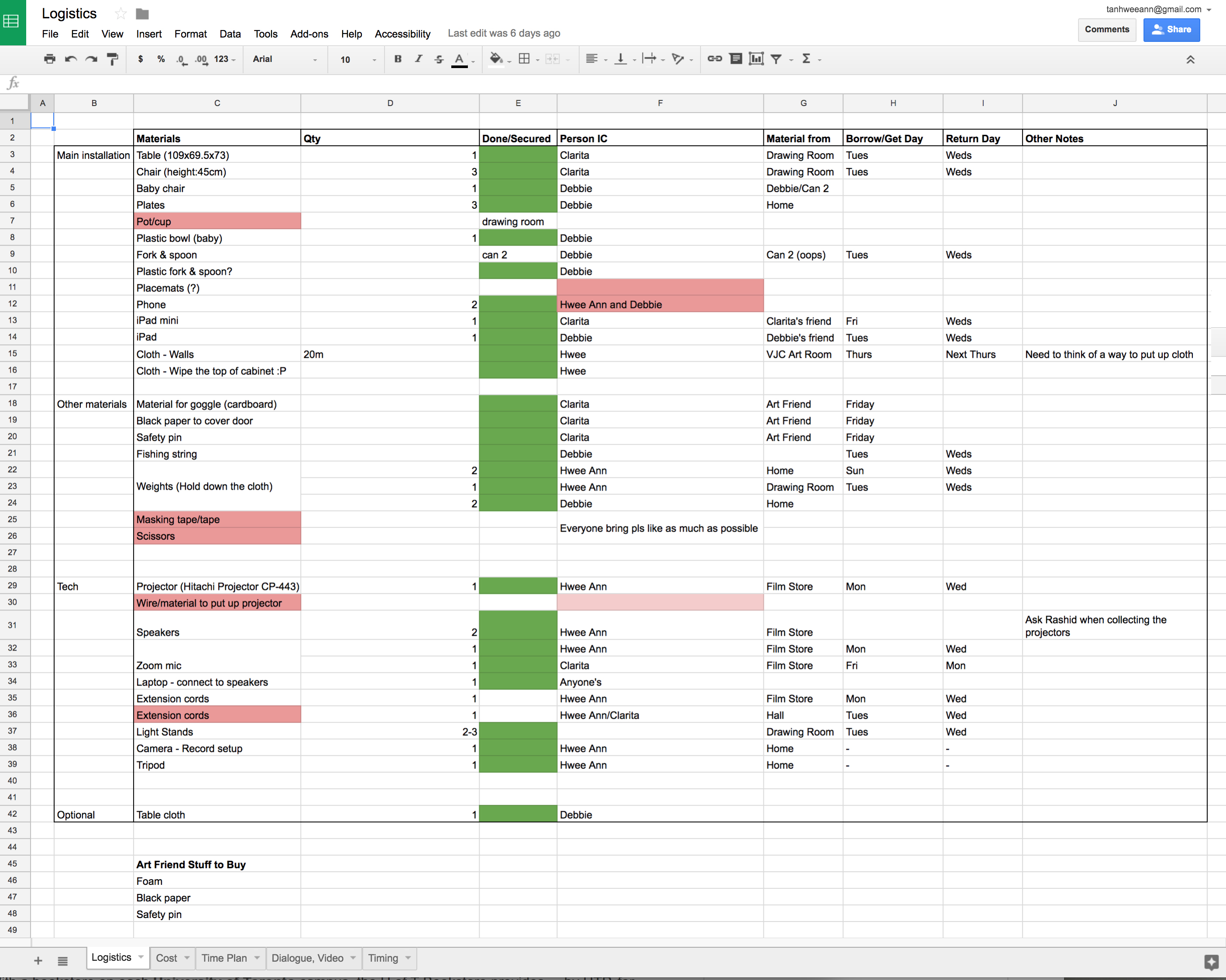
Logistics
 Timeline
◊ STORYBUILDING ◊
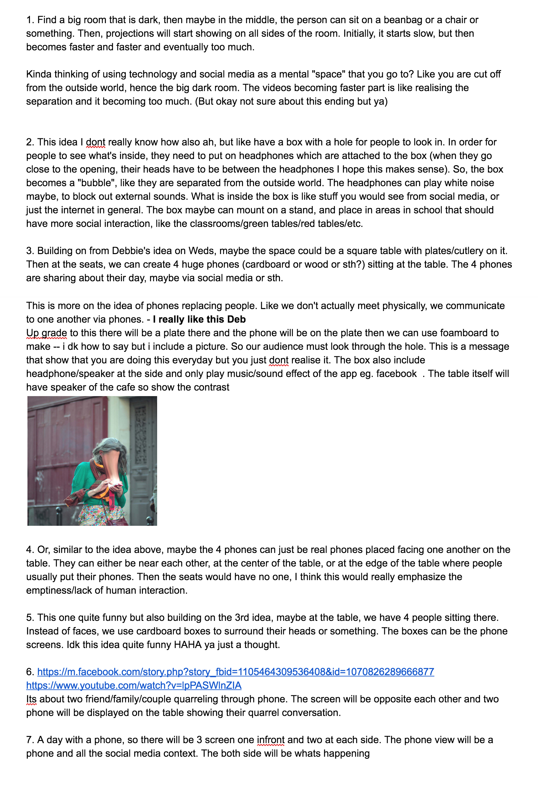
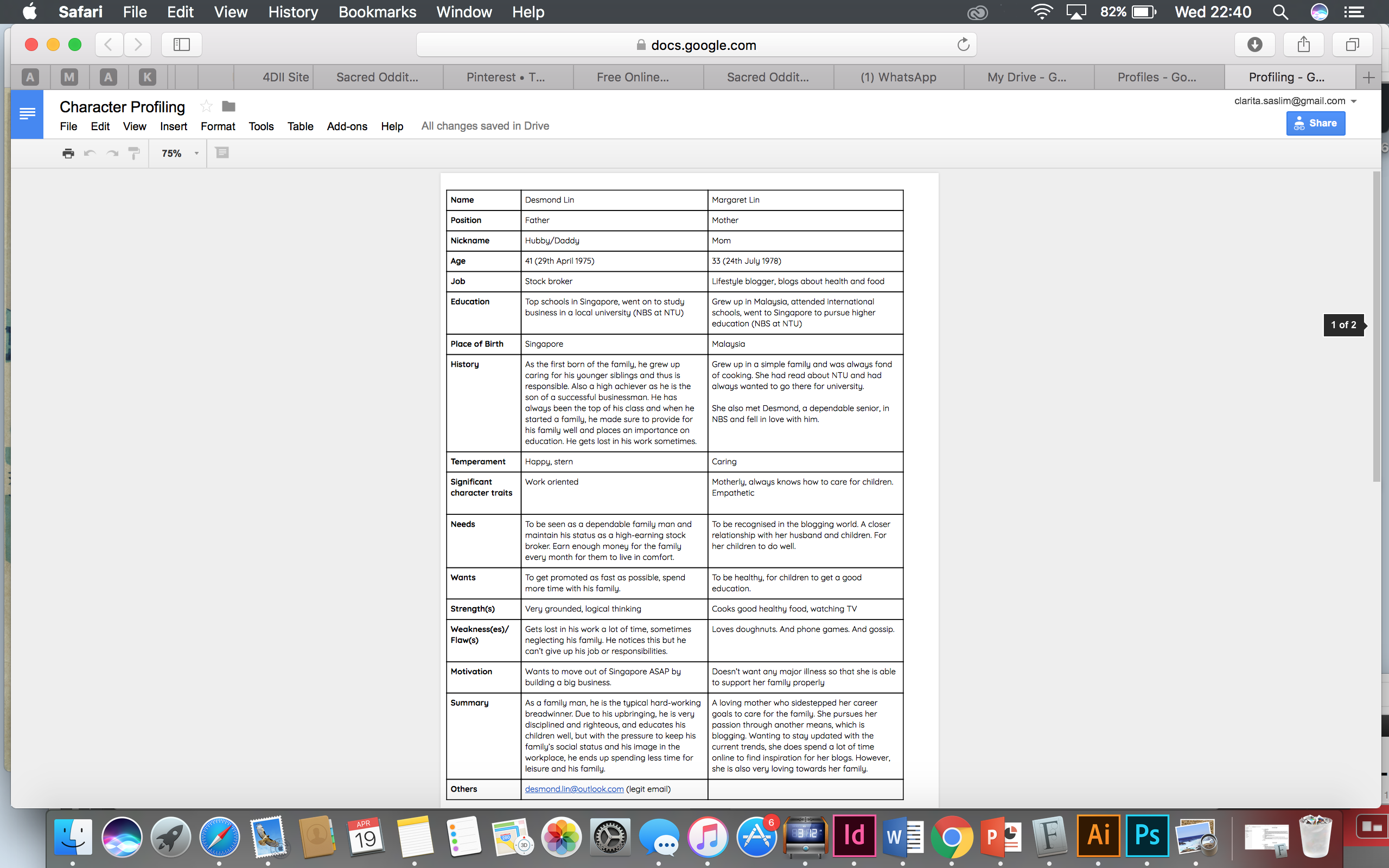
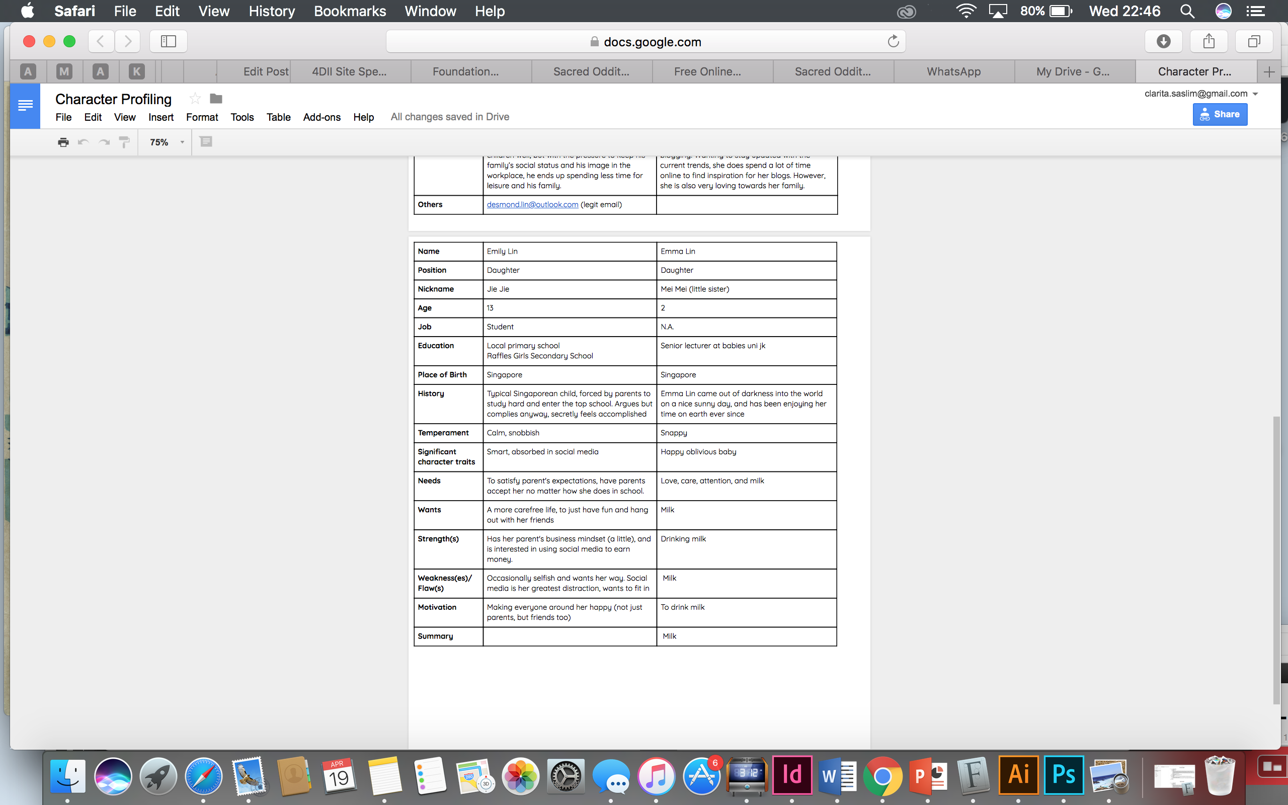
The narrative is an important aspect to this installation. What can/would happen on the dining table? As I have learnt from the first project, character building is extremely important in creating believable characters, and ultimately, a believable story. We wanted ours to almost become a stereotypical story, but we properly made sure that the family is real.
Hence, we started off with character profiling. (Due to some miscommunication, I forgot to share the updated file with my friends, but here is the combined version:)
Since we aren’t telling the story in the traditional sense of a narrative, we knew that planning was crucial to ensure flow. The way the narrative would unfold is through the phone/iPad screens of the family members (personal narratives) and through a background audio (combined narratives). This way, we are not only showing the story by itself, but also showing it through the eyes of each character. This we hope could shine light on the characters’ personalities and give a closer look into their lives.
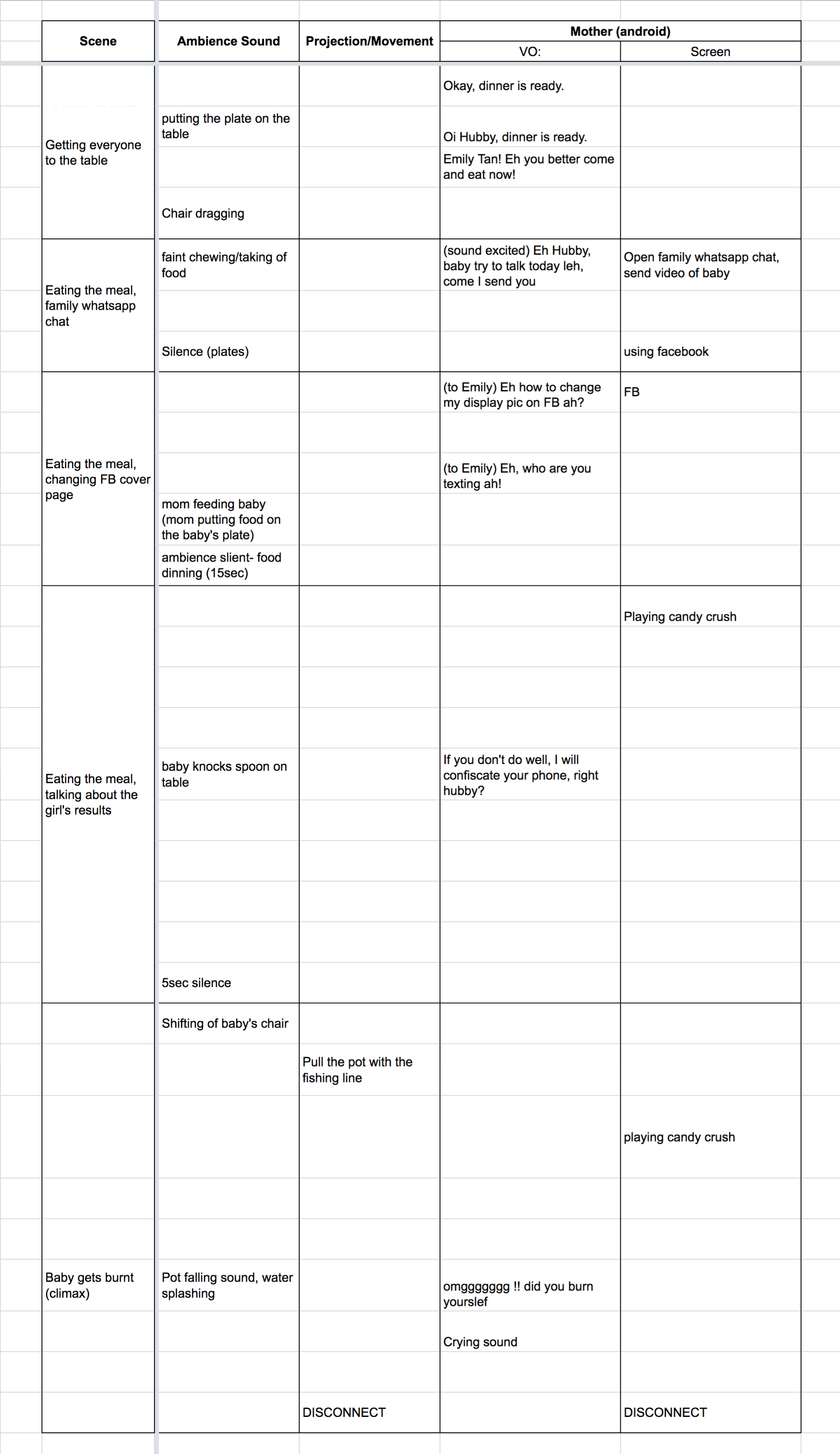
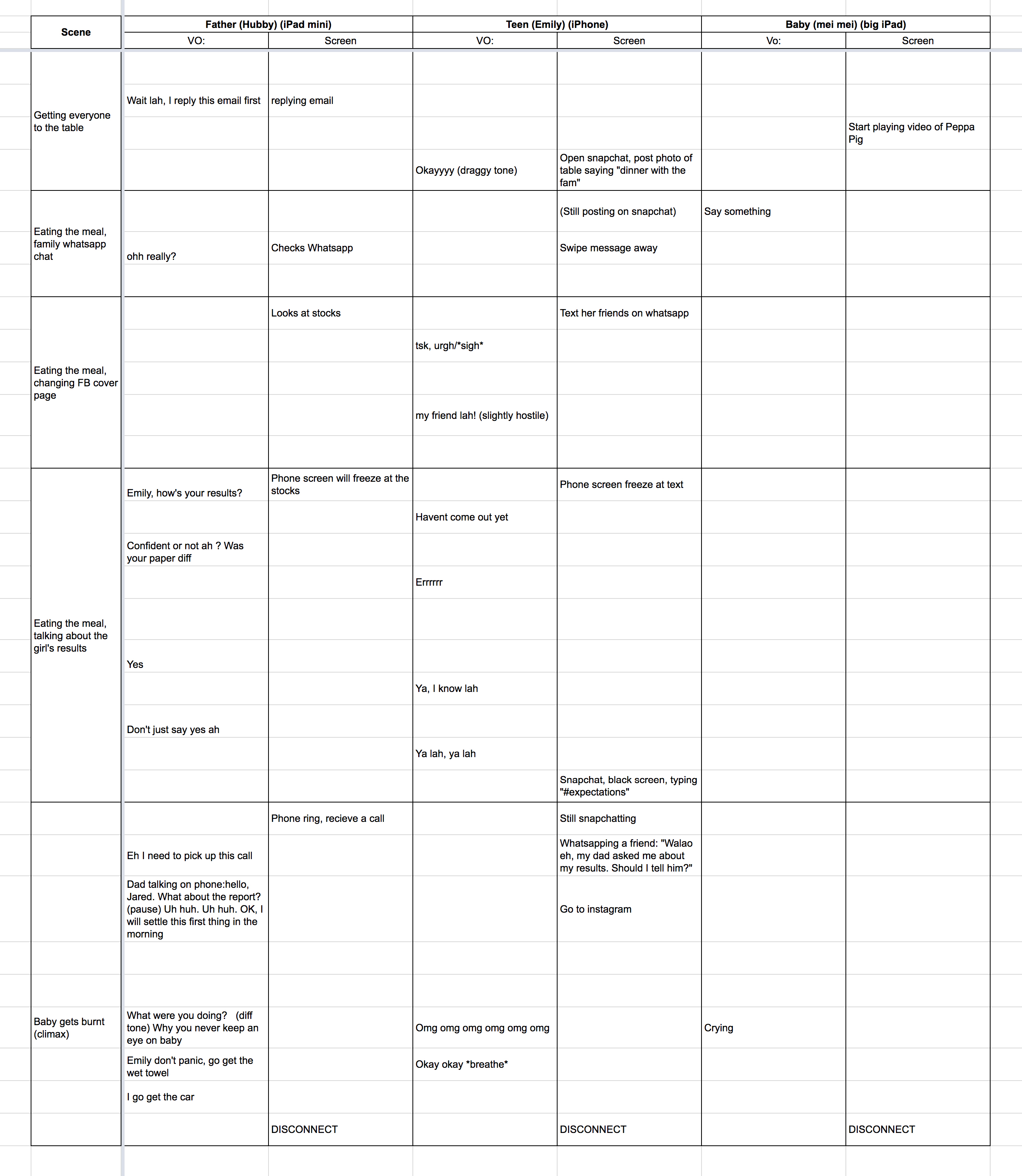
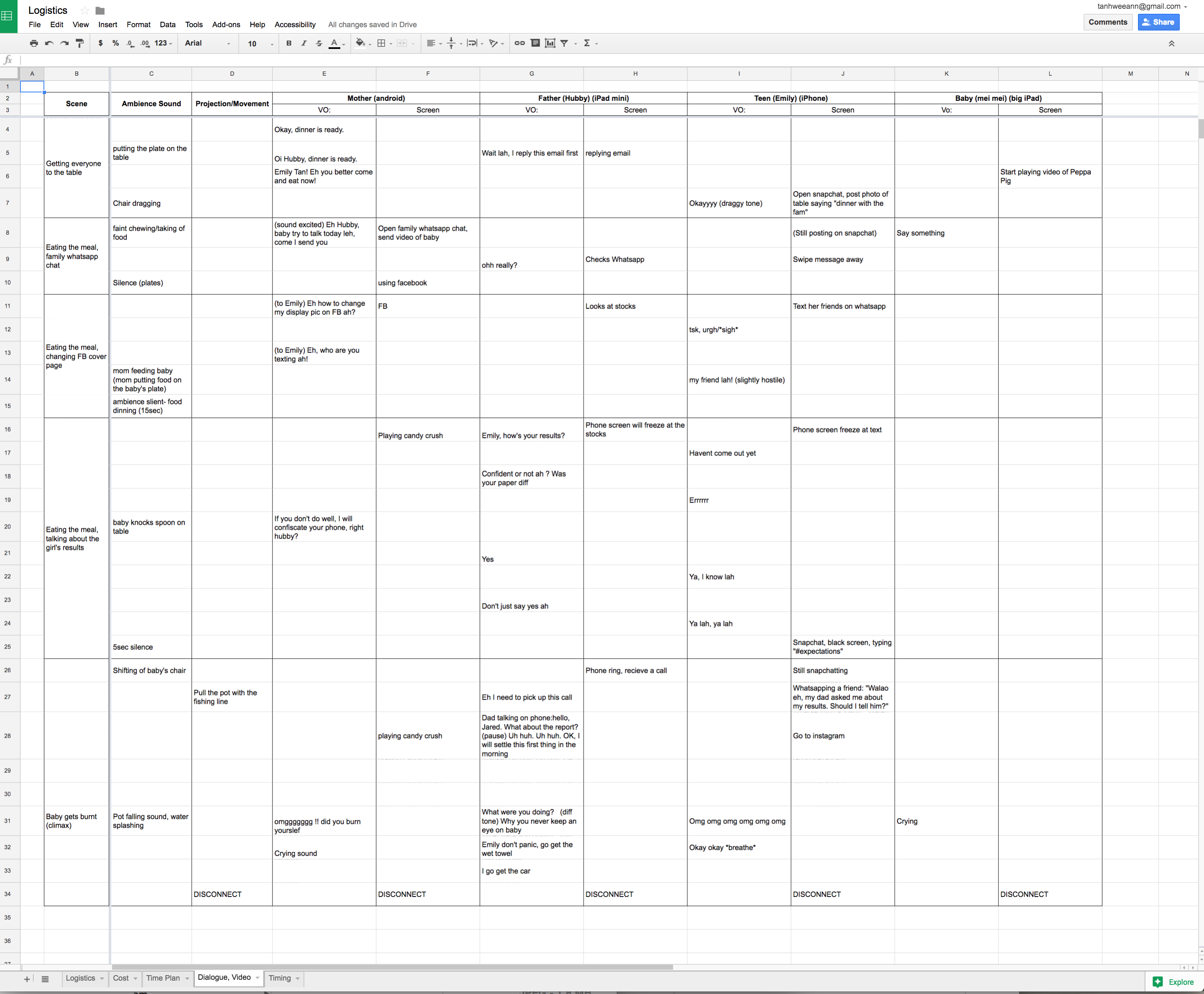
Again, we did it in excel to properly sync everything.
Originally, I felt that the installation should play for longer, at least 5 mins. However, after discussion, I realised that my teammates had a point about having the audience’s attention kept in check. A shorter video would mean the audience wouldn’t get bored easily.
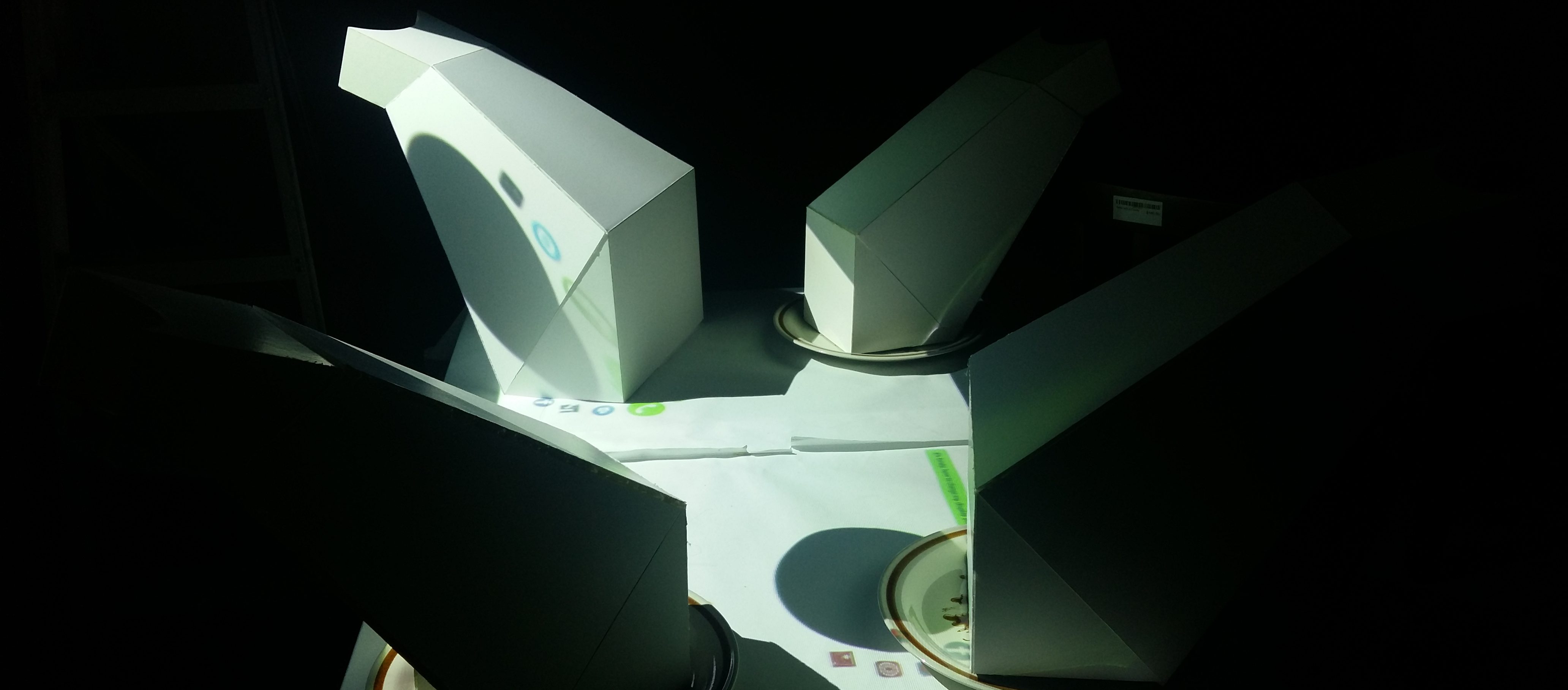
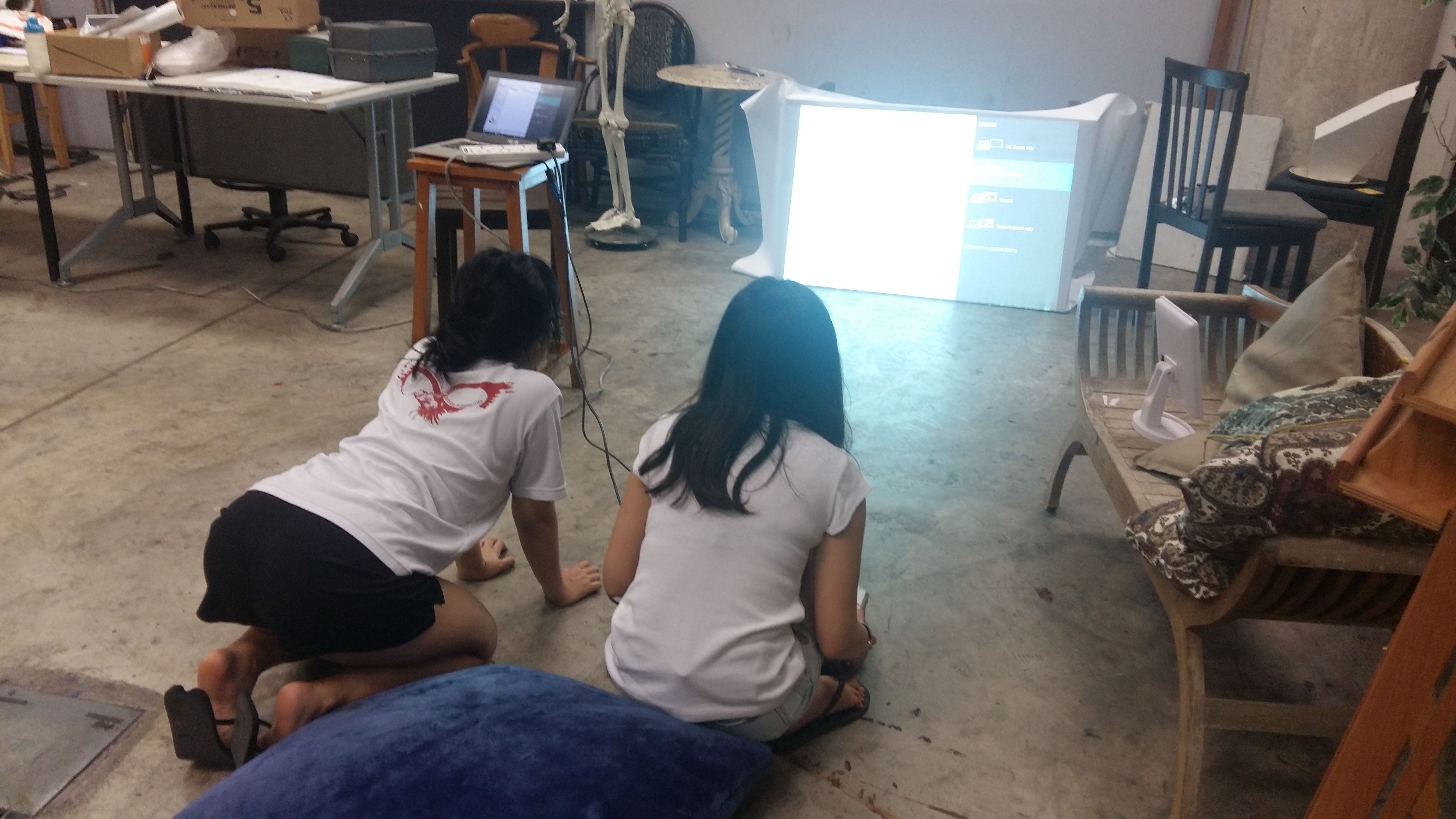
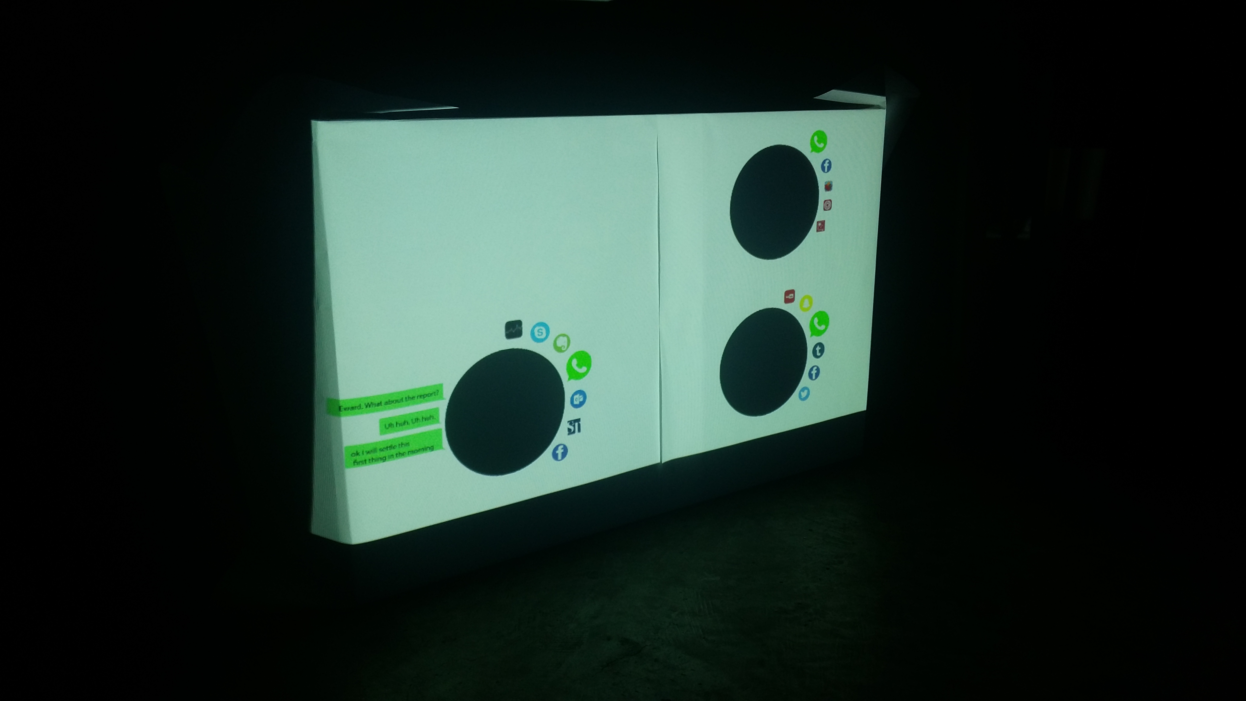
Along the way, Debbie came up with an excellent idea of having a projection on the table that would show viewers the activities each character is going through on their respective devices. This was what I had in mind initially, but dismissed because I’d have no idea how to do it. However, once Debbie said that she has done projection mapping before, I was so elated because it would be a really cool and interactive effect! This was also to facilitate easier viewing for audiences who are in the room but are not using the goggles.
Afterwards, we realised that we didn’t have enough time to properly sync all the apps appearing on the projection table. Moreover, the table’s size didn’t allow for our ideas, otherwise they would appear too small so we scrapped the idea and decided to just show the conversation unfolding in chat bubbles. This was also to identify the characters sitting in which position on the table.
◊ EXECUTION ◊
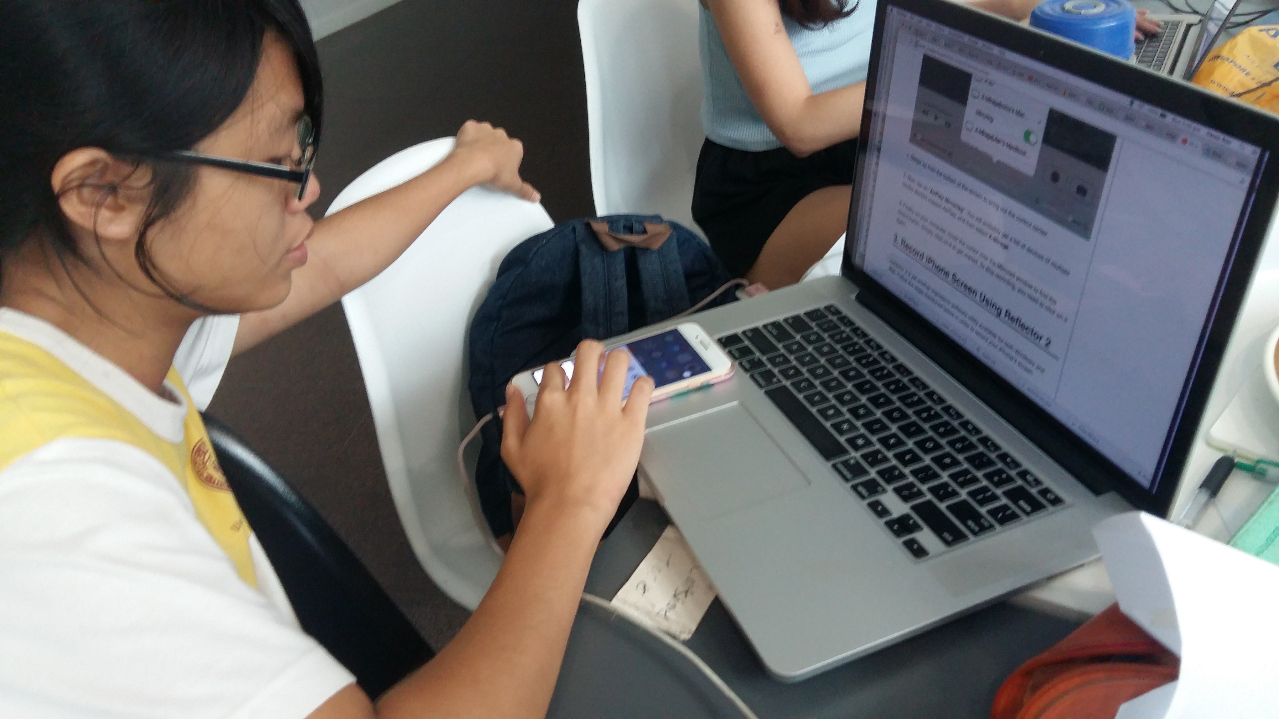
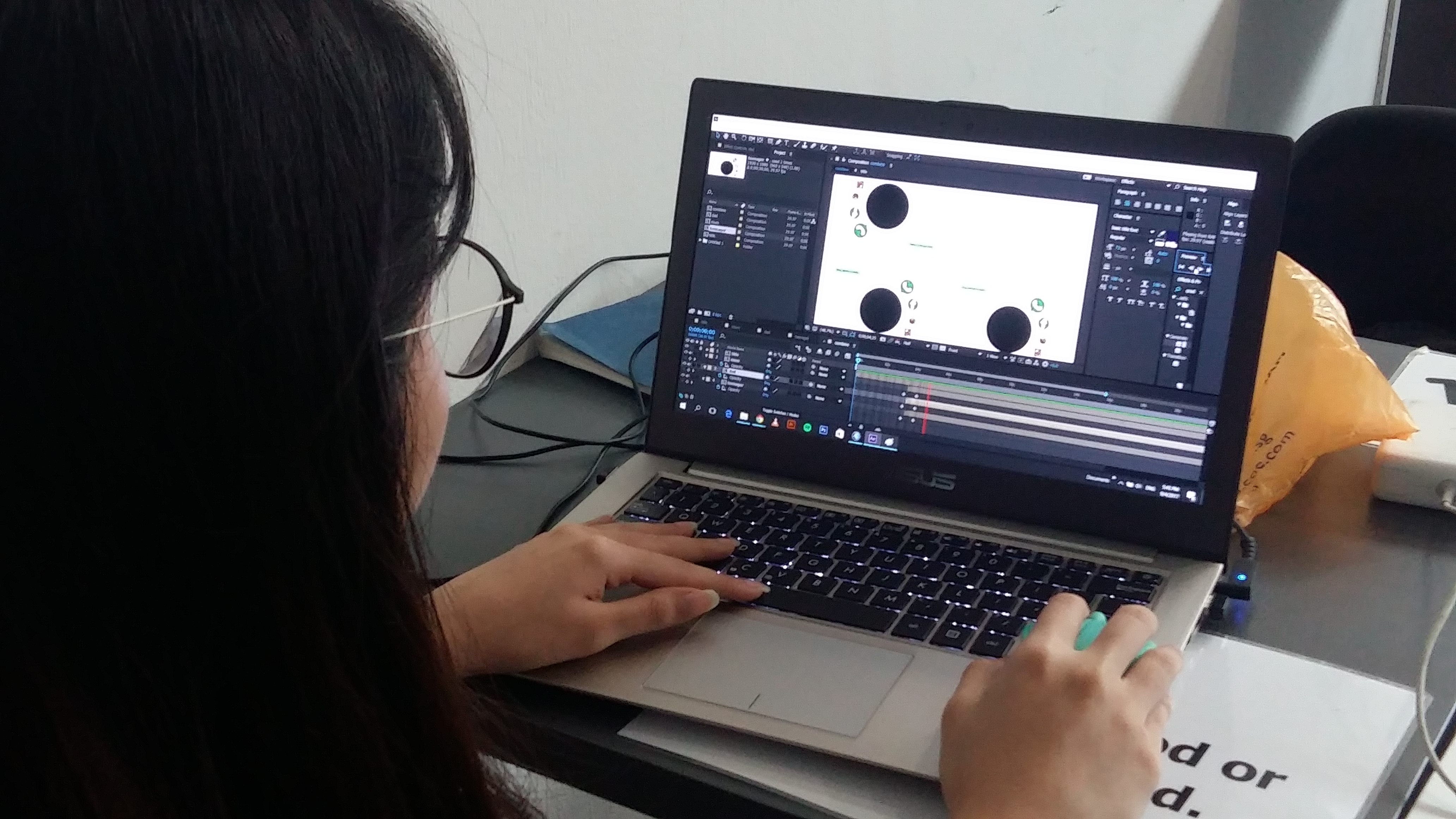
With all said, we split the work. I focused on creating the goggles, Debbie did the projection mapping on the table and Hwee Ann focused on recording the phones/iPads usage, and editing the videos together. Check their process posts out to find out more from their side!!
They did a really really good job on their parts and although I was hoping to help them out more on the editing side, I faced more challenges on making the goggles than I anticipated. However, I really loved how each of us brought our own strengths and experiences to the table and this I feel is the main reason why we work well with each other and could accomplish this much work in just over a weekend! I am so proud of what we have gone through.
For the goggles, I started making them during one of our meetings. I planned and started making the stands for the devices while Debbie worked on the animation and Hwee researched on how to record phone screens.
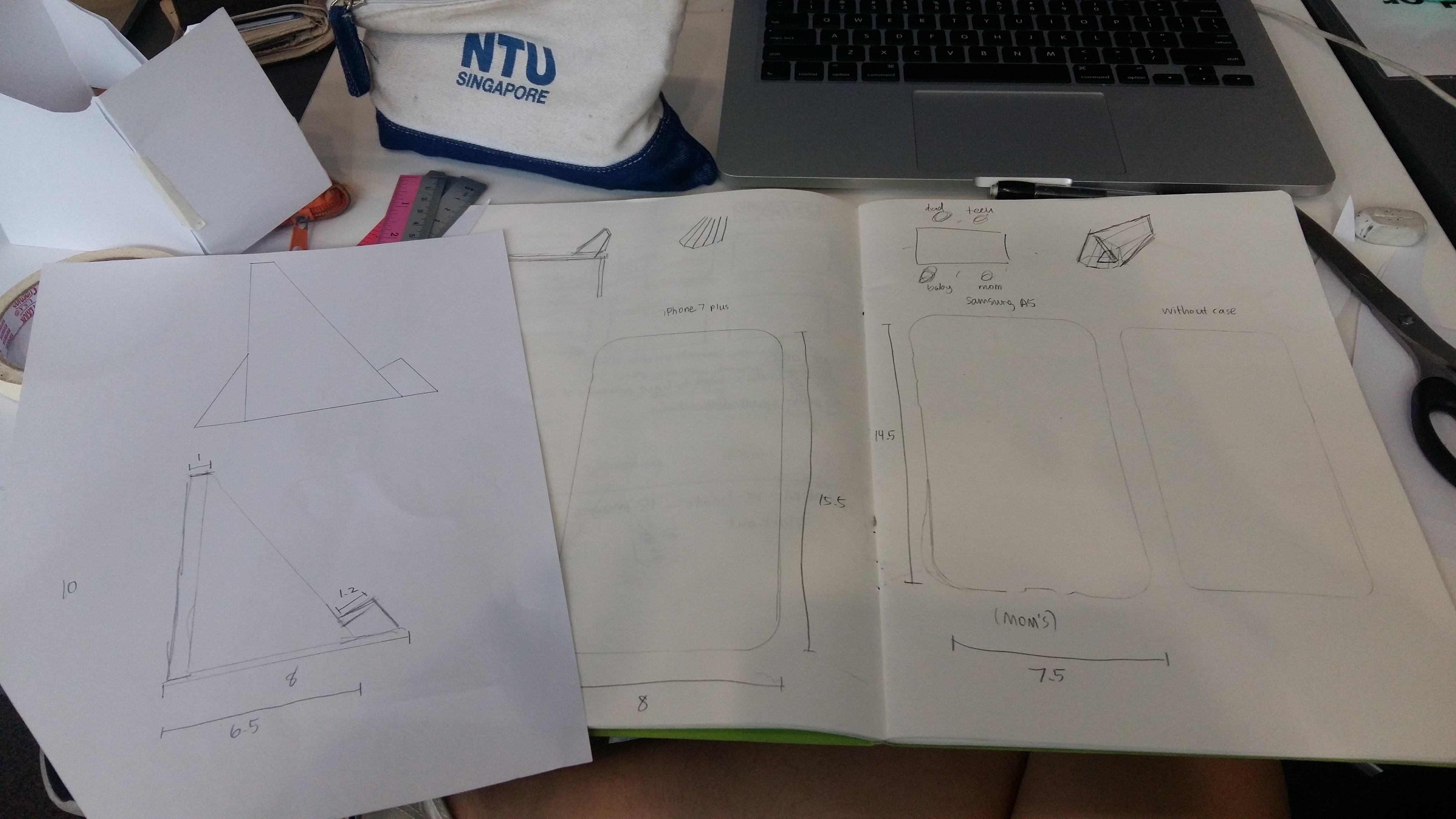
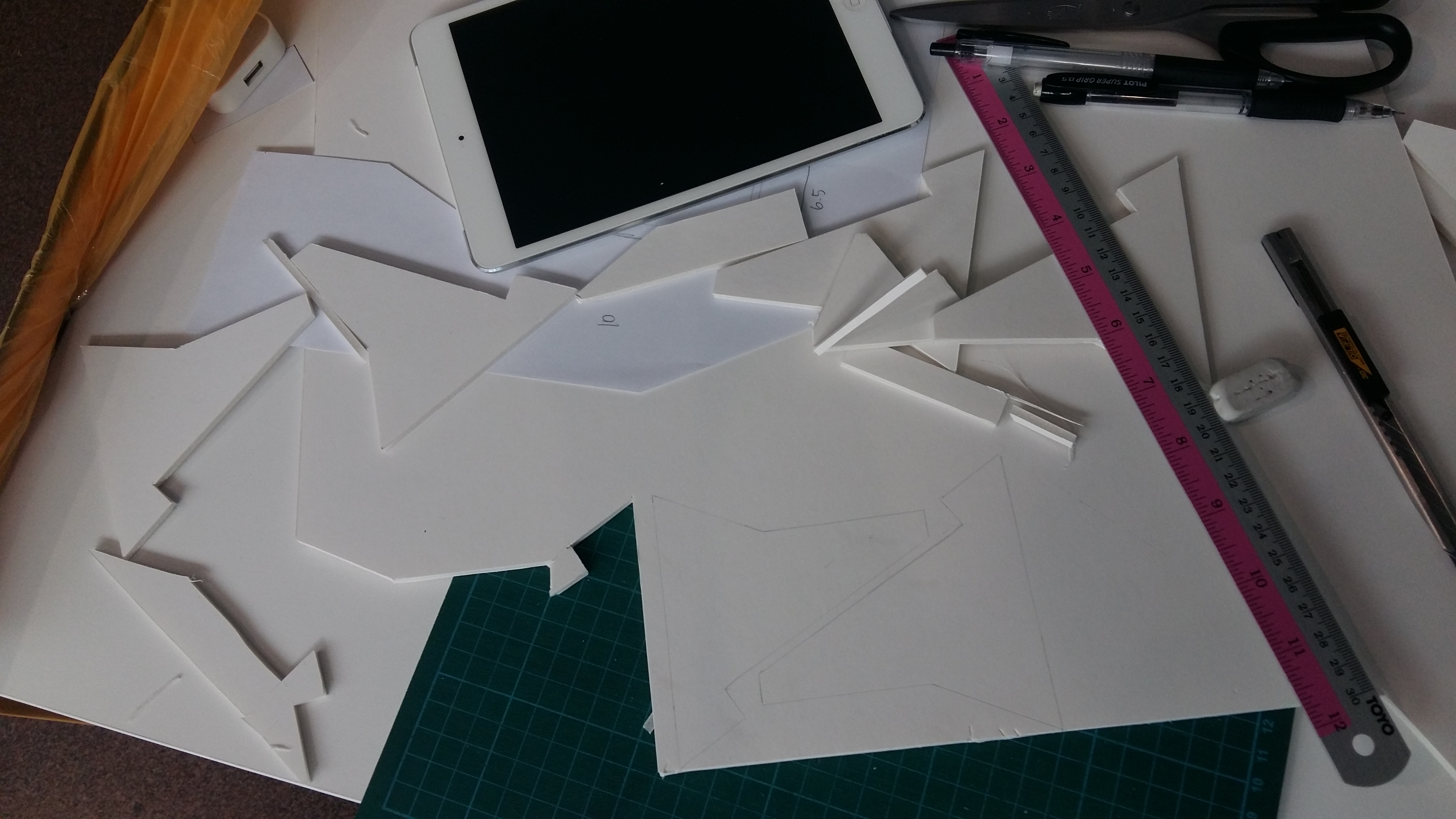
For the goggles, I had a specific idea in mind how it would accommodate the audience’s viewing pleasure and comfort. We wanted the viewers to be completely blocked off from their surroundings when looking at each screen, so I thought that simple trapeziums weren’t enough. Hence I designed a googles-attached scope… thing.
And I’m quite happy with the results!
At first I think that Hwee Ann and Debbie expected for me to finish the goggles way faster (which I think so too), but thankfully, they understood when I faced some challenges and trusted me with the creation of the goggles. Thanks guys!
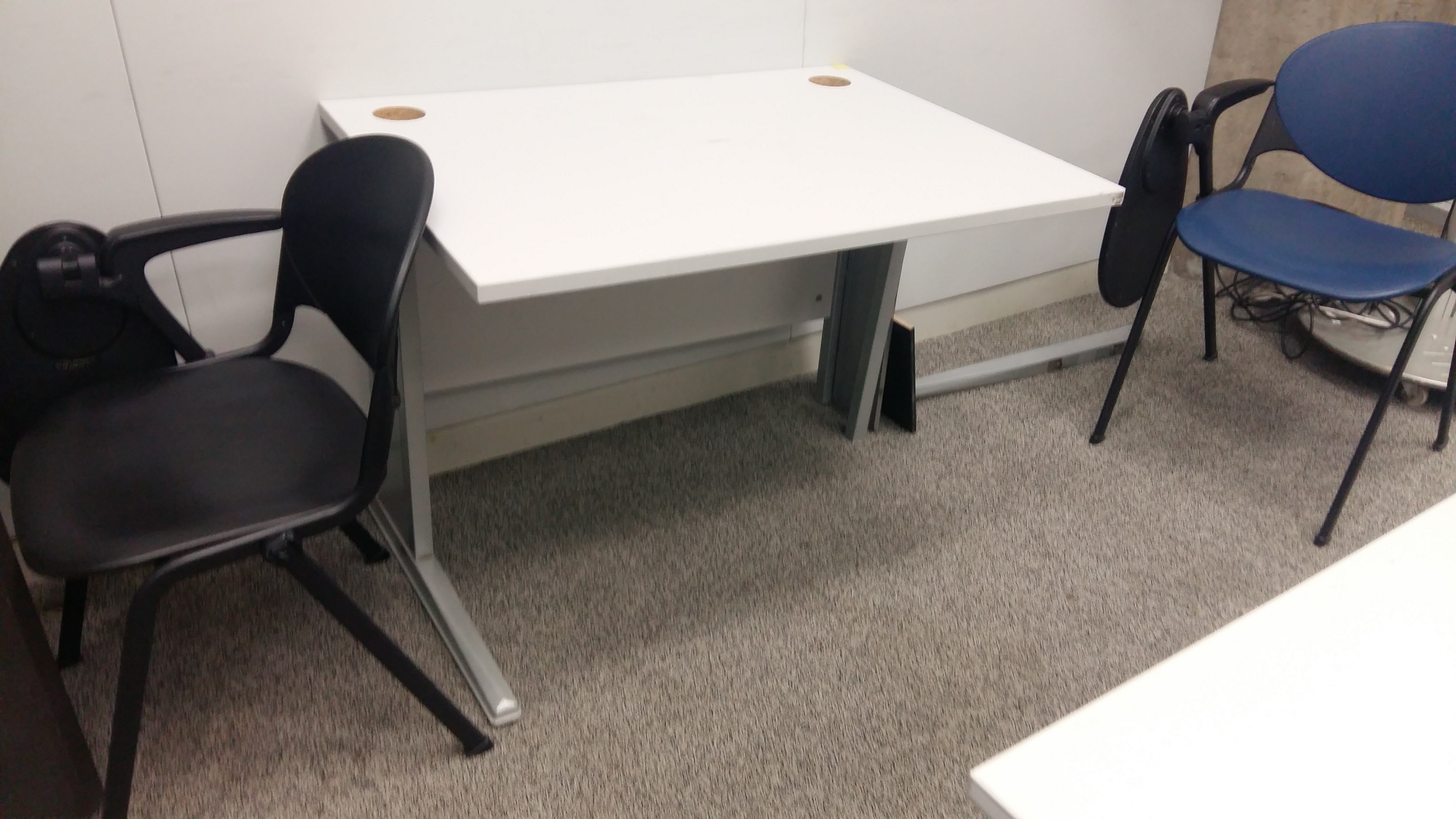
Another thing we did was sourcing the props for the installation. The ultimate musts were the table, chairs, dinnerware and goggles/stands. With the goggles done by me, and dinnerware provided by Debbie, we decided to source for tables and chairs in ADM so that it would be easier to set up.
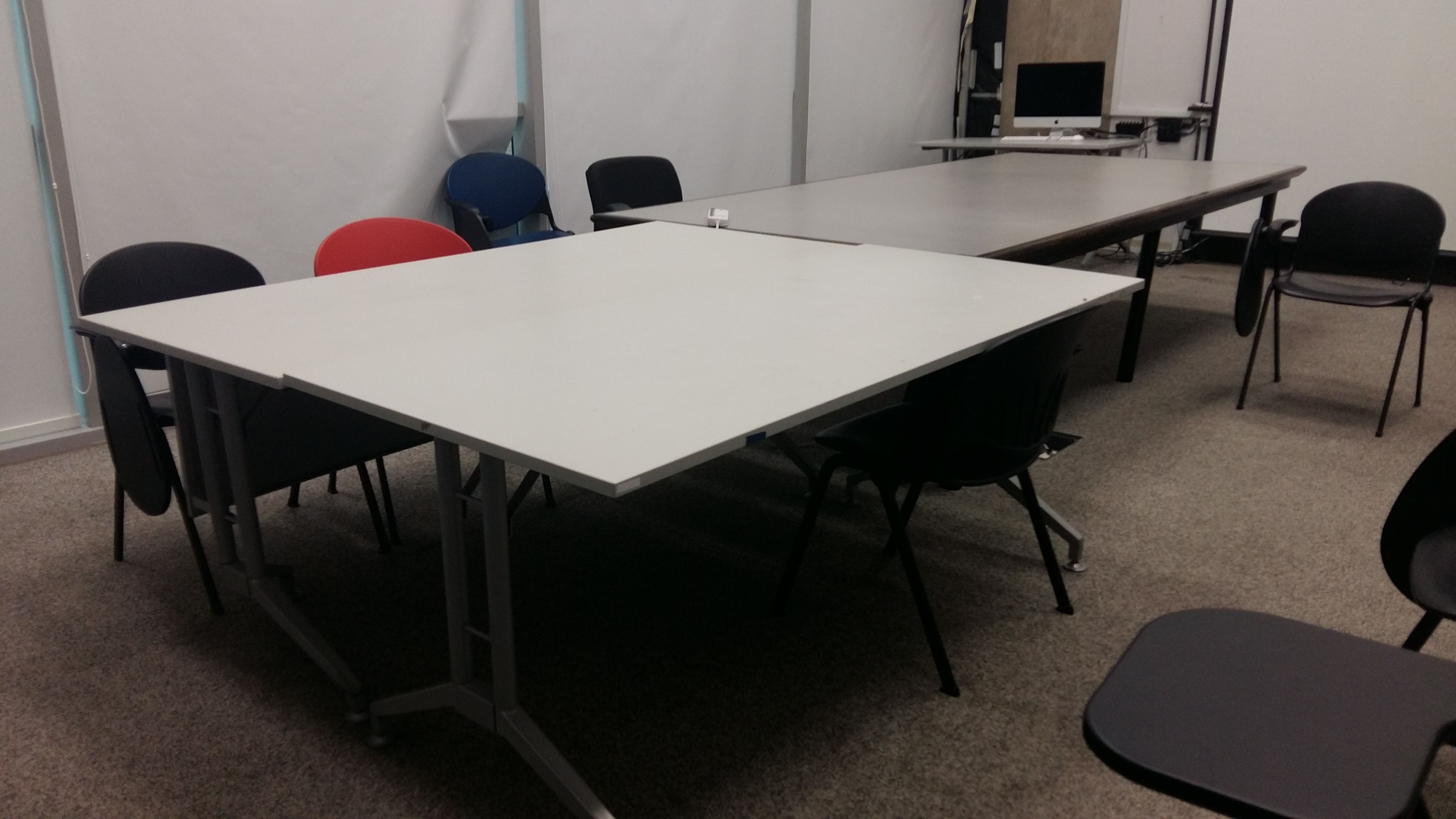
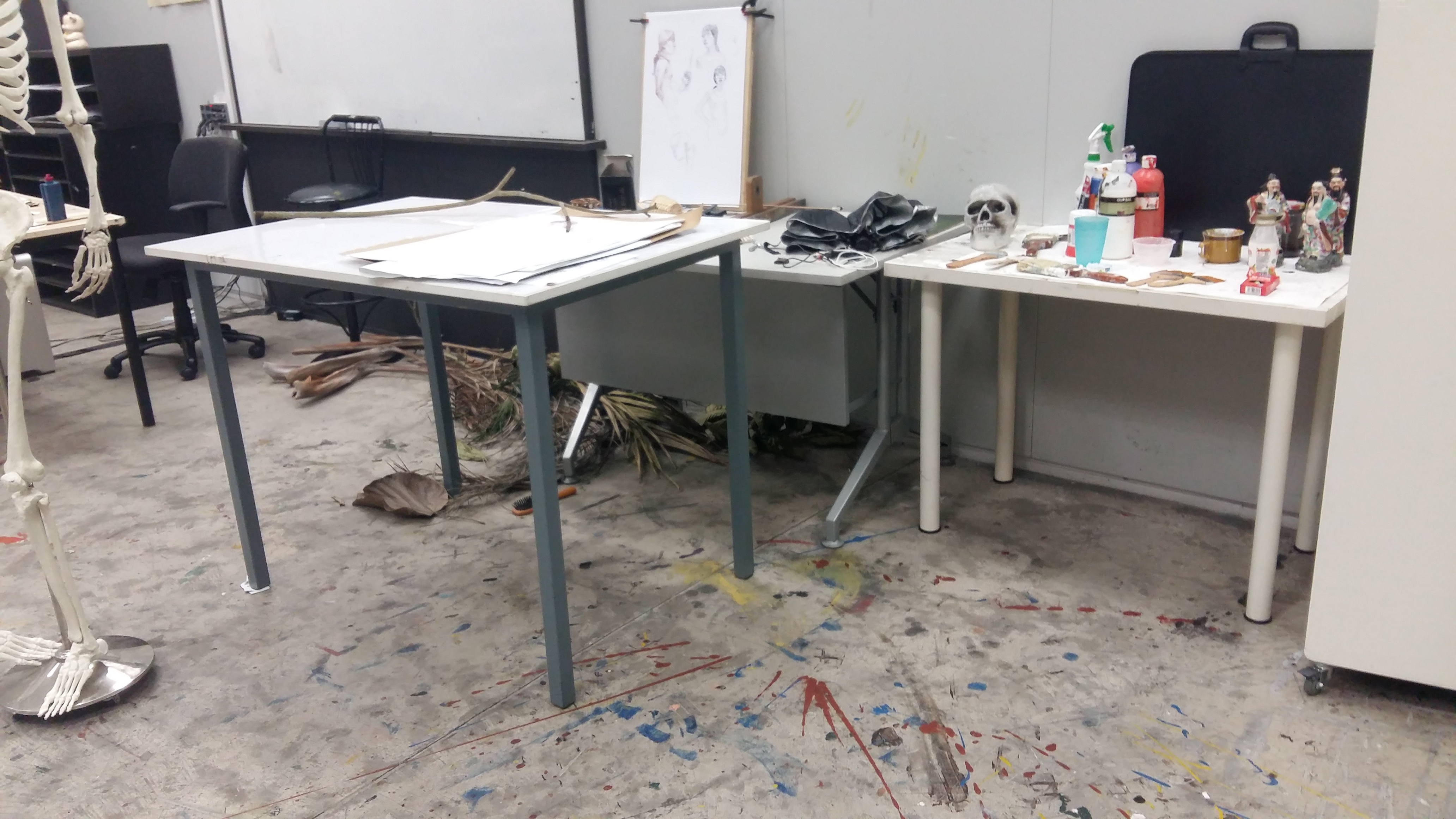
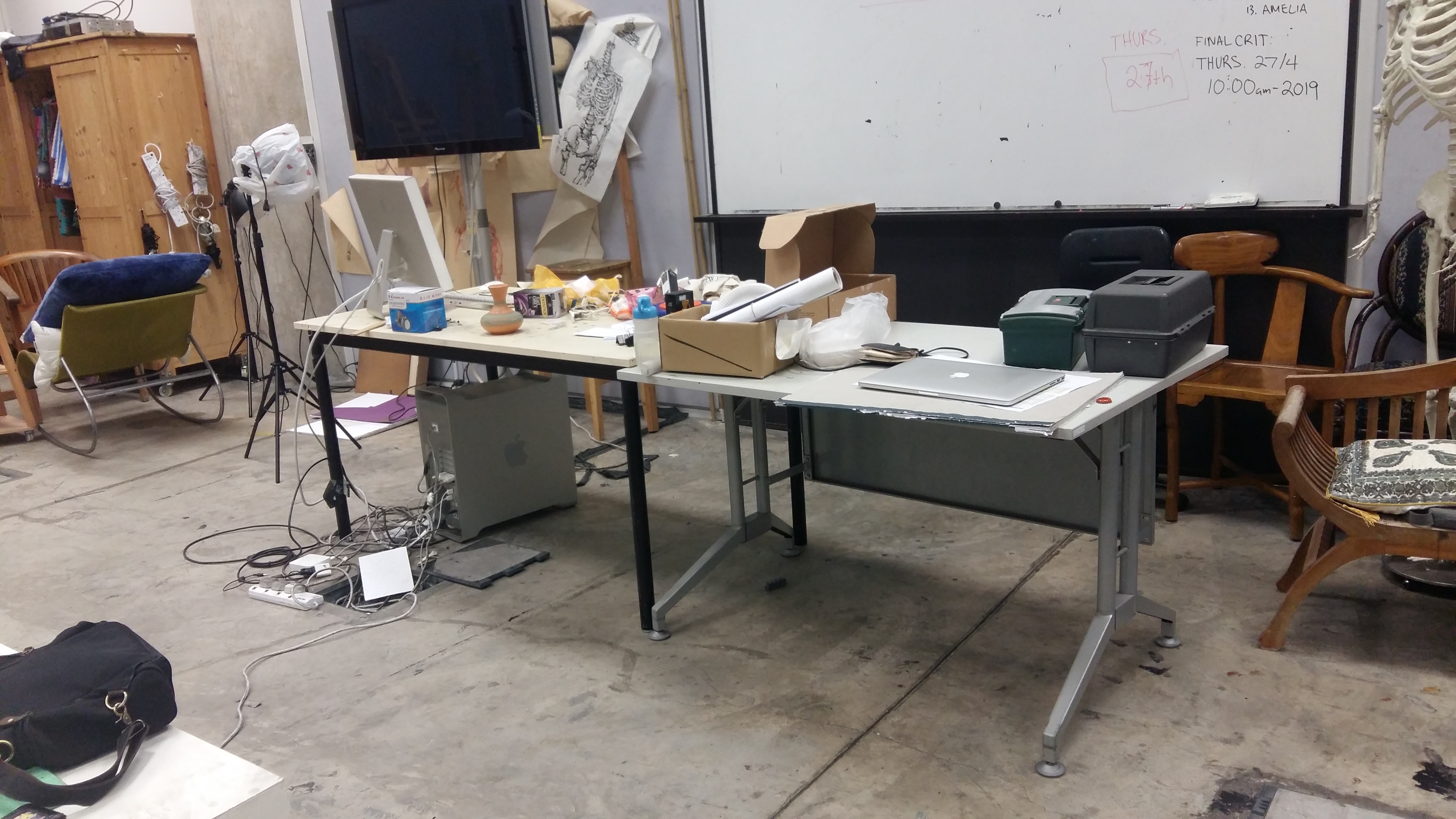
Wonderful tables all around ADM, but this baby hidden underneath stacks of paper in the drawing room was the winner:
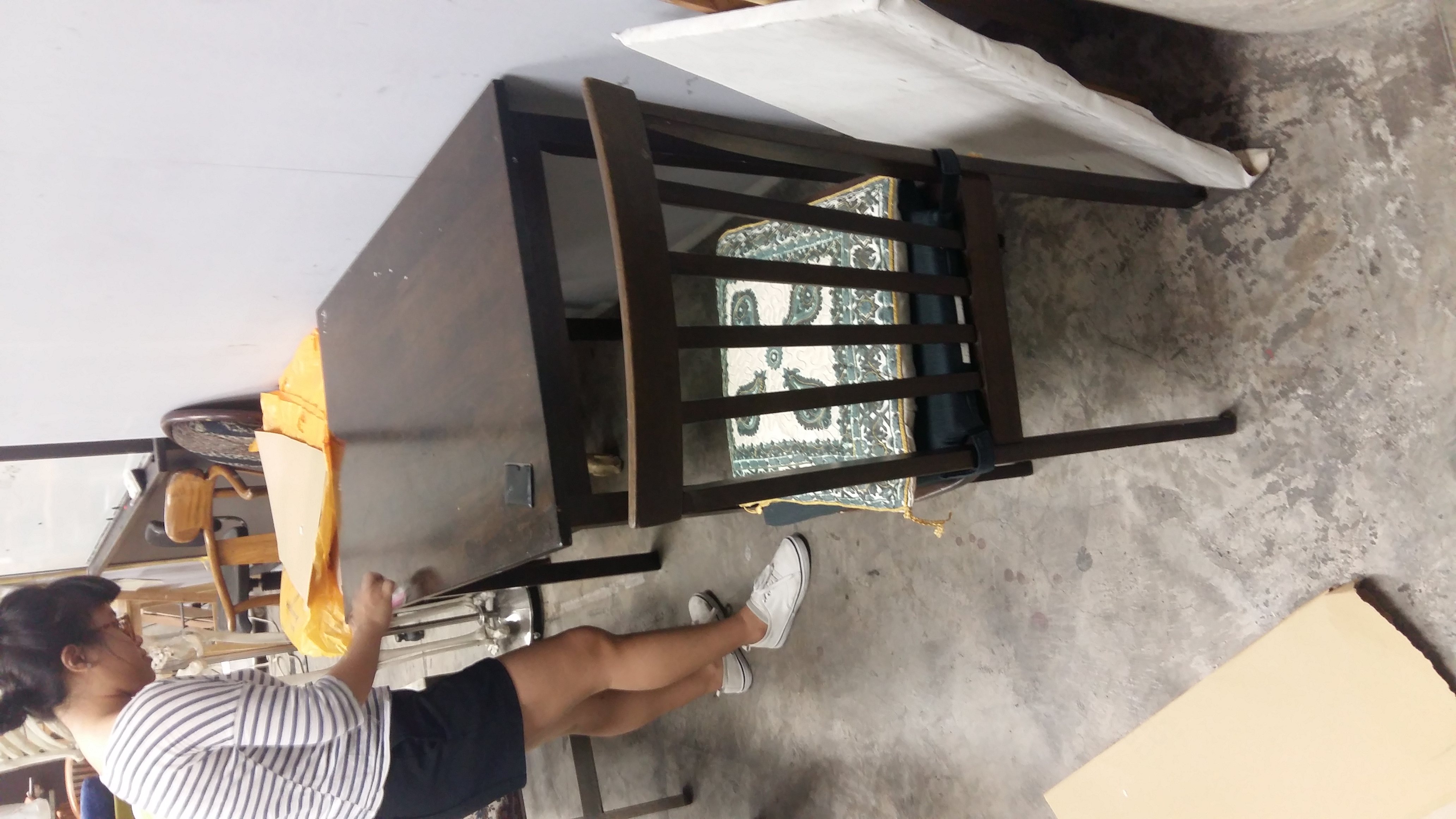
We found 3 chairs that were perfect with the table. And for the baby chair, thanks can 2.
Other chairs that didn’t make it through elimination. Better luck next time, folks!
Immediately, we tested projection by covering the table with white mahjong paper and tilting it to gauge the distance needed between the projector and the table.
Since we had a normal sized projector, we started thinking of ways to mount the projector on the ceiling. We were quite innovative and thought of using a mirror to reflect the projection downwards while the projector is horizontal. However, after some testing with Hwee Ann, we realised that the size would be a problem. After Facebook calling Debbie who was at home working on the After Effects for the projection, we decided to try and hang it up anyways.
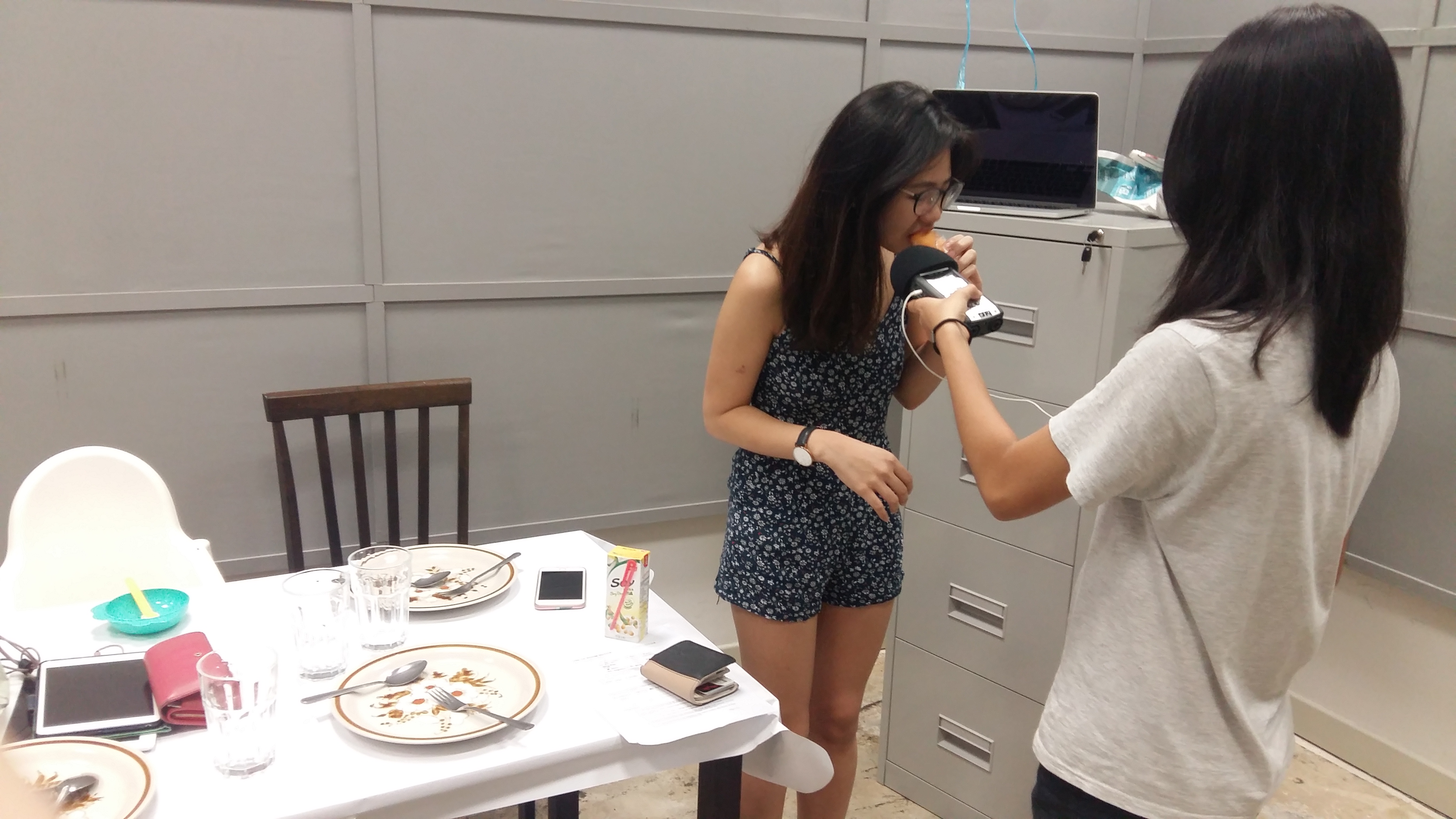
For sounds, Debbie went to visit her friend Celeste, who has a family and is currently pregnant! She recorded their voices as the mother and father, and Debbie herself acted as the teenager. We also recorded all the ambience and background sounds in school. From chewing sounds, to footsteps, chair dragging, and cutleries clinking. Overall, I think that Hwee Ann really did a good job in combining the sounds recorded to create a realistic dining room sound.
With the sound recording done and the mixing of the main background audio, it was easier to edit the individual videos and projection based on it so that everything would be synced.
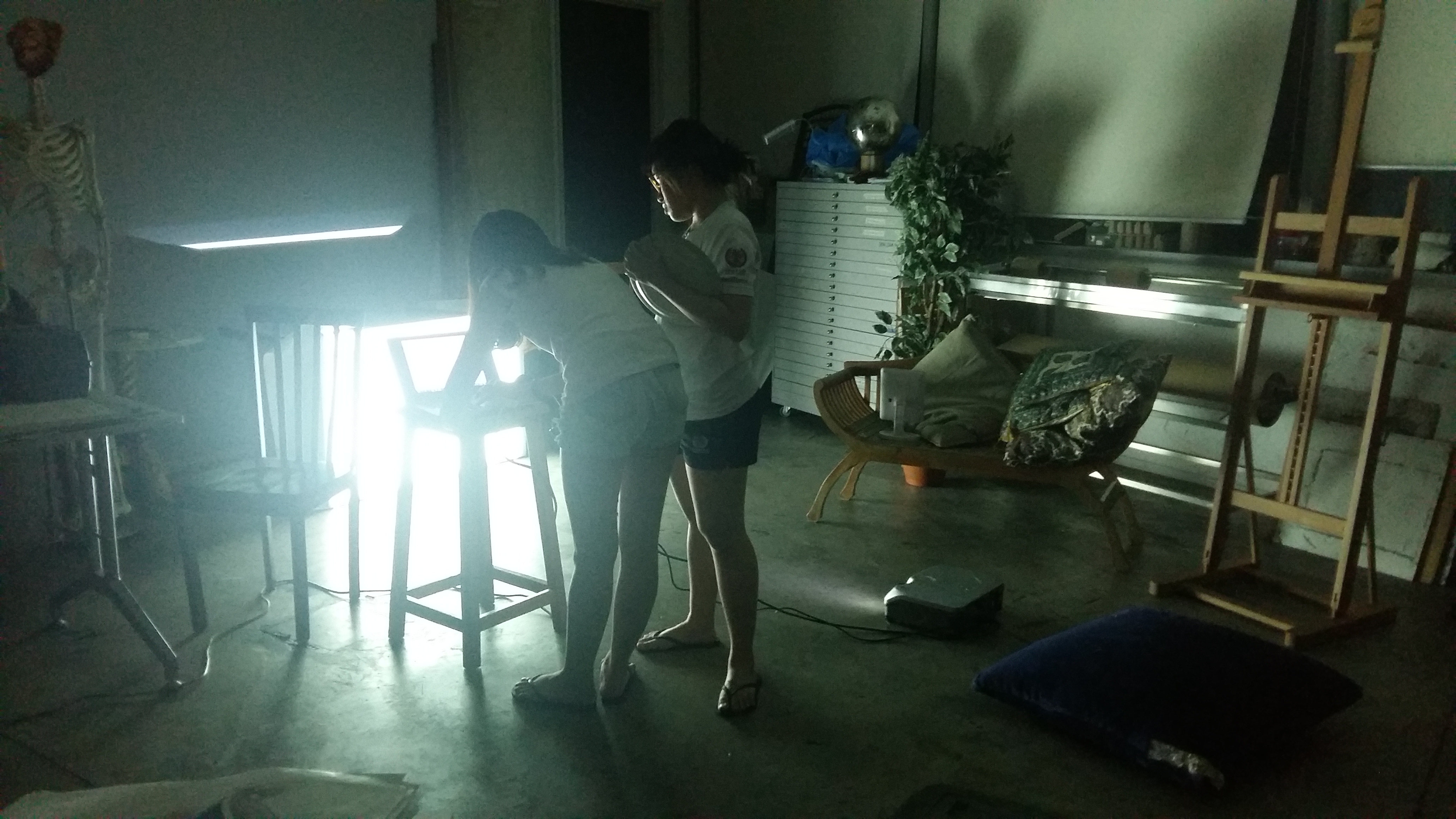
Needless to say, it was hard work to put up the projector. We tried to be ingenious by hanging the projector in a bag with raffia strings, but right when we managed to get the projector in, it DIED on us. And the bulk of our set up was just to get the projector up.
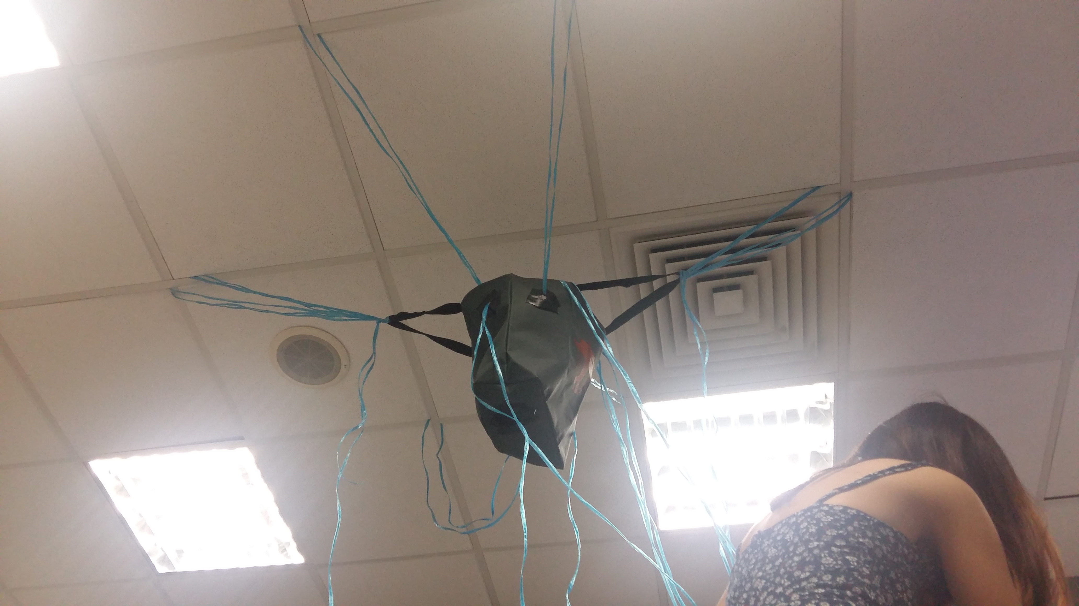
We changed strategies and with a newly loaned projector from Nevin, Mark, Brian and Nasya’s group (thanks guys omg), we tried using the mirror method, which worked because this projector’s projection was larger! Truly a blessing in disguise. Afterwards, the bulk of the work was reediting the table projection to fit the table and to edit the videos and sounds.
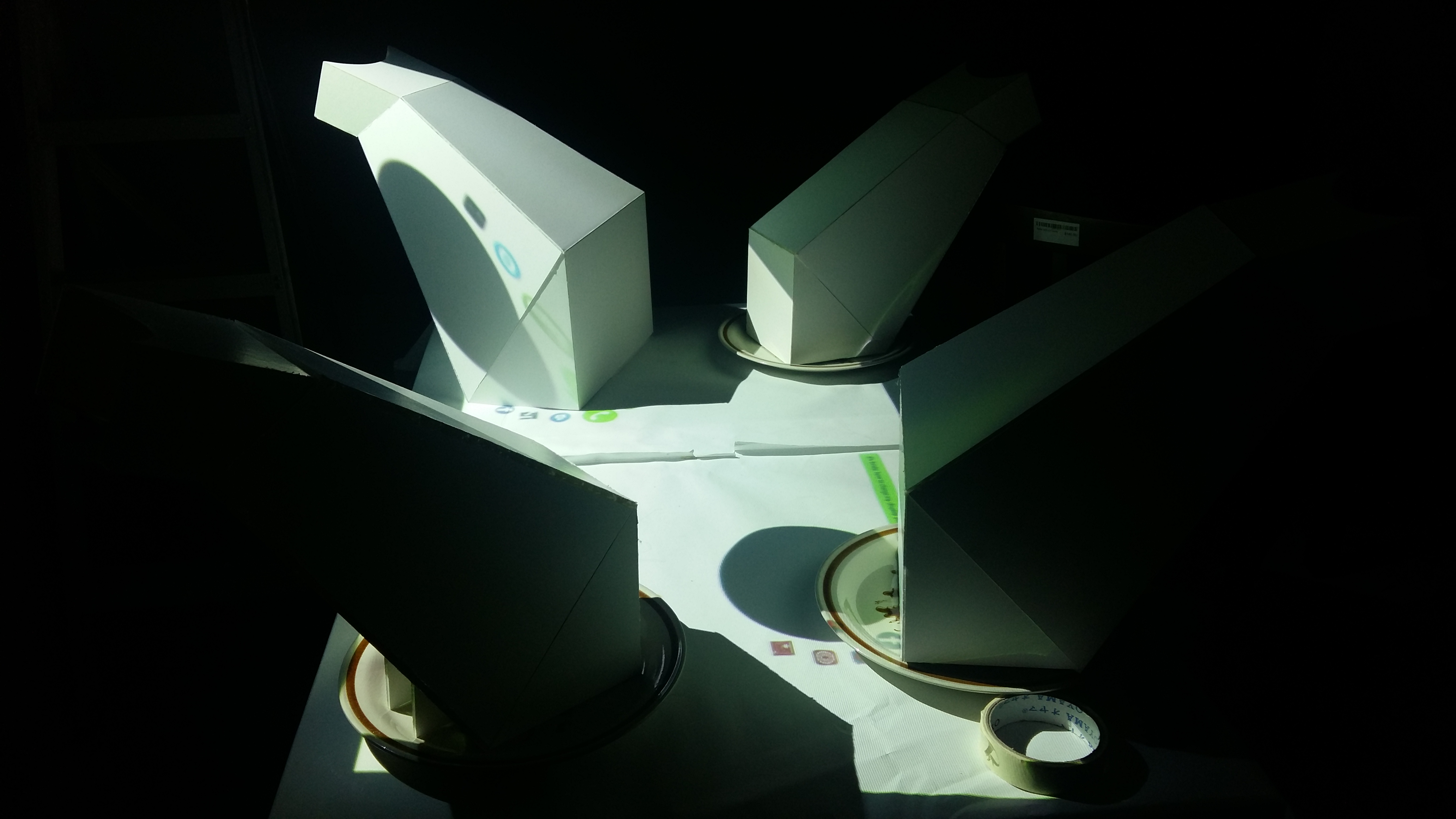
The projection had to be edited to fit the table set up. (And yay here are how the finished goggles look like)
After a long night during which I died for maybe an hour or so, we managed to pull through and while Hwee Ann and Debbie finished up the videos, I sourced for more things from the drawing room to set up our space. I felt that there was too much empty space since the table had to be under the projector, so I made use of existing furniture to create a living space.
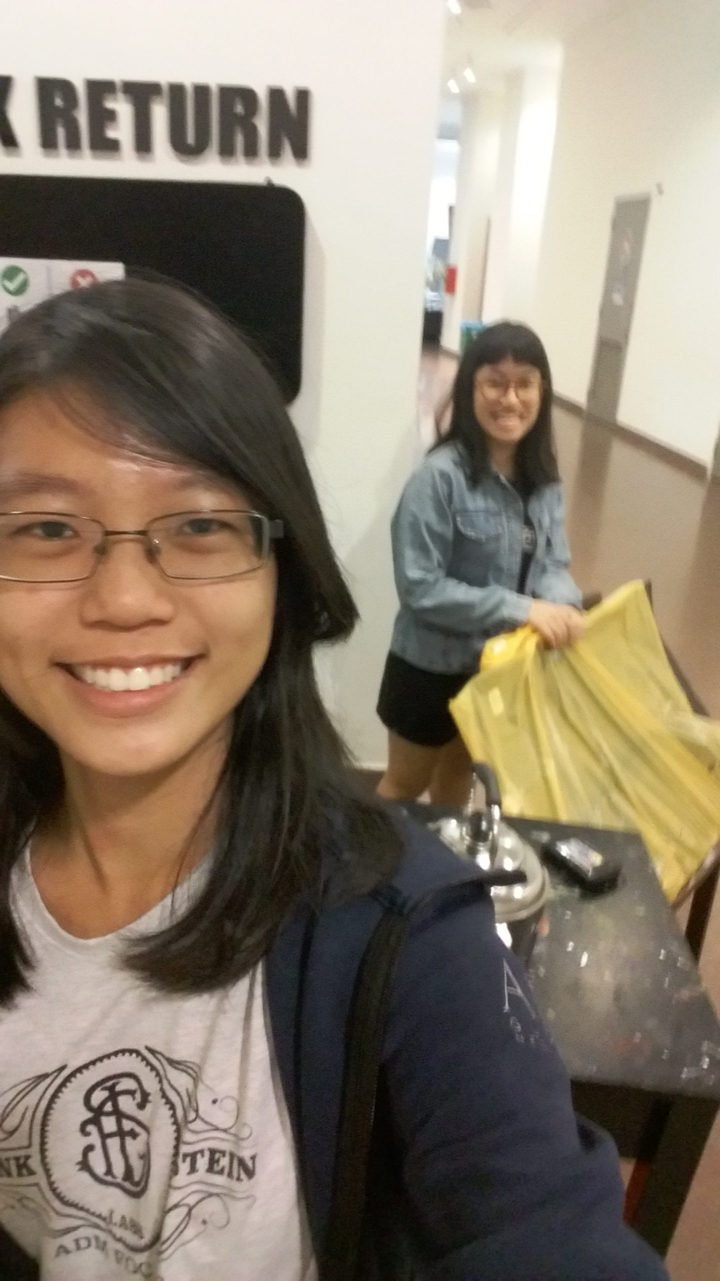
Us transporting props from the drawing room to 2-19
Here’s a behind the scenes of the set up:
Check out our final product in my final post!
Here are the screen recordings for the devices:
Baby
Dad
Emily
Mom
Table Projection Mapping
◊ REFLECTION ◊
I feel very accomplished and am really happy that we pulled through this project.
On hindsight, we could have started earlier and went on with some parts of the project while waiting for the consultation with Ruyi, so that there were concrete things to comment on. We could have also improved more if we did this.
However, I also feel that we did a really good job despite the stress and pressure. We acted calmly, planned well, and overcame each hurdle step by step together. I also feel that we’ve conquered the installation and managed to address each aspect of an installation, from changing the audience’s perception of the space to taking note of how the audience interacts with our installation. I also feel that we have really put what we learnt this semester to good use. From crafting a believable story through character profiling, pursuing topics that relate to us so that we can tell authentic stories, to sound design and placing importance on the relationship between audience, artwork and artist.
I’m really thankful for this semester. I’ve learnt a lot about my weaknesses and what I have potentials to improve on. I’m also very inspired by my classmates’ works and I’m motivated to do better and better. Thanks to Ruyi and my classmates for a very fulfilling semester in 4D! I hope to use whatever I’ve learnt this sem for the future!
How do I see the world? What am I looking for? How do I define myself?
Three very difficult questions.
◊ INITIAL THOUGHTS & PROFILING ◊
Many stories were written based on the author’s experiences. These stories feel more authentic and believable because they are based on actual thoughts and feelings on issues that matter to the author. Through this project, we are expected to develop characters that resonate to us and to use central issues in our lives in our story telling.
Easy at first glance, but extremely difficult when attempted. I have always perceived myself as an open book. But am I? There are things that I thought I would be comfortable to share with anyone, yet I still hesitate. Then again, I can talk about my problems to strangers and be fine with it (and half-regretting it later).
The point is. Am I ready to delve into issues that actually matter to me? Truth is, I’m scared. I’ve always been an escapist. Instead of tackling my problems head on, I conveniently run away. Even up till this point, I’m still hesitating.
Irregardless, here is me listing down characters that intrigue me or that I like.

◊ LITERATURE/FICTION ◊

The Little Prince – The Little Prince
I loved this book (now also an animated film) ever since I first read it for my literature class back in Secondary 1 in Indonesia. The book exposes the many facets of “adult” behaviour through the lens of a child-like narrator.
The Little Prince is naive, imaginative and pure in a world where adults strive for adult things. In his own little world he manages a routine that is important to him, and in his journey he meets adults who have their own superficial priorities.


Sakura Mikan – Alice Academy
Alice Academy is a manga written and illustrated by Higuchi Tachibana. I grew up reading and loving these types of stories where the characters are young and have a special power in school settings.
Mikan is the main protagonist. She is bubbly, optimistic, good-natured and determined, but clumsy and foolish at times. Despite her background growing up with her grandfather and no parents, she has a positive outlook and treasures her friends like family. She is courageous and would always stand up for her friends.

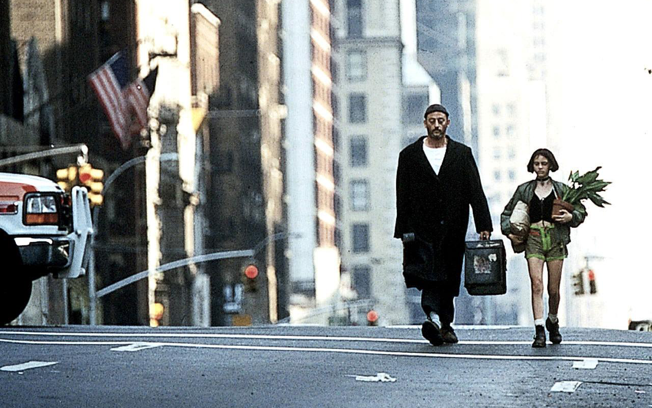
Mathilda Lando – Léon The Professional
I really like this film for its heartfelt showcase of humanity and love in unlikely characters, and of how unfair the world is. Also the band Alt-j made songs based on this film which I listened to before watching this. I was completely dumbfounded when I saw the scenes where the lyrics were taken from as I could instantly make the connection (OMG THIS IS WHERE THEY GOT IT FROM).
Mathilda is young, but she is forced to mature beyond her age as she attempts to avenge the death of her brother (and perhaps her family, although it was dysfunctional). She puts up a brave front and finds a father figure in Léon.

Hugo Cabret – Hugo
Hugo is a movie based on an American historical fiction novel written by Brian Selznick. Martin Scorcese’s take on Hugo is visually stunning and the world of Hugo Cabret is a mystical one for me.
Hugo Cabret is an orphan living in the walls of a Paris train station (love the idea of secret spaces). He is secretive and anonymous, and has a great goal to achieve: bringing his late dad’s automaton to life. While he is not exactly a role model, his actions are driven by circumstance and in searching for answers and a connection with his father, he is bold and unstoppable.

Sadie Kane – The Kane Chronicles
Like I said, I like stories with gifted children in fantasy settings that intertwine with the normal world. Peppered with Egyptian mythology and teen angst, this Rick Riordan series is one such story.
Sadie grew up apart from her father and twin brother after their mother’s death. I liked her being of mixed-ethnicity, that she has a twin, and that she has magical powers. I also related to her want of being closer to her father and brother but not very outwardly showing this.
◊ PUBLIC FIGURES ◊

Vincent Van Gogh
Vincent Van Gogh was a post-impressionist painter who remained unknown and poor until after his death. He struggled with mental illness and died at the young age of 37 from a self-inflicted gunshot wound. I like how he could express himself through his art and how the circumstances he was in and the state of his fragile mind was reflected in his paintings. Similarly, I would like to be able to express myself through my art.

Nyle DiMarco
Nyle was the first deaf winner of both America’s Next Top Model and Dancing With the Stars, two popular American TV shows. Despite being born with a disability, he could still accomplish his goals and to top it all off, he is also very sweet and down to earth.

Anna Akana
Anna is a Youtube personality who not only makes video content, but also writes, produces, directs and acts in her own short films. She is also a comedian and performs stand-ups, while managing her own clothing line. I admire her for having the willpower and determination to overcome her obstacles (her sister Kristina committed suicide and she herself struggles with anxiety and panic attacks) and achieve the things she wants in life.

Basuki Tjahaja Purnama (Ahok)
Ahok is the current governor of Jakarta, the second with Chinese ancestry and also the second who is Christian. In a largely Muslim society, he has faced his own share of racism and groundless opposition from extremists. However, he is headstrong in his conviction and exercises his plans as promised, while also being personable. He is known to be forthright, harsh, and iron-willed, facing corruption and other issues head-on effectively, in comparison to previous corruption-laden administrations.

Bethany Hamilton
Bethany is a professional surfer who lost her left arm in a shark attack. Despite this, she was able to eventually return to professional surfing – and emerging victorious at that. Her love for surfing and the sea was greater than the obstacle she faced at the time, and along with her unfaltering faith, she managed to rise back up from despair.
◊ PEOPLE I KNOW ◊
Mom
My reason of being.
RK
Grew up with a disability and lack of understanding from people, especially his family.
VK/KA/AJ/CS
My constants, though we are all in different countries now and rarely stay in contact.
AY/NA/SG/RR
My circle of support who shaped me to become who I am in Singapore.
OA
School caretaker and operations manager (sorta) in his 60s (I guess) whom I’ve known since Primary 2. Lives in school with no wife or children. Cares for me like his own child, but since going to Singapore I’ve rarely seen him.
OK so things are going to get p e r s o n a l.
◊ CONCLUSION ◊
I find that I have an affinity for a variety of characters.
Some have otherworldly powers and abilities, which reflect my constant day-dreaming of having a power that nobody else knows about. (Mikan, Sadie, The Little Prince) On a deeper level, this also reflects how mediocre I feel in the world and compared to those around me.
I also find that I am fascinated by characters who are weighed down by less-than-fortunate circumstances, whether it being an accident, a disability, or an illness. (Van Gogh, Nyle, Bethany, RK) These are very brave people, I feel, that they are able to face the world like everyone else. From my close interaction with RK, I know that it is definitely not easy, and behind the smiles there might be way more tears – but they endure it nonetheless. I applaud these people – their courage inspires me and pushes me to always try to overcome my own obstacles.
Lastly, and maybe most personally, I also find that I am drawn to characters who have lost their father or lack a father figure, or figures who are dependable, strong and caring. (Mathilda, Hugo, Sadie, Ahok, OA) Thankfully, I still have my father around, but growing up, I resented him. I do realise that he is still my father nonetheless and have learnt to love him in recent years. However, I did not realise that I’ve grown apart from him. There is this huge feeling of disconnect, no matter how much I try to establish rapport (or maybe I don’t even try). It slightly bothers me how I’m not entirely comfortable with my own father, and that I might actually don’t really care anyways. I realise that I subconsciously look for a replacement figure and like figures who are dependable and strong.
Here are three profiled characters from each list.
(Disclaimer: Profiling of real life characters are based on my own observations and the internet, they are not reflective of how these people truly are)


I find it fascinating how true it is that we are attracted to, subconsciously or not, characters that resonate with us.
Writing this wasn’t easy because I had to deal with some very personal issues. I rewrote sentences many times and deleted paragraphs when I felt too exposed. I considered approaching another topic that I still cared about, but it didn’t feel.. right. This may be a very small attempt to address the issues that matter to me and bother me, but I hope that it opens up new possibilities and help me understand my own thoughts and feelings about the matter.
◊ EXECUTION ◊
Initially, I wanted to have a story set first and a general idea of what kind of look I wanted it to have, inspired by some films.
From all of the above scenes, I really love their common use of metaphors. While used and presented in different ways, they really brought out the mood and the meaning of the scene better. They also reveal parts of the protagonist in hints.
I kept in mind what we learnt in our first lesson about creating films where all the elements point back to its main message. (Dialogue, subtext, mise en scene, props/metaphors, etc). I had a few ideas on how I wanted the 1 min dialogue to be like.
However, I became stuck when wanting to finalise the script and the story idea. I felt like the characters were flat and not well defined. I paused and tried to research on how to write good dialogue.
I found these quite helpful.
http://blog.nathanbransford.com/2010/09/seven-keys-to-writing-good-dialogue.html
https://www.nyfa.edu/student-resources/write-dialogue-film/
I remembered the clip of the man and the nun Ruyi showed us on the first lesson. We can learn so much about the protagonist even though he barely says a word. This, I realise, is achieved through illumination by the sub-character’s dialogue and actions, and the protagonist’s reactions.
I am also reminded of this movie that I watched upon reading my senior’s post. It really is an impactful scene that not only describes the relationship between the two characters, but also reveals the protagonist’s flaws and acts as a turning point in the film. And again, the protagonist barely says a word!
From these two scenes, I realised that dialogue does not need to be complicated or fancy. As how interaction is in real life, we find out more about a person from natural conversation and questions. Action and reaction. I also decided to develop the dialogue by using the character profiles, instead of jumping straight to the story only.
So, I already had a theme in mind: Family relationships. I decided to develop two original characters based on the two detailed character profiles I made on Hugo and Anna, altering and adding in traits from other characters to fully deliver my theme.
The main thing that I wanted to show was that the protagonist misses her family. In this scene, I wanted to reveal how the protagonist was so occupied with her academics that she rarely contacts her family. However, she doesn’t express this outwardly. To highlight this, the other character had to be contrasting, i.e. has a close relationship with her family.

The next step is to decide how to show this. I wanted the sub-character’s dialogue to reveal the protagonist’s feelings. Yet, how do I make it such that it is not obvious?
I’m an international student myself, who has grown up away from my family. I felt that I haven’t been contacting my family as often as some of my previous roommates. This is where the idea came from: The two characters could be roommates, and through B’s phone call home and conversation with her family, La’s hidden longing for her family could be revealed through her reactions.
From here, I developed the script surrounding the idea of La listening to a phone conversation between B and her family. However, I felt that it wasn’t enough to show La’s longing.
In the end I decided to have a preceding dialogue which shows how La hasn’t been visiting home for a long time. This will hopefully intensify the scene.

SHOOTING & ART DIRECTION
I asked my roommate to act with me so that it would be more natural. Coincidentally, she was also my roommate when I was in secondary school.
At first I wanted to shoot on the bed area but in the end I chose to use our desk setting because I thought that using symmetry, similar to Wes Anderson films, could amplify the contrast between the two characters.
I rearranged items on our desks, taking away things that were too distracting (because of the colour), and adding things to illustrate each character’s personality.


The protagonist’s side is filled with projects, books, and her laptop. Monthly planners are pinned up, and no pictures are seen except for a poster of an ice cave. I also changed the desktop background to a dark colour because the previous lighter colour was too distracting.
The roommate’s side, on the other hand, is filled with pictures, soft toys and memorabilia. There is almost no sign of school-related things except for the neat organiser at the corner.
By doing this, I hope to highlight how disconnected the protagonist is from her family by providing a contrasting character right next to her.
I originally took 4 different angles.


However, while editing I found it difficult to piece up together, and it was becoming a little too distracting for such a short dialogue. I decided to take a step back, keep it simple and re-shot with just two angles. One from the back and another to show my facial reactions. As for the bathroom scenes, I kept it at one frontal shot, one mirror shot and one top-down shot for the ending.
EDITING & SOUND
Editing was basically me warming up to Premiere Pro again. Anything I couldn’t do I Googled and it was okay. I also borrowed the Zoom recorder from school and used it to record good audio.
I hunted for appropriate music and tracks. Since it was unproductive and I couldn’t really find anything that fits, I decided to try looking from the pool of music that I already knew. I wanted a piano sort of beat at the start and so started listening through Tom Rosenthal’s music. I eventually found “The Snow”, whose intro was exactly what I wanted to use. For the last part, I was listening to Dessert’s songs when I realised that the lyrics of “Back Around” were somehow fitting to my character.
I was born to tell a lie, I could never change your mind, even when I tell the truth, there is nothing I can do, nothing I can do
She isn’t honest with her feelings, so she “tells a lie”, and there is seemingly nothing she can do about her dilemma of focusing on her academics but also missing her family.
REFLECTION
Overall, I’m satisfied with what I’ve done for this project. I’ve learnt so many things, from how to make a good film/story, how to put forth a theme in a story, to how important it is to have characters who are real, because they make the story so much more engaging, relatable and believable. I tried my best in applying all of this in my work.
Another important thing that I took away from this project is my finding out the issues or topics that matter to me. I realise that while I am concerned or interested in relationships between father and children, or how disabled people can go about their daily lives, the general idea is that I am interested in human relationships. This was a Eureka moment for me. I realise that what I am essentially interested in is the dynamics of human interaction and how this affects every single individual.
Well, I’m glad good things came out of this project and hopefully this will carry on to future projects.
Thanks for reading!
Watch the final product in my final post!
P.S. After more than half a year of not going home, I will be enjoying my time with my family during recess week 🙂
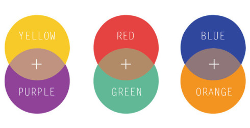
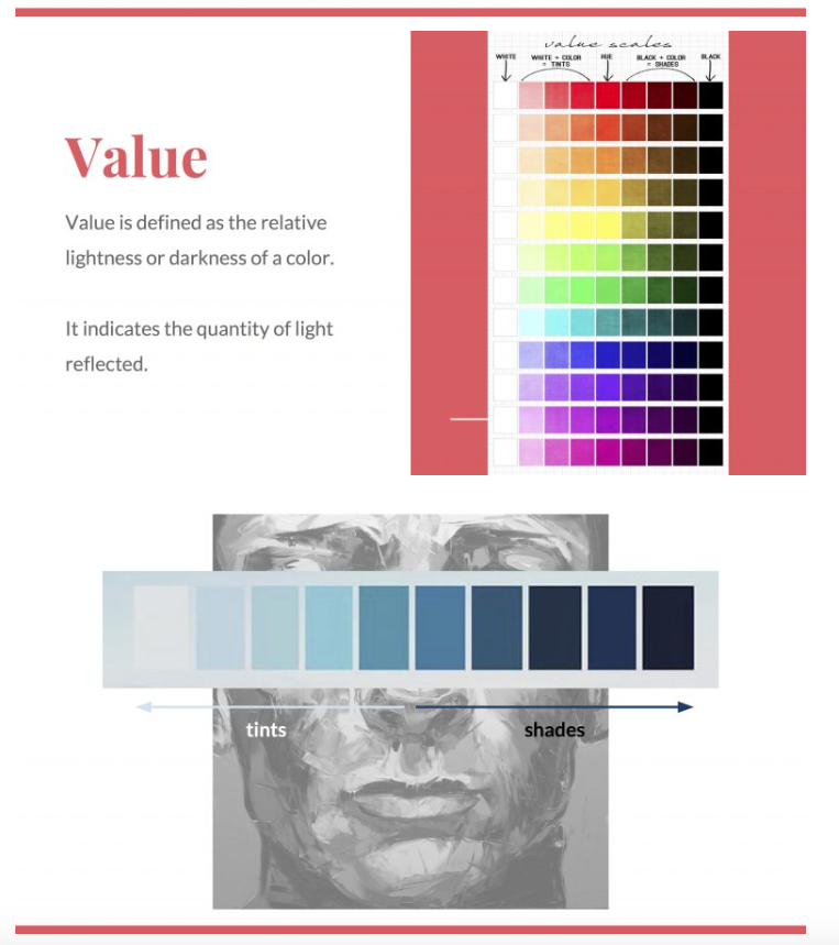
I did a little bit of research on colours and how to use them in making art. I knew about the basic ones like complementary colours and the such, but still did not really understand about terms like hue, tint and chroma. My classmates’ presentations helped a lot in making me understand these terms.

Obtained from http://www.tigercolor.com/color-lab/color-theory/color-theory-intro.htm
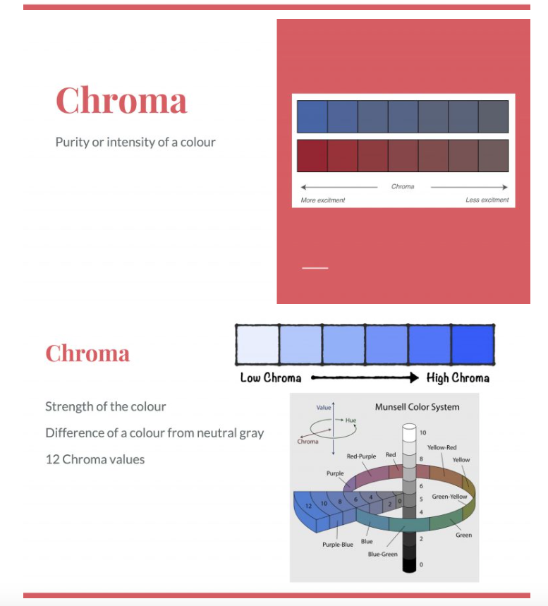
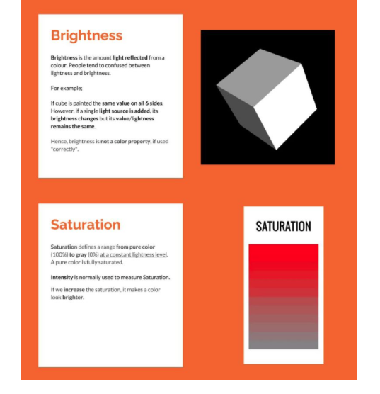
Some slides from my friends’ presentations that helped me
I also found out that my perception of colour and its meanings is something that is experienced by me alone, through the influence of the cultural heritage that I was brought up in. I thought that this was really interesting, that love is not always red or pink, and that happiness is not always yellow or orange. I lost the original website where I read about this, but I will include some examples of alternative colour meanings depending on the cultural context here. Oh wait, I found a similar diagram!
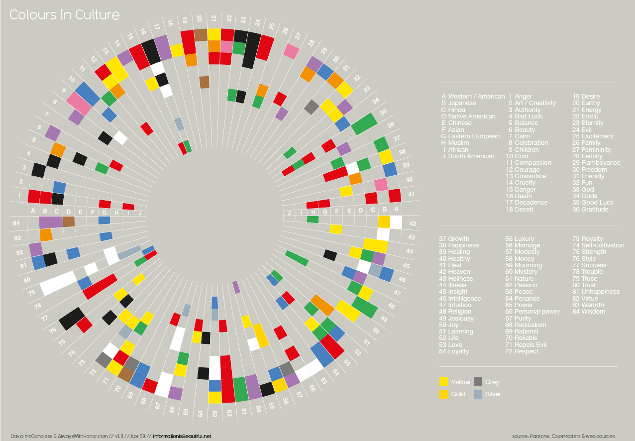
Obtained from http://www.informationisbeautiful.net/visualizations/colours-in-cultures/
While this is an interesting find, I decided to use my own perception of colour symbolism that I am sure my friends and I could agree on. Check out my final post and process post!
Everything is going by so fast! Nevertheless, this was a challenging but fun project to do. I love colours but they almost killed me this time. Here I will be elaborating on how I got to the final work and also the descriptions behind each of the twelve compositions. For a summary, check out the final work post!
◊ PROCESS ◊
At first, I was excited and started thinking that I would play around with different techniques and craft methods for each of the twelves compositions. I thought of paper cutting, embroidery, crochet, pop up cards, op art, even animation using an optical film (like below).

I was exceptionally ambitious, and super excited. During the first consultation, Joy addressed the white elephant in the room: Will there be enough time? This knocked me out of my daydream and I had to be honest with myself, of course there wasn’t enough time to explore so many methods. Also, how was I going to make sure everything is coherent? I decided to cut down to two techniques I was already comfortable with: embroidery and paper cutting. At this point of time, I haven’t thought of how I wanted to use colours, but I did research on colour theories and the such. Check this out on my colour theory research post!
Along the week, I started to develop my concept. I decided to use the idea of the equations illustrating my growth in Singapore, with each row representing a school I’ve been in. I also searched for artist inspirations and thought of how the compositions would look as a whole. The week passed by and it dawned upon me that at the rate I was going, I wasn’t going to make it. I forced myself to calm down and take a step back. I settled on ditching the embroidery and paper cut, and going back to watercolour/acrylic illustration: the medium I grew up with. I also chose to do my casual illustration style instead of my normal one. Not only is this style more known by my classmates, but it also helps to save time. (heheh) I sketched out the compositions, but was stuck at choosing the colours. Paintings can’t be undone like Photoshop, so I decided to consult my friends and Joy about it before starting on the colours.
Meanwhile, I searched around for inspiration on how the compositions would look like alone and together. These are some that I came across.


^Tytus Brzozowski’s dreamlike architectural watercolours


^Nicole Gustafson’s ethereal suspended worlds


^Marco Mazzoni’s meticulous pencil colour drawings
I knew I wanted to include a double exposure element in my work, for the last column especially. This is inspired by the beautiful tattoos done by Andrey Lukovnikov.


I still wanted to showcase my style and wanted everything to look like a whole. In the end, the main inspiration that gave my work its look is the publicity materials for We The Fest Indonesia.


I love the usage of circles in their collaterals! It is something very simple, clean, yet visually arresting and recognisable. I decided that I can base my compositions on a circle framing, and play around with it according to the different columns and different situations. In the end, the first column that represents me uses a simple circle frame, the second column, which represents the setting, includes the circles as “portals” to the world of the school, and the last column is a double exposure portrait bordered with a circle frame.
(Me at the start of the school duration) + (School experience) = (Me at the end of the school duration)
After much deliberation, I was finally able to choose colour schemes for each row, keeping in mind to make use of appropriate colour theories that would communicate the mood for each situation. I also switched over to gouache, because I didn’t want the plasticky finish acrylic has, and wanted more opacity than watercolour. Since gouache is new to me, it took me a couple of tries to get used to it. After settling the colours, I went straight to production!
◊ EXECUTION ◊
Once I got the gouache, I did some swatches and made changes to the sketches I have previously completed. I outlined the sketches in a thin pen, painted them in, and added the black outline last. All the while I mixed paint around in order to get the right colours. In choosing the colours, I made use of the existing colours of the uniforms and chose the rest of the colours according to them.


◊ FINAL BREAKDOWN ◊
ONE ◊ CAREFREE ME + CAGED WORLD = NAIVE ME


This equation is about my life in Jakarta. For my whole life before I came to Singapore, I grew up in Pelangi Kasih School, all the way from kindergarten to Sec 3.
School was relatively easy and the system not so rigid, so I lived a carefree life while still being able to maintain good grades and getting involved in many projects and competitions in school. I was young, only a seedling. I used peach-pink as the dominant colour for the first piece as it symbolises innocence.
As a result of my parents, school, surroundings, and how I was generally brought up, I lived a sheltered life. There was a straight path drawn for me and blindfolded, I happily walk straight, not knowing that I was in a cage, protected from the world. This I illustrated with blue, to show the calmness of the life I lived. By doing this, the straight path, which is in yellow, is highlighted due to contrast.
The result of this is still, a naive me. Still oblivious and very carefree, I live my life happily and without thinking of the future. The dominant colour yellow illustrates this very light, happy feeling that corresponds to my state at the point of time.
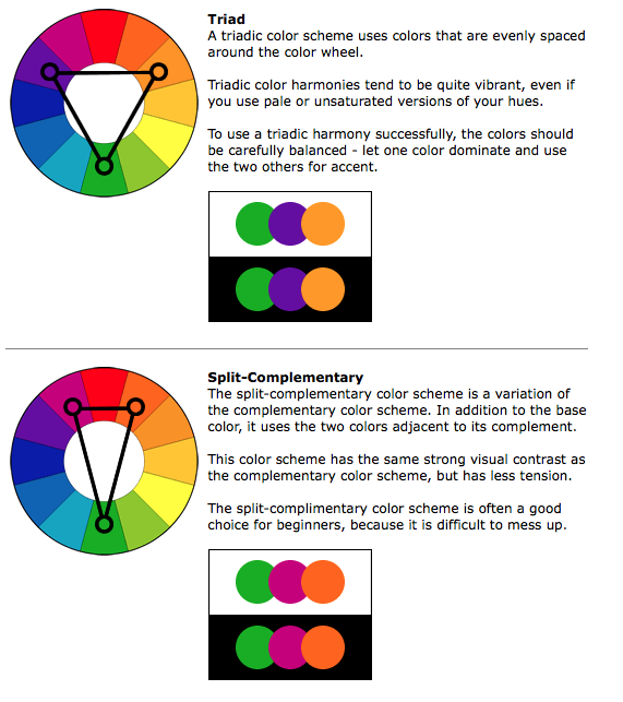
Overall, I chose to use the primary, triadic colours as to illustrate the basic building blocks that I started with. I was young and life was simple. However, I chose to use a much lighter tint, and used pastels of the three colours as I feel it would fit the idea of youth and innocence better.
TWO ◊ EAGER TO PLEASE + SCHOOL AND FRIENDS = SAD ME


The second equation is about my first two years in Singapore spent in Anderson Secondary School. While I learnt a lot and made lifelong friends, it was not a very pleasant journey at the start.
When I first came to Singapore, I was extremely eager to please. I was determined to be the perfect student and naively thought that it would be an easy journey. I grew from my experience in Jakarta, but I was a mere bud. My optimism and energy is shown through the use of a dominant bright orange, with blues from my uniform as an accompaniment.
Little did I know, school work was really tough. I was doing the worst I had ever done my whole life. Plus, my initial impression of my classmates was not very good, as the culture of welcoming new students was very different compared to what I was used to back in Jakarta. I closed up and did not want to face these problems head on, hence in the composition I am depicted as looking away from the setting (towards the viewers instead), unlike the rest of the compositions in the middle column. I used blues and a dull lavender to show the dark state that I was in, making use of the bright orange as accents in the glowing eyes.
As a result, I was a very unhappy girl. No matter how hard I tried to make friends, I knew that it was not a genuine effort. It made me feel very discontented, and I used a lavender with low chroma, almost grey, to highlight this dullness, along with the dark blue and the teardrop pattern at the back.
Overall, I chose to employ a split complementary colour scheme for this equation (orange, blue and purple) so that I will be able to show how my initial positivity (orange) was quickly drowned out , replaced with the analogous colours of blue and purple.
THREE ◊ COME AT ME + ROLLER COASTER = STRONG ME


The third equation is about my years in Temasek Junior College.
I thought that going to JC, it would be easier for me to start anew as everyone is new to the school. I wanted to enjoy my days and do better, and was determined to do so. This want to start anew, I hope, is able to be communicated through my use of bright green. I took on a fresh perspective and got rid of my old ways of thinking, I became a young flower.
Of course, JC was a tough journey. Academically, everything became even more difficult and I struggled to keep up. I took Art for A Levels and it took up a lot of my time, and by the end of JC1 I lost my scholarship. JC years were some of the worst years of my life. However, they were also some of the best years of my life. I loved Art and I was close to my classmates and Art friends. I had fun in House Committee and in orientation, and generally had a much better time compared to secondary school. JC was really a roller coaster filled with ups and downs. These challenges and journey is illustrated with red, as the colour can symbolise both danger (negative) and excitement (positive).
At the end of the two years, I find myself much stronger, more resilient, than ever before. The dominant red (more of a coral to fit the lighter tones) represents my strength and the complementary green also shows my contentedness. Overall, the colours I chose for this equation sets the mood for each composition, with coral and lime (tints of red and green) as the main colours, and blue to complement the two.
FOUR ◊ READY ME + GRADUATION IS A LONG WAY = ?


The last equation is about me in NTU. I am the most mature I have ever been (OK I’m still childish). I am transitioning into an adult and whether I like it or not, I will need to be responsible for my own future. I feel like I have become much calmer when facing challenges, so I tried to use minimalistic colours to create this equation.
I am still determined and eager to do my best in university, so I used three values of orange to illustrate this energy. Calm and filled with determination, I start my ADM journey.
The goal right now is to graduate, and it is still very far away. I illustrated this by creating a long walkway that ends with a mortarboard on a pedestal. I created an illusion of depth to show that it is far away, and my pose shows how I am ready to take on this challenge.
The last column is a reflection of how I am by the end of the years I spent in the particular institution, and since this is still in the future, it is a huge question mark, with black to show this void. However, I am positive of the outcome and hence use orange as the background to show this.
Overall, I used just slightly differing shades of orange, and black and white for contrast. The simple colour scheme is supposed to show a calmer, more mature side of me.
◊ REFLECTION ◊
I am glad that I was able to showcase my characteristic style in this project, and was able to make use of the circle framing well to make all the compositions look cohesive. I still need to improve in terms of time management, and there are also a couple of other things that I thought I could have done better on. I feel like I could have coordinated the colours across the rows better, and practiced more with the medium to achieve better saturated colours and a smoother brushwork.
All in all, I had fun in this semester and though I was literally dying through all the projects, I enjoyed myself and learnt quite a bit, not only in terms of skills and techniques, but also my way of thinking and developing my art processes. I want to thank my classmates for their inspiring works, and Joy for being a super nice and encouraging teacher. This class will be missed!
For a summary of everything, check out my final work post!
Okay, so I decided to include another process post because I felt like I wanted to elaborate more on the in-depth research that went behind each of the compositions. Following my initial ideas of using different cultures to illustrate the four quotes from “Leon: The Professional”, I went ahead and researched about different assassination cultures from around the world. Some possibilities that came up were Italian mafias, Russian hitmen and Indian Visha Kanyas (poison girls), among others. However, I will only be including research behind the final four compositions.
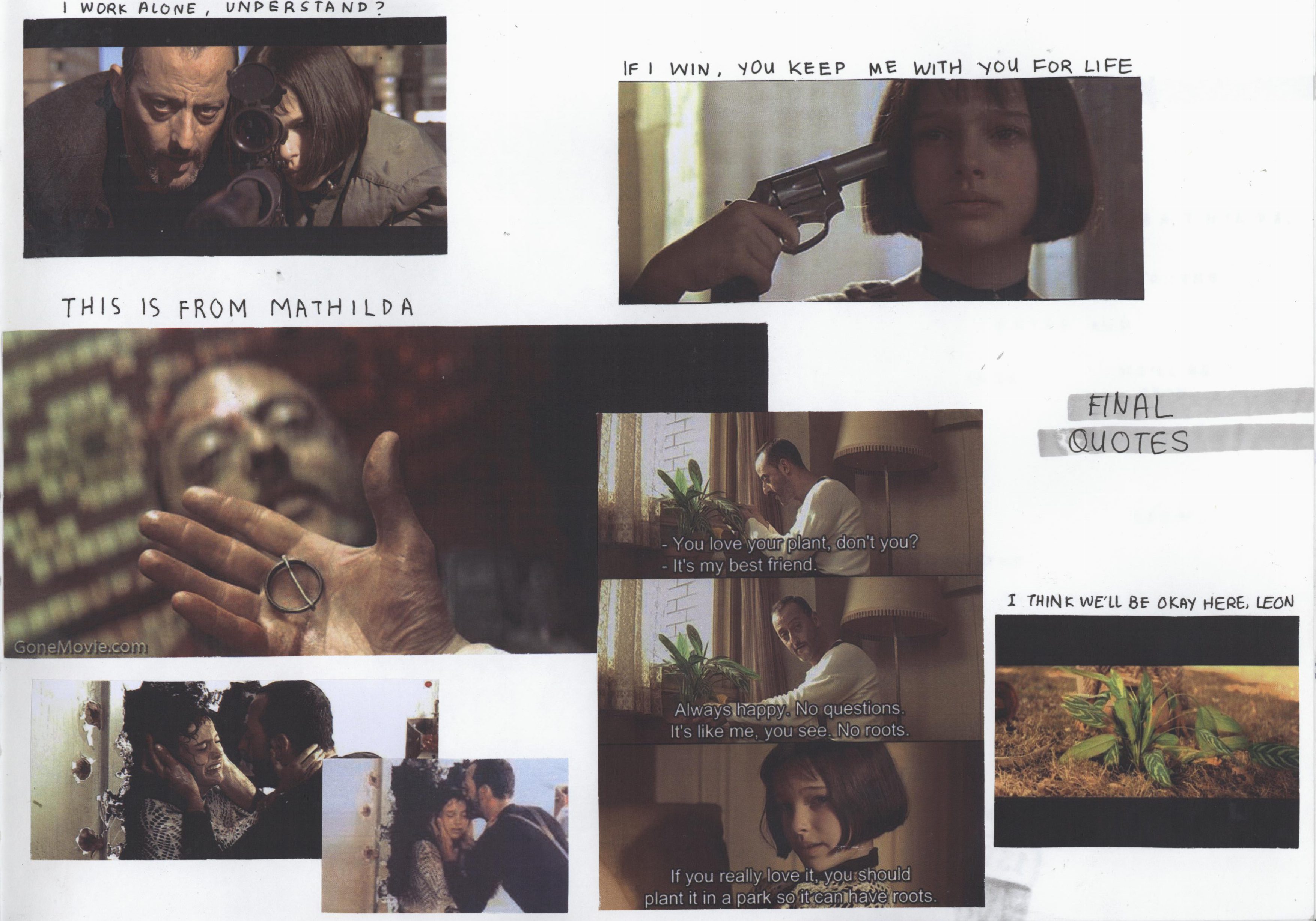
For a start, here are the final four quotes.
◊ FILM ◊
!!!MAJOR SPOILER OF THE WHOLE MOVIE ALERT!!!
\
\
\
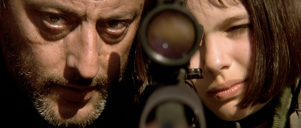
I chose the four quotes as they describe Leon and Mathilda’s relationship throughout the movie.
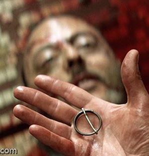
Leon saves Mathilda from the corrupt drug enforcement officers who killed her family, even when he had no reason to. She wants to hire Leon to kill them, but Leon declines. Instead, she asks for him to take her up as an apprentice and teach her to be a ‘cleaner’ too. Leon refuses, stating “I work alone, understand?“, and tries to send her off.
Mathilda tells him that it is just the same as letting her die in the hands of the corrupt officers. She takes a revolver from the table and initiates a game of Russian roulette, pointing the gun towards herself. She says, “If I win, you keep me with you for life.” She says that she hopes he really has no feelings and that he won’t regret this, while Leon tells Mathilda that the chamber is loaded and she will die. Mathilda is adamant and pulls the trigger just as Leon slapped the revolver away, the bullet very nearly killing Mathilda.
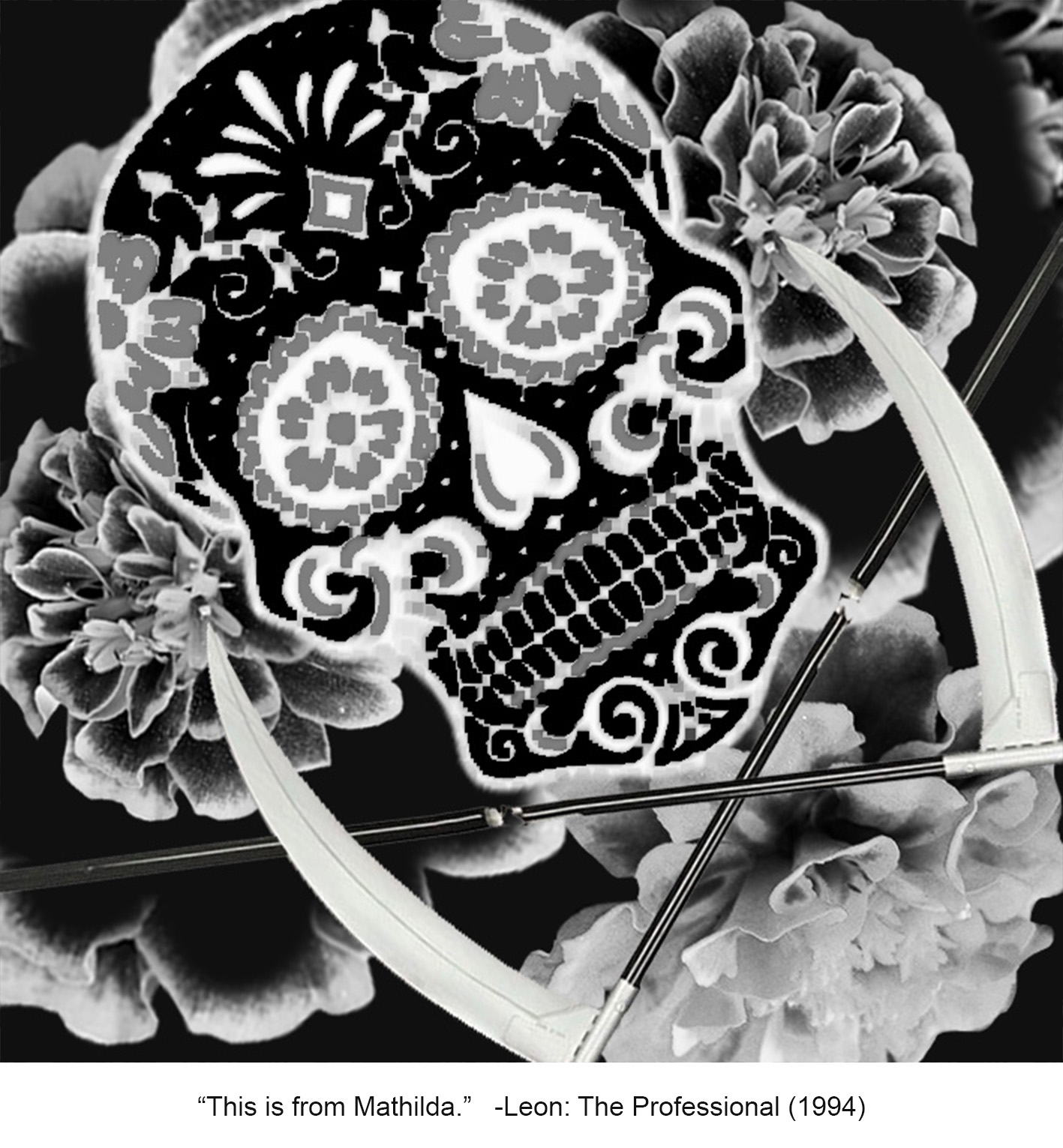
Mathilda undergoes training and develops a bond with Leon, influencing Leon in a way such that he became much more human, as once again he slowly let emotions into his life. Mathilda is trained into Leon’s way of living and routines. The story spins into a heightened conflict and both their lives are in serious danger. Leon and Mathilda profess their affection for each other as Leon forces Mathilda to safety. Leon barely makes his way out when Stansfield, the antagonist, shoots Leon from the back. In a slow and melancholic scene, Leon confirms Stansfield’s identity and hands him the pins of a grenade, saying “This is from Mathilda,” which were his last words. Stansfield discovers active grenades strapped to Leon’s vest, right after which the scene explodes, taking both of their lives.
Saddened by her loss, she finds out that Leon bequeathed his wealth of previous earnings to her. Mathilda finally finds protection under her previous school and goes out to plant Leon’s houseplant in the gardens. She previously told Leon about how he should plant it in a park so it could have roots. The plant here symbolises Leon. She says, “I think we’ll be okay here, Leon.”
With this storyline as an anchor to the project, I took a closer look at each quote.
◊ BREAKDOWN OF FOUR COMPOSITIONS ◊
These would be quite similar to what I had in the final post, but I will be including some pictures too. Meanwhile for the compositions, since I planned them really carefully, there were not a lot of changes except for subtle manipulation of contrast, levels and threshold. Unfortunately I did not really save the compositions from one change to another as I was editing them continuously.
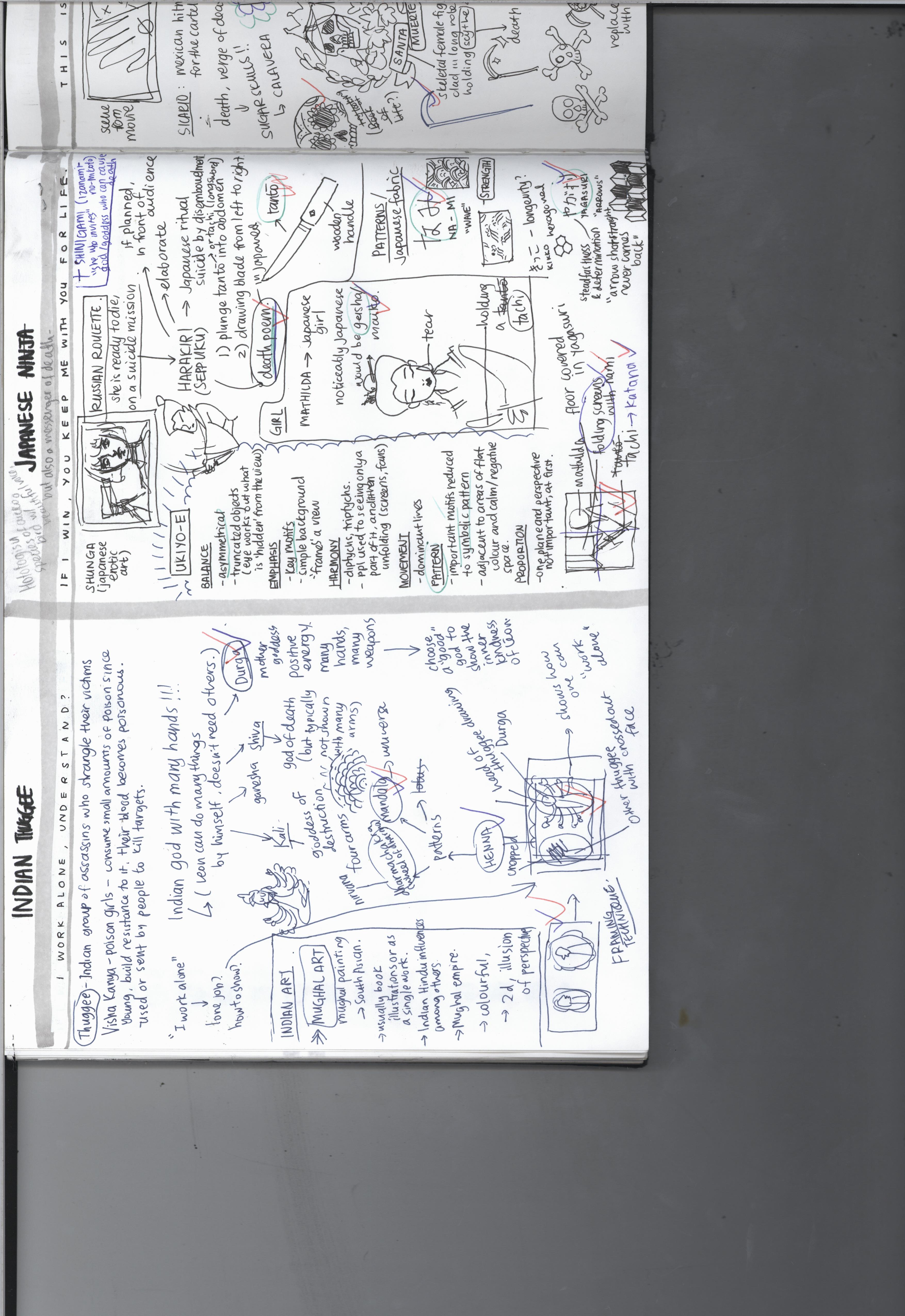
“I WORK ALONE, UNDERSTAND?” ◊ INDIA
I started with researching about assassins in the Indian context. I found the Visha Kanya to be interesting – they are poison girls who slowly poison themselves to the point of being immune to all sorts of poisons, and become poisonous themselves. (Phew so many poison in one sentence) Basically, small doses of poison are administered to girls since young, and the girls build resistance to it. Eventually their blood becomes poisonous and they become weapons. They are sent to kill off targets through seduction and then administering a kiss of death.
Depiction of Visha Kanya holding a scorpion in her left hand
However, I had already reserved the Mathilda pieces for the Japanese and Balinese cultures, and could not include the Visha Kanya in this composition.
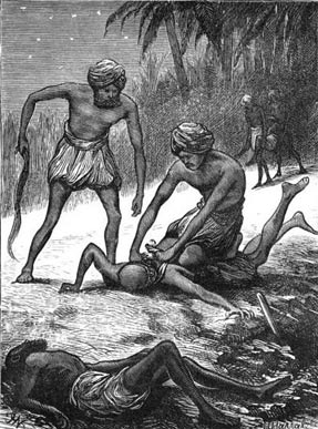
Another type of Indian assassin are the thuggee, a band of organised professional robbers and murderers who work in gangs, who mingle with their victims in their travels and strangle them with a noose or handkerchief to their deaths. This does not really fit Leon as he is a solo act, but I figured out that I could use this character of the thuggee to further emphasise Leon’s individuality.
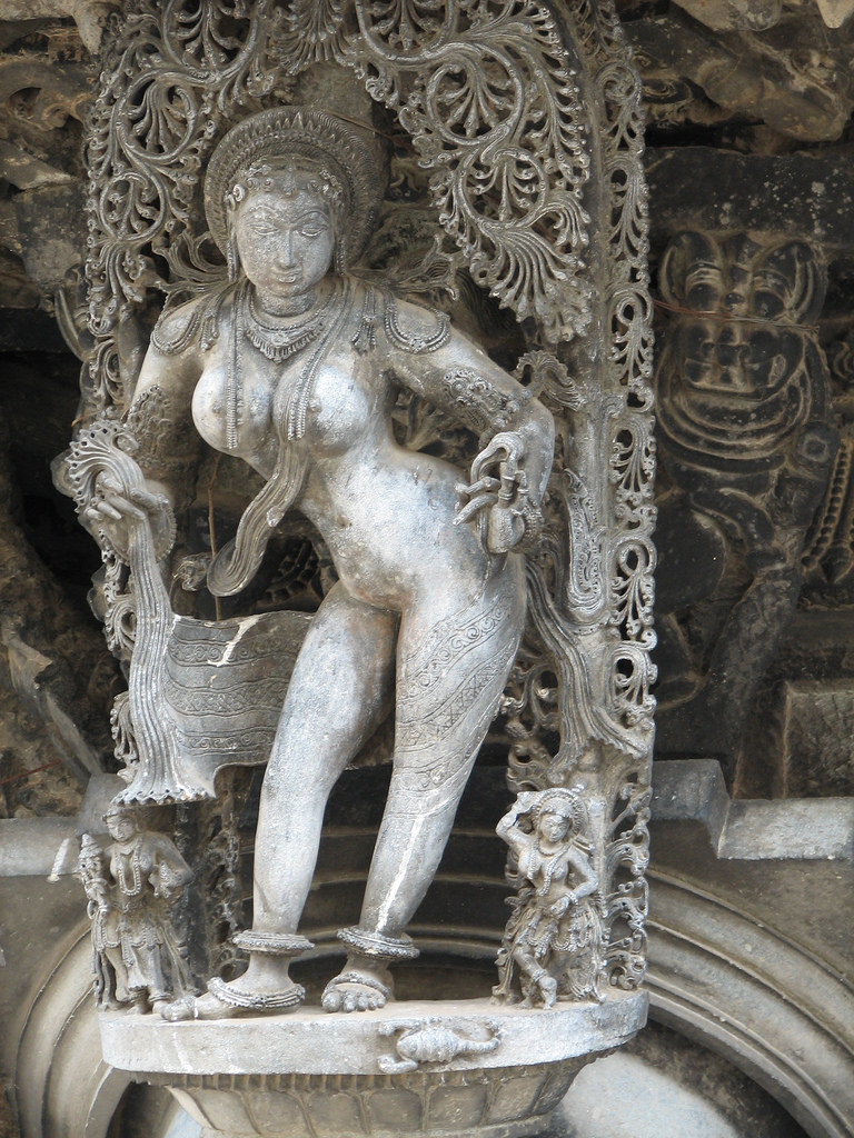
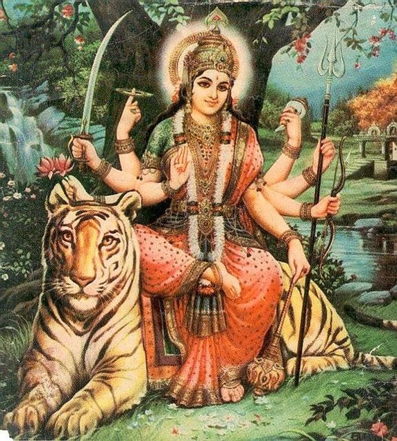
While researching on Indian mythology and folklore, I came across an image of a Hindu god with many hands. I immediately thought that I could use it to describe Leon’s ability to do many things by himself and him not needing anyone else. I researched further and found that most of the gods and goddesses have many different portrayals, with having multiple hands being one of them. I originally wanted to see if there was a god of destruction or death to represent Leon’s job as an assassin, but they are typically not shown with many arms. Indian deities

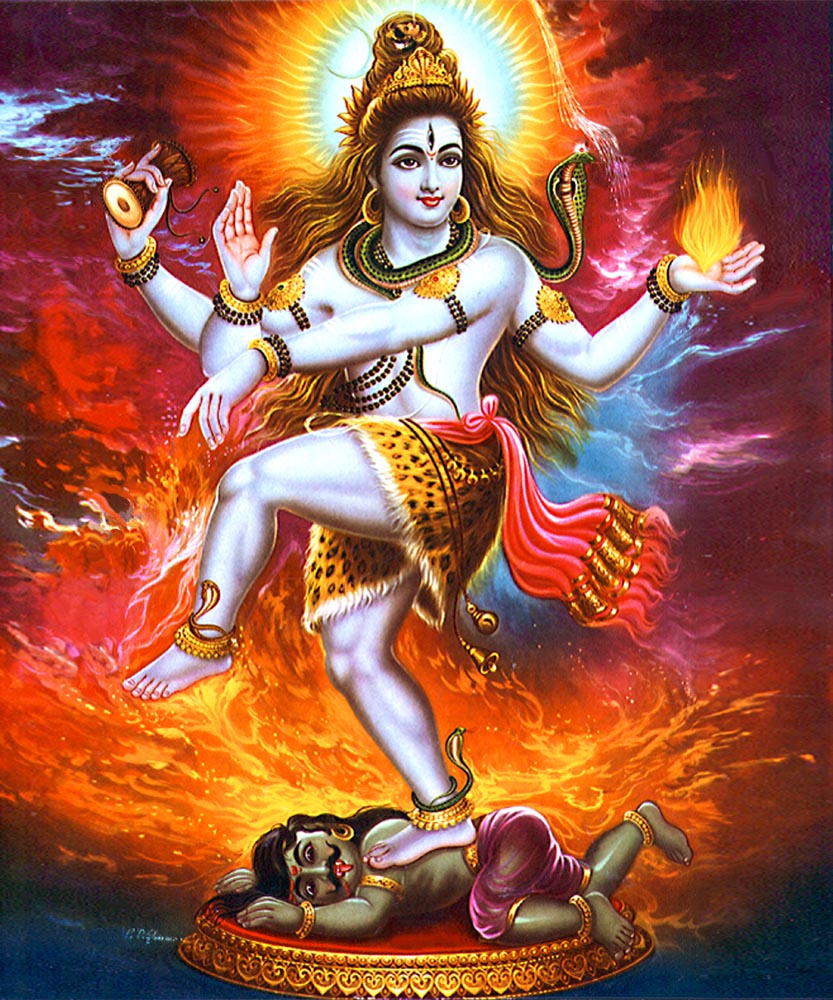
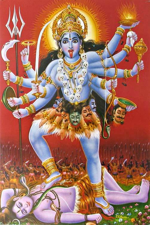
From left to right: Shiva, another depiction of Shiva, Kali with many arms
Durga, the mother goddess who emanates positive energy and wields many weapons in her many hands, is a god who is typically shown with many hands. I thought about it and decided that I could use this to symbolise Leon’s hidden kind nature and goodness, while at the same time wielding many weapons as an indication of his proficiency as a hitman.
Durga
After settling this, I went on to find out more about Indian art. I stumbled across Mughal art, a type of painting which originates from South Asia, and is typically in the form of book illustrations or as a single work. They are usually colourful and two-dimensional, with the people portrayed in the side profile, most of the time. They are flat and try to create a sense of perspective and depth through the size of elements. In the portraits, different kinds of frames are used. After looking through this list of Mughal paintings, I felt inspired by one of the paintings I saw.
This Akbar Mughal painting gave me the idea of subjects interacting or having a connection whilst being separated by the framing. I immediately thought of how I could put Leon (as Durga/thuggee) in one frame, and other thuggees in the other frame to show Leon’s separation from the world and other individuals, and refusal to work with others. I thought of deliberately cutting off one of the frames to suggest continuity and the presence of other frames with other thuggees. The faces of other thuggees in other frames are crossed out to show how Leon doesn’t need them.
This left an empty space above and below, so I researched on Indian motifs and was led to henna, a practice of temporary tattooing, which I’m familiar with as there is also a culture of henna in Singapore. There were many motifs and designs that each bear a meaning.
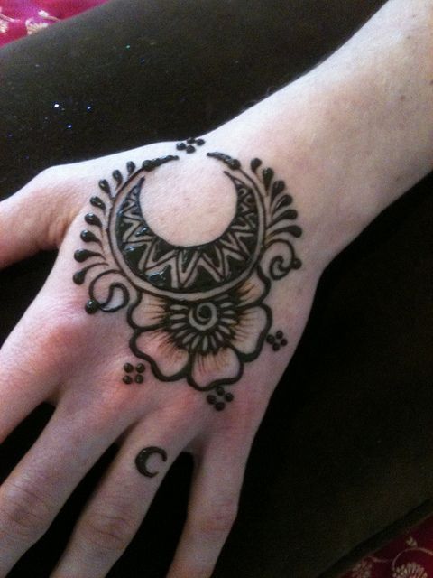
Left to right: Crescent design meaning a baby is on the way, lotus design symbolising the awakening of one’s soul, sun design representing immortality, knowledge and eternal love.
I decided to use the mandala, a typical but powerful motif that represents the universe. I repeated the design around the border, indicating how this is the universe that he lives in, the world Leon had created for himself, in which he is alone. This is the final result.
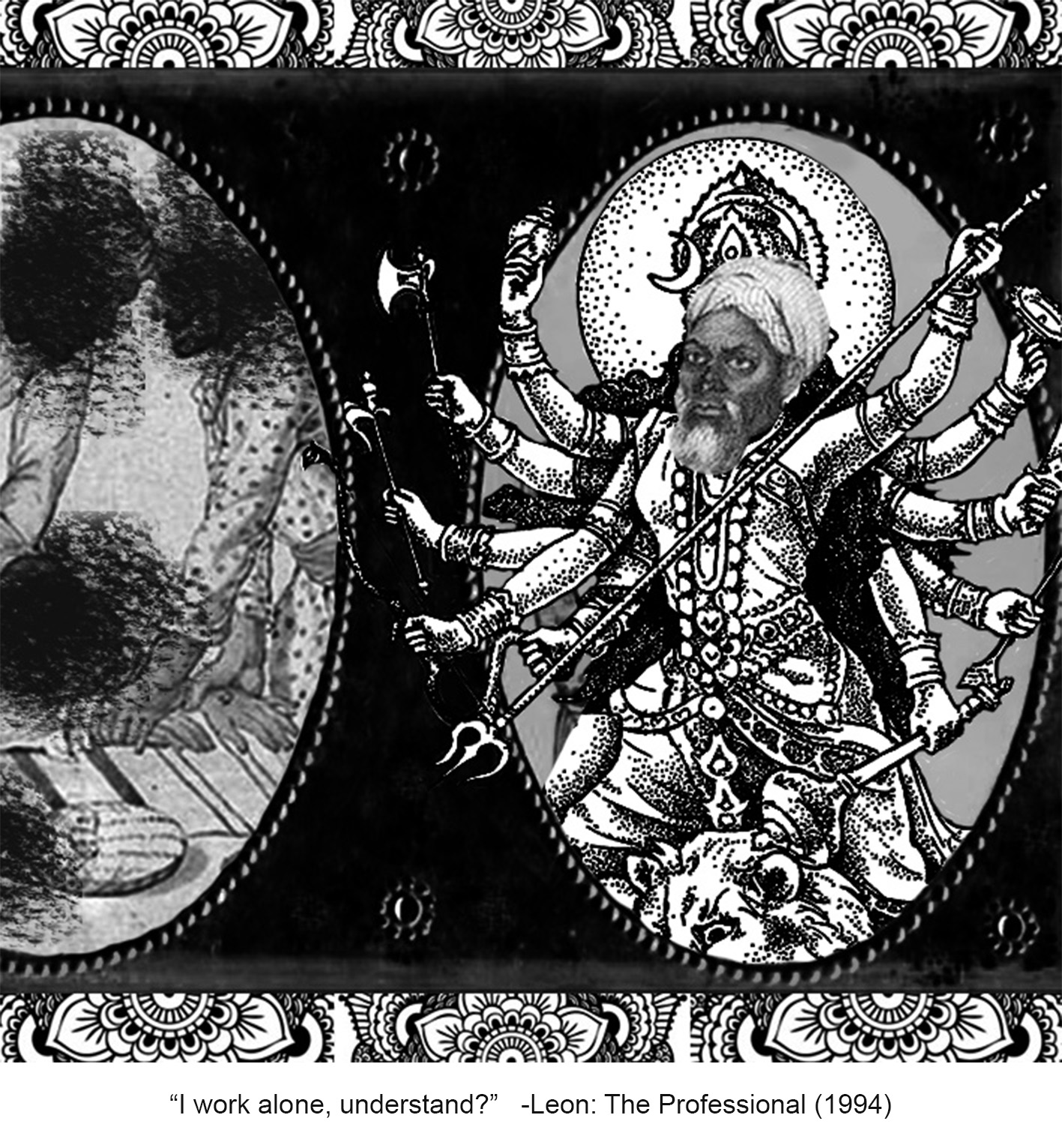
At first, the frame wasn’t black in colour, but since the Mexican (third) composition is really dark and stands out among the four, I decided to darken the frame to balance out the darkness of the third composition, and distribute the focus evenly over the four compositions when placed next to each other.
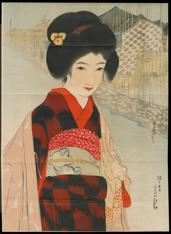
“IF I WIN, YOU KEEP ME WITH YOU FOR LIFE” ◊ JAPAN
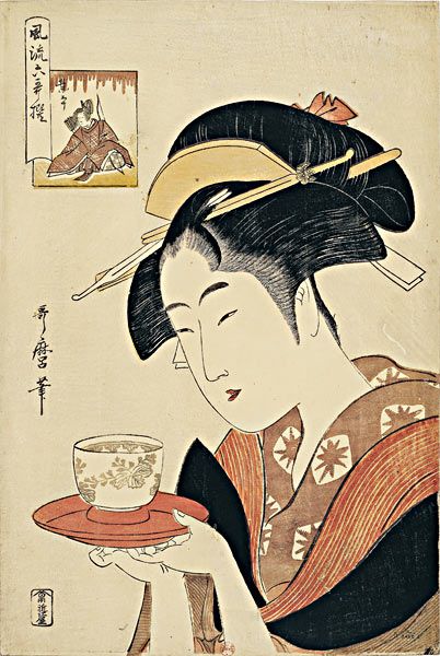
I assigned Japan to this quote because I knew about the Japanese act of suicide called harakiri/seppuku. Naturally, this is the first that I read up on. From my readings, I found out that this act is actually a ritual conducted in front of an audience, if planned. It was elaborate, slow, and as melancholic as it is intense. Usually, a tanto (short knife), wakizashi (short sword), or a tachi (long sword) is plunged into the abdomen and drawn from left to right. Immediately after that, a “kaishakunin”, or the “second”, decapitates the samurai. I chose the katana (a tachi) to be used by Mathilda in the composition as I felt it was most dramatic. Seppuku is usually done to die in honour rather than in the hands of the enemy, or as a capital punishment for samurais who committed serious offences. When in war or other unplanned circumstances, one can also carry out seppuku to save oneself from further torture.
Usually, a death poem is written as part of the ritual, as preparation for the act itself. I find that is is such a beautiful way to leave a part of yourself to the world after our death. I wanted Mathilda to have her own death poem. Hence I researched on death poems and found the hototogisu poems to be enchanting. The cuckoo is a bird recognised for its beautiful voice, but at the same time, it is also considered a messenger of death. “Hototogisu”, or “The cuckoo cries” is such a poetic way of indicating one’s moment of death. Thus, I simply used Google translate (what else) to translate a short English phrase into Japanese.
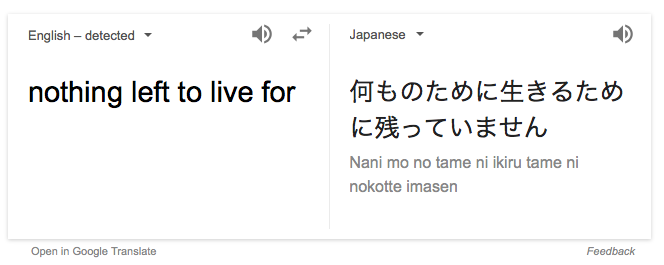
I wrote this phrase, with the “hototogisu” at the end, in the old Japanese style, and in Japanese calligraphy, on a yellowed piece of paper from my notebook.
From right to left: Nani mo no tame ni, ikiru tame ni, nokotte imasen, hototogisu.
Translation: Nothing left to live for, the cuckoo cries.
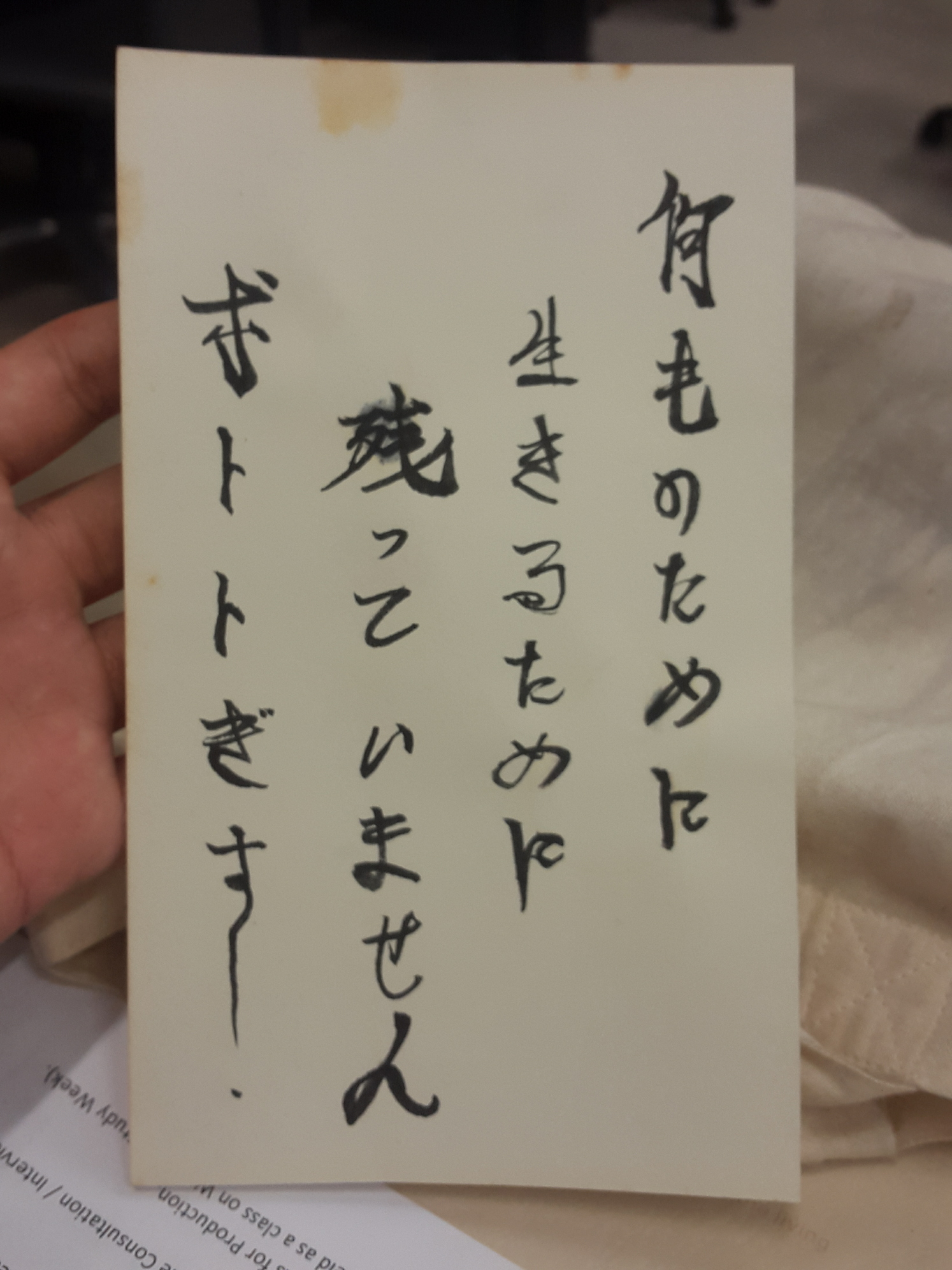
Next, I did a short research on ukiyo-e, a Japanese characteristic style of woodblock printing and painting. Ukiyo-e itself means “pictures of the floating world”, and often depict scenes from everyday life, beauties, sumo wrestlers, and other scenes. They also include harakiri and Japanese mythology, or can also be in the form of shunga, which is Japanese erotic art.
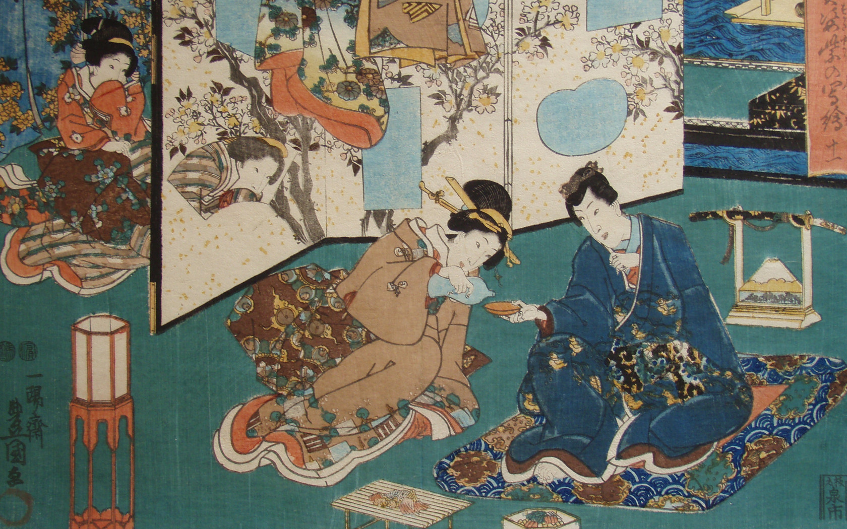
They are very in-the-moment and captures a vitality in movement of the subjects, making it almost voyeuristic. From the characteristics of ukiyo-e, I decided to employ asymmetry, perspective, and the use of key motifs and patterns in my second composition. For more explanation and examples of ukiyo-e, check out these websites. 1) What is ukiyo-e? 2) Ukiyo-e website 3) Ukiyo-e gallery
Other than that, I also researched on the patterns and motifs characteristic of Japan, searching for ones that would fit my intentions. This website gives a nice summary of some Japanese patterns. I chose to use the “nami” and the “yagasuri” motifs in my composition.
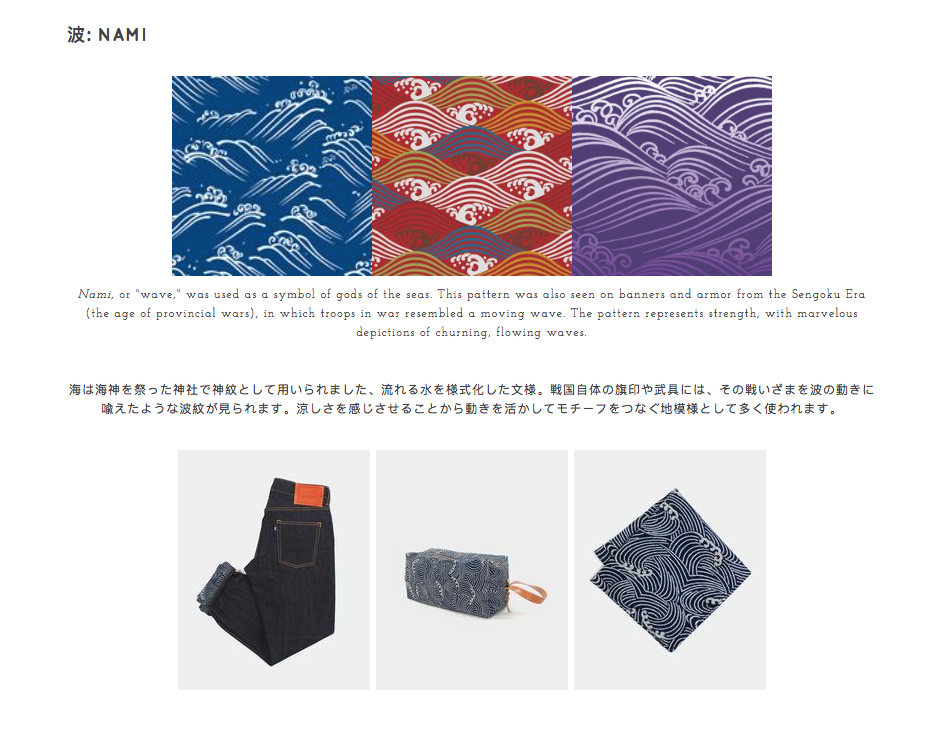
Nami is a pattern of waves. It represents strength, and in the “Leon: The Professional” context, it represents Mathilda’s courage and strength in her decision.
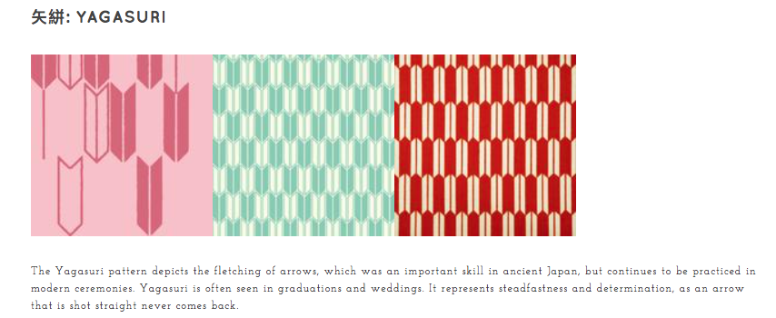
Yagasuri is a pattern of arrowheads. It represents determination, and in this film’s context, it represents Mathilda’s resolve to kill herself if Leon does not take her as his protégé.
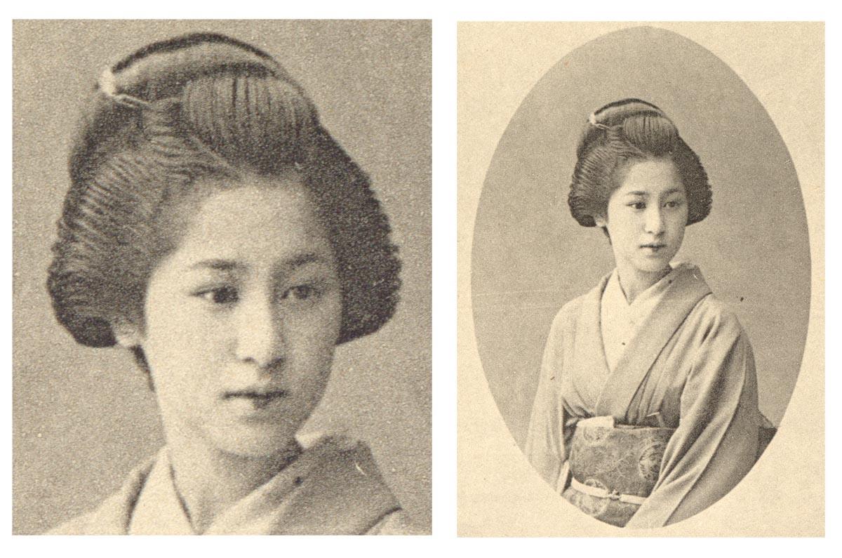
I chose to portray Mathilda as a maiko, an apprentice geisha. Ignoring what a geisha does, I solely took the apprentice quality of a maiko that is similar to Mathilda’s status of Leon’s apprentice in the movie. Also, the traditional garb worn by maikos would give the composition a strong Japanese visual.
Other than that, I included shinigamis at the background. A shinigami, or the “Izanami-no-mikoto”, meaning “she who invites”, is a god or goddess who can cause death by luring the person to kill himself or herself, basically coaxing the person to committing suicide. I thought that this was apt to accompany Mathilda’s suicide attempt and also to symbolise the other world.

As for composition, I made sure that all the elements were slightly off-centre to highlight the asymmetry, like used in ukiyo-e, and also gave the illusion of perspective and depth by dividing the composition into foreground (maiko), middle ground (screen-dividers) and background (shinigami). I made use of the screen-dividers, as a typical imagery used in ukiyo-e, to metaphorically separate the living world from the other world.
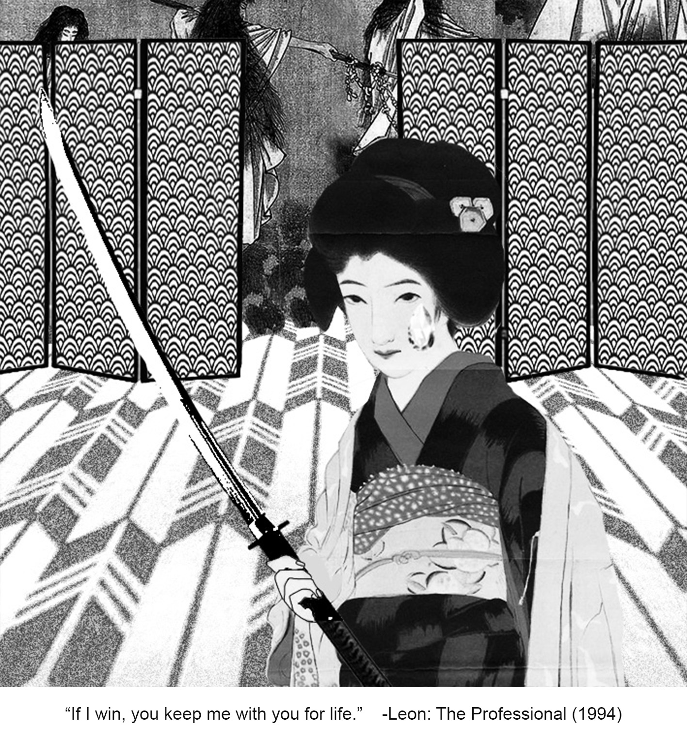
Meanwhile, the yagasuri pattern on the floor, replacing the usual tatami mats, is warped to enhance perspective and this is done deliberately such that the arrowheads are pointing towards the shinigami, showing further Mathilda’s determination in stepping towards the other realm. Mathilda is also placed in front of the opening towards the other world, indicating the shinigamis welcome and lure to bring her over to the other side.
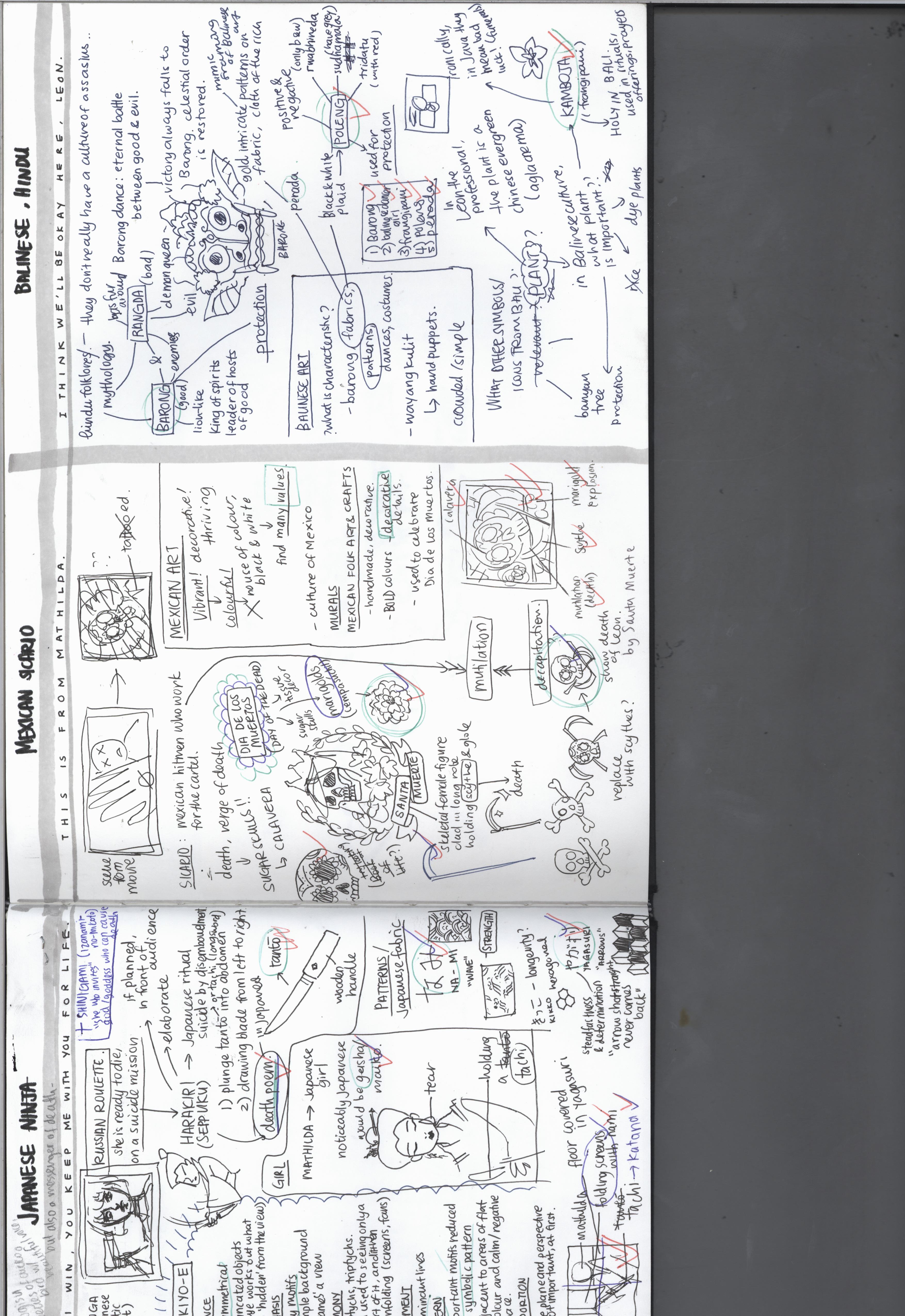
“THIS IS FROM MATHILDA” ◊ MEXICO
I originally only thought of Mexico in terms of their drug lords and hitmen culture, more commonly known as sicarios. I knew about it from the 2015 mystery/crime movie “Sicario”, which was about an escalating drug war in the borders between the U.S. and Mexico.
Emily Blunt in “Sicario”
However, the sicarios’ main weapons are usually firearms and the such, which is similar to those used in “Leon: The Professional”. This made me hesitant to follow through my plans of portraying Leon as a sicario.
To my delight, while researching about Mexican art, I was reminded of sugar skulls! As someone who loves colour, sugar skulls and Dia de los Muertos have always had a special place in my heart.
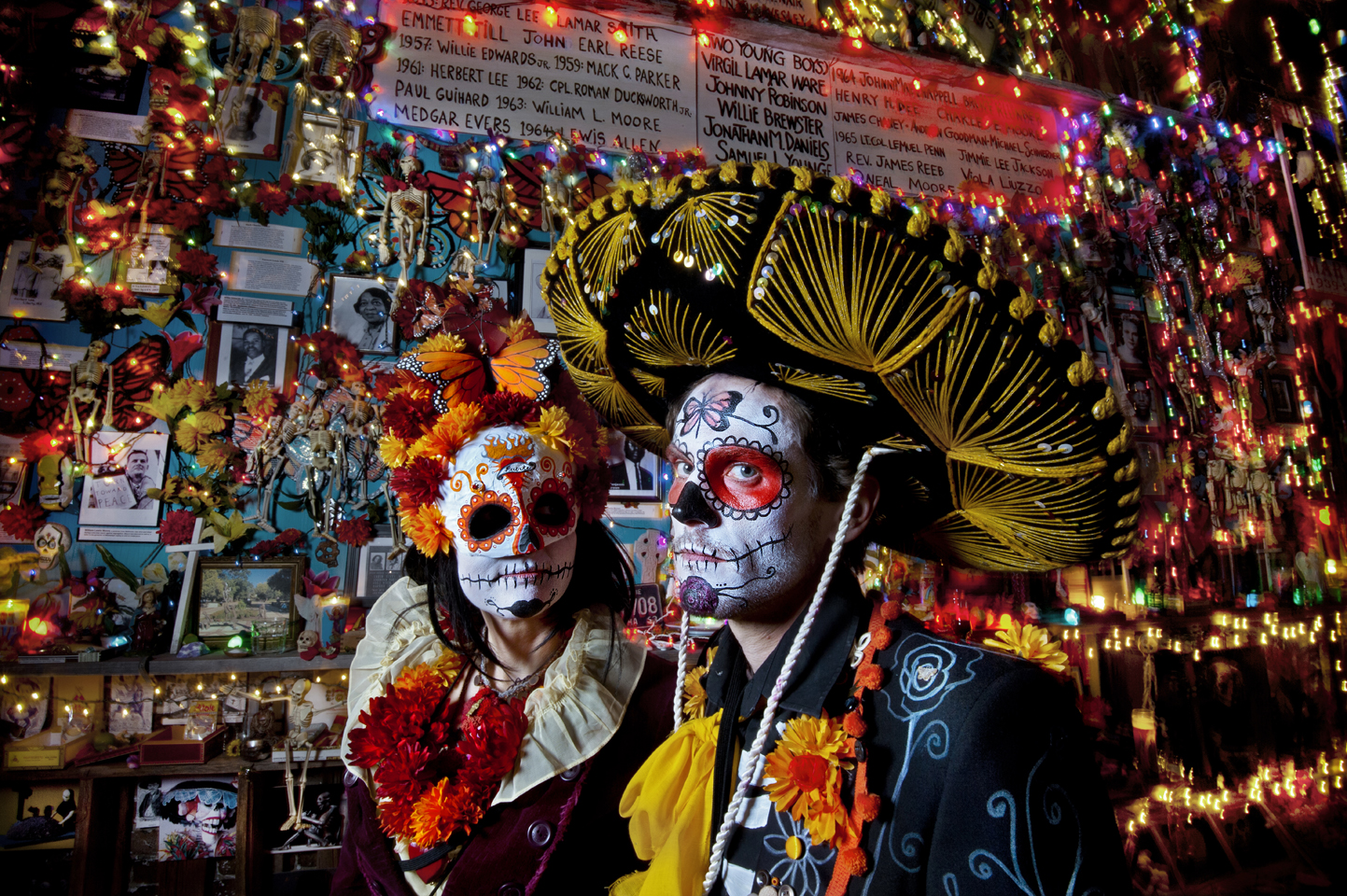
Love it!!!

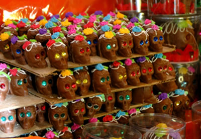
Sugar skulls, or known also as calavera, is an iconic element of Dia de los Muertos, which is the Mexican Day of the Dead festival. In this festival, Mexicans celebrate and honour the lives of the deceased, and spend a day with them, as they believe that during a particular day, the spirits make their way back to enjoy a day with their loved ones who are still alive. Happy with this, I continued to develop ideas on how to make the composition and what icons or symbols to use from Mexican culture and art.
Mexican art is usually vibrant and colourful, thriving and decorative. They proudly showcase the culture of Mexico. There was a strong presence of murals and also folk art and crafts. I chose to look closer at the folk art and crafts, which are decorative and used in their festivals, particularly Dia de los Muertos.
Another characteristic icon of Dia de los Muertos are marigolds, particularly the cempasúchil. In Mexico, they are called flor de muerto, which means “flower of the dead”. The cempasúchil can be seen covering the streets, as they are believed to attract the souls. I personally find the marigold to be a beautiful flower.

Look at this beautiful altar covered in marigolds!
I decided to use the marigold in the background, as the petals create an interesting pattern. They can also be seen as a sort of explosion, like fireworks, which alludes to Leon’s death by explosion, which is sad yet beautiful at the same time, because he sacrificed himself for someone whom, for the first time in his life since many years, has made him love again.
Also in my research, I found out about Santa Muerte, the personification of death. She is a female folk saint, depicted as a skeletal figure clad in a long robe and is typically holding a scythe and a globe. When I read the word scythe, I immediately thought of how I could use that to replace the bones in the typical skull and bones arrangement.


The typical skull and bones arrangement that I thought of was like of the left image. However, I got an idea and decided to arrange it more like the right image, with the blades of the two scythes against the neck of the calavera (which represents Leon). This signifies the taking away of his life by decapitation carried out by Santa Muerte, and also very subtly alludes to mutilation, which is also a common sicario way of brutal execution.
The tilted position of the calavera in the final composition is inspired by the scene from the original movie.
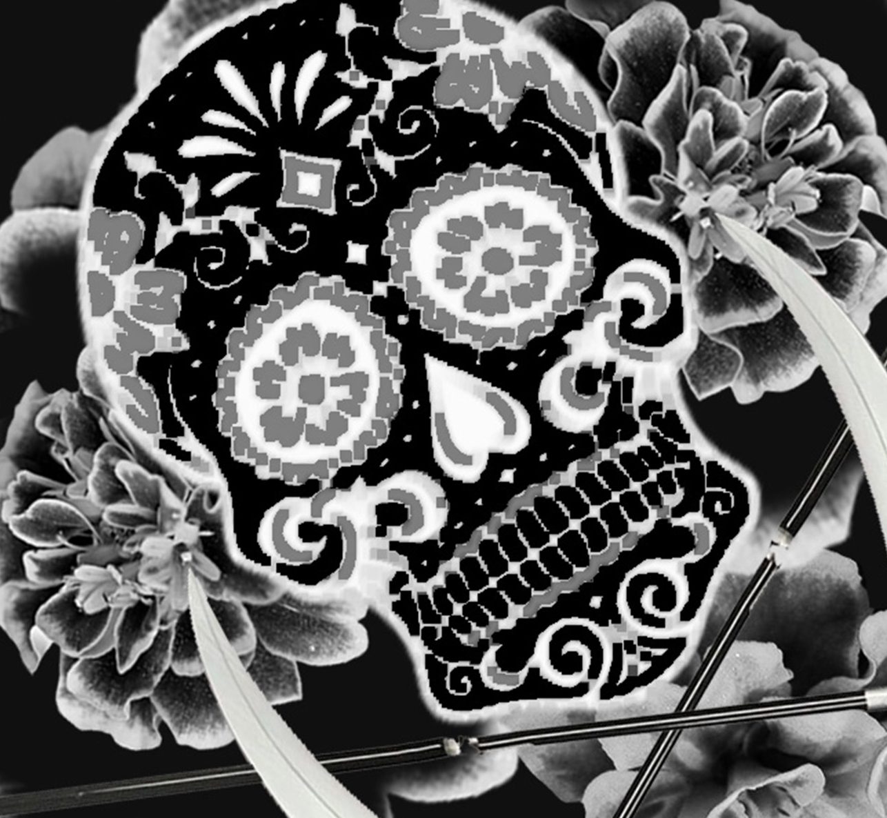
After looking at it again, I found that the tilted and off-centre position is much better than having it just frontal and straight, because it made the composition more dynamic and somehow more dramatic. Since the composition has to be in black and white, to showcase colour, I made sure that values were well represented through dark and light. I also finally chose to invert the colours because it made it look much more vibrant, almost as if the lines are glowing like neon lights.
“I THINK WE’LL BE OKAY HERE, LEON.” ◊ BALI
We have finally come to the last composition, one that is closest to home for me. When I was young, my mom put me in a traditional Balinese dance class, which I was in a couple of years, and ever since then, I have always had a special connection with Balinese dance and culture. I love the costume, the colours, the music. The dance, of course, but the aesthetics was what really intrigued me.

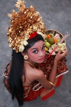
There were some things that I knew I wanted to include. I knew I wanted to portray Mathilda as a young Balinese dancer. Since costumes differ from dance to dance, I decided that the tari pendet, or pendet dance, is a suitable one. This was the first dance I learned, like any other Balinese dance newcomer. It was the first I had to conquer, a dance that marks the start of our journey in traditional Balinese dance.
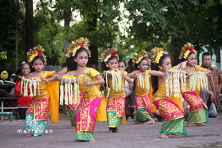
The dance itself is a welcome dance, a greeting. It is a dance to welcome the audience, invite the spirits to a performance, welcome the gods to the temple. In Mathilda’s case, I saw it more of a welcome of a new life. Like how the pendet was how I was welcomed to the world of Balinese dance, I wanted to use the pendet dance to symbolise Mathilda’s transitioning into a new life after the death of her loved ones. I think that the headpiece characterises the dance well enough, so I looked for a bust of a girl in the pendet costume.
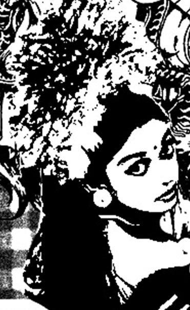
Then I adjusted the levels and threshold to not make it look so realistic.
In the film, Leon’s plant was also an icon. It eventually serves to represent Leon himself. In the film, the plant was a Chinese evergreen. I knew that for a replacement, I wanted to use the kamboja, also known as the frangipani.


It is a beautiful, fragrant flower that is characteristic of Bali. An interesting thing is that while it is considered holy in Bali, it is actually a symbol of bad luck in Java because it is a funeral flower. This, I thought, was interesting as I was using the plant to symbolise Leon, and the act of burying the plant is like giving Leon a funeral.
Other than that, I knew I wanted to use the poleng, which is a checkered fabric widely used in Bali as a symbol of protection. I read up more on it and found out there are three kinds of poleng, which are the rwabhineda (only black and white), the sudhamala (black, white and grey), and the tridatu (black, white, grey and red). The poleng basically represents the positive and the negative in life, yin and yang, good and bad. It reminds us of the balance of the two and thus serves as a symbol of protection and reminder to the people of Bali. I decided to put the poleng as the background so that Mathilda is enveloped by protection, in addition to the looming Barong figure, which I will explain in a bit.
Sudhamala, which I used for my composition.
Other than the few elements that I already knew I wanted to include, I researched more on Hindu folktales and mythology of the Bali region. They do not really have any significant assassins of the region, so I looked into two popular icons: the Barong and the Rangda. Barong and Rangda are enemies. Barong is the lion-like king of spirits, leader of the hosts of good, while Rangda is the evil demon queen. In the Barong dance, they fight in an eternal battle between good and evil, even though Barong always comes out victorious in the end, restoring celestial order.

Barong on the right and Rangda on the left.
The Barong is also a symbol of protection, and I wanted to illustrate the film’s message to the audience that Mathilda is finally safe and settled, so it felt apt to include the Barong, which is significant to the Balinese, as Balinese Mathilda’s protector, in a sense.
With regards to Balinese art, I found many interesting paintings, and wayang kulits (hand puppets) or wooden sculptures, but I felt that what was most interesting to me was the patterns, like those seen in Balinese wooden furniture, which are always meticulously hand-carved. These patterns are also often seen in the architecture of Bali, decorating the interiors.
LOVE IT!!!
Similar to this, another type of fabric, the perada, also makes use of similar patterns. The perada is a fabric used by rich Balinese. The patterns are usually painted in real gold over a bright-coloured or expensive, luxurious fabric.
I decided to include this pattern as a border to mimic the use of a patterned border in many traditional Balinese furnitures. Thus, this completes my fourth and final composition!
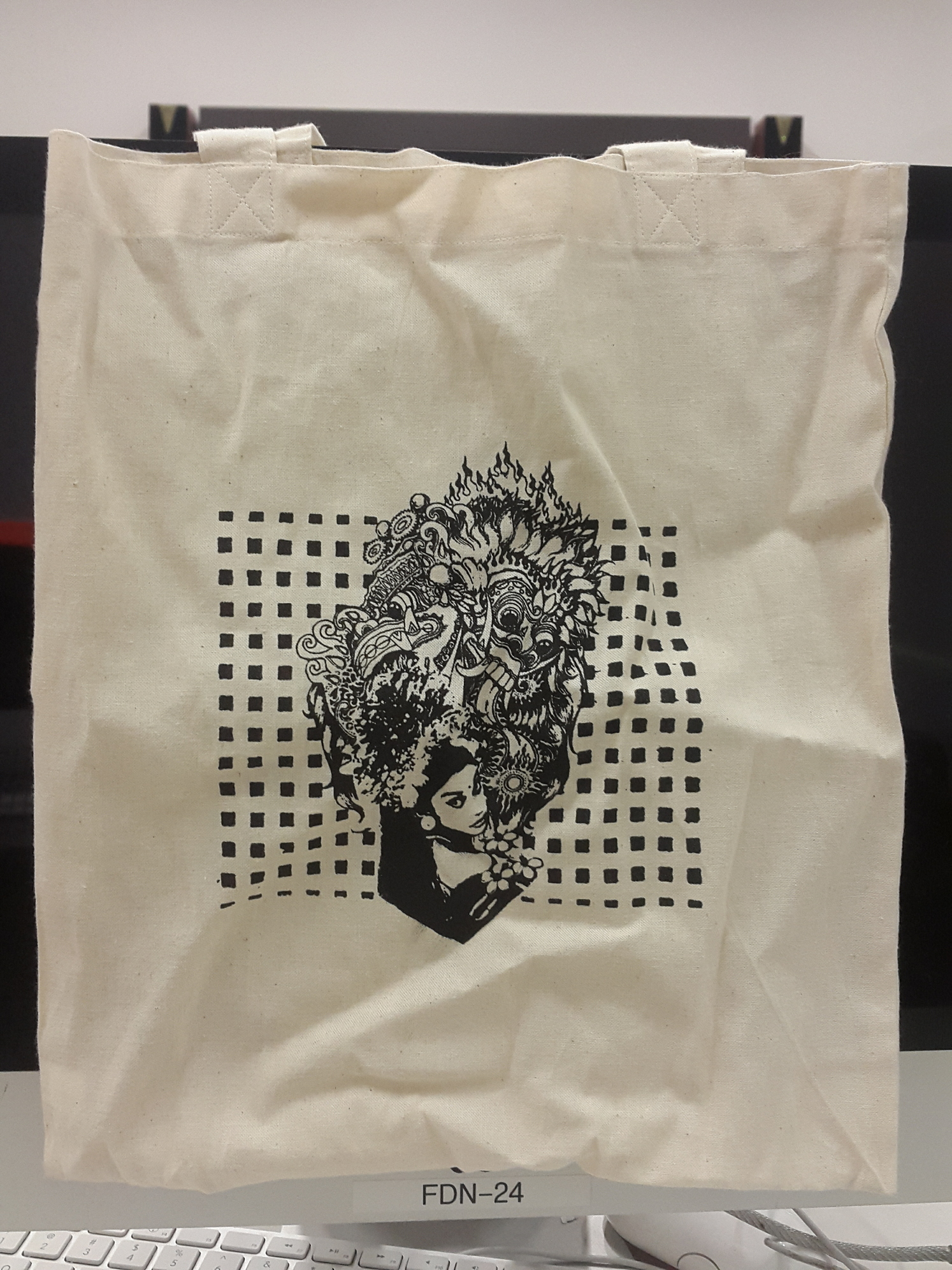
This is also the design I chose to print on my tote bag. I adjusted the levels and threshold, such that the colours all became block colours with no gradient, so that it would come out nicely in the screenprinting. I kept in mind that this design would be on a tote bag, and imagined how I would want the tote bag to be. Due to this, I decided to remove the perada border as I wanted the top and bottom parts of the Barong and the girl to sort of protrude out of the poleng background. After many tries, this is the final result, which I am satisfied with because I managed to make all the designs come out nicely!
That’s all! Thanks for making it through my long long explanation 🙂
(At this point I’m super tired because I had to type half of this twice because it was lost sigh but I made it anyways yay)
When I first came about this project, I was pretty excited because I love watching films. I really didn’t know which movie to get my quotes from, there were so many to choose from! I also hadn’t decided whether I wanted to get quotes from different movies, make four compositions out of one quote, or any other combination.
One day, while listing out movies that I liked and movies that I wanted to see, I randomly decided to go and watch “Leon: The Professional”. I fell in love with it. Especially the scene where Leon was dying. Not that I liked that he died, but it was partly because I could recognise what Leon was going to say from a song by Alt-j!!!!!!!!!!! I might be rambling incoherently and I apologise if you don’t understand but I was so excited asddfghjkl. When he started to say “This… is from…” I was like OMG MATHILDA! MATHILDA! THIS IS FROM MATHILDA! IT’S WHERE ALT-J GOT THE INSPIRATION FOR THE SONG FROM I NEVER KNEW IT HAD OTHER MEANINGS I NEVER UNDERSTOOD IT BUT NOW I KNOW NOW I LOVE THIS MOVIE EVEN MORE!!!
Okay, for both our sakes I’ve decided to calm down.
So, Alt-j is this band I like that makes weird music. Most of their songs are very metaphorical and experimental, and “Matilda” is one of their songs. In the song, “this is from Mathilda” is repeated multiple times and makes up almost the entirety of the song.
That’s why I lost it when I saw the scene in the film and could make an instant connection. I decided that at least I would use “This is from Mathilda” as one of my four quotes.
While watching the film, I could easily point out the many items that are icons of the film. I collated images of them to be used for my compositions. At this point of time, I was planning on using these icons in a different way, but did not know how yet.
After a consultation with Joy expressing my worries and lack of understanding of the project brief, I finally had a clearer direction for the project. It depended on how I wanted to present my ideas and views about the quotes, it isn’t that I had to completely take the quote out of context, it is about how I choose to interpret the quote, how I can give the quote a different meaning and how I can express the quote from my point of view. Joy suggested for me to look at the little details usually missed by the audience or alternative endings, which I kept in mind.
Suddenly, I thought of how I could look at the film from different cultures. I first had Indonesia in mind, and thought of how I could look at assassins from other cultures around the world, like the Mexican sicario (from the movie Sicario) and Japanese ninjas.
From here, I developed my idea into two forms of execution. The first one is to describe the relationship between Leon and Mathilda through a series of quotes from key parts of the movie, interjecting quotes from Leon and Mathilda. I didn’t know how the “look” would be yet, because I didn’t know whether this was still too literal or not. The second one is to take one quote and interpret it in four different cultural styles. I explained the ideas to Joy, who told me that I could actually merge the two ideas! I could keep the storyline and instead, interpret each of the four compositions in different cultural styles!
I finalised the four quotes and moved on to researching and constructing the compositions. This I will elaborate more on my research and process post!