2D Project 1: My Line is Emo – Execution

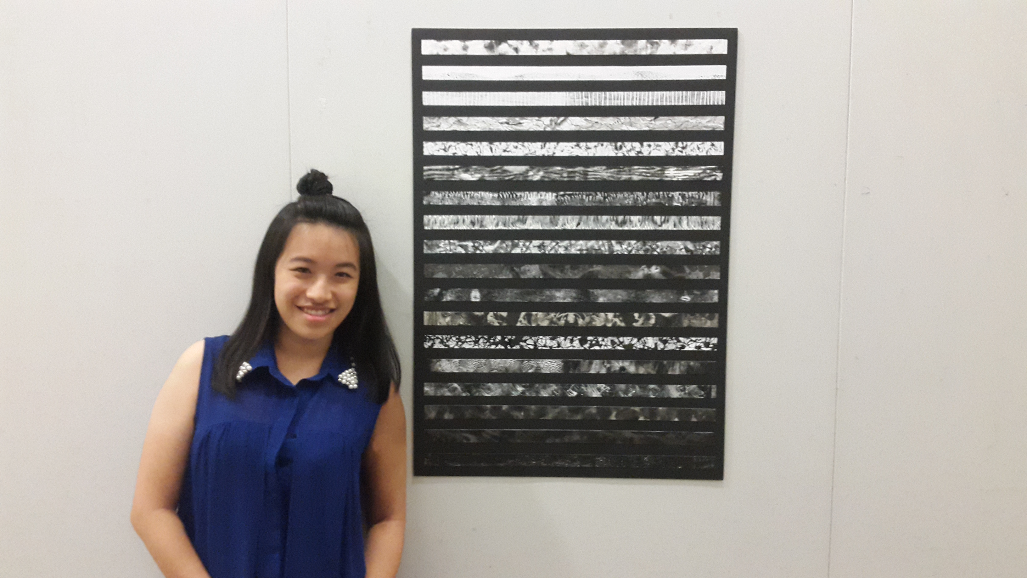
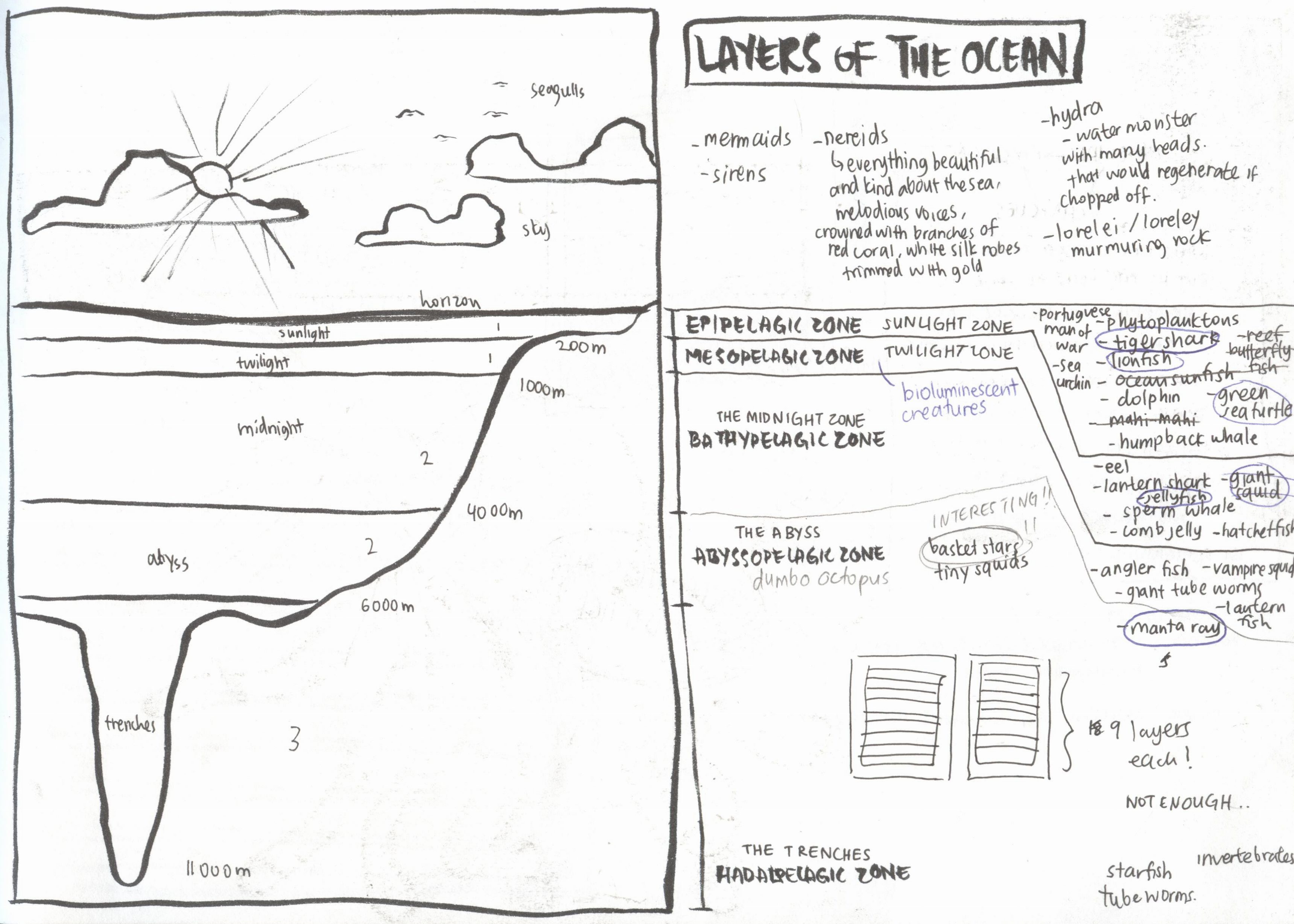
So, I decided to add in an execution post. Here I will be elaborating on the creation of each line in my final work. For my main thought processes and elaboration on my theme, you can check the process post and for a short summary of everything, check out my final post!


Screen Shot 2016-09-11 at 9.20.54 PM

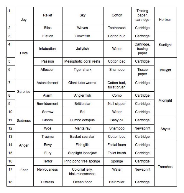
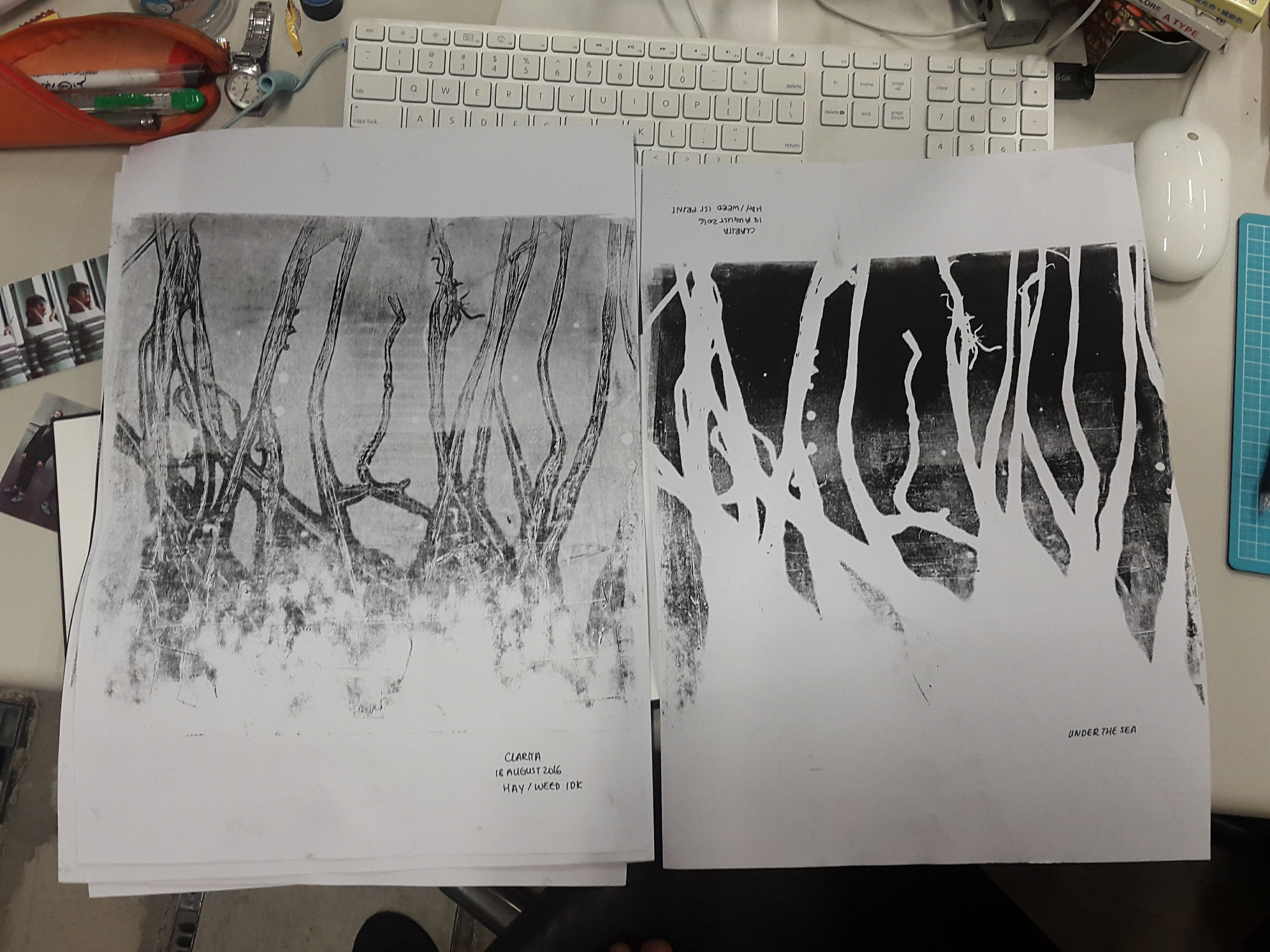
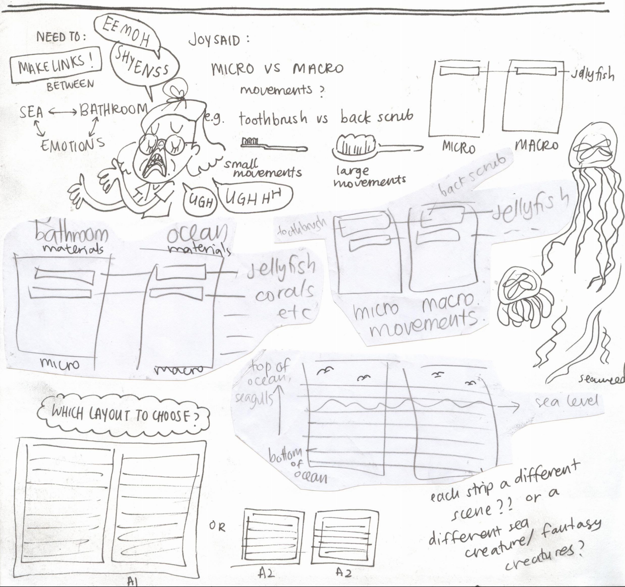
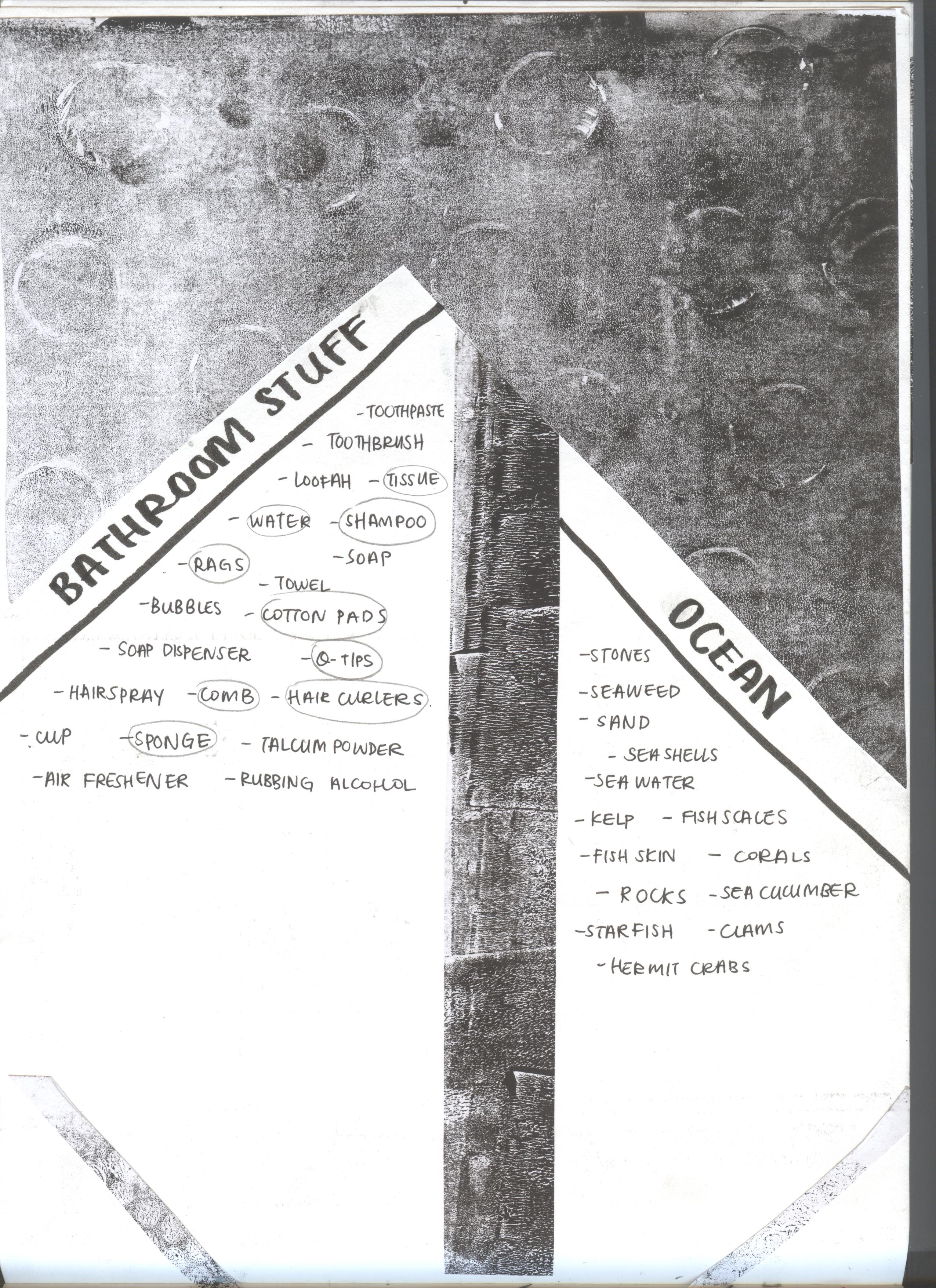
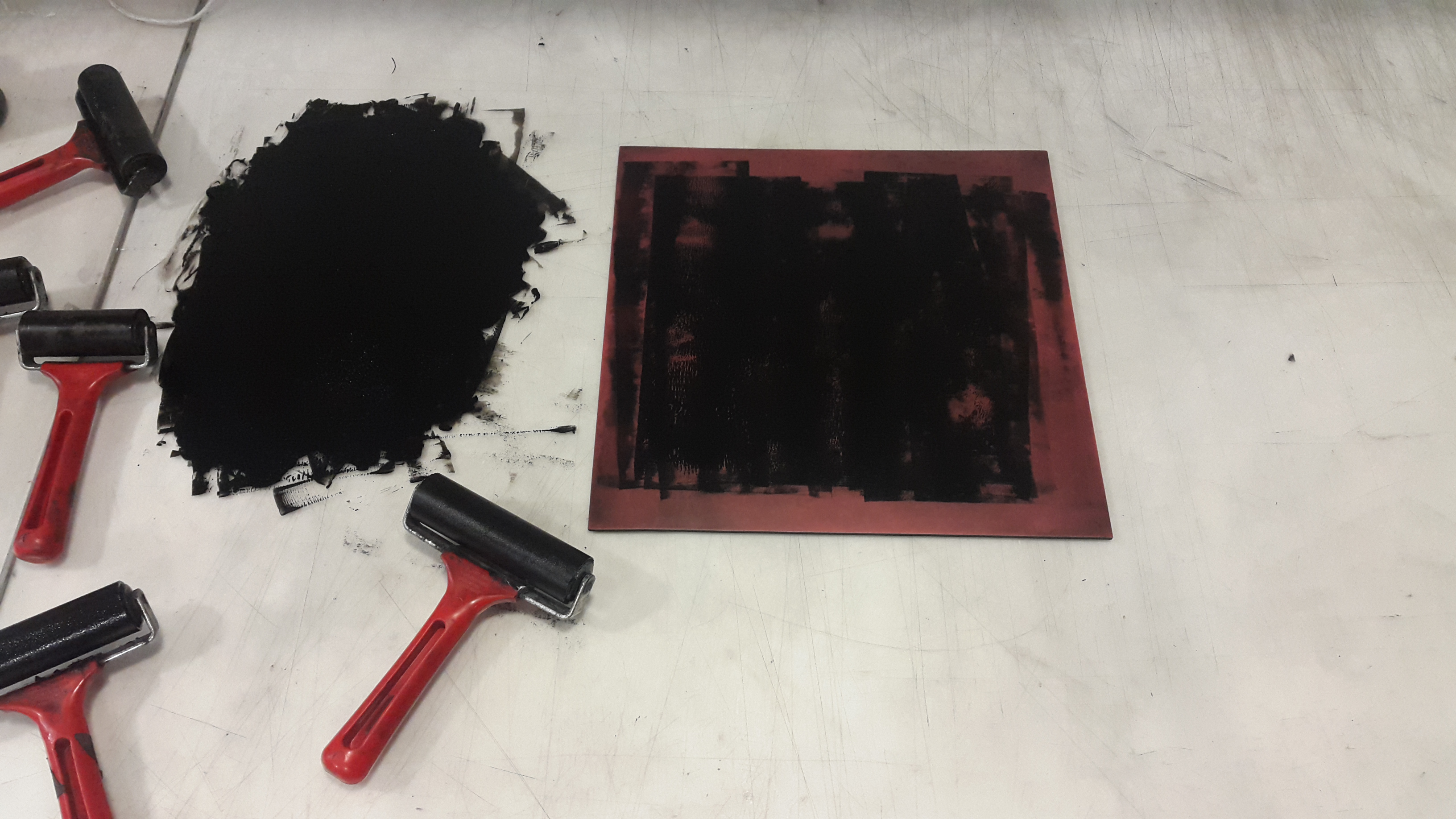
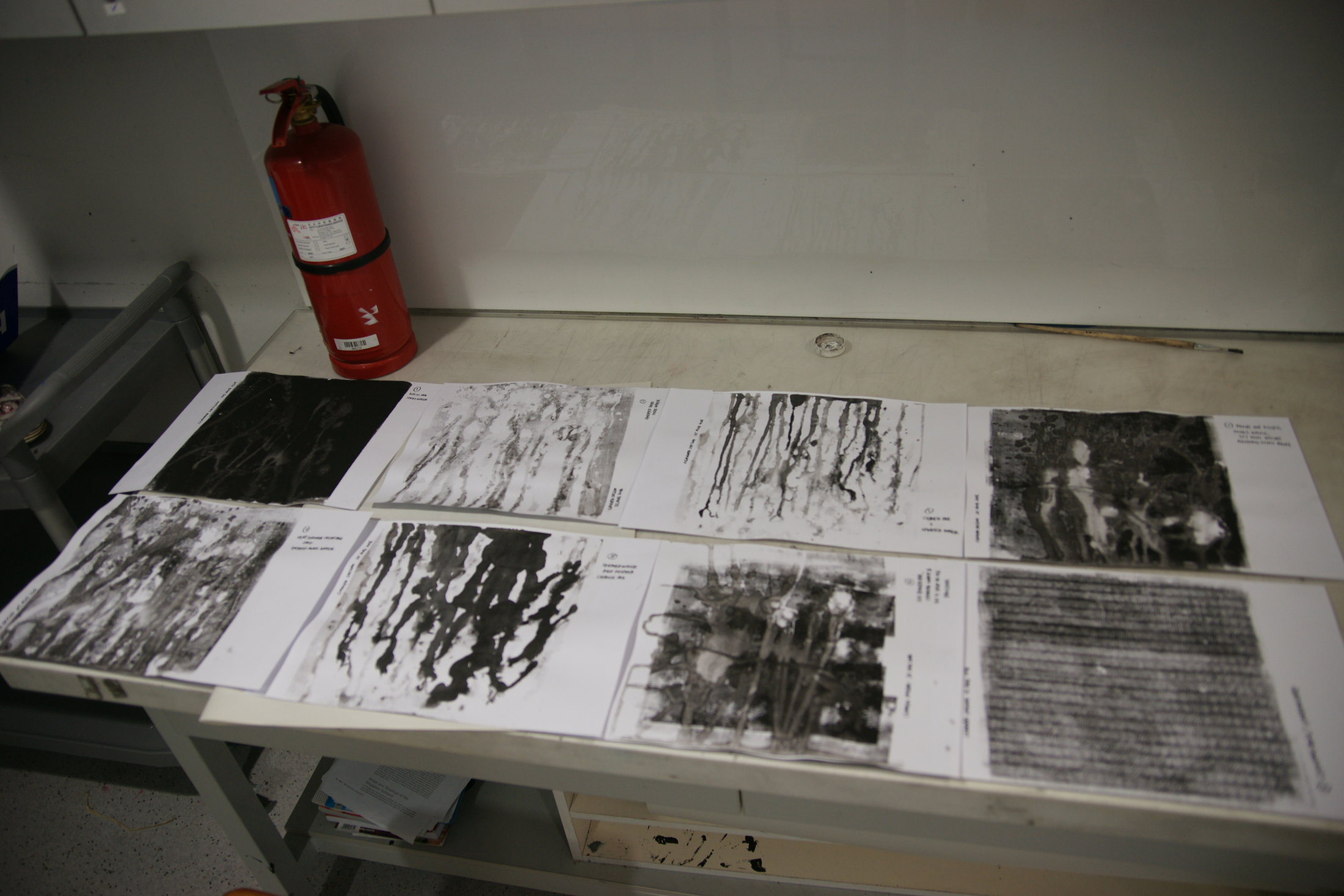
This is a summarised table form of my final work layout. Before going into making the final prints themselves, I would do several tryouts on loose sheets of paper. I also tried different backings. For some of the lines, I replicated an existing texture that I have from previous experiments. In these cases I did the patterns first and associated it with a sea creature afterwards. 

2d proj1 10

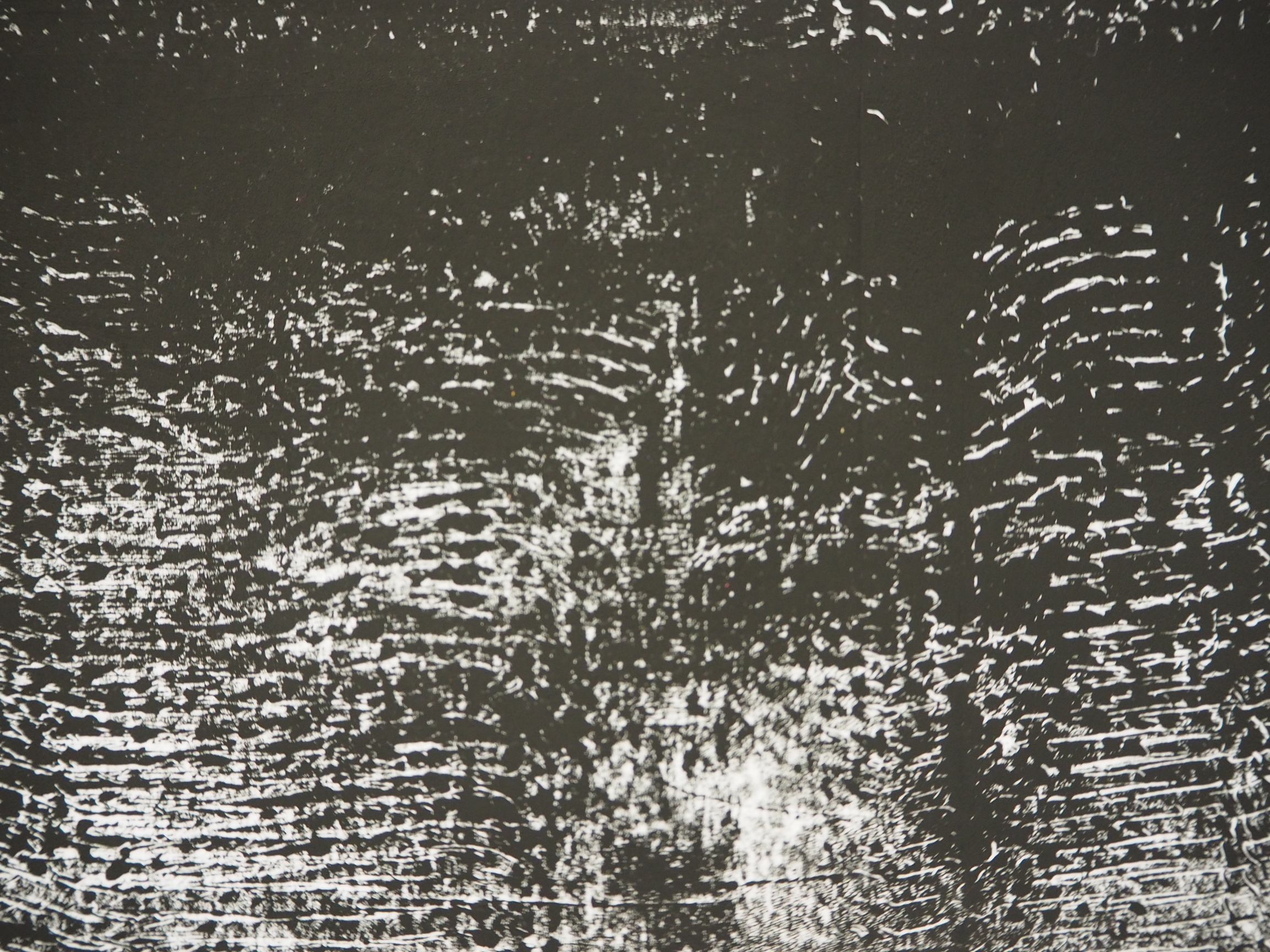
Journal page recording my thought processes as I started on the final strips.
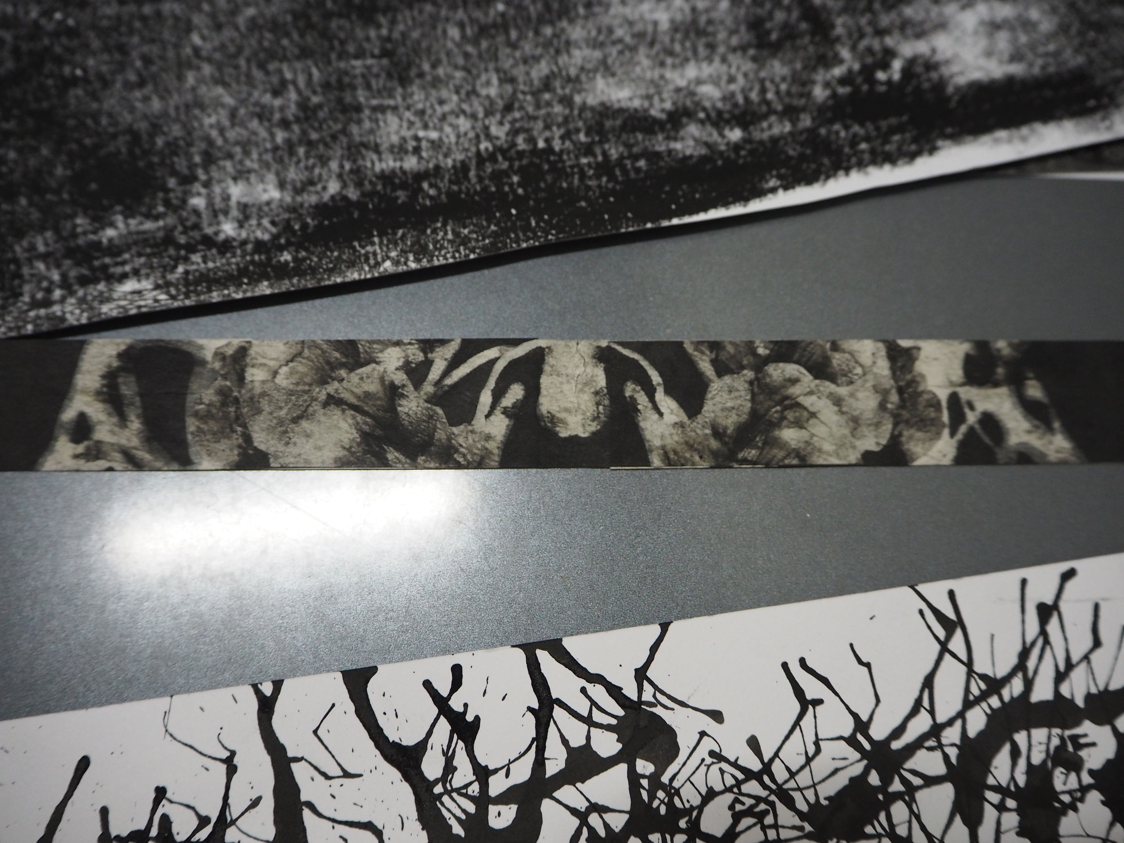

RELIEF ◊  SKY

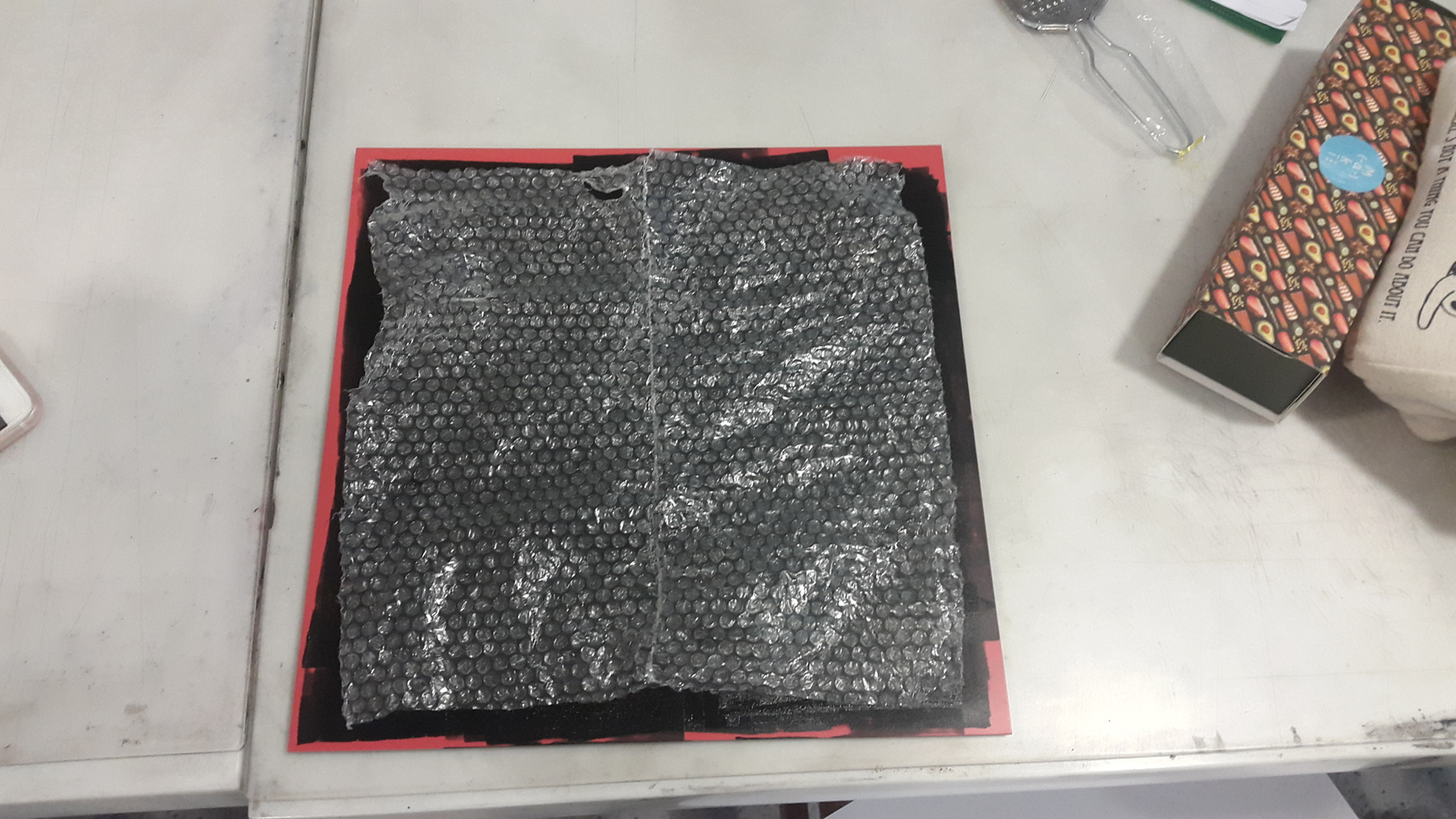
To represent clouds, I tore cotton pads into thin strips and placed it onto an ink-rolled linoleum tile. Then I placed a backing of choice on top of it and used the roller to transfer the ink onto the backing. I tried a couple of different backings, from normal cartridge paper, to newsprint and tracing paper.

2016-09-06 025823 1 2016-09-06 025908 1 2016-09-06 031403 1

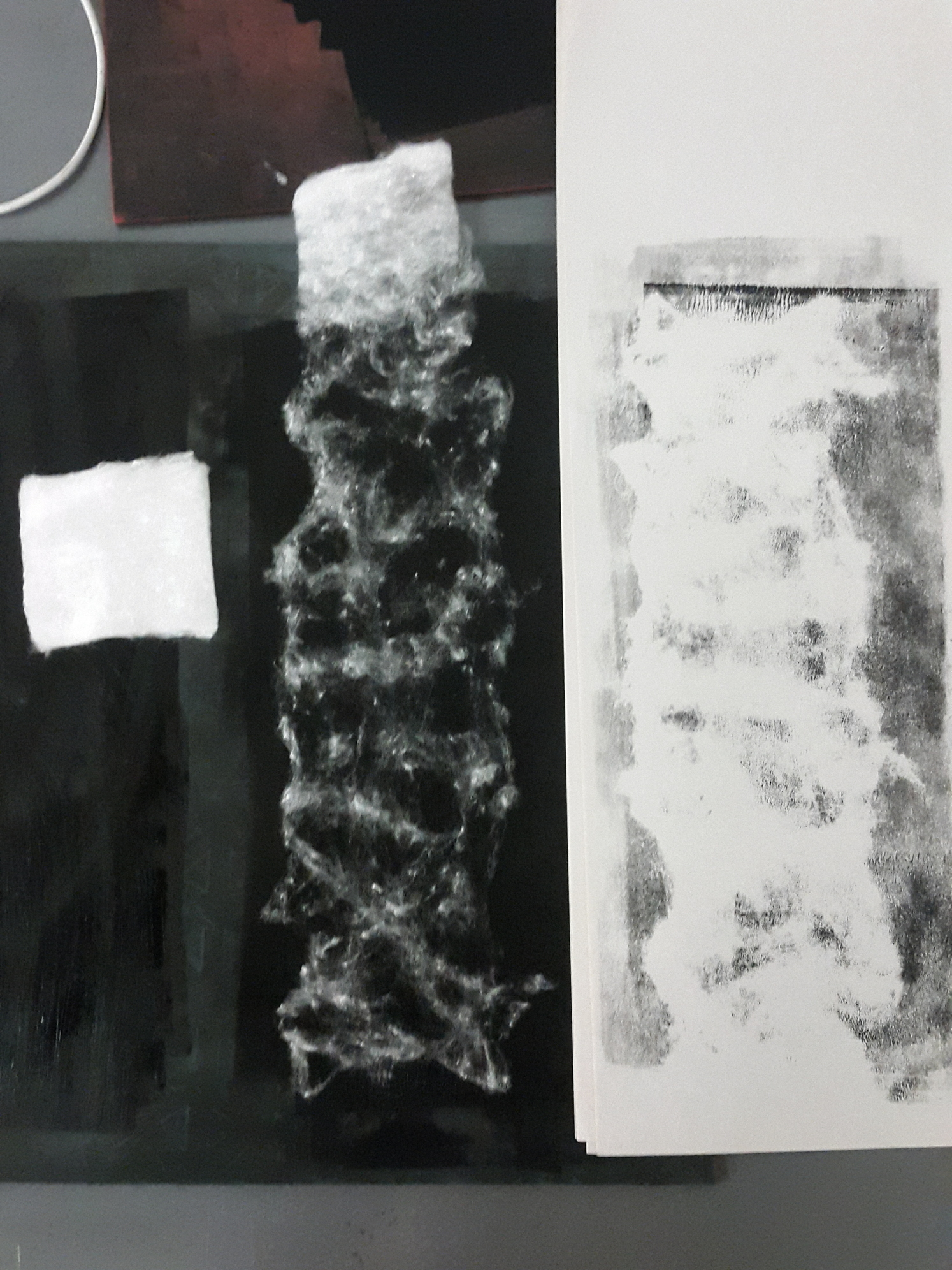
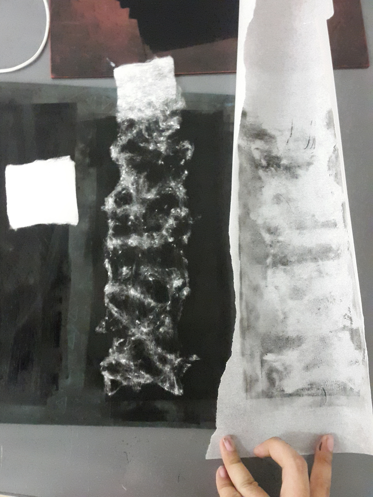
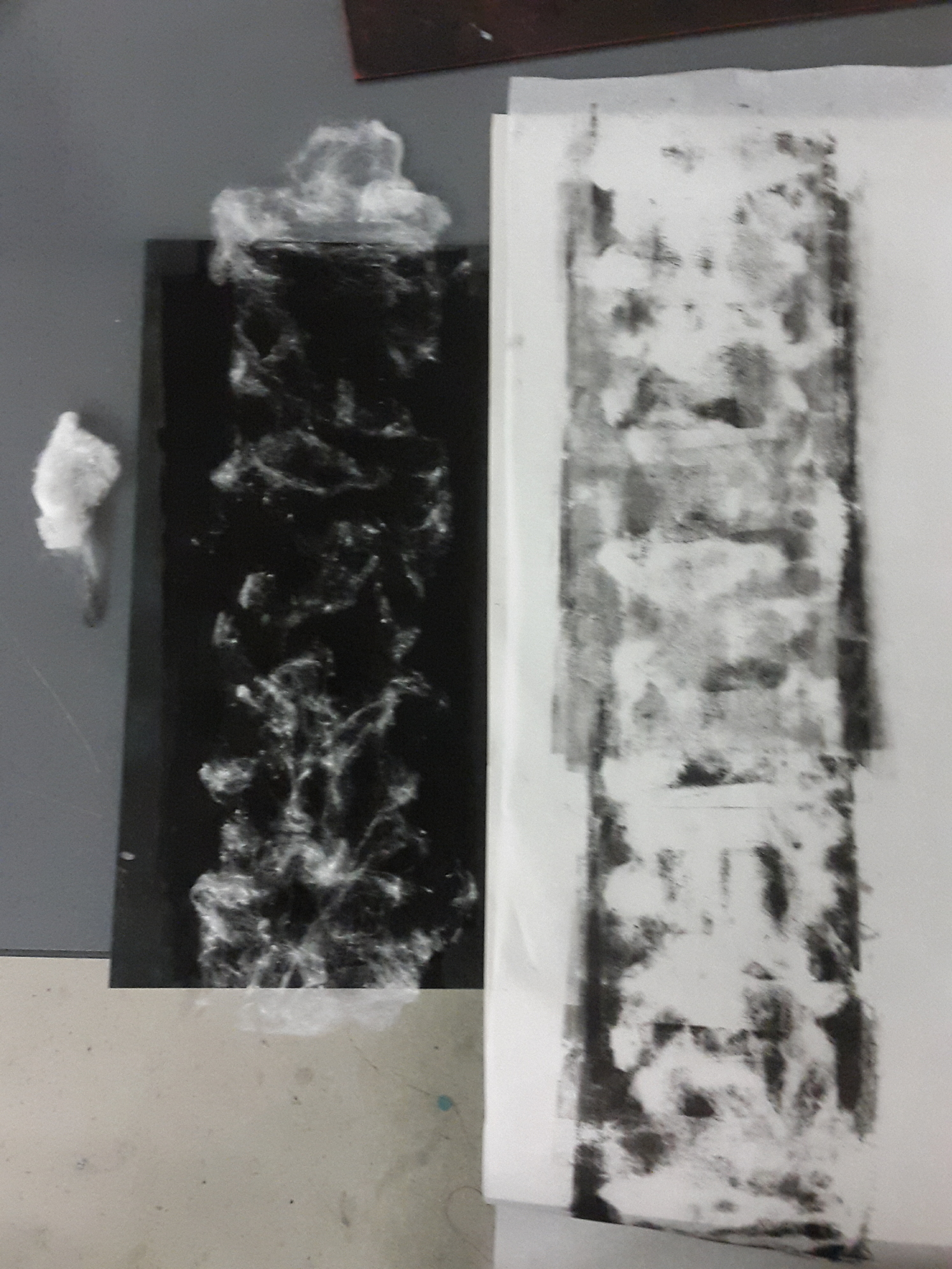
From left to right, cartridge paper, tracing paper (but clouds not defined enough), final print used.

Eventually I chose the tracing paper as the backing as it gives a slightly translucent effect that I felt fits the quality of soft clouds. I also included a layer of white cartridge paper behind it so that the line will look lighter in shade. To the sky line, I assigned the emotion relief, as I felt that the open sky is very liberating. Every time I go for a dive, when I resurface and take a gasp of breath, I would feel a huge sense of relief. Relief that I am still alive, relief that I could breathe again.


BLISS ◊ WAVES

2016-09-06 035610 1

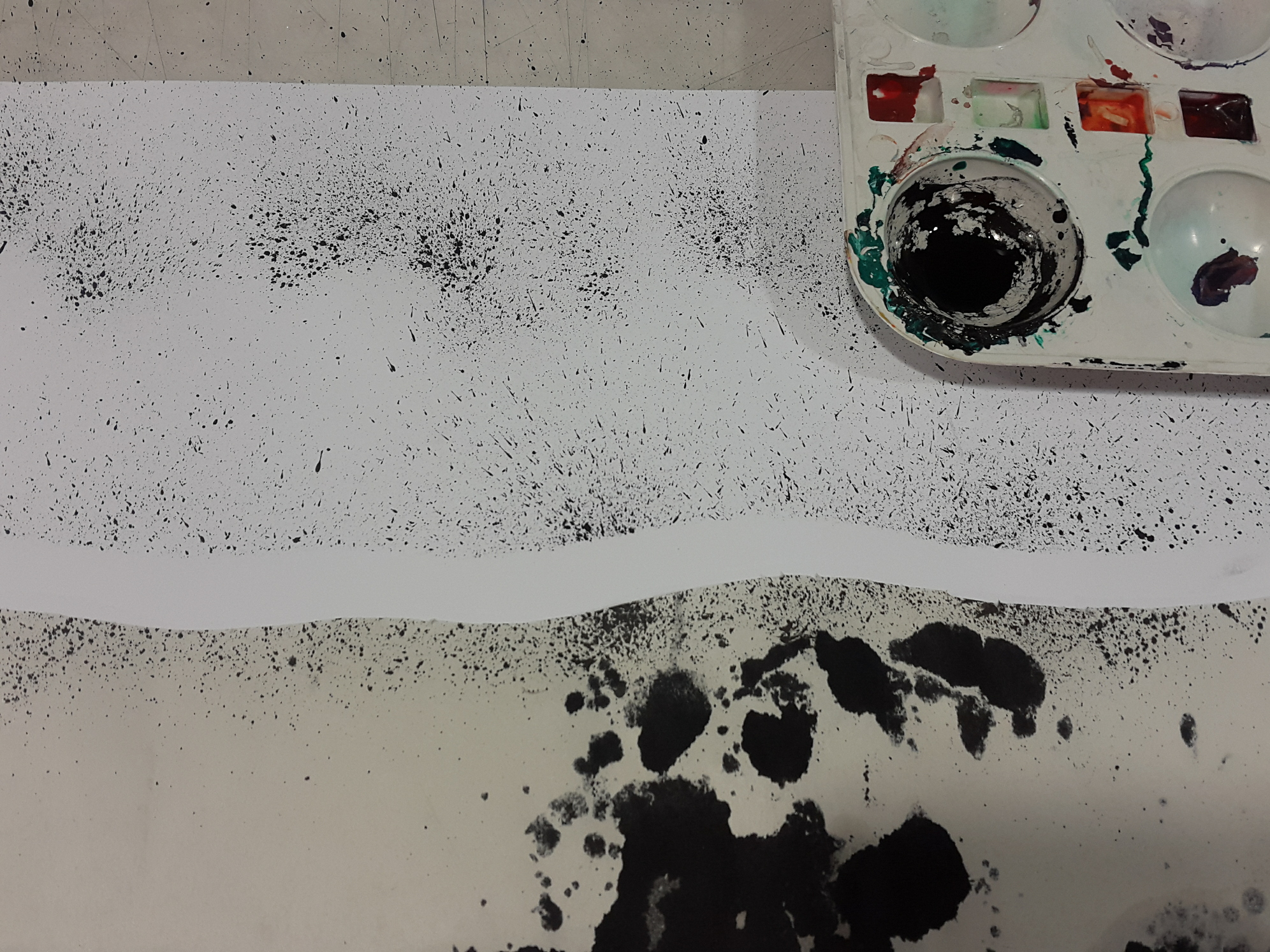
Bliss is represented by waves, the boundary between sky and sea. I like watching the waves move about, whether it is still or turbulent. There is this hypnotising feel waves give you. I particularly like standing by the shore, gazing at the waves lapping at my feet, which makes me feel as if I the ocean was pulling me in its embrace and letting me go, pulling me in and bringing me back to shore, while in actuality I was just standing there, still. The waves make me feel happy, in a lighthearted way.

To achieve the mark, I cut the outline of the waves on a waste sheet of newsprint and laid it over a sheet of cartridge paper. Then I used a toothbrush, dipped it in Chinese ink, and started flicking the brush all over to create an ocean spray effect. 
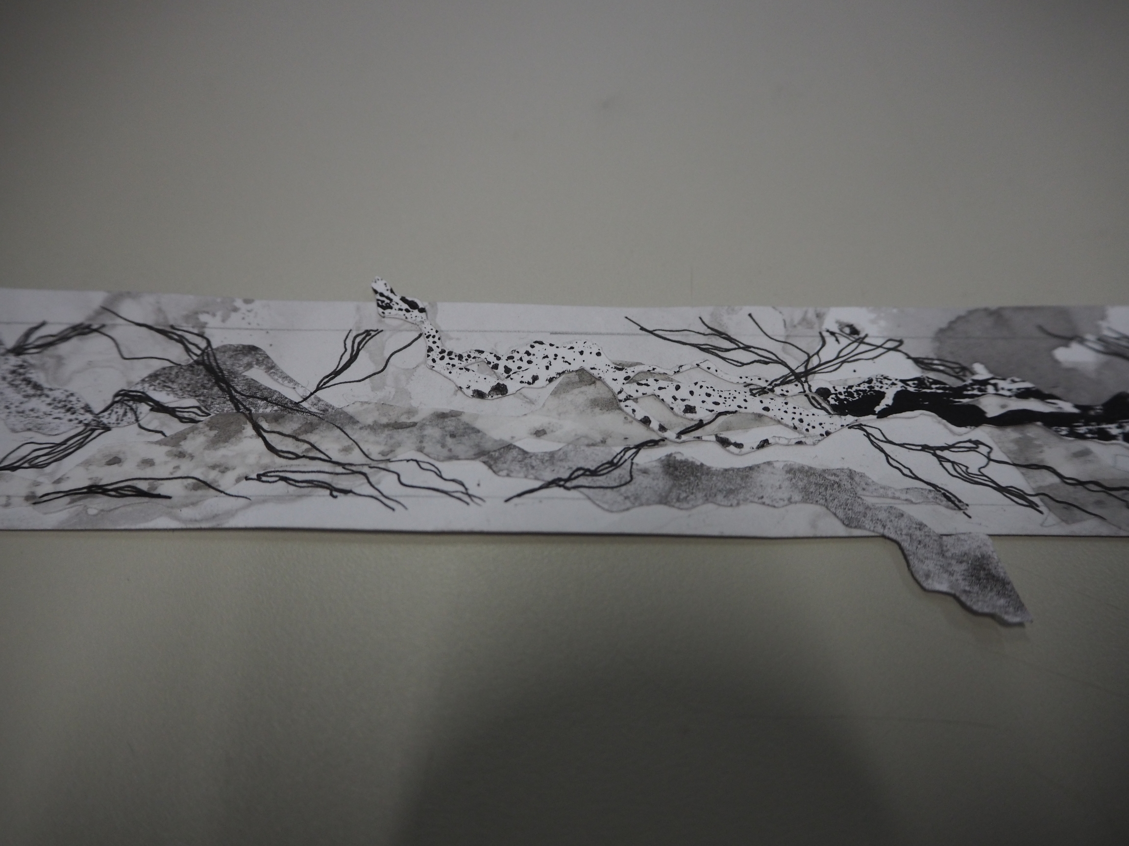
 

ELATION ◊ CLOWNFISH

a669e57a-d79e-4d5f-8e21-e8840f9a8984

2016-09-06 052400 1

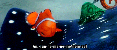
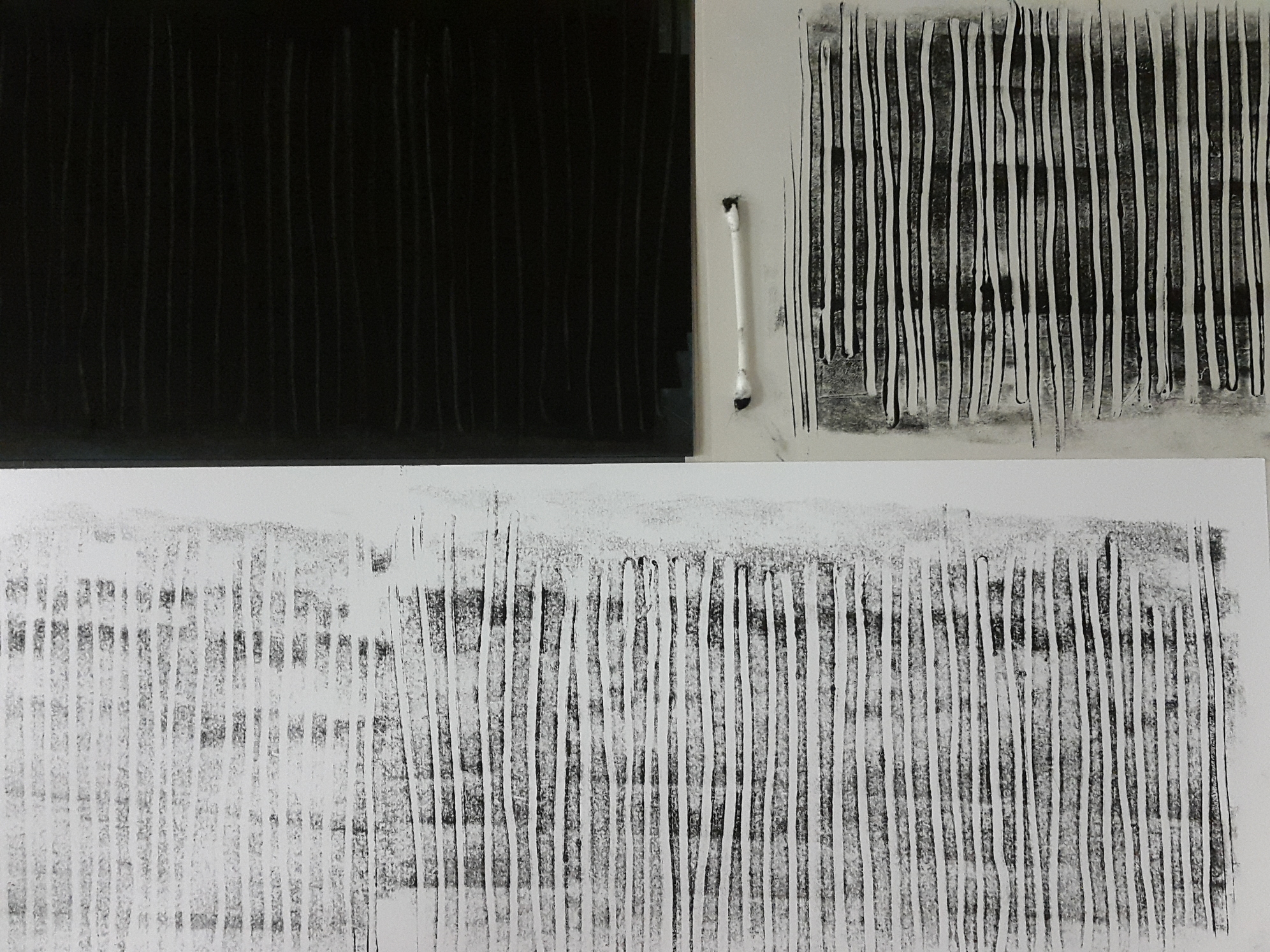
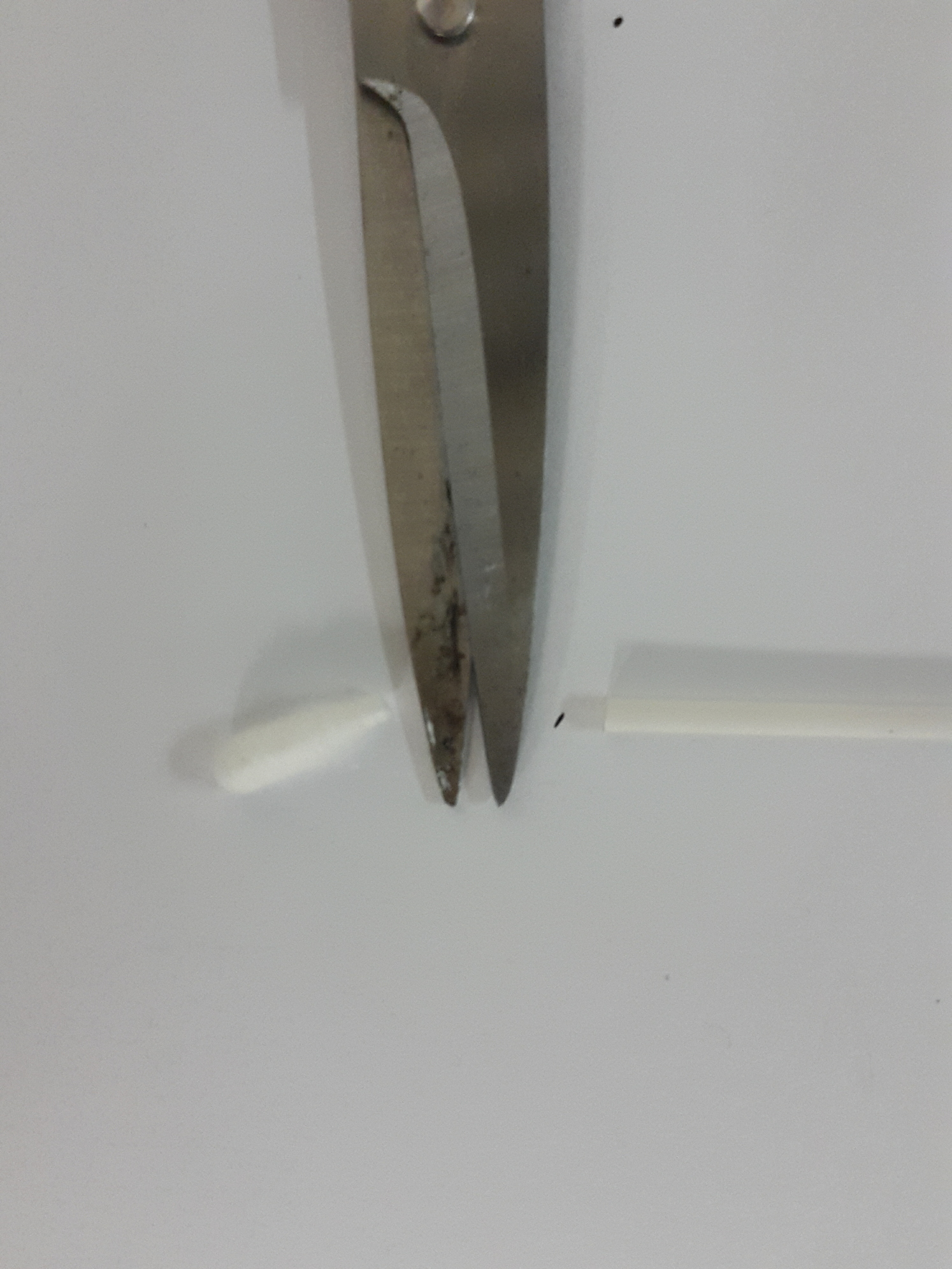
I made the same type of marks during the first monoprinting session, and thought that it reminded me of Nemo from “Finding Nemo”, so I recreated the mark, but this time using a cotton bud to create the lines. I had to make sure to put enough pressure so that the ink would be removed from the lino.

To me, the verticality of the lines represent the action of going upwards, and this symbolises positivity.  This highlights how we tend to look “upwards” when we are happy, and especially when we are elated, we tend to brighten up and become positive in our disposition! 


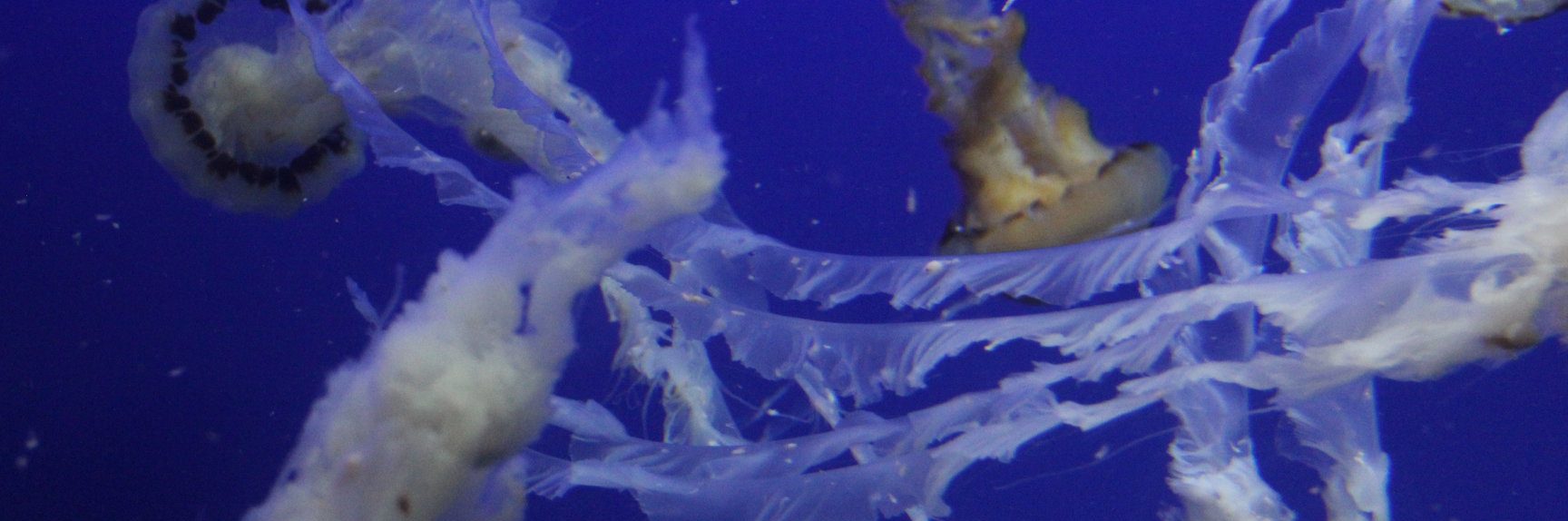
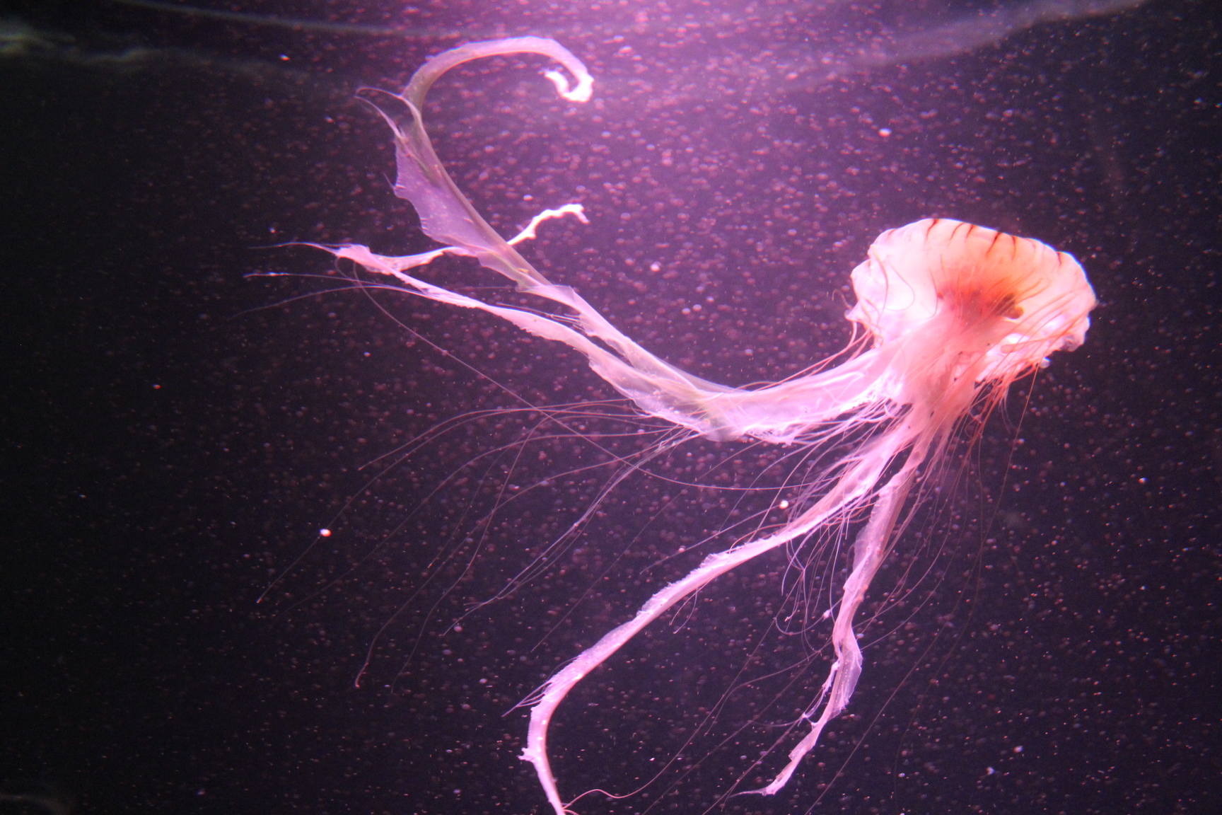
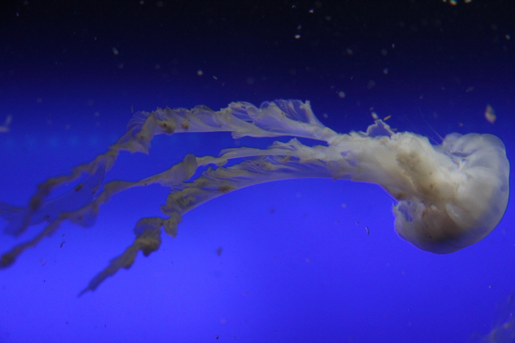
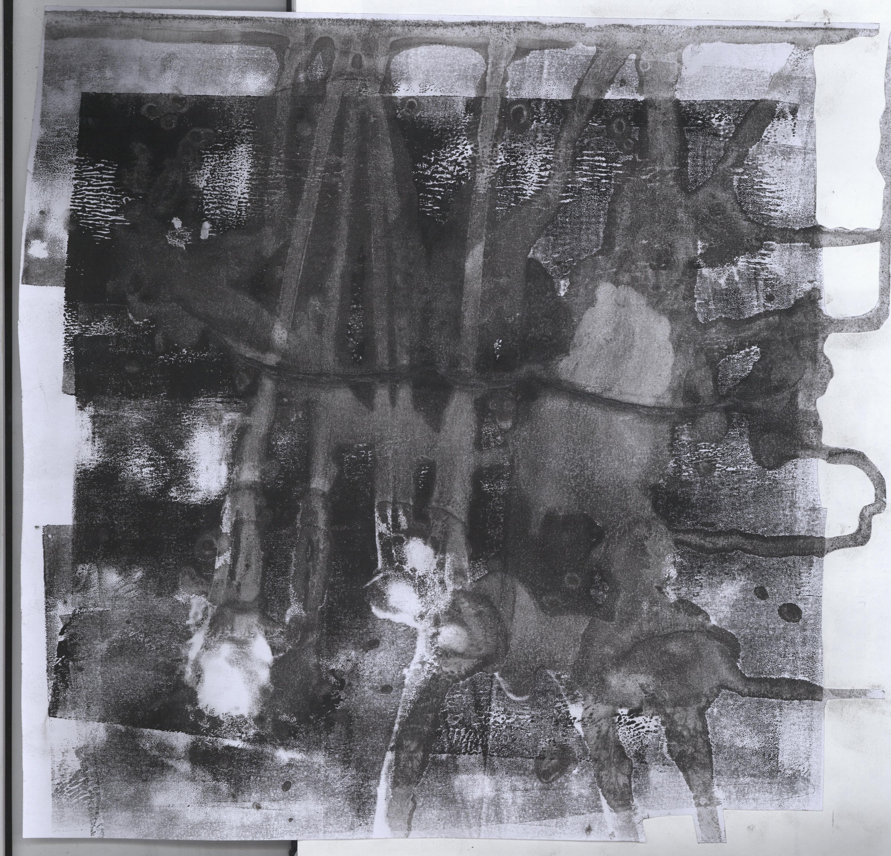
INFATUATION ◊ JELLYFISH

2016-09-06 104520 1   2016-09-06 115722 1  2016-09-06 115655 1   2016-09-06 115743 1

This line was one of the more complicated ones in terms of execution. There were several steps to it as I did a collage of several prints. I wanted to recreate the ethereal, flowy quality of jellyfish. I was cleaning ink off the table using wet tissue and found that it created a pretty cool texture on the table surface. Just out of curiosity, I put a sheet of paper over it and pressed. The result was a cool exact water droplet texture replica as shown in the bottom right picture. I thought that it looked like the frills of a jellyfish. I decided I would need a base layer so I tried to drip more diluted ink (top left picture) and then pressed the paper on top of it. The results were as shown in the two other pictures, a cool marbling effect with a softness to it that I felt could represent a jellyfish. I did more of the water droplet texture print on tracing paper, and using a penknife, created frill- like strips out of the print. In the end, the collage consisted of the water marbling print as the base layer, frills from the water droplet prints on cartridge and tracing paper, and also drawn lines using an ink pen.

P9080783JPG

The resulting collage felt very whimsical and intense, since there are so many elements to it. I likened this to the feeling of infatuation over someone you love, as it is almost as if there is an overwhelming sensation of emotions. 


PASSION ◊ MESOPHOTIC CORAL REEFS

rsz_2016-09-06_033727_1

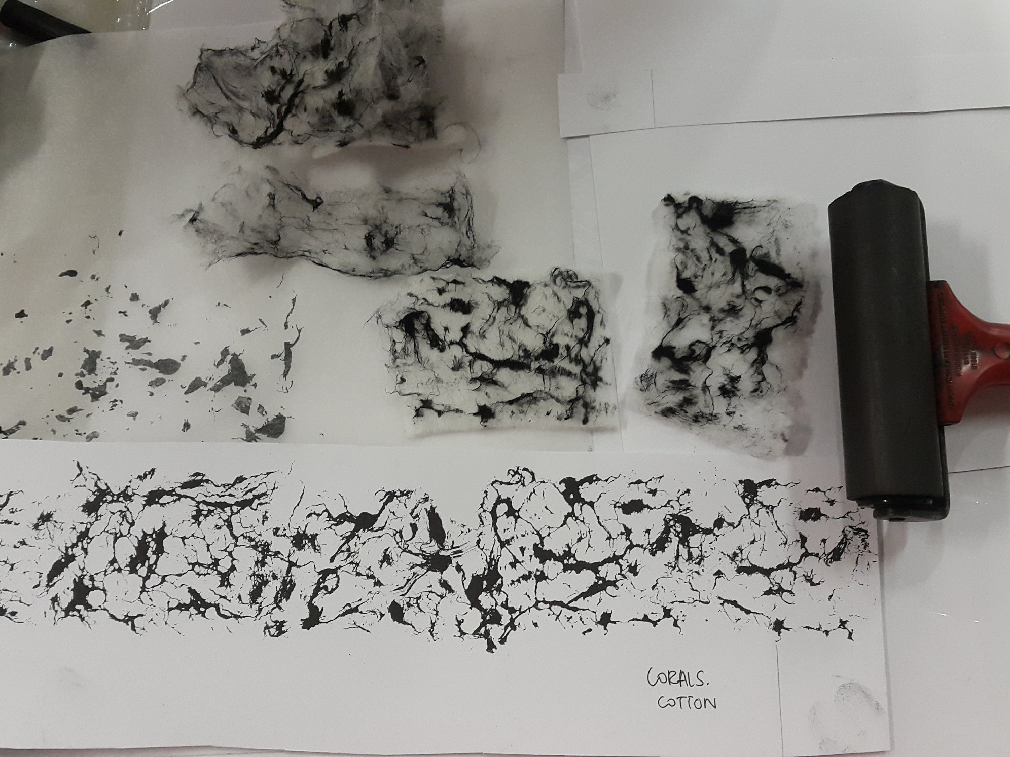
The creation of this line was a result of a experimentation. I painted Chinese ink lightly over the fibres of a cotton pad, placed it on the paper, and added pressure using the roller. I really loved the resulting print – a mesmerising, organic pattern.  This pattern reminded me of a cluster of coral reefs, and hence I researched to find out whether coral reefs grew in the mesopelagic (twilight) layer of the sea. Turns out they did! They are slightly different, though, from the coral reefs that grow in the epipelagic (sunlight) layer. 

The amalgamation of soft, thin lines and denser areas create a dynamic and organic flow about the strip. It felt as if the corals were swaying a little bit in the currents, a passionate affair. 


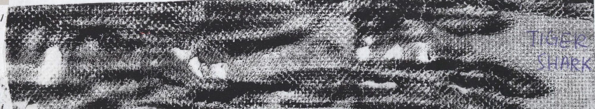
AFFECTION ◊ TIGER SHARK

I was starting to play around with shampoo and figuring out how to use it in my printmaking. I randomly squeezed shampoo on an ink-rolled linoleum tile.

20160901_160925

The result was a beautiful striped pattern! I absolutely had no high expectations, but shampoo proves to be quite versatile in terms of making marks (elaborated on other lines). Sadly I do not have any pictures of the freshly finished result! I was probably too excited to have taken a picture of it. After the first print on cartridge paper, I laid a sheet of tissue paper over it and made another print, which also gave wonderful results. The print on the tissue paper was what I decided to use for the final work. It smells really good!

tiger-shark-silo
Tiger shark image from graytaxidermy.com

2d proj1 10A section of the tissue paper that is saved and pasted on my visual journal.

The quality of the seemingly blurred out lines and the softness of the tissue paper gives an overall fuzzy quality which I likened to affection.


ASTONISHMENT ◊ GIANT TUBE WORMS

WIyzU
Giant tube worms image from theecology.tumblr.com

2016-09-07 050656 1

I simplified the giant tube worm into the stem and the head. To mimic its physical features, I used a toilet brush to create swift strokes representing the stems, and pressed the tip of a cotton bud on the linoleum tile repeatedly to create the heads.

I was really quite astonished when I saw pictures of the giant tube worm as I have never seen such a creature before. I tried to express my astonishment through the print by using quick flicks of the wrist to create the rapid lines, and quick dabbing of the cotton bud tips as if each stroke was a shocked gasp (which was my literal reaction when I first saw a picture of the worm). 
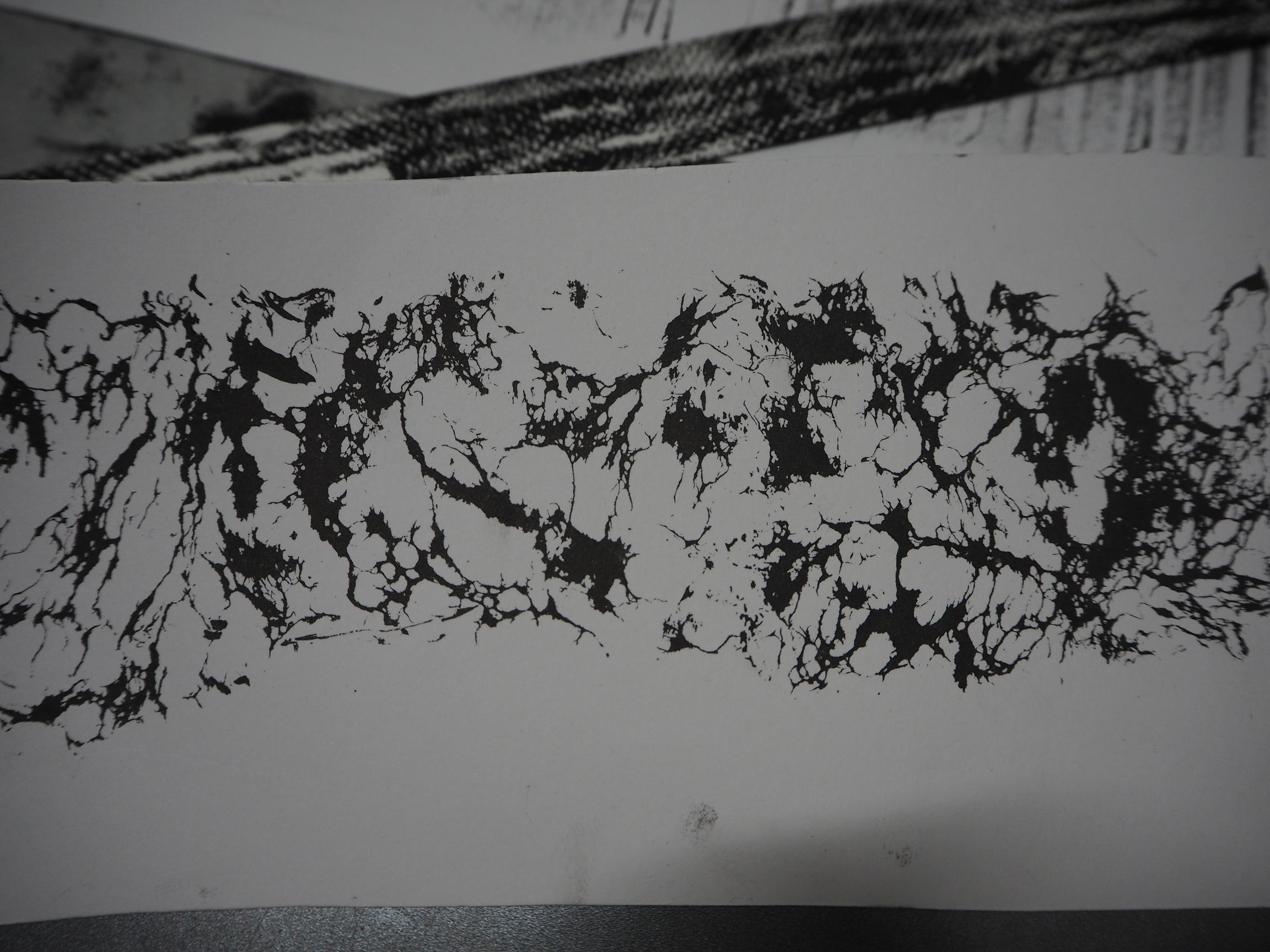
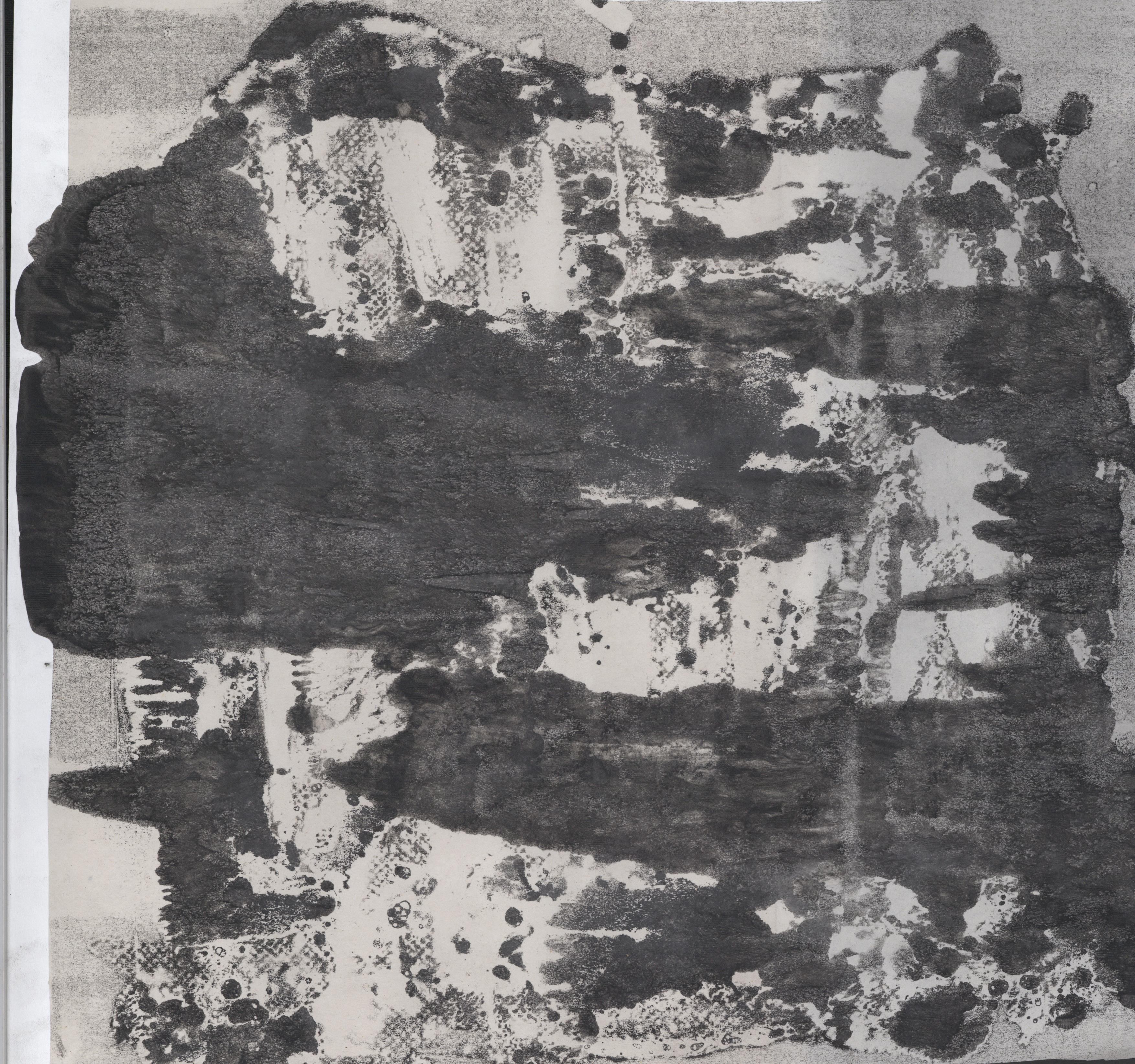
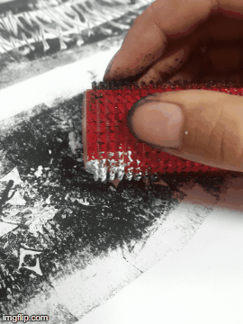
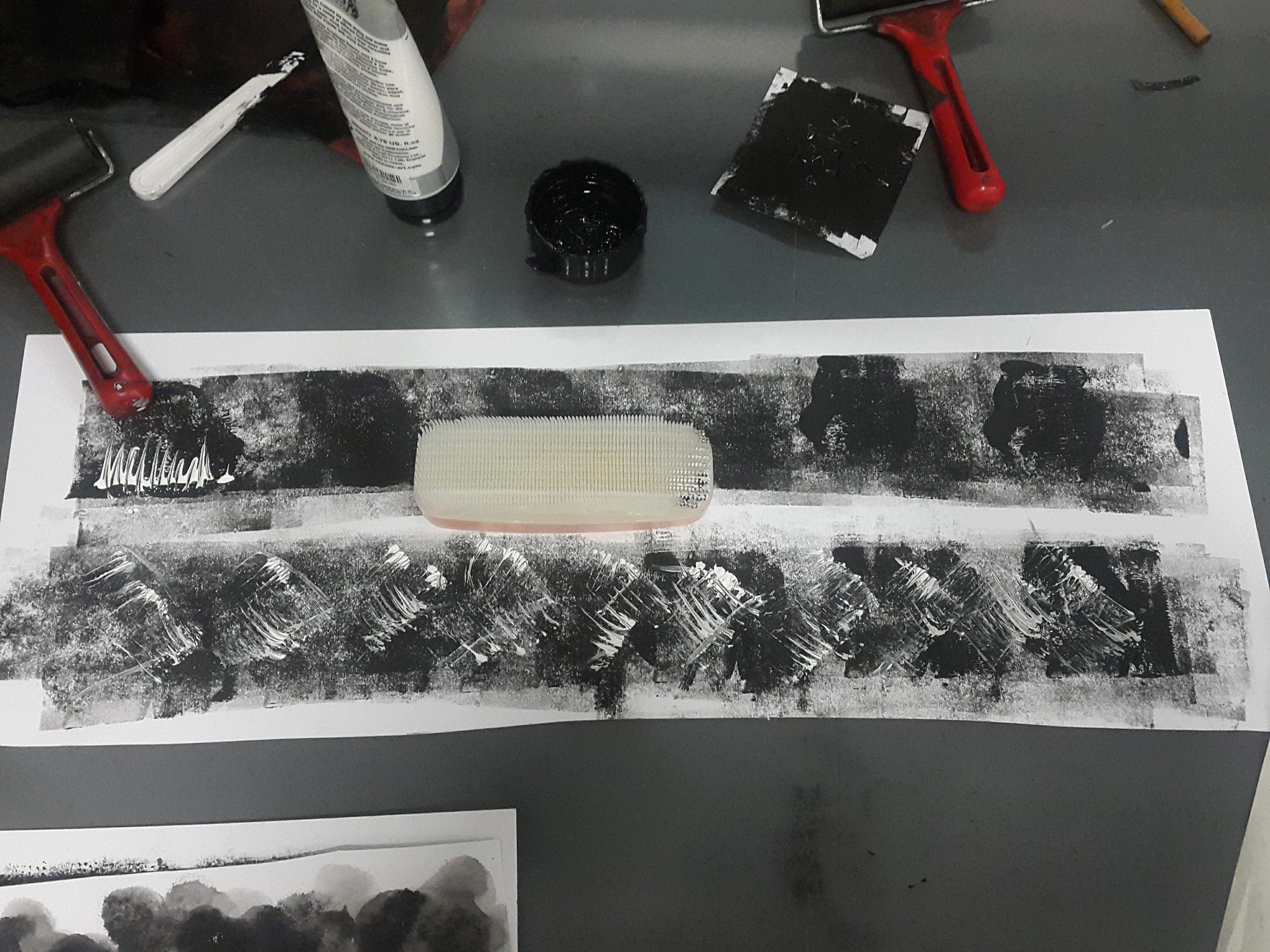
74Spldn


ALARM ◊ ANGLER FISH

2016-09-07 023620 1

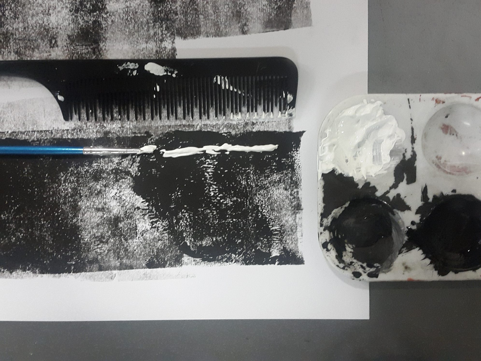
To create the angler fish line, what I did was I rolled a layer of ink directly onto cartridge paper, added two thick lines of white acrylic down the page, and afterwards, I dragged the paint vertically using the comb, creating a thorn-like effect.

2d proj1 10

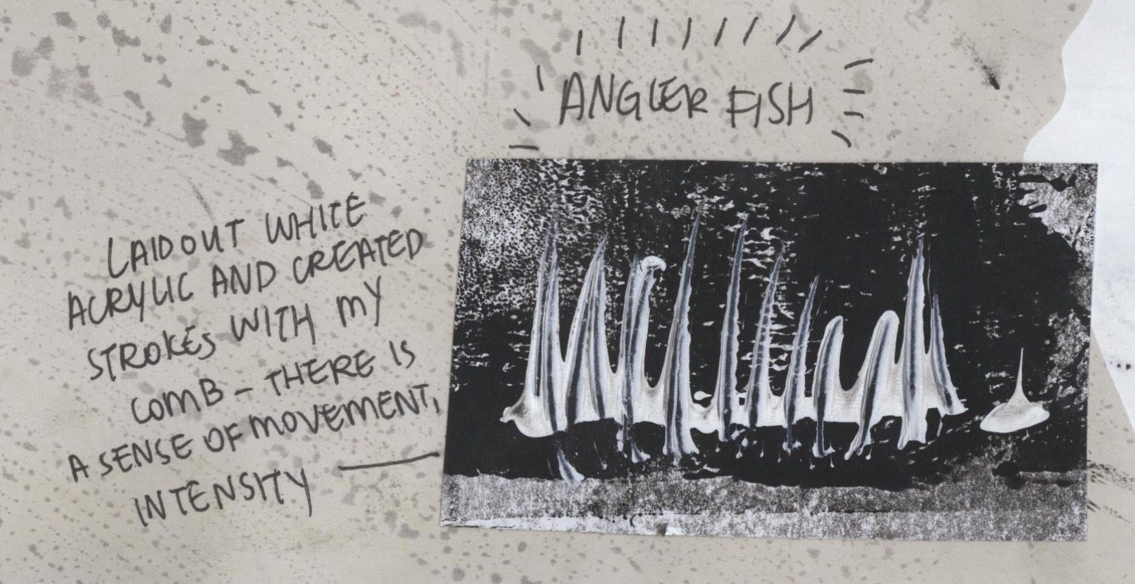
This effect is supposed to mimic the jagged teeth of an angler fish.

Angler-Fish
Angler fish image from knowledgebase.lookseek.com

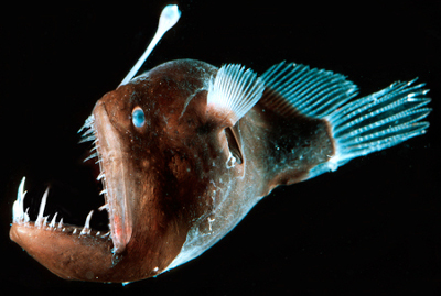
I assigned alarm to this strip because of how the teeth sort of overlap, creating a messy, almost claustrophobic feel due to the tightness of the darker area (background) surrounded by the lighter areas (teeth). I thought that there was a sense of danger that is imbued in the pattern, and I would imagine myself tone quite alarmed if I ever encounter an angler fish in the sea.

dory12


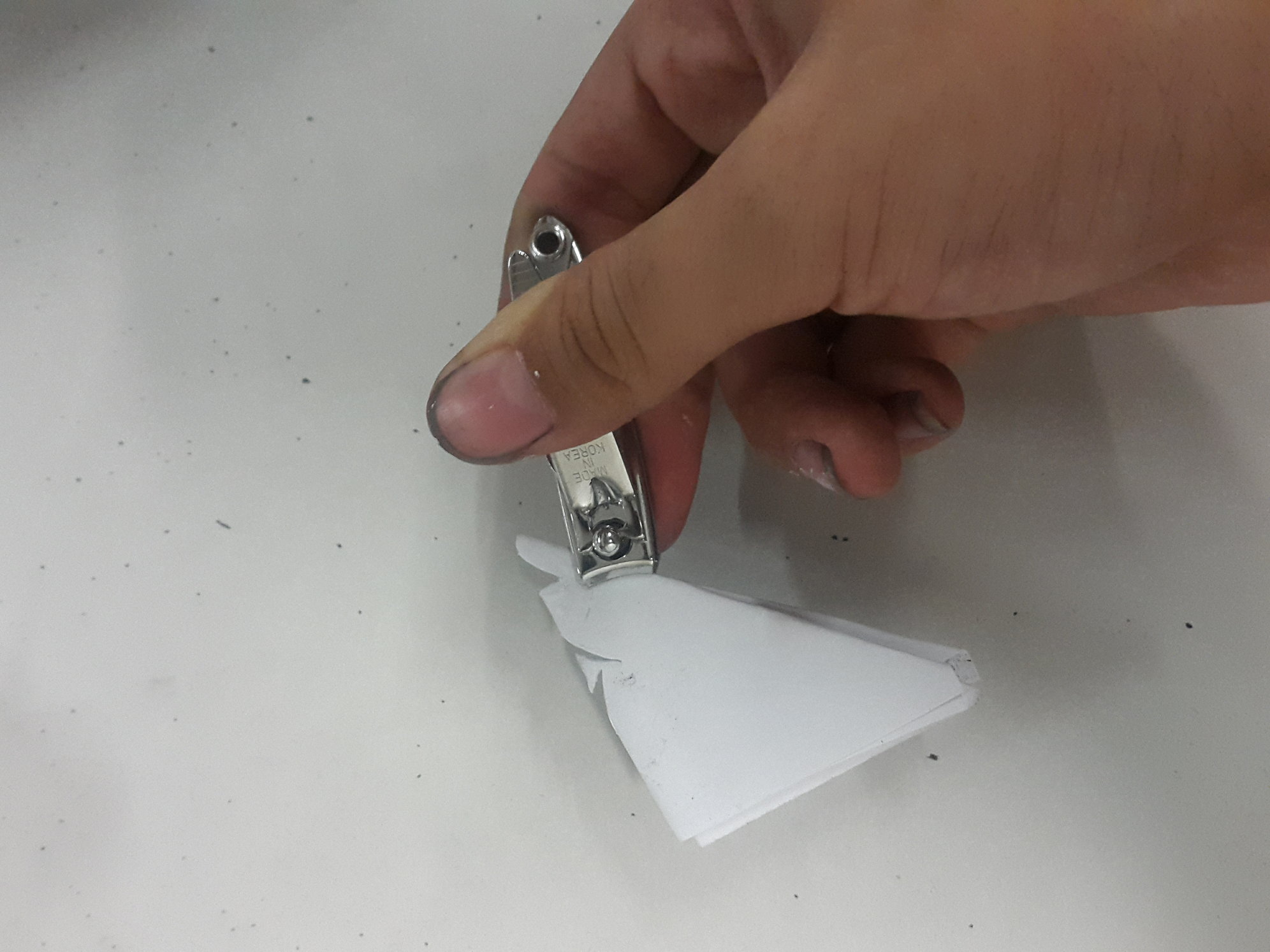
BEWILDERMENT ◊ BRITTLE STAR

File name :DSCN7354.JPG File size :573.7KB(587426Bytes) Shoot date :0000/00/00 00:00:00 Picture size :2048 x 1536 Resolution :72 x 72 dpi Number of bits :8bit/channel Protection attribute :Off Hide Attribute :Off Camera ID :N/A Model name :E995 Quality mode :FINE Metering mode :Spot Exposure mode :Programmed auto Flash :No Focal length :10.8 mm Shutter speed :1/51.3second Aperture :F2.9 Exposure compensation :0 EV Fixed white balance :Preset Lens :Built-in Flash sync mode :N/A Exposure difference :N/A Flexible program :N/A Sensitivity :Auto Sharpening :Auto Curve mode :N/A Color mode :COLOR Tone compensation :AUTO Latitude(GPS) :N/A Longitude(GPS) :N/A Altitude(GPS) :N/A
Brittle star image from palaeo.gly.bris.ac.uk

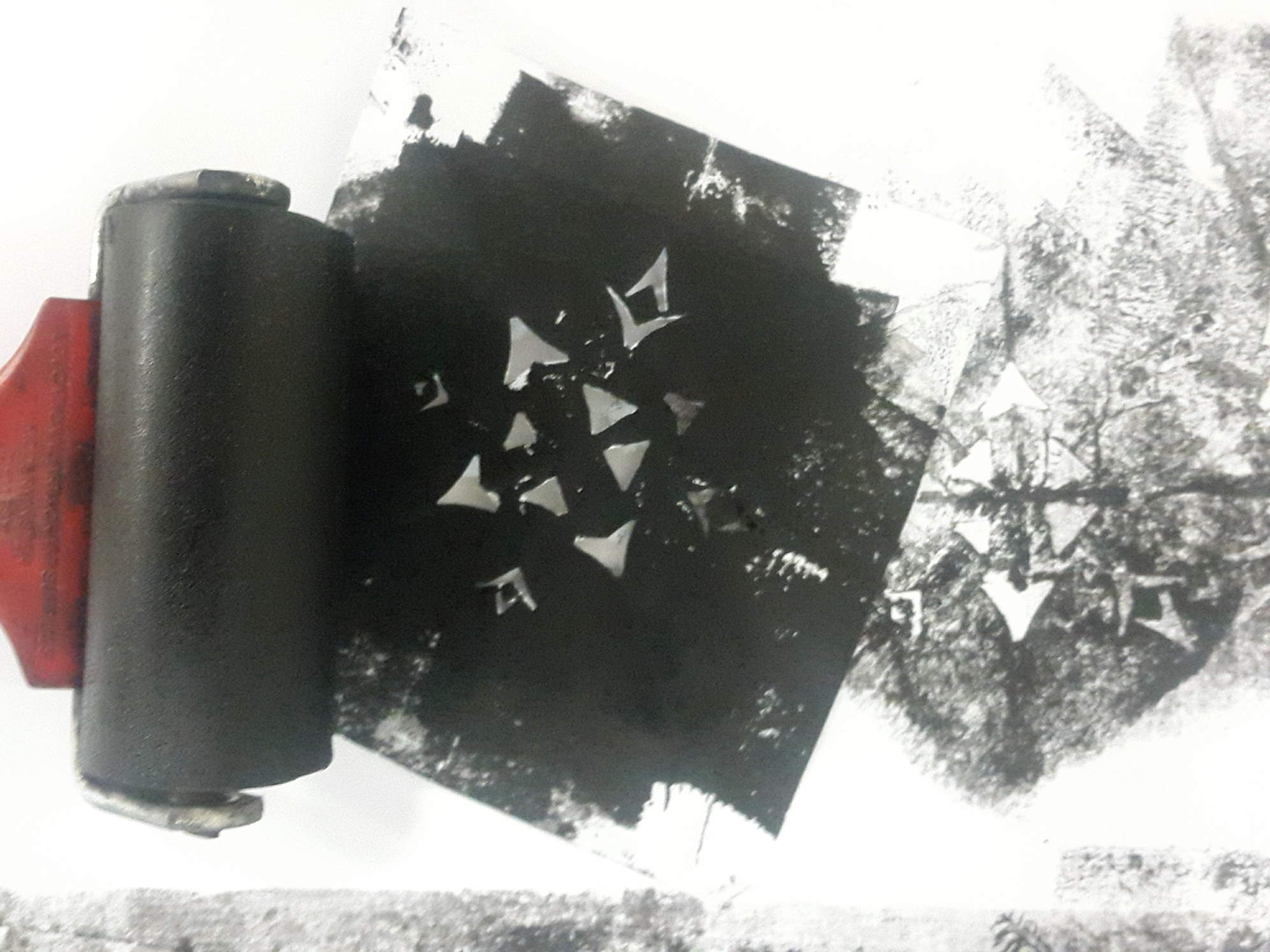
The creation of this line is one the most experimental. I had no clear pattern in mind that I was aiming for, but I just wanted to sort of replicate the body of a brittle star, roughly. I actually created a stencil, which was cut using a nail clipper.

rsz_2016-09-07_024534_1

I used this stencil to create multiple star shapes on a sheet of cartridge paper, by rolling ink on top of the stencil.

2016-09-07 024856 1

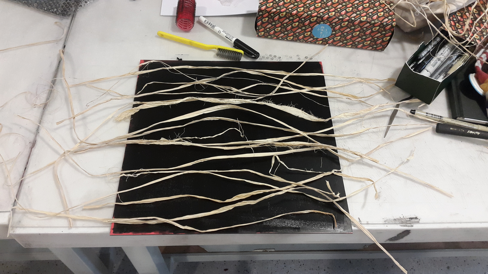
Afterwards, using acrylic, I added feathery extensions to mimic the limbs of the brittle star. I also added some extension using the hair roller.

1aeqwe-2

The resulting pattern was an all-over composition of stencil pattern and acrylic paint, and I was literally quite bewildered when I looked at the strip. Hence, I thought that ‘bewilderment’ would be most fitting. I also cross checked with friends, and they too felt bewildered when looking at it closely, as there are so many elements to look at. The feel is similar to when you look at Jackson Pollock paintings, which also have all-over compositions.


SORROW ◊ EEL

20160825_164017                   20160825_162613 20160825_163005 rsz_dsc00514

Eel was quite fun to do. I wanted to see if just adding water would create any interesting effect, and it absolutely did. I first rolled some ink onto the linoleum tile, sprayed water on it, laid a sheet of paper over it and rolled it under the press. Without adding any more ink, I repeated the process several times, and this resulted in a et of very different looking prints of differing values and line quality, which I thought was super cool. This was the method that I used for making the eel strip, as a section of the print reminds me of slithering eel bodies.

There was a sort of melancholy to the pattern that is also reminiscent of teardrops, and I thought that ‘sorrow’ was an apt word to describe the feeling when you look at the strip.

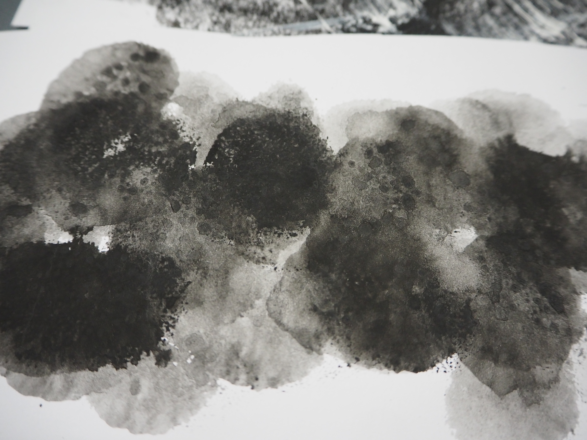
GLOOM ◊ DUMBO OCTOPUS

tumblr_n6g1z2Dm061stkhy4o1_500

rsz_2016-09-07_051859_1

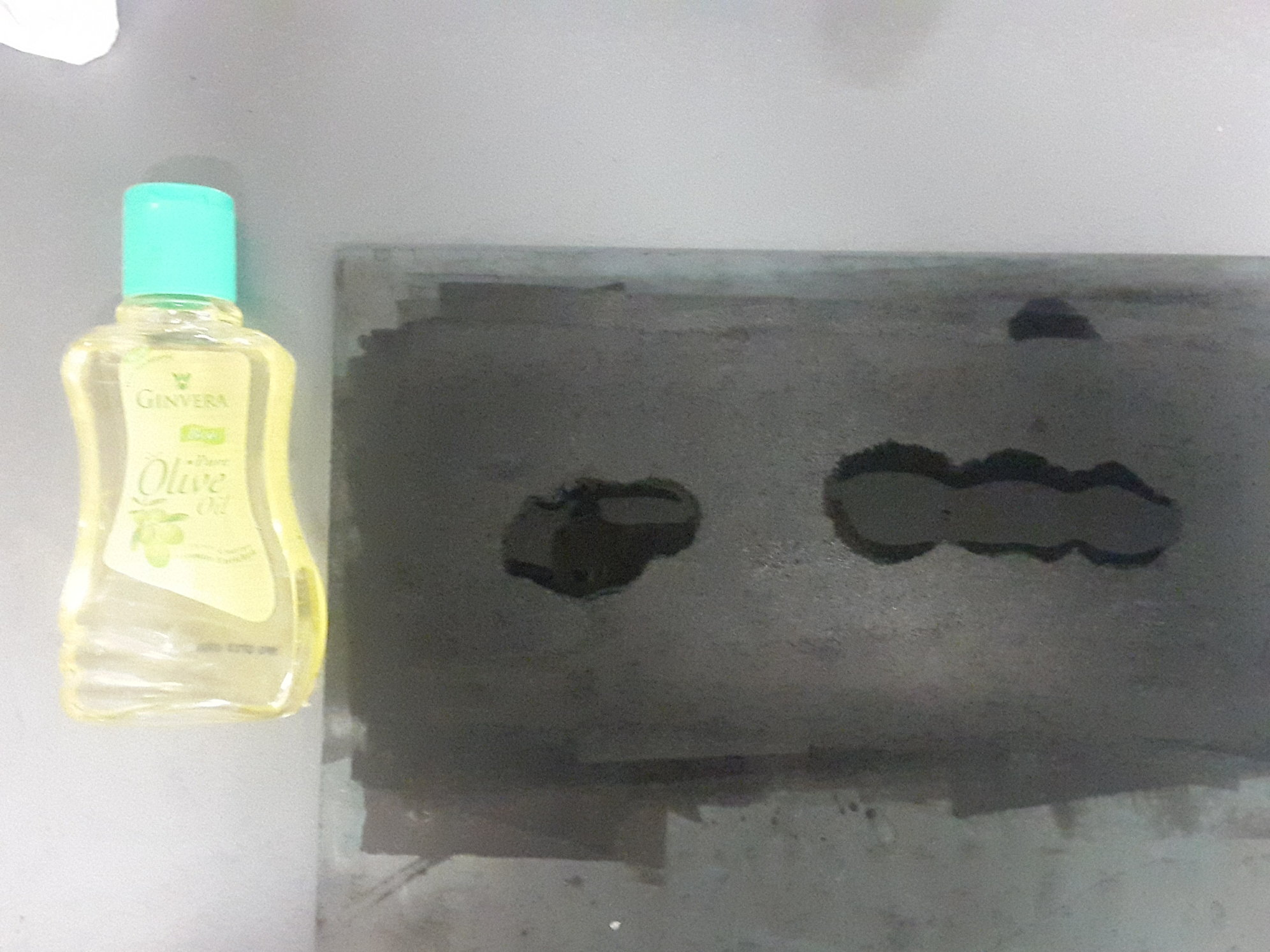
This was also one of the more unexpected outcomes. Like the shampoo, I also had no idea what the outcome would be. I randomly dripped some baby oil onto the ink-rolled linoleum and pressed down a sheet of paper on top of it. I was expecting some sort of marbling effect, but what came out was this coarse-ish texture that really reminds me of some kind of animal skin. Plus it smells amazing.

P9080790JPG

I already had the dumbo octopus as one of the animals in mind, and thought that it could actually represent the dumbo octopus. The overall grainy and dark look of the print emits a pessimistic aura that feels like a dark, rainy day, and hence I felt that ‘gloom’ was an apt emotion to assign it to.
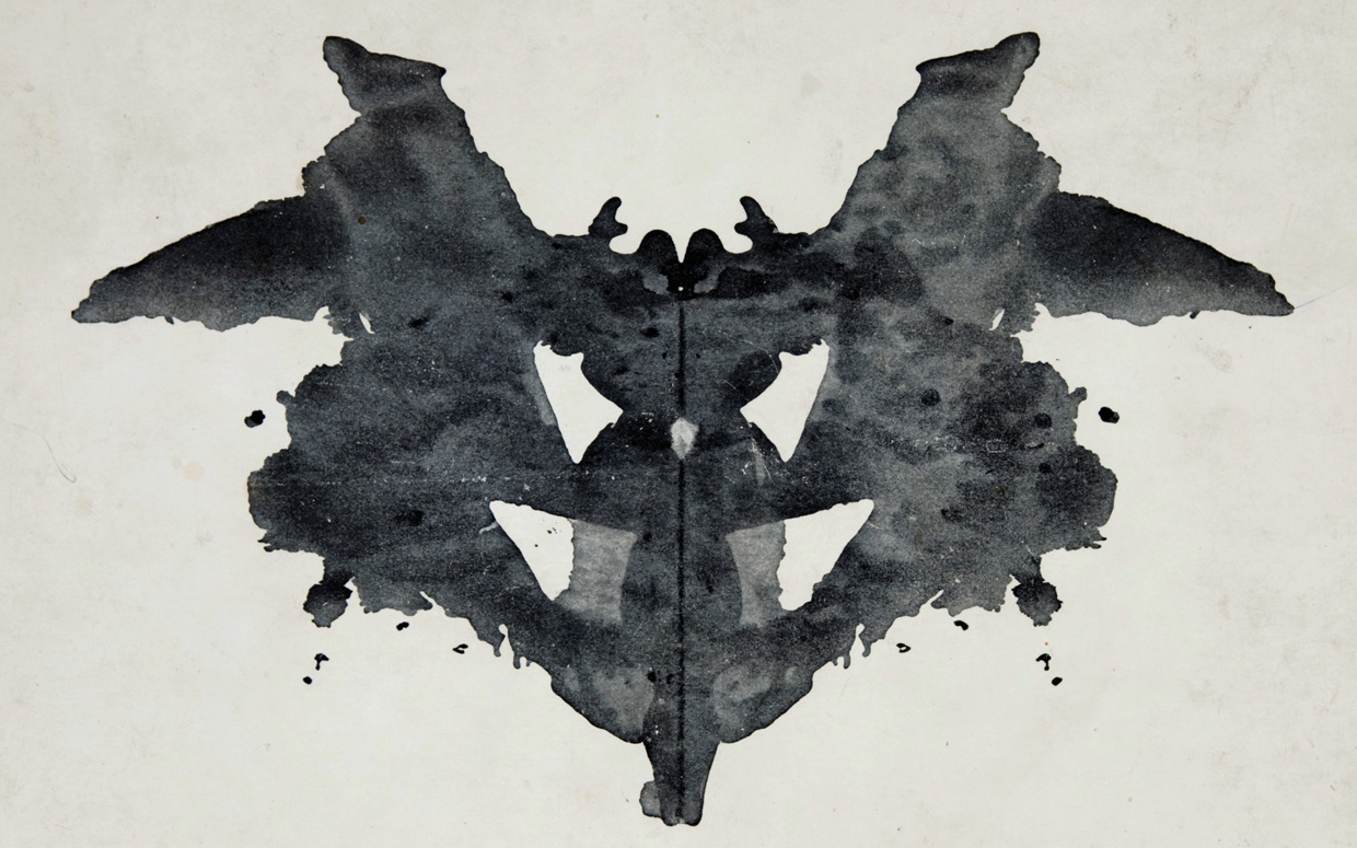
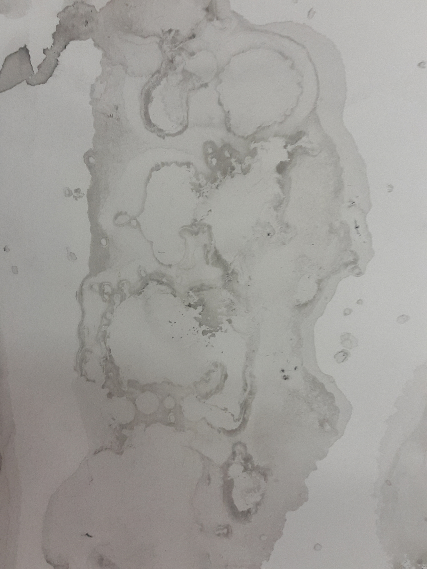
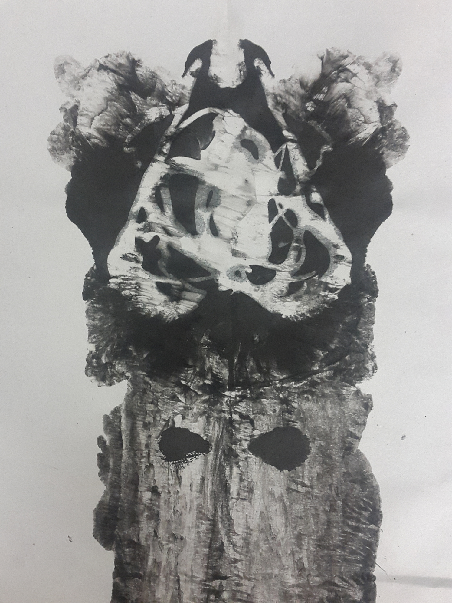
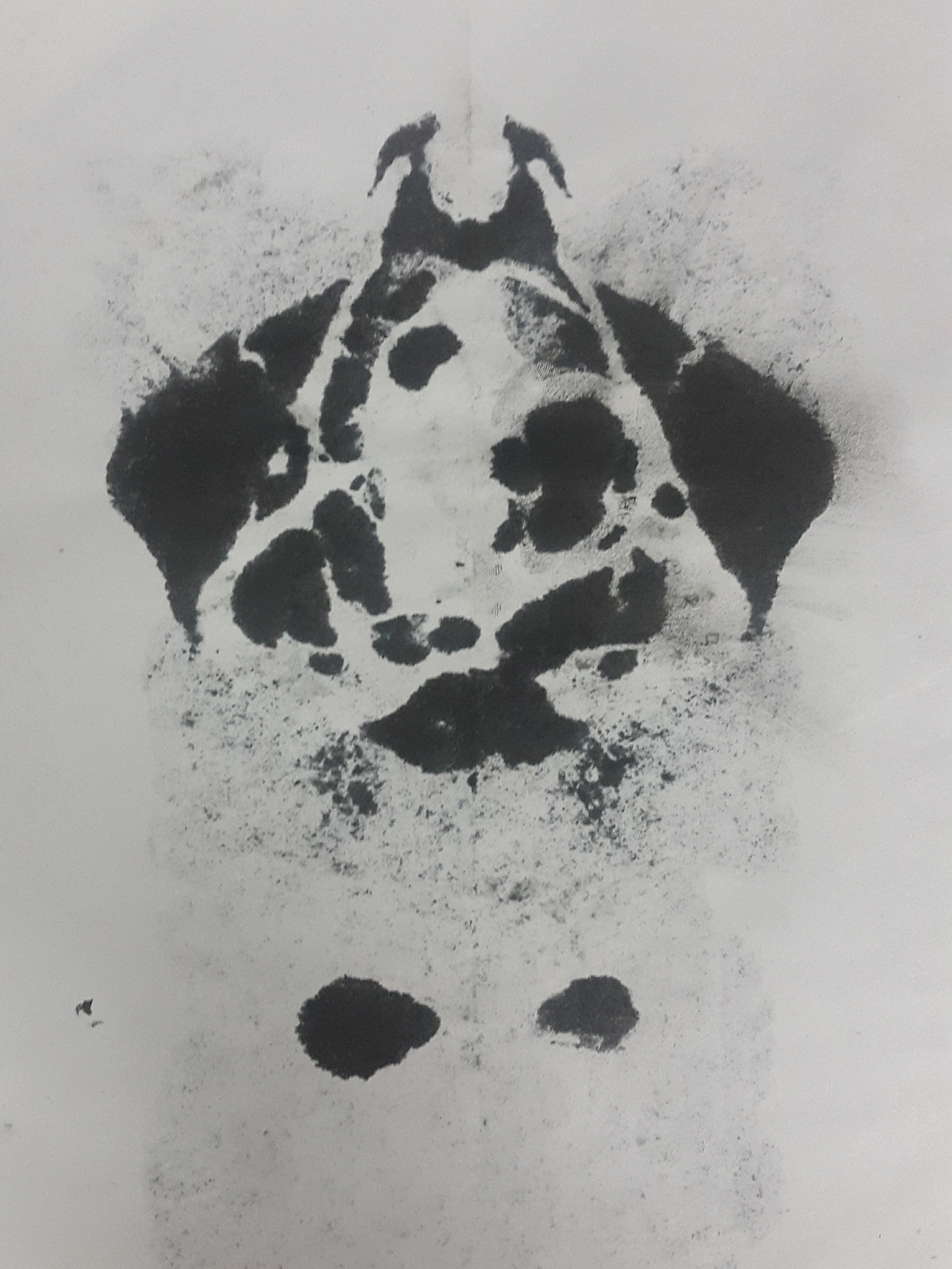
 

WOE ◊ MANTA RAY

I was inspired by Rorschach to try this method. I randomly dripped block printing ink, Chinese ink, shampoo and a little bit of water to a sheet of cartridge paper, which I then folded into half. I did not have any expectations for it so sadly, I did not document the process where I added all the condiments to the paper. Here is a picture of the result.

20160901_172042

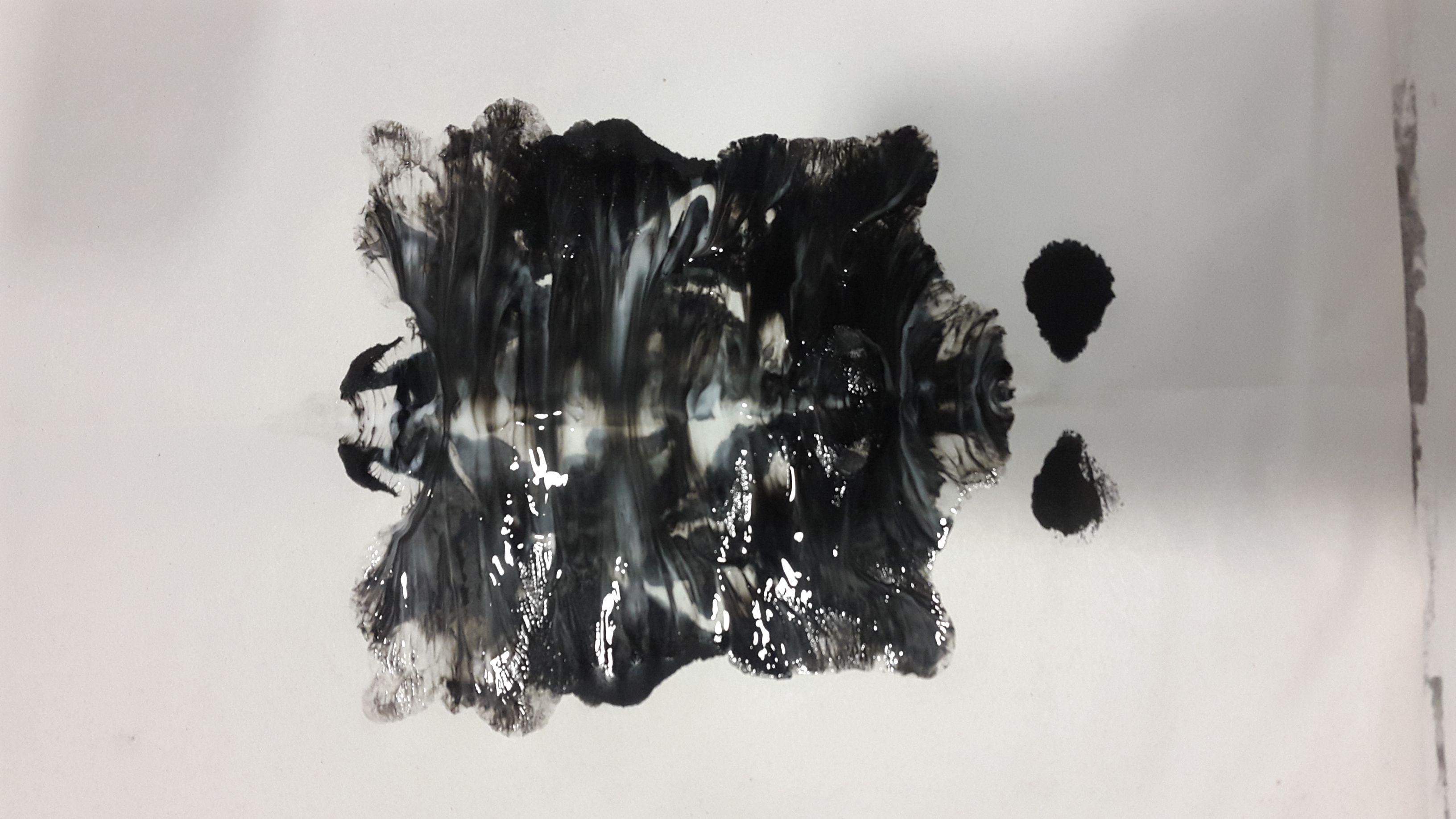
At this point, it was only meh, so I tried a couple more times. Here is another result.

20160901_163943 20160901_163956 20160901_164000

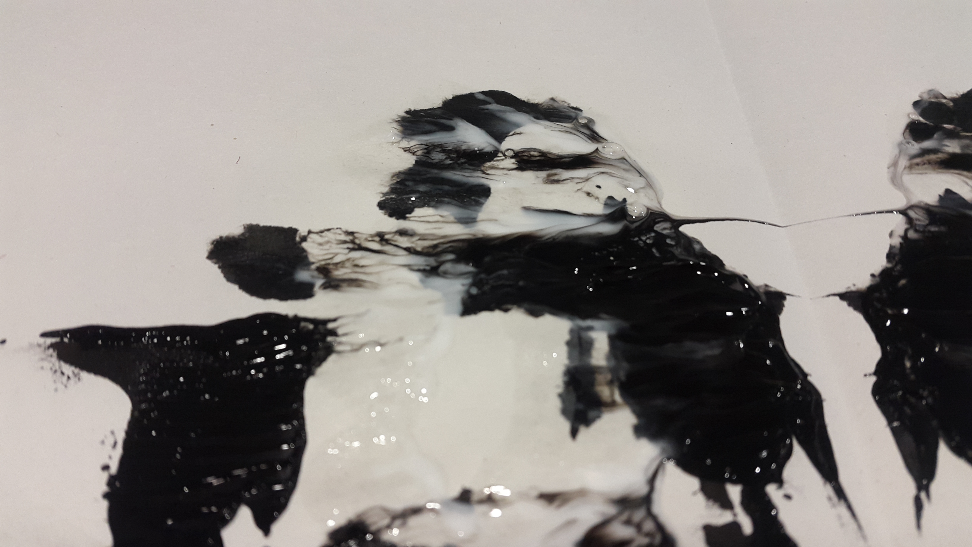
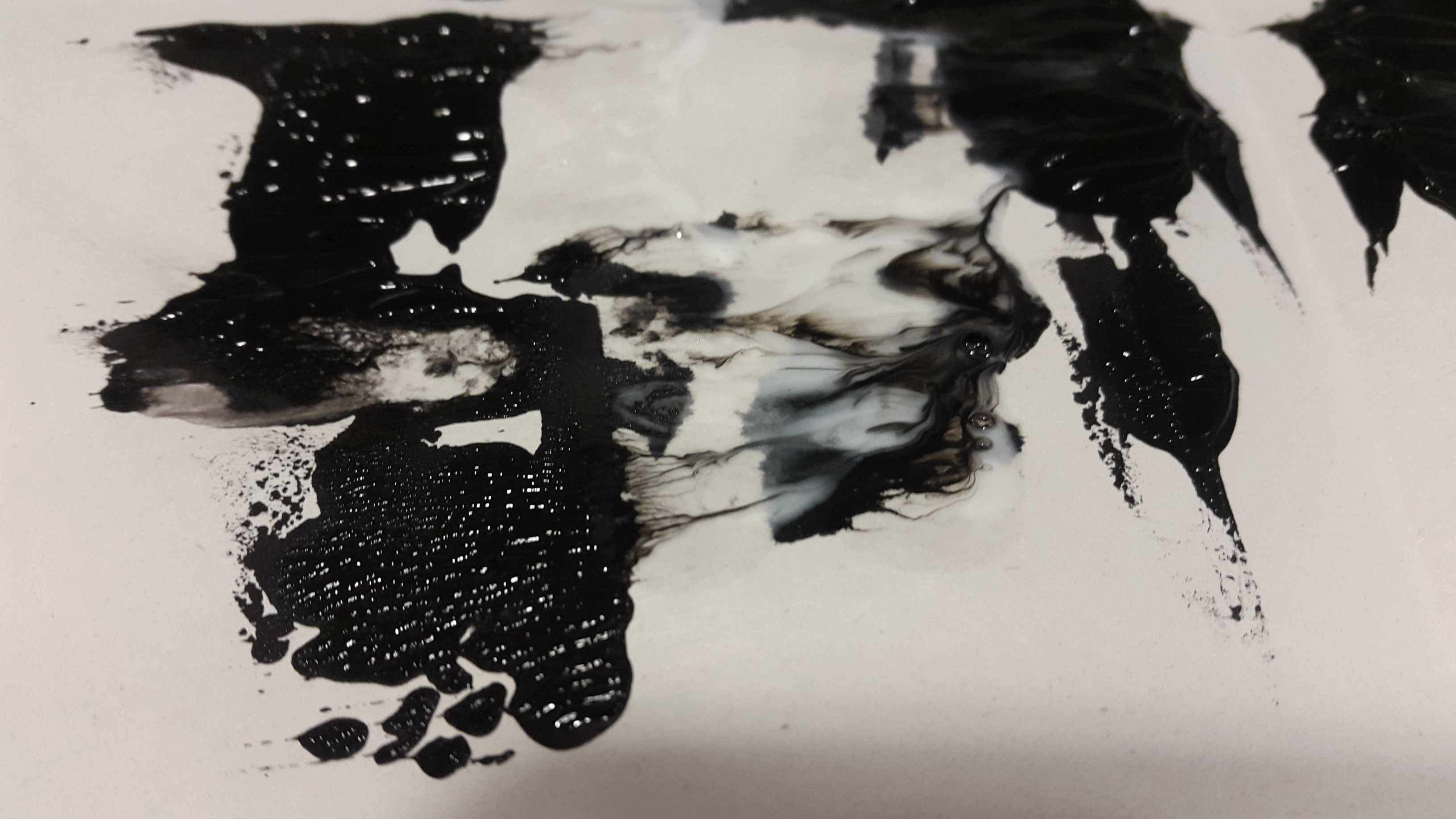
I love the rorschach pattern created. I was thinking that the shampoo would act as a white paint, but it turned out that it would evaporate when I left them to dry. This gave a completely new look to the first print that I thought was meh.

2016-09-07 035934 1 2016-09-07 035940 1Front and back side.

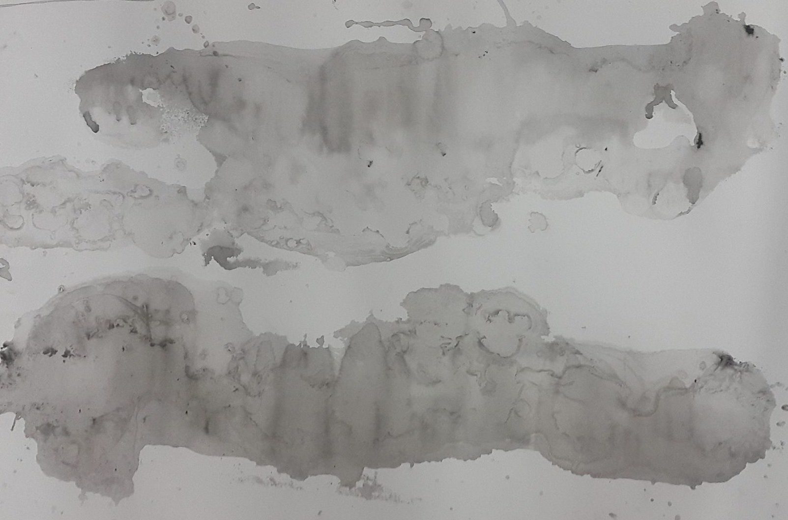
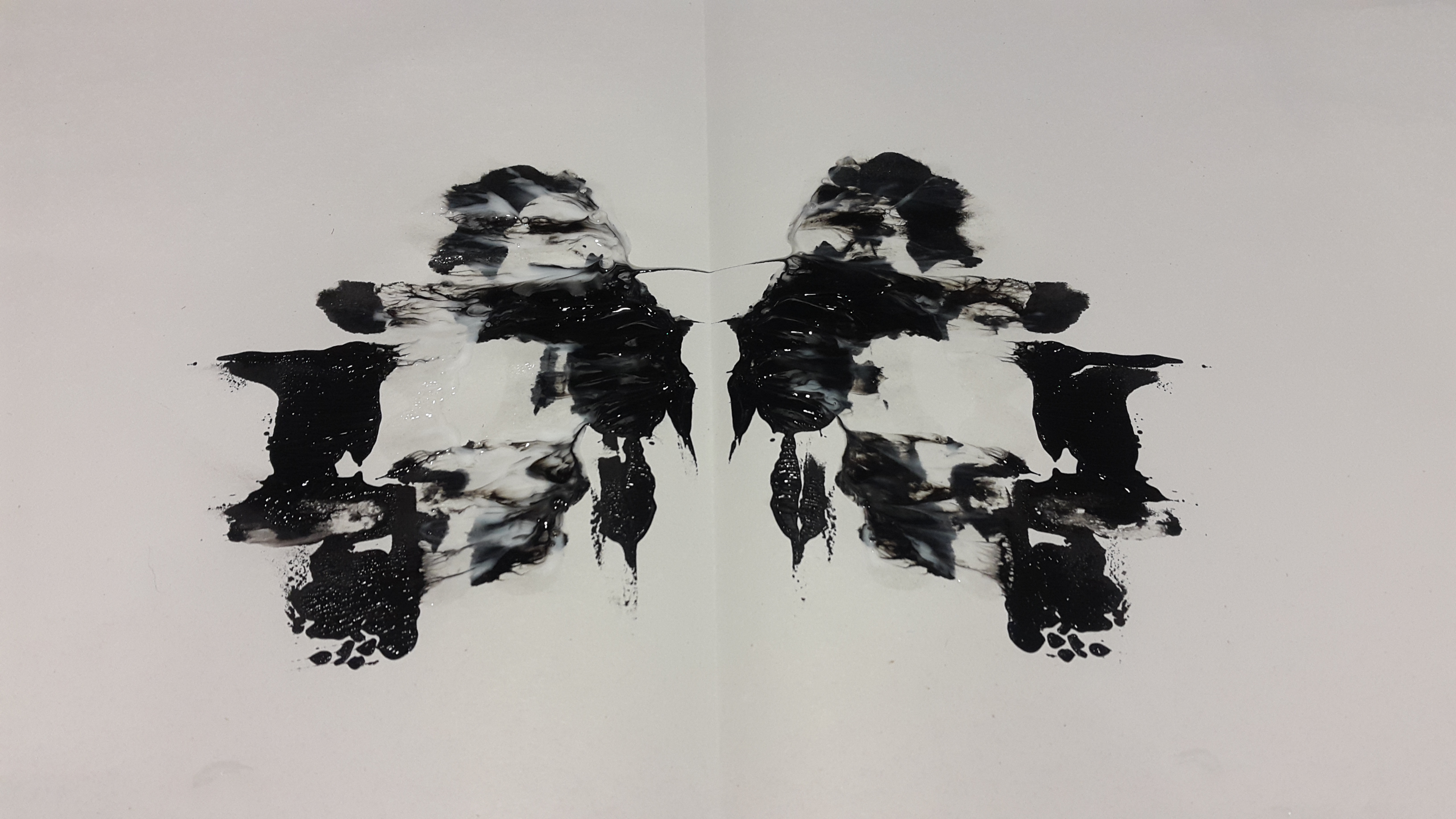
It immediately reminded me of a manta ray! I decided to use it for the manta ray line. One problem is that I would need one long strip, whereas this was just a short strip of design. I figured that I could cut a strip of the top part that looks like the head, and then dissect the body into different sections and assemble them together next to each other to make a line.

2016-09-07 042339 1
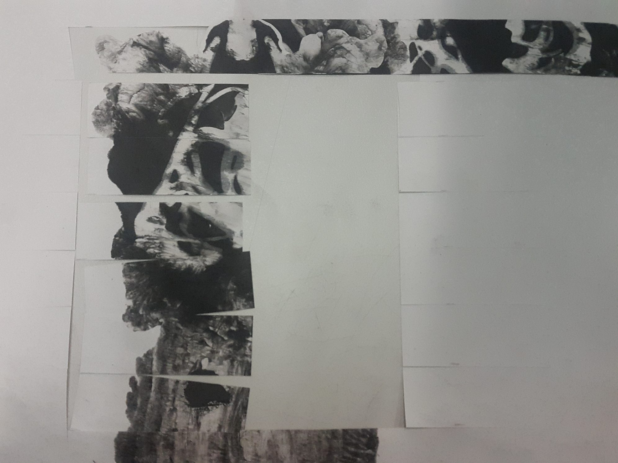
Left side shows cut strips, right side shows reassembled strips.

The overall spreading effect and the haunting negative space created by the shampoo lines, along with the dullness of the newsprint backing, feels like a lament of misery, hence I felt that ‘woe’ was a fitting emotion to assign this strip to.


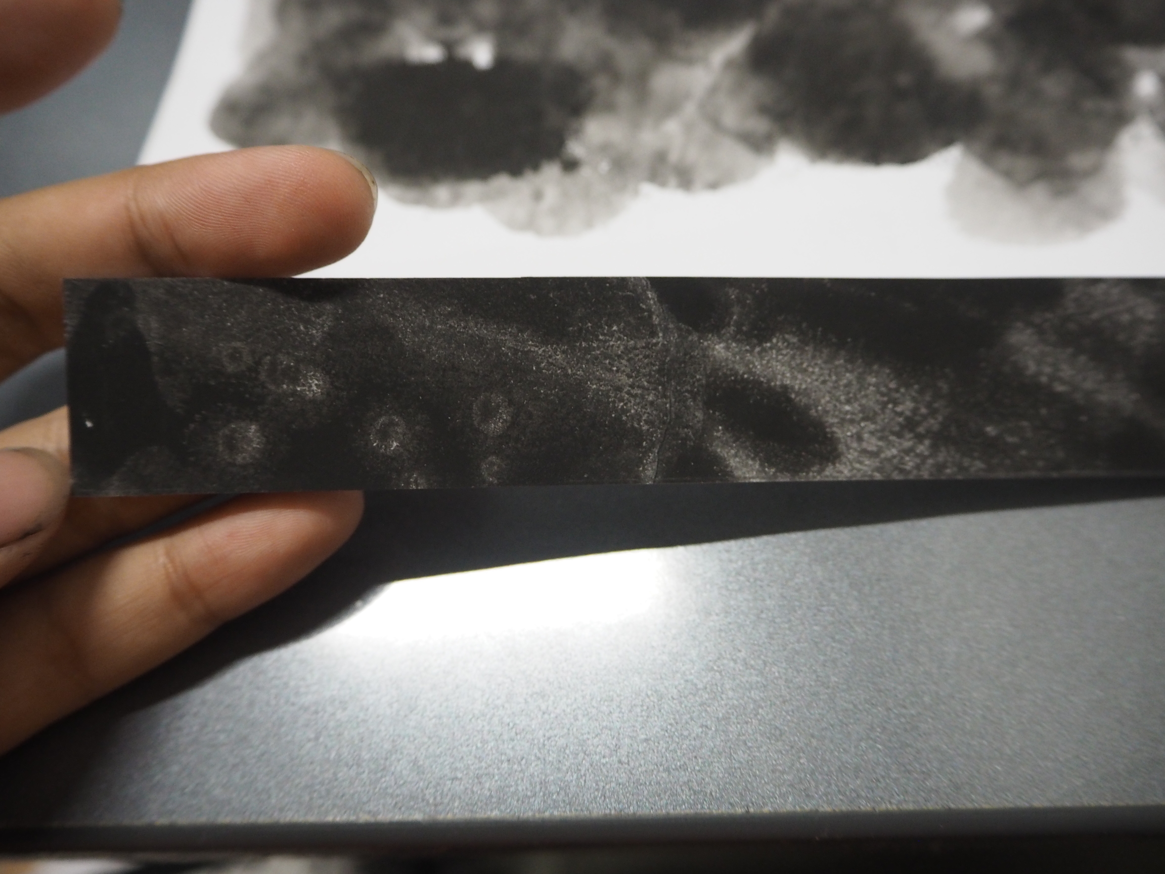
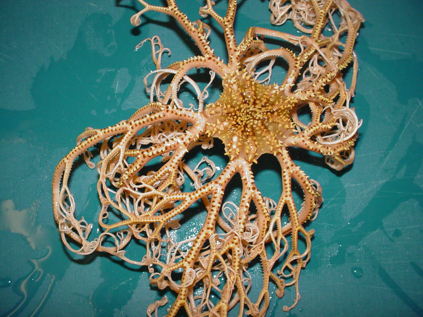
TRAUMA ◊ BASKET SEA STAR

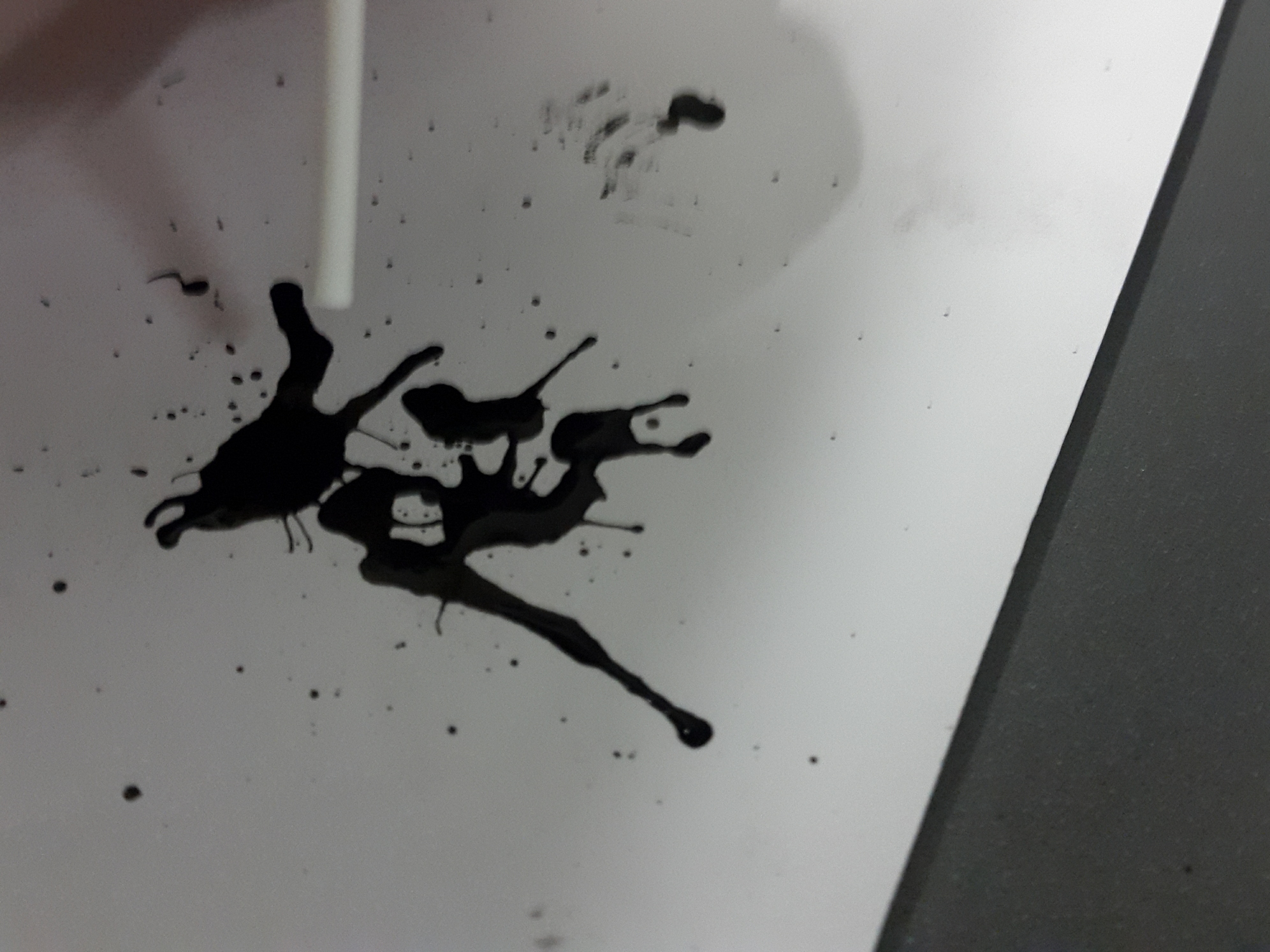
In one of my explorations, I tried blowing ink through a straw, and it create this veiny, mesmerising effect that I thought was pretty cool. It really reminded me of a basket sea star.

BasketStar_NOAA
Basket sea star image from wikipedia.org

The problem is, the straw is not a bathroom object! I eventually thought of a way to improvise: I could cut the edges of a cotton bud, and voila! A mini straw! I have to admit, it was a tough and long journey to produce one long line of blow painting but it was worth it because the results are really cool!

2016-09-08 123242 1  2016-09-08 123312 1  2016-09-08 124716 1

There is a sort of vitality and vigour to the lines created that suggests an explosive reaction to something. It also reminds me of overgrown forests in fairy tales where the branches would poke you in all directions and give an overall eerie feeling. I thought that this could really represent the feeling when going through a traumatic experience.


ENVY ◊ GILLS

2016-09-08 014728 1

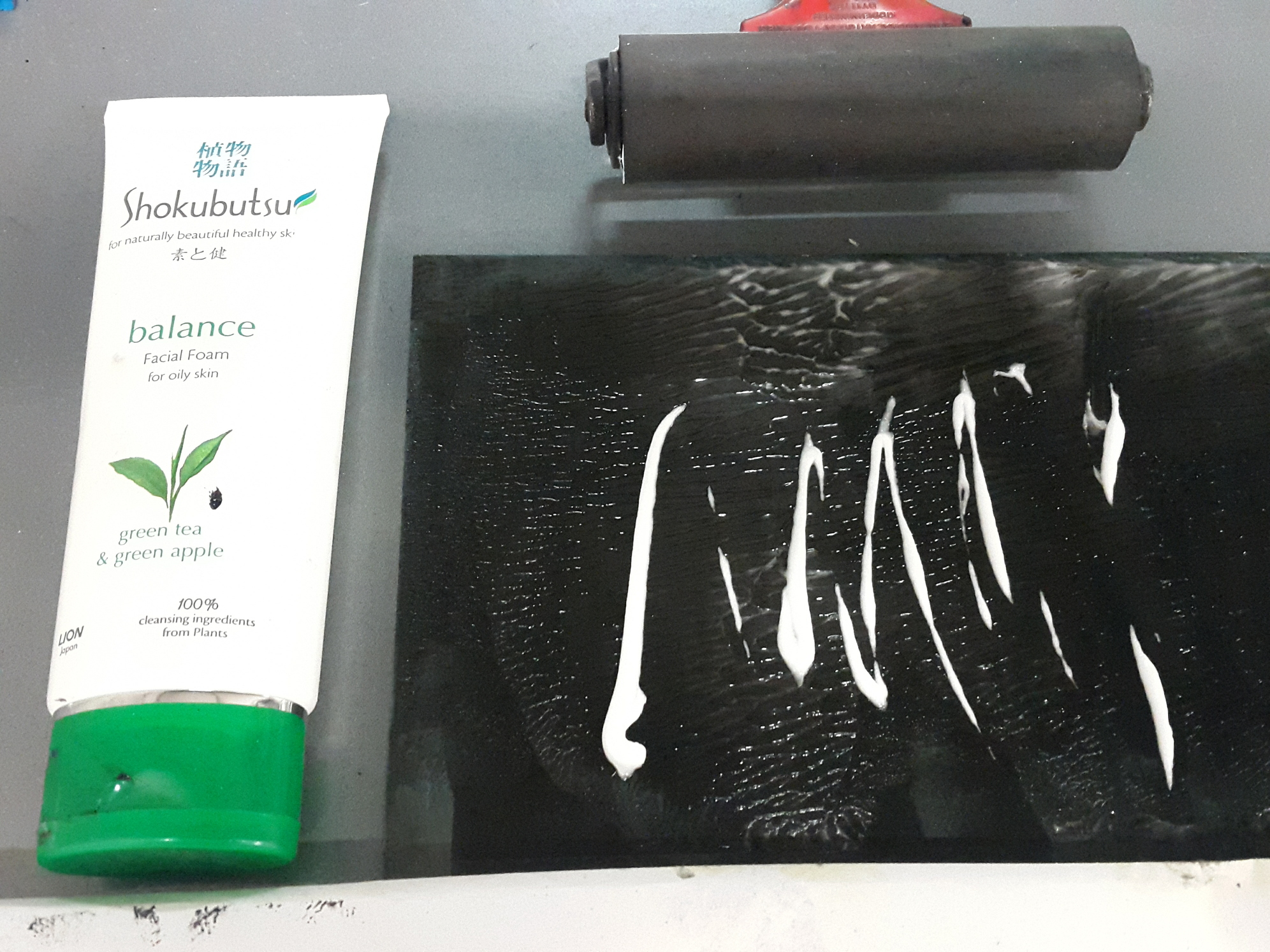
This line was a result of experimenting with facial foam. Honestly I thought that I would get a similar effect to the shampoo prints, except maybe a little bit less diluted as the foam has a firmer texture. I did not expect for the resulting print to be so visually different! The slightly beady texture and the viscosity of the foam created a beautiful network of veins on the paper. While this is not exactly representative of any sea creature, I thought that it definitely resembles gills.

P9080793JPG

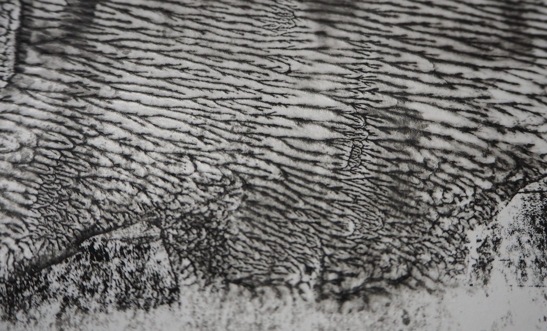
The tiny spreading of the veins reminds me also of the circulatory system. I felt like this could represent envy because I visualise envy as a feeling that creeps through your body slowly.


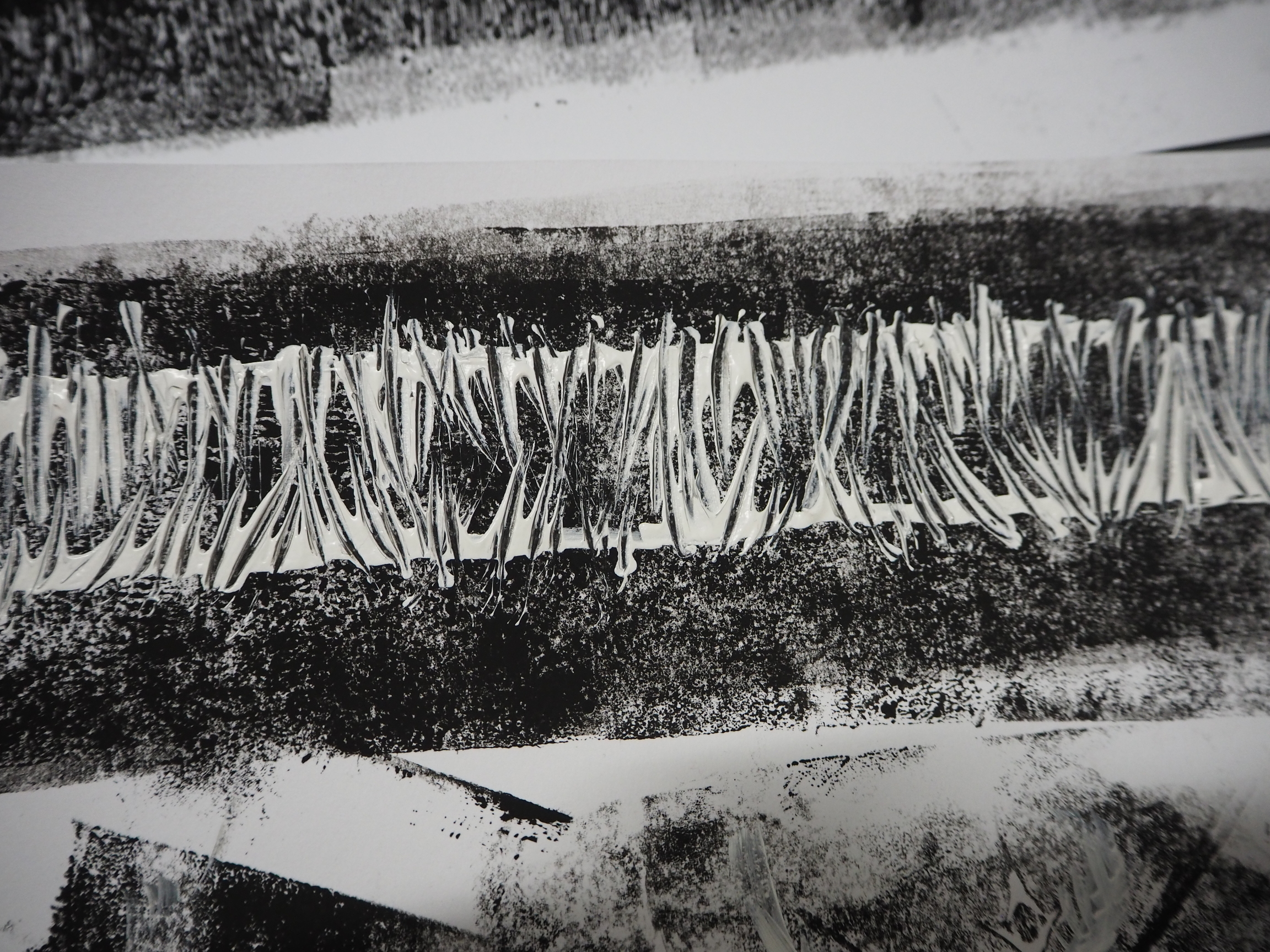
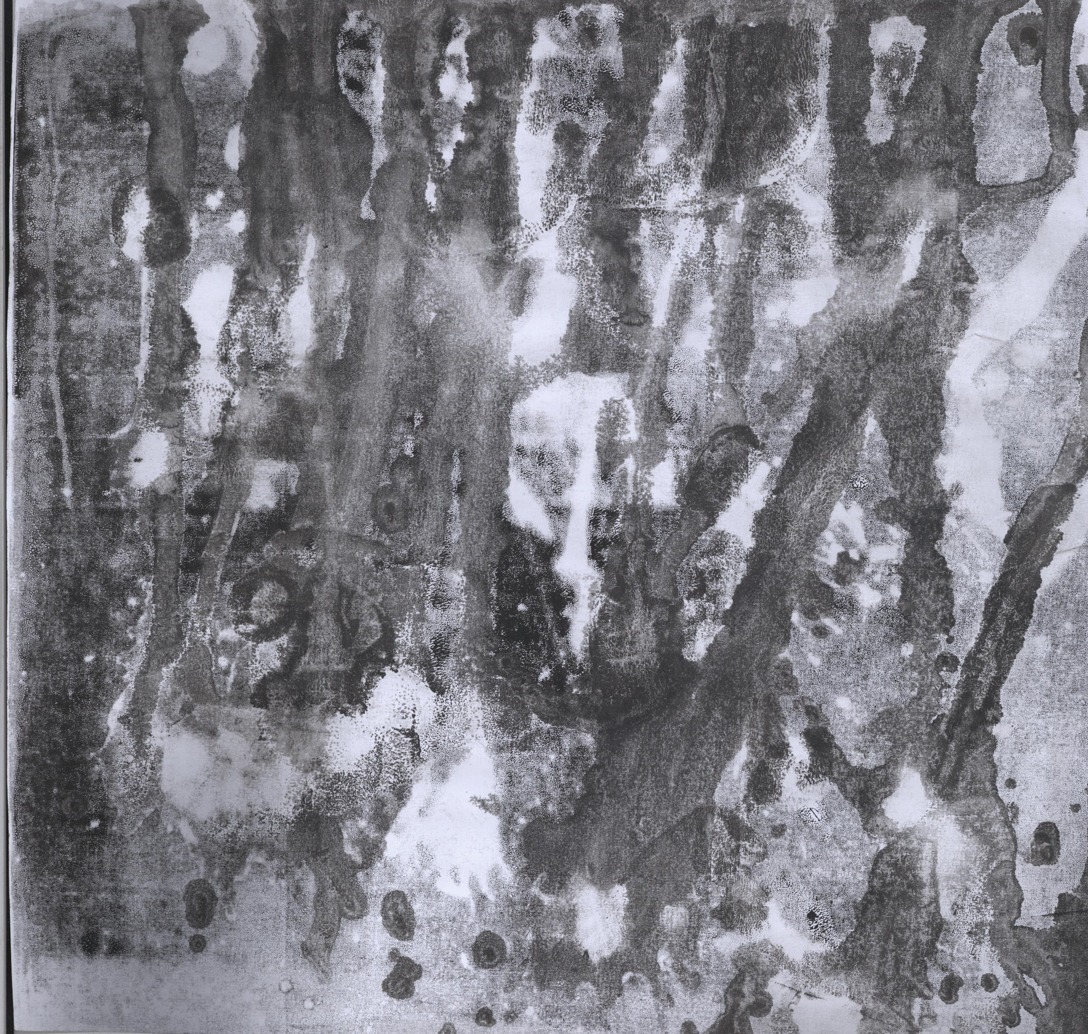
FURY ◊ STOPLIGHT LOOSEJAW

2016-09-07 064210 1

Fury is represented by the stoplight loosejaw, a fish that lives in the Mariana Trenches. Similar to an angler fish, it has sharp teeth, but unlike the angler fish, whose defining feature is its light, the stoplight loosejaw’s defining feature is its wide gaping jaw. Its teeth are also relatively thinner and longer. 

95ec49b6332ab8464d34c03e4cc2bfe0
Stoplight loosejaw image from miteebite.com

To achieve this, I used the toilet brush instead of the comb. As seen in the picture above, the toilet brush makes finer lines compared to the thicker, more defined lines created by the comb (small section on the top line).

I thought that the overall composition looked angry and violent, with the gaping jaw filled with razor sharp teeth, especially. Hence, I linked this pattern with fury.


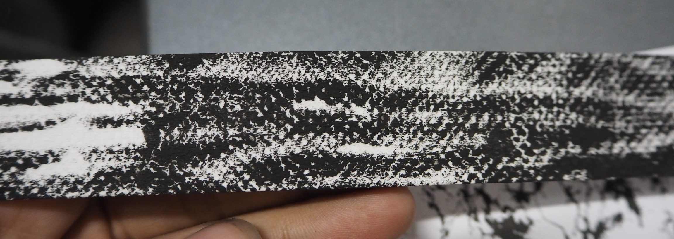
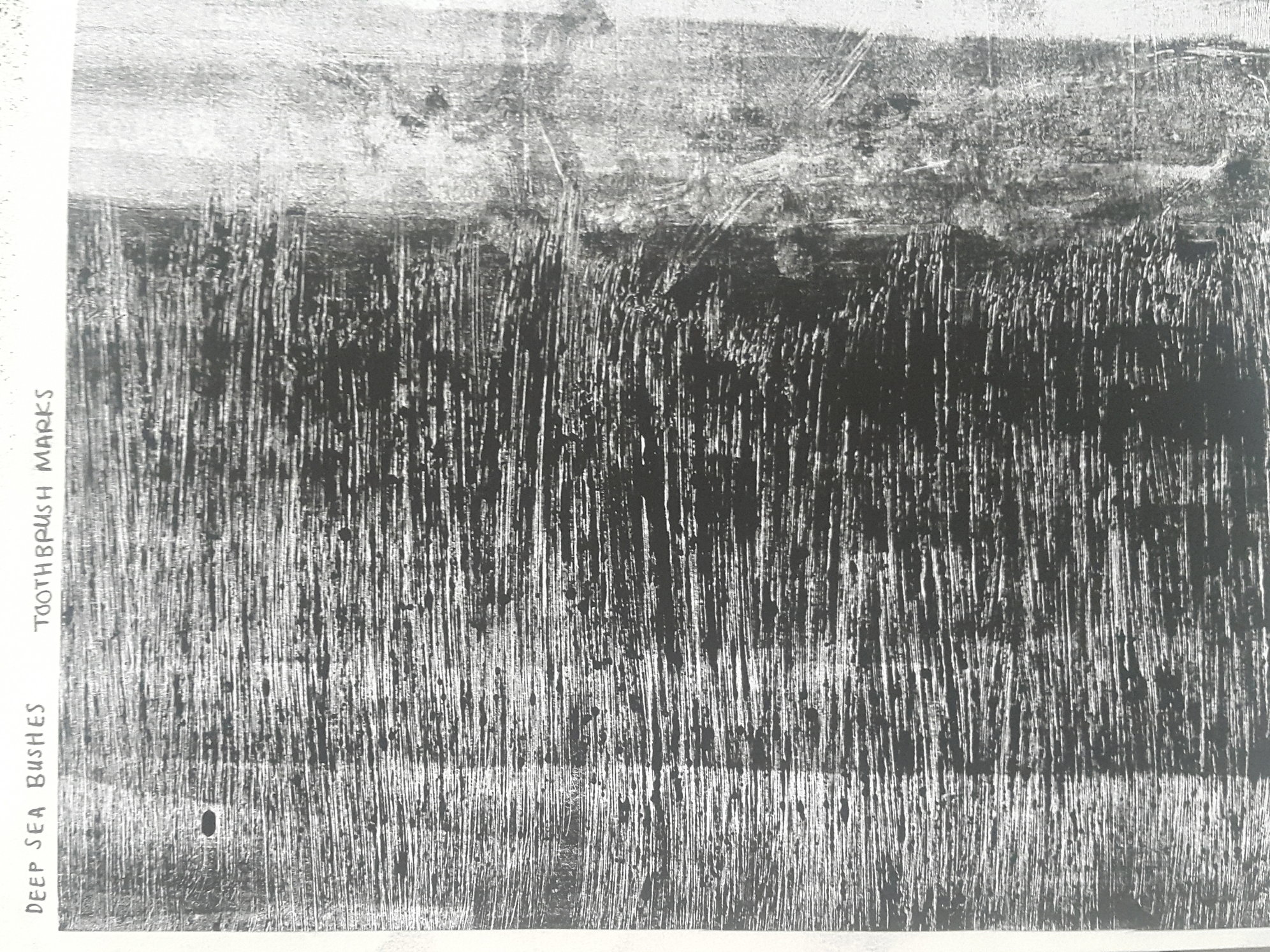
TERROR ◊ PING PONG TREE SPONGE

1353782753
Ping pong tree sponge image from nazo108.sblo.jp

The ping pong tree sponge is characterised by its appearance which literally looks like a tree with ping pong balls attached to it. 

2016-09-07 060029 1

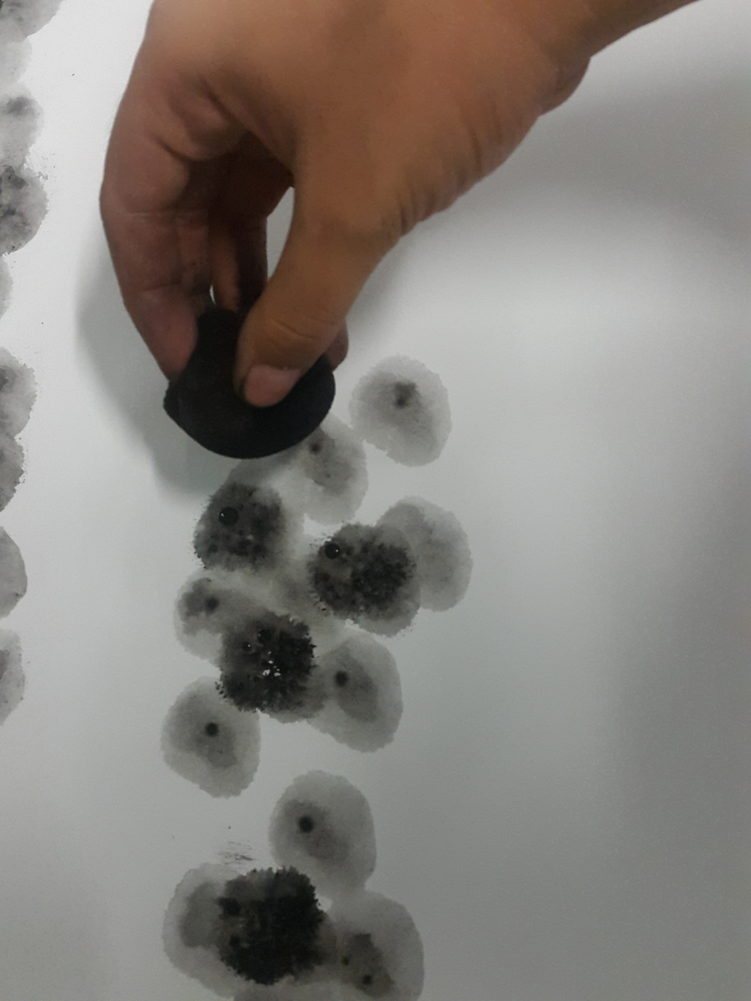
To replicate its physical features, I squeezed a sponge into a ball shape, moistened it, tapped it in block printing ink and dabbed it on the paper. I did this repeatedly with varying concentration of ink. I was mindful of creating an overall dark tone as the ping pong tree sponge is found in the trenches, and I need the print to be dark so that I could achieve the gradual darkening effect. Even though in reality the ping pong tree sponge seems to be light in colour, I chose to capture its physical quality instead in order to comply with my concept.

The spreading effect in each of the circles give a scary feel of something evil lurking in the darkness, or like many pairs of eyes in the darkness. Therefore I thought that this piece speaks terror in its simplest sense.


NERVOUSNESS ◊ COLONIAL JELLY/BIOLUMINESCENCE

comb-jelly
Comb jelly image from nationalgeographic.com
string-jelly
Colonial jelly image from wired.com

One of the key features of animals that live in this layer of the ocean is bioluminescence. Remembering how I created a luminous effect using water in my earlier experiments, I decided to use the technique to try to create a bioluminescent effect, but just a subtle one so that the overall line would still look really dark. 

I did this by rolling a thick, even layer of block printing ink on the linoleum, and spraying water on the tile. Afterwards it was the typical process of laying a sheet of paper over and rolling it under the press. I do not have pictures of the process of making the final ones, but it is the same idea as earlier elaborated under the “Sorrow – Eel” line.

I likened the print to the emotion of nervousness, when your heart beats so fast and you do not know how to act such that it feels as if you are surrounded in darkness. I imagined that if I sank this deep into the ocean, I would feel so agitated and panicked to an extreme level until it becomes sort of a numb, nervous tingling that is visualised by the dim glow of bioluminescence.


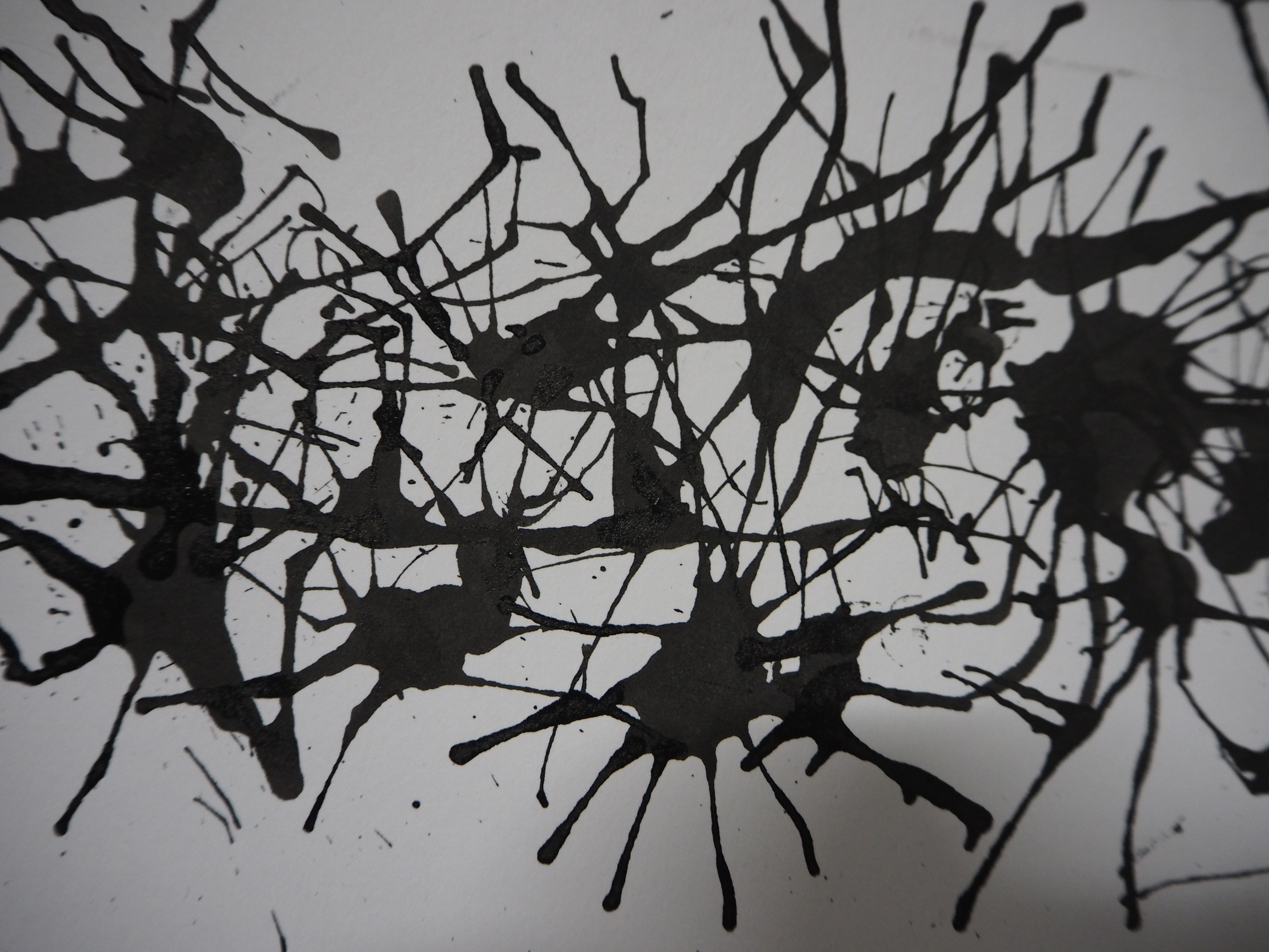
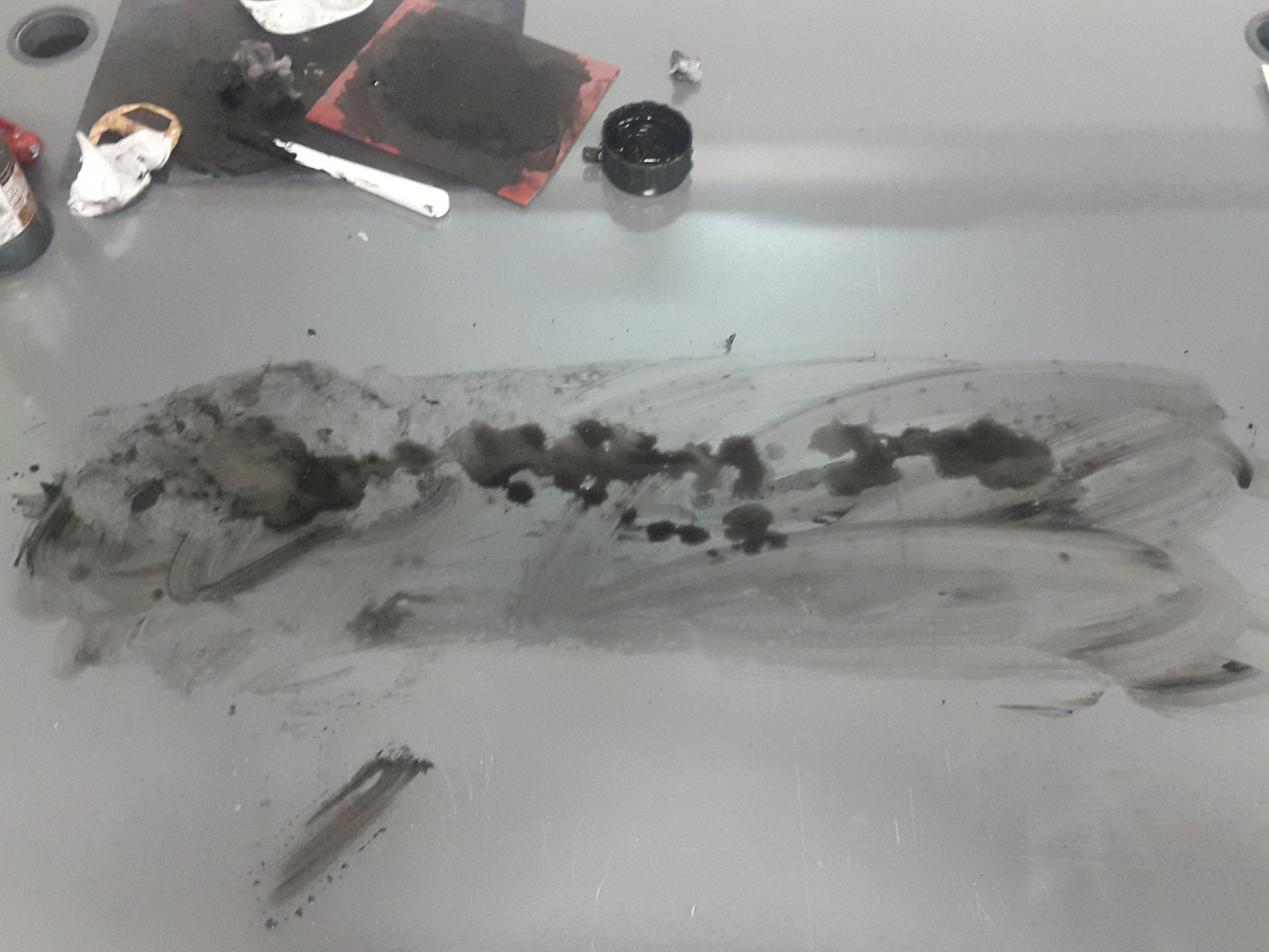
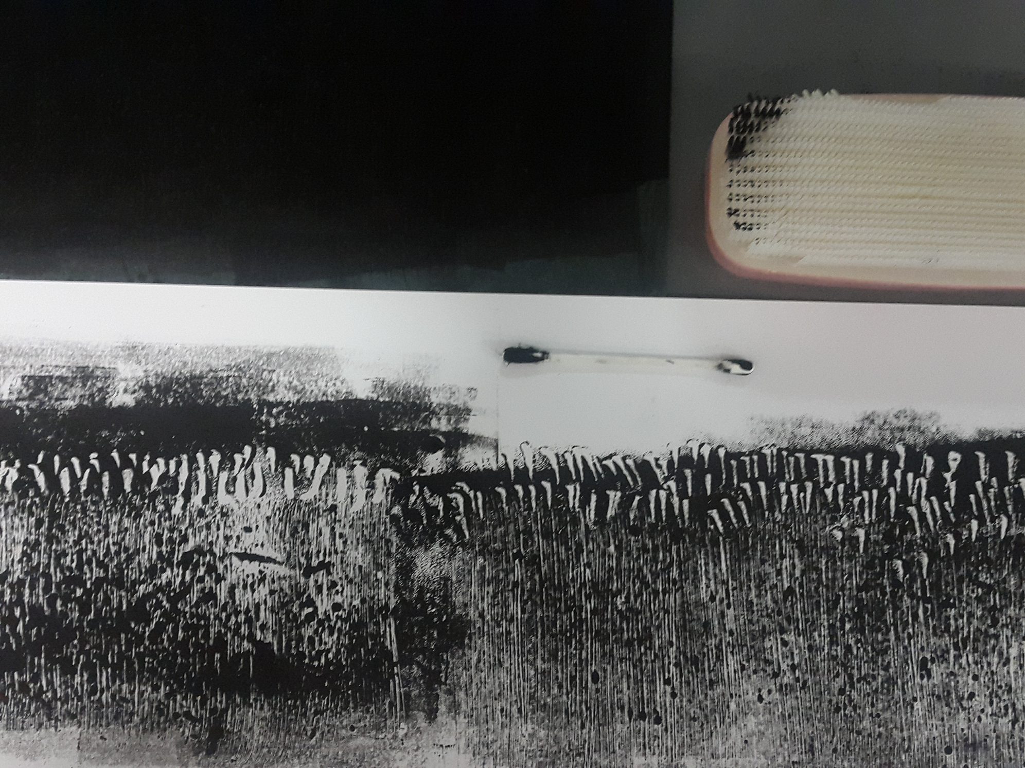
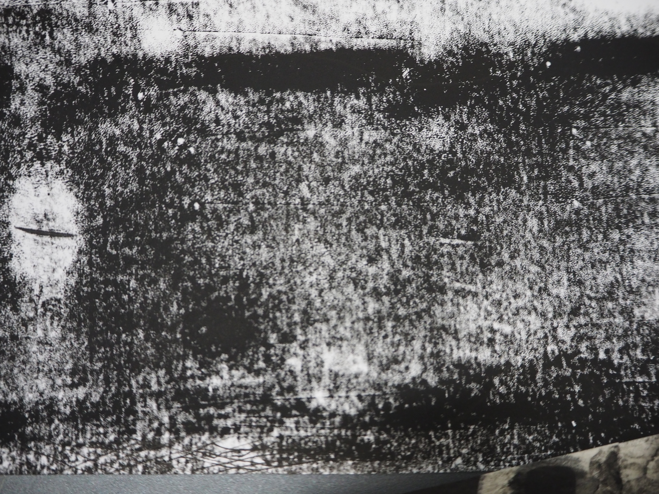
DISTRESS ◊ OCEAN FLOOR

We have finally reached the ocean floor! Execution for this line was simple. I applied a thick layer of block printing ink on the linoleum, and rolled the hair roller on the mat, picking up traces of the ink. Afterwards, I laid over a sheet of cartridge and applied pressure using a roller. The result was a disturbing pattern of small swivels that feel almost distressing due to its disorderly manner. 

P9080797JPG

The original result is of a darker black, the slightly warm colour seen here is because of the picture quality.

Reaching this layer of the ocean, there really is no more hope, no more light, no nothing. It is a very distressing situation, I feel, because you have absolutely no control, and this is one of the things that fear me the most. Other than the unpredictability, there is also no sense of safety at all, and while distress may not be a strong enough emotion to describe this feeling, I feel that it is an apt emotion to describe both the pattern and the feeling of frustration when you have finally reached a dead end.


◊ REFLECTION ◊

A few things I learned throughout this project are:

  • Line qualities and tonal qualities contribute a lot to the perception of emotion through sight. Thick or thin lines, neat or ragged, dark or light, all of these qualities affect the overall feeling of a line and pattern.
  • Limited materials do not mean limited artistic explorations. By choosing to restrict the materials I used to only bathroom objects, I pushed the boundaries of how these materials could be used, and learnt to improvise when needed be. This resulted in me finding new techniques that I never knew existed before. 
  • Inspiration can come from anywhere. 
  • Work faster to reflect the amount of thinking I have done.
  • Research more about artists and artworks relating to the project as more ideas may be able to be generated and developed from doing so.
  • Try out more materials and techniques, do not be afraid of failure.
  • DOCUMENT MY WORK

Overall, I find the journey to be quite fruitful in terms of figuring out my artistic direction and learning new things. I knew that I am someone who needs to think of something well before carrying it out, but the problem is that I take way too much time reconsidering things and pondering over ideas. This resulted in me not being able to produce enough materials to reflect the extent of my thinking processes. This has been a recurring habit since way back, and with the constant amount of projects, I hope that I will be able to change and work faster, slowly but surely (ha the irony). I think that if I can work faster, I would be presented with more opportunities to grow and develop my ideas, instead of letting the ideas simmer and just remain as they are. 


2D Project 1: My Line is Emo – Sea My Emotions

At last, our first 2D project has come to an end. It was not a smooth sailing journey, but as they say, a smooth sea never made a skilful sailor.

This post will be the summary of this project and a break down of all 18 lines. For a much more detailed explanation, check out my process post for my thought processes and theme research, and my execution post for a behind the scenes look of how I achieved my final lines! I am quite happy with the final product, and I hope you like it too! Presenting, “Sea My Emotions”!


FINAL LAYOUT ◊ CONCEPT

rsz_final

My final layout is a portrait A1 board with 554×25 mm strips. 

On the first monoprinting session, I brought along random things from my room that I thought would make interesting patterns or prints. From all of the prints produced, I found that most of them reminded me of the ocean. I also found that a toothbrush could make really intriguing patterns. It reminded me of how since I was a child, I would associate bath time with the ocean. This was how the idea of making the ocean my theme and bathroom objects my materials came about. While the association is made from personal experiences, I felt that the bathroom and the ocean are not too disparate for people to be able to make a connection between.

After several revisions of the layout, I finally settled on the A1 portrait as I thought that it would best capture the depth of the sea and could also deliver what I felt about the sea. The lines are divided into layers of the ocean (epipelagic to hadalpelagic), and each line represents a certain animal or plant that lives in that layer of the sea. I also controlled the values of each strip such that when viewed together, a gradual effect of light to dark can be seen. This is not only to showcase the physical nature of the waters (darker as it gets deeper), but also to heighten the visual connection of the emotions being arranged from positive to negative. The reason for this is my love-hate relationship with the sea. I am honestly quite terrified of the deep, dark waters, but I am also in love with its ethereal quality. I love just simply watching the waves break on the shore and the sea disappearing into the horizon. This is why I chose to arrange the emotions according to how I feel about the different layers of the ocean. I imagined myself sinking to the bottom of the ocean and visualised how I would feel while being in every layer. For a more detailed explanation, check here.

Without further ado, here is a break down of my 18 lines.


JOY

◊ RELIEF ◊  

P9080779JPG

Every time I dive down into the sea, there is always a huge sense of relief that washes over me when I resurface, take a huge breath and look up to the sky. This is why for me, the sky represents relief. This piece is done by monoprinting on tracing paper using cotton to create a dreamy, cloud-like texture. 

◊ BLISS ◊ 

P9080780JPG

As I mentioned before, I love watching the waves in motion. Whether it is still or raging, I like to just watch the waters go up and down, forwards and backwards. When I focus on the waves hitting the shore, I feel as if I am being sucked in and out of an otherworldly realm, even though in reality I am not moving at all. The sea is one of the places that can make me feel bliss. This piece is done by spraying Chinese ink on paper using a toothbrush.

◊ ELATION ◊

P9080781JPG

Elation is represented by a clownfish. The striped pattern particularly reminds me of Nemo from “Finding Nemo”. For this strip, I came up with the specific emotion after creating the print. This for me is elation, because the vertical lines exude positivity and directs the eye in an upwards motion, hence showing how when happy, we are usually looking “upwards” and reaching for greater heights.

LOVE

◊ INFATUATION ◊

P9080783JPG

This pattern represents jellyfish and infatuation. Jellyfish is one of the recurring inspiration in my art-making. In one way or another, I am sort of infatuated with the creature. The collage of water prints on  cartridge and tracing paper, along with the penned lines create a whimsical visual that I feel describes the state of mind of someone who is infatuated by someone when in love.

◊ PASSION ◊

P9080785JPG

Ripped cotton with Chinese ink creates a really cool pattern on paper. There are fine lines and darker blocked areas which together creates a very organic form. I thought that this was reminiscent of clutters of coral reefs in the sea, beautiful in their many shapes and forms, and the dynamism of the lines, I feel, evoke passion.

◊ AFFECTION ◊ 

P9080784JPG

While the tiger shark seems to be an unlikely candidate to represent affection, I chose to look at the patterns on its body and replicated it on tissue paper using block printing ink and shampoo. The result was a mellow-looking pattern, which is enhanced by the texture of the tissue paper. The overall softness of the look was what I feel demonstrated affection.

SURPRISE

◊ ASTONISHMENT ◊

P9080786JPG

At this point of time, I do not really know what is under the sea anymore, and I imagine being surprised when encountering the different animals in this layer of the sea. I have never before seen giant tube worms, and was quite astonished when I Googled images of them. Hence, I tried to translate this onto the print by making swift motions of the wrist to create the dynamic lines using a toilet brush. I also used cotton bud for the heads of the tube worms.

◊ ALARM ◊

P9080787JPG

Angler fish, with a light hanging from their heads, can come as quite a surprise, especially with their carnivorous nature. If encountered, one would feel quite alarmed and would panic for their safety, especially because you do not spend everyday actually meeting an angler fish. This piece is done using a comb to create the jagged teeth of the angler fish.

◊ BEWILDERMENT ◊

P9080788JPG

The creation of this piece was quite experimental. After rolling ink using a stencil, I added white whiskers to mimic the limbs of a brittle star. After looking at the final result, I felt bewildered as I did not know how to feel about it. There are many things going on in the pattern, with the ink, the pattern caused by the stencil, and also the feathered acrylics. Hence I felt ‘bewilderment’ was most-fitting.

SADNESS

◊ SORROW ◊

P9080789JPG

The eel is slimy and and moves in a slithery motion that feels slow and melancholic. I thought that this particular print looks like tears too, other than looking like the gliding bodies of eels. Hence I felt that sorrow is appropriate for this strip.

◊ GLOOM ◊

P9080790JPG

This print replicates the texture of the skin of a dumbo octopus by haphazardly adding baby oil onto an ink-rolled linoleum. The grainy and dark quality of the print makes me feel a little depressed, especially with the overall pessimistic feel of the piece.The darkness enhances the sense of gloominess in the strip.

◊ WOE ◊

P9080791JPG

Inspired by Rorschach, I used shampoo, block printing ink, water and Chinese ink to create this piece. Afterwards, I dissected the print and arranged the pieces side by side so as to create a line showing the gliding effect of a manta ray. The quality of spreading ink, as if caught in a paused moment of time, along with the dull colour of the newsprint, felt very sad and ethereal, hence I chose to assign ‘woe’ to this strip. 

ANGER

◊ TRAUMA ◊

P9080792JPG

This depiction of a basket sea star is rather explosive and horrific in nature, reminding me of overgrown, abandoned forests with branches that poke the life out of you. It looks rather painful and almost physical, as if like thorns in your mind that grow after a painful experience. Therefore I felt that this represents trauma.

◊ ENVY ◊

P9080793JPG

This was one of the most interesting prints that I created, and it was quite a spontaneous result. By adding facial foam on top of ink and pressing it down, This vein-like texture, which looks extremely similar to gills, is created. I felt that the spreading effect of the veins, very meticulous and fine, creates a haunting feeling of how envy could spread throughout our bodies. 

◊ FURY ◊

P9080794JPG

This line is quite similar to the angler fish line in terms of execution. However, I created the finer, sharp teeth of a stoplight loosejaw by using a toilet brush instead of a comb. I also angled them to create the illusion of many wide open jaws, which is a key feature of the stoplight loosejaw. The intensity and movement shown through the line quality mimics a bout of fury perfectly.

FEAR

◊ TERROR ◊

P9080795JPG

While replicating the physical form of the ping pong tree sponge, I also found out that the circular pattern creates a haunting ink spreading effect that reminds me of evil lurking from within the darkness. This I feel exudes terror in its simplest sense.

◊ NERVOUSNESS ◊

P9080796JPG

I have always visualised nervousness as a dark, empty room. And at this layer of the sea, everything is dark with no light at all. There is a feeling of some glowing light like when you close your eyes for too long and start imagining what light would look like. Hence I linked this with bioluminescence, a feature owned by animals who actually live in this depth of the ocean.

◊ DISTRESS ◊

P9080797JPG

We have finally reached the bottom of the ocean. I chose to use hair rollers to create disturbing patterns to represent the ocean floor as this is the most distressing part of the ocean, where I feel that there is no hope at all and there is a culmination of panic, worry, and a high level of fear in my mind. In the final strip, I selected the crop mostly the darker area.


PRESENTATION ◊ CONCLUSION

20160908_172639

In the presentation, I played a sea soundtrack to accompany my work. For the first ten seconds, I allowed my classmates to just stay still and listen to the sounds of waves while looking at my work. I included the audio as I felt that this would better let the audience know that my work is about the ocean. I also wanted to create a calm ambience that would naturally lead their eyes to the lighter coloured strips on the top of the work, and afterwards moving their gaze slowly down. Sadly I forgot to document this process and I also did not take a picture of the speakers set-up (which was placed on the floor just under the work).

Sea soundtrack that I used.

The presentation went well and I generally managed to say what I wanted to say within the time limit.

Overall, I had good fun doing this project and managed to pick up some new skills along the way. The feedback given to me by Joy and my classmates were motivating and helpful. I would definitely keep them in mind for upcoming projects. One of the most important improvement that I should work on is to do more actual work and experimentation instead of dwelling too much on ideas. After all, ideas will stay as ideas unless they are acted upon. I also need to work faster, this will allow me to perhaps open up more possibilities in my art-making. For a more detailed reflection on my processes, check out the execution post

Also, I loved watching my classmates’ presentations as they were really intriguing and inspiring. From using scents, mindful placement of their final work, well-thought concepts, beautiful technique to participatory arts, I think G09 has definitely done a good job for project 1. Really, a huge round of applause to my classmates!


mNbL7

2D Project 1: My Line is Emo – Process

Okay, so since I’m not really used to blogging, I did not update anything about my work in progress for My Line is Emo. Mostly I chronicle my thoughts and ideas in small notepads that I have and later compile them into my visual journal, but I will only be including a few of the key pages here. One thing is that I did not take a lot of pictures. Only afterwards I realised that it wouldn’t be good for documentation purposes, I mean how do I expect others to visualise my thoughts?? And even when Joy kept on telling us to document everything. Sorry Joy. 

Nonetheless, this post will be an elaboration of my initial exploration, research, and thought processes over the past 5 weeks.  The execution of the final lines are elaborated here! And for a summary of everything and the final work, check here!


◊ THOUGHT PROCESSES ◊

In week 2, we were introduced to monoprinting. It was pretty cool because I have always wanted to do printmaking using linoleums and the such, but never got the chance to. At this point of time, I totally had no direction and was just trying out monoprinting itself. I brought a bunch of random stuff from my room that I thought would make an interesting mark.

_DSC0277JPG    _DSC0279JPG
Left: Roller and block printing ink. Right: Me happily using the press.

20160818_140914     20160818_141429
Bubble wrap.

20160818_144242
Hair roller print which looks like the sea bed.

20160818_145502 2016-08-25 123745 1Some kind of hay/rattan. Looks like underwater plants.

rsz_2016-09-11_080753_1Toothbrush print which reminds me of reeds or tall plants under the sea.

From all of the prints that I made, I saw that a lot of them reminded me of either under the sea or the ocean. I thought that it could be a possible theme. I also felt that the toothbrush made a really cool effect (the print reminded me of bushes under the sea). Suddenly, a connection was made in my head! Why don’t I make the ocean my theme and bathroom things as my material?

You might be having questions in your head. As a child, I have always associated the bathroom with the ocean. Playing with water or swimming in the bathtub, I would pretend that I was under the sea.

2296YMX

While this experience is highly personal, I thought that the two are not too disparate for people to not be able to see even the slightest of connection. I was honestly quite baffled that some of my friends have never thought of connecting the bathroom to the ocean.

Anyways, I decided to pursue this theme and talked about it with Joy during our consultation on the third week. I did not have much to show her at this point of time. Long story short, I spent too much time thinking about how I should go about doing the prints/marks and did not produce actual results. The consultation did give me a clearer direction in terms of how I want to execute my ideas, though. I had materials down, so for the emotions part I instinctively thought of my trips to the S.E.A. Aquarium where I saw jellyfish and sea dragons. I thought they were magical, and they made me feel many different emotions at the same time.

IMG_9454JPG IMG_9529JPGIMG_9569JPG IMG_9678JPG From top left clockwise, tranquility, passion, peacefulness and excitement.

Joy suggested that in two panels, I could highlight micro (small) and macro (large) movements, using bathroom and ocean materials respectively. I thought that it was a really good idea. I could have an animal from the ocean represented in two adjacent lines using two different materials to express contrasting emotions. I consolidated this into a page in my journal:

2d proj1 2

Now my next step would be to gather materials from the beach and do more prints. However, I did not manage to make prints  directly at the beach. I collected a few things to use for the next monoprinting session. Meanwhile, I also thought that I could use the lines to represent layers of the sea or different sea creatures.

In week 4, we had our group consultations. I shared about my ideas and problems to my classmates and Joy, and received feedback. Again, I did not produce enough results to reflect the extent of my thinking processes and ideas. This was one point that everyone felt I needed to improve on.

“Just do it” -Nike

HAHAHA more seriously though, my friends suggested that I should not limit myself in terms of materials. This came about as a response to me saying that there are some non-bathroom materials like bubble wrap and foam slices that produce really good textures that are reminiscent of the sea (octopus and fish skin respectively). Also, I did try using ocean materials like sea water, sand and crushed seashells, but none made any interesting prints. This made me reevaluate my choice of materials and feasibility. I felt that it was a good takeaway and told myself to really up my game this time.

That was what I thought UNTIL I fell into a pit of confusion when I proceeded to plan my next steps. Without the bathroom and ocean materials, what would the difference between the two boards be? How do I justify my techniques? What would be the link between the emotions, materials and theme? Should I scrap the two boards idea then? As you can see, I really do think quite a fair bit. I decided to try going with the bathroom and ocean materials anyways.

2d proj1 3

I continued making prints from some other materials I found at the beach. It was frustrating because I did not seem to be making any decent prints from the ocean materials. It was then I finally scrapped the usage of ocean materials from my project, not only because I was not satisfied with the results, but also because of its impracticality. 

During the same session, I also played around with tap water, which I directly sprayed onto an ink-rolled linoleum tile. I really loved the results. (Sea water could achieve the same results, but they looked the same, and also I only had a limited supply of sea water)

2d proj1 7 2d proj1 9 2d proj1 6

There is sort of an ethereal, glowing feel caused by the negative spaces and the diluted vs concentrated parts.

I could feel my mind spiralling in 10 000 directions so I forced myself to focus and decide on what I want to do. I finally decided to restrict myself to only using bathroom objects as materials in creating my lines. After all, I could use the same object in different ways to create different marks. This was when everything fell into place. 


◊ THEME AND LAYOUT ◊

I will elaborate on my theme and how I went about doing the layout and assigning of emotions in this section.

Okay, so at this point of time I knew that I would only be using bathroom materials. I could still have the two portrait A2 board layout, with micro and macro movements on each board, for example by using toothbrush for one line and a back scrub for the line on the other board (this was suggested by Joy during our first consultation). 

2d proj1 4

However, I could also just have one portrait A1 board with 18 lines to separate the layers of the sea into. I felt that this was better as I could have more space to emphasise the depth of the sea. I thought that 9 layers were not enough to represent the sea in the correct proportion as shown in the diagram below. The journal page also shows my further research on the layers of the ocean and the sea creatures or plants that are found in each layer.  

ocean-layers-diagram
Layers of the Ocean from seasky.org

I then created another template which I used for the final work.  

2d proj1 5

This is where I scribbled and planned the final layout, division of sea layers and also the sea creature, material and emotion associated. The deeper the ocean, the darker it becomes as less and less sunlight is available. I decided to visually show this by making my lines progressively darker from top to bottom. I also decided to include the horizon (sky and sea level). In accordance with this visual cue, I also arranged the primary emotions categories from positive to negative, with negative being the darkest. Every layer of primary emotion is representative of how I feel towards that part of the ocean.

I have sort of a love-hate relationship with the sea. To be honest, I am pretty scared of the sea. I dislike floating in the sea with my feet not touching the ground, especially if I look down and am unable to see anything. I am afraid of drowning, of unknown animals swimming around my feet (What if it’s a shark? A jellyfish? A crab? A MERMAID READY TO DRAG ME DOWN TO MY DEATH FOR HER AMUSEMENT???).

tumblr_nc7m7g33c71sj5r1lo1_500
But I like mermaids

Basically I do not like having my sight sort of taken away from me and having no control. However, I also love the ethereal quality of the sea. I love going to aquariums and watching magnificent sea creatures swim in all their glory. I love gazing at the sea from the shore and it makes me happy. As long as I am in no possible danger, I find that the sea is very calming and an out-of-this-world place (I love the mountains too though).

Therefore, I chose to arrange it in this manner from top to bottom. I imagined slowly sinking into the bottom of the sea.

Joy I feel happy and content when watching the horizon and the calming waves.
Love This part of the ocean is where I imagine most of the creatures I love to look at live.
Surprise Creatures that are rarely seen start to appear, and I imagine being surprised when I encounter them.
Sadness At this point of time I would start to feel lonely and gloomy due to the darkness.
Anger The sadness would morph into irritation because of my helplessness and inability to control the situation.
Fear When I am nearing the bottom, I would start to panic over how I unfamiliar my surroundings are and fear over the dark and the unknown.

From here, I created marks and cropped them accordingly, being mindful of the overall value of the strip so that with all 18 strips together, a gradation can be seen. I was also conscious in trying to express a certain primary emotion for each line, and only afterwards I assign a more specific emotion to the finished line.

For the execution of the final lines and the elaboration on technique, check it out on this separate post!


◊ REFERENCES ◊

I did not have any specific artist references for this project. Most of my inspiration came from my personal experiences and also my previous visits to the aquarium, and my general interest/fear of the sea. 

I did look at Rorschach for one of my lines, though.

8f6cb3e5-8929-46f5-87c4-173d256dcbb7 images
Image sources playbuzz.com and drawception,com

I felt that the action of folding a piece of paper into two, creating symmetrical patterns, is quite intriguing and has the potential to create interesting marks. I also felt that a widespread effect could also be achieved in order to mimic the physicality of a manta ray. All the other lines were purely experimental and explorational. 


The journey had not been a smooth one but I am glad that I pushed through! I am happy to say that I did work hard for this project and every line was a whole-hearted effort. I have not only picked up a new skill (monoprinting), but also learnt a few things here and there from feedback and from my classmates’ presentations! Thanks for reading! A fuller reflection is up on the execution of final lines post!