2D Project 3: Ego – Process and Execution

Everything is going by so fast! Nevertheless, this was a challenging but fun project to do. I love colours but they almost killed me this time. Here I will be elaborating on how I got to the final work and also the descriptions behind each of the twelve compositions. For a summary, check out the final work post!

◊ PROCESS ◊

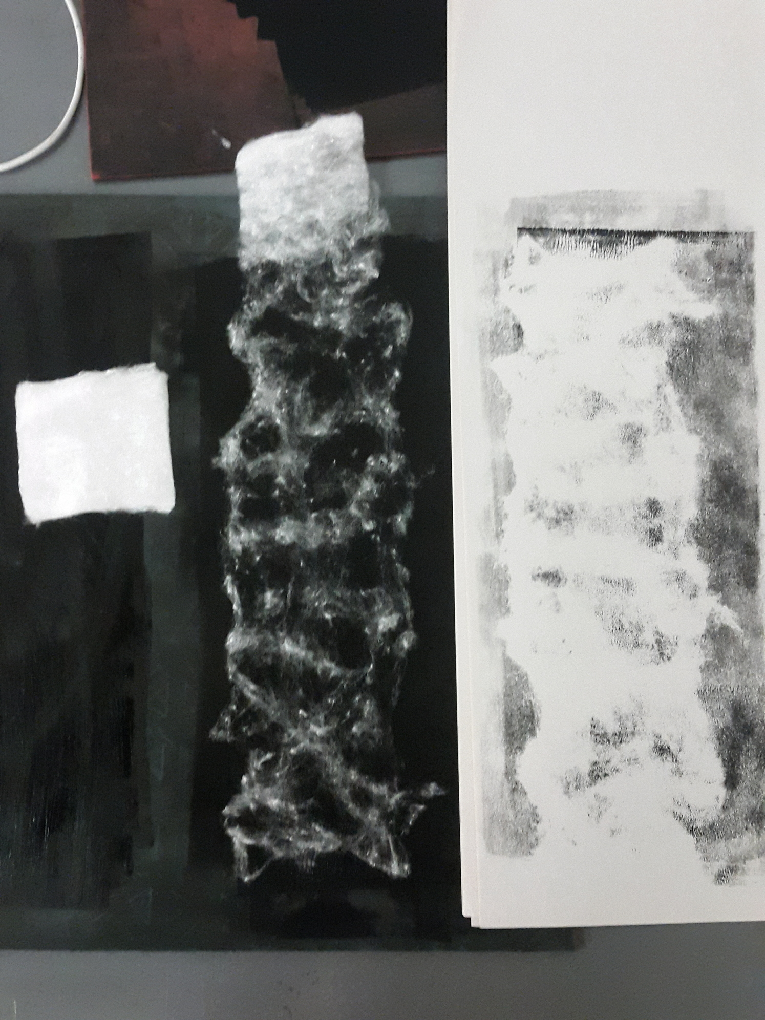
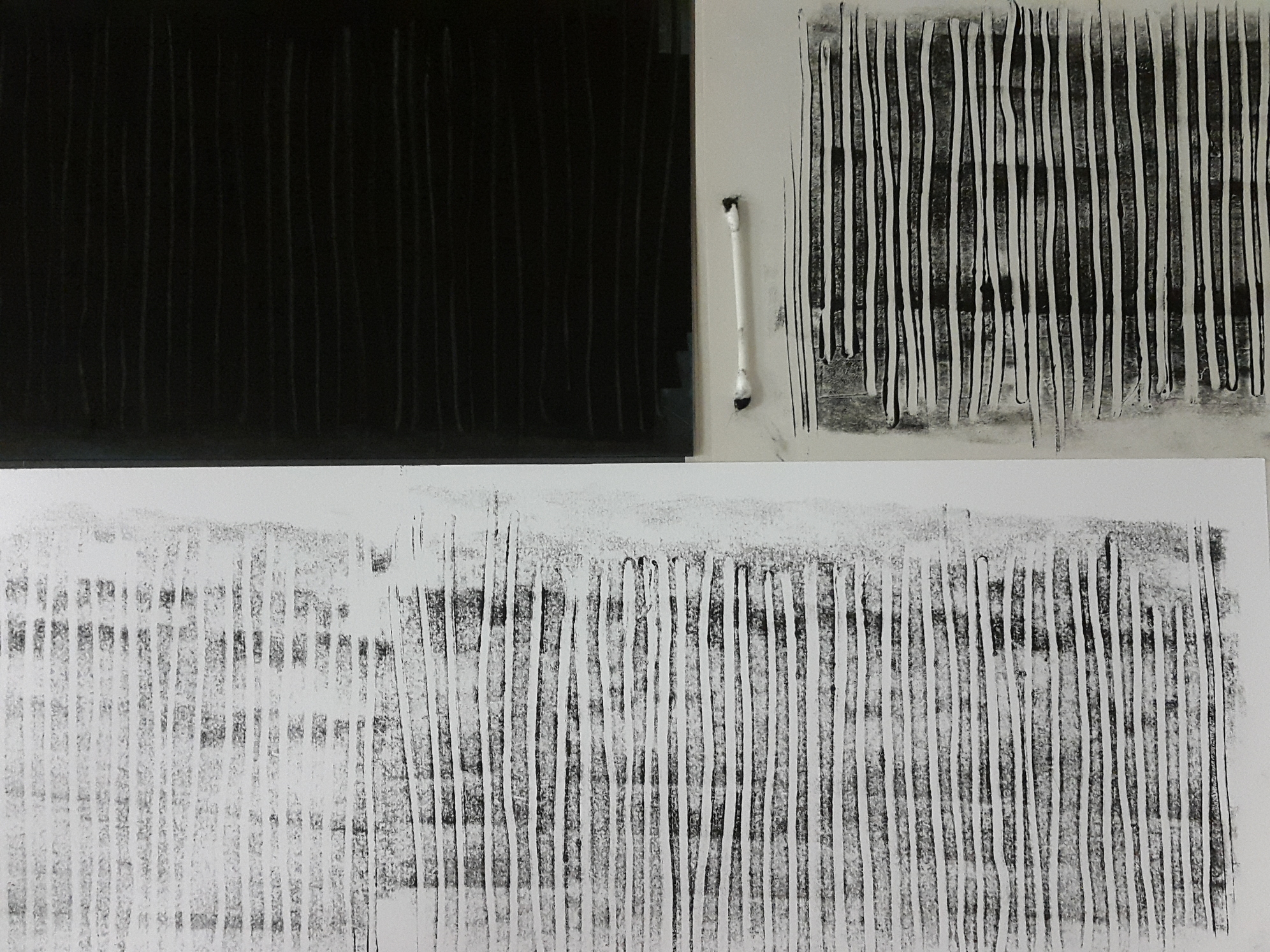
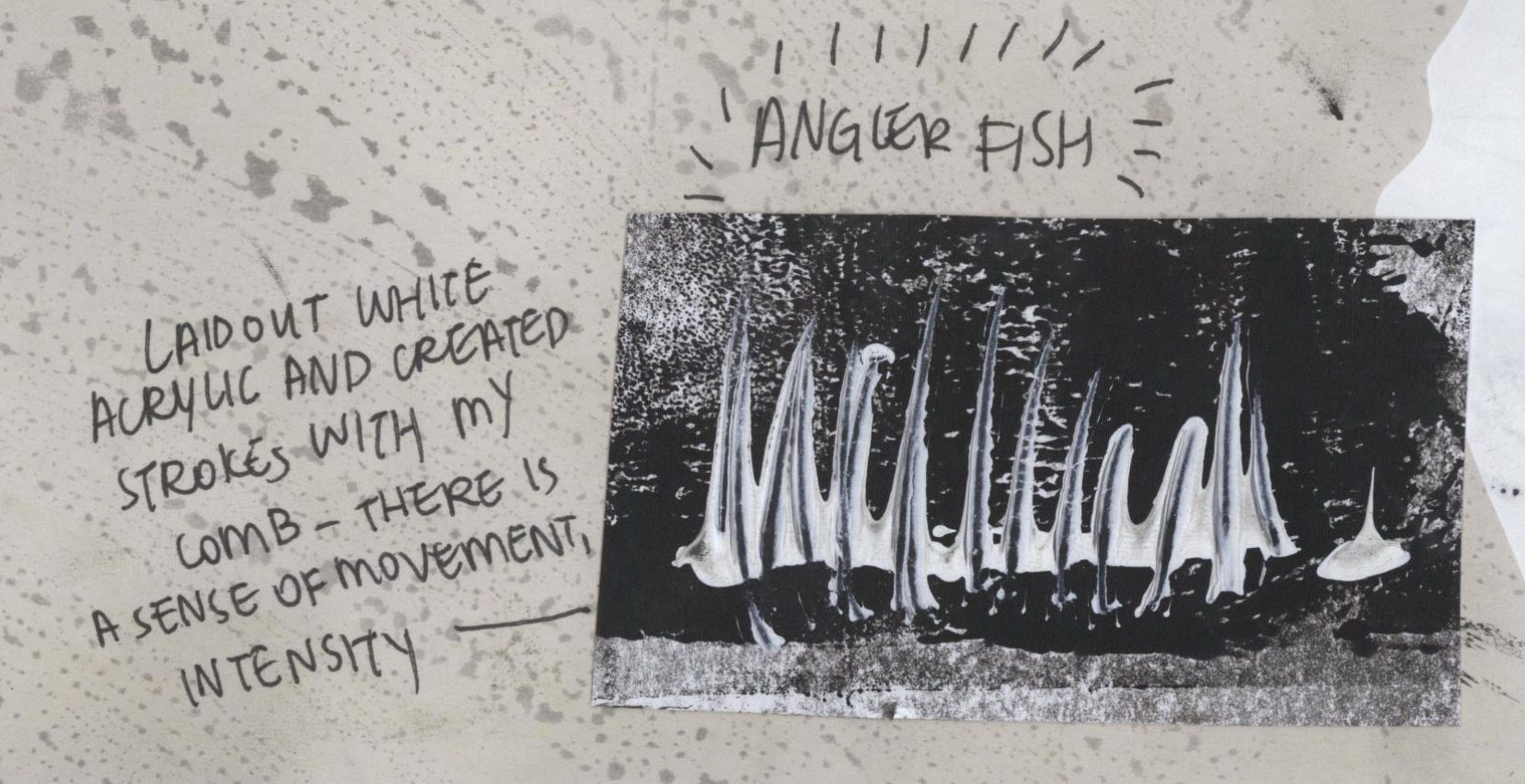
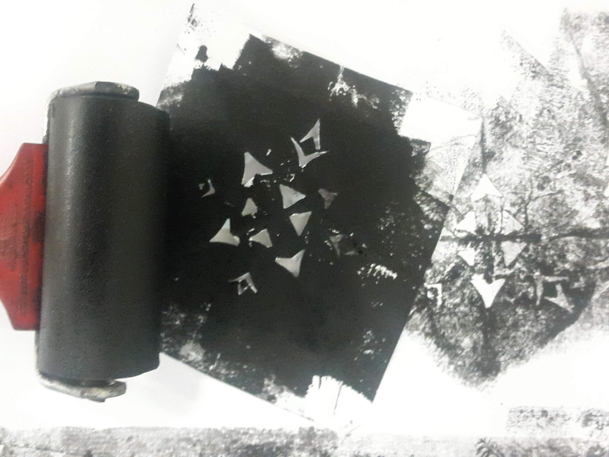
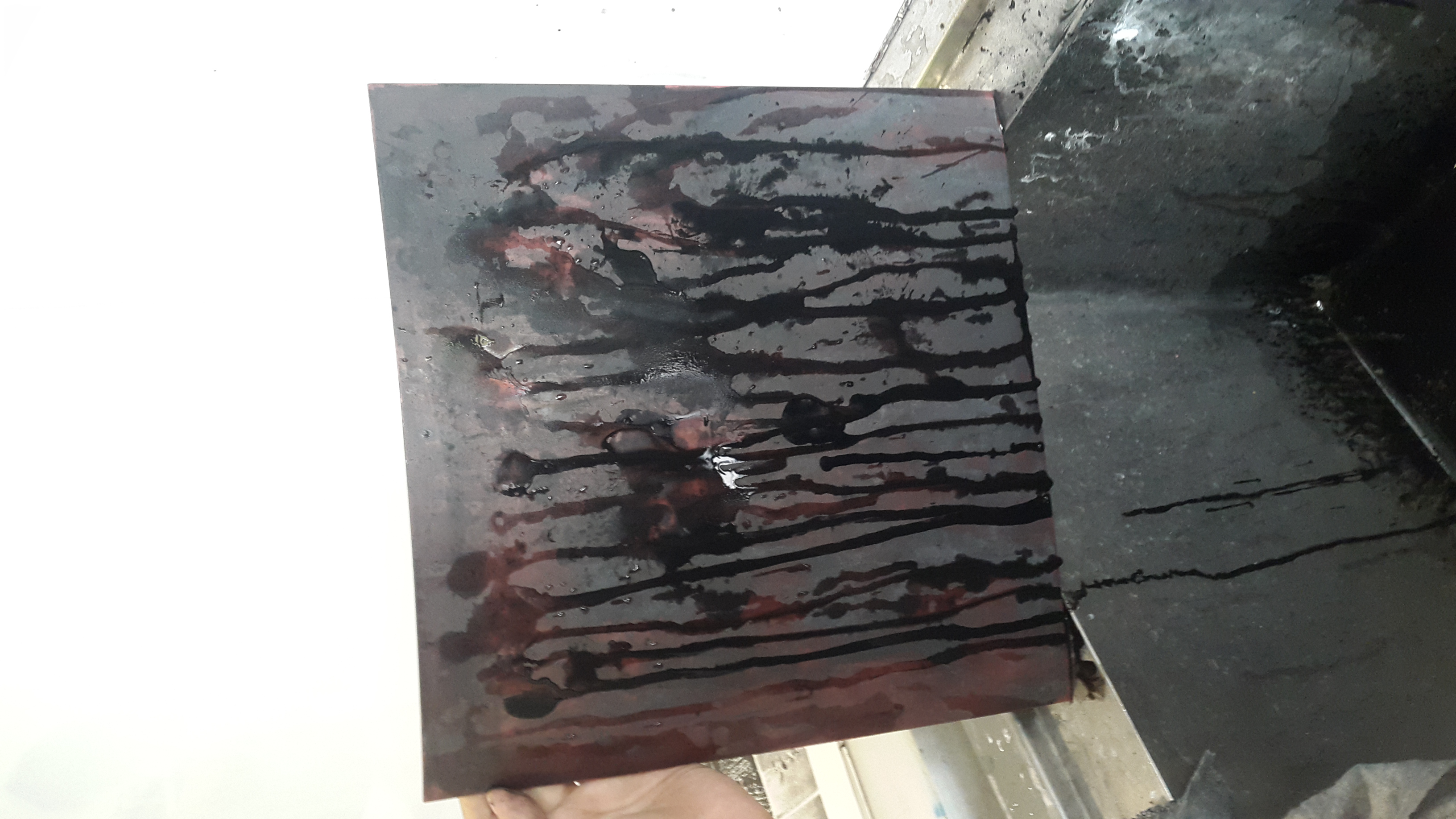
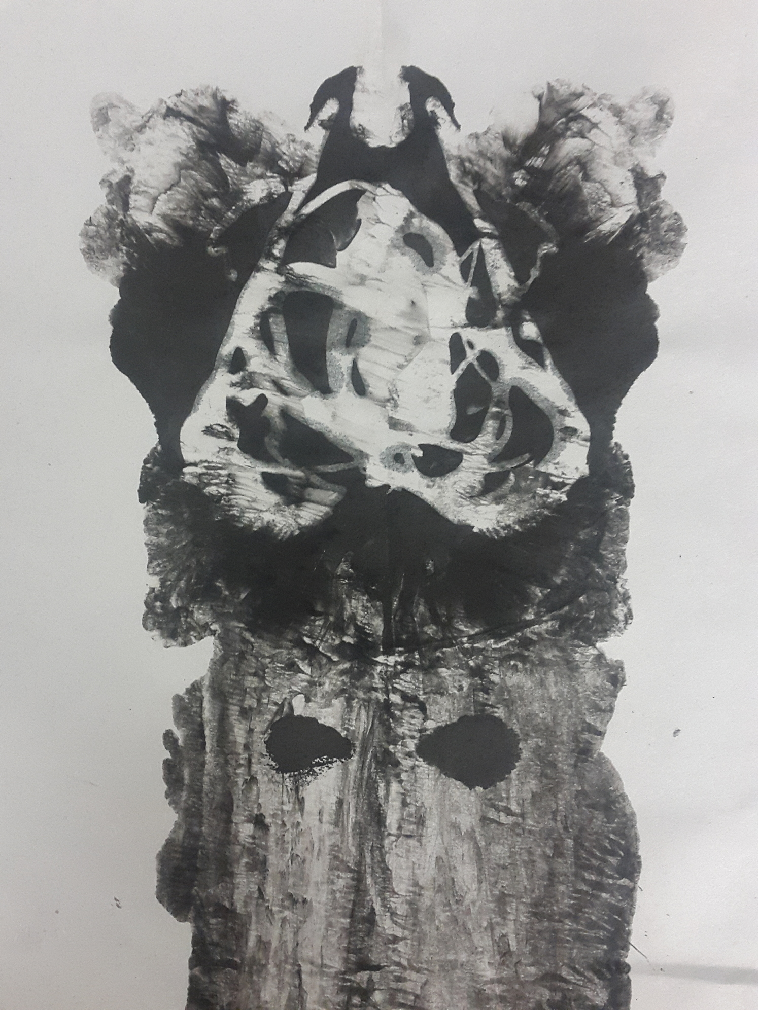
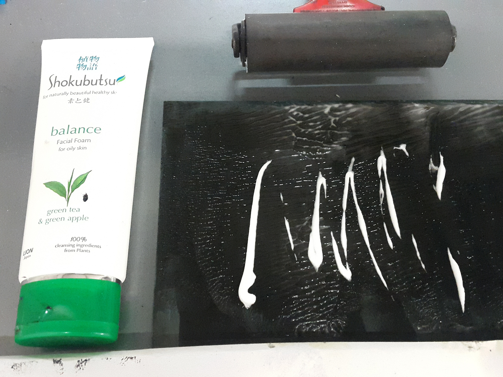
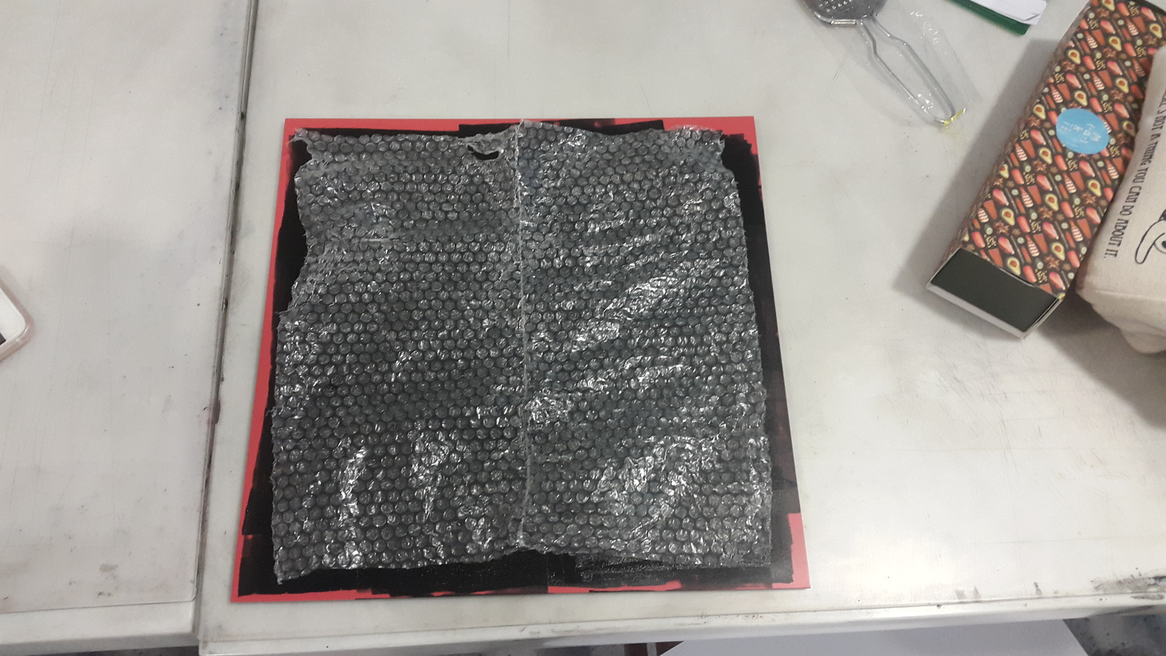
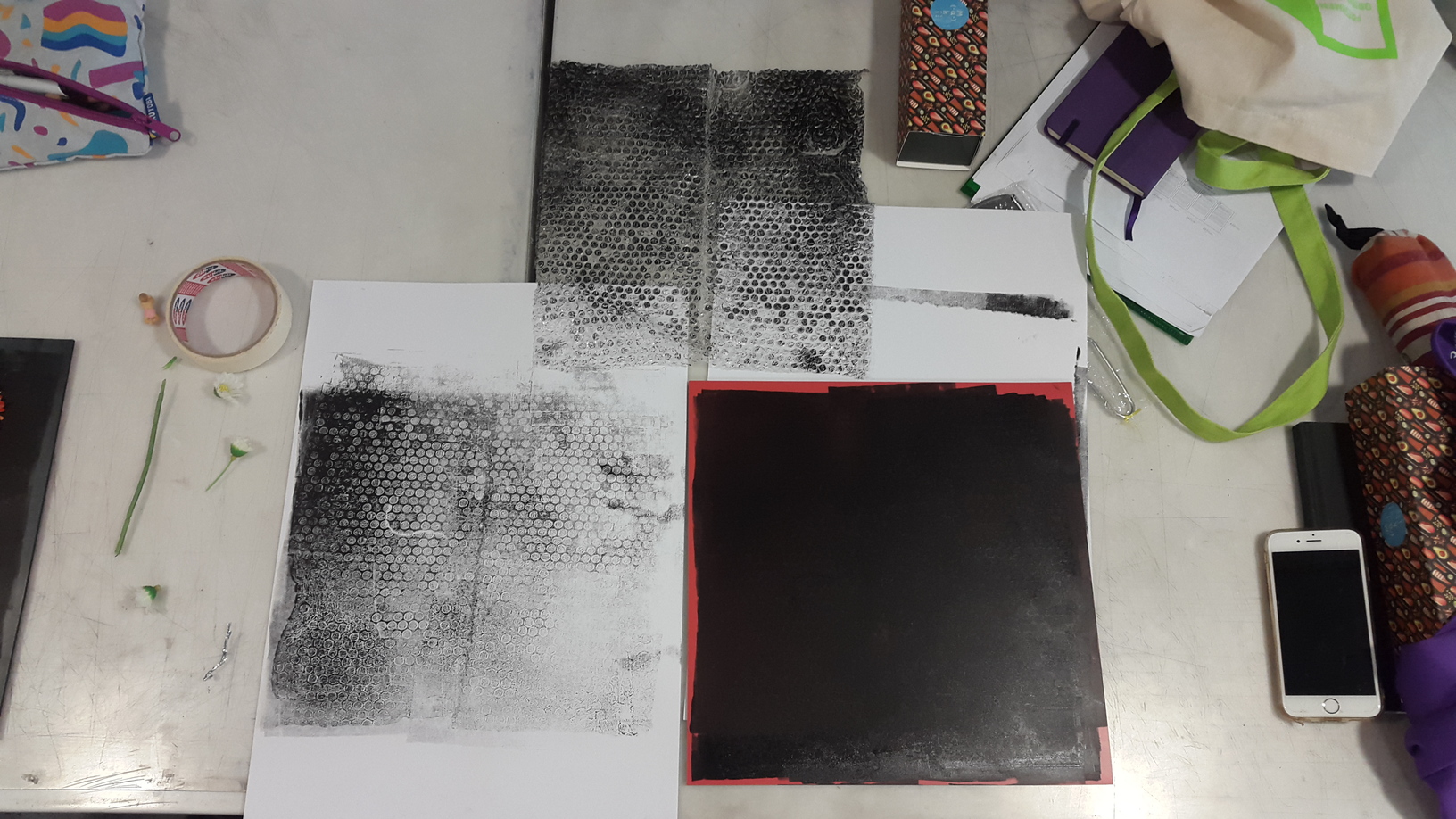
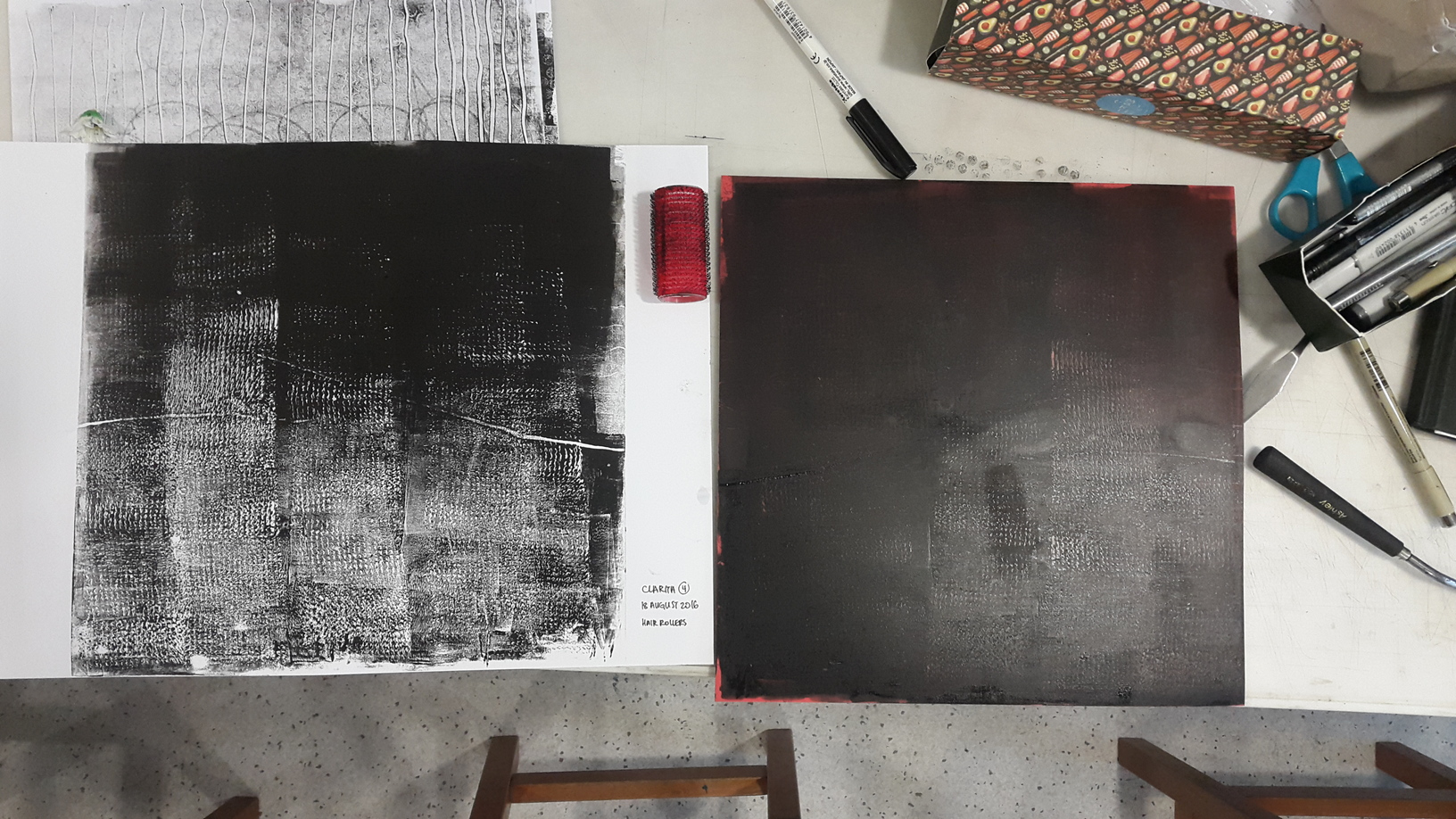
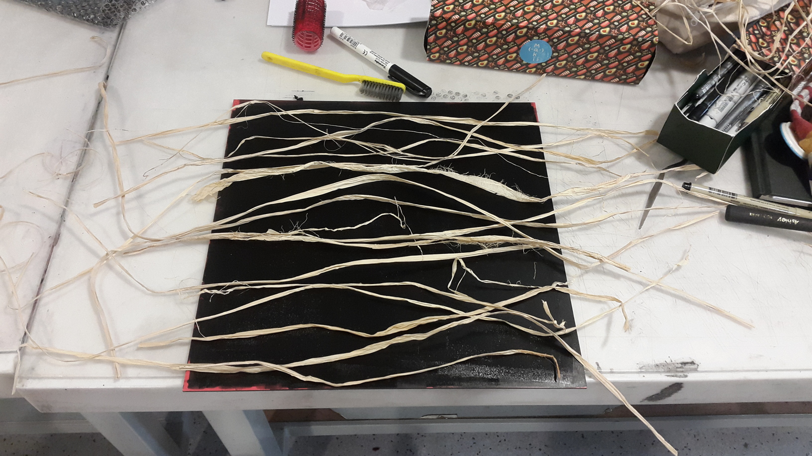
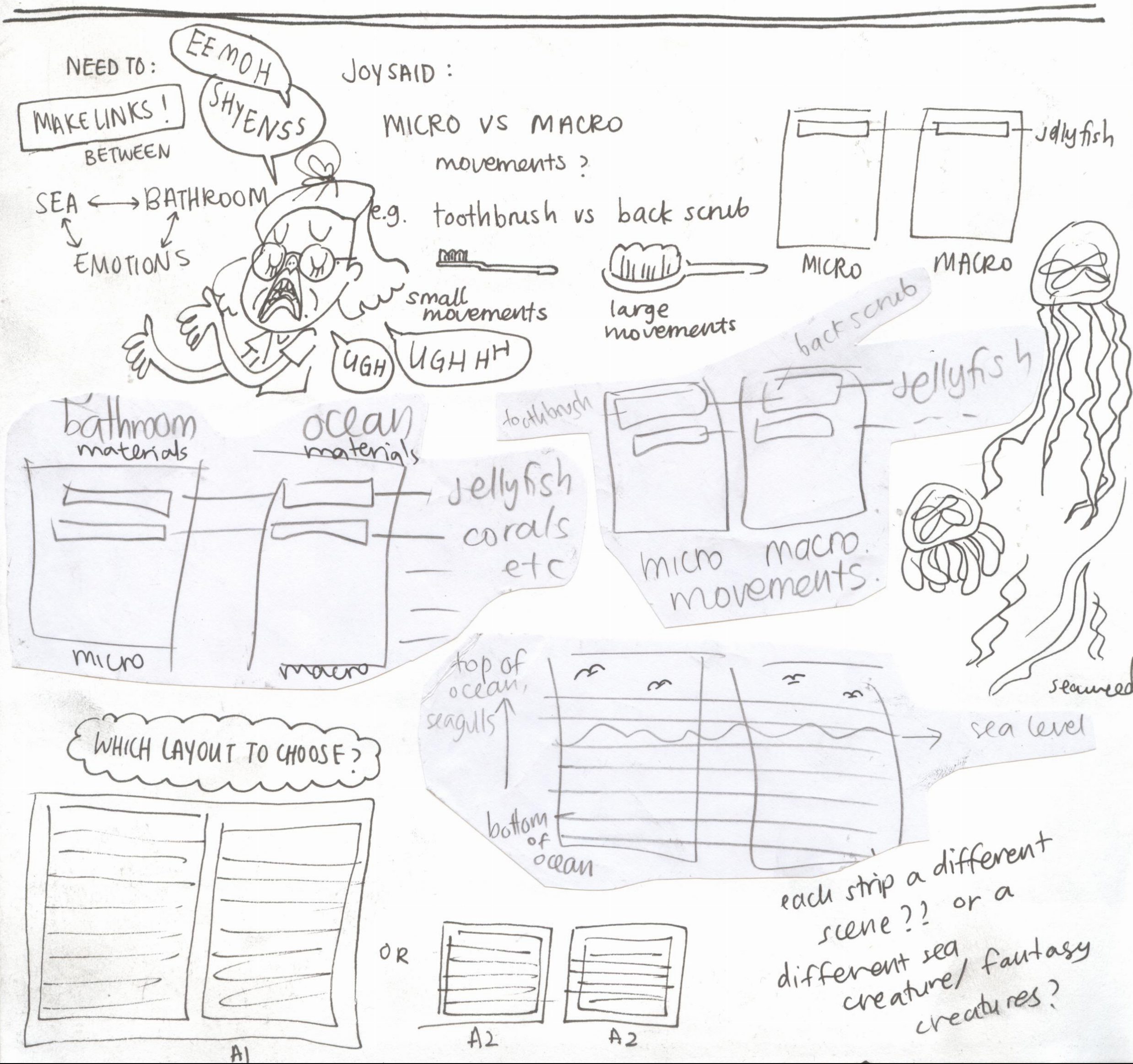
At first, I was excited and started thinking that I would play around with different techniques and craft methods for each of the twelves compositions. I thought of paper cutting, embroidery, crochet, pop up cards, op art, even animation using an optical film (like below).

vento
a page from “Vento”, by Virgilio Villoresi and Virginia Mori

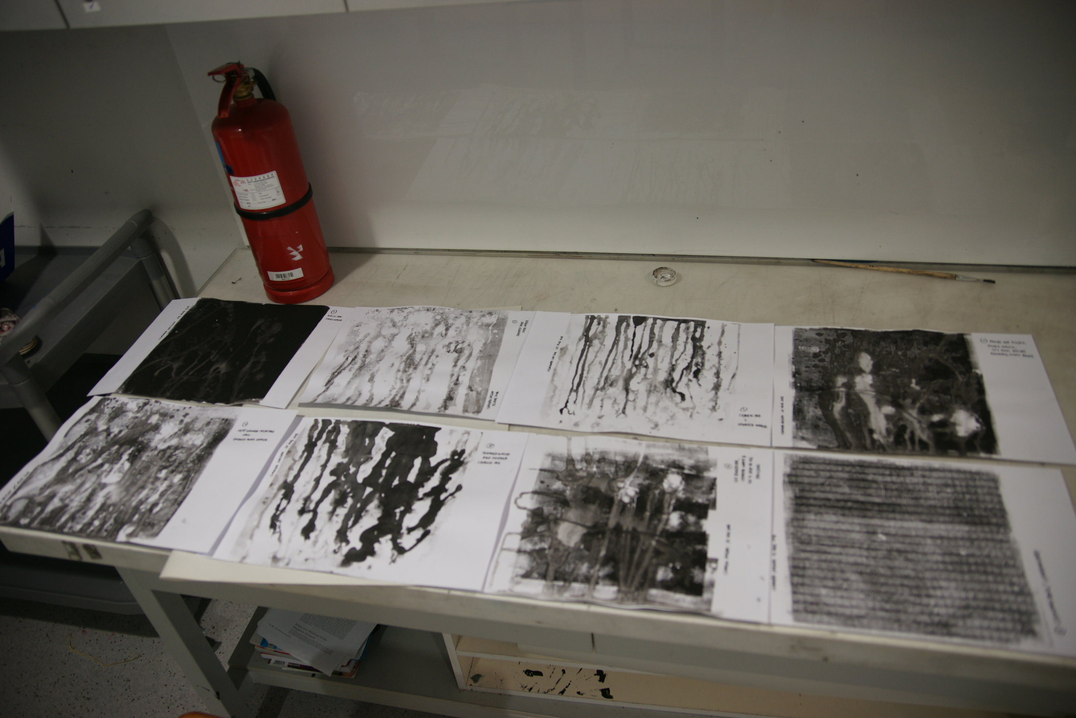
I was exceptionally ambitious, and super excited. During the first consultation, Joy addressed the white elephant in the room: Will there be enough time? This knocked me out of my daydream and I had to be honest with myself, of course there wasn’t enough time to explore so many methods. Also, how was I going to make sure everything is coherent? I decided to cut down to two techniques I was already comfortable with: embroidery and paper cutting.  At this point of time, I haven’t thought of how I wanted to use colours, but I did research on colour theories and the such. Check this out on my colour theory research post!

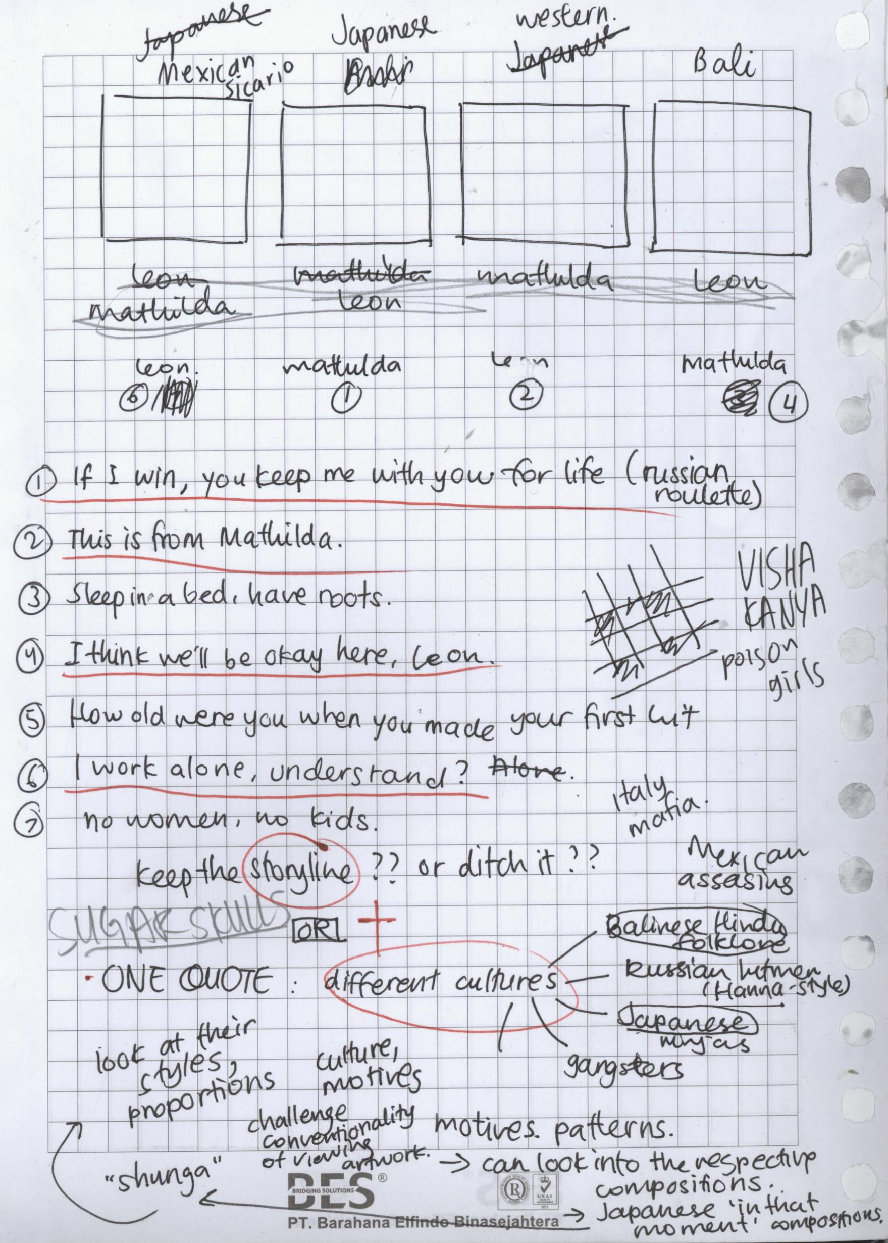
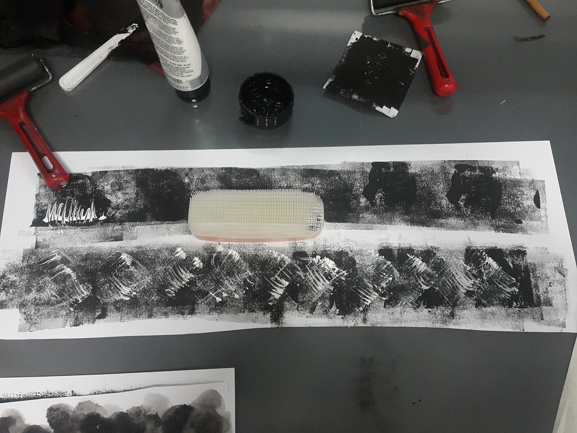
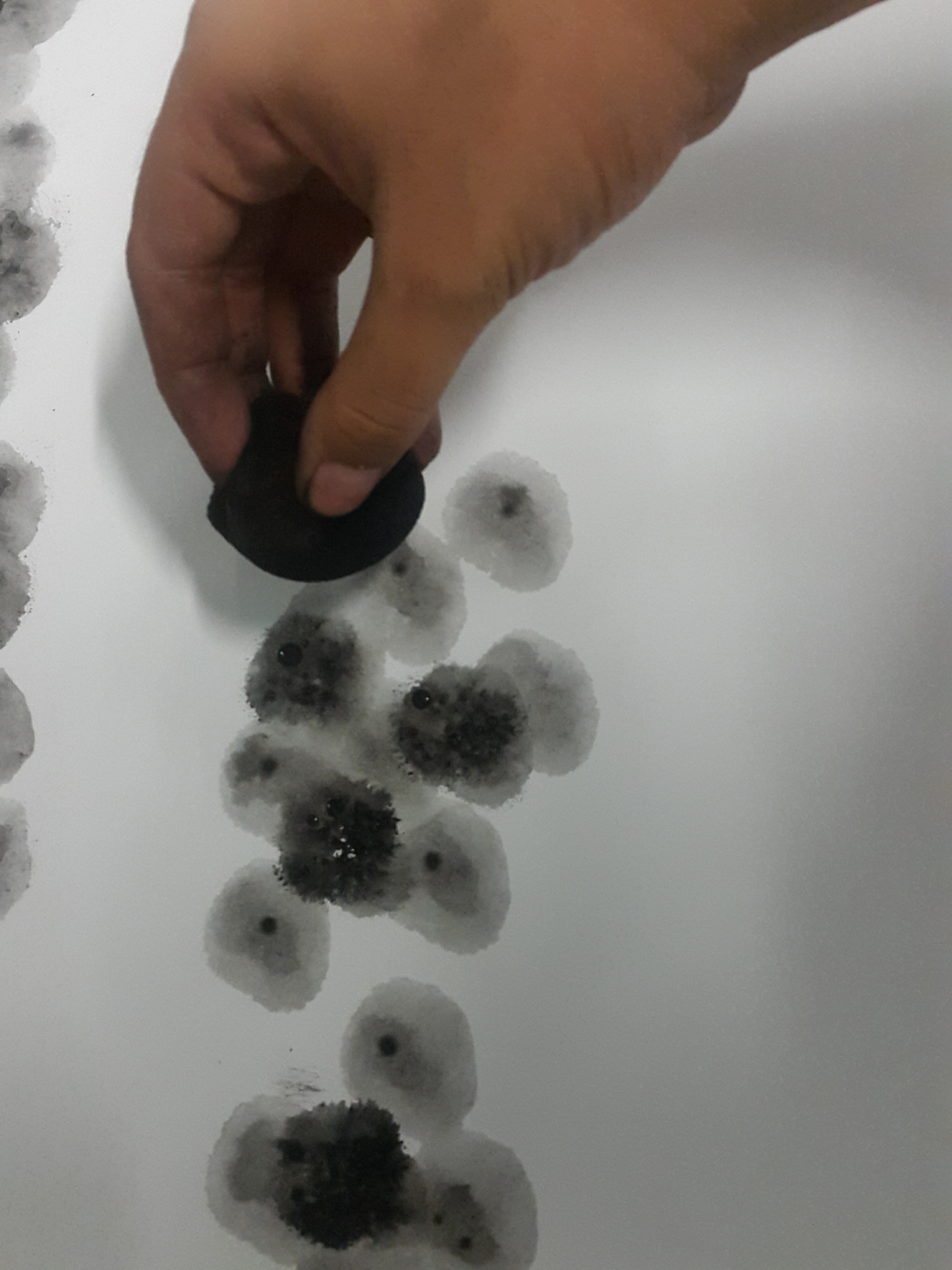
Along the week, I started to develop my concept. I decided to use the idea of the equations illustrating my growth in Singapore, with each row representing a school I’ve been in. I also searched for artist inspirations and thought of how the compositions would look as a whole. The week passed by and it dawned upon me that at the rate I was going, I wasn’t going to make it. I forced myself to calm down and take a step back. I settled on ditching the embroidery and paper cut, and going back to watercolour/acrylic illustration: the medium I grew up with. I also chose to do my casual illustration style instead of my normal one. Not only is this style more known by my classmates, but it also helps to save time. (heheh) I sketched out the compositions, but was stuck at choosing the colours. Paintings can’t be undone like Photoshop, so I decided to consult my friends and Joy about it before starting on the colours.

Meanwhile, I searched around for inspiration on how the compositions would look like alone and together. These are some that I came across.

tytus-7 tytus-1 tytus-4

^Tytus Brzozowski’s dreamlike architectural watercolours

nicolegustafsson_08 nicolegustafsson_09-1 nicolegustafsson_03

^Nicole Gustafson’s ethereal suspended worlds

marcomazzoni_08 marcomazzoni_02

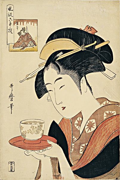
^Marco Mazzoni’s meticulous pencil colour drawings

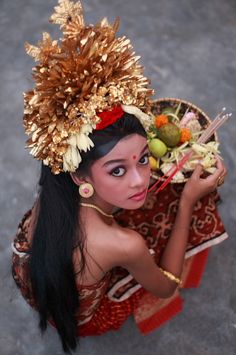
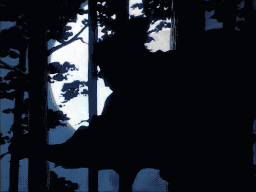
I knew I wanted to include a double exposure element in my work, for the last column especially. This is inspired by the beautiful tattoos done by Andrey Lukovnikov.

lukovnikov-3 lukovnikov-1 lukovnikov-4

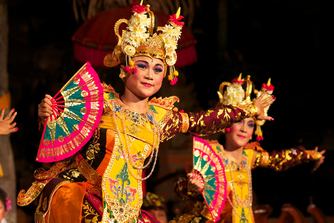
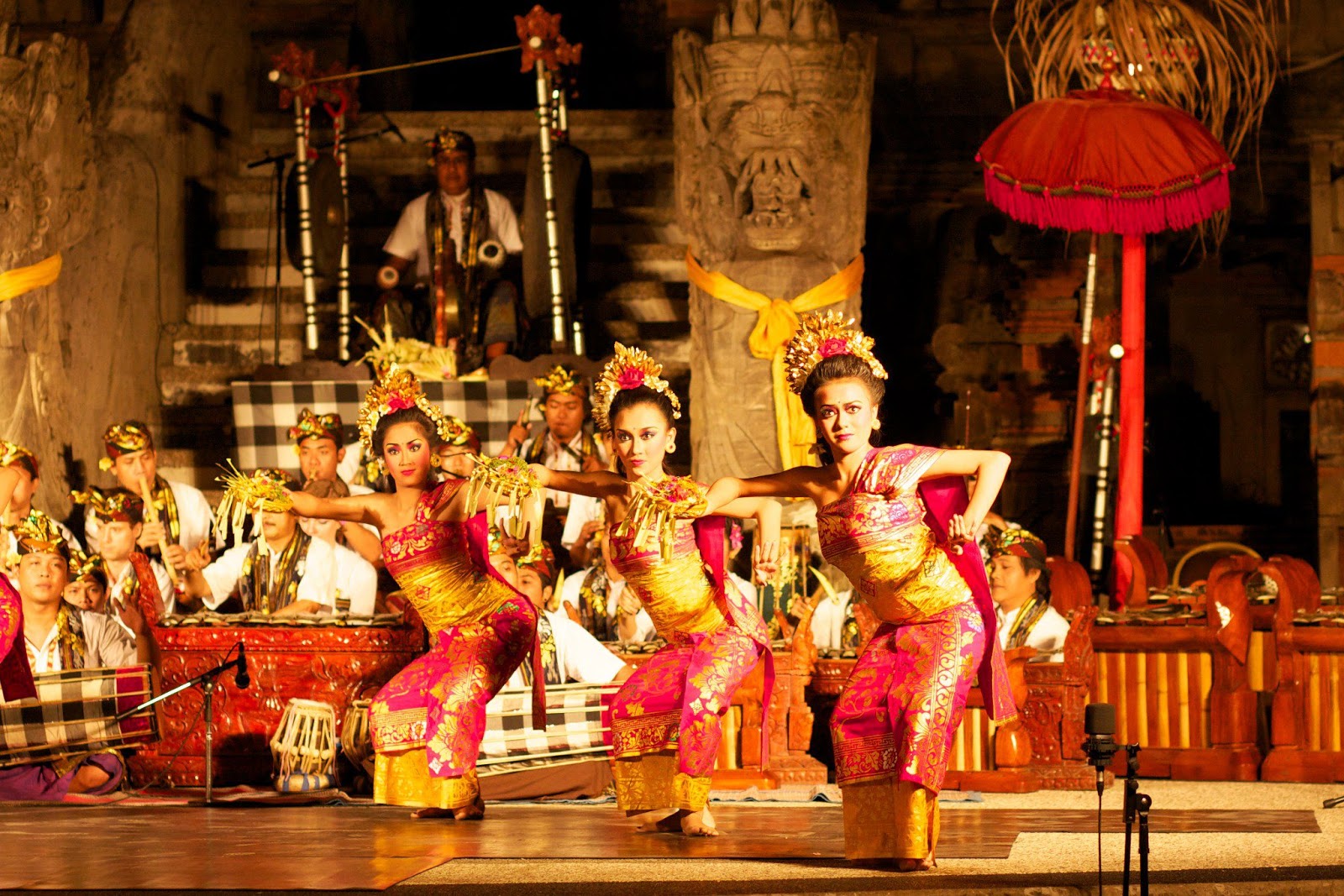
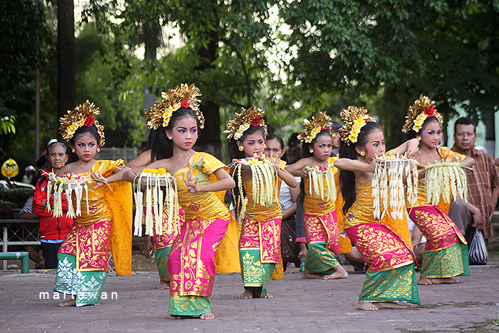
I still wanted to showcase my style and wanted everything to look like a whole. In the end, the main inspiration that gave my work its look is the publicity materials for We The Fest Indonesia.

64e707d9b2b15b972918ee9b71264500 25d47a9ac3c356838c5c439f3d68b2c9 180746_3708e6ae-f686-11e3-9a74-0d904908a8c2 5d905cd3128e285ea434381856b134fe

I love the usage of circles in their collaterals! It is something very simple, clean, yet visually arresting and recognisable. I decided that I can base my compositions on a circle framing, and play around with it according to the different columns and different situations. In the end, the first column that represents me uses a simple circle frame, the second column, which represents the setting, includes the circles as “portals” to the world of the school, and the last column is a double exposure portrait bordered with a circle frame.

(Me at the start of the school duration) + (School experience) = (Me at the end of the school duration) 

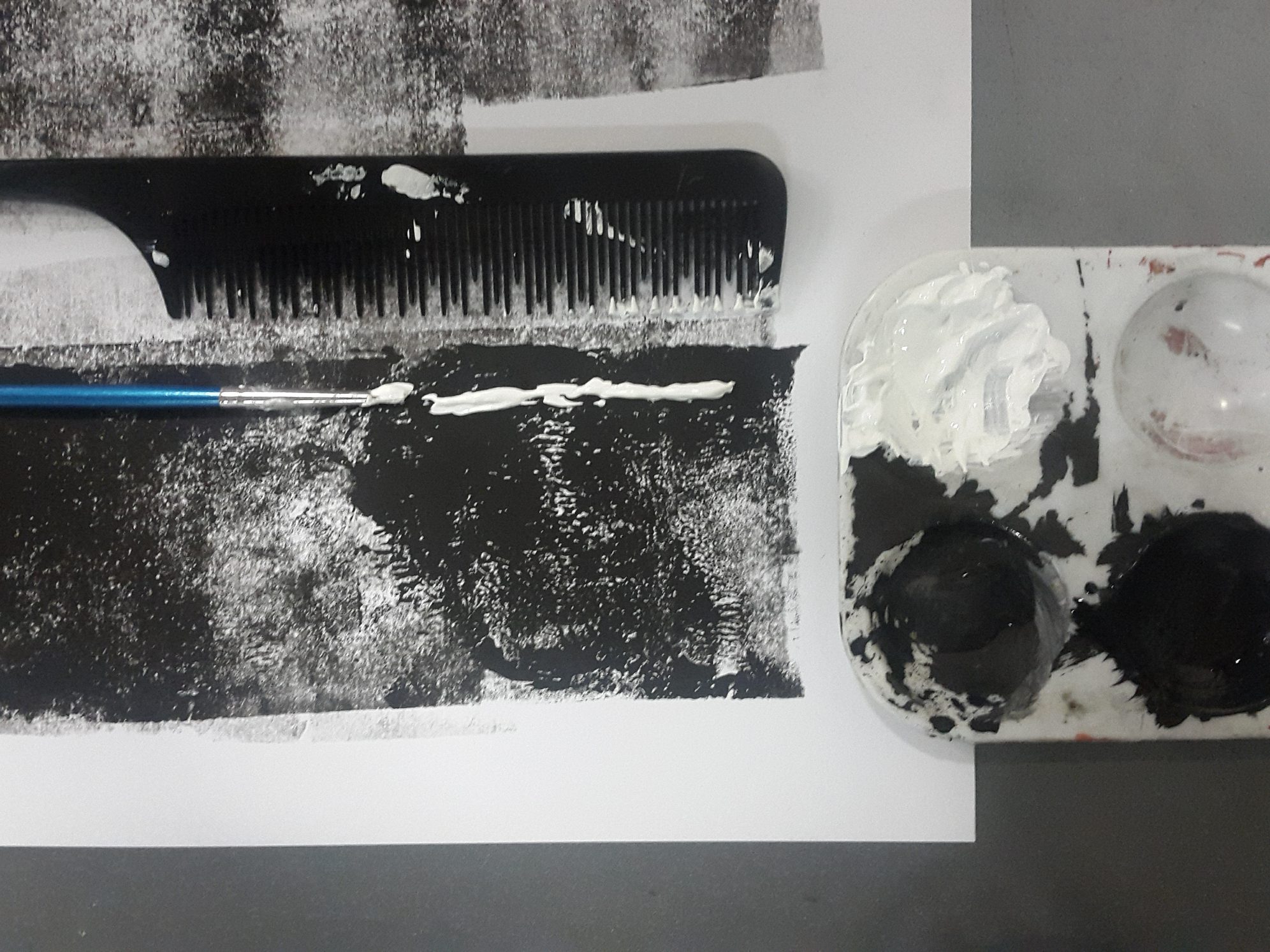
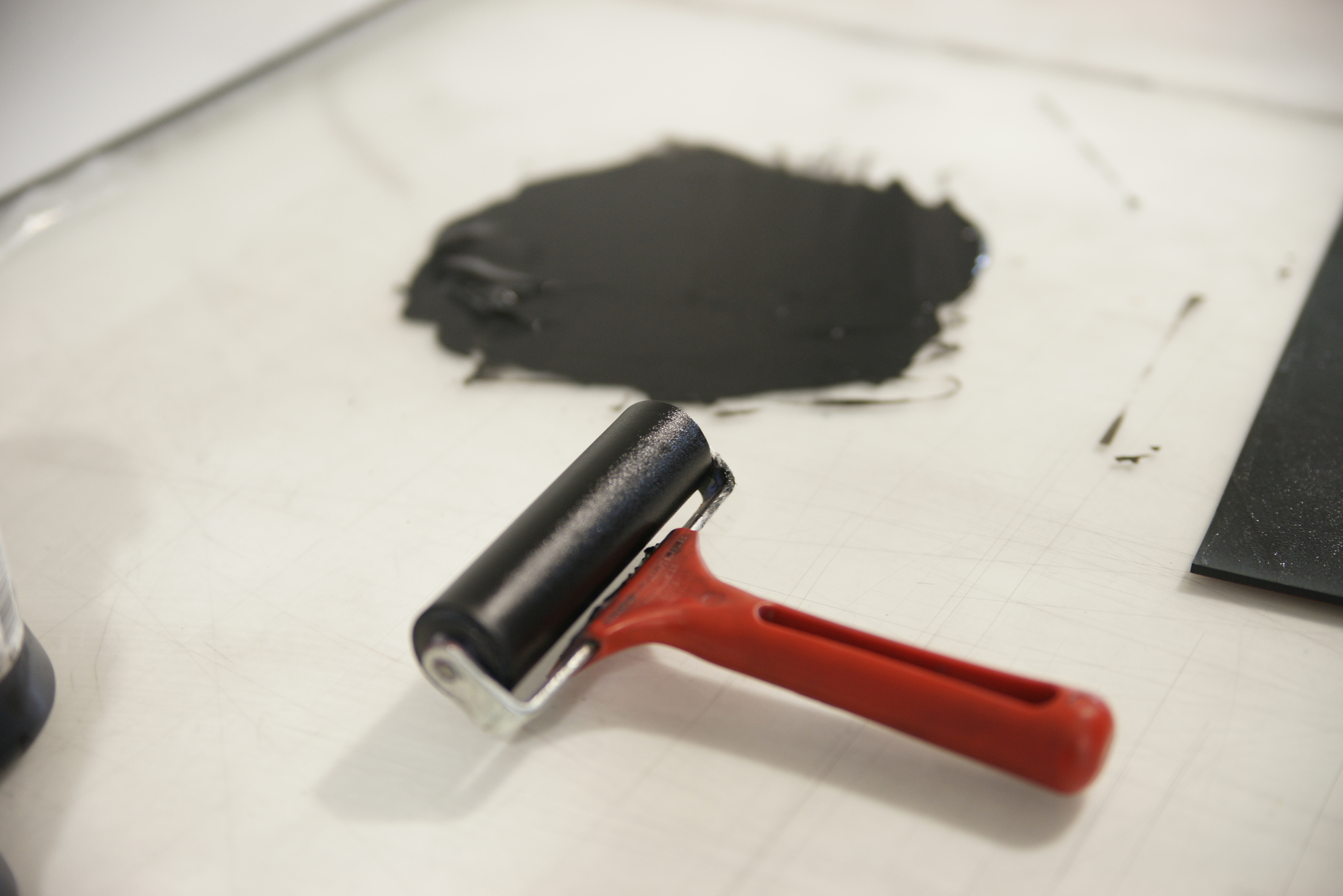
After much deliberation, I was finally able to choose colour schemes for each row, keeping in mind to make use of appropriate colour theories that would communicate the mood for each situation. I also switched over to gouache, because I didn’t want the plasticky finish acrylic has, and wanted more opacity than watercolour. Since gouache is new to me, it took me a couple of tries to get used to it. After settling the colours, I went straight to production!
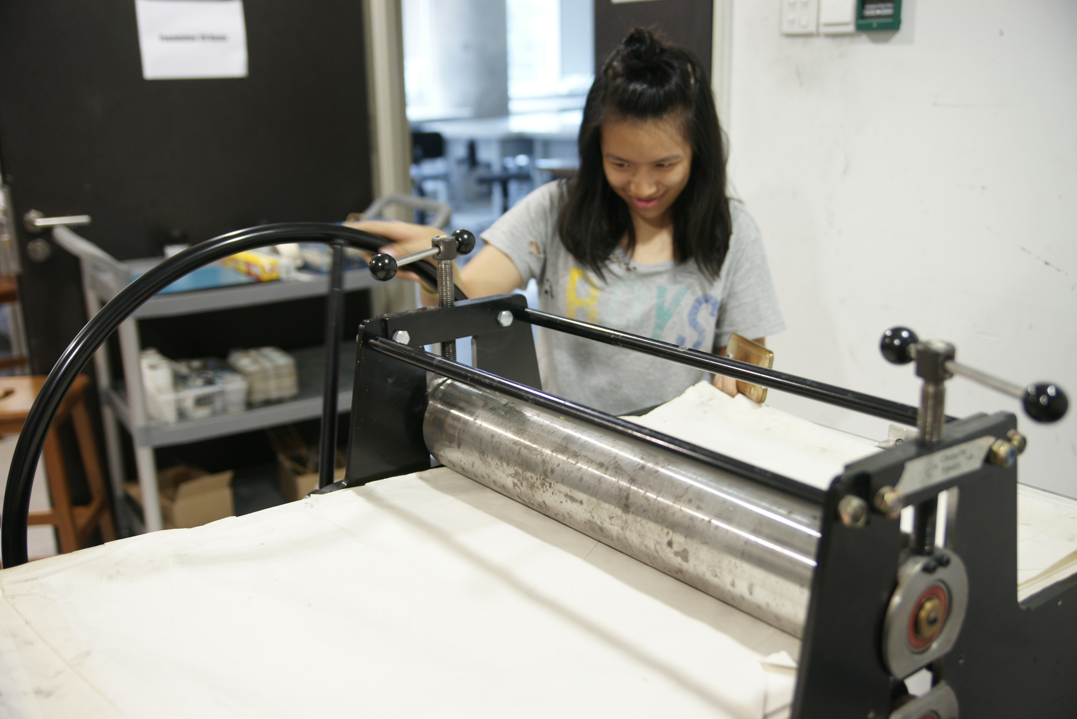
 

◊ EXECUTION ◊

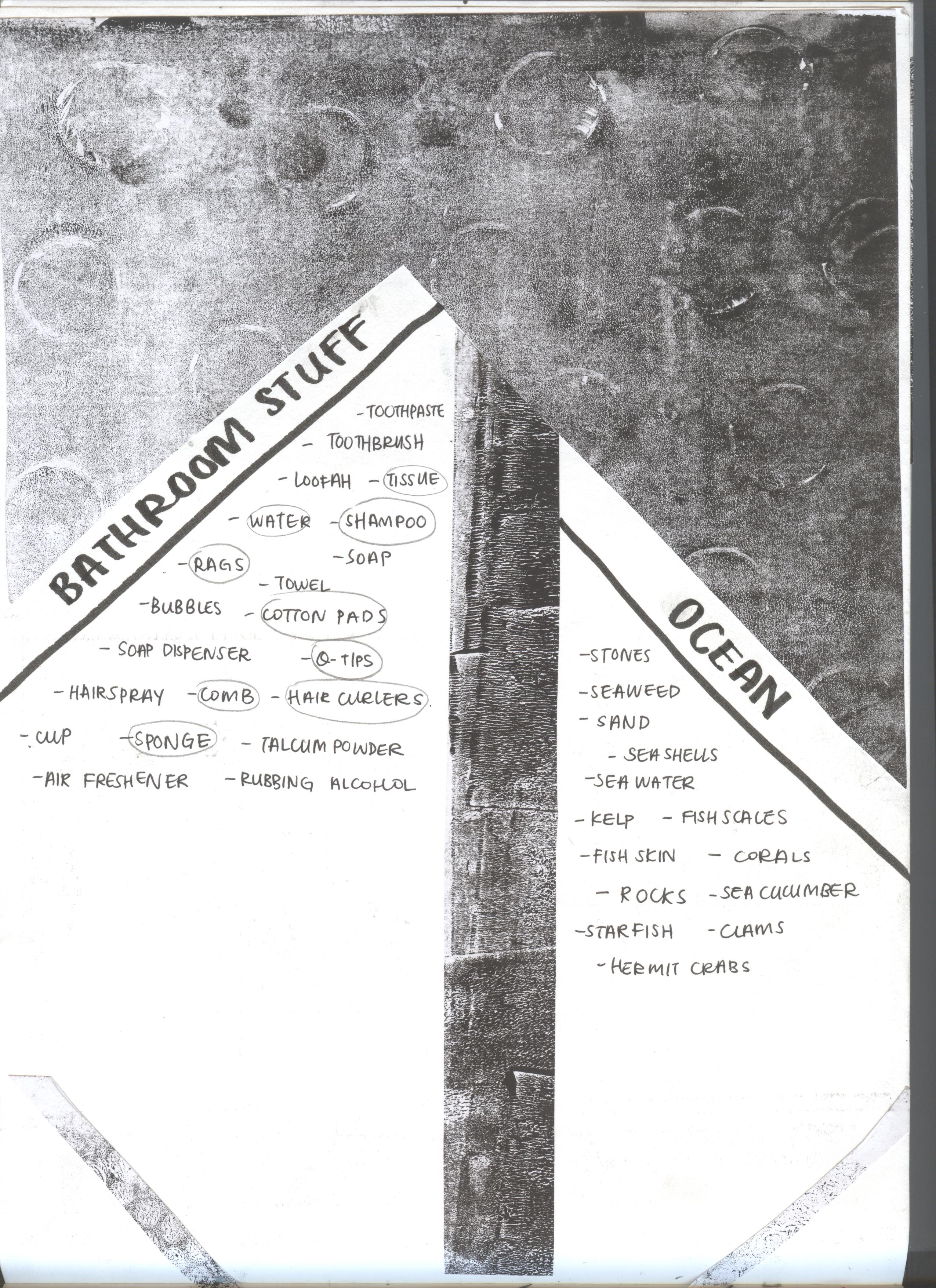
Once I got the gouache, I did some swatches and made changes to the sketches I have previously completed. I outlined the sketches in a thin pen, painted them in, and added the black outline last. All the while I mixed paint around in order to get the right colours. In choosing the colours, I made use of the existing colours of the uniforms and chose the rest of the colours according to them.

20161113_180734 20161109_173210 20161110_121440


◊ FINAL BREAKDOWN ◊

ONE ◊ CAREFREE ME + CAGED WORLD = NAIVE ME

2d3-1 2d3-2 2d3-3

This equation is about my life in Jakarta. For my whole life before I came to Singapore, I grew up in Pelangi Kasih School, all the way from kindergarten to Sec 3.

School was relatively easy and the system not so rigid, so I lived a carefree life while still being able to maintain good grades and getting involved in many projects and competitions in school. I was young, only a seedling. I used peach-pink as the dominant colour for the first piece as it symbolises innocence.

As a result of my parents, school, surroundings, and how I was generally brought up, I lived a sheltered life. There was a straight path drawn for me and blindfolded, I happily walk straight, not knowing that I was in a cage, protected from the world. This I illustrated with blue, to show the calmness of the life I lived. By doing this, the straight path, which is in yellow, is highlighted due to contrast.  

The result of this is still, a naive me. Still oblivious and very carefree, I live my life happily and without thinking of the future. The dominant colour yellow illustrates this very light, happy feeling that corresponds to my state at the point of time.  

Overall, I chose to use the primary, triadic colours as to illustrate the basic building blocks that I started with. I was young and life was simple. However, I chose to use a much lighter tint, and used pastels of the three colours as I feel it would fit the idea of youth and innocence better.


TWO ◊ EAGER TO PLEASE + SCHOOL AND FRIENDS = SAD ME

2d3-4 2d3-5 2d3-6

The second equation is about my first two years in Singapore spent in Anderson Secondary School. While I learnt a lot and made lifelong friends, it was not a very pleasant journey at the start.

When I first came to Singapore, I was extremely eager to please. I was determined to be the perfect student and naively thought that it would be an easy journey. I grew from my experience in Jakarta, but I was a mere bud. My optimism and energy is shown through the use of a dominant bright orange, with blues from my uniform as an accompaniment.

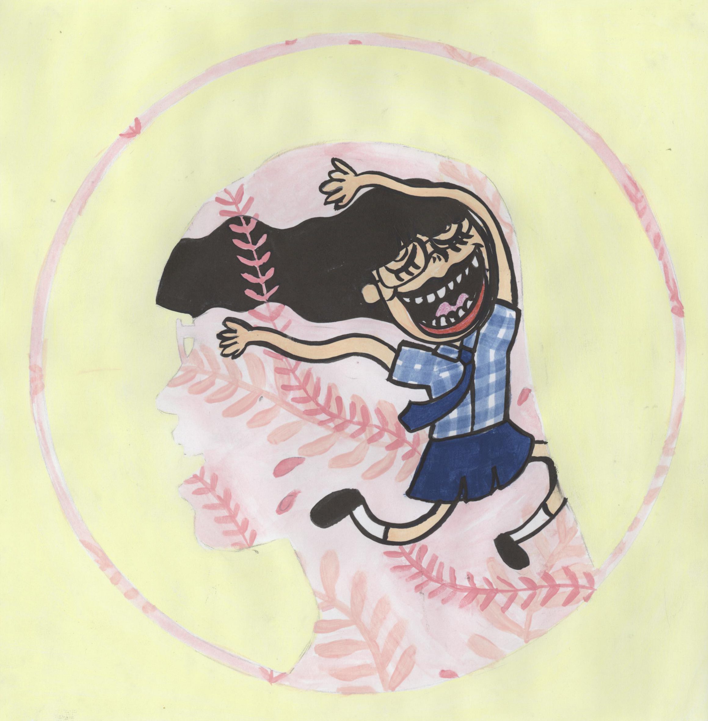
Little did I know, school work was really tough. I was doing the worst I had ever done my whole life. Plus, my initial impression of my classmates was not very good, as the culture of welcoming new students was very different compared to what I was used to back in Jakarta. I closed up and did not want to face these problems head on, hence in the composition I am depicted as looking away from the setting (towards the viewers instead), unlike the rest of the compositions in the middle column. I used blues and a dull lavender to show the dark state that I was in, making use of the bright orange as accents in the glowing eyes.

As a result, I was a very unhappy girl. No matter how hard I tried to make friends, I knew that it was not a genuine effort. It made me feel very discontented, and I used a lavender with low chroma, almost grey, to highlight this dullness, along with the dark blue and the teardrop pattern at the back.

Overall, I chose to employ a split complementary colour scheme for this equation (orange, blue and purple) so that I will be able to show how my initial positivity (orange) was quickly drowned out , replaced with the analogous colours of blue and purple. 

THREE ◊ COME AT ME + ROLLER COASTER = STRONG ME

2d3-7 2d3-8 2d3-9

The third equation is about my years in Temasek Junior College.

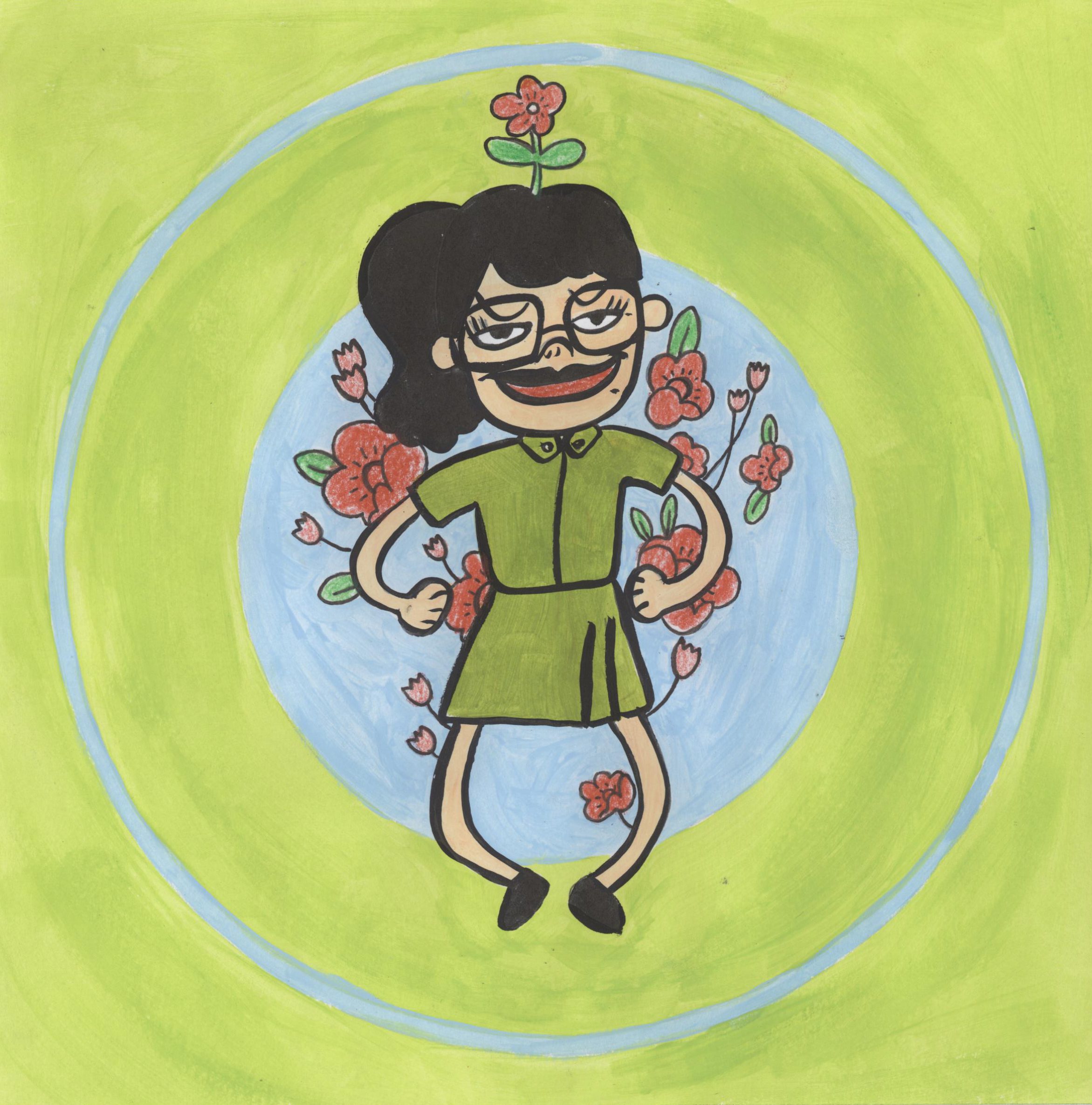
I thought that going to JC, it would be easier for me to start anew as everyone is new to the school. I wanted to enjoy my days and do better, and was determined to do so. This want to start anew, I hope, is able to be communicated through my use of bright green. I took on a fresh perspective and got rid of my old ways of thinking, I became a young flower.

Of course, JC was a tough journey. Academically, everything became even more difficult and I struggled to keep up. I took Art for A Levels and it took up a lot of my time, and by the end of JC1 I lost my scholarship. JC years were some of the worst years of my life. However, they were also some of the best years of my life. I loved Art and I was close to my classmates and Art friends. I had fun in House Committee and in orientation, and generally had a much better time compared to secondary school. JC was really a roller coaster filled with ups and downs. These challenges and journey is illustrated with red, as the colour can symbolise both danger (negative) and excitement (positive).

At the end of the two years, I find myself much stronger, more resilient, than ever before.  The dominant red (more of a coral to fit the lighter tones) represents my strength and the complementary green also shows my contentedness. Overall, the colours I chose for this equation sets the mood for each composition, with coral and lime (tints of red and green) as the main colours, and blue to complement the two.

FOUR ◊ READY ME + GRADUATION IS A LONG WAY = ?

2d3-10 2d3-11 2d3-12

The last equation is about me in NTU. I am the most mature I have ever been (OK I’m still childish). I am transitioning into an adult and whether I like it or not, I will need to be responsible for my own future. I feel like I have become much calmer when facing challenges, so I tried to use minimalistic colours to create this equation.

I am still determined and eager to do my best in university, so I used three values of orange to illustrate this energy. Calm and filled with determination, I start my ADM journey.

The goal right now is to graduate, and it is still very far away. I illustrated this by creating a long walkway that ends with a mortarboard on a pedestal. I created an illusion of depth to show that it is far away, and my pose shows how I am ready to take on this challenge.

The last column is a reflection of how I am by the end of the years I spent in the particular institution, and since this is still in the future, it is a huge question mark, with black to show this void. However, I am positive of the outcome and hence use orange as the background to show this.

Overall, I used just slightly differing shades of orange, and black and white for contrast. The simple colour scheme is supposed to show a calmer, more mature side of me.


◊ REFLECTION ◊

I am glad that I was able to showcase my characteristic style in this project, and was able to make use of the circle framing well to make all the compositions look cohesive. I still need to improve in terms of time management, and there are also a couple of other things that I thought I could have done better on. I feel like I could have coordinated the colours across the rows better, and practiced more with the medium to achieve better saturated colours and a smoother brushwork.

All in all, I had fun in this semester and though I was literally dying through all the projects, I enjoyed myself and learnt quite a bit, not only in terms of skills and techniques, but also my way of thinking and developing my art processes. I want to thank my classmates for their inspiring works, and Joy for being a super nice and encouraging teacher. This class will be missed!

For a summary of everything, check out my final work post!

2D Project 2: Forrest Gump Research and Execution

Okay, so I decided to include another process post because I felt like I wanted to elaborate more on the in-depth research that went behind each of the compositions. Following my initial ideas of using different cultures to illustrate the four quotes from “Leon: The Professional”, I went ahead and researched about different assassination cultures from around the world. Some possibilities that came up were Italian mafias, Russian hitmen and Indian Visha Kanyas (poison girls), among others. However, I will only be including research behind the final four compositions.

For a start, here are the final four quotes.

vj4

  1. Leon: I work alone, understand? (Couldn’t find the right still for this)
  2. Mathilda: If I win, you keep me with you for life.
  3. Leon: This is from Mathilda.
  4. Mathilda: I think we’ll be okay here, Leon.


◊ FILM ◊

!!!MAJOR SPOILER OF THE WHOLE MOVIE ALERT!!!

\
\
\

I chose the four quotes as they describe Leon and Mathilda’s relationship throughout the movie.

Leon saves Mathilda from the corrupt drug enforcement officers who killed her family, even when he had no reason to. She wants to hire Leon to kill them, but Leon declines. Instead, she asks for him to take her up as an apprentice and teach her to be a ‘cleaner’ too. Leon refuses, stating “I work alone, understand?“, and tries to send her off.

Mathilda tells him that it is just the same as letting her die in the hands of the corrupt officers. She takes a revolver from the table and initiates a game of Russian roulette, pointing the gun towards herself. She says, “If I win, you keep me with you for life.” She says that she hopes he really has no feelings and that he won’t regret this, while Leon tells Mathilda that the chamber is loaded and she will die. Mathilda is adamant and pulls the trigger just as Leon slapped the revolver away, the bullet very nearly killing Mathilda.

Mathilda undergoes training and develops a bond with Leon, influencing Leon in a way such that he became much more human, as once again he slowly let emotions into his life. Mathilda is trained into Leon’s way of living and routines. The story spins into a heightened conflict and both their lives are in serious danger. Leon and Mathilda profess their affection for each other as Leon forces Mathilda to safety. Leon barely makes his way out when Stansfield, the antagonist, shoots Leon from the back. In a slow and melancholic scene, Leon confirms Stansfield’s identity and hands him the pins of a grenade, saying “This is from Mathilda,” which were his last words. Stansfield discovers active grenades strapped to Leon’s vest, right after which the scene explodes, taking both of their lives.

Saddened by her loss, she finds out that Leon bequeathed his wealth of previous earnings to her. Mathilda finally finds protection under her previous school and goes out to plant Leon’s houseplant in the gardens. She previously told Leon about how he should plant it in a park so it could have roots. The plant here symbolises Leon. She says, “I think we’ll be okay here, Leon.

With this storyline as an anchor to the project, I took a closer look at each quote.


◊ BREAKDOWN OF FOUR COMPOSITIONS ◊

These would be quite similar to what I had in the final post, but I will be including some pictures too. Meanwhile for the compositions, since I planned them really carefully, there were not a lot of changes except for subtle manipulation of contrast, levels and threshold. Unfortunately I did not really save the compositions from one change to another as I was editing them continuously.

vj6 vj5

“I WORK ALONE, UNDERSTAND?” ◊ INDIA

I started with researching about assassins in the Indian context. I found the Visha Kanya to be interesting – they are poison girls who slowly poison themselves to the point of being immune to all sorts of poisons, and become poisonous themselves. (Phew so many poison in one sentence) Basically, small doses of poison are administered to girls since young, and the girls build resistance to it. Eventually their blood becomes poisonous and they become weapons. They are sent to kill off targets through seduction and then administering a kiss of death. 

2828113325_cf36ae30f9_b

Depiction of Visha Kanya holding a scorpion in her left hand

However, I had already reserved the Mathilda pieces for the Japanese and Balinese cultures, and could not include the Visha Kanya in this composition.

Another type of Indian assassin are the thuggee, a band of organised professional robbers and murderers who work in gangs, who mingle with their victims in their travels and strangle them with a noose or handkerchief to their deaths. This does not really fit Leon as he is a solo act, but I figured out that I could use this character of the thuggee to further emphasise Leon’s individuality.

edab6f2e2febfa4cf04fcf8c2851b0ab  thuggees

While researching on Indian mythology and folklore, I came across an image of a Hindu god with many hands. I immediately thought that I could use it to describe Leon’s ability to do many things by himself and him not needing anyone else. I researched further and found that most of the gods and goddesses have many different portrayals, with having multiple hands being one of them. I originally wanted to see if there was a god of destruction or death to represent Leon’s job as an assassin, but they are typically not shown with many arms. Indian deities 

shiva_2 ff628b27c303205bc3cacb3974372ca6 096a8186720a865d01ebd7e2b9a28fbb

From left to right: Shiva, another depiction of Shiva, Kali with many arms

Durga, the mother goddess who emanates positive energy and wields many weapons in her many hands, is a god who is typically shown with many hands. I thought about it and decided that I could use this to symbolise Leon’s hidden kind nature and goodness, while at the same time wielding many weapons as an indication of his proficiency as a hitman.

main-qimg-395a3a124a87aeb171e95ee65d93db9b-c

Durga

After settling this, I went on to find out more about Indian art. I stumbled across Mughal art, a type of painting which originates from South Asia, and is typically in the form of book illustrations or as a single work. They are usually colourful and two-dimensional, with the people portrayed in the side profile, most of the time. They are flat and try to create a sense of perspective and depth through the size of elements. In the portraits, different kinds of frames are used. After looking through this list of Mughal paintings, I felt inspired by one of the paintings I saw. 

27-mughal-painting-akbar-preview

This Akbar Mughal painting gave me the idea of subjects interacting or having a connection whilst being separated by the framing. I immediately thought of how I could put Leon (as Durga/thuggee) in one frame, and other thuggees in the other frame to show Leon’s separation from the world and other individuals, and refusal to work with others. I thought of deliberately cutting off one of the frames to suggest continuity and the presence of other frames with other thuggees. The faces of other thuggees in other frames are crossed out to show how Leon doesn’t need them.

This left an empty space above and below, so I researched on Indian motifs and was led to henna, a practice of temporary tattooing, which I’m familiar with as there is also a culture of henna in Singapore. There were many motifs and designs that each bear a meaning.

1c012b6e0f480630e3f4a23bee7e7416 henna-lotus-designs henna-sun-designs

Left to right: Crescent design meaning a baby is on the way, lotus design symbolising the awakening of one’s soul, sun design representing immortality, knowledge and eternal love.

I decided to use the mandala, a typical but powerful motif that represents the universe. I repeated the design around the border, indicating how this is the universe that he lives in, the world Leon had created for himself, in which he is alone. This is the final result.

clarita_saslim_leon_the_professional_1

At first, the frame wasn’t black in colour, but since the Mexican (third) composition is really dark and stands out among the four, I decided to darken the frame to balance out the darkness of the third composition, and distribute the focus evenly over the four compositions when placed next to each other.  

“IF I WIN, YOU KEEP ME WITH YOU FOR LIFE” ◊ JAPAN  

I assigned Japan to this quote because I knew about the Japanese act of suicide called harakiri/seppuku. Naturally, this is the first that I read up on. From my readings, I found out that this act is actually a ritual conducted in front of an audience, if planned.  It was elaborate, slow, and as melancholic as it is intense. Usually, a tanto (short knife), wakizashi (short sword), or a tachi (long sword) is plunged into the abdomen and drawn from left to right. Immediately after that, a “kaishakunin”, or the “second”, decapitates the samurai. I chose the katana (a tachi) to be used by Mathilda in the composition as I felt it was most dramatic. Seppuku is usually done to die in honour rather than in the hands of the enemy, or as a capital punishment for samurais who committed serious offences. When in war or other unplanned circumstances, one can also carry out seppuku to save oneself from further torture.

ezgif-com-crop

Usually, a death poem is written as part of the ritual, as preparation for the act itself. I find that is is such a beautiful way to leave a part of yourself to the world after our death. I wanted Mathilda to have her own death poem. Hence I researched on death poems and found the hototogisu poems to be enchanting. The cuckoo is a bird recognised for its beautiful voice, but at the same time, it is also considered a messenger of death. “Hototogisu”, or “The cuckoo cries” is such a poetic way of indicating one’s moment of death. Thus, I simply used Google translate (what else) to translate a short English phrase into Japanese. 

screen-shot-2016-10-24-at-3-42-58-am

I wrote this phrase, with the “hototogisu” at the end, in the old Japanese style, and in Japanese calligraphy, on a yellowed piece of paper from my notebook.

2016-10-23-083044-1

From right to left: Nani mo no tame ni, ikiru tame ni, nokotte imasen, hototogisu.
Translation: Nothing left to live for, the cuckoo cries.

Next, I did a short research on ukiyo-e, a Japanese characteristic style of woodblock printing and painting. Ukiyo-e itself means “pictures of the floating world”, and often depict scenes from everyday life, beauties, sumo wrestlers, and other scenes. They also include harakiri and Japanese mythology, or can also be in the form of shunga, which is Japanese erotic art.

5e0f8d1f3f1d5cd1e1ddc552e56cd1dd  the_great_wave_off_kanagawasake1680

They are very in-the-moment and captures a vitality in movement of the subjects, making it almost voyeuristic. From the characteristics of ukiyo-e, I decided to employ asymmetry, perspective, and the use of key motifs and patterns in my second composition. For more explanation and examples of ukiyo-e, check out these websites. 1) What is ukiyo-e? 2) Ukiyo-e website 3) Ukiyo-e gallery

Other than that, I also researched on the patterns and motifs characteristic of Japan, searching for ones that would fit my intentions. This website gives a nice summary of some Japanese patterns. I chose to use the “nami” and the “yagasuri” motifs in my composition.

screen-shot-2016-10-24-at-7-19-32-am

Nami is a pattern of waves. It represents strength, and in the “Leon: The Professional” context, it represents Mathilda’s courage and strength in her decision.

screen-shot-2016-10-24-at-7-20-16-am

Yagasuri is a pattern of arrowheads. It represents determination, and in this film’s context, it represents Mathilda’s resolve to kill herself if Leon does not take her as his protégé.

I chose to portray Mathilda as a maiko, an apprentice geisha. Ignoring what a geisha does, I solely took the apprentice quality of a maiko that is similar to Mathilda’s status of Leon’s apprentice in the movie. Also, the traditional garb worn by maikos would give the composition a strong Japanese visual.

http-www-baxleystamps-comlithoogawaogawa_geysha105-shtml http-www-ohmigallery-comdbitemdetail-aspitem11257

Other than that, I included shinigamis at the background. A shinigami, or the “Izanami-no-mikoto”, meaning “she who invites”, is a god or goddess who can cause death by luring the person to kill himself or herself, basically coaxing the person to committing suicide. I thought that this was apt to accompany Mathilda’s suicide attempt and also to symbolise the other world.

http-listverse-com2013092110-more-psychopomps-of-ancient-and-modern-mythology

As for composition, I made sure that all the elements were slightly off-centre to highlight the asymmetry, like used in ukiyo-e, and also gave the illusion of perspective and depth by dividing the composition into foreground (maiko), middle ground (screen-dividers) and background (shinigami). I made use of the screen-dividers, as a typical imagery used in ukiyo-e, to metaphorically separate the living world from the other world.

clarita_saslim_leon_the_professional_2

Meanwhile, the yagasuri pattern on the floor, replacing the usual tatami mats, is warped to enhance perspective and this is done deliberately such that the arrowheads are pointing towards the shinigami, showing further Mathilda’s determination in stepping towards the other realm. Mathilda is also placed in front of the opening towards the other world, indicating the shinigamis welcome and lure to bring her over to the other side.

“THIS IS FROM MATHILDA” ◊ MEXICO

I originally only thought of Mexico in terms of their drug lords and hitmen culture, more commonly known as sicarios. I knew about it from the 2015 mystery/crime movie “Sicario”, which was about an escalating drug war in the borders between the U.S. and Mexico.

original
Emily Blunt in “Sicario”

However, the sicarios’ main weapons are usually firearms and the such, which is similar to those used in “Leon: The Professional”. This made me hesitant to follow through my plans of portraying Leon as a sicario.

To my delight, while researching about Mexican art, I was reminded of sugar skulls! As someone who loves colour, sugar skulls and Dia de los Muertos have always had a special place in my heart.

03

Love it!!!

55d553859365fce187fc425677094e31 chocolate-skulls

Sugar skulls, or known also as calavera, is an iconic element of Dia de los Muertos, which is the Mexican Day of the Dead festival. In this festival, Mexicans celebrate and honour the lives of the deceased, and spend a day with them, as they believe that during a particular day, the spirits make their way back to enjoy a day with their loved ones who are still alive. Happy with this, I continued to develop ideas on how to make the composition and what icons or symbols to use from Mexican culture and art.

Mexican art is usually vibrant and colourful, thriving and decorative. They proudly showcase the culture of Mexico. There was a strong presence of murals and also folk art and crafts. I chose to look closer at the folk art and crafts, which are decorative and used in their festivals, particularly Dia de los Muertos. 

Another characteristic icon of Dia de los Muertos are marigolds, particularly the cempasúchil. In Mexico, they are called flor de muerto, which means “flower of the dead”. The cempasúchil can be seen covering the streets, as they are believed to attract the souls. I personally find the marigold to be a beautiful flower.

ofrenda-patzcuaro

Look at this beautiful altar covered in marigolds!

I decided to use the marigold in the background, as the petals create an interesting pattern. They can also be seen as a sort of explosion, like fireworks, which alludes to Leon’s death by explosion, which is sad yet beautiful at the same time, because he sacrificed himself for someone whom, for the first time in his life since many years, has made him love again.

Also in my research, I found out about Santa Muerte, the personification of death. She is a female folk saint, depicted as a skeletal figure clad in a long robe and is typically holding a scythe and a globe. When I read the word scythe, I immediately thought of how I could use that to replace the bones in the typical skull and bones arrangement.

             skull_n_bones_round_black_sticker-rf934c19f3c794df793e47ccdca0d7030_v9waf_8byvr_324suit-skull-bones2_1375096463_400x400

The typical skull and bones arrangement that I thought of was like of the left image. However, I got an idea and decided to arrange it more like the right image, with the blades of the two scythes against the neck of the calavera (which represents Leon). This signifies the taking away of his life by decapitation carried out by Santa Muerte, and also very subtly alludes to mutilation, which is also a common sicario way of brutal execution. 

The tilted position of the calavera in the final composition is inspired by the scene from the original movie. 

c691654d4d9aad428637fecdde650187  clarita_saslim_leon_the_professional_3

After looking at it again, I found that the tilted and off-centre position is much better than having it just frontal and straight, because it made the composition more dynamic and somehow more dramatic. Since the composition has to be in black and white, to showcase colour, I made sure that values were well represented through dark and light. I also finally chose to invert the colours because it made it look much more vibrant, almost as if the lines are glowing like neon lights.

clarita_saslim_leon_the_professional_3

“I THINK WE’LL BE OKAY HERE, LEON.” ◊ BALI

We have finally come to the last composition, one that is closest to home for me. When I was young, my mom put me in a traditional Balinese dance class, which I was in a couple of years, and ever since then, I have always had a special connection with Balinese dance and culture. I love the costume, the colours, the music. The dance, of course, but the aesthetics was what really intrigued me.

legong

There were some things that I knew I wanted to include. I knew I wanted to portray Mathilda as a young Balinese dancer. Since costumes differ from dance to dance, I decided that the tari pendet, or pendet dance, is a suitable one. This was the first dance I learned, like any other Balinese dance newcomer. It was the first I had to conquer, a dance that marks the start of our journey in traditional Balinese dance.

7 121124-tari-anak

The dance itself is a welcome dance, a greeting. It is a dance to welcome the audience, invite the spirits to a performance, welcome the gods to the temple. In Mathilda’s case, I saw it more of a welcome of a new life. Like how the pendet was how I was welcomed to the world of Balinese dance, I wanted to use the pendet dance to symbolise Mathilda’s transitioning into a new life after the death of her loved ones. I think that the headpiece characterises the dance well enough, so I looked for a bust of a girl in the pendet costume.

                   bali-girl      clarita_saslim_leon_the_professional_4

Then I adjusted the levels and threshold to not make it look so realistic.

In the film, Leon’s plant was also an icon. It eventually serves to represent Leon himself. In the film, the plant was a Chinese evergreen. I knew that for a replacement, I wanted to use the kamboja, also known as the frangipani.

large    9283s b207ab9d7825092794_49910c0399_c1

It is a beautiful, fragrant flower that is characteristic of Bali. An interesting thing is that while it is considered holy in Bali, it is actually a symbol of bad luck in Java because it is a funeral flower. This, I thought, was interesting as I was using the plant to symbolise Leon, and the act of burying the plant is like giving Leon a funeral.

Other than that, I knew I wanted to use the poleng, which is a checkered fabric widely used in Bali as a symbol of protection. I read up more on it and found out there are three kinds of poleng, which are the rwabhineda (only black and white), the sudhamala (black, white and grey), and the tridatu (black, white, grey and red). The poleng basically represents the positive and the negative in life, yin and yang, good and bad. It reminds us of the balance of the two and thus serves as a symbol of protection and reminder to the people of Bali. I decided to put the poleng as the background so that Mathilda is enveloped by protection, in addition to the looming Barong figure, which I will explain in a bit.

images

Sudhamala, which I used for my composition.

Other than the few elements that I already knew I wanted to include, I researched more on Hindu folktales and mythology of the Bali region. They do not really have any significant assassins of the region, so I looked into two popular icons: the Barong and the Rangda. Barong and Rangda are enemies. Barong is the lion-like king of spirits, leader of the hosts of good, while Rangda is the evil demon queen. In the Barong dance, they fight in an eternal battle between good and evil, even though Barong always comes out victorious in the end, restoring celestial order. 

barong-rangda-dance-bali-l

Barong on the right and Rangda on the left.

The Barong is also a symbol of protection, and I wanted to illustrate the film’s message to the audience that Mathilda is finally safe and settled, so it felt apt to include the Barong, which is significant to the Balinese, as Balinese Mathilda’s protector, in a sense.

With regards to Balinese art, I found many interesting paintings, and wayang kulits (hand puppets) or wooden sculptures, but I felt that what was most interesting to me was the patterns, like those seen in Balinese wooden furniture, which are always meticulously hand-carved. These patterns are also often seen in the architecture of Bali, decorating the interiors.

91e31c78ff27ce02a541359f3850bf985a6ccc6499685a02079488b93c246a43

LOVE IT!!!

Similar to this, another type of fabric, the perada, also makes use of similar patterns. The perada is a fabric used by rich Balinese. The patterns are usually painted in real gold over a bright-coloured or expensive, luxurious fabric.

https-in-pinterest-compin537969117964414315

I decided to include this pattern as a border to mimic the use of a patterned border in many traditional Balinese furnitures. Thus, this completes my fourth and final composition!

This is also the design I chose to print on my tote bag. I adjusted the levels and threshold, such that the colours all became block colours with no gradient, so that it would come out nicely in the screenprinting. I kept in mind that this design would be on a tote bag, and imagined how I would want the tote bag to be. Due to this, I decided to remove the perada border as I wanted the top and bottom parts of the Barong and the girl to sort of protrude out of the poleng background. After many tries, this is the final result, which I am satisfied with because I managed to make all the designs come out nicely!

2016-10-23-083531-1

That’s all! Thanks for making it through my long long explanation 🙂

(At this point I’m super tired because I had to type half of this twice because it was lost sigh but I made it anyways yay)

2D Project 2: Forrest Gump – Initial thoughts

When I first came about this project, I was pretty excited because I love watching films. I really didn’t know which movie to get my quotes from, there were so many to choose from! I also hadn’t decided whether I wanted to get quotes from different movies, make four compositions out of one quote, or any other combination.

One day, while listing out movies that I liked and movies that I wanted to see, I randomly decided to go and watch “Leon: The Professional”. I fell in love with it. Especially the scene where Leon was dying. Not that I liked that he died, but it was partly because I could recognise what Leon was going to say from a song by Alt-j!!!!!!!!!!! I might be rambling incoherently and I apologise if you don’t understand but I was so excited asddfghjkl. When he started to say “This… is from…” I was like OMG MATHILDA! MATHILDA! THIS IS FROM MATHILDA! IT’S WHERE ALT-J GOT THE INSPIRATION FOR THE SONG FROM I NEVER KNEW IT HAD OTHER MEANINGS I NEVER UNDERSTOOD IT BUT NOW I KNOW NOW I LOVE THIS MOVIE EVEN MORE!!!

Okay, for both our sakes I’ve decided to calm down.

39cbf7160f47050a3da8ee01f359cb39

So, Alt-j is this band I like that makes weird music. Most of their songs are very metaphorical and experimental, and “Matilda” is one of their songs. In the song, “this is from Mathilda” is repeated multiple times and makes up almost the entirety of the song.

That’s why I lost it when I saw the scene in the film and could make an instant connection. I decided that at least I would use “This is from Mathilda” as one of my four quotes.

While watching the film, I could easily point out the many items that are icons of the film. I collated images of them to be used for my compositions. At this point of time, I was planning on using these icons in a different way, but did not know how yet.

vj1

After a consultation with Joy expressing my worries and lack of understanding of the project brief, I finally had a clearer direction for the project. It depended on how I wanted to present my ideas and views about the quotes, it isn’t that I had to completely take the quote out of context, it is about how I choose to interpret the quote, how I can give the quote a different meaning and how I can express the quote from my point of view. Joy suggested for me to look at the little details usually missed by the audience or alternative endings, which I kept in mind.

Suddenly, I thought of how I could look at the film from different cultures. I first had Indonesia in mind, and thought of how I could look at assassins from other cultures around the world, like the Mexican sicario (from the movie Sicario) and Japanese ninjas.

s3

giphy

From here, I developed my idea into two forms of execution. The first one is to describe the relationship between Leon and Mathilda through a series of quotes from key parts of the movie, interjecting quotes from Leon and Mathilda. I didn’t know how the “look” would be yet, because I didn’t know whether this was still too literal or not. The second one is to take one quote and interpret it in four different cultural styles. I explained the ideas to Joy, who told me that I could actually merge the two ideas! I could keep the storyline and instead, interpret each of the four compositions in different cultural styles!

vj3

I finalised the four quotes and moved on to researching and constructing the compositions. This I will elaborate more on my research and process post!

2D Project 1: My Line is Emo – Execution

So, I decided to add in an execution post. Here I will be elaborating on the creation of each line in my final work. For my main thought processes and elaboration on my theme, you can check the process post and for a short summary of everything, check out my final post!


Screen Shot 2016-09-11 at 9.20.54 PM

This is a summarised table form of my final work layout. Before going into making the final prints themselves, I would do several tryouts on loose sheets of paper. I also tried different backings. For some of the lines, I replicated an existing texture that I have from previous experiments. In these cases I did the patterns first and associated it with a sea creature afterwards. 

2d proj1 10

Journal page recording my thought processes as I started on the final strips.


RELIEF ◊  SKY

To represent clouds, I tore cotton pads into thin strips and placed it onto an ink-rolled linoleum tile. Then I placed a backing of choice on top of it and used the roller to transfer the ink onto the backing. I tried a couple of different backings, from normal cartridge paper, to newsprint and tracing paper.

2016-09-06 025823 1 2016-09-06 025908 1 2016-09-06 031403 1

From left to right, cartridge paper, tracing paper (but clouds not defined enough), final print used.

Eventually I chose the tracing paper as the backing as it gives a slightly translucent effect that I felt fits the quality of soft clouds. I also included a layer of white cartridge paper behind it so that the line will look lighter in shade. To the sky line, I assigned the emotion relief, as I felt that the open sky is very liberating. Every time I go for a dive, when I resurface and take a gasp of breath, I would feel a huge sense of relief. Relief that I am still alive, relief that I could breathe again.


BLISS ◊ WAVES

2016-09-06 035610 1

Bliss is represented by waves, the boundary between sky and sea. I like watching the waves move about, whether it is still or turbulent. There is this hypnotising feel waves give you. I particularly like standing by the shore, gazing at the waves lapping at my feet, which makes me feel as if I the ocean was pulling me in its embrace and letting me go, pulling me in and bringing me back to shore, while in actuality I was just standing there, still. The waves make me feel happy, in a lighthearted way.

To achieve the mark, I cut the outline of the waves on a waste sheet of newsprint and laid it over a sheet of cartridge paper. Then I used a toothbrush, dipped it in Chinese ink, and started flicking the brush all over to create an ocean spray effect. 


ELATION ◊ CLOWNFISH

a669e57a-d79e-4d5f-8e21-e8840f9a8984

2016-09-06 052400 1

I made the same type of marks during the first monoprinting session, and thought that it reminded me of Nemo from “Finding Nemo”, so I recreated the mark, but this time using a cotton bud to create the lines. I had to make sure to put enough pressure so that the ink would be removed from the lino.

To me, the verticality of the lines represent the action of going upwards, and this symbolises positivity.  This highlights how we tend to look “upwards” when we are happy, and especially when we are elated, we tend to brighten up and become positive in our disposition! 


INFATUATION ◊ JELLYFISH

2016-09-06 104520 1   2016-09-06 115722 1  2016-09-06 115655 1   2016-09-06 115743 1

This line was one of the more complicated ones in terms of execution. There were several steps to it as I did a collage of several prints. I wanted to recreate the ethereal, flowy quality of jellyfish. I was cleaning ink off the table using wet tissue and found that it created a pretty cool texture on the table surface. Just out of curiosity, I put a sheet of paper over it and pressed. The result was a cool exact water droplet texture replica as shown in the bottom right picture. I thought that it looked like the frills of a jellyfish. I decided I would need a base layer so I tried to drip more diluted ink (top left picture) and then pressed the paper on top of it. The results were as shown in the two other pictures, a cool marbling effect with a softness to it that I felt could represent a jellyfish. I did more of the water droplet texture print on tracing paper, and using a penknife, created frill- like strips out of the print. In the end, the collage consisted of the water marbling print as the base layer, frills from the water droplet prints on cartridge and tracing paper, and also drawn lines using an ink pen.

P9080783JPG

The resulting collage felt very whimsical and intense, since there are so many elements to it. I likened this to the feeling of infatuation over someone you love, as it is almost as if there is an overwhelming sensation of emotions. 


PASSION ◊ MESOPHOTIC CORAL REEFS

rsz_2016-09-06_033727_1

The creation of this line was a result of a experimentation. I painted Chinese ink lightly over the fibres of a cotton pad, placed it on the paper, and added pressure using the roller. I really loved the resulting print – a mesmerising, organic pattern.  This pattern reminded me of a cluster of coral reefs, and hence I researched to find out whether coral reefs grew in the mesopelagic (twilight) layer of the sea. Turns out they did! They are slightly different, though, from the coral reefs that grow in the epipelagic (sunlight) layer. 

The amalgamation of soft, thin lines and denser areas create a dynamic and organic flow about the strip. It felt as if the corals were swaying a little bit in the currents, a passionate affair. 


AFFECTION ◊ TIGER SHARK

I was starting to play around with shampoo and figuring out how to use it in my printmaking. I randomly squeezed shampoo on an ink-rolled linoleum tile.

20160901_160925

The result was a beautiful striped pattern! I absolutely had no high expectations, but shampoo proves to be quite versatile in terms of making marks (elaborated on other lines). Sadly I do not have any pictures of the freshly finished result! I was probably too excited to have taken a picture of it. After the first print on cartridge paper, I laid a sheet of tissue paper over it and made another print, which also gave wonderful results. The print on the tissue paper was what I decided to use for the final work. It smells really good!

tiger-shark-silo
Tiger shark image from graytaxidermy.com

2d proj1 10A section of the tissue paper that is saved and pasted on my visual journal.

The quality of the seemingly blurred out lines and the softness of the tissue paper gives an overall fuzzy quality which I likened to affection.


ASTONISHMENT ◊ GIANT TUBE WORMS

WIyzU
Giant tube worms image from theecology.tumblr.com

2016-09-07 050656 1

I simplified the giant tube worm into the stem and the head. To mimic its physical features, I used a toilet brush to create swift strokes representing the stems, and pressed the tip of a cotton bud on the linoleum tile repeatedly to create the heads.

I was really quite astonished when I saw pictures of the giant tube worm as I have never seen such a creature before. I tried to express my astonishment through the print by using quick flicks of the wrist to create the rapid lines, and quick dabbing of the cotton bud tips as if each stroke was a shocked gasp (which was my literal reaction when I first saw a picture of the worm). 

74Spldn


ALARM ◊ ANGLER FISH

2016-09-07 023620 1

To create the angler fish line, what I did was I rolled a layer of ink directly onto cartridge paper, added two thick lines of white acrylic down the page, and afterwards, I dragged the paint vertically using the comb, creating a thorn-like effect.

2d proj1 10

This effect is supposed to mimic the jagged teeth of an angler fish.

Angler-Fish
Angler fish image from knowledgebase.lookseek.com

I assigned alarm to this strip because of how the teeth sort of overlap, creating a messy, almost claustrophobic feel due to the tightness of the darker area (background) surrounded by the lighter areas (teeth). I thought that there was a sense of danger that is imbued in the pattern, and I would imagine myself tone quite alarmed if I ever encounter an angler fish in the sea.

dory12


BEWILDERMENT ◊ BRITTLE STAR

File name :DSCN7354.JPG File size :573.7KB(587426Bytes) Shoot date :0000/00/00 00:00:00 Picture size :2048 x 1536 Resolution :72 x 72 dpi Number of bits :8bit/channel Protection attribute :Off Hide Attribute :Off Camera ID :N/A Model name :E995 Quality mode :FINE Metering mode :Spot Exposure mode :Programmed auto Flash :No Focal length :10.8 mm Shutter speed :1/51.3second Aperture :F2.9 Exposure compensation :0 EV Fixed white balance :Preset Lens :Built-in Flash sync mode :N/A Exposure difference :N/A Flexible program :N/A Sensitivity :Auto Sharpening :Auto Curve mode :N/A Color mode :COLOR Tone compensation :AUTO Latitude(GPS) :N/A Longitude(GPS) :N/A Altitude(GPS) :N/A
Brittle star image from palaeo.gly.bris.ac.uk

The creation of this line is one the most experimental. I had no clear pattern in mind that I was aiming for, but I just wanted to sort of replicate the body of a brittle star, roughly. I actually created a stencil, which was cut using a nail clipper.

rsz_2016-09-07_024534_1

I used this stencil to create multiple star shapes on a sheet of cartridge paper, by rolling ink on top of the stencil.

2016-09-07 024856 1

Afterwards, using acrylic, I added feathery extensions to mimic the limbs of the brittle star. I also added some extension using the hair roller.

1aeqwe-2

The resulting pattern was an all-over composition of stencil pattern and acrylic paint, and I was literally quite bewildered when I looked at the strip. Hence, I thought that ‘bewilderment’ would be most fitting. I also cross checked with friends, and they too felt bewildered when looking at it closely, as there are so many elements to look at. The feel is similar to when you look at Jackson Pollock paintings, which also have all-over compositions.


SORROW ◊ EEL

20160825_164017                   20160825_162613 20160825_163005 rsz_dsc00514

Eel was quite fun to do. I wanted to see if just adding water would create any interesting effect, and it absolutely did. I first rolled some ink onto the linoleum tile, sprayed water on it, laid a sheet of paper over it and rolled it under the press. Without adding any more ink, I repeated the process several times, and this resulted in a et of very different looking prints of differing values and line quality, which I thought was super cool. This was the method that I used for making the eel strip, as a section of the print reminds me of slithering eel bodies.

There was a sort of melancholy to the pattern that is also reminiscent of teardrops, and I thought that ‘sorrow’ was an apt word to describe the feeling when you look at the strip.

GLOOM ◊ DUMBO OCTOPUS

tumblr_n6g1z2Dm061stkhy4o1_500

rsz_2016-09-07_051859_1

This was also one of the more unexpected outcomes. Like the shampoo, I also had no idea what the outcome would be. I randomly dripped some baby oil onto the ink-rolled linoleum and pressed down a sheet of paper on top of it. I was expecting some sort of marbling effect, but what came out was this coarse-ish texture that really reminds me of some kind of animal skin. Plus it smells amazing.

P9080790JPG

I already had the dumbo octopus as one of the animals in mind, and thought that it could actually represent the dumbo octopus. The overall grainy and dark look of the print emits a pessimistic aura that feels like a dark, rainy day, and hence I felt that ‘gloom’ was an apt emotion to assign it to.


WOE ◊ MANTA RAY

I was inspired by Rorschach to try this method. I randomly dripped block printing ink, Chinese ink, shampoo and a little bit of water to a sheet of cartridge paper, which I then folded into half. I did not have any expectations for it so sadly, I did not document the process where I added all the condiments to the paper. Here is a picture of the result.

20160901_172042

At this point, it was only meh, so I tried a couple more times. Here is another result.

20160901_163943 20160901_163956 20160901_164000

I love the rorschach pattern created. I was thinking that the shampoo would act as a white paint, but it turned out that it would evaporate when I left them to dry. This gave a completely new look to the first print that I thought was meh.

2016-09-07 035934 1 2016-09-07 035940 1Front and back side.

It immediately reminded me of a manta ray! I decided to use it for the manta ray line. One problem is that I would need one long strip, whereas this was just a short strip of design. I figured that I could cut a strip of the top part that looks like the head, and then dissect the body into different sections and assemble them together next to each other to make a line.

2016-09-07 042339 1Left side shows cut strips, right side shows reassembled strips.

The overall spreading effect and the haunting negative space created by the shampoo lines, along with the dullness of the newsprint backing, feels like a lament of misery, hence I felt that ‘woe’ was a fitting emotion to assign this strip to.


TRAUMA ◊ BASKET SEA STAR

In one of my explorations, I tried blowing ink through a straw, and it create this veiny, mesmerising effect that I thought was pretty cool. It really reminded me of a basket sea star.

BasketStar_NOAA
Basket sea star image from wikipedia.org

The problem is, the straw is not a bathroom object! I eventually thought of a way to improvise: I could cut the edges of a cotton bud, and voila! A mini straw! I have to admit, it was a tough and long journey to produce one long line of blow painting but it was worth it because the results are really cool!

2016-09-08 123242 1  2016-09-08 123312 1  2016-09-08 124716 1

There is a sort of vitality and vigour to the lines created that suggests an explosive reaction to something. It also reminds me of overgrown forests in fairy tales where the branches would poke you in all directions and give an overall eerie feeling. I thought that this could really represent the feeling when going through a traumatic experience.


ENVY ◊ GILLS

2016-09-08 014728 1

This line was a result of experimenting with facial foam. Honestly I thought that I would get a similar effect to the shampoo prints, except maybe a little bit less diluted as the foam has a firmer texture. I did not expect for the resulting print to be so visually different! The slightly beady texture and the viscosity of the foam created a beautiful network of veins on the paper. While this is not exactly representative of any sea creature, I thought that it definitely resembles gills.

P9080793JPG

The tiny spreading of the veins reminds me also of the circulatory system. I felt like this could represent envy because I visualise envy as a feeling that creeps through your body slowly.


FURY ◊ STOPLIGHT LOOSEJAW

2016-09-07 064210 1

Fury is represented by the stoplight loosejaw, a fish that lives in the Mariana Trenches. Similar to an angler fish, it has sharp teeth, but unlike the angler fish, whose defining feature is its light, the stoplight loosejaw’s defining feature is its wide gaping jaw. Its teeth are also relatively thinner and longer. 

95ec49b6332ab8464d34c03e4cc2bfe0
Stoplight loosejaw image from miteebite.com

To achieve this, I used the toilet brush instead of the comb. As seen in the picture above, the toilet brush makes finer lines compared to the thicker, more defined lines created by the comb (small section on the top line).

I thought that the overall composition looked angry and violent, with the gaping jaw filled with razor sharp teeth, especially. Hence, I linked this pattern with fury.


TERROR ◊ PING PONG TREE SPONGE

1353782753
Ping pong tree sponge image from nazo108.sblo.jp

The ping pong tree sponge is characterised by its appearance which literally looks like a tree with ping pong balls attached to it. 

2016-09-07 060029 1

To replicate its physical features, I squeezed a sponge into a ball shape, moistened it, tapped it in block printing ink and dabbed it on the paper. I did this repeatedly with varying concentration of ink. I was mindful of creating an overall dark tone as the ping pong tree sponge is found in the trenches, and I need the print to be dark so that I could achieve the gradual darkening effect. Even though in reality the ping pong tree sponge seems to be light in colour, I chose to capture its physical quality instead in order to comply with my concept.

The spreading effect in each of the circles give a scary feel of something evil lurking in the darkness, or like many pairs of eyes in the darkness. Therefore I thought that this piece speaks terror in its simplest sense.


NERVOUSNESS ◊ COLONIAL JELLY/BIOLUMINESCENCE

comb-jelly
Comb jelly image from nationalgeographic.com
string-jelly
Colonial jelly image from wired.com

One of the key features of animals that live in this layer of the ocean is bioluminescence. Remembering how I created a luminous effect using water in my earlier experiments, I decided to use the technique to try to create a bioluminescent effect, but just a subtle one so that the overall line would still look really dark. 

I did this by rolling a thick, even layer of block printing ink on the linoleum, and spraying water on the tile. Afterwards it was the typical process of laying a sheet of paper over and rolling it under the press. I do not have pictures of the process of making the final ones, but it is the same idea as earlier elaborated under the “Sorrow – Eel” line.

I likened the print to the emotion of nervousness, when your heart beats so fast and you do not know how to act such that it feels as if you are surrounded in darkness. I imagined that if I sank this deep into the ocean, I would feel so agitated and panicked to an extreme level until it becomes sort of a numb, nervous tingling that is visualised by the dim glow of bioluminescence.


DISTRESS ◊ OCEAN FLOOR

We have finally reached the ocean floor! Execution for this line was simple. I applied a thick layer of block printing ink on the linoleum, and rolled the hair roller on the mat, picking up traces of the ink. Afterwards, I laid over a sheet of cartridge and applied pressure using a roller. The result was a disturbing pattern of small swivels that feel almost distressing due to its disorderly manner. 

P9080797JPG

The original result is of a darker black, the slightly warm colour seen here is because of the picture quality.

Reaching this layer of the ocean, there really is no more hope, no more light, no nothing. It is a very distressing situation, I feel, because you have absolutely no control, and this is one of the things that fear me the most. Other than the unpredictability, there is also no sense of safety at all, and while distress may not be a strong enough emotion to describe this feeling, I feel that it is an apt emotion to describe both the pattern and the feeling of frustration when you have finally reached a dead end.


◊ REFLECTION ◊

A few things I learned throughout this project are:

  • Line qualities and tonal qualities contribute a lot to the perception of emotion through sight. Thick or thin lines, neat or ragged, dark or light, all of these qualities affect the overall feeling of a line and pattern.
  • Limited materials do not mean limited artistic explorations. By choosing to restrict the materials I used to only bathroom objects, I pushed the boundaries of how these materials could be used, and learnt to improvise when needed be. This resulted in me finding new techniques that I never knew existed before. 
  • Inspiration can come from anywhere. 
  • Work faster to reflect the amount of thinking I have done.
  • Research more about artists and artworks relating to the project as more ideas may be able to be generated and developed from doing so.
  • Try out more materials and techniques, do not be afraid of failure.
  • DOCUMENT MY WORK

Overall, I find the journey to be quite fruitful in terms of figuring out my artistic direction and learning new things. I knew that I am someone who needs to think of something well before carrying it out, but the problem is that I take way too much time reconsidering things and pondering over ideas. This resulted in me not being able to produce enough materials to reflect the extent of my thinking processes. This has been a recurring habit since way back, and with the constant amount of projects, I hope that I will be able to change and work faster, slowly but surely (ha the irony). I think that if I can work faster, I would be presented with more opportunities to grow and develop my ideas, instead of letting the ideas simmer and just remain as they are. 


2D Project 1: My Line is Emo – Process

Okay, so since I’m not really used to blogging, I did not update anything about my work in progress for My Line is Emo. Mostly I chronicle my thoughts and ideas in small notepads that I have and later compile them into my visual journal, but I will only be including a few of the key pages here. One thing is that I did not take a lot of pictures. Only afterwards I realised that it wouldn’t be good for documentation purposes, I mean how do I expect others to visualise my thoughts?? And even when Joy kept on telling us to document everything. Sorry Joy. 

Nonetheless, this post will be an elaboration of my initial exploration, research, and thought processes over the past 5 weeks.  The execution of the final lines are elaborated here! And for a summary of everything and the final work, check here!


◊ THOUGHT PROCESSES ◊

In week 2, we were introduced to monoprinting. It was pretty cool because I have always wanted to do printmaking using linoleums and the such, but never got the chance to. At this point of time, I totally had no direction and was just trying out monoprinting itself. I brought a bunch of random stuff from my room that I thought would make an interesting mark.

_DSC0277JPG    _DSC0279JPG
Left: Roller and block printing ink. Right: Me happily using the press.

20160818_140914     20160818_141429
Bubble wrap.

20160818_144242
Hair roller print which looks like the sea bed.

20160818_145502 2016-08-25 123745 1Some kind of hay/rattan. Looks like underwater plants.

rsz_2016-09-11_080753_1Toothbrush print which reminds me of reeds or tall plants under the sea.

From all of the prints that I made, I saw that a lot of them reminded me of either under the sea or the ocean. I thought that it could be a possible theme. I also felt that the toothbrush made a really cool effect (the print reminded me of bushes under the sea). Suddenly, a connection was made in my head! Why don’t I make the ocean my theme and bathroom things as my material?

You might be having questions in your head. As a child, I have always associated the bathroom with the ocean. Playing with water or swimming in the bathtub, I would pretend that I was under the sea.

2296YMX

While this experience is highly personal, I thought that the two are not too disparate for people to not be able to see even the slightest of connection. I was honestly quite baffled that some of my friends have never thought of connecting the bathroom to the ocean.

Anyways, I decided to pursue this theme and talked about it with Joy during our consultation on the third week. I did not have much to show her at this point of time. Long story short, I spent too much time thinking about how I should go about doing the prints/marks and did not produce actual results. The consultation did give me a clearer direction in terms of how I want to execute my ideas, though. I had materials down, so for the emotions part I instinctively thought of my trips to the S.E.A. Aquarium where I saw jellyfish and sea dragons. I thought they were magical, and they made me feel many different emotions at the same time.

IMG_9454JPG IMG_9529JPGIMG_9569JPG IMG_9678JPG From top left clockwise, tranquility, passion, peacefulness and excitement.

Joy suggested that in two panels, I could highlight micro (small) and macro (large) movements, using bathroom and ocean materials respectively. I thought that it was a really good idea. I could have an animal from the ocean represented in two adjacent lines using two different materials to express contrasting emotions. I consolidated this into a page in my journal:

2d proj1 2

Now my next step would be to gather materials from the beach and do more prints. However, I did not manage to make prints  directly at the beach. I collected a few things to use for the next monoprinting session. Meanwhile, I also thought that I could use the lines to represent layers of the sea or different sea creatures.

In week 4, we had our group consultations. I shared about my ideas and problems to my classmates and Joy, and received feedback. Again, I did not produce enough results to reflect the extent of my thinking processes and ideas. This was one point that everyone felt I needed to improve on.

“Just do it” -Nike

HAHAHA more seriously though, my friends suggested that I should not limit myself in terms of materials. This came about as a response to me saying that there are some non-bathroom materials like bubble wrap and foam slices that produce really good textures that are reminiscent of the sea (octopus and fish skin respectively). Also, I did try using ocean materials like sea water, sand and crushed seashells, but none made any interesting prints. This made me reevaluate my choice of materials and feasibility. I felt that it was a good takeaway and told myself to really up my game this time.

That was what I thought UNTIL I fell into a pit of confusion when I proceeded to plan my next steps. Without the bathroom and ocean materials, what would the difference between the two boards be? How do I justify my techniques? What would be the link between the emotions, materials and theme? Should I scrap the two boards idea then? As you can see, I really do think quite a fair bit. I decided to try going with the bathroom and ocean materials anyways.

2d proj1 3

I continued making prints from some other materials I found at the beach. It was frustrating because I did not seem to be making any decent prints from the ocean materials. It was then I finally scrapped the usage of ocean materials from my project, not only because I was not satisfied with the results, but also because of its impracticality. 

During the same session, I also played around with tap water, which I directly sprayed onto an ink-rolled linoleum tile. I really loved the results. (Sea water could achieve the same results, but they looked the same, and also I only had a limited supply of sea water)

2d proj1 7 2d proj1 9 2d proj1 6

There is sort of an ethereal, glowing feel caused by the negative spaces and the diluted vs concentrated parts.

I could feel my mind spiralling in 10 000 directions so I forced myself to focus and decide on what I want to do. I finally decided to restrict myself to only using bathroom objects as materials in creating my lines. After all, I could use the same object in different ways to create different marks. This was when everything fell into place. 


◊ THEME AND LAYOUT ◊

I will elaborate on my theme and how I went about doing the layout and assigning of emotions in this section.

Okay, so at this point of time I knew that I would only be using bathroom materials. I could still have the two portrait A2 board layout, with micro and macro movements on each board, for example by using toothbrush for one line and a back scrub for the line on the other board (this was suggested by Joy during our first consultation). 

2d proj1 4

However, I could also just have one portrait A1 board with 18 lines to separate the layers of the sea into. I felt that this was better as I could have more space to emphasise the depth of the sea. I thought that 9 layers were not enough to represent the sea in the correct proportion as shown in the diagram below. The journal page also shows my further research on the layers of the ocean and the sea creatures or plants that are found in each layer.  

ocean-layers-diagram
Layers of the Ocean from seasky.org

I then created another template which I used for the final work.  

2d proj1 5

This is where I scribbled and planned the final layout, division of sea layers and also the sea creature, material and emotion associated. The deeper the ocean, the darker it becomes as less and less sunlight is available. I decided to visually show this by making my lines progressively darker from top to bottom. I also decided to include the horizon (sky and sea level). In accordance with this visual cue, I also arranged the primary emotions categories from positive to negative, with negative being the darkest. Every layer of primary emotion is representative of how I feel towards that part of the ocean.

I have sort of a love-hate relationship with the sea. To be honest, I am pretty scared of the sea. I dislike floating in the sea with my feet not touching the ground, especially if I look down and am unable to see anything. I am afraid of drowning, of unknown animals swimming around my feet (What if it’s a shark? A jellyfish? A crab? A MERMAID READY TO DRAG ME DOWN TO MY DEATH FOR HER AMUSEMENT???).

tumblr_nc7m7g33c71sj5r1lo1_500
But I like mermaids

Basically I do not like having my sight sort of taken away from me and having no control. However, I also love the ethereal quality of the sea. I love going to aquariums and watching magnificent sea creatures swim in all their glory. I love gazing at the sea from the shore and it makes me happy. As long as I am in no possible danger, I find that the sea is very calming and an out-of-this-world place (I love the mountains too though).

Therefore, I chose to arrange it in this manner from top to bottom. I imagined slowly sinking into the bottom of the sea.

Joy I feel happy and content when watching the horizon and the calming waves.
Love This part of the ocean is where I imagine most of the creatures I love to look at live.
Surprise Creatures that are rarely seen start to appear, and I imagine being surprised when I encounter them.
Sadness At this point of time I would start to feel lonely and gloomy due to the darkness.
Anger The sadness would morph into irritation because of my helplessness and inability to control the situation.
Fear When I am nearing the bottom, I would start to panic over how I unfamiliar my surroundings are and fear over the dark and the unknown.

From here, I created marks and cropped them accordingly, being mindful of the overall value of the strip so that with all 18 strips together, a gradation can be seen. I was also conscious in trying to express a certain primary emotion for each line, and only afterwards I assign a more specific emotion to the finished line.

For the execution of the final lines and the elaboration on technique, check it out on this separate post!


◊ REFERENCES ◊

I did not have any specific artist references for this project. Most of my inspiration came from my personal experiences and also my previous visits to the aquarium, and my general interest/fear of the sea. 

I did look at Rorschach for one of my lines, though.

8f6cb3e5-8929-46f5-87c4-173d256dcbb7 images
Image sources playbuzz.com and drawception,com

I felt that the action of folding a piece of paper into two, creating symmetrical patterns, is quite intriguing and has the potential to create interesting marks. I also felt that a widespread effect could also be achieved in order to mimic the physicality of a manta ray. All the other lines were purely experimental and explorational. 


The journey had not been a smooth one but I am glad that I pushed through! I am happy to say that I did work hard for this project and every line was a whole-hearted effort. I have not only picked up a new skill (monoprinting), but also learnt a few things here and there from feedback and from my classmates’ presentations! Thanks for reading! A fuller reflection is up on the execution of final lines post!

4D Project 1: Curating Self Research and Process

The camera may record accurately but it is people who choose what and how it records. Photography appears to offer truth when in reality it can portray any manipulative or suggestive statement. Photography is a powerful media tool capable of persuasion and propaganda. A photograph need only be sufficiently plausible so that it appears to offer the truth

 -(Galer, 2004)

Here are my initial exploration and research for the first 4D project, CURATING SELF. Check out the final work here


◊ TASK 1 ◊

Originally I was quite conflicted about how to go about doing the first task. I tend to think a lot so I made some mind maps to streamline some ideas of mine. 

rsz_4d_proj1_6

There were multiple ways to curate myself. Do I want to show the real me that nobody sees? Do I want to show the me that I want others to see? Do I want to show who I think I am? Do I want to show physical traits or my personality? After consultation with Lei, I finally had a focus to work on. She pointed out that a recurring theme was reflection, as seen from my explorations in my visual journal (pictures will be spread throughout this post). This means that in three pictures I could show a reflection of myself in others, a reflection of others in myself, and finally a reflection of my true self. These artists were part of my exploration for task 1. 

◊ NAN GOLDIN ◊

“Misty doing her make-up”, Paris 1991

Nan Goldin did not care about good photographs, what she wanted was complete honesty. Goldin has captivated me in her idea of capturing one’s essence and true self rather than a perceived personality. This particular photograph inspired me to play around with the idea of mirrors.

“Self-Portrait in my Blue Bathroom” Berlin, 1991

Mirrors have deep symbolic meaning. When they were first discovered, their uncanny ability to imitate reality propelled them to become a necessity as a means of personal assurance of oneself. Some meanings or symbols that mirrors could have/represent are:

  • Narcissism
  • Reflection of true self
  • Truth/Lie
  • Purity
  • Desire
  • Influence

After brainstorming, I find that one quality of mine could be well represented with mirrors. As a person I am able to influence others as well as I am easily influenced by others. This could be a illustrated as a reflection of myself in others and a reflection of others in me. My very first idea was to reflect my face in a mirror in a shot featuring a friend of mine. Here are some test shots. 

DSC_2323JPG DSC_2324JPG DSC_2325JPG

In the end, I managed to find the right angle to hold the mirror such that my arm would not be distracting. I held the mirror above the frame of the picture.

DSC_2331JPG    DSC_2328JPG

4d proj1 3

◊ CINDY SHERMAN ◊

4d proj1 3

Cindy Sherman’s photographs feature herself in many different characters and settings. I personally like her untitled film stills as there is a wide range of characters that she was able to portray through costume, props and setting. Her framing techniques also invoke a sense of presence of other characters out of the frame, even though she is usually alone in the photograph.

I tried to evoke the same feeling of presence of other characters in the room although I did not include them in the shot. In reality I was alone in the room. Through these photos I was trying to portray myself as an affable person. I tried both high and low angle too to portray myself as down-to-earth/dominant. In the end I did not use any pictures based on Sherman’s photographs.

◊ IRVING PENN ◊ CHRIS BUCK ◊

4d proj1 1

Irving Penn interests me as he could clearly show his subjects at a very vulnerable stance, as he catches them off-guard in his photos. I thought that through capturing myself unaware of the camera shooting, in a sense, could show a hint of the real me, and not posing for the camera. 

Chris Buck’s self portraits are amusing at first glance. He photographs a miniature plastic version of himself with objects or in settings like the dentist. I interpreted this as him showing how small he feels when confronted with these objects or subjected to these situations. He could be facing alcoholism, and feels intimidated by the problem. He could also be scared of performing in front of an audience, hence the trumpet. The dentist scene should be self explanatory by now. Through this, I thought of how I could also define myself through my fears or imperfections. 

In the end, I also did not use these as my references.

◊ METRA BRUNO AND LAURENCE JEANSON ◊

4d proj1 1

Metra Bruno and Laurence Jeanson’s “Identity Project” shows clearly the juxtaposition of everyday humans and the images imposed to us through advertisements and media. I thought that the method creates visually striking images and could also show how there are parts of myself that are not me or are obtained from other people through influence. In the above page I used cutouts from magazines. Below, I decided to use facial features from my friends to show how I am influenced by them.

DSC_2369   DSC_2371

The mouth represents how the way I speak is usually influenced by the people I spend my time with. I pick up accents and slangs from many of my friends. The eye represents how I am able to see from that person’s point of view after spending my time with them and talking to them. It looks a little bit unnatural as sometimes these influences are not lasting and are sometimes not my true self, however I am usually comfortable with it, hence in the final photo I am seen to have a smiling face. (Final photo in final work post!!)

Here is a behind the scene shot of the setup outside my room.

rsz_img_7059

Here are some other shots that I experimented on, but did not use in the end.

4d proj1 2

From top left clockwise, shots of the youth mark on my left shoulder, more shots of the youth mark showing how I used to not be confident of it, shots of various physical appearances that are representative of me, scrapped idea of tears on acrylic sheets, battle scars, snapshots of self portrait gifs, cling wrap exploration showing stress.

Another scrapped idea is of me surrounded by clouds in a deliberate studio setting. 

4d proj1 5


◊ TASK 2 ◊

I was much more certain about task 2 in terms of what I wanted to portray. I knew that the object would have to be my crochet needle and yarn, which I take as one object, as they come as a set for me. They were a huge part of my life in 2015 because crochet was my medium for my A Level final work. I distinctly remember spending all the time crocheting: while I walk, in class, in the bus, before sleep. It was a newly acquired skill and I was struggling a little bit with it at first, but eventually I grew to love it, and it also helped me come to terms and cope with some family medical problems.

4d proj1 4

Originally I wanted to show how much time I spent crocheting by photographing me crocheting in various places and situations. However, I decided to show the transition between hating to loving the art instead. (Final photos here!!!) Here are some behind the scenes photos of the shoot.

2016-08-28 043802 1 2016-08-28 043950 1 2016-08-28 044008 1

From left to right: Set-up for the top down shoot, backdrop set-up featuring my curtains, close-up of crochet backdrop.

I went back to my JC to get Metastasis, my final work for A Levels. I took the pieces and pinned them up on the curtain. Originally it was supposed to be on the floor and shot from a higher ground, i.e. the second floor. However, as my friend could not make it to help me at the last minute, I decided to make do with the curtain. I call the backdrop Metastasis 2.0, and it is still up there because I am too lazy to take it down HAHA

01.1_SASLIM_C
The original “Metastasis”, 2015

◊ TASK 3 ◊

Like task 2, I was clearer in terms of direction. Obviously, I cannot take photographs of my house or other significant places back in my home country, Indonesia. Instinctively I thought of the hostels that I had stayed in as significant places in my life in Singapore thus far. I have always identified myself through the school/institution I was studying in at that moment of time. The hostels that I stay in are my temporary homes in Singapore, and I do everything in my hostels. This is what made me want to feature my hostels in Singapore for this task.

Lei advised me to have a common visual or concept behind the photographs in this series, for example doors. At first I wanted to do corridors or my room doors, but I realised that I am no longer able to access my previous rooms in the hostels. Also, I only had time to do the shoot at night, so I was a bit worried about getting decent pictures, and also about the overall concept.

The shoot itself became quite meaningful to me as it was the first time I went to visit some of these places in a long time. From NTU, I traveled to Changi, and then Dunman High School Hostel (Junior College period) in Mountbatten, Anderson Junior College Hostel (Secondary school period) in Ang Mo Kio, and finally back to Hall 2 in NTU. I wanted to go to Parry Hall in Kovan too, as it was my first ever home in Singapore (even though I only stayed there for two months), but could not find the time to. At Dunman, I got to chat with the security uncle and auntie whom I grew close to during my stay there. It was a very heartwarming feeling as I have not seen them in a long time. I did not know anyone who was still staying in AJCH, so it felt quite alienating as I did not even have the authority to go into my “home” anymore. However, in all cases, there was a common feeling of warmth that a home gives. This is what I tried to show in the end. The buildings that I show in the photographs are the first landmarks I see on my way home that really tells me that “I am home”. Like a lighthouse, these landmarks draw me back and show the way home for me, as usually I would arrive back at the hostel at night. Usually tired from school, these landmarks are the bright, warm indications that I am finally “home”, where I can rest, even if it’s a temporary home.

DSC_2082JPG DSC_2085JPG DSC_2096JPG DSC_2099JPG DSC_2114JPG
I tried documenting my journey home to Dunman High School Hostel.

DSC_2127JPG DSC_2126JPG

From left to right: Inside the security guardhouse where I chatted with the security uncle and auntie who were like my grandparents, the guardhouse as seen on my way back.

I decided that the landmark to photograph would be the guardhouse, as it not only gave me a sense of security, but I always feel welcomed when I get back to the hostel. This trip to Dunman was the point that inspired me to portray these landmarks in my hostels as the light in the dark. 

DSC_2118JPG    DSC_2204JPG

This was also a consideration for the visuals that I wanted to portray: Behind the fences, these previous “homes” are no longer accessible to me, and I am no longer welcomed. However, this could only be applied to Dunman High School Hostel and Anderson Junior College Hostel. Hence I did not use this idea.

I also wanted to include Changi Airport as the start and end of the series, but decided not to in the end because the pictures were too different from the rest of the photographs that I decided to use in this task.

In terms of technique, I had to take many shots to finally get the effect that I wanted. I did this by adjusting the ISO and the shutter speed settings, to mimic the dramatic lighting that Cindy Sherman employs in her photographs. Sadly, I forgot to document what the settings I used were.

Check out the final selection here!!


While this project was a fun one, I did face a lot of stress in terms of time management and focusing on an idea to be built upon. I will need to be clearer in my decision making in the future.

There was a lack of visual continuity in the first and second task. Compared to the strong visual connection in the third task, task 1 looks like they were three random pictures put together. 

I also feel like I did not experiment enough on vantage point, although I did explore on framing techniques and angles (high, low, dutch tilt). I was too focused on the concept and did not give enough attention as to how I should produce the photographs. This is a learning point for upcoming projects.

Overall, I am glad to say that I have finished Project 1, and that I have rediscovered my identity and existence in Singapore, all the while learning how to use the camera again. Time for the next project! (dies)

cameron-im-dying