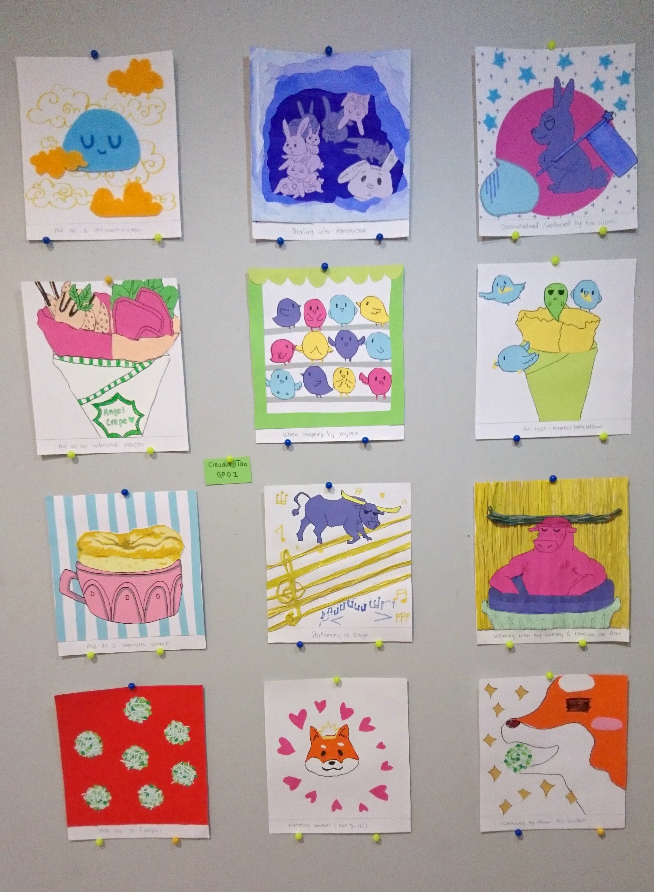
YAHOH! This is the final project for 2D, and (sort of) the semester!! ٩(⊙ᗜ⊙)۶ We were tasked to create four rows of three squares in the sequence of ME + SETTING = OUTCOME. We get to use any medium, technique, and style to create the pictures but we need to apply our knowledge of colour theory.
-INSPIRATION-
From the start, I already know that I want to work with paper and illustration. The reason is because in my portfolio, the works that I submitted were mostly drawings, and I chose to use paper cutouts for my stop-motion animation. Since I ‘start’ my ADM journey with paper and illustrations, I decided to ‘end’ it on the same note too hahaha!
I went to pinterest, FOR THE FIRST TIME, and I was super awed by so many works by other artists because so far, I was only exposed to other art pieces/styles through instagram and tumblr. So I was really impressed and inspired!
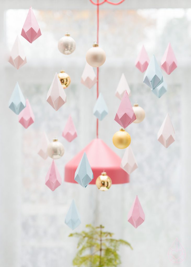
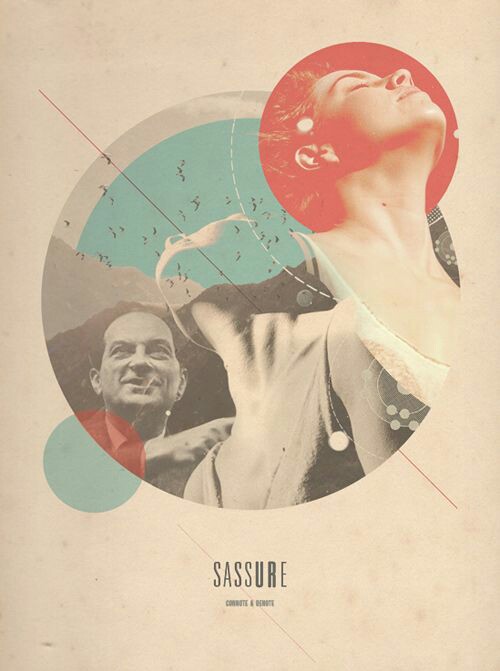
My inspirations were mostly types of paper cutting techniques and styles of arrangement.
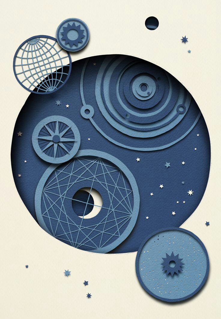
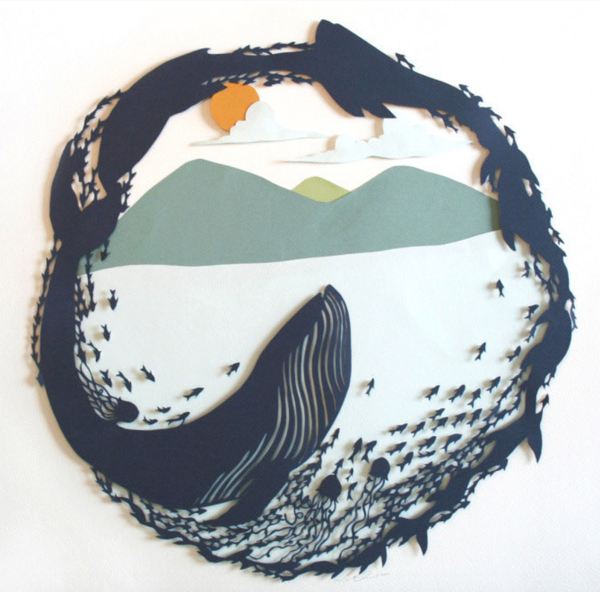
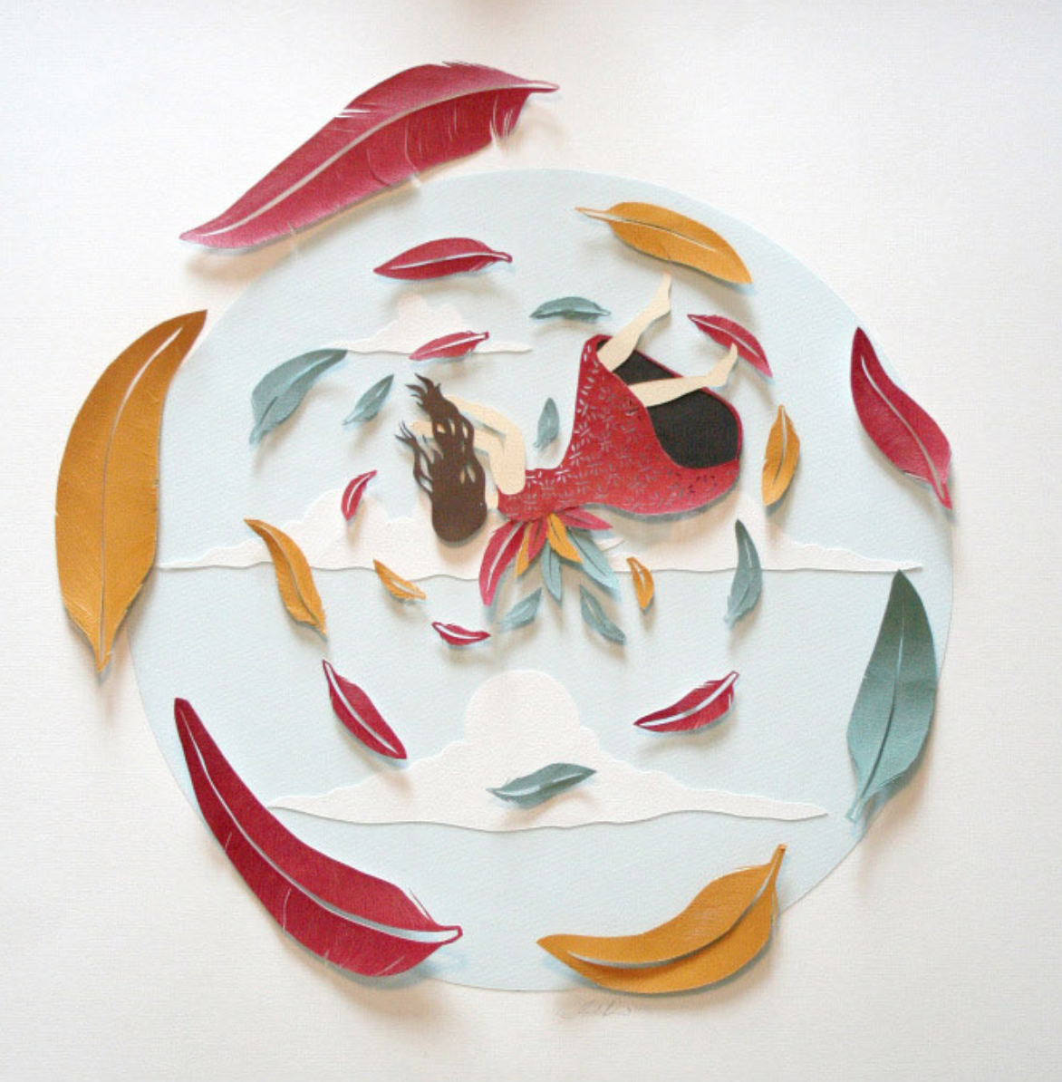
These circular designs help to draw in attention. Overlaying layers can create depth and textures. We can also play with adding small details in them to further draw people in.
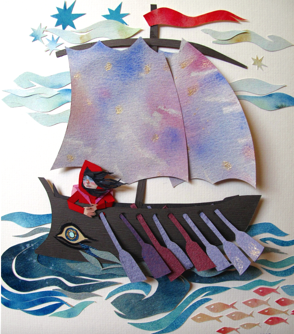
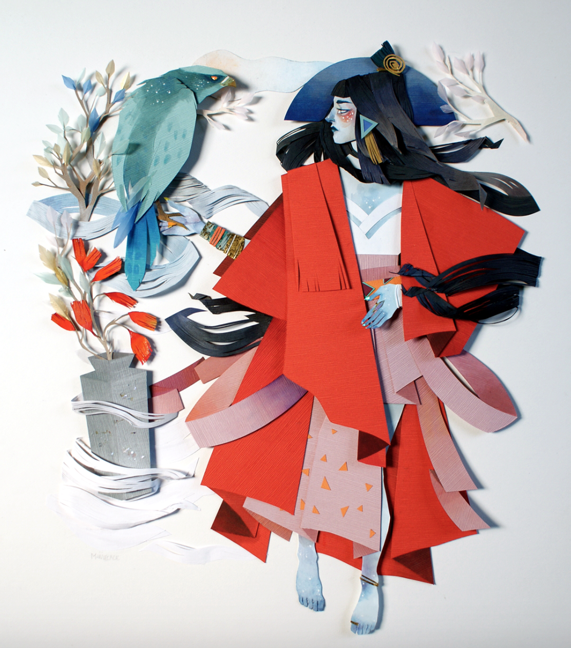
Use of papers with different textures: watercolour painted, text, metallic
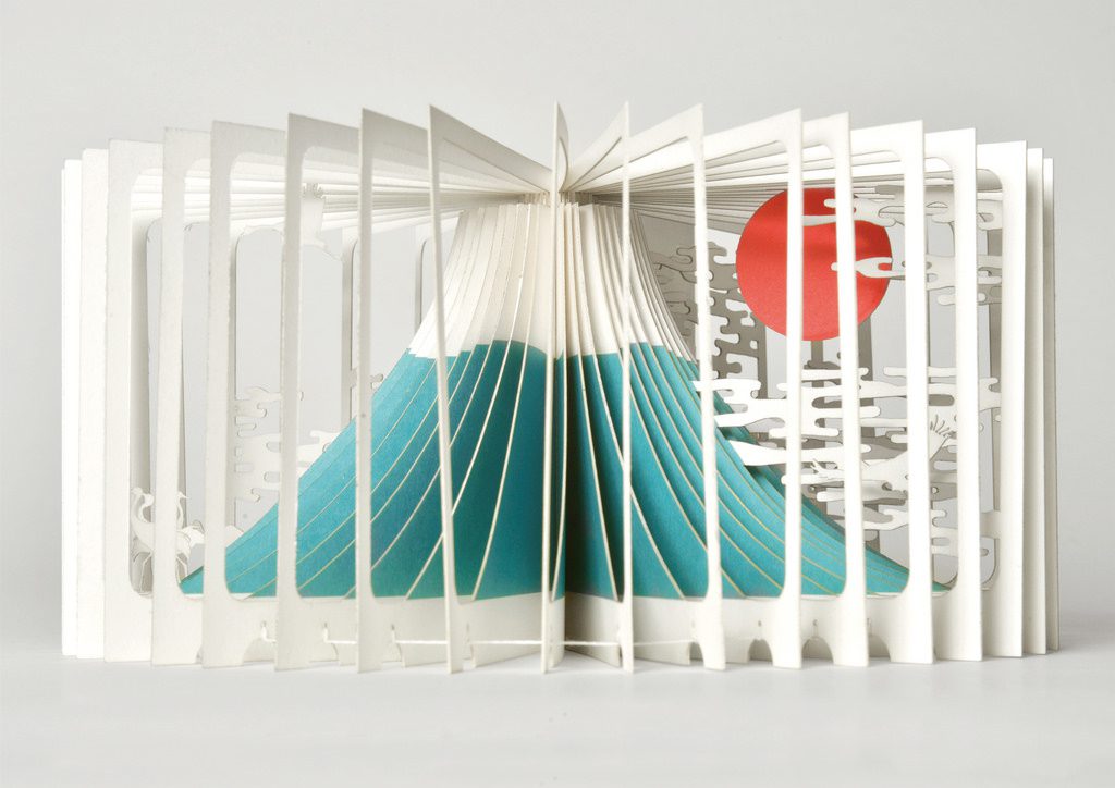
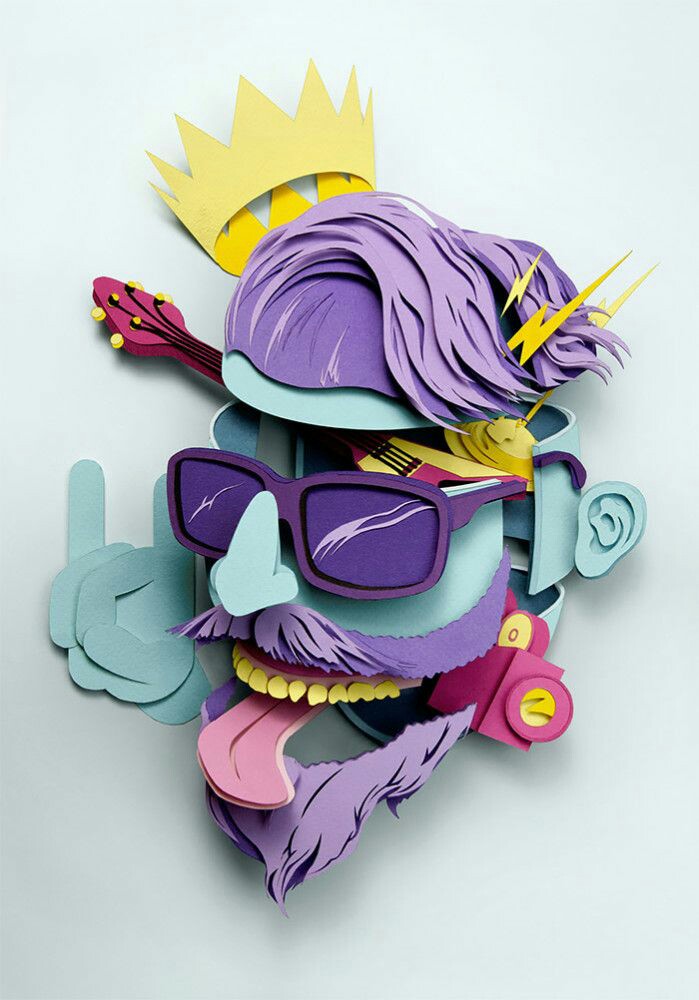
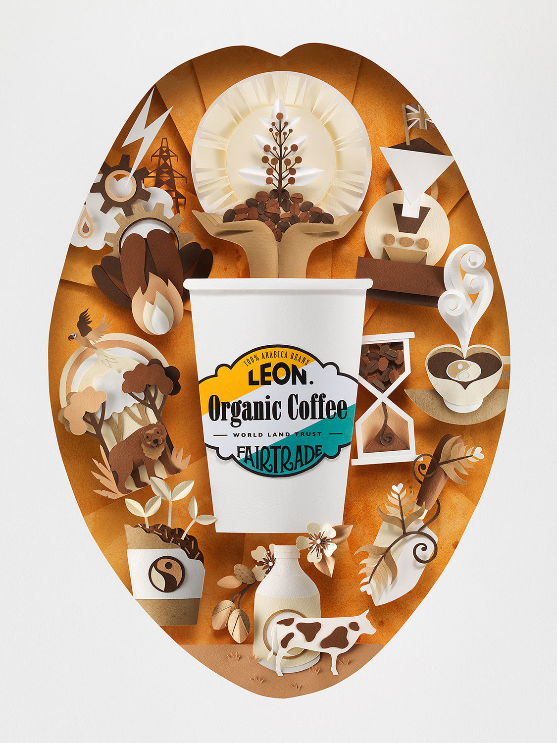
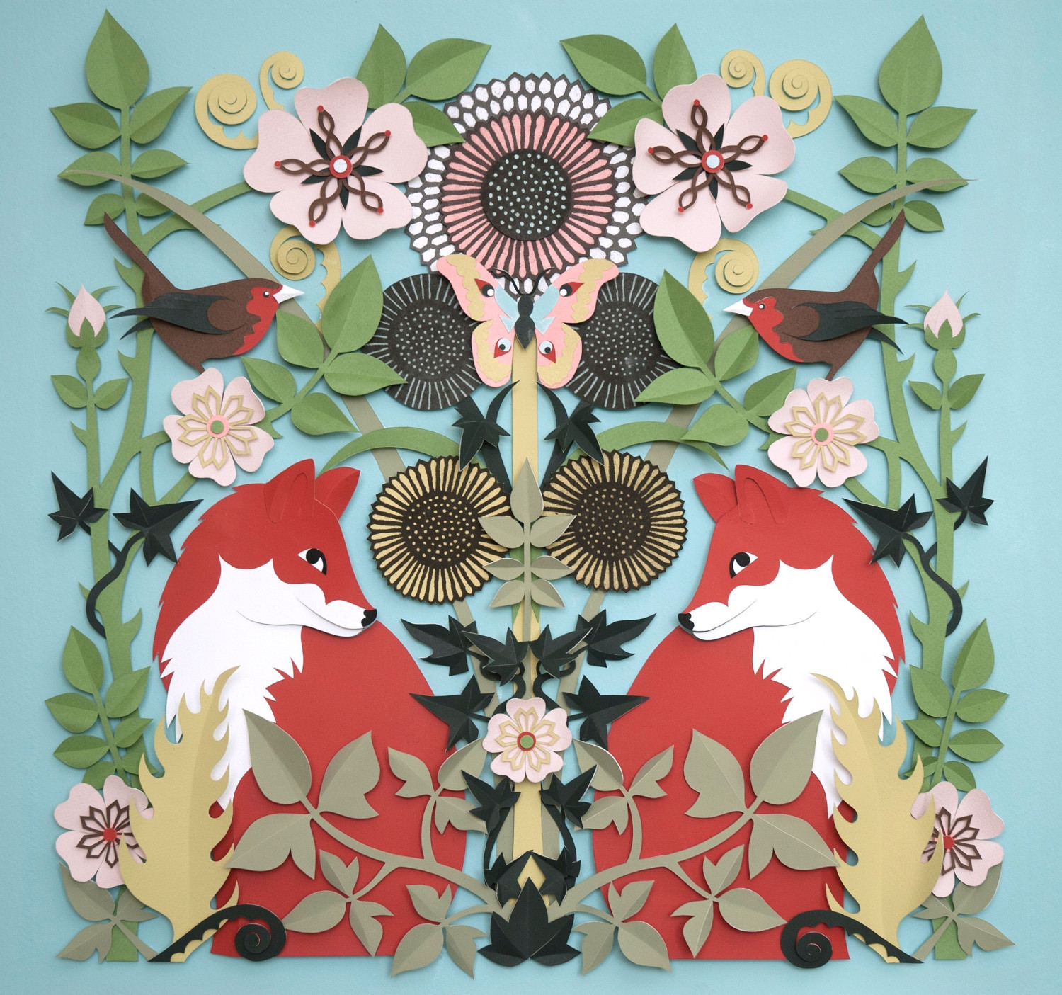
Intricate cuting styles, use of colours to create depth
Playing with the arrangement of papers to create unique visuals

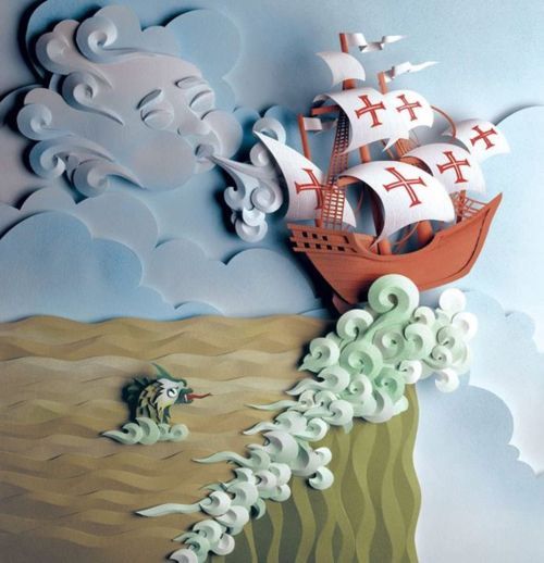
3D style in 2D??? (pop out effect)
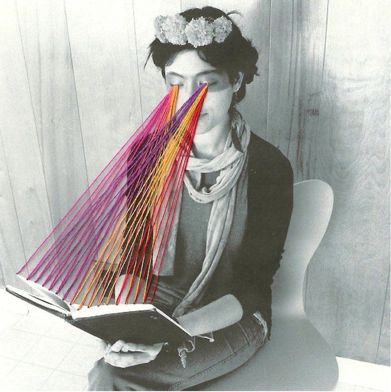
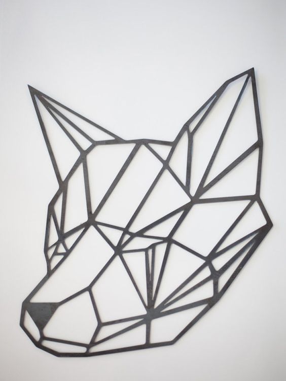
other styles: geometric, incorporating strings
-PROCESS-
First, I experimented with the possible colour schemes so that I can set a mood and come up with the ideas that relate to that mood.
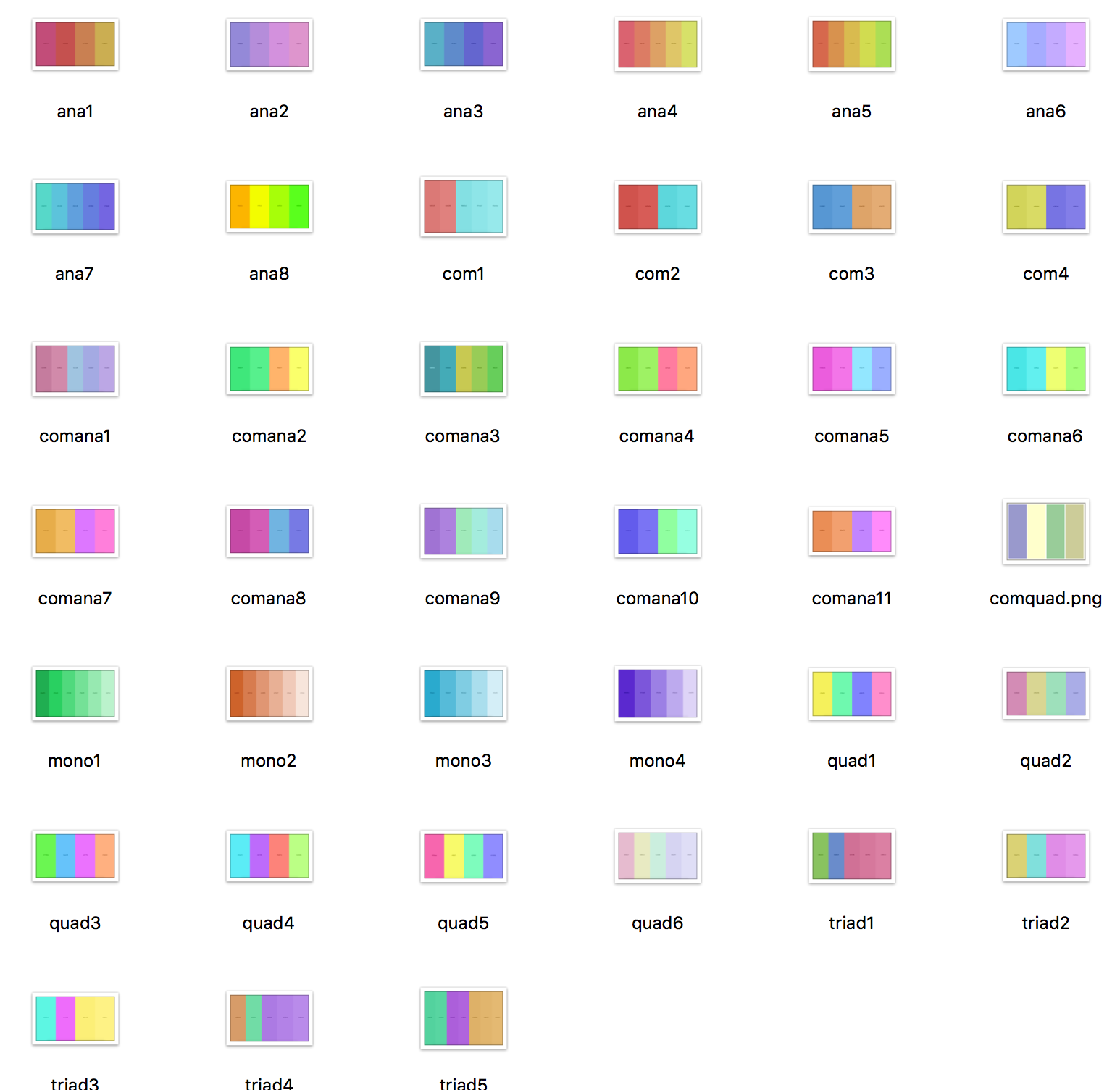
(please don’t mind the names HAHA)
I go with colours that I like, which are bright and pastel-looking.
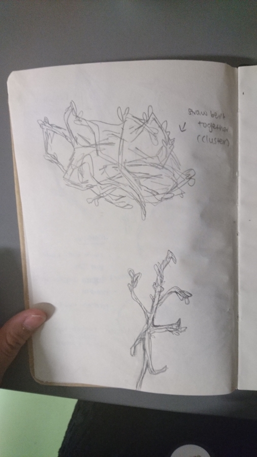
Secondly, coming up with the pictures. I was really at lost on what do.
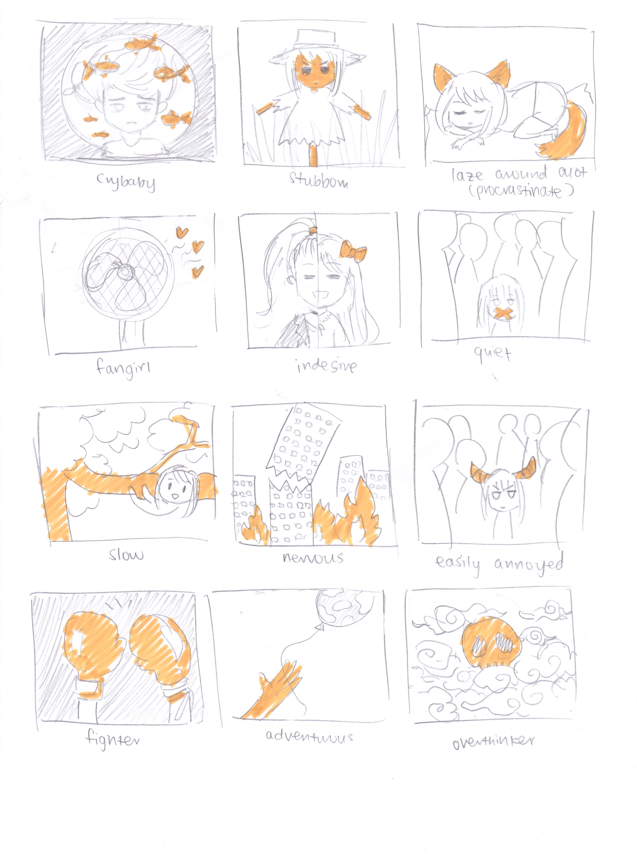
sketches of the possible me pictures
But after much thinking, I narrowed down to these four that shows what I’m usually like: PROCRASTINATOR, INDECISIVE, NERVOUS WRECK, FANGIRL.
Because I narrowed down, I was able to better visualise the settings that best represent me, and thus also able to come up with the outcomes.
- When I think of procrastinating, it is me dealing with HOMEWORK/DEADLINES.
- I get especially nervous when I’m about to PERFORM on stage
- I am already very indecisive all the time, but when I’m SHOPPING, I can be in the same shop for hours, just to decide if I should buy that item or not.
- And yes, I become a total trash when I’m WATCHING ANIME/READING MANGA. The hotness of cute anime guys is.. too… much.. for.. my.. heart…..
I will further elaborate the details below.
Okay so I came up with the ideas, but how should I represent them? I could draw them in the literal sense. But where is the fun in that. So I decided to use symbolism.
Since I love food and animals, I used desserts to represent me and animals to represent the settings! This helps to better translate my sense of humour in the outcome, showing my work style in this self-promo project.
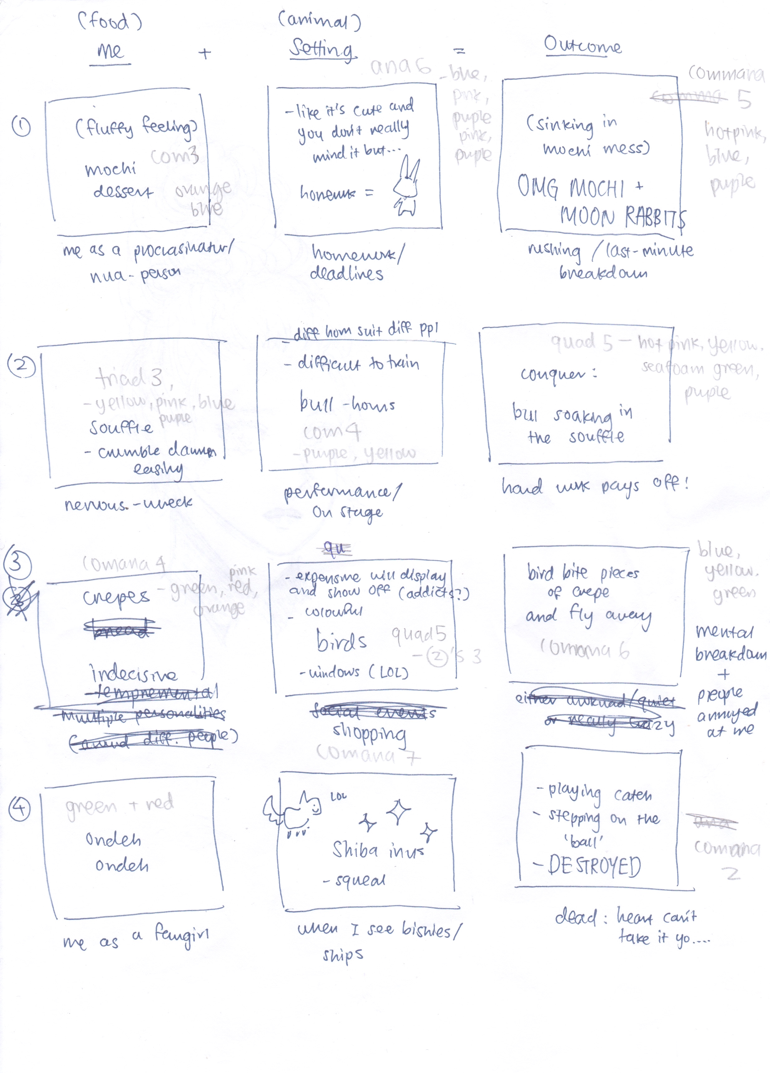
summary of the twelve pictures
-DESIGNS-
- PROCRASTINATOR ME + HOMEWORK = DEFEATED BY OVERWHELMING WORKLOAD
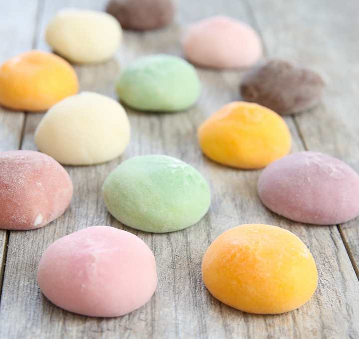
Because when I procrastinate, I become super lazy and just lie around in my comfort and not do anything, being this soft fluffy state. Making me think of mochi!
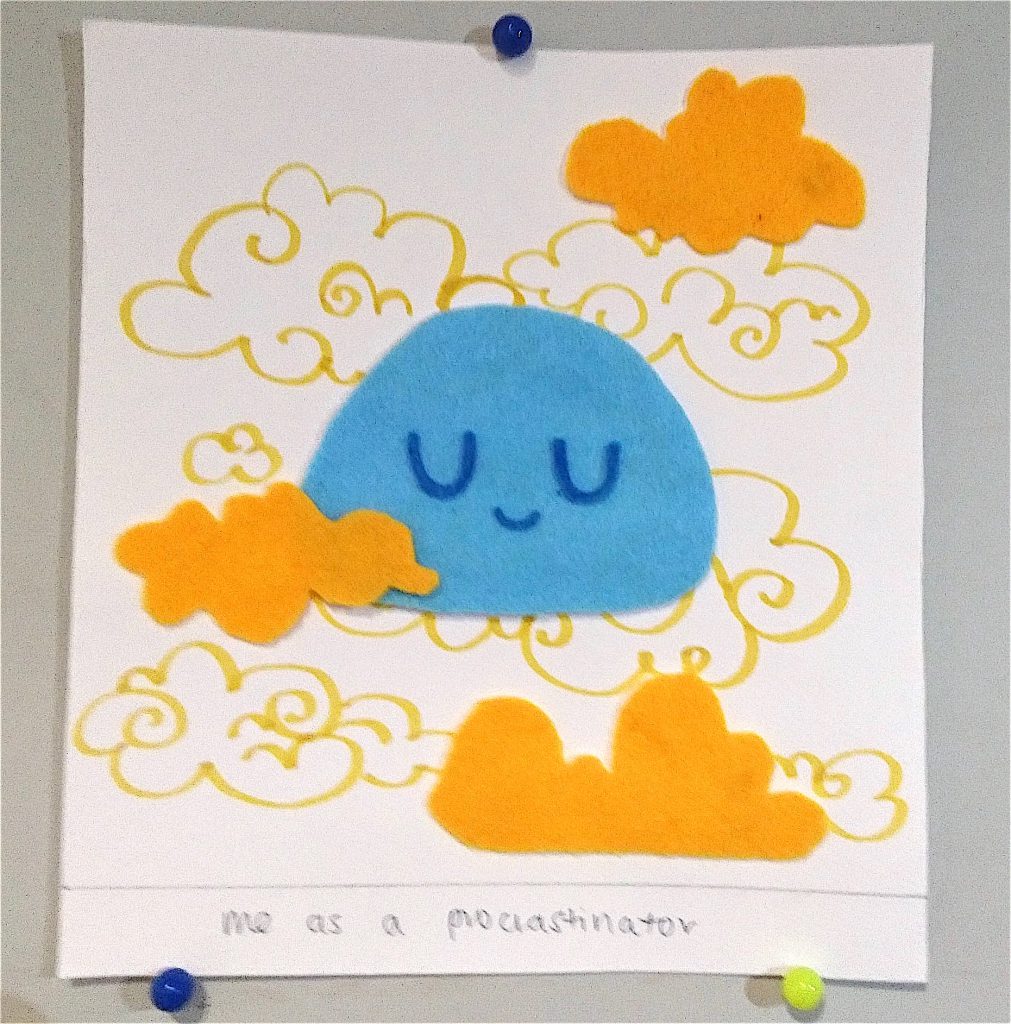
I incorporated the use of felt fabric as I wanted to convey the soft texture of my idea. I also drew clouds in the background for the dreamy like state. The colour scheme used is complimentary – blue and orange.
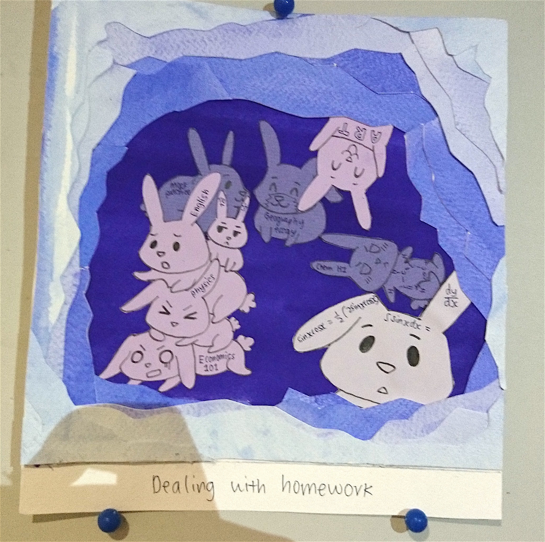
For homework: when it’s just one assignment, it looks ‘cute’ and harmless, and you will just leave it. But before, you know it, there’s suddenly one HUGE stack of work waiting for you. Just like rabbits, although they appear harmless, they are able to ‘reproduce’ at such a rapid rate and BAM! Holy moly, suddenly you suffocated by them!! To make my idea clearer, I also wrote subject names and academic stuffs on them.
I used monochromatic purple colour scheme. Because I could not find the exact shade of colour, I watercolour painted the shades used for the cave. I was inspired to do the ‘hole’ effect. It is purely coincidental that I chose to use rabbits, because by not dealing with my homework on time, I’m actually falling into a rabbit hole. I also drew the rabbits in three different coloured papers so that I can portray more depth.
I thought of how fitting it is for the outcome because in Japanese folklore, there are rabbits living on the moon and they make mochi! Because of that, I translated the outcome of me being overwhelmed by homework/deadlines as the rabbits looking intimidating and threatening me with a hammer LOL.
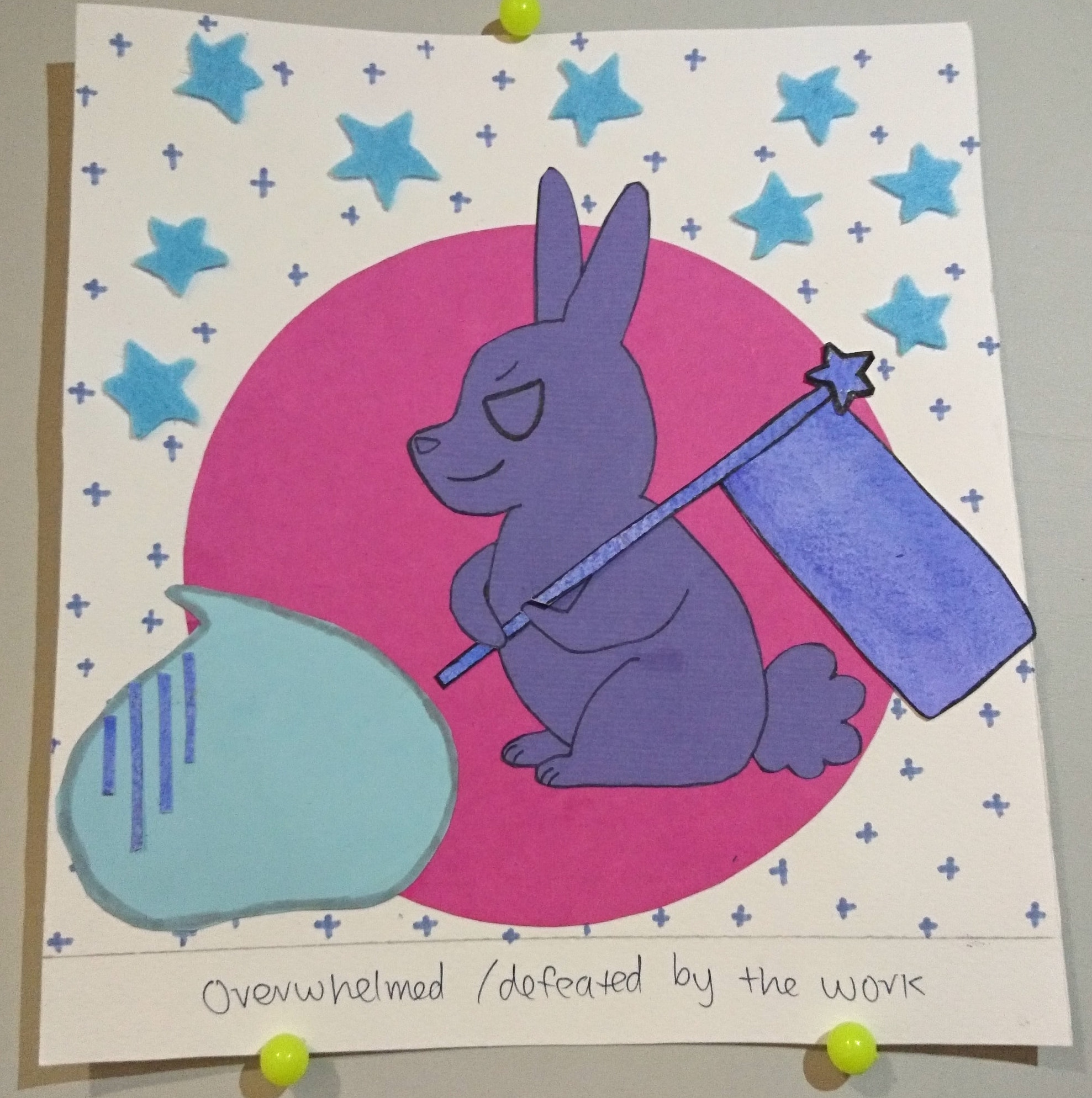
 I drew on the sparkles since I drew the clouds for the mochi piece. I cut out stars made of the felt. I placed the circle in the middle as I want it to represent the moon but I was also inspired by the graphical design style of including shapes in the work. I added the mini strips on the mochi to show how dreaded it is (I am) when facing the rabbit (homework). The colour scheme for this is analogous-complimentary.
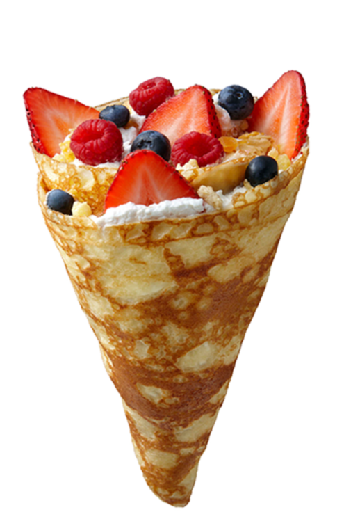
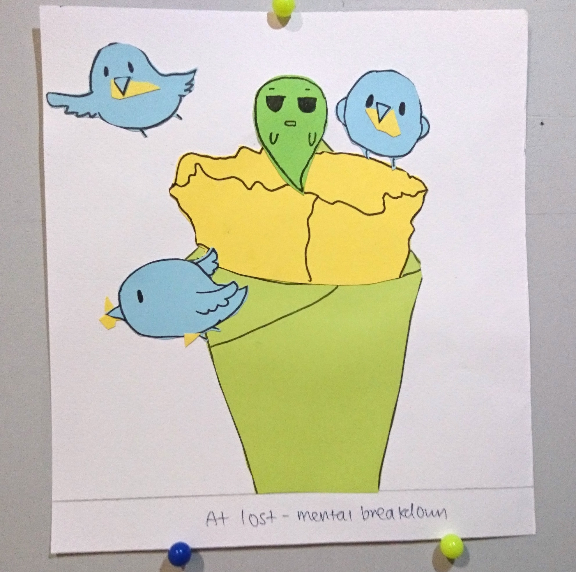
2. INDECISIVE + SHOPPING ALONE = MENTAL BREAKDOWN
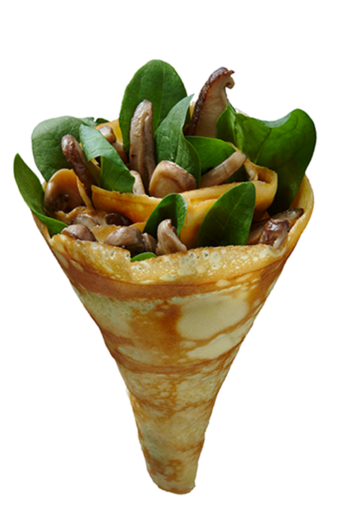
 I chose to use crepe as a representation of me as an indecisive person as crepes can be eaten as sweet or savoury. It can also be served hot or cold. Because of how there are two types of choices, it reflects how I am stuck into making a decision.
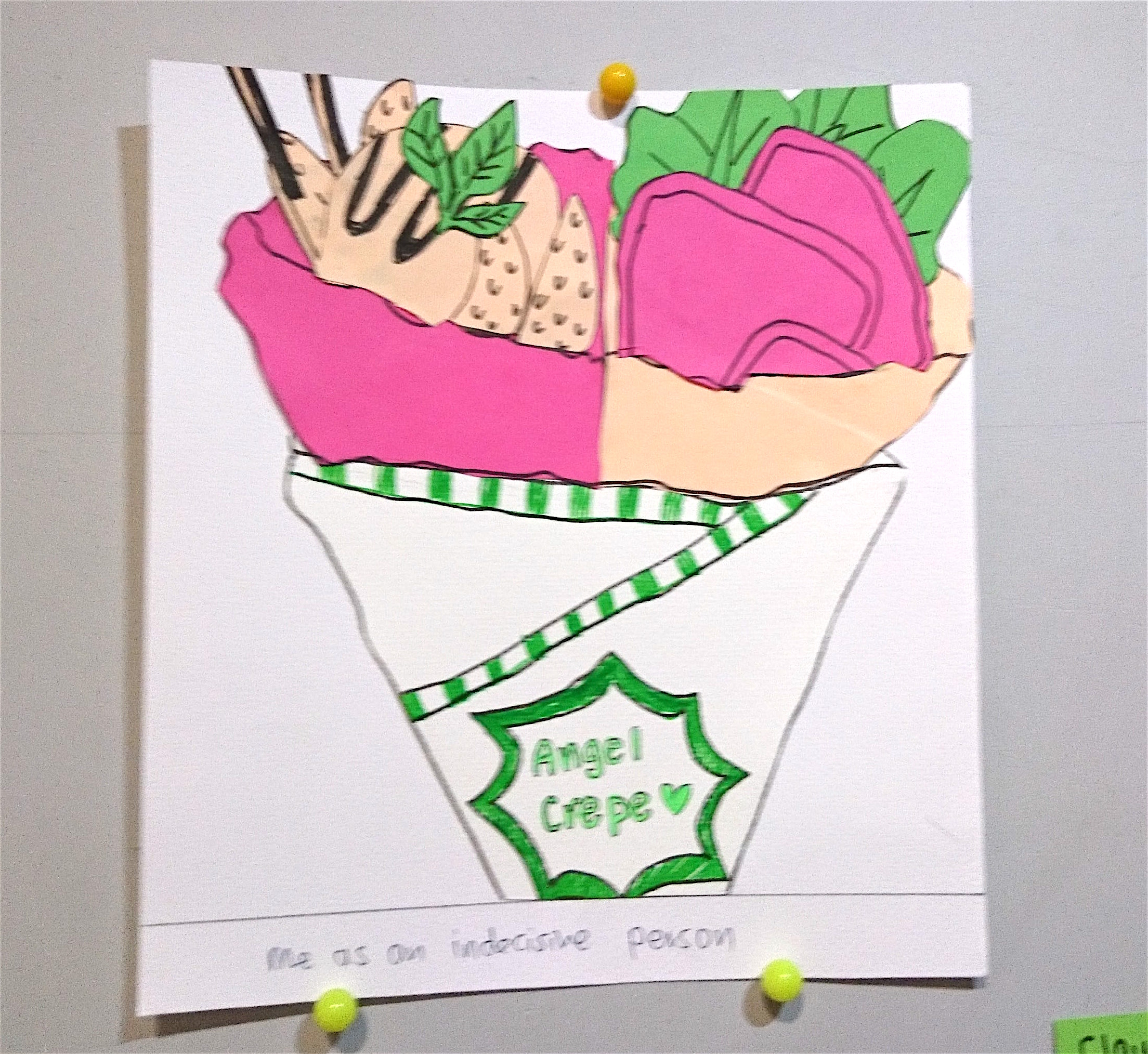
I used complimentary-analogous colour scheme. I cut out the different ingredient before assembling them together into separate parts – savoury and sweet.
I used birds to represent shopping because birds are colourful and has a lot of variety, making them attractive looking. There are also many people who enjoy buying/collecting birds as a hobby, like shopaholics. When they own an expensive breed or a beautiful one, they will show them off, like how people show off branded clothes too.
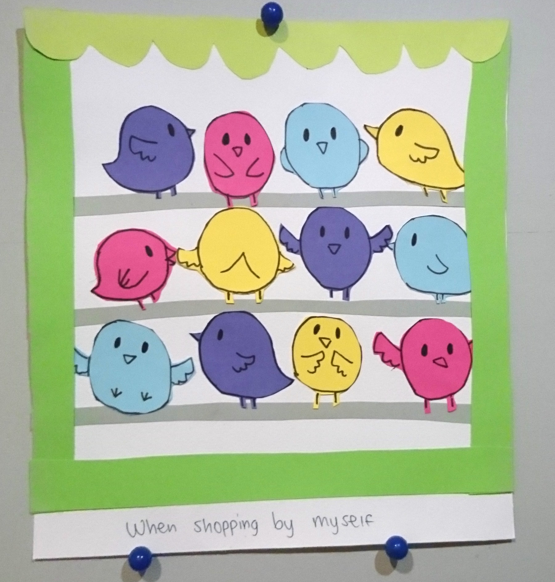
Notice how I drew the birds by the window because.. window shopping… heh.
I used quad-colour scheme so that I can show off more variety of colours of the birds.
For the outcome, I drew the birds picking away bits of the crepe. And that the crepe has lost its soul. This is to represent how I am getting more listless and mind blank when I spend even longer looking at the items and deciding if I should buy them. I used complimentary-analogous colour scheme of green, yellow, blue.
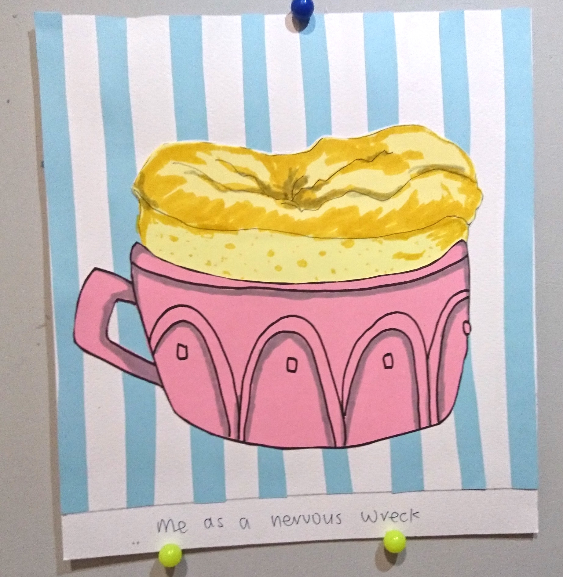
3. NERVOUS WRECK + ABOUT TO PERFORM = MANAGING TO OVERCOME FEAR
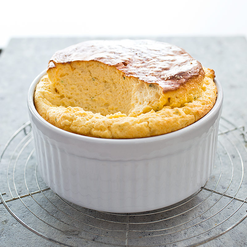 To show how nervous I get, I chose to use soufflé as the food to represent me. As they can be easily overcooked or undercooked, and collapse easily if not immediately consumed.
Basically, it is a very difficult dessert to make and eat… like how I’m a difficult person too. HAHA.
I added cut out stripes in the background so that it gives off the retro American vibes. I coloured on the soufflé to show the varying tones as it is too difficult to find the exact tones of yellow. I used triadic colour scheme of blue, pink and yellow.
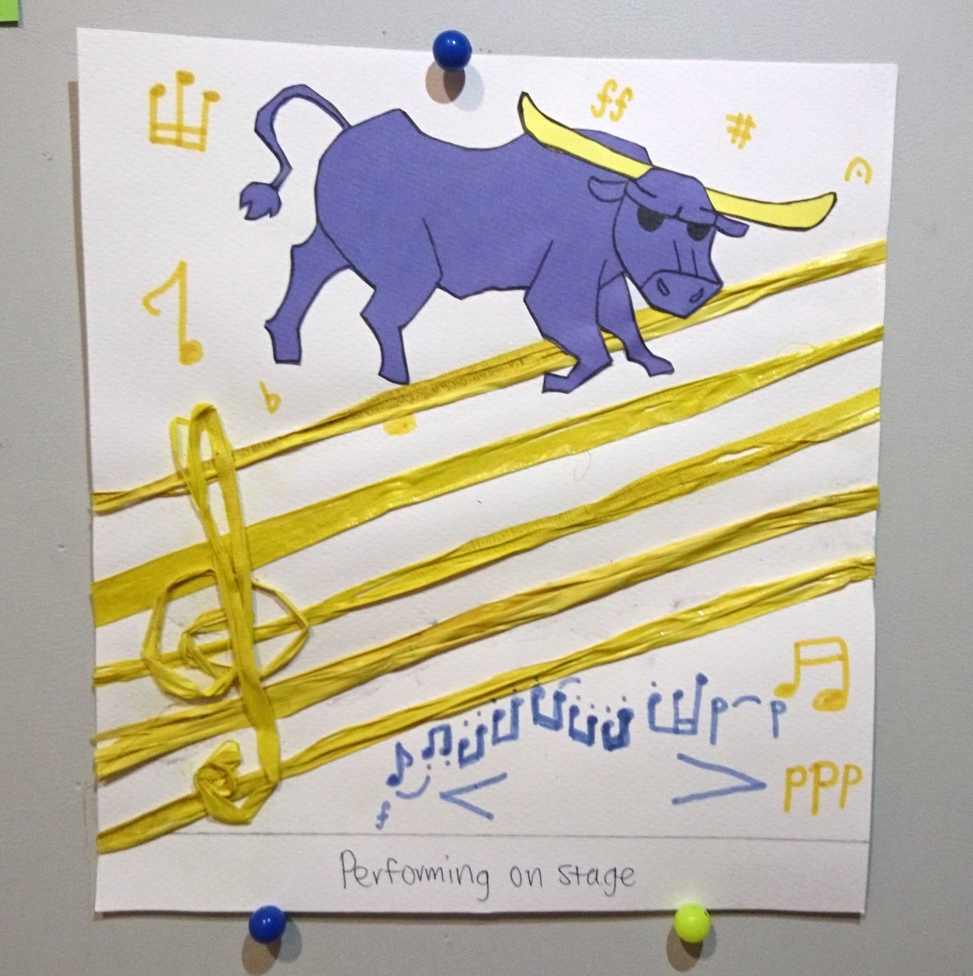
I chose the bull as my animal for performance on stage as they are intimidating. Like bulls, it is stressful to face our performance as they may ‘attack’ back. Because most of my performance experiences were from my band days, I decided to include musical elements in this piece. I drew the bull jumping over the fence, that looks like a music bar. I added the treble clef at the side to make it more obvious. I also drew on different musical signs in the background so that it is less plain.
The violet coloured notes is a the tune from my part.
(if you’re wondering what it sounds like)
I really like how coincidental my ideas are with my own experience. For my last major performance, it was the wind orchestra SYF in 2015. I was the first horn position so it was even more stressful than usual. The competition piece was El Camino Real by Afred Reed, a Spanish style piece. The horns of the bull are to represent the instrument that i play – the french horn. It is also interesting how in Spain, they are famous for bull fighting where the matador must confront the intimidating bull only after a long period of intense trainings, like how I was prepping myself for the competition.
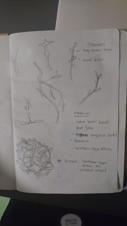
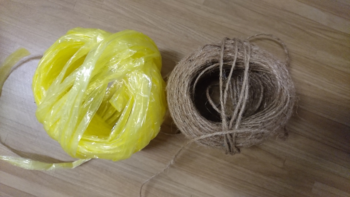
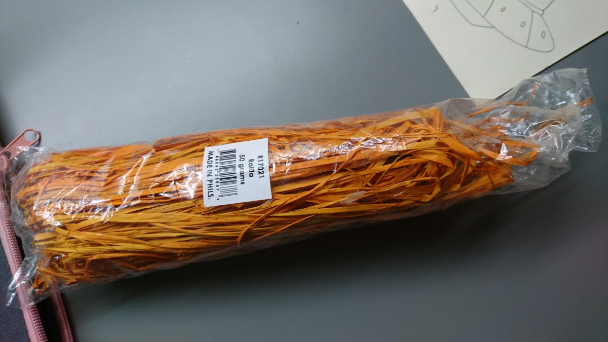
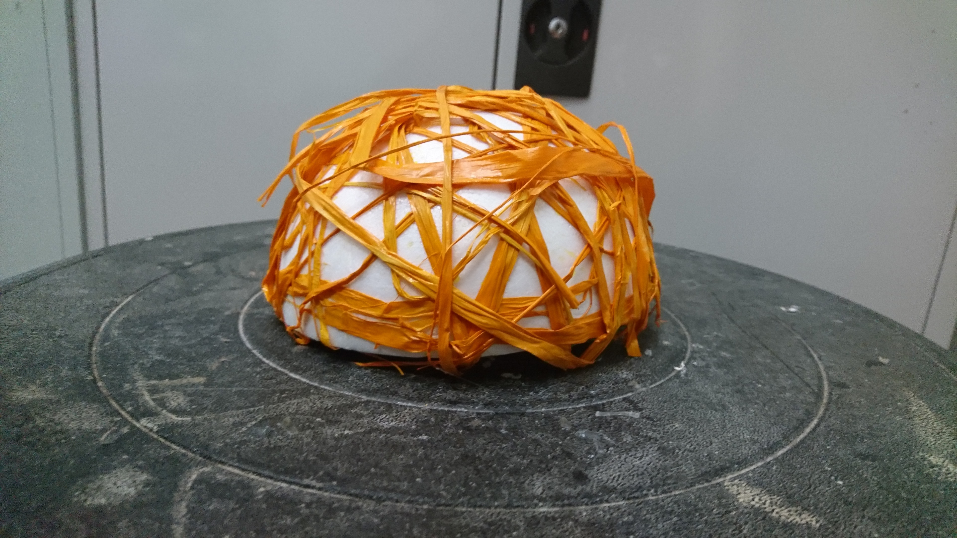
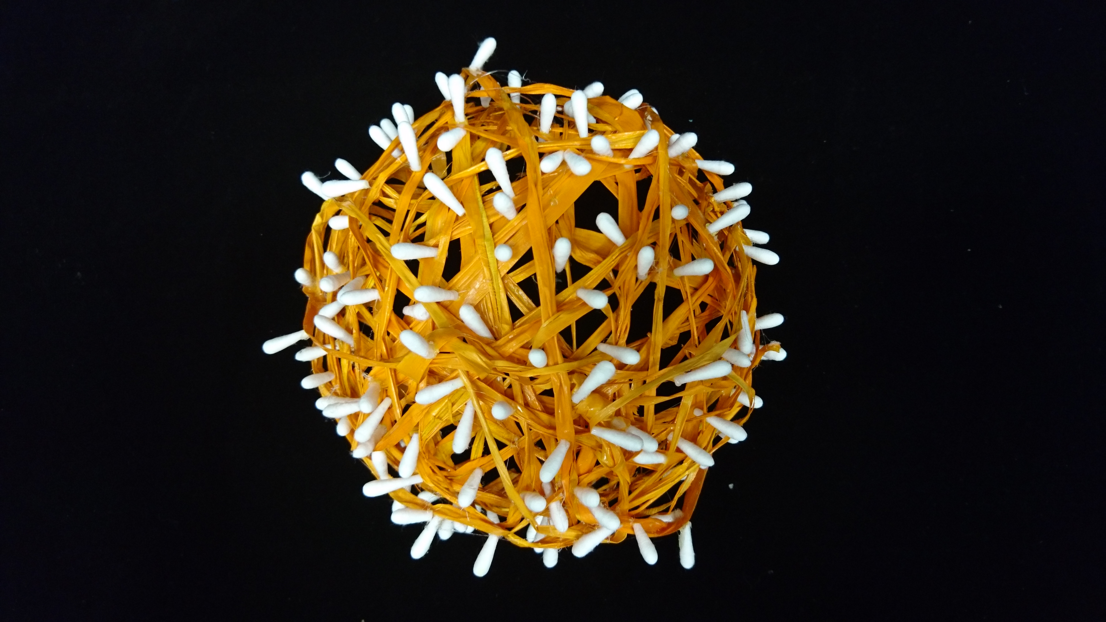
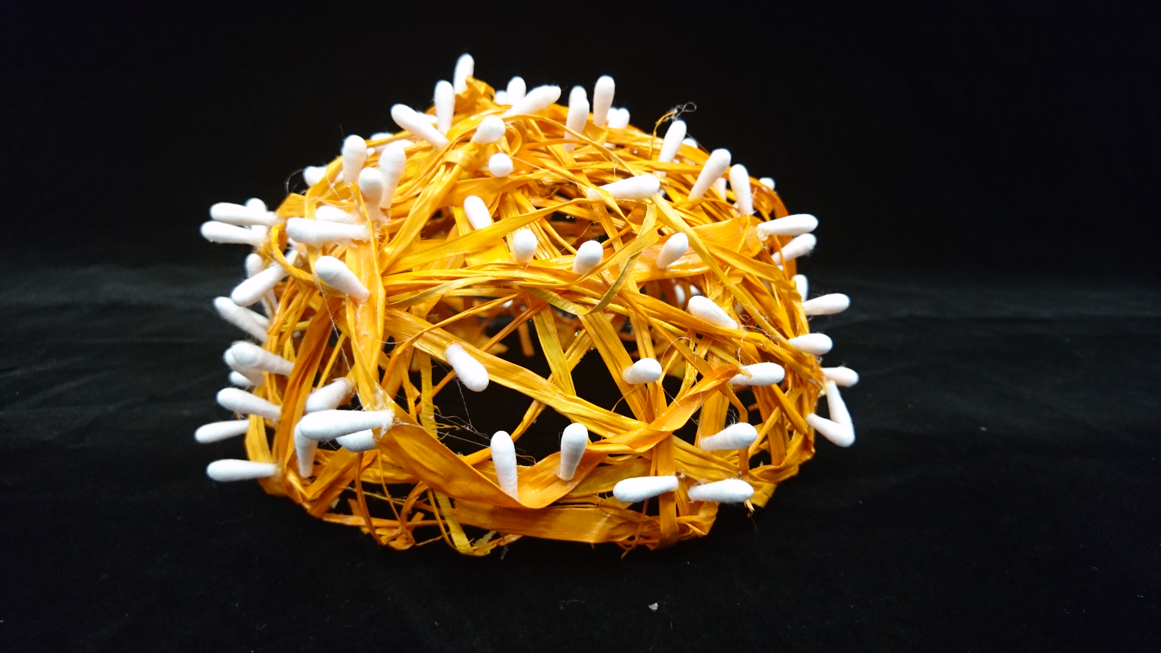
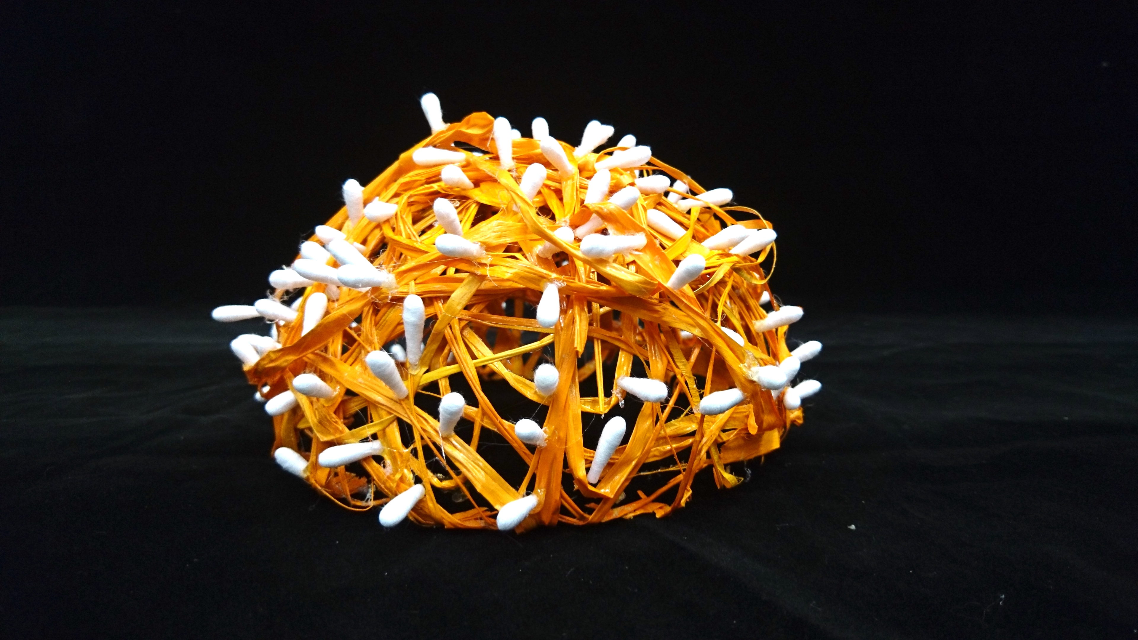
I decided to use raffia paper strings as I wanted to try out different textures, and since I have a huge amount of them from of my 3D project, I didn’t want to waste them (LOLLLL). The colour scheme used is complimentary: purple and yellow.
For the outcome, I want to show that despite my nervousness for every performance, I am always able to work with my anxiety and in the end, delivering a great performance (not to blow my own horn. alright this pun game needs to stop)
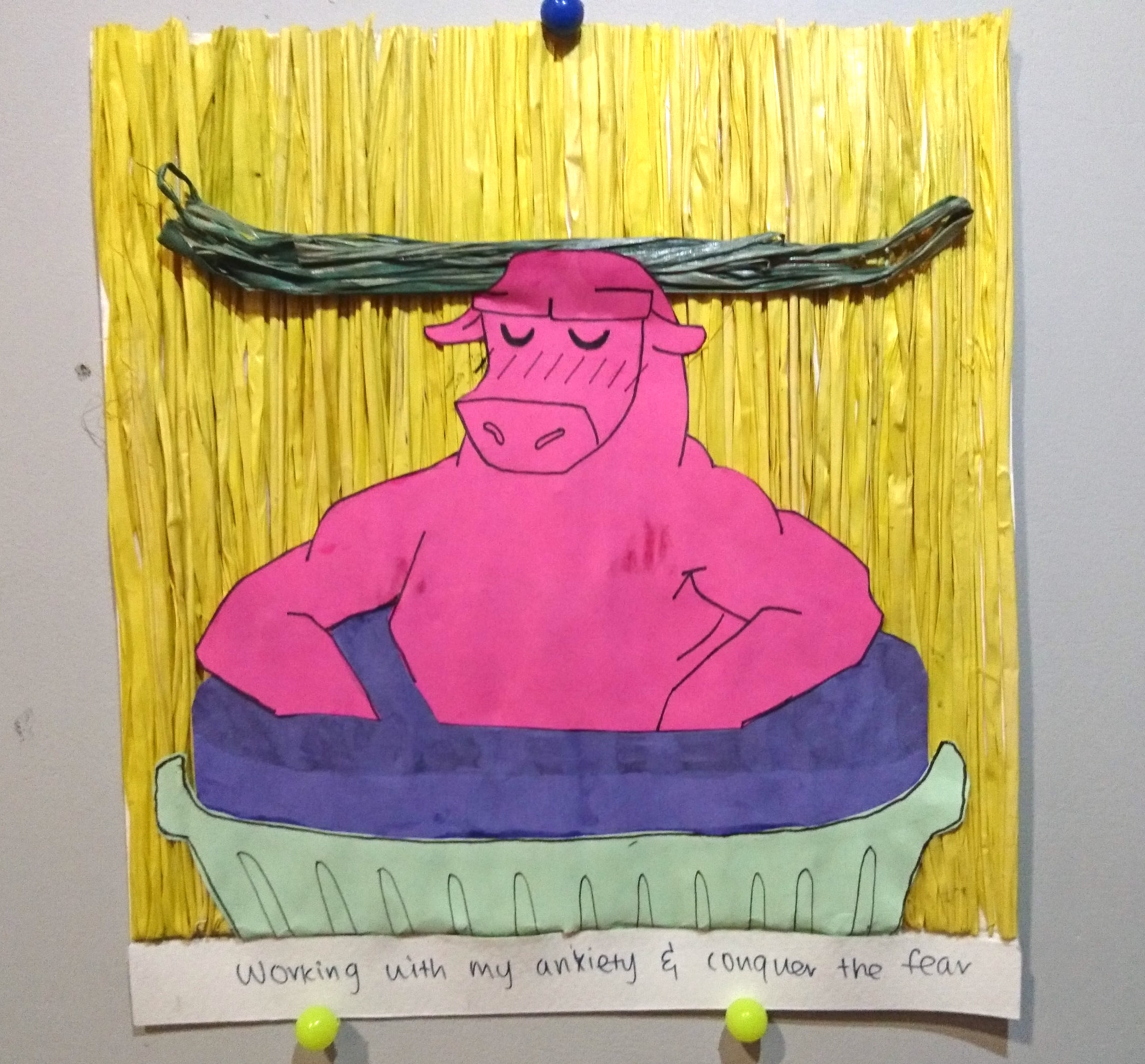
Which is why I drew the bull soaking in soufflé goodness and enjoying them, like in a hot spring! I combined the two pieces styles by adding the raffia paper strings in the background as a bamboo wall – like what you see in a Japanese hot spring room (onsen). I also used the raffia string as its horns as well. I like the effect of the raffia strings as it delivers the texture of how bamboo is like, and how it accents the horns. The colour scheme used is quadratic.
4. FANGIRL + ANIME/MANGA HOT GUYS = CAPTIVATED (DEAD)
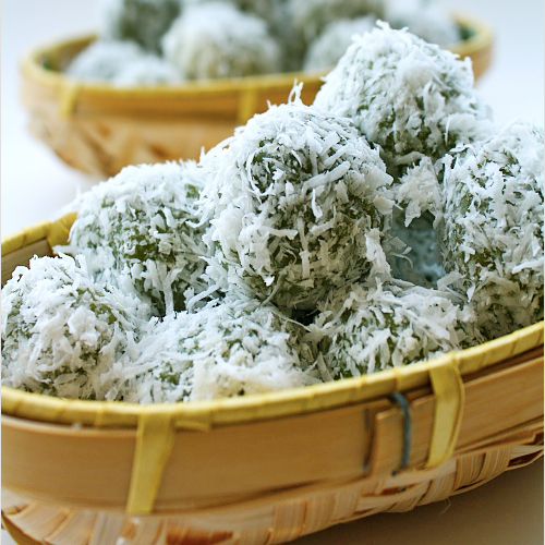
To express my fangirl side, I used ondeh ondeh as the food to represent me. The gula melaka filling inside is hot. When you bite into it, the filling explodes in your mouth and melts into a sweet delicious mess (this was not meant to sound erotic)
Which is like me! When I fangirl, I turn into a screaming hot mess. And get it, because the filling flows out… like my feels. Overflowing feels. Sorry for being lame again. /coughs/
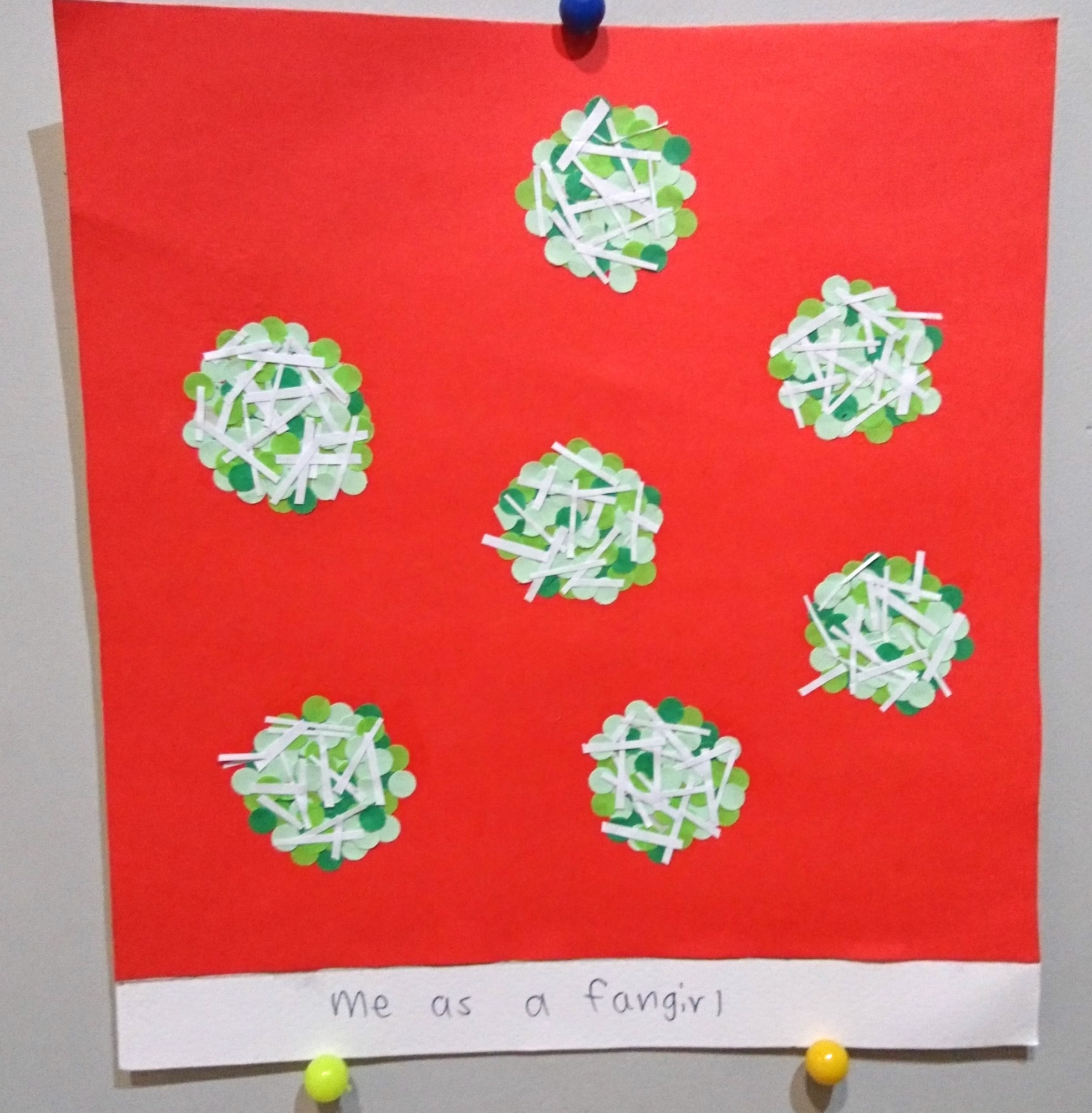
I used the hole puncher and made many mini circles of different tones of green. I then pasted them all together to form a circular shape. I think this makes the ondeh ondeh look more interesting rather than just cutting out circles from a piece of green paper. I also added little white strips on top to imitate the coconut shreds. I used complimentary colour scheme of red and green. The red background really helps to push out the contrasting colours of the ondeh ondeh.
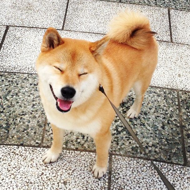
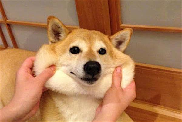
I chose to use shiba inu, a type of dog breed to represent the hot anime guys.
For both shiba inu and anime guys, they are both really cute and I just want to squeal and hug them and spazz over their attractiveness. And well, they are also both from Japan….
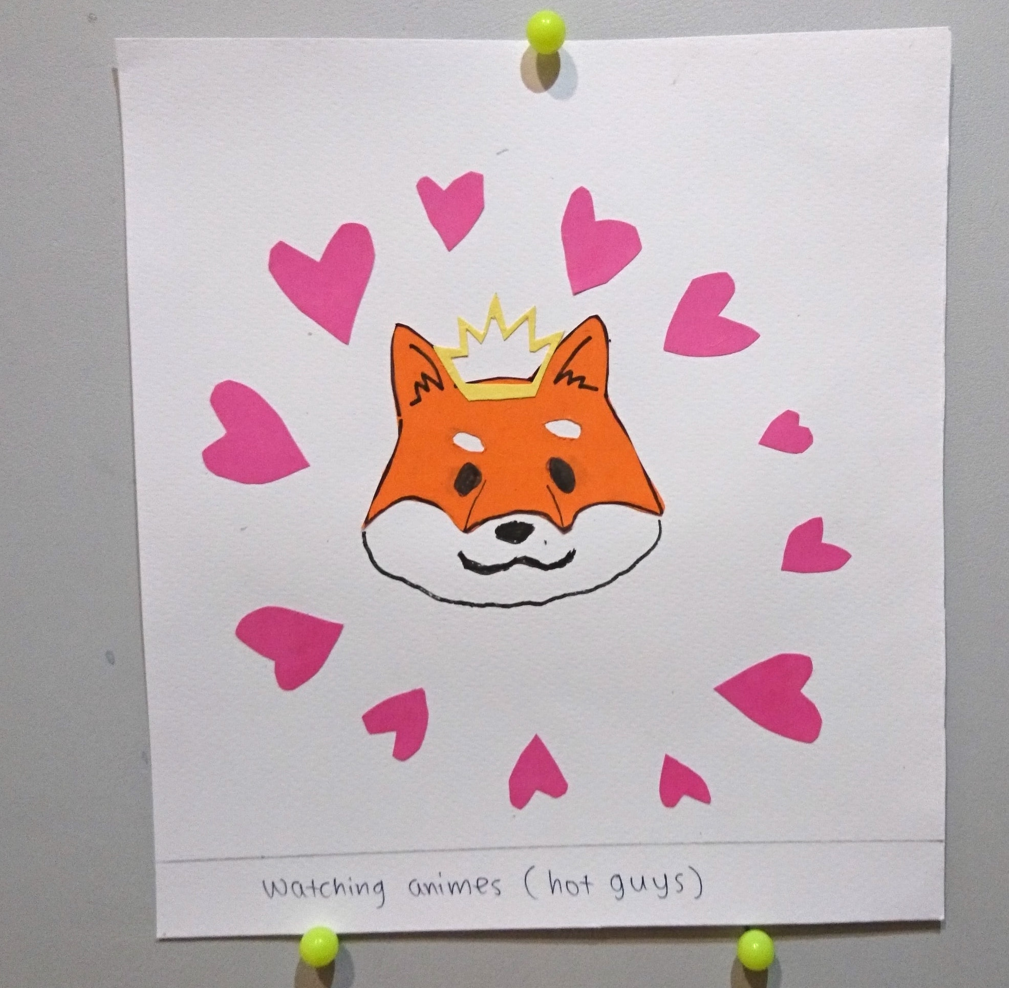
I thus added the circle of hearts around the shiba inu, after getting inspired by the circular design style from my inspirations, as I want to show how well loved they are. Instead of just cutting out the whole face of the dog, I just cut out the orange part of the shiba inu and used the background as the white parts of the dog. I also added a crown on it as they treated like royalties by the fans (actually more like Gods). I used a triadic colour scheme.
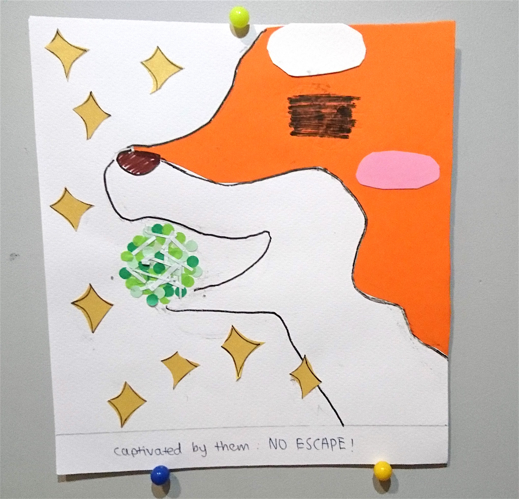
For the outcome, I conveyed how my heart gets captured by them by showing how I’m treated like a toy ball and that the dog is biting on to me, so I can’t escape anymore from their overwhelming cuteness /cries/. Like the previous piece, I only cut out the orange part of the dog. I added the sparkles around them to show the ‘heaven’-like state. The colour scheme used is complimentary-analogous.
-PRESENTATION-
-REFLECTION-
To be honest, I was very rushed to complete all the pieces and it is a pity how I could not apply all the inspirations that I got. The pieces could really look more neat. I could have done better by adding more details to my work and making the backgrounds less plain.
But I am still very proud of the results and I love every piece! I like my choices in the variety of colour schemes and how the designs worked together, in the narrative sense and also the mixture of techniques. By using paper and cutting the pieces in a collage style, it makes the illustrations look more cute and casual. It was really fun showing off myself hahaha.
Through this project, I learned that I should really study more on colour theory to improve on future work.
That’s all, thank you! Sorry for rambling so much. (^_^)v