Category Archives: Foundation 2D 2 – G8

Research – DADA

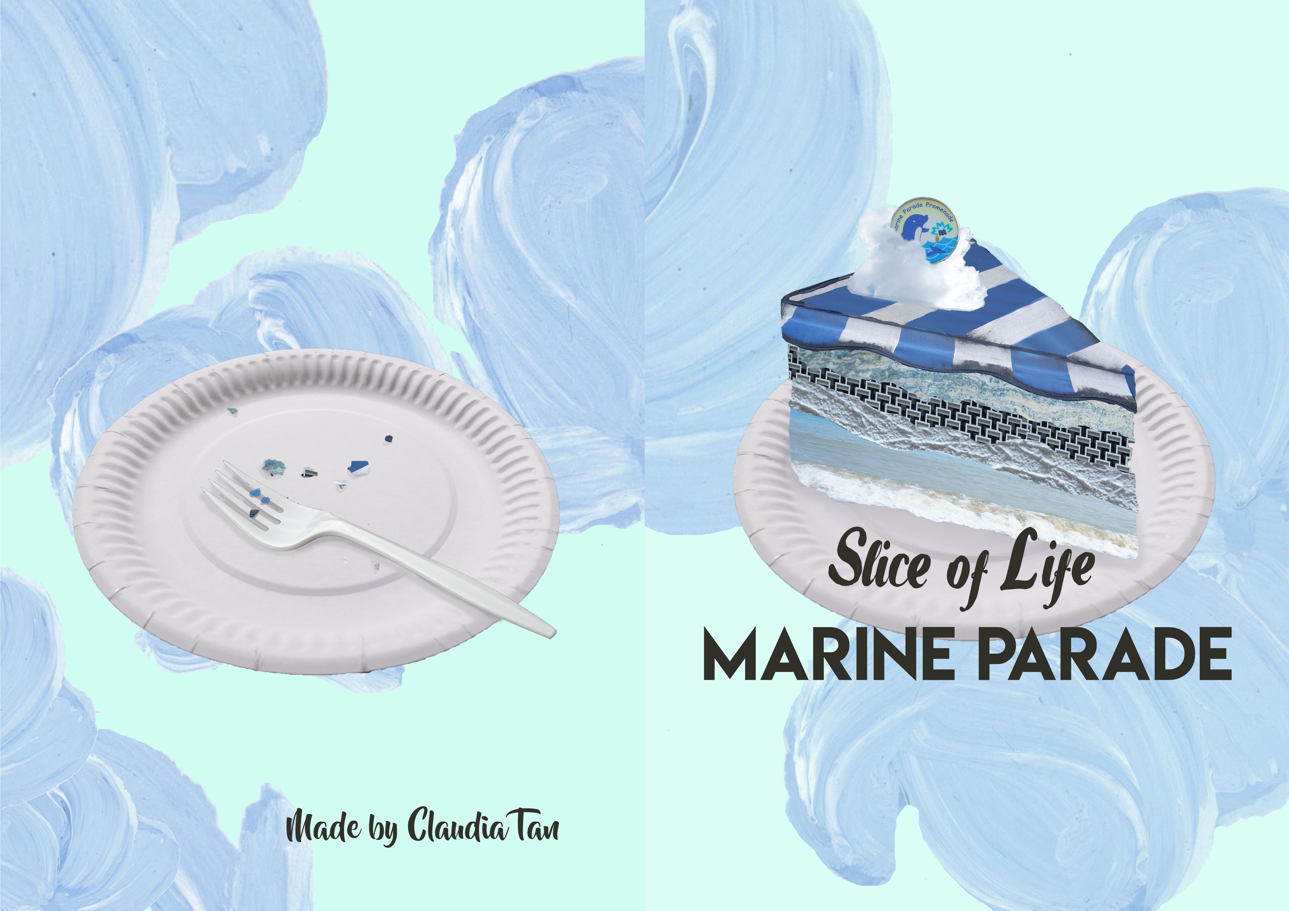
While researching about Dadaism, I didn’t expect myself to be so intrigued by this art style. At my first glance of Hannah Hoch’s works, they just look like a bunch of cut outs being pasted together. I do think that the composition of the pieces look nice despite the offset in proportions, but that was just it. It was until I read what the Dada movement is about that I realised that, “OH. The meaning behind is actually meaningful!!”

So, what is Dada?

Silly as it sounds, it is a rebellious art movement that ‘mocks’ the norm and invokes thoughts about society. It started at around 1916 as a reaction to violence and deaths of World War 1 and the patriotism of people that led to the war. The artworks are not meant to be aesthetically pleasing but to get people to question about the nationalism and societal structures. It was goofy and sarcastic and playful movement although it was a form of protest. By throwing aside rationality, Dada artists experimented different ways and materials to express their creativty! The artists usually includes topics about technology and uses cutouts from print media to showcase the increasing connection with the modern life.

The artists themselves question their purpose as artists and that constitutes as art. This led to the spontaneous process of using untraditional materials to mix and match to create artworks. They will gather different pieces of papers/photographs or other materials and arrange them. There also other various forms of Dadaism through sculptures and performance art but we shall leave that for now hahaha.

Photomontage & Collage

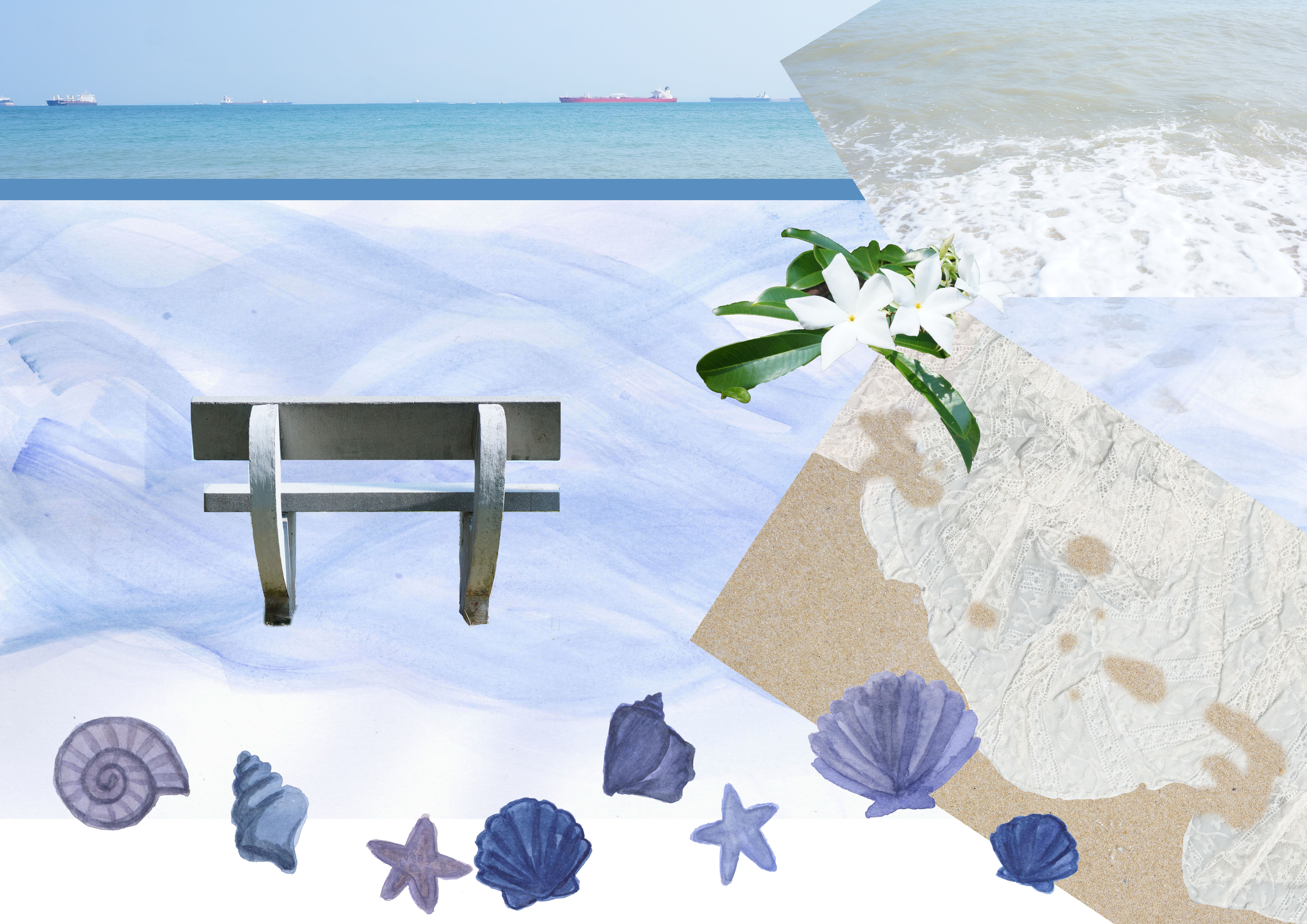
For collages, artists used a wide range of materials, from a subway ticket to a piece of handkerchief, they paste the fragments to create a chaotic but neat image.

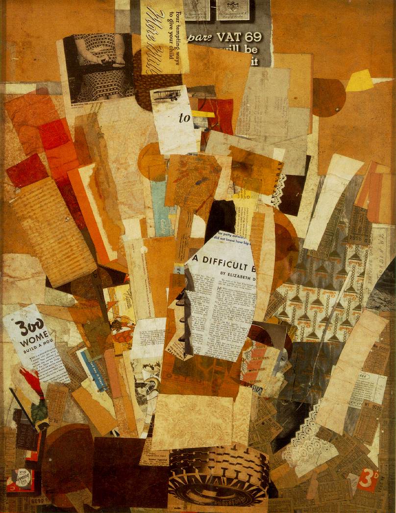
(Kurt Schwitters – Difficult, 1942-43)

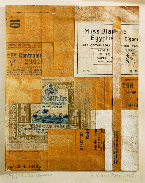
(Kurt Schwitters – Merz 231 Miss Blanche, 1923)

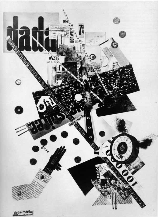
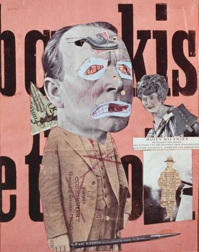
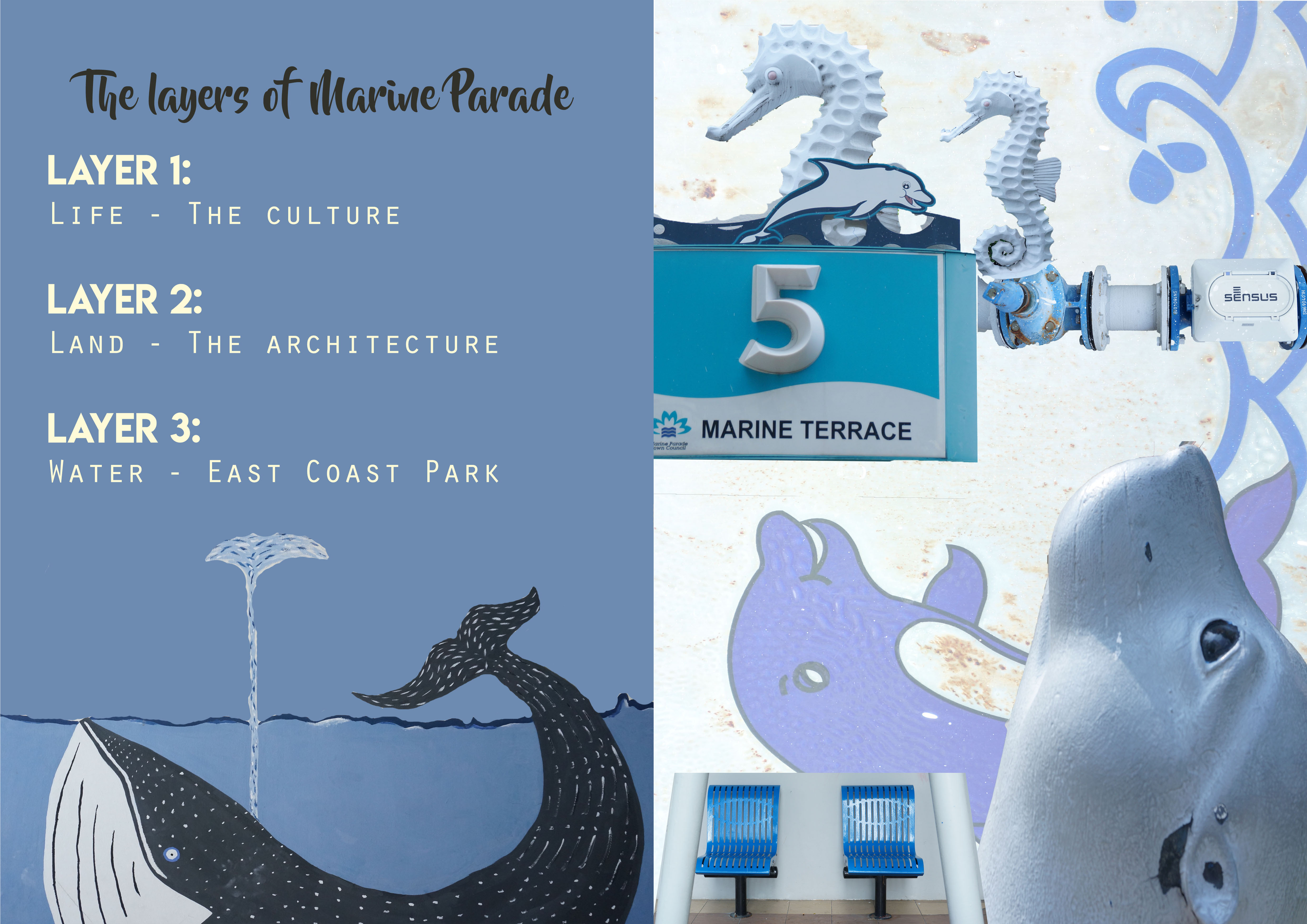
For photomontages, it is a collage of pasted items of existing photographs from the press or photographic reproductions. This form of Dada is more commonly practiced by artists as it effectively shocked the public when they see photos of important figures that they were used to seeing, being edited in a nonsensical way. The fact that they used printed media to create artworks, and arrange the pieces unthinkingly challenges the concise traditional art form of painting.

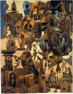
 (Hannah Höch – Cut with the Kitchen Knife through the Beer-Belly of the Weimar Republic, 1919)

Typographies

“They would use as many different fonts as they wanted, would punctuate in unconventional ways, loved to drop random letters or symbols throughout their pages.  They would also print both horizontally and vertically on the same paper, composing indifferently in any direction.”

Artist played with different composition styles with texts to create a visually popping effect, sending hidden messages about politics or social problems. There was a close relation between text and images, using a variety of lettering formats and line dimensions.

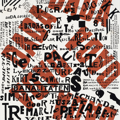
(Kurt Schwitters & Theo van Doesburg – Poster design, 1922)
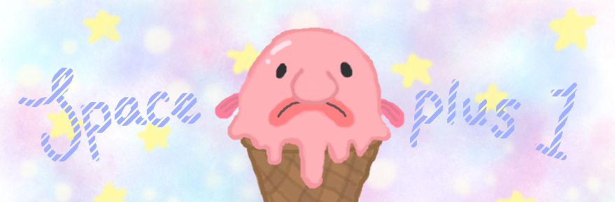
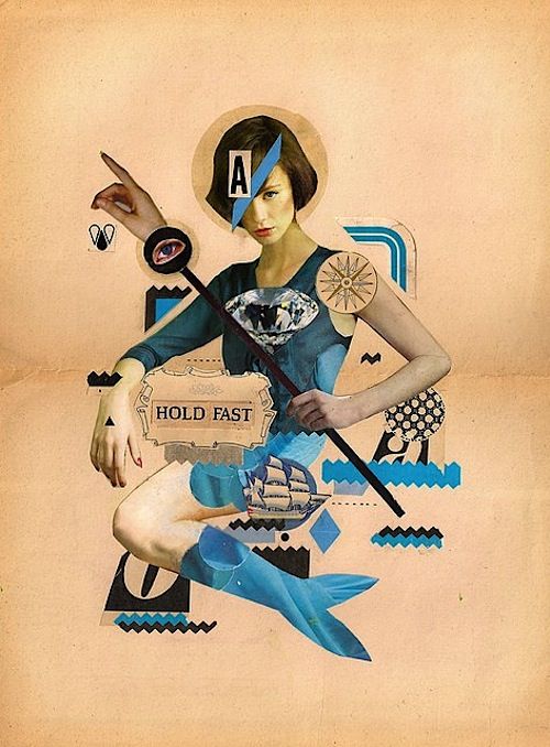
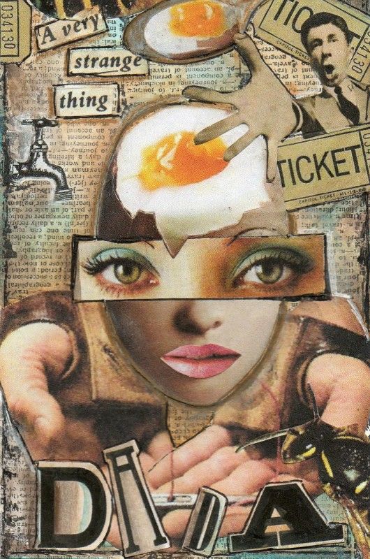
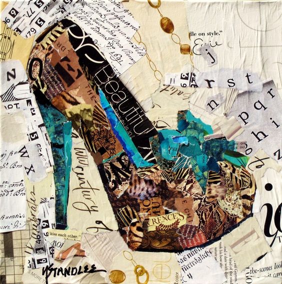
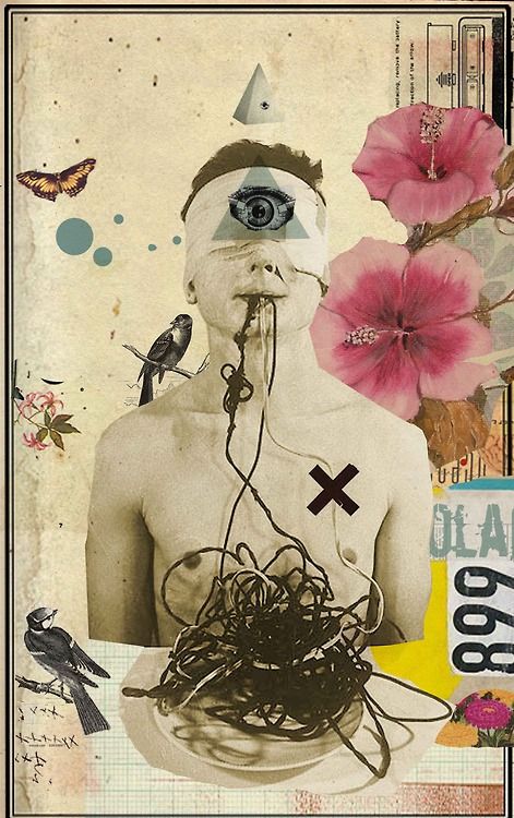
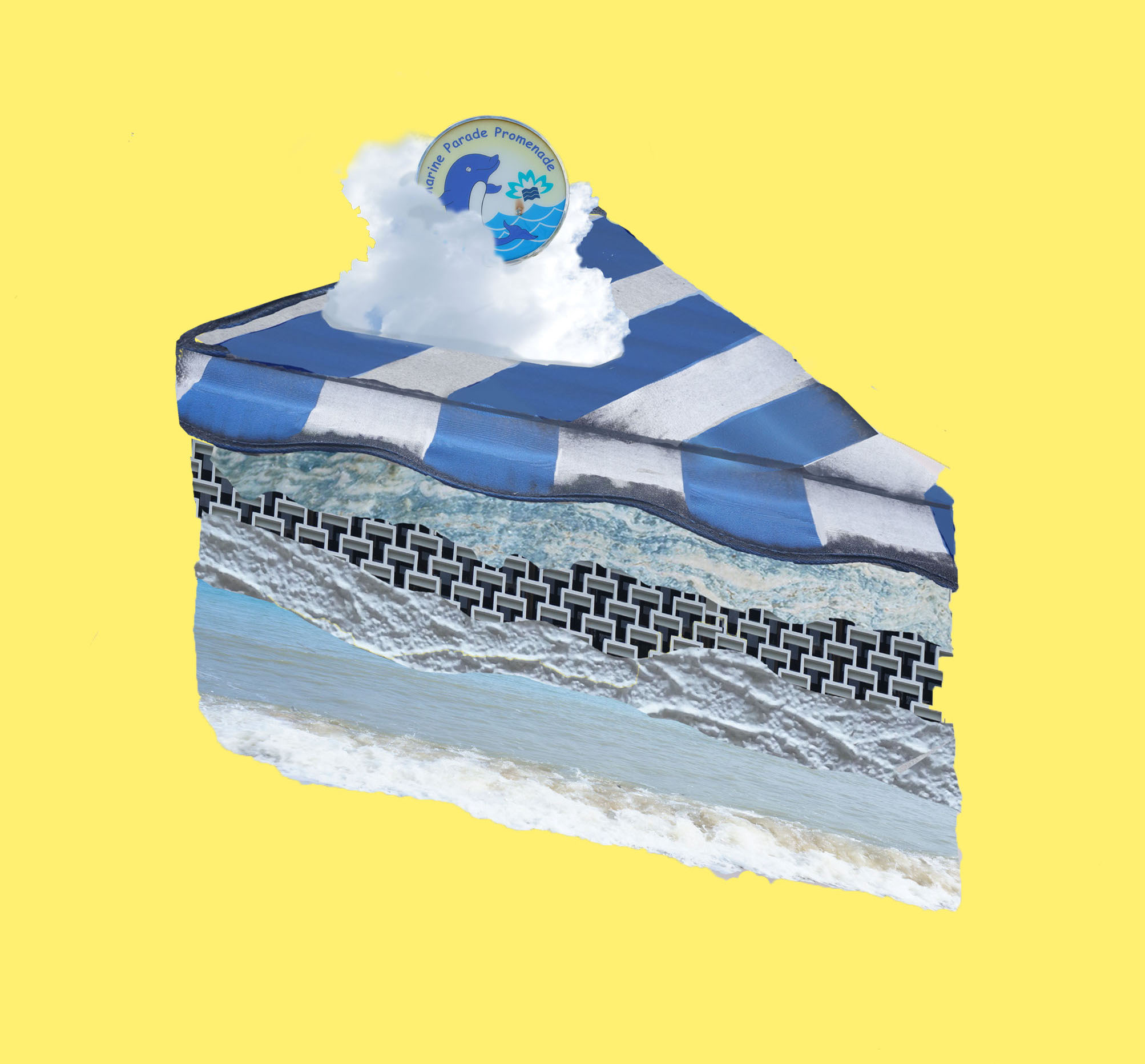
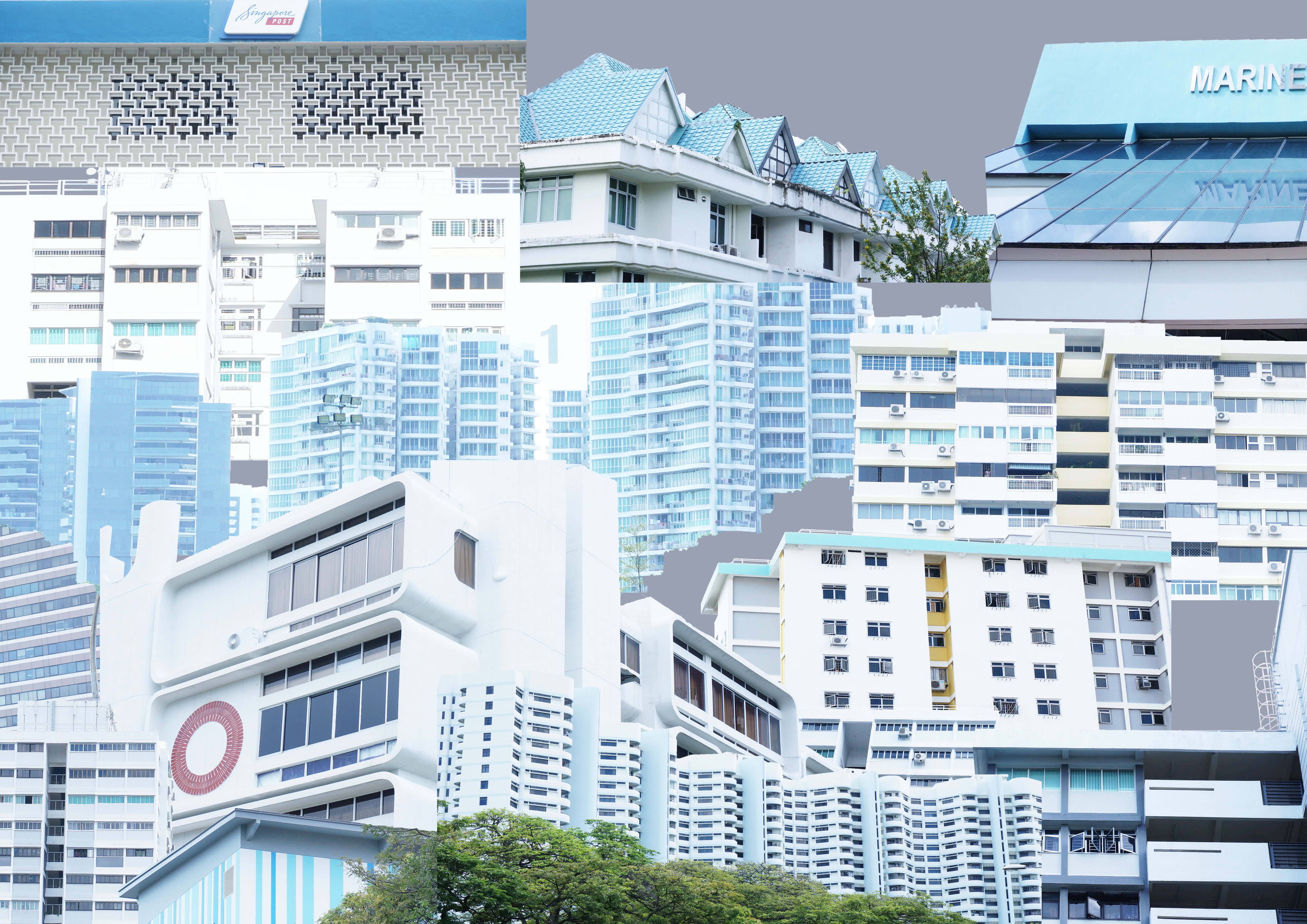
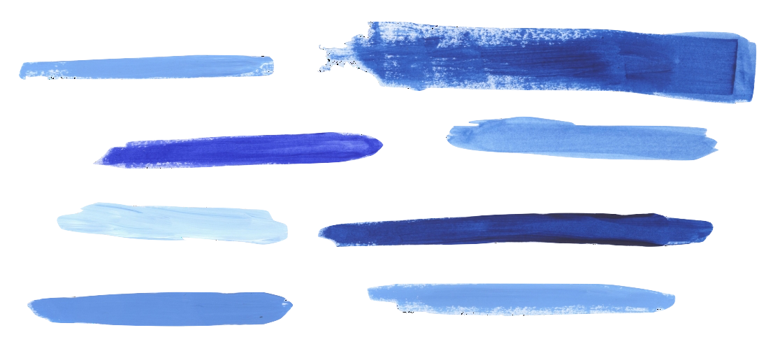
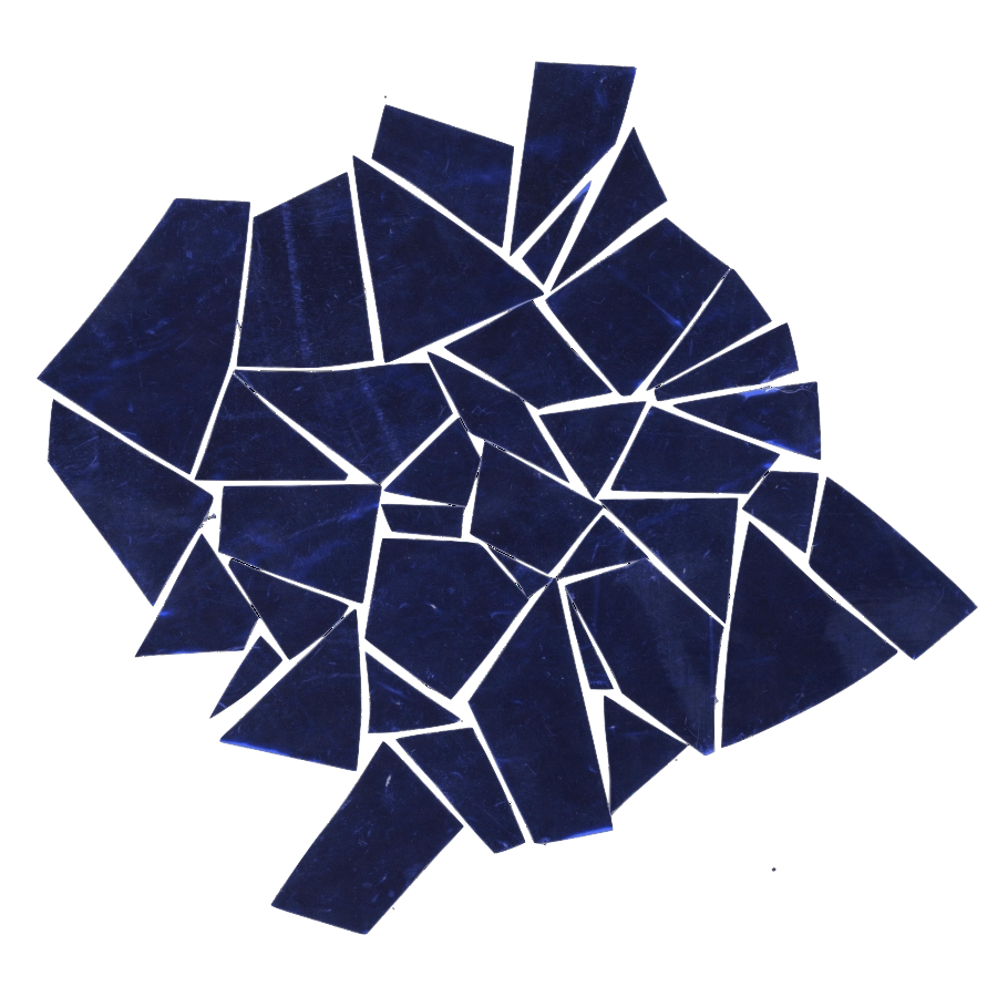
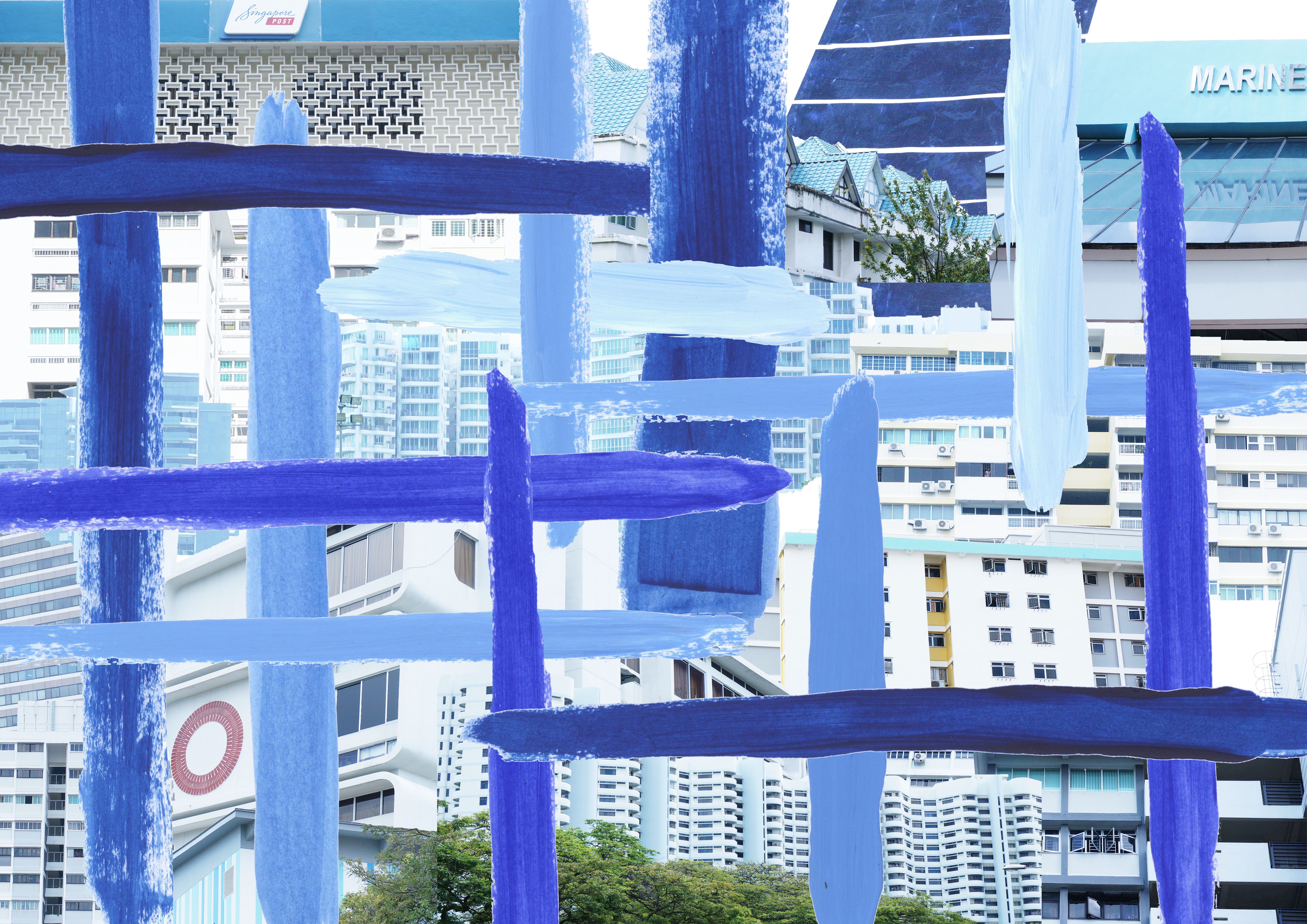
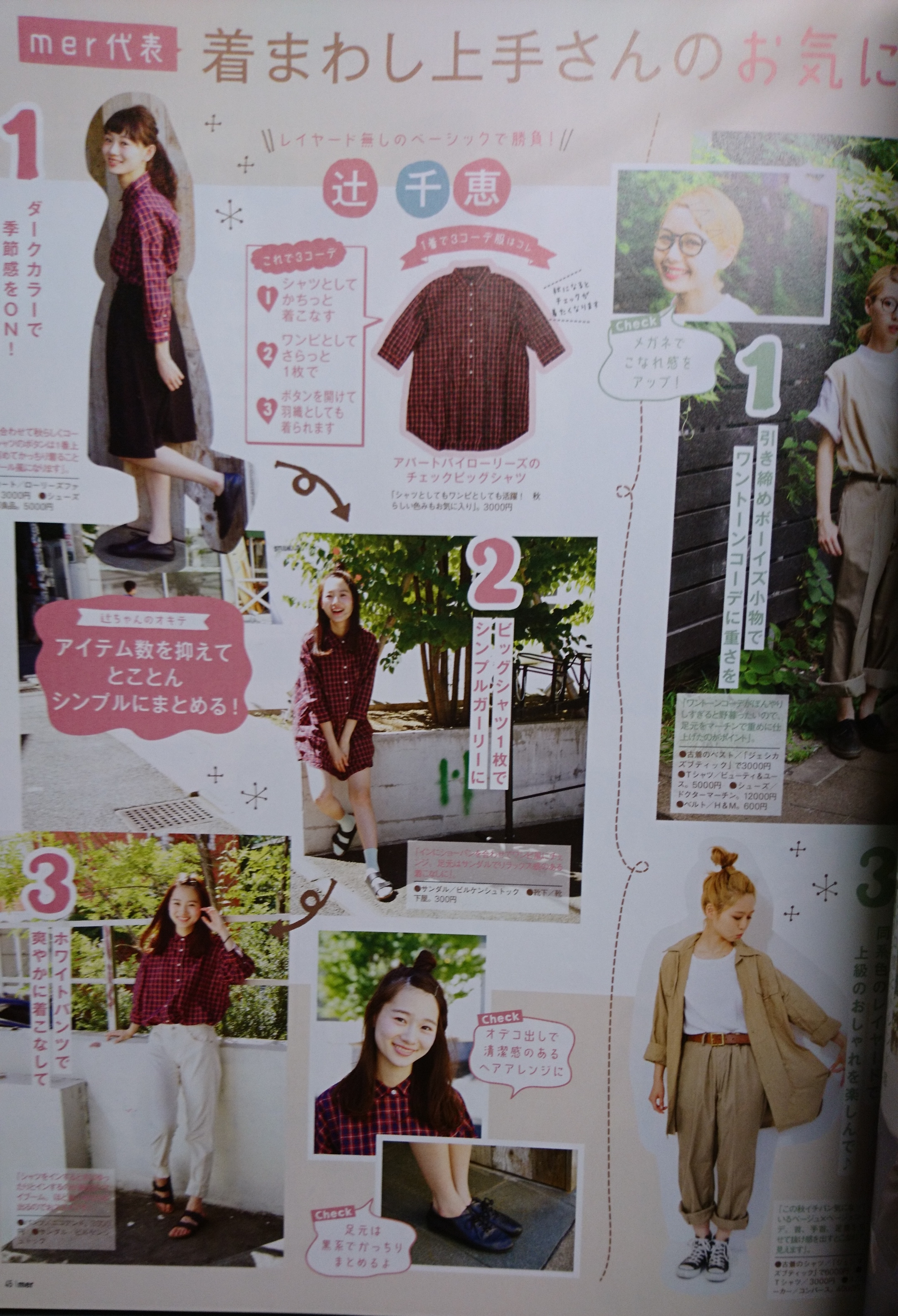
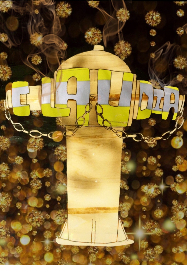
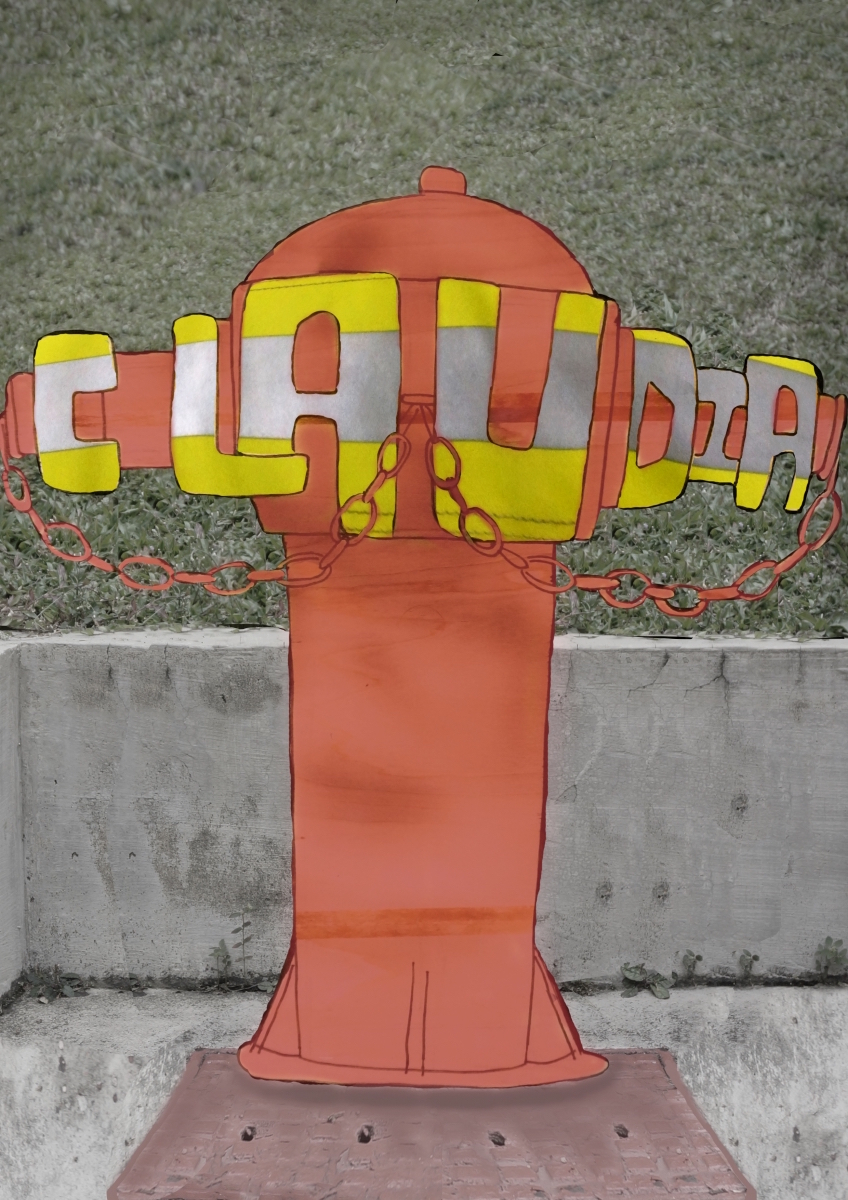
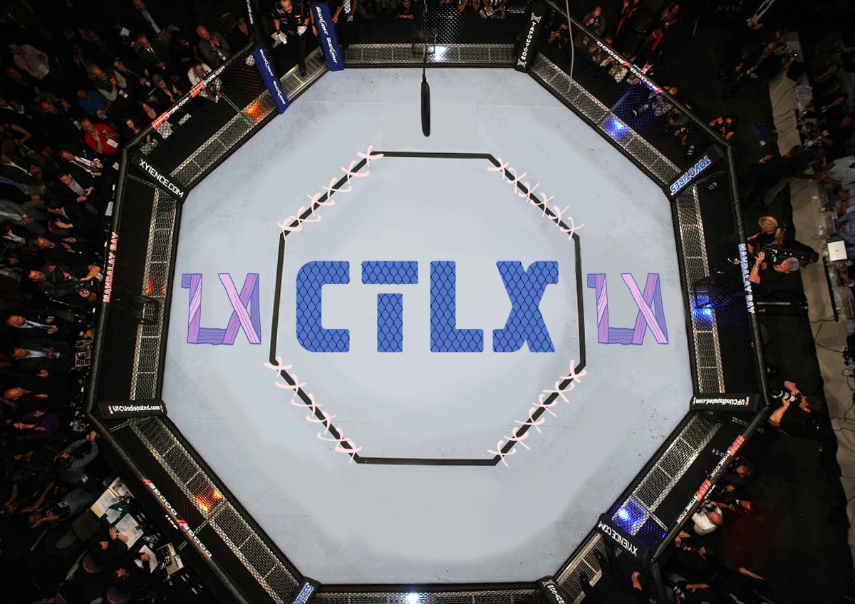
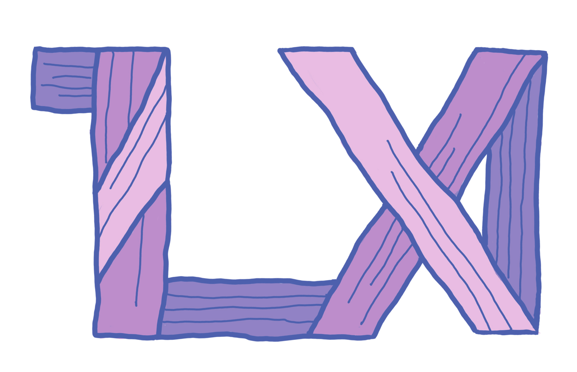
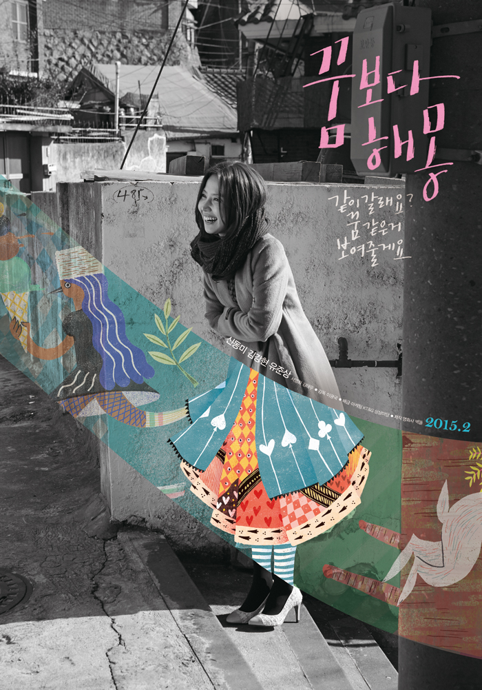
Modern Take

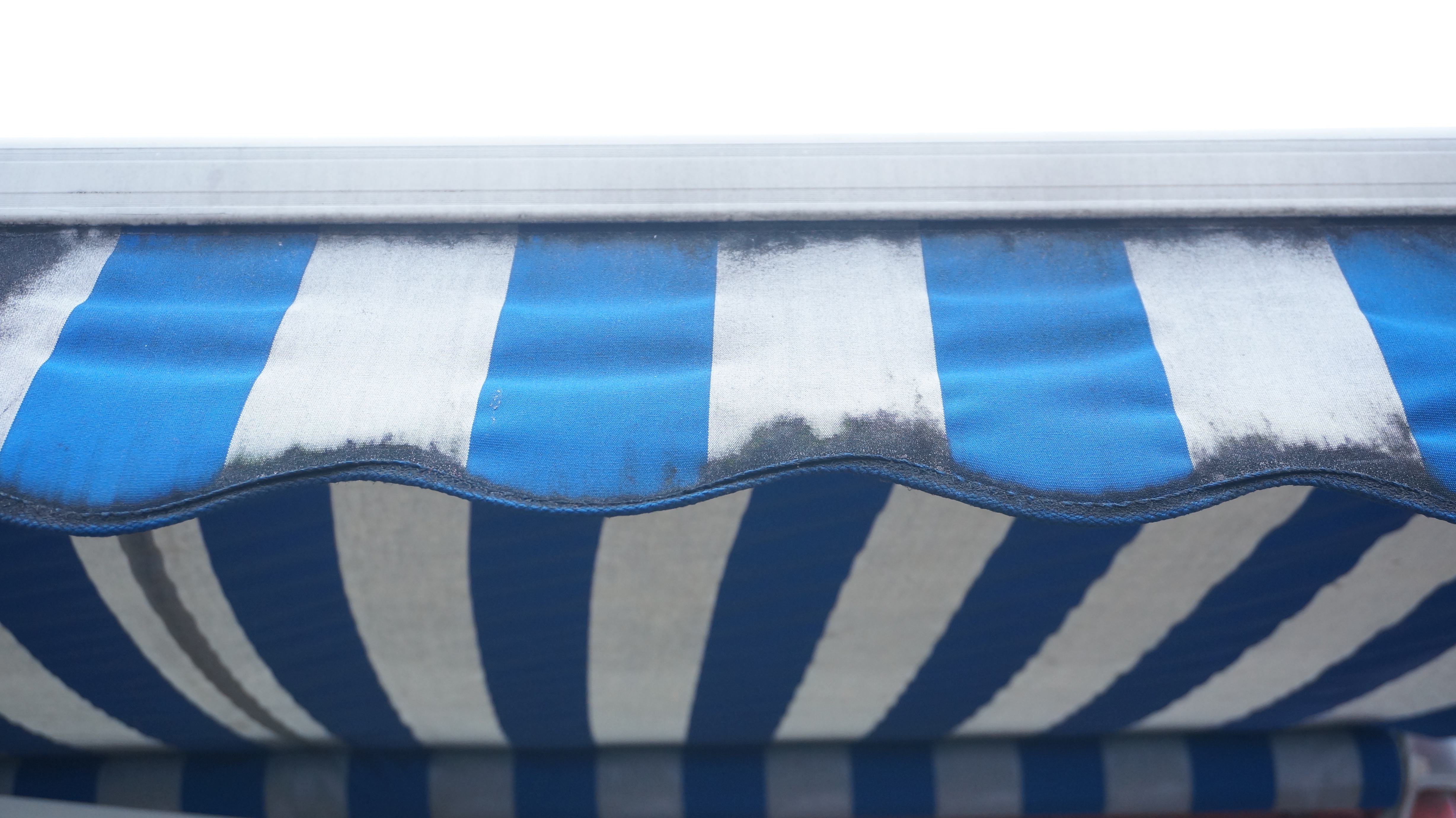
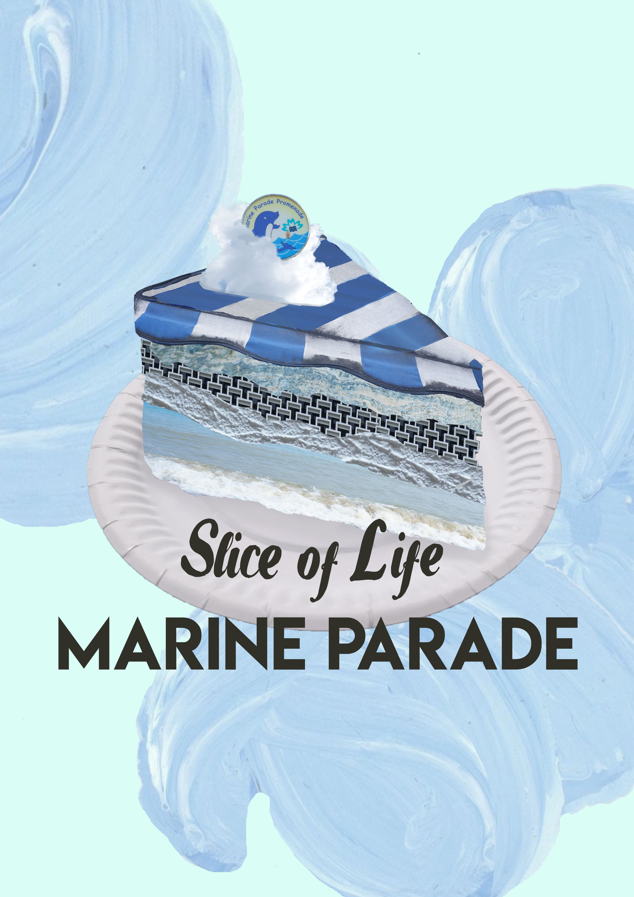
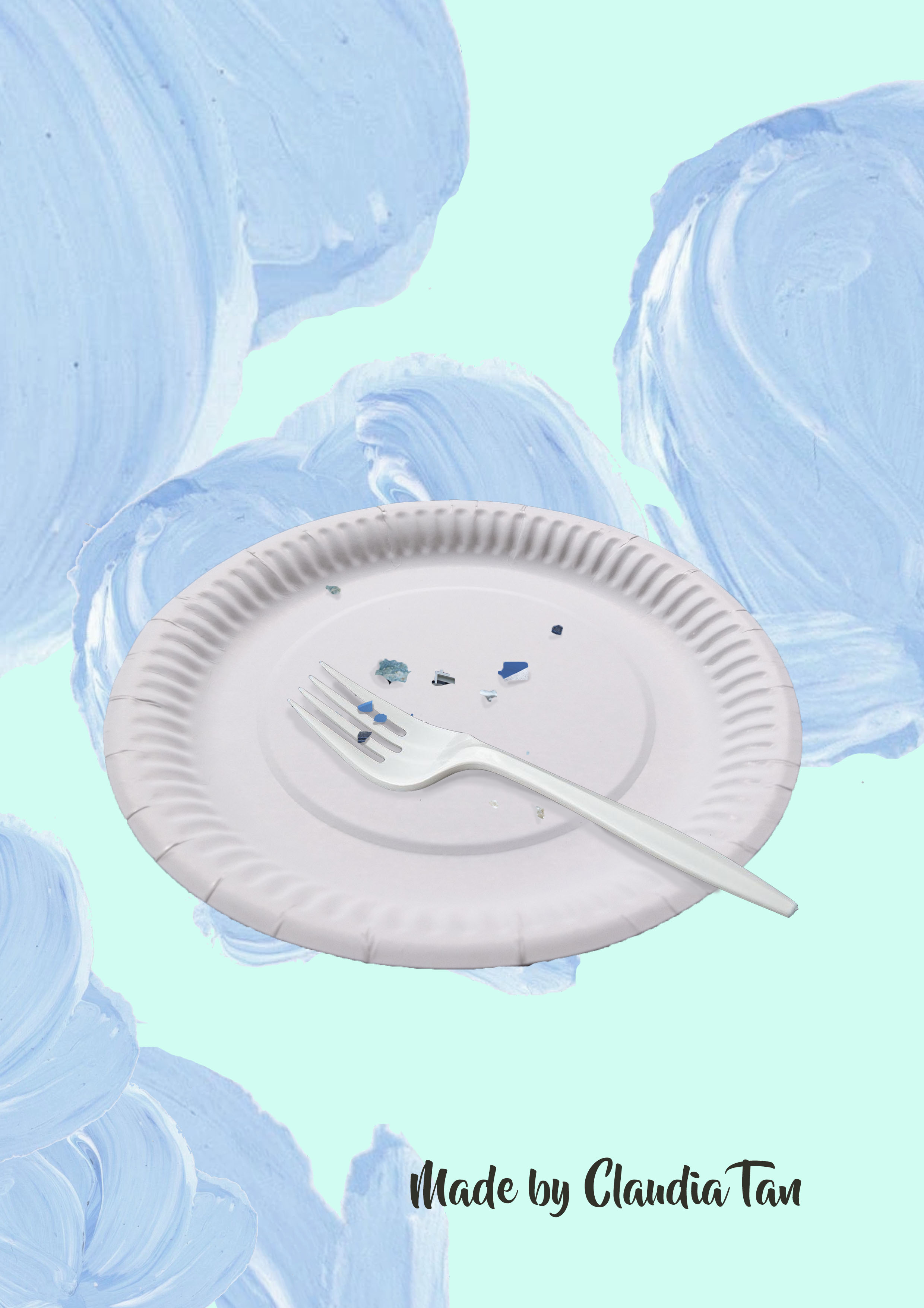
Dadaism is still pretty relevant today as many artists use it as an art style to incorporate into their works. It certainly helps to deliver a visually-popping effect and depending on the composition, creates whimsical moods or jarring effects with the intense contrast.

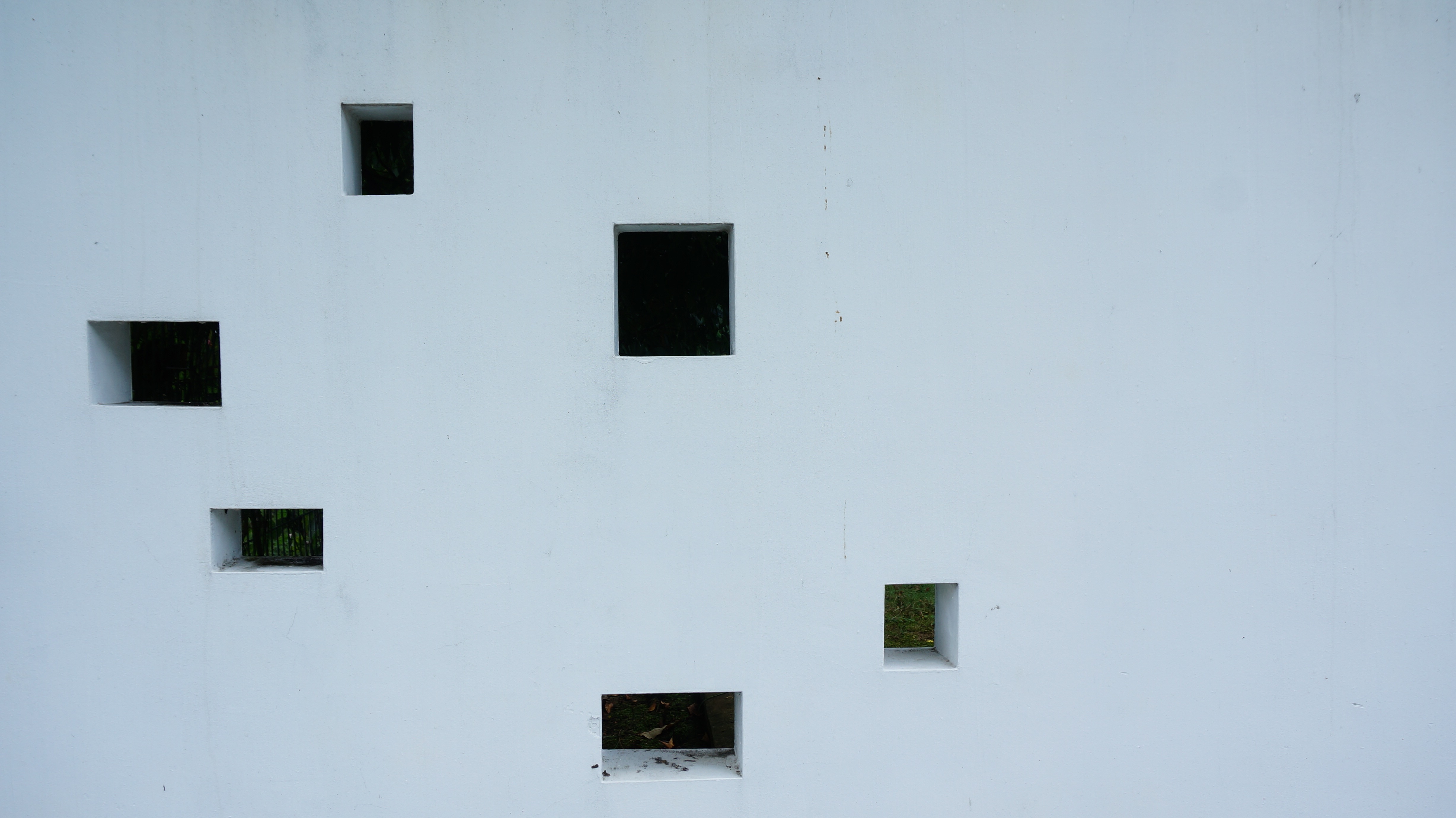
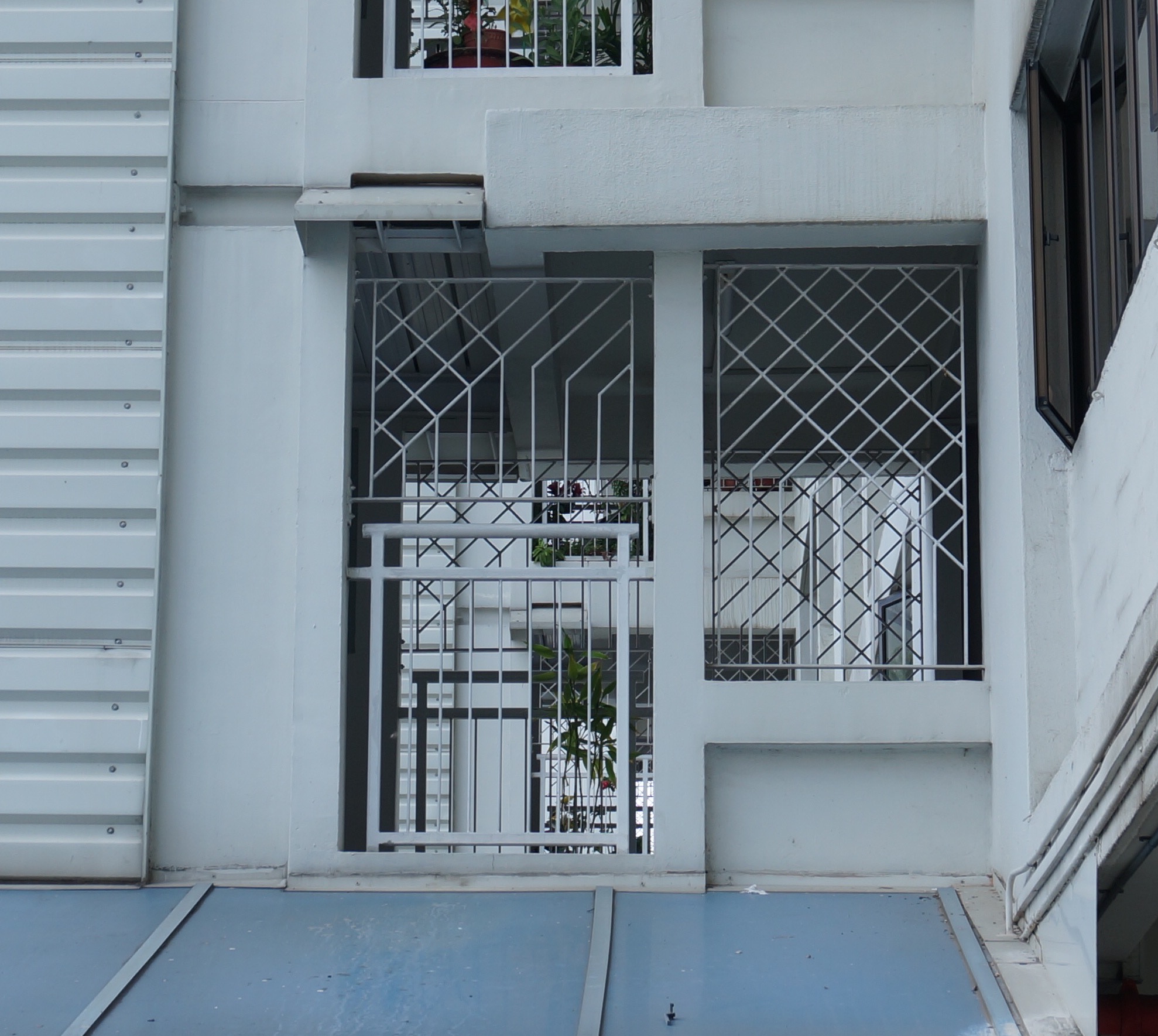
Here are some examples!


It certainly looks like a fun style to explore in my future works! Hope this post helps give you a little more insight of what this unique and empowering art movement is about!

Project 2: Zine Final Outcome!

Hello, here’s the full layout of my zine about Marine Parade!

(cover pages: front & back)

page 2 & 3

page 4 & 5

page 6 & 7


Reflection:

When I started out in this project, I was really quite excited as it seem like while trying to present and encourage people to discover more about Singapore, I myself was opening my eyes to a side of Singapore I never knew as well! I felt like I learnt a lot from my exploration adventures. I used to feel that because Singapore was so small, that was nothing else to do. But being on this zine journey made me realised there is still a bigger world out there. I am stoked to visit more unfamiliar places in the future, especially after reading my classmates’ zines! ╰(*´︶`*)╯

Now for the zine process.

I honestly felt that my idea was not bad. The fact that I wanted to stick to a colour theme and venture on exploring the ‘texture’ side was sort of stepping out of my comfort zone as I was used to drawing (but with not much technical skills lol).

Which was why it was really disappointing that I could not complete my zine in the best way possible. It was still far from what I wanted it to be. There were so many other layout methods that I could have approached e.g. own typography. I should also include textual information on introducing my ideas and explaining the uniqueness of each layer/page, as people who don’t read my OSS won’t know my concept behind the zine.

It was regretful that I was rushed to do the zine although we were given a lot of time and it was unfulfilling to showcase works that were not my best. I could not share my zine properly with my peers. It was even worse that I could not have it printed professionally and my zine was printed in such a bad format, I had to end up resizing it down to nearly an A6 size after cutting away the edges. (。•́︿•̀。)

Given another chance and better time management, I will show a better zine.

Even so, thank you for reading my post and I hoped that you still enjoyed it. ◡̈⃝


Project 2: Making of Zine

Heyya! My zine’s idea was to focus on textures and shapes unique to Marine Parade, categorising into the ‘layers’ that make up the neighbourhood.

Since I wanted to explore the topic about textures, I got the idea to incorporate other textures and superimpose them into my photos and mimicking the actual photos, trying to create more variety in my works and not make the pages that flat since I was only planning to focus on the visual aspect on the zine only through my photos.

For example, the waves will be replaced with lace.


scan of my lace dress: sea waves


scan of blue sticky notes overlaying: tiles


scan of several blue yarns: lines patterns of the rock


scan of cellophane paper: glass roof

I also did some watercolour drawings so that my beach layer won’t be so plain.

For the buildings, I thought of mixing textures of clay and paint streaks to make a play on the characteristics of how buildings were made.

scan of paint streaks


Now for the pages process! I used Photoshop to create all my edits, saving the pieces as individual pictures then pasting in on InDesign.

I forgot to mention that I titled my zine ‘Slice of Life’. The name was derived from the anime genre – slice of life, whereby the anime of this genre focuses on a cut of narrative that could happen in the every day life of a character. It enhances the ‘layers’ concept and introduces to the readers that they will be getting a taste of a part of Marine Parade!

Because of this, for my cover page, I edited a slice of cake showing the different layers that I gathered from my photos.

It was modelled after this photo of a chocolate cake:

The ‘cake’ layers include the sea waves, tunnel wall connecting to ECP, the post office’s architecture, rock monument, a shop’s banner. The top was then decorated with the clouds as the whip cream and the wheel sculpture as the chocolate piece.

Photos used for this edit:

I also put the cake on top of a paper plate, similar to those used in hawker centres (the popiah), as the use of ‘proper’ plates and utensils may make the styles too contrasting as the cake looks quite whimsical whereas the a porcelain plate is bit formal.

I used my blue painted swirls to add on abstract patterns in the background so that it was less plain.

The back cover follows the same layout showcasing an empty plate with leftover bits of the cake, signifying the readers digested the mini experience of Marine Parade after reading my zine, being a perfect last page to my zine.


For the pages inside, I originally wanted to divide the pages from the top to bottom as people, cultures (food, monuments, etc), architecture, beach. I realised the limitations of the number of pages I could do and thus decided on the following layout.

pg. 2: contents page – introducing readers to the layers

pg. 3: first layer – cultures

pg. 4-5: second layer – architecture

pg. 6-7: third layer – beach


For the contents page, I kept it simple. As mentioned, I wrote down the ‘layers’ that I would be showing.

The drawing of whale was extracted from one of the wall murals below the HBD flats.


For page 3, it is about layer 1: the cultural aspect of what makes Marine Parade unique. Unlike most other neighbourhoods, there was an effort to make it a culturally unique place. There was many recurring usage of the nautical theme through the multiple figurines placed around the neighbourhood.


I also included some of the ‘everyday’ objects that I found! Although there were not exactly part of the nautical theme, I had not seen them in any places yet, making them special too.

I compiled the photos as a collage.


For the 4-5 pages, they centred on the architectures that one can find in marine parade.

I wanted to present the architecture to form up one continuos flow of buildings. Mimi helped gave me some ideas such as making fonts out of these building structures or just putting them in a collage style. Such as:

Another idea was to overlay the different patterns that I found. Whereby the buildings will follow the grids of the patterns or fit into them.


In the end result, I chose to make it as a collage style.

I then added on the “reflective glass roof” cellophane paper cutouts and overlaid the paint streaks in a similar fashion to follow the pattern as shown below. The pattern was used in many of the HDB flats’ void-deck walls design.


For the 6-7th page, they featured the beach – East Coast Park!

I decorated it with the little shells/starfishes drawings I made. The background used was the waves painting. As mentioned, I used the lace to superimpose on the sea waves.

I included the stone benches as I felt that they are an iconic object found in ECP. The white flowers were also added as greeneries are an important part of the beach.

During my visit, the trees near seawalls area were blooming! It was really beautiful and I wanted to include them for appreciation of the nature aspect of Marine Parade.


And that’s all the pages that make up my zine! Hope you had fun viewing it!

Project 2: Zine’s Research + Ideas Presentation

Hello! For our 2D’s second and final project, we were each assigned to a random neighbourhood in Singapore and afterwards present a zine about it (:

Aaaand the neighbourhood that I got is.. Marine Parade! To be honest, the ‘bubble’ that I live in mainly revolves around the MRT’s purple north-east line and I had zero idea about what does Marine Parade look like. Just the week before Mimi picked the neighbourhood for me, I was talking to my hall friend, Evelyn. Our conversation went something along the lines of:

Me – “Oh ya, where do you stay ah?”
Evelyn – “Marine Parade!”
Me – “Oh…. Marine Parade.. Where is that?”


Great start to the project. However I was quite pumped up as this meant exploring a side of Singapore that I was unfamiliar with! I had no idea of where to go and what to expect, and it was really interesting to discover the unique sides of Marine Parade in my recce trips.

It was really quite inconvenient to visit via MRT but lucky for me, I had a direct bus from my house, bus 43! (But it was really super far when I went from hall…) During my first visit, I went during the evening as it had been raining for the previous few days. The findings were not much. I only covered the Marine Drive area.


There some nice mural paintings about community care (for the elderly). And I noticed that most of the HDB flats were white with some blue accents.

After some of my classmates did a presentation on colour theory, I got inspired to have colour theme so that my photos can look more consistent. Which was why on my second recce trips, I focused on sceneries/objects that were white & blue (with some green)!

Here’s what I found!


I walked from Parkway Parade to the estate areas, covering basically the whole Marine Parade Road: Marine Drive, Marine Terrace, Marine Crescent. It was really fun photographing the colours aspects of the neighbourhood, there were a lot! I guess it was because there was an effort to integrate a nautical theme since it was built on waters (which I will elaborate on in a later part). From HDB flats to condominiums to even the landed properties, most of them were a mixture of blue & white. Along the way I also spotted objects that were blue & white too, such as the chairs, market shops’ banner and decorations.

Also it was then that I realised that East Coast Park was part of Marine Parade….. Which was embarrassing because every Singaporean had been to ECP at least once in their life. Which was even worse when I told people I have not been to Marine Parade before when I frequent ECP often when I was young (¬_¬;) ohmy

These were the photos that I took and which that I used to present my findings.

ANYWAYS! I did some research on my own too.

Background Information of Marine Parade:

Marine Parade is a reclaimed land, being part of Singapore’s multi-phase project. Works started at 1966. Being one of the first few housing estates on reclaimed land, it was popular in demand of that time. Which was why in recent times, it had regraded as one of the silver zones in Singapore.

I thought that the fact that Marine Parade is a reclaimed land was really cool, and I wanted to incorporate this information into my zine’s idea.

Reclaimed land is the mad-made process of stacking and packing layers of sand on sea waters. Because there are layers of the whole land, I thought of translating that into my zine.

Whereby the pages of the zine are the layers that form up Marine Parade, e.g. the sea waters on the last page. And architecture, people, culture are the layers stacking on top (the upper pages). I proposed a rough idea to Mimi but she felt that the idea had to be more concise.

An idea then popped in my mind. The concept of these layers are also associated with their ‘textures’, e.g. Smooth waters vs rough sandy lands vs angled layers of buildings. From my photos, I noticed that there were also many intriguing-looking shapes and patterns from the buildings.

Basically, I wanted to work with textures and shapes of Marine Parade, exploring the ‘layers’ of the land, while being in the theme of blue & white.

I wanted to my audience to focus more on the visuals on the zine which was why I decided to include only photos and edits in it, showcasing the textures of each layer.

I went to look up for inspirations on how I could make the layouts of my photographs more interesting.


I wanted to do more the scrapbook style similar to those of Japanese magazines, where they played around with patterns and photo to make their editorials more appealing.


In order to gather more finds about the textures, I went back for a third and fourth recce. This time I explored near the ECP area and got these photos.


Once again I found new textures to work such as the wall designs, sand particles, sea waves. Also! There were a lot of cute sea animals statues aww. And bonus popiah photo since it was my lunch @ marine parade central’s hawker centre + it’s sort of white colour haha.


I think I was more or less settled with these photographs at that point. I did went back two more times because I wanted gather some thoughts and opinions people had of marine parade as I felt that texts can make my zine look more entertaining to read and convey my message better.


Refer to my next post for the making of the zine’s pages! (:

2D Project 1 – Que Sera Sera (Progress + Finals)

¡Hola a todos! (trying to put my Spanish to good use HAHA) For this 2D project – Que Sera Sera, we were assigned to use our names to create typographies in relation to four occupations that we chose for ourselves. Most of my stuffs are in my journal so I will briefly go through the inspirational process behind each design and the final outcomes!


fonts-copy

This was the first job that came to my mind because I really did aspire to be a farmer 😀

When I think of farmers, it is a lot about being ‘hands-on’ and ‘natural’ state. Which is why for most of my typography designs for farmer, I decided to use real organic materials to create my name.

162bb08d2575a9151d5fa23c503d7373 9c7f0ae64ee42f312ea8e94bd3e13852 c5560f1bdaf0be05359209b5cc689c1e  

The colours used also needs to be bright and vibrant!

I bought vegetables with long roots, different shapes/sizes, to experiment. And to better recreate the ‘farm’ scene, I bought soil too to create the fields background  and it was really fun experimenting with the different vegetables and tweaking their shapes to fit the letters.

Here are some of design experimentation : for example for turnip’s leaves, I used the side of the leave as the background to write my name (Claud). I also tried to make it look as though the markings on different potatoes dd up to form my initials (CTLX).


optimized-leaf-cut  optimized-potato

But here’s the final outcome!

I chose this as it looks most organic. It is simple and shows my name in a natural state. It is appropriate as it shows how farmers work in the fields and this is a sight that they encounter in their daily chores.

optimized-roots

I arranged the roots in a way to spell CLAUDIA. The original picture was a little messy as I could not totally control the shape of the roots, so I used photoshop to touch up on it by leaving out only the roots the spell out my name and emphasising the size and colours of it, and darkening the soil to make the roots more pop.


fontsInitially I wanted to be a baker. But as I explored around with various sketch designs and inspirations, I felt that being a café owner gives me more space to experiment with various styles! I want to create the vintage warm feels of a café and I went to research more on the interior – food, interior design, layout, & exterior – ‘architecture’ aspects.

Interior

298a7573dfb78f6ce66853fc71172e8c dddd4702fb3f9839c2d7a18cd98f9405

i drew different sketches involving around menu designs, display cases, using a variety of food/drinks to form my name

p2051006 p2051017

Exterior

0e58f77ac6134754da850cb6d822a124 87cfec7cd8145a9cdd24b583bbddcb5d 1366_2000

I think it was clearer in conveying the message that I’m a café owner by focusing on the exterior design of cafés as the use of food and menu items can also be found in restaurants.

It really appealed to me when I saw how many café’s glass windows have writings on them. They  are either the shop name, menu items, or just illustrations for decoration purposes. I want to use the glass window part as I feel like most cafés in general have huge windows to create that inviting warm feeling as light pours in. It also creates an interaction for passers-by to be curious and walk inside the café (or at least that’s how I always end up being attracted to enter one hahaha)

I experimented with various backgrounds and fonts to write my name but I felt that it is too literal. I came across some simple illustrations styles on pinterest and I thought that it would work really well as designs on the glass.

dsc09001  38e8623c5cdbb308a5571830efb29389

optimized-cafe

I tried to imitate the interior of the café as my background by printing out an actual image of it (thus solving the reflective light issue) and use illustrations of things that you (hopefully) find in my café hee.

fonts-copy-2

Creating typographies with the theme of ‘firefighter’ took me some time as there are so many things that can be linked to them e.g. the fire hydrant, outfit, fire

4a2c17e9fec110f6e5ec97fa3f00d4956d7ec115445640b5fbe7c473b42d2b8doptimized-dsc090161d19f900c268c27ae7df00cd3628a9d4

I played around with different narrative illustrations around objects that are linked to firemen, but when I came across this picture, I was really inspired because it uses the negative space that was created by the ‘fire’ – burnt part, leaving on the silhouette of the firefighter ‘unburnt’, conveying the message of the firefighter’s job.

il_570xn-876040567_qydw

optimized-dsc09645

I burnt a plank of wood and after drawing on the illustration of a fire hydrant with my name being the top part of it, I painted the surrounding areas black with paint.

After uploading on to my computer, I did some editing by putting the neon reflective band found at the freighter’s outfits over my name to highlight it. I also added some golden smokes and sparkles after being inspired by the picture below, and to create the image of fire but glorifying it in a way.

double-exposure-faces-blended-into-plumes-of-ink-in-water-by-chris-slabber-7  optimized-fireman

It ended up looking a little tacky, and unlike my finals for farmer and café owner, the background does not look realistic, making my works inconsistent. Therefore, I replaced the black background with an actual site of a fire hydrant that I found near my hall and here’s the final outcome!
optimized-hydrant

Although the original one by just photoshopping the actual environment, the colours does not bring out the image of the wooden fire hydrant. Therefore I darken the surroundings and also added a red tint over the wooden plank to make it resemble the fire hydrant more.

fonts-copy-3

I struggled to think of the last occupation the most. I thought of being a carpenter, veterinarian, detective, etc. But these are either to similar to the others jobs that i chose in terms of craftsmanship/industry, or areas that I’m too unfamiliar with. It occurred to me that I should use what I have experience in, to better translate the typography.

So… during the long break before we started uni, I signed up for various kickboxing and muay thai classes. (ARE YOU SURPRISED? HAHAHA) Which is why I decided to combine both and ended up choosing to be a MMA  fighter as my fourth occupation!

kickboxing-moves-450x257

(obviously still no toned muscles like this lady)

To best portray the MMA idea, the first thing that I thought of was to use the octagon arena ring in UFC matches. There were also many other ideas – incorporating the different fighting styles to form my name in a narrative way, the different equipments used, exercises regimes, motivational quotes styles, etc etc.

In my final outcome, I still felt that the best idea is to use the octagon arena as the background base and further enhance the picture with other ‘fighting’ elements.

optimized-ufc2

I put my initials (CTLX) as the arena name and use metal mesh fence as an overlay to further showcase the metal fence that is unique to UFC arena cages. It still looks quite plain so I also drew on crosses over the lines to look like the laces on boxing gloves.

Since the arena are also often filled with sponsors’ names, I wanted to include my name too as it also makes the arena look less plain. I did so by writing LX in a way that looks like it is formed by hand wraps.
7937519_f520lx

Although I was tempted to create different versions of my name and paste it around the arena, I was scared that it will look too messy. It then occured to me that champion belts have the smaller gold-plates, one at each side of the main plate. Hence I just sticked with 2 of the other names.

45db39fbd5c482ecdf1a67a9394bf666

I like how all my works have the realistic feel to them as they show the environment of my workplace. I hope you will appreciate them too, thanks! (◍•ᴗ•◍)