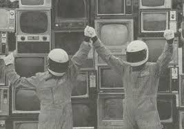
Media Burn https://assets.atlasobscura.com/media/W1siZiIsInVwbG9hZHMvYXNzZXRzLzk4YWMwYjkwMGZkYzM5NTI1YV8xNi4gTWVkaWEgQnVybiwgcGhvdG8gSm9obiBGLiBUdXJuZXIuSlBHIl0sWyJwIiwiY29udmVydCIsIi1xdWFsaXR5IDgxIC1hdXRvLW9yaWVudCJdLFsicCIsInRodW1iIiwiMTI4MHg-Il1d/16.%20Media%20Burn%2C%20photo%20John%20F.%20Turner.JPG
Ant Farm (1968-1078) was founded as an architecture, graphic arts, and environmental design company by Chip Lord and Doug Michels (1943-2003) in 1968. The group of adventurous artists and architects based in San Francisco identified themselves as part of the underground culture in the late sixties and seventies. That how the company name was made.
Ant Farm’s artworks were experimental and against the existing system. In the 1960s, the society was transforming into the era of collectivism, connectivism and DIY culture, where sexual liberation, mind-altering drugs, and utopian ideals were embraced. Also, they were not only focusing on single discipline, and crossed the conventional boundary of art with the rise of new media and technologies in the 1960s.
Our professor Randall Packer hosted an interview in the third space with the co-founder of Ant Farm, Chip Lord. Media Burn is one of the examples that he shared during the interview. It is an exciting performance documented in the videotape, that consist the two American icons. One is the customizes 1959 Cadillac El Dorado Biarritz, and another is the television. This public performance was widely spread on news, and there was live audience, camera crew involved which was ‘using TV to destroy TV’, said that by Doug Michels. On July 4, 1975, Schreier and Michels, drove the Cadillac through the set of televisions at its full speed, ended with the flaming televisions.
However, the performance did not end with the burning televisions. Doug Hall, an American artist, presented as President John F. Kennedy, had a speech, addressed the issues with mass media.
All in all, Media Burn was a piece that addressed the social issue using the most recognizable cultural icons: Cadillac and television. As the majority was addicted to television, and the mass media was having control over the audience. It seems to be the mobile phone and social media we have now. Media Burn, the “reality” that the artist create also brought up the question for us today: Haven’t you ever wanted to put your foot through your mobile phone?
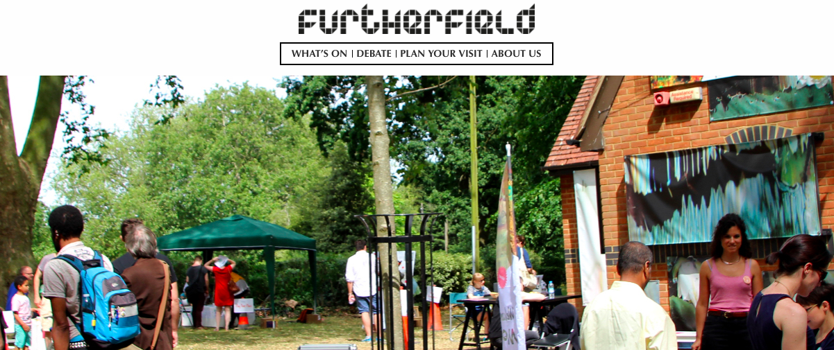
Furtherfield is a non-profit organization and community that was found by Ruth Carlow and Marc Garrett in 1996. It was created to reach out a wider audience without the constraints of the physical gallery spaces at London. Furtherfield was a small website where the artist, technologist, and academics have the freedom to DIWO (DO IT WITH OTHERS) to share the resources and contribute to the human knowledge through the integration of first, second, third or multiple spaces. It was expanded around the world later on. Furtherfield also has physical space, the Gallery, and Lab in the London’s Finsbury Park. It is a platform in the urban park where people can explore the network culture.
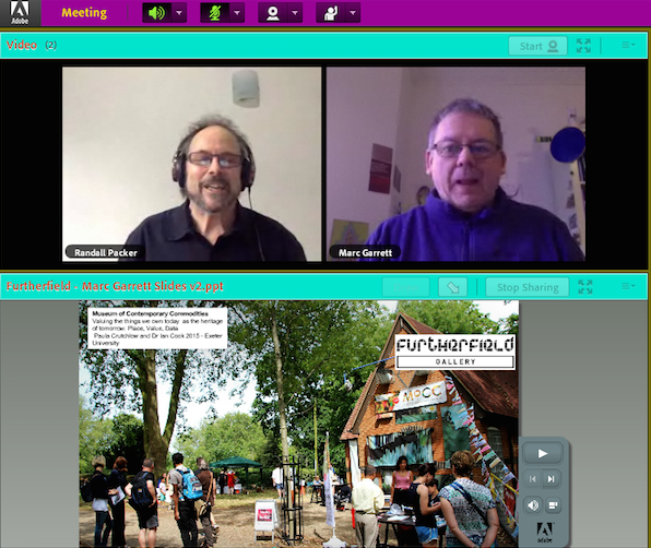
Screenshot of the Adobe Connect Lecture With Marc Garrett
We had Marc Garrett to be our guest speaker on Adobe Connect lecture with our professor Randall Packer on 16th February 2018. Marc Garrett gave us a better insight of Furtherfield, Maker Culture, and shared with us some projects that are supported by Furtherfield. The major idea of Furtherfield is making art for a better society.
For example, an ongoing project supported by Furtherfield, called ‘Seeds From Elsewhere’ by They Are Here which gathering young asylum seekers and refugees, and others. Each of them has a piece of land to grow plants or food from their own homeland. This project is creating an environment that embraces, maintains and produce the diversity of the residency status in the current society. Further, this project started less than a month after Brexit, when the majorities are against migrants in the UK. ‘Seeds From Elsewhere’ is demonstrating that the DIWO culture should not just exist in the small garden community, yet it applies to all scales of activities even beyond the scale of the government. The garden itself has multiple functions. Firstly, it could be a comfortable place for the young refugees to hang out. Secondly, it might provide job opportunities in the future. Lastly, it could be used to address anti-immigration.
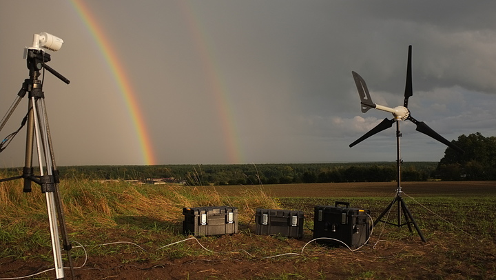
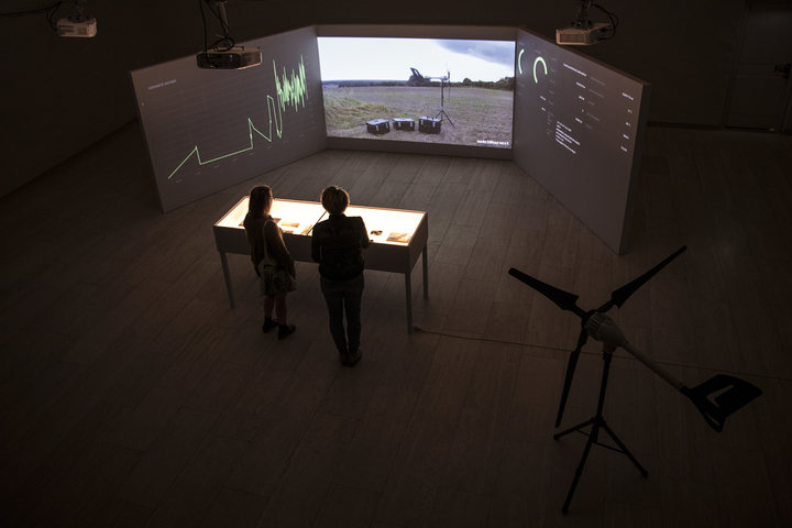
HARVEST by Julian Oliver https://julianoliver.com/output/harvest
Moreover, another artwork that Marc Garrett shared with us is HARVEST by Julian Oliver, a work of critical engineering and computational climate art. The two-meter high wind turbine transforms wind energy into the electricity required to meet the demanding task of Zcash, A decentralized and open-source digital currency. All the profits the HARVEST earned goes to the non-profit climate change research organizations to support the studies. In 2017, HARVEST was exhibited for two months in the museum. It supported three non-profit climate change research organizations at the end of the exhibition.
Last but not least, the Adobe Connect lecture ended with the Q&A session with Marc Garrett. As an art student living in the 21st century, I was not sure if my role is simply creating the painting, sculpture, and objects that are aesthetically appealing to the viewers or there are more responsibilities on my shoulders. Therefore, I asked the following question:
Marc Garrett answered that the consciousness of the environment is essential for artists. Technology is deeply influencing people’s behaviour nowadays, yet we must be aware of nature. As technology cannot survive without the survival of nature. Randall Packer added on that artist should be engaged with the society, connect with the issue, and invest in the process of working with others like what Furtherfield had done. Such as the ‘Seeds From Elsewhere’ project mentioned earlier. All in all, the role of artists is not just making this world more beautiful tangibly but probably a place where we can live with others peacefully.
REFERENCES
https://julianoliver.com/output/harvest
Ruth Catlow and Marc Garrett, Do It With Others (DIWO): Participatory Media in the Furtherfield Neighbourhood
Create typographic portraits by using your name to describe your future jobs.
MY NAMES AND JOBS
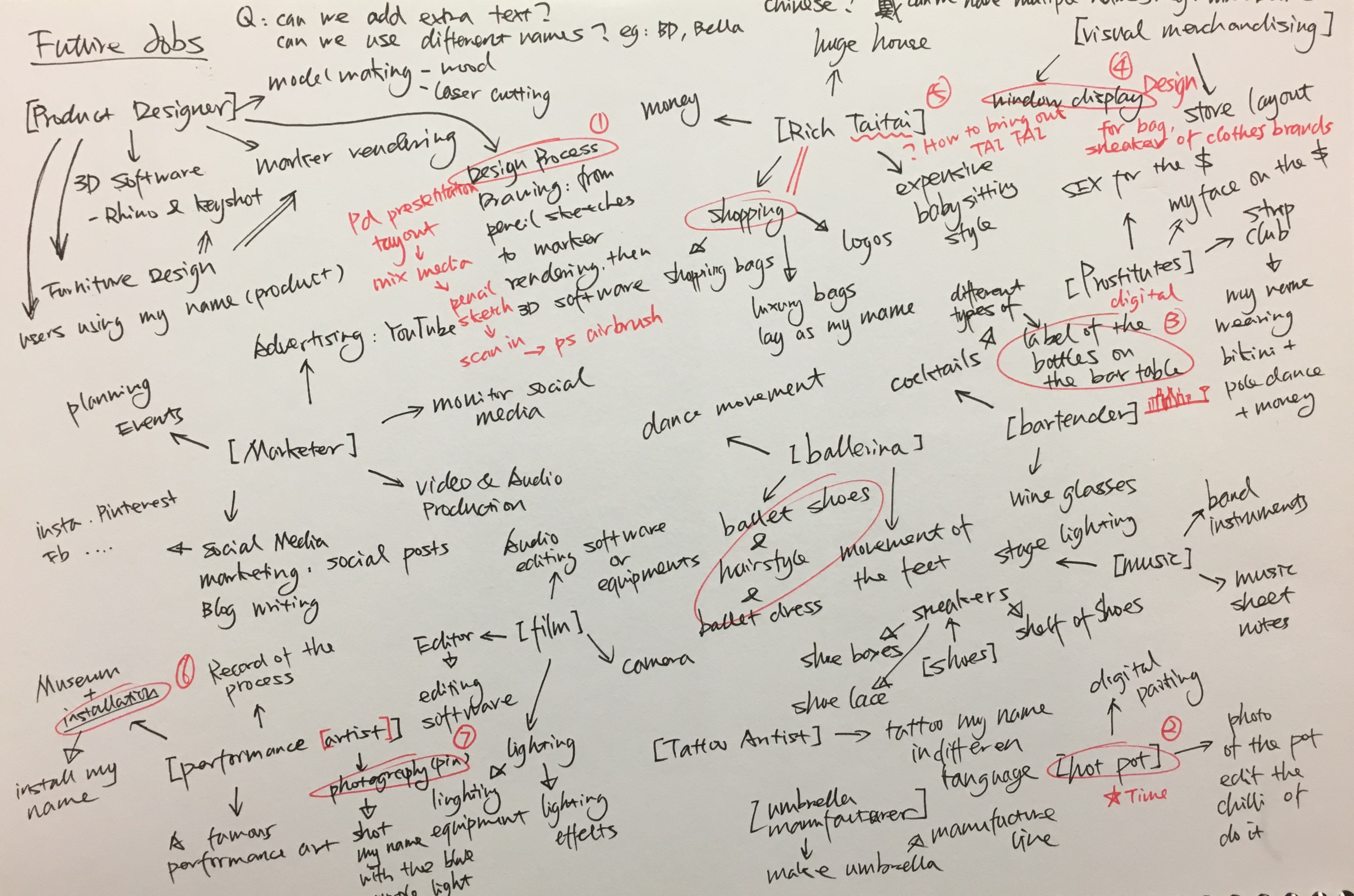
Mindmap
I started this project with mind mapping with the job titles and the possible ways to represent the job. The chosen jods are listed below:
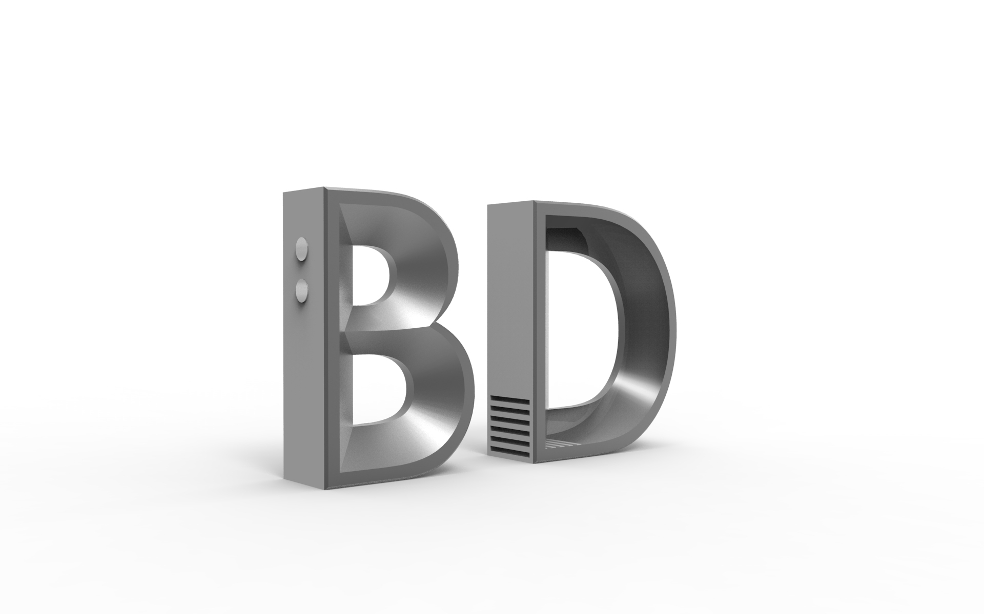
MY NAME IS BD AND I AM A PRODUCT DESIGNER
MY NAME IS BELLA AND I AM A MALA RESTAURANT OWNER
MY NAME IS BELLA AND I AM A VISUAL MERCHANDISER
MY NAME IS BELLA AND I AM A BARTENDER
MY NAME IS BD AND I AM A PRODUCT DESIGNER
Overview
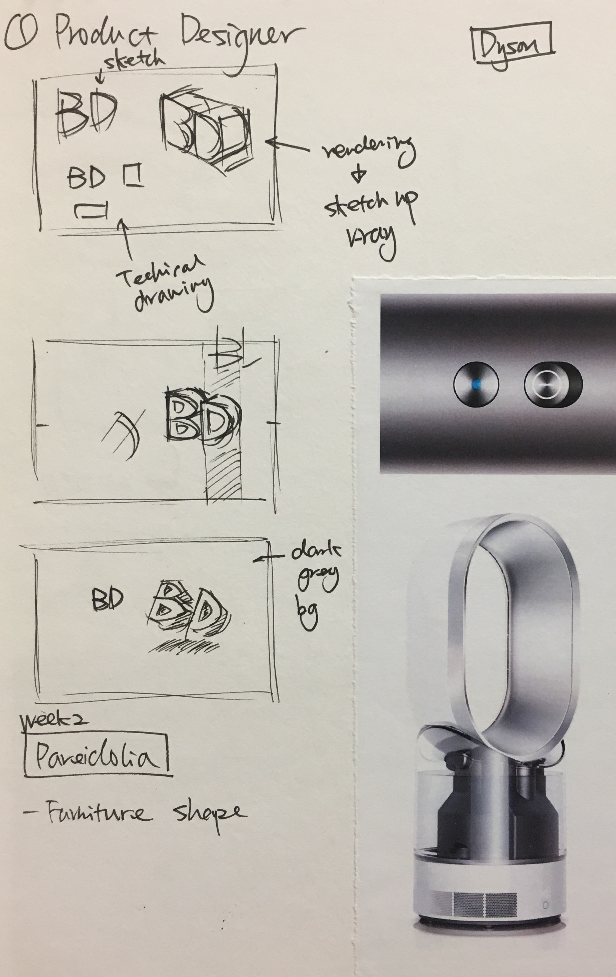
Product design, in my own words, is the process of problem-solving. There are a lot of steps involved in the process such as market research, ideation, prototyping, manufacturing, marketing and etc. Graphic design is also important to promote the product, for instance, product posters and packing. Therefore, I decided to incorporate my name into the ‘product design poster’.
I started my research by looking at different product design presentation style. Some are pen or pencil sketches with marker rendering and some are purely digital rendering.
Dyson Fan http://www.g-mark.org/award/describe/36333?token=oDzi8yCdWSSketch
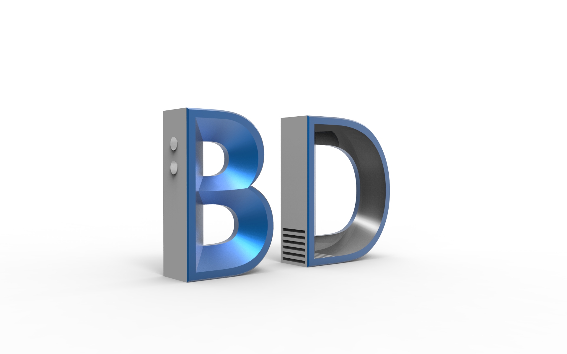
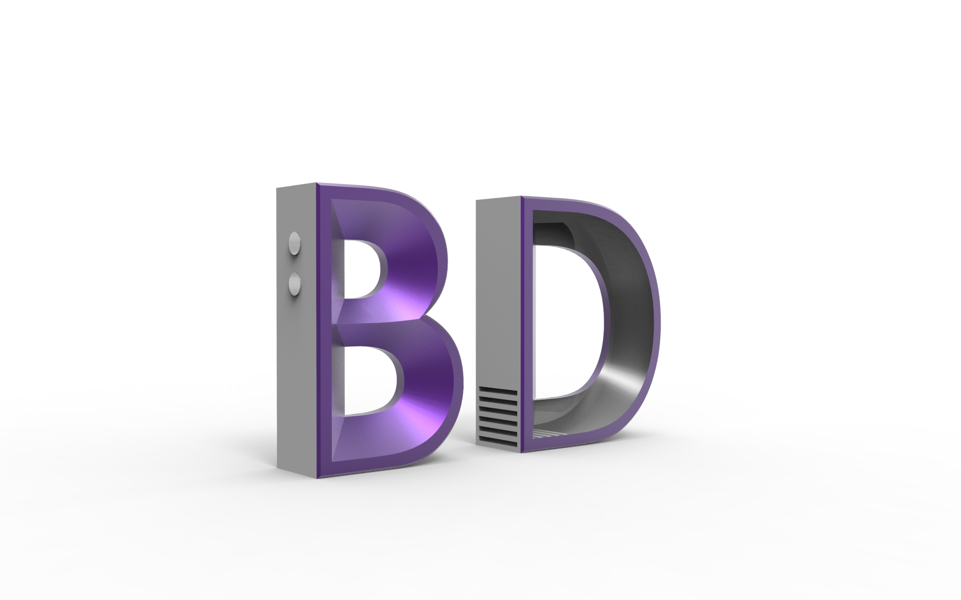
I sketched out some composition and decided to use 3D software to deconstruct my initial, BD. Further, I chose the font based on my experience in learning product design for three years. Century Gothic is frequently used in product design as it is clean and sleek. I referred to the design language of Dyson, a well-recognized household appliances brand for my 3D alphabet model.
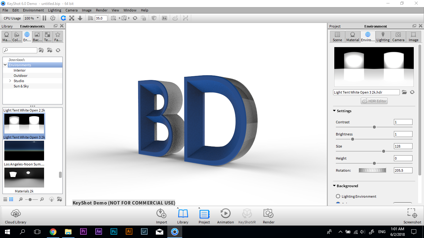
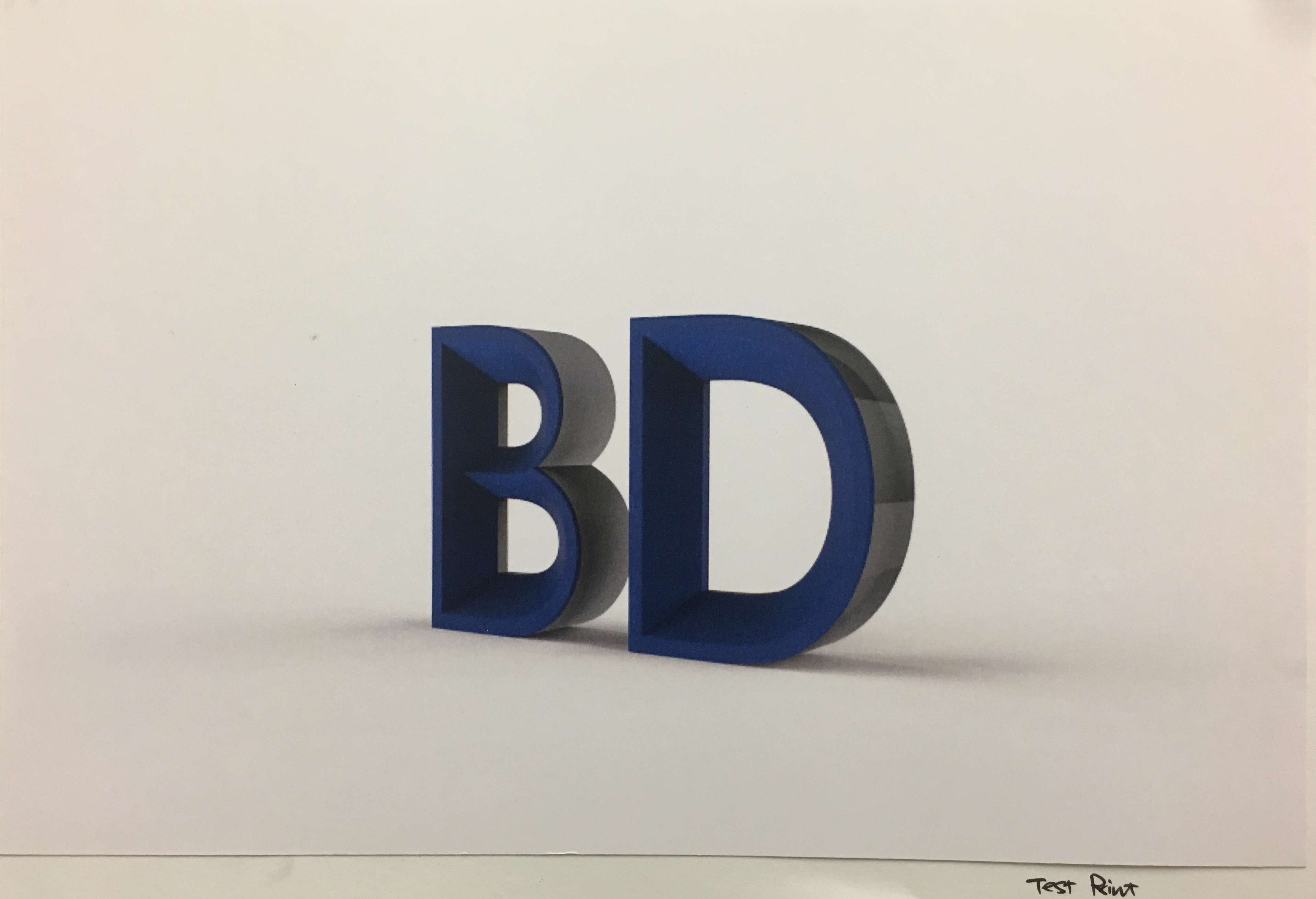
Process
3D Model in Rhino3D Model in KeyshotTest Print
In the 3D model, components like buttons, and ventilation were added to the alphabet to make it seems like an electronic product. I used Keyshot, a 3D rendering software to add realistic material effects to the alphabet. Further, I went through a few run of test print to adjust the colour, lighting and choosing the right paper.
My initial idea was to use special paper and printing technique to show the different views of the 3D alphabet. However, I was told that this kind of print is only available in a few printing factories in Singapore, and it will be very costly. Thus, I changed my composition to four sets of BD in the different colours, like how products are available in a range of colours in the series.
Final Artwork
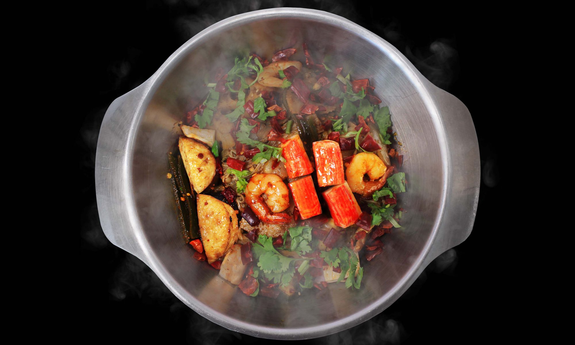
MY NAME IS BELLA AND I AM A MALA RESTAURANT OWNER
Overview
#ispotthealphabets
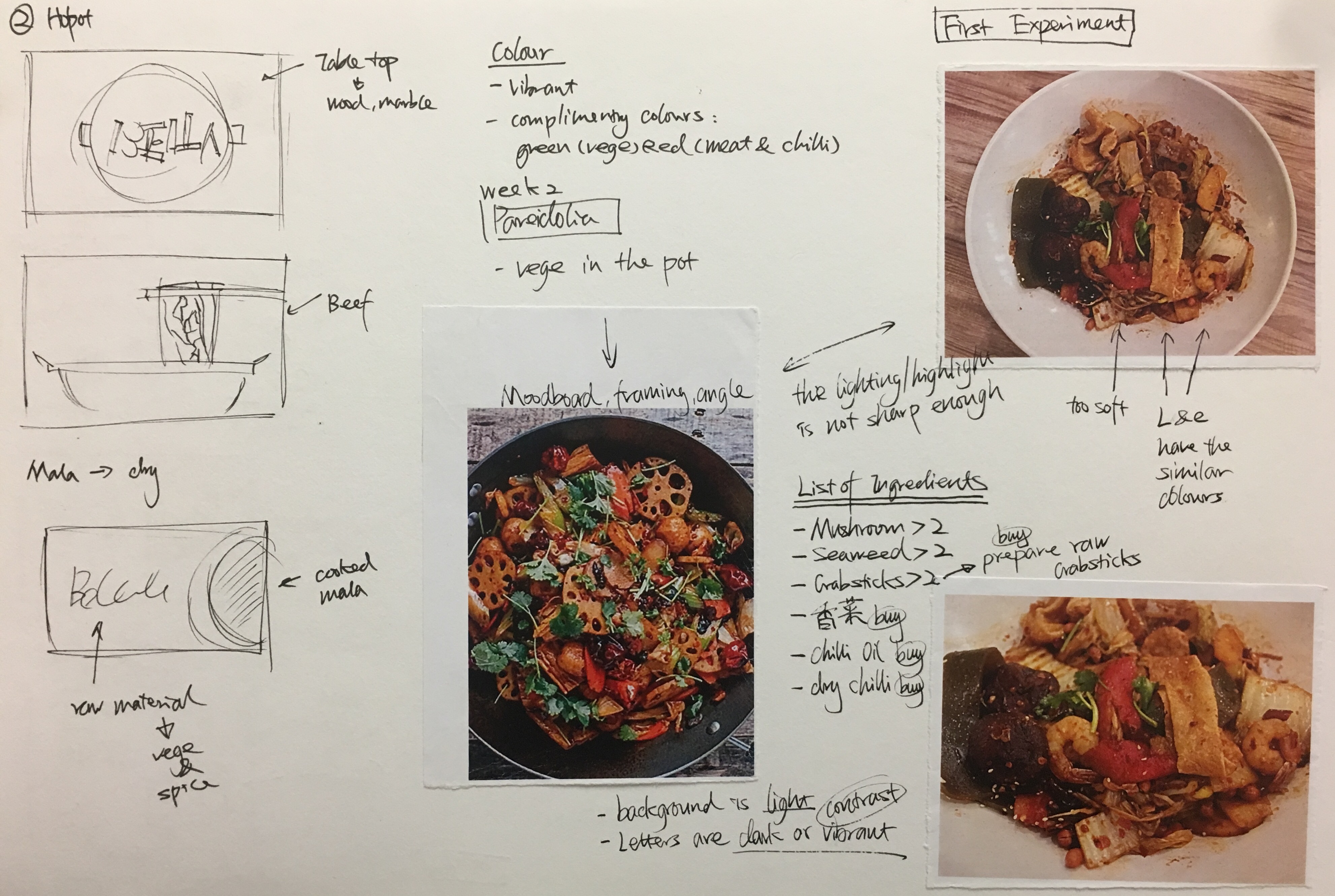
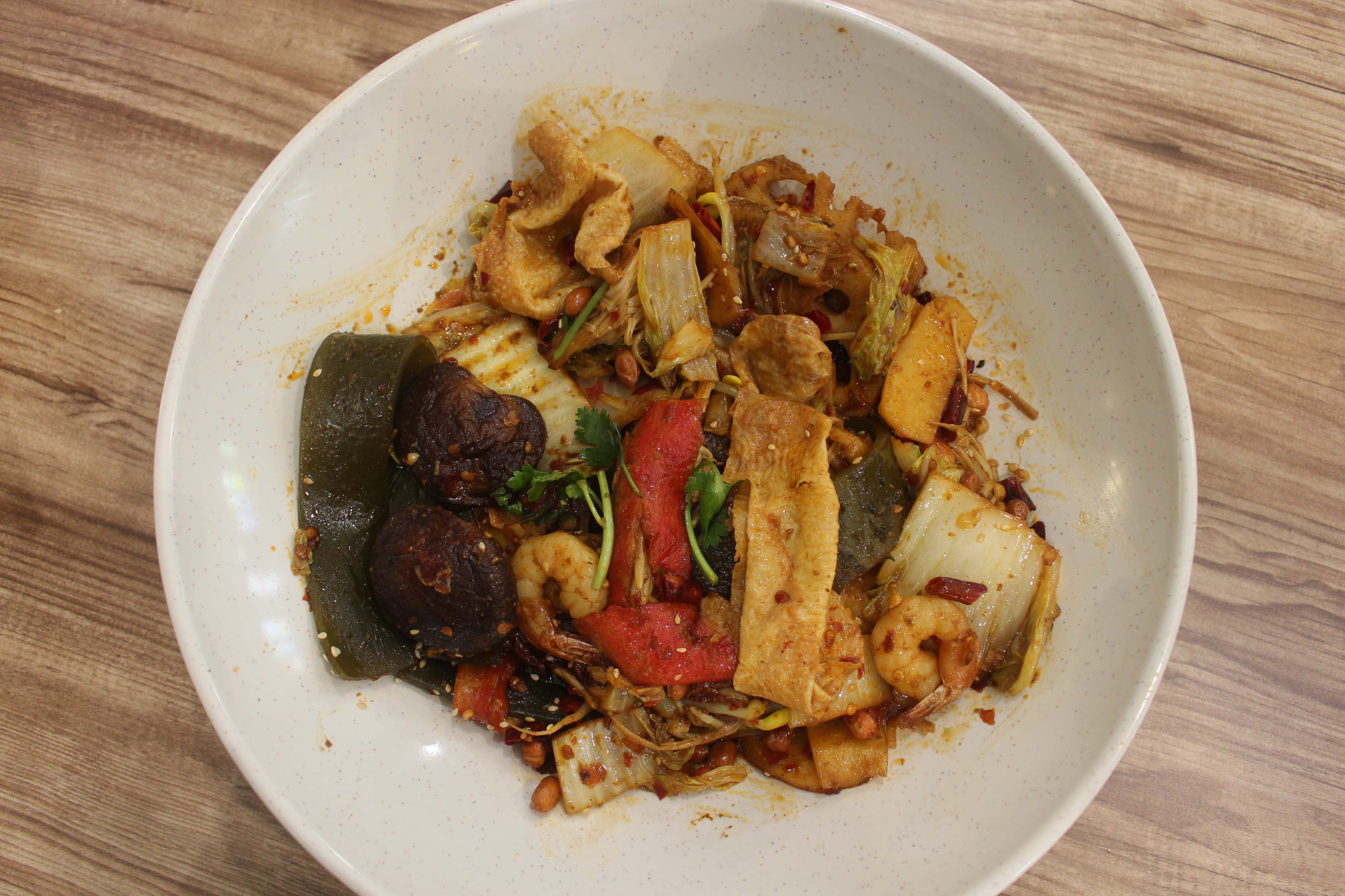
To own a Mala hotpot restaurant is one of my dream jobs, since Mala hotpot is my favorite food, and it was from my hometown Sichuan in China. Initially, I was thinking of using the raw ingredients in mala to form my name (like some food commercial like to do in the advertisement). However, I found a more interesting concept after the lesson about Pareidolia and doing the in-class assignment, I Spot the Alphabets. Therefore, I started doing experiments to find the food that is able to represent my name.
Research
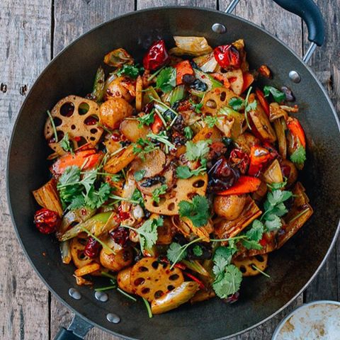
Sketch and NotesOne of the Test ShotsCommercial Mala photo https://i.pinimg.com/564x/56/2b/1a/562b1a4adc1d1410674ee0bb095b1c0a–chinese-eggplant-chinese-food-recipes.jpg
I had some test shots and researching on how to take good photos of food. There are a few videos available on youtube about food commercial photo shoot techniques and tricks. Also, I consulted some of my friends who has photography background for suggestions. The style is this concept is commercial food photo to show that I am the owner of the restaurant instead of the chief or just food lover.
Process
DIY Photo Studio
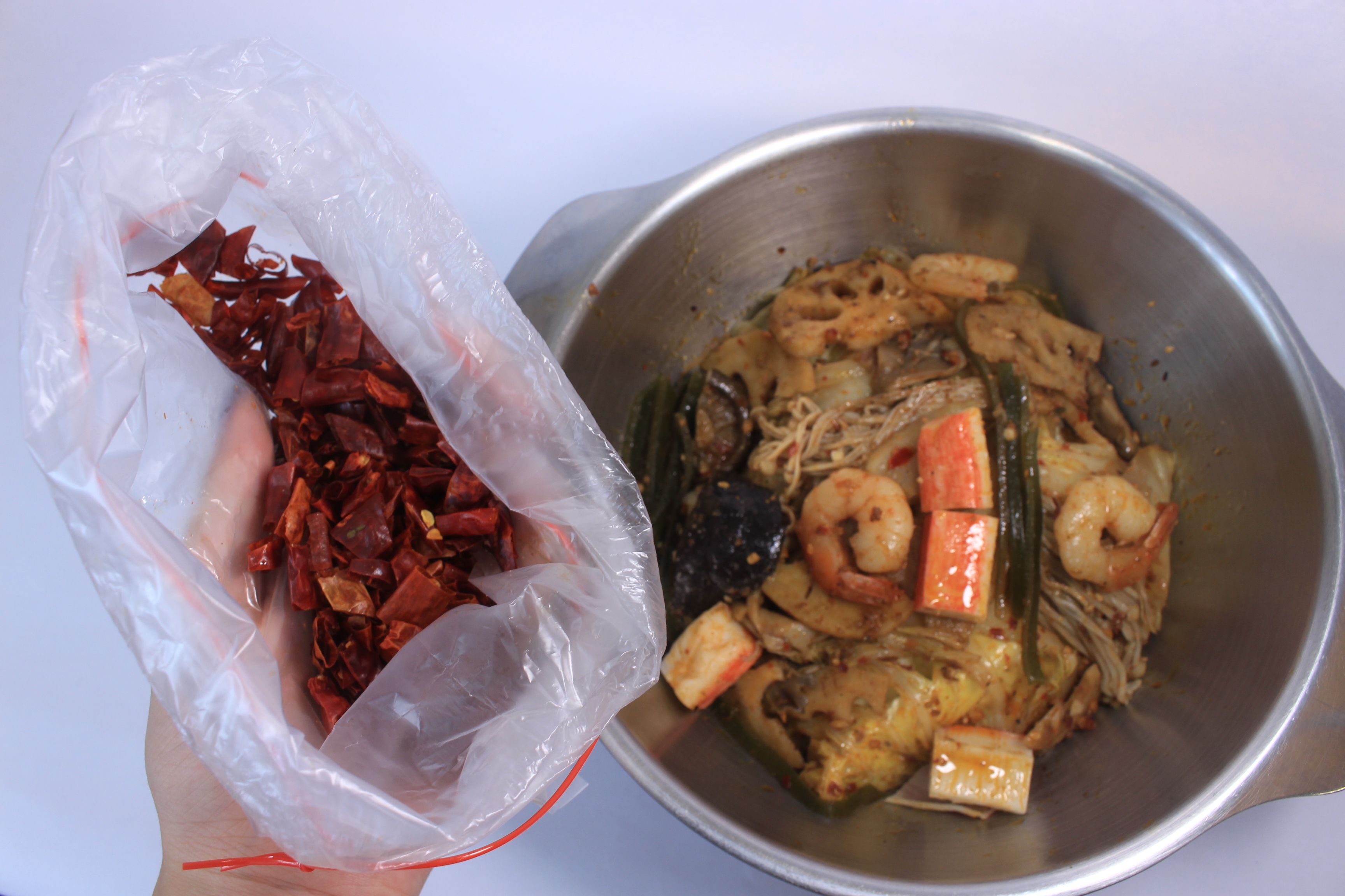
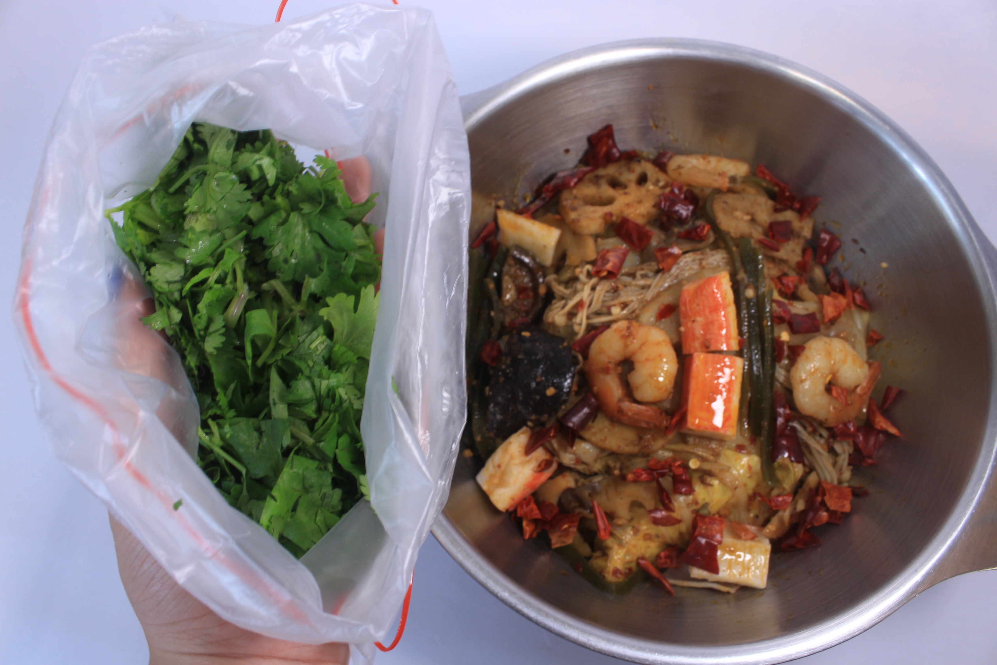
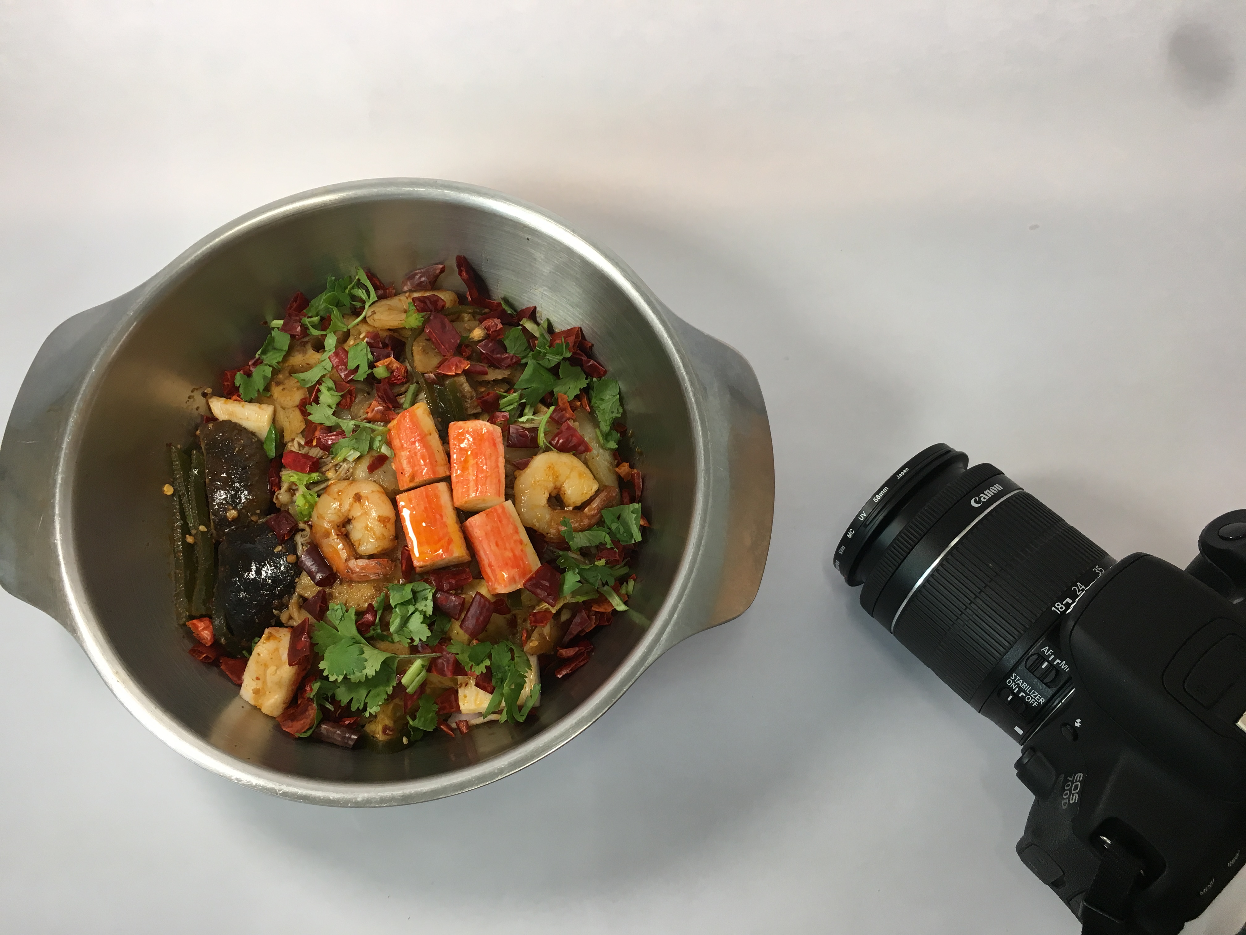
I set up a DIY studio on my table in my room with white paper and a 12 dollars portable table lamp. I bought mala hotpot from my hall restaurant and also bought some other raw ingredients such as chili and Chinese parsley that are normally used to decorate the food. The hotpot restaurant agreed to lend me a small stainless steel pot.
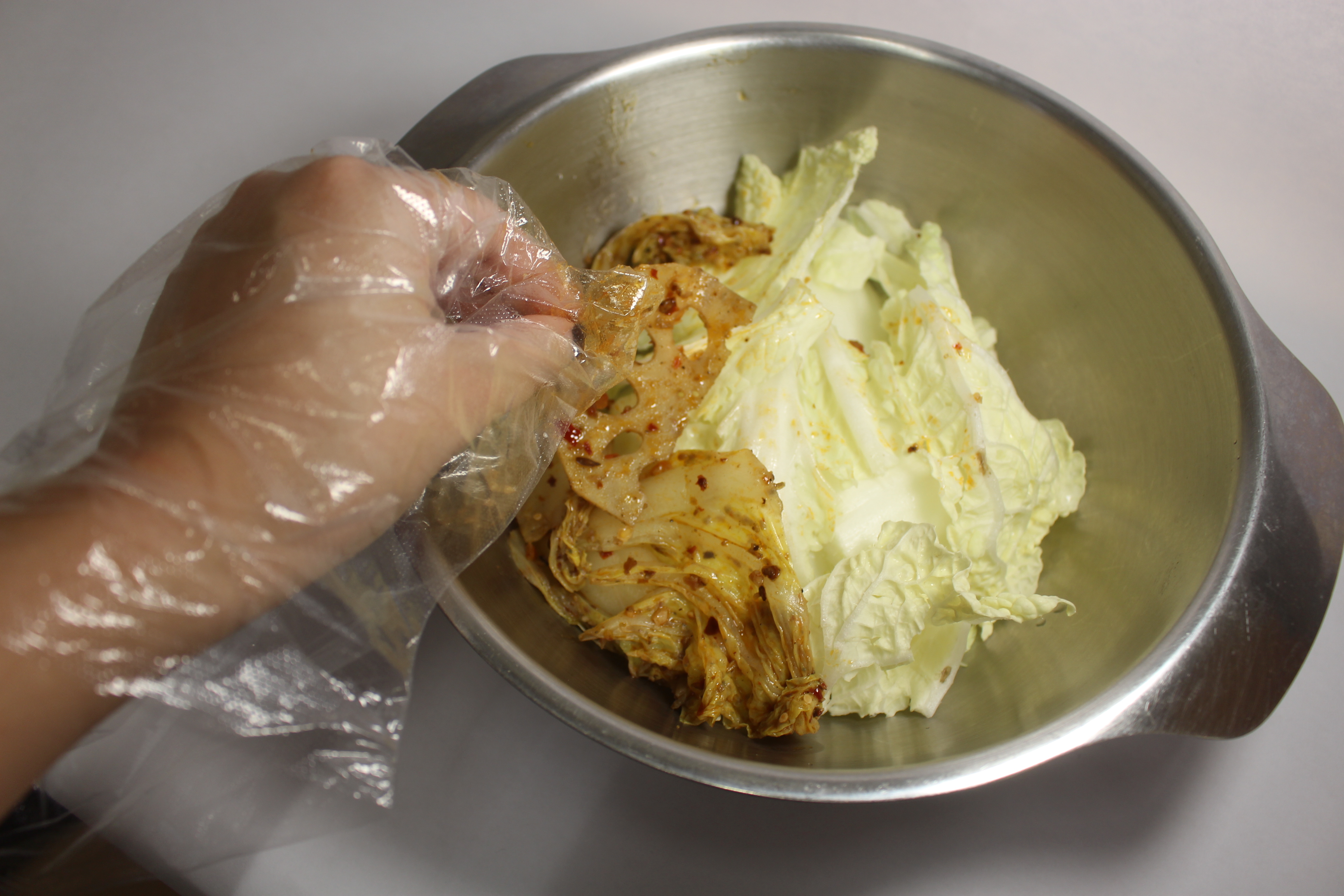
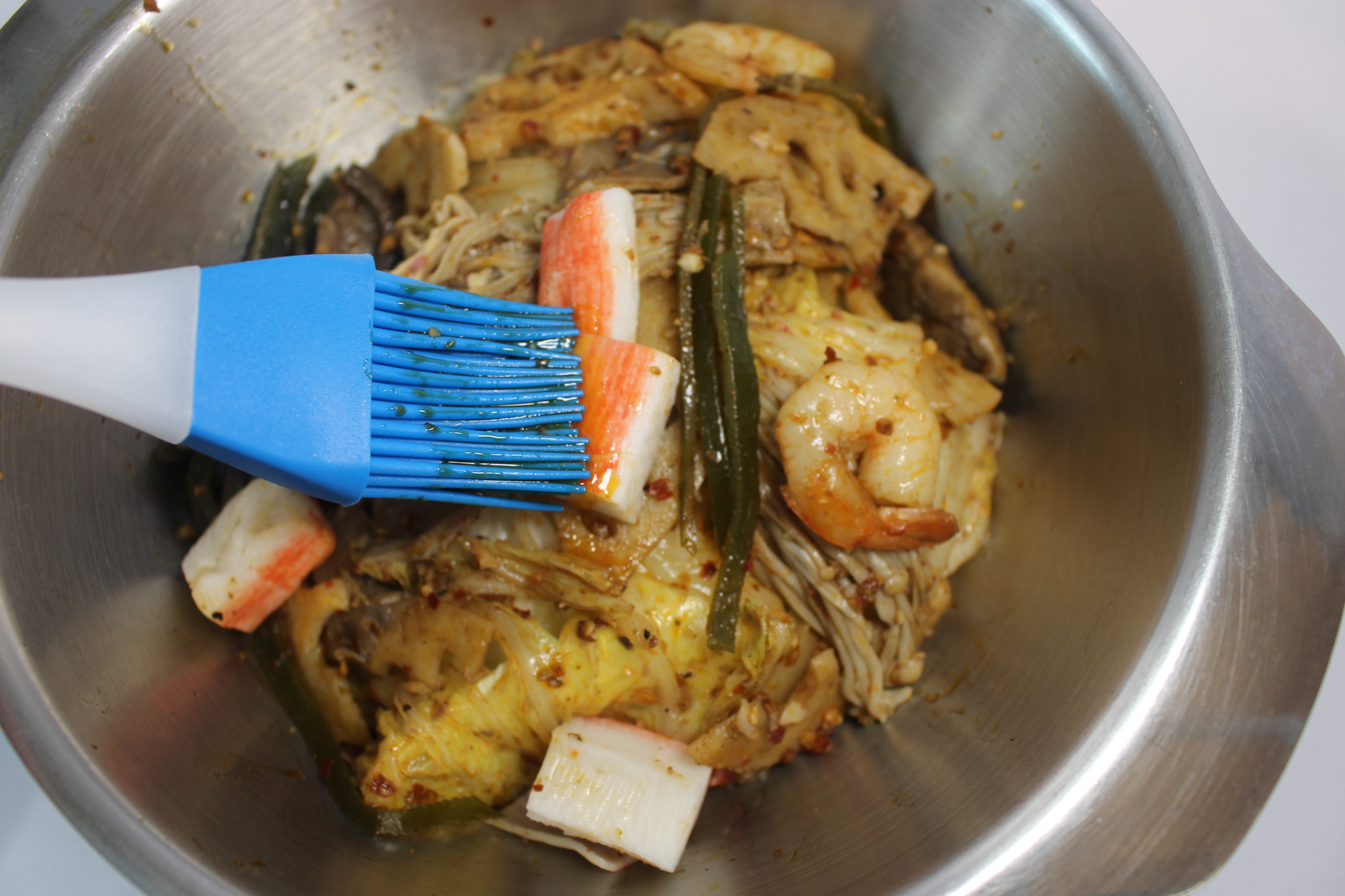
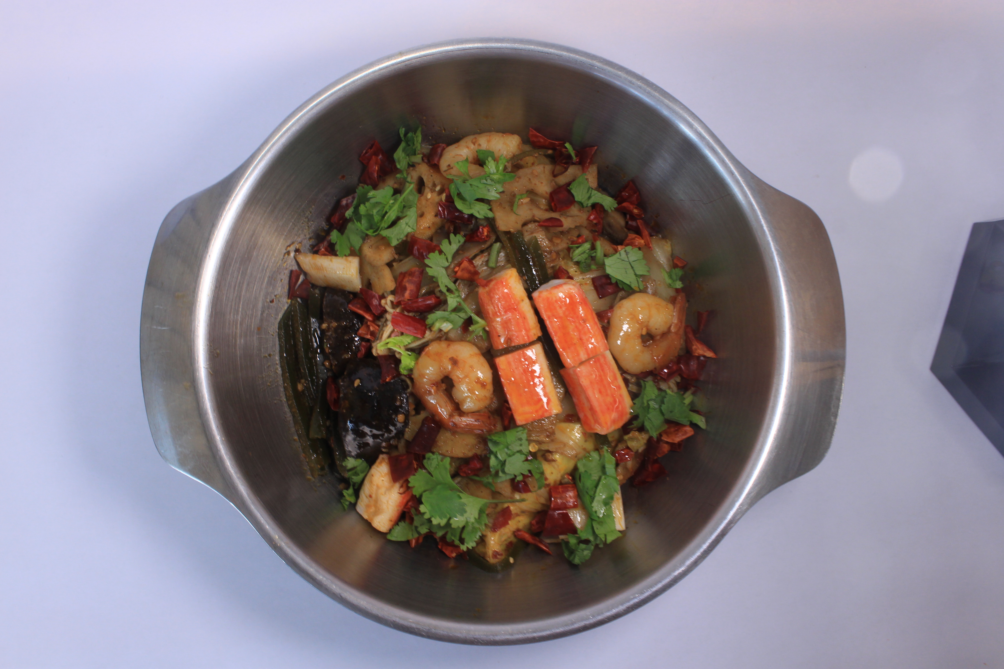
After setting up the lighting and pot, I started to arrange the food layer by layer to make sure the ‘alphabet ingredients’ stands out from the ‘background ingredients’. I brushed extra oil on the ‘alphabet ingredients’ to emphasize the contrast. Here I used mushroom, prawn, and crab sticks to represent the name of my alphabet. Some ingredients are raw and brushed with oil. It is because some ingredients have better shapes when they are raw, such as, crab sticks and dry chili.
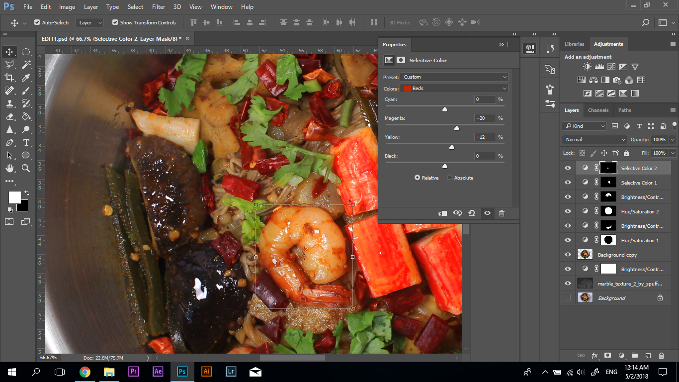
Editing in Photoshop
I increased the saturation of the ‘alphabet ingredients’ to maximize the contrast. Also, the steam effect was edited in the photo to create the focal point, and avoid the artwork to be too pictorial.
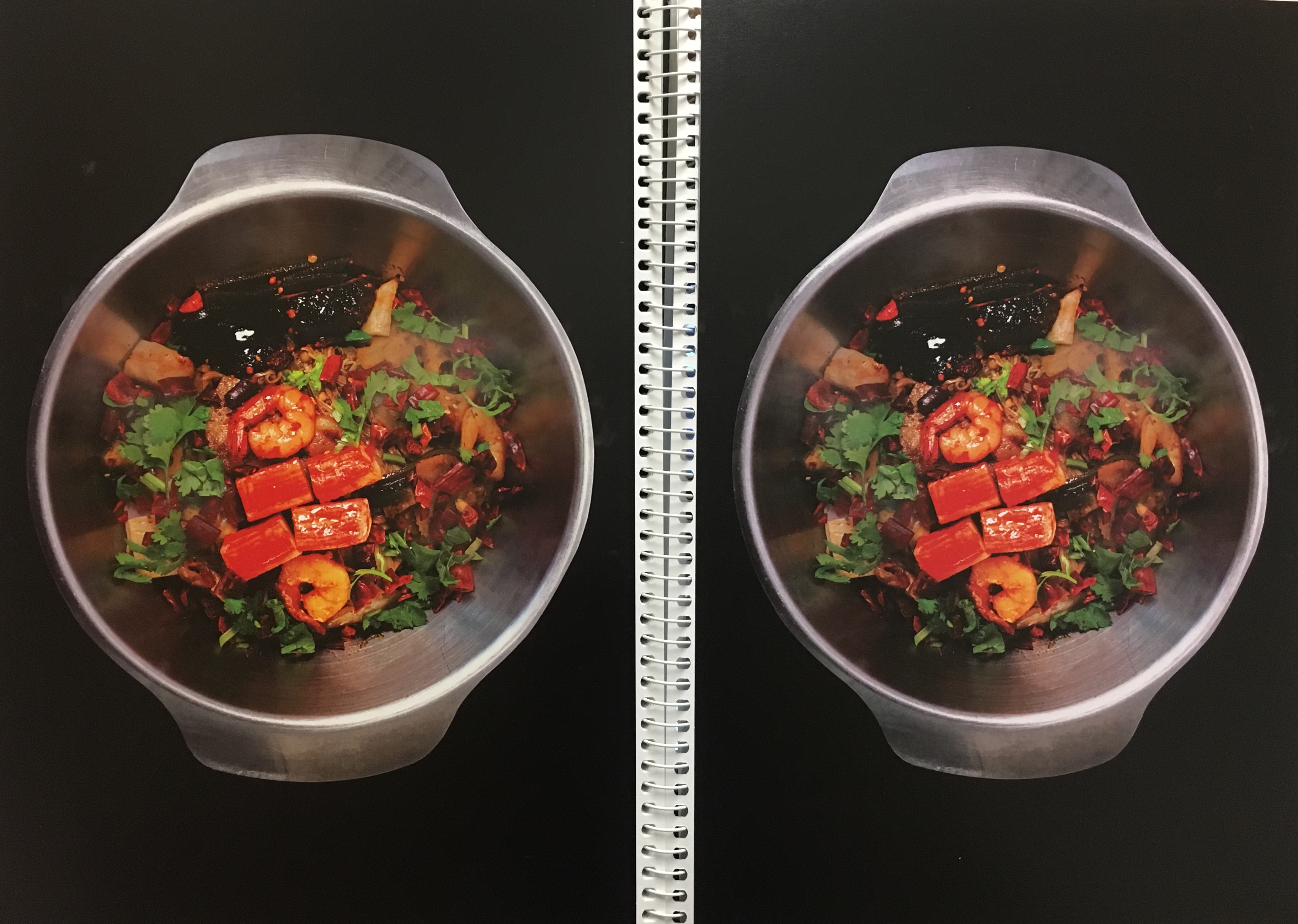
Test Print
Lastly, I test print the artwork and adjusted the saturation, and capacity of the steam to achieve the ideal effect on paper.
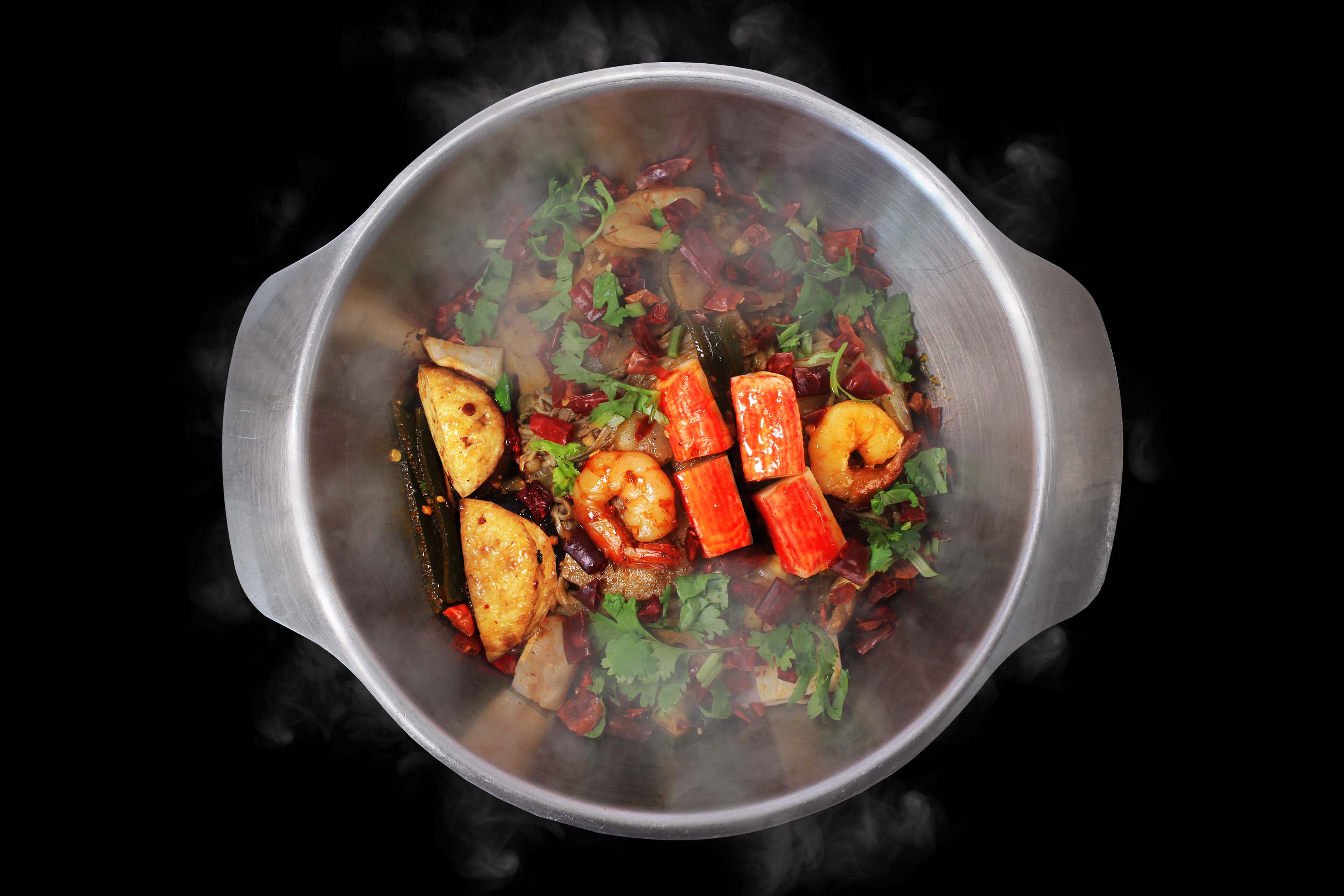
Final Artwork
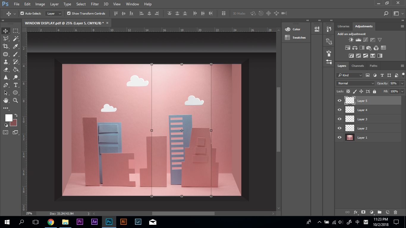
MY NAME IS BELLA AND I AM A VISUAL MERCHANDISER
Overview
Visual Merchandiser is the job that I will probably pursue in the future. Visual merchandiser’s role is to design the layout and display of the store in order to improve the customer’s shopping experience and increase the sells. Thus, my concept for this job is to incorporate my name into the window display.
Research
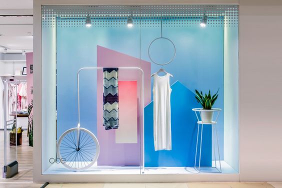
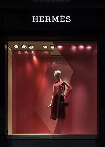
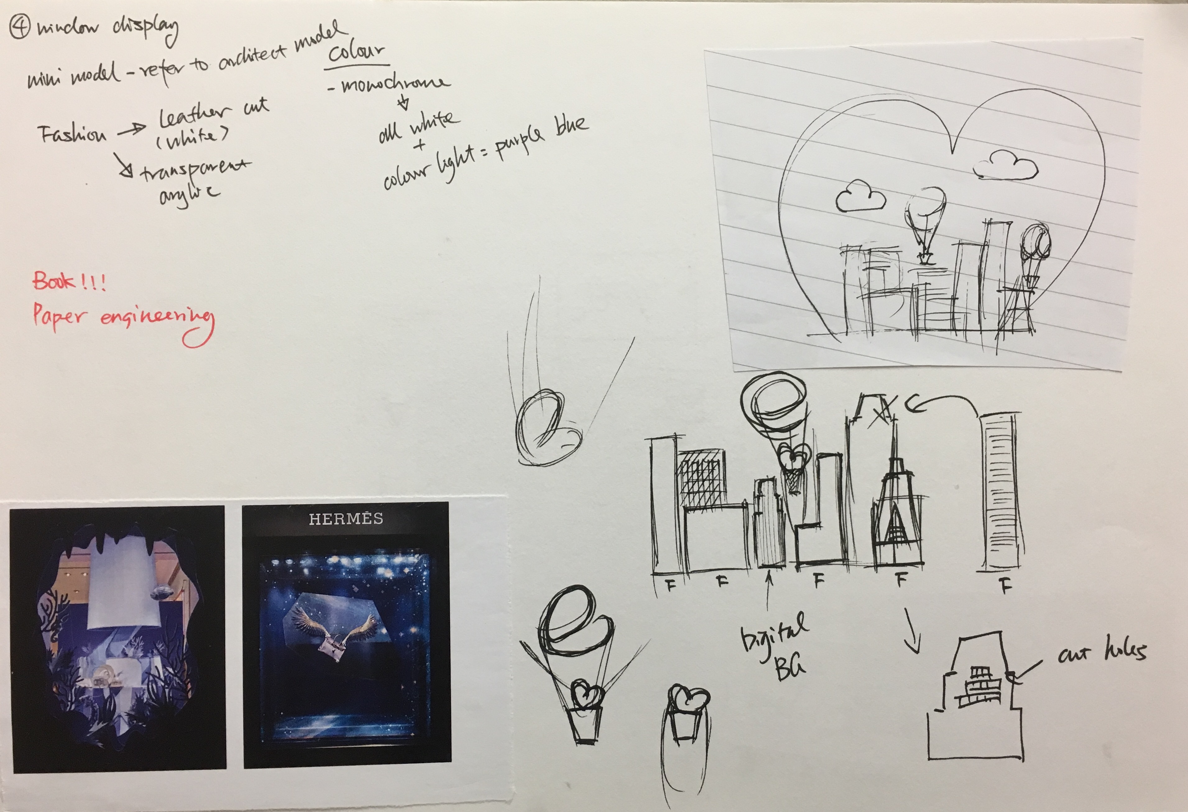
Window Display Colour Theme https://i.pinimg.com/564x/54/52/08/545208062e5547b7c3e5b3d7405c7e1b.jpgInspiration for Composition https://i.pinimg.com/564x/b4/9c/71/b49c7160d54bb6a281ded5bd9220791d.jpgSketch
The window display is a three-dimensional space. It often has a different theme according to the season and festivals. Therefore, I decided to have a Valentine’s Day theme for my window display.
Process
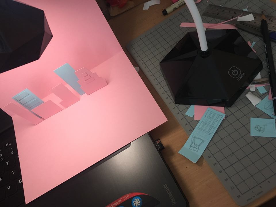
For this concept, I used both traditional media and digital media. First, I used paper to constructed the display and used my table lamp to create the lighting.
Paper ModelThe Original PhotoEditing the Window Reflections in Photoshop
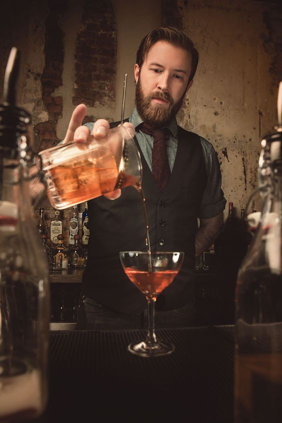
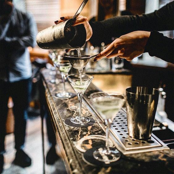
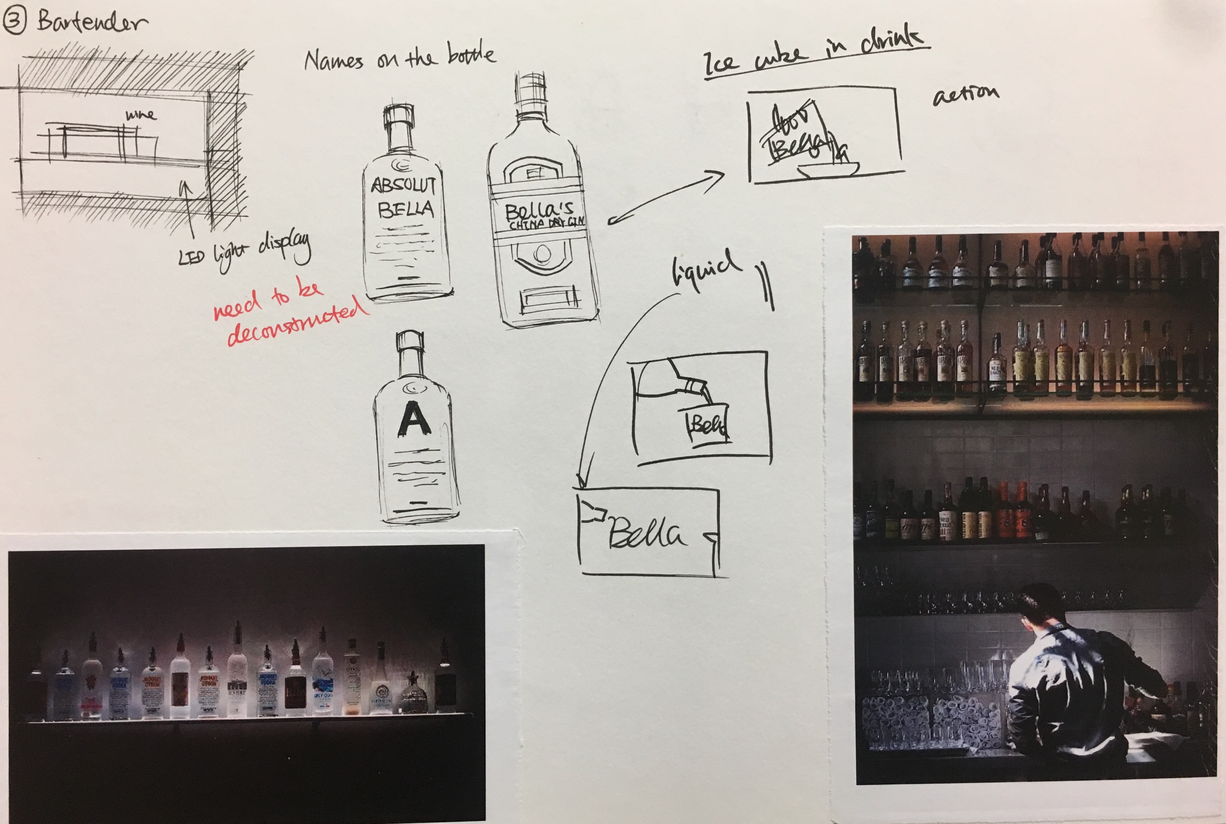
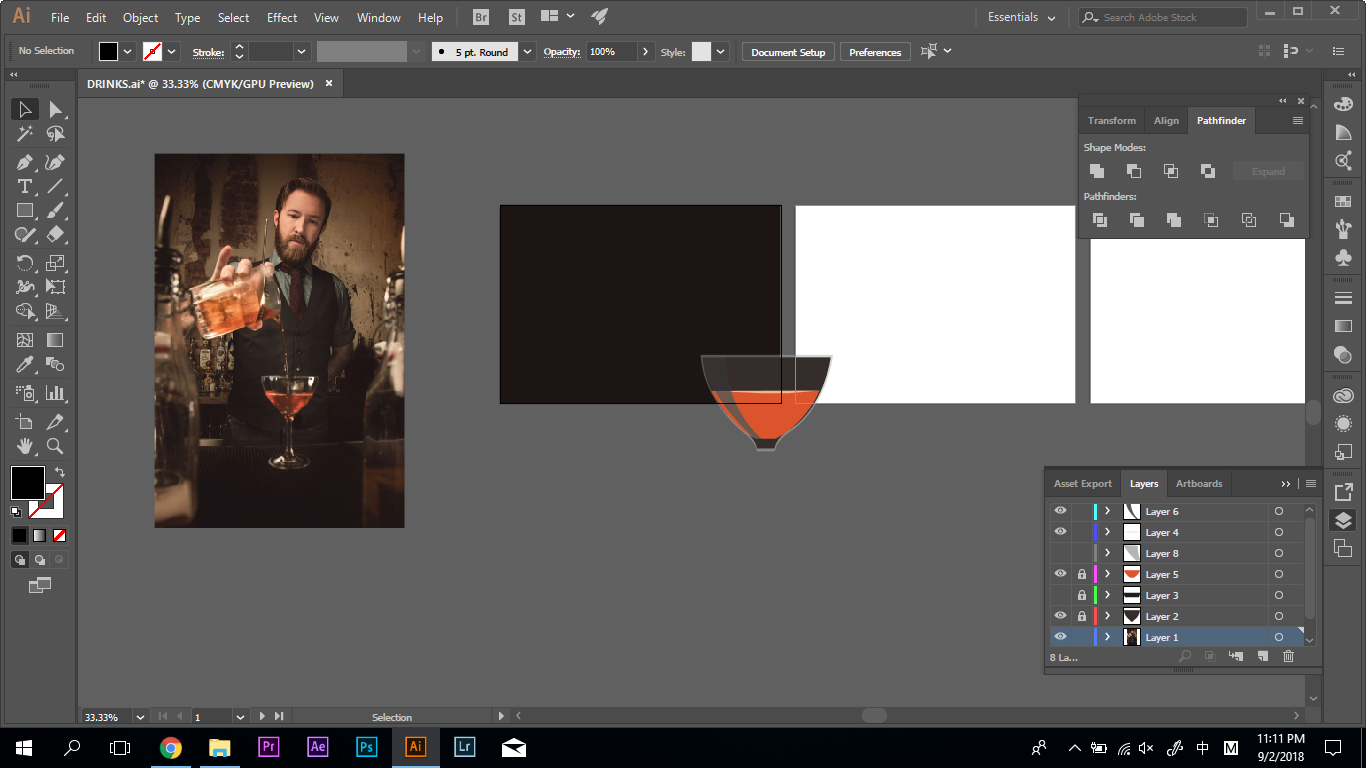
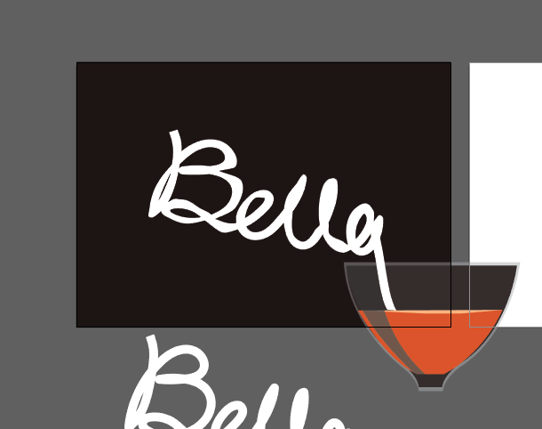
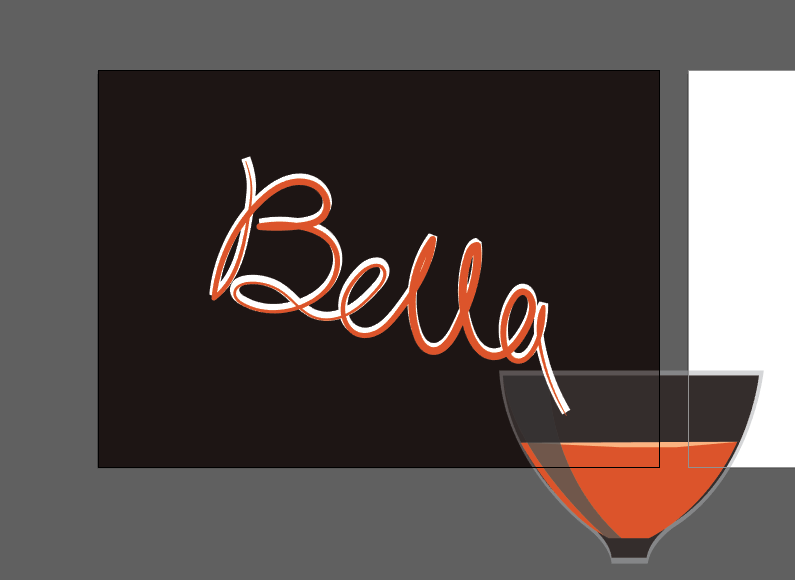
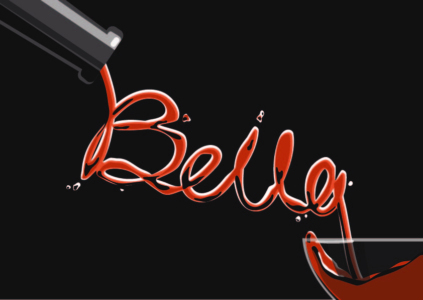
Working in the bar and have knowledge of different drinks is one of the dreams. Initially, I planned to have different alcohol bottles to have the label of my name. However, it seems to be pictorial after the consultation with my professor. Therefore, I decided to use the flow of liquid to create my name.
Research
Bar https://www.pinterest.com/pin/490118371941500030/Sketch
I researched the photo if bars to determine the colour scheme of my artwork. I used the dark background as people normally visite bar at night, and most of the bartender wear the dark uniform. Then, I sketched out the composition to prepare for my final artwork.
Process
Sketch
This artwork was done digitally using Wacom. I create the glass, bottle, and drew my name. Then create different layers to achieve the liquid effect.
B eeeeL lll Aa provided the orginal image, and our professor Randall Packer gave us the c o n c e p t. The control of the proce……………ss is in the other group member’s hands. There is no restri ction that everyone can do anything to the original work. It is in teresting as the result is not expected when an artwork is done by multiple artists.
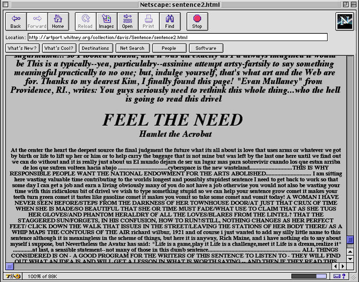
These screenshots show the historic version of the Sentence viewed through an early version of the Netscape browser http://whitney.org/Exhibitions/Artport/DouglasDavis#206-11
Douglas Davis, the creator of one of the earliest artwork on the world wide web, The World’s First Collaborative Sentence 1994. It allows everyone to contribute words, video, photographs, sounds and etc. to this long sentence in the collective third space. It was commissioned by the Lehman College Art Gallery, Bronx, N.Y. and The City University of New York, with the assistance of Gary Welz, Robert Schneider, and Susan Hoeltzel. Up to date, there are two versions of the sentence. One is the historical version and another is open to new contributions.
Screenshot of the website when I was contributing to the sentence http://artport.whitney.org/collection/DouglasDavis/live/writesentence.html#contribute
The sentences added are various, as it had been edited for a lot of time by Anonym. I contributed to the new version of the sentence that came to my mind when I was doing the research (screenshots above). I am now part of this collective artwork. So there is the question, who is the author of this online artwork? According to the essay, The Work of Art in the Age of Digital Reproduction (An Evolving Thesis: 1991-1995) by Douglas Davis, this is the first artwork that is multiple in authorship. It also has unconventional time-scales, since it can be edited anytime.
The free language learning platform https://cdn.makeuseof.com/wp-content/uploads/2016/12/Duolingo-logo-994×400.jpg
Another example of online collaboration project is called Duolingo, a free language learning platform with 200 million users. It seems to be an ordinary language learning app. However, collaboration is happening seamlessly. The users are actually translating the web while simultaneously learning a language. It extremely costly to employ professionals to translate the webpage, and computer translation is not accurate sometimes. Duolingo collects and combines the different versions of the translations to obtain the most accurate result. Translating English Wikipedia to Spanish would take only 80 hours with 1 million users. Moreover, this platform is free for both the users and web translation. Thus, this online collaboration seems to form a common thread among peers.
All in all, The World’s First Collaborative Sentence and Duolingo do have something in common that they gathered the “puzzles” around the world to create the piece of work, which is probably impossible to achieve by an individual. It seems that the online collaborations are efficiently creating incredible artwork, and contributing to the human knowledge.
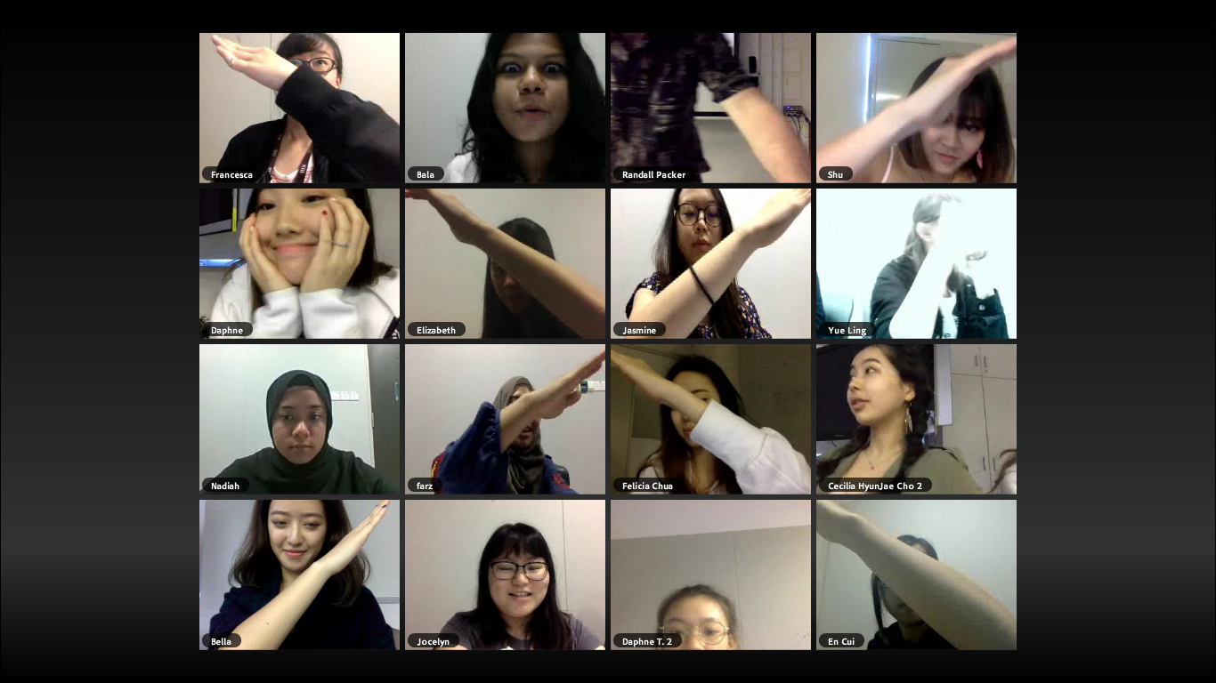
I would like to give a name to this screenshot, e-connect. A lot of things in our daily life are going “e” (Electronic) because of technology. For example, e-mail, e-ticket, e-commerce and etc.. Technology improves the quality and efficiency of our lives. Today, we are able to connect with each other easily in the third space which the technology creates.
Last week, I had my e-connect experience in class. It was my first DIWO experience with Adobe Connect. We did several activities with each other, one example is making a cross on the screen as the photo above. We decided to make a cross with the guidance of our professor Randall Packer. A few minutes were taken for us to agree to do it, figure out how to achieve the effect, and tell each other “wait, don’t move! I need to take screenshots”.
Furthermore, we discussed our feelings in class, and received a word that worth million dollars from Randall Packer, “Negotiation”. It made me think about why negotiation is so important. It sounds like a big world yet it seems to be what we are using on the daily basis. It is simply looking for a deal that makes everyone happy. It is beneficial for us to master the skills of negotiation, as most of the artworks would involve more than one participants. For instance, art history group presentation. The first thing we do after forming a group is probably creating the WhatsApp group, where we can negotiate how we are going to contribute to the project in the third space. Good negotiation will give everyone a good group project experience and vice versa.
All in all, negotiation is essential as we are living in the society where it is almost impossible to avoid collaborations. Also, the existence of the third space had improved the quality of negotiation base on my experience in class and daily life.