PROJECT BRIEF
Every person reacts differently to different settings. In four rows of three squares, create a self-portrait based on four different settings. For each of the four rows, use the first column to represent yourself and the second column to represent a setting and the third column to represent an imagined outcome. Apply your understanding of colours and colour theory to visually represent the multifaceted nature of your personality. You may choose to do this digitally or by hand (or mix-media). There are a total of 12 image compositions. Each individual composition measure 200mm x 200mm (square) with a 20mm x 200mm space for text.
OVERVIEW
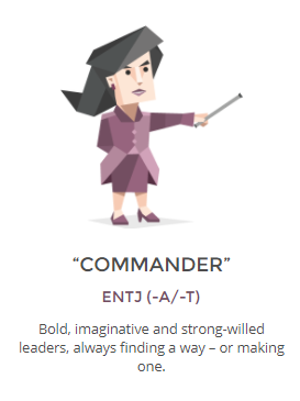
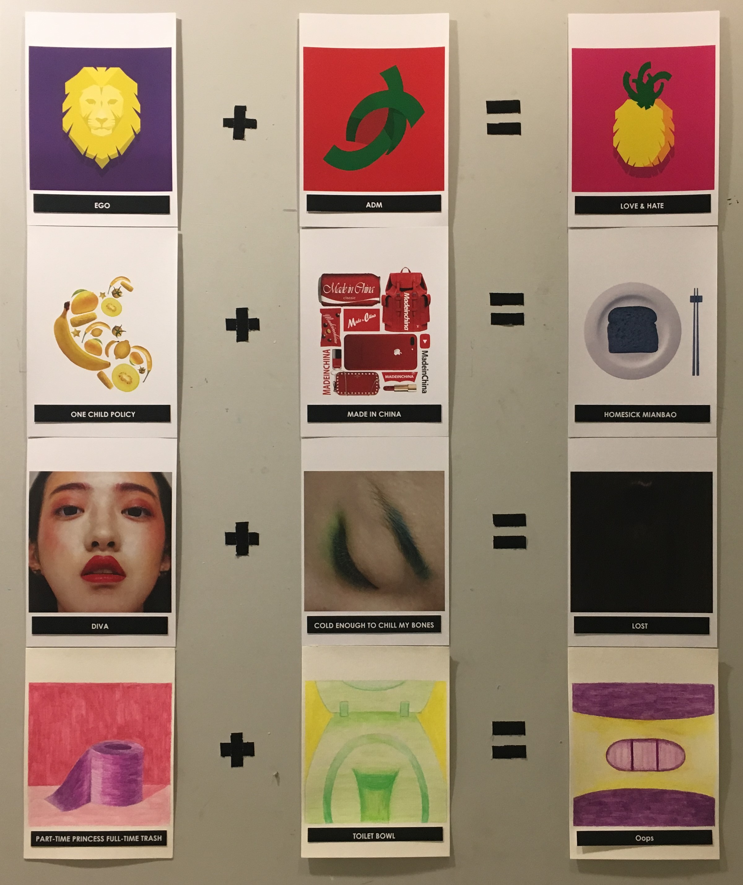
I started this project by looking at my personality based on a personality test that I think is the most accurate. My test result is the ENTJ PERSONALITY (“THE COMMANDER”), and I used the four categories, such as career paths, family value, romantic relationship and friendship of my personality analysis as the concepts of my equations.
Your time is limited, so don’t waste it living someone else’s life. Don’t be trapped by dogma — which is living with the results of other people’s thinking. Don’t let the noise of others’ opinions drown out your own inner voice. And most important, have the courage to follow your heart and intuition. They somehow already know what you truly want to become. Everything else is secondary. – Steve Jobs
According to research, Steve Jobs is also with ENTJ personality. People with this type of personality are determined, confident and forceful. Thus, red is the dominant colour in my equations to represent energy and passion.
1ST EQUATION

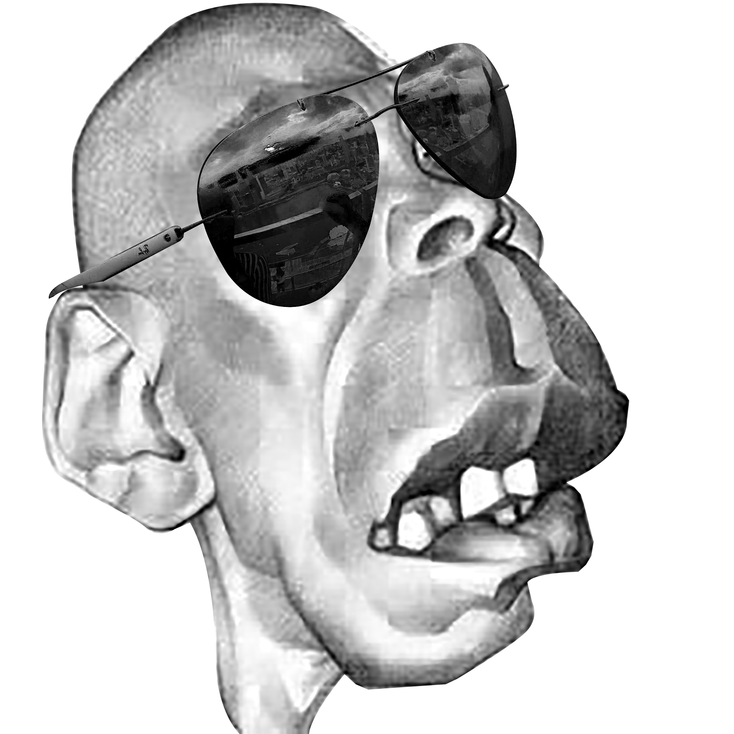
CONCEPT
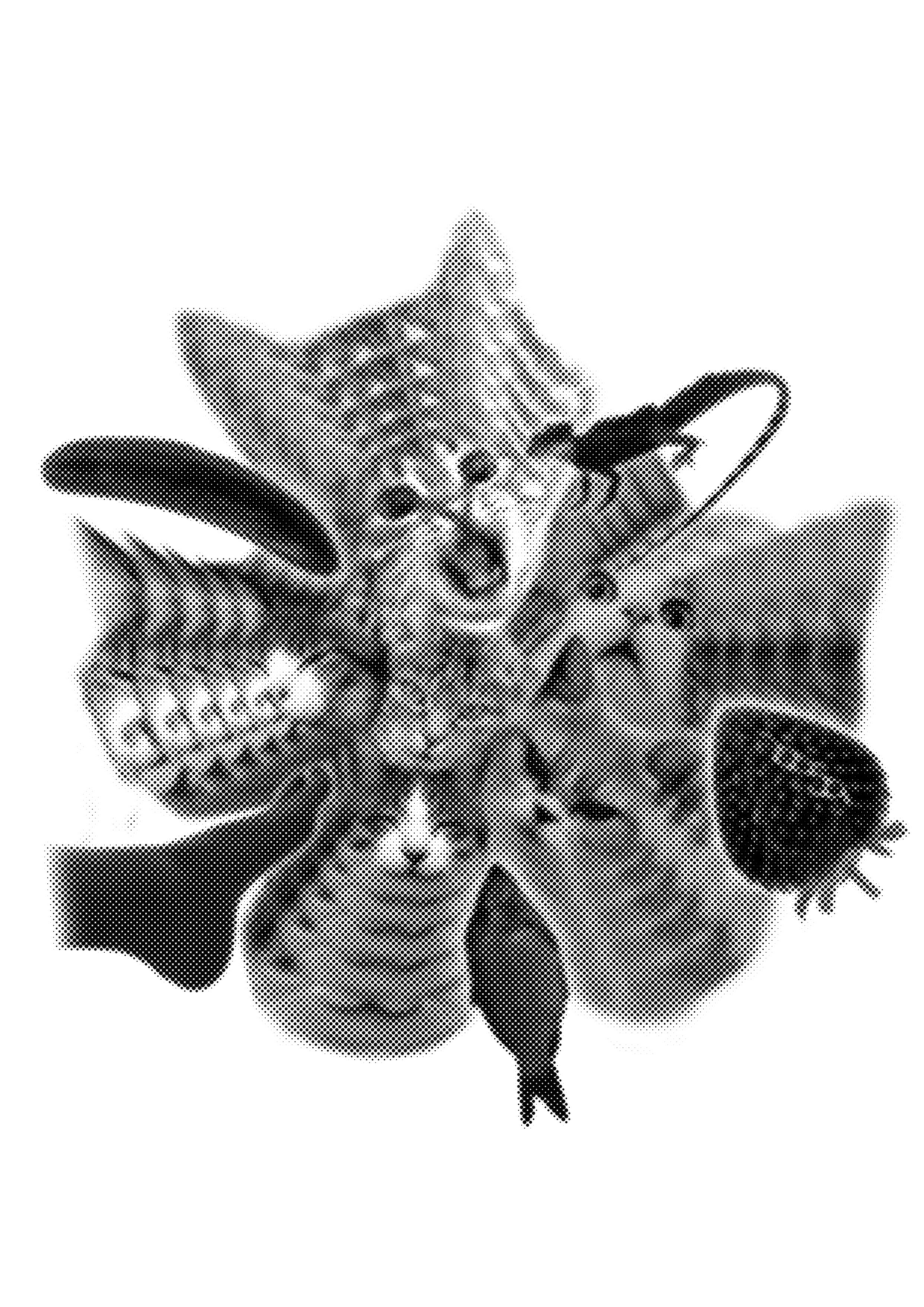
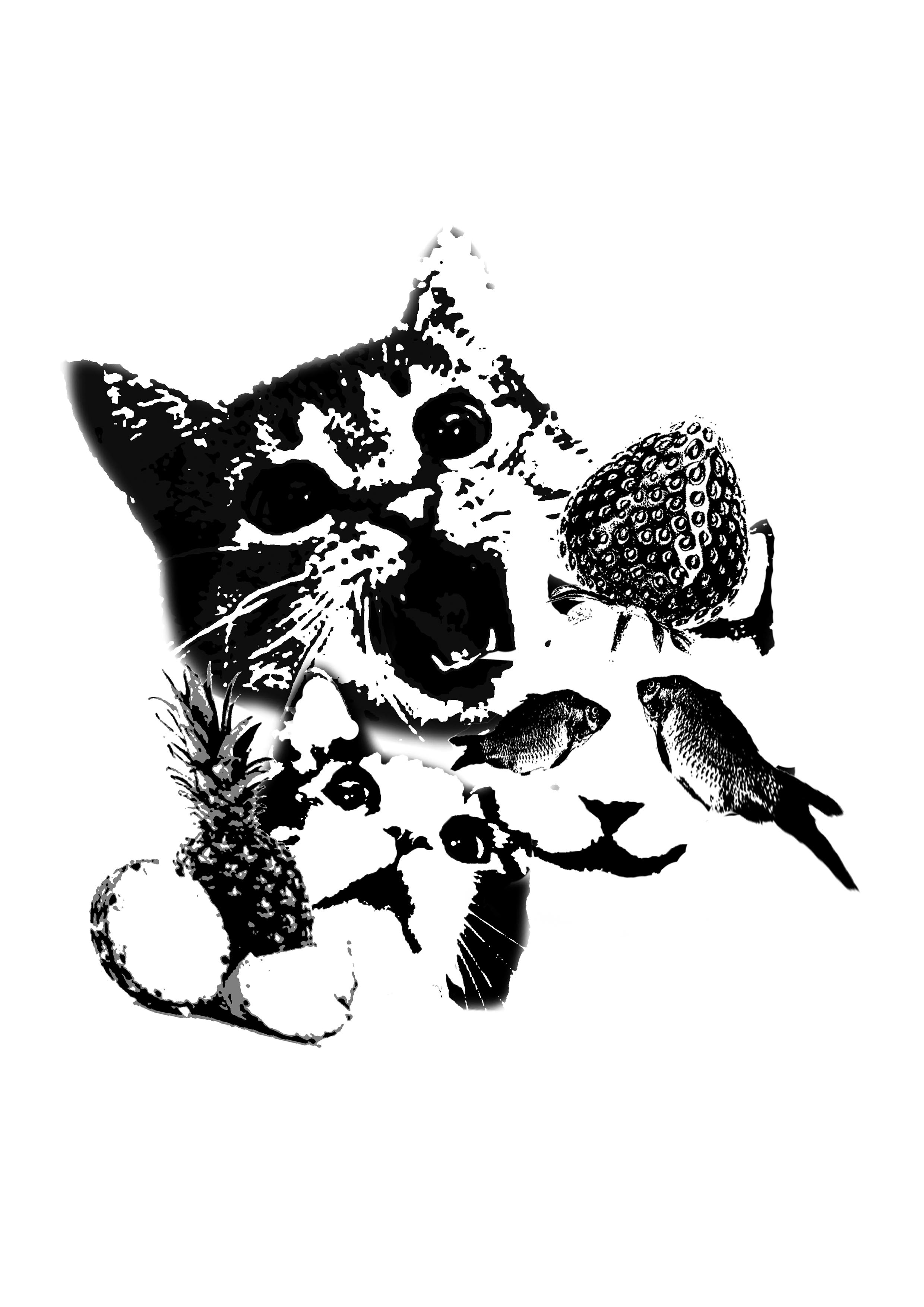
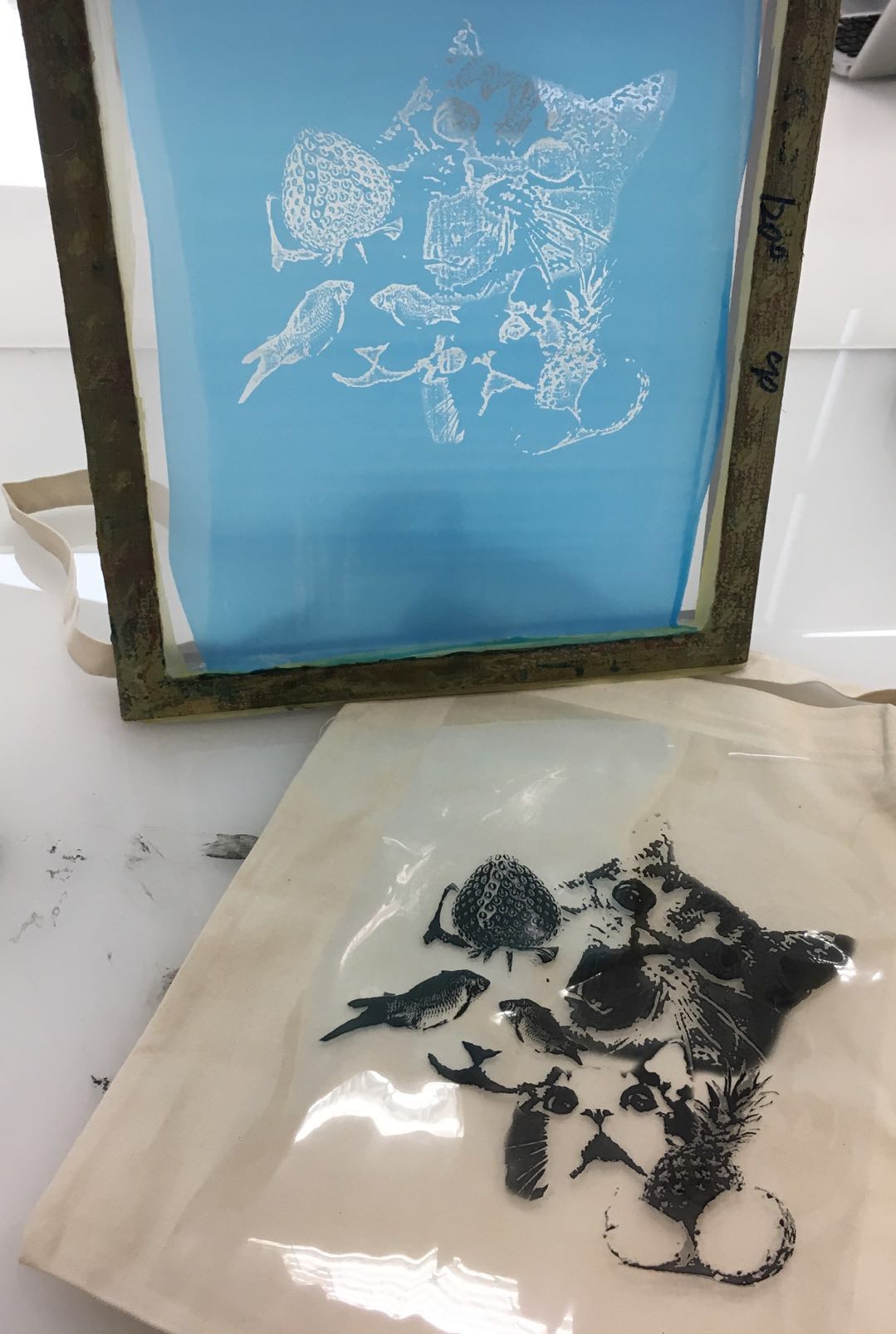
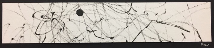
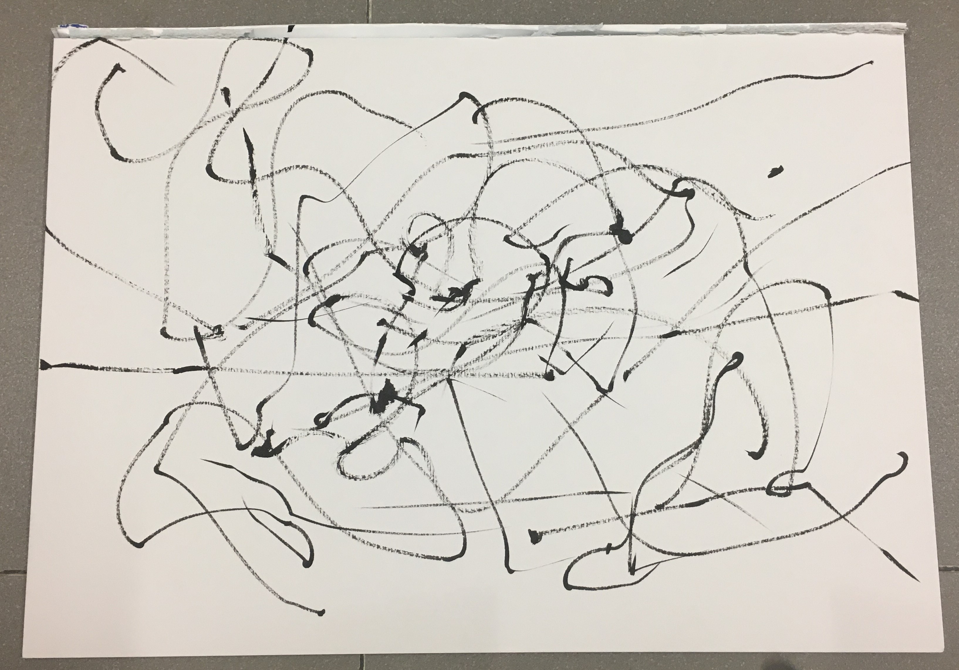
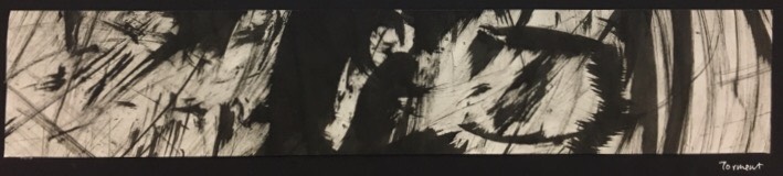
My first equation is about my career paths. My personality makes me suitable to be the leader in the organization. I chose lion to represent myself, as lion symbolizes strength and leadership. My setting here is my school ADM. It is where I am preparing for my future career. My response to my personality is a pineapple, as it a love and hate fruit. It tastes great at first but gives the numb feeling on the tongue after eating too much of it. I am passionate about what I am doing but sometimes it torturing when I am stuck on some projects.
INSPIRATION

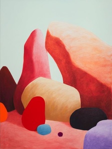
I was inspired by the vibrant colours of pop art and its simple composition.
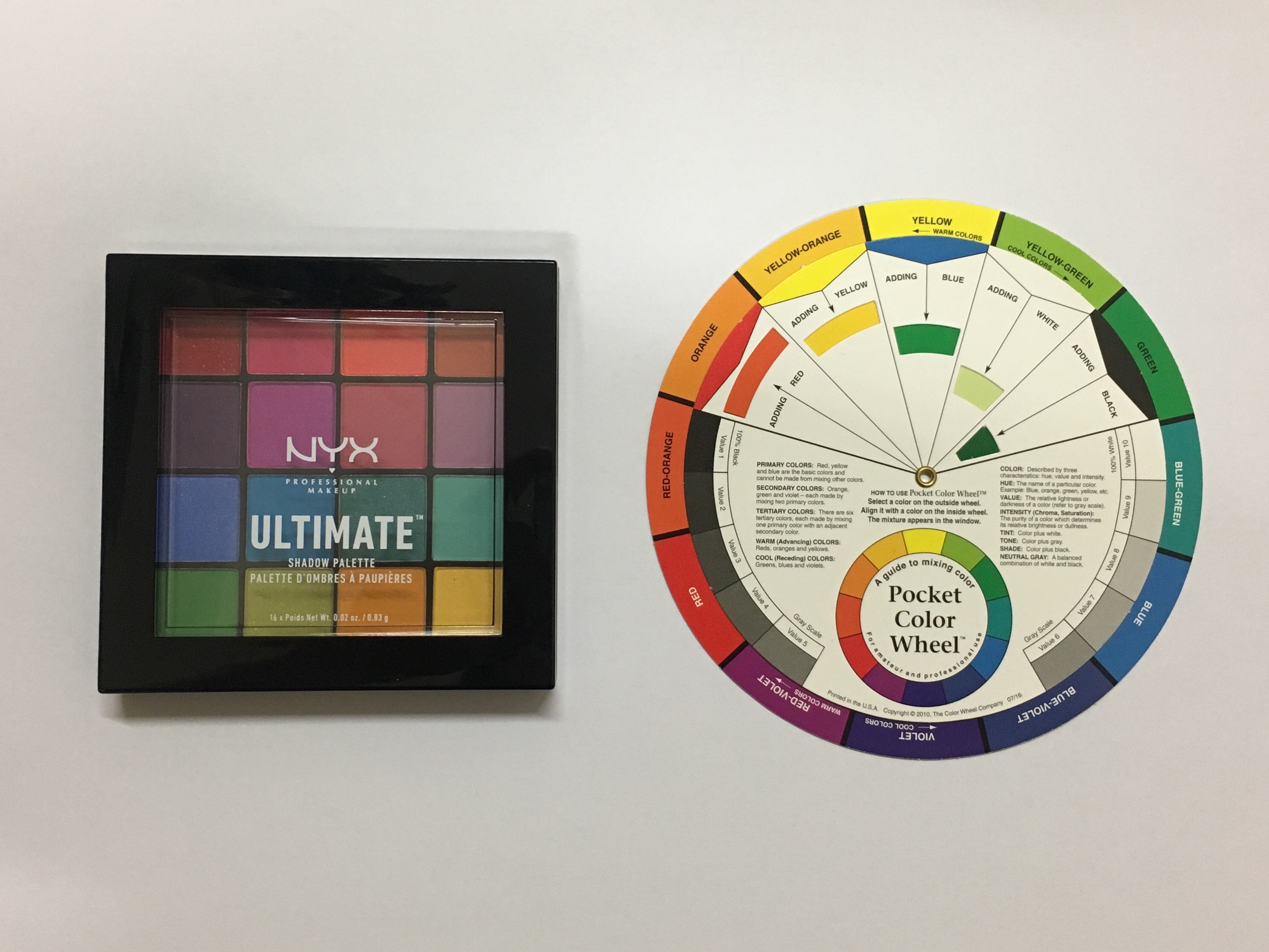
COLOR THEORY

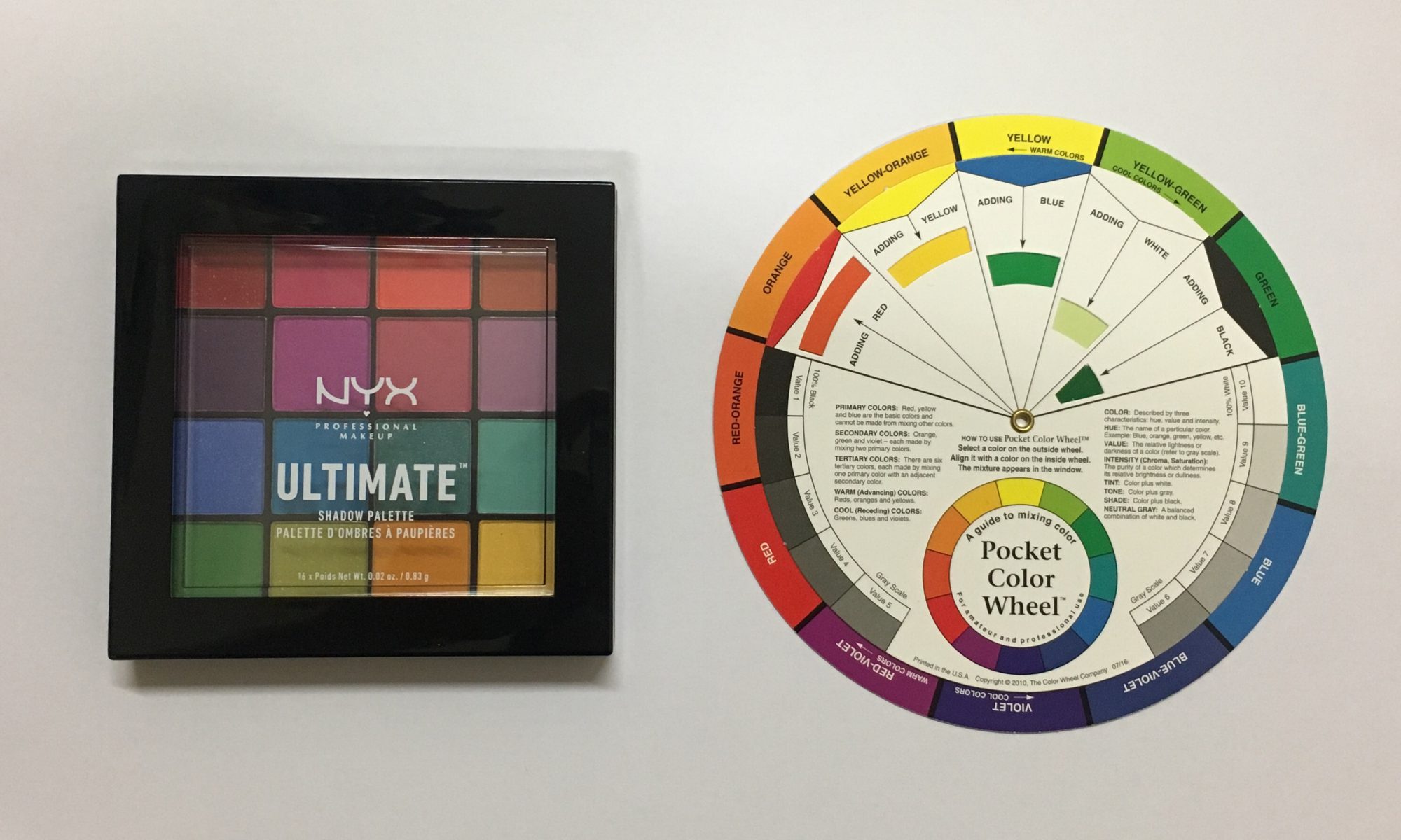
I decided to use complementary colours for my personality and setting as it represents conflict which is my love and hates towards my career paths. The first set of complementary colours are violet and yellow, while the second are red and green. I used red-violet, which is the hue in between violet and red to be the background of the response. I used yellow and green again in the response to form split-complimentary colour.
DESIGN ELEMENTS & PRINCIPLES


In this equation, I used the symmetrical balance to achieve harmony. Symmetrical balance also shows the sense of order and clarity which is my attitude toward my career paths.
2ND EQUATION
CONCEPT
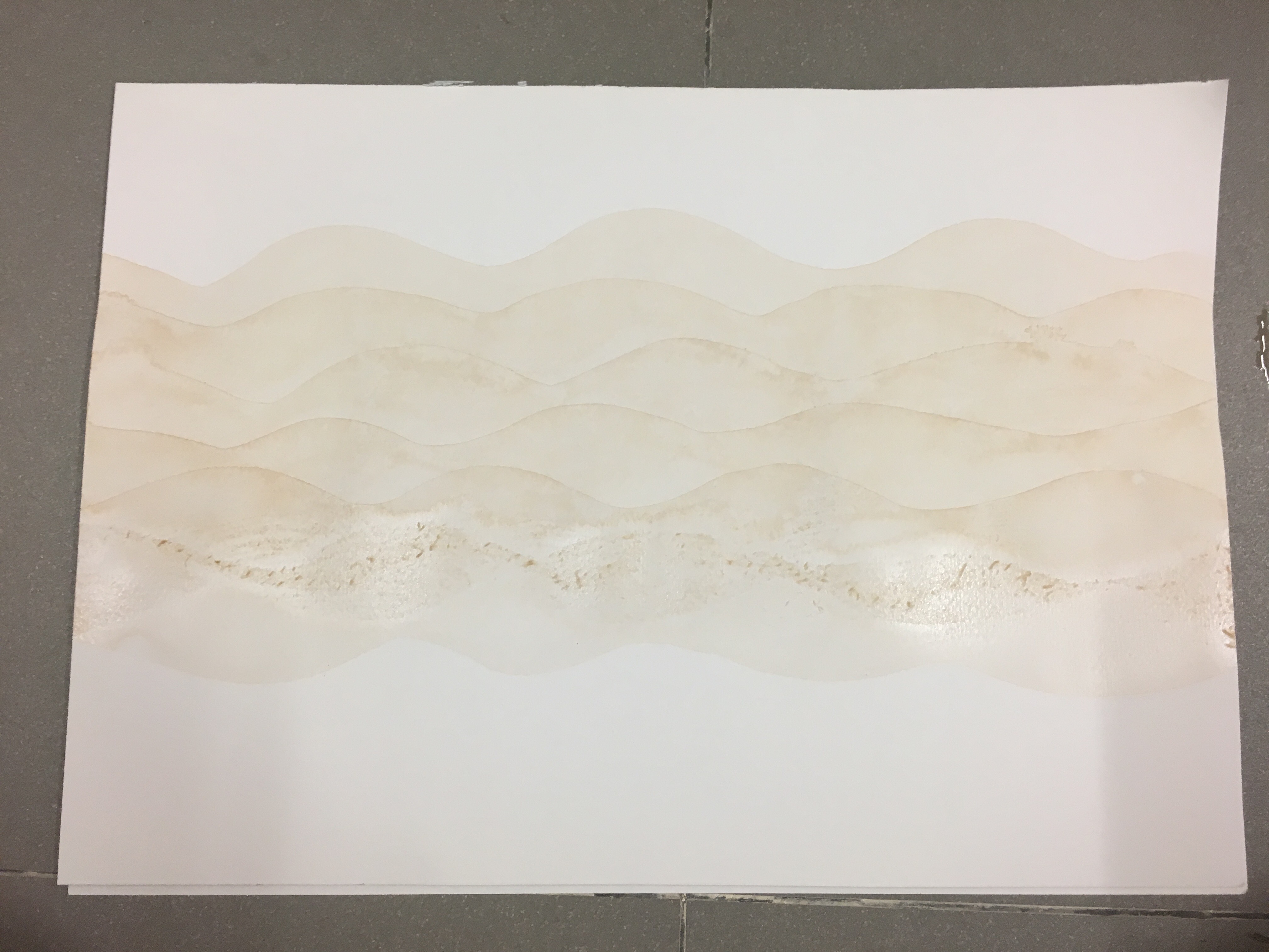
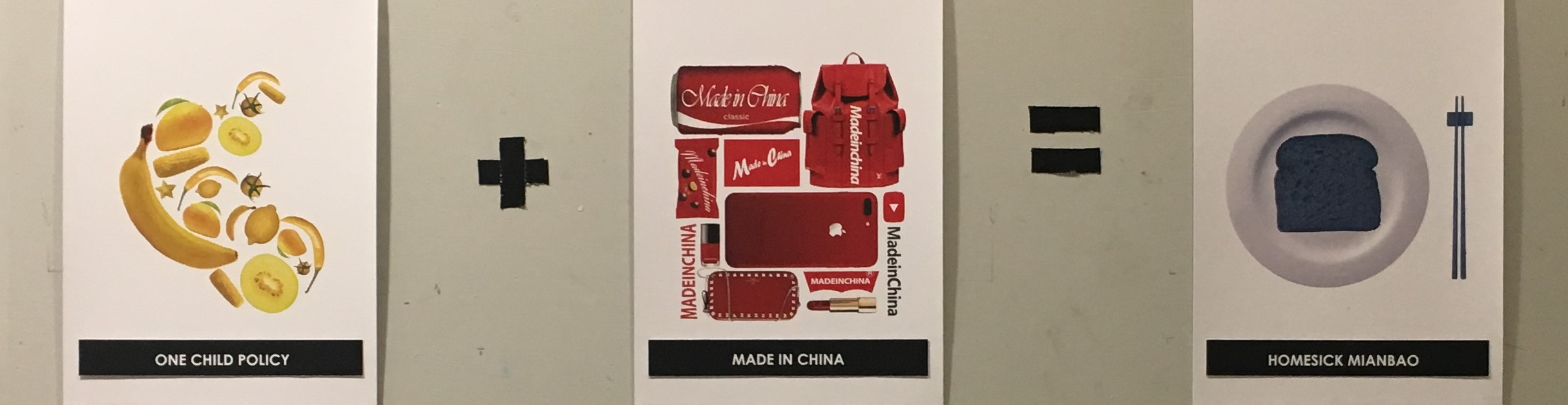
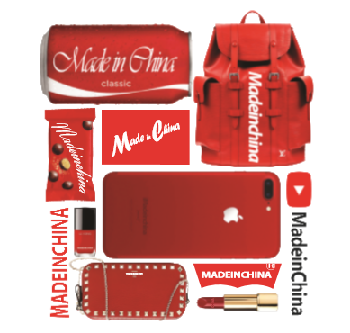
The third equation is about my relationship with my family. I was born during the one-child policy period in China that each couple could only have one child. Therefore, I am the only child in the family with all the attention from my parents. However, I started living overseas away from my family since 15 years old. I am living in Asia but the western culture influenced me for years. Thus, the response is my confusion of my cultural identity, and also my homesickness
INSPIRATION
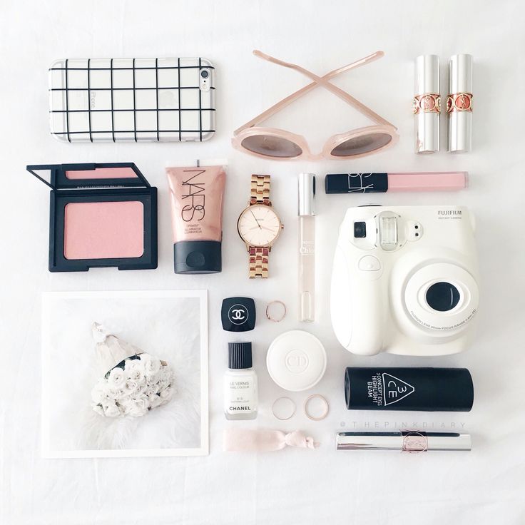
I was inspired by the flat lay photography that is trendy on social media. I search for the existing product, edit them accordingly, and arranged them into the plat lay.
COLOR THEORY
I used monochromatic colour scheme. I picked yellow and red from the National flag of China for my personality and the setting. The colour of the response is blue which represent my sadness. Those three colours form triad colour that is lively and harmonious.
DESIGN ELEMENTS & PRINCIPLES


For the first composition, I used elements with curvy lines to form the shape of a baby which also contain curvy lines to achieve unity. The decomposition contains more shapes like rectangles and squares that create unity although there is quite a number of different objects. Lastly, the bread is dominant in the composition while the plate and chopstick are the subdominant and subordinate. The focal point is the bread as it is the main character in the story, and the tableware is here to create contrast.
3RD EQUATION

CONCEPT
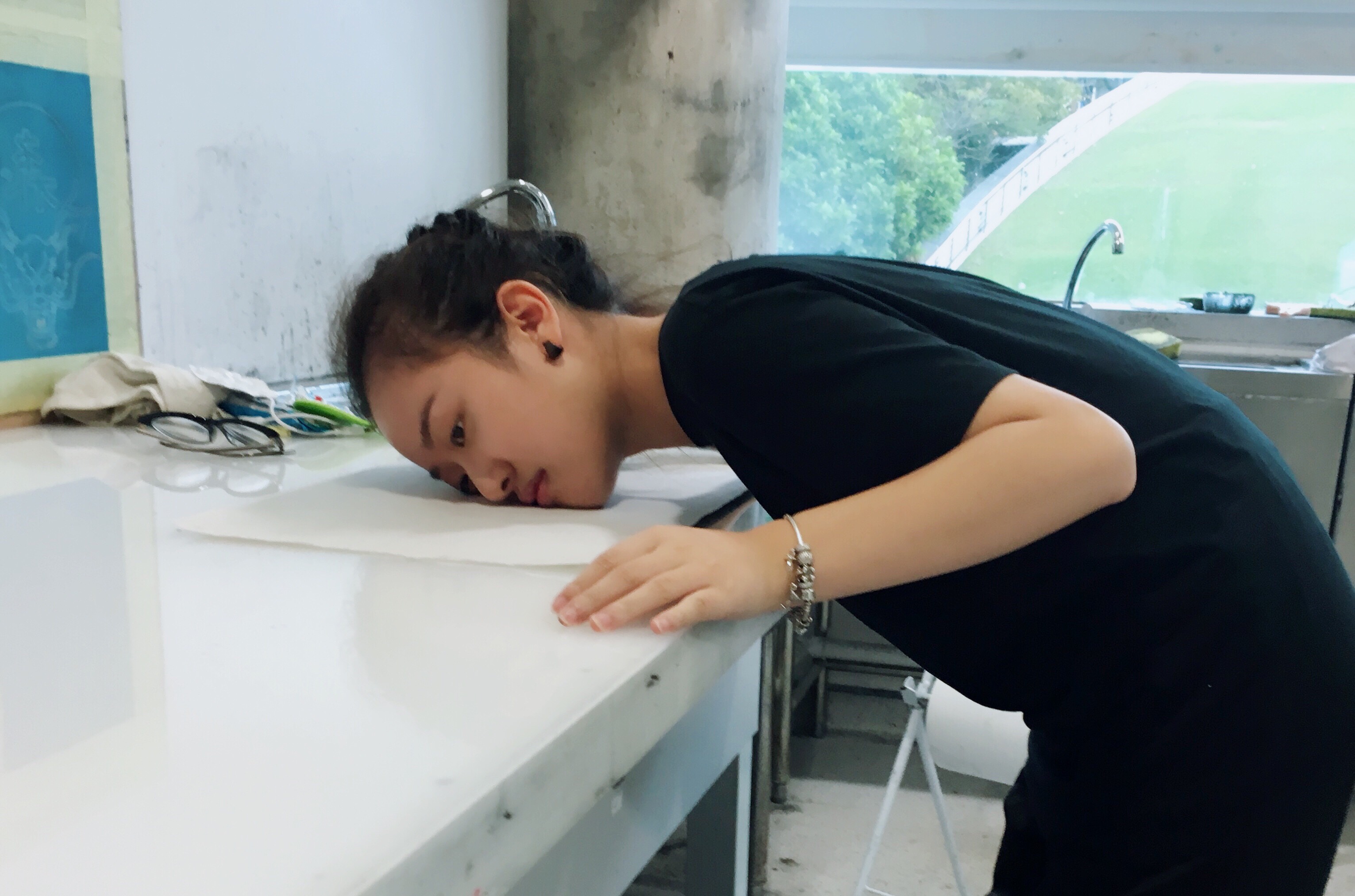
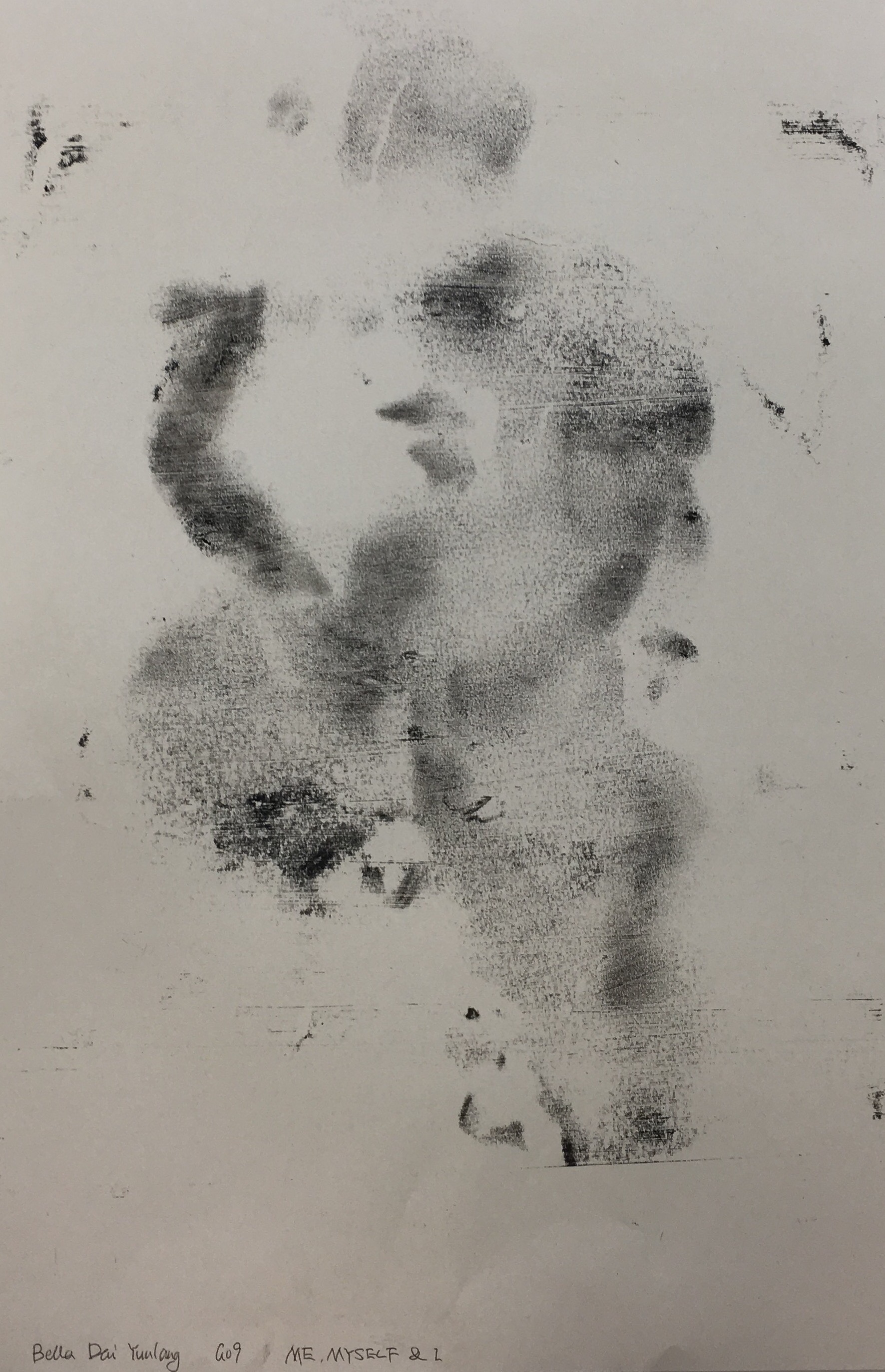
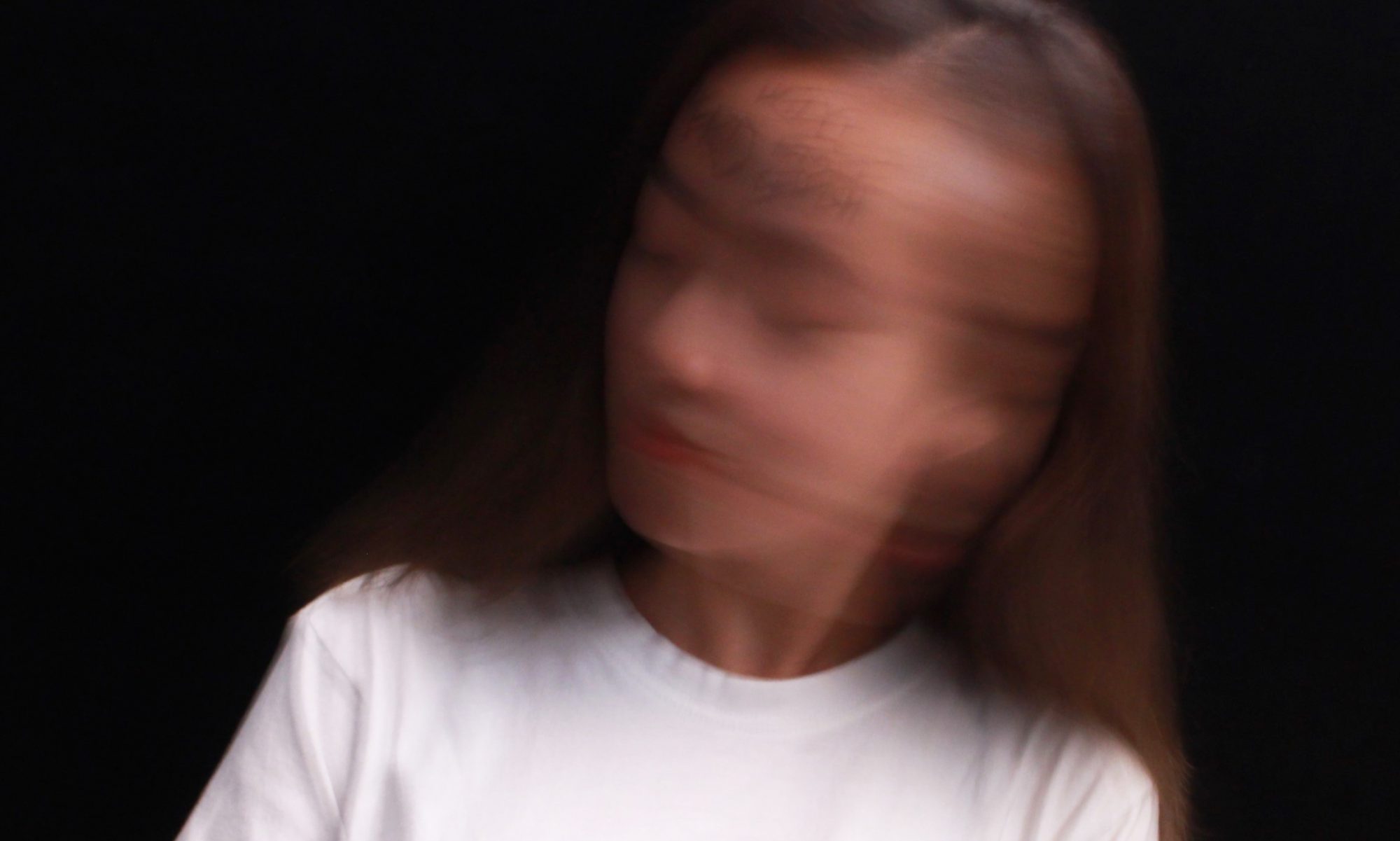
The 3rd equation is about my romantic relationship. People with the ENTJ personality type like to be the leading roles in relationships. I approach a relationship with a set of goals and plans. My ideal type of relationship is fall of creativity and energy. However, the reality is cold enough the chill my bones. It is difficult to find a partner who shares the similar value. I feel lost and confuse when I am facing the single me with my pride and high expectation.
INSPIRATION
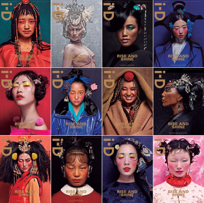
I always like to explore new things so I decided to do mix media for this equation. One media is makeup, and another is photography. I was inspired by a Chinese visual artist, Chen Man. One series of her artworks gave me the idea of using makeup as the media. The colours are pure and vibrant in this series.
COLOR THEORY

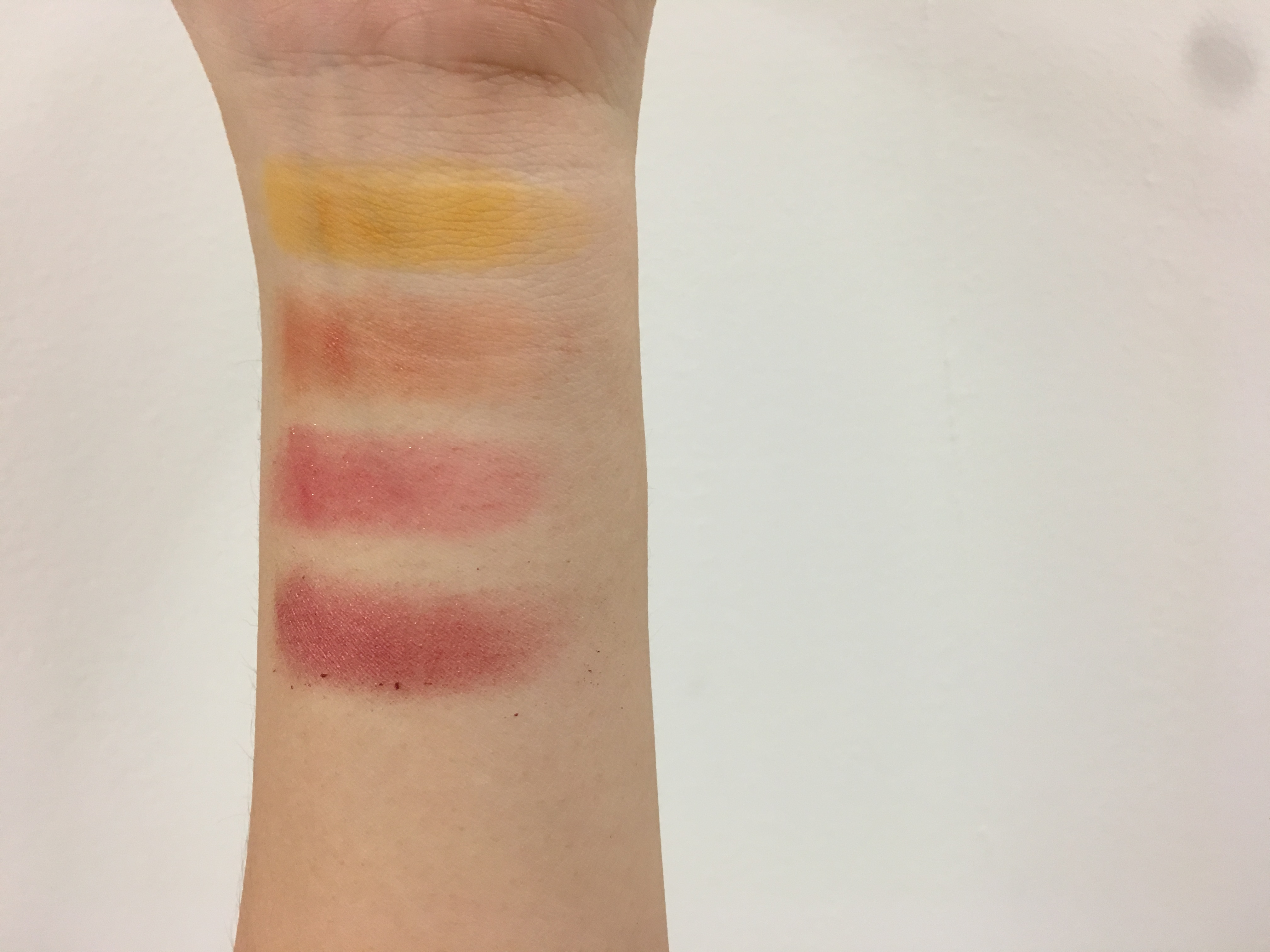

I chose analogous colours for this equation. Red is used as the dominant in the first composition while red-orange and orange compliment it. The warm colour here represents my energy in my ideal relationship. Moreover, I used cool colours for the setting which are green, blue-green and blue. Those three colours are opposite red, red-orange, and orange that from the contrast between idealism and realism.
DESIGN ELEMENTS & PRINCIPLES
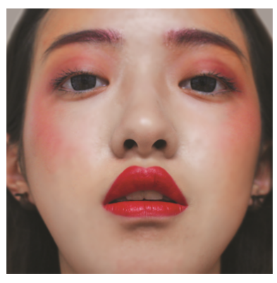
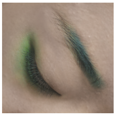

The first composition is shot at the low angle which shows the power of the character. The second composition is an extreme close-up to capture the emotion. The last composition is underexposed to show the darkness. My face is covered with my hair, and it seems like I had lost my vision and hope.
4TH EQUATION
CONCEPT
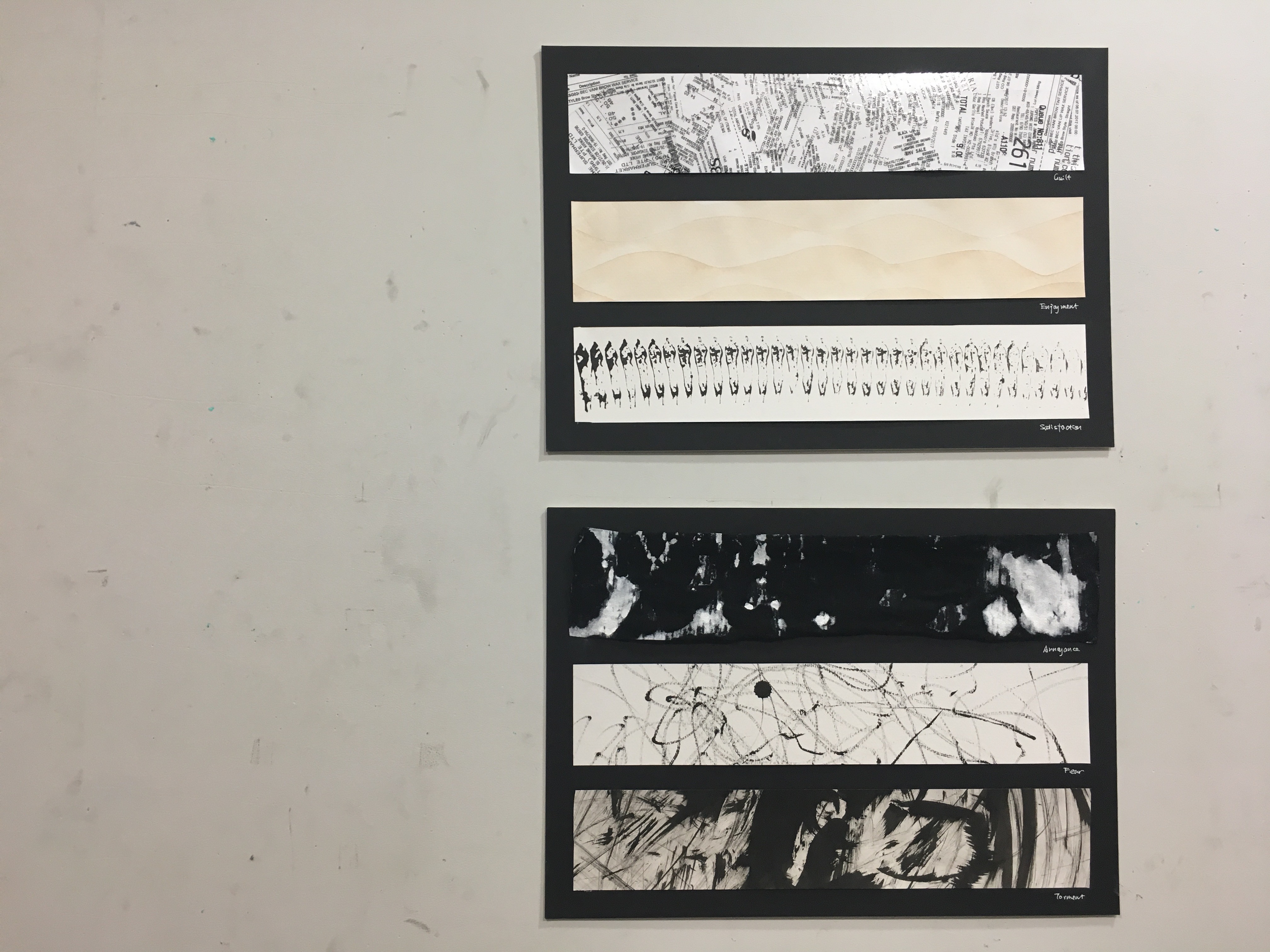
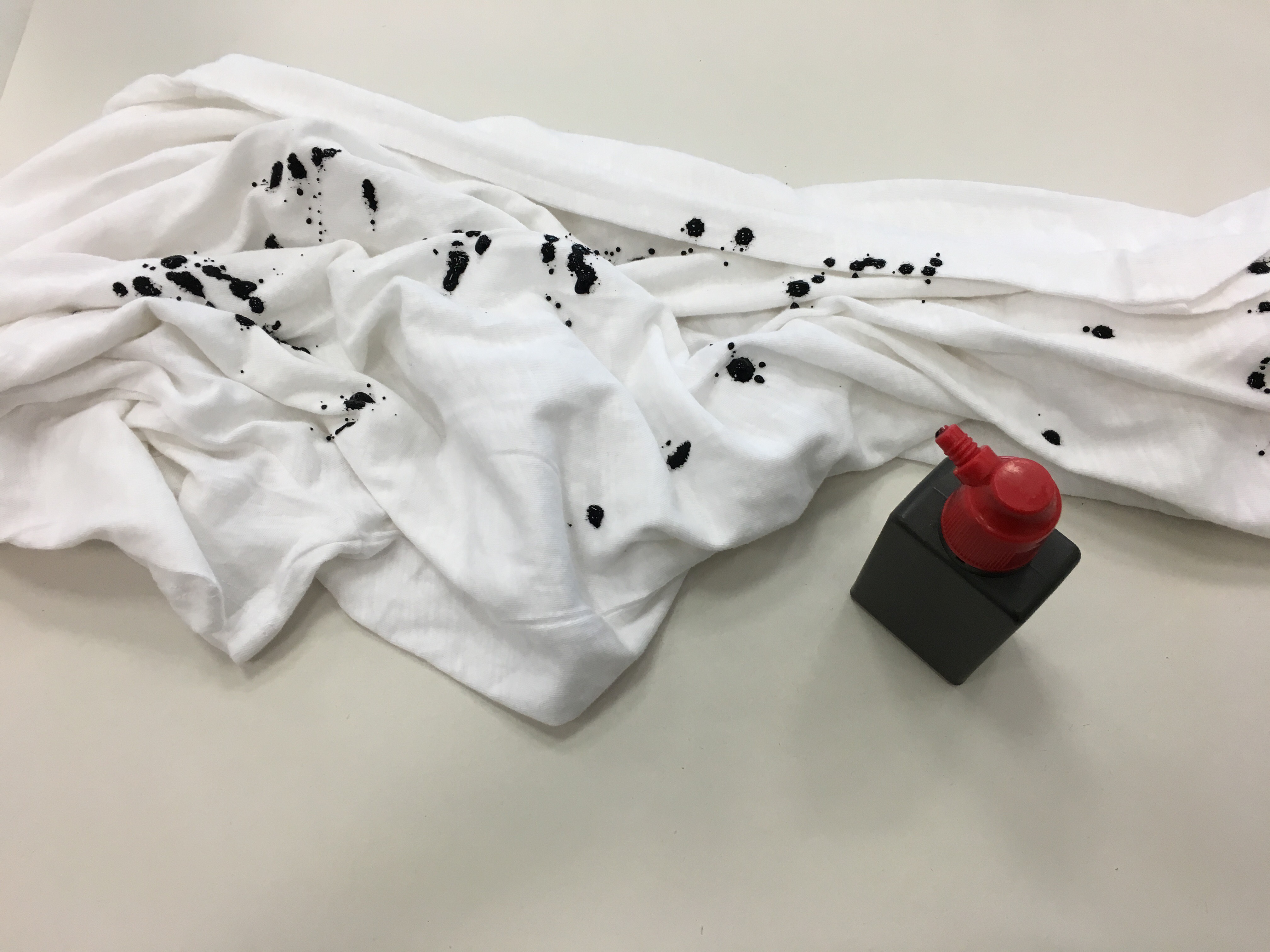
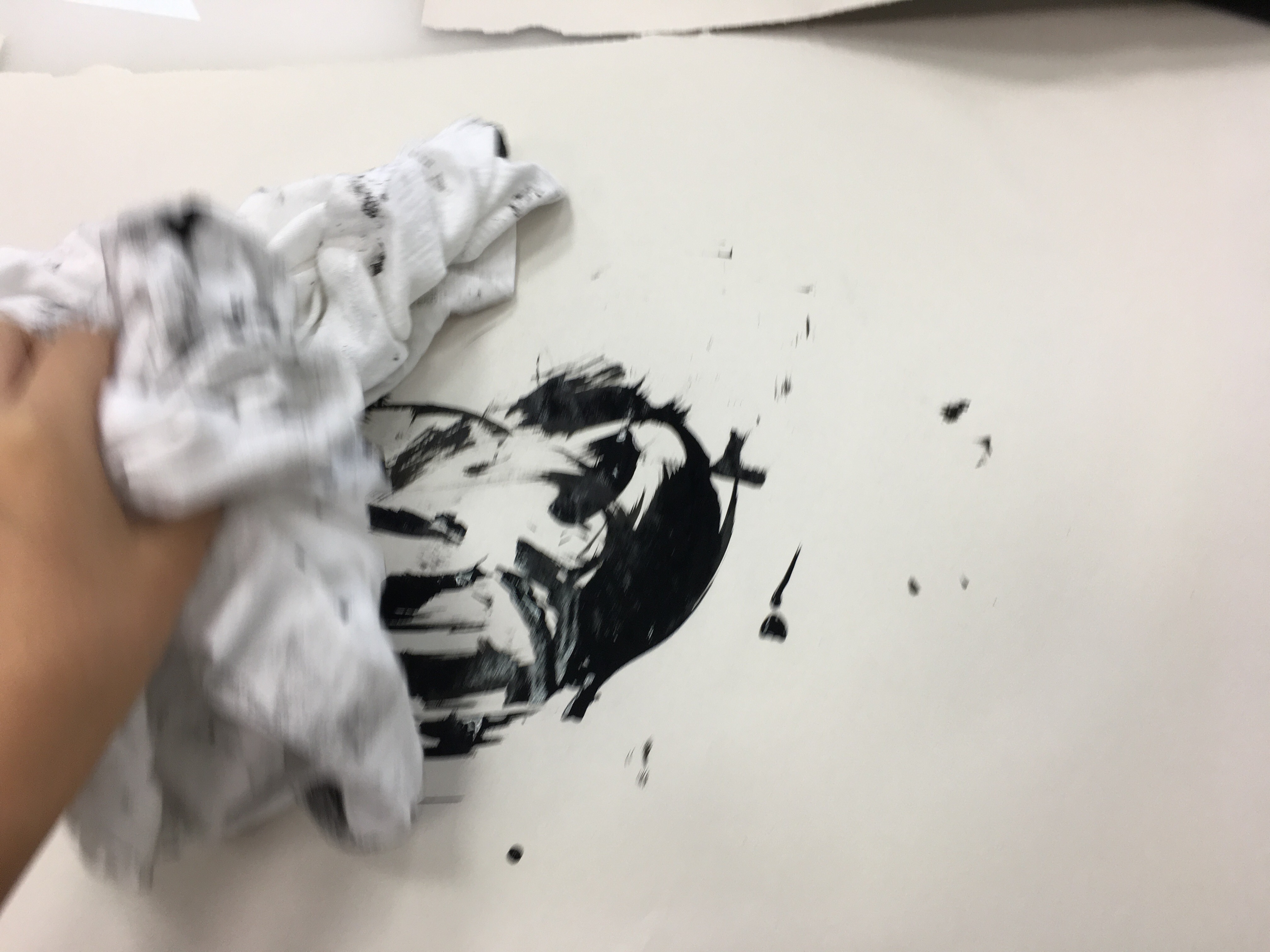
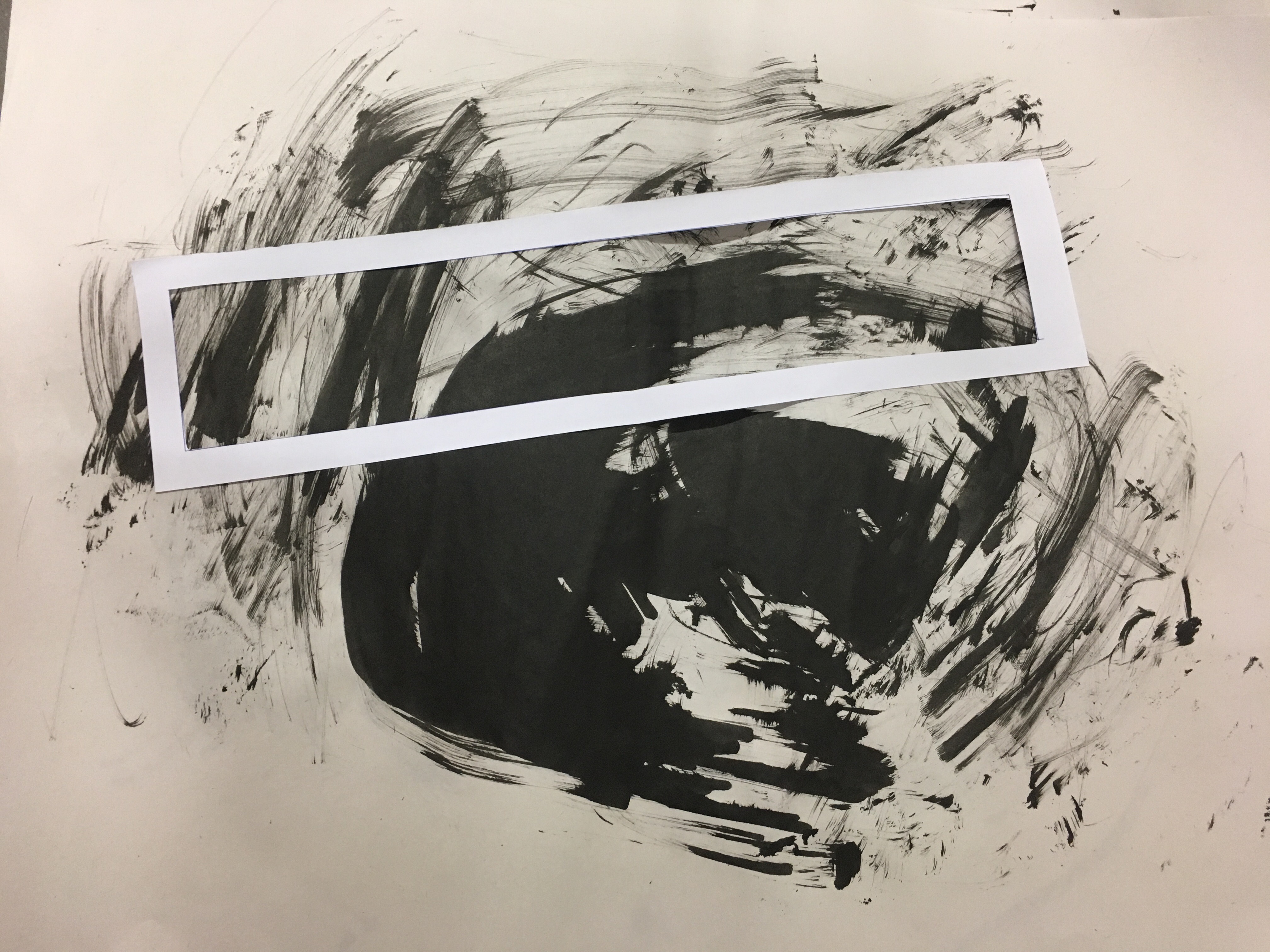
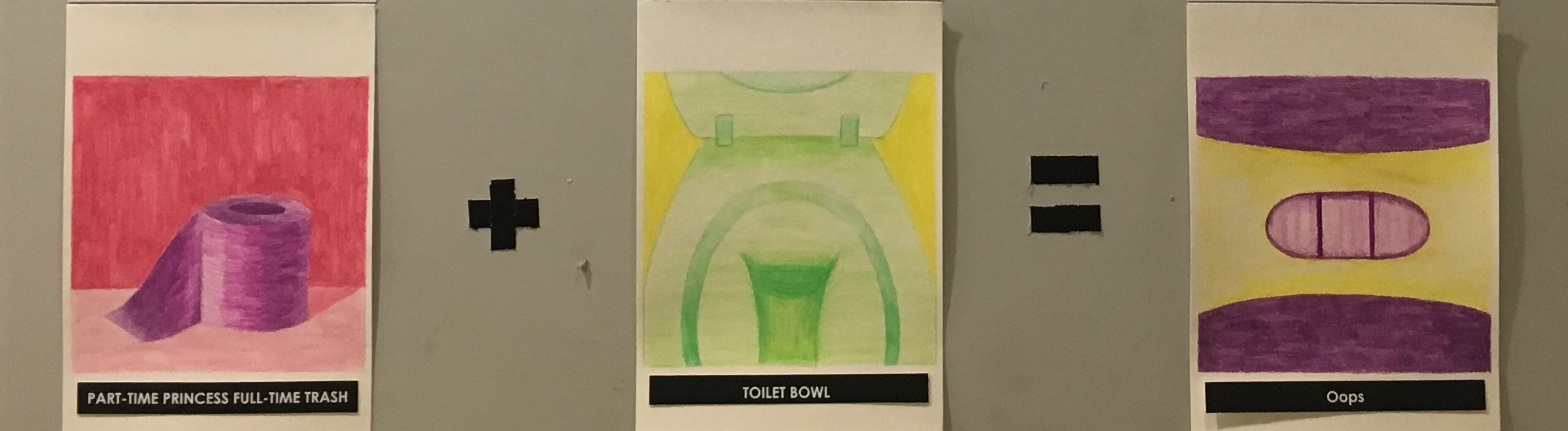
The last equation is about friendship. I used traditional medium, such as watercolour pencil and watercolour paper and some other tools like blender and cotton pad. Friends are very important for me as they are the closest while my family is so far away. I received a lot of help from my friends along the way. My friends and I are the types of person who work hard like trash but also play hard sometimes. We are all spontaneous and do not think about consequences sometimes. Therefore, I used toilet paper to represent ourselves. The toilet bowl is our setting, as we always do ‘shit’ together. The response is a pregnancy test with two lines which means the test result is positive. unplanned pregnancy emphasized how spontaneous and playful my friends and I are. Lastly, the objects I used in this equation are normally in white, which shows that how friendship makes my life more colourful and lively.
INSPIRATION

I was inspired by an artist called Nicolas Party. He is famous for using saturated colour in his painting. I like the way he composites the object in a simple way. Each of the object is in monochrome.
COLOR THEORY
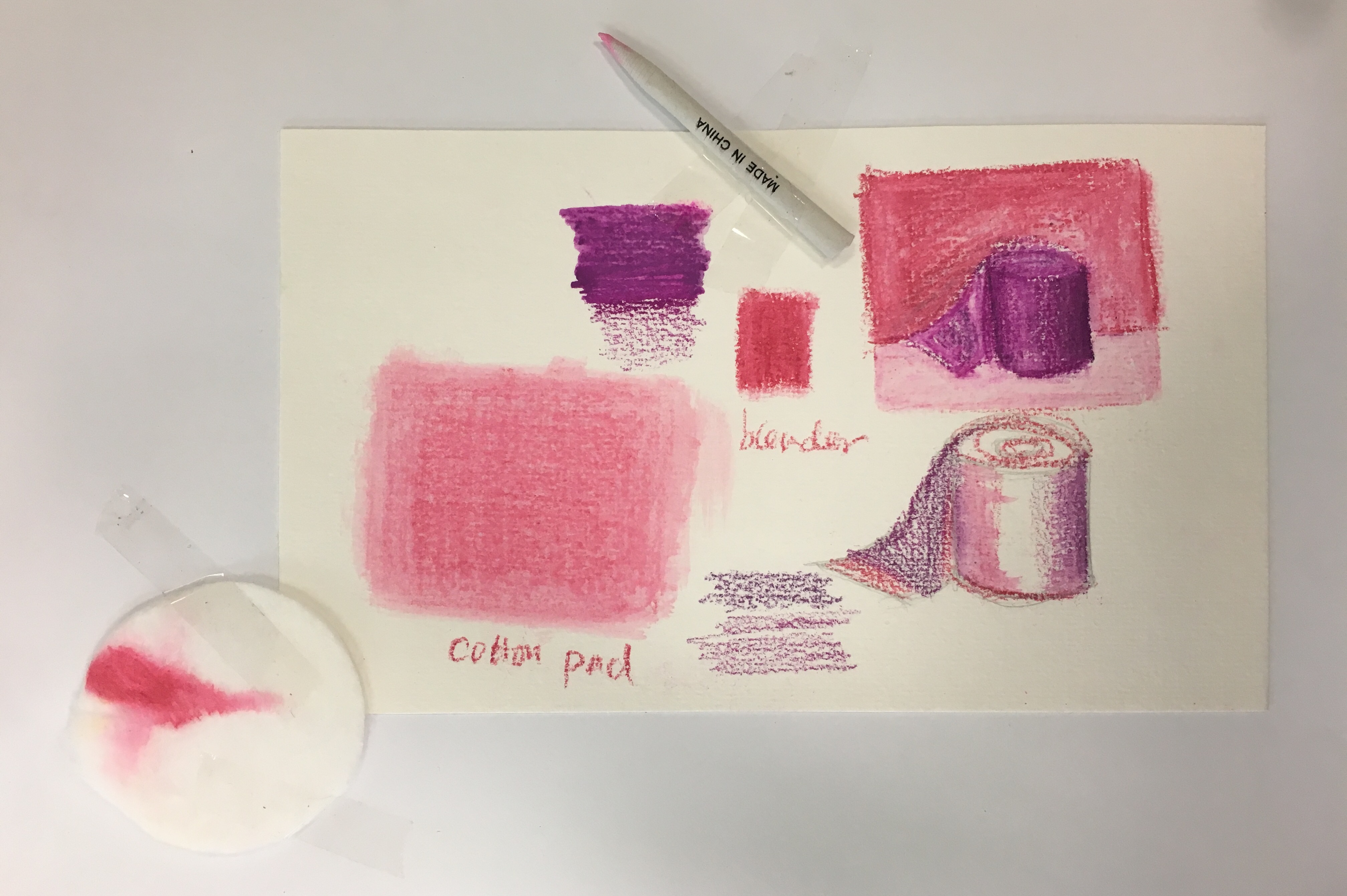
I chose analogous colours for my last equation as it is the most harmonious colour combinations represent the good friendship that I have. The first composition is in red, red violet and violet. The red colour here represent the energy my friends and i have. The second composition is in green, yellow-green and yellow. As green is directly opposite red which form a strong contrast in this equation. The response is in complimentary colours to form contrast.
DESIGN ELEMENTS & PRINCIPLES
The scale of the objects increase from the first composition to the last composition to gradually draw the viewer’s attention, and trigger their curiosity. As the objects become less clear when the scale increase.
ALL IN ALL
This project helps me with a better understanding of colour theory and also myself. It is challenging as I do not use many colours in my own work. I had a good time exploring different technique and other artworks. I received constructive feedback from my professors and friends along the way. I think I will pay more attention to the usage of colours in the future projects.