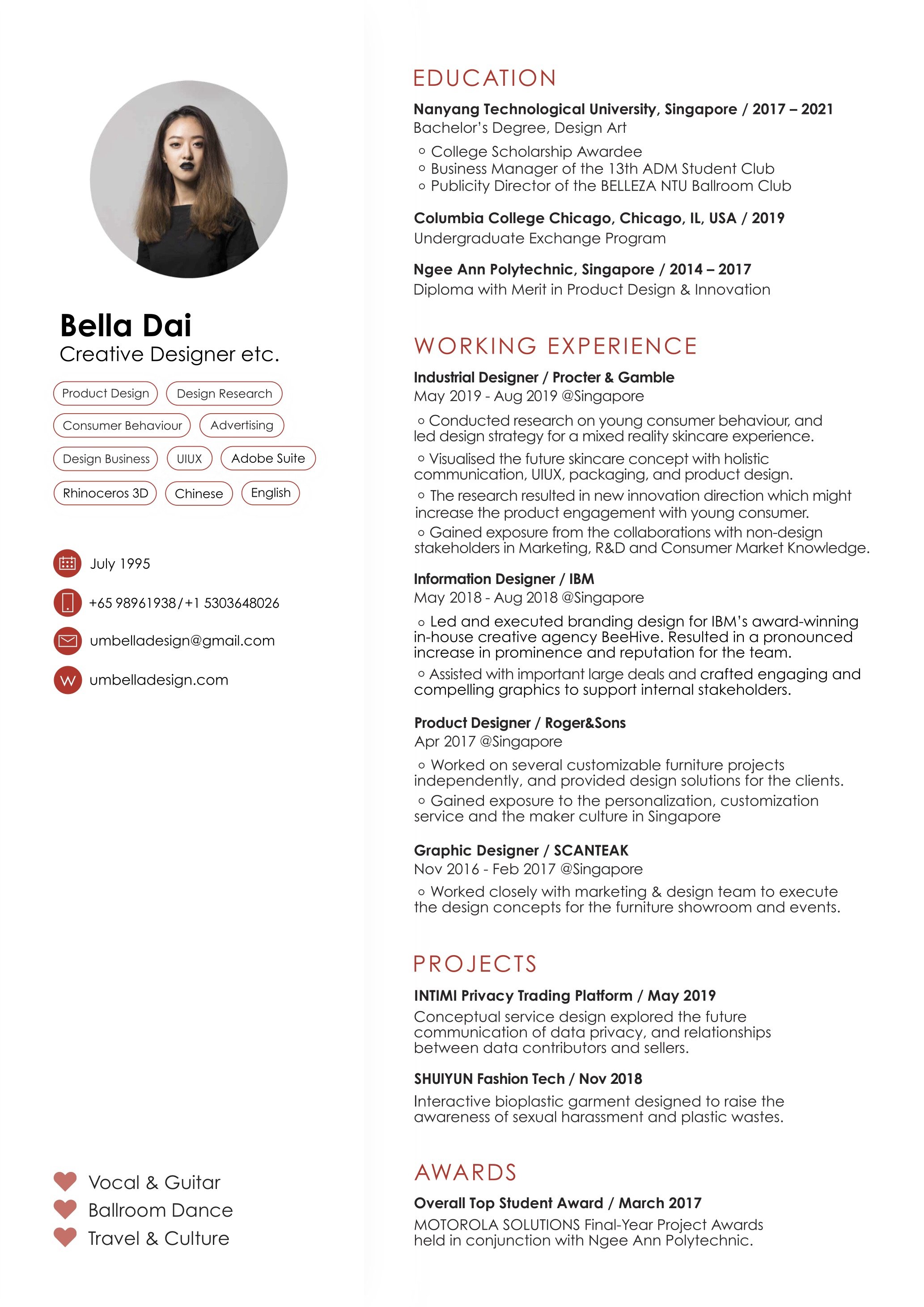
Bella Dai is a multi-facet Creative Designer based in Singapore. Dai has achieved outstanding results in her pursuit for a degree in design, under Nanyang Technology University.
She discovered a profound interest in the Arts when she first steps foot into a drawing class at the age of 6, never looked back since.
Her experience in design has matured over extensive projects in university, and a collaborative internship with prominent companies such as P&G, IBM, and Roger&Sons.
Dai adores design with a good course. She places much emphasis on human-centric design that aims to uphold the well-being of the mass users. Hence, her work often overlaps with fields concerning the environment, communication, and user experience.
Bio2
Bella Dai is a creative designer based in Singapore, and pursuing her degree in product design at the School of Art, Design & Media, Nanyang Technological University.
Design is Dai’s passion since young when her mother first put her in an art class. The diploma in the Product Design & Innovation program she had at Ngee Ann Polytechnic boosted her interest in becoming a designer. During her study of design, Dai had internships with companies across various industries such as Scanteak, Roger&Sons, IBM and Procter & Gambles. Dai is aiming to build her career as a user experience designer on a global scale.
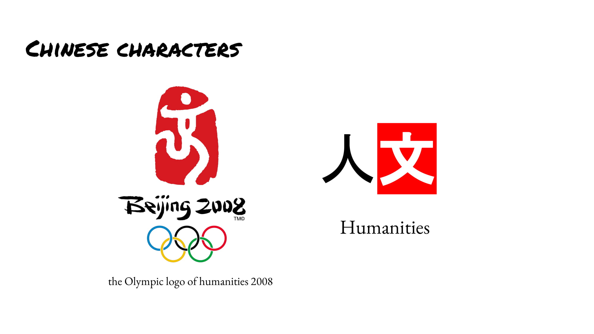
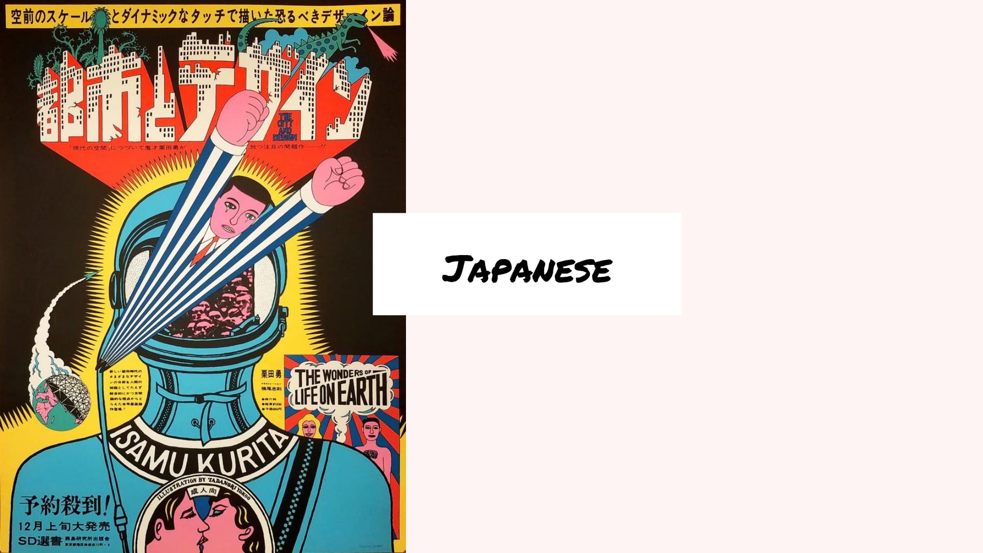
MY ARTWORKS
水韵 SHUI YUN, the rhythm of water is an interactive garment designed to raise the awareness of sexual harassment and plastic wastes. In this project, I experimented with new material, bioplastic which pushed my boundary as an industrial designer.
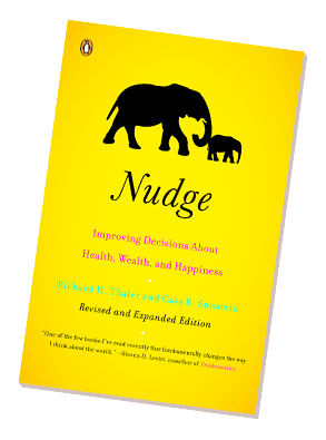
Nudge: Improving Decisions about Health, Wealth, and Happiness is a book written by University of Chicago economist Richard H. Thaler and Harvard Law School Professor Cass R. Sunstein, first published in 2008. It inspired me to step into the study of behavioral science which will help me to have a better understanding of the people that I am designing for as well as the influence on society and humanity.
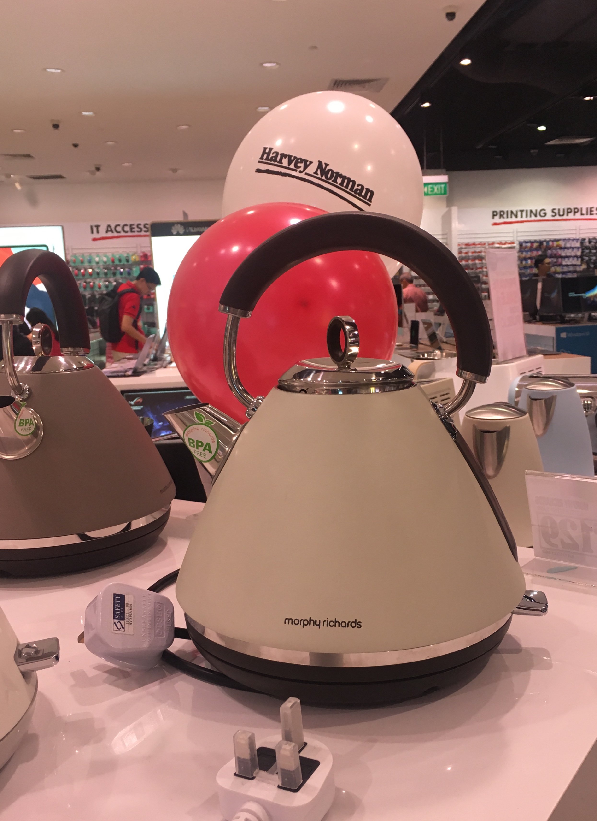
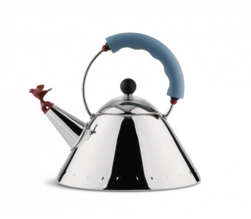
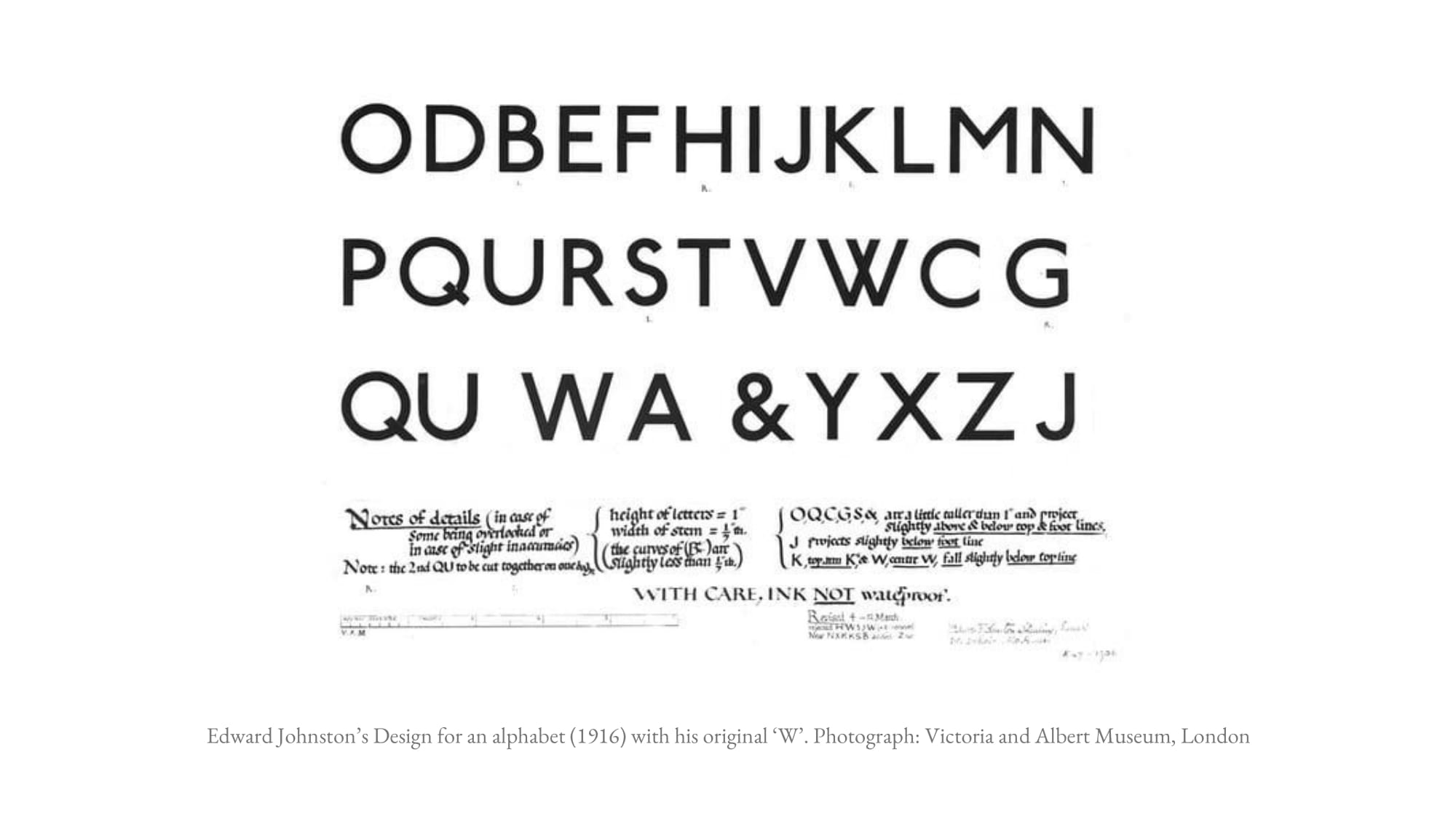
Morphy Richards Traditional KettleAlessi 9093 kettle designed by Michael Graves in 1985
The first product that caught my attention at Harvey Norman is the Morphy Richards traditional kettle. The handle with thin metal and thicker plastic and the shape of the body remind me of the iconic Alessi 9093 kettle designed by Michael Graves in 1985. Alessi 9093 kettle works with the stove while the Morphy Richards electric kettles are designed for the contemporary lifestyle. Morphy Richards was founded as a manufacturing company in 1936 by Morphy, an engineer, and Richards a salesman. Their mission was to design aesthetic yet affordable electrical items for the average income family. It seems like they are still carrying the mission to create aesthetically pleasing products at a reasonable price. Harvey Norman is selling Morphy Richards kettle at S$129 while the Alessi 9093 kettle costs almost S$200. Perhaps, Morphy Richards would like to bring the vintage mood and the functionality into the modern house within the average buyer’s budget.
COURTS
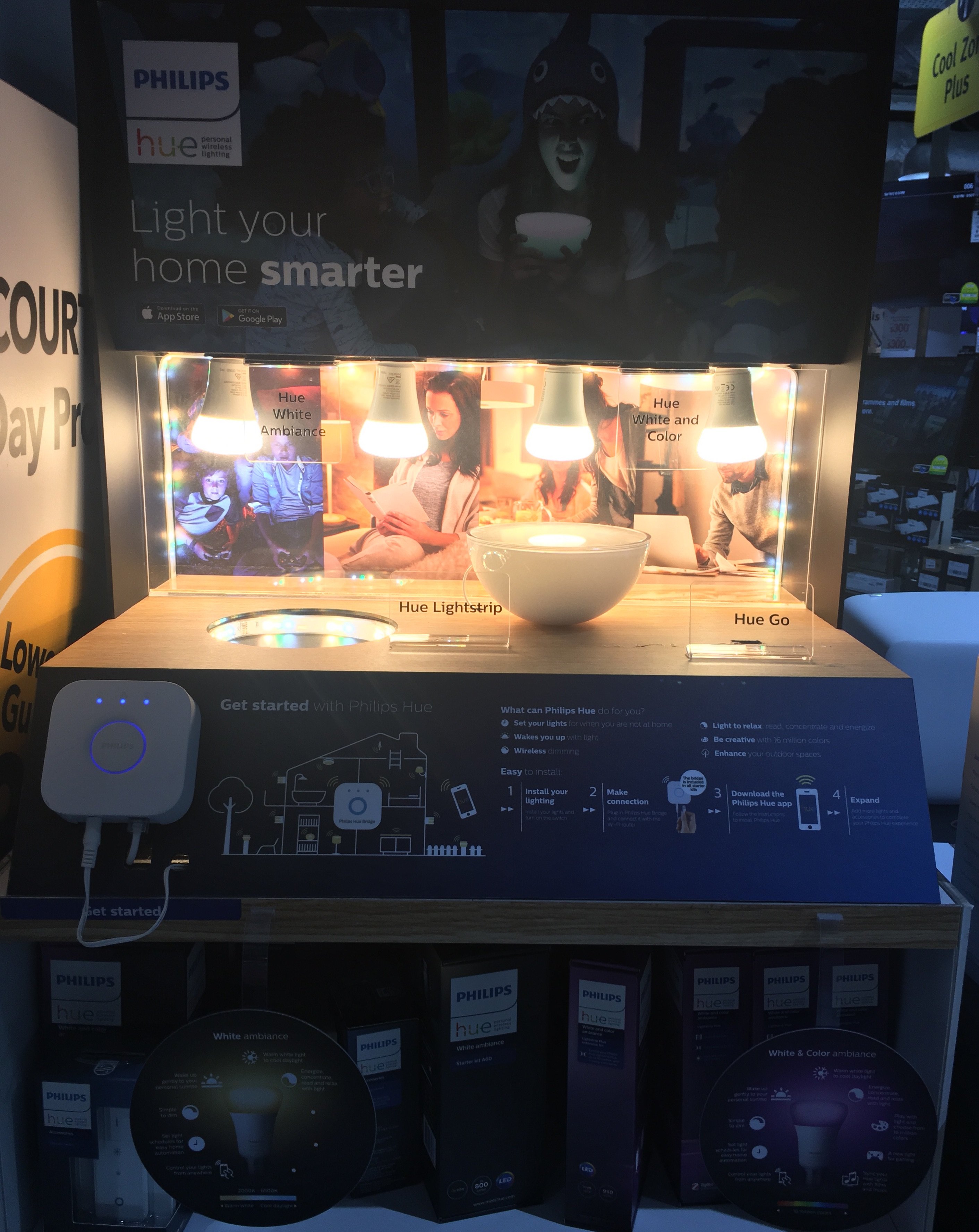
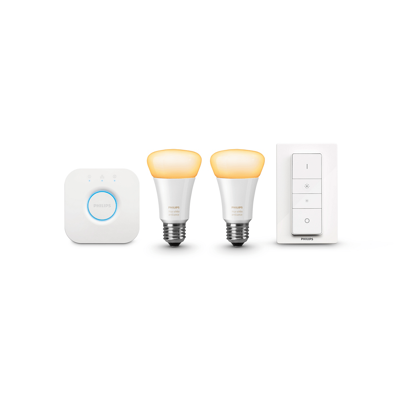
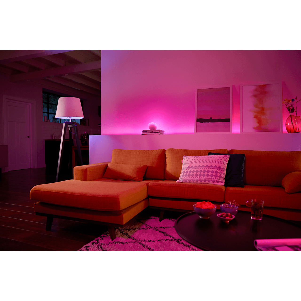
Philips HUE at CourtsPhilips Starter kit E27
Philips HUE Single bulb E27 The product that I am interested in Courts is the Philips HUE, a smart lighting system that allows the users to control the light and create the mood of the room. It works of smart devices such as Google Assistant, Apple HomeKit and etc. Lighting used to be just the equipment to provide light when the sun goes down. However, as technology developed and our lifestyle change, we tend to pay more attention to our feeling and experience. Hence, products like Philips HUE is designed to light up the room as well as the mood. Now we could have better control of our living environment and be more integrated with our homes.
IKEA
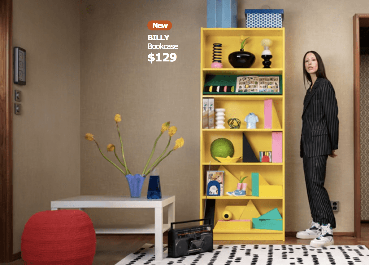
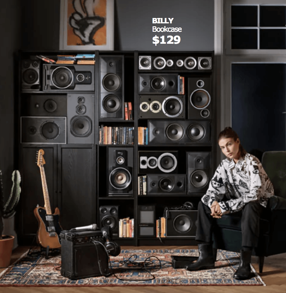
Ingvar Kamprad established IKEA in 1943 with his belief: “ people not as well off should be given the same opportunities as those who are.” IKEA is known for its affordable flat packed Scandinavian style furniture which brings Hygge to millions of homes IKEA always stick to its beliefs to produce good designs with simplicity no matter how crazy the trend is. For instance, IKEA’s iconic BILLY bookshelf designed by one of the IKEA’s first employees, Gillis Lundgren. Lundgren was born in Sweden in 1929, studied at the Malmö Institute of Technology, and joined IKEA in 1953. Lundgren grew with the IKEA from a small startup into a multinational corporation. He also had his contribution to the flat-pack, self-assembly concept. He once removed the legs of the table so it would fit into the car, and he mentioned this story when he received the Swedish Tenzing Prize for innovators in 2012.
IKEA’s iconic BILLY bookshelf designed by Gillis Lundgren
BILLY is functional and flexible storage furniture that allows individuals to add personality to the design instead of showing off the designer’s fashion status. The simplicity of BILLY had been appreciated by its users in the market for 40 years. I would consider it as a product that is designed for everyone and all the time.
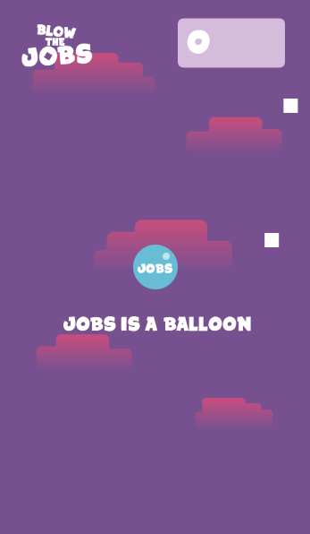
Have you ever had the moment when you want to sleep but your midnight thoughts won’t allow you to fall asleep? I guess most of the people would start to scroll through their phone without even knowing why they do it. Sometimes, technology is not functioning as pain killer in our life but vitamin, for the maintenance of our mind. Therefore, I designed a hyper-casual phone game that seems to be the lavenders mist for the sleepless night.
Starting of the GameCircuit Playground
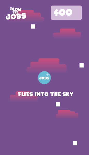
The main character of the game is called Jobs. He is a balloon that whats to get to a higher position in life. The player needs to blow to microphone on the phone (I am using circuit playground here for prototype).
Poem of the Game
The background story Jobs will slow revealed as Jobs goes higher. The story is like a poem goes like:
JOBS IS A BALLOON

HE WANTS TO FLY

FLIES INTO THE SKY

FLIES ABOVE THE NEGATIVITY

WITHOUT DOUBTING HIS ABILITY

THERE WILL BE OBSTACLES

BUT NOT AS BIG AS GOALS

BREATHE DEEPLY

MOVE ON HAPPILY

......
The night gets darker while the player gets tiring blowing. The poem might help the player to get encourage for the next day.
At the end of the game, there is no win or lose. It is the matter of how far you want to go. The GAME OVER throws a question mark to the player to let them think if it is really over, and letting them know them can always restart.
Further, this is my first time designing a game and I gave a clickbait title to the game. Our curiosity is so uncontrollable and it needs to be satisfied. This kind of ‘tricks’ is frequently used in article titles that make us WONDER. Why this name sounds so wrong? Should I check that game out in the middle of the night? The desire for resolution might make us click on the game to try.
Conclusion
This is a challenging project as it is my first time learning programming and get to know electronic components such as circuit playground. I would like to improve on the stages of the game and enhance the visual and sound effect without the time constraint.
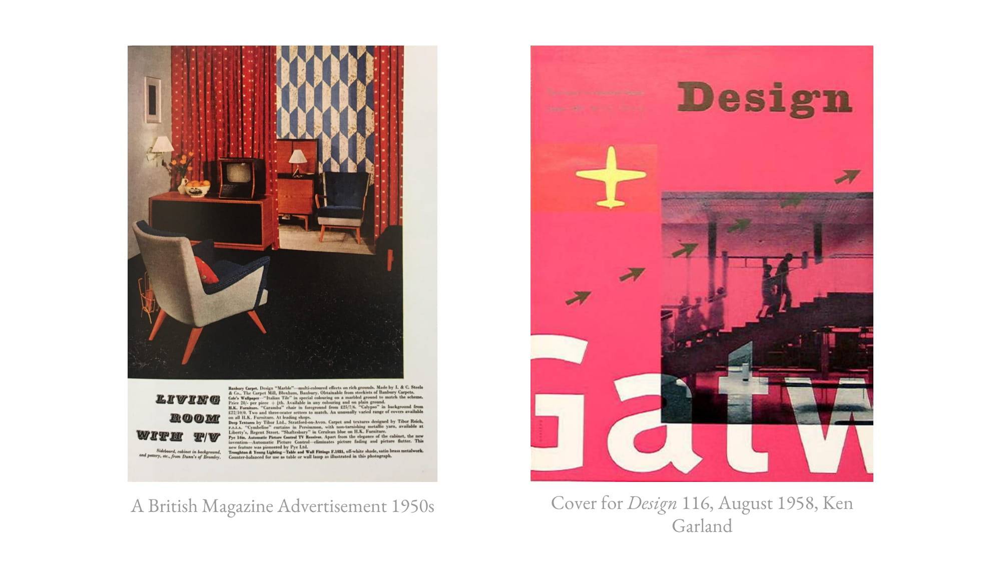
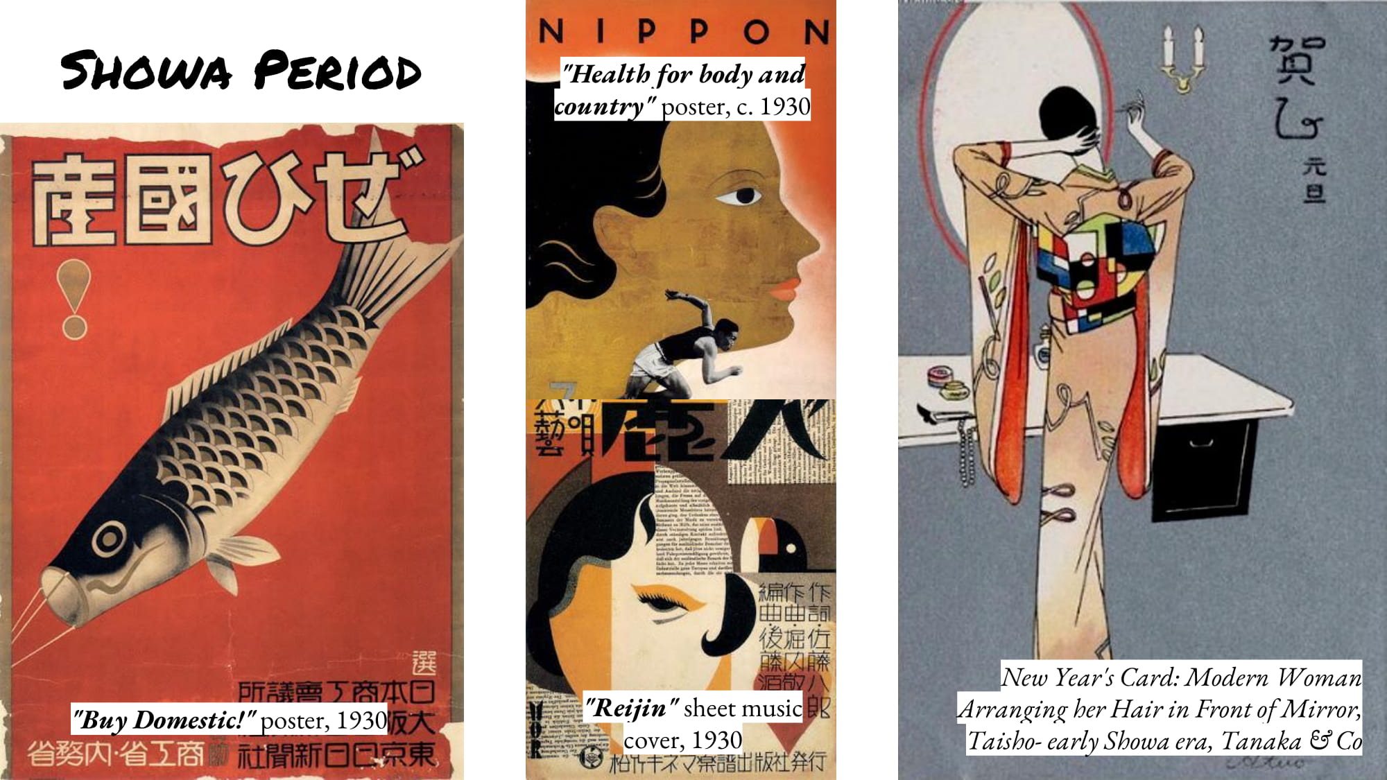
The history of design began before human beings opened their eyes. Nature was beautifully designed even before human existence. To date, we are still discovering and learning from nature.
IMAGE FROM https://stmed.net/sites/default/files/moraine-lake-wallpapers-27960-296893.jpg
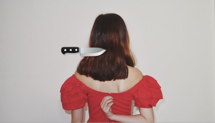
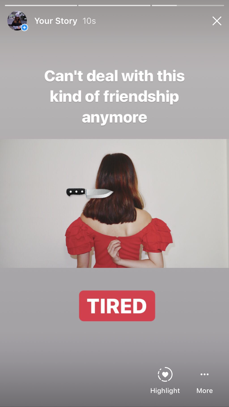
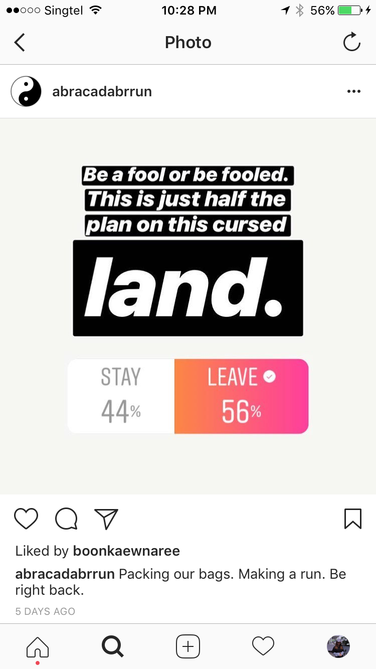
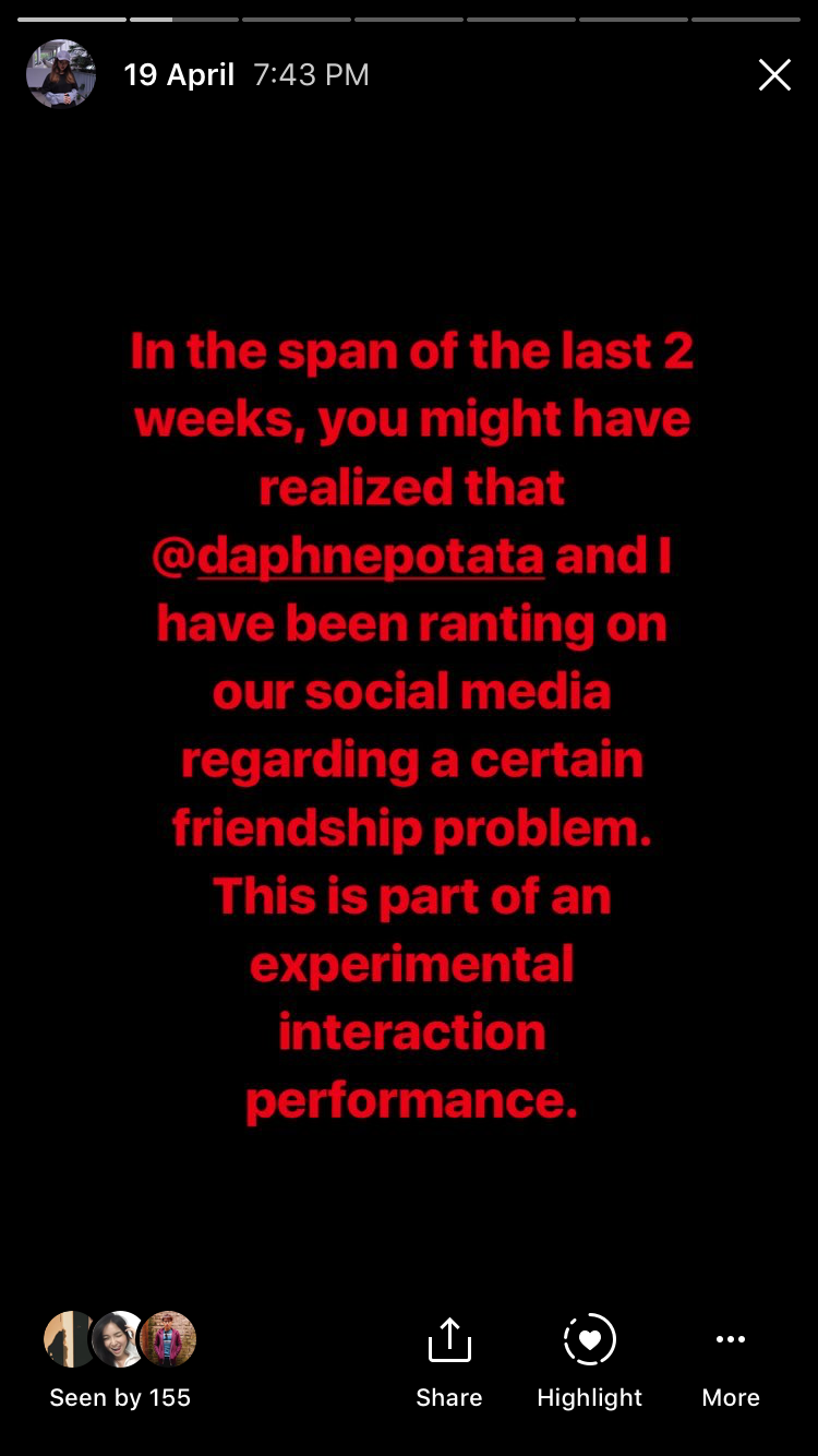
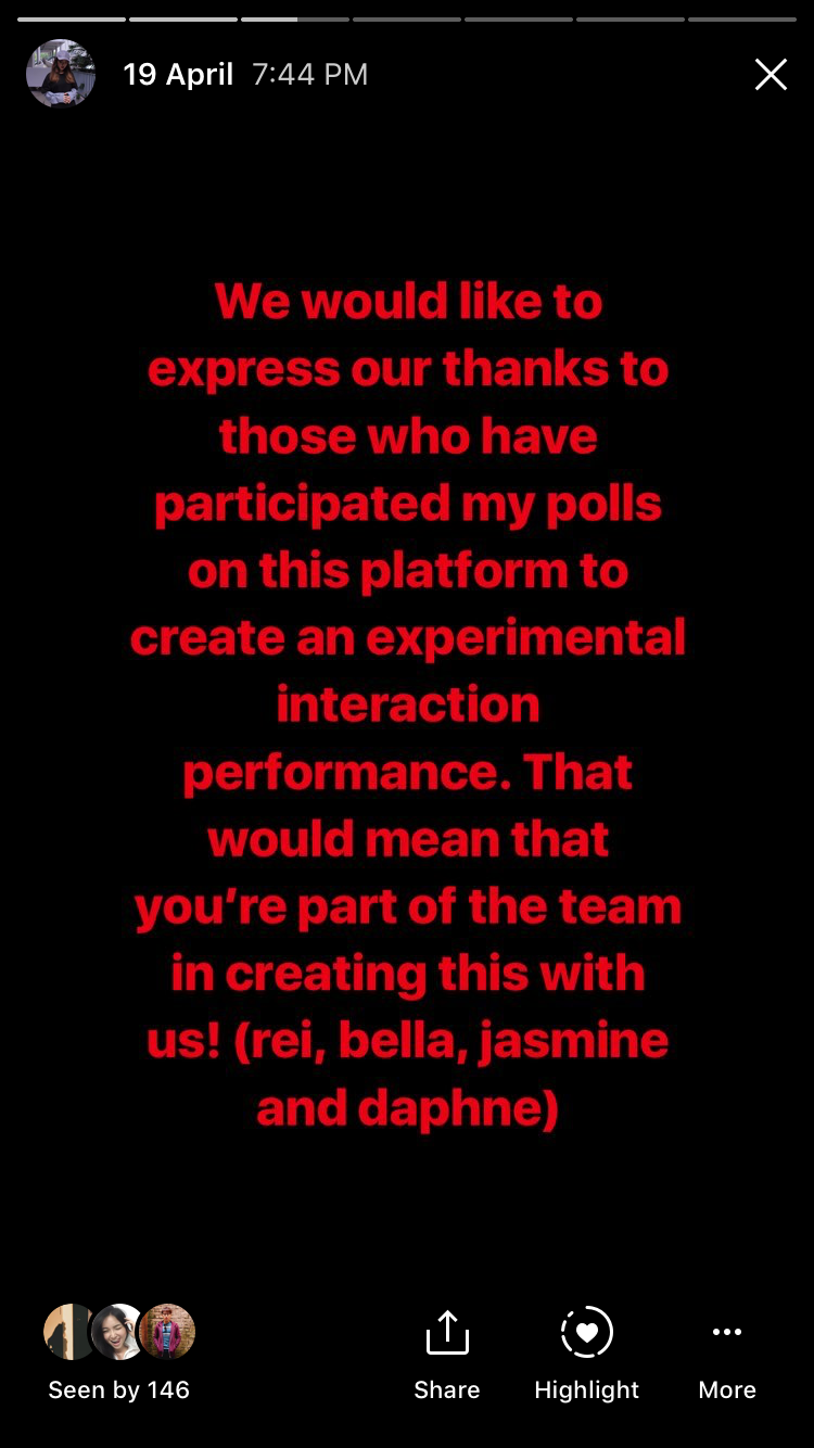
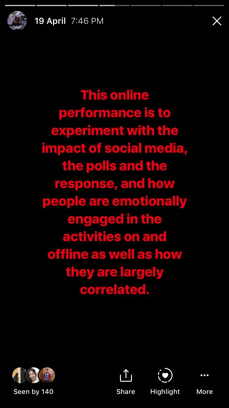
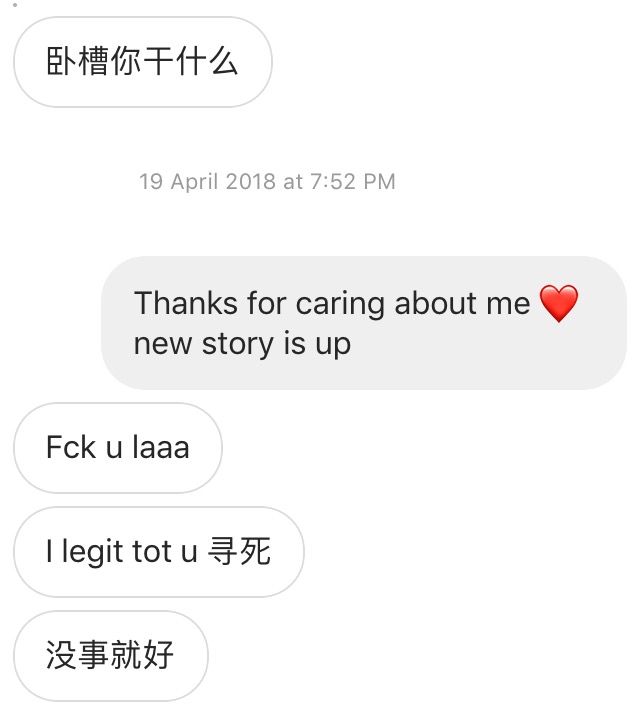
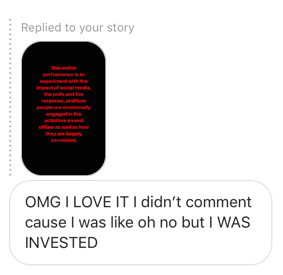
A Third Space Fallacy is an experimental interaction performance on third and first space that combines the responses collated on the third space through Instagram polls and stories to curate the next move in a friendship conflict between two girls, Bella and Daphne. To make the entire performance as real as possible, both girls had to put up an act in the span of 1 week in the first space, when questions arise from the people around them. Also, to stage that this is not part of our project for Experimental Interaction, our group have created another Instagram account @abracadabrrun, collating uninformed decisions made by our followers, which is part of the narrative of the death of Bella.
Conceptualization
Initially, I had an idea of having a social media game at Changi Airport, however, we rethink after receiving the comment of my critique on the online Symposium, Are We in LOVE with the Connectedness? from our professor Randall Packer.
“Very interesting how you expressed your thoughts on interaction in such personal terms: how we engage emotionally in the third space. This has been one of the key ideas we have discussed this semester, how meaningful interaction can be achieved despite geographical separation. Wasn’t this proved when you elected not to interact in the chat for Annie Abrahams’ performance, and found yourself removed and disconnected. This implies that is direct interaction that creates the quality of engagement in any form of interactive art. Perhaps it would be interesting and helpful to your thesis to applied this to Blast Theory’s work: how the players and performers engage in something dynamic, arresting, and challenging in both physical and virtual spaces. ”
Randall Packer mentioned that the emotional engagement in the third space has been one of the key ideas we learned in this semester. It got my group mates and me into thinking. How can we emotionally engage our audience? The answer is DRAMA. Some people love drama because it is something that might not really happen in real life or the exaggerated version of the real-life event. It catches people’s eyes, trigger their emotions, and sometimes it is just entertainment.
We chose Instagram as the main media for our piece. We decided to use our personal account in order to make the drama seems real, and let people participate unconsciously. Thus, we could receive real emotions from our audience, or while interacting with them.
Firstly, we scripted the characters and the rough/possible storyline. The two characters, Bella (acted by Bella) and Daphne (acted by Daphne) are the bullied and bully in this friendship drama. They are old friends from Secondary School. Daphne had been taking advantage of the kindness and dependability of Bella since they met. Then, they happened to be on the same course and university. The conflict started with Bella exposing her toxic friendship on her Insta-story. The rough storyline is that Bella expressed her anger towards the friendship, and asking for solutions online, while Daphne got annoyed by clingy Bella and also started ranting and asking for help on her social media. The ending of the drama could be happy, sad, tragic, and etc. depended on the choices our audience made.
Execution
We only had two weeks for this group project, and we started building up the tension on Instagram a week before the critique day.
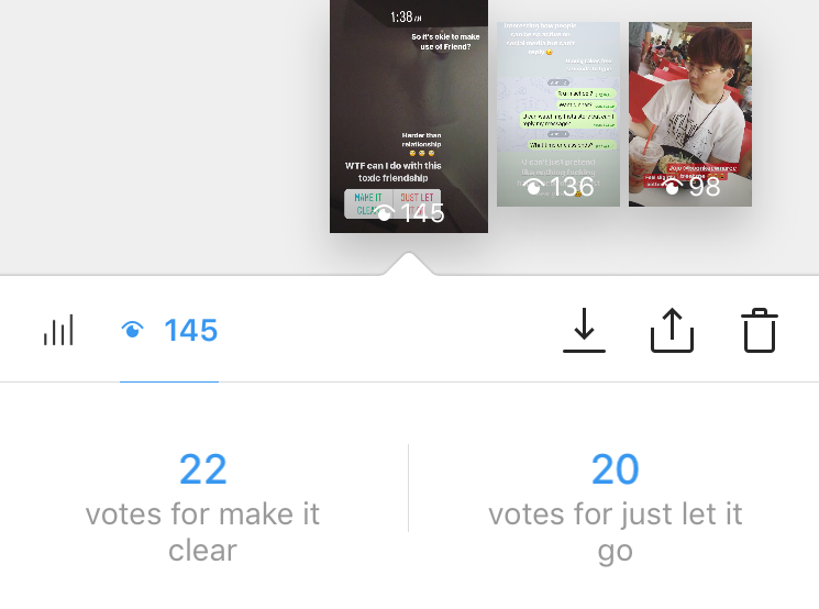
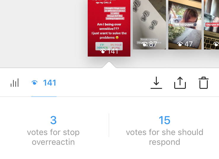
INSTA STORY DAY 1INSTA STORY DAY 1INSTA STORY DAY 1
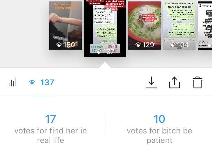
I posted the first story to complain about the toxic friendship and 45 out of 145 viewers voted for this post. The opinions are make it clear and just let it go. Participant Including strangers as my account is public.
INSTA STORY DAY 1
Also, people were replying to this post. 4 people were showing concern, 1 was curious and 1 was giving the constructive solution to my situation. Then we decided our next move base on the result we obtain.
DAPHNE INSTA STORY DAY 2DAPHNE INSTA STORY DAY 2
Daphne also posted emotional stories and ask her followers to vote for her.
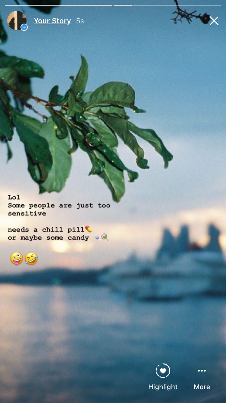
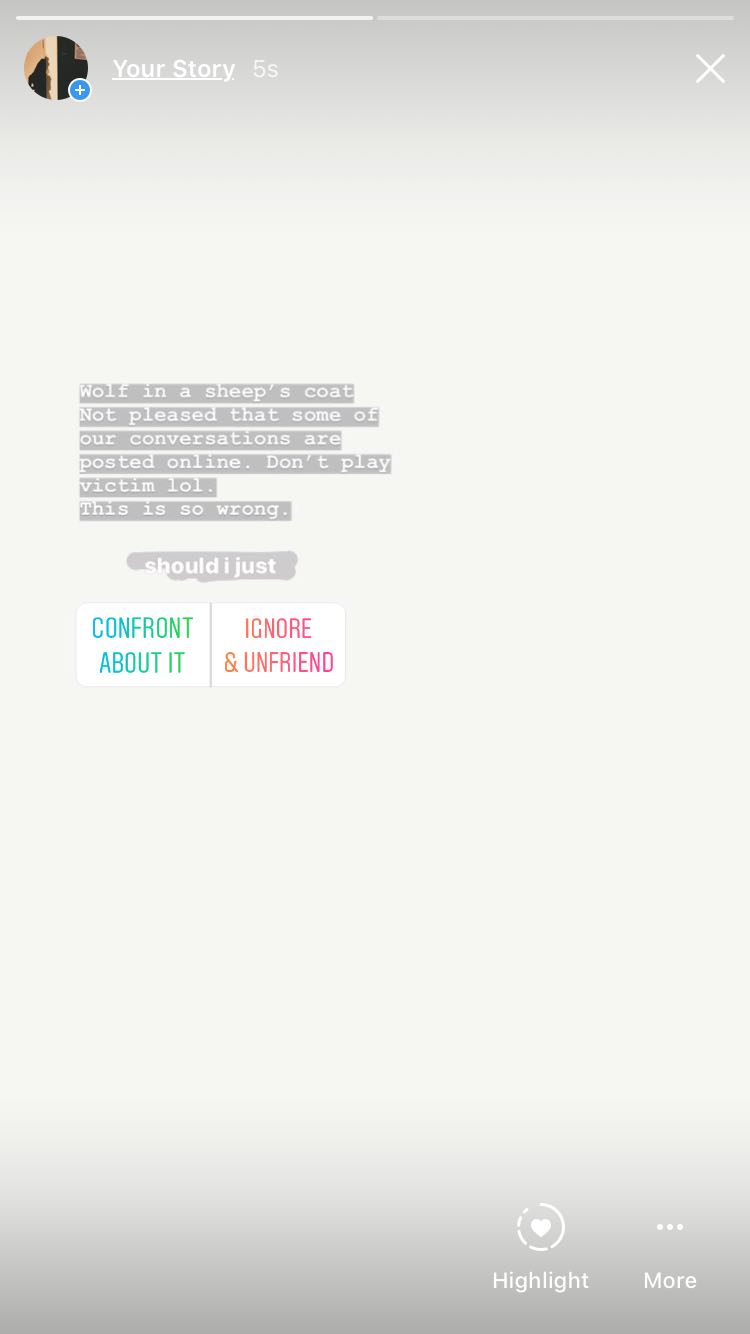
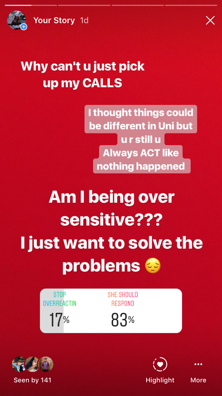
INSTA STORY DAY 2INSTA STORY DAY 2INSTA STORY DAY 3INSTA STORY DAY 3INSTA STORY DAY 4INSTA STORY DAY 4
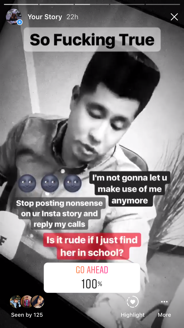
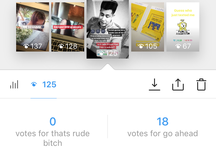
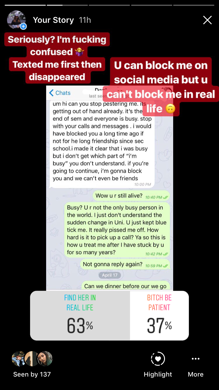
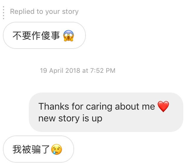
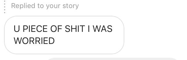
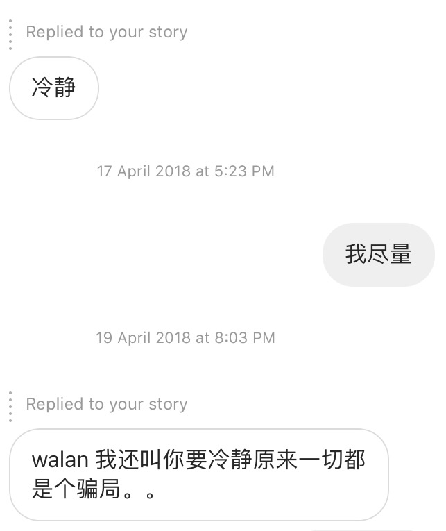
The social media rant lasted for days until my followers voted me to find her in real life. I found Daphne at Jurong Point by stalking her Insta-stories. We got into a fight there as her followers voted her to confront me. She left me there with hurtful words as she was angry that I kept following her and contacting her.
FAKE GAME INSTAGRAM ACCOUNTFAKE GAME INSTAGRAM ACCOUNT
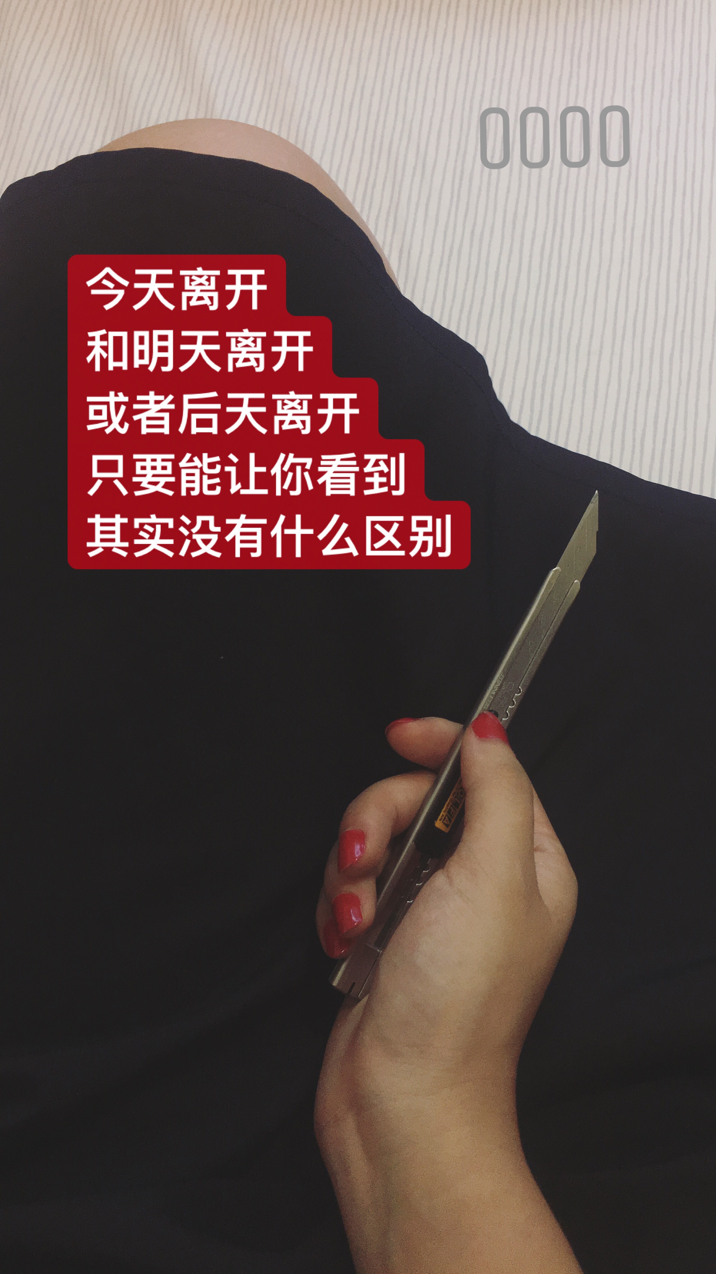
In order to make it more convincing as people were doubting that our drama is our Experimental Project, we made an Instagram account and used our initial idea to create a fake game. Also, the blind decision people had made actually led to my suicide and the way I suicide.
MY LAST INSTAGRAM POST
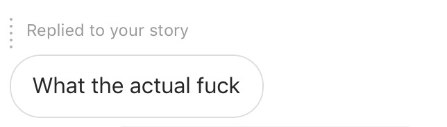
Our social media drama reached the climax with my last emotional posts. I left social media for 18 hours, as I committed suicide in the third space. I received 5 replies that showed concerns and other messages from friends.
The game ended with the launch of our trailer video on youtube and our message.
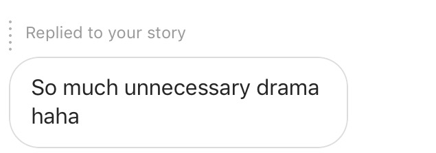
We received emotional replies from our friends after they found out the truth. One friend actually told me that she did not participate in the voting but she actually followed the whole story.
Discovery & Exploration
This piece of social media performance is experimental, as it is only 30% staged. The audience has the most control over the narrative. Our intention is to test the impact of social media, how it affects our life emotionally and create the awareness that our behaviors on social media could lead to serious consequences. We were surprised that how powerful Insta-story is. The image and text we created were able to convince people around us even our closed friends who see us almost every day. It is interesting how easy we could shape our digital identity that is totally different from our real personality. Also, people actually brought the third space drama into the first space to engage more people. They talked about the story and also tried to have their opinion towards our situation. Daphne and I needed to be in our characters in real life.
To conclude this project, we applied what we learned in this semester into this social media performance. We exposed our emotions online and created our new digital identities. We engaged our audience unconsciously in both first and third space. Everyone DIWOed this piece of performance, as we, the artists only created the outline and platform. Lastly, I think the role of artists is to make the world a better regardless of our area of disciplines. Furtherfield helped refugee through the power of Internet, raised the awareness of the environmental issue, Media Burnt was conveying the issue of mass media, and Hasan Elahi spread his story of discrimination online. As young artists, we also like to raise the question of how we should use social media, and how we can avoid social media tragedy to happen in the future through this project.
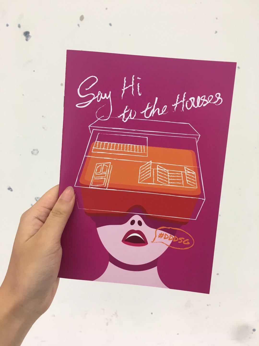
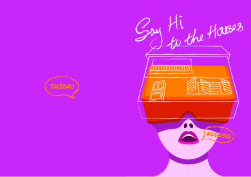
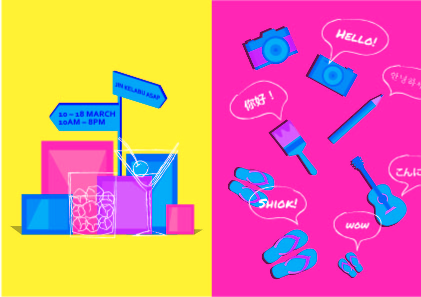
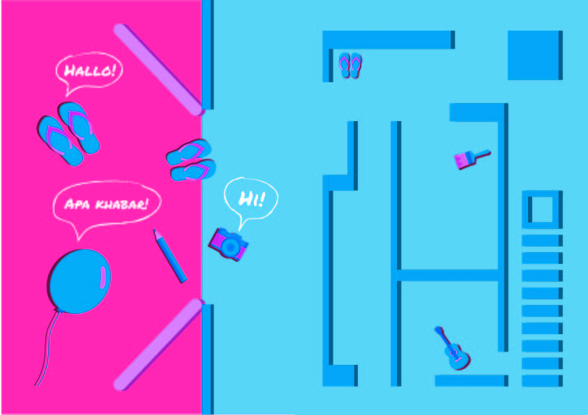
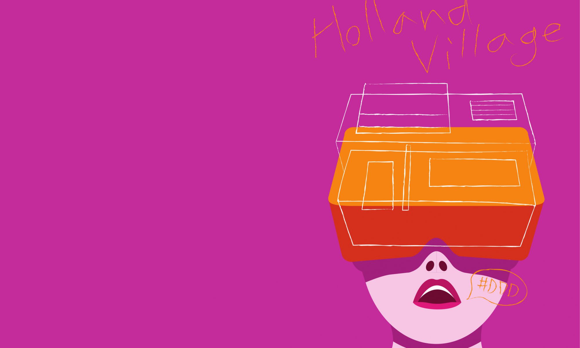
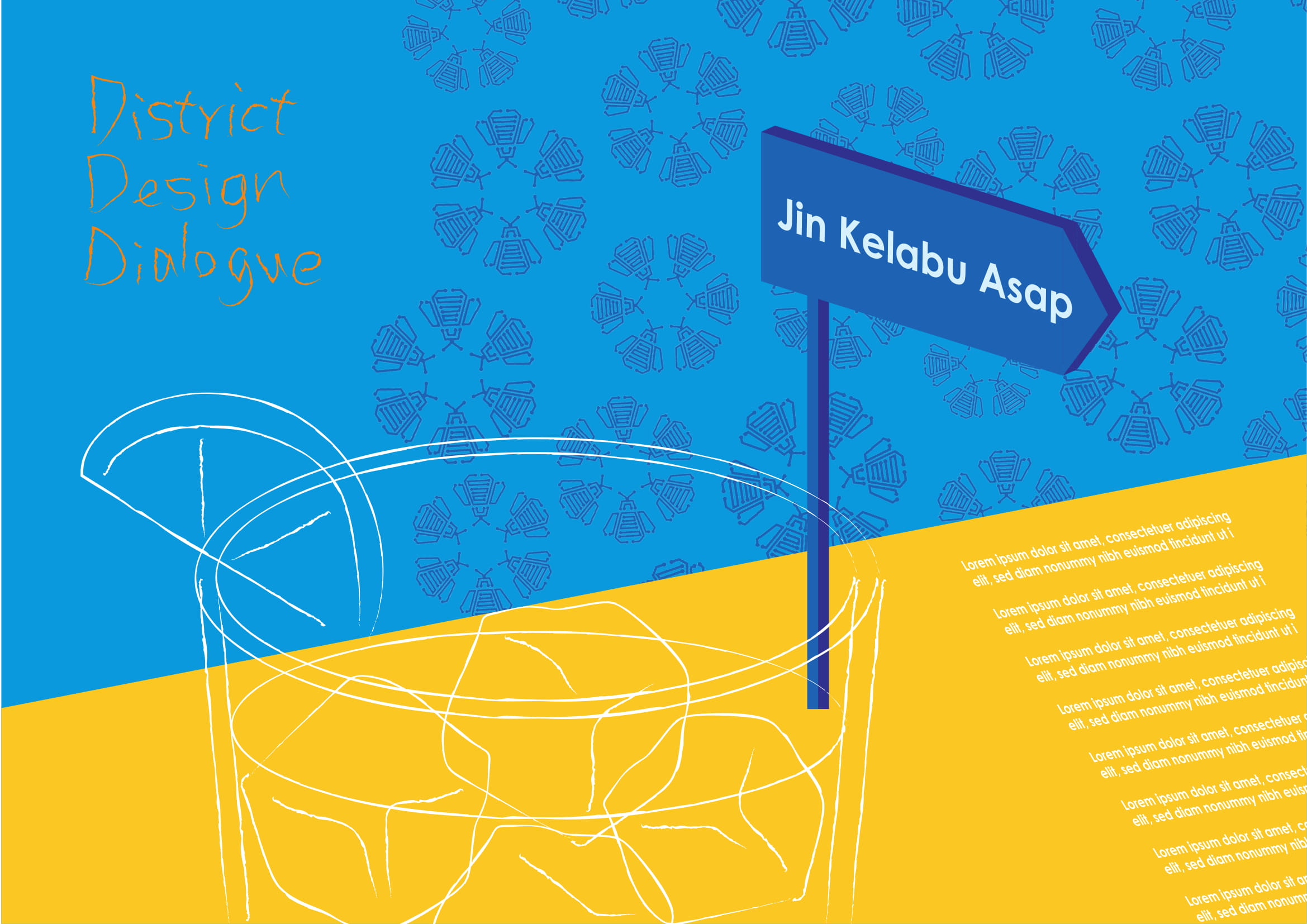
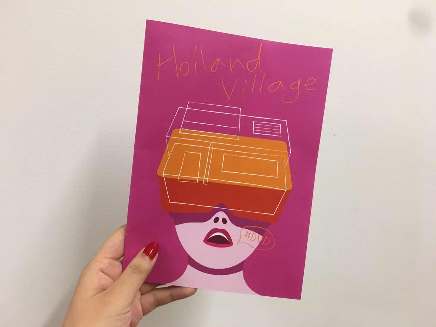
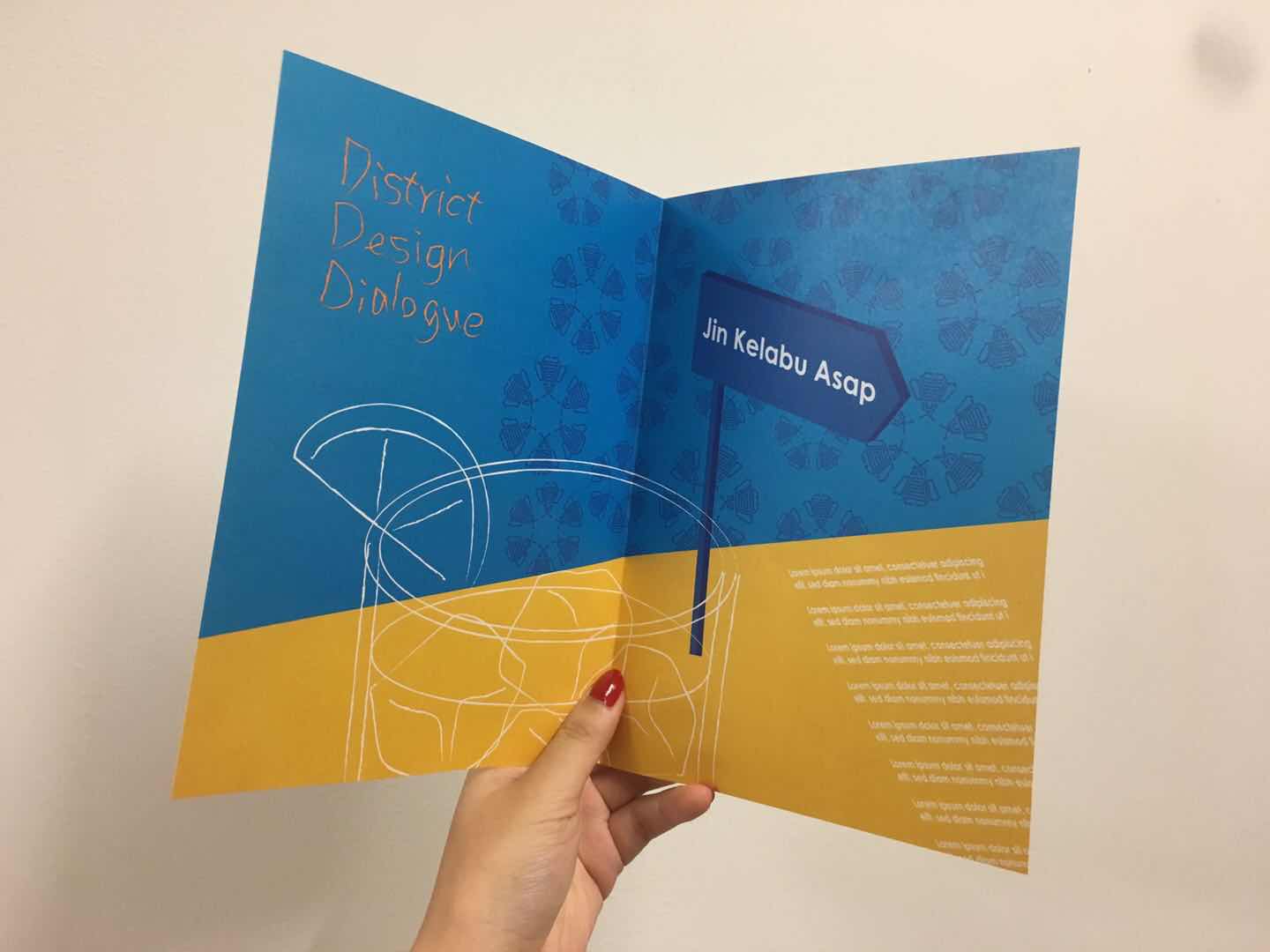
The final version of my zine design was inspired by the annual District Design Dialogue event at Holland Village that I visited during Singapore Design Week. My concept was changing along the way, from capturing the atmosphere at Holland Village during day and night to celebrating design in an international neighborhood.
FINAL ZINE
The final zine will lead the visitor through the house tour full of interactive artworks, drinks, and music.
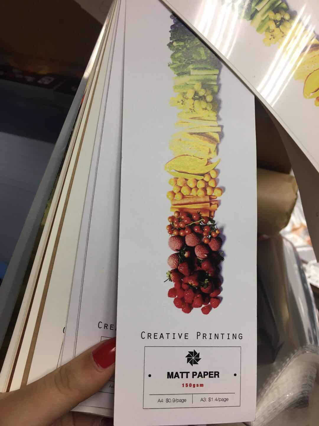
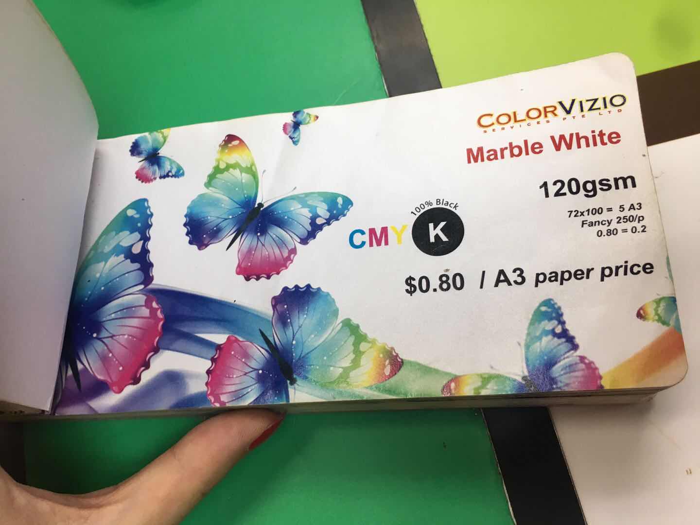
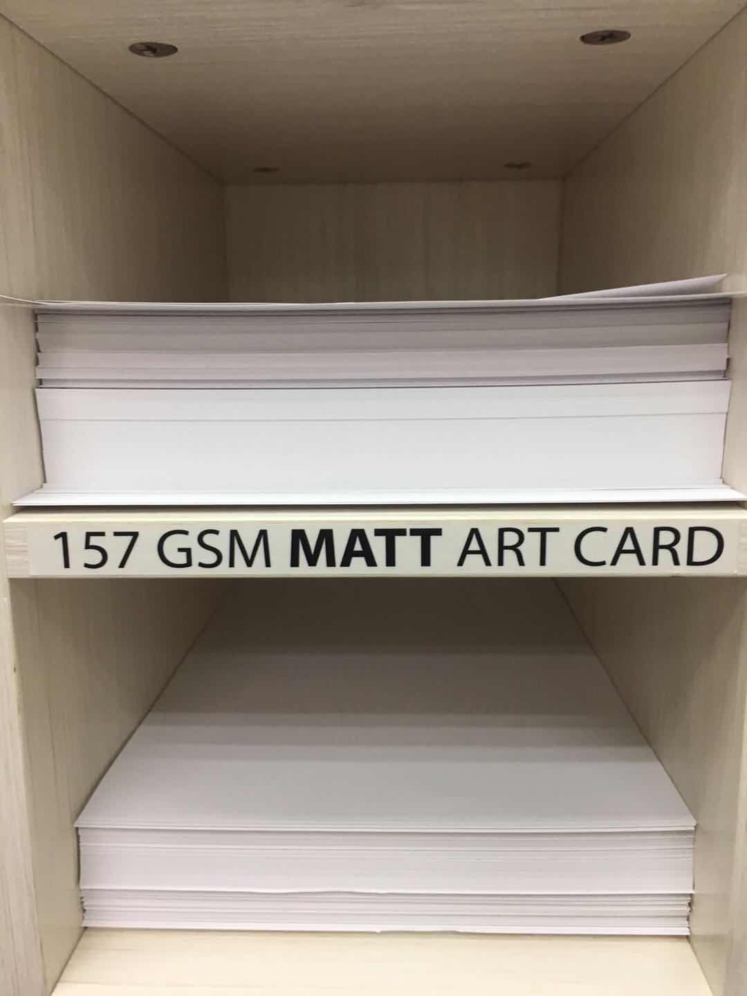
I tested printed another few types of paper as the Marble White 120gsm paper is a bit too thick for the zine.
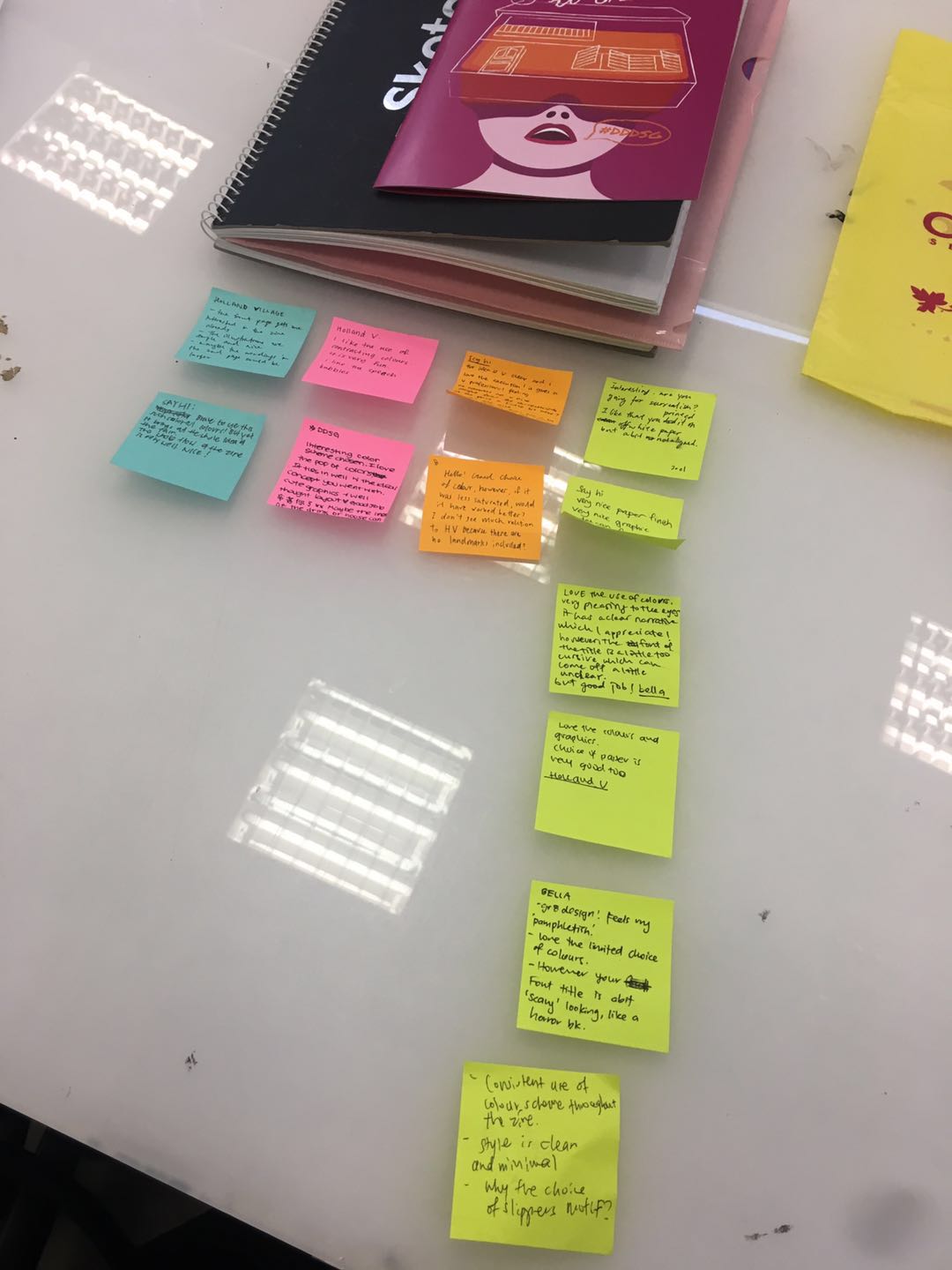
FEEDBACK AND REFLECTION
I received constructive feedback from my classmates and professor. I am glad that my classmates like the choice of colours and found the cover page eye-catching, however, maybe the symbolic object I chose could be more relatable, and easier for the reader to understand the narrative. Also, there are still flaws in printing, as the last page is not perfectly aligned. I will work carefully on the software and also check on the printing to make sure the outcome has the best quality. Some also suggested that the font could be easier to understand. Overall, I had found doing this project, attaining the event, trying a quite different graphics style this time. I am from a product design background which emphasizes practicality. Sometimes, I found it hard to break the constraints. I am grateful that my professor pushed my limited and answer my doubts patiently. I will step out of my comfort zone and explore more about graphic design in the future.
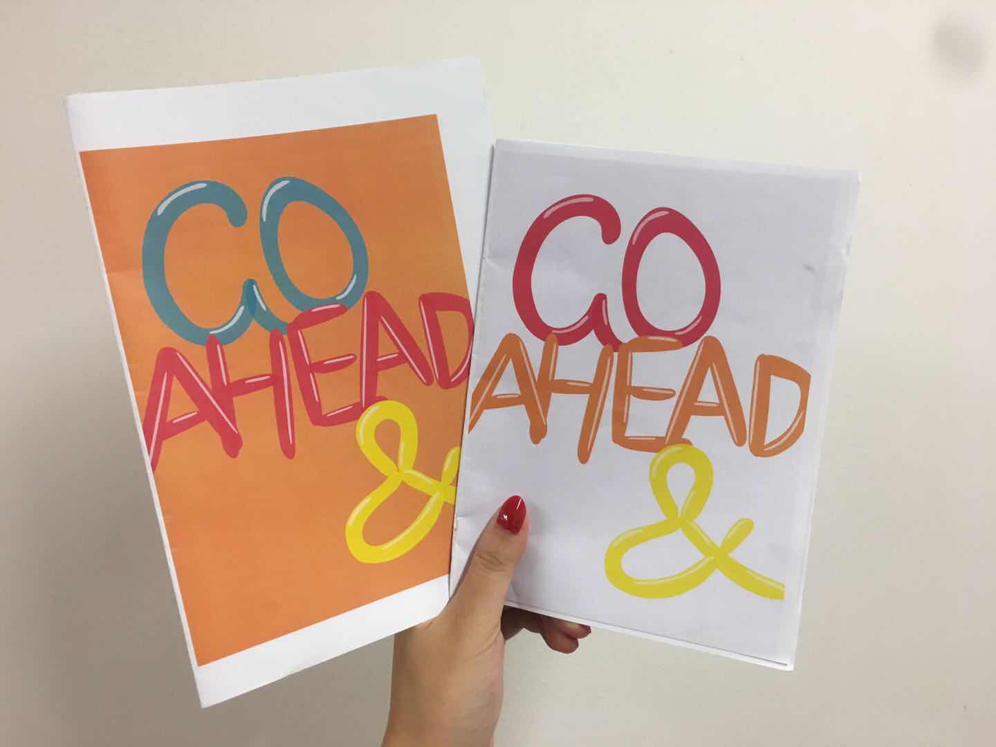
The first draft of the zine was printed out on the normal paper. The theme is celebrating design at HV neighborhood based on the new research and observation at the annual event at Holland Village during the Singapore Design Week.
However, the first draft is lacking in the “celebrating design elements”. Also, it seems to be a zine for children instead of design lovers. Moreover, the design style is not consistent, and the pages seem to be stand-alone posters. Thus, I worked on the narrative and style for the second draft.
SECOND DRAFT OF MY ZINE
Photos OF #DDDSG
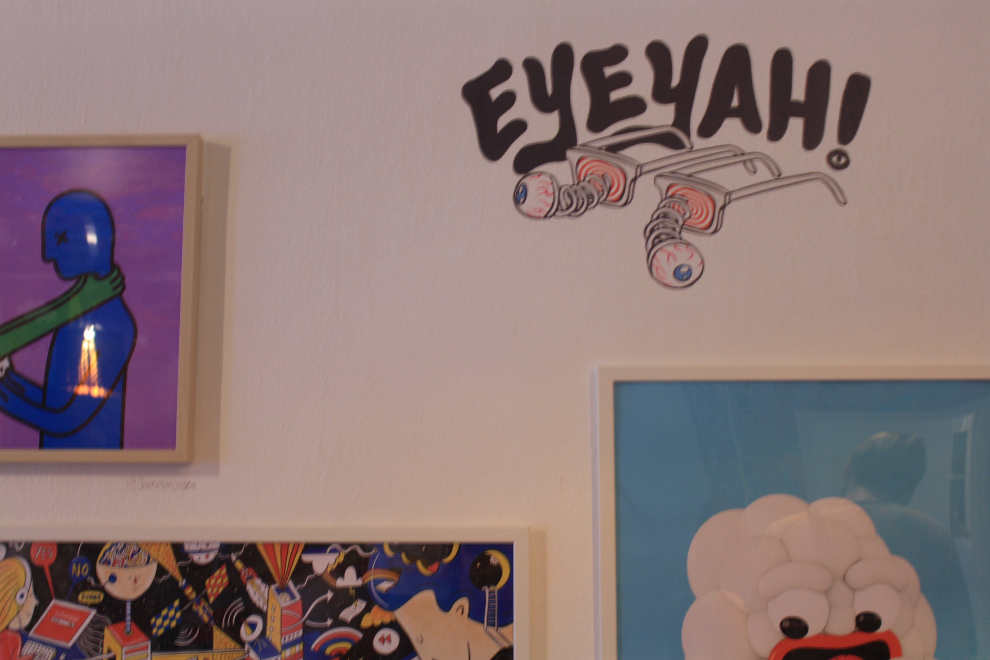
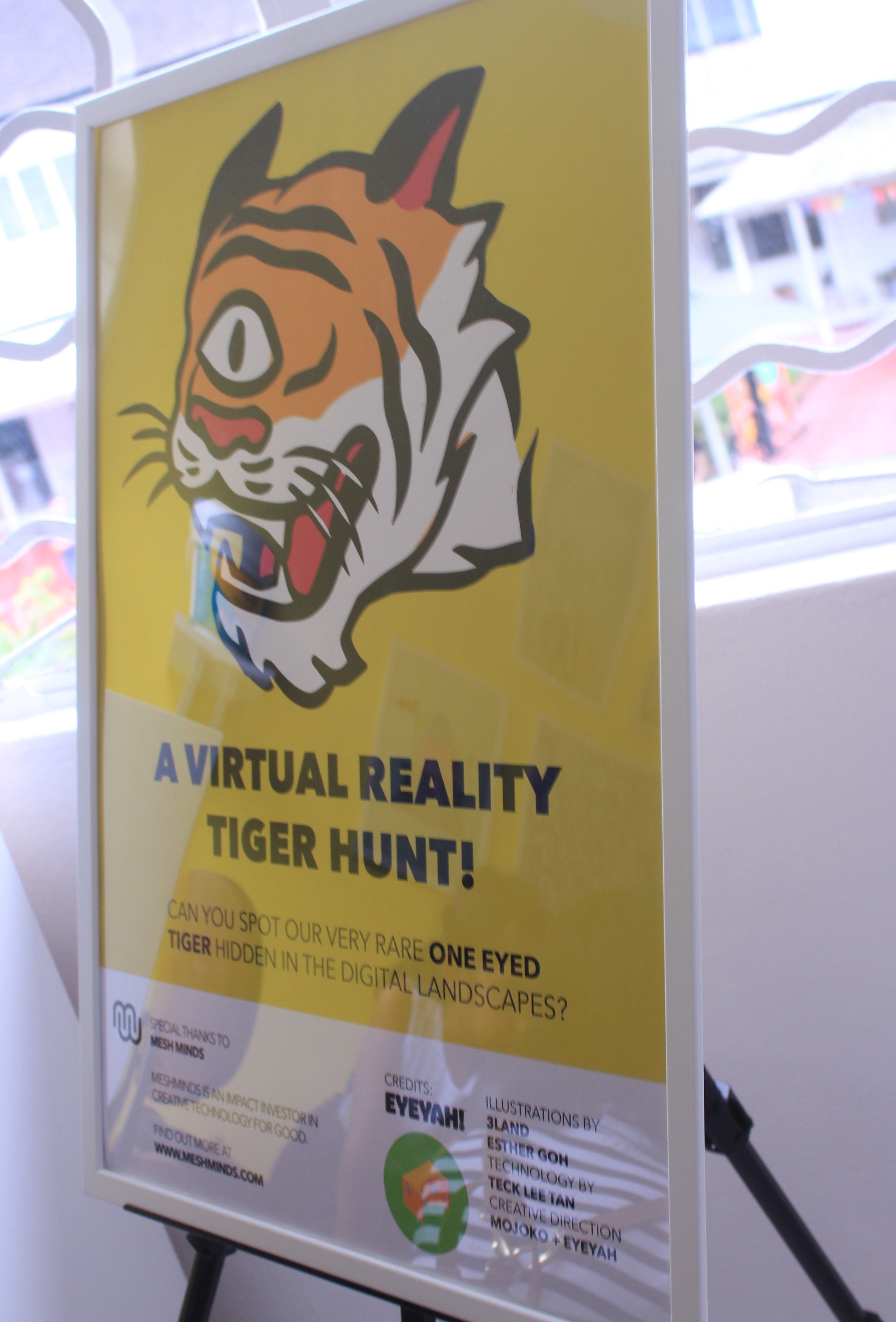
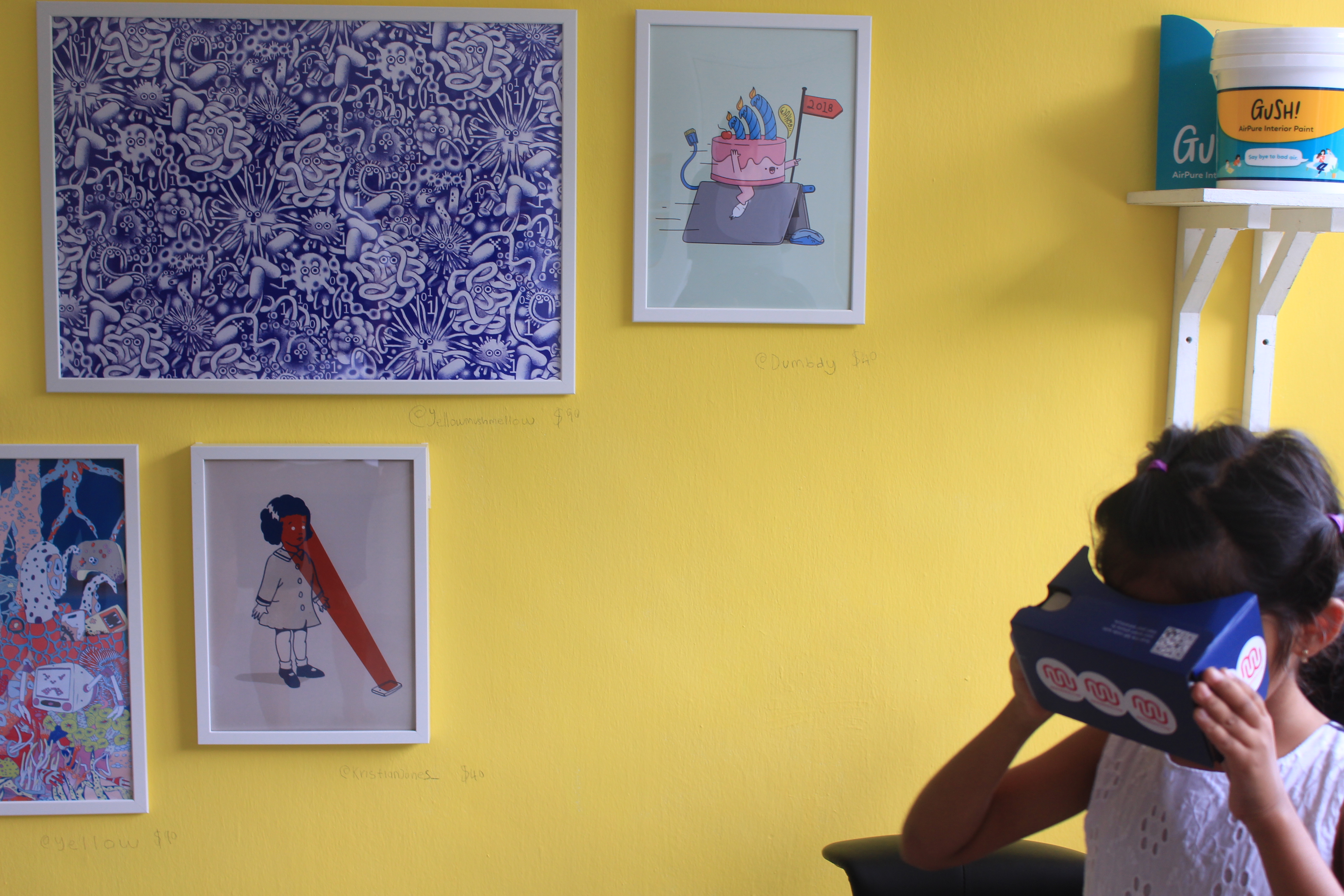
I started to filter the photos that I took at the event to find the focus of my zine. I decided to pay more attention to one of the houses that opened for the exhibition. That house was opened for EYEYAH!, which showcased works including t-shirts, painting, and installations of over 30 artists. At the second floor, there is one room where the visitor could use the VR googles to find the logo of the exhibition around the room. I was able to capture a moment that a little girl was playing with it.
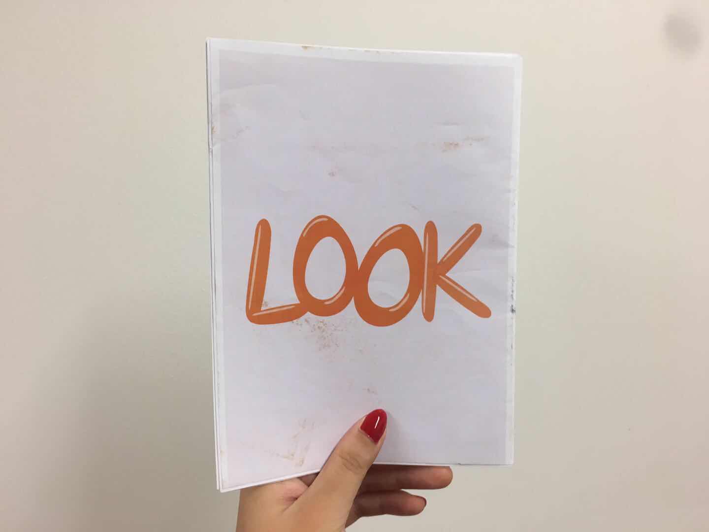
I decided to use the VR google in my zine cover to make it fun and eye-catching.
I also used the elements and colours on the street for the zine design.
Further, another room in this house has walls of artworks done by artist and the visitors are free to draw and write on the wall. It gave me inspiration for the style of my zine design.
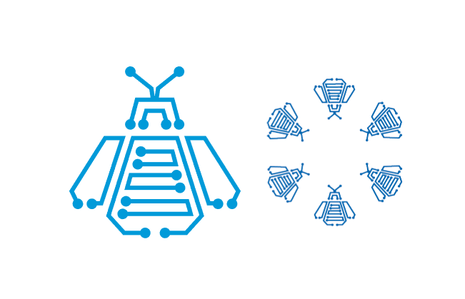
The pattern is created for the location Chip Bee Garden. I used the elements from the chip, bee, and garden (flower).
TEST PRINT
I test printed the first four pages on different papers with different printers.
The Marble White 120gsm paper seems to be the ideal paper out of all. It gives the metallic effect which matches the theme of the zine design.
Feedback
The title of the cover page is not interesting enough to match the zine design. I might think of a new one instead of putting the name of the location. Also, I will explore more different handwriting title font to get the one that matches the text font. Moreover, the style will be spread into the rest of the pages. Lastly, adjust the composition to achieve the visual hierarchy.
What is love? What makes you fall in love? A lot of people tell me that love is the connection. Having the connection gives the feeling of belonging to a particular person or group. Communication is probably the key to create the connection. Our ancestors created languages for better communication and invented methods and tools to help with communication including, pigeon post, letter, telegraph, satellite technology, and the Internet.
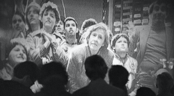
Hole in Space by Kit Galloway and Sherrie Rabinowitz https://www.wired.com/wp-content/uploads/archive/images/slideshow/2008/12/gallery_participation/04_holeinspace.jpg
In 1980, memorable moments were made through satellite technologies. Two big screens were set up on the two sides the United States. People at New York and Los Angeles had their live broadcasting for the first time with strangers, friends, and the loved ones. There were several emotional connections between people who were 2789 miles apart. I realized how beautiful connection is when I did the research at the beginning of the experimental interaction class on this piece of performance art, Hole in Space by Kit Galloway and Sherrie Rabinowitz. I named it The Mother of Facetime.
According to John Durham Peters, broadcasting is a tool used for dissemination, which the main source is spread to one large audience without the exchange of dialogue in between. The audience only has the choices to listen, analyze or just ignore the information. Over time, the centralized one-to-many broadcasting seems to be replaced by the peer-to-peer interactions that join the artist and audiences in the third space.
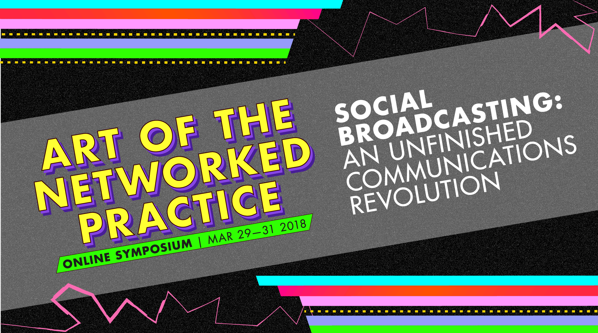
For instance, the online Symposium, collaboration of the School of Art, Design & Media at Nanyang Technological University (Singapore), LASALLE College of the Arts (Singapore), and The School of the Art Institute of Chicago, Department of Performance (US). The three-day event from 29th to 31st March 2018, gathered international artists to share their artwork, thoughts and answered questions from the audience on Adobe Connect.
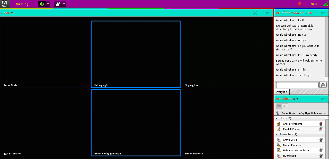
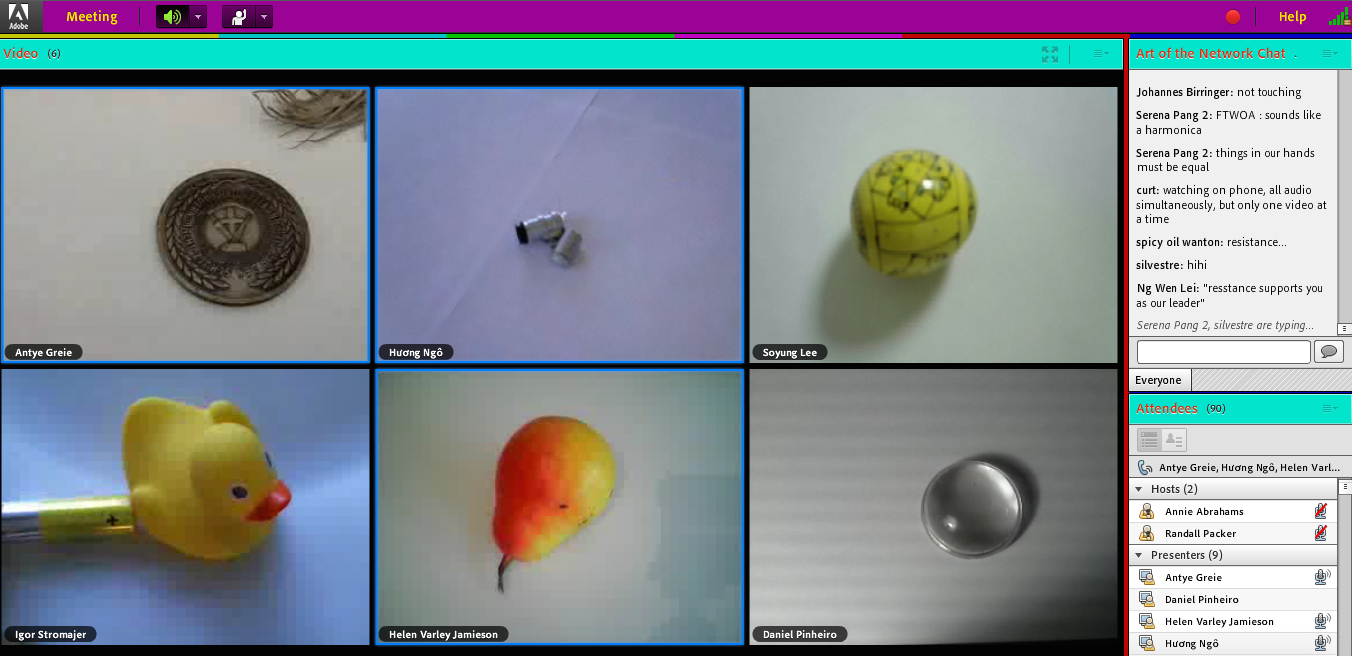
On the first day, Annie Abrahams, the Scienartist I researched on in my previous short essay, created a performance during the online Symposium. The performance connected a group of international artists who stay in different countries. It started with them reading their latencies with the black screen and the blue frame flashing. Annie Abrahams mentioned that she gave freedom to the performer, as she only gives rules and there is no directing. Annie Abrahams also commented that we know that the performers are not in the same space and time, yet we can still make something with entanglement between machine and people. In the following scene, artists showed different objects in the similar framing on their screen. We can see the connection and similarity in framing although those items were actually far apart in different countries.
Meanwhile, the conversation carried on in the chat room. Some were the clarifications of the performance from the hosts, some were questions, and some were just sharing thoughts. It seems to be outside of the performance but it somehow complimented it as the audience was able to connect and got to know others’ opinions. The decentralized and non-hierarchical modes of interaction gave the audience equal chance to connect with the artists and the other audience over the world.
Further, I had a mini experiment on the first day of the online Symposium. I decided not to join the chat room in the online Symposium, as I participated in Annie Abrahams’s online performance in my Experimental Interaction class organized by my professor Randall Packer. I would like to see the difference without participation. In the end, I found that I lost my interests and I actually felt excluded. My personal experience might not be enough to prove anything, but interaction is probably one of the keys to creating the connection in the “alternative social world”.
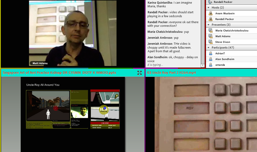
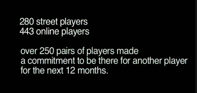
Another example that created the connection is the game Uncle Roy All Around You by Blast Theory in 2003. During that period, online games were developed in new genres like social games, mobile games and etc. In this game, the online and street players collaborated to find Uncle Roy before being invited to make a commitment to a stranger. The street player held a mobile device that shows the real-time location and the online play could be able to see the street player and guide him or her to find uncle Roy. They communicated with each other via online text and audio messages. At the end of the game over 500 players out of 723 total players made a commitment to be there for another player for the next 12 months. Matt Adams shared with us on the second day of the online Symposium that this game gave people opportunity to play with the relationship that they might create. Some people treated it as a game while some think it was real and actually had commitments for over 12 months. How interesting that people could be connected easily in the third space.
Numerous interesting artworks were made with the revolution of communication. Many memorable moments were captured. However, some said love without hate is not true love. Back in 1975, artists from Ant Farm expressed their attitude towards the mass media through Media Burn, a performance art that a Cadillac drove through a mountain of television. My research on that artwork made me questioned: Haven’t you ever wanted to put your foot through your mobile phone? Since our daily life seems to be dominated by our phone and the internet. We are so attracted to the connections and interactions we can easily make in the third space. Everything seems so lively yet not seems 100% real, as some treats it as games while some actually make commitments just like how people view the game Roy All Around You.
All in all, It is hard not to fall in love with someone or something you can connect with. It is hard to deny that the connection that interaction creates is beautiful and attractive. It is hard to change the reality that the third space is dominating our daily life. Many are obsessed with it, while some are against it. After going through the journey in Experimental Interaction class. I think the best solution so far of my own question “Haven’t you ever wanted to put your foot through your mobile phone?” is probably to build a new perspective to see the art of social practice. To see the beauty of connectedness we can build through those great human inventions.
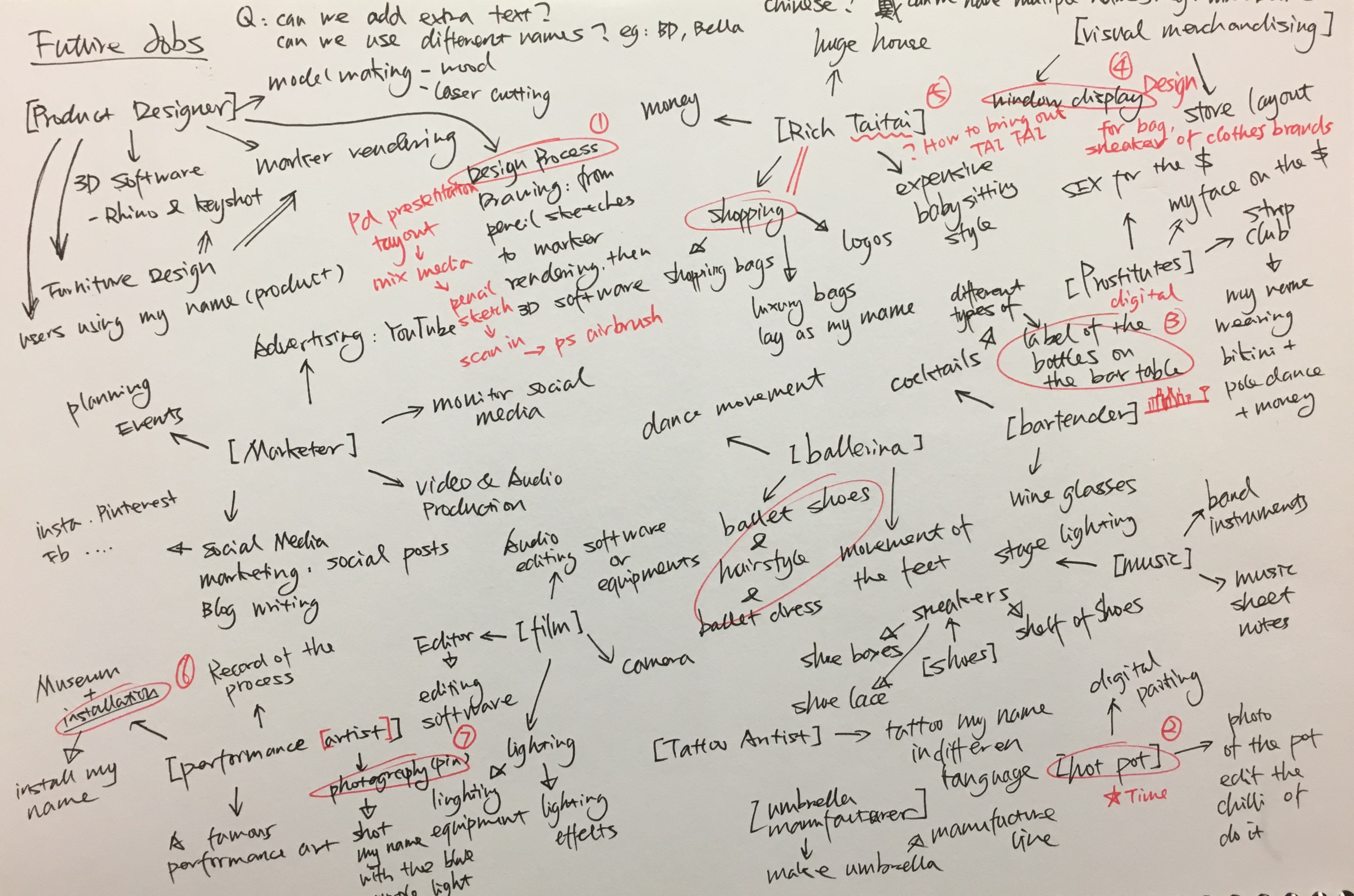
Create typographic portraits by using your name to describe your future jobs.
MY NAMES AND JOBS
Mindmap
I started this project with mind mapping with the job titles and the possible ways to represent the job. The chosen jods are listed below:
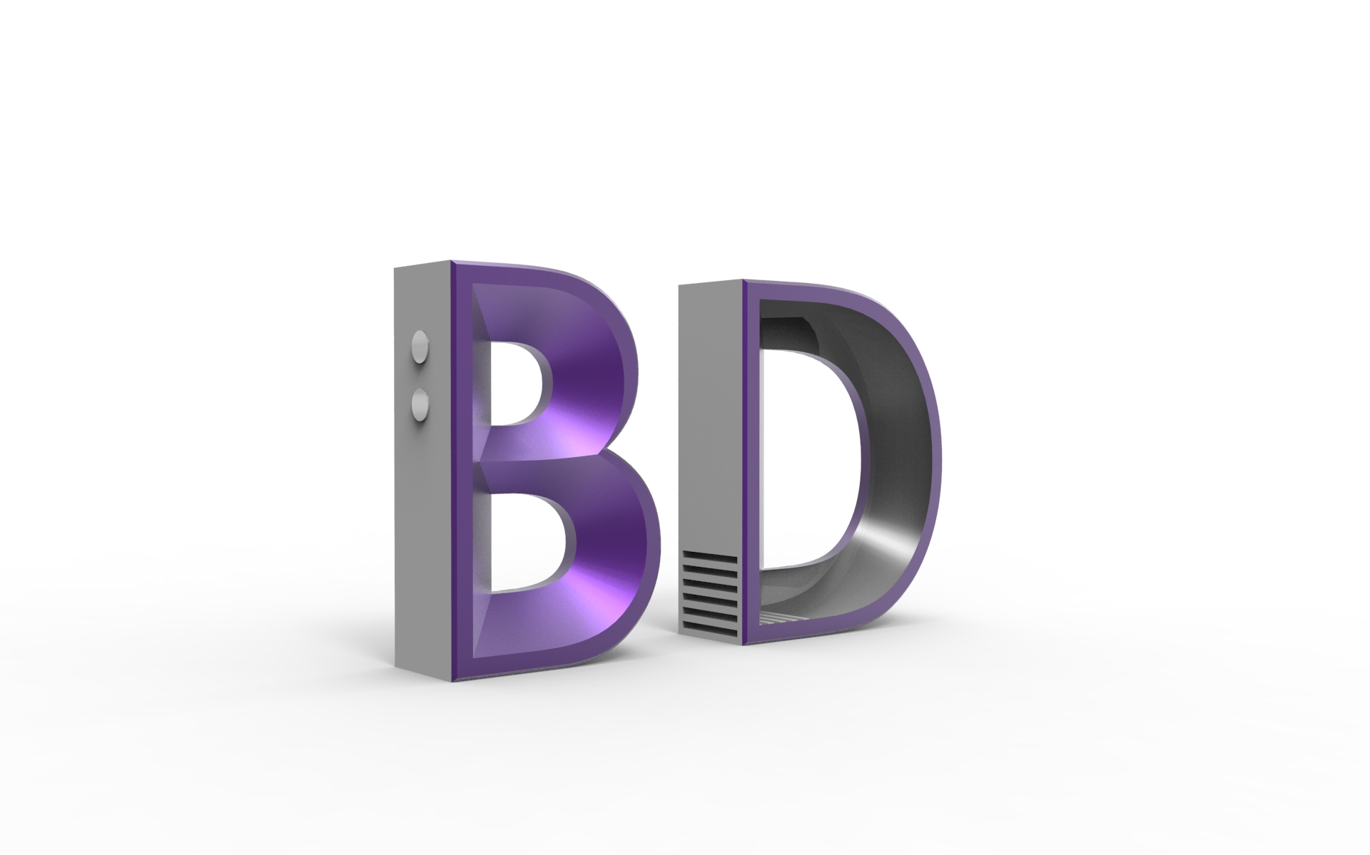
MY NAME IS BD AND I AM A PRODUCT DESIGNER
MY NAME IS BELLA AND I AM A MALA RESTAURANT OWNER
MY NAME IS BELLA AND I AM A VISUAL MERCHANDISER
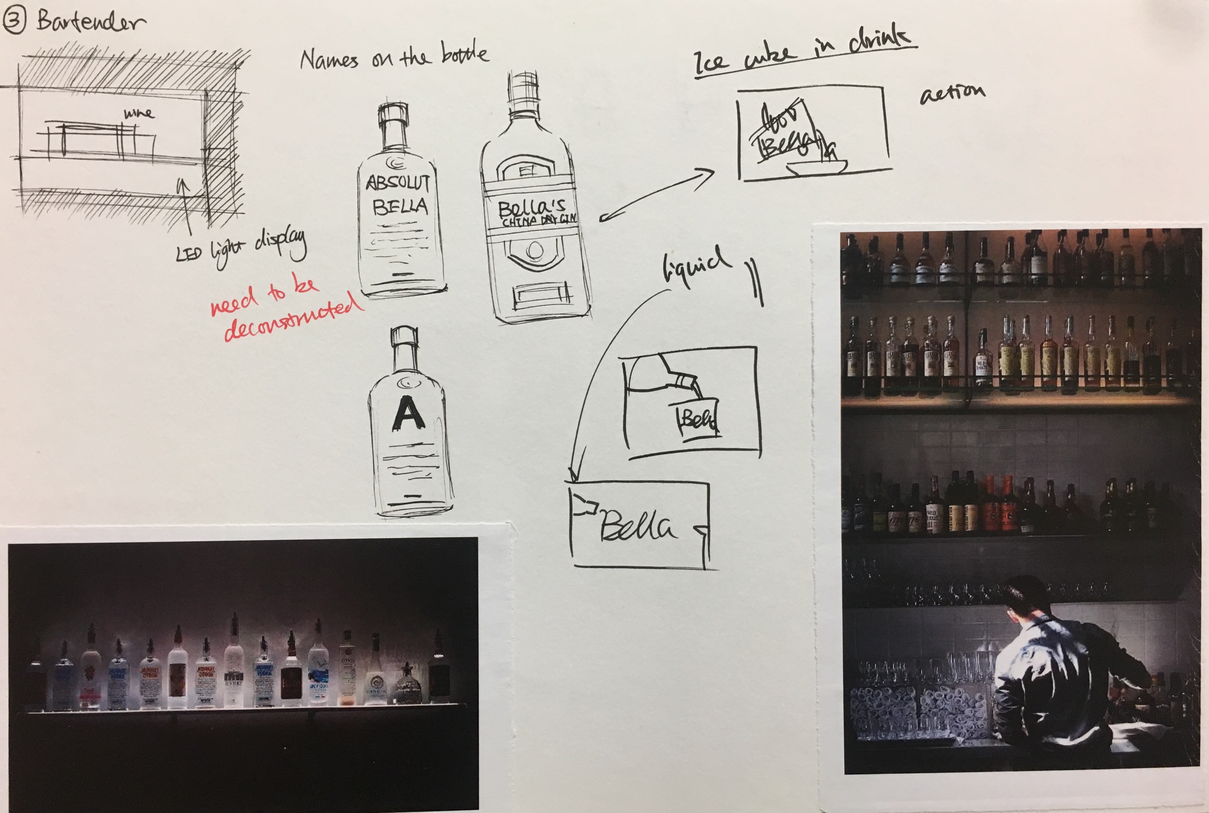
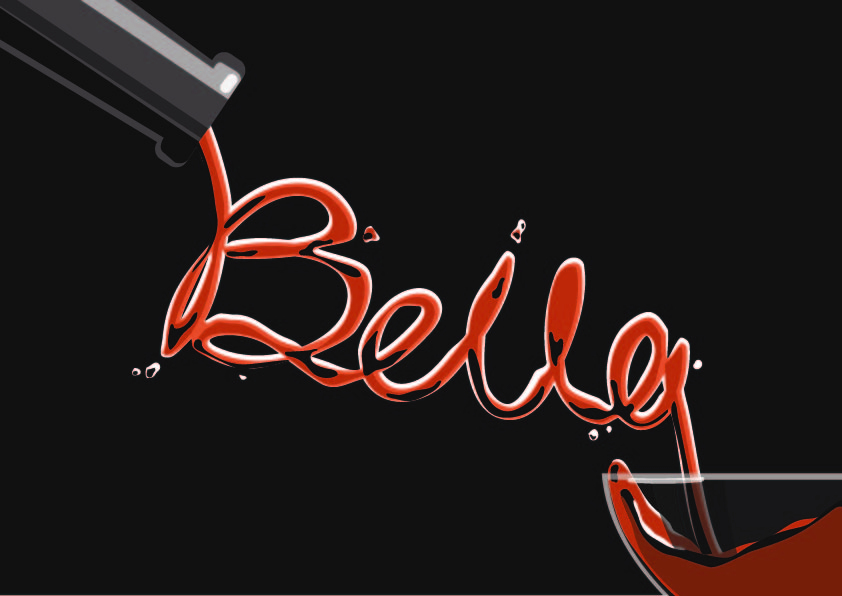
MY NAME IS BELLA AND I AM A BARTENDER
MY NAME IS BD AND I AM A PRODUCT DESIGNER
Overview
Product design, in my own words, is the process of problem-solving. There are a lot of steps involved in the process such as market research, ideation, prototyping, manufacturing, marketing and etc. Graphic design is also important to promote the product, for instance, product posters and packing. Therefore, I decided to incorporate my name into the ‘product design poster’.
I started my research by looking at different product design presentation style. Some are pen or pencil sketches with marker rendering and some are purely digital rendering.
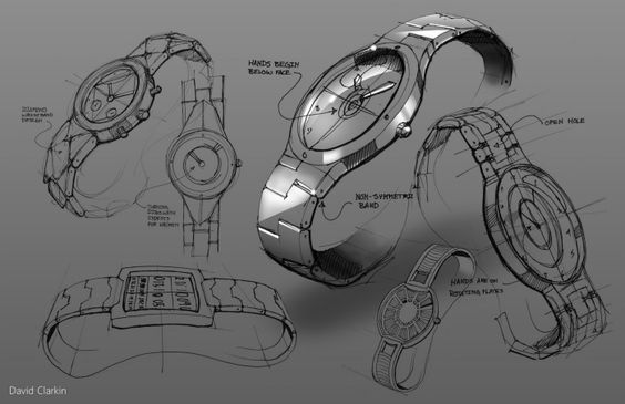
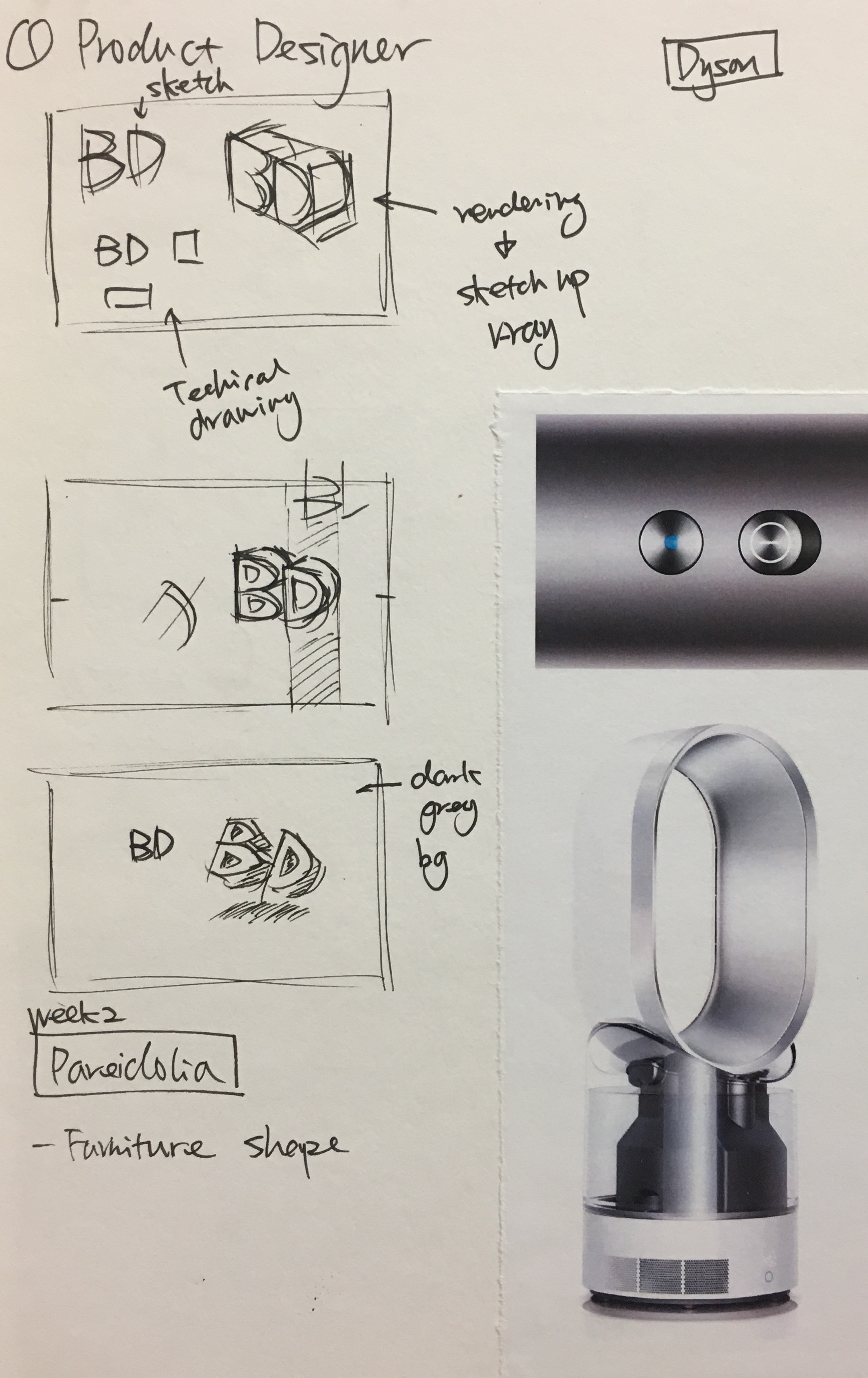
Dyson Fan http://www.g-mark.org/award/describe/36333?token=oDzi8yCdWSSketch
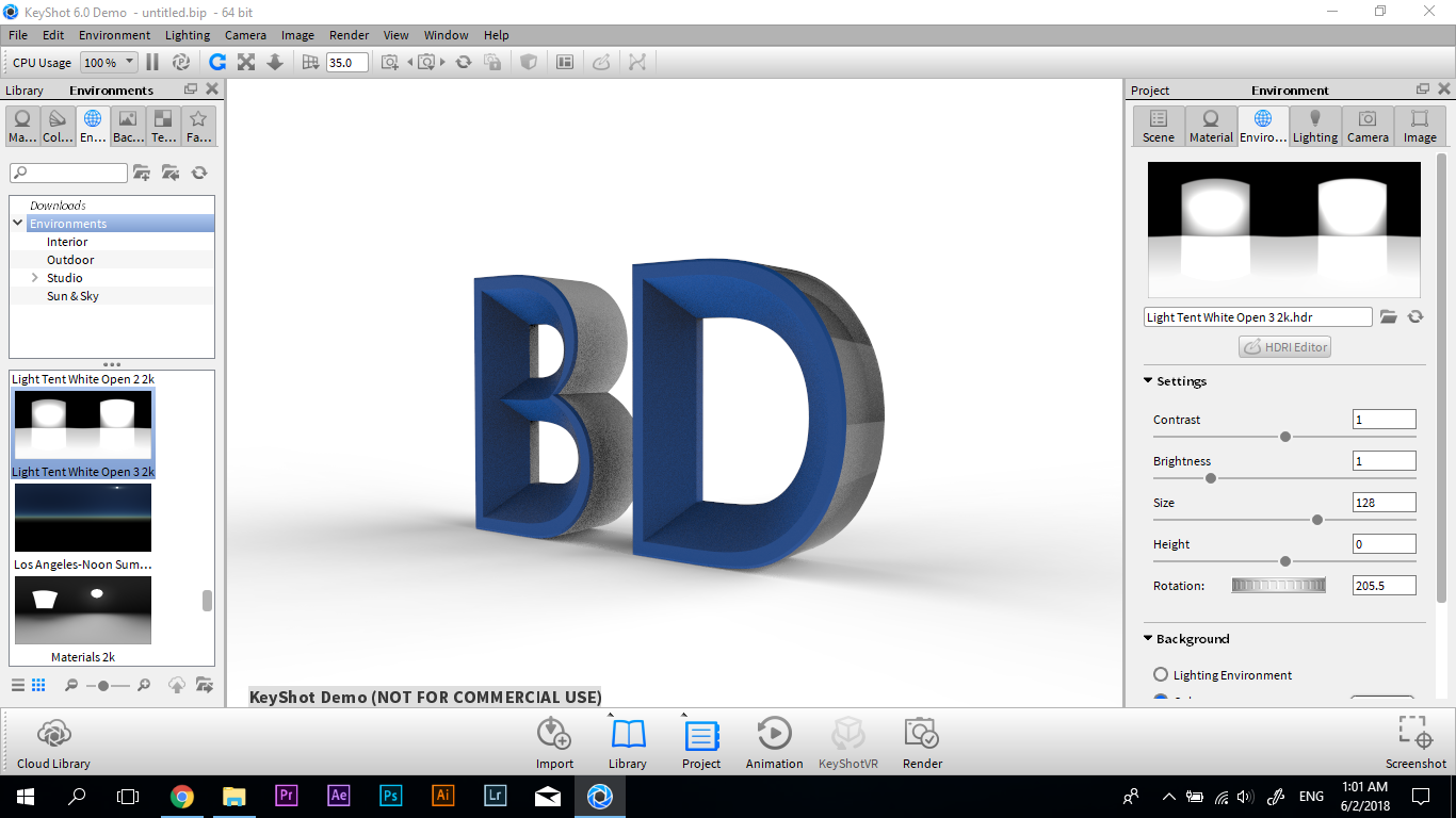
I sketched out some composition and decided to use 3D software to deconstruct my initial, BD. Further, I chose the font based on my experience in learning product design for three years. Century Gothic is frequently used in product design as it is clean and sleek. I referred to the design language of Dyson, a well-recognized household appliances brand for my 3D alphabet model.
Process
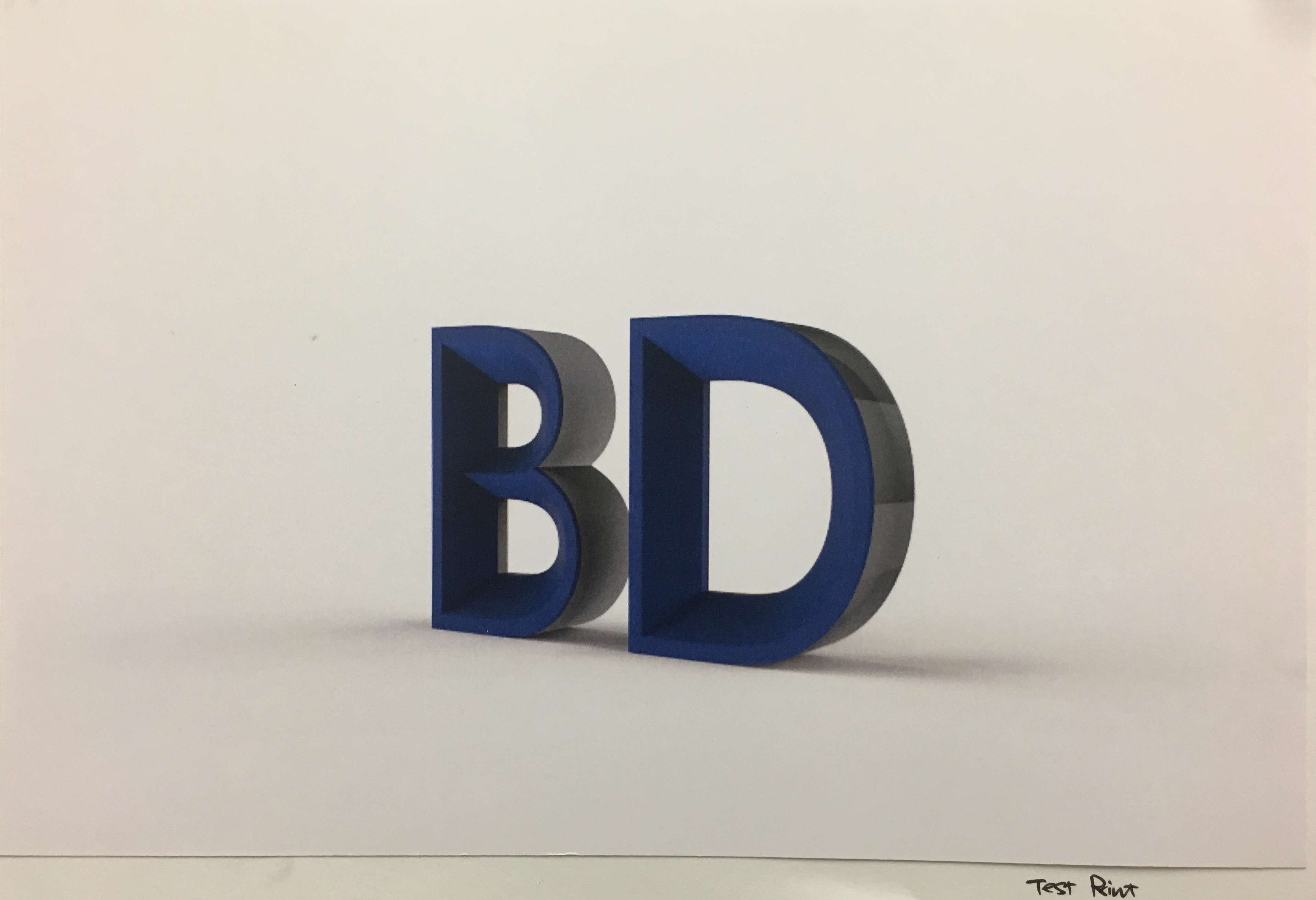
3D Model in Rhino3D Model in KeyshotTest Print
In the 3D model, components like buttons, and ventilation were added to the alphabet to make it seems like an electronic product. I used Keyshot, a 3D rendering software to add realistic material effects to the alphabet. Further, I went through a few run of test print to adjust the colour, lighting and choosing the right paper.
My initial idea was to use special paper and printing technique to show the different views of the 3D alphabet. However, I was told that this kind of print is only available in a few printing factories in Singapore, and it will be very costly. Thus, I changed my composition to four sets of BD in the different colours, like how products are available in a range of colours in the series.
Final Artwork
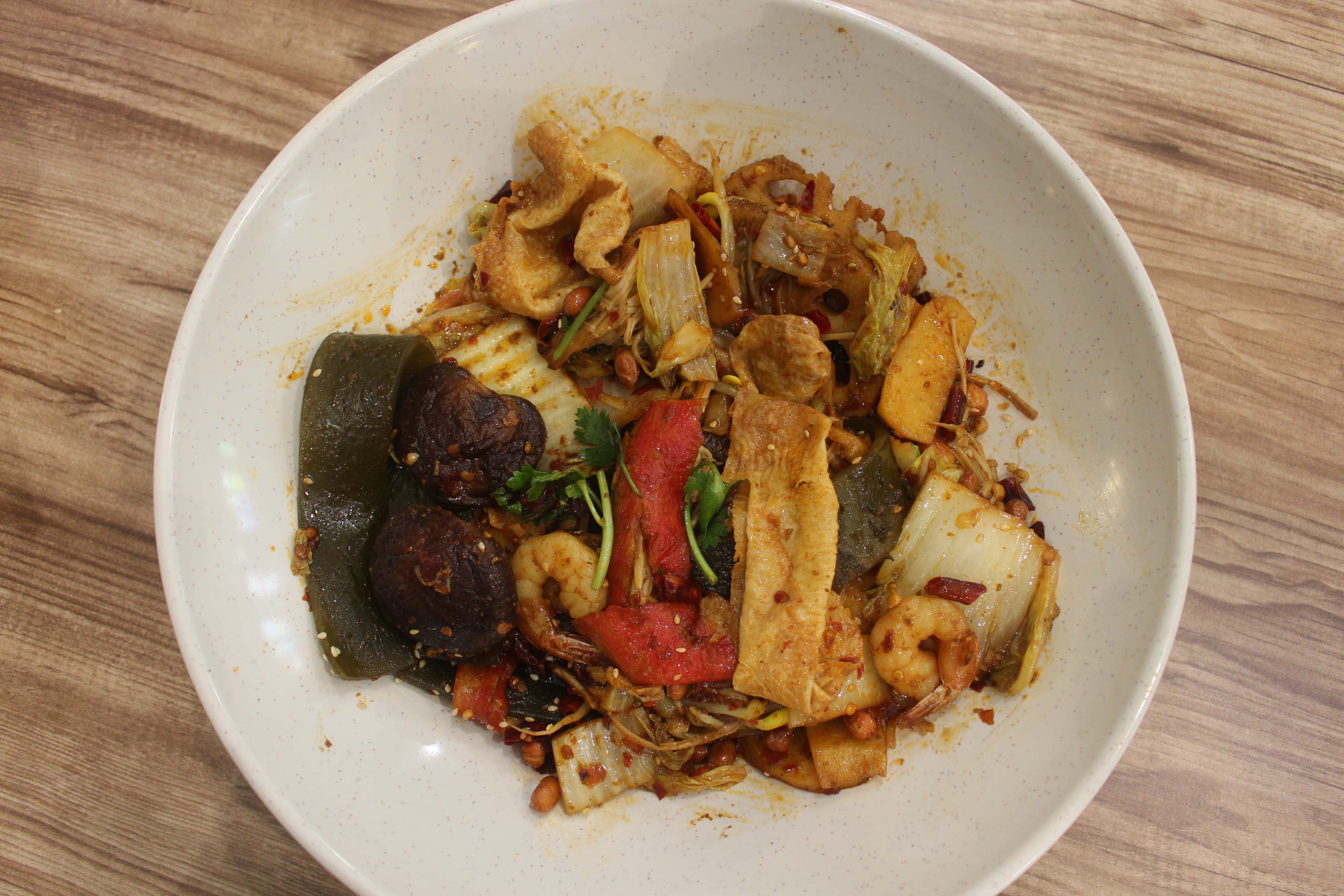
MY NAME IS BELLA AND I AM A MALA RESTAURANT OWNER
Overview
#ispotthealphabets
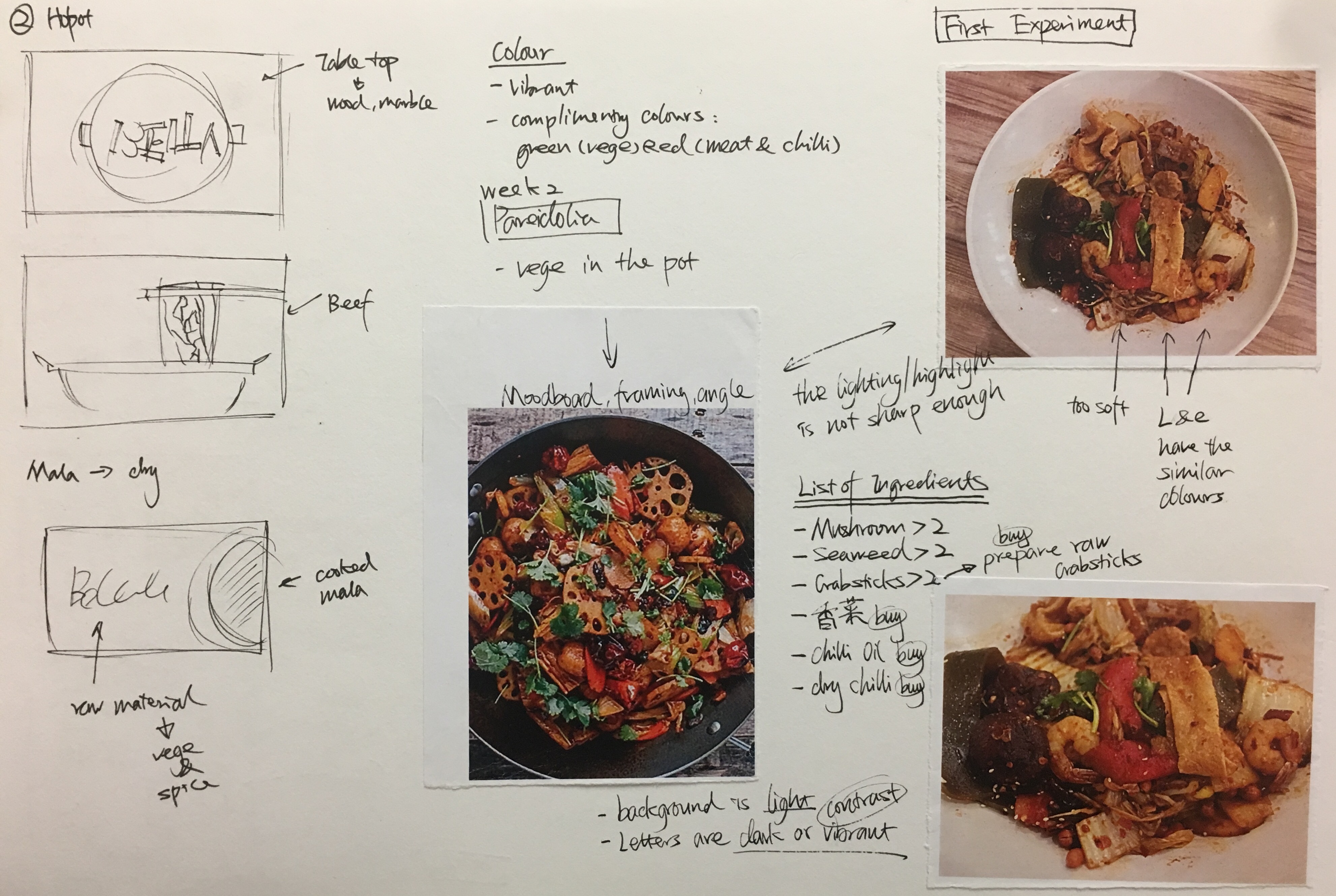
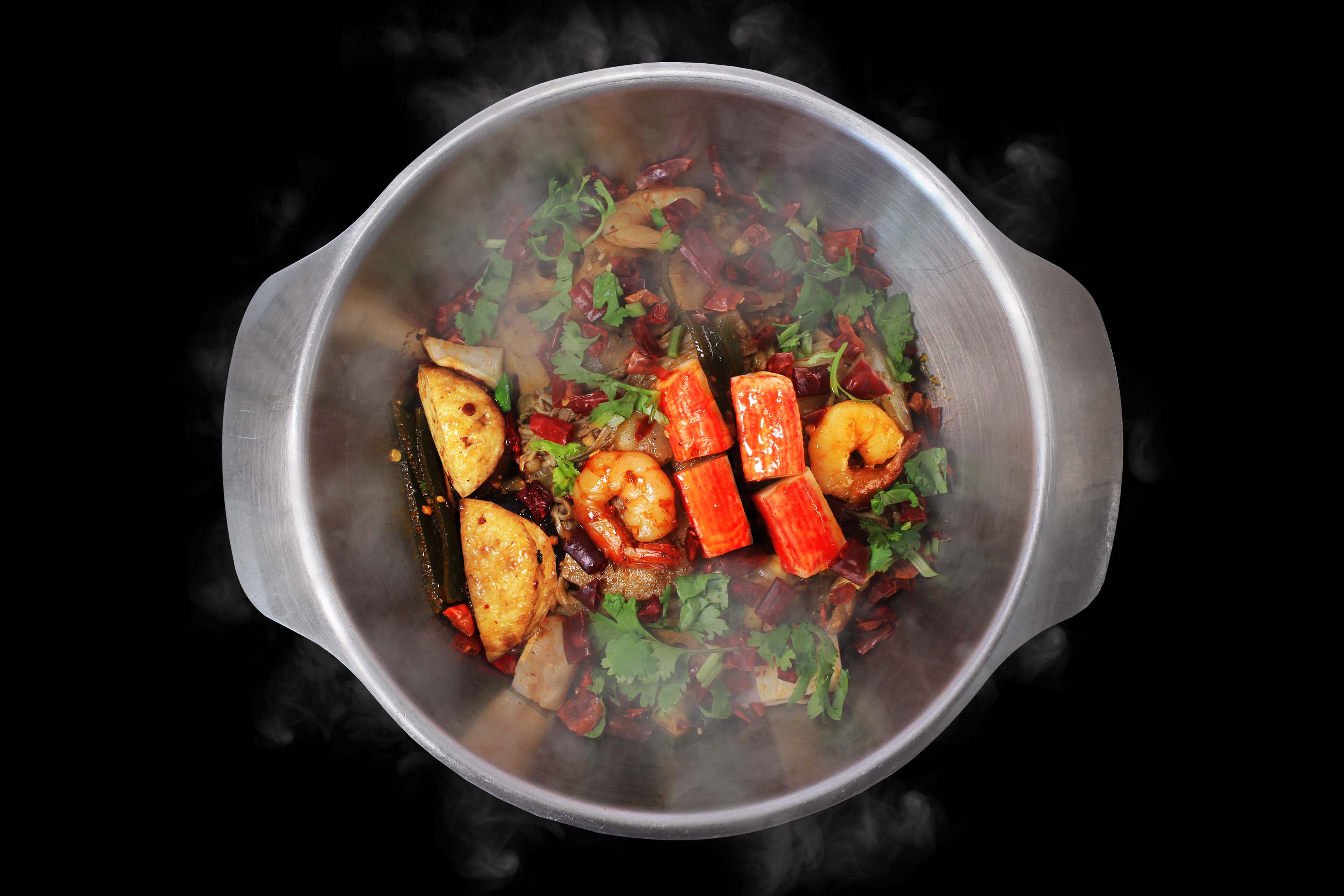
To own a Mala hotpot restaurant is one of my dream jobs, since Mala hotpot is my favorite food, and it was from my hometown Sichuan in China. Initially, I was thinking of using the raw ingredients in mala to form my name (like some food commercial like to do in the advertisement). However, I found a more interesting concept after the lesson about Pareidolia and doing the in-class assignment, I Spot the Alphabets. Therefore, I started doing experiments to find the food that is able to represent my name.
Research
Sketch and NotesOne of the Test ShotsCommercial Mala photo https://i.pinimg.com/564x/56/2b/1a/562b1a4adc1d1410674ee0bb095b1c0a–chinese-eggplant-chinese-food-recipes.jpg
I had some test shots and researching on how to take good photos of food. There are a few videos available on youtube about food commercial photo shoot techniques and tricks. Also, I consulted some of my friends who has photography background for suggestions. The style is this concept is commercial food photo to show that I am the owner of the restaurant instead of the chief or just food lover.
Process
DIY Photo Studio
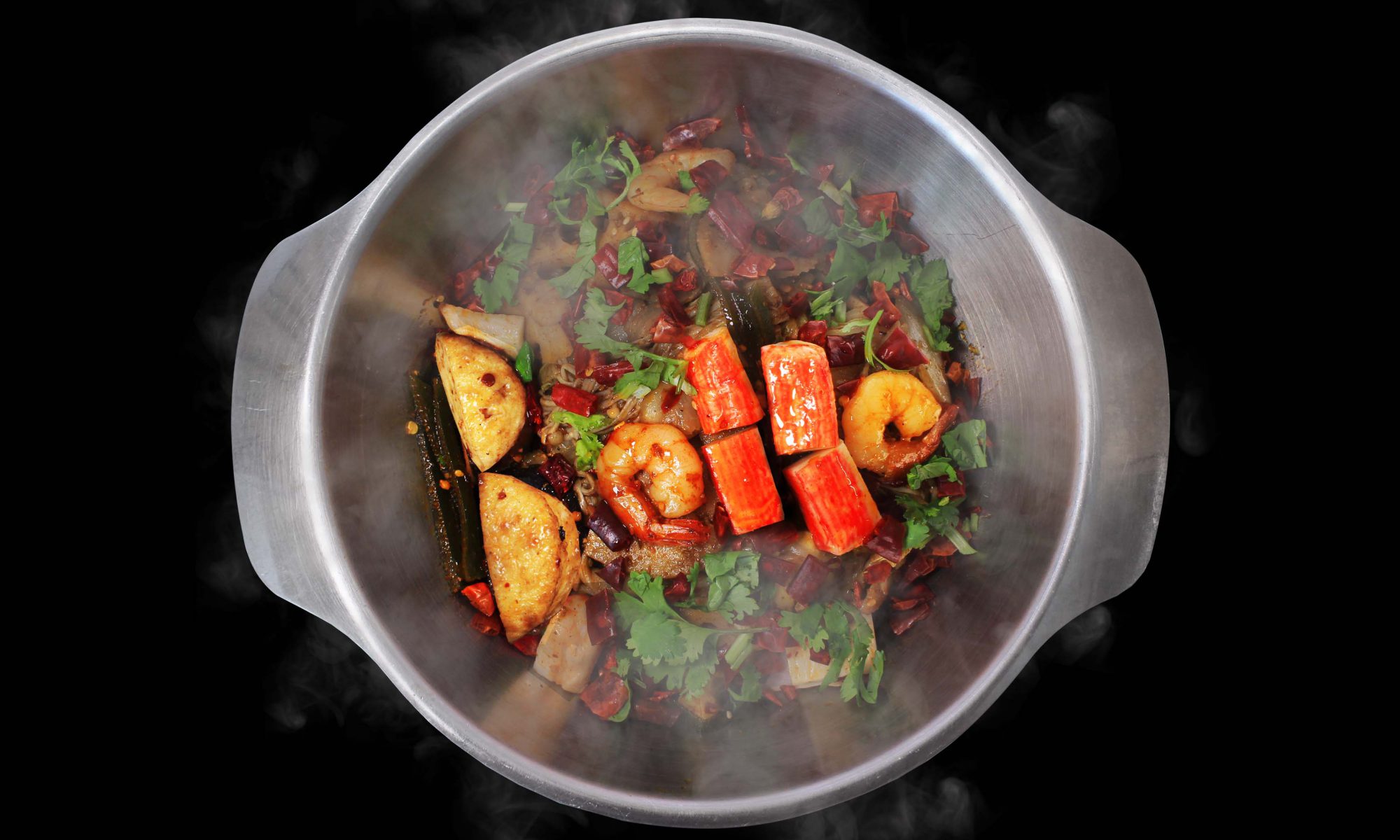
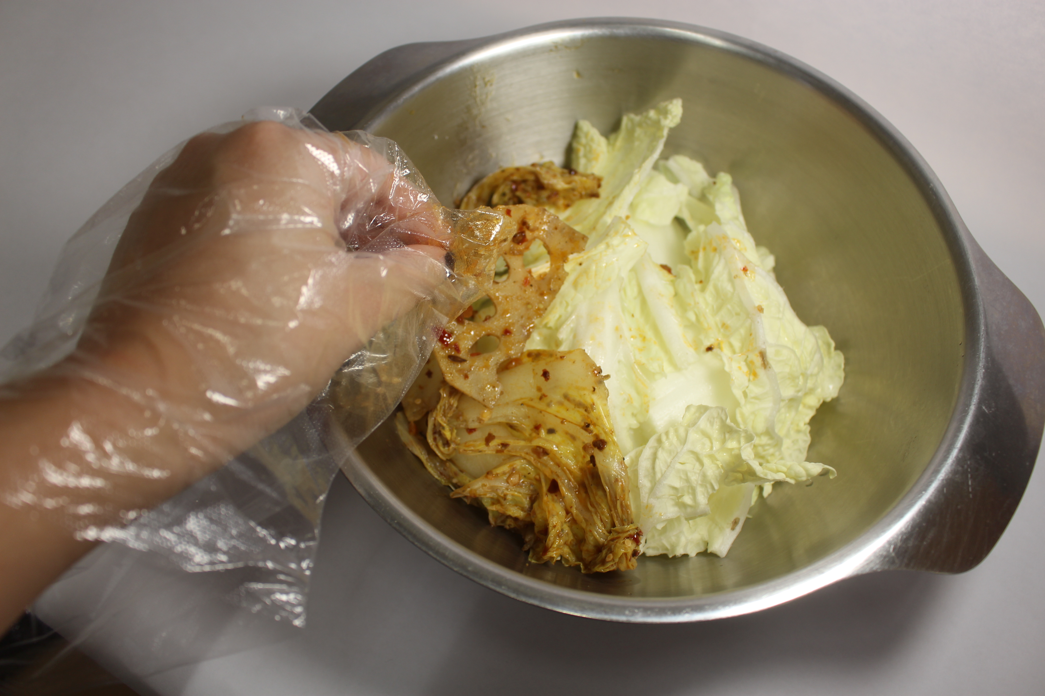
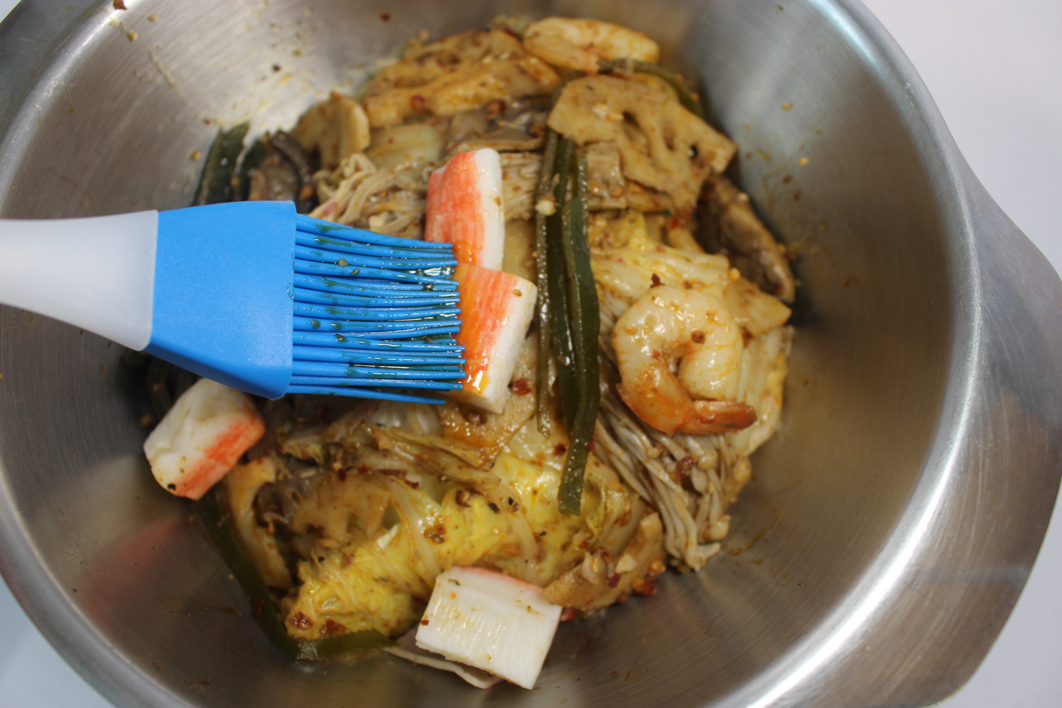
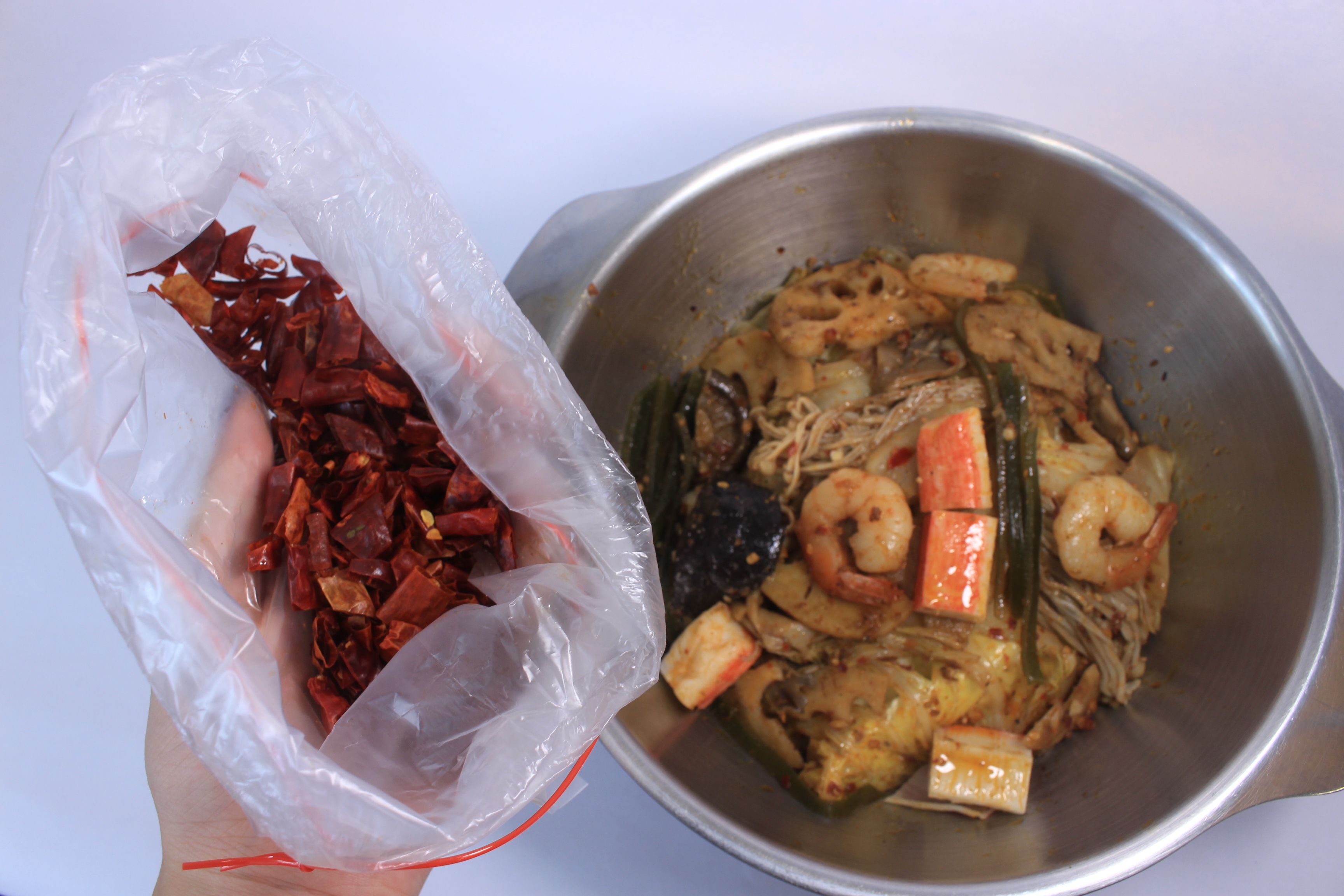
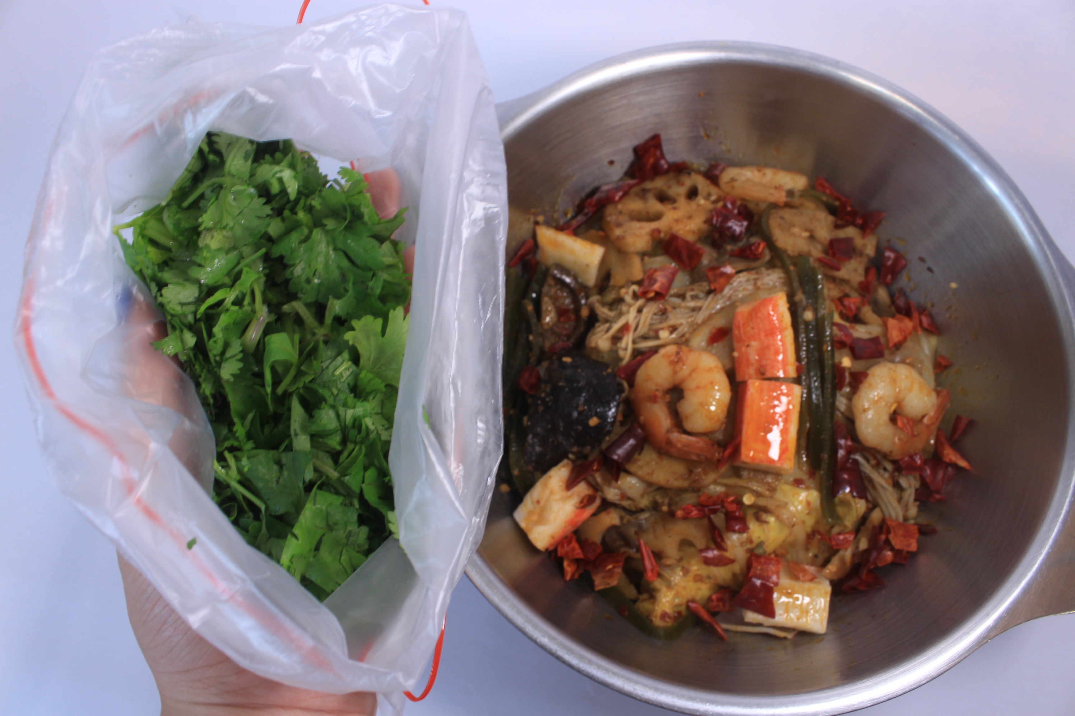
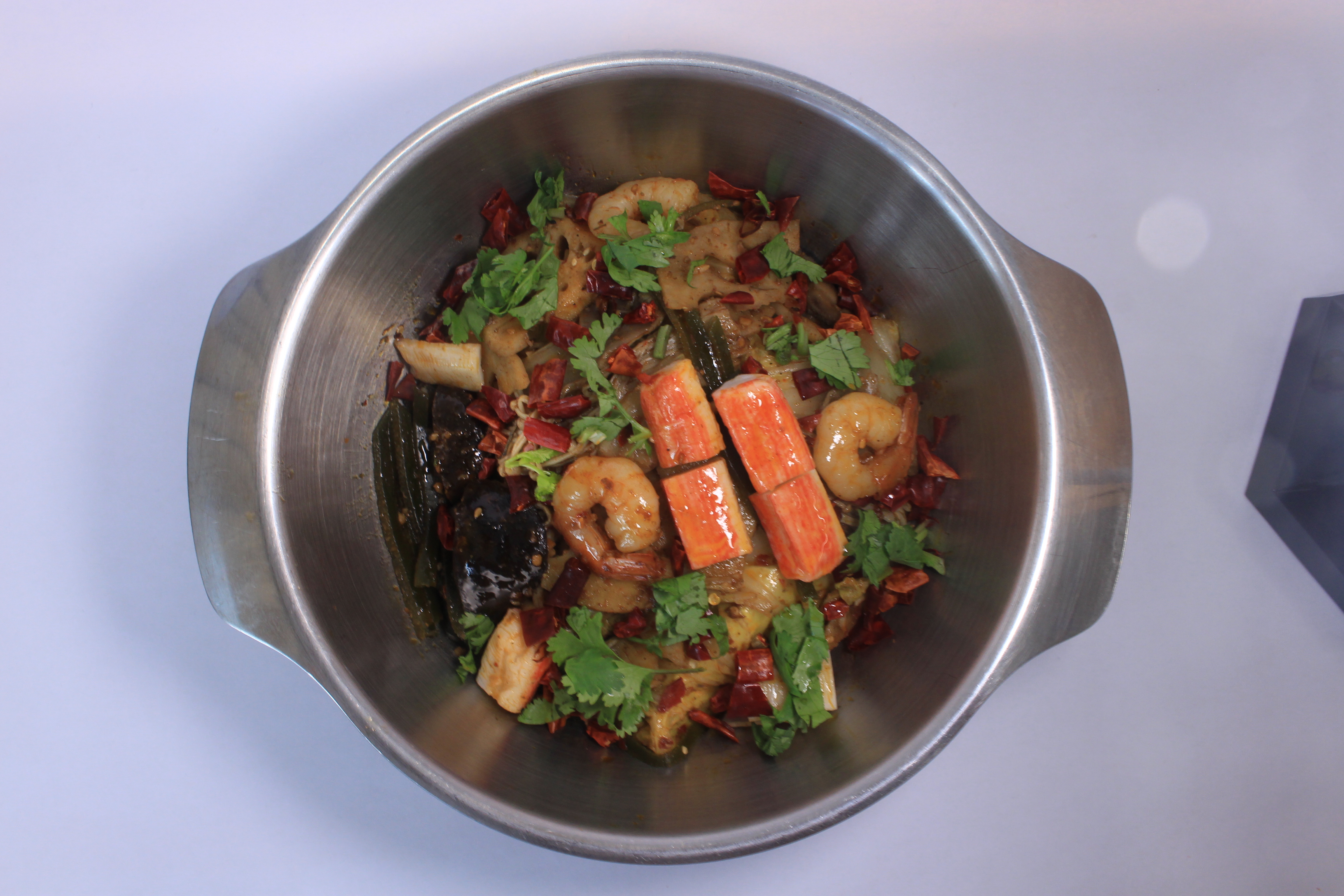
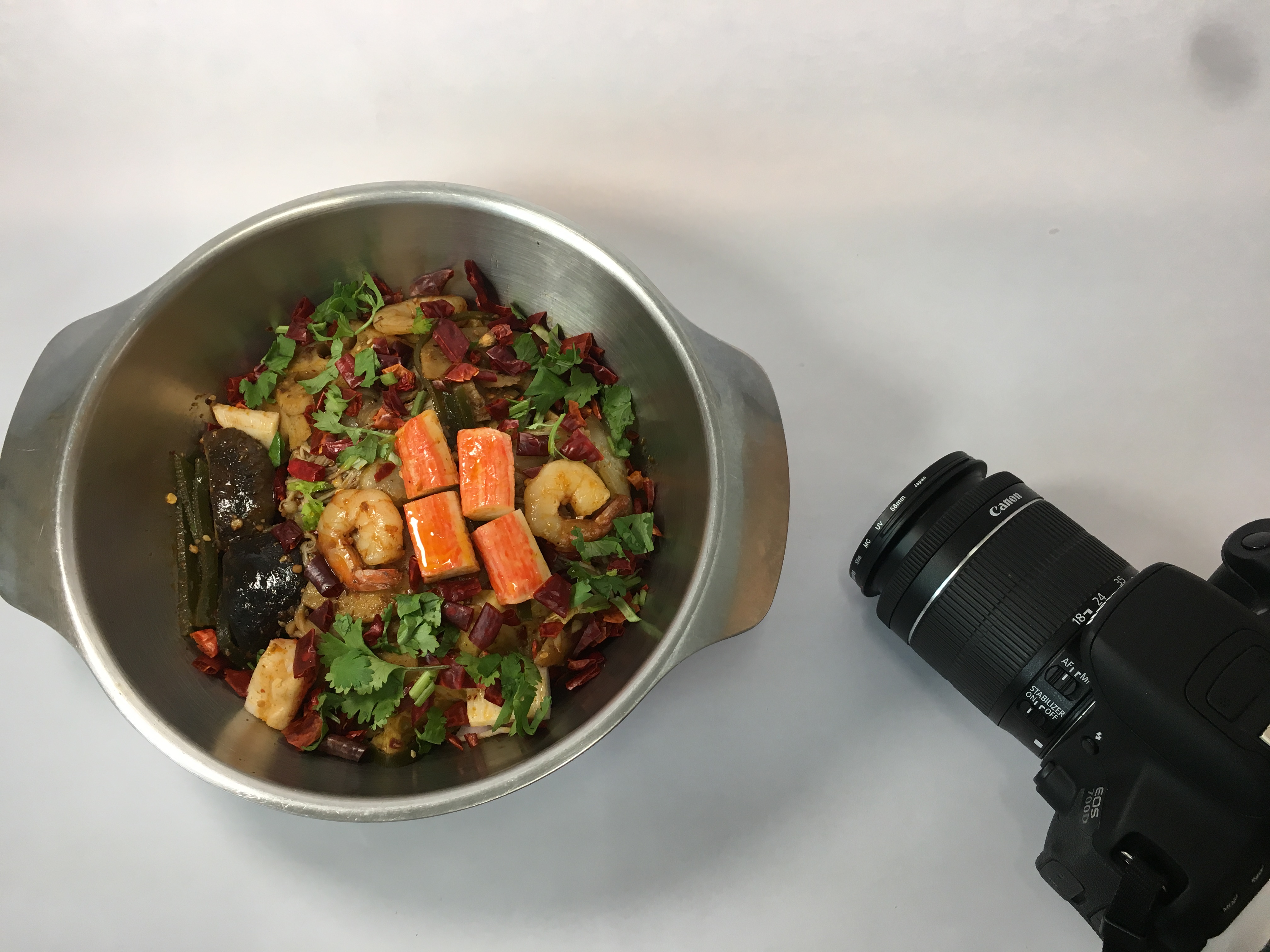
I set up a DIY studio on my table in my room with white paper and a 12 dollars portable table lamp. I bought mala hotpot from my hall restaurant and also bought some other raw ingredients such as chili and Chinese parsley that are normally used to decorate the food. The hotpot restaurant agreed to lend me a small stainless steel pot.
After setting up the lighting and pot, I started to arrange the food layer by layer to make sure the ‘alphabet ingredients’ stands out from the ‘background ingredients’. I brushed extra oil on the ‘alphabet ingredients’ to emphasize the contrast. Here I used mushroom, prawn, and crab sticks to represent the name of my alphabet. Some ingredients are raw and brushed with oil. It is because some ingredients have better shapes when they are raw, such as, crab sticks and dry chili.
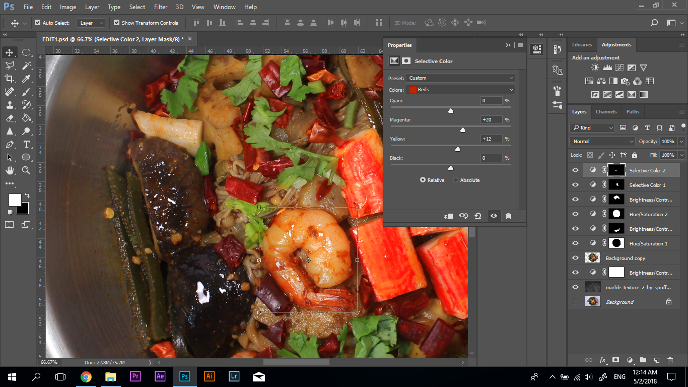
Editing in Photoshop
I increased the saturation of the ‘alphabet ingredients’ to maximize the contrast. Also, the steam effect was edited in the photo to create the focal point, and avoid the artwork to be too pictorial.
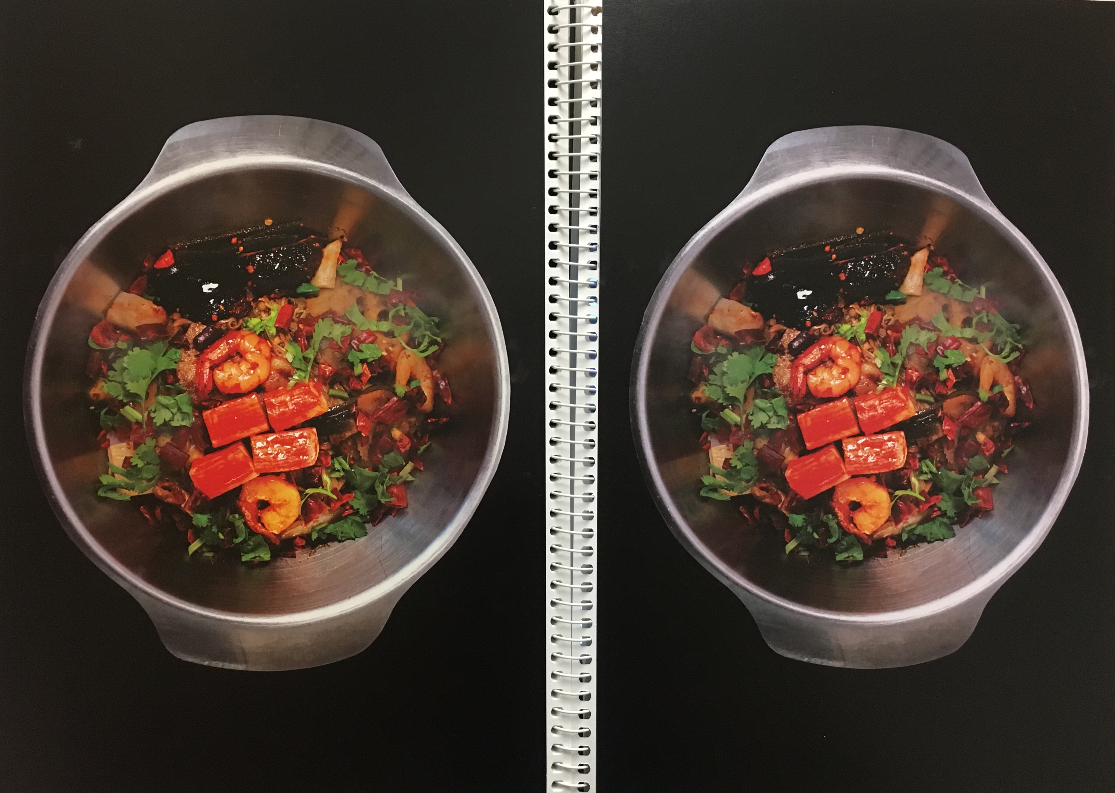
Test Print
Lastly, I test print the artwork and adjusted the saturation, and capacity of the steam to achieve the ideal effect on paper.
Final Artwork
MY NAME IS BELLA AND I AM A VISUAL MERCHANDISER
Overview
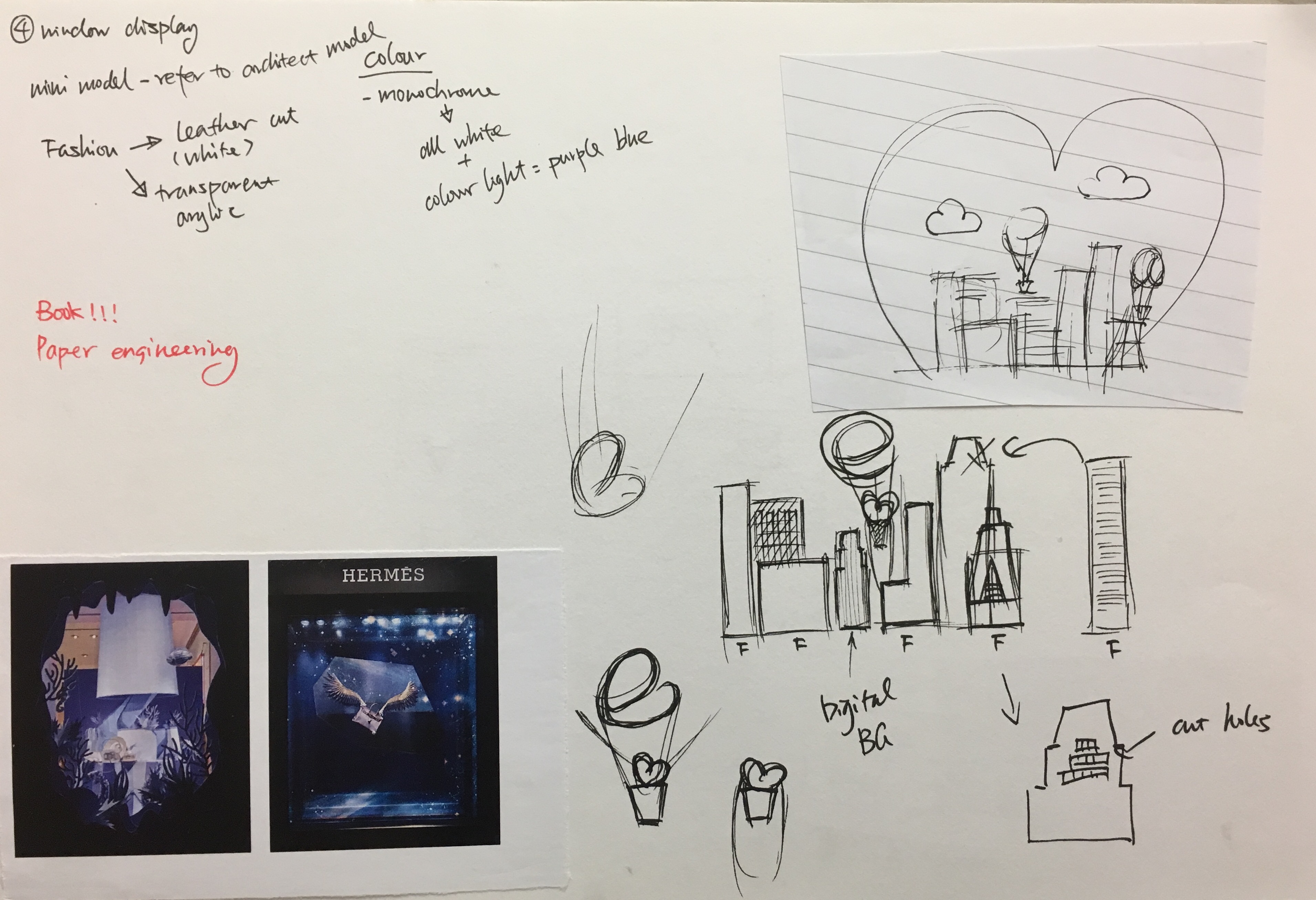
Visual Merchandiser is the job that I will probably pursue in the future. Visual merchandiser’s role is to design the layout and display of the store in order to improve the customer’s shopping experience and increase the sells. Thus, my concept for this job is to incorporate my name into the window display.
Research
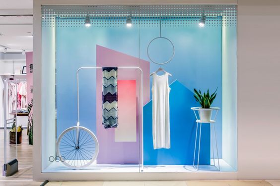
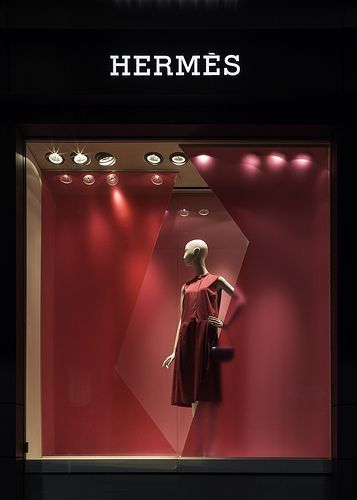
Window Display Colour Theme https://i.pinimg.com/564x/54/52/08/545208062e5547b7c3e5b3d7405c7e1b.jpgInspiration for Composition https://i.pinimg.com/564x/b4/9c/71/b49c7160d54bb6a281ded5bd9220791d.jpgSketch
The window display is a three-dimensional space. It often has a different theme according to the season and festivals. Therefore, I decided to have a Valentine’s Day theme for my window display.
Process
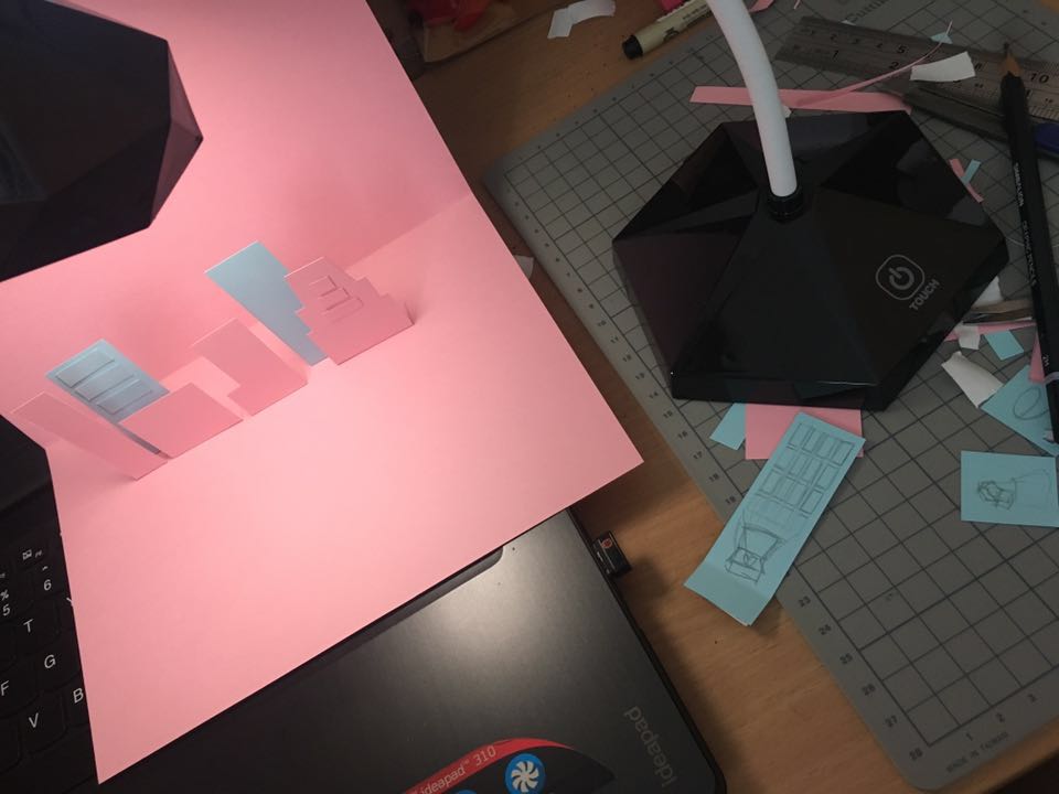
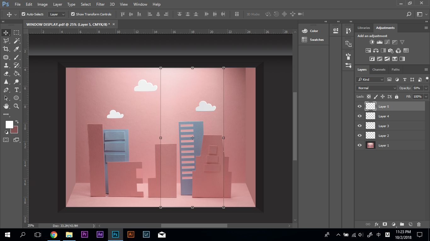
For this concept, I used both traditional media and digital media. First, I used paper to constructed the display and used my table lamp to create the lighting.
Paper ModelThe Original PhotoEditing the Window Reflections in Photoshop
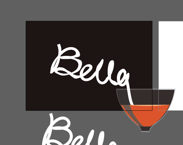
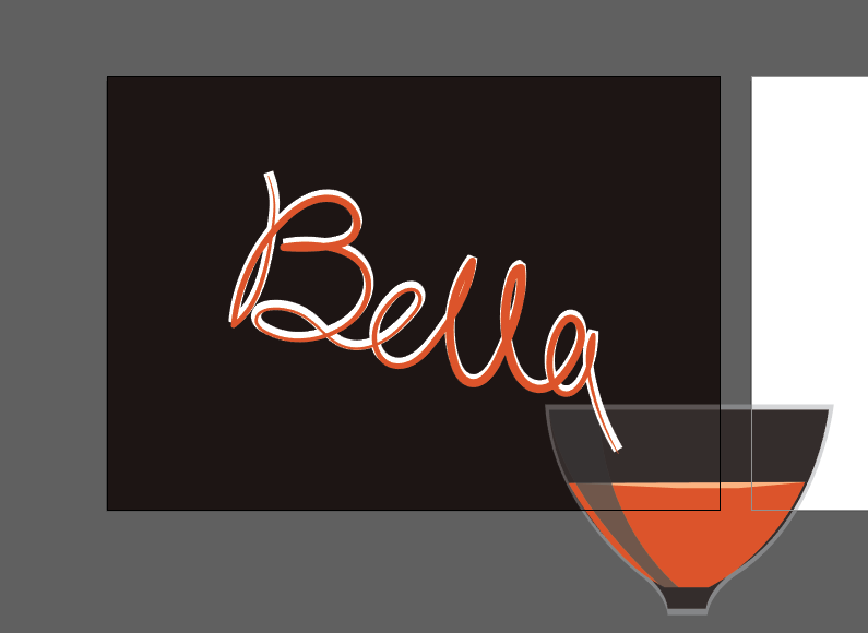
Working in the bar and have knowledge of different drinks is one of the dreams. Initially, I planned to have different alcohol bottles to have the label of my name. However, it seems to be pictorial after the consultation with my professor. Therefore, I decided to use the flow of liquid to create my name.
Research
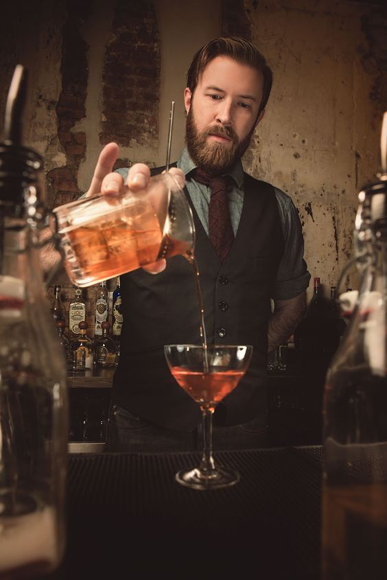
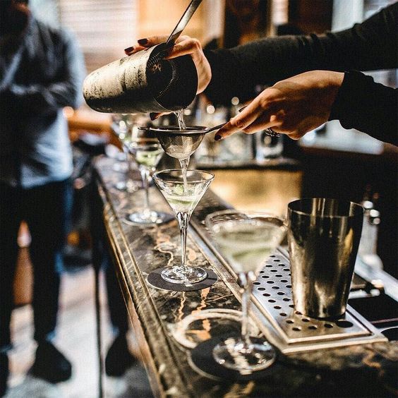
Bar https://www.pinterest.com/pin/490118371941500030/Sketch
I researched the photo if bars to determine the colour scheme of my artwork. I used the dark background as people normally visite bar at night, and most of the bartender wear the dark uniform. Then, I sketched out the composition to prepare for my final artwork.
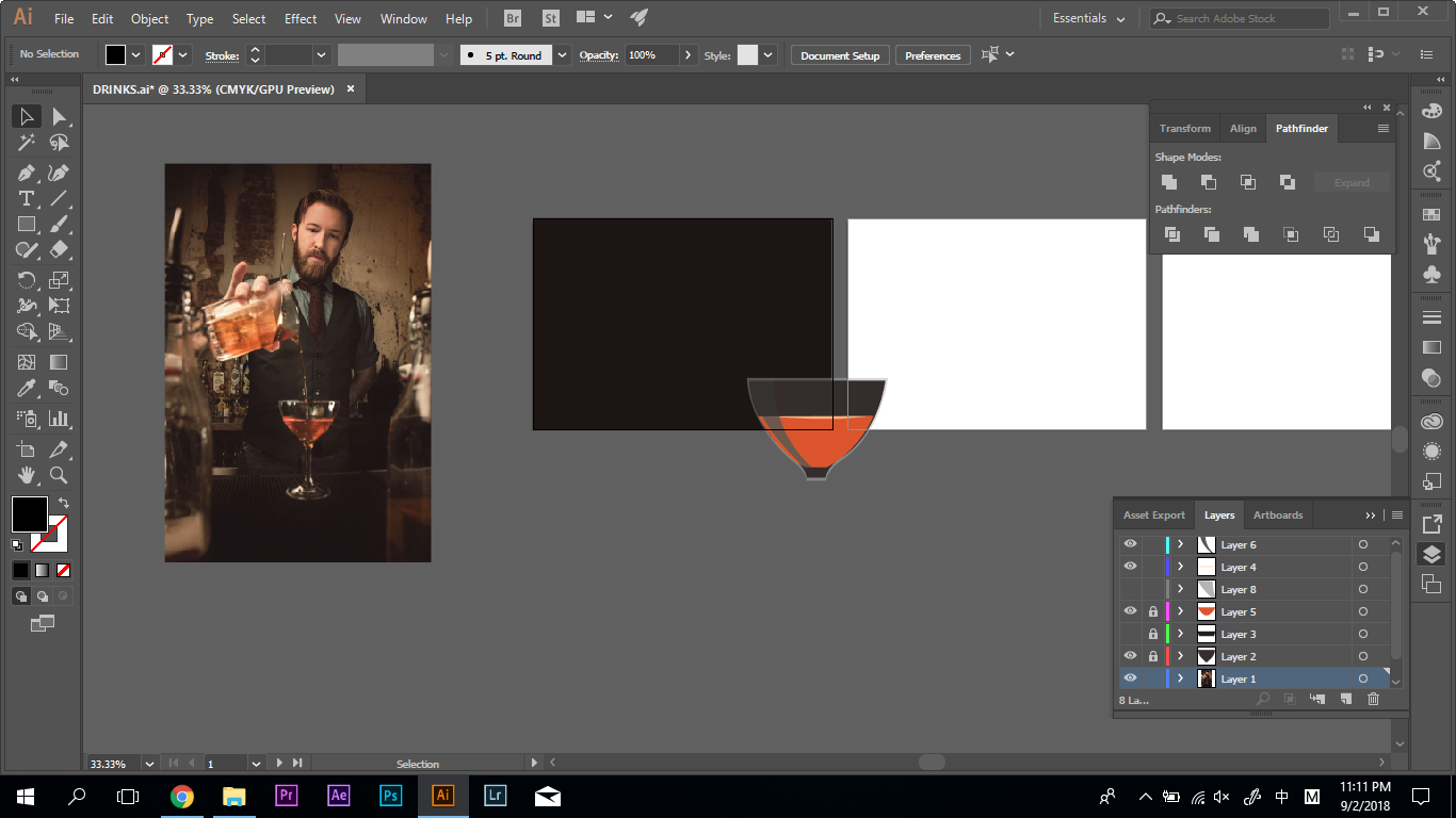
Process
Sketch
This artwork was done digitally using Wacom. I create the glass, bottle, and drew my name. Then create different layers to achieve the liquid effect.