PROJECT BRIEF
Create typographic portraits by using your name to describe your future jobs.
MY NAMES AND JOBS
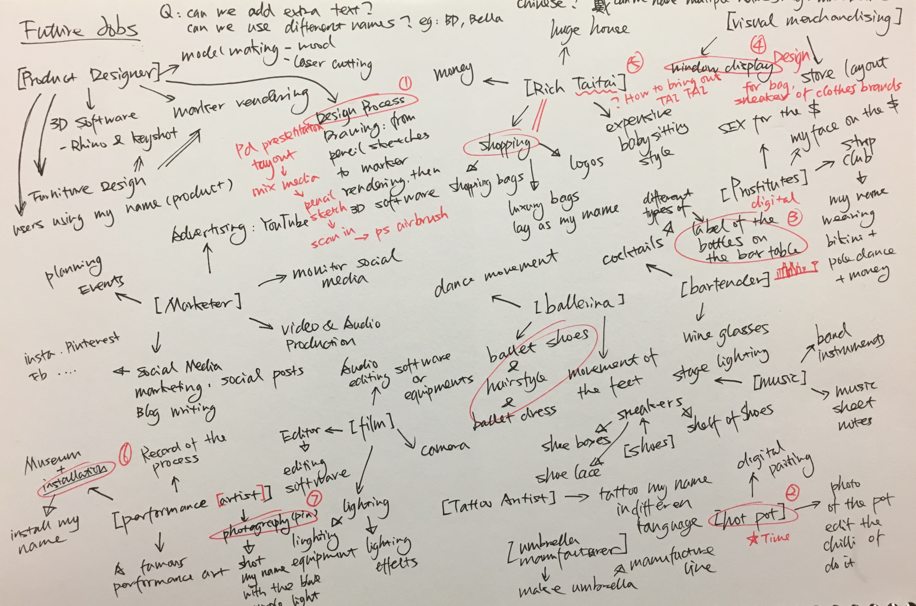
I started this project with mind mapping with the job titles and the possible ways to represent the job. The chosen jods are listed below:
MY NAME IS BD AND I AM A PRODUCT DESIGNER
MY NAME IS BELLA AND I AM A MALA RESTAURANT OWNER
MY NAME IS BELLA AND I AM A VISUAL MERCHANDISER
MY NAME IS BELLA AND I AM A BARTENDER
MY NAME IS BD AND I AM A PRODUCT DESIGNER
Overview
Product design, in my own words, is the process of problem-solving. There are a lot of steps involved in the process such as market research, ideation, prototyping, manufacturing, marketing and etc. Graphic design is also important to promote the product, for instance, product posters and packing. Therefore, I decided to incorporate my name into the ‘product design poster’.
Research
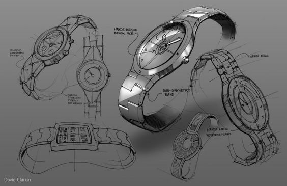
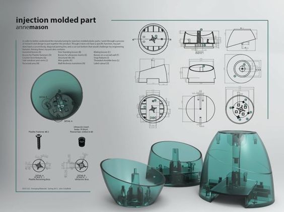
I started my research by looking at different product design presentation style. Some are pen or pencil sketches with marker rendering and some are purely digital rendering.

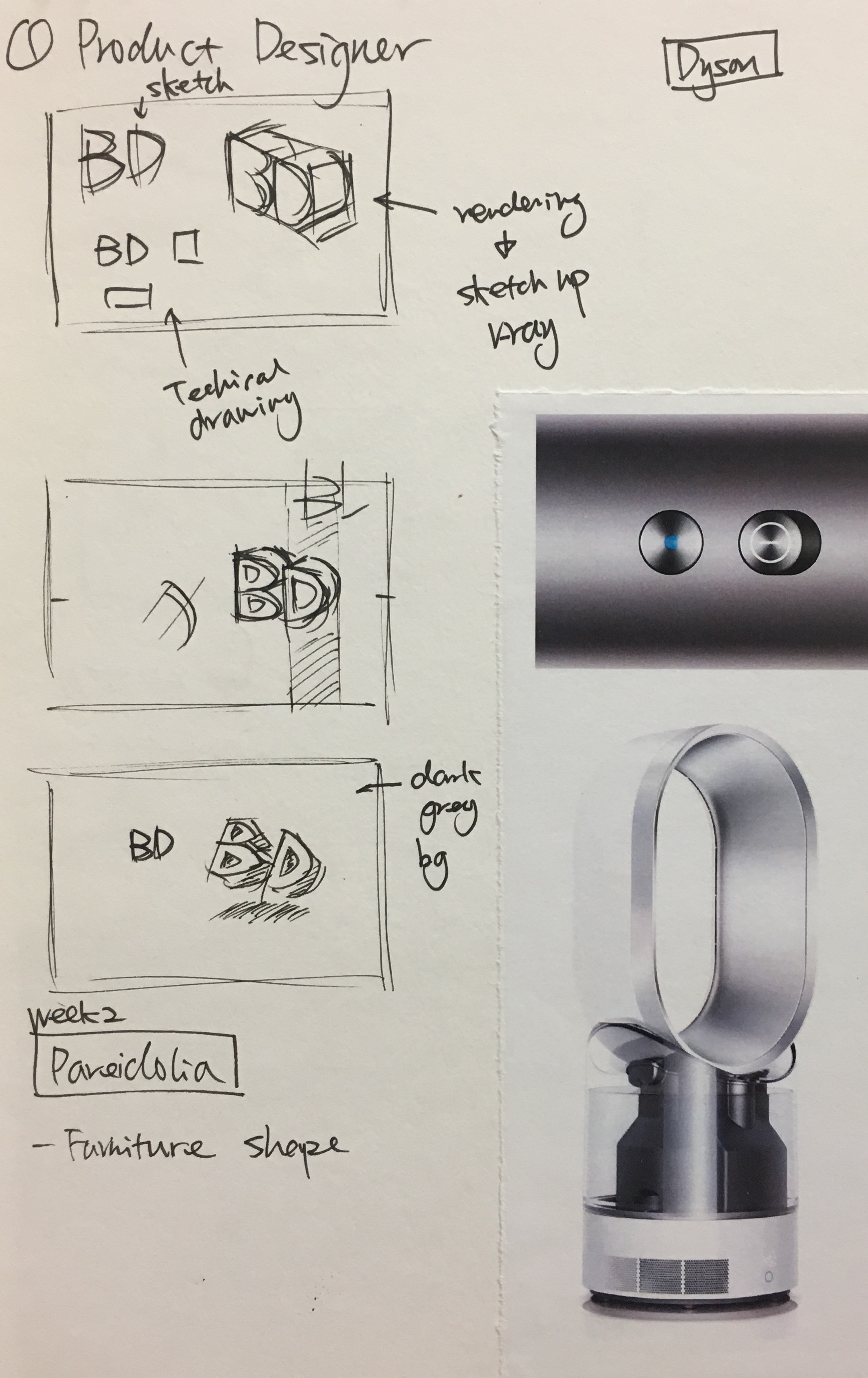
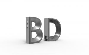
I sketched out some composition and decided to use 3D software to deconstruct my initial, BD. Further, I chose the font based on my experience in learning product design for three years. Century Gothic is frequently used in product design as it is clean and sleek. I referred to the design language of Dyson, a well-recognized household appliances brand for my 3D alphabet model.
Process

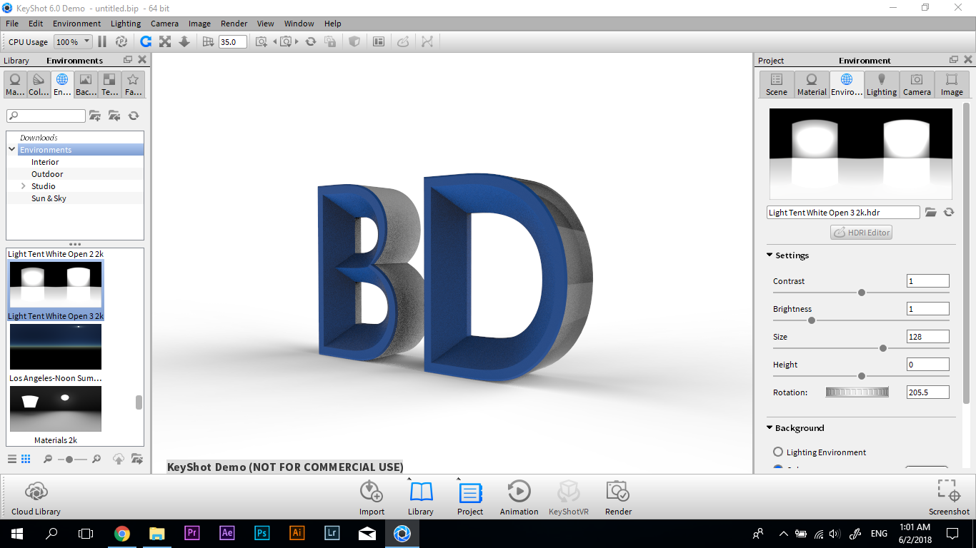
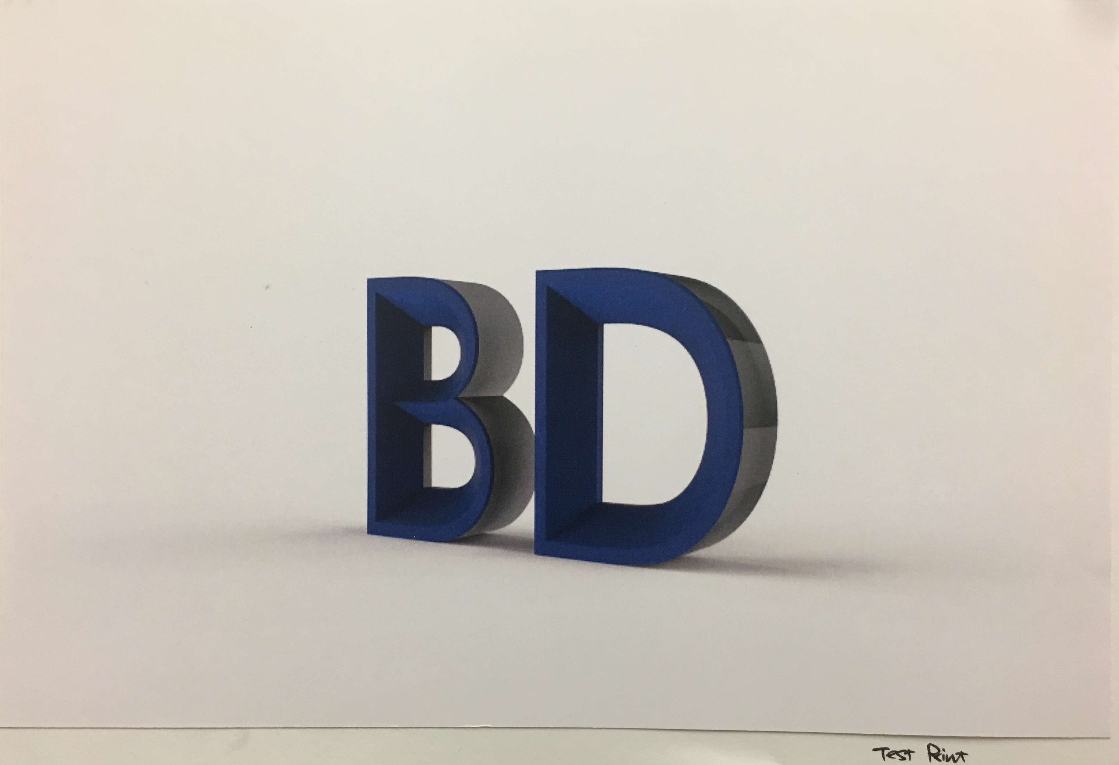
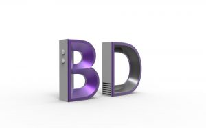
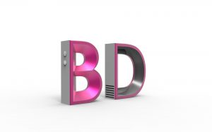
In the 3D model, components like buttons, and ventilation were added to the alphabet to make it seems like an electronic product. I used Keyshot, a 3D rendering software to add realistic material effects to the alphabet. Further, I went through a few run of test print to adjust the colour, lighting and choosing the right paper.
My initial idea was to use special paper and printing technique to show the different views of the 3D alphabet. However, I was told that this kind of print is only available in a few printing factories in Singapore, and it will be very costly. Thus, I changed my composition to four sets of BD in the different colours, like how products are available in a range of colours in the series.
Final Artwork
MY NAME IS BELLA AND I AM A MALA RESTAURANT OWNER
Overview
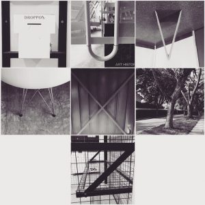
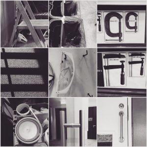
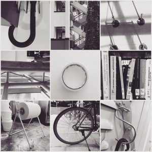
To own a Mala hotpot restaurant is one of my dream jobs, since Mala hotpot is my favorite food, and it was from my hometown Sichuan in China. Initially, I was thinking of using the raw ingredients in mala to form my name (like some food commercial like to do in the advertisement). However, I found a more interesting concept after the lesson about Pareidolia and doing the in-class assignment, I Spot the Alphabets. Therefore, I started doing experiments to find the food that is able to represent my name.
Research
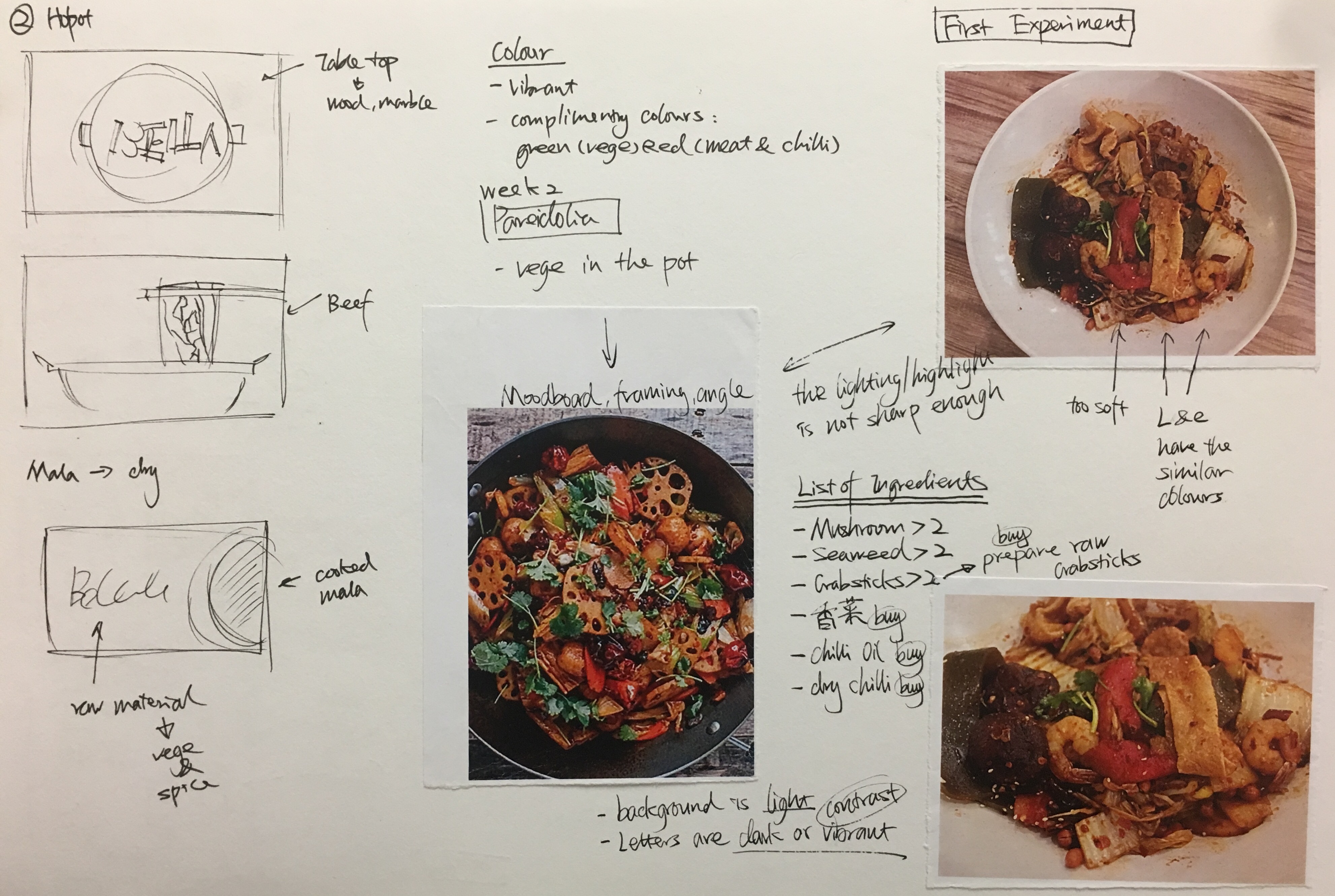
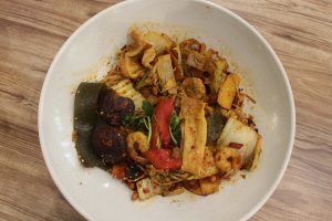
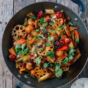
I had some test shots and researching on how to take good photos of food. There are a few videos available on youtube about food commercial photo shoot techniques and tricks. Also, I consulted some of my friends who has photography background for suggestions. The style is this concept is commercial food photo to show that I am the owner of the restaurant instead of the chief or just food lover.
Process
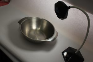
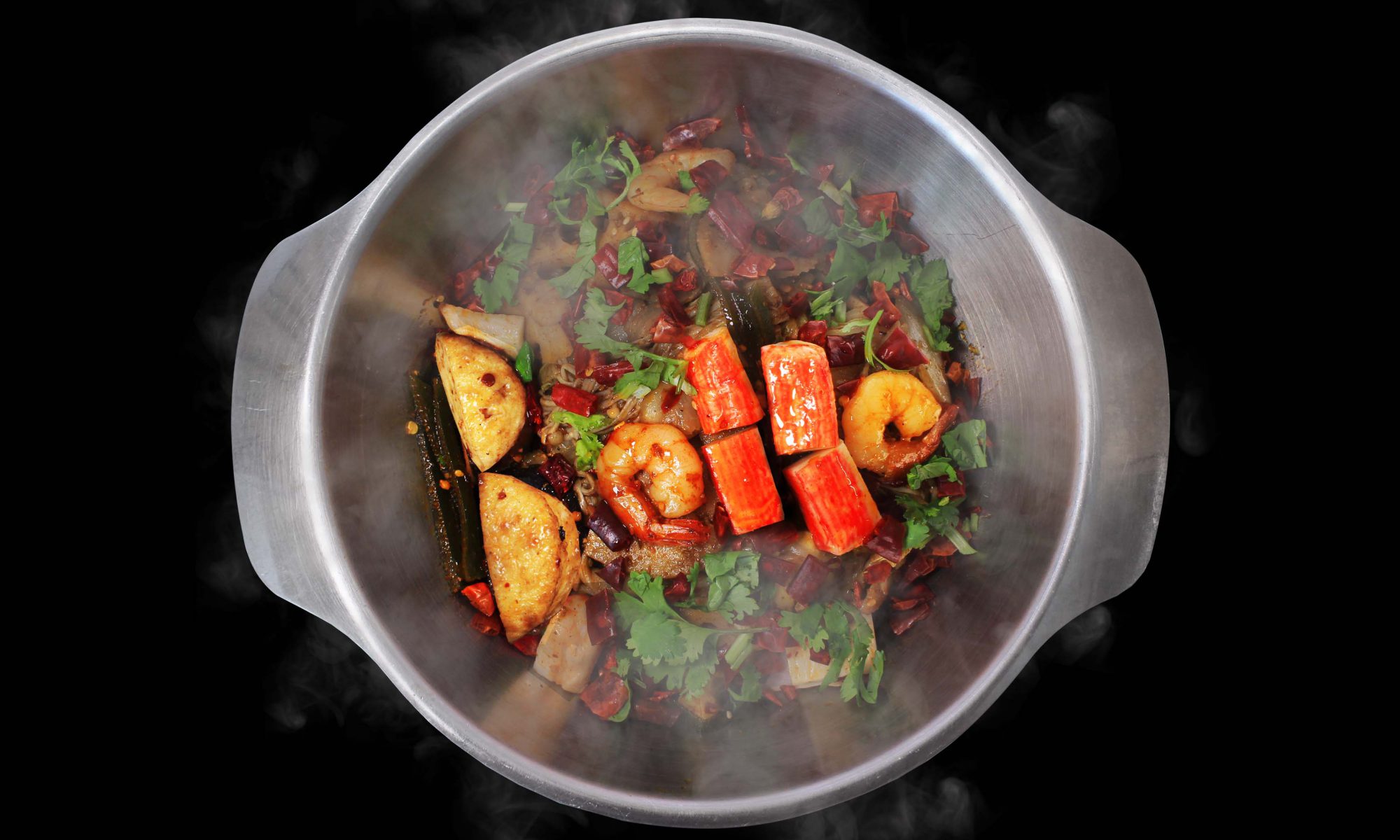
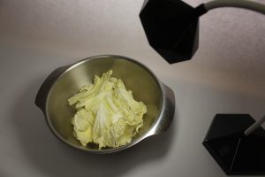
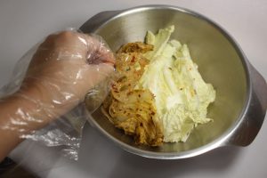
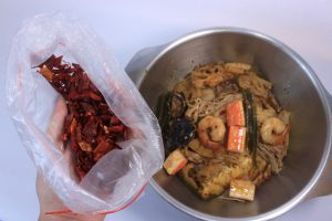
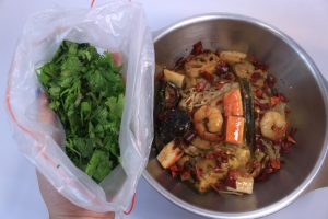
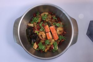
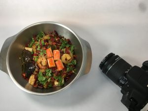
I set up a DIY studio on my table in my room with white paper and a 12 dollars portable table lamp. I bought mala hotpot from my hall restaurant and also bought some other raw ingredients such as chili and Chinese parsley that are normally used to decorate the food. The hotpot restaurant agreed to lend me a small stainless steel pot.
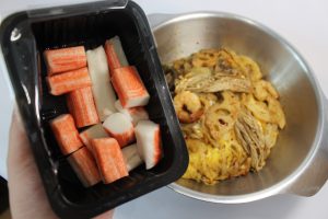
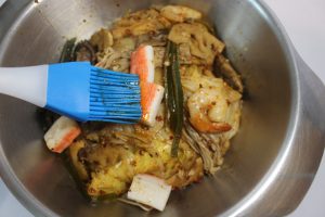
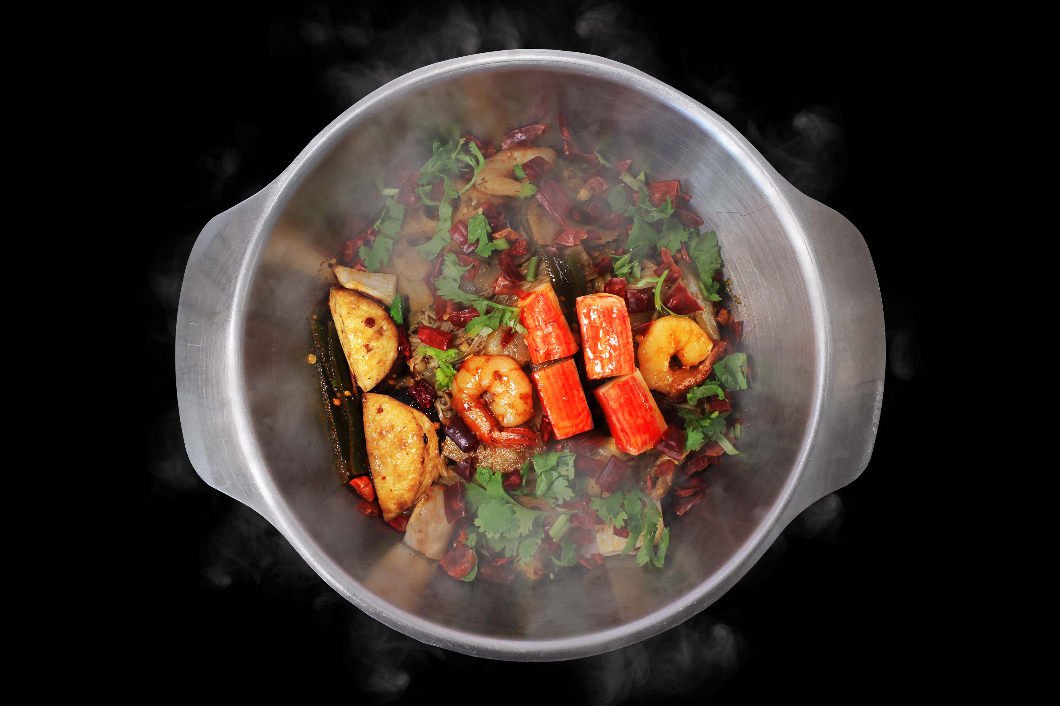
After setting up the lighting and pot, I started to arrange the food layer by layer to make sure the ‘alphabet ingredients’ stands out from the ‘background ingredients’. I brushed extra oil on the ‘alphabet ingredients’ to emphasize the contrast. Here I used mushroom, prawn, and crab sticks to represent the name of my alphabet. Some ingredients are raw and brushed with oil. It is because some ingredients have better shapes when they are raw, such as, crab sticks and dry chili.
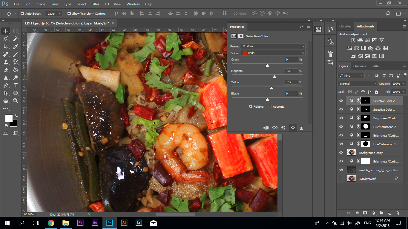
I increased the saturation of the ‘alphabet ingredients’ to maximize the contrast. Also, the steam effect was edited in the photo to create the focal point, and avoid the artwork to be too pictorial.
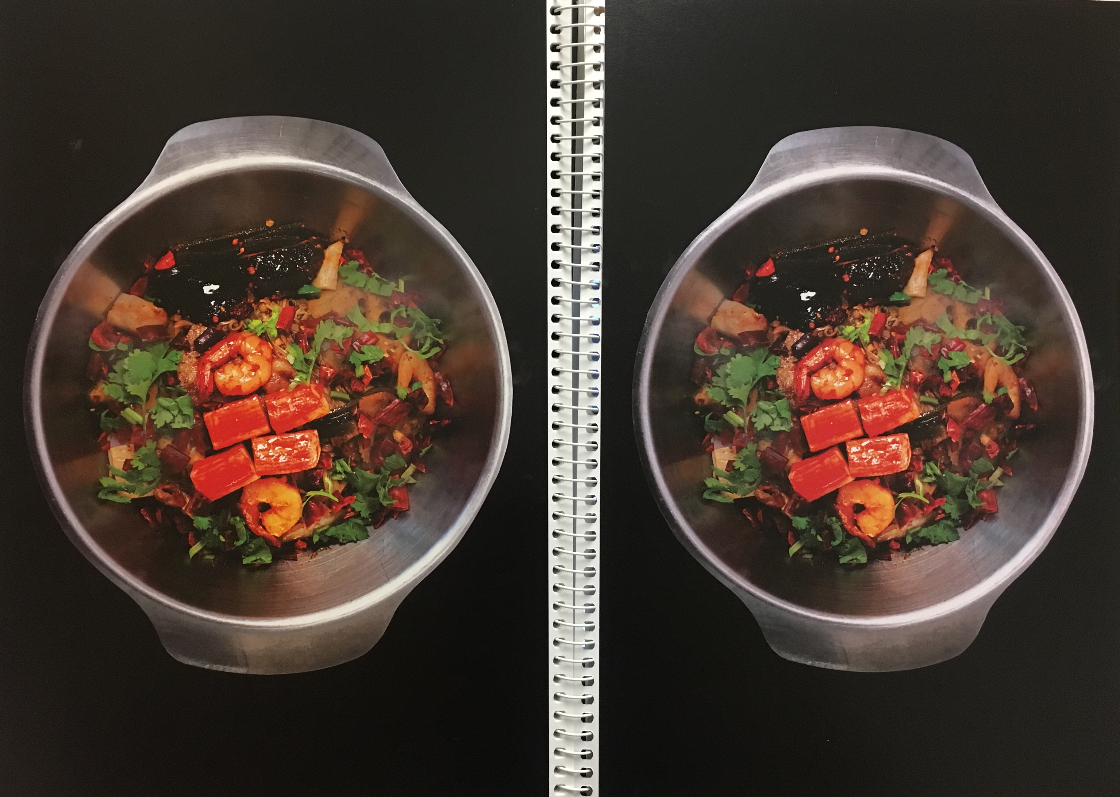
Lastly, I test print the artwork and adjusted the saturation, and capacity of the steam to achieve the ideal effect on paper.
Final Artwork
MY NAME IS BELLA AND I AM A VISUAL MERCHANDISER
Overview
Visual Merchandiser is the job that I will probably pursue in the future. Visual merchandiser’s role is to design the layout and display of the store in order to improve the customer’s shopping experience and increase the sells. Thus, my concept for this job is to incorporate my name into the window display.
Research
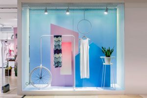
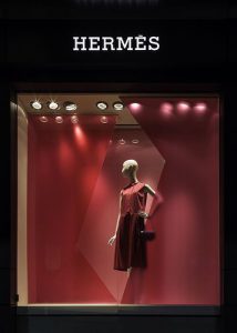
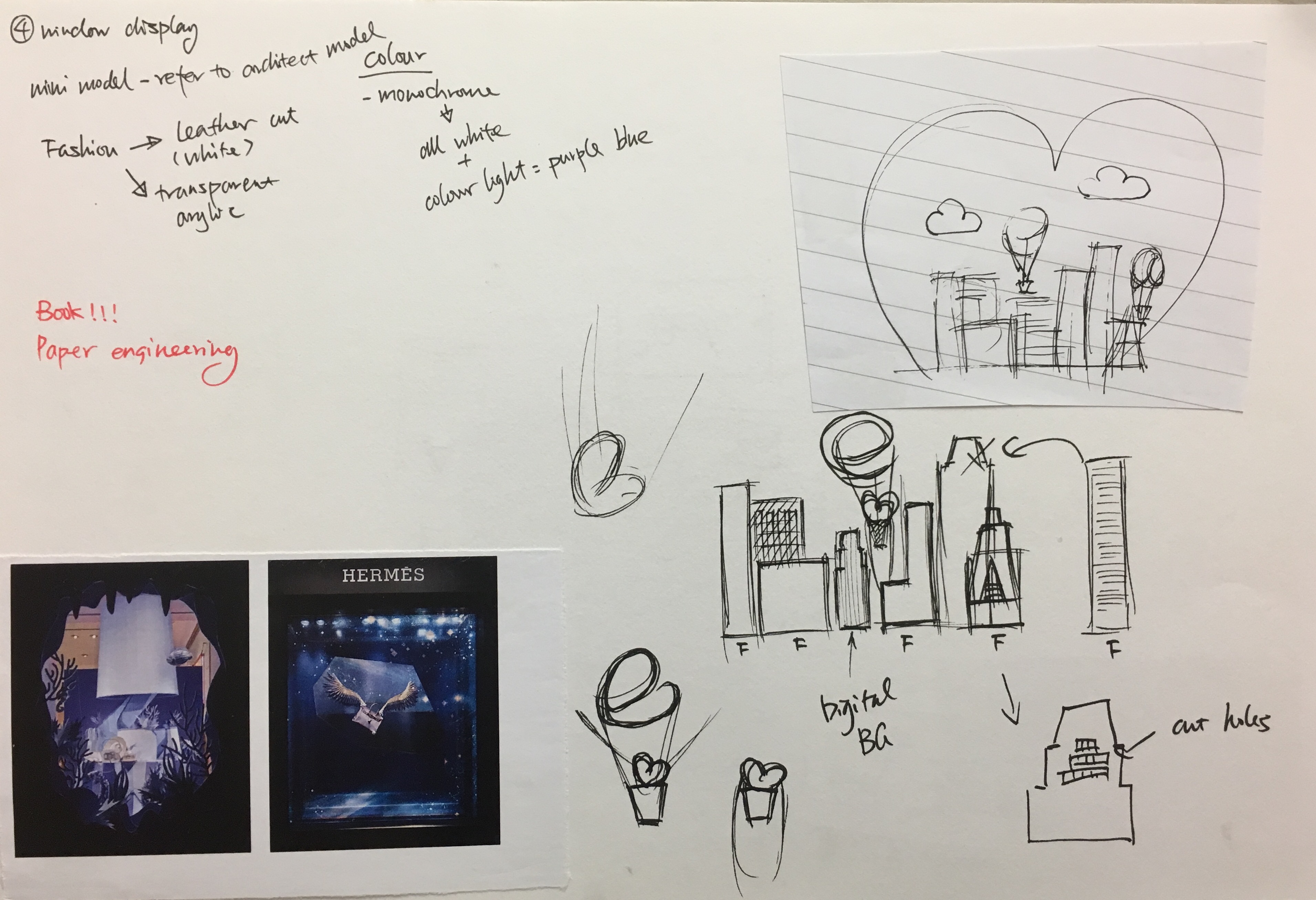
The window display is a three-dimensional space. It often has a different theme according to the season and festivals. Therefore, I decided to have a Valentine’s Day theme for my window display.
Process
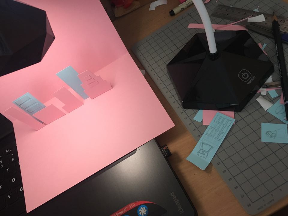
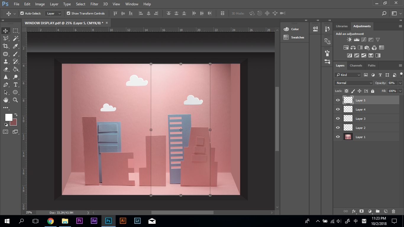
For this concept, I used both traditional media and digital media. First, I used paper to constructed the display and used my table lamp to create the lighting.

Final Artwork
MY NAME IS BELLA AND I AM A BARTENDER
Overview
http://www.99wtf.net/category/young-style/casual-style/
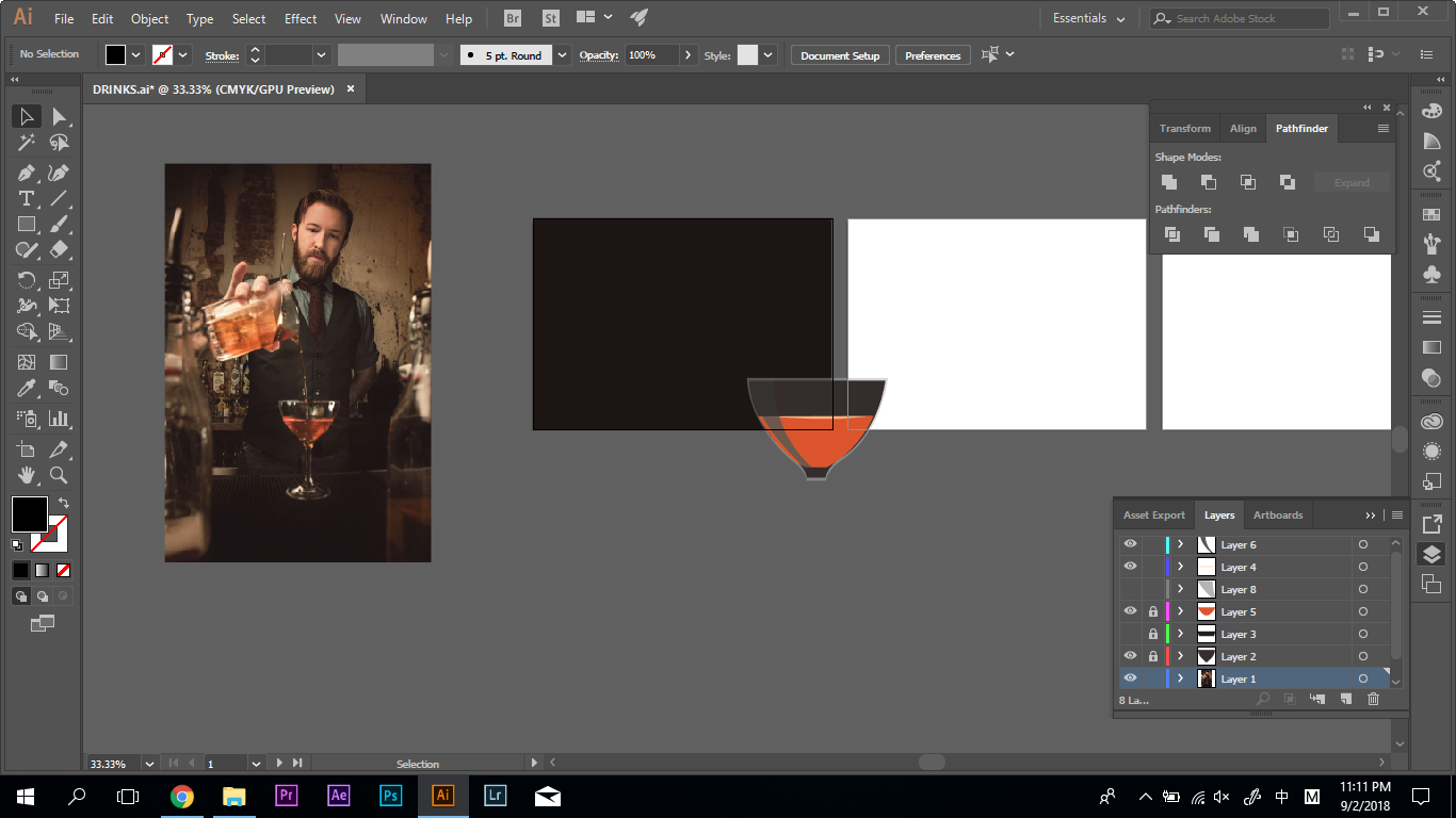
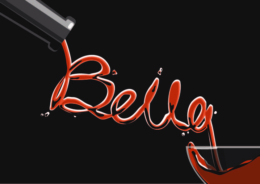
Working in the bar and have knowledge of different drinks is one of the dreams. Initially, I planned to have different alcohol bottles to have the label of my name. However, it seems to be pictorial after the consultation with my professor. Therefore, I decided to use the flow of liquid to create my name.
Research
https://www.pinterest.com/pin/490118371941500030/
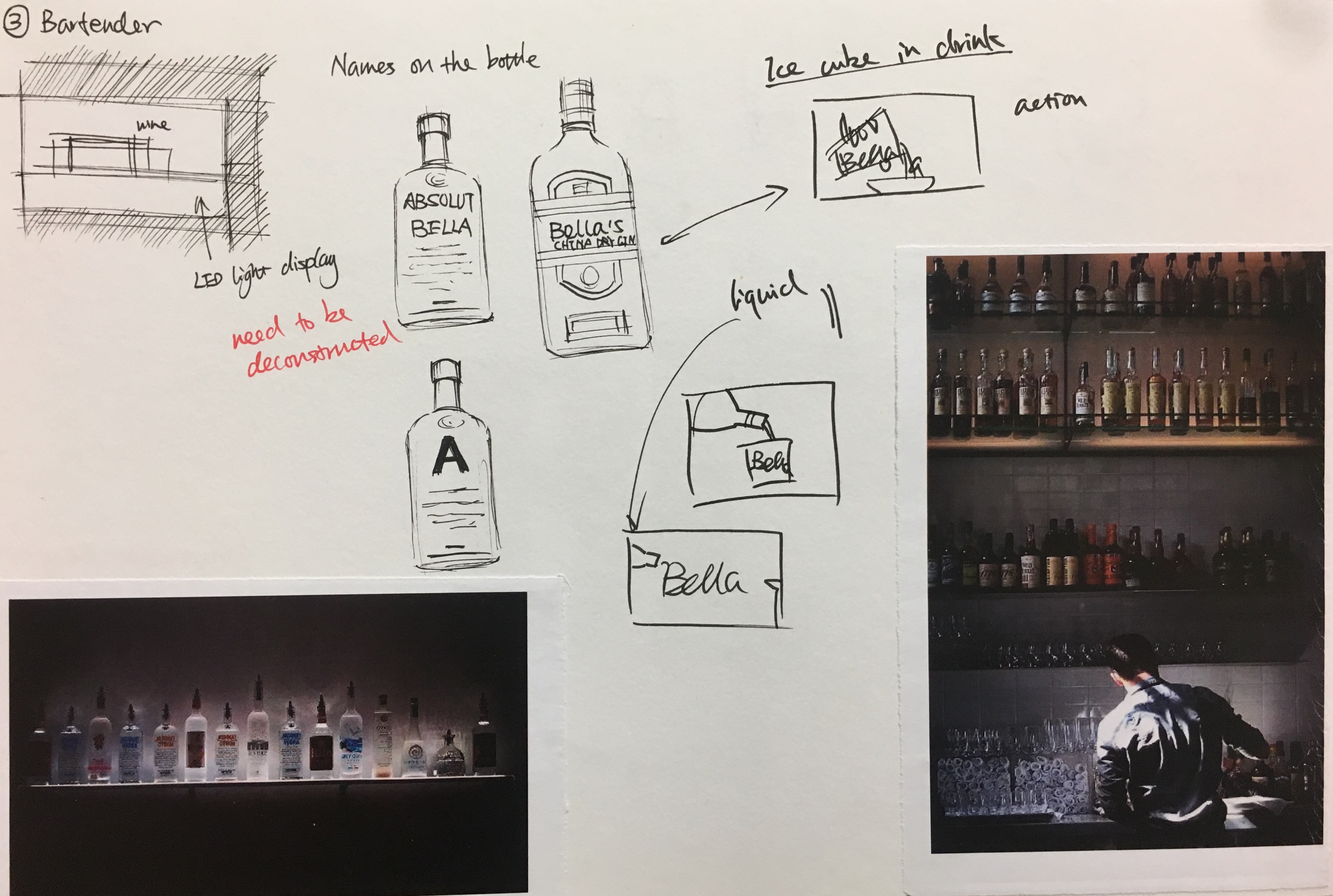
I researched the photo if bars to determine the colour scheme of my artwork. I used the dark background as people normally visite bar at night, and most of the bartender wear the dark uniform. Then, I sketched out the composition to prepare for my final artwork.
Process

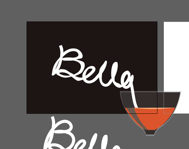
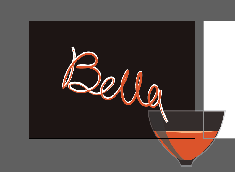
This artwork was done digitally using Wacom. I create the glass, bottle, and drew my name. Then create different layers to achieve the liquid effect.
Final Artwork
