The Past Present & Future of Humanistic Design

Scandinavian Design Research

Scandinavian style always associates with the coziness at home, and Scandinavians enjoy the simple things in life. Hygge, the word that explains this phenomenon. It is the key part of Danish culture since the 1800s. This is probably the reason that Denmark is always at the top of the list of the world’s happiest countries. Hygge is a trendy practice around the world now as many are struggling with the fast-paced modern lifestyle.

The Scandinavian region in Northern Europe includes Iceland, Norway, Denmark, Sweden, Finland. There are only three months of summer and the rest of the year are dark and cold. The lack of sunlight led to the limitation of natural resources in Scandinavian countries. Hence, nature is highly appreciated by Scandinavians. Moreover, Scandinavian designers are willing to invest efforts and skills into the craftsmanship with their strong understanding of nature and respect for materials. The Scandinavians strongly believe that everyday objects should be simple, functional and beautiful which are able to enhance the quality of life physically and mentally. Scandinavians’ believe in moral humanist ethos can be traced back to Lutheranism, a major branch of Protestant Christianity which identified with the theology of a German friar, Martin Luther. Lutheranism seeks truth and season, and believe that salvation can be gained through honest work.


Poul Henningsen, one of the most passionate lighting designers. His work focuses on the relations between light structures, shadows, and glare. He claimed that “The aim is by working scientifically, to make lighting cleaner, more economical, and more beautiful.” His most iconic design, the multi-shaded lights to reduce the dazzling glare, the fundamental problem of the modern electric bulb. The light bounces off the shades and distributed equally, which create less harm to the eyes. This design reflected the equality in Scandinavian design, and how it prioritizes user’s experience.


Paimio Chair is also an example of humanism, designed by Alvar Aalto in 1931-32. It was designed for a hospital in Finland where he designed all the furnishings. The angle of the back was intended to help the patients to breathe more easily. He conducted experiments in bent wood as a softer, warmer and more humanist material as compared to steel. The two closed loops of laminated wood form the arms, legs, and a thin sheet of plywood. Similarly, the Armchair he designed used the same technique with the open end bentwood arm and legs. Both chairs allow the sitter to swing which reduced the tension while sitting. Further, the tea trolley design by Alvar Aalto was inspired by British tea culture, as Alvar Aalto had become familiar with through their traveling. Their admiration toward Japanese woodwork and architecture brings the Japanese belief in nature in their work. Japanese Shinto is similar to Hygge, Shinto’s goal is to be in touch with KAMI, means the spiritual energy. Japanese Shinto believes the spirits exist in nature, in the mountain, trees and etc. Therefore, natural materials are well respected and appreciated. Another example of Alvar Aalto’s design is the Stacking Stools for Artek designed in 1929-30. This design and the experiment with the bent legs was influenced by his meetings with various members of the Bauhaus design school. Unlike other chairs, it was designed for the community instead of an individual. The minimal three leg design keeps the stool simple yet with a strong support. The stools seem to be a sculpture when they are stacked together with the spiral form. The legs can be unscrewed for flat packing. The combination of functionality and beauty could be seen clearly in through this design.


One of the most important figures of Finnish Design, Wirkkala’s work embrace the traditional processes of Finnish handcraft, and the emotionally seductive forms found in nature. In his work, for instance, Kantarelli vase(1947), Laminated birch platter(1951), Iceberg Vase(1951), and Apple vase (1955) showed his ability to capture the spirit of flower, leaves, ice, and apple.


One of Denmark’s most successful architects, Arne Jacobsen, had the idea to be involved in the design throughout the entire SAS Royal Hotel, from the exterior to The iconic Swan and Egg chairs, and the stainless-steel cutlery used in the restaurant. SAS Royal Hotel was opened in 1960. It was the highest building in Scandinavia during that time, and also the world’s first design hotel often called the ‘total work of art’, which reflects the Scandinavian design that user’s experience is the priority.


Ingvar Kamprad, the founder of IKEA, who believes that “people not as well off should be given the same opportunities as those who are.” In 1959, he introduced the first flat-packed design, The Regal bookshelf, then modular thinking. Later on, IKEA’s iconic furniture, Poang Chair was designed by a Japanese designer Noboru Nakamura. He was probably inspired by the Armchair designed by Alvar Aalto, as the two design has the similar structure that the arm and legs form open U shape. Noboru Nakamura believes that “A chair shouldn’t be a tool that binds and holds the sitter; it should be a tool that provides us with emotional richness. This chair creates an image where we let off stress or frustration by swinging. Such movement has meaning and value.”


Lastly, Hans J. Wegner, the Danish designer who focus on not only the physical but also the emotional connections between the users and the products, by simplifying the form and construction. The uniformity and lightness of his three-legged shell chair design create the sense of calmness. The compression-molded veneer curvy back and seat gives the sitter extra comfort. The three legs design achieve the simplicity and stability. The design of this chair is appealing from all angles. functionality and natural beauty. Moreover, his Y-shaped back wishbone chair requires more than 100 operations to manufacture mostly by hands. The paper cord woven seat takes a skilled craftsman about one hour to create.


All in all, the characters of the products mentioned above reflects the beliefs of Scandinavian design Hygge which functional honesty, sensual purity, naturalism, and sense of joy and well being regardless of the manufacturing method. Nothing is concealed, what you see is what it is, and it is simply doing its job. Also, the Scandinavians designers share the same value, that they care about the user’s physical and emotional satisfaction. They were passionate about creating objects people want to have and love. They are creating moments of feeling at home. They committed to the quality with high knowledge of materials, and attention to the user. They build designs that last for decades.


My Thoughts

During this research, I dived deeper into the style that I always admire beyond the lines and shapes. The humanism in the Scandinavian design is the beauty that machine and technology cannot replace. It made me rethink my role as a designer. In the past, people were greatly influenced by religions, for instance, Lutheranism which seeks for the truth, honesty, nature and etc., thus, the objects were designed to follow those principles. Products were built with quality, honesty and built to last. Today, many might believe in Monelisim (belief in Money, a word that I just made). Success and quality of life were measured by wealth. Products were judged by its monetary value. People expect to get things done fast, and instantly which is against nature. It takes time for trees to grow, wastes to degrade and relationship to be built. Perhaps we could slow down for a while, have a cup of hot chocolate and think about the value that we are losing overtime.

References

https://www.1stdibs.com/furniture/lighting/chandeliers-pendant-lights/poul-henningsen-ph-5-light-pendant/id-f_7004003/

https://www.moma.org/collection/works/92879http://www.moma.org/d/c/exhibition_catalogues/W1siZiIsIjMwMDA2MjcxMyJdLFsicCIsImVuY292ZXIiLCJ3d3cubW9tYS5vcmcvY2FsZW5kYXIvZXhoaWJpdGlvbnMvMTc5MiIsImh0dHA6Ly93d3cubW9tYS5vcmcvY2FsZW5kYXIvZXhoaWJpdGlvbnMvMTc5Mj9sb2NhbGU9ZW4iXV0.pdf?sha=d88f220a94b32471

https://www.radissoncollection.com/en/royalhotel-copenhagen/destination/the-history-of-the-iconic-royalhotel
https://www.radissoncollection.com/en/royalhotel-copenhagen/destination/the-history-of-the-iconic-royalhotel
https://www.radissoncollection.com/en/royalhotel-copenhagen/destination/the-history-of-the-iconic-royalhotel


Design for Better

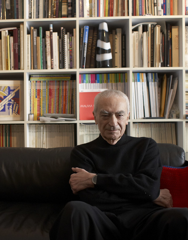
Massimo Vignelli, whose work covers nearly every field of design including advertising, identity, packaging, product, industrial, interior and architectural design.

‘design is one’ – Massimo Vignelli

He believes that “if you can design one thing, you can design everything. The methodology is the same no matter what the content.” His philosophy reminds me of the new system that ADM students are going through. We seem to be learning the vocabulary of the visual language, and we can extend it base on the requirements of the project. It is all generated from similar logic related to material and the function as mentioned by Massimo Vignelli. Designer’s role is changing in this digital age, for instance, graphic designers are all working with digital technology. That is why he prefers the new name, ‘information designer’.

“A good designer who understands his business can make things memorable, make them easy to recall which is very important, and improve the general quality of life, which is the only reason for our existence.” – Paul Rand

The industrial revolution pushed the companies to present themselves better to the public to survive in the competitive market. Companies where shaping their brand in order to adapt to the society. Thus, many good brand designers appeared after the rise of the industrial revolution. Paul Rand is one of the examples. He designed numerous corporate identities that are still in use today, such as IBM, NeXT, Westinghouse, UPS, and etc. He also sees logos as the marketing tool, as the logo tells the story of the company and its products.

In Conclusion, design is flexible yet has its logic. It is a way to improve people’s everyday life in the form of logos that make the product or services memorable, furniture that make our life easy and comfortable and etc. Designer’s role is always changing as we look through the history. It is up to us to decide how we can apply the design language, and what impact we want to make using design. 

How is Your Vision?

“I don’t believe in change for the sake of change. Change comes about through a natural process of development or because something needs improving. Modernism suggests movement which is ahead of its time. If we do something that has been done before, we are not being creative; we are being redundant. Creativity, which is what Modernism is all about, is a constant searching process that promises a greater chance for failure than it does for success.”                                            – Bierut, Michael. Looking Closer. Allworth, 1997.

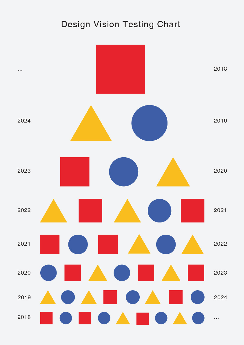
During the first lesson, we talked about the design culture in Singapore. The design industry in Singapore is still developing. Trace the history of design back to the Modernism which was a movement about being ahead of its time. Artist and designers were trying to make changes to the society and move the creative industry forward. Even earlier during the Bauhaus movement, Wassily Kandinsky asked the students and faculty that the basic shapes and three primary colours at Bauhaus. My ideal colours for those shapes are the same as Wassily’s, however, the meaning behind my matches are quite different. Firstly, the red square is at the top of the vision chart. It represents the burning passion that can multiply by itself (math). I think the burning passion is what Singapore needs the most to push the design culture onto the international stage. Secondly, triangle has a very stable structure and matches with yellow that symbolizes energy and positivity. The stable energy and positivity are what the local designers should have. Lastly, the blue circle, represent intelligence and the wholeness. The slogan of Bauhaus was “Art into Industry”. The most popular in Singapore is probably the ones helping Singapore to be a smarter nation, and I believe that design is important along the way, thus the blue circle is the smart nation that we are trying to build. I hope that the vision of Singapore design industry will be better and clearer.


Cover image source

https://images-na.ssl-images-amazon.com/images/I/71lpK9lgkpL._SX679_.jpg

Hungry???

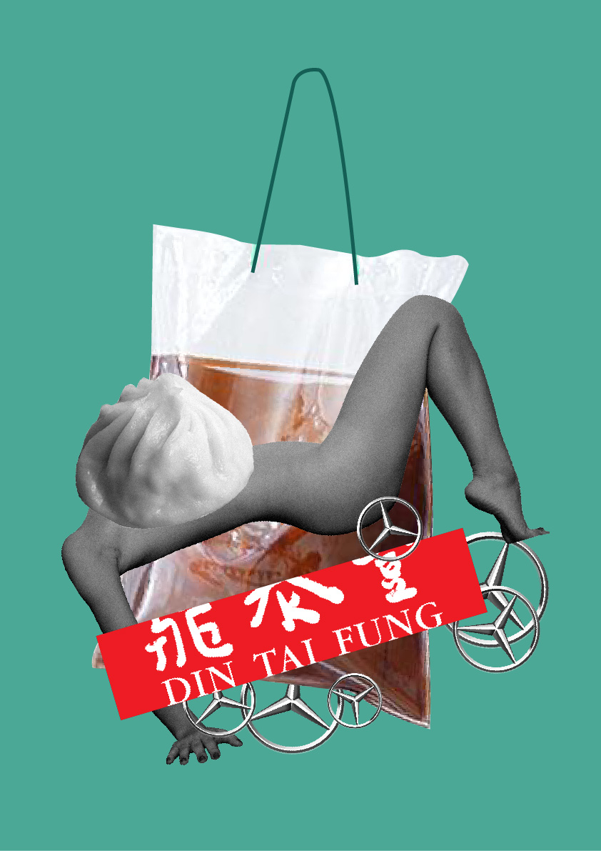
This collage is about the Singaporean ‘pick up’ culture, also known as ‘dabao’(take away), where females are objectified as something that can be taken away. I arranged the items that symbolize the female body, pick up lines and the materialistic objects that often used in this kind of situation. The style is inspired by Hannah Hoch, a Dada artist famous for her incisively political collage artworks. She used metaphoric imagery to represent the social issue such as Das schöne Mädchen (The Beautiful Girl).


Image Sources

https://glints.com/sg/opportunities/jobs/accounting%20supervisor/8a18700b-da5d-4c09-81ff-0d2f688ed9f9

http://www.renatoautocapas.com.br/

https://wolipop.detik.com/read/2017/09/26/184304/3659292/233/title/amp

https://www.google.com/search?sa=G&hl=en-SG&q=draw+xiao+long+bao&tbm=isch&tbs=simg:CAQSlgEJwGduxGJaY_1EaigELEKjU2AQaBAgVCAoMCxCwjKcIGmEKXwgDEieABoEGowEMyAnfBsYJ2Aa0Ba0WpieoJ6QnmCKnJ8wplyKdJ58iyzQaMHWK0WRq0manBaWn9HOll4aaYxXJMOOXQqodbN4FWU8FWyM8DehWZy2lykNpldXjgSAEDAsQjq7-CBoKCggIARIE82nonww&ved=0ahUKEwj04MqfoJrdAhWIOo8KHR78CjgQwg4IJSgA&biw=1366&bih=631#imgrc=YHuzH0PJJRC0vM:

The History of Design Began When …

The history of design began before human beings opened their eyes. Nature was beautifully designed even before human existence. To date, we are still discovering and learning from nature.

IMAGE FROM https://stmed.net/sites/default/files/moraine-lake-wallpapers-27960-296893.jpg

Third Space Fallacy

Third Space Fallacy

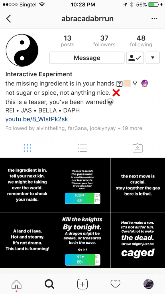
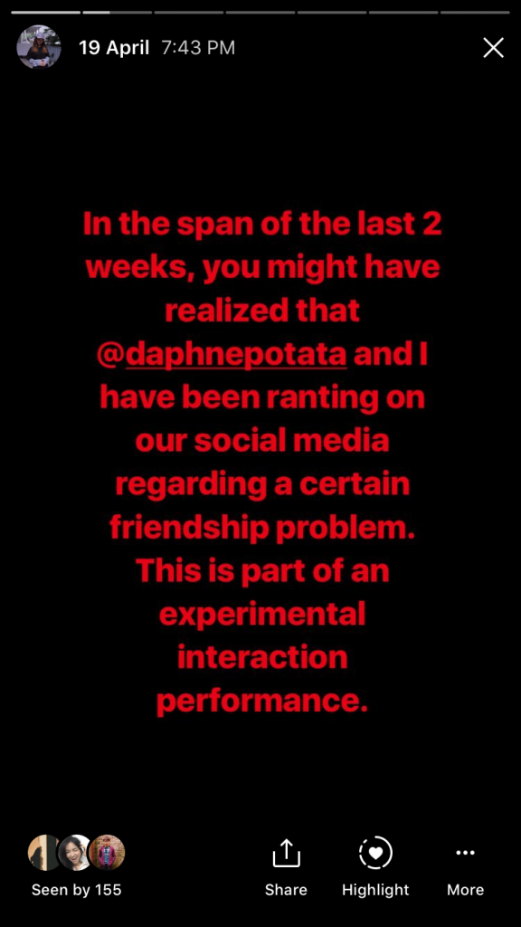
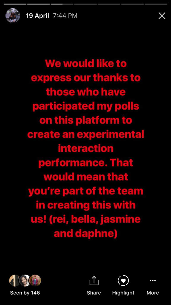
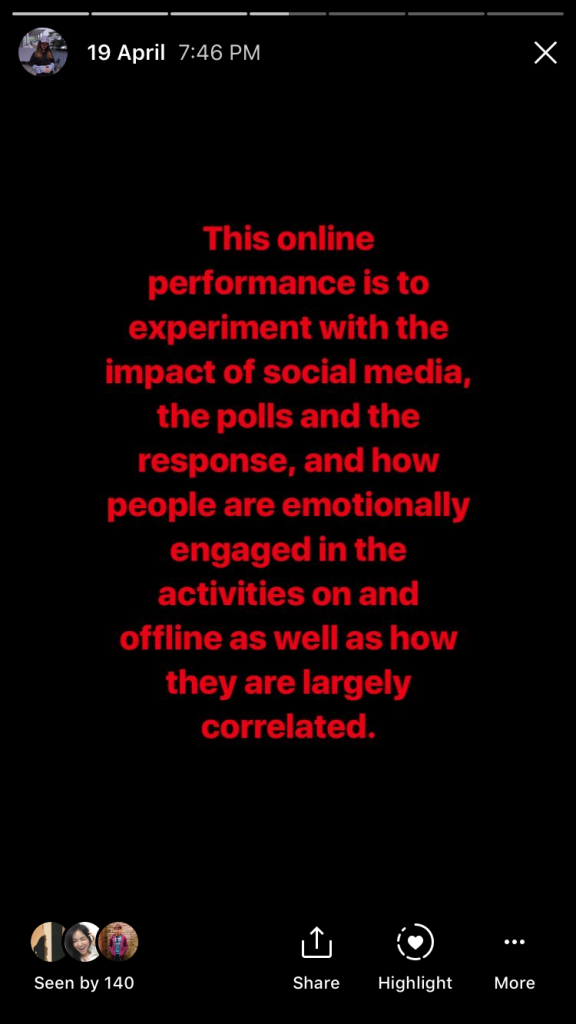
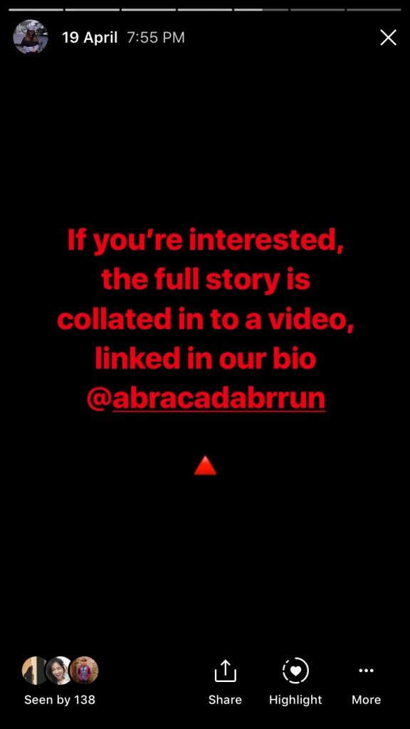
A Third Space Fallacy is an experimental interaction performance on third and first space that combines the responses collated on the third space through Instagram polls and stories to curate the next move in a friendship conflict between two girls, Bella and Daphne. To make the entire performance as real as possible, both girls had to put up an act in the span of 1 week in the first space, when questions arise from the people around them. Also, to stage that this is not part of our project for Experimental Interaction, our group have created another Instagram account @abracadabrrun, collating uninformed decisions made by our followers, which is part of the narrative of the death of Bella.

Conceptualization

Initially, I had an idea of having a social media game at Changi Airport, however, we rethink after receiving the comment of my critique on the online Symposium, Are We in LOVE with the Connectedness? from our professor Randall Packer.

“Very interesting how you expressed your thoughts on interaction in such personal terms: how we engage emotionally in the third space. This has been one of the key ideas we have discussed this semester, how meaningful interaction can be achieved despite geographical separation. Wasn’t this proved when you elected not to interact in the chat for Annie Abrahams’ performance, and found yourself removed and disconnected. This implies that is direct interaction that creates the quality of engagement in any form of interactive art. Perhaps it would be interesting and helpful to your thesis to applied this to Blast Theory’s work: how the players and performers engage in something dynamic, arresting, and challenging in both physical and virtual spaces. ”

– Comment on Are We in LOVE with the Connectedness? Randall Packer

Randall Packer mentioned that the emotional engagement in the third space has been one of the key ideas we learned in this semester. It got my group mates and me into thinking. How can we emotionally engage our audience? The answer is DRAMA. Some people love drama because it is something that might not really happen in real life or the exaggerated version of the real-life event. It catches people’s eyes, trigger their emotions, and sometimes it is just entertainment.

We chose Instagram as the main media for our piece. We decided to use our personal account in order to make the drama seems real, and let people participate unconsciously. Thus, we could receive real emotions from our audience, or while interacting with them.

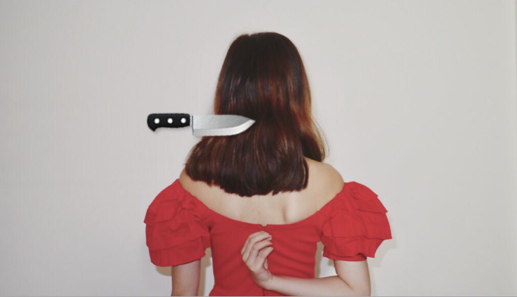
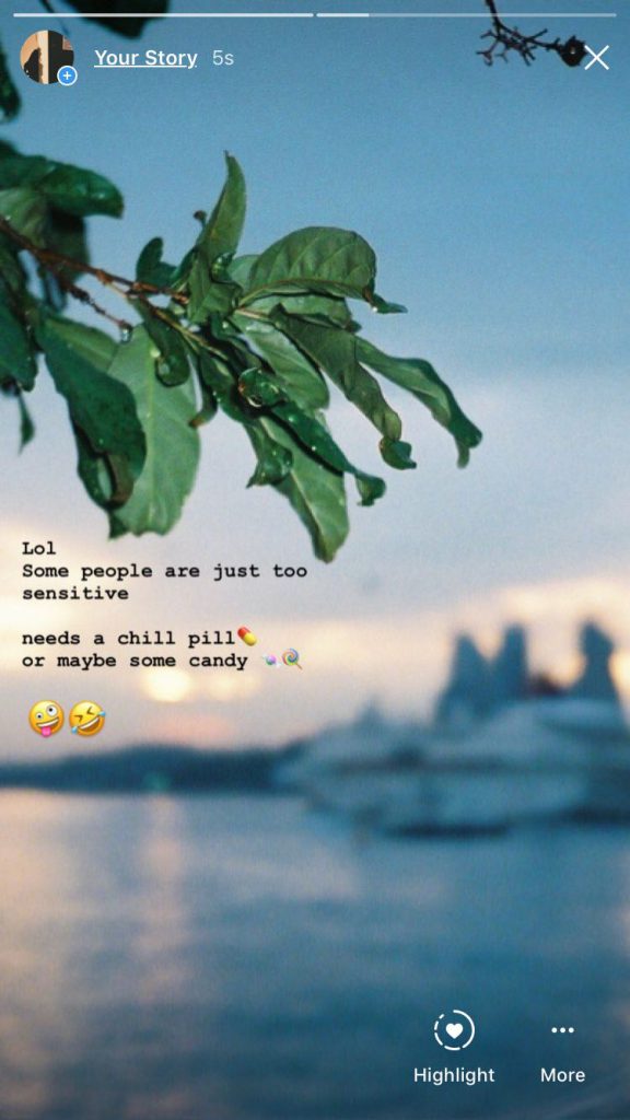
Firstly, we scripted the characters and the rough/possible storyline. The two characters, Bella (acted by Bella) and Daphne (acted by Daphne) are the bullied and bully in this friendship drama. They are old friends from Secondary School. Daphne had been taking advantage of the kindness and dependability of Bella since they met. Then, they happened to be on the same course and university. The conflict started with Bella exposing her toxic friendship on her Insta-story. The rough storyline is that Bella expressed her anger towards the friendship, and asking for solutions online, while Daphne got annoyed by clingy Bella and also started ranting and asking for help on her social media. The ending of the drama could be happy, sad, tragic, and etc. depended on the choices our audience made.

Execution

We only had two weeks for this group project, and we started building up the tension on Instagram a week before the critique day.

INSTA STORY DAY 1
INSTA STORY DAY 1
INSTA STORY DAY 1

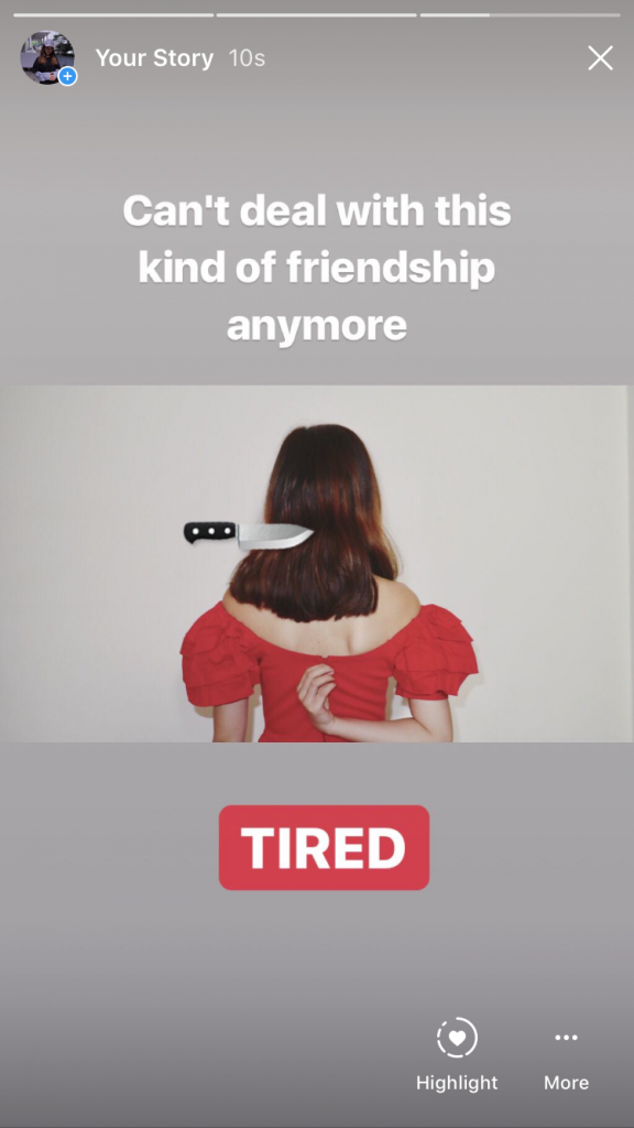
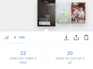
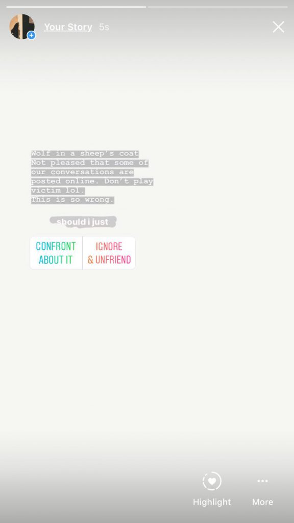
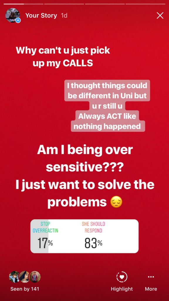
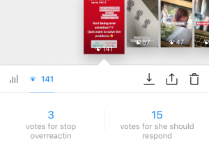
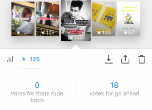
I posted the first story to complain about the toxic friendship and 45 out of 145 viewers voted for this post. The opinions are make it clear and just let it go. Participant Including strangers as my account is public.

INSTA STORY DAY 1

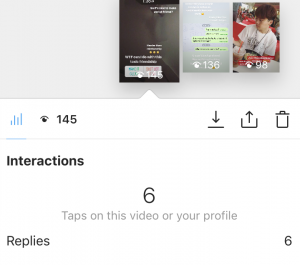
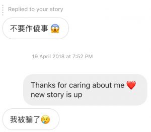
Also, people were replying to this post. 4 people were showing concern, 1 was curious and 1 was giving the constructive solution to my situation. Then we decided our next move base on the result we obtain.

DAPHNE INSTA STORY DAY 2

Daphne also posted emotional stories and ask her followers to vote for her.


INSTA STORY DAY 2
INSTA STORY DAY 2
INSTA STORY DAY 3
INSTA STORY DAY 3
INSTA STORY DAY 4
INSTA STORY DAY 4

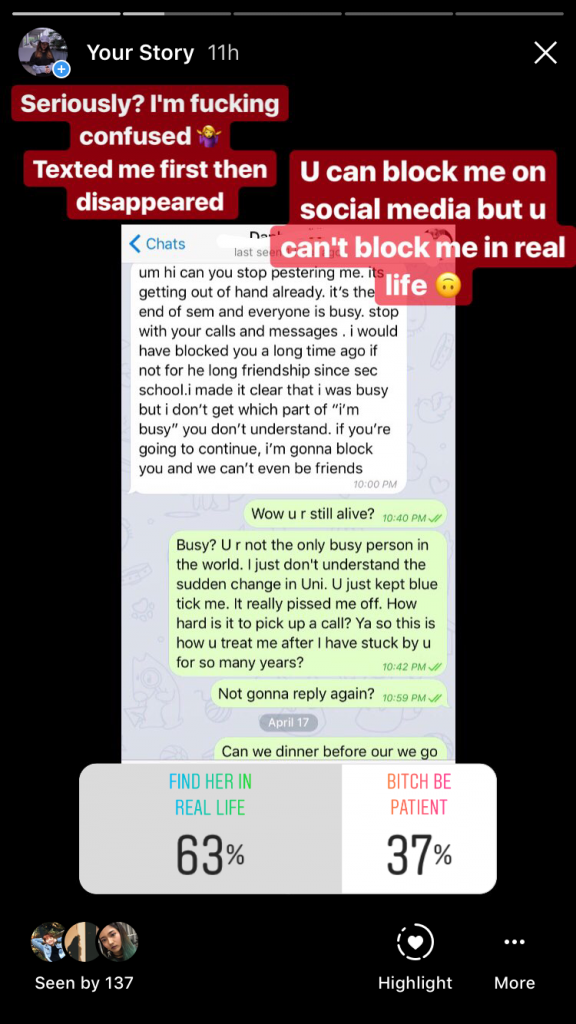
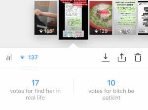
The social media rant lasted for days until my followers voted me to find her in real life. I found Daphne at Jurong Point by stalking her Insta-stories. We got into a fight there as her followers voted her to confront me. She left me there with hurtful words as she was angry that I kept following her and contacting her.


FAKE GAME INSTAGRAM ACCOUNT

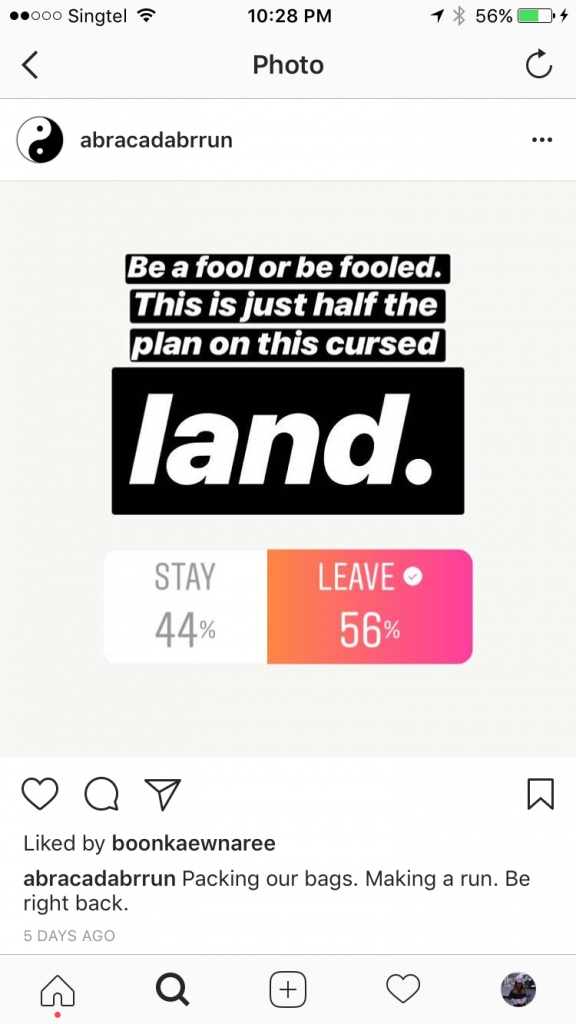
In order to make it more convincing as people were doubting that our drama is our Experimental Project, we made an Instagram account and used our initial idea to create a fake game. Also, the blind decision people had made actually led to my suicide and the way I suicide.

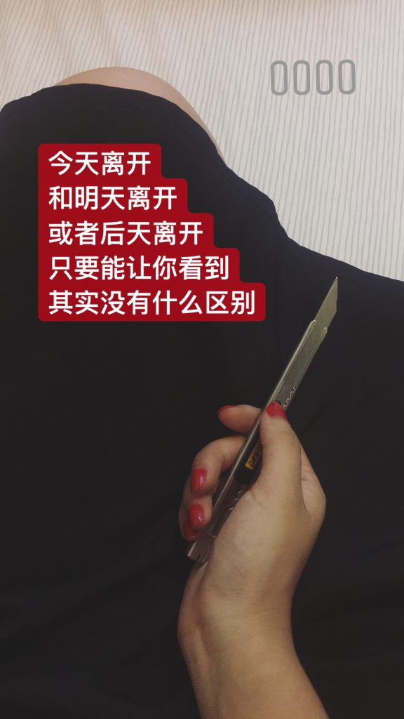
MY LAST INSTAGRAM POST

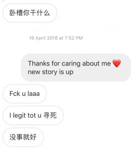
Our social media drama reached the climax with my last emotional posts. I left social media for 18 hours, as I committed suicide in the third space. I received 5 replies that showed concerns and other messages from friends.

The game ended with the launch of our trailer video on youtube and our message.

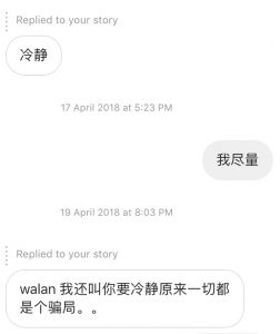
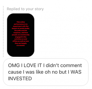
We received emotional replies from our friends after they found out the truth. One friend actually told me that she did not participate in the voting but she actually followed the whole story.

Discovery & Exploration

This piece of social media performance is experimental, as it is only 30% staged. The audience has the most control over the narrative. Our intention is to test the impact of social media, how it affects our life emotionally and create the awareness that our behaviors on social media could lead to serious consequences. We were surprised that how powerful Insta-story is. The image and text we created were able to convince people around us even our closed friends who see us almost every day. It is interesting how easy we could shape our digital identity that is totally different from our real personality. Also, people actually brought the third space drama into the first space to engage more people. They talked about the story and also tried to have their opinion towards our situation. Daphne and I needed to be in our characters in real life.

To conclude this project, we applied what we learned in this semester into this social media performance. We exposed our emotions online and created our new digital identities. We engaged our audience unconsciously in both first and third space. Everyone DIWOed this piece of performance, as we, the artists only created the outline and platform. Lastly, I think the role of artists is to make the world a better regardless of our area of disciplines. Furtherfield helped refugee through the power of Internet, raised the awareness of the environmental issue, Media Burnt was conveying the issue of mass media, and Hasan Elahi spread his story of discrimination online. As young artists, we also like to raise the question of how we should use social media, and how we can avoid social media tragedy to happen in the future through this project.

THE TEAM

ZINE: Say Hi to the Houses

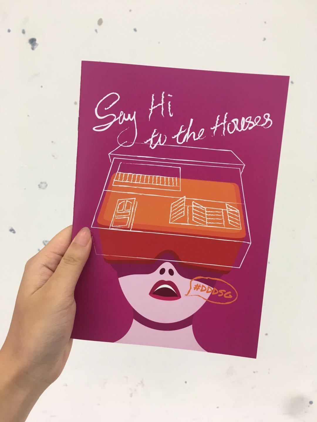
FINAL ZINE DESIGN

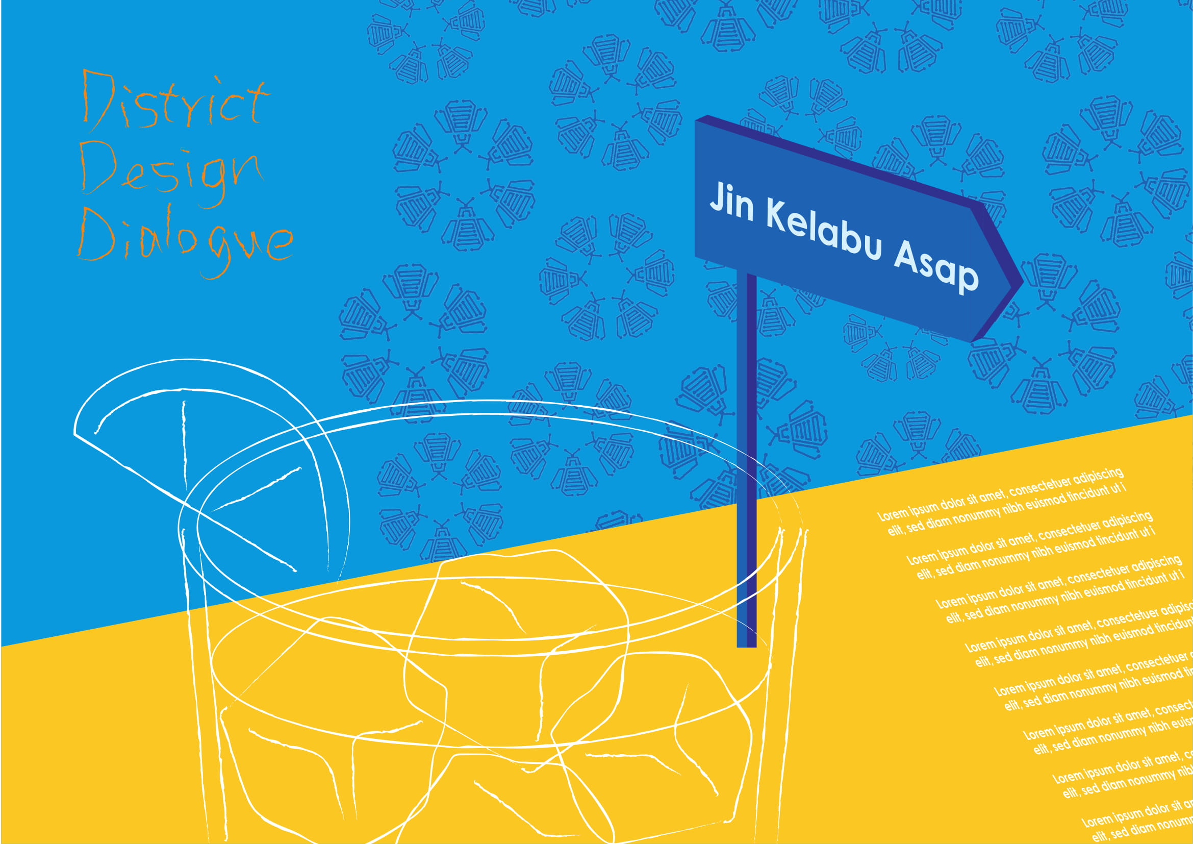
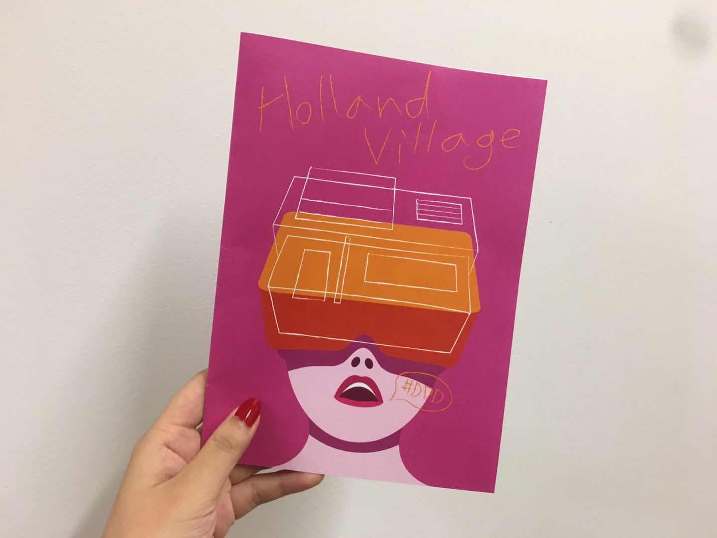
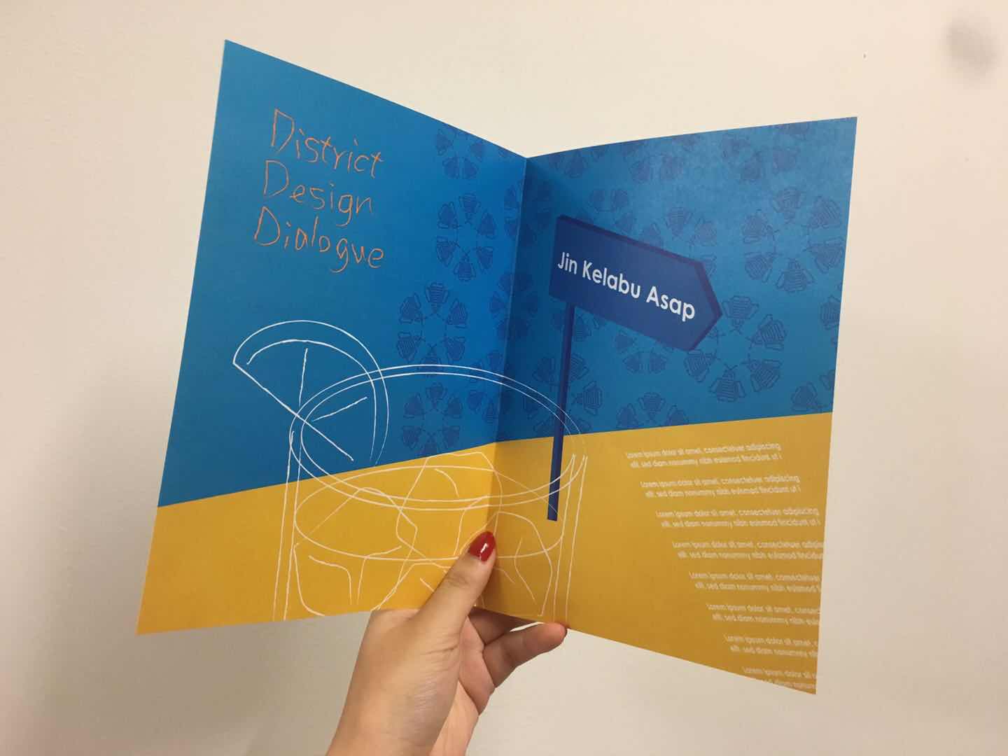
The final version of my zine design was inspired by the annual District Design Dialogue event at Holland Village that I visited during Singapore Design Week. My concept was changing along the way, from capturing the atmosphere at Holland Village during day and night to celebrating design in an international neighborhood.

FINAL ZINE

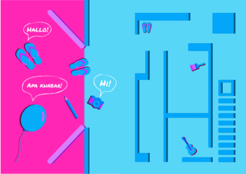
The final zine will lead the visitor through the house tour full of interactive artworks, drinks, and music.

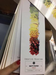
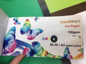
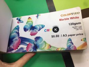
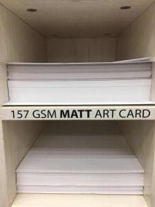
I tested printed another few types of paper as the Marble White 120gsm paper is a bit too thick for the zine.

FEEDBACK AND REFLECTION

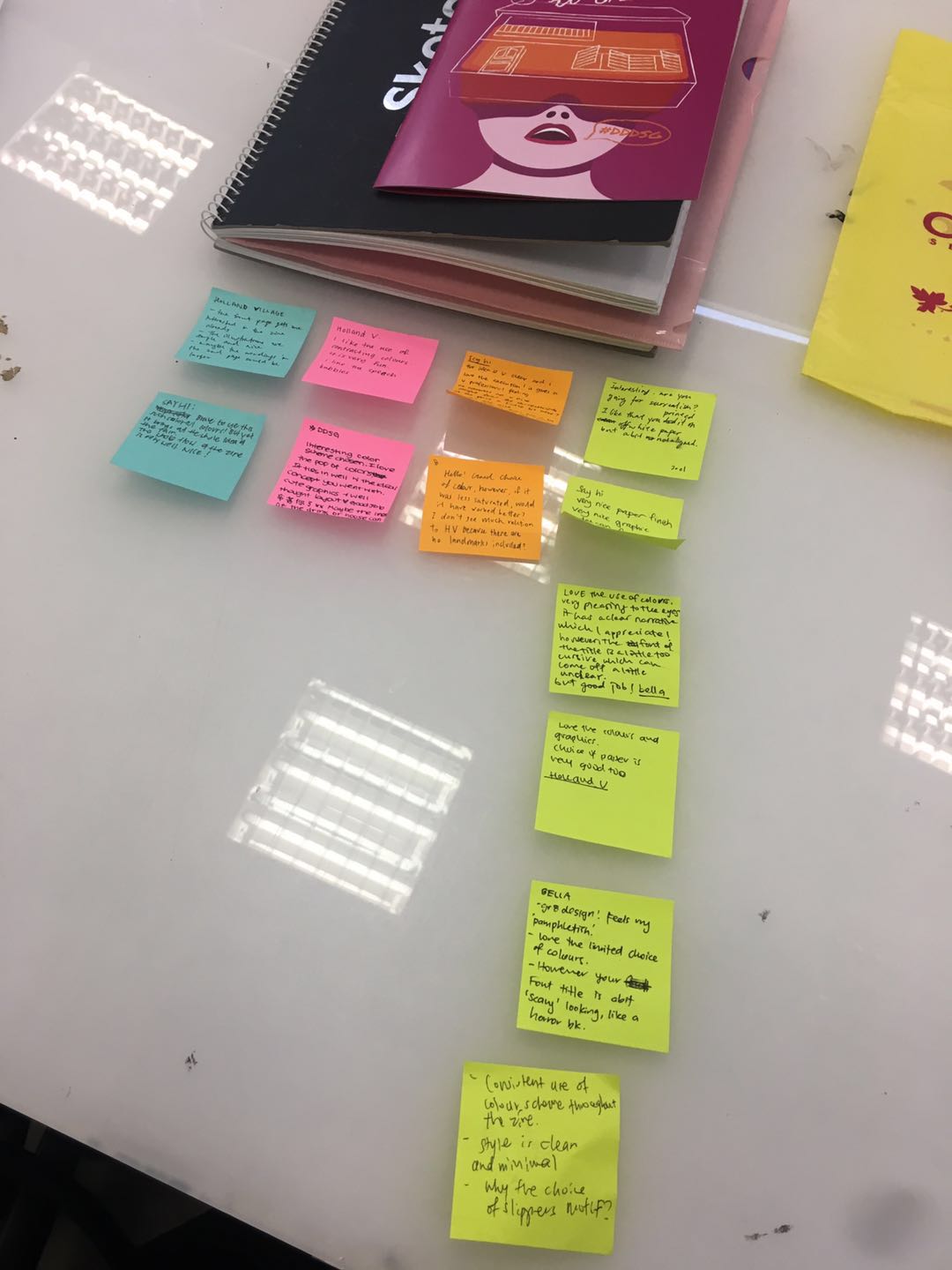
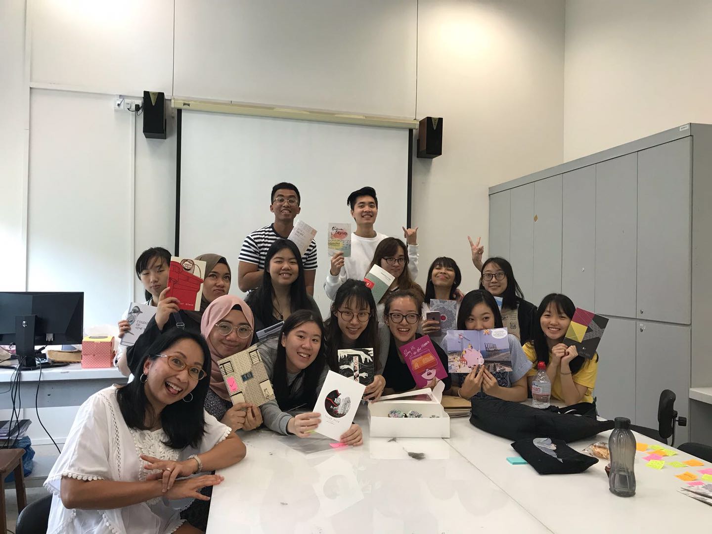
I received constructive feedback from my classmates and professor. I am glad that my classmates like the choice of colours and found the cover page eye-catching, however, maybe the symbolic object I chose could be more relatable, and easier for the reader to understand the narrative. Also, there are still flaws in printing, as the last page is not perfectly aligned. I will work carefully on the software and also check on the printing to make sure the outcome has the best quality. Some also suggested that the font could be easier to understand. Overall, I had found doing this project, attaining the event, trying a quite different graphics style this time. I am from a product design background which emphasizes practicality. Sometimes, I found it hard to break the constraints. I am grateful that my professor pushed my limited and answer my doubts patiently. I will step out of my comfort zone and explore more about graphic design in the future.

#DDDSG ZINE DESIGN PROCESS

FIRST DRAFT OF MY ZINE 

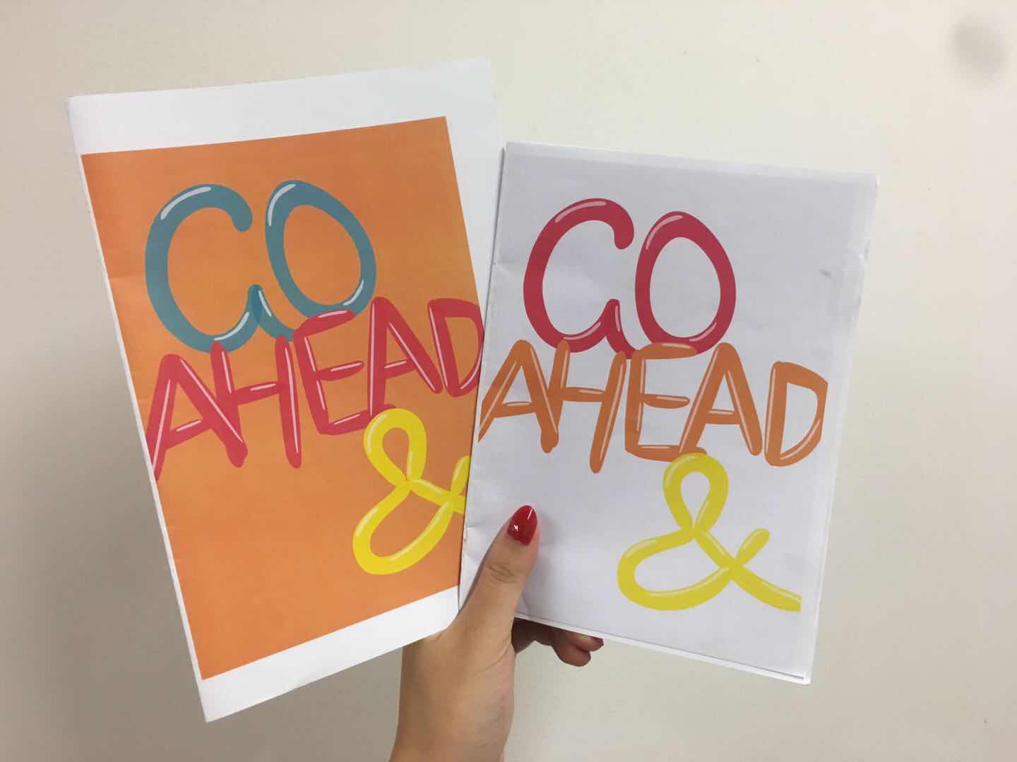
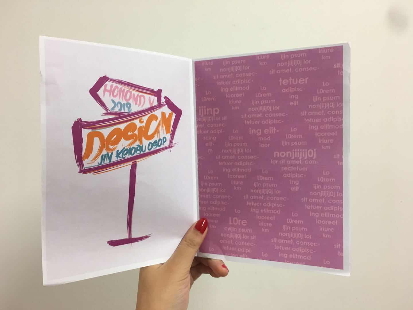
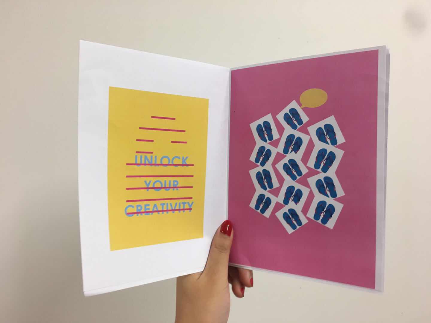
The first draft of the zine was printed out on the normal paper. The theme is celebrating design at HV neighborhood based on the new research and observation at the annual event at Holland Village during the Singapore Design Week.

However, the first draft is lacking in the “celebrating design elements”. Also, it seems to be a zine for children instead of design lovers. Moreover, the design style is not consistent, and the pages seem to be stand-alone posters. Thus, I worked on the narrative and style for the second draft.

SECOND DRAFT OF MY ZINE 

Photos OF #DDDSG

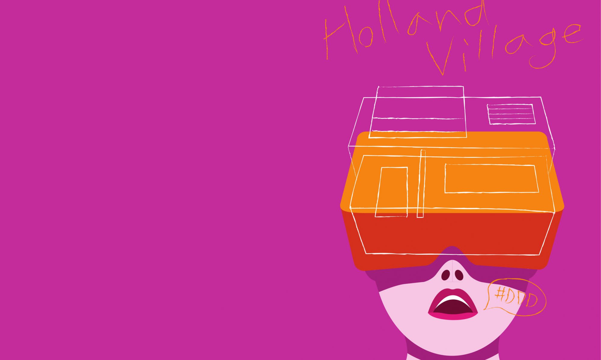
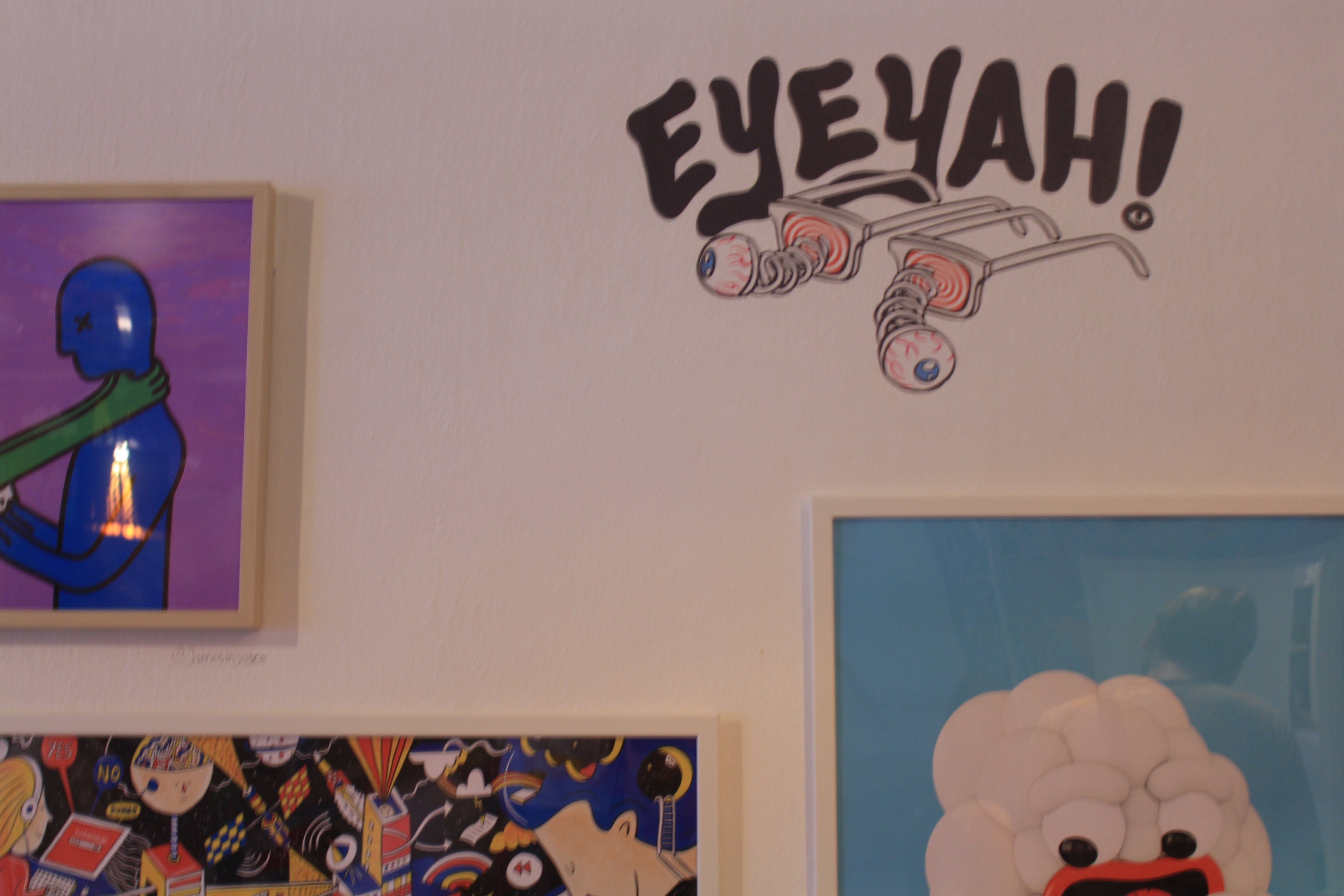
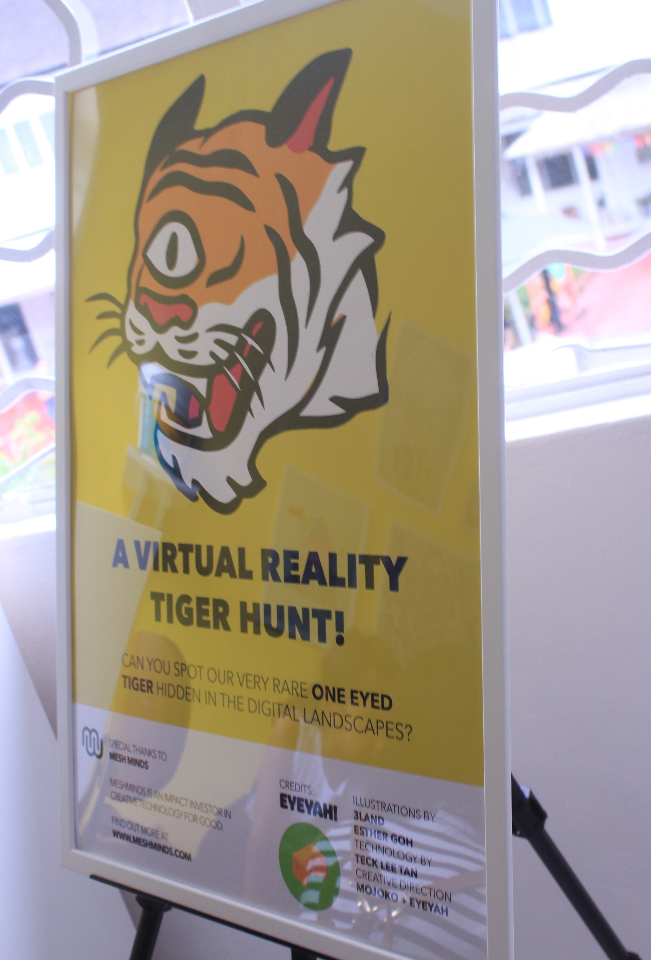
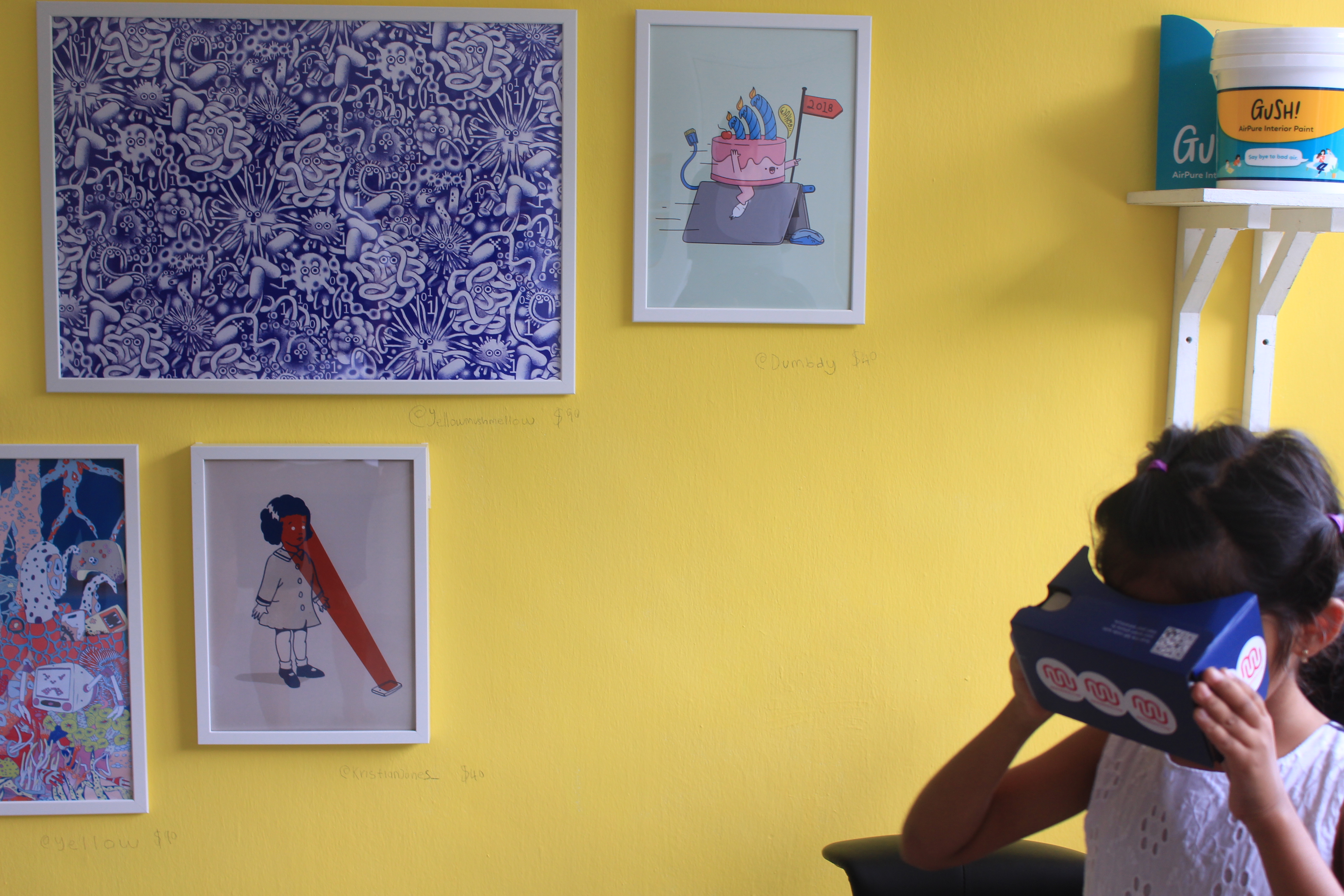
I started to filter the photos that I took at the event to find the focus of my zine. I decided to pay more attention to one of the houses that opened for the exhibition. That house was opened for EYEYAH!, which showcased works including t-shirts, painting, and installations of over 30 artists. At the second floor, there is one room where the visitor could use the VR googles to find the logo of the exhibition around the room. I was able to capture a moment that a little girl was playing with it.

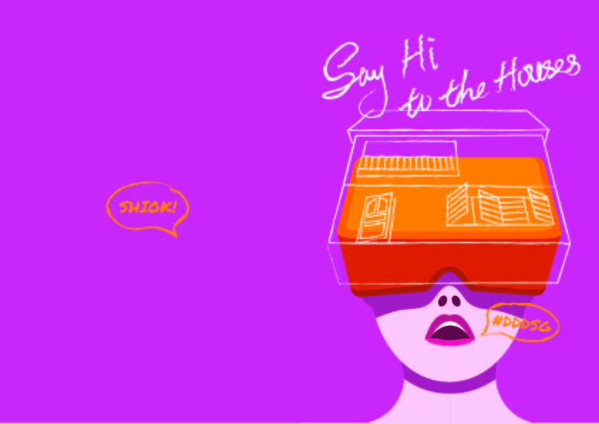
I decided to use the VR google in my zine cover to make it fun and eye-catching.

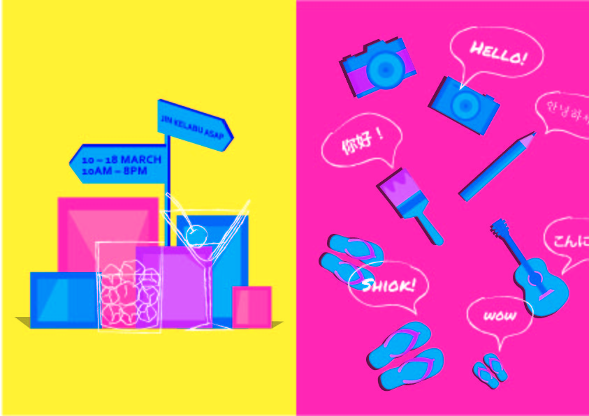
I also used the elements and colours on the street for the zine design.

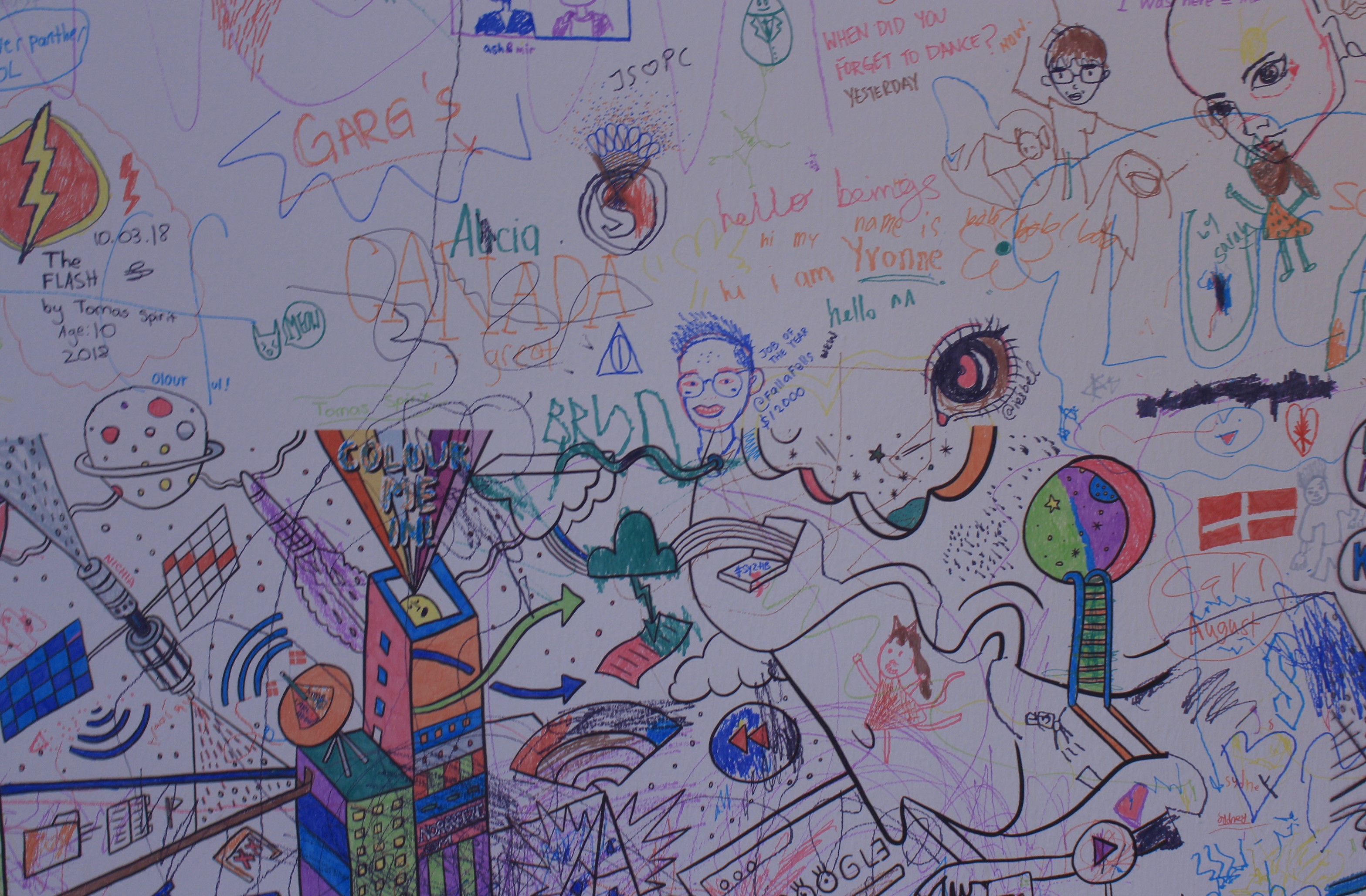
Further, another room in this house has walls of artworks done by artist and the visitors are free to draw and write on the wall. It gave me inspiration for the style of my zine design.

INSPIRATIONS

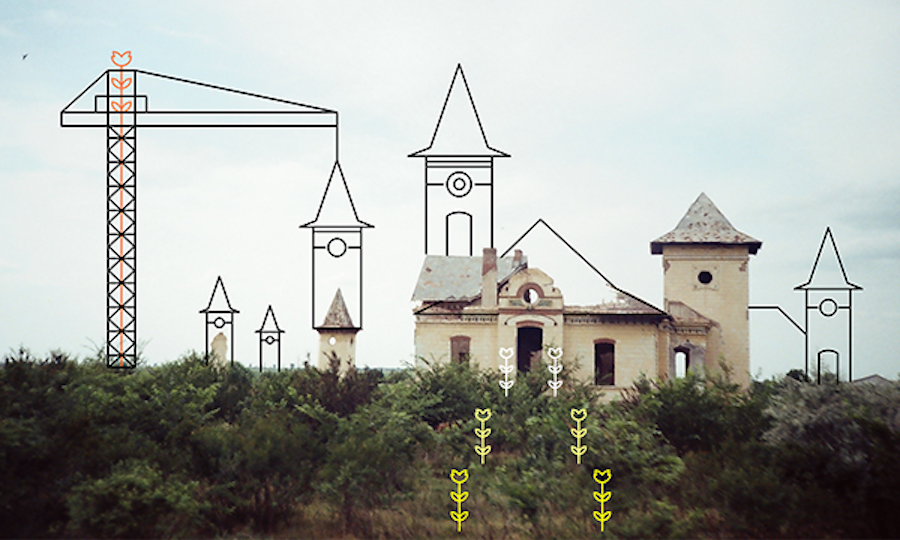
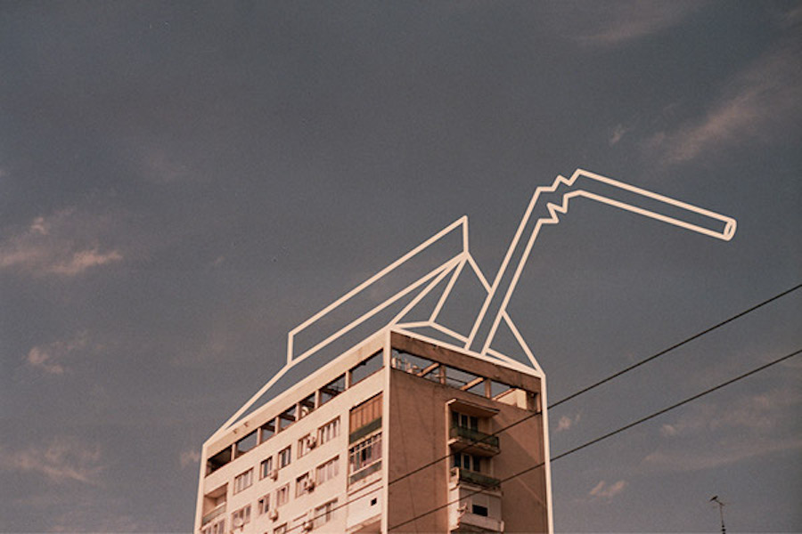
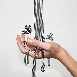
Combinophy is a photography series made by Romanian graphic designer Cristiana Costin. After having captured daily life scenes, she combines her analog photographs with digital illustrations, transforming images into surreal settings
http://viciouslycyd.tumblr.com/

http://malikafavre.com/
MY ZINE DESIGN process
Cover Page
3rd & 4th Pages

The pattern is created for the location Chip Bee Garden. I used the elements from the chip, bee, and garden (flower).


TEST PRINT

I test printed the first four pages on different papers with different printers.

The Marble White 120gsm paper seems to be the ideal paper out of all. It gives the metallic effect which matches the theme of the zine design.

Feedback

The title of the cover page is not interesting enough to match the zine design. I might think of a new one instead of putting the name of the location. Also, I will explore more different handwriting title font to get the one that matches the text font. Moreover, the style will be spread into the rest of the pages. Lastly, adjust the composition to achieve the visual hierarchy.