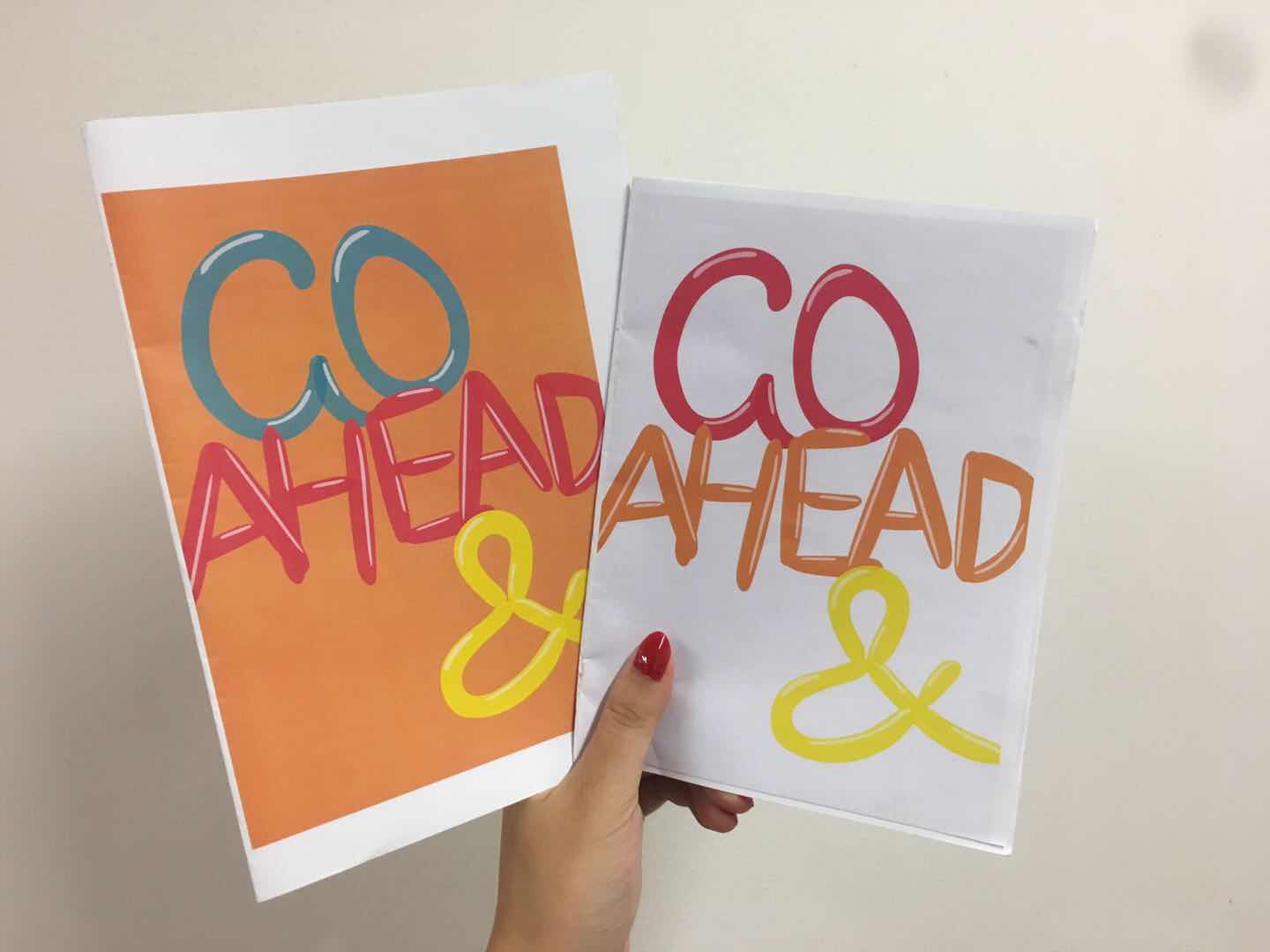
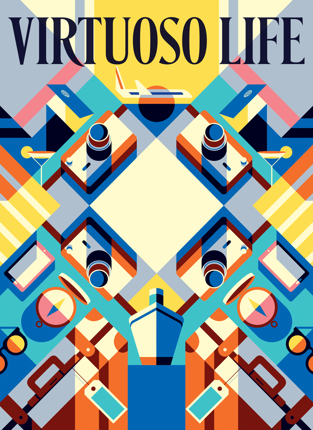
The first draft of the zine was printed out on the normal paper. The theme is celebrating design at HV neighborhood based on the new research and observation at the annual event at Holland Village during the Singapore Design Week.
However, the first draft is lacking in the “celebrating design elements”. Also, it seems to be a zine for children instead of design lovers. Moreover, the design style is not consistent, and the pages seem to be stand-alone posters. Thus, I worked on the narrative and style for the second draft.
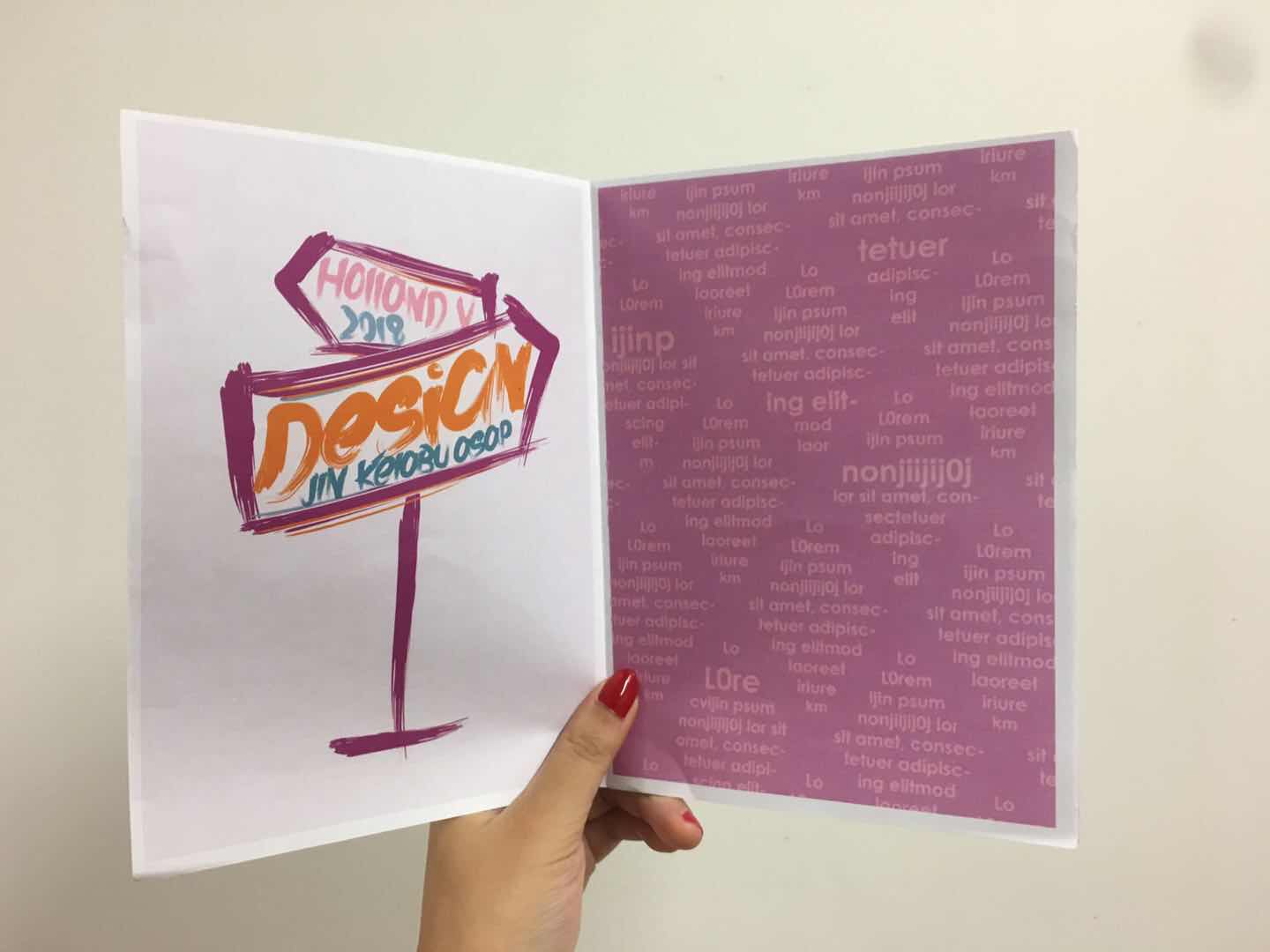
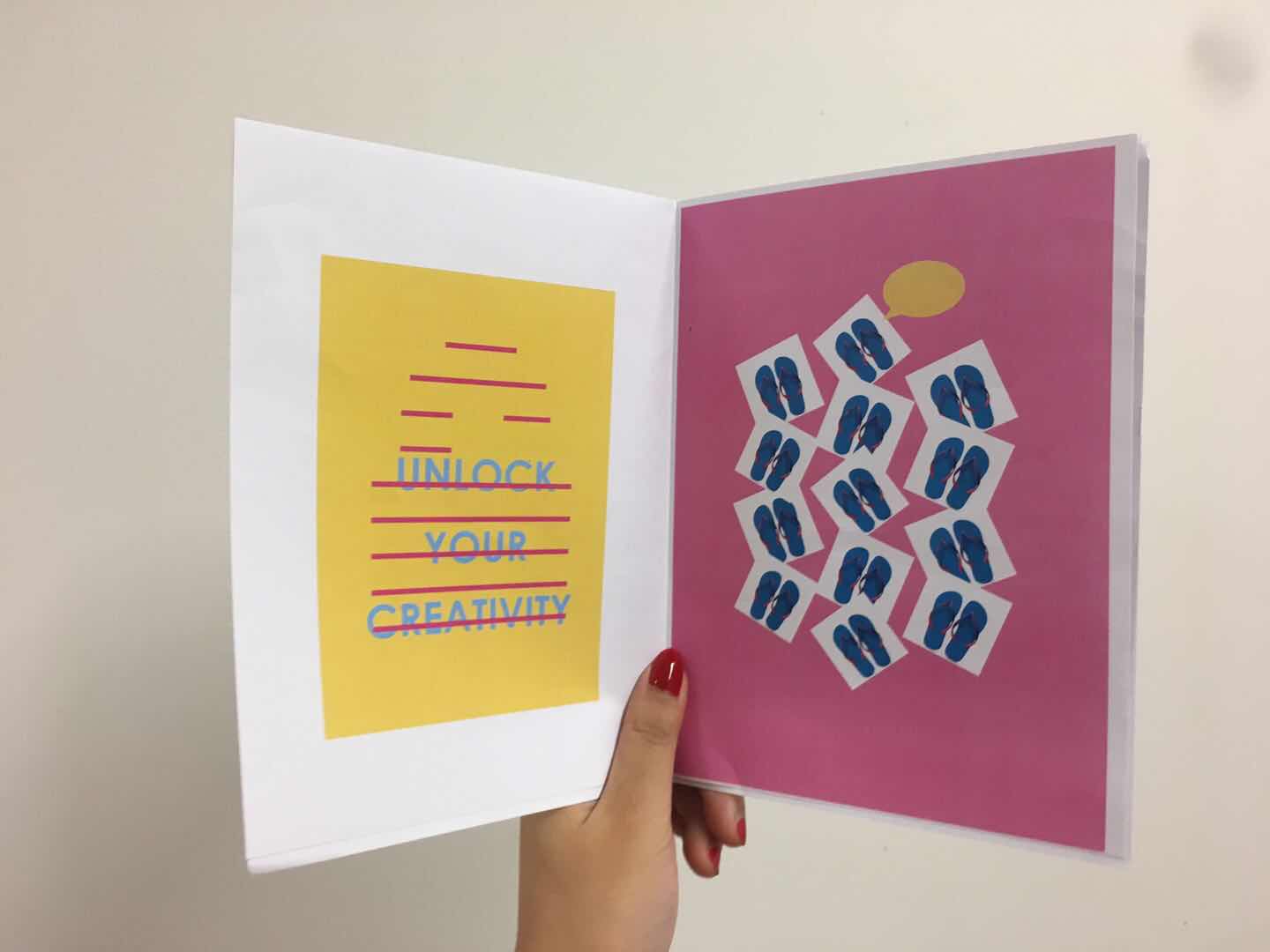
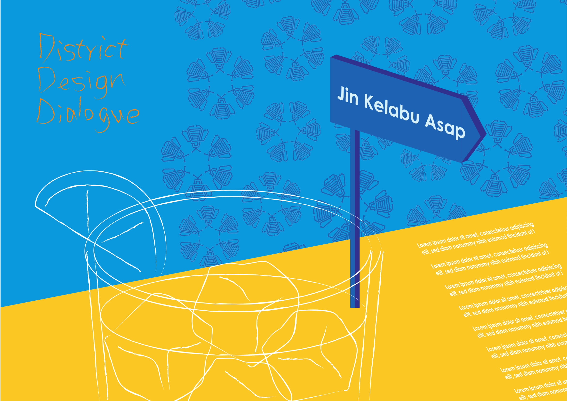
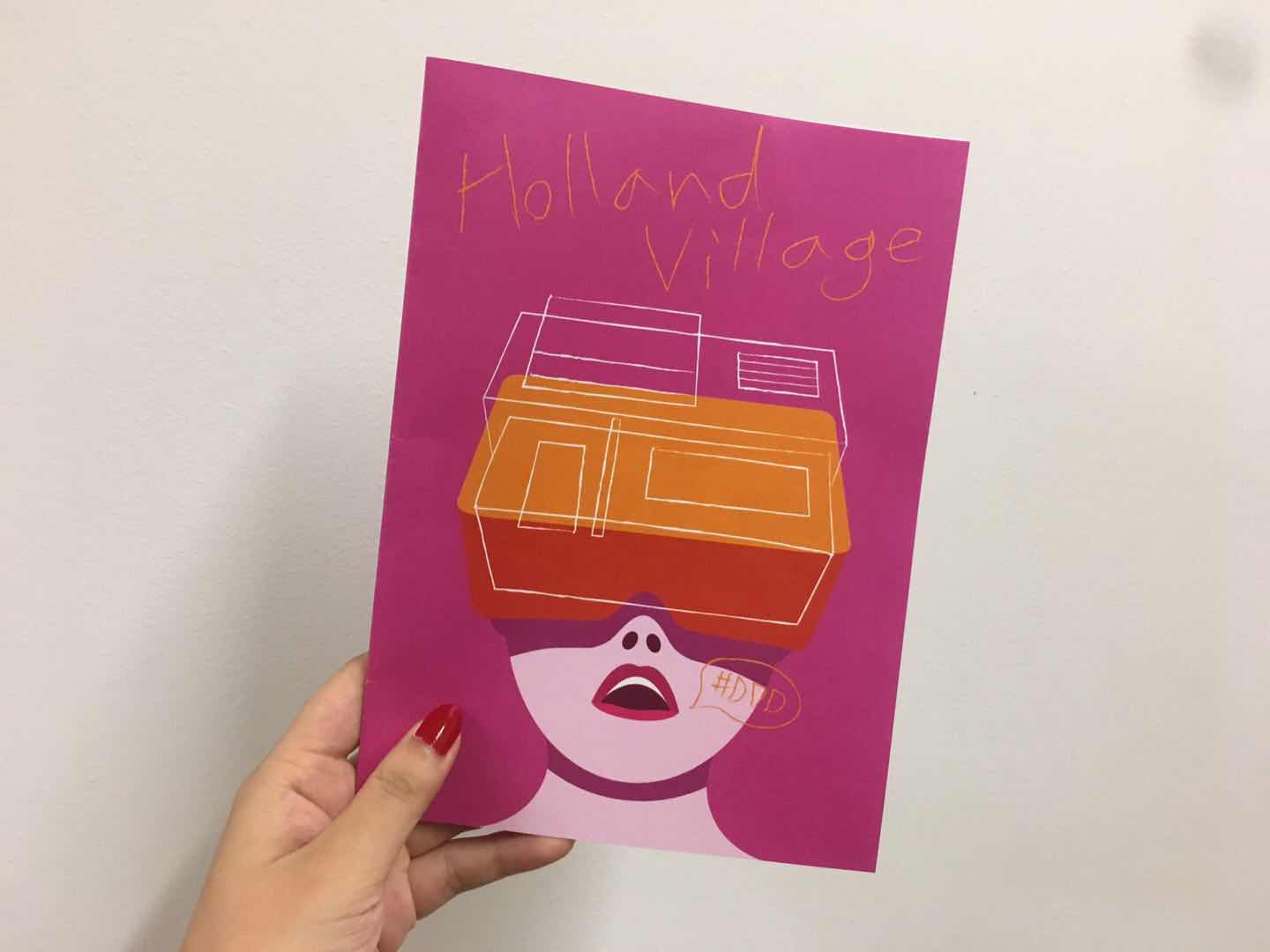
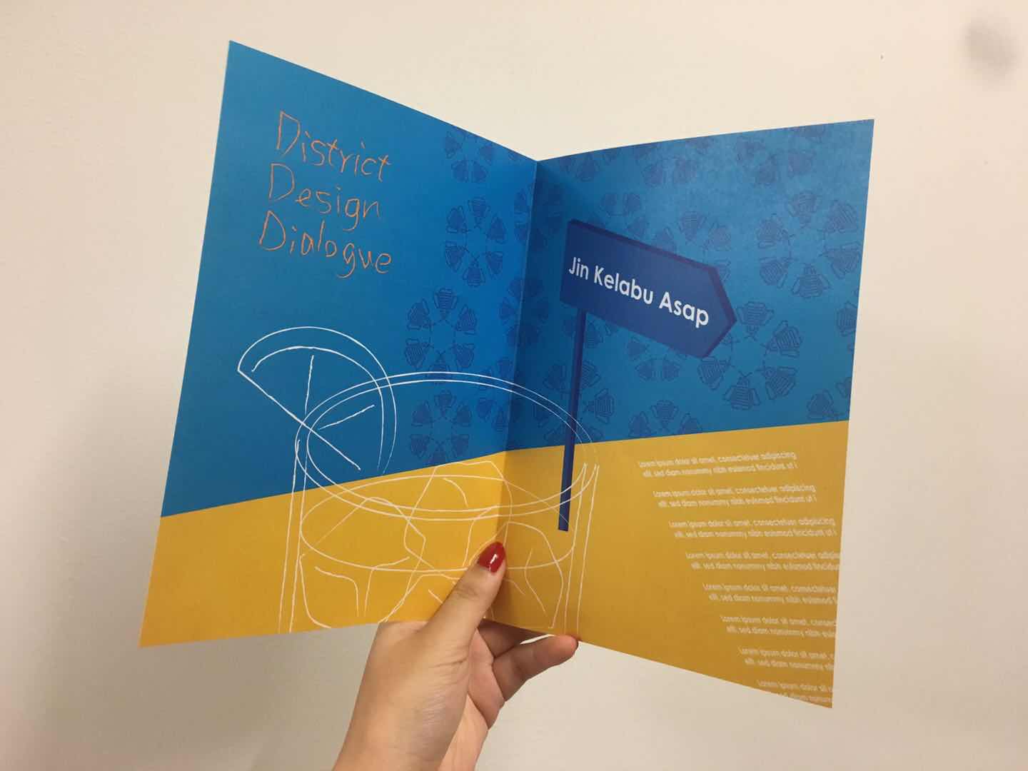
SECOND DRAFT OF MY ZINE
Photos OF #DDDSG
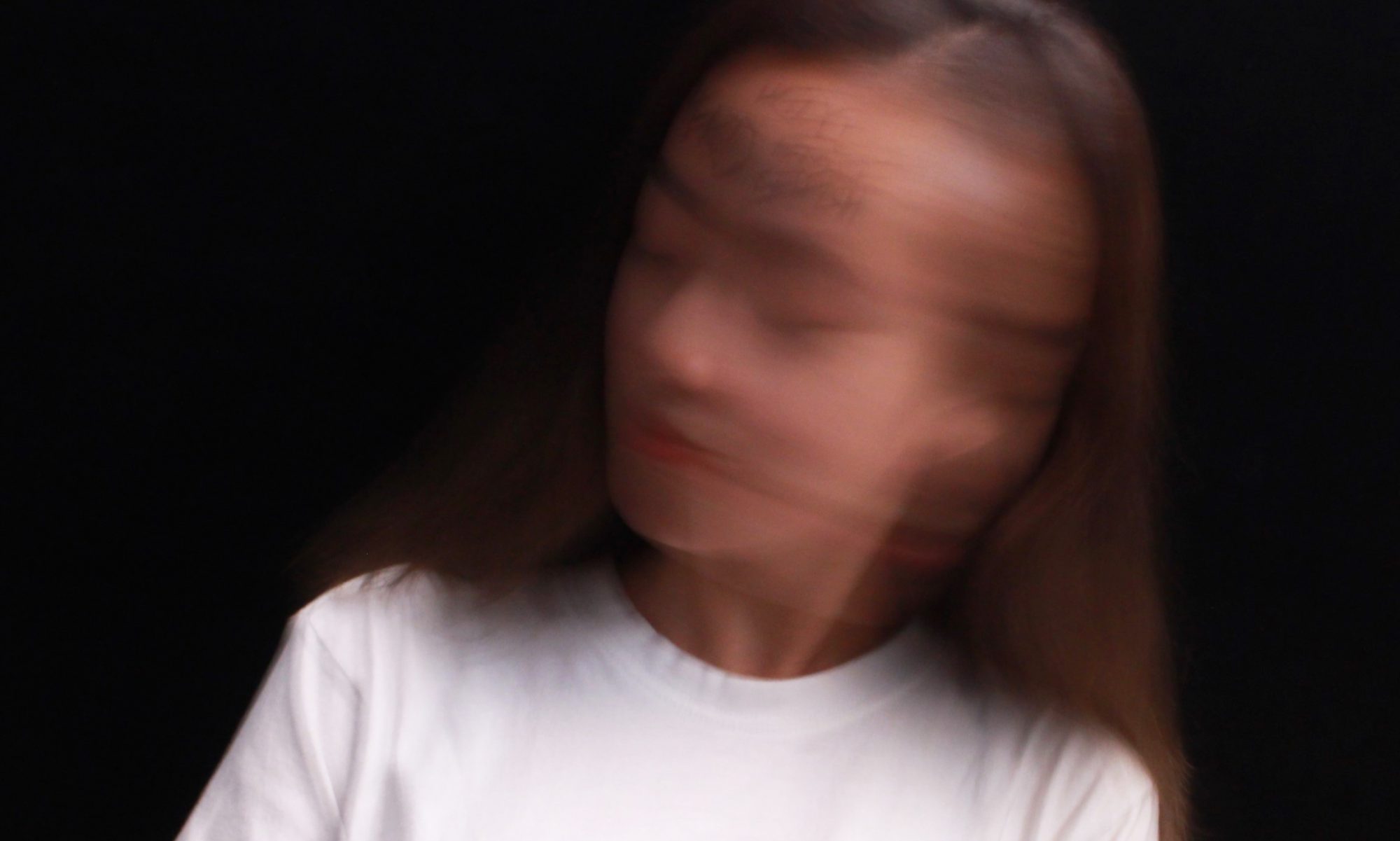
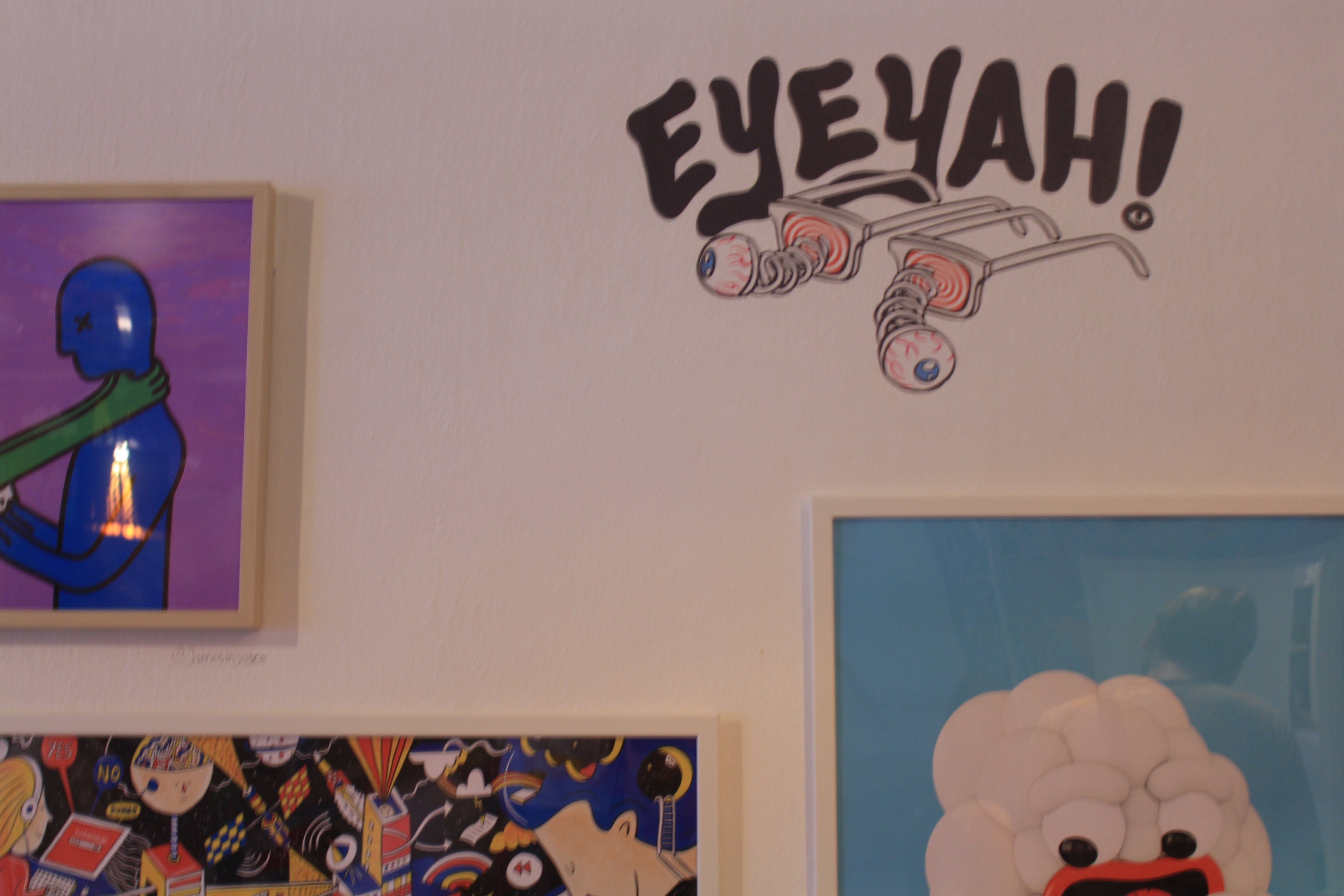
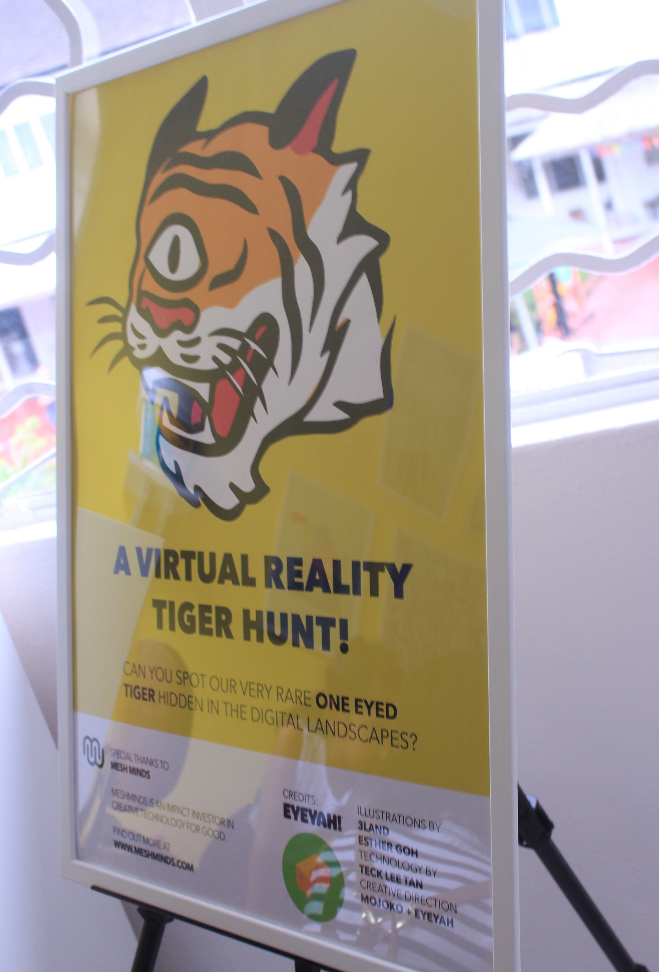
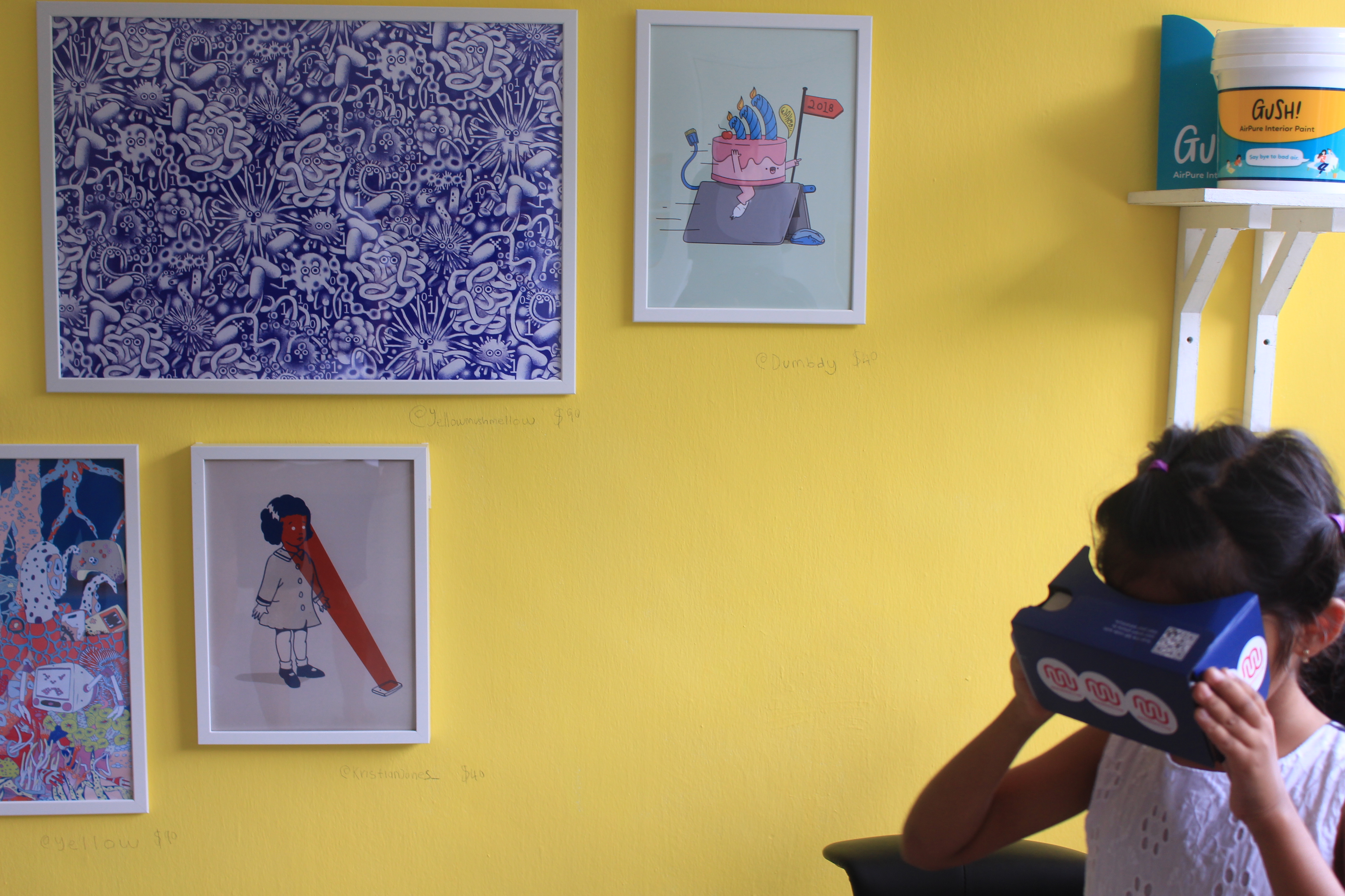
I started to filter the photos that I took at the event to find the focus of my zine. I decided to pay more attention to one of the houses that opened for the exhibition. That house was opened for EYEYAH!, which showcased works including t-shirts, painting, and installations of over 30 artists. At the second floor, there is one room where the visitor could use the VR googles to find the logo of the exhibition around the room. I was able to capture a moment that a little girl was playing with it.
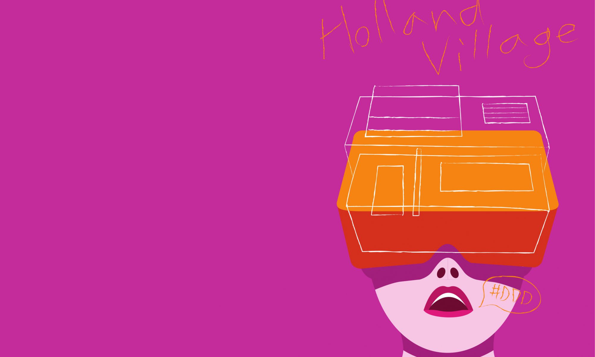
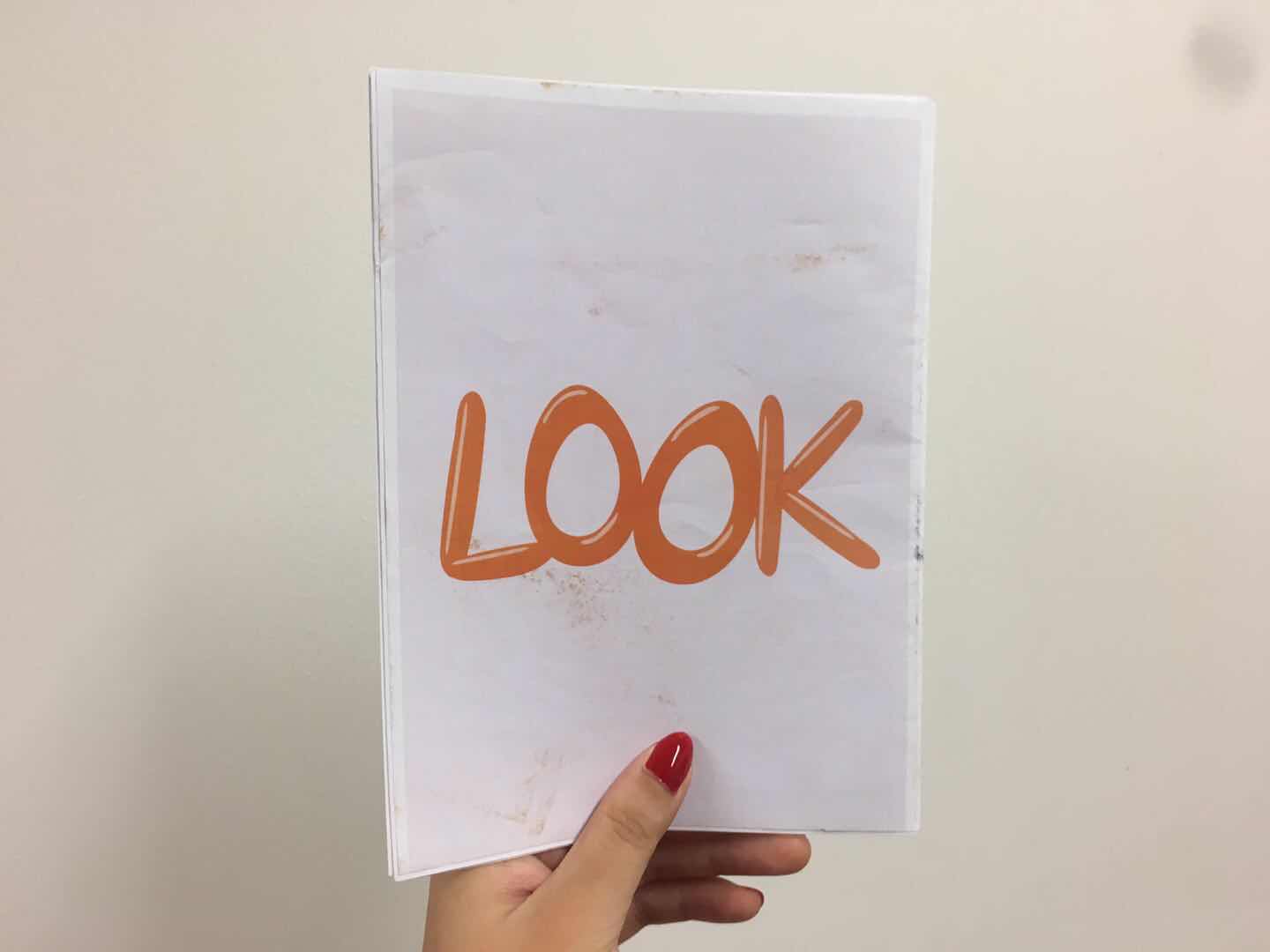
I decided to use the VR google in my zine cover to make it fun and eye-catching.
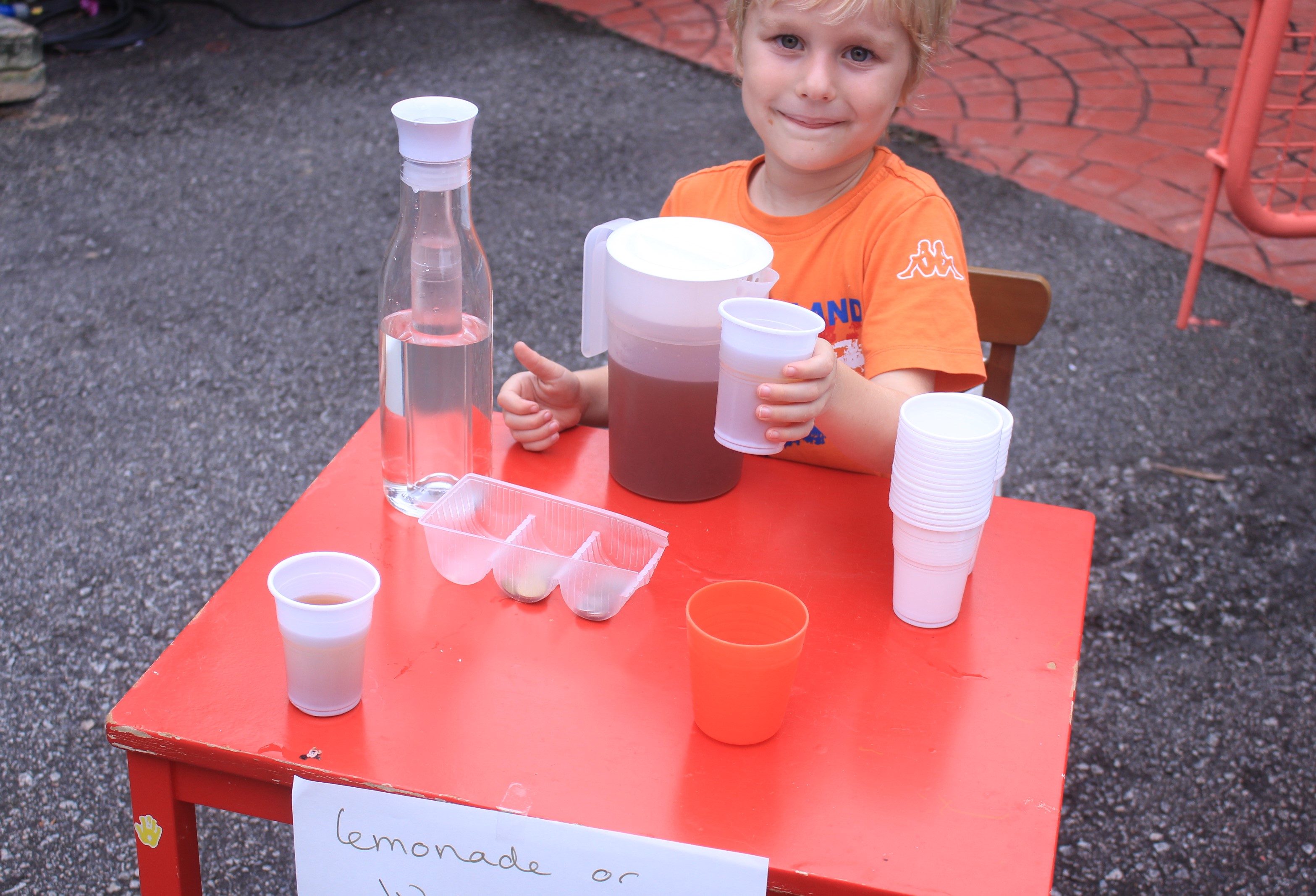
I also used the elements and colours on the street for the zine design.
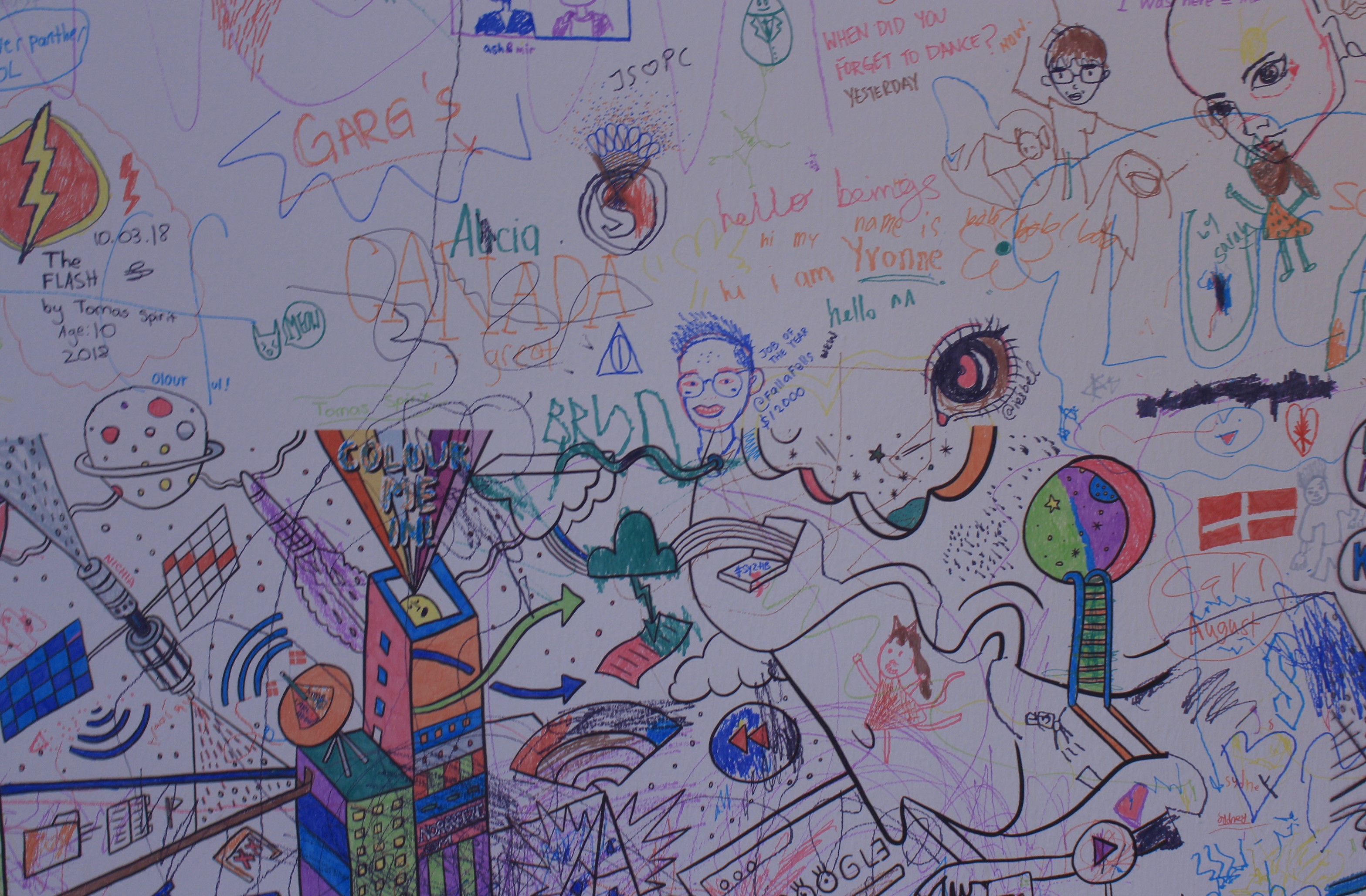
Further, another room in this house has walls of artworks done by artist and the visitors are free to draw and write on the wall. It gave me inspiration for the style of my zine design.
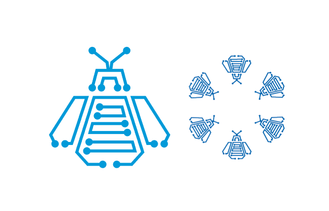
The pattern is created for the location Chip Bee Garden. I used the elements from the chip, bee, and garden (flower).
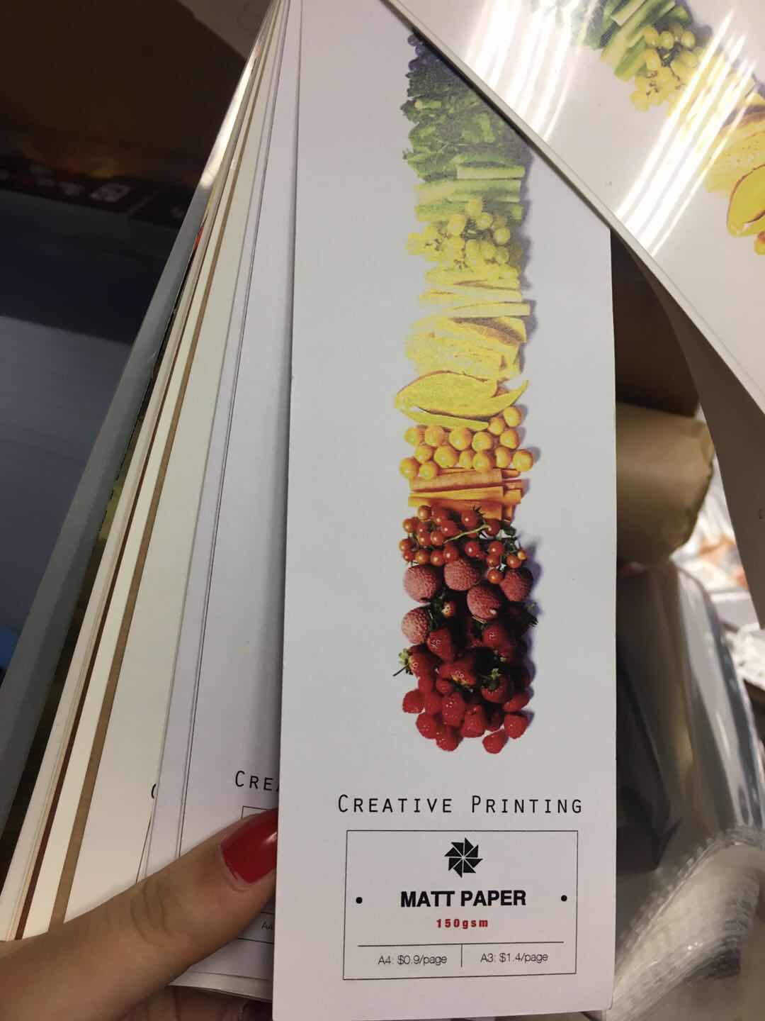
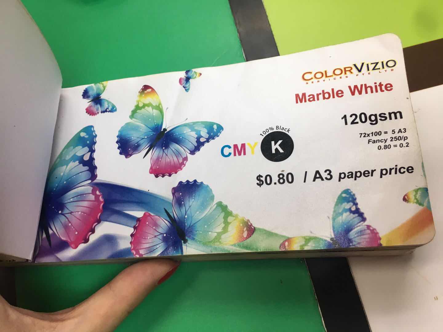
TEST PRINT
I test printed the first four pages on different papers with different printers.
The Marble White 120gsm paper seems to be the ideal paper out of all. It gives the metallic effect which matches the theme of the zine design.
Feedback
The title of the cover page is not interesting enough to match the zine design. I might think of a new one instead of putting the name of the location. Also, I will explore more different handwriting title font to get the one that matches the text font. Moreover, the style will be spread into the rest of the pages. Lastly, adjust the composition to achieve the visual hierarchy.
Furtherfield is a non-profit organization and community that was found by Ruth Carlow and Marc Garrett in 1996. It was created to reach out a wider audience without the constraints of the physical gallery spaces at London. Furtherfield was a small website where the artist, technologist, and academics have the freedom to DIWO (DO IT WITH OTHERS) to share the resources and contribute to the human knowledge through the integration of first, second, third or multiple spaces. It was expanded around the world later on. Furtherfield also has physical space, the Gallery, and Lab in the London’s Finsbury Park. It is a platform in the urban park where people can explore the network culture.
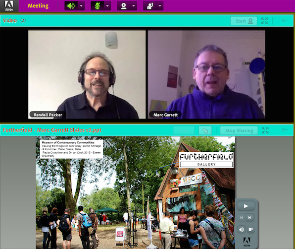
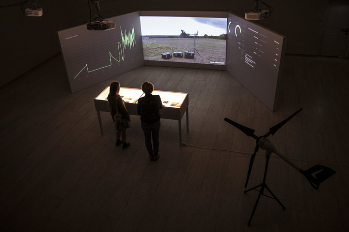
Screenshot of the Adobe Connect Lecture With Marc Garrett
We had Marc Garrett to be our guest speaker on Adobe Connect lecture with our professor Randall Packer on 16th February 2018. Marc Garrett gave us a better insight of Furtherfield, Maker Culture, and shared with us some projects that are supported by Furtherfield. The major idea of Furtherfield is making art for a better society.
For example, an ongoing project supported by Furtherfield, called ‘Seeds From Elsewhere’ by They Are Here which gathering young asylum seekers and refugees, and others. Each of them has a piece of land to grow plants or food from their own homeland. This project is creating an environment that embraces, maintains and produce the diversity of the residency status in the current society. Further, this project started less than a month after Brexit, when the majorities are against migrants in the UK. ‘Seeds From Elsewhere’ is demonstrating that the DIWO culture should not just exist in the small garden community, yet it applies to all scales of activities even beyond the scale of the government. The garden itself has multiple functions. Firstly, it could be a comfortable place for the young refugees to hang out. Secondly, it might provide job opportunities in the future. Lastly, it could be used to address anti-immigration.
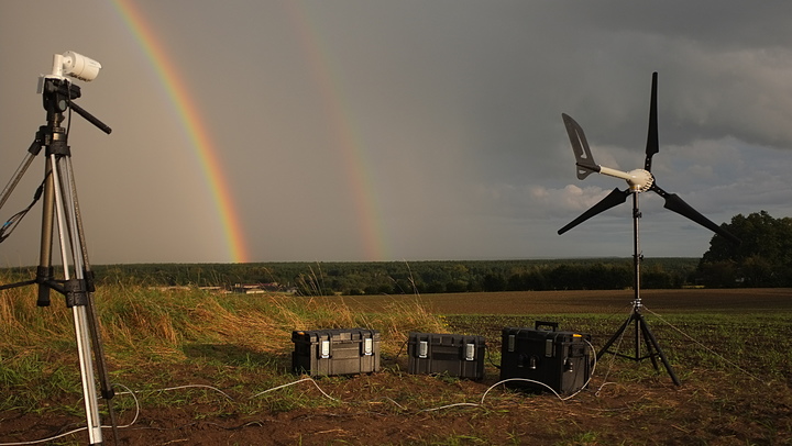
HARVEST by Julian Oliver https://julianoliver.com/output/harvest
Moreover, another artwork that Marc Garrett shared with us is HARVEST by Julian Oliver, a work of critical engineering and computational climate art. The two-meter high wind turbine transforms wind energy into the electricity required to meet the demanding task of Zcash, A decentralized and open-source digital currency. All the profits the HARVEST earned goes to the non-profit climate change research organizations to support the studies. In 2017, HARVEST was exhibited for two months in the museum. It supported three non-profit climate change research organizations at the end of the exhibition.
Last but not least, the Adobe Connect lecture ended with the Q&A session with Marc Garrett. As an art student living in the 21st century, I was not sure if my role is simply creating the painting, sculpture, and objects that are aesthetically appealing to the viewers or there are more responsibilities on my shoulders. Therefore, I asked the following question:
Marc Garrett answered that the consciousness of the environment is essential for artists. Technology is deeply influencing people’s behaviour nowadays, yet we must be aware of nature. As technology cannot survive without the survival of nature. Randall Packer added on that artist should be engaged with the society, connect with the issue, and invest in the process of working with others like what Furtherfield had done. Such as the ‘Seeds From Elsewhere’ project mentioned earlier. All in all, the role of artists is not just making this world more beautiful tangibly but probably a place where we can live with others peacefully.
REFERENCES
https://julianoliver.com/output/harvest
Ruth Catlow and Marc Garrett, Do It With Others (DIWO): Participatory Media in the Furtherfield Neighbourhood
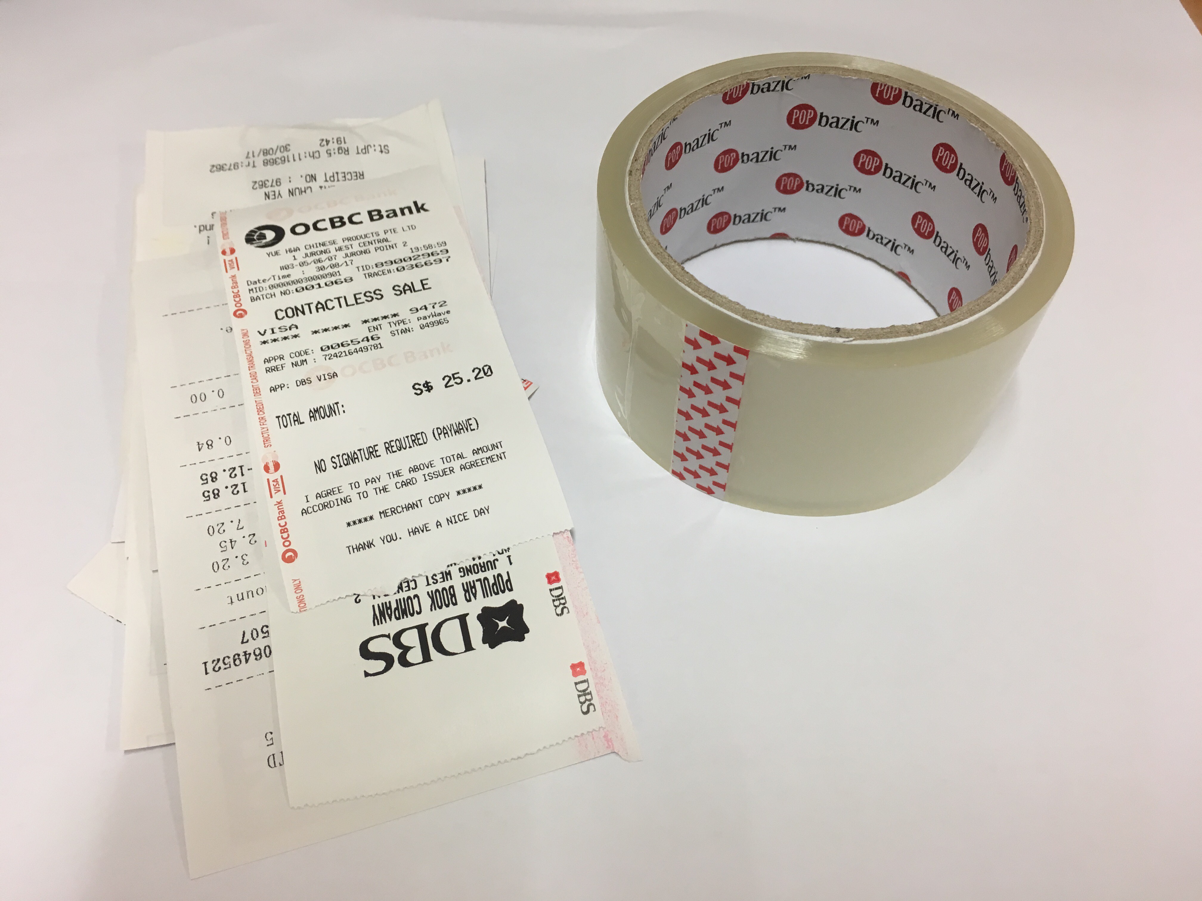
According to the dictionary, overspend means spend more than the expected amount. Overspending is one of the issues that I am trying to solve. Receipts are the evidence. I feel extremely guilty when I look at the whole stack of receipts in my wallet. Thus, I amplified my guilt by making it as one of the mark making to remind myself and others not to have unnecessary expenses.
Material: Receipts, Clear Tape & Water
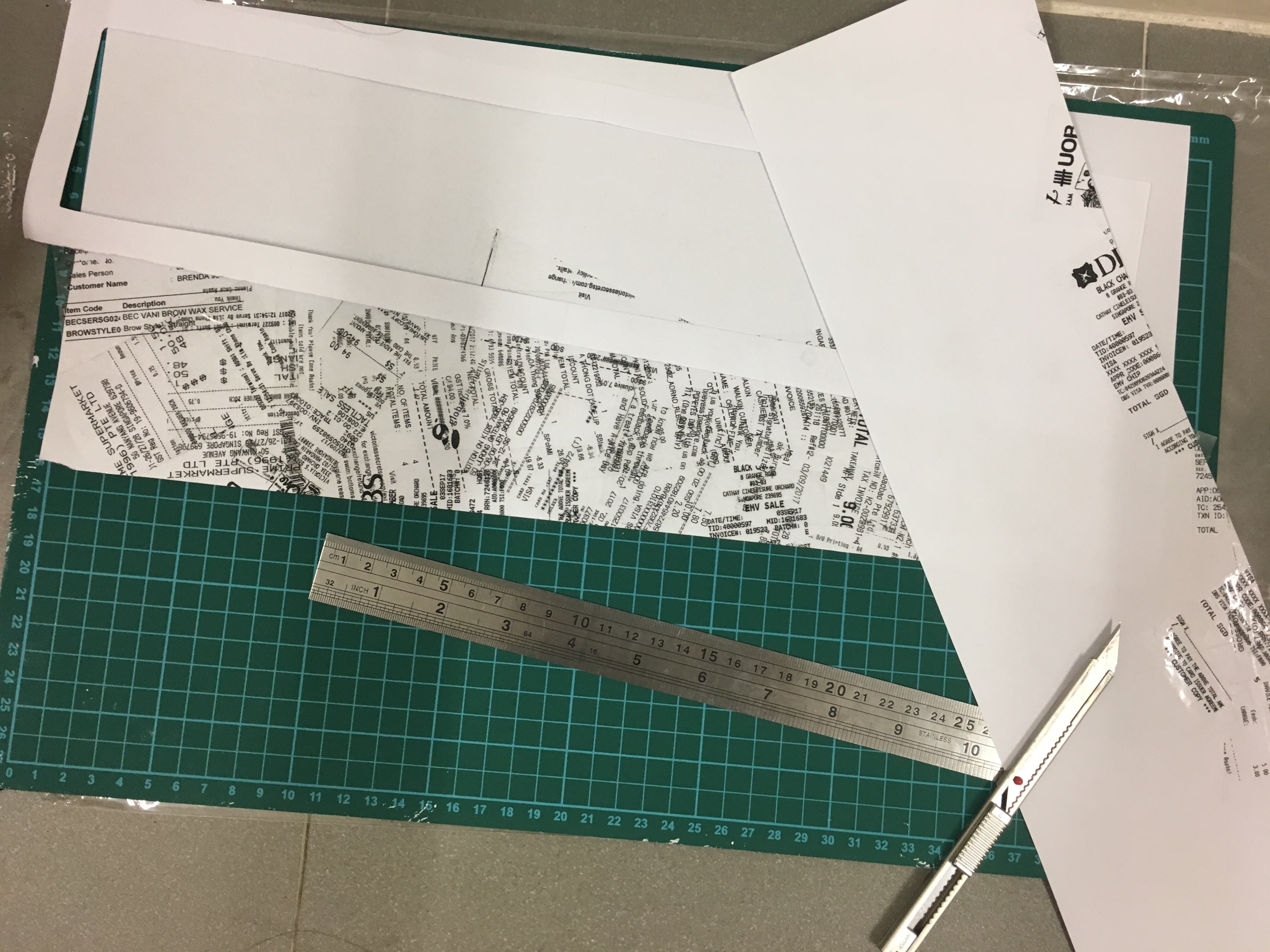
This is an interesting technique that I knew years ago. This is the first time I am using it in the school project. Simply paste the clear tape on the side of the receipt that has words. Tap water on the receipt then removes the wet paper. The words will be transferred to the clear tape, and overlapped tape achieved the ideal effect.
I had done experiments with the original receipts. The value of the words transferred on the clear tape is low, which could not achieve the ideal effect. Hence, I scanned and printed the receipts, and repeated the same method.
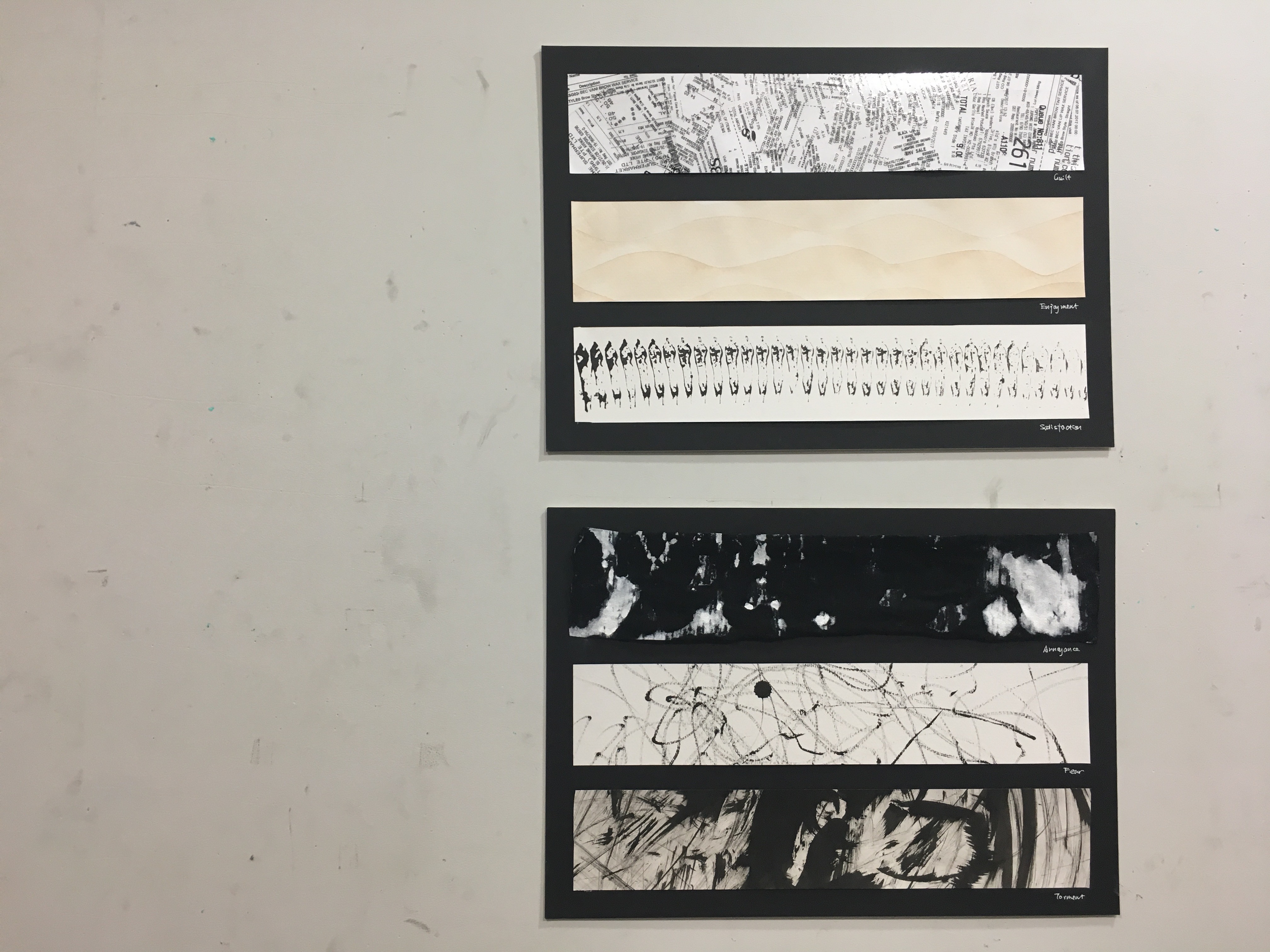
High density is achieved by adding more elements in the space. The high value of the words forms a contrast with the white background, which emphasize the emotion.
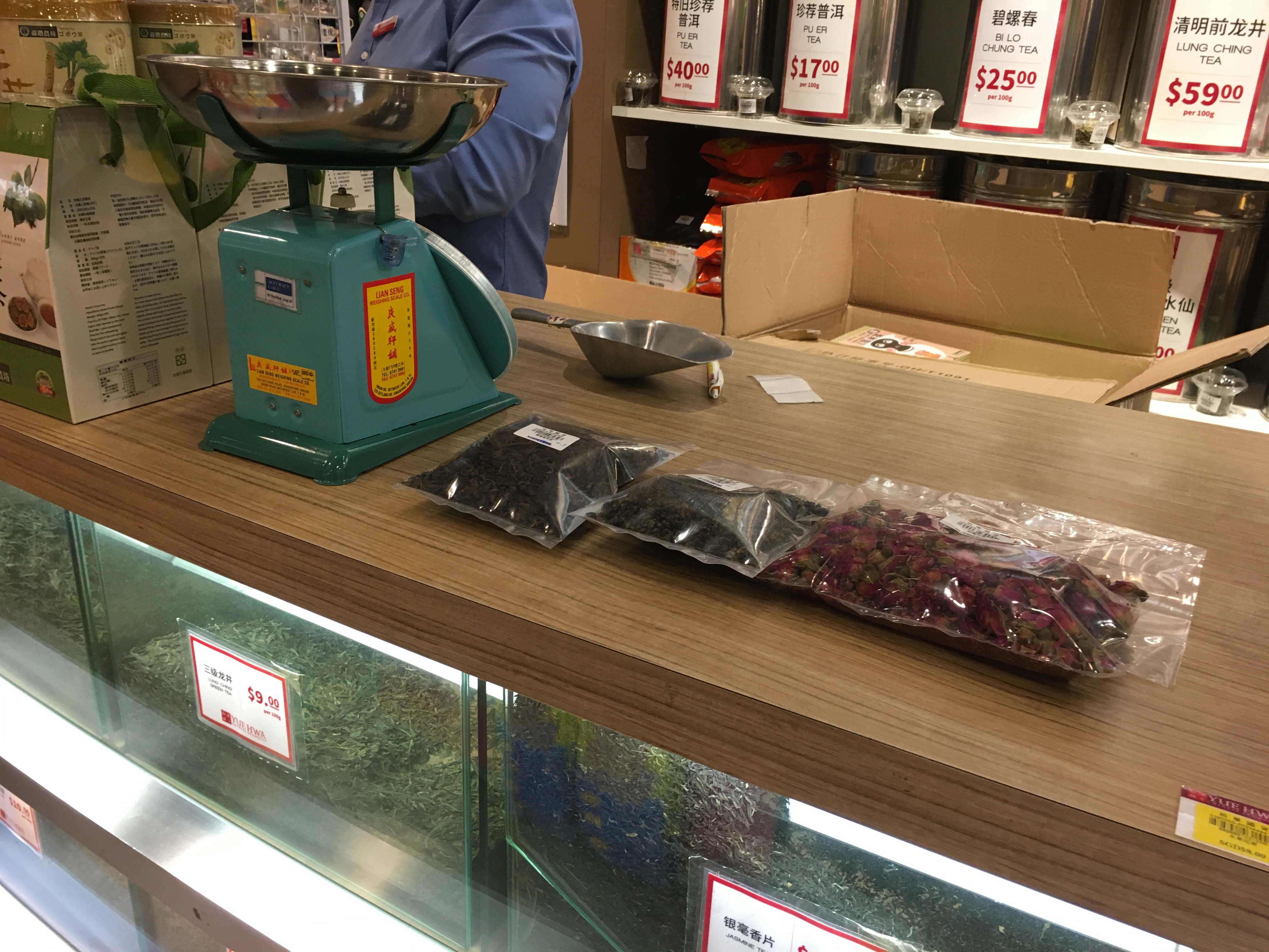
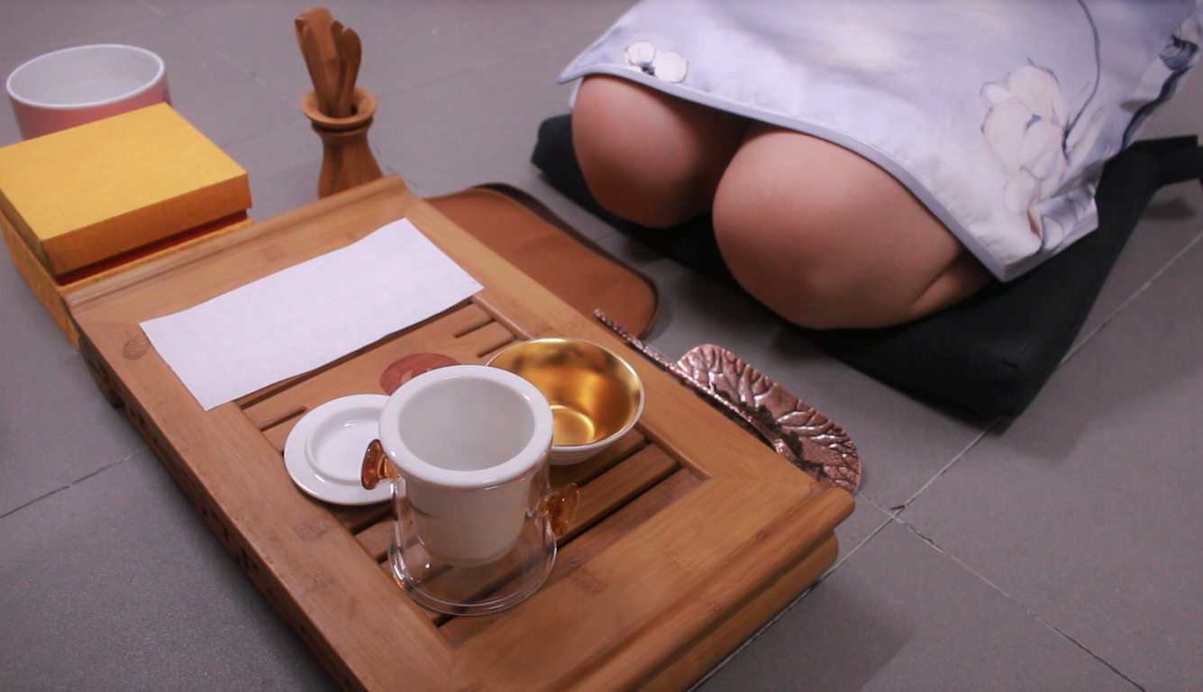
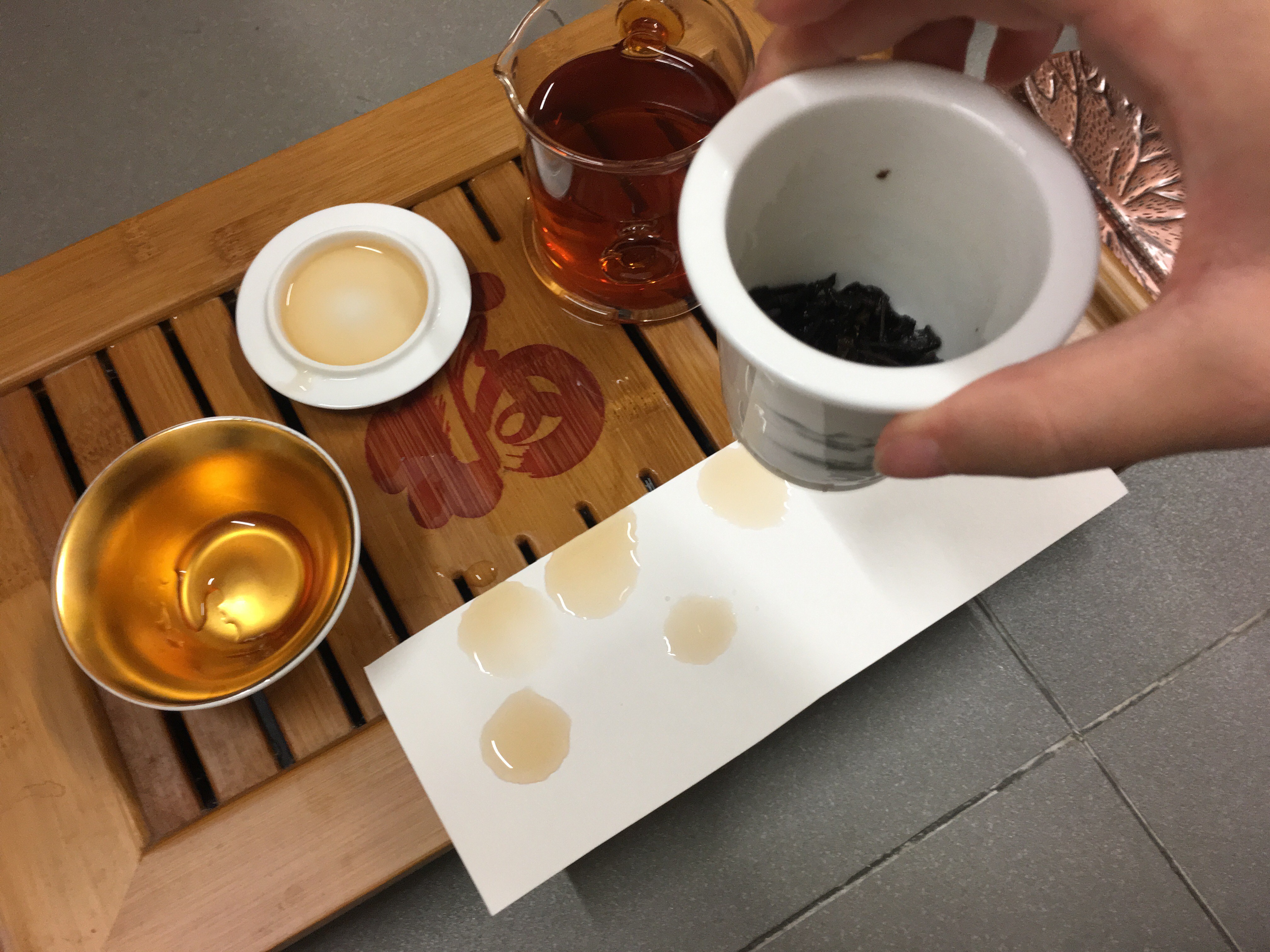
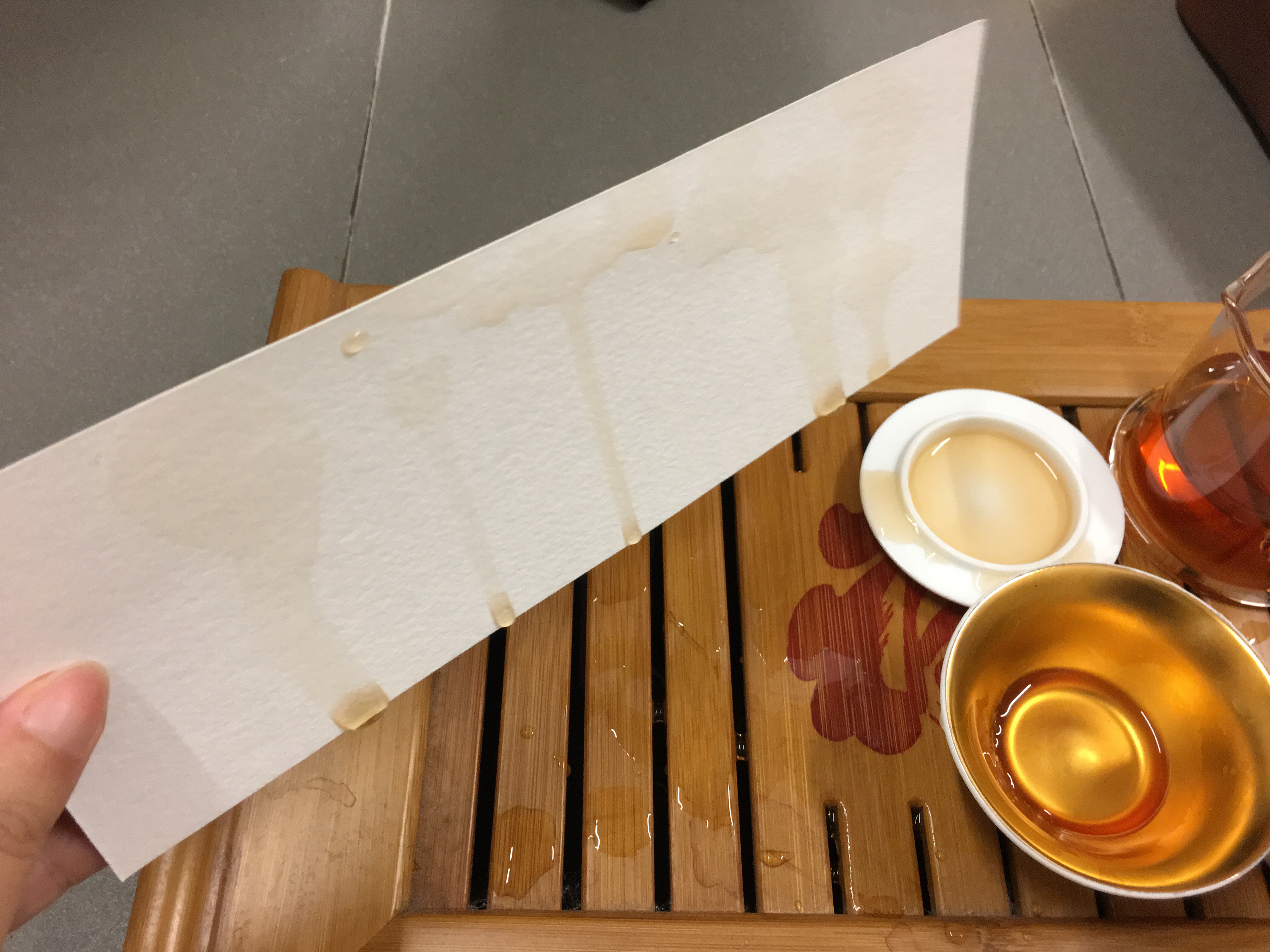
ENJOYMENT – CHINESE TEA CULTURE
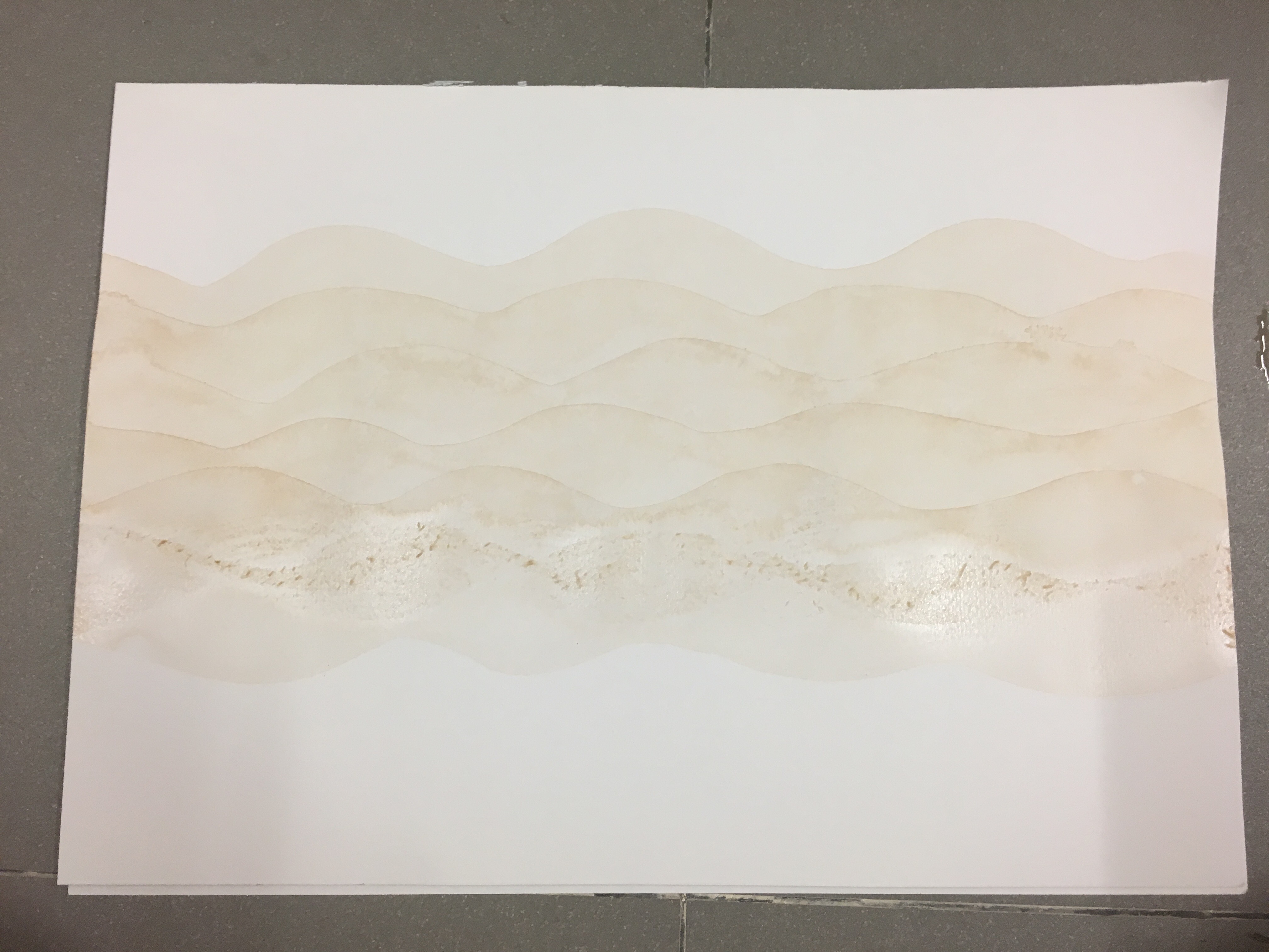
Final Artwork
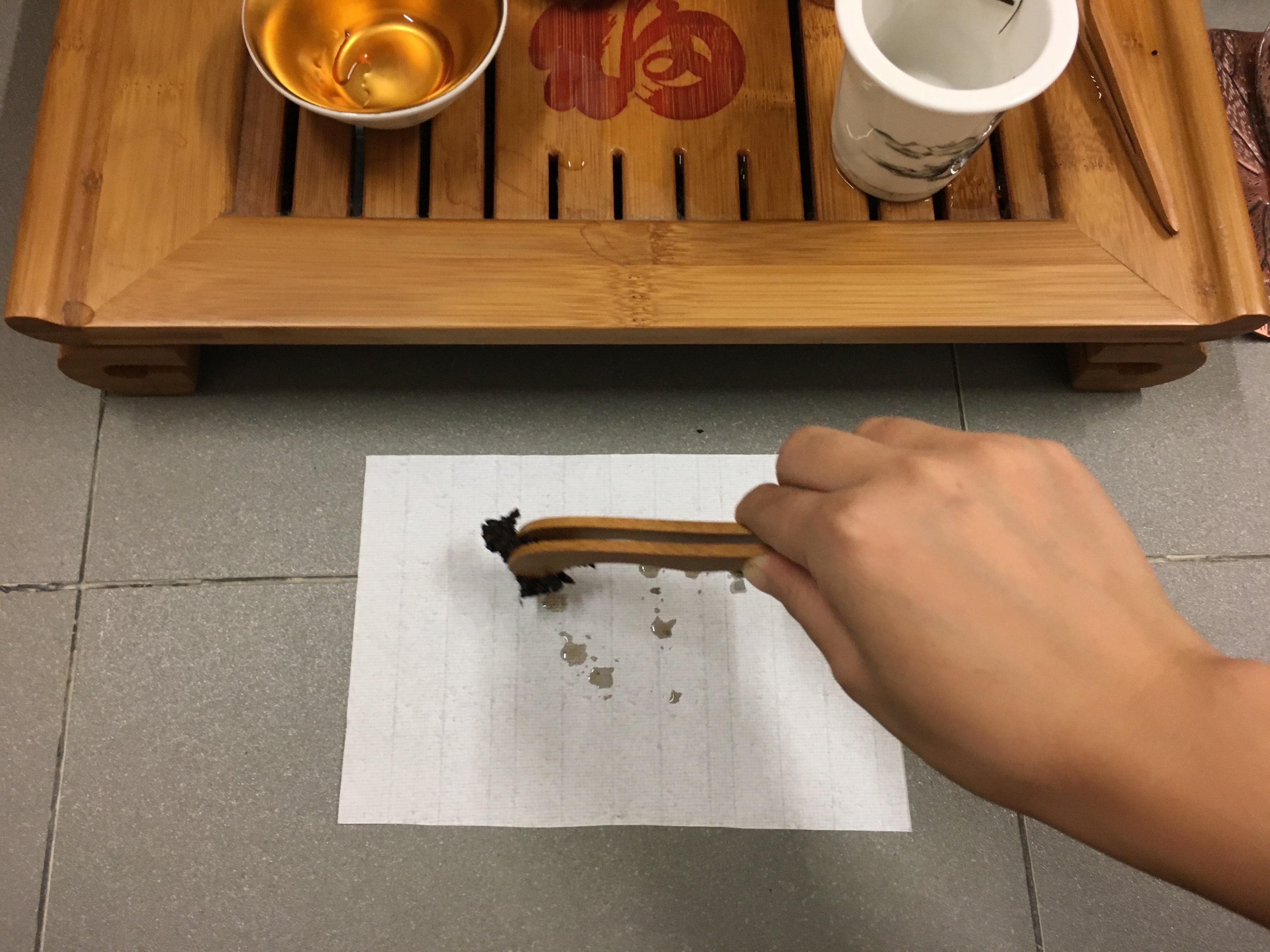
I was inspired by a Chinese artist Cai Guo-Qiang, who is deeply influenced by his cultural background. I started to pay attention to my cultural background after knowing more about Cai. I was born in China and spent my childhood there before I moved to Singapore. Chinese tea always plays an important part in my family, for example, family gathering. Everyone sits together, having the warm tea and share the joy.
Material: Chinese tea & Watercolour Paper
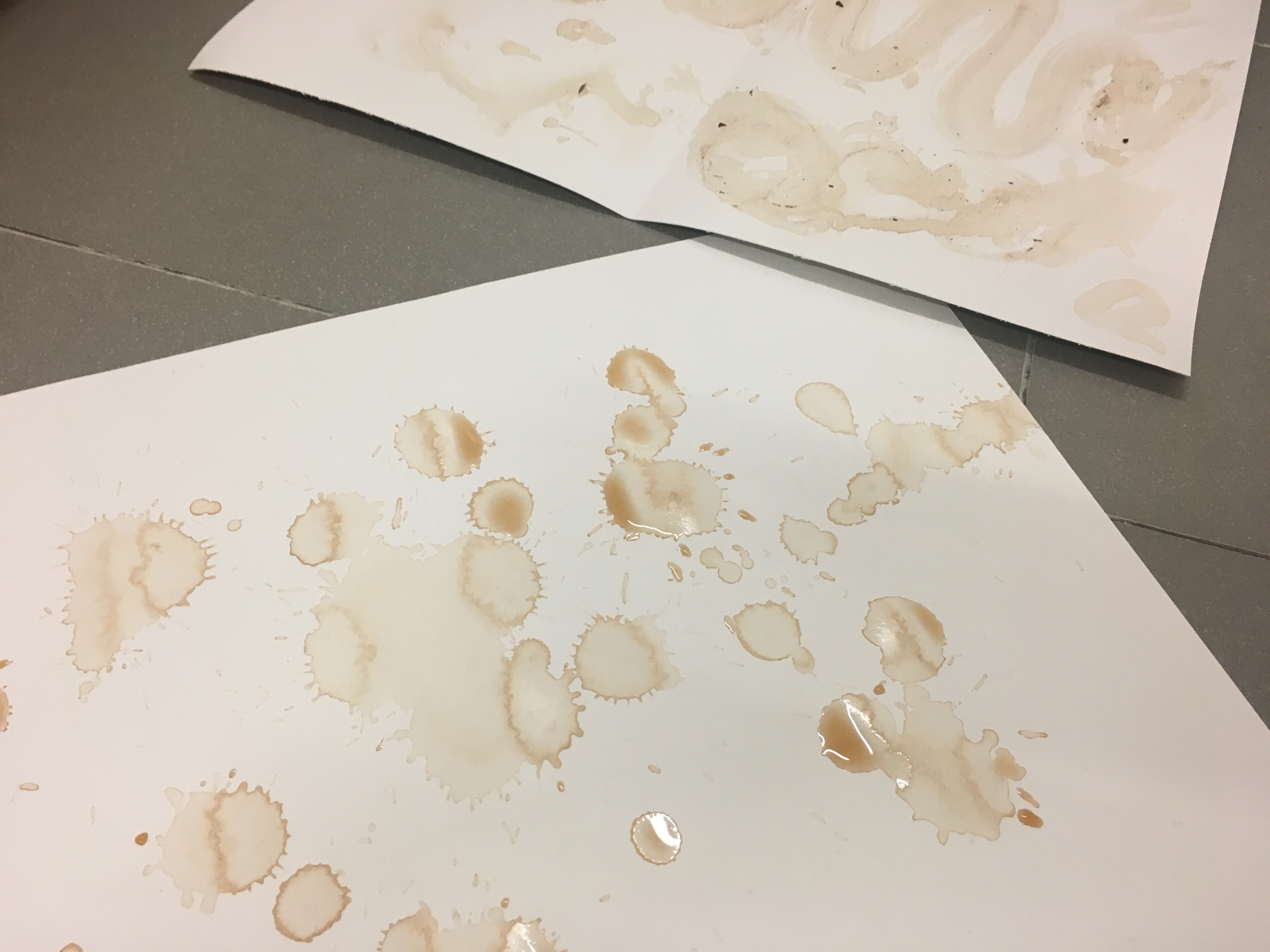
I started the experiment with different type of Chinese tea. I used the tea and tea leaves to draw in different motion on different kinds of paper, and watercolour showed the best result. As the paper would not warp too much when it meets water.
I cropped the part that had the cleanest lines. In the final artwork, repetition is used to create rhythm, a sense of uniform movement, which is like the process of making Chinese tea. In addition, when elements symmetrical, the design feels harmonious formal. The low-value colour of the artwork is the original Chinese black tea. It is visually subtle that create a calm feeling. The design principles used here represent the function of tea, that ties family members together, and shows the sign of respect.
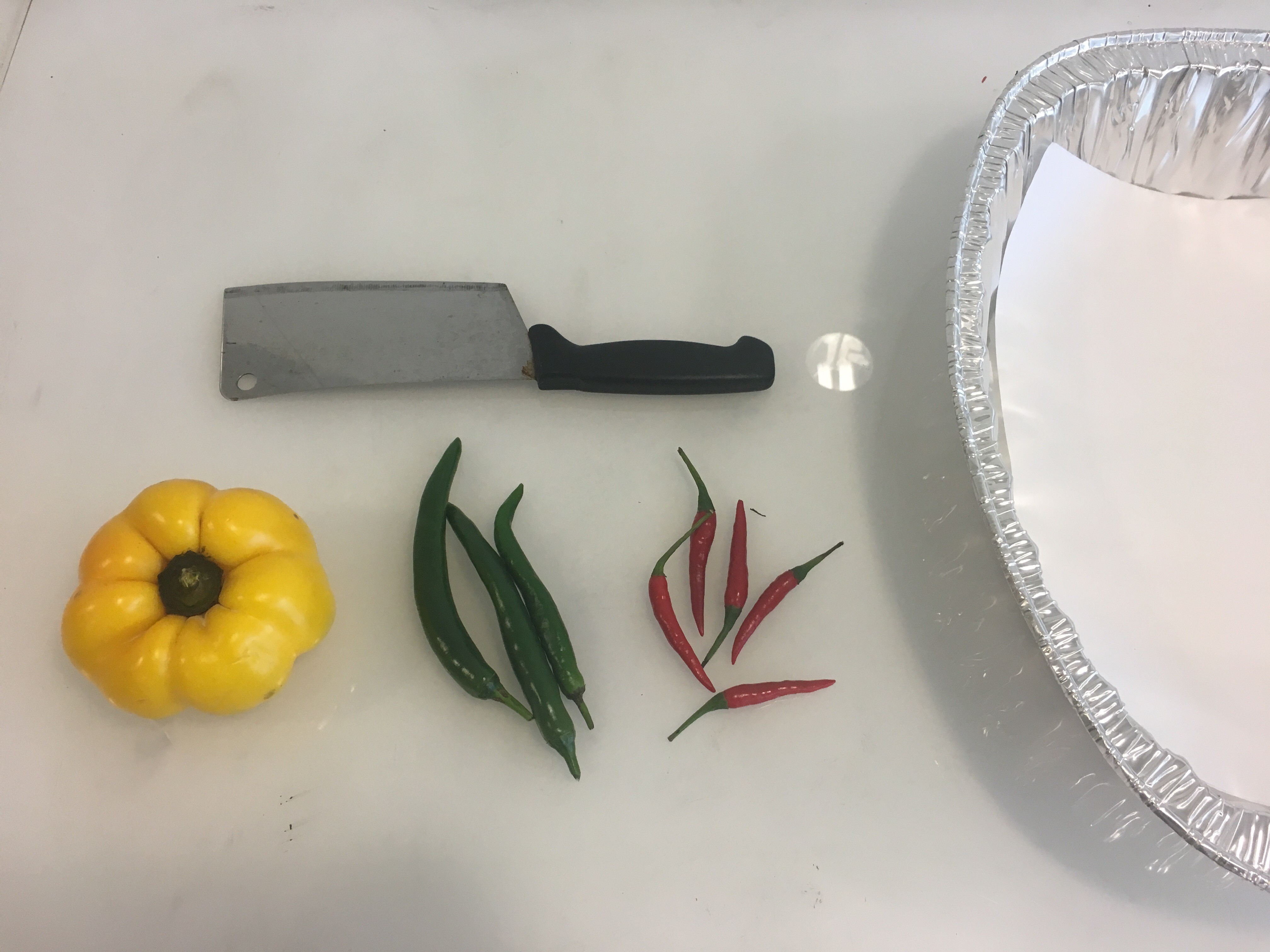
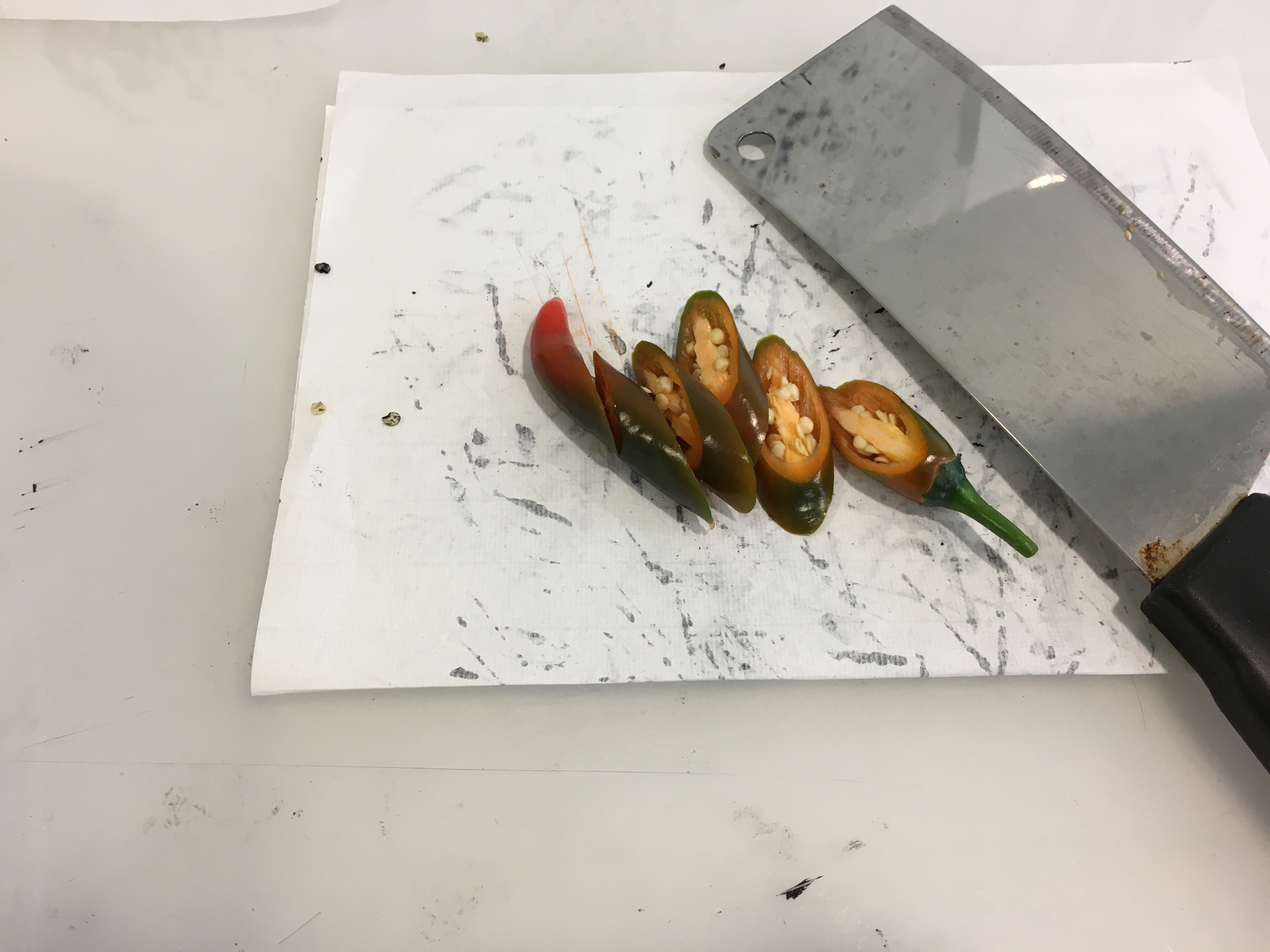
SATISFACTION – CHILLI
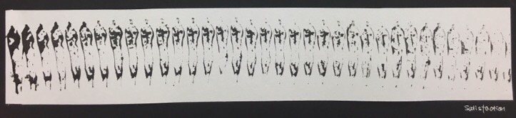
Final Artwork
Chilli is my all time favourite food. It goes well with all kind of ingredients. I always feel satisfied when eating or cooking spicy food.
Material: Chilli, Chinese ink & Watercolour Paper
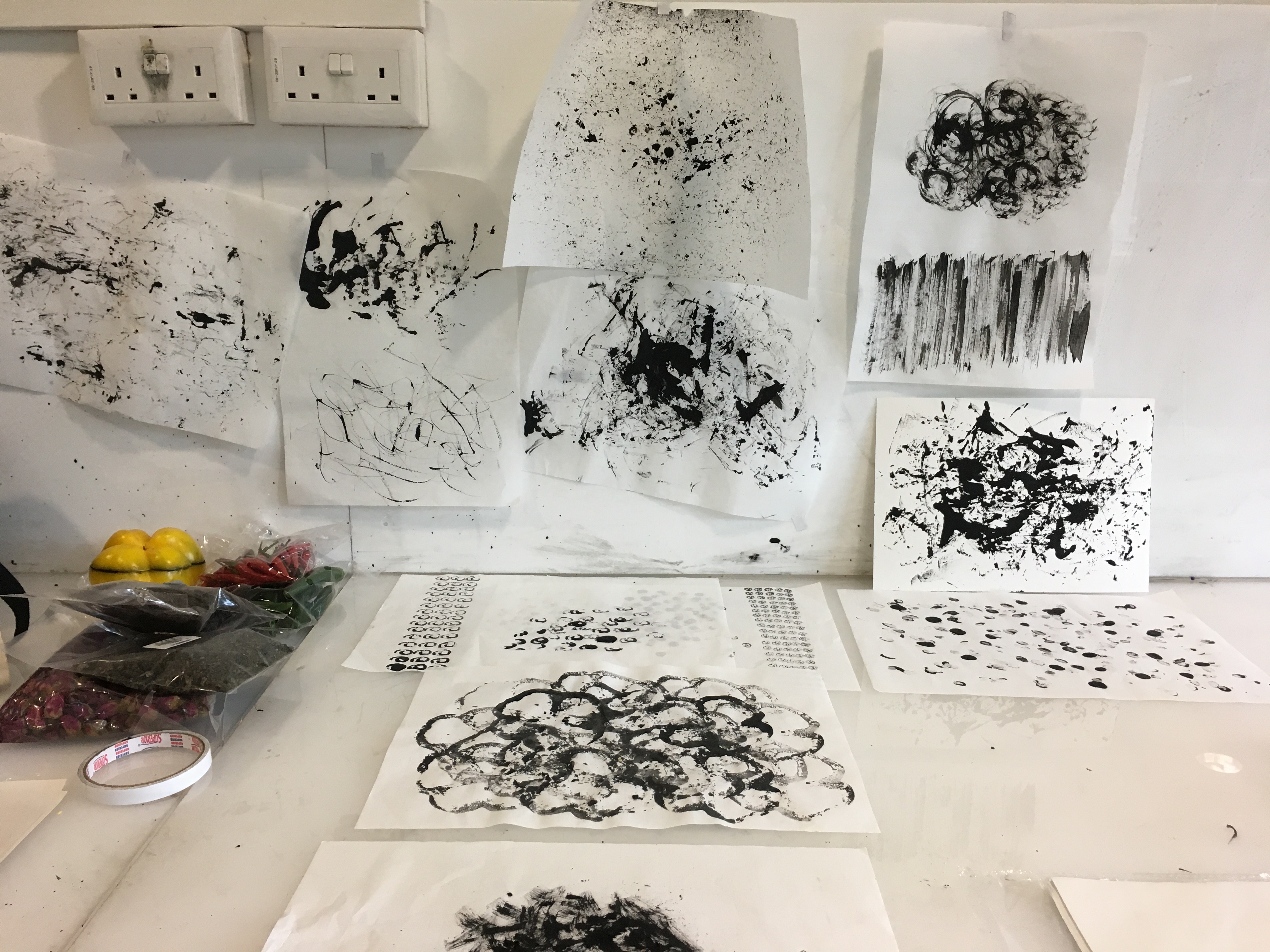
I had tried several methods to do mark making with chilli. I prepared a aluminium tray and ‘fried’ chilli in different shapes, as the process of frying chilli is satisfying. Moreover, I tried to dip different shapes of chilli in the ink and stamp them on different types of paper.
In the final artwork, repetition is used to create a feeling of organized movement. The gradual change of value leads the viewer’s eyes to move back and forth. The consistent movements bring a feeling of intense excitement and happiness.
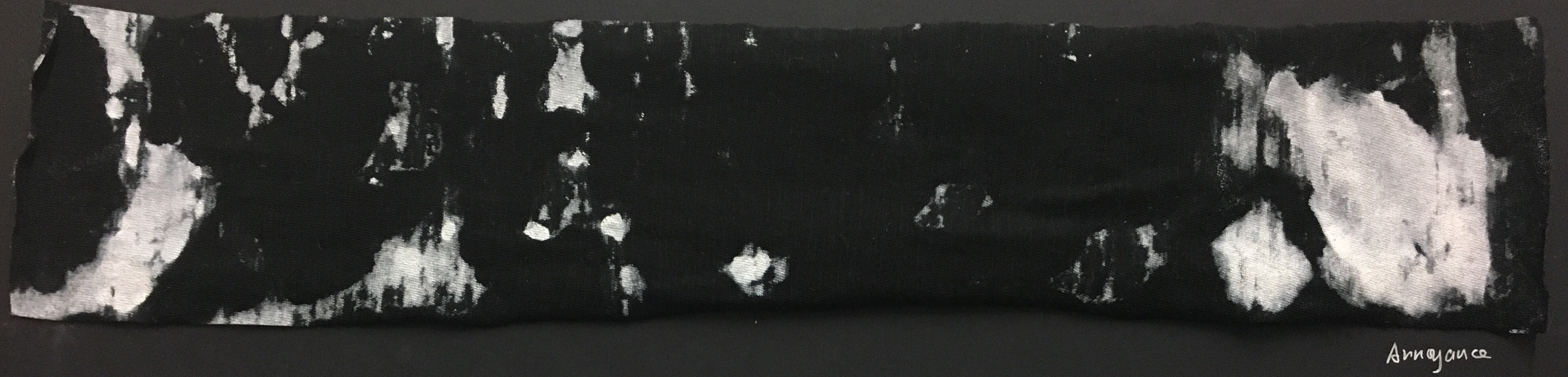
ANNOYANCE – DREAM
Final Artwork
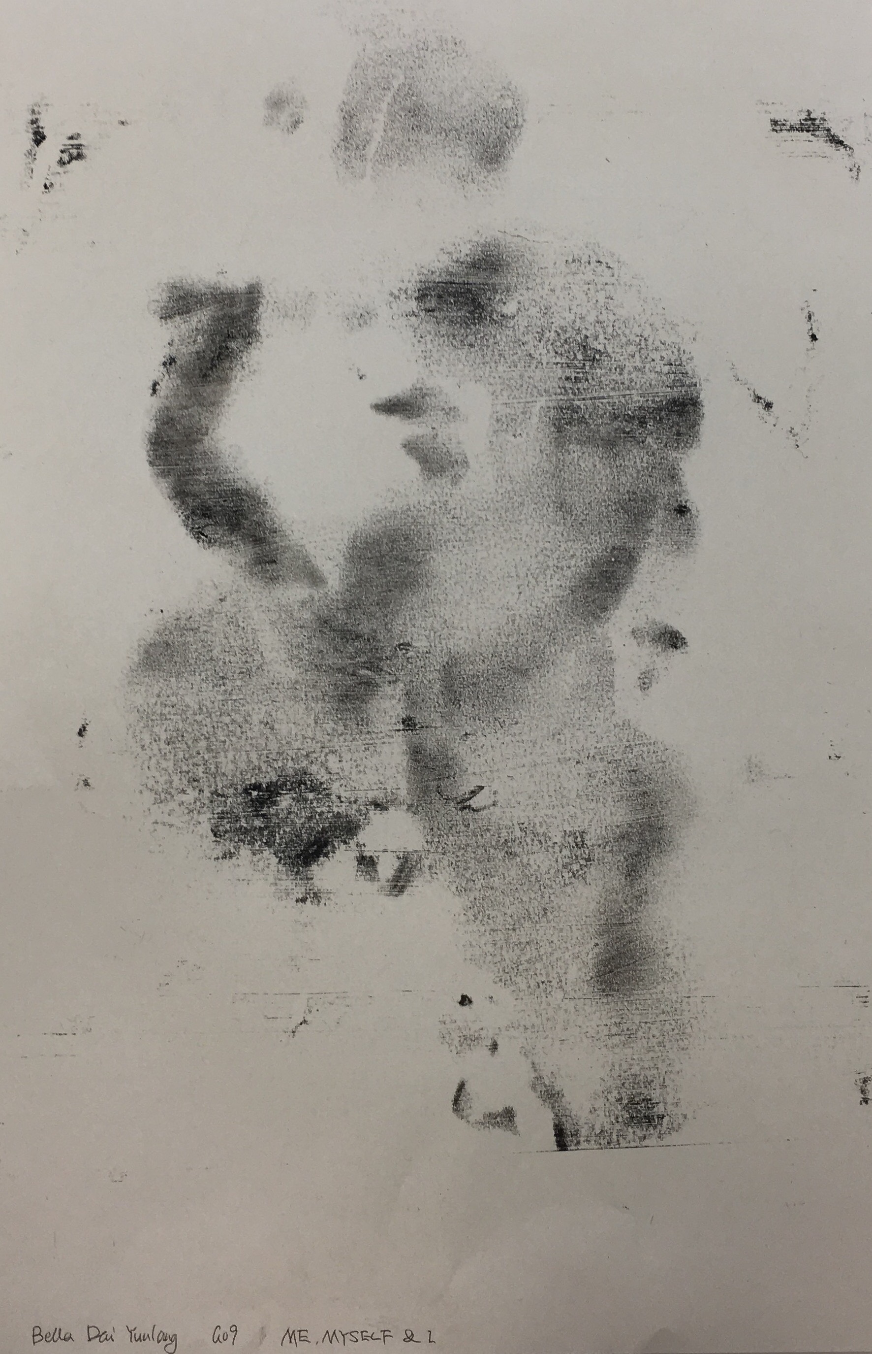
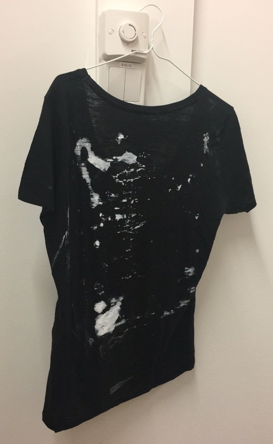
Dream reminds mysterious since the start of human history. It is a succession of emotions, images, ideas, and sensations. I always mix what happened in my dream up with the reality. It is annoying that I try to remember my dream but the memories fade so fast.
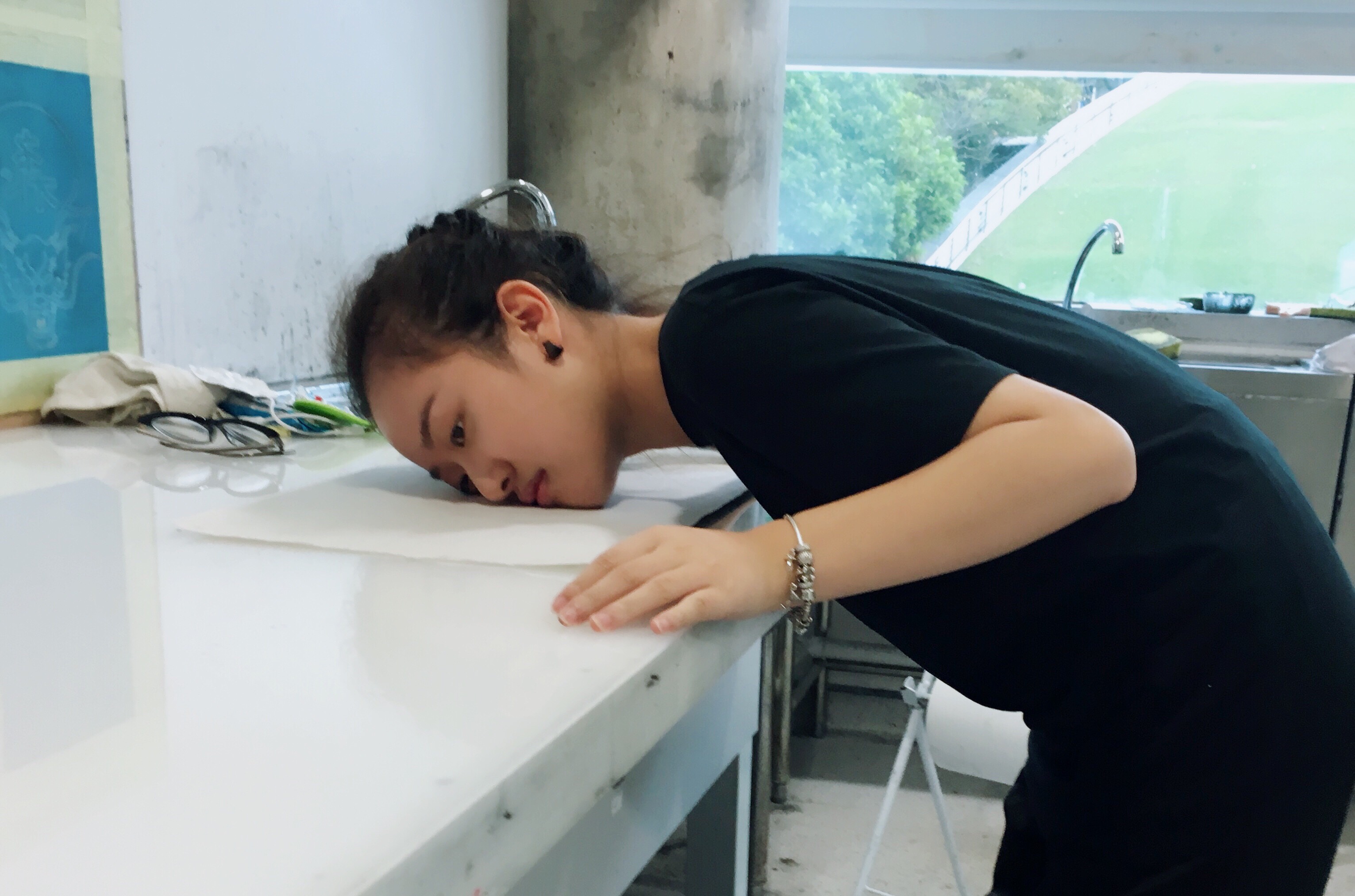
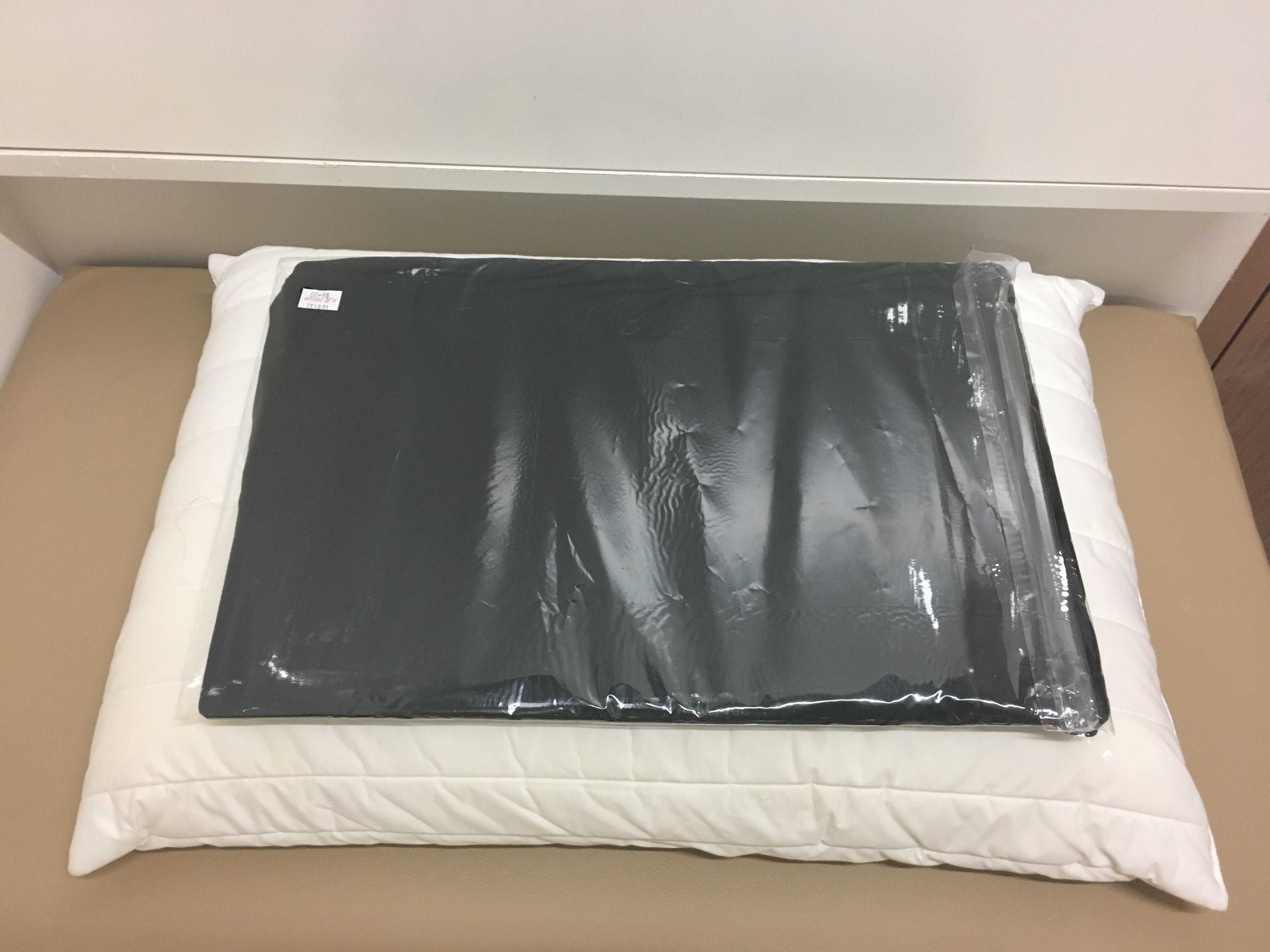
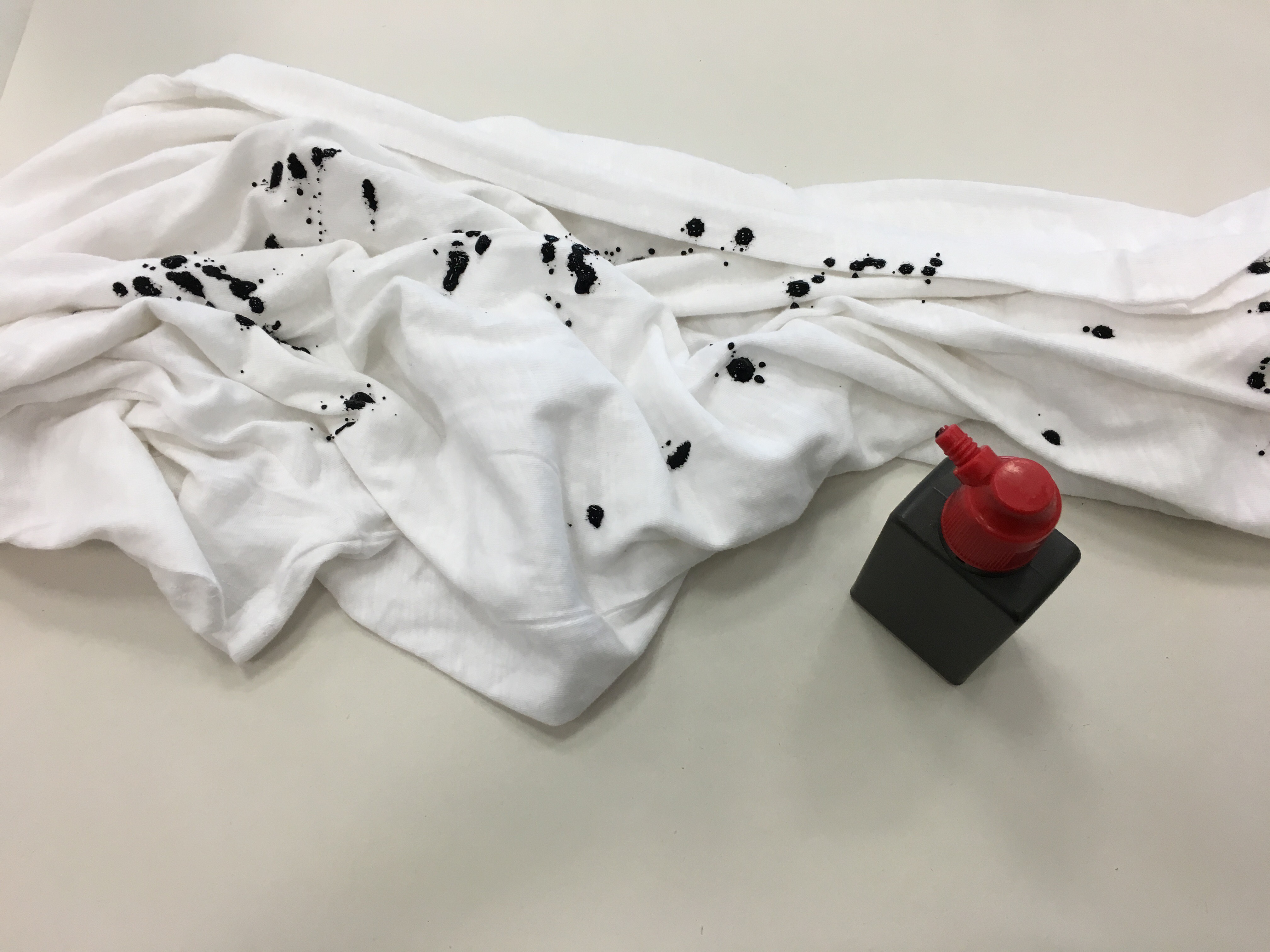
Material: Black Cloth (t-shirt), Poster Colour & Cutting Mat
At first, I was trying to use my face to do mark making, and I found out this illusionary effect I got because of different amount of pressure. It reminded me of the feeling of dreaming. Therefore, I decided to use the similar method for the final artwork.
This mark making was done while sleeping. I applied white poster colour on the cutting mat, covered with a black t-shirt and plastic bag. Then placed it on my pillow. The shapes and the value of colour were determined by the movement of my head on the pillow.
The marks on the black clothes were irregular. those shapes represent nothing other than what we see like we are always confused by the meaning of the dream. The cropped part is where my head mainly moved around, like the track of my dream. Further, the composition is not symmetrical, which creates feels of informality.
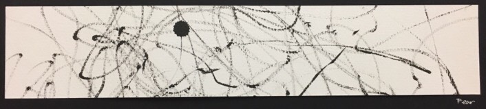
FEAR – MY CONSTRAINT
Final Artwork
In the past few years, I always restrict myself with rules that set by the other’s opinions and forgot to listen to my heart. My deepest fear is losing freedom physically and mentally. I am eager to see the world with my own vision and follow the direction of my true feeling.
Material: String, Brush Pen & Watercolour Paper
The artwork was done unconsciously, that I blindfolded myself, tied my hands together, and hung the brush pen with the string. My vision was taken away as well as my freedom. I had down a few times and the cropped part has a dot. It was caused by accident, which represents the uncertainty of life.
The expressive curvy and ununiform lines tend to lead the viewer’s’ eyes wandering around the space to nowhere, which creates a sense of chaos like my fear towards the constraint.
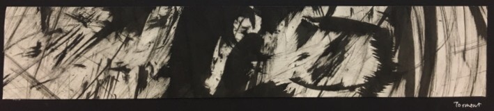
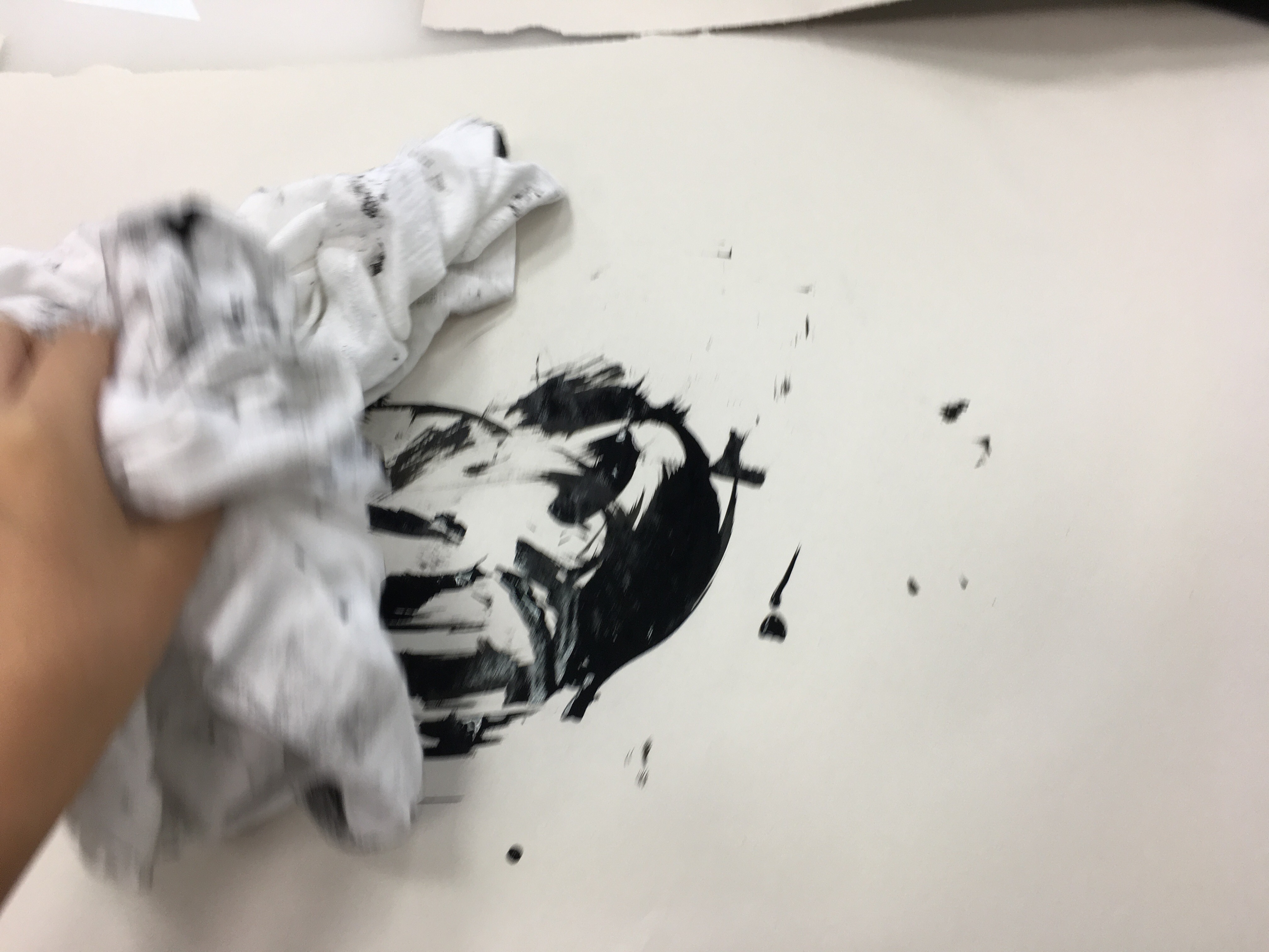
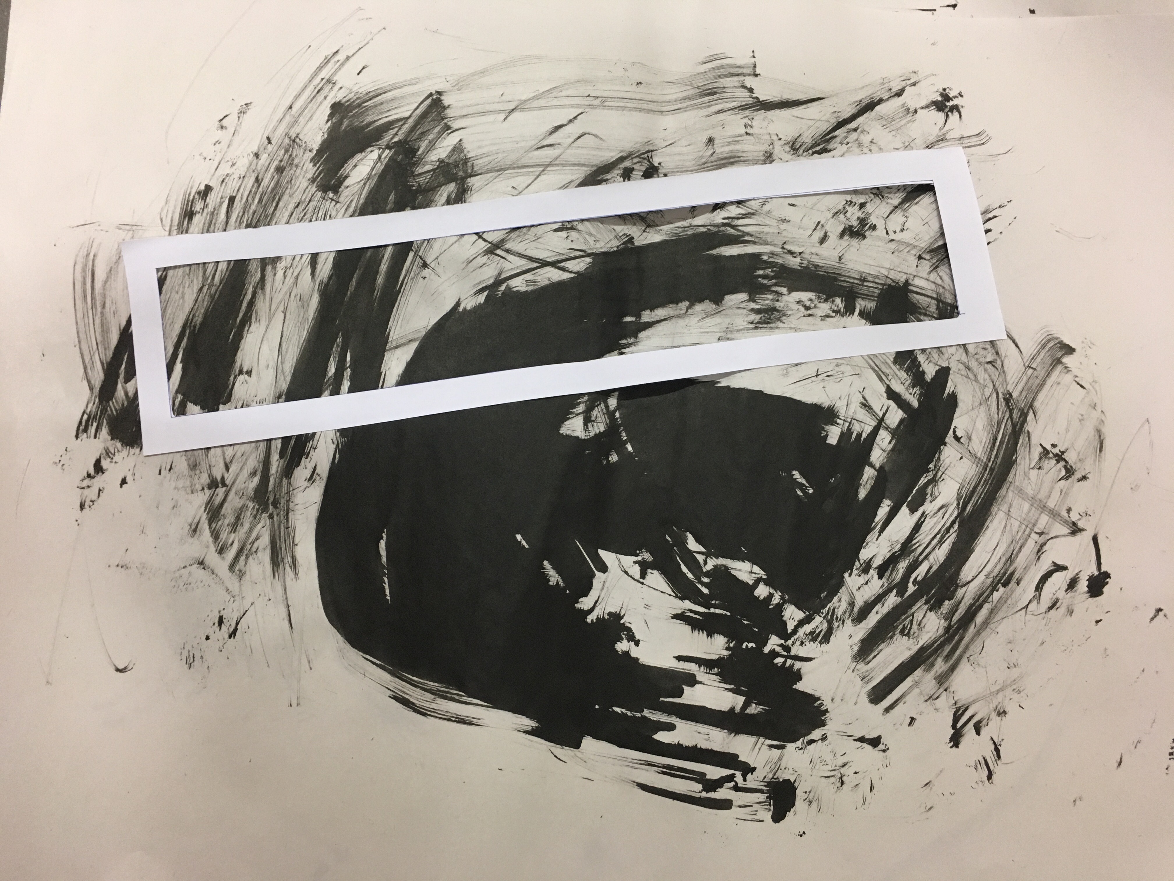
TORMENT – I HATE LAUNDRY
Final Artwork
I lived by myself since 15 years old, thus I have to do my own laundry. It is the housework that I hate the most. By right, I should do laundry at least once a week. However, I often postpone it until I have almost no clothes to wear.
Material: Clothes, Black Chinese Ink & Newsprint
I threw and rub the clothes with black Chinese ink on the newsprint.
I had done several prints. The chosen area content dark patch, sharp shapes, curvy and straight lines. The composition is not symmetrical, also not in any regular order. The mix of different elements forms no unity, which is chaotic.
ALL IN ALL
In Class Group Exercise
I enjoyed having this project as I experimented with different mediums to express emotions, not just the conventional ways with paper and pen. Also, I was inspired by great artists through research and the in class group exercise. Abstract art was a challenge for me, as I am more familiar with realistic drawing. Through this project, I have a better understanding of using design elements and principles to express thoughts.