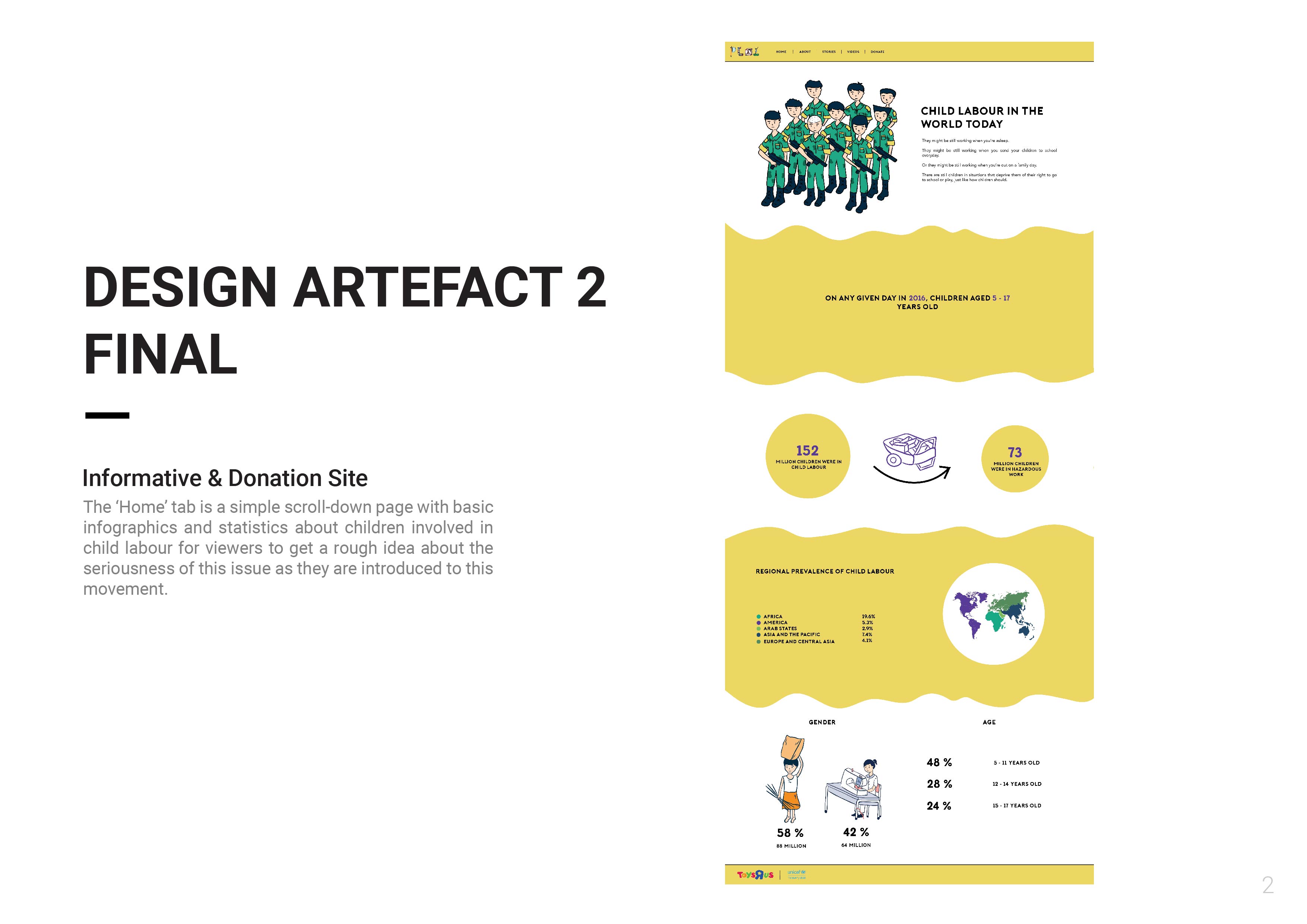
Please click on images to have a clearer view.
Link to website prototype: https://invis.io/47GQJILVYGH
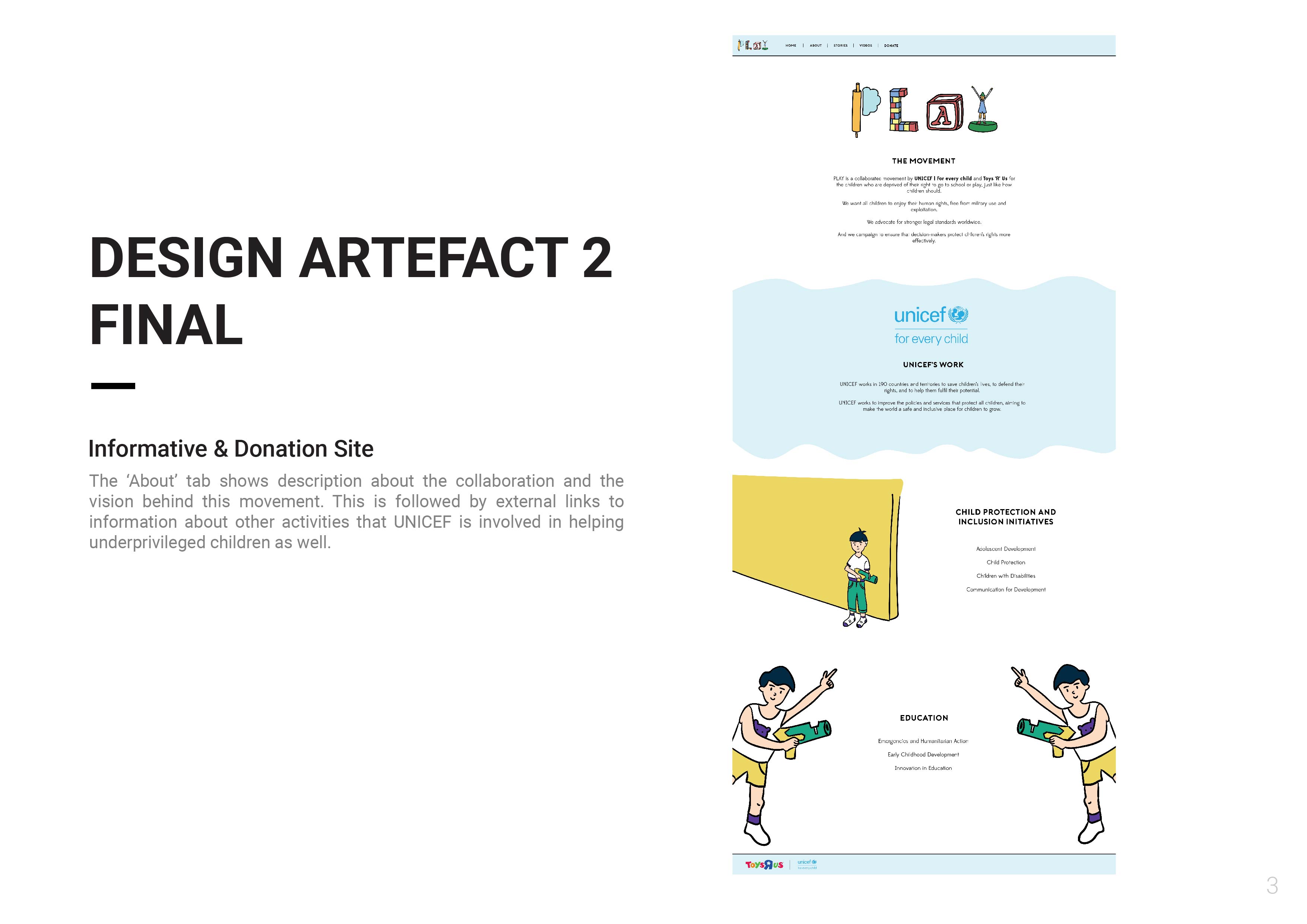
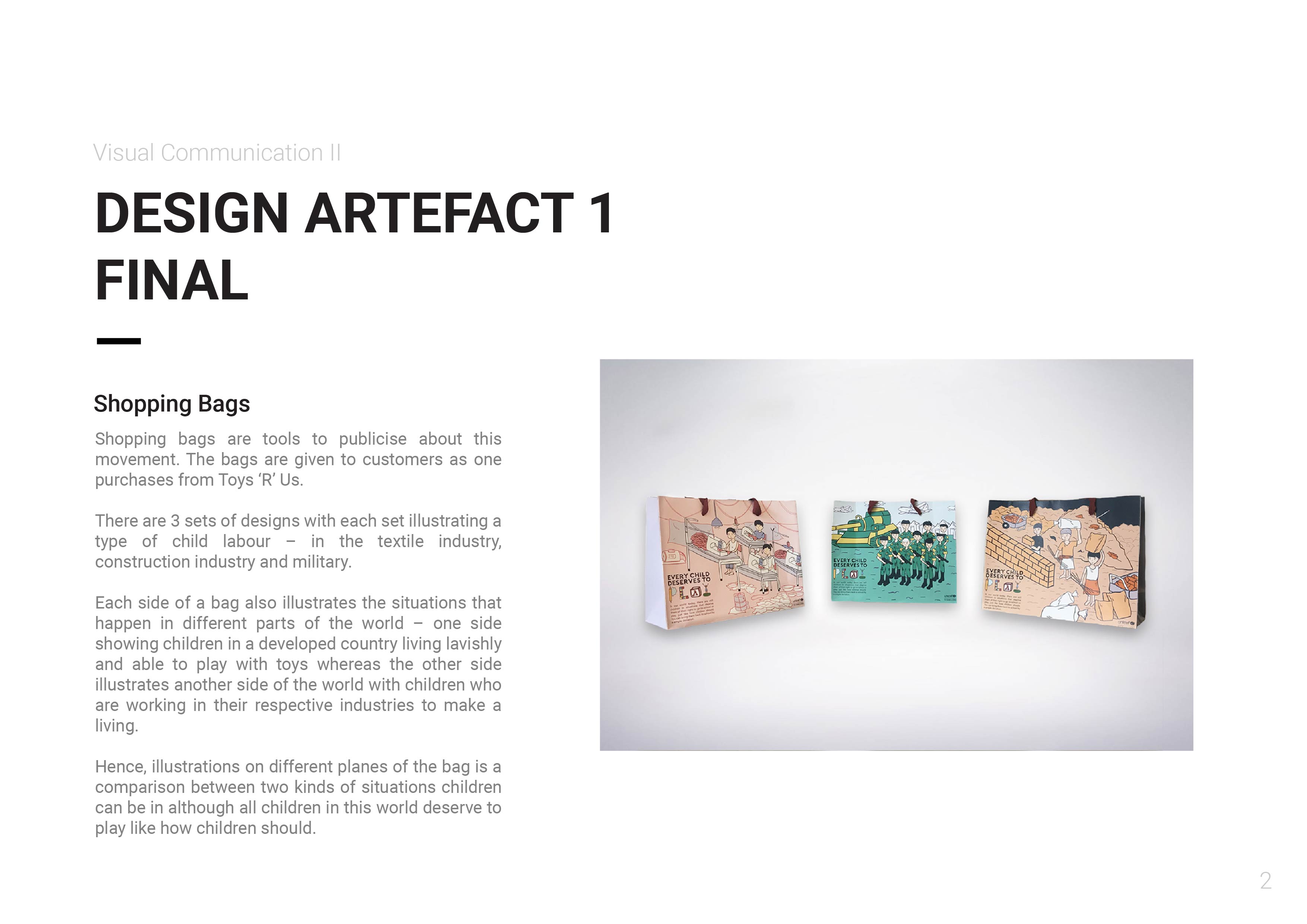
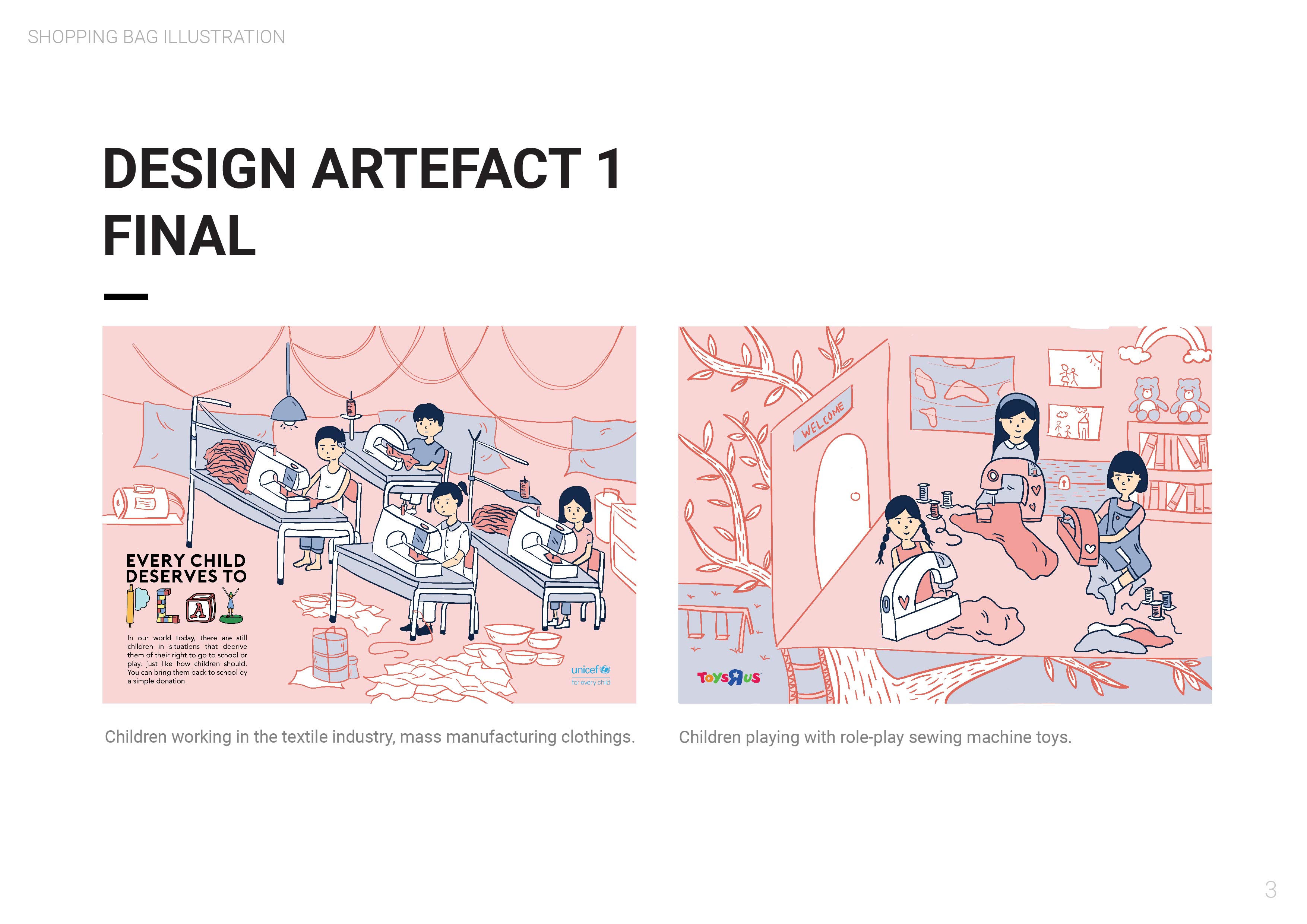
Please click on images to have a clearer view.
Link to website prototype: https://invis.io/47GQJILVYGH
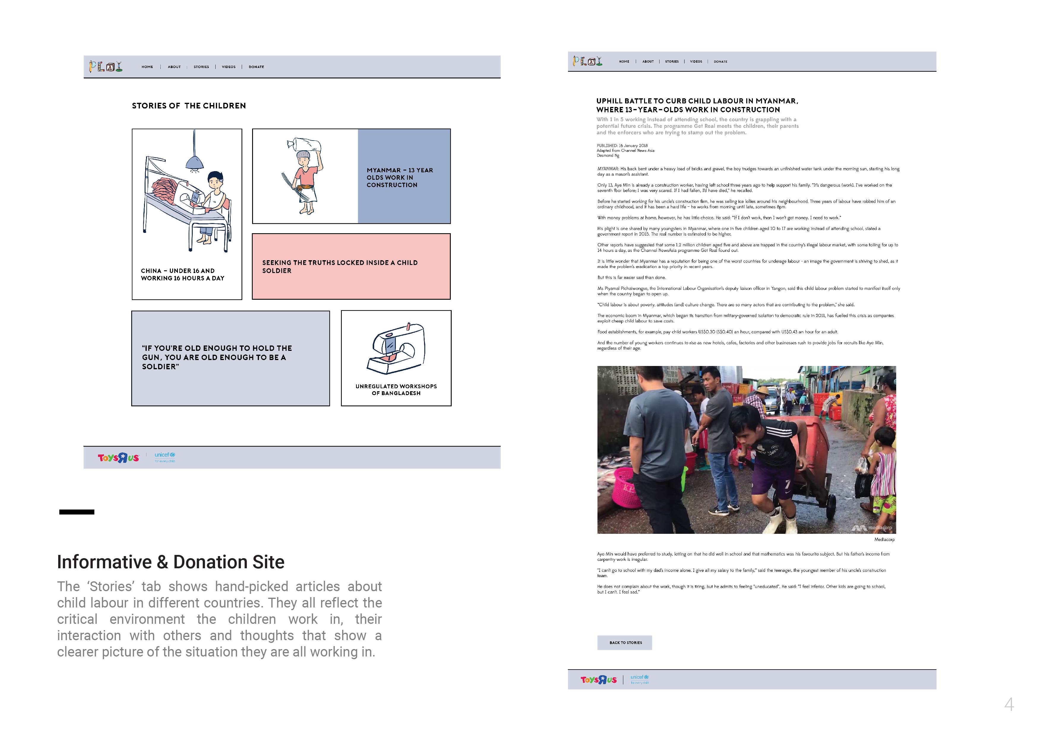
Please click on images to have a clearer view.

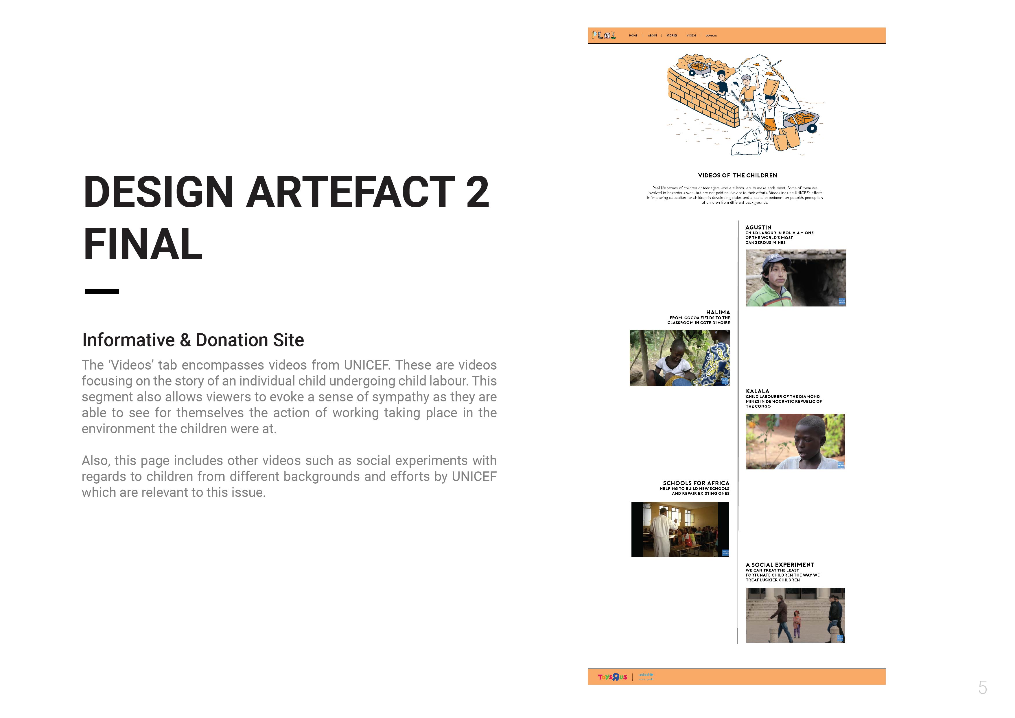
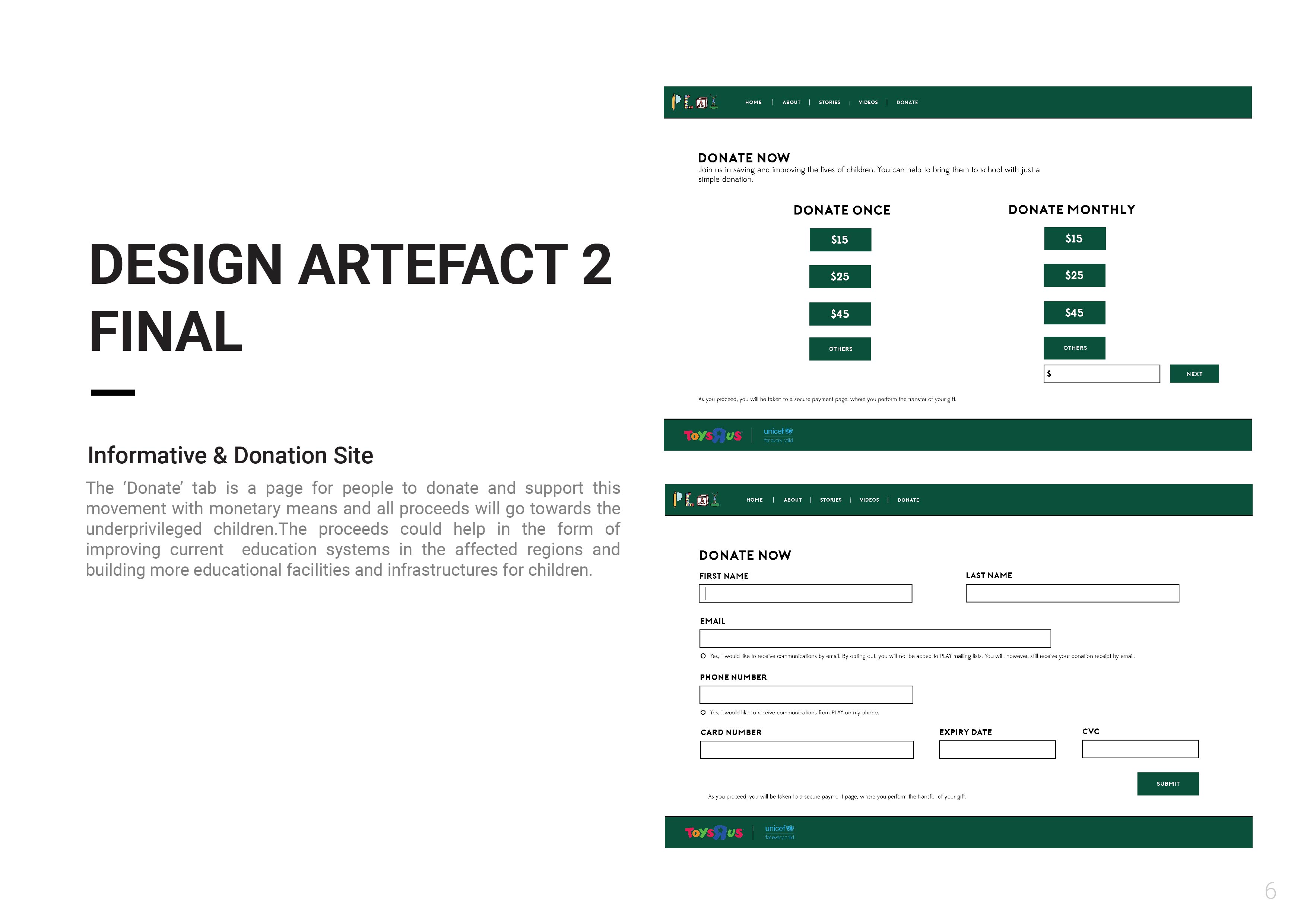
Please click on the images for a clearer view.


What are some of the current issues confronting our world today? Amongst them what is of interest and cause a concern to you?
There is a low consumer awareness of genetically modified food products. Support for both plant and animal-based GM foods appears to have declined somewhat between 2001 and 2003. Overall, fewer Americans (from a research targeting at the American community) also seem convinced that GM technology will improve the quality of their lives. Hence, with the lack of awareness and knowledge about the advantages of GM food, some of the world problems such as poverty be inevitable.
https://ageconsearch.umn.edu/bitstream/22058/1/sp03ha05.pdf
https://www.alternet.org/food/bill-gates-mission-sell-gmos-africa-hes-not-telling-whole-truth
http://science.sciencemag.org/content/327/5967/812
https://www.theguardian.com/environment/cif-green/2009/jul/08/gm-crops-povery
2. Environment – Climate Change – Melting Glaciers in specific
The exacerbation of Global Warming has led to the melting of Glaciers. They are melting so much that they are changing the shape of the Earth’s crust. This subsequently leads to catastrophes such as rising sea levels and floods especially in poverty-stricken countries. E.g. Southern Louisiana are sinking a meter every century.
https://www.nationalgeographic.com/environment/global-warming/big-thaw/
http://www.independent.co.uk/environment/glaciers-melting-earth-crust-shape-change-climate-change-global-warming-nasa-solitary-wave-rink-a7762756.html#gallery
https://climate.nasa.gov/climate_resources/4/
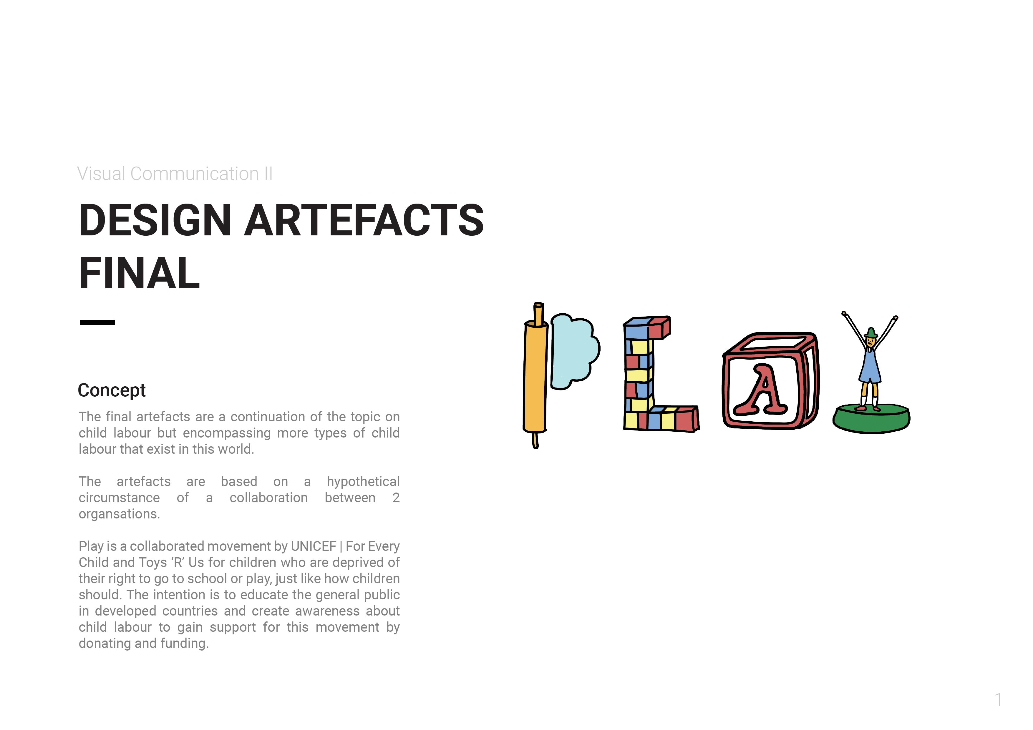
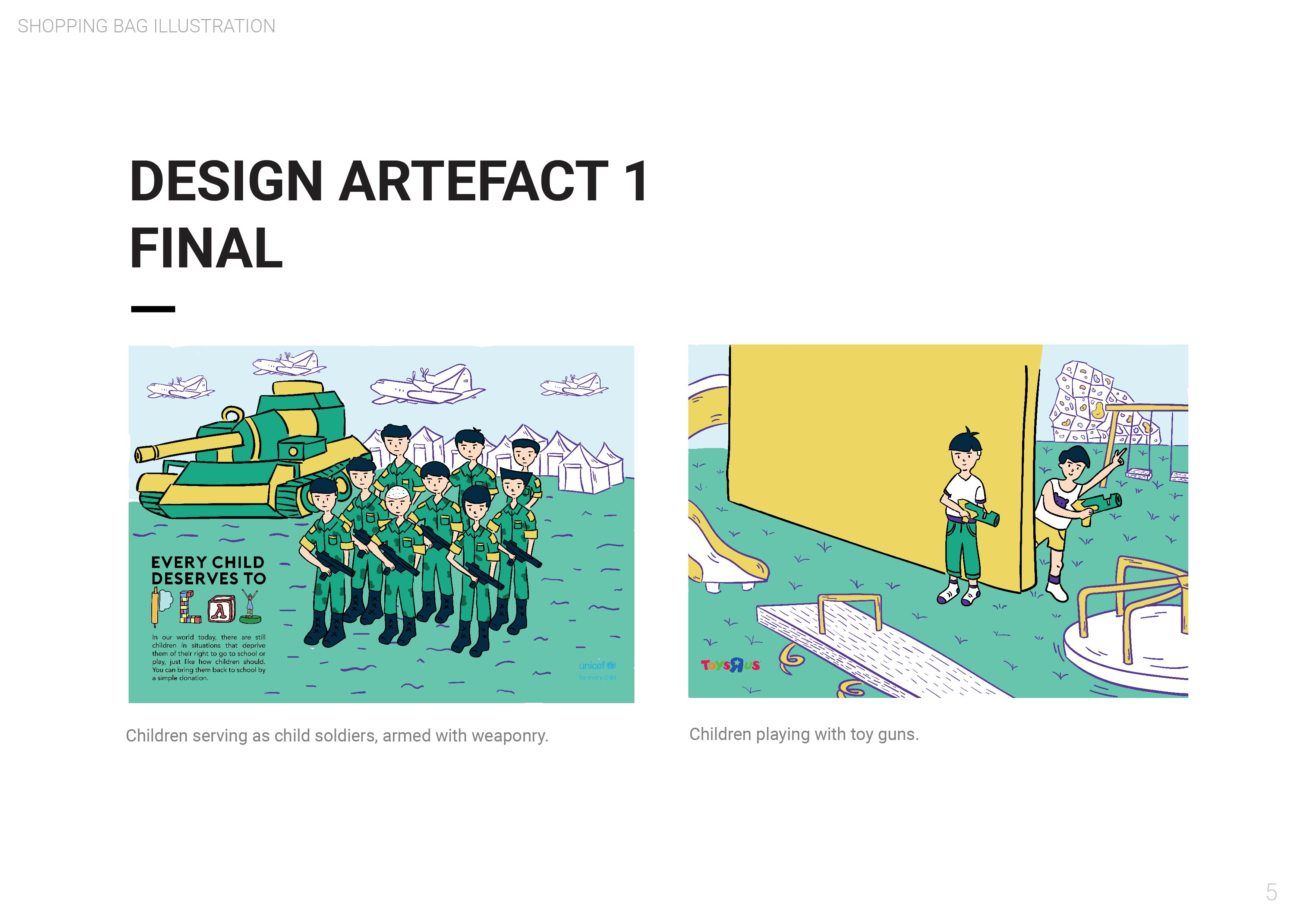
3. Social – Child slavery, child soldiers (chosen topic)
One of the issues haunting the world today is child slavery in the form of child soldiers. KONY 2012 allowed the world to bring our attention to the presence of children who are trained militarily from as young as 4-year-old. These children are deprived from education and are affected both physically and emotionally as well.
https://www.child-soldiers.org/who-are-child-soldiers
http://www.refworld.org/publisher,CSCOAL,,,5845375f4,0.html
https://www.hrw.org/topic/childrens-rights/child-soldiers
4. Social – Discrimination against ex-convicts
It is a fact that there is discrimination and prejudicial practices against ex-convicts especially in the workforce. Despite campaigns and movements to solve the disparity, the perceptions of some are still unchanged towards ex-convicts as individuals with questionable character or have unfound fears that they might commit crimes again which cause them to be deprived of opportunities for employment.
http://www.yellowribbon.org.sg/lend-a-hand
Why is the issue important? Who does it affect and how?
Child soldiers are children (individuals under the age of 18) who are used for any military purpose. Some are in their late teens, while others may be as young as four. They are not only boys – many are girls. Some child soldiers are used for fighting – to kill and commit other acts of violence. Others are used as cooks, porters, messengers, informants or spies, or in any other way their commanders want. Child soldiers are also used for sexual purposes.
Children’s development, health and well-being are disrupted when they are drawn into military organisations. Recruited children, particularly those used in armed violence, run a high risk of being killed or maimed, and of suffering serious psychological and social problems afterwards. Military training is designed to break children down psychologically until they obey commands without question, which can alter their personality in the long term. Some children can be tremendously resourceful in finding ways to cope, but they should not have to face risks such as these. Witnessing killing, and especially taking part in it, is particularly harmful to a child, who is still developing psychologically and emotionally. Children associated with military forces also face a higher risk of being sexually abused by adults or other children in their military group. Such traumatic events can disrupt children’s development, staying with them for the rest of their lives. Bullying, physical violence and sexual harassment are common in a military environment.
Who do you need to communicate to, and why?
The presence of child soldiers ought to be known by the general public, especially adults living in developed regions which are not really exposed to such an issue. With the awareness about the children, people can help by doing a few things as simple as fund raising in bringing back the children from the military to the normal lives of being a child and attend school to receive proper education. Also, there are initiatives allowing children living in conflicted areas to participate in workshops or the media to learn about child rights and to stay away from violence.
From communicating with the general public, the idea of shock could be anticipated from people who are oblivious to this issue occurring in the present world. The effect of shock after being educated could be effective in encouraging them to step up and support the movement of educating children.
How has visual communication contributed to address the cause?
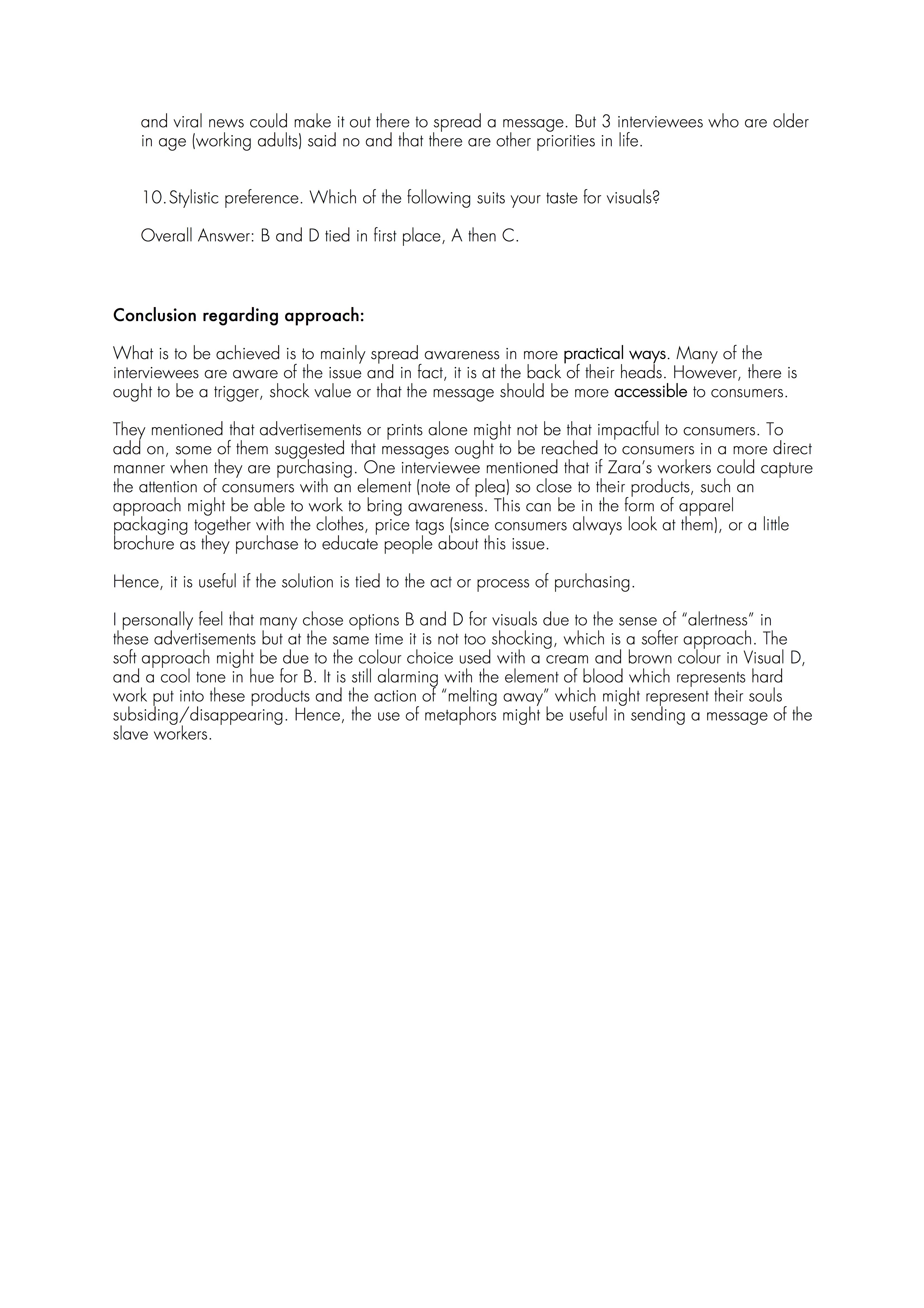
 From https://www.behance.net/gallery/7823859/aware-organization-campaign
This was created by Agnes Natalie in 2013 from AWARE Singapore Campaign for Domestic Violence Against Women and it portrays “how beauty hides painful secrets”. One quality that I appreciate from this advertisement is about how the page is so simple with the accent of the red lips being the focal point and the element of blood which is the main message to be brought about. The words are bold which shows the seriousness of this issue reminds the reader in a stern manner and somewhat alarming. Overall, a straight to the point design.
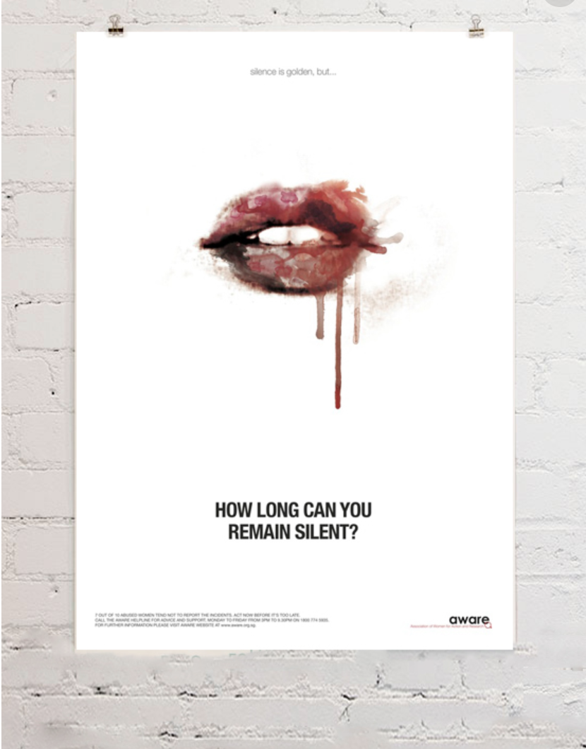
From https://www.pinterest.com/pin/285274957616640253/
The artist for this piece is unknown. What struck me is the comparison of a non-living being with a cut out of a forlorn-looking girl at the back to portray the message of child-marriage. I think that this is also very clever in terms of the concept of marriage portrayed by the doll which suggests a bride. Although not as straight-forward, the thinking process would leave viewers with a shock factor which then creates an impression and impact about the issue.

From https://www.pinterest.com/pin/348184614913911644/
Luba Lukova created this artwork in 2009-2010. Not exactly sure about the issue to be addressed in this piece but it definitely compares how a particular society focuses and lives on war and does not believe in educating its people. It is a clever idea from the artist to focus on icons from a particular subject like a pencil for education and a bomb for war and how the pencil shredding is equivalent to the deteriorating state of the education system in the society which the artist wishes to illustrate on.

Please click on the pictures to get a clearer view! 🙂
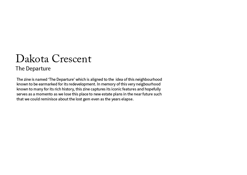

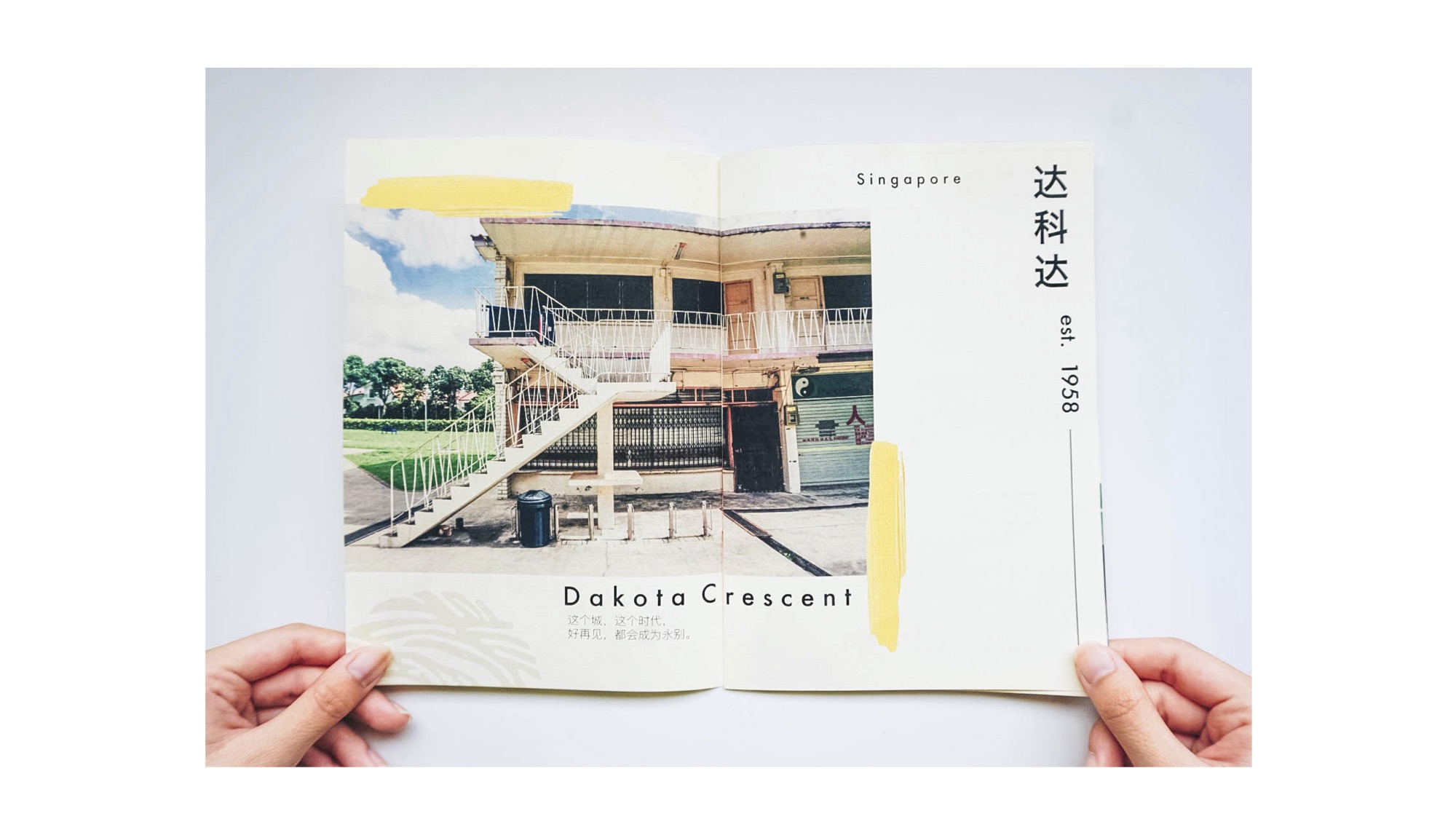

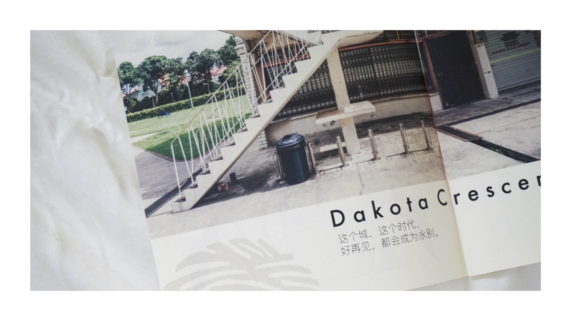


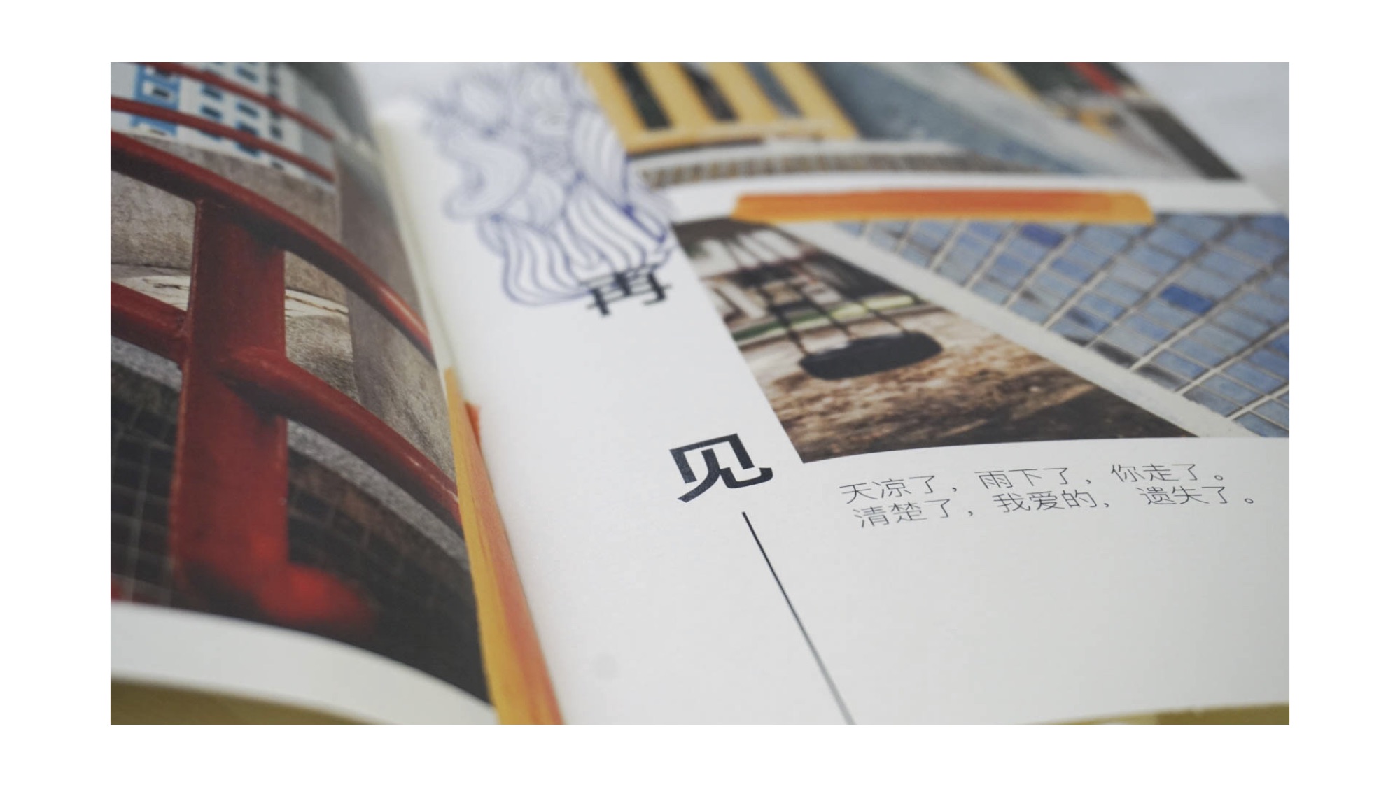


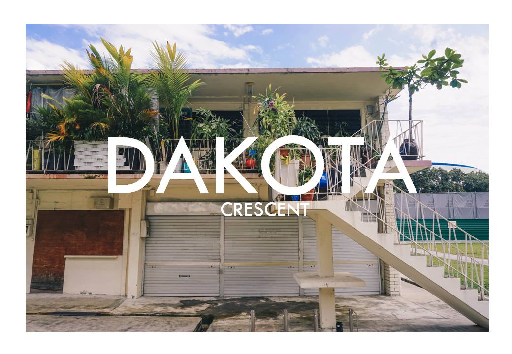
The place I am covering on is Dakota Crescent.
Cover page
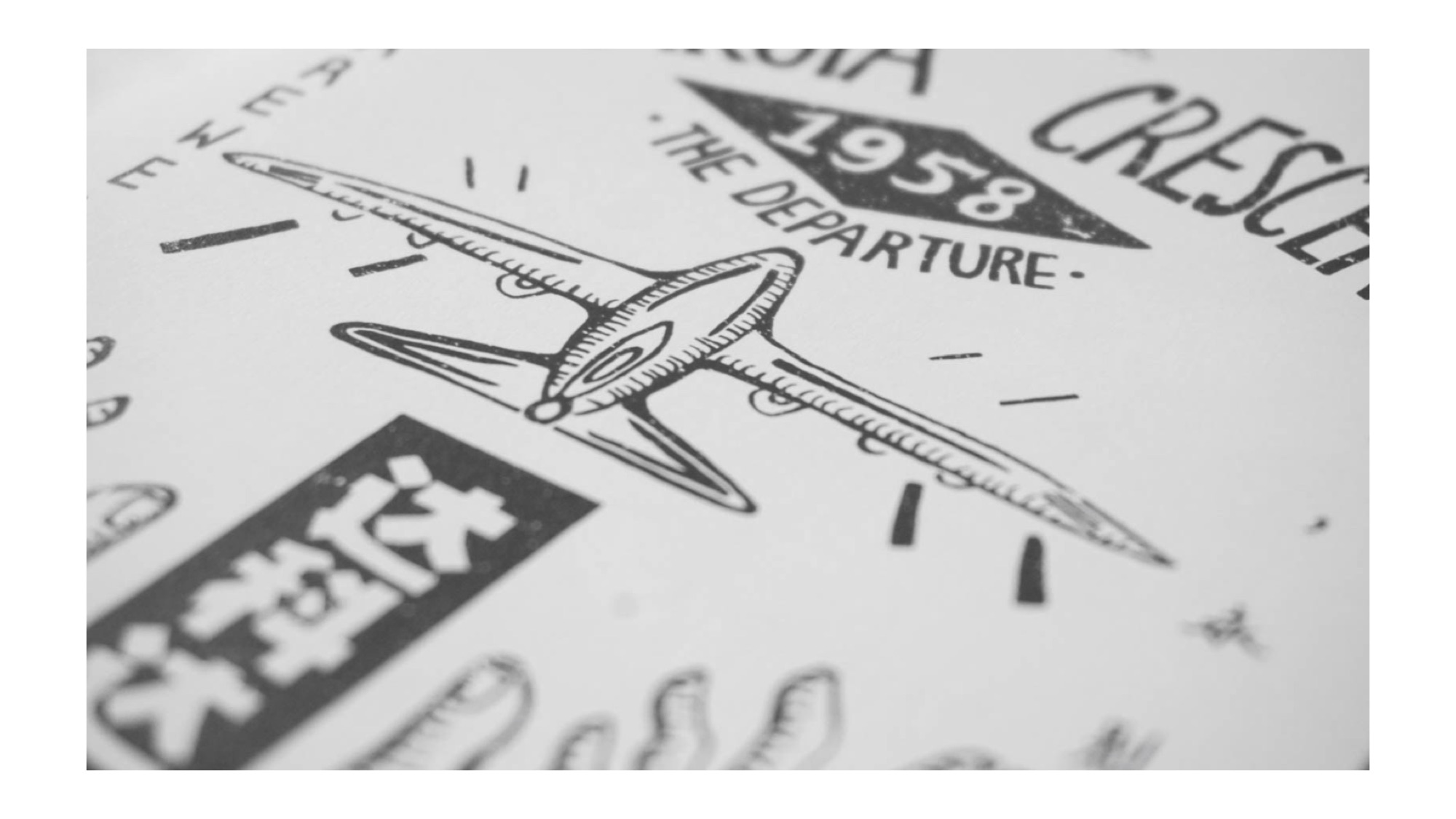
At the start, I knew that I wanted to have the concept of a vintage-looking cover page since Dakota Crescent is known to be an old neighbourhood (since 1958) with residents who are mostly senior citizens. However, I was quite lost about what colours to use and images as well. But I happen to chance upon this picture which I thought is pretty old school and I felt I could do something like this!


Thus, I decided to illustrate everything from the fonts to illustrations and wanted to go for something more symmetrical and neat so it kind of looks like an old poster/brochure (?) or that I feel that symmetry seems to be in alot of old school posters as well. Another illustration I referenced would also be the one below by BMD Design! (I love the technique of using technical pen to design due to more control)

Hence, I drew some elements of Dakota Crescent on a paper and then scanned them in and arranged them in the end. I used most of the illustrations but there are some that I feel are too stiff (such as the stairs and cat) hence I did not use them in the end.

Later on, I then arranged the different elements to the arrangement that I want, focusing on symmetry and that everything is kept within an imaginary rectangle box.

Later on I then added navy blue and maroon colours to the elements. After that, I learned a new technique (!!!) of using the clip mask technique to add textures into the elements. For the other fonts and shapes not in this picture, I used the wacom to illustrate them digitally.
As for the content inside, I wanted my zine to have a semi-minimalistic concept and layout of a ‘Lookbook‘, not really something as detailed as a tourist guidebook or a manual of where to roam around in Dakota C. Also, I want a clean look just like what I have mentioned about my cover page. Hence, I referred to works by designers Tseng Green, nakamuragraph and works from Pinterest.

by Tseng Green

by Nakamuragraph

from Pinterest

from Pinterest (Really like the colours in this one!)
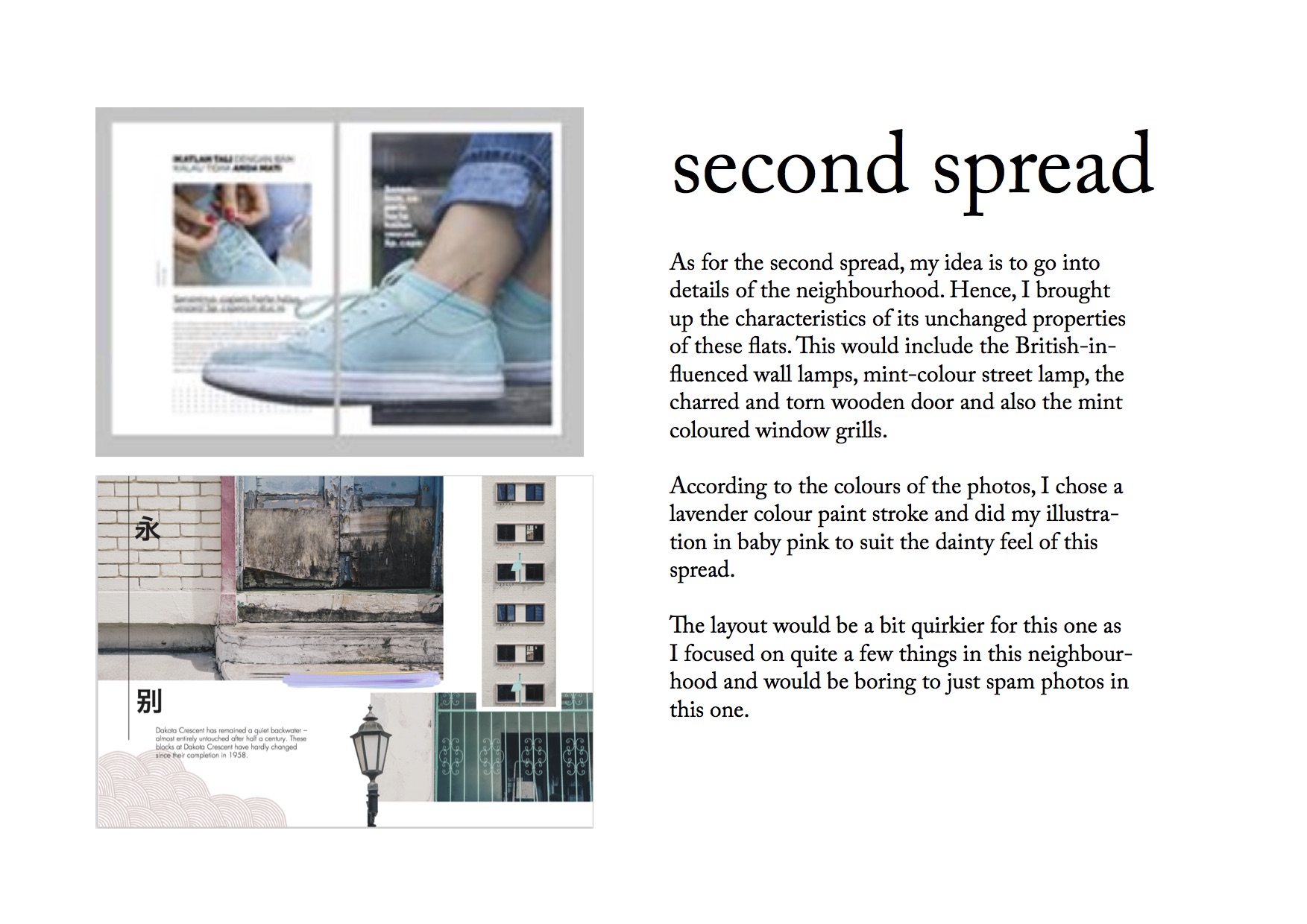
And also, to add some accent to my spreads, I added some patterns and paintbrush strokes and played around with the colour to see which suits the pages best as well.


My detailed explanations about the spreads are shown below.


As for the last page, I referenced from this picture to give an oriental look as well, just like the cover page.

There are also other things that I did not put in my zine but I guess they are still part of the process. I picked up some dried leaves at Dakota Crescent thinking I could do something with them. Hence, I decided to do some mark-making thinking I could use them for the very back page. But this design is not suitable for the concept that I am going for and looks more like a cover page than a back page.


Overall, I have quite a few learning points throughout the whole project


One of the controversial video installations that I have researched is a silent film by David Wojnarowicz. The name of this film is called “Fire in my Belly”. Shown in 1987, it caused an uproar because many people believed that the artist was trying to bring Chritianity down by having an imagery of Jesus Christ with insects that are crawling all over the figure. The overall colours and concept of the video are very dark. Other than the controversial scene that I have explained, there are other components of this film which involves dripping of blood, a rotting hand, knitting of lips, burning of the world map (which I thought was the most impactful scene) and people performing in the circus. The techniques he used for this piece encompassed many sudden video transitions, playing with lighting (which can be seen in the bread scene in 14:32 of the full video above and also the very vigorous flickering of light at 16:38 and 19:03) His rationale for this piece was in memory of a friend that died from AIDs. He was also suffering from the same condition when he created this video. This video was to express his feelings that the world had abandoned him as the US did nothing about this problem for many years. He felt that he was suffering the same amount of pain as Jesus Christ hence, using the figurine of Jesus Christ which caused a controversy due to religious reasons.


Another controversial piece I have researched is a performance art by visual artist and New York University professor Wafaa Bilal. This piece, called The 3rd I encompassed Bilal to have a titanium plate implanted into the back of his head, while a camera was attached capturing an image every minute for 24 hours a day, automatically posting online (www.3rdi.me). He did this performance art in 2010 and for one year. According to Bilal, it would raise “important social, aesthetic, political, technological and artistic questions,” It is also said that he wanted to capture the mundane while not knowingly taking the pictures. This indeed would cause a controversy with people’s privacy being invaded and having footages of people taken without their permission. Due to this, Bilal’s college required him to take the camera down as well. I believe another factor to have cause this controversy is due to the fact that an object was being “injected” or “semi-inserted” into his head which could be viewed as gruesome to some in the general audience.
The last controversial piece that I will talk about is a video art made by Bill Viola named “Anthem” in 1983. This piece which includes stereo sound and collage of footages of ripped food (which could be inferred as body parts), fire from factories, piercing screams of a girl/demon who is standing in the chamber of Union Station in Los Angeles, x-ray scans, stationary vehicles (giving me the impression that he is trying to portray the image of engines and probably an analogy of the energy from human bodies) and more, cars streaming along a highway, blood flowing through veins, modern surgical technology and tree branches in an ancient forest. For Bill Viola, the piece is a ritual evocation of “our deepest primal fears, darkness, and the separation of body and spirit.”. Tantric Buddhist chants (ritual exorcism and conversation with demons) were depicted in this film. The original scream is extended in time and shifted in frequency to produce a scale of harmonic notes that forms the soundtrack. For me, I believe that the discomfort and slight fear that one would probably gather from this piece is the reason for its controversy and the confusion that it might cause due to the random footages of subjects which I myself found it hard to link together.
Overall from my research, I feel that as time elapsed, it is evident that the advancement of technology has allowed practices done by artist to become even more bold and allows the space for them to express their interest and carry out their ideas. Without the advancement of technology, Wafaa Bilal would not be able to monitor the raw and mundane happenings around him. It was due to the quality of the camera being compact which allowed him to record footages conveniently. He was then able to gather the most “genuine” sights since people around him would not be aware of the gadget that is on his head. Also, in terms of video art and films, in contrast to the past when technology is limited, videos in recent years are more refined and then there’re more software developed to encourage the use of special effects and computer graphics like After Effects.
It is also evident that in the past, the skills in production especially in videos were not as refined as how they are now. As we can see in Bill Viola’s video, the footages of the video seems to be abrupt (but it could be on purpose for greater effects as well). As for the “Fire in my Belly” video, to introduce tension and maybe fear when it reaches the end of the silent film, he increased the transition of the different scenes to add in a sense of confusion and terror – a very simple technique I feel but it achieves its purpose. In contrast, in the recent years, sound is the main technique when it comes introducing tension especially in films done by James Wan who does a very wonderful job in Horror films like Conjuring and Annabelle. The mood of the video is indeed enhanced by this technique. Being a fan of Royston Tan’s short films, I also feel that sound is an essential technique in setting in the mood and context, not just in the aspect of horror and terror but other moods such as heart-warming and evoking a sense of nostalgia.

For this soundscape project, I did a sonic portrait of my mom. The reason for choosing my mom as my subject is because I realise the sounds that are related to my mom are sounds of childhood, which is meaningful to me. These are the sounds that I have been listening after I am dismissed from school from kindergarten till the days when I was in junior college. And also, I realised that amongst the people that I observe, I actually observe my mom the most in my life due to me being inquisitive ever since I was a kid.
In this soundscape, there are some elements of what I thought were some iconic elements that remind me of my mom. Although the sounds depict the subtle things that she would do around the house, they still instil a sense of nostalgia. My mom is the only one who would wear bedroom slippers around the house. Spraying the plants instead of watering them (very inefficient). Settling down for a cup of iced milo and butter crackers before cooking for dinner. And also, I remember her tuning into 958 FM (she refuses to tune into 933 FM) as an accompaniment while she cooked for dinner.
All in all, I would say the concept of this soundscape would be more oriental, raw and homely.
The sounds in this soundscape are all recorded by me except for the radio static sound.
As for research, I went to listen Hildegard Westerkamp’s Kits Beach sound walk. I really like the variation of volume, allowing me to imagine the distance of her from the ducks and that she was near to the crashing sounds of waves, just the space between her and the subjects at the beach in general. This inspired me to have a variation of sounds in terms of the volume and the direction as well. Whenever my mom comes back from work, the sound of the gate opening would always be from the left as I stay at my study table and also since my room is far away from the gates, this explains the low volume of the gates. In contrast, the dropping of keys on the table and frying of dishes will always be remembered as the louder movements.
Also, as for the background sounds, I decided to use the sounds in the morning when there are sounds of bird chirping to depict a more peaceful mood when my mom is having afternoon tea.
In this soundscape, I tried to feature a few movements of my mom at once such as listening to the radio while cooking, reading newspapers while munching on food because my mom is known to be a multi-tasker. And in fact, she is very good at it. I actually focused a lot on my mom cooking because when I was young I would always sit at the dining table and watch her cook and I would remember how the sounds of the radio diminishing as she is trying to fry food. These are the little details that I have noticed and they’re edged pretty vastly in my mind.
So, all in all, presenting to you, Nostalgia.
Ciao!

The place that I have been assigned to is Kallang. However if you are a true blue Singaporean, you would know that Kallang alone is a large scope to look at. The area with sports arenas at the Stadium near Kallang Indoor Stadium? Or the older aspect of Kallang near the Old Airport Road?
I decided to set my perimeters just in the area of Dakota Crescent in Kallang.
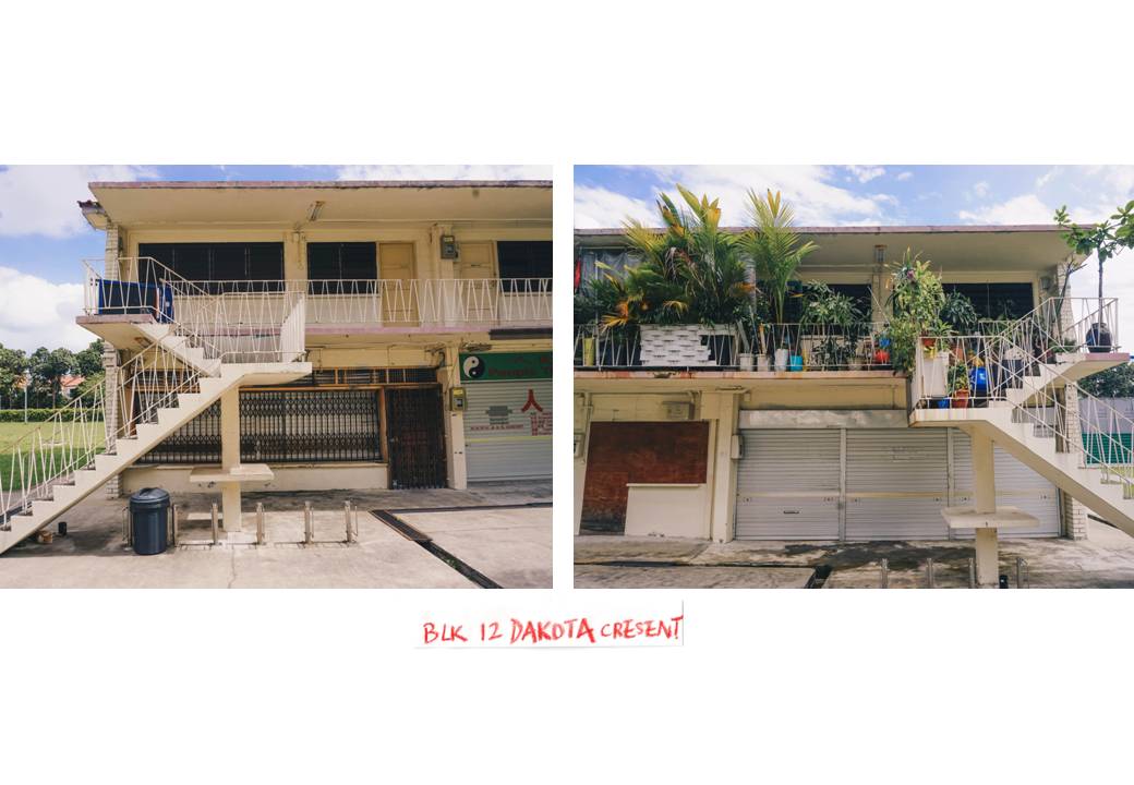
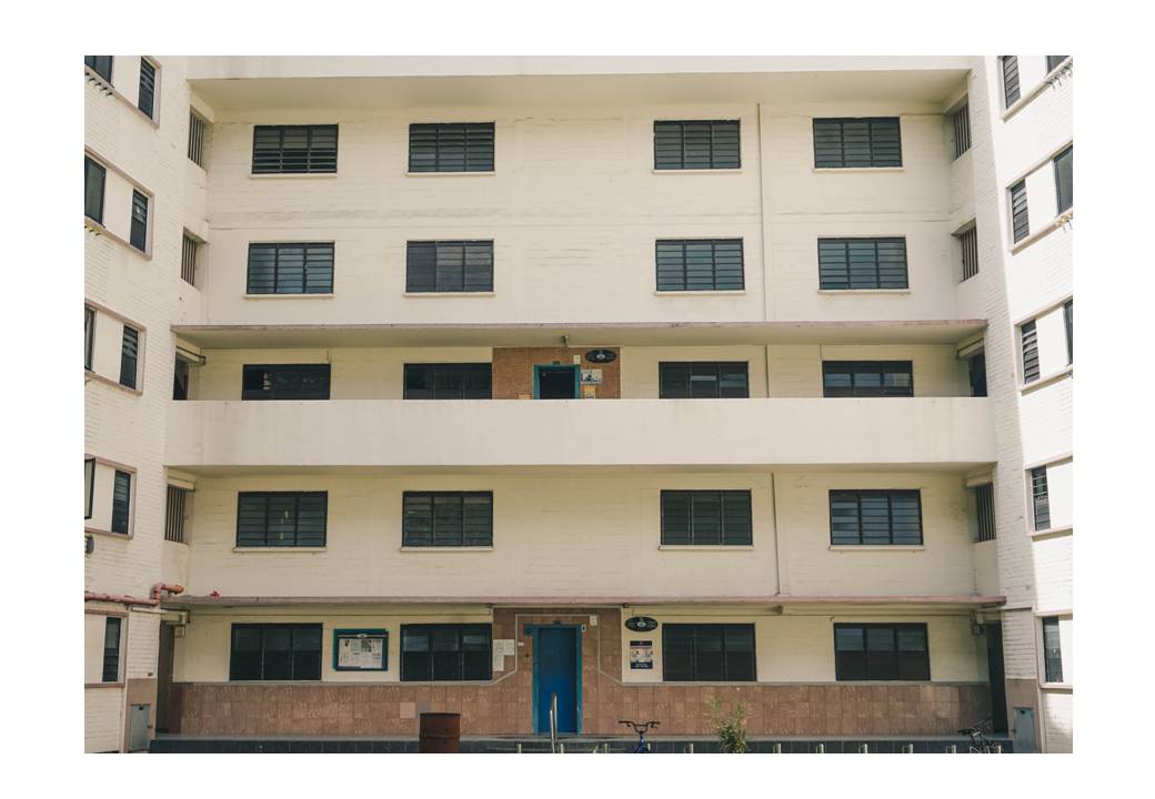
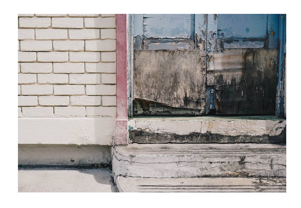
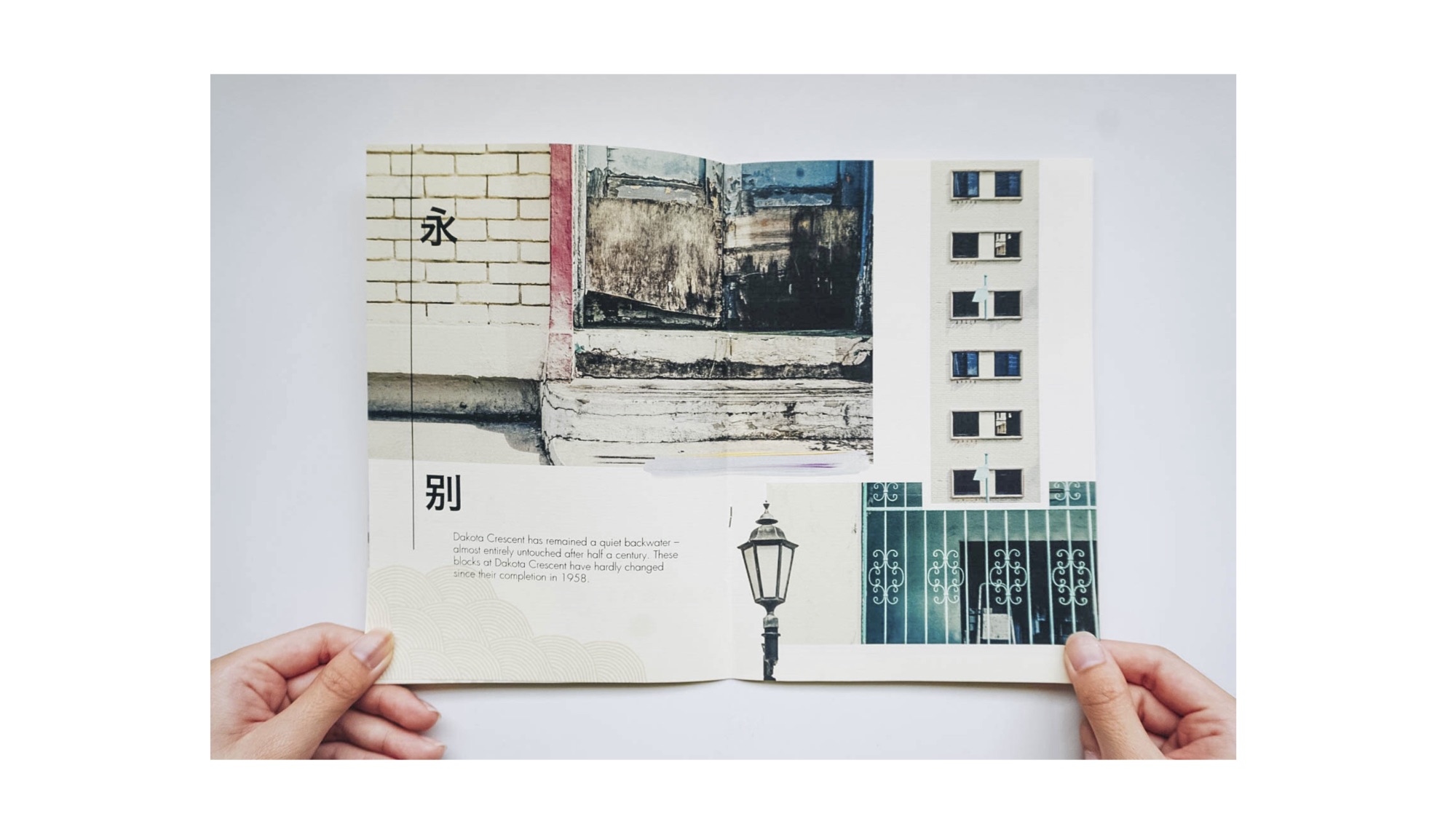
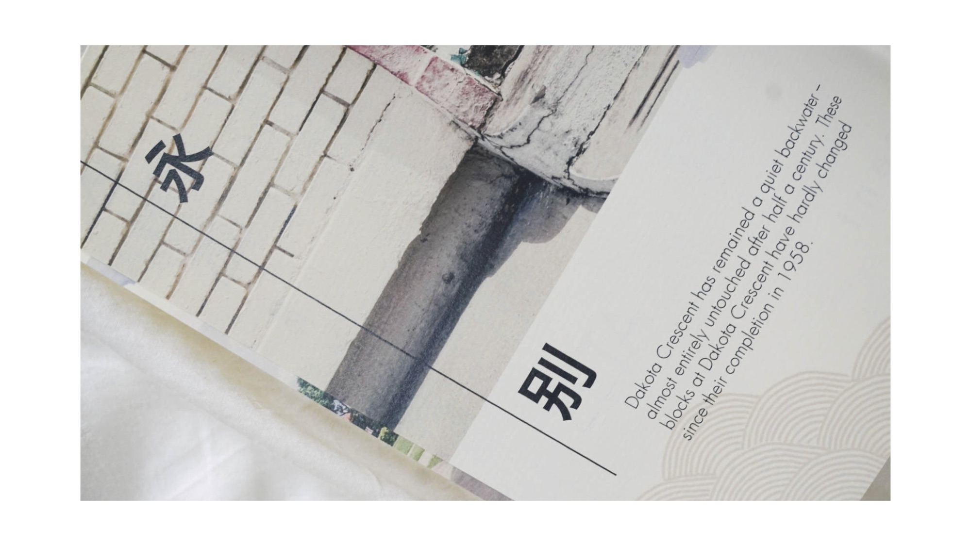
When I researched about Dakota Crescent, I felt pretty ignorant because never have I known that this place encompasses a rich history, even before Singapore’s independence and is now on the verge of disappearance due to Singapore’s future renewal plans for Mountbatten announced in 2014. Dakota Crescent is characterized by low rised buildings situated not far away from the city area. The estate, together with Tiong Bahru, was designed by Singapore Improvement Trust, before it was handed to HDB.
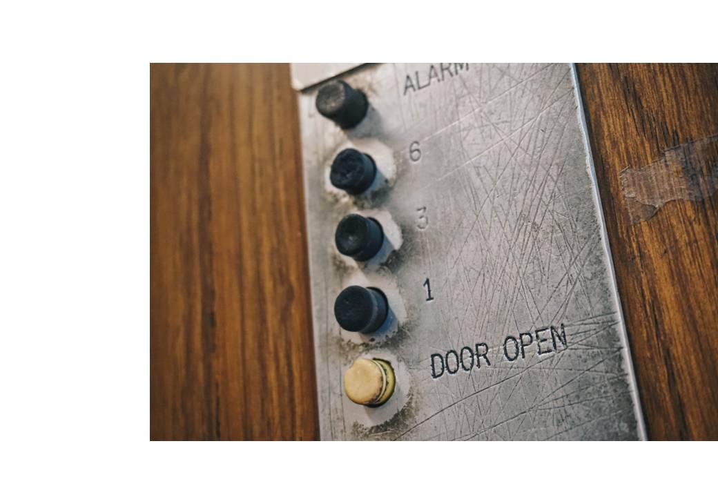
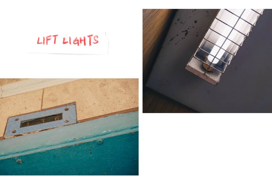
There are many interesting elements to the 17 blocks collectively. I saw for myself the “ancient” lift, not typical of Singapore’s flats to have which only travels to the first, third and sixth level. The lift is dimly-litted with its long fluorescent white light and a small screen with the numbers “1, 3, 6” on it which lights up whenever it reaches the levels respectively.
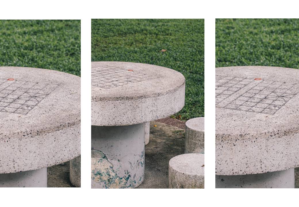
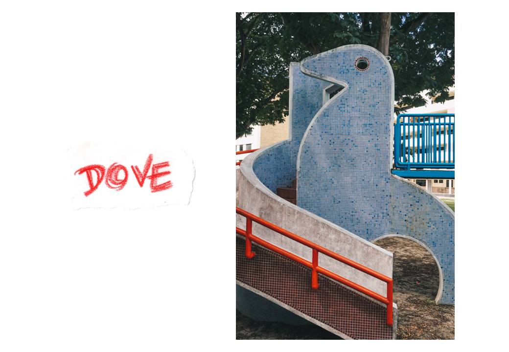
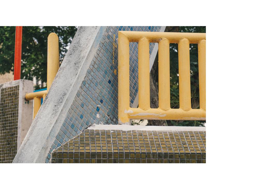
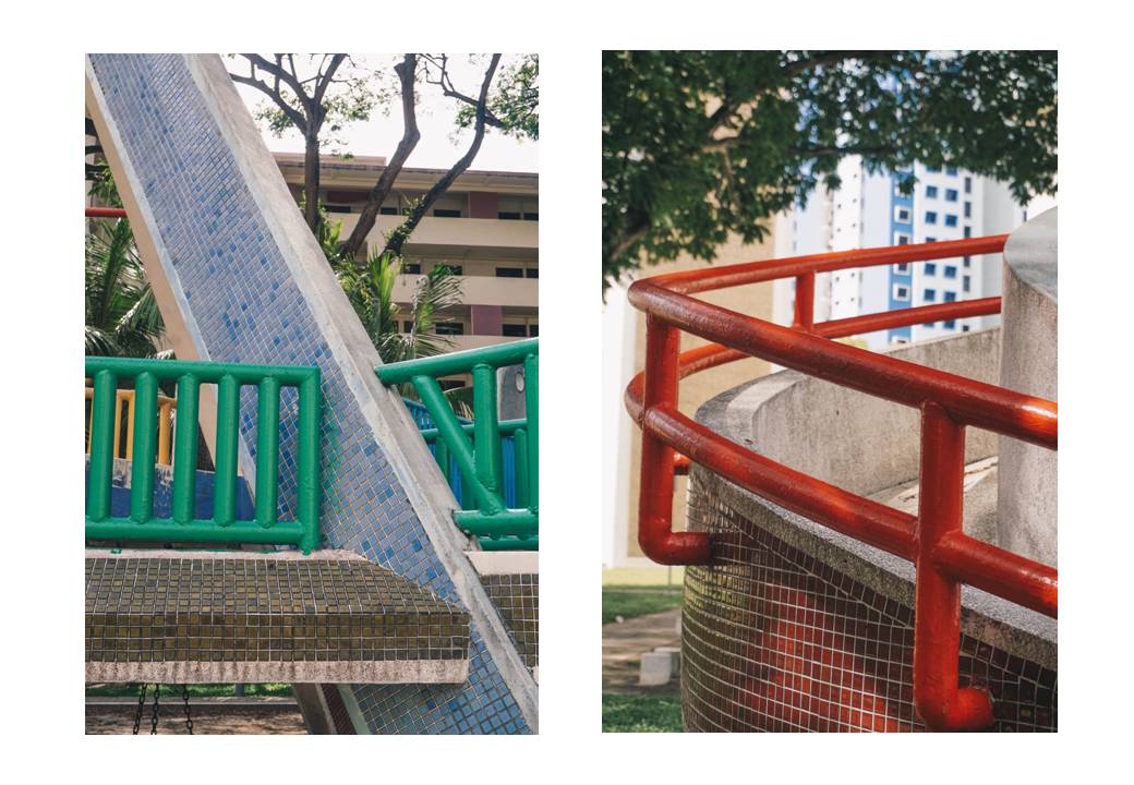
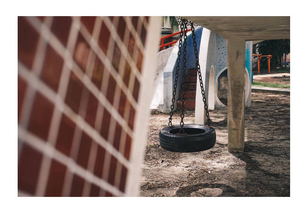
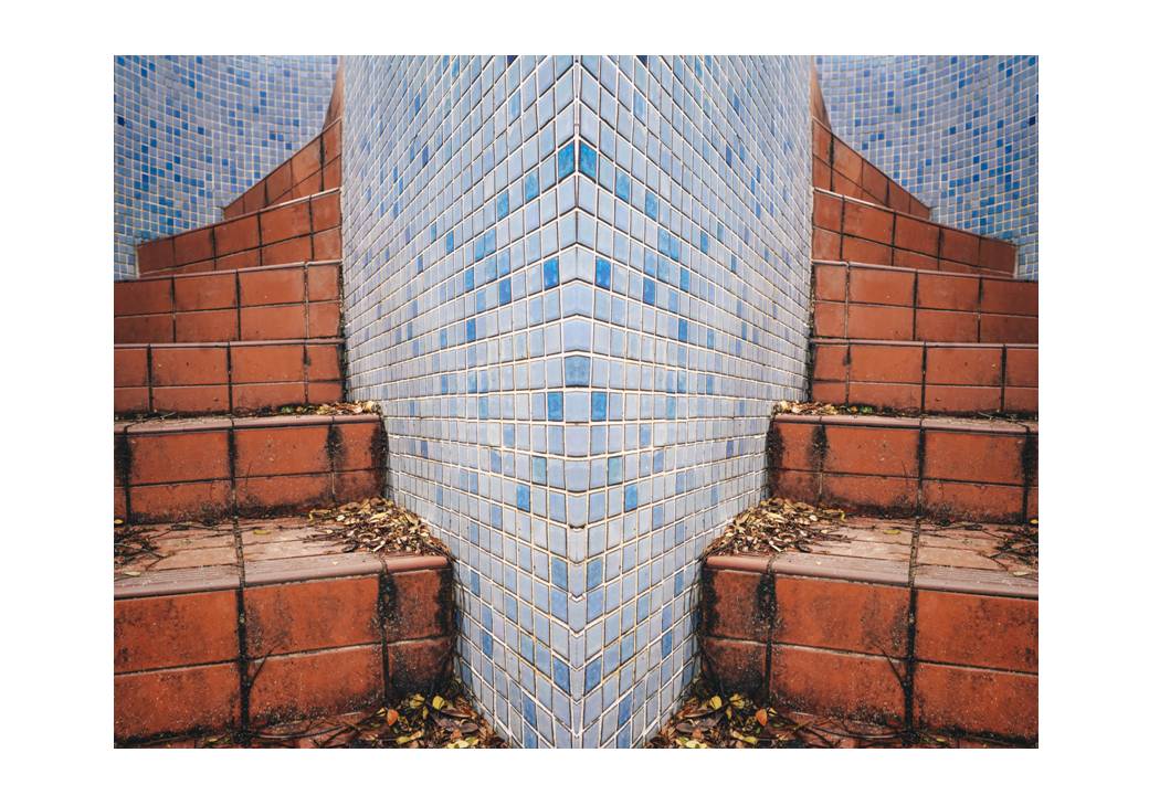
As you walk further in to Block 10, you would see the very iconic “Dove” playground which I would call it one of the “legedandary” playgrounds in Singapore aside from the “Dragon” and “Sampan” playgrounds. Very different from the typical playgrounds in Singapore, characterised with rubbery mats and plastic structures, the playground is made of stone, concrete and finished with tiles of maroon and gentle strobe of blue. The railings, I would say, is the mini accent to the playground with its vibrant colours of green, red and yellow. But of course, the highlight of the playground would be the figure of the dove which suggests the name of this playground as well.
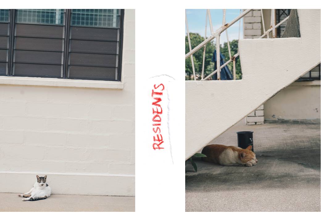
When I was walking around this playground, to be honest, the only people who walked by me seemed to come from the Old Airport Road, probably from the food court opposite. Other than that, the only living beings were stray cats and there were many of them in this neighbourhood.
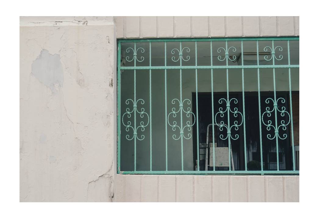
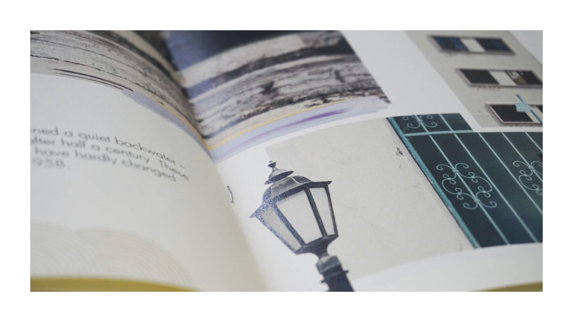
Other characteristics which I adore about this neighbourhood are the lamps and the window grills. The lamps stuck on the walls do not look like they’re from the concrete jungle but very vintage looking and I guess they seem to have some sort of British influence to it. As for the window grills, they have some sort of floral patterns to them and not typical black squares or lines of window grills which I find pretty dainty and interesting, especially because they are finished in pastel colours.
Admittedly, I found it creepy to venture around this estate which was near full abandonment. But it is saddening that this place is on the verge of disappearance with signs of flats and playground being abandoned since the government announced that the residents ought to leave the estate by the end of 2016. I feel that citizens ought to make a trip down to witness this estate before it is being wiped out since it is the last of the past to make it till this date. Conservation efforts have also been imposed. On Facebook, there is a group called “Save Dakota Crescent”, a group which focuses on ideas and thoughts about the renewal of this estate.

When researching, I came across news that involve the commotion of whether this estate, so rich in history, ought to be renewed.
 This news is from the straits times. If you all want to read about it, the link is here: http://www.straitstimes.com/singapore/parliament-lim-biow-chuan-asks-govt-to-reconsider-plans-to-redevelop-dakota-crescent
And last but not least, the very reason why the renewal of this state is so heart-wrenching – the residents who had their hearts in this neighbourhood for the longest time.


Credits: The Straits Times (http://www.straitstimes.com/singapore/people-behind-the-old-charm-at-dakota-crescent)