
The place I am covering on is Dakota Crescent.
Cover page
At the start, I knew that I wanted to have the concept of a vintage-looking cover page since Dakota Crescent is known to be an old neighbourhood (since 1958) with residents who are mostly senior citizens. However, I was quite lost about what colours to use and images as well. But I happen to chance upon this picture which I thought is pretty old school and I felt I could do something like this!


Thus, I decided to illustrate everything from the fonts to illustrations and wanted to go for something more symmetrical and neat so it kind of looks like an old poster/brochure (?) or that I feel that symmetry seems to be in alot of old school posters as well. Another illustration I referenced would also be the one below by BMD Design! (I love the technique of using technical pen to design due to more control)

Hence, I drew some elements of Dakota Crescent on a paper and then scanned them in and arranged them in the end. I used most of the illustrations but there are some that I feel are too stiff (such as the stairs and cat) hence I did not use them in the end.

Later on, I then arranged the different elements to the arrangement that I want, focusing on symmetry and that everything is kept within an imaginary rectangle box.

Later on I then added navy blue and maroon colours to the elements. After that, I learned a new technique (!!!) of using the clip mask technique to add textures into the elements. For the other fonts and shapes not in this picture, I used the wacom to illustrate them digitally.
As for the content inside, I wanted my zine to have a semi-minimalistic concept and layout of a ‘Lookbook‘, not really something as detailed as a tourist guidebook or a manual of where to roam around in Dakota C. Also, I want a clean look just like what I have mentioned about my cover page. Hence, I referred to works by designers Tseng Green, nakamuragraph and works from Pinterest.

by Tseng Green

by Nakamuragraph

from Pinterest

from Pinterest (Really like the colours in this one!)
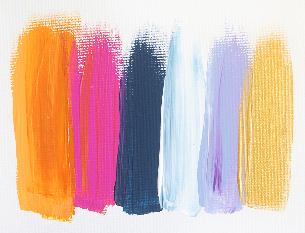
And also, to add some accent to my spreads, I added some patterns and paintbrush strokes and played around with the colour to see which suits the pages best as well.

My detailed explanations about the spreads are shown below.

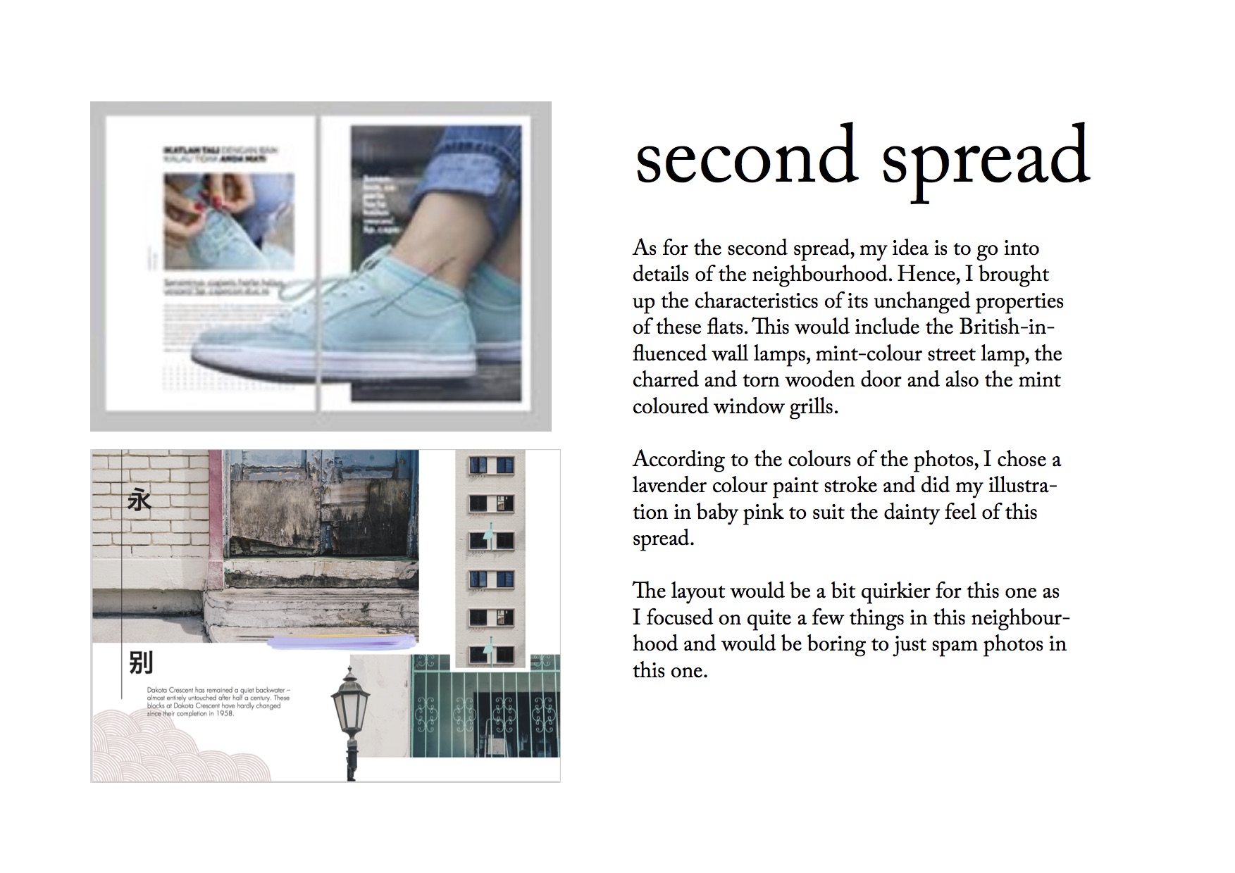

As for the last page, I referenced from this picture to give an oriental look as well, just like the cover page.

There are also other things that I did not put in my zine but I guess they are still part of the process. I picked up some dried leaves at Dakota Crescent thinking I could do something with them. Hence, I decided to do some mark-making thinking I could use them for the very back page. But this design is not suitable for the concept that I am going for and looks more like a cover page than a back page.


Overall, I have quite a few learning points throughout the whole project
- Using indesign!!!
- Making use of whatever sources that I have to the fullest.
- A few tools on photoshop which I didn’t know hence I have been doing it the longer way to get the same effect.
- How to get to Dakota Crescent (haha)
- Lightroom tools