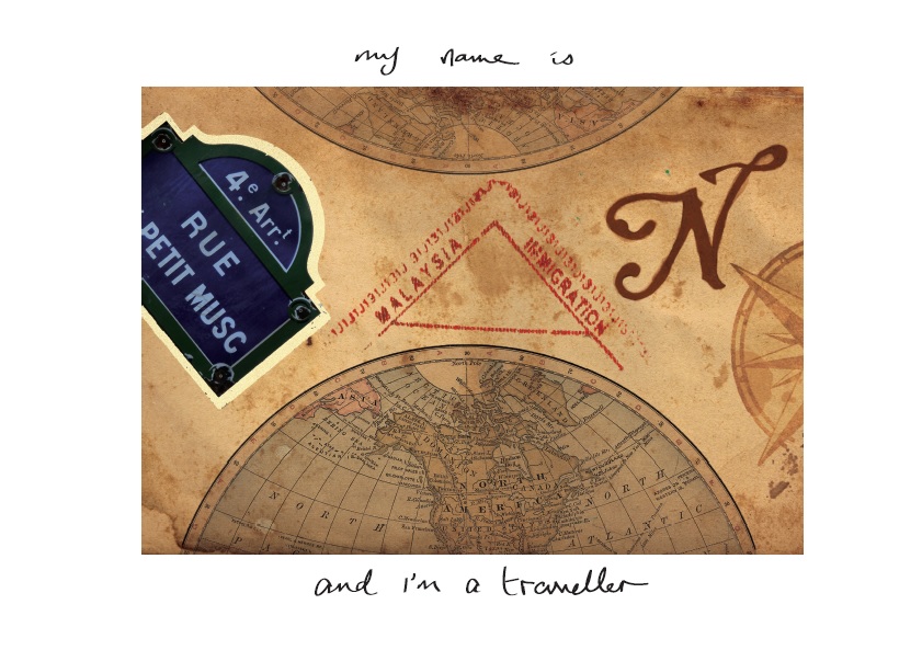
Alter ego means a person’s secondary or alternative personality.
In this piece, I harboured the idea of portraying both my public and a more personal persona in an exaggerated manner – happy, simple-minded, indecisive, poor-time management and a whole lot of quirkiness. And also another side of me that many people don’t usually face. It is a side that I would not usually want others to know of and would keep a conscious effort to keep it to myself. Hence, this video starts of with my public persona – light-hearted, happy, poor-time management, slightly eccentric, indecisive, straight-forward and a whole of of quirkiness. It later progresses to a side of me which is less seen and felt by others – sensitive, dejected, abit mysterious. However most of the video would still be more “happy” as that is how I really am and feeling pessimistic is a rarity, though it still happens.
Hence, I decided to put all of that into a very simple “story line” or perhaps a setting of me getting ready to go out. The reason to do that is because I feel that the very easy act of getting prepared to go out can already portray one’s personality clearly such as inferring if one is positive about the day or if one has a sense of urgency etc.
With all that in mind, a character that surfaced in my mind is actually a character from a drama called My Love From Another Star. Her role in this show is a celebrity who is known for being blunt, comedic, rash, simple-minded, quirky and slightly self-centered. Basically a very exaggerated version of myself and someone who reminds me of myself when I watch the show. And also, as a celebrity, she would sometimes feel lonely and that she is alone in this career path thus feeling unmotivated at times which is also something that I can somehow relate too as well.

One challenge is that, with her character in mind, I had to make the conscious effort to best portray myself and not deviate far from my actual personality although the plan is to exaggerate it.
Before choosing this character as my reference, I had a dilemma between quite a few people actually.
- Jennifer Lawrence
- Emma Stone
- Zoe Suen
- IU
- Cara Delevigne
I once took a very detailed personality test and the results mentioned that I had the same personality type as the first two mentioned above and thinking deep into it, I do feel that I can relate to theirs words in videos and screen tests. However, I was then advised to not refer to public figures and their personas because it may be personas that they have been developing as celebrities and may not be true. Hence, I decided to go for fictional characters instead and the first character that surfaced in my mind is the one that I chose.
As for Zoe Suen, after much thinking I feel that the reason I thought about choosing her is simply because I like her style in her works and videos and sees her as a role model. In terms of personality, I think we still have some sort of difference. Lastly, Cara Delevigne is known for her eccentric personality but then again, models nowadays are taught to be individualistic and Cara of course stood out by being bold and funny and all in the first place which is not what models usually do and this “individualism” that they are taught to have may not actually be genuine.
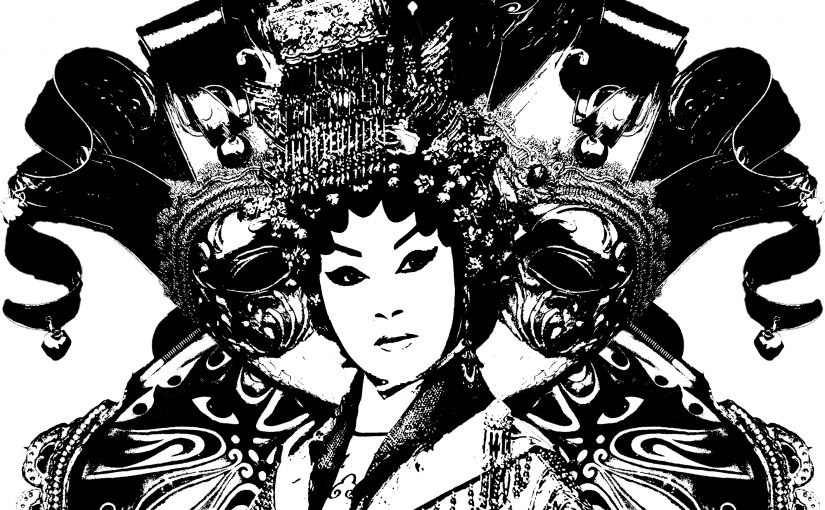
This piece is basically about how I prepare to go out from waking up to brushing my teeth, being fickle-minded about selection of clothing till the end of waiting for a call. At first, viewers may think that I do actually have a company or a date to out with since the character I am portraying shows that I am somewhat anticipating a date with glee and would probably infer that I’m just someone sociable and fun. But in the video, there are hints that the character in the video does not actually have a company. This is shown with a few clips of a phone without any notification or alarm jingles and is pretty much stationary from the very start, especially the part when I am holding my phone, portraying my anticipation for the phone to ring. The twist of loneliness and dejection of the character is then shown in the end when she faces the music of being alone despite having prepared to go out with a company. Just like how Venetian masks are used to protect one’s identity, it is being put on at the end to signify how I would cover up that side of me which is not usually shown to many.
password: purge


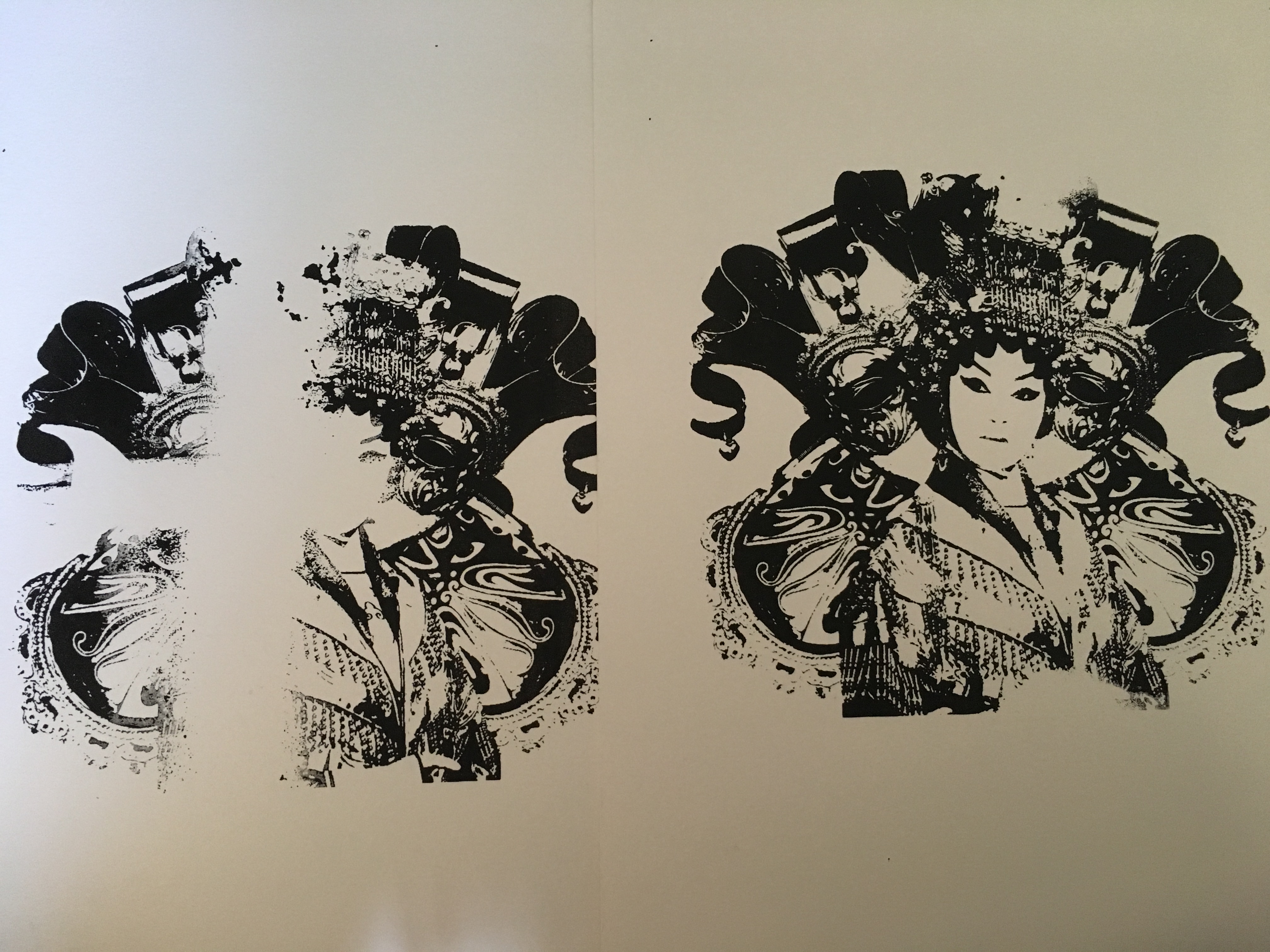 Attempts 1 and 2.
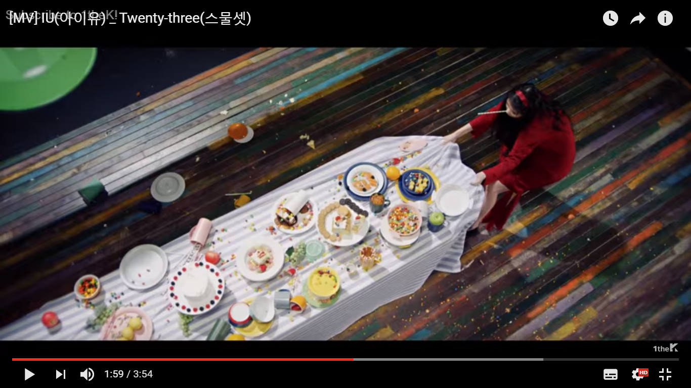

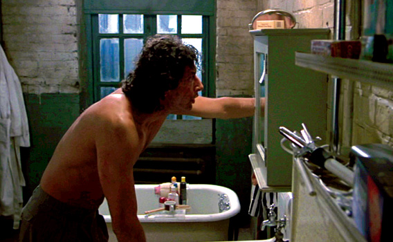 the above photo’s from https://www.pinterest.com/pin/283656476502231460/
 and this is my own version of a bathroom scene